Hi Everyone,
I didn’t intend for this to be three posts. Alas, I needed to divide it up, which you’ll see why in a sec. If you missed the two-part post discussing the latest floor finishes, please go here. I also added one new company that a lovely reader told me about. It’s another low-VOC product from Europe and is sold here.
So, I have spent many hours making numerous renderings similar to the ones I made nearly three years ago.
I used the same base image as I used in November 2020, an hour after I closed. This was before any furniture was brought in. Then, I found the table I love, from Englishman’s Furniture, but in a better perspective.
The table I’ve been using is two demilune tables, but it’s a little too small. I thought I could use a slightly larger table pad, but it scoots around and sometimes doesn’t work well.
One issue with these renderings is if doing a shiny finish; we don’t see the reflections from the windows, which definitely lightens up the floor a lot.
Choosing a floor finish can be an agonizing decision because it very much affects the feeling of the room.
But, here’s the thing. I don’t hate the finish as it is now, except it has to be redone because there will be parts that are new wood.
That’s upstairs and down.
The other thing and this is an important point, is that the kitchen is all white.
Therefore, looking into the kitchen, I want to see warmth.
Let’s look first at some of the renderings I’ve created for the floor and also the floor as it is.
Okay, I did a whole mess of finishes on Picmonkey.
But, first, let’s look at an image of the floor as it looked two years ago.
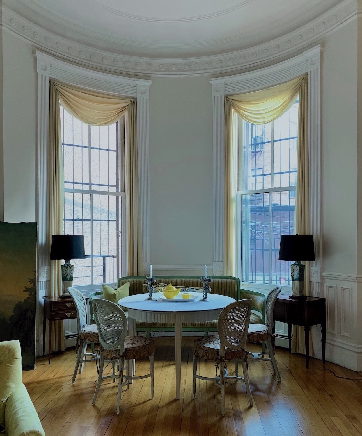
Pretty yellow, ain’t it. And, I put as much blue in the image as I possibly could.
At night, however, it looks like this. (below)
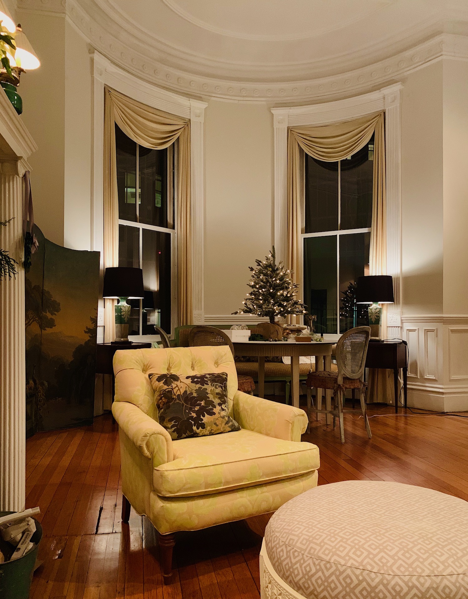
See what I mean?
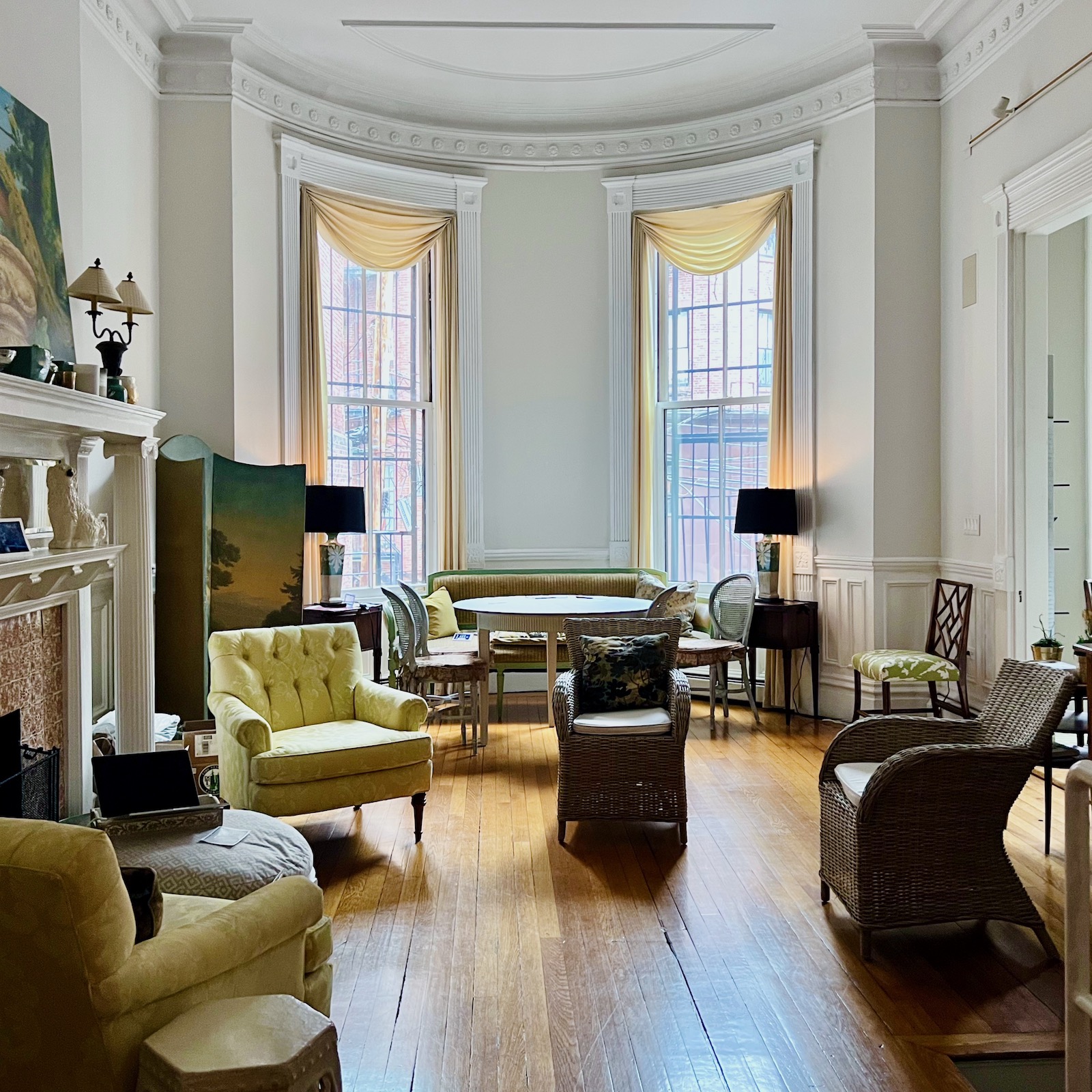
However, most of the time, during the day, it’s pretty much like this.
So, let’s look at the Picmonkey renderings.
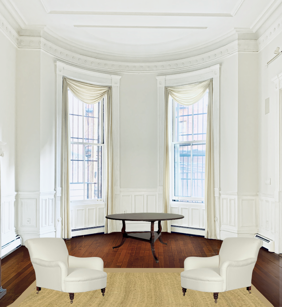
Floor 1
This is a traditional English Chestnut. My finish would have more of a sheen.
While this isn’t how the furniture is arranged, the entire back third of the room will be rugless.
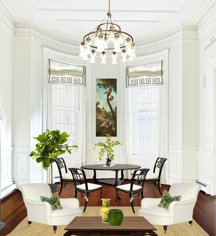
Here it is with more furniture. I am not necessarily going to have black chairs. It feels quite traditional and a little heavy to me.
What happens if the floor finish is black or ebony?
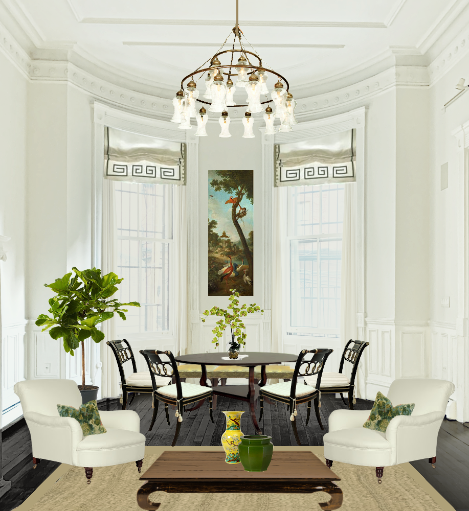
Floor 2
During the day, I think it would begin to weigh me down. At night, I would be in heaven. However, I need to like it both times.
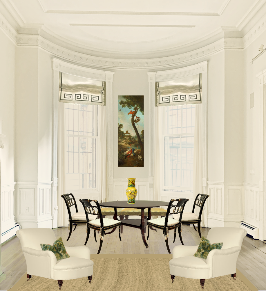
Floor 3
There are some yellowish highlights I had trouble getting rid of.
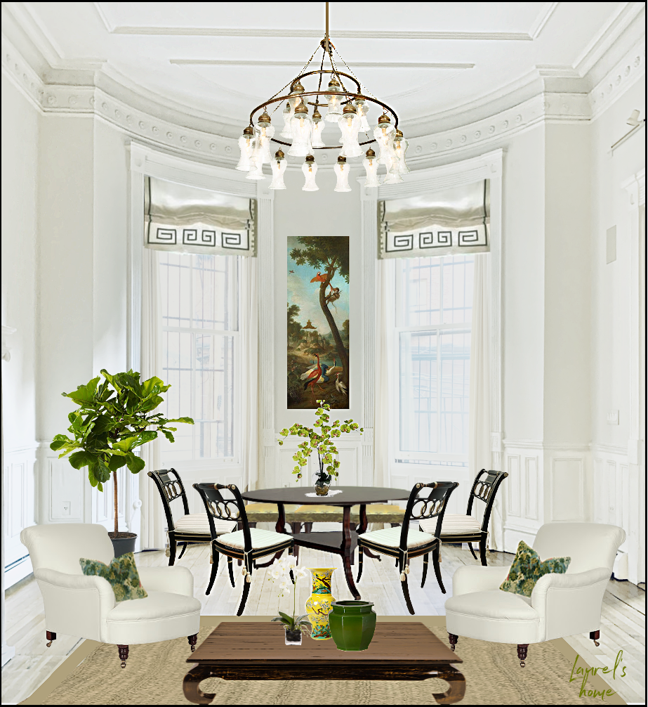
Floor 4
I went even further with this color because I love it. If the floorboards were super wide, maybe, but they’re not. On further reflection, I don’t think it’s right. It’s not right for this house in Back Bay, Boston. However, if you look up Sir John Soane’s Museum, some floors inside are this color.
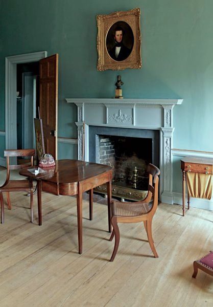
Above is a historically accurate no-stain 18th c. hardwood floor.
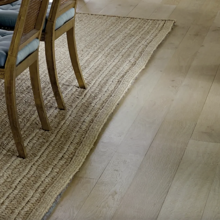
This is very similar to Jasper Conran’s floor!
Then, I thought, “What color were Thomas Jefferson’s Monticello floors?”
They look to be a Chestnut color, not super dark, but not light, either. It’s pretty much what you would expect.
However, what were the floors when Monticello (late 18th, early 19th c.) was built?
They were probably more like the floors above.
But, here’s the part that’s one of the coolest things ever. While researching the floors inside Jefferson’s Monticello masterpiece, I found another website (Enbois Flooring) that featured a floor color named “Monticello.”
Okay, not bad, I thought. Then, it said: “See this in your room.”
Well, okay, I thought this was going to be a disaster. So, I uploaded my image, and what appeared on my screen about 20 seconds later shocked me immensely.
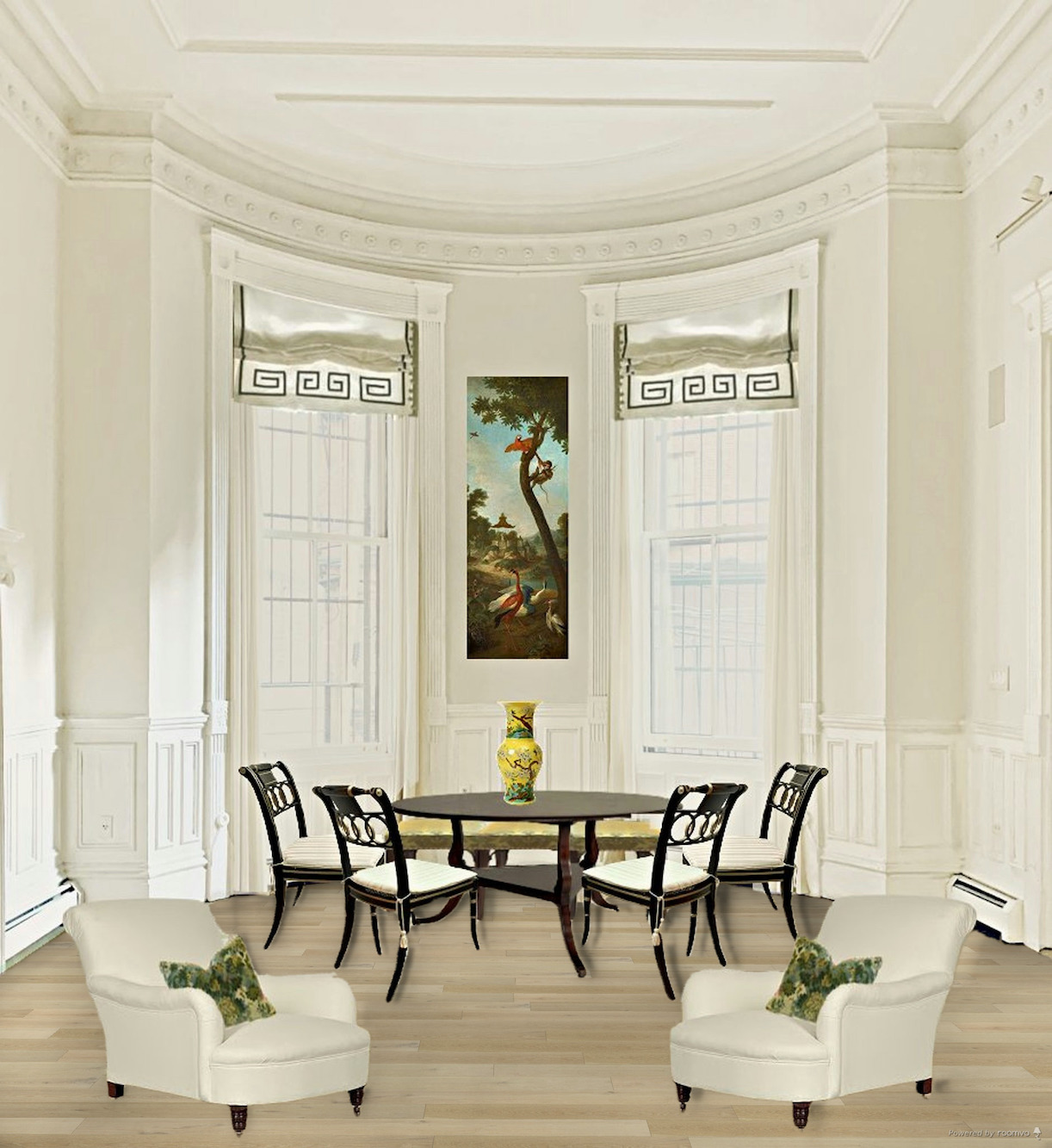
Floor 5 (Monticello from
Not only did their program get the floor exactly where it was supposed to be, but it put shadows on the virtual chairs and table! These are images of furniture with the background removed. The shadows weren’t there! I mean, all I had to do was sit here and look pretty.
To boot, I very much like this natural floor white oak floor color.

It’s pretty close to my floor, #3.
However, I looked at nearly every color on the website.
Of course, I did. ;]
Now, I won’t show them all to you, but I will show you a few more.
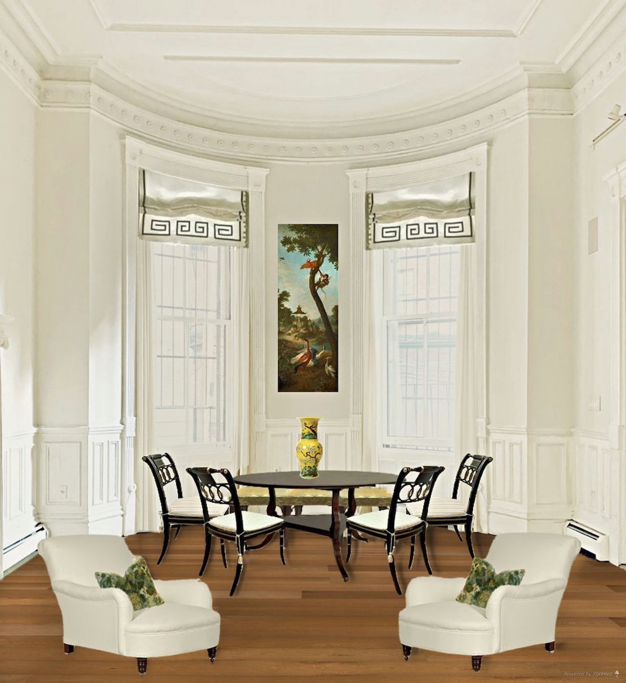
Floor 6
This is one of their darkest colors, much like Minwax’s English Chestnut. Again, there’s no shine.
This is also similar to Steve Cordony’s floor color in his double front parlor. Actually, Steve’s floor is darker than this.
But, but, but… 90% of it is covered with his rug and furniture.
Plus, if I did a dark floor, I HAVE to do a rug.
Let’s look at a few more of the Enbois Flooring images.
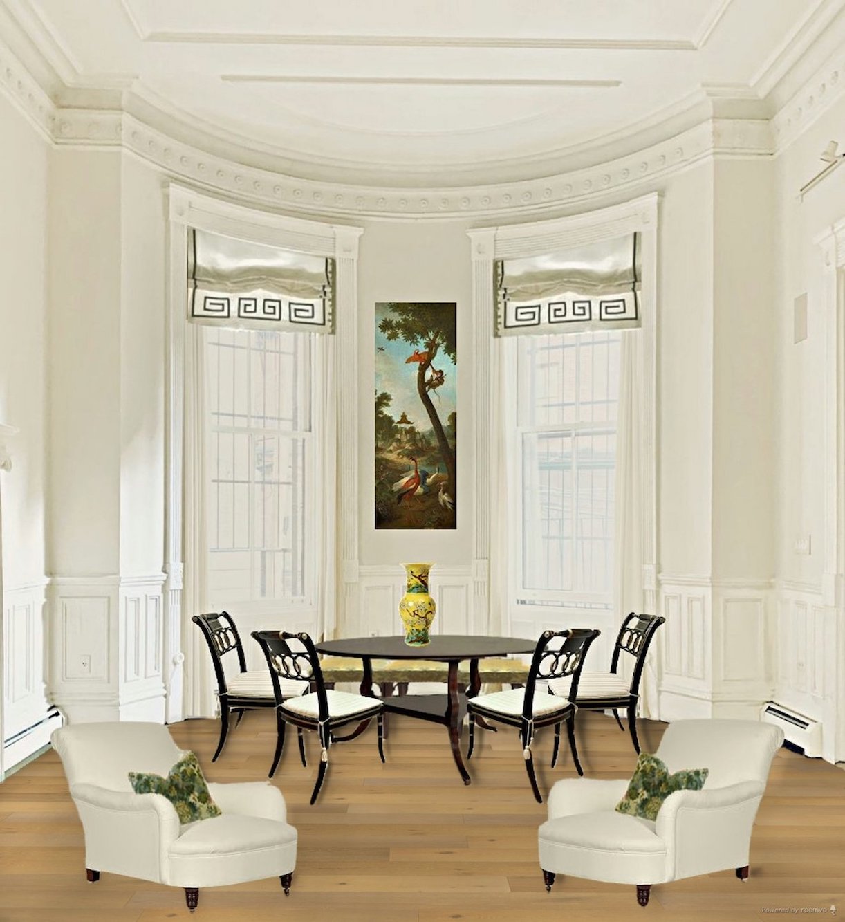
Floor 7
This one’s called Ritz Cove. This is along the lines of Gerald Bland’s country home floor, but his floor is wide-planked pine. However, this color is maybe even closer to what I currently have. This one could work.

It looks like they took the finish off and just waxed the floors, which is what they did IF they finished the floors in the early to mid-19th century.
Seriously beautiful!
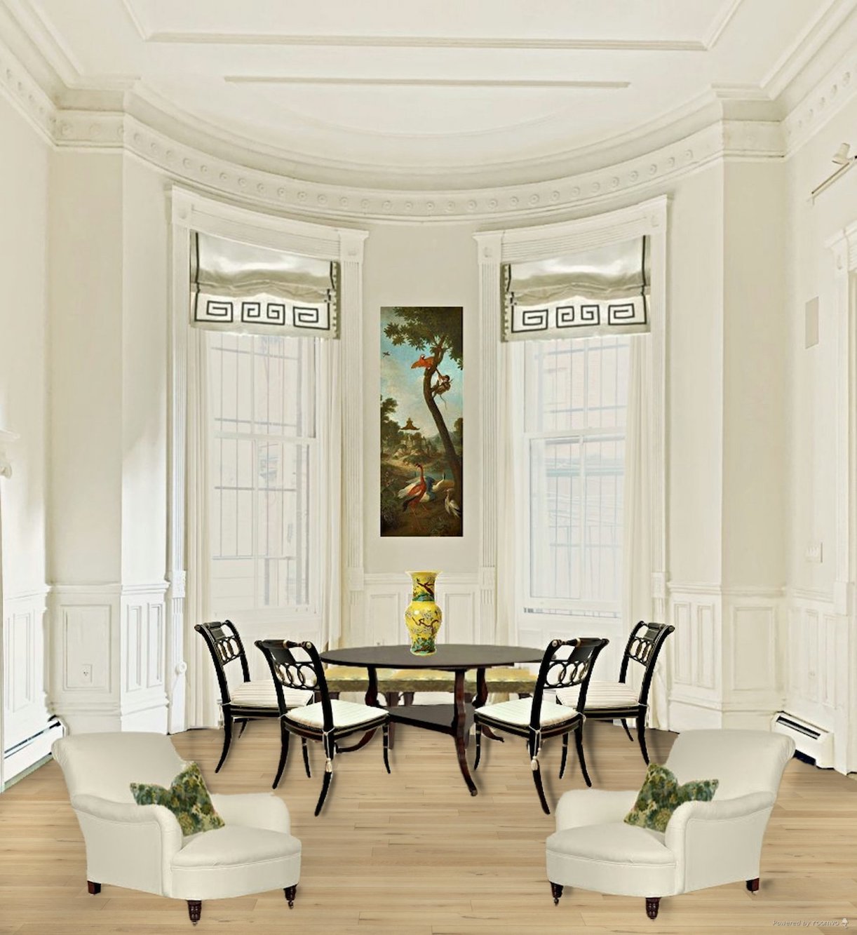
Floor 8
Delano is another finish I like that’s similar to Monticello but with a little more red. These no-color finishes would be flat to maybe a slight satin finish.

Monticello is pretty much what unstained white oak looks like.
Another important consideration is the floor juxtaposed next to the black and white painted floor in the entry and kitchen.
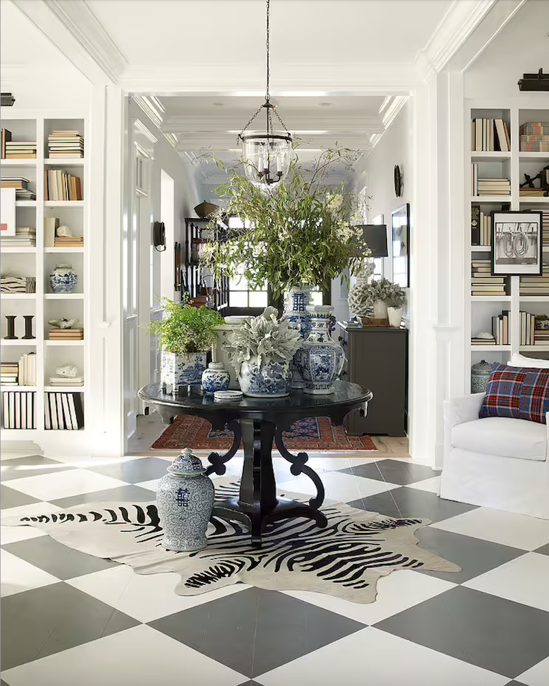
Above is a Betsy Burnham favorite with a black and white painted floor and a medium light finish similar to Delano in the background.
In closing, while the floor color is important, it’s literally and figuratively a supporting player in the scheme of things. Frankly, if someone comes over and then they are asked later what color the floors are unless I pointed it out to them, they should say something to the effect:
“Ya know, I don’t really remember the living room floors, only the stunning checkerboard as I came in. Whatever it was, it looked nice.”
Besides, I believe I passed out when I stepped into the kitchen and saw the exquisite, gleaming cremone bolts on those dramatically tall glass doors.”
;];];]
Okay, that’s pretty much it. The floor only needs to look nice.
So, what do you guys think?
By the way, I received a sample from Wilmette Hardware of the polished nickel finish. And, indeed, *I* nearly passed out. It’s gorgeous! Incidentally, it was wrapped a thousand times better than either of those glass shades. In addition, Wilmette sent me a stunning book of their entire line. They are a class act, for sure!
xo,

Please check out the recently updated HOT SALES!
There is now an Amazon link on my home page and below. Thank you for the suggestion!
Please note that I have decided not to create a membership site. However, this website is very expensive to run. To provide this content, I rely on you, the kind readers of my blog, to use my affiliate links whenever possible for items you need and want. There is no extra charge to you. The vendor you’re purchasing from pays me a small commission.
To facilitate this, some readers have asked me to put
A link to Amazon.com is on my home page.
Please click the link before items go into your shopping cart. Some people save their purchases in their “save for later folder.” Then, if you remember, please come back and click my Amazon link, and then you’re free to place your orders. While most vendor links have a cookie that lasts a while, Amazon’s cookies only last up to 24 hours.
Thank you so much!
I very much appreciate your help and support!
Related Posts
 21 Best Hidden Storage Ideas, Stairs, Kitchens, Bathrooms
 Wallpaper – The Complete Guide To Avoid Screwing It Up!
 Rooms With Light Walls Look Larger, Yes Or No?
 Yellow Walls – Why Do You Hate Them So Much?
 Can a Studio Apartment Become a 1-Bedroom?
 Bathroom Design Inspiration – Revisiting an Old Project
 Help! I wanted Soothing Green Walls and I Got Hospital Green Instead!


