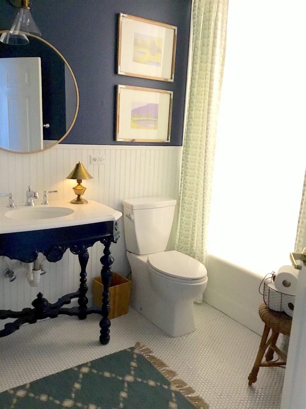
The other day, I received a comment from Mary, a faithful reader who was bemoaning her painted antique table that she’s using as a vanity.
If you missed Sunday’s post, it was all about bathroom vanities, plus sinks, faucets, lighting and mirrors.
She feels that the navy color she chose is too “bossy” and cold and should probably have been left its original wood tone.
But, at the time, it was a “trend” to paint thrift-store antique furniture and she said fell prey to it.
That one got my curiosity up, because there are already two issues with her painted antique table “mistake.”
- One, is that painted furniture is not and never will be a “trend.”
Oh, sure. People will call it a trend and it’s not hurting anything, but it’s not correct.
- Painted wood furniture of all kinds has been en enduring classic for over 250 years.
It was the rage in the latter part of the 18th century all over Europe.
- And painted furniture is more wildly popular than ever– right now!
But you can’t paint an antique, Laurel!
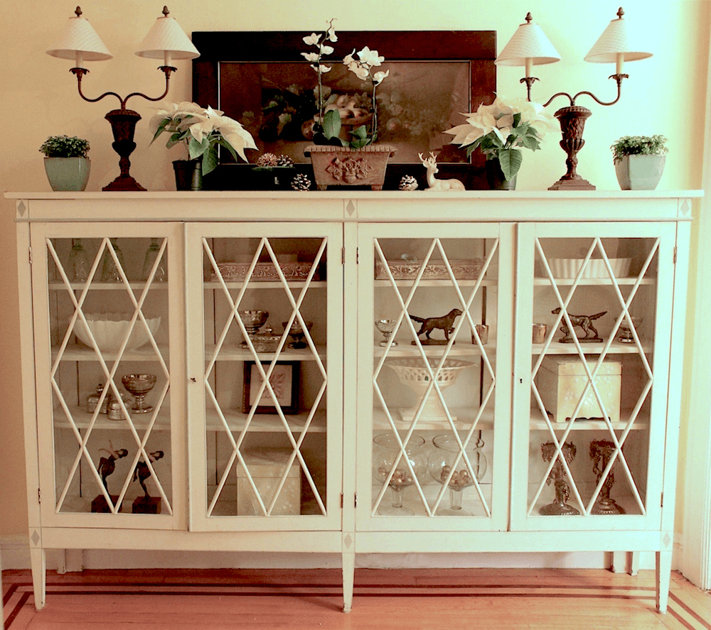
Uh… yes, you can. I did! You can see more here. And it’s been my favorite piece of furniture ever since I bought it and had it painted, 18 years ago!
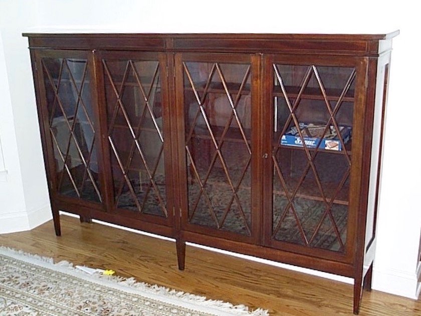
Before.
I’m pretty sure that I’ve shown this before because I recall commenting on the Pikachu cake server on the floor. I had two little boys at that time.
The other issue is that in my mind’s eye, I saw a totally white bathroom with a big navy painted table.
Hehe… this will be an easy one, because if the table is bossy, it means the balance is probably off.
So, I wrote Mary and said, if she’s game, I would take a look at it and if I thought it would make a good blog post, I would use the image(s) with her permission.
To my great dismay, Mary sent me an absolutely gorgeous bathroom, with a gorgeous navy vanity that in my opinion, isn’t the slightest bit bossy.
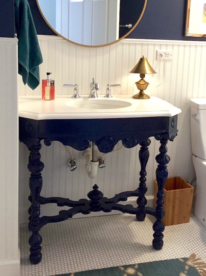
She explained that she painted the vanity Navy and it was because of the adjoining guest bedroom which is dark. AND because it was the “trend of the day.”
Sure. If I want to get super-nit-picky, I could come up with a couple of things. And really. I should talk!!!
And, these are small. But if I were doing bead-board or any wainscoting with an 8-foot ceiling. The max height is about 36″. (unless going up 3/4 up the wall) I might be wrong, but this looks to be about 42″. I would also put the mirror a couple of inches over the wainscoting and the sconce up a little higher. But jeepers, this is a fabulous looking room!
Plus, Mary sewed the custom shower curtain herself.
Before I move on, I want to show another cool bathroom with an antique chest used for the vanity
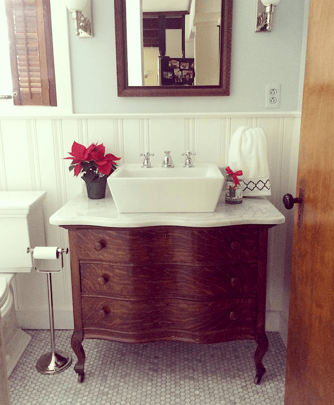
Coincidentally, another talented reader Amy from @littlecedarfarmhouse on instagram shared this wonderful bathroom in a comment she made, earlier today.
I told her that it might end up in tonight’s post.
The difference is that Mary’s vanity is far fussier in its design and I think in the painted finish feels fresh. And I think in a wood finish would start to look a little fuddy-duddy. It looks to be a Victorian style which was trying to be Louis XV but mixing in a little American-country.
Amy’s piece could easily have gone either way, but it looks lovely here in the wood stain with the pale gray-blue walls.
However, I’m not done because I was curious after seeing that stunning bathroom to see what the rest of the house looked like. She also had a small complaint about her very dark guest bedroom.
We’ll get to that in a minute.
First—
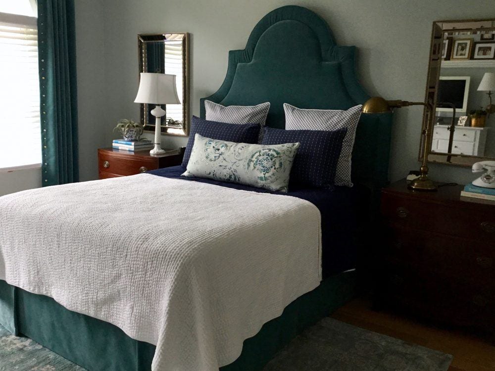
The gorgeous master bedroom. Mary made the headboard, pillows and maybe the bed skirt. In the dark room, I had suggested mirrors behind the lights, but she beat me to it here.
Can I have those wonderful chests please?
Since the home is a two-bedroom condo, understandably, she didn’t want to repeat the mirrors behind the lamps in the dark bedroom, coming up.
Love the colors!
Speaking of; the bedroom color here, is everyone’s favorite, including me, Benjamin Moore Quiet Moments. It’s one of the 144 Laurel Home Essential paint colors.
This is without a doubt one of my can’t fail no-fail paint colors. It always looks great.
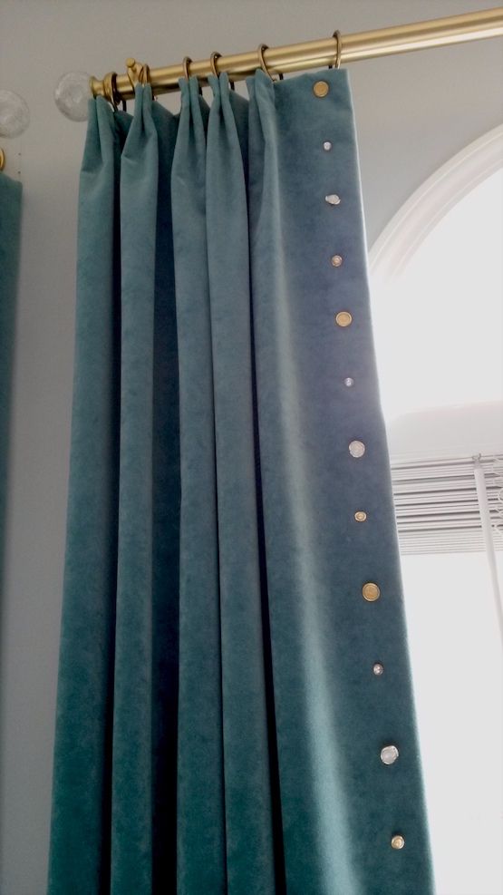
For the draperies, Mary purchased some ready-made drapes and then she pleated them and added the smart-looking button trim. Now, they look like expensive custom drapes!
Now, let’s take a look at the aforementioned dark, guest bedroom.
(one of my favorite dark teal bedrooms ever is in the link)
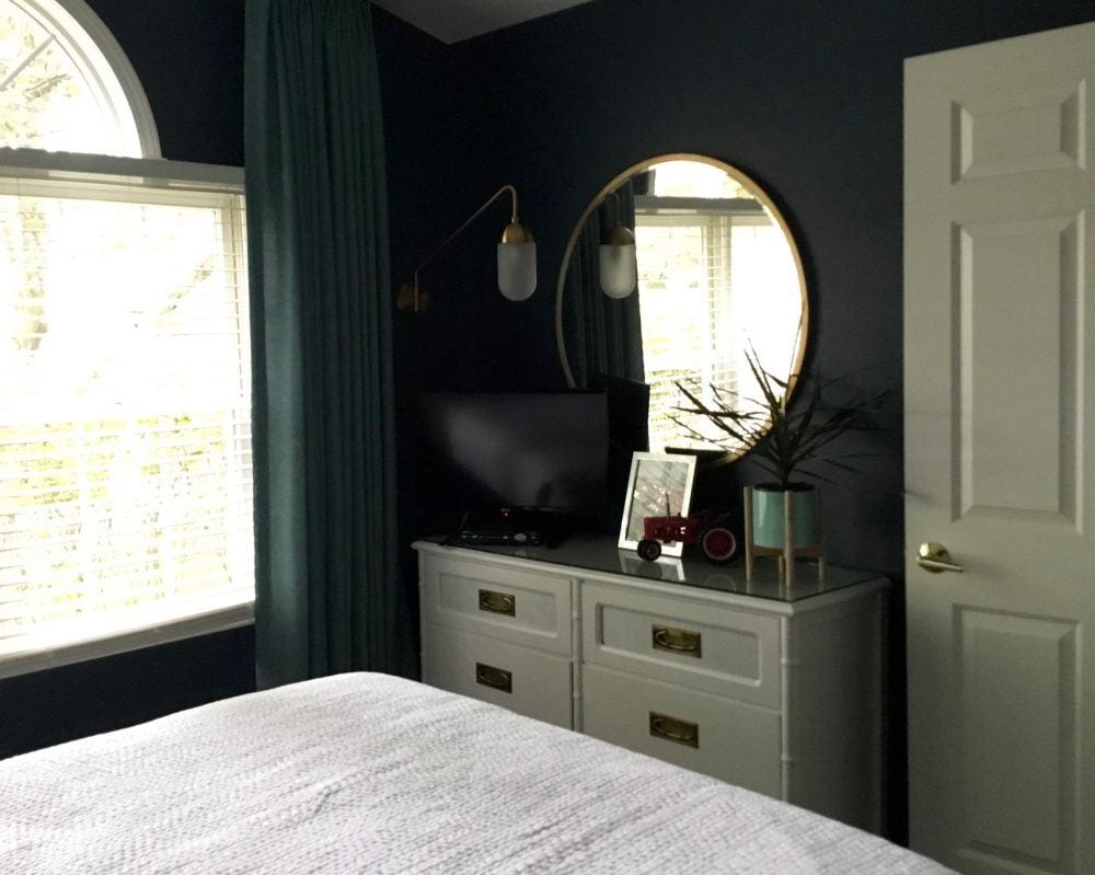
The wall color is Benjamin Moore Newburyport Blue hc-155.
Love the sconce in front of the mirror. Perfect!
And the touch of gold. Also perfect.
And I love how the white balances things out. Really great.
Benjamin Moore Newburyport Blue (above)
is verrrry close to another Laurel Home paint color, Benjamin Moore Van Deusen Blue.
Benjamin Moore Van Deusen Blue above
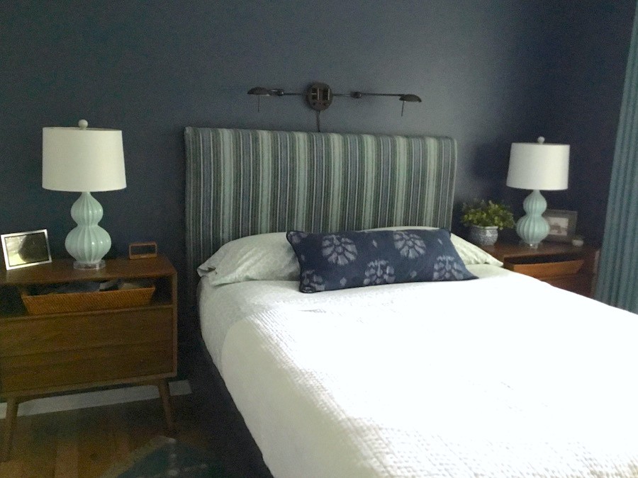
In a low-light room, this color will look navy.
So, why does it look gray-green here?
Most likely the lighting. But, photos can do wonky things. That is why it is most unwise to select a wall color from a photo that you see. Always test your paint colors!
In fact, in the photo editing, I made the image a little bluer, but it’s still going green.
Again, Mary made the headboard and pillow.
The room is absolutely fine as is. But for fun, I thought about some other options that might look nice and at a little lift.
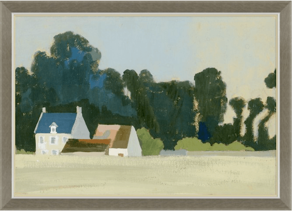
One idea would be to move the light up higher and then put a painting above the bed. I love the colors in this giclee print by Soicher Marin.
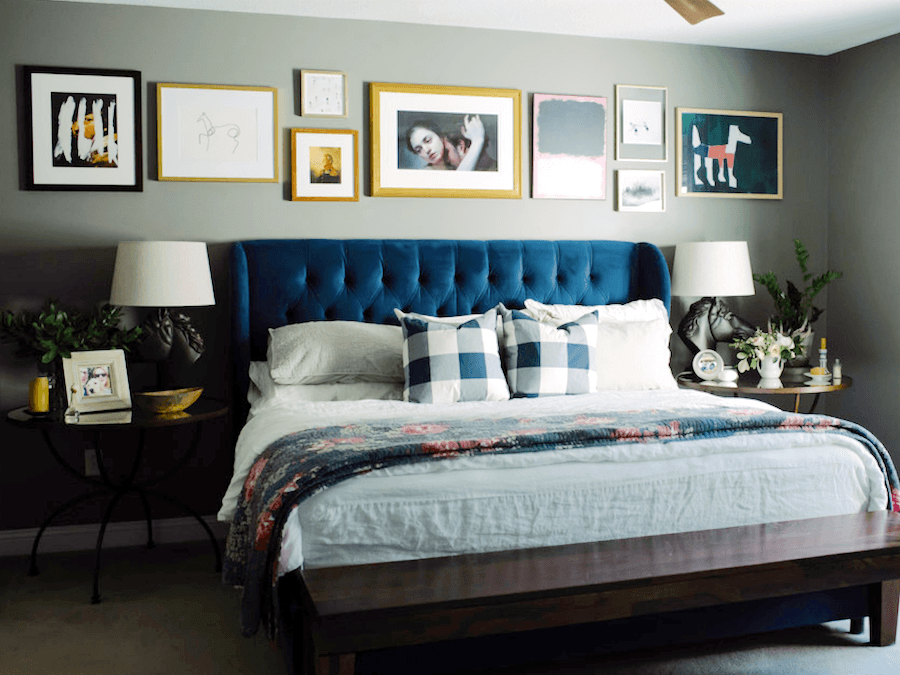
photo by Melissa Cholendt – interior design Melissa Oholendt-via Domino
Above is another handsome idea for art over a bed.
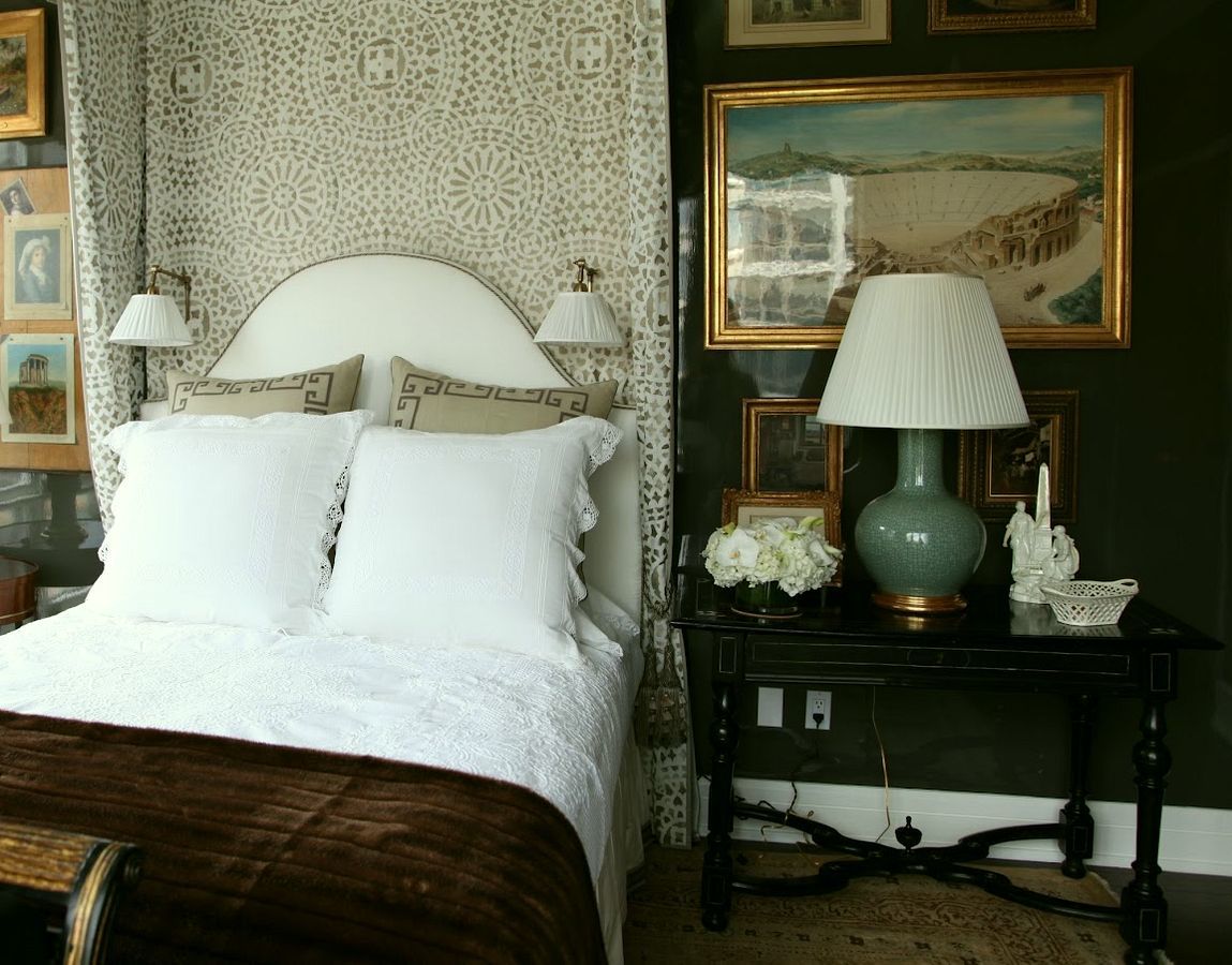
I’ve always loved Alexa Hampton’s bedroom for the Kips Bay Showhouse a few years ago.
Stacked mirror from Wisteria
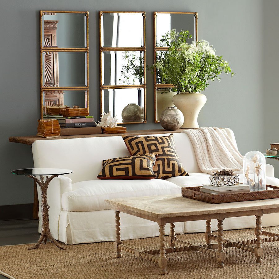
She could also do a mirror OVER the bed. One of these mirrors hung horizontally could work. That would add a lot of light into the room.
Or, it would also be very beautiful to have artwork behind the lamps or as part of a composition. I Love this piece from Artfully Walls. Great company that offers fresh young artwork by “starving young artists.” The beauty is that you can get the art in a number of sizes and frame options and mat or no mat like here. And the pieces are reasonably priced.
However, Mary’s so talented, it would not surprise me in the least, if she created her own art.
Remember another handsome home a while back by the also super-talented photographer Tara Sharma? She had feared too, that she had made a mistake with her sexy dark walls; not at all, but after she changed one thing, the room began to sing and sizzle!
But find out what happens when a no-fail paint color DOES fail and why.
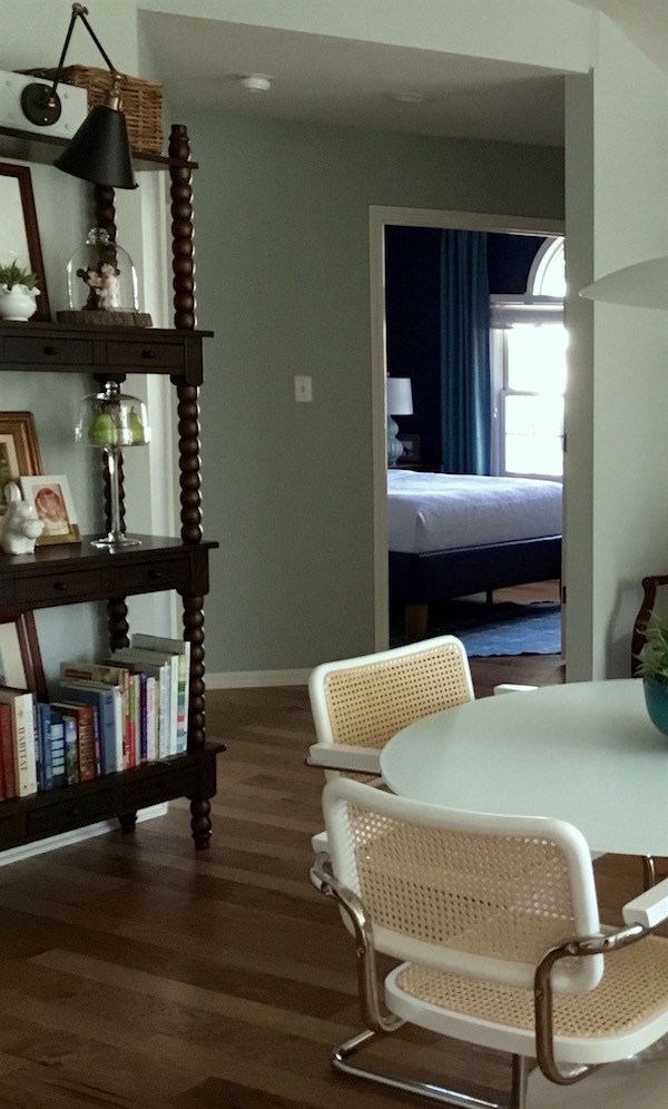
I love this last image looking into the guest bedroom from the dining area.
Thank you Mary for sharing your beautiful, collected, and inspirational home with us!
xo,
Related Posts

- 12 Amazingly Wonderful Exterior Home Makeovers
- Seven Different Winning Combinations For Your Bedroom

- I Can’t Afford A New Kitchen. Can You Paint Stained Wood?
- What They Didn’t Tell You About The Best Yellow Paint Colors
- A Bad Fiber For A Stair Runner+ A Difficult Staircase {or is it?}
- Selling Your Home Soon? Not If You Do This…
- The Best Color Of The Year Is Largely A Farce – Here’s Why
87 Responses
Thanks for sharing these lovely ideas! Each picture shows its own beauty.
Thank you Sarah!
Tears came to my eyes when I saw Mary’s vanity. Why, oh why, do we doubt ourselves so much? The lesson here is to trust your instincts a little more. I am so familiar with this syndrome: I get a great idea, then I get cold feet and talk myself out of it. Who gives a damn what the hoi polloi think—just decorate for yourself with things and colours you love.
Amen!
Hello –
Ok, I’m ready to paint three pieces. What next? Should I use the sprayer I bought that’s been sitting around forever? Should I hire someone to use oil paint? Or should I buy that chalk paint I’ve been hearing about, only because they say no sanding involved just brush and be done? Everyone’s painted pieces seem turn out so lovely, will mine look like yours?
Sincerely,
Paint brush in hand, but still afraid
Hi Tinamarie,
If you aren’t confident about what you’re doing, I would hire a pro– always. If that’s not in the budget, then perhaps get some wood samples to experiment with.
Every single time I read your blog, it hits me afresh just how much I enjoy, not only your generous sharing of detailed information, and your laser-sharp writing, but also your gracious attitude and handling of awkward feedback. You set the bar high, girlfriend.
Thank you so much Minto! I very much appreciate the support!
Uh Mary, I just finished a custom build, do you wanna come decorate my home!
:]
Oh my, Mary, what a lovely room! Well, her entire home, really. I’m taking notes on that, as I have to meet my designer and pick out plumbing fixtures next week. We’re in the midst of building a Swedish country house and I intend to mix antiques and new pieces. (On my list is to find a set of Jenny Lind beds in iffy finish to paint for the guest room). I’m inspired both by Mary’s color sense and her ability to edit – something I have all sorts of trouble with.
Thanks for sharing, Laurel. Even if my designer may sigh over my (your) latest bright idea. (I’ve already been talked out of vintage light fixtures, on the grounds that they won’t pass inspection. Though I do love the old Porcelaire sconces). At least antique furniture should get me less pushback from my builder than the vintage sink and other tidibits I’ve tried to drag in. 😀
Glad that you enjoyed the post Holly!
Great post! I instantly loved Mary’s bathroom. Thank you both for ideas I hope to incorporate in my home.
So glad that the post is helpful for you Patti!
I love that you shared and praised and did not nitpick a reader’s home and reminded others to follow your example. When someone desires a critique, she usually asks for it. Good for you. Again!
Thanks so much Gaye! Always appreciate your support!
Wow, that vanity is fabulous! I love how crisp the navy makes the white top look. I’ve seen those tables and in wood they look so fussy, but painted that dark color you can appreciate the details. You have wonderful taste, Mary. I’m stealing your idea!
:]
I couldn’t agree more – her whole home is beautiful and I’m going to on the lookout for one of those tables now!
And I loved Laurel’s painted cabinet from so many years ago.
Thank you Mary Beth!
What a talented decorator Mary is! I love her house and all she has made for it on her own- wowzers- what a powerhouse Mary is.
Thank you so much for sharing this real person’s home with us. A huge inspiration.
And Laurel, you are a gem for ensuring everyone is civil on your piece of the internet- true leadership.
Thanks on all counts Abby. And yes, real homes are great!
Absolutely beautiful bathroom! I love Mary’s navy vanity and navy bathroom walls! Did she share the name of the navy paint color?
No, I don’t believe so, but too great ones are Hale Navy and the one in my paint collection Deep Royal,
both by Benjamin Moore. You can see Deep Royal in these posts.
I love Mary’s choice of colors and her taste. Her home is lovely and she shouldn’t worry about painting the vanity navy; it’s great! Blues and greens are my favorite colors to look at and live with and Mary hit it out of the park. The Alexa Hampton bedroom looks as though it was painted Narrangasset Green by Benjamin Moore. My son painted his bedroom the same color and he loves it.
Hi Marcy,
Yes, N. green is a good one too!
Mary’s navy vanity is gorgeous!
Great post. About hanging mirrors over beds – a true story. We had a heavy ornate mirror that I wanted to hang over my daughter’s bed, but we put it over her dresser instead. One night we heard a loud crash and lo and behold that dang mirror had fallen and put a deep gouge in the top of the dresser. It could have been my sweet daughter’s head!
We had hung it correctly, into a stud with heavy fittings. The problem was that the anchor in the frame had missed going into the center of the center of the side of the frame and wasn’t seeded enough to keep the wire attached. After a few years it gave out and fell.
My new rule is nothing heavy over a bed without checking that the frame, fittings and wall are all properly attached.
Excellent advice!
Agreed. Heavy objects hanging above the headboard is a potential danger. Especially in earthquake zones!
Great post. I think her vanity is beautiful. I love the navy, but I also have several rooms painted navy. Mary has great taste. I cant believe she made those headboards. Those are awesome. Thanks for sharing Laurel. 🙂
You’re welcome!
Lovely bathroom.
Thank you Lorie!
I really love everything in Mary’s apt. I really love the apt. Itself. The windows and the hard wood floors.
She has the natural taste that all of us want. It gives a true warmth feeling.
Way to go Mary
I think this house is so lovely and pulled together. That “bossy” vanity is fab. And LOVE those dining chairs.
Thanks so much Jamie!
While I normally hate to see nice antiques get painted, your cabinet and that sink base are two huge exceptions! I think Mary can make her navy base blend in better by choosing different accessories. A rug with some navy in it, and a more elegant wastebasket — say, brass, or a patterned metal with some navy in the design, would match the dressiness of the vanity. I would also have chosen a shower curtain fabric with some navy. Given how talented and creative Mary is, she could add that color with the right trim.
Thanks Laurie. There is seldom one option that works. And that is why I’m still trying to decide what to do with my window shades!
Hi Laurie,
Thank you for your suggestions.
I live in a smallish home that has an open floor plan. The colors I use in all my rooms are teal, navy, & white. I just use different percentages of each color in different rooms. That seems to help keep a good flow throughout.
Agree with you Laurel as love her painted vanity and feel as well that Mary’s home is indeed beautiful.
-Brenda-
Thanks Brenda!
IMG_3991.jpg
I really wanted to send a picture of my antique piece bathroom vanity conversion after your last post, but talked myself out of it. Who knew I could have been included in your next post? Well, no talking me out of it now that you’ve thrown navy blue into the discussion. Our walls are a custom mix of 1/2 Newburyport and 1/2 Van Deusen (and the blue glass subway tiles in the shower not shown match). We renovated a new-to-us 1917 Craftsman 2 years ago and made ourselves this tiny master bathroom out of the original/only bath that had long before become a laundry room.
Thank you for your fantastic blog! Yours and Maria Killam’s are the only 2 blogs I read in religious/never-miss-a-post fashion.
Hi Kimberly,
I’m sorry, but images won’t show up in the comments. A work around is if you have an image on pinterest, or some other website, you can post a link. Or, if you’re a subscriber, just answer any email you get from me and you can attach the image there.
It is a beautiful home! The only thing I would change (from what I see on the pictures) is the draperies in the guest bedroom. Perhaps lighter colour, not blending with the walls would lighten the room. But I can’t see the whole room, maybe there is a reason for these draperies, and of course it is imho. But what a lovely home!!!
The opposite side of the room has the white chest of drawers. I love the drapes in here! I’m thinking of the view from the dining room and I love how rich the tone on tone looks. It’s a case of a looking at the big picture; that’s for sure!
Hi Laurel, first of all, thank you for your blog – always interesting, always amusing.
I want to say a word in defence of Mary calling painted furniture a ‘trend’. Unless you would claim that a ‘trend’ is something that only happens once? Because we all know that everything goes round in circles – you tell us that painted furniture was trendy in the late 18th century (and presumably not in the earlier?). In the 60s we painted old furniture, in the 70s we stripped it (in England, that is). Currently we’re painting it again, but I see more and more beautiful untouched pieces being used – so I see why Mary is having doubts about her navy paint. I agree with you and all the other commenters that it looks great, but I also agree with Mary that it is a little dominant. I think that if the rug close by were a darker colour, that would balance the navy.
Maybe some quick reading or a misunderstanding? I said: “Painted wood furniture of all kinds has been en enduring classic for over 250 years.” I believe that the navy wall color is enough to create balance. But of course, there is more than one way to do things. The point is that what Mary has done is lovely.
Oops! Sorry for the gripe about deleted comments — I’ve just checked and seen that my comment did appear under the previous post, it’s just that there’s a delay in it appearing, which used not to be the case.
One addition: do you remember all the stripped pine from the 1970s? All that furniture was originally painted… Yes, painted furniture has been around for centuries.
Hi GL,
No, I don’t remember the striped pine, but I lived in Wisconsin and in Palo Alto, CA in the seventies.
Couldn’t agree more about the vanity: the blue paint turns it from overdone Victorian to modern and fresh: the whole room is cohesive and has just the touch of fun! My only caveat: the little lamp beside the washbasin. Is that legal? Maybe that’s just me — here in France regulations on electricity in bathrooms are extremely strict after the death of pop singer Claude François who electrocuted himself trying to change a light bulb over the bath while in it.
By the way, I’ve had comments deleted twice recently (not after moderation), apparently automatically, as I posted. Don’t know why.
The comment on the previous post was simply to tell people that wood countertops in the bathroom work fine, as my experience of our varnished oak, done in 1996, is that it has held up perfectly (I re-varnished with 2 coats in 2016) — but we did do 10 coats the first time round!
Hi Gilly,
Yes, there are codes and probably the lamp shouldn’t be that close to the basin, if there’s any chance that it could land up in the water. What a tragic accident. I guess it’s easy to forget that water and electricity don’t mix.
I see your comment above that you found the post. Glad about that. Actually, I have the opposite problem that on occasion, some readers posts appear in my comment cue, two times. Identical comments.
Lovely home, love the bathroom and vanity. I have an armoire that is lovely. It’s an antique with custom slide out shelves and drawers on the bottom with brass hardware. I was considering take the huge doors off and haVing glass put in and then painting the inside and outside similar to DeVol Cabinet of Curiosities. I may be able to have it in my kitchen then without feeling like there is a heavy dark box in there. It’s a great cabinet, but I worry I will ruin it.
Maybe try to do a search online to see if you can find another armoire like yours that’s painted?
Sometimes the problem isn’t the wood color, but the wall color.
The stain isn’t bad for oak. Considering I am waiting on a bid for kitchen remodel and probably need surgery soon, I won’t be getting to it for a while. Kitchen will be white, possibly a very very pale yellow. Every single room needs new paint and new window trim, crown moulding and new flooring. Old 1900 farmhouse. Hoping to do a DeVol type kitchen which I learned about from you. So thanks! Will send pics in 10 years, should at least be half done by then.
Well, I will pray that you don’t need surgery, Korina and that all goes well with your renovations!
That’s it, I’m convinced! My fussy nightstands are going navy (or some other sophisticated shade of blue). I love Mary’s style!
Mary has no idea. She’s a trend setter!
Mary has a very beautiful home. I love the colours & the unique vanity she created. Like you, I love the view from the dining area to the guest bedroom….the combination of the hall colour in the foreground with the guest bedroom colour beyond is a great combination. I think the Soicher Marin art you recommended would REALLY bring the guest bedroom to life!
I followed your link ‘when a no-fail paint color does fail and why’ to read that post. It made me think of a time that I was selecting paint colours and all of my ‘go-to’ paint colours looked completely different than they usually do, even though it was a sunny day & I was just using natural light. Then it dawned on me…..it was the skylights! The natural light was coming from a different direction than the direction it would shine in from typical windows, and it was direct sunlight, not reflected off outdoor elements. It was amazing what a difference that made. The difference was much greater than the difference between summer (light reflected off green outdoor elements) and winter (light reflected off white snow).
It’s so true and another funny thing is that people are always bemoaning north facing rooms, but I think it’s the other directions that are more difficult. Particularly south and west that changes SO much during the day!
At least with a north facing room. It’s pretty even lighting, even if on the cool side.
Mary’s bathroom is fabulous..wouldn’t change the vanity one bit. (I have serious bathroom envy right this minute!!) Her house is just lovely,and I agree, a little more artwork would likely be the lift she is looking for, the art will look great against those walls. I find sometimes the inner critic takes over and it is hard to see things as others see them. (Speaking of myself here) but Mary should be thrilled to have such a gracious and beautifully decorated home.
That’s a very good observation Danielle and I know that’s happened to me and I’ve seen it before with clients. I’ll walk in and go “oh wow! this is gorgeous!” And they’ll say. Really?
I really like it. I particularly like the navy vanity. I would never have thought to put mirrors behind the lights in that other room and it’s fabulous, I always like homes that express someone’s personality. I was expecting Revenge of the Chalk Paint.
I really like how the navy paint takes something that could’ve felt heavy or fussy and makes it sophisticated.
Thanks Celeste! I agree.
LOVE the navy vanity…guess we all second-guess our decor decisions. Thanks for another relevant post full of beautiful pics & ideas.
Hi Robin,
That was the primary reason for posting this. I think this piece in particular is smashing painted navy. And one reason is that it is not a big heavy piece in a big solid and ornate cabinet.
Laurel, I am looking at the bedroom designed by Alexa Hampton, and I have always wondered how designers attach wall sconces to the wall when there is fabric behind them. (I’m sorry, I do not know the proper word for the “backdrop” behind the head of the bed. I’m sure you designers have a word for it.) Can you unlock this mystery for us design illiterates? Thank you.
Hi Lisa,
In my practice, I was lucky if I got to design a bed-spread. Custom linens are phenomenally expensive. I would call that a canopy. And I have no idea how a sconce is installed with fabric behind it. If anyone sees this and knows, please chime in!
I don’t know for sure, but my guess is that the fabric has a large ‘buttonhole’ type opening that the sconce arm fits through. (I don’t mean the typical type of over-stitched buttonhole… I mean the kind that is bound with fabric.) You don’t see the backplate (that attaches to the wall and covers the junction box) in the photo, so I think that it is hidden behind the fabric & the sconce ‘arm’ goes through the opening. If you look at the sconce on the left, there seems to be a ‘slit’ that the sconce arm goes through that is in keeping with this theory.
That makes a lot of sense. Thanks Catherine!
I agree with Catherine as a self-fabric bound buttonhole (a couture method that can be worked by hand or a sewing machine) is possibly one option. Whereas, if the fabric due to its width was seamed/pieced together vertically or horizontally (difficult to tell from the photo if it was) an opening could be left in the stitching line that would barely be visible once it was pressed and/or pulled taut.
-Brenda-
Thanks Brenda!
I’m a huge fan of painted furniture when it’s done right. It can give new life to a dark, dated, heavy piece.
I agree!
ps: lovely pinterest feed. Following!
I love that painted piece as a vanity. I’m not sure it would look right stained. Although the dresser vanity is gorgeous stained. I may have to steal Mary’s vanity idea. I have a pedestal sink in a narrow powder room that needs something different, but I’m having a hard time finding a vanity shallow enough to fit.
Well, sinks come in narrow sizes, so all one needs is a shallow cabinet. Did you see Sunday’s post about vanities? I found some pretty chests I like. They weren’t meant to be vanities. But a skilled carpenter could probably make it work. One of them was quite narrow from front to back.
Mary has a beautiful home! I would be interested to hear how she made the gorgeous headboard in her master bedroom.
Yes, me too! Maybe she should start a blog. haha
Maybe she could do a “guest post” for your blog? When you need a day off or “filler”??
Now you’re talking!!! Great idea Tea!
Thank you all for the sweet comments. This was quite the surprise today!
I love Amy’s vanity. I used to have a small dresser exactly like that. And we considered using it as a vanity but it was too short.
Malkie, yes, I made both headboards & all the drapes. I just used YouTube videos & taught myself how to do all the things I didn’t want to pay someone else for. (Laurel, the store-bought drapes that I added trim to were for the living room.)
I’m glad you mentioned putting art behind the lamps. I’ve actually been considering doing that but was waiting to come across some that speaks to me.
I can’t raise the lighting above the headboard. It’s meant for reading in bed. So it has to be reachable. But I could lower it a bit & put some art above it. I love the inspiration picture of the bedroom by Melissa Oholendt.
You’ve given me some great ideas to think about.
In the bathroom my husband used 8’ boards & cut each one in half. So it’s 48” high. He’s obviously more concerned with his golf game then the correct height of bead board. 😏
Thank you Laurel for your kind words & great suggestions. You’ve made my day!!
I’m glad that you are pleasantly surprised, Mary. I don’t know if it’ll work or not, but perhaps the light over the bed could be turned on with a wall switch? Then it could go up high and illuminate both your reading and any art work below it. I would not make the lights any lower than they are.
Sorry, I misread which drapes you added the trim to. I had an extra challenge with some of the text because of the big inline images, but not a problem.
Thanks so much for sharing your beautiful home!
Mary’s place is gorgeous and the navy is wonderful. I can see that in a 2 bedroom condo the dark can feel very strong. I like your suggestions of some artwork with colour so there is something different for your eyes to focus on.
Thanks Jane! Dark bedrooms are really wonderful. I did enjoy my dark bedroom, but I’m also enjoying it lighter too! Tough when one only has one bedroom!
Love your blog. Love this post.
Thank you Susan!