Hi Everyone,
I think it has rained nearly every day this week. At the very least, it’s been overcast. I know. It’s Boston.
Okay, I know I keep saying I’m “almost done” with my designs. I realize it’s a lot like when I said last December. “I’m 90% done with my packing.”
The problem is this: The last “10%” took 90% of the time!
It was probably more than 10%.
Well, I am narrowing in on the quirky kitchen design and many kitchen elements. I’m sure it’ll need some tweaking. Or, maybe more than tweaking.
But, the point is that it always takes longer than I think it should.
So, for today, I’m going to address some of your comments from Wednesday’s post. And then, we’ll continue with more kitchen elements.
A lot of you are disturbed by the bisecting wall. However, most of it has to stay. But, it will be shortened by at least two feet and widened by about six inches. In fact, I am considering putting a hidden door there, as well.
For more hidden storage please go here.
But, here’s something interesting. It was mentioned that it would be cool if the division could be the golden mean. That is 1.68, and if I recall correctly, that is 3:5. For more on the golden mean please check out one of my favorite posts.
Well, I took a ruler to my image, and guess what?
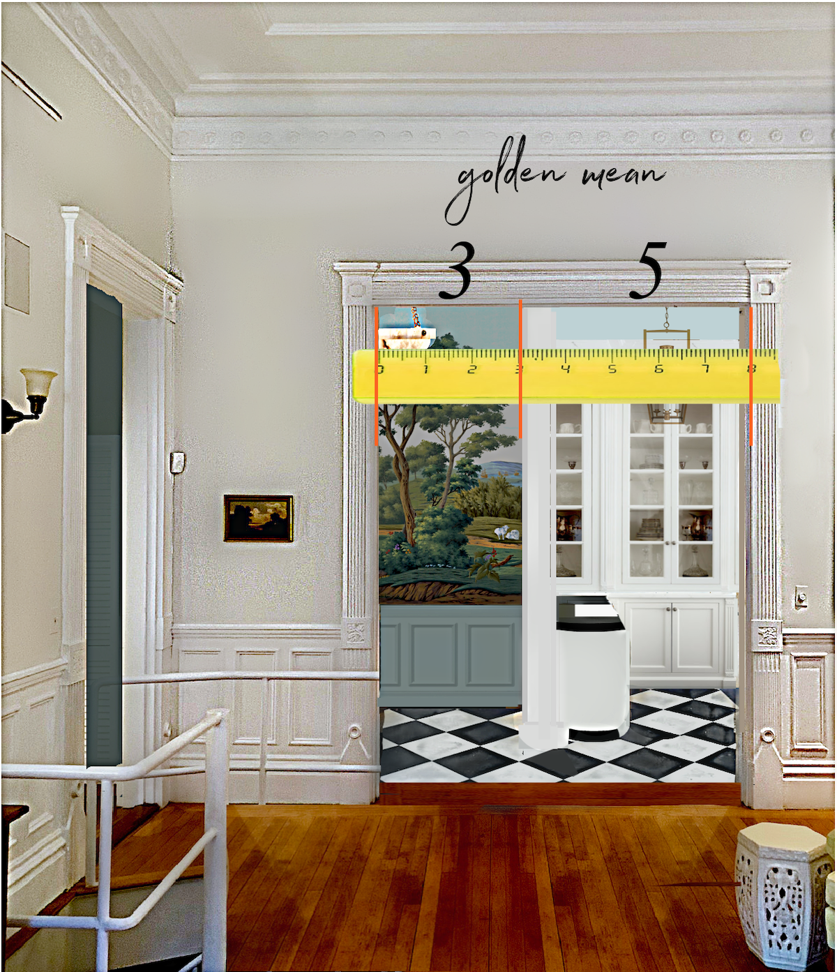
It is exactly 3:5!
Please note that the wall where the dishwasher is located is shared with the front duplex apartment. Of course, that can’t change. As it is, the plumbing will need to be extended 12″-18″ to accommodate the location of the new sink.
Oh, I am planning on a 24″ dishwasher. There are times when I’ll be cursing myself for not getting the larger one. I do recall that many of you love your dishwasher drawers, and I’m not ruling them out at this point.
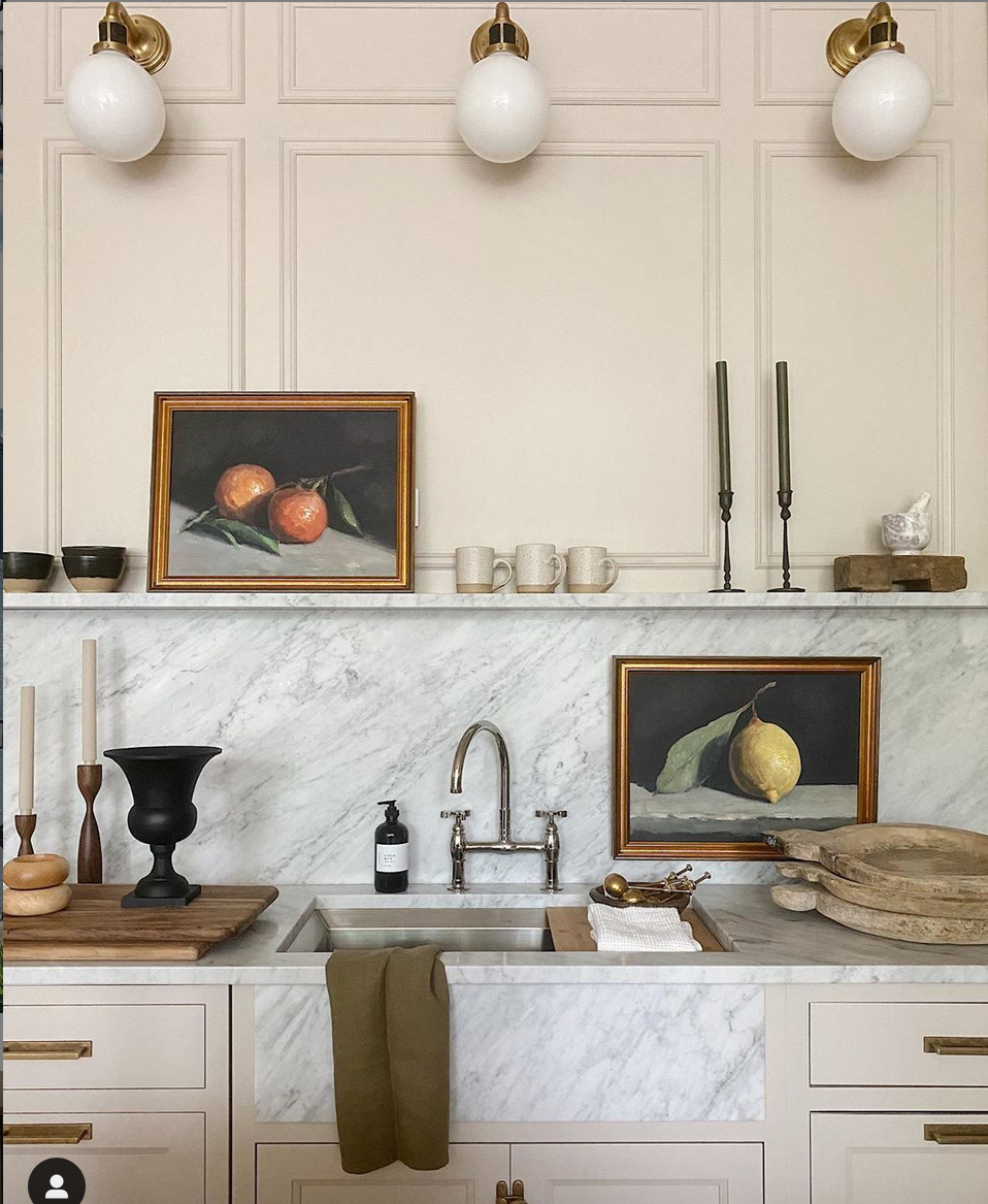
Gorgeous kitchen elements and design by Jean Stoffer
I definitely want an under-mount sink.
If I do a farmhouse style, I prefer the kind Jean Stoffer did that’s flush with the cabinetry. I also want to have the under-sink area customized with a pull-out trash and recycling bin and a storage pull-out.
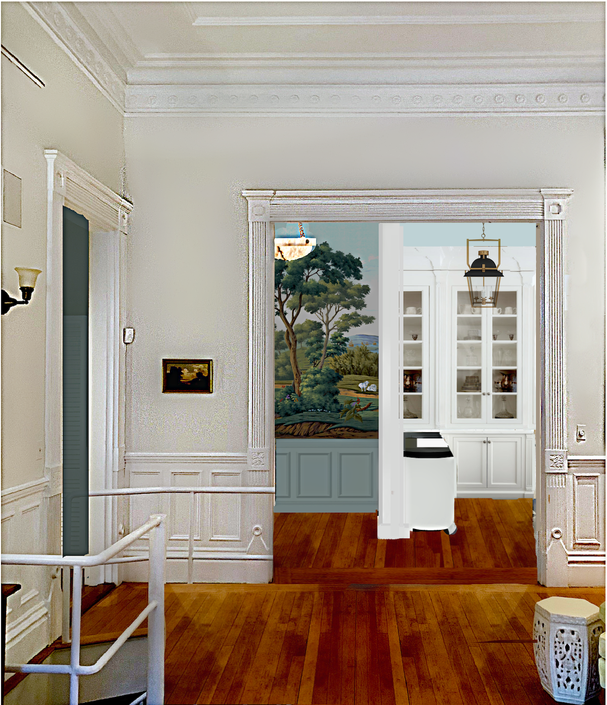
Let’s talk about the entry because I thought I would try it to see how it would look with a deepish gray-green wainscoting. If you want to see the earlier image, you can go here.
However, below is the newest version looking into the kitchen/entry from the living room.
This way, you can follow along more easily with the visual representation.
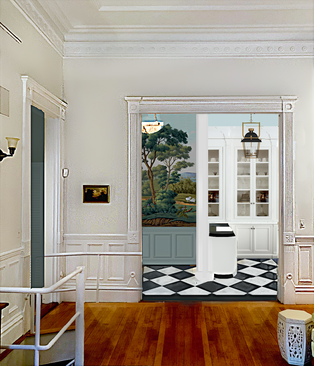
In addition, I would paint the crown in the entry only the same color as the wainscoting. However, you can’t see the crown from this perspective.
OHHHHHH!!! The other day I had an epiphany.
That is because I am no longer making two sections of the closet only 18″ deep; I could put some refrigeration in one of them. However, I’m not sure if it’s necessary or even a great idea. This would not be instead of the refrigerator drawers in the kitchen; maybe just two of them.
But, I know myself, and it’s probably not advisable for the simple reason that I can just see myself running between fridges trying to locate something. Although, it will mean having to do fewer laps around through the living room and den. Yes, I do that sometimes! haha
Okay. Some of you thought I was painting the walls in the kitchen the same as the ceiling.
That is understandable because I got the perspective a little off, which you’ll see in a second. But, the blue in the original schematic is only the ceiling as the crown does go into the ceiling.
As you can see, I added some more kitchen design elements, as well.
In addition, I fixed the perspective and scale in the kitchen. I know that some were concerned with the mural pattern being cut off if doing wainscoting. However, the mural is available on a smaller scale.
Some of you missed the link to The Mural Source. Please note: The Mural Source is only available to the trade at this time.
 The little section you see is from the lovely Derbyshire mural from The Mural Source.
These images don’t even come close to doing these gorgeous murals justice. They really do look hand-painted.
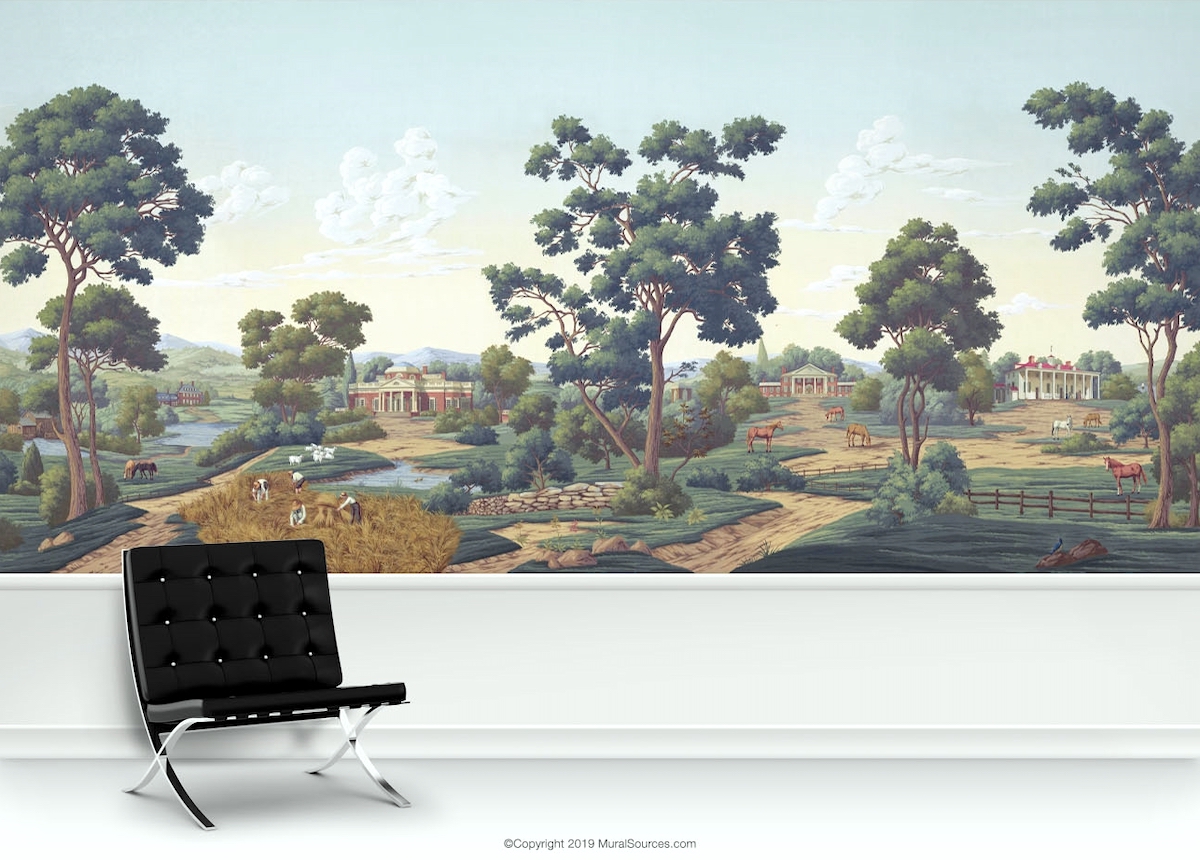
The Virginia Mural is another favorite.
For more scenic murals, please go here.
I really like the wainscoting. The entry is only about 5′ x 7′, so I think it would be a little overwhelming to have a mural totally surrounding one as they walk in. The wainscoting helps to break it up.
Some of you aren’t fond of the tile floor and prefer a wood floor. I like wood too, but it’s not the look I’m going for, in this case.
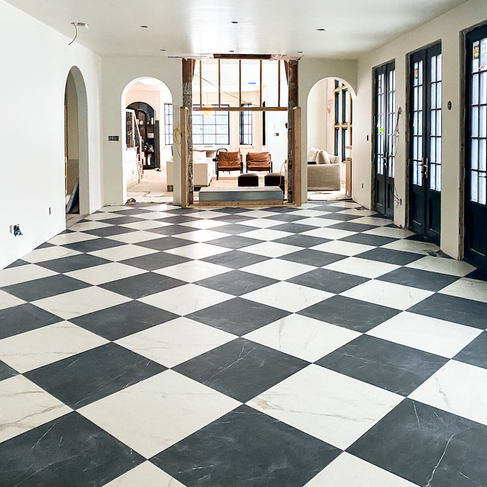
This is the tile I like, again, from Chris Loves Julia. It also comes in different sizes. This is a faux tile and comes in different finishes.
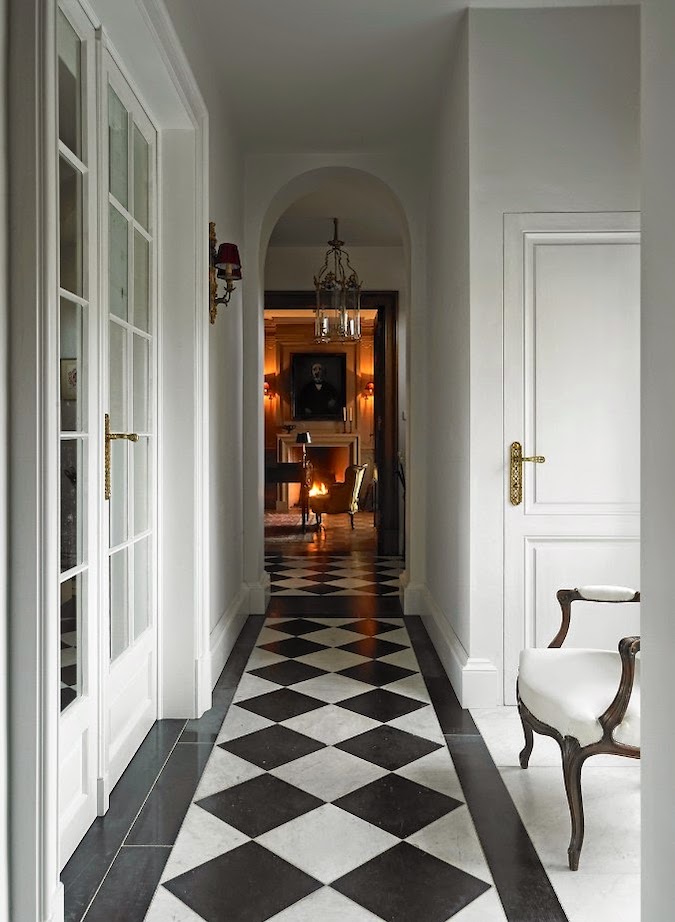
This would be an excellent scale and a lovely look for the kitchen and entry.
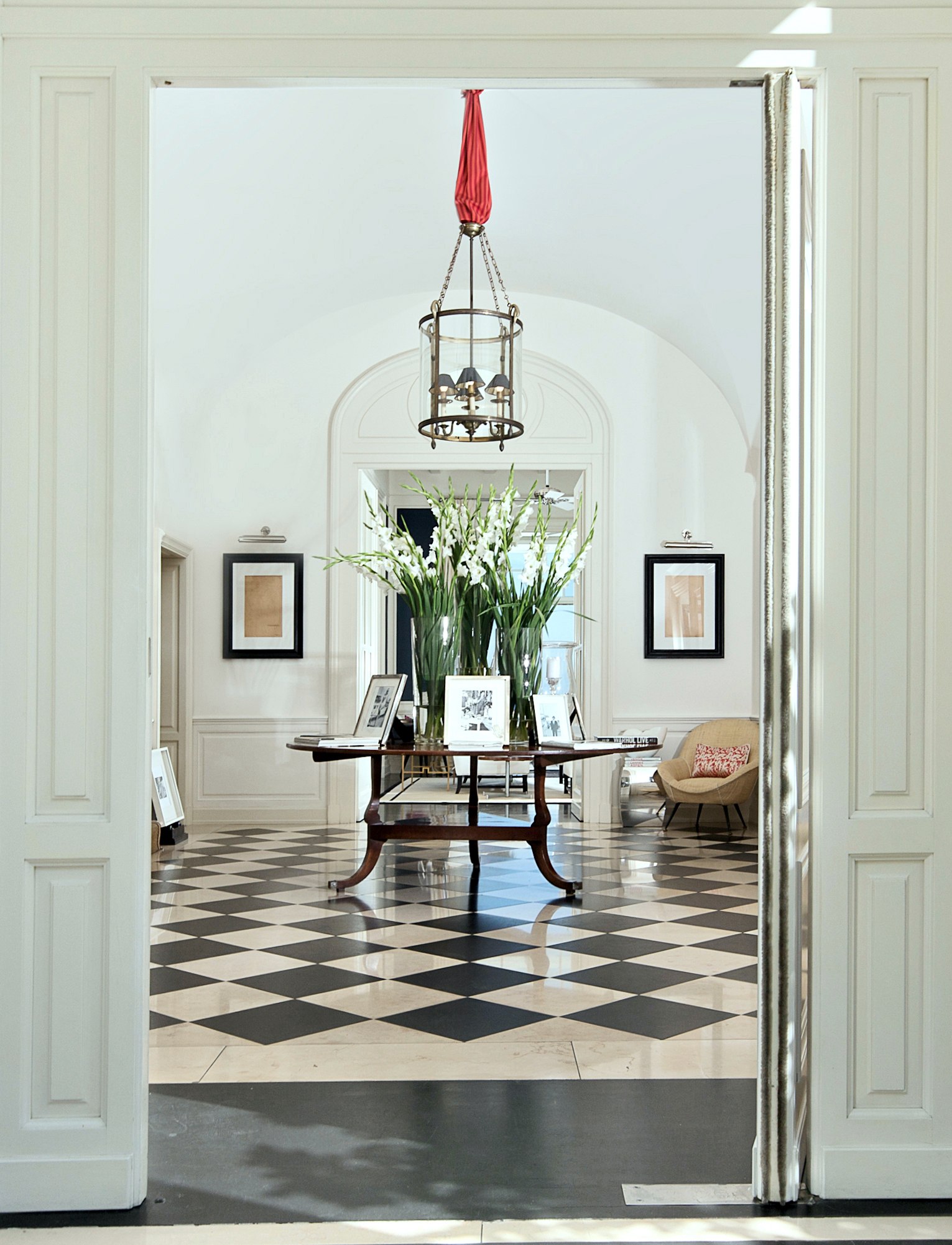
And, of course, my ultimate is the JK Place in Capri.
The main thing that’s left is the range and refrigerator drawer wall opposite the sink.
Let’s first look at my drawing, and then we can check out some inspiration photos I like.
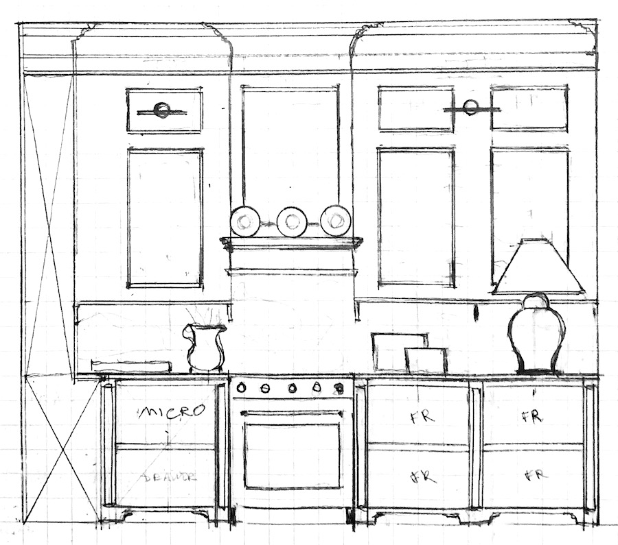
Starting with the base cabinetry.
There are three fridge drawers and one freezer drawer. To the left of the range, there’s a drawer microwave and a storage drawer beneath it.
Above the counter is panel moulding similar to its opposite wall. And, here is another example of quirky kitchen elements. I felt it was better to center the panel moulding over the lower cabinet than centered on the wall.
Normally, I wouldn’t accessorize a drawing to show a contractor, and I’ll fix it before submitting it.
The backsplash is marble.
And again, there’s a little brass shelf.
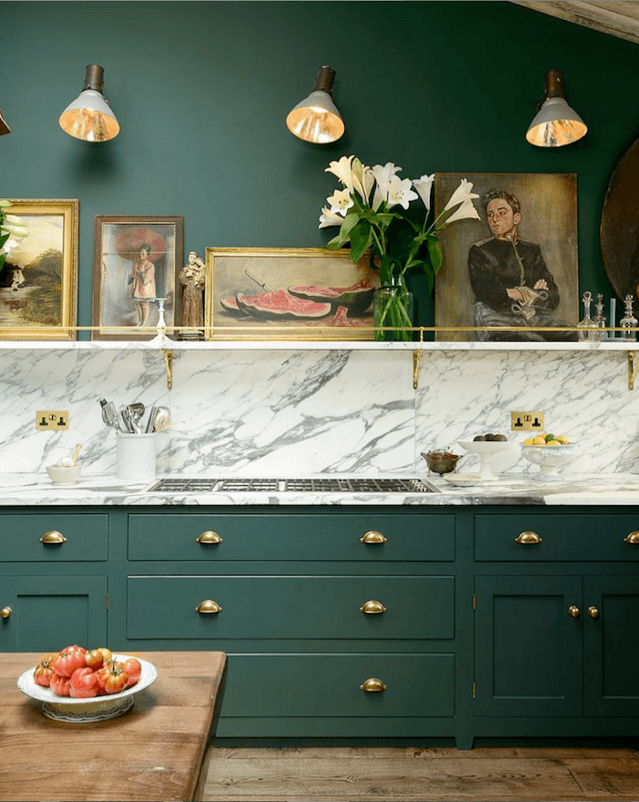
My inspiration is this shelf from DeVOL Kitchens. They used brass and marble. But, it could be brass and wood. Or even brass and glass.
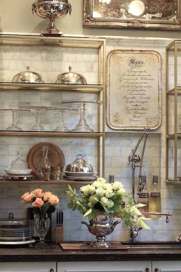
It won’t be as big as this bistro shelving, but it is somewhat the elegant look I’m going for. That reminds me. I’m bringing my schematic back down. But, initially, I thought I wanted marble counters, and I still love that. However, I’m wondering if soapstone might be a better choice for me. It looks so lovely above.

Practicality aside, which do you prefer?
Soapstone or a white marble?

Let’s bring down the range wall drawing again because I want to point out that when you walk in the front door, what you’ll see is a foot or two of the kitchen on the right.
I’m not sure if I’ll be able to do the furniture base with the fridge drawers. However, I have seen that kitchen element (or something similar) done before with drawers.
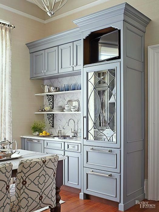
Below is some range hood inspiration.
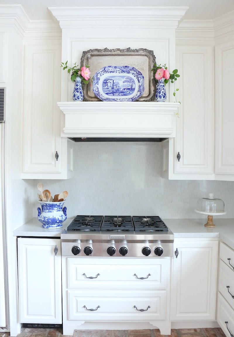
My range hood design is similar to this pretty range hood by 11 gables.
There has been some debate whether I actually need a range hood with an induction range. However, I do like the architectural feature. I think I can get away (I hope) with a venting system that’s only 12″ deep. They do make hoods that go inside an upper cabinet. It’s probably not sufficient for a gas range, but with induction, it should be fine. It’ll undoubtedly be better than the piece of crap I currently have.
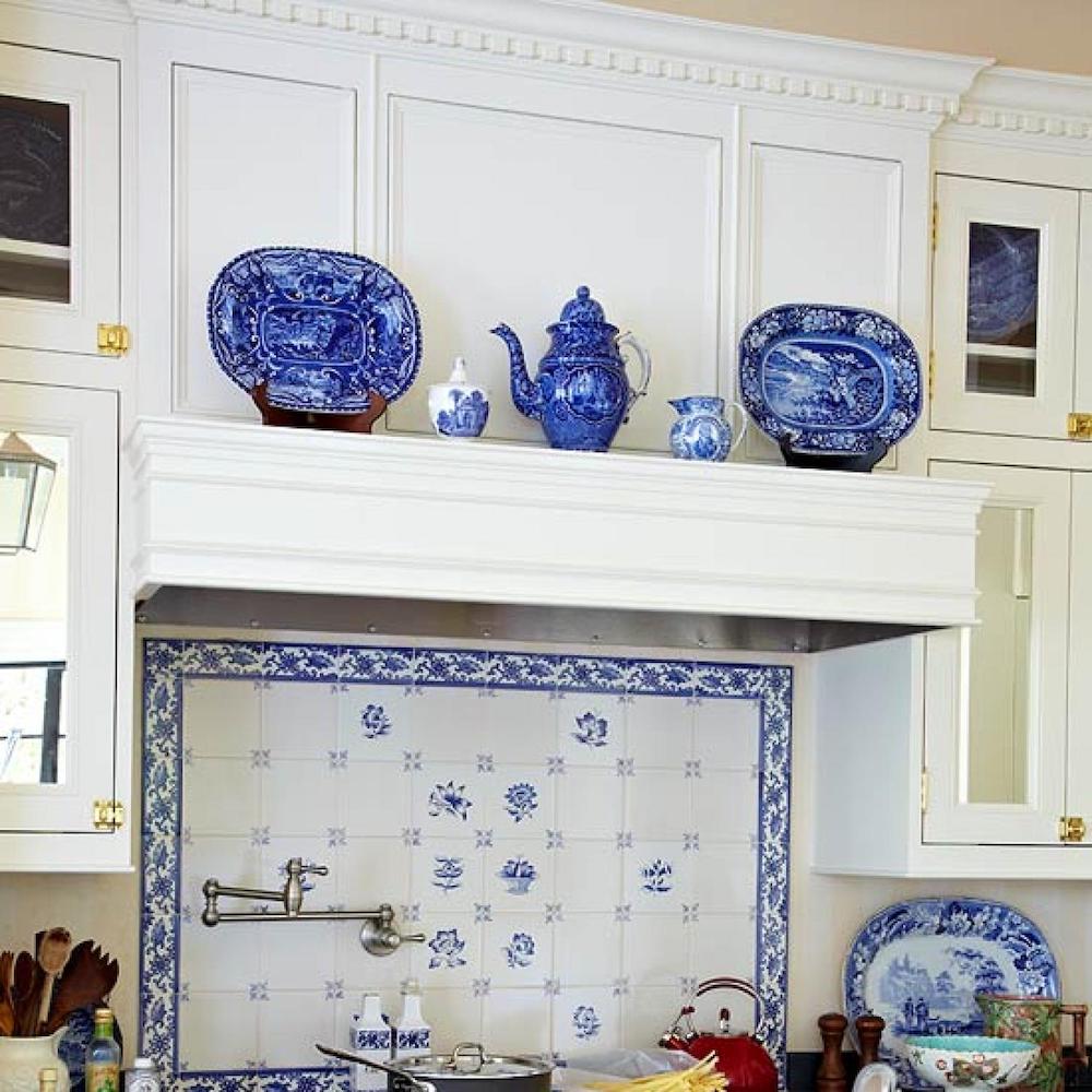
Here’s another pretty hood that appeared in Traditional Home. (may it rest in peace. The magazine, not the range hood. lol)
And finally. I’d love to copy almost exactly the crown and ceiling detail in Jean Stoffer’s fantastic living room.
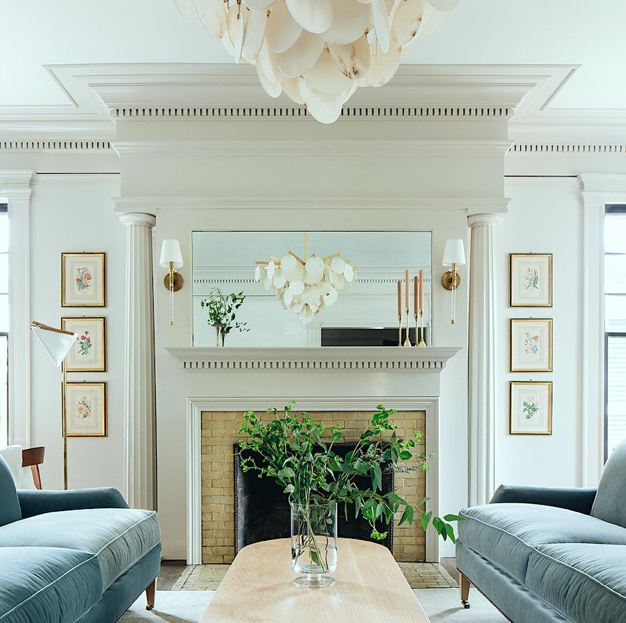
I love the dentil moulding, but I’m not sure if it’s right for my kitchen and entry. And I would like the crown to be just a tad smaller, as well
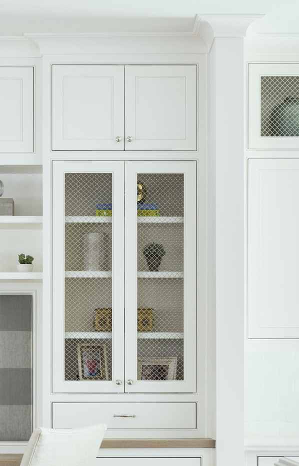
This is a lovely ceiling and crown moulding detail by Marie Flanigan.
Well, I just need to clean up some more of these kitchen elements, and then I’ll be ready to submit my drawings to get a quote from the contractor.
Hopefully, I’ll be able to do that this week.
My goal is to have everything done by December 1, 2022.
Eventually, I’ll be focusing on other kitchen elements such as:
Well, that’s it for the renovation plans for a spell.
Happy Halloween!
xo,

This post is dedicated to the loving memory of our dear Eileen Lonergan.

Eileen was my first mentor, who also became a dear friend. Three years ago, on 10.31, she passed away after a tough bout with breast cancer.
I think of Eileen every day.
I wouldn’t be here without her. Her stamp is on every page and in so many behind-the-scenes aspects of the blog. In fact, Eileen came up with the name HOT SALES for my weekly Friday evening offering. Eileen’s enormous talents included both web design as well as marketing.
Plus, her dry, matter-of-fact sense of humor had me laughing all of the time.
Eileen is sorely missed but will never be forgotten.
If interested, please read my tribute post written three years ago here.
Related Posts
 Is it a Mistake To Decorate With A Greek Key Motif?
 How to Make Budget Window Treatments Look Expensive
 Did You Say Enfilade? On Fill What?
 The Hidden Truth About Paint That No One Ever Told You
 5 Classic Kitchen Combos, Cabinets, Hardware, Lighting…
 No Windows? No Problem. Help for a Windowless Room
 40 Outdated Home Trends. But, Are They All Passé?












106 Responses
We just finished a kitchen renovation. While I cannot point to any one thing, I know my many years of following your blog influenced its overall design. Thank you for your generosity: I love learning from you! I am interested in understanding “why” the entry light fixture is very different from the kitchen fixture. I love both but expected them to be the same; would like to learn more about your reasoning! You asked about soapstone v. marble. I was headed toward soapstone, when I discovered a granite called Jet Mist Honed; it has a soapstone look. It’s now installed & we love it. It’s silky with soft glow. Two other things that bring me joy 🙂 Blanco Silgranit sink (Coal Black) and Kohler’s Artifacts faucet in Polished Nickel. Looking forward to your continued adventures in Boston & your beautiful new home–I’m so happy that the transition has been so good to you!
Hi Susan,
That’s a great question about the light fixtures. They certainly could be the same. But, I cheated over the entry chandelier, so if standing in the middle of the living room, one can only see about a third of it.
Also, they are not on the same plane. The entry chandelier is about six feet closer to the living room than the one in the kitchen. Also, I like the one in the kitchen, for the kitchen, but not as much for the entry. And vice versa. It also goes with my desire to keep the entry as its own space and not really part of the kitchen, even though it acts that way. And, finally, you cannot see both fixtures at the same time when either in the entry or kitchen. Those are my reasons.
I’m only 5’5”, but my arms are 2-1/2” longer than normal. I had to lower the height of my marble topped island so I could work pastry comfortably. I can’t knead properly at standard counter height. We’re all different. But I agree that heights should be adjusted for the comfort of the person using counters.
Depending on your height and the height of your ceilings, consider raising the height of your countertops. 36″ has been the standard for eons and most of us are notably taller than our ancestors. Our counters finish at 39″ a.f.f. throughout our home and our backs thank us every day.
Laurel – I love everything about your kitchen plan, the mural – the green wainscot – & the checkered floor which ties the two areas together. This floor change also makes the outer trimmed out entrance become a feature, framing the view. I also love the decision of pulling the bisecting wall back – it has transformed the space. The rounded edge on the counter looks perfect and the black counter gives graphic punch! I live in a home of the same era and have both soapstone and honed Carrara marble in different areas – and both are beautiful and workhorses – yes you have to consider that lemon etches the marble but its a historic house and pristine is not the look most of us who treasure historical architecture are seeking. I have also used honed absolute black in some renovations and that looks wonderful too – but the black soapstone is a warmer look. Also I would consider using 2″ thick counters to balance your great ceiling height and moldings – I think it adds so much! Oh, and as for refrigerators – I love the idea of an extra fridge in the entry allowing you to have a lower cabinet or storage drawers next to your fridge drawers in the kitchen. I have multiple fridge locations in my kitchen and pantry and you just get used to putting certain types of items in the different units. I would even consider keeping the freezer and beverages/drinks in the entry unit – but then again I don’t use the freezer much :)Looking forward to seeing your plans come to life! This is going to be fabulous.
Gorgeous. Would you humor us— I would like to see a mock-up with cabinets somewhat matching the hall. Or at least treating the two sides as one space. How would it look?
I also wonder how it would look to move the mural a bit left so the lighter parts of it abut the white kitchen in our viewpoint. The tree would go out of view a little but it gives you something to want to follow, like the mystery of a secret garden, and maybe the line dividing the two sides would disappear a little?
Vote for soapstone only because of the mural.
Hi Mina,
Sorry, I’m not understanding your query. There are no cabinets in the front hall.
This design is really perfect but I vote for no kitchen! Order in… EVERY SINGLE DAY. You deserve it!!!!!
lol!!! Thank you, George. Now you’re talking!
Love the design, including the floor in both areas. My vote is full mural wall for the drama from the living room view, although I can see why you’re considering wainscoting. Although I love a white kitchen, I think in a color that comes from your mural with some appropriate indirect lighting to prevent a cave view from the living room, a green kitchen with marble similar to the pantry in Mary’s Westchester kitchen may be very nice. Elegant and cozy at the same time.
You’ve received some valuable comments. I’ve been in the real estate business for over 50 years and see a lot of houses. I had some pretty definite opinions. We redid our kitchen in 2019 and retained the oak plank flooring and kind of built the room around some existing wallpaper we liked and appliances purchased randomly — Bosch and Kitchenaid from when Sears and HHGregg closed; and the new AGA on ebay from a dealer in California. We, also, decided to eliminate a small old boiler room and repurpose the space as a “scullery”. I designed the room and had an old friend — a craftsman/carpenter — come out of retirement to do this project. To answer your question 1: Soapstone is a big YES. Please see examples at a website we added for our family to view (

) which shows the graining and beauty of a lovely natural product that nicely resists wear. It can be left to “age” or quickly oiled to better show off beauty. It’s important, though, to not cut on it. It is a talc. You can add integrated grooves as we did. And, to soften the look, soapstone really looks good next to wood (or zinc) counters — we used recycled mahogany from an old family desk. Above the AGA is a steel backsplash — hammered repousse technique — using an Irish Trinity knot I use elsewhere. Best reason for soapstone is that it blends with both formal and country and it’s not overused. It’s unique!
Question 2: we used a Bosch induction range in the 2nd kitchen and a fan is a necessity for the reasons given by your readers.
Question 3: I found a pretty SHAW fireclay sink that went well with our ROHL fixtures. I like your idea and look of an undermounted, flush-to-cabinets sink but ours was round. As you can see we added a stained ledge to match the shape.
Finally, we wanted the entire project to be contemporary but not a “certain style” .. and to look as if it had been done years earlier and had kind of grown-in-place over the years.
I like what you’re doing. Keep up the good work.
Laurel,
After I read this post, I rushed around trying to find my phone so I could call you! And then remembered that we don’t know each other. LOL! Your info about the golden mean (I read your full post on that, also) hit me – this is the issue I am having with my home!! It is a darling ranch built in the 1950’s in the hills in CT. BUT, I have spent several years trying to overcome my “discomfort” – new siding, moving the kitchen from one side of the house to the other, drawing the new layout of the house (once the kids head to college), so so SO much more, only to realize after your post that my discomfort really is coming from the fact that my home is not designed according to the proportions of the GM. In fact, when I looked at my drawings, I realized that my new (future) layout IS designed (as much as posssible) according to those proportions! Crazy.
So my question is, without spending too much more money replacing everything, is there a way to “create” these proportions in an existing, wonky home?
Thank you!
Jenn
P.S. My new kitchen is a lovely unkitchen, thanks to you. 🙂
Hi Jenn,
I think it is in our nature to be attracted to the proportions of the golden mean. So, yes, it stands to reason that most of us are already using these proportions without realizing it.
I too found myself going into the other frig/freezer to find lost items. Now, I’ve got it down to freezer in mud room is for frozen fruits and homemade items; while frig is for drinks and not everyday garnishments. Made life easier.
Def first world problems. But, that makes so much sense. It’s like keys. They go in one of two places, in the house. 99% of time. lol
As an aside, I was thinking that replacing the metal handrail surrounding the down staircase with clear glass panels would work beautifully with your style and allow an unobstructed view of the wainscoting and other areas.
Although marble floors would be beautiful, and fine for the entry, standing on marble in the kitchen is very hard on the feet and legs. I stood on old fashioned linoleum for 25 years before we renovated our kitchen, and I still remember my aching feet. The floor is now wood, and I can work for hours without my feet and legs tiring. That is why I think tile will be better than stone.
We’re planning a kitchen gut job for Jan or Feb 2022. I’ve learned so much from reading your blog, THANK YOU.
I love seeing your elevation drawings, Laurel. You are so talented. If it were me, I would not do the mural at all and instead do floor to ceiling wainscoting, painted same as living room. I love the look of jib doors with floor to ceiling wainscoting. I would also do real marble for the floors. If cost is the reason for doing faux, I would find a way to cut costs elsewhere.
That is a great idea, Michelle and I love jib doors built into floor-to-ceiling panel moulding, as well. It’s in the hidden door post, I believe.
Love it all, even though not having upper storage gives me hives lol. I especially love the black and white floor and the paneling and the mural…such a beautiful view! If you do add an additional refrigeration in the closet it’s not hard if you just have certain categories in that fridge–for instance we have an extra fridge in our laundry room and that’s where we mostly keep drinks–soda, wine, sparkling water, etc. No confused running around between fridges (or at least maybe only at Thanksgiving or for parties when it’s needed for overflow).
Hi Jennifer. But, there IS upper storage. Four big cabinets worth! And, we also are getting that valuable space where the backsplash is usually located.
I vote Soapstone; we have it in our new kitchen, and I love the warmth and softness of it. I had granite before, and will never go back to that-cold and hard and too busy. We also chose Quartzite in the other areas of our home and I absolutely love it too-it IS a natural stone-completely different than Quartz. Our Quartzite actually looks like marble but looks warmer to me for some reason. I like the soapstone with the tile floors. Love your drawings it is going to be beautiful!
Green with the color in the hallway is amazing. The black soapstone countertop echoes the black in the floor and is also excellent. Beautiful, just beautiful.
Every person commenting loves your design. That has to make you feel good. Sometimes there are several options that would be equally stunning, just in a different way.
Have you compared the price of real marble for the checked tile floor vs. the faux stone? When building I found that the difference was small. Labor is a large portion of the cost and it is the same, regardless of material. Your apartment is filled with authentic materials and I have always been unhappy when I listened to others who said a synthetic product was “just as good”. Genuine materials age and wear well. Washington DC has marble steps and floors in many of its building that have been heavily used for over a century and still look lovely.
My other preferences are for the full length mural, white marble counters and antique mirrored cabinet fronts.
Hi Les,
Actually, if the floor underneath the terracotta is at all salvageable, I would also consider a painted checkerboard floor.
Everything is beautiful! Love all your choices. My only suggestion is to not use a glass shelf with brass. Being near the stove it might always need cleaning. I would use the same material you choose for the backsplash. I can’t wait to see it all done, breathtaking design and I know it will make you so happy every morning when you come up stairs
Aaaaaand the winner is: marble countertop (or similar appearance). I think whichever one you choose will look stunning. I also prefer the tile floor for more visual interest.
Has it been a year since we lost Eileen? I remember I was going to reach out to her (after reading your AMAZING “Six-Figure-Blogger” e-book) and was shocked when you announced she’d passed. Such a loss! Hugs to you.
Thank you, Michelle. We lost Eileen in 2018 which also blows my mind. Still, time is especially distorted these days.
I would go with the more elegant look of marble. Soapstone is more rustic and darkens over time. You might want to consider Quartzite that does mimic marble without the care problems. Your apartment is going to be gorgeous, and your mural is so special. Definitely do the wainscoting in the entry, it makes a big difference. The kitchen-non-kitchen is spectacular.
If Miele still makes their 24″ dishwasher, it’s a great unit. I had one in a small kitchen years ago and it held more dishes than the full size dishwasher I’d had in my apartment. And super quiet. Still a fan of Miele dishwashers.
Marble
Each of your rooms are little jewel boxes. If this is what you are planning, the view from the living room is consistent with your total look. However, if you want a cohesive look, I think the moldings in the living room should be the same in the entry, the colors between the entry and kitchen should be the same. Your designs are beautiful it is just how much contrast you can live with!
I don’t know what to tell you about the countertop because I’m a mess and I need a low maintenance countertop…..and I have a husband (need I say more). I like the wood floor better but that is because the black/white tile makes me dizzy when I look at it. If you get the tile make sure it’s one that isn’t slick if wet because water spills are common and falling on tile is painful. I love the mural!
It’s going to be beautiful Laurel!
SOAPSTONE for the win!
Dear Laurel,
I love all of your ideas! I moved into my new house 8 months ago. I have unsealed very lightly veined honed (matte) quartzite in my kitchen. I have spilled red wine, lemon juice and tomato sauce on the quartzite and there has been no staining or etching yet. I have a friend who has polished quartzite and it is gorgeous. The polished quartzite looks more like marble and is more formal looking. The honed quartzite is more casual. My house is a low country/coastal style and I think the honed quartzite is perfect for this style of home. I think the polished would look better in your kitchen because it looks more formal. Either way you can’t go wrong with quartzite. It’s harder and not as porous as marble.
I have unsealed soapstone with some veining in the laundry and butler’s pantry. Soapstone will “absorb” some liquids(mostly liquid detergent and stain remover in the laundry room) but all I have to do is wipe down the entire counter with a damp sponge and the stain is gone. One of the workers chipped an edge of the soapstone but they were able to buff it out and I can’t find it.
I can’t wait to see the finished product. I know it will be gorgeous.
Yes to everything Jude mentioned! My thoughts exactly.
I love the hit of black for your countertop. And Laurel, I have an induction countertop range and can tell you from experience: you need that exhaust fan! You can generate just as much steam, smoke, and grease with induction as with gas!
I love the mural but not the painted wainscot that is so different than the kitchen (and not sure I love the mural there)– it looks all broken up with the dividing wall.
The marble countertops will wear down beautifully so they will look like they’ve always been there in no time—the wear and the stains etc on the marble are what I love in old French kitchens. Also, with appliances not being made to last more than 5 or 6 years now, will all the built ins have to be torn out when they need replacing???? When we had to replace our built ins nothing was the same size and it all had to be torn out (which equals expensive). Just a few thoughts.
I have marble countertops and love but I vote soapstone for you! Everything is looking so beautiful! Take a peek at our marble and brass adjustable cake pedestals at Dovecote Home.
They give you the feel of bistro shelving in the Romancing the Home image! Without the space!
Induction cooktop. I had one in my previous home, and it had an annoying (to me) hum when it was operating. So ask around to ensure you get a silent one.
I thought the full mural had true ‘wow’ factor. That feeling wasn’t there when it was shortened, I felt. All looks lovely.
Re induction stovetop– bravo for using it in your very nice kitchen!– and yes, you do need a vent hood! The cooking fumes are the same, and you will find induction so fast and low maintenance that you may even cook more. Another thing you may love is that you can actually safely place single large sheets of newspaper (if you can still come by some) under your burner and folded up to stand against the backsplash and what ever may be sitting on the surrounding counter– super easy cleanup if there are going to be spatters. The surface is a great additional, well-lit (from that induction hood!) workspace as in making/decorating cookies or whatever. One tip– we got ours in 2013, there are more mfrs now and better layouts and prices have come down. You may want to look at the burner layout. Ours has the largest burner of 5 in the center rear which is not ideal– i’d rather have it up front.
Enjoying following the process! I have soapstone in my slightly less formal (Colorado) white kitchen– similar to marble, there is some patina/wear and tear you have to be OK with. I love the sheen and darkness of freshly oiled soapstone, and also letting it go to a softer matte charcoal and all the stages in between. It would speak to your dark tiles but might indeed be a little to casual for your look. At great savings I installed in an upstairs powder room, and basement full bath and kitchenette LEATHERED garden variety (small speckles!) granite similar in tones to my kitchen soapstone. The leathered finish totally transformed it from from the typical, somewhat cheap and dated granite look you have with a high polish. Might you consider a black or nearly black granite with a less common finish? Very similar in feeling to my kitchen soapstone but super durable and low maintenance for guest/grandkid areas!!
Hi Laurel,
Great post and I’m excited to see what the end result will be! When we were building our new home in 2018, I read so many articles about soapstone and watched YouTube videos about upkeep of the soapstone. One quote made my decision about soapstone easy and it was “If you are the kind of person who irons your linen pants, then soapstone is not for you” So I went with Quartzite 🤣🤣🤣. Ask yourself that question and you will know what material to choose!
Happy Halloween!
Hi Michele,
I’m the type of person who sleeps in her linen pants. lol
love your progress so far… please consider an 18″ dishwasher. Boston has very specific codes for cooktop ventilation – that should help your design. The visual on a marble countertop & backsplash w. softer gray and white floors fit the age of your building. Love the mural – the more trees the better – can’t wait to see more.
What a loving & thoughtful way to honor your dear friend (of blessed memory)…
Wow! Great post!!
I thought I wanted wood flooring to continue through kitchen and entry but after seeing your photo and comparing to B and W, I much prefer the B and W!!!!
It’s more interesting, elegant and fun.
Gorgeous!!!
Thumbs up on the wainscoting! Love the color too, and if it was my kitchen I would paint the kitchen ceiling the same color, or at least a muddier blue closer to the colors in the mural. I might also paint the wall behind the shelving in the glass door cabinets to match. A few other readers suggested a charcoal/gray and whitish checkerboard tile and that was my first thought too. As to the countertops, readers seem divided. I have a soapstone top on my large island and love it. I have LG Viatera Rococo on my counters and behind the sink. To me it’s perfect, and that’s the whole point. Do what makes you happy.
Love the wainscoting in the entry, and would you consider the same color white as the rest of the Wainscoating? I realize this does not blend as well with the mural you have chosen, but I love the simplicity with the black-and-white floors. And the view from your dining room.
Definitely keep the black and white floors over the wood. Add such a great contrast and is practical in your kitchen.
Since the kitchen is smaller, I would choose the marble over soapstone. I realize the practicality of soapstone or black mist granite, but not sure it would be the best surface for a smaller kitchen. Would you choose a honed marble, so it’s easier to take care of any etchings?
Favorite part is that gorgeous built-in hutch in the kitchen! Can’t wait to see the completion.
I have marble in my bathrooms and got a shock to find that if I use the wrong cleaners (ones with lemon in them) it etches the surface terribly. I can’t imagine ever using marble in a kitchen. If it is used one would have to make dead certain that it had a thick layer of protectant..or else!
Love your ideas for your beautiful home, Laurel! My suggestion would be better coordination among the entry, kitchen and living room – as if it were all built at the same time. Color of kitchen cabinets and trim should match the ‘tone’ of living room trim. Also, I would add architectural detail to the center wall and entry that match original. LOVE the marble counters and backsplash – soapstone too farmhouse for this home IMHO. (Although I also love what looks like antique Zellige tile shown on your link above). Finally, I love the glass fronts on the back cabinets although I think antique mirror would be equally beautiful and give you storage space for items you wouldn’t want to display.
If Robin is right about a small section of counter, I agree that a small bit of black might look choppy. But couldn’t you use that space for butcher block? Everyone needs a place to chop, and having butcher block permanently installed is a convenience you don’t appreciate until you have it. I bought a large butcher block that sits on my marble counter next to the sink and over the pullout trash bin, and it has made my life so much easier.
Soapstone. It echoes the black in your floor. Marble backsplash. I have marble counters and love them, but I also have a high tolerance for patina formation, along with a willingness to take certain precautions, such as squeezing lemons in the sink. I love soapstone and did a lot of research on it. You need a very dark variety with minimal veining, and you’ll need to oil it occasionally. Its lack of porosity and heat tolerance make it very practical.
Your mock-up with the wood floor makes it very clear that the black and white is the way to go. It looks much more elegant.
I love the soapstone. I love the black and white tile. Can you HELP me? I have to put together 12 bedrooms (various family places). Bedding is so different now. It used to be a bed frame, box spring with skirt on it, relatively thin mattress, comforter and pillow with sham. Done. Now there are these very tall mattresses, no box spring (where do you put the skirt? Coverlets that don’t cover ugly bed legs. Duvets that are kind of a pain unless you have 2 or 3 servants! Bedspreads that are too short on the sides and don’t have rounded edges on the bottom, so they make and odd point that drags on the ground. And, on top of that, there are many out there that are quite expensive and not great quality. Can you advise on how to choose the right bedding elements?
Love, love the Black & White diagonal tiles for the foyer and kitchen. I also love the look of marble in your design…can’t wait to see the finished look!
Dear Laurel
Soap Stone is NOT a good choice for the kitchen. Doesn’t bring anything to the table ( so to speak).
Unless a person actually likes a gritty/dull appearance.
Hard to take care of too.
Definitely the soapstone for counters and white marble for the backsplash, which will look gorgeous with the black and white floors! Classic and fabulous.
Laurel
As always your designs are beautiful. I will chime in with the previous comments.
I love the floor. Very elegant.
I could be happy with or without wainscoting.
I am a slob chef, so I would have to choose the most durable, and stain resistant material in a light color similar to marble.
The very small transition wall between the entry and the kitchen needs help.
This is so much fun!! Thank you.
Beverly
I didn’t see anyone else mention it, but that BH&G kitchen with the drawer freezers is actually a single unit refrigerator with 2 freezer drawers. Likely Sub-Zero’s panel ready 30″ wide model.
S-Z also makes panel-ready undercounter 2-drawer fridge units and freezer units. So rather than something like a Fischer & Paykel pair of drawers mounted in cabinetry you could do one of the S-Z undercounter options.
I would agree with NFONCA’s concerns in regards to the proximity of the fridge and freezer drawers to the stove. Would it be possible to relocate them without disturbing your gorgeous design?
Hello Laurel, It looks like your plans are coming along quite nicely. We trust you to make some interesting final decisions, as agonizing as those might be. Multiple refrigerators sounds confusing, but extra refrigeration is often appreciated, especially if you are planning to have lots of company. My current refrigerator is on the small side, and there are so many times when I run out of room. I know that checkered floors laid on the diagonal are considered elegant, but personally they bother my vision–I am so happy that my checkerboard floors are all parallel with the walls!
Happy Halloween! –Jim
Such gorgeous spaces you are designing. I love the new color in the entry area, and also the wainscoting with the shorter mural. And normally I prefer hardwood to tile, but in your space the black and white tile is perfect. As for counters, I’d take soapstone over marble, but I’d take leathered black mist granite over soapstone. We face and made this exact choice and we LOVE it. It looks just like soapstone and the leathering gives it the same softer feel, but it has the added durability of granite. Oh, and as a bonus, it was the least expensive of the options because granite is “out” and thus lower priced, even when it’s a beautiful soapstone doppleganger, rather than the speckly granite of the 90’s.
I’m sure you’ve thought of this but I’m asking anyway. Is there sufficient space around each of the fridge and freezer drawers and the stove to properly allow for the heat/cold to dissipate as per installation requirements?
Gorgeous!
My two cents:
full size mural
A dark grey and white honed floor will coordinate with Carrara better
white Carrara countertops as black/grey soapstone going up the walls will overwhelm the space
I’m doubtful that trash and recycle bins will fit under your sink, the plumbing will likely not accommodate them.
It’s very clear that your kitchen is going to be elegant and classic. I’d choose marble over soapstone but that’s just because I think it’s more attractive. I didn’t know about fridge drawers so that’s cool! Also, I totally adore the mural with the wainscoting. Excited to see how it all evolves!
Hi Laurel, this is such a lovely renovation that you’re planning; entering the apartment by way of a rolling countryside in the entryway is going to be magical every time! Regarding a few of the kitchen details you were contemplating: we have soapstone and we feel we are spoiled rotten by it: we can (and always do) put our hot cookie trays, frying pans, etc right down on the countertop, straight out of the oven or straight off the cooktop (no trivet needed). Soapstone is impervious to this type of abuse, also to any type of chemical abuse. Soapstone is what they make chemistry lab countertops out of – so it’s very tough stuff! It scratches relatively easily, but those scratches can be sanded out, or left in place to add character. Something to consider. Second, I’d recommend a fan despite having induction. We have induction, and as another reader pointed out, it produces all the same smells, steam, grease, etc as other cooktops. A fan will keep your lovely domain smelling like roses, even after cooking cabbage or fried onions 🙂
Given the small space will your beautiful marble/limestone counters end up being mostly etched/scratched? So is limestone the lesser of the two evils/beauties to fix? Which will bother you the most?
Joseph Corlett, LLC on Houzz:
We warned you about your bad boy when you were dating him, but you didn’t listen. He’s just exactly like we told you he would be. Just like his cousin Marble, and you’d never be able to change him.
So much to consider. Can’t wait to see it!
Just FYI, Traditional Home magazine still exists, albeit in a 4 issues per year format!
Oh Laurel, this is going to be beautiful! I love following your design journey. I recently completed a kitchen remodel and am so happy. I chose to do light counters and cabinets so that my accessories would pop. I do love soapstone, but I’m afraid too much contrast with the floors and with your countertop would limit the type of accessories you could choose because it would look too busy. Let your eyes rest with marble backsplash, counters, and sink front.
I love the soapstone with the black and white floor. If you were going with a wood floor then Marble. I remember when you posted about your friend passing away, it was so sad. She sounded like an amazing person!
So sorry about your loss. Losing a good friend is so difficult.
Your kitchen and foyer plan looks so well thought out. I tend to jump first and regret later. Except on my countertops.
My son had soapstone countertops and did not like them. I went with antiqued solid black granite 20 years ago and never once regretted my decision. So many options these days.
Looks like you’re having fun honing your design. My notes:
I love the black and white floor. I’ve had wood in two kitchens and don’t like it. Too hard to keep clean.
I prefer the full wall mural without the wainscoting. I echo Lisa’s concerns about colonial or plantation themes.
Whatever you choose for the counter should also be used for the backsplash. I think a dark backsplash would overpower so I would stick with the marble. Besides, I’ve been reading you for 5 years and you’ve always loved marble.
Whatever you choose in the end will be gorgeous and tasteful because that’s who you are.
My heart goes out to you on the anniversary of your friend’s passing.
I put soapstone in my last kitchen and will put it in my current kitchen when I gut it and start over. It is forgiving. My last one survived teenagers (mine and her many friends cooking and messing about) and other misadventures. Soapstone only grows more lovely with age and experience. Much like teenagers.
Soapstone! I have regretted granite, I have regretted marble, but have never regretted my soapstone. It feels as a soft and living thing, and would look fabulous with the rest of your design. Blest you are to have had such a good friend.
Hi Laurel,
First, I’m sorry about the passing of your good friend. I remember when she died. Your tribute to her was beautiful.
I think your design is perfect. My only thought is to go with a soapstone countertop. It would be perfect with your checkered floor. I’m a stickler for flow & continuity.
I like the look of the checkerboard floors and both marble and soapstone for countertops. However in your situation with such a small kitchen, I feel that high amounts of contrast will make it feel tinier. So as another reader commented; I might do checkerboard with gray/charcoal and white instead of black and white. And then marble for the countertops. Soft and pretty!
I love the addition of the wainscoting because it’s more architectural and adds substance and definition to the small area. I’d definitely do soapstone/black honed marble as it goes beautifully with the colors in the mural, the blue-green wainscoting and floors, I don’t think it will be too dark as there is so much ceiling height and surrounding cabinetry, it can take it. I’ve both white and black honed marble, no issues there, but you have to wipe things away and not let it sit. No gas range in a small galley kitchen (mine heats up tremendously when I cook and the heat has nowhere to go), definitely induction! Both murals are gorgeous, but maybe the Virginia with the elegant architecture in it would be a good fit for Back Bay, also the trees seem to be more dramatic in that one, very pretty.
The more I look at your drawings, the more I realize what an amazing designer you are. When I first heard of your plan I thought there would be no way I could not have uppers. Now looking around it with a detailed eye and seeing what all you’ve done, there is a tremendous amount of storage in that small space that you have created.
Don’t you have a small amount of countertop in your wall of cabinetry, just below the drawers that are between the bottom cabinets and the upper glass cabinets? If you do soapstone, you would need to continue it there too, and I would not want that wall to have that break of black in the middle of it. And I really love the marble, it just lets my eye visually sweep over the whole room.
Sorry about the loss of your friend. What a beautiful tribute to her by making the world a little more beautiful with your designs! Kitchen is going to be beyond beautiful!!!
First, I’m sorry your dear friend Eileen lost her battle to breast cancer. I love the black and white tile floor. I’m truly love hardwood floors, yet the b&w tile looks so much more beautiful in your design. Also, I love centering the upper moulding over the lower drawers. I adore the crown moulding and ceiling design in the pic of. Jean’s LR. Lastly, I drool over the marble counter tops and backsplash in the one pic, but now I’m wondering if black soapstone creates a better look with the B&W tile floor.
I cannot tell if it is the computerization, but I see a distracting differences in colors. Am I seeing differing white and blue tones? Perhaps it is the computer/my computer. It seems to chop the flow. My kitchen might have faux mill panels above the cabinets to look as if the cabinets extended to the ceiling/crown and dentil molding. That would alleviate the extra shade of blue that breaks with the entry colorization.i might also have the kitchen white be the same as the trim white in the rest of the sight line rooms.
I had my kitchen redone just before the pandemic (thanks, guardian angels!). I have soapstone counters and I LOVE them. I just want to lie my face on their silky smoothness every day, Ha! They do scratch, but the minor ones rub away with a little mineral oil, and deeper ones can be sanded out and oiled, they tell me, I haven’t had any yet. No worries with hot dishes on them. But I am not a perfectionist, and love the wabi-sabi feel of a lived in space. Soapstone is a classic New England material. Quartz and quartzite, despite its rock sounding name, is really a plastic product with stone particles in it. My builder/designer put it in his kitchen, and hates it because he can’t get over the plastic-y feel of it. Honed granite or schist is another thought. The schist is a particularly Western Mass thing maybe, (Goshen stone, Ashfield schist), Anyways I haven’t regretted soapstone for one minute! Your design is gorgeous, I like the mural both ways.
Hi Laurel. I’m enjoying following your explorations of design ideas for your lovely apartment. Adore the black and white tiles. Did you ever consider using the wainscotting colour for the kitchen?
Hi Laurel. I’m enjoying following your explorations of design ideas for your lovely apartment. Adore the black and white tiles. Did you ever consider using the wainscotting colour for the kitchen? Love the mural too.
I love your cabinet design. Good proportions and classic. I’m finishing up our new kitchen and my first choice was either carrera marble or figured soapstone. After much internal debate (my husband is high maintenance and I wanted to avoid conflict and headaches) I went with granite. Your Bistro brass shelving is wonderful. A good fan is a must! The first time you cook cabbage, fish or boil pasta, you will appreciate its draft. The cabinet under my 33″ farm sink has a 15″ high opening…not a lot of room for much storage. Sorry about your friend. You were fortunate to have had her guidance and friendship.
I also have Danby marble from Vermont and love it. My kids etched it making lemonade, but otherwise (and if adults only) it’s an amazing stone. No stains, super durable.
Laurel, I have an induction range and love it. Works fast and stovetop is easy to clean. I’m puzzled by the idea that induction ranges may not need a vent hood. This range generates steam, grease, and odors just like any other. I wish you luck with your exciting project!
I love your ideas and how you show your inspiration photos! My thoughts:
1) Full mural is more dramatic and interesting. Using the wainscoting seems a little dining roomish.
2) Lighter counter top will lighten kitchen.
3) I’d like to see image of the dividing wall edge painted the same color as the entry. My eye really wants to see more visual flow of the two spaces when viewed from the living room. Another idea would be to bring a lightened version of entry color through to the kitchen (though I know your preference is for a white kitchen!).
I like the checkerboard floor but the black and white although classic, is a bit jarring. What if you did white and gray instead? It would soften the look while giving you the pattern you love.
LOVE your renderings of your new kitchen, Laurel!
Regarding some of the comments on marble–I have had Danby marble (from Vermont) in my kitchen for seven years and it does not stain at all. Tomatoes, red wine, coffee, tea, berries, beets, nothing stains it. It’s very dense and durable-more dense than many granites. Like all marble, however, it etches, so if that’s okay with you, then don’t hesitate. Also, buying New England marble for your Boston condo would be a good choice.
I love reading about your design development process. The green wainscoting in the entry is a beautiful addition. Have you considered honed black granite? It gives the look of soapstone but is less expensive and more durable. Thanks for your weekly inspiration.
Hi Lisa
I agree with you on the Virginia mural, but the Derbyshire one is English countryside. English countryside, New England, that works for me. 🙂
My condolences on the loss of your friend. I think of my best friend every time the anniversary of his passing comes. Which also happens to fall on my birthday. I look at his passing as a rebirth, so now we share a birthday.
I LOVE LOVE the kitchen and entry design. I actually much prefer the entire wall with the mural. And, easier to hide jib doors without the moulding IMHO. Also, the view from the living room to the kitchen and entry just look stunning with the full mural. Somehow they don’t compete, they compliment each other. I also love the tile. It’s perfect!!
Hi again,
I should add that I installed a Carrera marble countertop and backsplash in my kitchen seven years ago and it hasn’t stained at all. I used a stain protector right away, and reapplied it about ever six months. Works like a charm. It’s overdue for a cleaning now, but tomato sauce and greasy spills still wipe off without leaving a mark. Acids, such as lemon or lime juice, if left to sit, will leave a white mark, but I have had no problem buffing those out with Soft Scrub.
I was thinking you might consider 2 fridge drawers and an under-counter mini fridge (maybe on the far right) so you are not having to dig through drawers to find things all the time. Of course, it could have a cabinet front to keep with your “unkitchen” look. Love your blog. LRS
We love our soapstone, so that would be my choice. Plus it’s appropriate for New England. What would not be appropriate is the Virginia mural. Those mansions were slave plantations. Are there any mural scenes that look more like New England than either of those? 🙂
I love the details and color palette. I would be careful with the door panel style for the kitchen. What you show is a simple Shaker style, and does not coordinate with the beautiful and unique wainscoting of the rest of the apartment. The wainscoting you added to entryway doesn’t have the same style or proportions as the original wainscoting either. The height of the baseboards and cabinet frame proportions should of the kitchen and entryway should be, at the very least, share the same proportions as the original wainscoting and baseboards.
Cabinetry and wainscoting are the bones of the apartment. A cabinet maker with a good eye will be able to blend the new with the old. Many contractors will try to sell you what’s popular today.
Love following the posts and the advancement of the kitchen planning. A few of my comments:
1. Both soapstone and marble are hard to live with if you are a perfectionist and love to cook. I agree with a comment to consider quartz or quartzite for a similar look.
2. Initially I was going for the darker countertop bringing in the black from the floor. However if you are going for a farmhouse look as seen in the Stoffer Photo, they are using the countertop as a face for the sink and I do not think a black face would be attractive. If you use a soapstone top, then it would look funny if you changed to marble for the face of the farmhouse sink. So in such a small kitchen, I think things would be more cohesive to have a more veined marble that can be used for countertop face of the sink and also the backsplash.
3. From my own kitchen remodel I found that if you do choose a farmhouse sink that is relatively deep that leaves very little space underneath it for storage. The garbage can you are hoping for would probably be quite small in order to fit under the sink. All I can fit underneath my sink is a basket for the collapsible dish pan and the dish soap and sink cleaner.
4. Traditional Home is back! It is now a quarterly magazine. One of my favorites for many years
I had the same thought as Margot – would do the cabinets and the hallway wainscoting in the same color. Additionally, would trim the divider in the same molding as the living room doorway. I wouldn’t do either marble or soapstone as low maintenance is my mantra – quartz or quartzite definitely! Looks like this will be a beautiful kitchen.
Focusing on the countertop issue, I have to ask, how much of a perfectionist are you?
If you spill red wine on marble, you will see it forever. Not so with soapstone, however, it scratches like crazy. My latest project is going with quartzite, which will need to be sealed at least once a year but can echo marble in appearance. I recently used (engineered) quartz which is the ultimate in durability but not as interesting in looks. I have one client who will absolutely freak if any stain, scratch, etc. occurs on her countertop so the sealed quartzite is her choice.
I’m assuming you have an icemaker somewhere? Maybe I missed it in your comments.
Your design is exquisite. You’ve turned a tiny, windowless space into a jewel box.
Allyson
Thought of wainscoting last week as the mural was too much – love the black and white tile floor, soapstone, and Flanigan’s moulding. I would prefer a little more fridge in the kitch. Your updated image is beautiful!
Hi Laurel, I love love love your kitchen drawings! And, the more of your blogs that I read, I am so impressed with how much knowledge you have. As to the question of marble vs soapstone, my favorite for beauty and timelessness is marble, hands down, but whatever you ultimately choose will be exactly right. i can’t wait to see the finished product!
Each time you post, it looks as if you’re inching closer to getting everything perfectly right, Laurel.
I think your tile floor is just right: you want a floor that marks the spaces out as different from the living areas (an earlier post on creating a hallway where there is none showed one space where the wall colour marked the difference, but so did the floor, exactly what you’re doing here). The thicker dividing wall is a great idea, it looks intentional rather than makeshift. I like the wainscoting idea, but that will make the jib doors more obtrusive. You live in Boston, I don’t think the Virginia mural would be appropriate! The Derbyshire you show would be better. I don’t think refrigeration in the entry would be a good idea — with 4 drawers in the kitchen, you’ve got enough.
In the kitchen, white cabinets are the right thing to do. Putting in more of the wainscoting colour would make the kitchen dark. The kitchen is visible from the living room, it’s never going to disappear, so trying to disguise it seems to me to be a waste of effort.
Soapstone counters would echo the off-black of the chequered floor, but would darken the work zones. I’d be inclined to say soapstone for the sink area but quartz to look like marble in the rest. The induction hob will be black anyway, so that would pull things together as far as the counter tops go. The main thing is not to have anything too busy.
Unless you already have full mechanical ventilation in the apartment with an outlet in the kitchen, you need ventilation for the cooktop — induction makes no difference whatsoever to steam and grease projection. (And as an aside, don’t forget that induction heats up at a terrific speed on full, you need to keep an eagle eye on it if you’re using full power. But induction gives instant temperature control and is a wonderful tool.) Also, the underneath of your shelf is going to get disgusting (unless you never sauter anything), so that surface needs to be easy to clean. Mind you, I do think that open shelves near a hob are a bad idea, so I’m thoroughly biased against them!
One last thing: the images from Jean Stoffer and Belgian Pearls are lovely, but take away all the accessories in the first, and I find it less attractive (that cunning symmetry of paintings and candlesticks is what makes it); the floor in the second leads the eye to the warmth of the room with a fire, and almost anything looks wonderful seen from somewhere else through some kind of arch/opening. Garden photography uses this trick all the time.
Just my opinion, and I am not a decorator. Haha
But I preferred the full size mural, it felt it lost something with the wainscoting below.
Was the soapstone the wall tiles? Beautful in the pic, but might they be too busy in that small kitchen, where a lot is going on visually already?
Fridge drawers, brilliant!
But you can see the actual areas, and you have ‘the eye.’ It all looks beautiful to me, no matter which way you go. Enjoying taking the journey with you, vicariously.🥰
I would be much happier if you were to paint the kitchen cabinetry and woodwork the same color as the wainscoting in the entry. Visually, from the living room, the dividing wall would recede—look like a pilaster. If you then do white marble counters, a light floor and get your lighting right, the kitchen space should not feel too dark. And it will certainly be a good fit with your living room. Mirror instead of glass in cabinet doors, as in one of your inspiration photos, would also work well.
i don’t think this will fit in with the design of the kitchen because you can’t have anything but the stainless steel sink that comes with the dw. i put this dishwasher in my kitchen because i didn’t have a lot of space. it’s a GE ‘under the sink’ dishwasher. i don’t have the model number handy but if you want it i’m sure i could find it. it works in my kitchen but it is in no way as elegant as what your planning. or even
‘elegant’