COTY 2023 – Two Companies – One Winner!

It’s the most wonderful time of the year.

No, not the period between October 1st and January 21st, known as the “holiday season.” Although that is pretty amazing, too, as we watch the leaves go from a rich, vibrant green to shades spanning glowing gold, orange and red– to bare bark completely.


But, aside from the holidays and the leaves, the fall season is when the top paint companies reveal their “color of the year” for the upcoming year quickly approaching.


The two top companies in the northeast (and maybe elsewhere) are Benjamin Moore and Sherwin Williams. Of course, there’s PPG, Behr, Glidden, etc. And, Farrow & Ball is gaining ground.

Did you know you can get Farrow & Ball online? Yes, and samples, too.


However, during most of my career, it has been Benjamin Moore and then Sherwin Williams.


So, let’s focus on these two giant paint company’s choices for COTY 2023

Sherwin Williams came out of the gate last August with their COTY 2023. They describe it as “a romantic blush beige.” They say if “beige could blush” to describe their paint color to be the one we should embrace this year.


The color is called Redend Point sw-9081


Maria Killam talking about gray floors

Redend Point – “A romantic blush-beige.”

Yes, that’s what they said.


Benjamin Moore’s COTY 2023 came out in mid-October. They chose 2008-30 Raspberry Blush.


benjamin-moore 2008-30-raspberry-blush -COTY 2023

Raspberry Blush


Do raspberries blush? I don’t know where they come up with these names.


Okay Laurel, please tell us what you think?


Well, as many know by now, I don’t pay much attention to paint trends. I don’t see the point. But, fine. It’s not up to me. The only thing that interests me is whether their choice is a good color to use in an interior.

Remember the abysmal Marsala? 

That was Pantone’s faux pas several years ago.

Some years, I’m not too fond of most of the colors, selected. However, this year, one company made a great choice, and one company should definitely be blushing out of embarrassment.


It’s the company that selected this color. (below)


Maria Killam talking about gray floors
Sherwin Williams COTY 2023, Redend Point is the clear loser, IMO.

Hmmm… I’m having a deja vu. This color is reminding me so much of another COTY.

Yes! I found it. It’s PPG’s COTY 2021 – Transcend.  You can read my review here. 


Remember? I felt and still do that it was the perfect shade of cat gromitz.


Or, if I’m being generous, pressed face powder. It is not a paint color I’d throw all over my walls.  Well, unless I hated my client. (just kidding) Or, it was 1982. But then, I didn’t know any better.

Redend Point is Transcend after it’s gone to the beach for the day.

However, its mid-tone muddiness doesn’t work for me at all.


I mean, seriously, they actually painted this kitchen the color of ketchup-tinged barf.
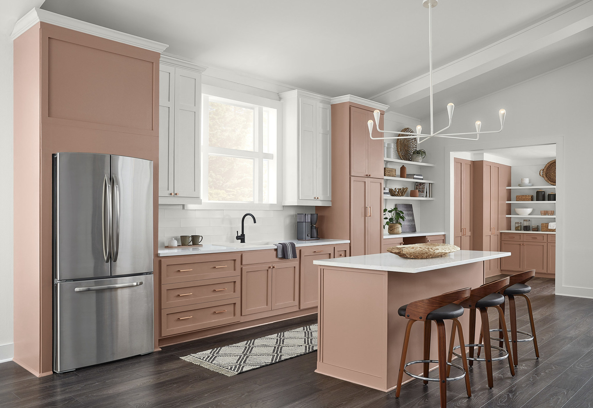
 

Sherwin-Williams-Redend-Point-SW-9081-Kitchen-Image
Sherwin-Williams 2023 Color of the Year, [Sad]Redend Point SW 9081


I’m failing to understand why they painted those two upper cabinets flanking the windows – white, as well as the crown moulding. And, egads! It never ends! They extended this sea of vomit into the butler’s pantry. I sincerely hope this is a computer-generated image.


To round it off, they put in an ugly gray floor.


Just have to say; Who’s following Maria Killam’s series on Instagram? It’s about what you must do if you want to love your house forever. I’m enjoying it a lot. She just did one about gray hardwood floors. Maria says without missing a beat.


“Gray flooring should never been invented in the first place.”

 

Maria Killam - gray flooring is a bad idea!

“Gray or taupe floors. It makes no difference,” They’re all terrible, Maria says.

I agree 100%. Thank you, Maria.

However, reflecting back on the cabinetry, there is one positive way this color might work for some people. If one is interested in losing weight, this is the perfect color to paint your kitchen cabinets. I’ve certainly lost my appetite, just looking at the images.


Okay, let’s move on because I don’t want to waste any more time discussing Sherwin Williams choice for COTY 2023.


However, for the rest of the post, I will feature Benjamin Moore’s COTY 2023 Raspberry Blush 2008-30


benjamin-moore 2008-30-raspberry-blush -COTY 2023


Raspberry Blush is a lovely shade of coral, veering into a soft red. This is a color that I could see looking redder or slightly pinker, depending on the light. While its overall color is warm, there is a subtle cool undertone. I’ve never used it unless you count the color of nail polish I always choose when getting a pedicure. :]

 

Benjamin Moore adobe orange 2171-30


We can see the bluer undertone when we compare it to Benjamin Moore Adobe Orange, one of the Laurel Home Paint and Palette Collection colors. The undertone doesn’t make one or the other more desirable. It depends on the light in your room. If it’s north-facing, Adobe Orange might be the preferred choice.


This is why I created the Laurel Home Paint and Palette Collection.


If Raspberry Blush looks too cool in your space, but otherwise, you like it, then Adobe Orange might be your perfect color.

There are several shades of red, orange-red, and orange in the Laurel Home Paint and Palette collection of 144 beautiful Benjamin Moore paint colors.


As a side note:


I have decided to release the update for Laurel’s Rolodex AFTER Thanksgiving this year. It’s the most significant update since 2015, and I am also updating the Etsy Guide and The Six Figure Income Blogger – website guide.


All my interior design and blogging guides are going up in price come January 1st.


Okay, back to Raspberry Blush.


Benjamin Moore put out their usual press release of their COTY 2023.
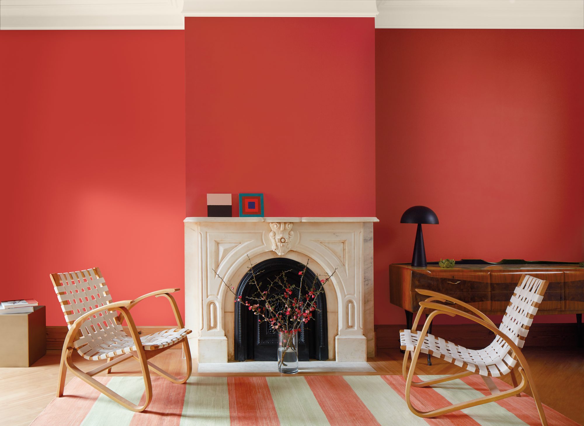
 

benjamin-more-2023-color-of-the-year-main
I wish they would actually decorate the room. As good as the color looks here, it would look even better if the room was styled with art and mirrors.

Since there aren’t a lot of other images with this color, I looked at similar colors but didn’t come up with much. Therefore, I went through my image library and found some that look close enough to me.
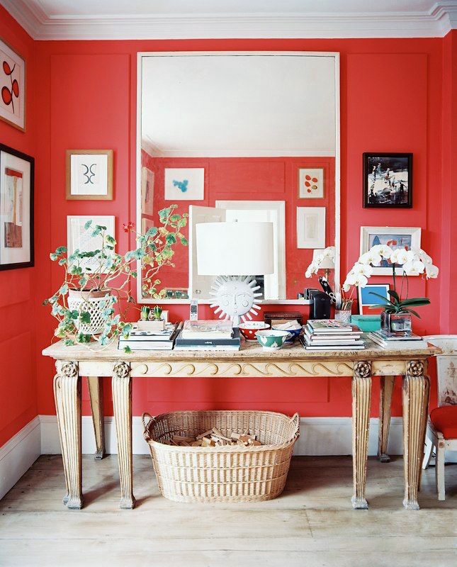
Cath Kidston Lonny - coral red walls

Above is an image from Lonny with a vignette by Cath Kidston. This photo is at least seven years old, if not more.
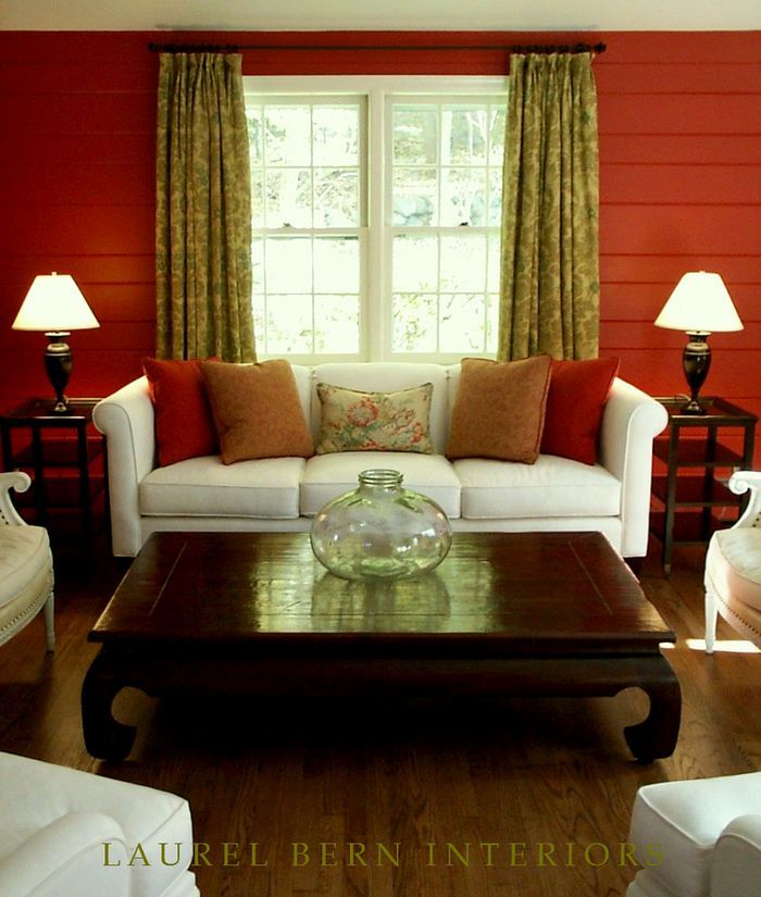
 

Pound Ridge, NY living room Moroccan Red design and image by LBI

This is an old pic circa 2003 I took of a room painted Benjamin Moore 1309 Moroccan Red.

Benjamin Moore 1309 Moroccan Red

Moroccan Red. It did look brighter in that living room with windows on three sides.

 

Benjamin Moore Geranium
I just found an image of Benjamin Moore Geranium 1307. This almost made it into the Laurel Home Collection, but I had to make ruthless cuts. But, I do like this soft red.

benjamin-moore 2008-30-raspberry-blush -COTY 2023
This is Raspberry Blush for comparison.
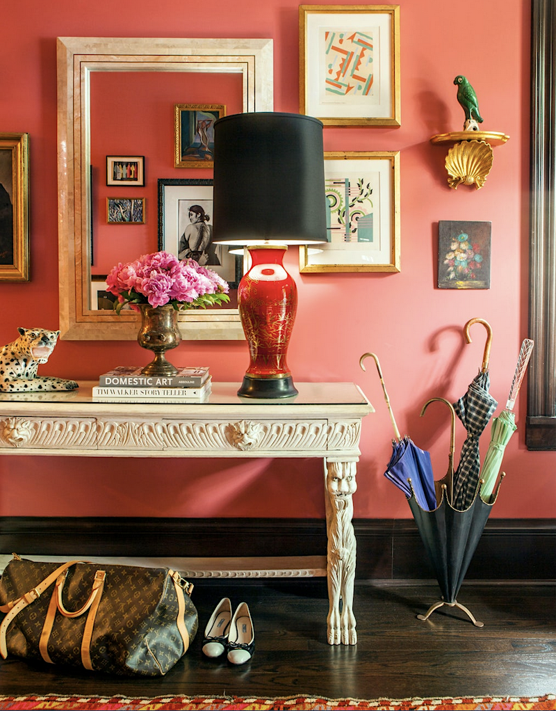
 

Summer Thornton - coral walls - vignette

This lovely vignette is by Summer Thornton.


raspberry red front door Beacon Hill


This is a photo I took last year in Beacon Hill. I don’t know the color, but it is in the same general neighborhood as Raspberry Blush.
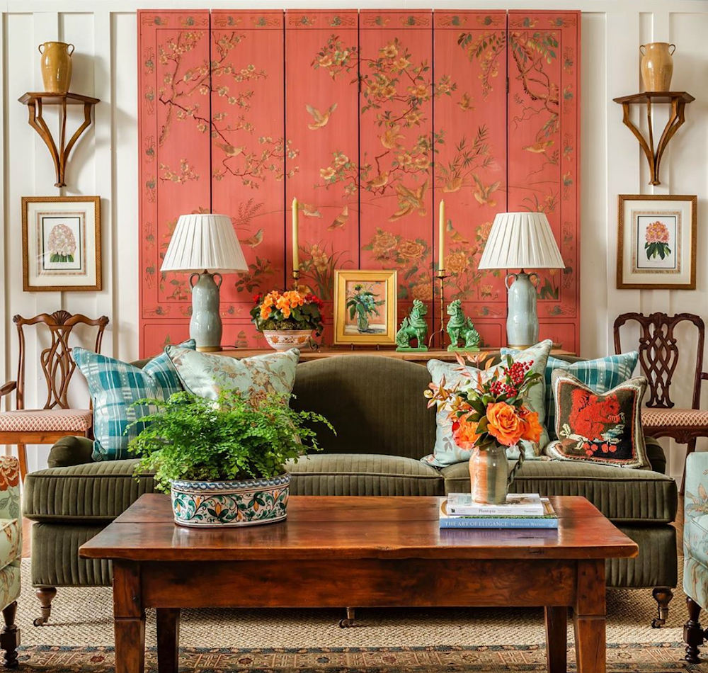
 

@jamestfarmer on instagram - orange decor - Chinoiserie screen

While this isn’t a wall, James T Farmer’s wonderful living room vignette has this fantastic screen in a lovely coral color. I also used this image to share an example of a beautifully symmetrical room in this post.
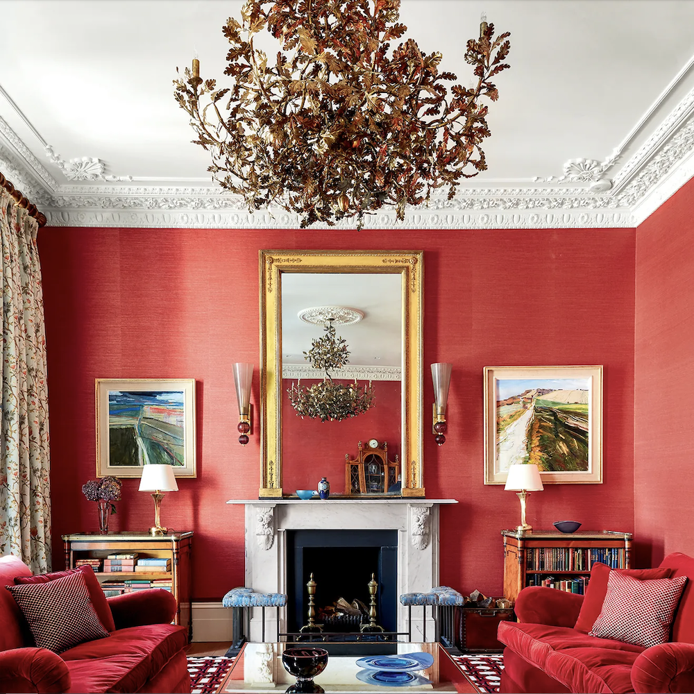
 

House and Garden UK Red grasscloth living room

House and Garden UK


This isn’t paint; it’s grasscloth.


It looks to be a touch redder than Raspberry Blush. However, I love the way this room is furnished.
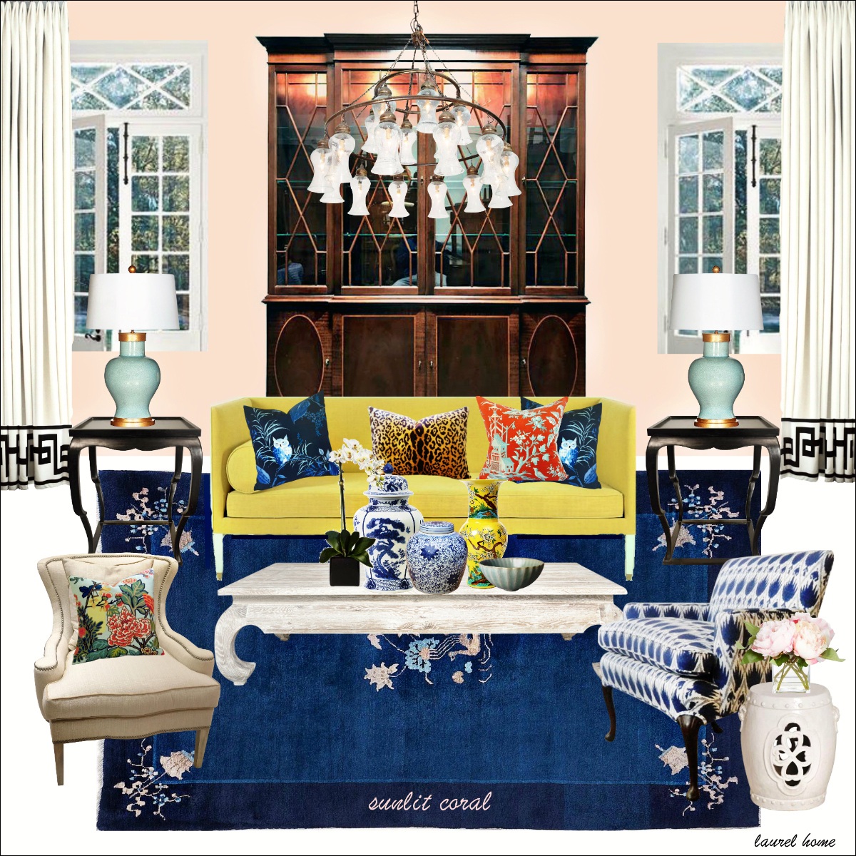
 

Benjamin Moore Sunlit coral


If Sherwin Williams wants to do something interesting, how about a pretty, warm pink instead of the tiresome pinky-greige-tan?  Above is a bonus board in addition to the 40 boards from the Laurel Home Paint and Palette Collection featuring Benjamin Moore Sunlit Coral.


I created this board as an ode to Ben Pentreath’s charming living room in Dorset, with a similar color on the walls.
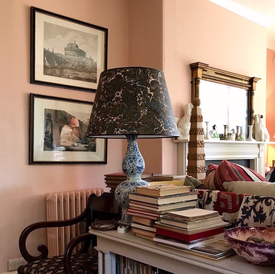
 

Ben Pentreath - Charlie McCormick - old parsonage-vignette -living room

Above is my image from my trip To England in 2017.
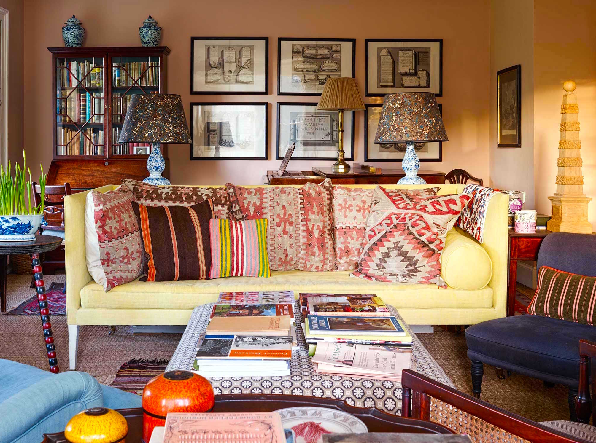
 

Ben Pentreath - The Parsonage, Dorset (24th November 2014)

Above is another image of Ben Pentreath’s living room, not taken by me.

For my post about Ben Pentreath’s paint colors, please go here.


Okay, I will add another image reminding me of Sherwin William’s COTY 2023, but with a difference.
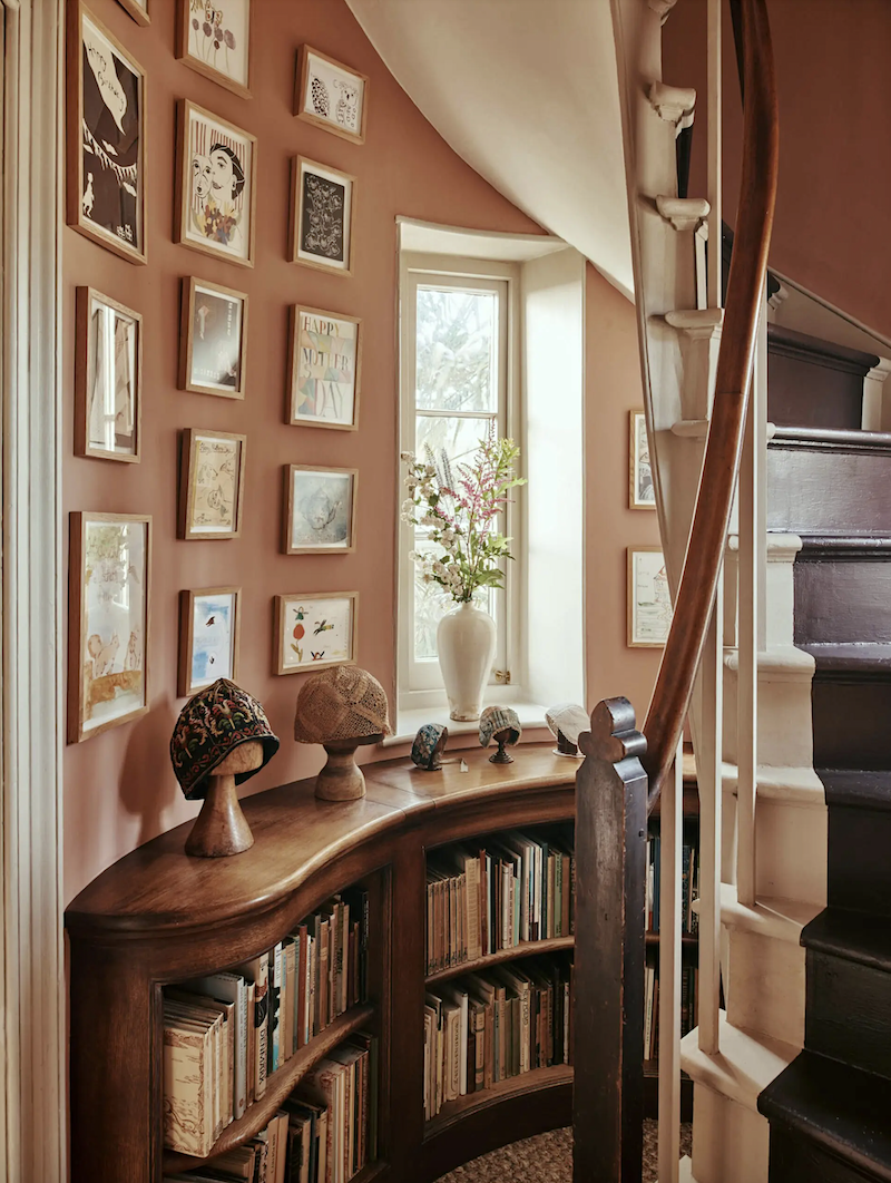
 

Artichoke - spiral staircase

I just came across this lovely from this post, “The British are Coming!” The post was about several fantastic British designers. This is from Artichoke, a fantastic cabinetry company.
The color is not the same as Sherwin Williams. (see below) The color above has much more life to it. It’s more of a dusty terracotta color.


It’s also beautifully styled and looks great juxtaposed against the wood.


redend point Sherwin Williams COTY 2023

This is Sherwin Williams COTY.
Pink mud? No, thank you.


I need to end on a brighter note.


red building-Nyhavn - waterfront - colorful houses - boat tour seeking hygge in copenhagen

This lovely was taken during my trip to Copenhagen in 2018. What a beautiful city!

Okay, I’m sure y’all have some opinions about these two colors of the year. (COTY 2023) Please share your thoughts in the comments.

Also to read my other reviews of the past color of the year posts, click here.

xo,

 

PS: Also, please check out the newly updated HOT SALES (there are some new and amazing sales going on!) and also the newly opened HOLIDAY SHOP!   It’s filled with decor and gift ideas for the holiday season.

46 Responses

  1. What a fun discussion. And, Laurel, as a native NYer, I love your bad-ass NY attitude: never, ever hold anything back in your blog posts. I LOL’ed at the wickedly clever ways to describe the COTY colors, especially the “wet hot dog.” And, gotta agree with you 100 percent about the SW choice.

    I’m old enough to have seen countless variations on color palettes, over the decades. Such a tumult creating new names for the same old colors. Go figure.

  2. “If one is interested in losing weight, this is the perfect color to paint your kitchen cabinets.” … hahahahaha!!! Thanks for a highly entertaining post. Laurel!

  3. Laurel, do you know of a good book, or source, that talks about people’s emotional and psychological reactions to colors they are surrounded by? I’m sure that one, or some, or many exist. For example, blue is a favorite color of many, and it’s a beautiful color, but I often find it too cold to live with. Peoples’ responses to color are fascinating to me.

  4. I’ve never been very fond of those mauve pink shades. They always look as if a pall had been cast over the room. In fashion it looks like an old lady color. I decor, it just makes me feel down. I do love pinks and corals though, just in warmer, happier shades.

    1. Hi Susie,

      No need to apologize, ever. You are entitled to your opinion, no matter what I or anyone says. This is the premise of every blog post.

      I just took a look, and I’m not a fan, of the color in Ina’s dining room, either.

      And, there’s the rub. There are some serious problems with this room; and one of them is disastrous. No color is going to look good in there. I think I’ve just decided the topic for Sunday’s post.

      Here’s a link to her dining room in the Hamptons circa 1996.

      I think it looks as beautiful and fresh today, 26 years later as it did back then. I couldn’t stop looking at this space. I hesitate to use the word “obsessed” because I realize it is grating. However, I was completely taken with that Clarence House fabric that was $200.00/yard. And, even though CH had a two yard min. the lovely rep let me get 1.5 yards. I was very grateful, as we had to borrow the money to do the work in our NY townhouse.

      Of course, I still have those pillows. They’re in their third home and I love the fabric just as much 26 years later, as I did in 1996.

  5. Redend Point:
    My later mother’s liquid make-up.
    Cheap hot chocolate
    Neutral Lipstick mistake
    Bologna
    I’ll stop now. Redend Point point made.

  6. I heard Miles Redd once say that there was no color he really disliked except “wet hot dog.” I think it was on Ballard Design’s “How to Decorate” podcast. It stuck with me because I agreed that would be the only kind of color I would dislike, as well. When Sherwin William’s announced Red End Point as COTY, I immediately thought, “There it is. Wet Hot Dog!” I’ve said it reminds of Wet Hot Dog many times since.

  7. My favorite “red” is BM Milano Red #1313. I painted my former dining room in that color and the painter insisted I’d hate it but I loved it and will use that color again in my new home. It is such a happy color to me!

  8. Hi Laurel,
    I’m testing different pink paint colors for my front door. Redend Point won’t be a contender. It’s not clean enough for me.

  9. This is not related to the Color of the Year but I am hunting for a beautiful Celedon paint color. What do you know about that one?
    Laura

  10. Haha, I love Redend Point! To me the really muddy warm colors are where I want to go after all the gray. Not that any of them ever end up in my house. As you advise, I have a long-term scheme that doesn’t follow trends. Anyway, I love the snark, even when I don’t agree!

    1. Hi Loryn,

      What’s funny is that I like green mud, just not red mud. A lot of paint colors sway green even if they don’t look green on the chip. However, I don’t recall any that ever go red, unless it’s just before sunset.

  11. Early this year I painted a home office. Red seemed like an ideal color, but I was nervous about living with such a saturated hue. I chickened out and painted the space what I thought would be a more restful light blue-green. I immediately hated it and repainted it Farrow and Ball’s Book Room Red. I’m so glad I repainted. The red is warm, cozy, inviting and I love it. I only wish I had listened to the right-side of my brain from the beginning, rather than the left-side overthink and overrule it!

    1. Hi Frederick,

      I’m going to be writing more about the color red and related colors like coral. Like orange, people have a lot of preconceived ideas based either on what they were told or experienced in a situation that no longer exists, like 70’s neon orange, brown, gold and avocado green rooms.

  12. I like the Raspberry Blush better, but I only love it when there is a lot of art on the wall to give the eye a rest. I also love the stunning exterior idea (with a lot of windows), like your last picture.

    I too wonder why BM didn’t finish their room…weirdly blank and boring.

    I don’t agree that gray flooring is consistently terrible. I’ve seen a few very pretty examples, especially when paired with creamy white walls. But hey, that’s why we don’t have cookie cutter design outcomes.

  13. Laurel, Red? So red on an exterior door – Yes! Reddish brown on home or building exterior – yes again. Red accents in the room or red pillows on a sofa or chair or a red chest – wow! But red or pink or orange walls in the home – I do not think so. I love to wear red sweaters, coats – even a pair of heels or a red handbag. But to have to live for any length of time with red or pink or walls for me would get too boring after a while. And yes I know that painting is the easiest redecoration. However the expense of having professional painters come in to paint a room or several rooms is no longer the least expensive of redecorations. By the way I listened to Maria on gray floors and agree but I disagree with her comment on how exterior gray dates your home. Gray painted homes have been around in New England for several hundred years – you might say gray is a historical color trend.

    1. That’s the way I feel about blue on walls, just can’t live with that color on walls or as the dominant color in a room. I wear some blues, have some blue accents but that’s it! Periwinkle is my favorite shade of blue.

    2. Hi Marlene,

      Yes, gray is a classic exterior color. What isn’t classic is some of the architecture that’s done these days that is then painted gray. Besides, gray is usually a muted green or blue on an exterior, especially.

      And yes, red is a beautiful interior wall color, when done correctly. That doesn’t mean you have to have it in your home. I appreciate it when I’m in a beautiful red room and I’ve been in a number of them. But, I wouldn’t use it in my home. There are a lot of colors I wouldn’t use in my home, but they are part of my paint collection because they’re still beautiful colors and they are appropriate for other people.

      However, ALL colors are going to suck if the rest of the room isn’t doing what it needs to do to make that color look its best. There still needs to be the correct balance. The problem is, I believe is that people see elements in isolation; not as part of an entire composition. Or, there is no composition. To be continued.

      All I’m asking is to keep an open mind and respect the opinion of everyone even if you don’t agree. Thank you.

  14. I saw the SW color and immediately thought “Half-Healed Scab.”

    The Raspberry Blush is better, and could be interesting with the right furnishings, although I like my reds to be true reds. My office is painted in Myland Arts Club. I don’t think Mylands is sold widely in the US, but it’s another wonderful British paint company. I wonder if you’ve ever used them, Laurel?

    Anyway, fabulous post, as always! I would love your opinions on the new crop of Farrow and Ball colors. I love Farrow and Ball and have it in every other room of my house, but I’m really unimpressed with the new offerings.

    1. Hi Abbot,

      Half-healed scab, lol! Yes, Farrow & Ball is coming soon. November is my nutso month, and on top of it, we’re moving the email list. It would be easier to create a nuclear bomb. Plus, everything else going on, PLUS trying to have an actual life. I’m determined to do the latter. This was a good week.

    1. Oh, Susie! Although, yes, Benjamin Moore did a not-so-great job of selling their color. I’m going to show some people who did a wonderful job, and explain some other reasons that people might say yuck to Benjamin Moore’s color, as well.

  15. Historically, I have disliked all of the COTYs, regardless of who chooses them. Except I love October Mist (BM’s 2022 COTY for those who don’t know) and am using that color in the remodeling project in my own home. I think Pantone can more successfully select brilliant colors, because even hidous colors don’t look as bad in print. When I worked as a typesetter back in the 80s, one of our hightlights was receiving the new Pantone catalog and seeing all of the beautiful colors of ink available.

    The SW color is a big blunder, IMHO, and reminds me of the peachy brown dessert hues that were popular in the early 80s in some regions. That kitchen is not attractive at all. Clearly this design was put together to showcase the color, but instead it looks like a mistake. They could have used flooring and backsplash materials that would have made the color work better. Even the name is bad: Redend Point makes me think Dead End Point. It could be nice on a wall that had lots of windows, doorways, molding, and art, I suppose, but it is horrid on cabinets. That kitchen picture is cringe-worthy. Another kitchen designer posted it in a FB group when the COTY was announced and mosted of us reacted negatively.

    I believe Ben Moore did better in the naming department, although I have never seen an orange-toned raspberry. I personally wouldn’t use it on a wall, but the younger me might have. I can see Raspberry Blush being used in so many ways and it would look really cool on painted furniture pieces and soft goods.

  16. Too orange for me, even with the cooler undertone. Maria may like it! I’ve followed her for more than ten years (long before I found you), and her help when we were renovating our house was invaluable.

    I’ve hated that gray flooring ever since I first saw it, and have shuddered many times over the ruination of an otherwise lovely house by the installation of gray “luxury vinyl planking.” What a misnomer! There is absolutely nothing luxurious about it. Hideous is more like it.

  17. I loathe the SW color! Truly nauseating. But the BM color is also something I just couldn’t see in my own home. A sweater…yes. A wall…no!
    I just don’t get how these companies pick the COTY choices.

  18. When I look for a tan or beige color the first thing that will turn me away is any pink or lavender undertone in the shade. This Sherwin Williams color I wouldn’t touch with a ten foot pole, don’t care what the light exposure is! Just ugly.
    Not sure how they come up with these colors. Do they ever predict a trend for the year? Don’t think so. I do like the Benjamin Moore color as an accent. While we haven’t seen most reds too much recently, I can see coral in our future. You are spot on again, Laurel.

  19. I guess I’m going to be the voice of dissent. The Raspberry Blush paint is hideous to me! If I walked into a room painted that color, I would immediately turn and walk out. On the other hand, SW Redend Point painted walls would be lovely with a brown velvet sofa and lots of brass details. Maybe throw in some soft teal pillows.
    This is why the world is so interesting! We’re all different with different tastes!

  20. Agree on the hideous gray floors in the cat vomit kitchen, but the gray floor in the Lonny photo are making that room for me!

    1. Hi Leigh,

      Ahhh, I agree, but those floors look naturally weathered and antique. That is what hardwood floors often looked like 150 years ago and more. They didn’t finish the wood or stain it. They might’ve waxed it, is all.

  21. I’ve seen the Sherwin Williams color referred to as “Band-Aid”. I think that fits perfectly.🤮

    1. Hmm. No, no and no. Is this really the best they can come up with? It just like our potential presidential candidates. No and no!

  22. The Sherwin Williams color reminds me of the blush little old ladies in Florida use along with the black eyebrows and blue hair. Ghastly!

  23. I painted my dining room Raspberry Blush (or something quite similar) in 2003. I loved it the . Not sure I would do it now – but you never know! Love your perspective.

    1. Hi Lisa,

      I did lots of red dining rooms back then, and we did a lot of gold walls too. These colors aren’t as popular now as the cooler colors have prevailed. I still think a balance of warm and cool is always best.

      We also did a few red bedrooms, as well as living rooms. They all looked beautiful. And, one couple who had a small kitchen with tired oak cabinets painted their walls red, and it made those tired oak cabinets look so much better!

      Red was right for those clients. It wasn’t the right choice for others and it’s not in my palette either, but I appreciate it when it’s well-done.

  24. I totally agree with your thumbs down for that hideous, pink-beige barf color. Whoever invented that ought to be fired – they need a new career anyway. Though probably not a choice for me, I do love the exciting raspberry blush color. I could see doing it in a small room, perhaps. I was quite intrigued with the door on Beacon Hill – would not have thought to put that color with bricks, but it looks lovely.

  25. I could tell in an instant which was the fail, and which was the win. That kitchen was truly awful! I would love a small piece of furniture painted in the raspberry color. Have a good day, Laurel.

  26. Interesting how a small shift in a colour makes all the difference. That staircase in a faded terracotta is indeed lovely — also because there is no solid expanse of the colour, it’s broken up by the display of prints. Agree entirely about the first kitchen photo: truly hideous.
    The raspberry — very underripe raspberries! — is in my view far too bright a colour for walls. The small square of colour looks lovely, but in a big expanse would be a lot less so. And I don’t think if goes with any wood furniture which has an orange element, as can be seen in the House & Garden image. I much prefer the more muted tones of F&B’s Fox Red (n° 48, now an archive colour) and Red Earth (n° 64) — my sitting room ceiling is Fox Red, broken up by the white beams and sponged over with Ringwold Ground (the wall colour) to disguise the unevenness of the ceiling planks. Warning: these colours really suffer with LED lighting which muddies them. So perhaps the brighter tones are better adapted to modern lighting systems.

    1. Hi GL,

      I think it depends on the light and what else is going on. Farrow & Ball has a color in their Archives called Harissa which is almost a dead ringer for Raspberry Blush. Some colors they retire and I’m not sure why like Orangerie. Others like Hague Blue and Down Pipe I doubt they’ll ever retire. At least I hope they won’t. I wish they had kept Pantalon.

      1. I really wanted a red/coral to make my kitchen island pop. I finally settled on Benjamin Moore Ryan Red. It leans a little more red than Raspberry Blush. I am very happy with the result.

Leave a Reply

Your email address will not be published. Required fields are marked *

This site uses Akismet to reduce spam. Learn how your comment data is processed.

Welcome To Laurel Home!

laurel-aarons-18th-e1456449963926

Hi, I’m Laurel, and Laurel Home is the website and blog for Laurel Bern Interiors.
I’ve been creating new-traditional interiors since 1988. The blog is where I share all.

New Edition, November 2023! Get The Indispensable Guide For 100s of Home Furnishings And Interior Design Sources That Everyone Is Raving About

laurels-rolodex-final-book-cover-master 10th edition 23-24

laurel home archives

Categories:

Please click the image below for more info about my rockin’ Interior Design Guides for 2024!

Laurel Home Interior Design Guides 2024
Amazon ad

please click below to check out my favorite decorating & design books

Laurel Bern's Favorite Interior Design and Decorating Books