Hi Everyone!
Guess where I am today? Well, I won’t make you think too hard, so I’ll just tell you.
I’m back in Bronxville and staying with my wonderful friend and former client, (frient) Mary. Yes, Mary, of the fabulous kitchen that I’m sitting in right now.
Mary is so incredibly kind that when I had my accident, she offered to have me stay with her to heal for as long as I liked.
I didn’t take her up on that offer, mostly because I was in no shape to get ready to go on a trip.

via the New York Times – Photo – Yudi Ela
However, I did tell her that I wanted to come to see Skylar Brandt in her New York debut performance of Giselle in the romantic, highly revered ballet, Giselle at the David Koch Theater (Lincoln Center) this Thursday evening. So, that is what we are doing!
I will stop here because some of you are interested in knowing more, and if you are, I have created a tribute page for Skylar.
I have been following her dancing and career ever since we first met in 2003 when she was only ten years old. However, it was clear at that very young age that Skylar was going places. I am so in awe of her incredible talent, drive, and she is such a fantastic person on top of all of that.
For those who wish to know more, about Skylar Brandt, please go here to read the rest.
***
And now, onto the post. Since I’m on a workcation, I am revisiting a revised version of one of my favorite humorous posts from 2016, having to do with a hideous apartment remodel that had just come on the market.
First, let’s discuss what an open concept home is. (in case you’ve never heard of that term.)
It’s a home where the common living spaces, great-room/family/living + kitchen + dining are all open to each other.
It’s a concept, alright. But is it a good idea?
It depends.
It’s certainly a contemporary affectation, and if one frequently has large gatherings and enjoys that aesthetic, then sure, but otherwise, I would consider this option very carefully–especially for a smaller home. And, if you’d like help fixing your open concept to open house, please check out this post.
And, you might also enjoy this post about an open concept loft space in San Diego I pretend renovated.
Back in 2016, this apartment that is exactly like my old Bronxville apartment went on the market.
It had been sold in 2014 for 167k. The new owners did a massive renovation which included an open concept floor plan. When I saw the new listing, I was quite shocked at what they had done to this beautiful old apartment.
At the time, I couldn’t see how they were going to sell the apartment quickly. And, in a moment, I’m going to show you why.
Here is another apartment mess for sale from 2015.
A checklist is in order before embarking on a significant renovation of any kind, including an apartment remodel.
- How much can I spend?
In this case, we know that apartments, especially, have a finite cap. It’s up to the owner, but if it’s essential not to spend more than the place is worth, that is an important consideration.
- How old are the home and what style?
The building is a gracious traditional-Tudor style building built in 1927, with thick walls, large windows, high ceilings, architectural mouldings, and ribbon-banded oak floors.
- I think it’s very important to respect the age of the building.
- The inhabitants. How old are they? Are there children?
- What is the neighborhood like?
- What are the other homes like?
The ages of the adults in the building range from 25 – 120. ;]
This apartment on the top floor of the building was the same configuration as my old apartment, except it does not have the bay window in the living room.
I say, was because it is very different now.
First, I’m sharing several photos of my place when it was empty back in 2012 so that you can see more clearly the changes.
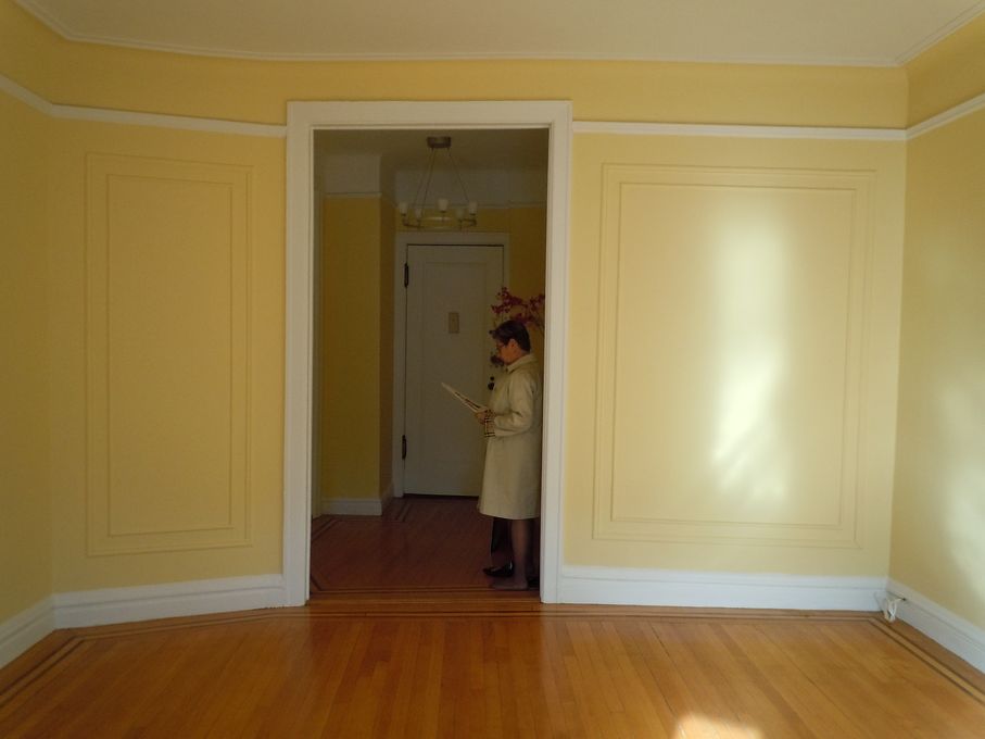
When you walk into the apartment, you enter a cozy vestibule (where the realtor is standing), one of my favorite parts. As you walk in, to the right is the kitchen, and straight ahead is the living room.
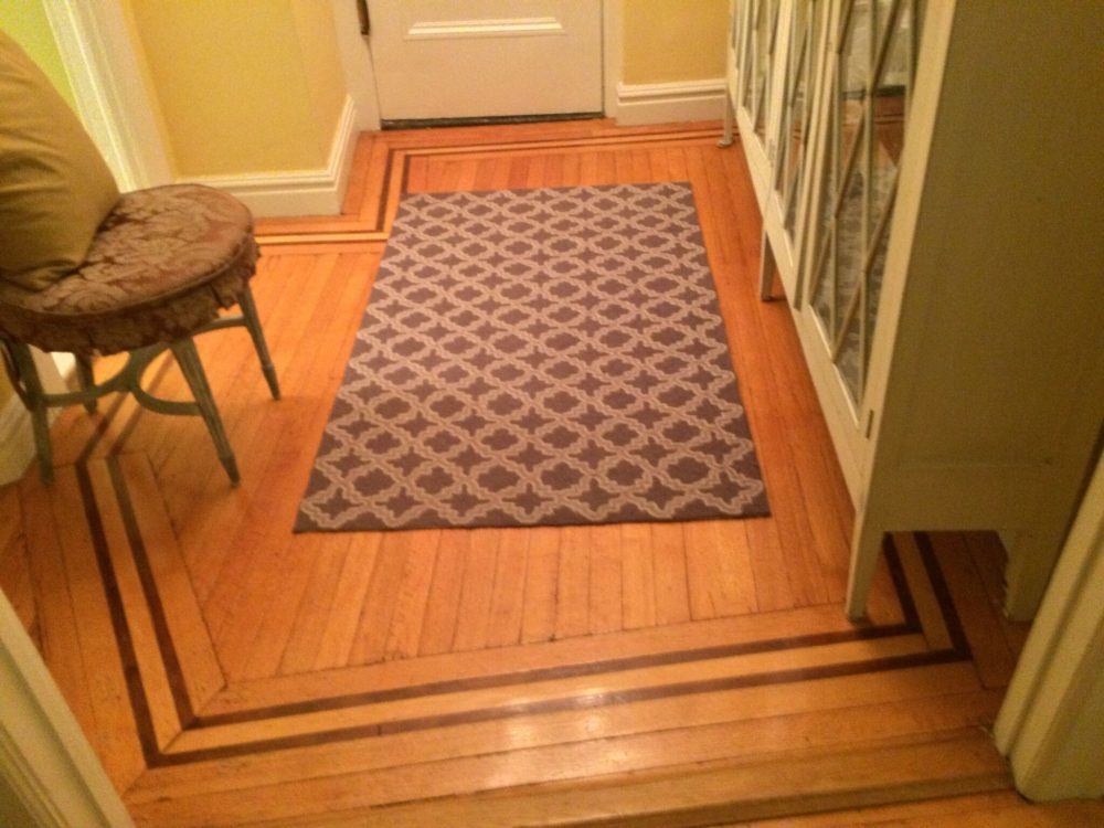
My charming former entry with ribbon banded mahogany inlay on oak floors. The kitchen is on the left, and the hallway at the bottom left. The entrance and my bedroom were my favorite parts of the apartment.
You do not need to walk through any living spaces to get to another living space.
Most one-bedroom apartments have a design that requires one to walk through the living room to get to the bedroom.
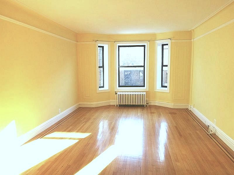 The sunny living room
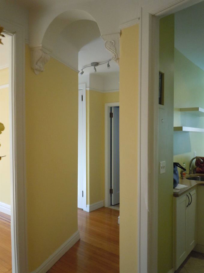
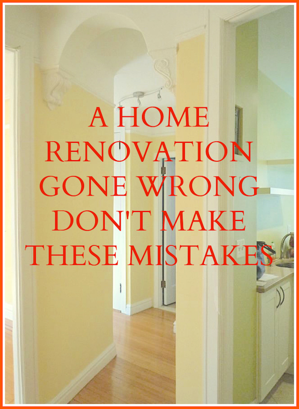
Just past the kitchen, which you can see the sliver of yellow-green, is more of my favorite part, connecting the welcoming entry. I adore this small winding hallway with a lovely arch and corbels. EVERY apartment in the building has at least one of these arched doorways with decorative corbels.
EVERY ONE.
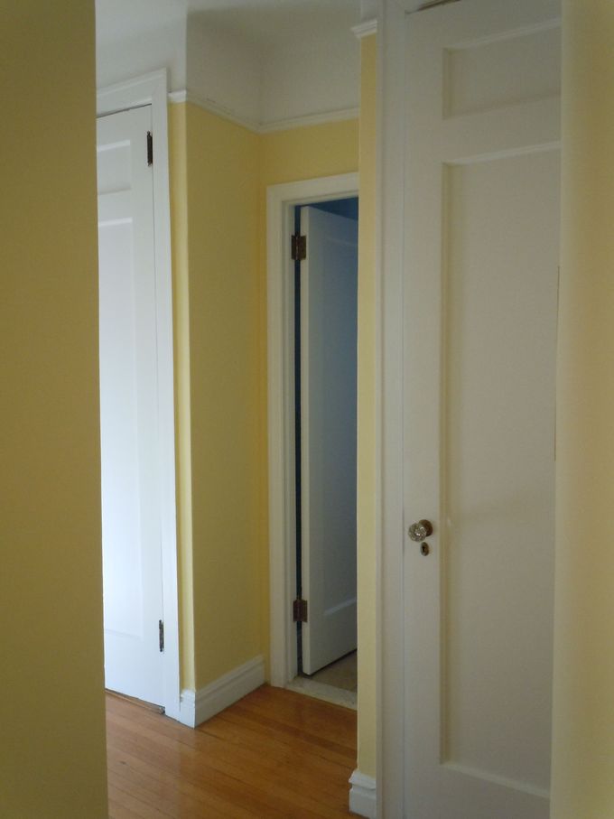
Walking through the tiny winding hall, we come to a utility closet.
Next is the bathroom.
Then another closet
What I love about this hallway is that one cannot see the bedroom from the entrance. There is a sense that the apartment might keep on going, which makes the apartment feel more home-like. And I love that one does not have to walk through any room to get to another room!
And then finally is the bedroom. For a more updated version of my bedroom, please look here.
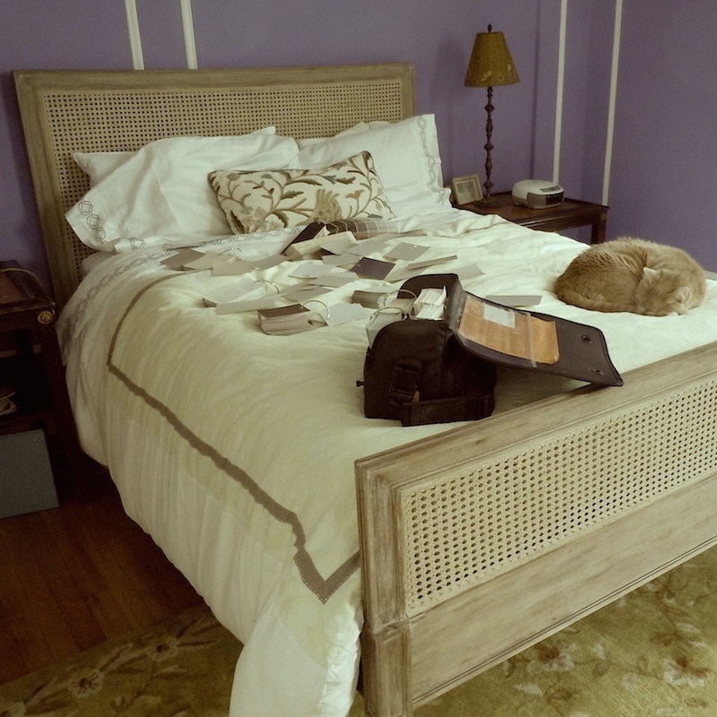
Awww… back in early 2013 with my darling Peaches, who passed away on Dec. 2, 2014.
I miss you so much, Snooky!
And, please note the plethora of paint samples thrown across the bed.
As an aside, here’s the proof that I, too, can obsess about paint colors with the best of ’em. It’s why I put together this nearly 500 page, two-volume paint and palette guide to help with the selection of your paint colors.
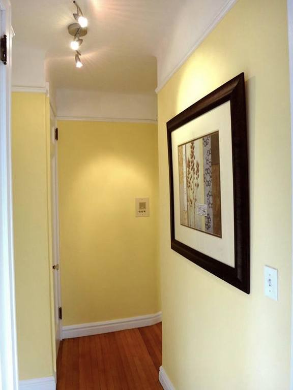
Looking back from the bedroom at the winding hallway. (bathroom and closets are on the left)
Because of the way this is configured, if one has a guest staying in the living room, like when my sons come to visit, I can barely hear anything. We put my Zuber screen over the doorway, and it is also very private for them.
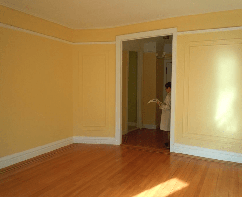 A look back from the living room into the entry, kitchen, and then the beginning of the winding hall on the far left of the entrance.
For the best photos of my old apartment furnished, please see this post from November 2020.
Here is the same view from the renovated apartment.
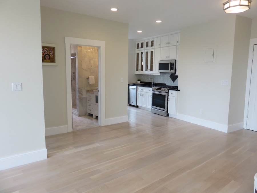 Gone is the cozy entrance; you walk straight into the living room.
In addition, also gone is the charming cove ceiling. And, all of the mouldings, arched doorway, and ALL of the walls, except for the bedroom wall.
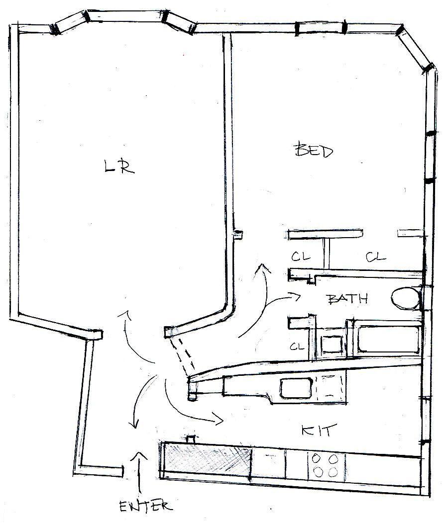
Above is a sketch of my old apartment drawn to scale.
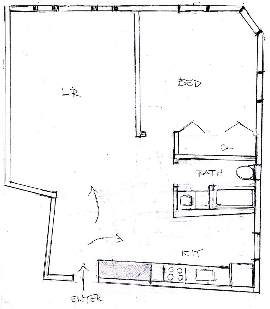 The open-concept apartment remodel – floor plan.
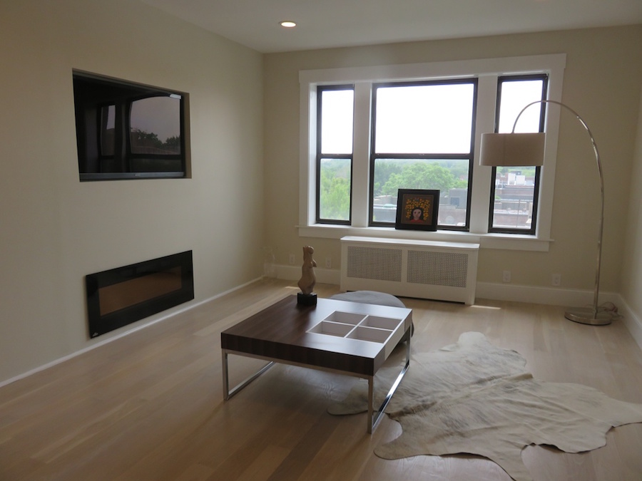 The living room is stripped of all architectural features, including the wonderful cove ceiling details and mouldings. Click here for some great ideas for treating a long interrupted living room wall.
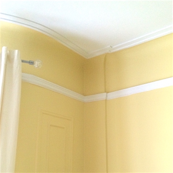 Here, you can see my former apartment with the cove ceiling and moulding. I love the curved wall, which becomes the bay window. Here are some great ideas for the best bay window treatments and measuring guide.
True, the renovated apartment is different as it had no bay window, to begin with, but it did have everything else.
Actually, I did find two very small images before the reno to show you what it once was. (clashing colors aside.)
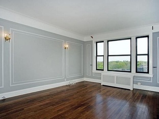 Above and below the apartment before the remodel.

Yes, this is the same place taken in 2014. Please notice that the original floors look to be in good shape.
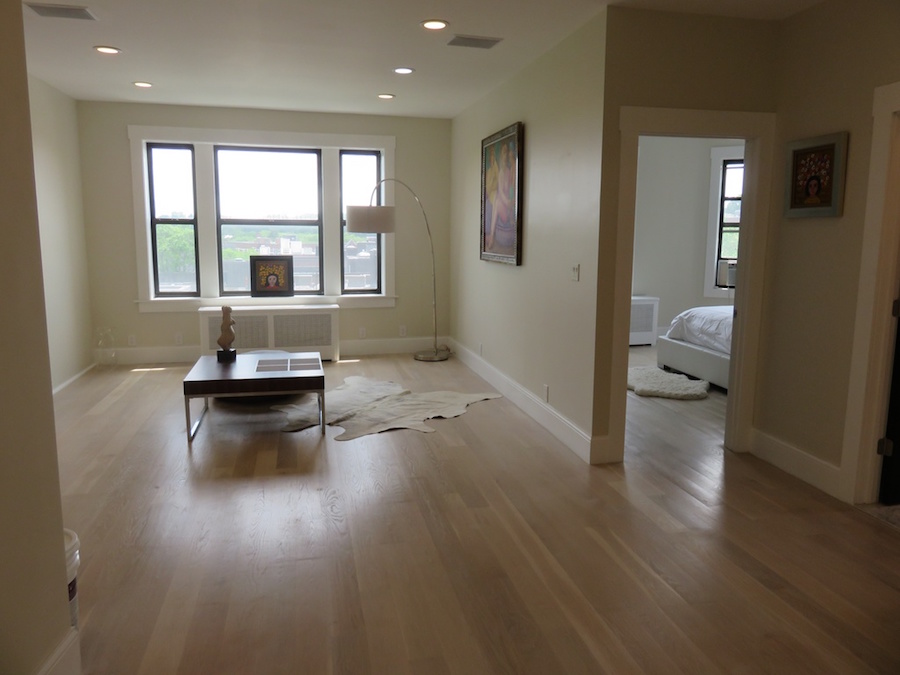
I lived in this building for eight years. It is a very quiet building. There are no parties here.
NEVER. And at least half of the inhabitants are over 60.
This looks like a swinger’s pad. Right?
These people need a lot of space to well… swing, I guess.
But let’s look at the first image again.

See, it goes like this.
You are a guest at a party at the swinger’s apartment when you realize you have to make a poo.
You go into the bathroom to make a poo, and when you come out, everyone is going to know that YOU were the one who made the big stinky poo.
—because the john is in the middle of the LIVING ROOM.
No, wait, that’s not right.
It’s actually in the middle of the DINING ROOM!
***
Oh, I’m just warming up.
Please observe what else is missing.
BOTH CLOSETS were flanking the bathroom.
In all fairness, they probably did create access to the one closest to the bedroom from the bedroom, but they don’t show that.
Still, this place is already low on closets, and to take that one out just to make the bathroom longer, is not a fair trade, IMO.
Let’s go into the bathroom to see what’s doing there. (that’s a New York colloquialism if you don’t already know that.)
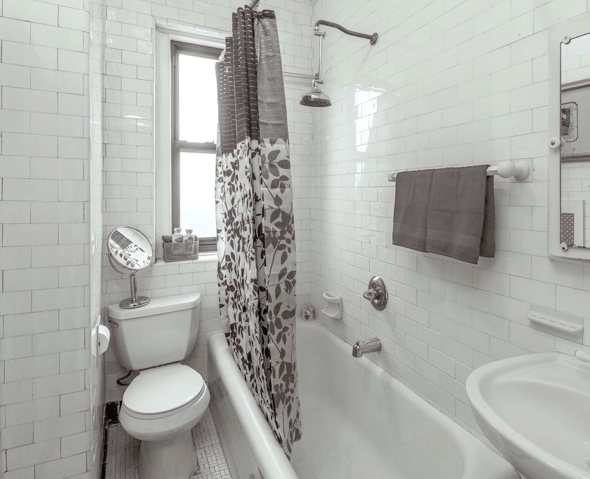
I am positive that this bathroom from another apartment has the original subway tile from 1927.
The bathroom. Pre-renovation would’ve looked like the one above.
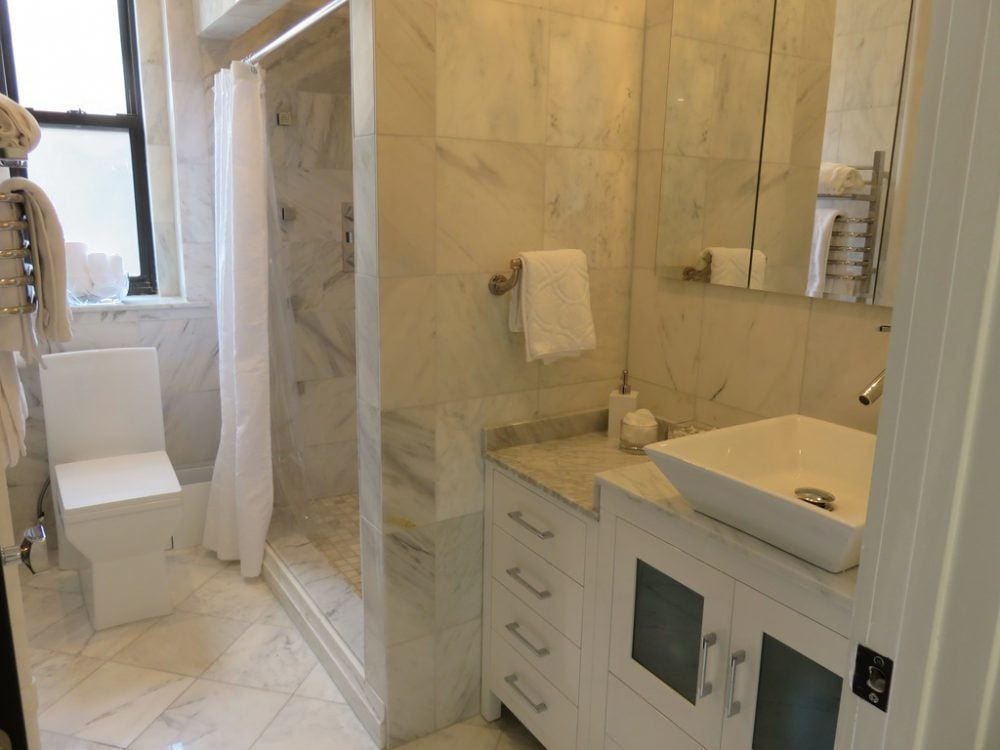 After.
Actually, I don’t mind the bathroom. However, I don’t understand why the vanity is on two levels, and I wouldn’t have clad the walls in marble. But I don’t hate it.
However, there’s no tub. Some people absolutely must have a tub, and if you don’t have one, they are probably not going to buy your place. Therefore, I believe that a one-bedroom, one-bath apartment should always have a tub.
Aside from that, the bathroom is by far the best part of this reno.
Let’s scoot over to the bedroom.
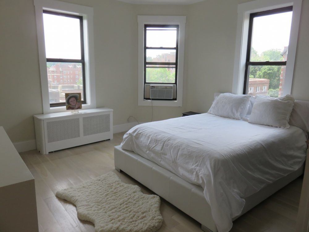
My bedroom is the favorite part of my apartment.
It’s what SOLD me on this place.
Here, in this apartment remodel, they stripped away every vestige of its former glory; it looks like one of the rooms at the recent hospital cardiac unit they built down the road; not the charming architectural gem from 1927 it was meant to be.
No mouldings.
And what is going on with the window and door casings in this mess of an apartment remodel?
To find out the appropriate window and door casings (interior trim), click here.
They stuck up some flat boards, didn’t even bother to miter the corners, and the top rail hangs off like some Adirondack hunting lodge.
Laurel???
Yes?
When are you going to talk about the floors?
I am not going to talk about the fake hardwood floors; the fact that they took perfectly gorgeous vintage floors, removed them, along with that wonderful ribbon mahogany banding, and then stained the new ones the color of cat gromitz. I’m not going to talk about that because it is too upsetting.
But I will talk about the fact that they chose a white paint which clashes horribly with the pinky-beige floors, and then they put in a lot of gray marble, which also clashes with the floors AND the walls.
I’m also not going to talk about the big black monolithic TV they embedded in the wall in the living room. (much to the dismay of their neighbors!) Here are some great alternatives for hiding the TV.
Of course, swingers like TVs, I guess. Alas, swingers do not live in this building.
APARTMENT REMODEL – THE KITCHEN
At first glance, the kitchen has some excellent points, like the cabinets going all the way up to the ceiling. Bravo!
However, the first thing to catch my eye is the clashing backsplash.
And what IS that thing over the stove? Anyone?
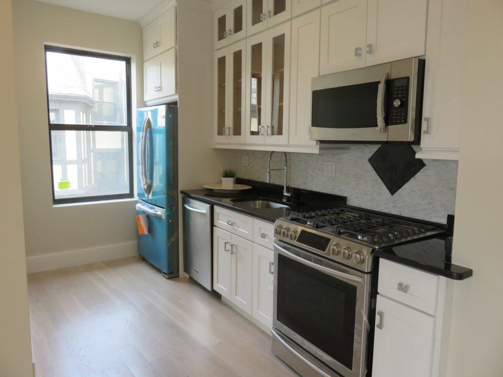
Why do people feel the need to embellish that which requires no embellishment?
However, I’m dwelling on minutiae when the most critical issue is that they created a kitchen without enough cabinets and no counter space.
It’s a galley kitchen, but they chose to make it a one-sided kitchen for some reason. Apparently, they wanted a larger dining area outside the bathroom?
What else?
The fridge. I would not have put the fridge so close to the window and would definitely get a counter-depth fridge. (although, I read maybe here that someone did that and hates it, so if anyone would like to chime in about that, I would be grateful.)
But… I haven’t gotten to the best part yet.
Price
They put this abomination on the market at $299,000 and then dropped the price to 270k–the next day! Then, it dropped before $260,000.
The comps at that time went for between 165k-190k.
But who will pay 40-50% more for an apartment with a ton of wasted space and a bathroom in the dining area?
There is another apartment in the building that’s been on the market for nearly TWO YEARS, priced at 169k.
Oh, dear. Somebody didn’t do their homework, it appears.
What surprises me most about the reno is I can’t believe the condo board approved this renovation. My feeling is if you want a modern apartment, then purchase something in a newer building!
OR, paint it all white and put in modern furnishings. That’s a beautiful look.
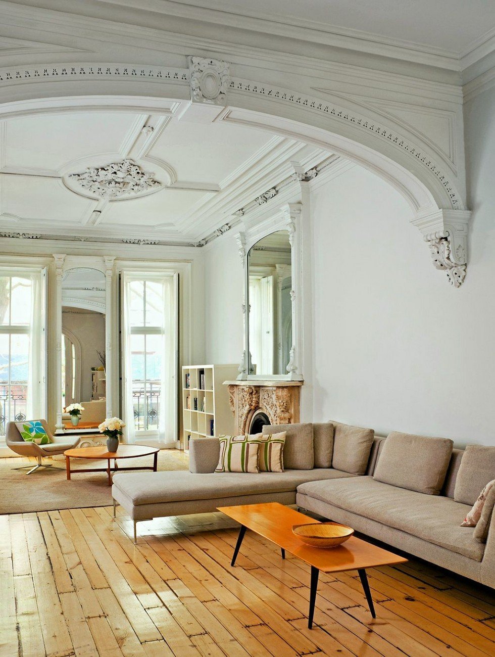 photo: Bruce Buck
 This is a typical bedroom in this building. (and far nicer than most)
I don’t know what happened with this apartment remodel or why they are selling so soon.
But, I think especially if you live in an apartment at this price point, one needs to be super careful of any renovations unless you don’t care if you will lose thousands of dollars or not be able to sell it at all.
Apparently, they’ve been watching too many episodes of Property Brothers. ;]
What is the upshot of all of this? How could they have avoided making so many mistakes?
Well… they should’ve gotten some professional help. I don’t think there’s a realtor anywhere in these parts who would advocate taking down all of those walls.
They needed a designer.
- To coordinate colors and finishes and
- ensure that the layout was optimal and tasteful while meeting the homeowner’s needs.
- Ensure that the apartment has ample storage and counter space for preparing meals.
- Help the homeowners keep to a realistic budget.
- Spend where it will give them the biggest bang for their $$$.
I think overall; these homeowners made several mistakes with this apartment remodel that prospective buyers aren’t going to like:
- They removed all vestige of old-world charm this building is known for
- They spent too much money and frequently on the wrong things
- They created a place with no sense of entrance and no place to hang a coat in the bedroom. They could’ve put up a nice closet by the kitchen.
- They created an inefficient kitchen which is sorely lacking in storage. My old kitchen that’s the same size has at least 50% more storage. (and seven drawers!)
- The only closet is in the bedroom.
- There is no bathtub.
- The colors clash.
- There’s a gross TV embedded in the wall.
- And, a matching black bathroom door which you can’t see here.
- The bathroom is located in the middle of the living-dining area.
- There’s no sense of privacy, and it’s like a hotel suite, not a home.
- And, it’s WAAAY too expensive compared to the other apartments in the area that have sold recently.
Note: The apartment only lasted on the market a couple of months and then was pulled. After that, I believe it may have been rented. It finally did sell in May 2020 for $243,000, and my apartment closed in April 2021 for $249,000.
What is your feeling about this open-concept one-bedroom apartment remodel?
I’ll look forward to hearing your comments.
xo,

PS: Please check out the newly updated HOT SALES!
And also, if you’d like to learn more about the ballet phenom, Skylar Brandt, please go here.
Ahh, today would’ve been my beautiful Mommy’s 99th birthday!
Related Posts
 I Just Inherited All Of My Granny’s Hideously Dated Living Room Furniture
 Transom Windows – Everything You Need To Know!
 How To Create The Perfect Summer Home
 20 Bargain Chandeliers That Look Super Expensive
 But, WHY is it Bad Architecture? I’ll Tell You Why.
 How To Get Gorgeous Free Art That Looks Expensive
 20 Favorite Exterior Paint Colors + Doors and Trim


