

Hi Everyone,
We are finishing up the post that began last Sunday. I will be going into more depth about my tapestry mural for the entry, how I recolored it. And, we will also look at the sample set I received from Romantic English.
If you’ve already read part 1 and would like to skip it, please click the link below to jump ahead. If you’re landing here for the first time or wish to review, please begin from the top of the page.
Part 2 Begins Here
Hi Everyone,
Oh my, we’re having a blizzard here in Boston! Then, it will warm up in the morning and rain all day. It will then freeze again overnight. Well, maybe stay in and shop?
Today, I want to go back to the entry wall covering. I’ve finally decided what I’m going to do.
I know you don’t believe me; however, now that I have the sofa and rug, it’s much easier.
It’s not that I don’t like my original choice. My concern is that the pieces won’t coordinate. Above all else, I don’t want to do anything that will take too much attention away from the Gracie panels.
Laurel, why haven’t you had those put up yet?
I did reach out several weeks ago, but the guy is super busy. It will happen, but it will take more time.
Back to the entry wall covering, and there’s the new little Murano glass lamp!
Finally, there are lampshades for the two vintage Mario Buatta lamps.
Also, I’m unsure if these shades will stay on the lamps. They look fabulous on the yellow lamps in the den, and while they’re okay on the kitchen lamps, I think I can do something better. For that, they will need to be custom. More about that later.
In the meantime, these lampshades are from Royal Designs, and no, they are not the gray ones. The gray shades are a taupe color and looked awful with these lamps. This is the white shade you can see in the widget below. Anyway, for about 80 bucks on Amazon, this is a lovely shade with polyester fabric that can be washed. It is not a bright white. It’s more of a cream, but fine for now. The shades look much better than they do in the image above.

And then, the little Murano lamp I showed you the other day arrived from the Netherlands.
It’s funny; my fireplace mantel, mantel screen, and something else I recently got are all from the Netherlands. But, this person, Henny, not sure if that’s male or female was the best of the best vendors on Etsy. The store is called DecorativeFinds21.
He/she/they thanked me for buying the lamp and then proceeded to follow up every step of the way. Supposedly, the USPS tried to deliver the lamp on February 7th; however, there was no sign of that happening. No problem. I fetched the lamp on Thursday from my friendly neighborhood post office.
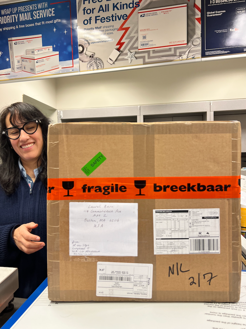
And, look what was inside the box!

I know that Henny was nervous, so I wrote him immediately to assure him that the candy had arrived safely. ;]
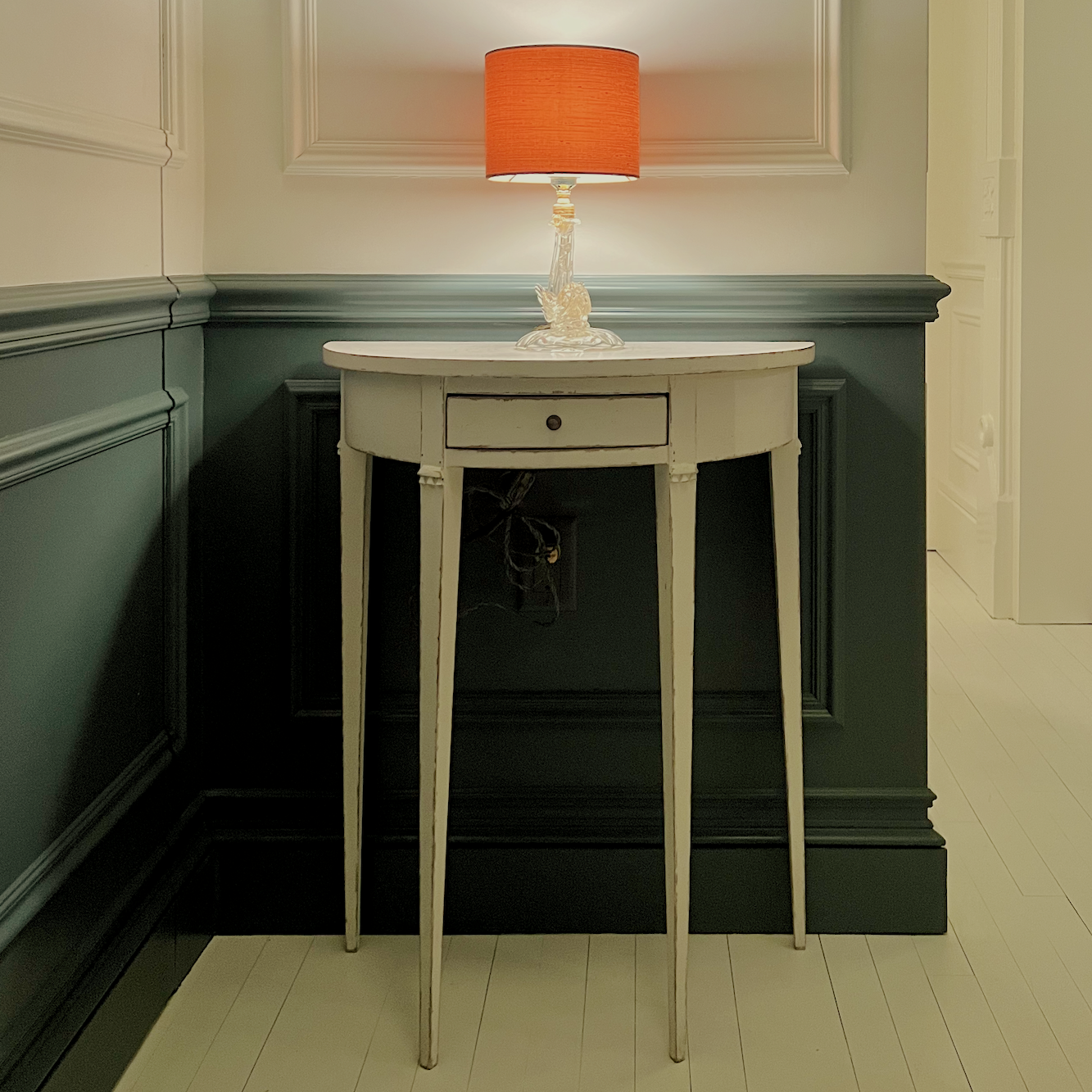
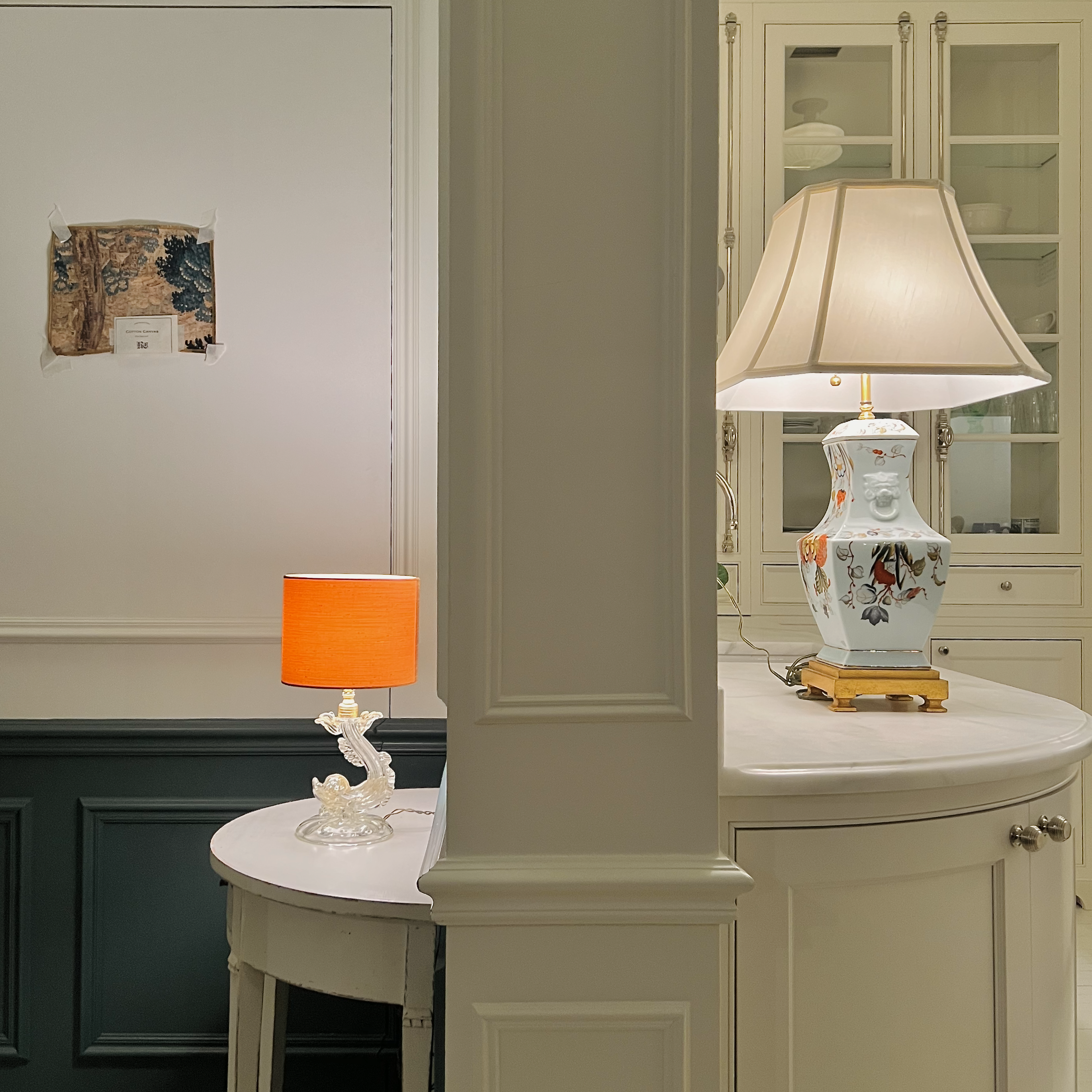
This is the view when one walks through the front door.
Laurel, doesn’t the jib door hit the table when you open it?
That’s a great question, and the answer is NO! It stops 1/8th of an inch away from the tabletop and leg.
Okay, let’s look at the kitchen as it was two years ago.
Let’s crop that shot.
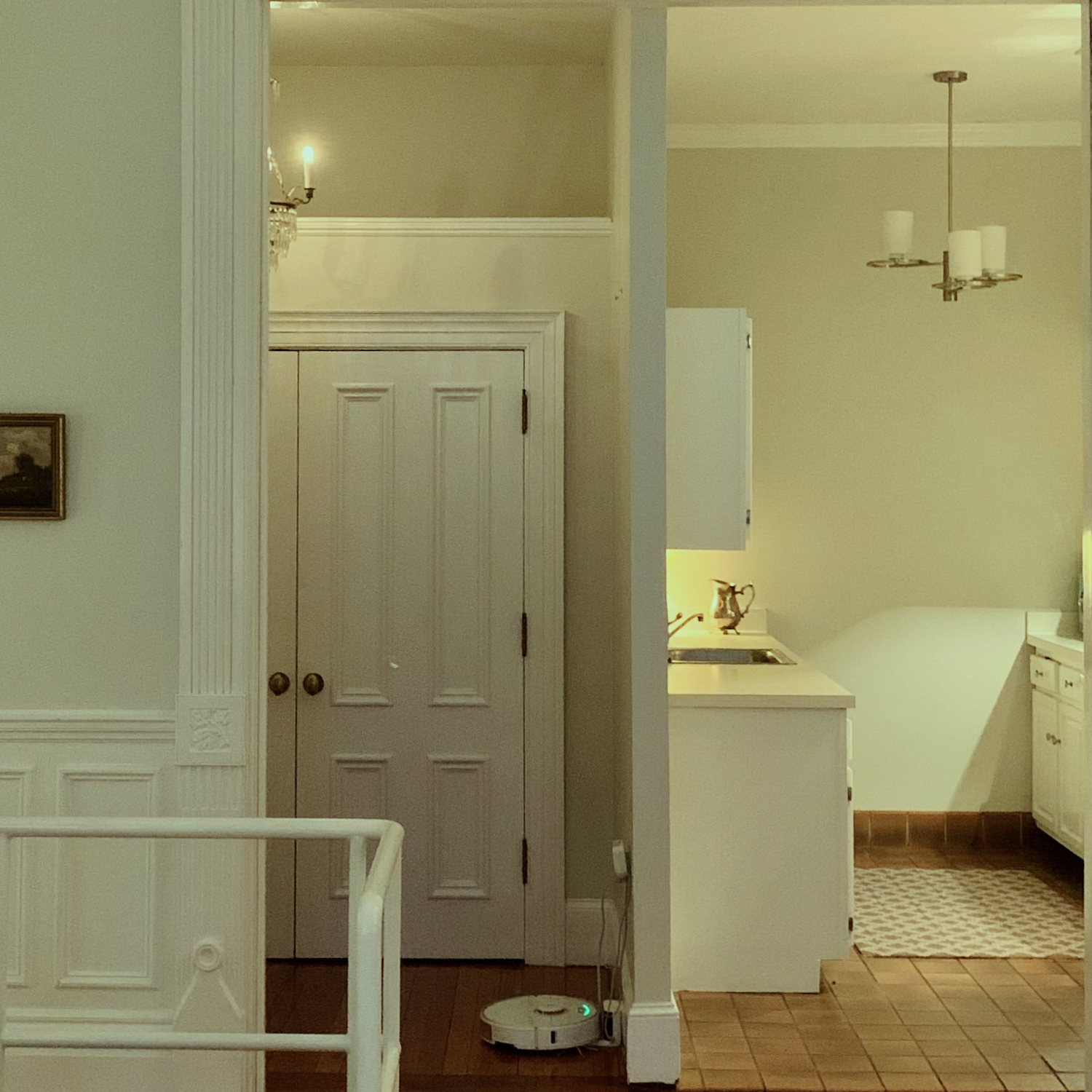
Oh, gawd, how I hated that horrid light fixture in the kitchen. I don’t understand how anyone can think it looks good with the adjacent crystal chandelier in the entry.
Now, let’s look at how it is today.
I always knew I wanted a little lamp in the entry because I think most spaces look better with more than one light source. However, I also needed a lamp that would look okay with the lamps in the kitchen. I worked hard to get the photo to look like it is in real life.
The lighting is so beautiful, and I am so glad I did not do any recessed lighting in the kitchen.
Unfortunately, the image I posted last night on my Instagram (please follow me!) is a little bright, and someone chastised my lighting, saying it was glaring. It is not at all bright. In fact, some might think the kitchen is a touch on the dim side. I can make it super bright if need be, but mostly, the lights are not bright.
I had to turn off the cabinet lights because it is impossible to get them to look as lovely in a photo as in person.
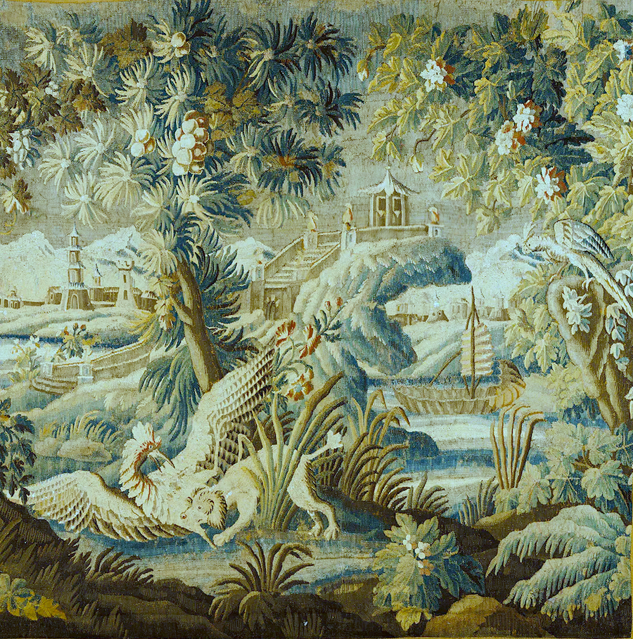
This is from a tapestry wall covering from Romantic English. You might notice that the design is reversed above. Actually, I believe the correct way is how it is below.

I sized it for David at Romantic English.
We’ve exchanged several emails, and basically, one can have whatever they want. He can custom-make a design in any size, and yes, reverse it if one wants.
Below is the original colorway for the tapestry I re-colored.

However, for my space I think it looks a tad too gold, so I put the image in my photo editor and made it bluer and greener.
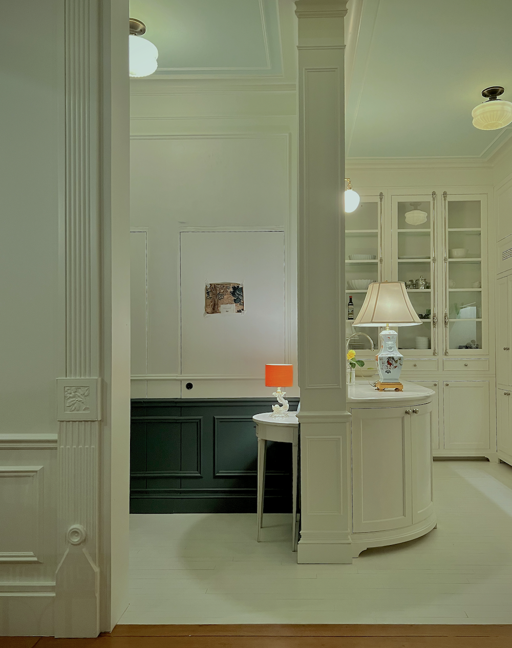
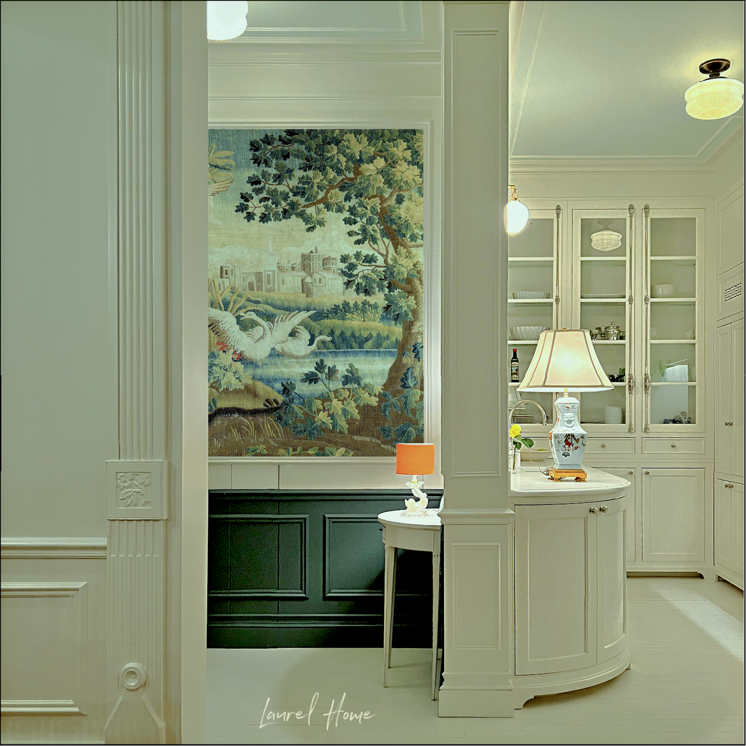
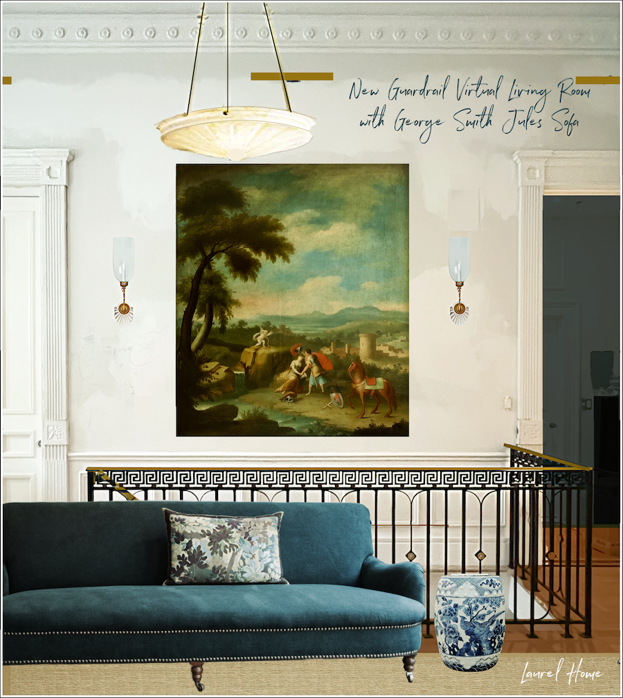
To close, let’s bring that image back down that shows how the tapestry will look in the entry. I’m doing this because there’s another version.
Below is the other version. Please notice how I picmonkeyed the shot to give the impression that the light slightly reflects on the tapestry wall covering. By the way, it is a print of a tapestry, not an actual tapestry weave I’ll be doing. I will explain more about that in the next post.
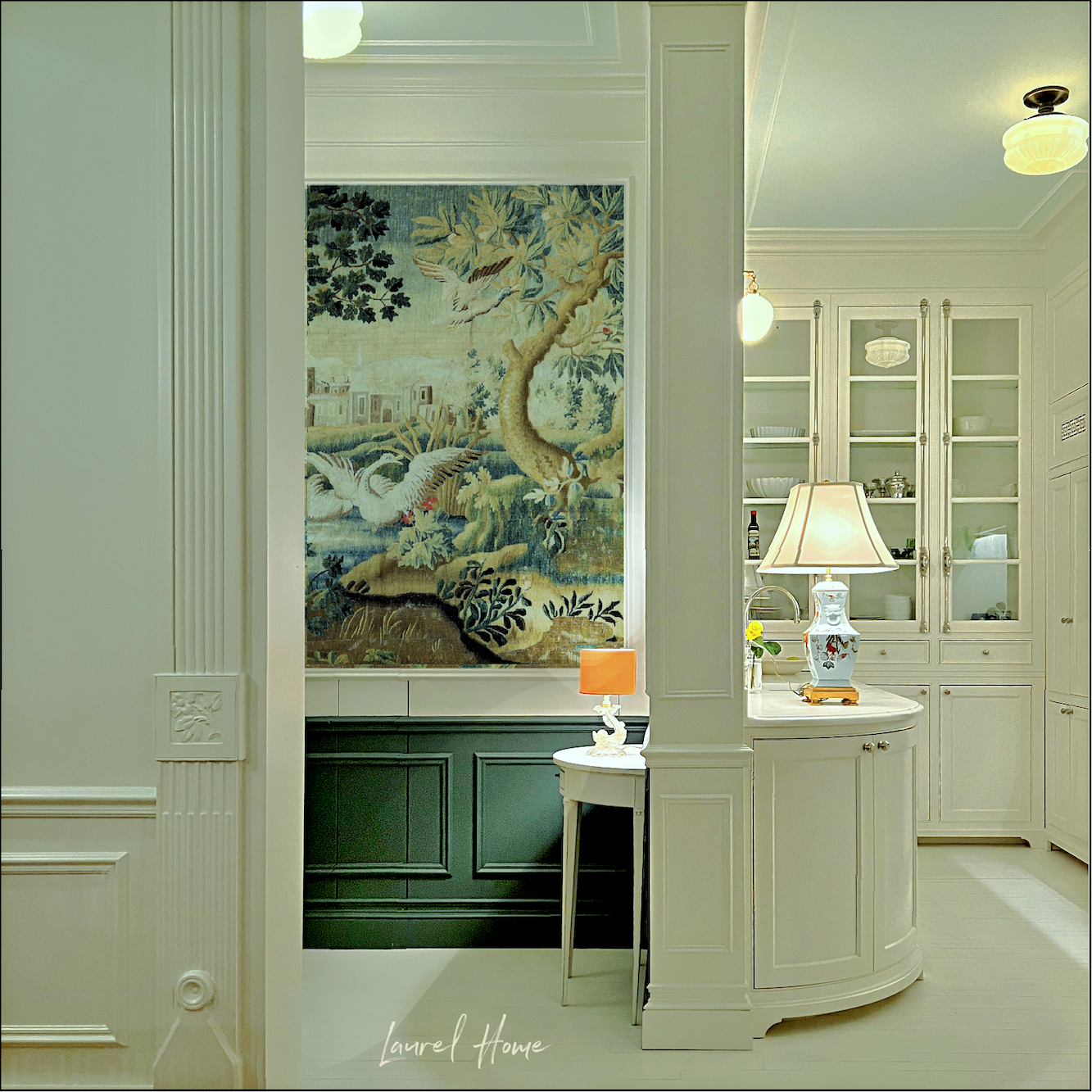
Both versions are beautiful, and you will still see the other side. (See below.) However, I think the lighter side will be better on the right.

On Monday or Tuesday, I’ll continue this post to show you what I’m planning for the other two walls and, finally, the beauty I found for over the stairwell. I can’t wait to show you.
Also, I plan to make a short video to show you the samples I received from Romantic English a few weeks ago and a review of each.
In the meantime, one last shot shows how the tapestry wall covering will look during the day with the lights off in the entry.
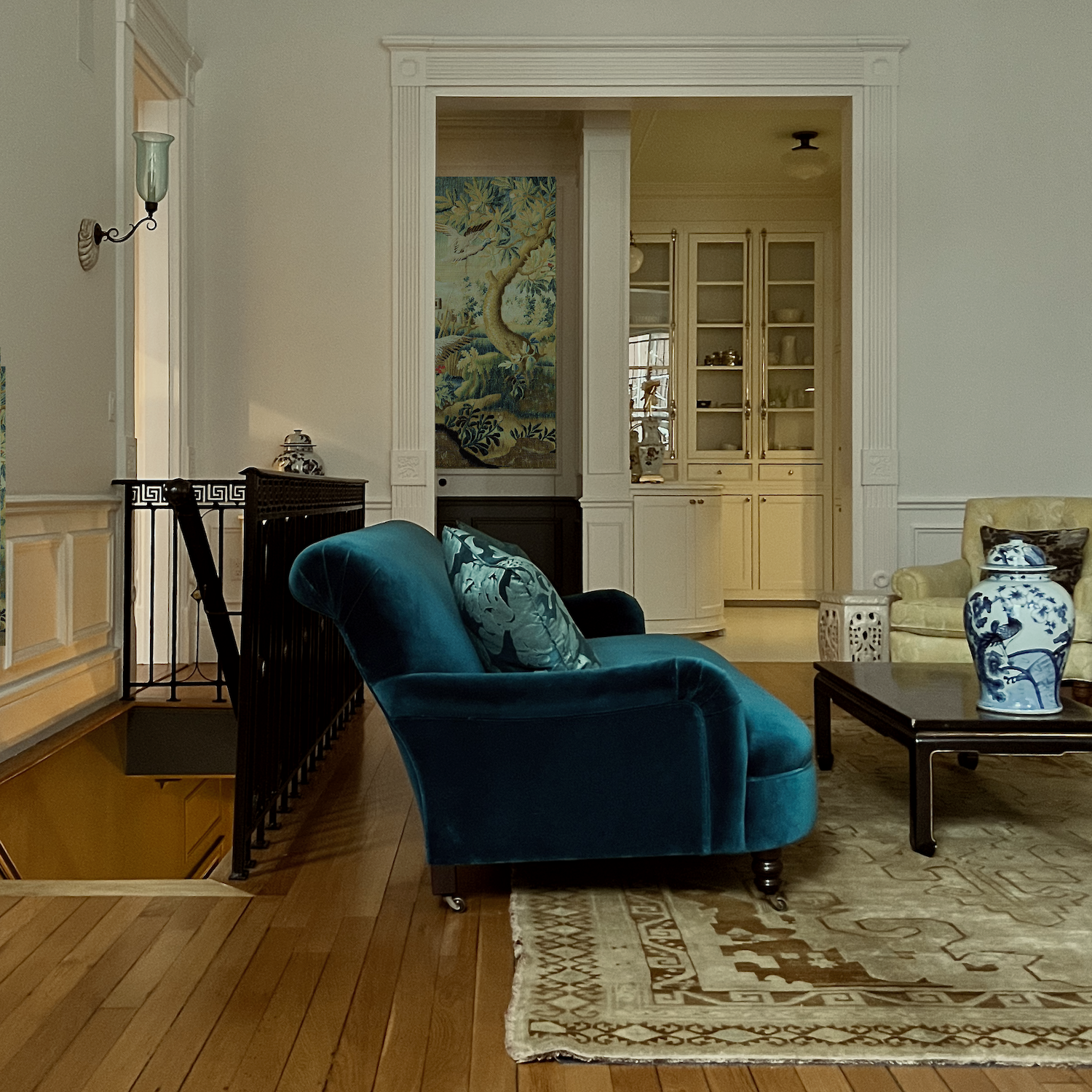
I adore the little snippet of the wall covering one can see from the dining area or when coming out of the den towards the kitchen.
xo,

*********************************************************
Part 2 Begins Here
Wednesday, February 19, 2025
Hi Everyone,
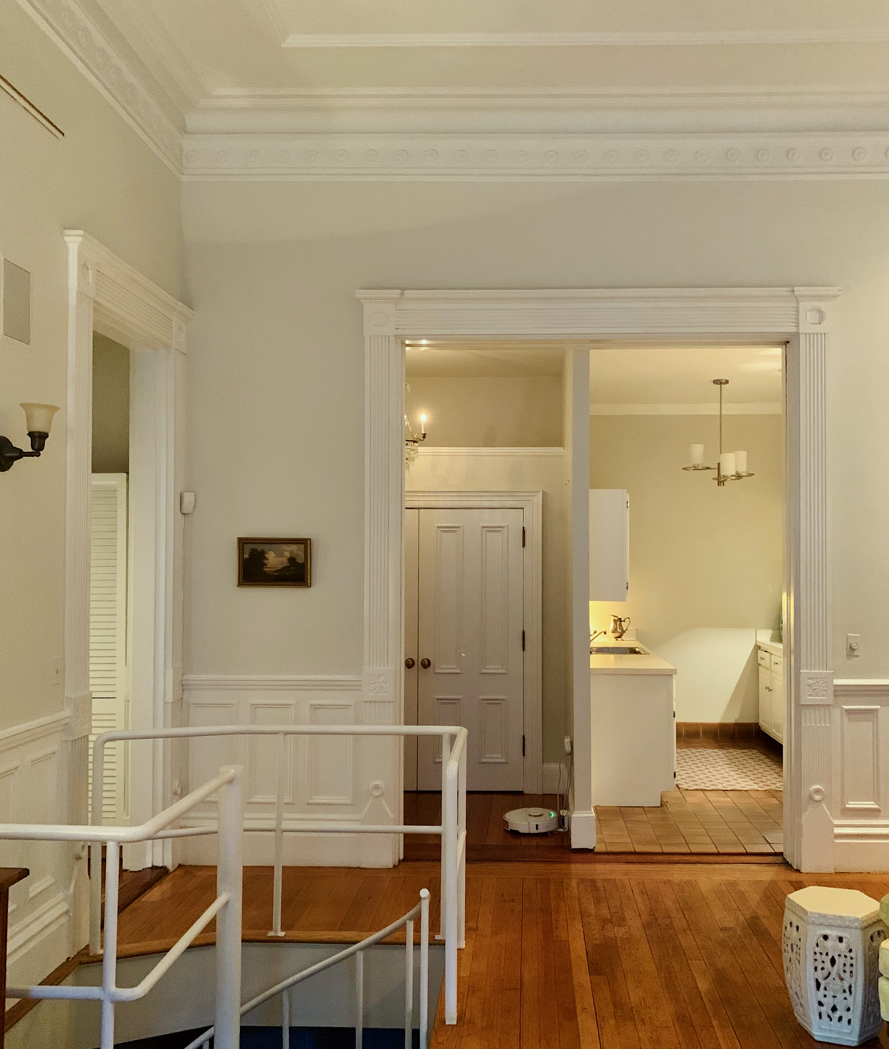
As I said the other day, I’m working with Romantic English to create some elegant artwork for my upstairs entry and the big wall over the stairwell between two Anglo-Indian wall sconces.
This has been challenging because the fireplace wall will have two beautiful double-width Gracie panels.
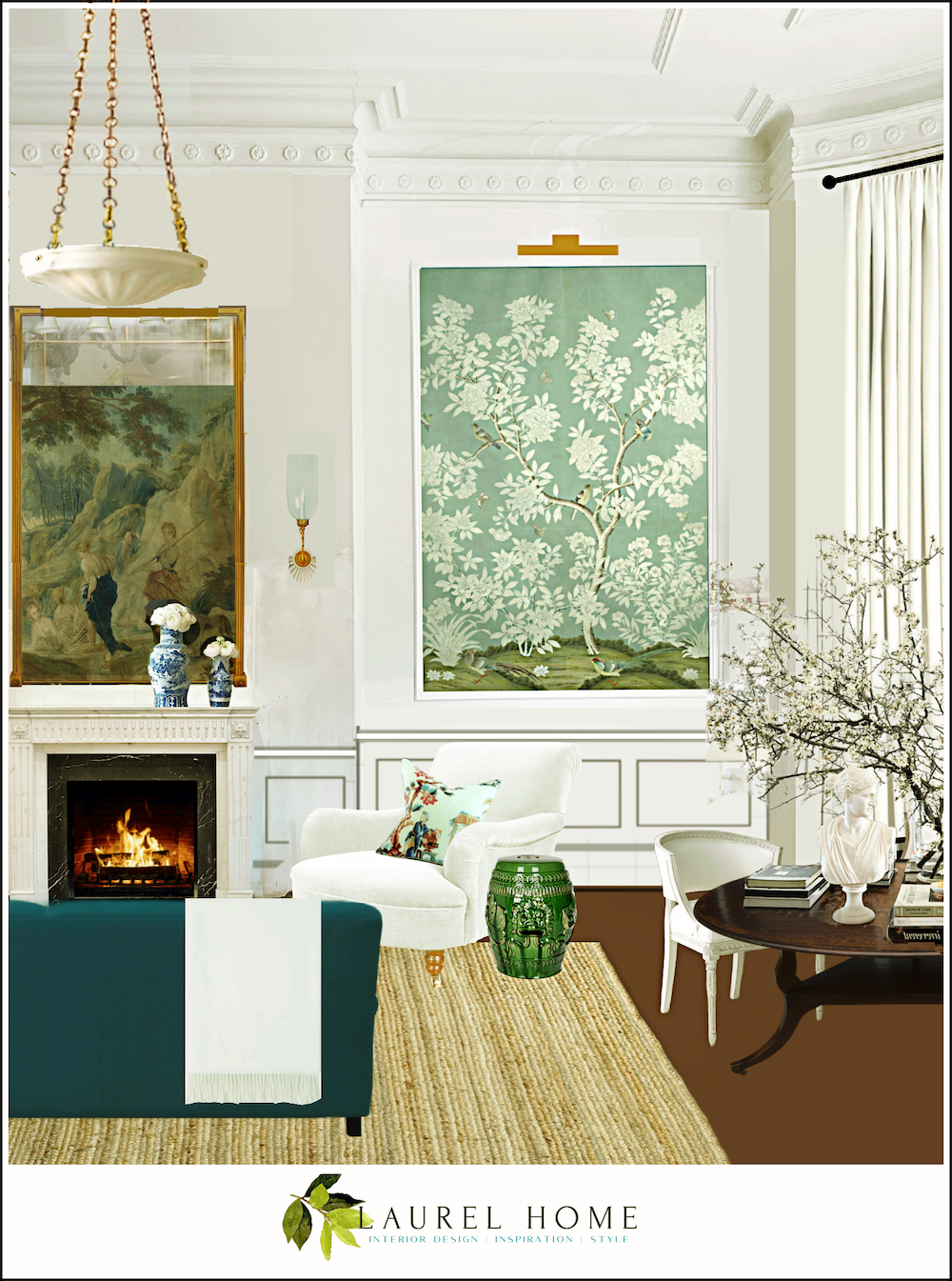
Above, you can see one of the Gracie panels. However, what’s reflected in the mirror is not the piece I’m doing.
Ever since I decided to put the screen downstairs, I’ve wanted to reproduce the Otis House painting I love.
When I realized I’d have to wait a long time to get a super high-res image of the Otis House art, I began looking at all the gorgeous tapestries on the Romantic English website.
There are hundreds of gorgeous pieces to choose from. However, as I understand it, if you see something at an auction house, a museum, or a place like 1stdibs, David can recreate it for you at a fraction of the price.
Antique tapestries can sell for hefty five figures to six figures for a rare piece in perfect condition.
But, there’s more. David can also custom-color and redesign your piece to your exact specifications. He’ll also provide a rendering and a strike-off (sample) of what you’ll get.
So, to get started, David told me that he needed either the Pantone colors or hex codes for the colors to achieve the best color match.
Laurel, what’s a “hex code?”
Oh, sorry. Hex stands for hexadecimal. It’s a series of six numbers and letters preceded by a hashtag. The code conveys the color’s amount of red, green, and blue, as well as the chroma (amount of gray), tint (white), or shade (black).
We will see how I grab the hex code when working on Picmonkey in a sec.
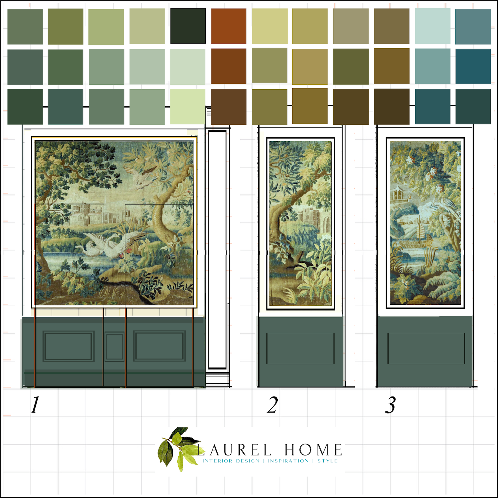
Okay, the hex codes are not a problem, but what is a problem is that there are thousands of them in my tapestry! Still, David doesn’t need all of them to color the piece. He would probably be fine with about 12 of the main colors as a point of reference. But since this is me, I did 36 colors.
However, before I share that information with you, I want to show you the sample set of materials Romantic English uses for their tapestries.
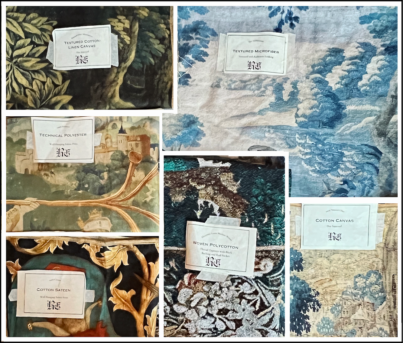
Below is a closeup of my favorite of the bunch.
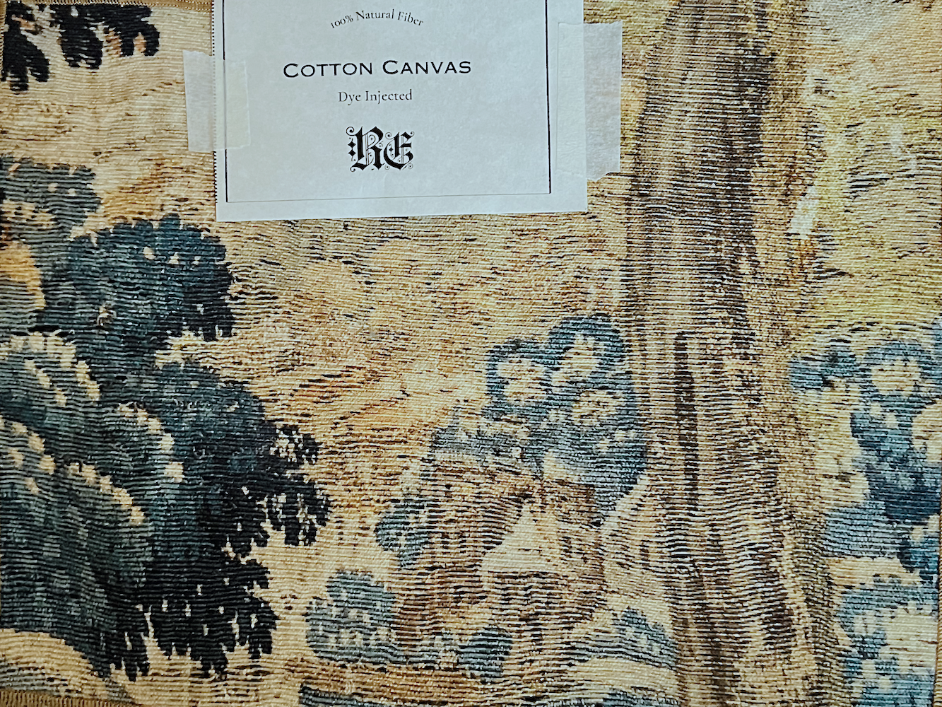
It’s hard to believe this is plain old canvas, but it is. The texture looks so real, but it’s a print. Remember this post where the company blew up a much smaller file size, and some of the lines looked cartoonish up close? Well, there’s none of that here. This was the little sample you saw in the entry on one of the jib doors.
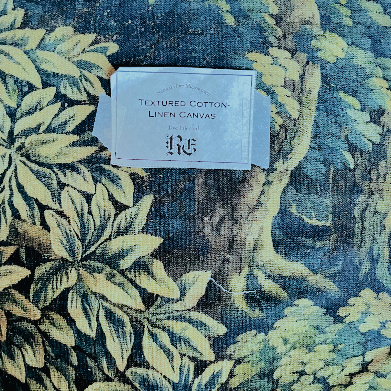
Below is the textured cotton canvas, similar to the one above.
This is the fabric used for my mural, and after it’s paper-backed, it will make an excellent wall covering.
I took the liberty of recoloring it to the best of my ability—it’s like putting a wash over the entire piece. I also lightened it. However, my piece is nothing like this one. It is much lighter, to begin with.
You can see my tapestry below.
Above is after I edited the colors.
You can see it on the website in the original colorway.
If you’re considering getting one of the tapestries but want to see the sample set first, you can order it here.
Below is a little video I made to explain each fabric. I loved all of them except for the woven poly cotton and the textured microfiber.
Okay, now get ready. Below are the three panels used as wall covering in the entry with the 36-color color key.
How on earth do you do that, Laurel?
It’s super easy.
On picmonkey, I take a square from the graphic maker and bring it over to my virtual board, where my image is. Then, there’s a dropper icon. (see below) After clicking it, I drag it over to the spot where I want to grab the hex code on my image. When I hover over the square, it automatically tells me the hex code. (The dropper is over the square with circles around it, but you can’t see the dropper in the screenshot.)
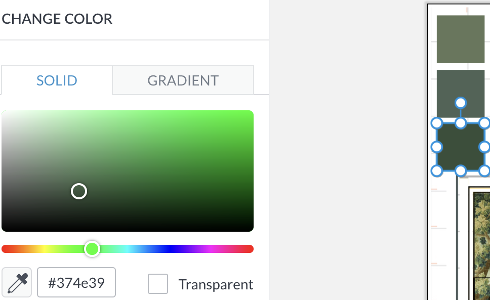
From there, I duplicated the squares and repeated the same process with the dropper. I realize it would be easier for you to understand if I could demonstrate how to do this. It’s incredibly easy and fun, too!
Okay, as I said earlier, there’s one more piece of art in the entry.
It’s for the wall opposite the jib doors.
It began as the piece below. I am using the right side of the piece and need about 30″ for the panel’s width.

And then, I recolored it to coordinate with the other two sections.
Why didn’t you use another section from the first tapestry?
That’s an excellent question! I adore this piece, but it’s not large enough to do all three panels.
So, to make it clear, Romantic English can create the tapestry in panels, and I imagine do a print on whatever substrate you prefer. I’m not sure if they can apply the paper backing, but as was discussed in this post from early January.
However, in the meantime, I found another source for fabric backing specifically for the purpose of using the fabric as a wallcovering.
But, Laurel, you didn’t explain how to recolor the image.
Oh, gosh, you’re right. Okay, you put the image in your photo editor and have fun. I just use the one in my photos. However, you can also edit images in Picmonkey. The image can be made warmer (more yellow), cooler, (more blue), or one can add more red, green, or sepia. You can change the contrast, brightness, sharpness, and more.
There isn’t any one way. One has to experiment to get the effect they want. Often, I’ll do several versions of the original image until I settle on the one I like the most.
For the image below, I darkened the tapestry wall covering because it’s in shadow.
Okay, I have one more piece of art to share with you. But it will have to wait until Sunday.
Tomorrow is the party I think I mentioned that I’m giving for 35 women. Oh my, I have to go cut up vegetables! It seemed so far off last April, but alas, at this time tomorrow night, it’ll be winding down.
xo,
***Please check out the newly updated HOT SALES –
There is now an Amazon link on my home page and below.
Please note that I have decided not to create a membership site. However, this website is very expensive to run. To provide this content, I rely on you, the kind readers of my blog, to use my affiliate links whenever possible for items you need and want. There is no extra charge to you. The vendor you’re purchasing from pays me a small commission.

To facilitate this, some readers have asked me to put
A link to Amazon.com is on my home page.
Please click the link before items go into your shopping cart. Some people save their purchases in their “save for later folder.” Then, if you remember, please come back and click my Amazon link, and then you’re free to place your orders. While most vendor links have a cookie that lasts a while, Amazon’s cookies only last up to 24 hours.
Thank you so much!
I very much appreciate your help and support!
Related Posts
 How To Hang Art – Little Known Ways + Mistakes to Avoid
 Dated Kitchen And No Money – Can It Be Saved?
 Adding Trad Style to a Contemporary California Home
 These Interior Design Trends in 2022 Will be Huge!
 36 Cheap Sofas & Chairs That Look High-End! (Parts 1 & 2)
 Insanely High-End Lighting You Can Have for Cheap!
 Renovation Woes and Then the Contractors Went on Vacation Parts 1 and 2!


42 Responses
Wow! Truly stunning! Any chance you could share what the main hex codes are? I loved learning from your paint guides, and you have the best sense of color and how colors related, absolutely stunning!
Dreamy, dreamy dreamy!!!
Just a suggestion,check out ‘The Lamp Lady” in Vt
Custom lamps with materials I thinkyou would approve of. I ordered a sm wall lamp and just love it
Painted my north facieng kitchen in cotton balls and islandn base in night train,lv it, TY Nancy
Hi Laurel,
Stunning! Enjoy your party. What is on the menu for those lucky ladies? 😊❤️
Xo,
Julia
Spectacular, Laurel… love the elegantly serene atmosphere. Beauty wherever the eye rests….
The dolphin lamp with the orange shade … what a treat.
Enjoy your gorgeous home – and thank you for taking us on this exciting journey.
It is beyond breathtaking ! I can’t even fathom ( despite reading your exquisitely detailed step by step) how you did it all – and how you made every detail of your home a true work of art . What a magnificent accomplishment this divine domicile is ( I know it’s still in the process of becoming – but I stand in awe ) . It’s a gasp !
Question: the beautiful color on the entry wainscotting – is that also the same color that is downstairs off of the stairway ? Can you refresh one devotees memory ( as I am sure you have posted this info before ) as to what that color is ?
We all want to come to your home for a soirée ( and never leave !) Words fail me !
GASP!!! It is just stunning. The blue/green colorway in the tapestry is PERFECT. I am so happy for you!
You have pulled off a miracle transformation! What a feat! Enjoy the vision you brought to life! Bravo!
Absolutely…positively…gorgeous. You worked on every detail and it shows. It’s stunning. Maybe you should do this for a living?
Oh my gosh–STUNNING! I love the mural with the lamps–gorgeous!!
I like how the colors of the stairwell wall sconces, the sofa and the entrance hall tapestry all tie together in that picture. Aso the color of the rug and the colors in the tapestry wall covering. Progressing nicely!
Bellisima!!
The whole place makes my eyes hungry, but I really cannot believe you found a Murano Dolphin lamp. Dolphins are precious to me.
I am dying to see the lights in the kitchen cabinet. Maybe you will be able to adjust that when things are in place.
Do the kitchen lamps have orange or rose color in them?
Hi Laurel, I agree with everyone else – love it! Looks beautiful.
Everything is absolutely gorgeous!
LOVE IT!!!!!
What a spectacular home – I hope this journey is eventually going to be a book! For custom lampshades, have you considered Lampshadelady? She’s on Etsy, Instagram, etc. While most of the shades she shows are smaller than the size you want in the kitchen, she can often make larger ones and she uses gorgeous vintage fabrics. She made one for me that I’ll treasure forever.
Laurel, I am a usually-silent follower. But I have to say, I LOVE the kitchen and the view showing your sofa, kitchen, and the tapestry print and deep teal in your foyer. The lamps. Everything is stunning!
I know this is obvious but I am delighted by the teal and cream coordinated throughout the space:
The wall covering is the piece that says “hello.” The line of dark teal from the sofa to the wainscot, the pale blue of the kitchen ceiling and the sconces–divine.
Love the orange lamp!!! Now I need an orange lamp! I really love your living room rug. Where did you get that? It looks so nice in your LR.
What a wonderful pop of color (orange) it takes all to another level.. Great call on no overhead lighting in Kitchen..
Laurel,
This is gorgeous!!!
It feels so warm and inviting; what an incredible transformation.
You are one talented lady. Enjoy.
Dottie
It is just beautiful. I love seeing it all coming together. I keep going back and forth between the before and after. You are so talented. I just realized you will have to work with the jib door when installing the wall covering. Sounds complicated. I look forward to learning about it. Thank you for sharing your knowledge and for taking us all along on this journey.
Laurel, This blog series is a MasterClass in layering a home through time and patience to adjust and tweak the colors and patterns etc to perfection. I’ve been working on redecorating/remodeling for 25 years in this house. If I’d had the budget to do everything I wanted to do when I first moved in….well, it’s a good thing I didn’t. Because there’s so much to learn from others – like you – that continues to expand my thinking and taste.
You are a great inspiration!
Perfection…transparent fish joining the water play in the tapestry is sweet genius! So far so damn good…I’ve been your fan since day one and have plenty of time seeing how you are having your way with your home and give sooo much inspiration
Lovely, simply stunning! I’m not much of a kitchen lamp kinda person but, just my two cents, I’d go with a sage green shade which would compliment the wonderful wall paper in the hall.
Laurel, your work is absolutely GORGEOUS, GORGEOUS, GORGEOUS! Your home is looking STUNNING! I love it. Yay, YOU!
Tapestry exudes warmth and color! Love the view from the living room. You have the prettiest “un-kitchen” ever. Would love to know the thought process behind the choice of tapestry vs. mural?
Hi Laurel,
I’m not sure how you’re able to contain yourself. The wall covering is so gorgeous you must be chomping at the bit to get it hung. And the tiny bits of orange are the chef’s kiss. Just so so good!
Stay warm.
Hi Mary,
The wall adornments will make a big difference, and I am looking forward to them being up, but I am so enjoying what is here and the fact I’m no longer living in a dustbowl! You know when they say it’s always darkest before the dawn. I actually said to one of the painters about 5 days before they left, “Is this ever going to end?”
That little lamp is fantastic! I know it makes you happy every time you see it. Gorgeous spaces!
Beautiful as always, Laurel! I checked out Romantic English’s website and appreciate you sharing this new to me source. I didn’t see anything about wallcoverings per se, so I am assuming you are having the fabric hung as wallcovering? I know you promised more information in your next post. I’m looking forward to hopefully hearing some of the technical details of how you will convert a printed fabric to a wallcovering. Are you having it paper backed? Is Romantic English printing it in panels? Or are they railroading the image? Or are you essentially upholstering the Entry wall panels? Are you seeking input from the hanger/installer, or have you done this so many times that you already know exactly how it should be prepared for hanging without having to check first with the installer? Thanks for bringing us along for the process as well as the finished results!
Hi Shawn,
Yes, I will be using a linen/cotton blend substrate and it will be backed so it can be hung as wallcovering. I discussed it briefly in this post from early January.
However, in the meantime, I found another source for backing specifically for this purpose.
Yes, Romantic English can print the design in panels.
I love the tiny bit of orange on the kitchen lamp, the new entrance lamp, and on the tapestry. Just a hint, but lovely! The whole space is remarkable and what an improvement! 💖
Hi Laurel,
The lamp is a beautiful accent in your wonderful home and interior. The wall covering will give it a very stately look.
I admire your taste!
P.S. My name in the Netherlands is used for male and female….but I am male.
Greetings!
Hi Henny,
Thanks so much for your incredible service, kind words, and delicious candy. If only all vendors were as conscientious!
Hi Laurel,
Before you have custom lamp shades made for the kitchen lamps, you might consider checking with Brody’s Lamps in St. Louis (314-647-3318). When I lived in St. Louis, I had them replace multiple lamp shades for me, and they always seemed to have the perfect shade. Of course, I was able to bring my lamps to them so they could fit the lamps to the correct size shade in person. But with your background, you might be able to select the right shade remotely.
Hi Linda,
What a fabulous resource. Yes, in this case, it would be better to be local. I would love to do a very pale blue gray silk-like material for the shades. Something I forgot to say is that this lamp takes a typical shade with a spider fitter, but it does not use a harp. There’s a stem at the top that holds two light bulbs. There’s only one 25 watt bulb in there right now. The issue with the stem is that there is no wiggle room in terms of shade fit.
With a lamp that uses a harp, the harp can be sized up or down.
What’s funny is the other day, I googled custom lampshades and came up with a fabulous source that’s local to me. Well, it’s in Concord, MA, so a short drive away. The store is called Concord Lamp and Shade. So, I think that would be a fun field trip when the weather improves.
Ohhh. The lamps, the tapestry. That kitchen. Definitely that mural is ‘the one.’ what a find! ❤️
It’s simply stunning, Laurel. Absolute perfection. I love the Before & After.
The tapestry is gorgeous. And the red-orange lamp shade makes a great complement.
Your Kitchen is beautiful, so inviting.
Congratulations on your accomplishments and having the patience and wherewithal throughout the process.
You are one talented person.
I agree with Sande…it’s gorgeous…your vision is amazing.
On another note, it takes some kind of nerve to chastise a person on their own Instagram. Was the world always this way?
Sorry, it’s 2:00 AM and one of the tapestry images got deleted somehow and so there was a line that didn’t make any sense. I fixed it now if you were reading and confused.
I don’t see how you will ever leave……….it is too wonderful!
Beautiful!!