Do you ever look at a beautiful designer-room, say in a magazine or blog and examine it?
I mean, really examine it.
And say to yourself why it does or doesn’t work?
Well, I do that sometimes.
The other day, I found myself analyzing the beautiful work of some of my favorite designers. And I thought it would be fun to share some of my findings.
The first one is Suzanne Kasler who’s been featured on the blog many times.
There are many, many wonderful interior design lessons to be learned by looking at her living rooms!
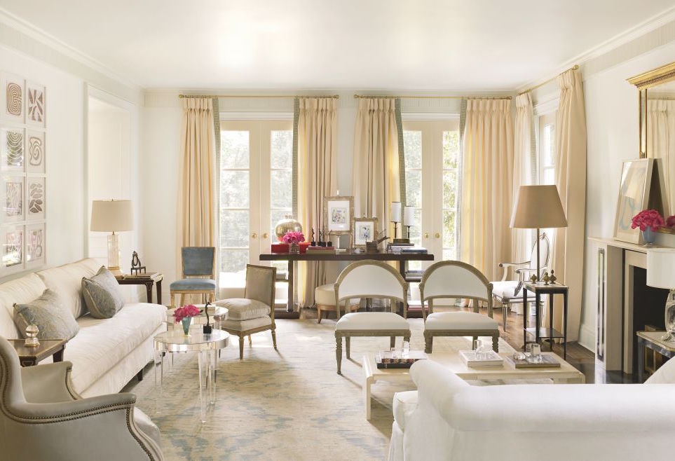
This is Suzanne Kasler’s gorgeous living room in her fabulous neo-classical home in Atlanta. Suzanne renovated this 1930’s Georgian-style home a few years ago. She enlisted the help of architect William Baker who I had the pleasure to spend three days with at the Adorno Mag tour at the Spring 2016 High Point Market.
Just one thing bugging me.
Did you notice?
The windows are off-center.
This is especially curious, because the hallmark of Classical and Neo-Classical, Georgian, Federal and the like is symmetry.

This is the front facade of Suzanne’s home.
It is perfect.
And perfectly symmetrical.
Based on the position of the windows, the living room is the set of French doors on the left. Everything
looks perfectly centered.

A 3/4 view shows another clue as we can see that the masonry on the fireplace wall on the opposite side of the home is quite thick.
The question, is… Could the windows have been moved in such a way that they would be centered in the room and on the facade. I don’t know because I have not seen the original home. But knowing that both Suzanne and William have a keen attention to detail, my guess was it was either sacrifice the width of the living room which would’ve been a big mistake or have the windows off-center.
Could anything else have been done? Again, doubtful.
Sometimes we can fudge a few inches by taking one pole to the very edge of the window and the opposite pole extended, but that might look funny as the drape would not hang symmetrically on the windows, themselves.
Well… that’s just the way it is sometimes. Let’s move on…
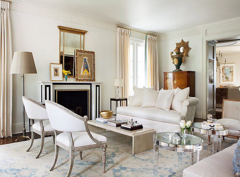
This is the same room looking in the opposite direction. I love the mix of furnishings and styles. But, what is that occasional chair (on the far right) doing on the other side of the room just sitting there lined up with the pretty love seat.
I know that Suzanne would not set up her room like this!

Going back to image number one, we see that indeed, the occasional chair is NOT there, it’s on the other side of the room! And in its place is a bergere, facing into the room which is better.
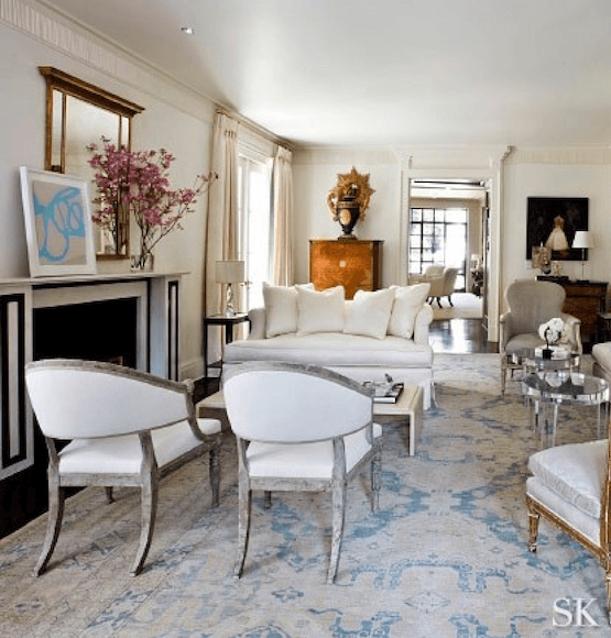
Here, from a photo in Suzanne’s portfolio, we can see that she has her living room set up with the bergere. It’s difficult to tell. There may be some distortion, but it appears that the chair is behind the sofa. That’s good. Lining it up with love seat is not good. But I’m sure that was done by the stylist and/or photographer.
As an aside, this is not a love seat, but I found this pretty white slip-covered sofa designed by Robin Bruce on One King’s Lane. I did some research and found out that Robin Bruce is produced by Rowe Furniture. I don’t have the latter in my rolodex because I am not fond of a lot of their designs. But Robin’s pieces are quite lovely.
One of the interior design lessons here, is that images in magazines are manipulated to look good for the photo, not necessarily what they are in real life!
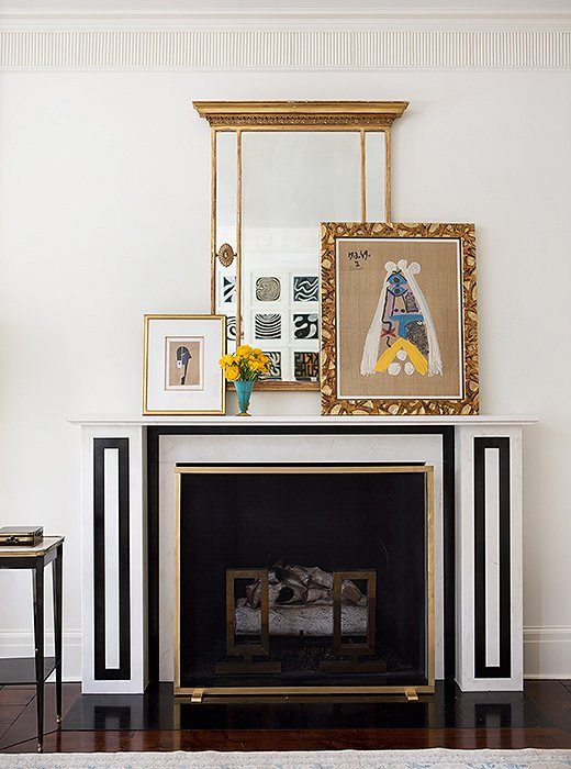
A case in point is that we can see that the cocktail table was moved out-of-the-way for this shot and a few other things as well. They styling is different from Suzanne’s portfolio. I’ve always loved the look of leaning art. It used to drive my husband nuts, though. However, it’s easier to make changes and is a very stylish look, I think.
The fireplace was modeled on an 1824 drawing in the archives of Sir John Soane’s Museum in London.
One of Suzanne’s hallmarks as a designer, is her frequent use of creamy, warm, pale tone-on-tone palettes– very elegant!
There will be people who will ask me what color this is.
I don’t know that, but what I do know is that it’s usually not the color that people are so attracted to, but how it all fits together so perfectly.
I do notice that she chose ONE color and wrapped it around the entire room, including the ceiling.
Anyone else notice that there appears to be a slight sheen on the ceiling? If you decide to do this, the ceiling surface will need to be flawless or every little ding and imperfection will become very visible.
There are lots of lamps, and some near each corner like we discussed on Sunday’s post about table lamps and lighting.
There is one recessed down light in Suzanne’s portfolio image, but it is not there in the editorial images.
And why is that?
They obviously photo-shopped it out. They do that, ya know.
The other thing that she does which I love are the touches of black.
- In the fireplace
- Side tables
- paintings and accessories
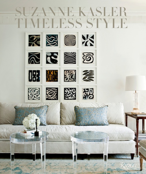
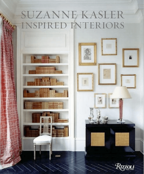
Suzanne’s Books are a must for every library
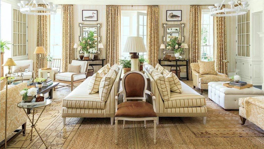
The next room is from the Southern Living Idea House and a jaw-dropping room by Mark D. Sikes.
 .
.
Each designer in the showhouse chose a room from another generation, for inspiration. Mark chose a timeless room done some 50 years ago in a similar monochromatic palette.
This is a large room and very symmetrical, in every which way. Mark intentionally played that up and put in two separate seating areas. They aren’t identical, and that is the best way to handle it. They are visually balanced, however.
Everywhere you look, there are wonderful details, and it’s those details that are what make the room special.
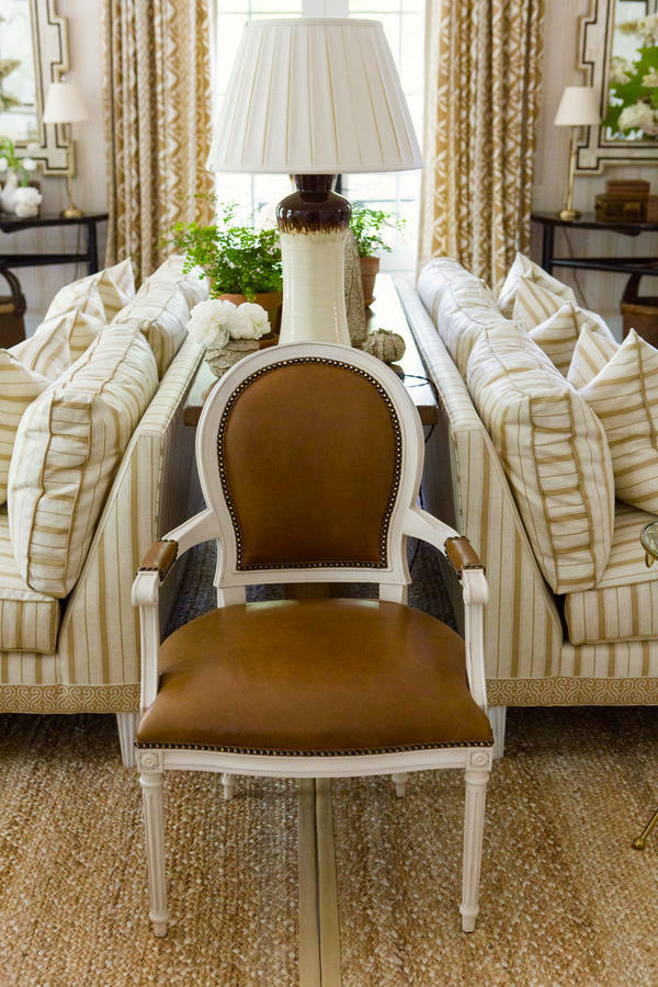
I adore Mark’s mix of furnishings, from the layered rugs to the many versions of stripe. I believe that the bottom layer of rug is jute.
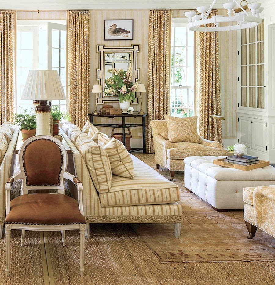
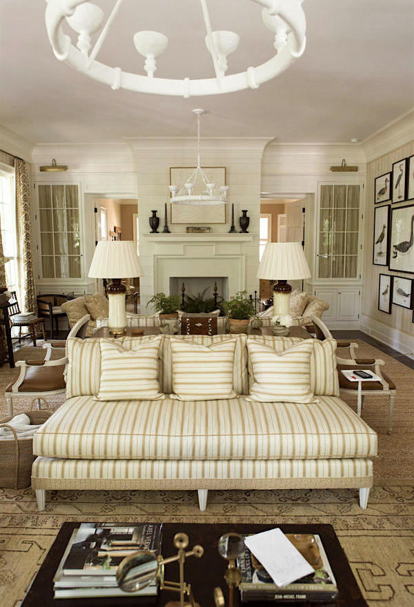
I love the armless sofas, or couches, rather. While the terms couch and sofa are used interchangeably, I learned in design school that an armless sofa is a couch. But a couch implies a more casual sofa, perhaps.
I don’t really care much one way or the other which term is used. Our cleaning lady back in the 60’s called it the davenport. :]

A wonderful detail on the couches is the trim on the bottom. No worries, I’ve found it for you. This time, it was an educated guess because one of the best collections of trims is at Samuel and Sons in New York City. (they also sell online, but they are to the trade only).
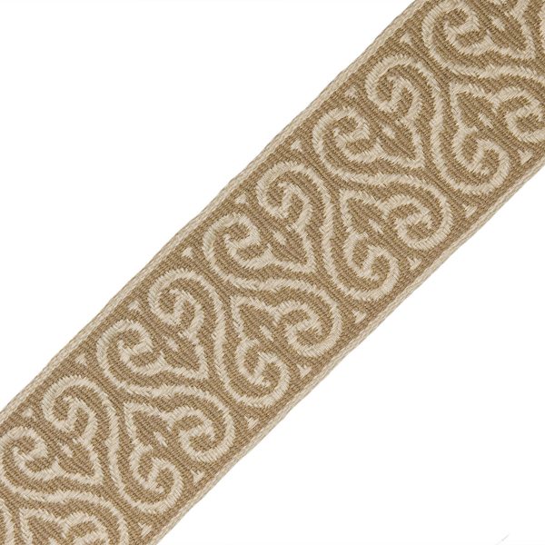
I was so happy when I found it there, The 3″ Espadrille Woven Border. It comes in a bunch of different colorways.
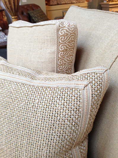
Here, they used the trim on a box throw pillow.
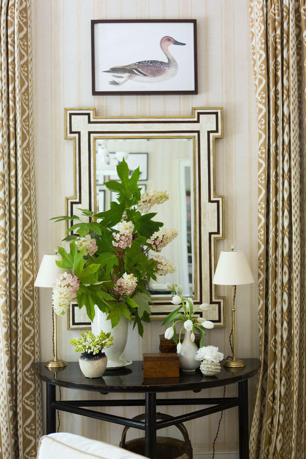
One of my favorite parts of the room is this fabulous vignette with two little lamps. While not directly in front of those wonderful mirrors, they are close enough to reflect the light back into the room.
This is one of my favorite lighting tricks.
Now about those mirrors!
I just had to find the source.
And I googled and googled and googled until I found them!
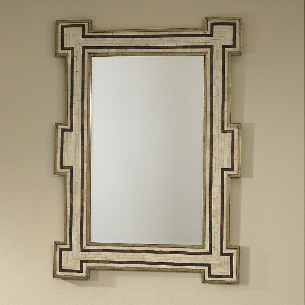
They are the Constanta Mirror from Mr. Brown Home which is in conjunction with Julian Chichester. And yes, they are in Laurel’s Rolodex! They are trade sources, but after I found the source, I found the mirror at a few places, retail.
I found it at White Birch Studio which is not in Laurel’s Rolodex. I would not purchase it from them however, because they are selling it an inflated retail price.
AKA: ripping you off.
I would get it retail the Mr. Brown Home Constanta Mirror at Candelabra (no affiliation but I wish that there was!). You will notice that they don’t have any of that crossed out “retail” price nonsense. That is almost always a sign that they’ve inflated the retail price. Tacky, n’est-ce pas?
Mark’s room is rich in detail. But, I think he stops short of making it look cluttered and contrived.
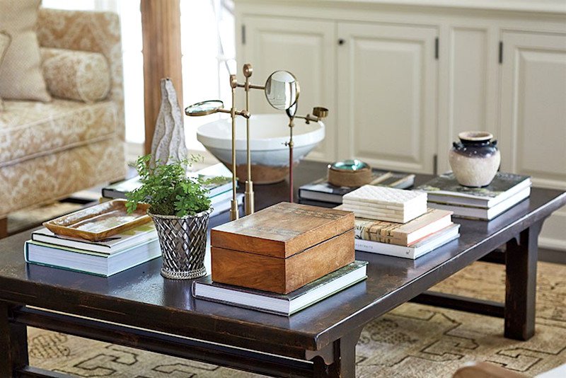
The coffee (or cocktail) table is simply accessorized with books primarily. Love the antique magnifying glasses. That’s not a bad thing to have around in case someone forgets their reading glasses! And they have a light and refreshing sculptural quality.
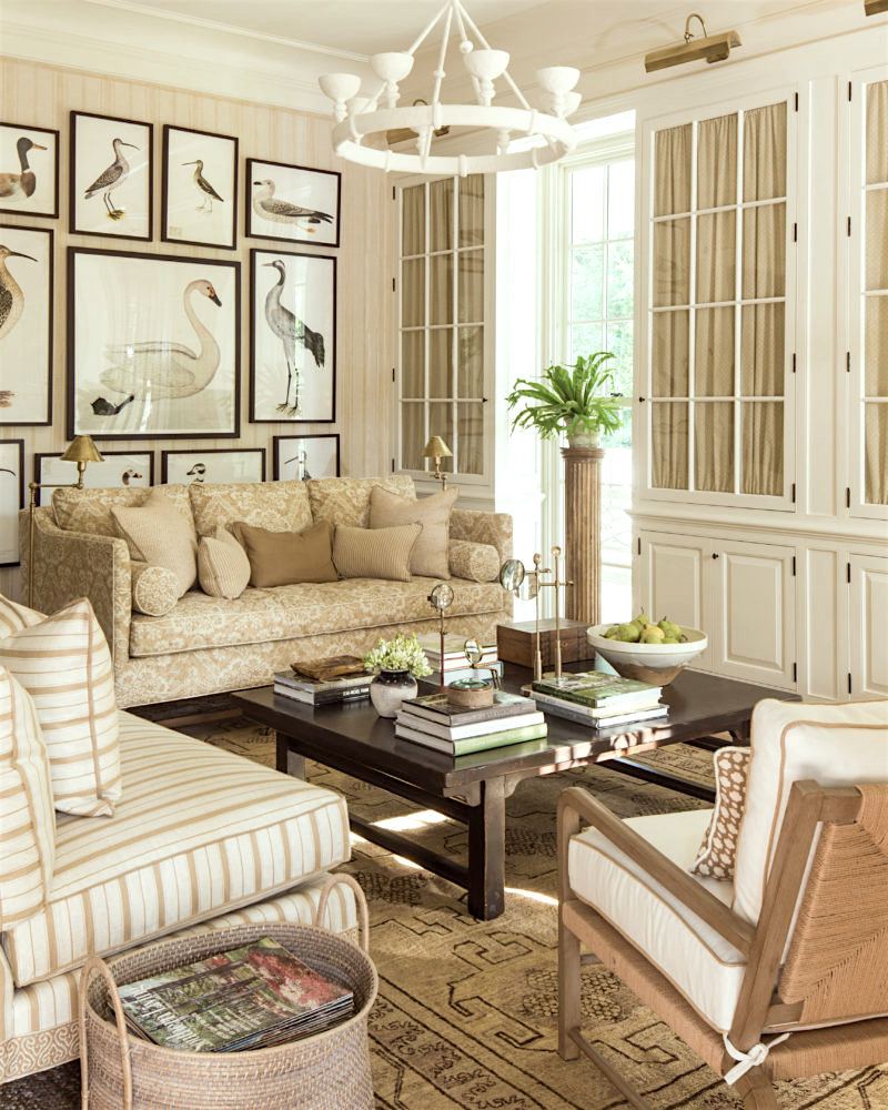
I did track down the wonderful bird prints which are sold at Ornis Galleries. I find the site a little confusing and am not sure if they are to the trade or retail or both. But their prints are lovely.
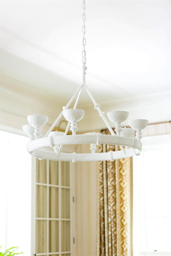
And I also found the cool gesso chandeliers by Stephen Antonson
It’s the accents of white and black which keep a predominantly beige room from being blah.
I love the scale and the cups which remind me of bird nests without overtly screaming bird nest. The other great thing is that they force the light to go up which will then hit the ceiling and get bounced back down. It’s a great way to create ambient light that’s soft and won’t burn out one’s retinas.
By the way, the Southern Living Idea Showhouse is in Birmingham, AL and will be open through December 18th, 2016.
I highly recommend that you get Mark’s new book. It is exquisite!
I hope that you enjoyed some of these interior design lessons. If you like this sort of thing, I’ll be posting similar posts. I think it’s a great way to learn and take those lessons into our own homes.
I’m going tomorrow to visit my mom and sis in Wisconsin. I’ll still be around, but not quite as much. See you on Sunday!
xo,

***Please check out the recently updated HOT SALES!
There is now an Amazon link on my home page and below. Thank you for the suggestion!
Please note that I have decided not to create a membership site. However, this website is very expensive to run. To provide this content, I rely on you, the kind readers of my blog, to use my affiliate links whenever possible for items you need and want. There is no extra charge to you. The vendor you’re purchasing from pays me a small commission.
To facilitate this, some readers have asked me to put
A link to Amazon.com is on my home page.
Please click the link before items go into your shopping cart. Some people save their purchases in their “save for later folder.” Then, if you remember, please come back and click my Amazon link, and then you’re free to place your orders. While most vendor links have a cookie that lasts a while, Amazon’s cookies only last up to 24 hours.
Thank you so much!
I very much appreciate your help and support!
Related Posts
 Here’s How You Can Create Beautiful Rooms – Effortlessly
 Discover the new black in interior design!
 Here’s Why Buying Furniture Online Is A Bad Idea
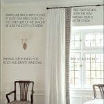 How To Get Window Treatments Like You See In Magazines
 Farrow and Ball Colors Update – 2018 + Matching
 Can You Use Gray Paint in a North Facing Room?
 The Virtual Alexa Hampton @ The Design Bloggers Conference












60 Responses
I can see the merits of each of these rooms but for my taste they are both just a bit cluttered. I am not a minimalist by any means but so many chairs in Suzanne’s room and too much of everything in Mark’s especially on the coffee/cocktail table. Sorry I am never going to get on that wavelength, Laurel. I want space on the table, not on my expensive books, to put my drink.
However on a more positive note, I love the colour schemes of both rooms. I had an all-off-white living room with pops of copper/orange many years ago and a visitor told me it was ‘too sterile’. When I first met the man I later married, his first reaction was ‘what a glorious house’. We have been together for 35 years now.
Hi Christina,
It’s very possible that Suzanne’s room isn’t really like that, but the stylist or Hickory Chair wanted their furniture placed in there.
I can appreciate your feelings. I like lots of different things. I don’t know if that’s a blessing or a curse!
Hi Laurel,
The chandelier in Mark D. Sikes room is made by Stephen Antonson.
http://www.stephenantonson.com/lighting/
Beautiful work!
Hi Deborah,
Oh gosh! I hunted that one down and was lead to the other site, but then thought it strange when I didn’t see the piece. Thanks for the correction. I’ll go and make the change.
Hi Laurel! I have an off topic question. I just read your post at https://laurelberninteriors.com/one-cheap-and-easy-interior-design-fix where you say not to use faux water in floral arrangements. So if you have a clear vase, should you just put the stems in with no water at all? Or should you use real water? Or maybe it’s better to use a vase that is not see through?
Hi Emily,
Well, it depends what the faux flowers are made out of. If they are okay with water, then why not put in real water? And of course, I would change it at least once a week and/or add a squeeze of lemon which is anti-bacterial and will smell nice. If it’s a silk plant, perhaps the stems could be coated with something so that they could go in water.
I just think that the fake water looks fake if one looks at it closely. But of course, if it doesn’t bother you, then it’s fine. It’s not a huge deal.
I started leaning and layering pictures after reading your blog. It was very helpful advice. Thank you! But, my wife was like “Why is everything on top of each other?”. I told her, “It’s layering, you need to read this Laurel Bern blog and learn about layering”.
When we have this lady clean she undoes all the layering and props all the picture up. 🙂
BTW, here’s an article you might like about when wall paper became more affordable/popular in Britain after the coloring was made with arsenic.
And then it started killing people….
https://www.fastcodesign.com/3065670/when-interior-design-killed
Hi George,
Ahh.. yes, the cleaning lady always moves everything no matter what. Crazy article! Lots of stuff like that way back!
I second everyone else – I’d love to see more Learn From The Masters posts!
Thanks so much Kate! I never know how some posts will be received and it’s grate to get the feedback!
First off, I looked at the picture and thought okay, what is bugging Laurel with this room? I didn’t notice the window spacing at all. I thought, there were way too many chairs! Haha…..just goes to show how much I know about interior design, but you’re educating me Laurel! I look so forward to receiving your blog and the best part is your unabashed sense of humor! I have your paint guide and I can’t tell you how invaluable its been for me as my husband and I get our home ready to sell in the spring. Thank you, thank you, thank you for sharing your many years of design experience and expertise in the world of interior design, especially for those of us who can only dream of having a home as lovely as the pictures you post. You’re a blessing to so many! Wishing you a joy filled Thanksgiving with your mom and sis! Safe travels.
Thank you Patti for such a sweet comment! They may have added some chairs that aren’t normally there. But the other thing that’s nice about them is that when guests come, they can move them around more easily for conversational groupings.
I love dissecting a room. Your eye sees what an inexperienced eye doesn’t. It teaches us to look more carefully. Please keep this as regular segment. On another note, I have never liked the coffee table stacked with books idea but this one has changed my mind. I think it is all the other pieces he has amongst the books that makes it so interesting.
Hi Joanna,
Right. I love the books but agree that too many can look like a cop-out.
Hi Laurel. I love the leaning art and mirrors. Any tips on how to keep a 40 lb mirror from sliding off the mantle?!
haha! Good question. But I have a very heavy mirror in my bedroom that leans on the dresser. It’s definitely not going anywhere. The lean is very slight
OK, I’m going to trust you on this one and try it out…
Fea, You are not to trust me on anything. I am completely serious. I wouldn’t want to be responsible for anything bad happening. I am only relating my experience and can’t predict any other outcome for someone else.
Laurel, I absolve you of any and all responsibility for anything that may result from the choice I am making of my own free will and volition to lean a 40lb mirror against the wall on my mantel. If it crashes to the floor in an expensive mess, it is my fault. If it looks fabulous, I will take the credit! Haha!
Haha! I’m sure that it’ll look fabulous and yes, please take the credit!
Suzanne Kasler’s house is amazing!! That exterior! It is so lovely it almost hurts a little…..but I likes the Sikes living room best.
Yeah, Mark’s room is sublime!
Thank you for another really helpful post, Laurel! I am itching to know what you think of the layout of the bird prints on the wall?
Is it just me being too picky, or does that bottom row that is chopped in half by the height of the sofa just bother the heck out of you too? I can’t really see the point of hanging that row. ??
The prints themselves are really lovely….
Happy Thanksgiving! 😊
Hi Lisa,
You are right! It’s as if they weren’t planning on putting any furniture there and it was just an art wall.
Dear Laurel,
Love this post and would certainly Love to see more design comments by you!! Thanks so much & have a nice trip!
Cookie
Thanks Cookie. I will!
Please do many more like this! I could (and do) also spend hours analyzing photos like this.
Thanks so much Elizabeth!
Wow, these homes are so completely gorgeous and serene and still interesting! I love beige/tan/off-white and my husband loves color! Try not to make it a battle….
Also, I like Benjamin-Moore-Pearl-style finish on the ceiling, seems to make the rooms feel taller.
Hi Nancy,
He may be thinking of blah versions of beige/tan off-white. Show him these and ask what he thinks? He might change his tune.
What if you could do this and add some green to the scheme?
Hi Laurel,
I am wondering if there is a way to find the source, name and model number, (if there is such a thing), of an item – say a light fixture, bed, sofa, fabric, or whatever, when the source is so often not mentioned in the website or magazine article. Is it possible to find this information? So often I read an article about a room or rooms which I happen to love, but the writer does not include this information. While perhaps it would not be very practical to include every little thing, it would be nice if they were to include more. Thanks so much.
Hi Lisa,
I do have a bonus chapter in Laurel’s Rolodex which gives a comprehensive list of ways to get this information.
But one way is to type in everything you do know. Describe the item in your google search.
Like for the bone inlay mirror, I put in: “bone inlay mirror in geometric key shape.” and hit IMAGES. If that doesn’t work, then try something else. bone inlay mirror with stripe border. Bone Inlay mirror, Mark Sikes Southern Living…
If you find something close to what you are looking for, go to related images and keep going until you get closer and closer.
I do have another method in the rolodex, but it’s too involved to say here and it involves graphics to explain exactly what I do.
Do make sure that you maintain in your search box what it is you want, even when it spits images at you. Sometimes the search term changes.
Once you find it in one source, providing they have it listed correctly, you’re in!
Hope that helps!
What is there to say? You are just the best Laurel. So generous. Thank you.
Hi Teresa,
I very much appreciate that! While 99% of comments/emails are kind, occasionally, I get one that is mean-spirited or provocative.
“Grow” a thicker skin? Well, I treated myself to a wickedly amazing facial yesterday. It’s actually a little bit thinner right now– haha!
Oh man, these photos are beyond gorgeous. I learn something new every single time I get your newsletter, which are quickly becoming like letters from dear friends. I live in Atlanta and am pretty sure I know Suzanne’s home and it’s just as beautiful inside as I imagined it would be from admiring the outside. Thanks for sharing your wisdom, expertise, and sense of humor with us! Happy Thanksgiving to you and yours.
Thanks so much Monica! Much appreciated!
Hi Laurel, I loved your post and appreciate you educating our eyes to see what makes a room work. Sheer joy to read your blog. Keeps me enthralled and learning. Have a safe journey to Wisconsin to see your mom and sis.
Hi Jill! How wonderful to hear from you! Your “babies” are in high school now? Thanks so much for that! Regards to Don! xoxo
I bought your Rolodex and paint palettes. Can you explain how to the trade works. I am a new home stager in Athens Georgia and need some basic education. You are so witty and I feel like I know you already.
Hi Karen,
To the trade means just that. The items are only sold to folks in the interior design or architectural field. To be honest, I am not sure if home stagers are included, but if I had to guess, I would say yes.
You will need a resale certificate in the state you are working, usually three trade sources that you already have accounts with. (It helps to know someone, or just call and explain that you are new.)
Then, you will need to supply a biz card and/or your letterhead.
Some companies ask for a professional association. My answer to that is: grrrrr…
But having a professional website is also a good thing as it shows that you are a serious designer who is doing this biz to make a living as opposed to a well-heeled house wife who is purchasing for themselves and their friends who can well-afford to pay retail.
And yes, it exists.
No comment.
Hope that helps!
Nice blog! Just found it. I Enjoy the tone which is the prefect blend of educational and unpretentious. Good for you. Keep up the good work.
Thanks so much for the kind feedback Bebe! Much appreciated!
Yes Laurel, please do more posts about what is right and wrong about a room, and why. Seeing that through a pro’s eyes is the best way for me to learn. Thanks!
Glad you enjoyed it Kim. I definitely will!
Loved this post. I love dissecting a room and you do it so well. Please post more.
Thanks so much Kim!
Love Kaslers work even if cream sofas are sooo impractical! Funny, the left French window bothered me right away too. I think she could’ve put a slightly longer curtain rod on that side running it closer to that corner and pulling the pinch pleat drape to the left and more open if that makes sense. You could fudge it but yes then more glass would show on that window.Sometimes old houses which r built from outside in are like that.
I have a question: I need a source for grosgrain ribbon to use on leading edge of drapes and to trim Roman shades in my sisters newly renovated house. We ordered fro .jKM ribbon like a year ago and they never shipped saying those colors wouldn’t be available until enough quantity was requested by customers! Wtf? I know, crazy…I hv your Roladex but this is a detail that’s not in there. Thanks Laurel…..ps: good to see u on FB re the “recent developments! Yikes!
Hi Betsy,
I get almost all of my trims from Samuel and Sons. They have a wonderful line. And they are in the rolodex! To The Trade only, in this case.
Hi Laurel. I’m a new subscriber loooove your blog and resources.
With respect to Suzanne Kasler’s windows, do you not think a tall plant in the left corner could make a difference. In addition, it does not help the OFF centered windows that the drapery panels are either not pulled back equally or the panels are different widths. What are your thoughts?
Hi Kelley,
Yes, the drapes are a little messy in terms of not being open equally. I don’t mind that more relaxed look, but here, it’s only emphasizing the difference. I’m sure that the panels are the same width, but one is just pulled in more.
I too really liked this post and the rooms from Southern Living. I recall seeing this in their last magazine issue ( yes I’m still a magazine reader for some of the decorating magazines). Safe travels to Wisconsin. It’s suppose to be 70 here tomorrow. It’s been one of the warmest Novembers to date here. Gotta love that!! I truly enjoy your Blog. If you drive past Fredonia stop in and say hi😊
Hi Dawn,
Oh wow! I just checked the forecast and not too bad!
My mom lived in Port Washington for over 30 years! She was right on the lake and it was so beautiful!
Thank you for being so generous with your resources and your talent. I love the way you break it down. I’m a Wisconsin girl too!!! Living in South Carolina now so I don’t have to shovel snow. Have a great holiday.
Hi Diane,
I have fantasies of moving to SC. Snow sucks!
Actually, I was born in Chicago and then lived in Evansville, IN until I was 15 and then lived in WI in my mid teens and then again in my early 20s before coming to NY.
Having visited the SL Idea House, yes, Mark Sikes’s room is a stunning delight.
Hi Susan,
Thanks for stopping by!
I’m a new subscriber. Loving your posts! I’m almost ready to pull the trigger on your Rolodex. You are genuine, you have great taste and you have a great eye! This makes me think you have great contacts too? I’m a frustrated designer. Which means I never became a designer, but trust myself and my own good taste. I can spend that $$ better and put it towards decorating the homes I love and own. Thanks for all your good advice and taste!
Hi Ashley,
Welcome! Glad you found me/us. I say us because there are a lot of active subscribers who contribute wonderfully to the posts. In fact, sometimes I think that the comments are better than the post!
I’ve been in the business as a working designer for 24 years and over 20 of that is my own business. I do know a lot of people by now.
For a designer, one of the best aspects of the rolodex are all of the “designer friendly” sources where you can buy directly from the vendor and quite often (but not always) at stocking dealer prices.
I have found it to be a win/win as I can offer great pricing for my clients and the business still makes a good profit. The trick someone told me years and years ago is — low overhead!
LOVED this post! So observant, so interesting, so informative! Please do more like it! Kay Doyle
Hi Kaye,
Thanks so much! Okay! I will!