Hi Everyone,
Yes, there’s some dreary decorating going on. Another lovely reader wrote me the other day. Only this time, a dad wrote on behalf of his son and daughter-in-law.
Laurel, what’s the mistake you made regarding the dreary decorating?
I’ll be getting to that.
But, first, I’m going to share what darling Dall had to say.
Hi, Laurel:
I Love the look of your face-lifted website! Geez, that was a lot of work you put into your Bad Florida Architecture post. You offered a plethora of wise advice.
Thanks, Dall!
Okay, I have another one for you. Our son and daughter-in-law have just bought their first house. It’s a 2300 square-foot 1961 bungalow with honey oak floors, low popcorn ceilings, and the typical L-shaped living room/dining room set-up.
It’s definitely a cute starter home.
But get this; as the kids were preparing to move from their apartment, a local major home staging company decided to go out of business and liquidate millions of dollars of high-end furniture at hugely discounted prices. My daughter-in-law and I made several trips to the sale, and she was able to furnish their entire living and dining room house.
This brings me to my point:
The furniture leans towards contemporary with a touch of industrial. Please note the Cisco Brothers reclaimed wood coffee table.
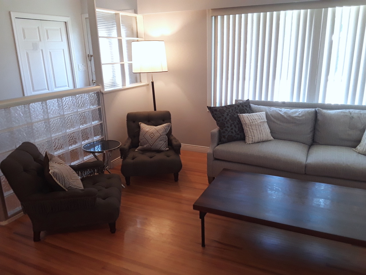
However, there are traditional touches with the Robert Abbey floor lamps, Bernhardt desk with shades of Louis XV, and the accent chairs are eclectic John Derian.
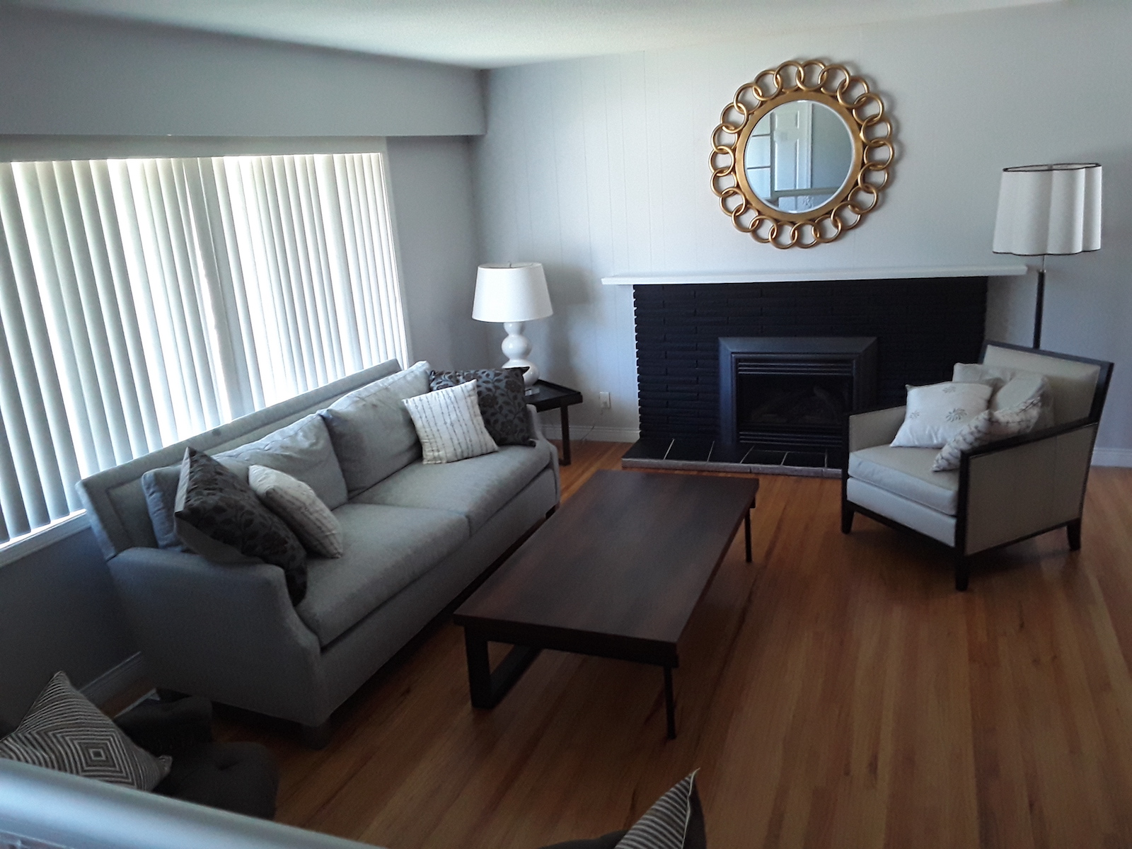
The walls are light grey, and the baseboards are white. The stone fireplace is painted BLACK.
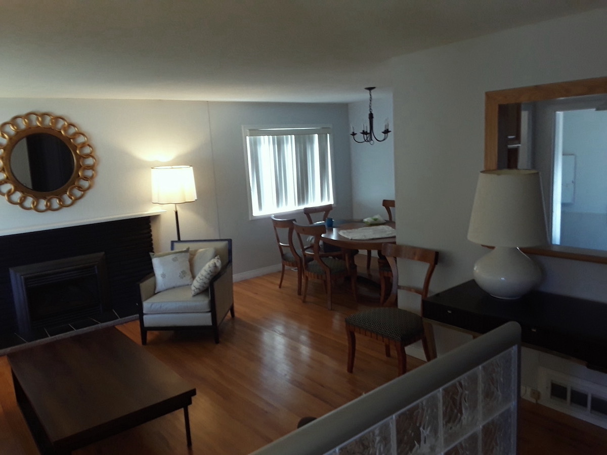
We tried to lighten things up with a gold mirror, light-colored lamps, and upholstery. I think everything suits the house, but it lacks warmth and coziness.
Of course, some decor items would help to alleviate this dreary decorating, but our “kids” are reluctant to add items because they have a kinetic 3-year-old who is faster than a cobra.

Uh-huh… I understand. Above, my boys Cale and Aaron in late 2016 (They were 26 and almost 21.) near where they were raised. I have no idea who the gentleman in the background is.
I wonder whether your readers would be interested in this situation and whether you might wish to address it in a post. I’ve included a bunch of photos.
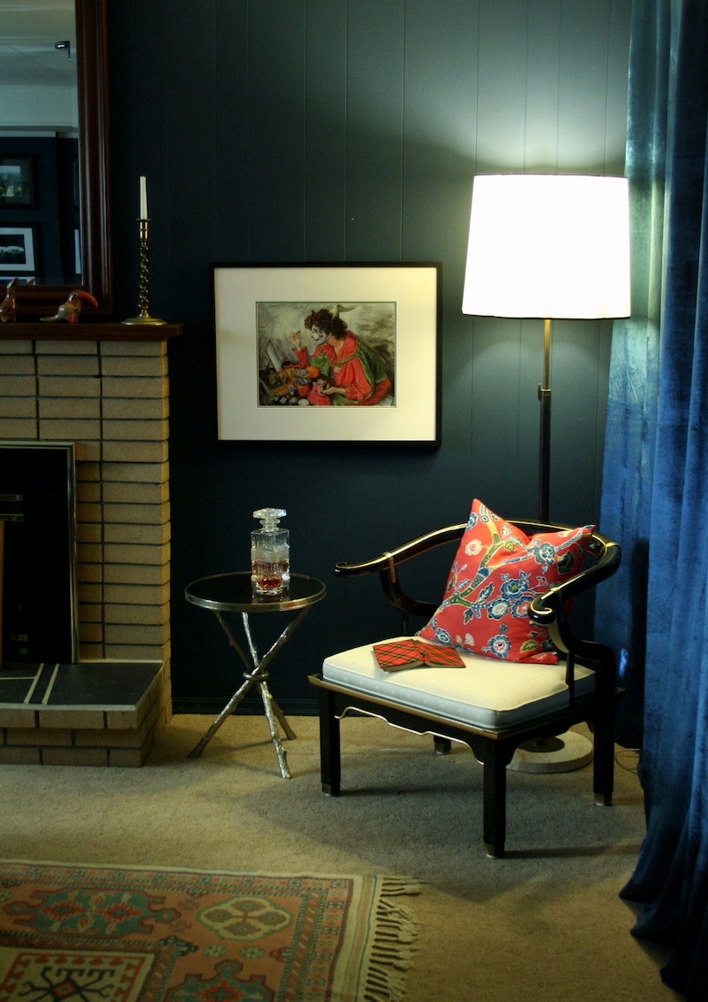
On that subject, I continue to tinker with the “Twilight Room,” having obtained a pair of James Mont-inspired Century Furniture lacquered Chinoiserie chairs, a Global Views “Twig” table, and a brass Robbert Abbey lamp. A vignette photo is below.
Thank you once again!
Sincerely,
Dall
PS: I’ll understand if you can’t do this as a post, but I thought it might be fun.
***
Oh, what a lovely vignette Dall did! I found myself thinking about this challenge.
Right away, I knew that the kids’ room needed a killer rug and probably a much darker wall color.
It reminded me of my Amherst Gray color board; that’s one of 40 palette boards in the Laurel Home Paint and Palette Collection.
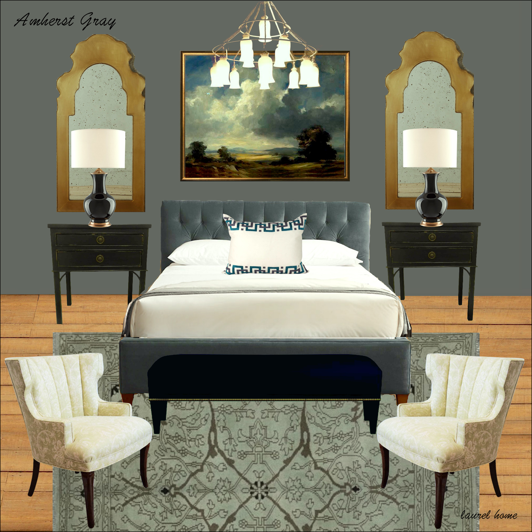
This is an excellent example of how a darker room doesn’t have to be dreary. It’s about the balance. What’s missing in Dall’s kids’ room is that there’s a lack of warmth and contrast. Plus, I think there’s a little too much black. However, even putting some books on the coffee table and some other low unbreakable items, like a tray and a small box, would go a long way towards breaking up the heavy dark table.
There’s nothing seriously wrong with this room except for one thing.
The vertical blinds are one of my intense dislikes. Vertical blinds say 70s insurance company in a strip mall.
What I find interesting is that this is some seriously sophisticated furniture for this young family. I rather like that.
Another cool thing is that the Lee sofa is the same frame as the Serena & Lily Grady sofa you can see below!
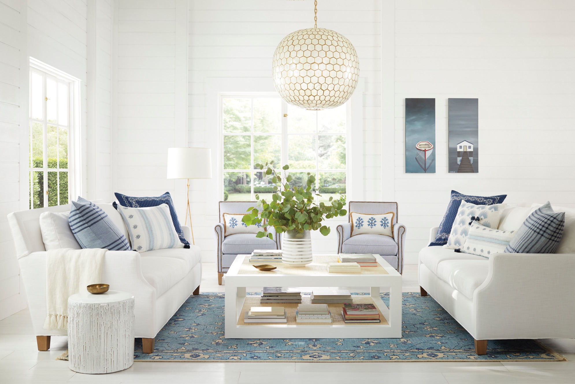
Please check out Serena & Lily’s 20% off sale this weekend. I believe it’s ending Monday.
Okay, here’s my mistake: dreary decorating aside, you would think I would know better by now. But, I don’t. ;]
In this case, I spent about four hours today obsessing over which gray I would use for the board. Instead, I should’ve just started making my board on Picmonkey, like I always do.
It’s really terrific to be able to see everything in one place. If one doesn’t have access to the actual room, doing a consult virtually is best done with all the significant elements in one spot. When I began doing this for clients in about 2011, decisions were made much more quickly.
So, what happened today is when I finally decided on a wall color, I realized it was too heavy for what I had in mind. It wasn’t making the dreary decorating any less dull.
Therefore, I had to spend another hour experimenting with colors. If I had done that, to begin with, I would’ve saved three hours.

The color I ended up with is not dissimilar from what’s there, but maybe a shade deeper. The color is Benjamin Moore Eternity af-695, an ethereal gray with blue-green undertones. It’s also a Laurel Home Paint and Palette Collection color.
In the meantime, I found a fantastic source on eBay that has super inexpensive and beautiful hand-knotted Oushak-style and other oriental rugs. The 8 x 10s are between $777.00 and about $900.00!
Please note that this guy has a rating of 100% and with hundreds of happy customers. I’ve heard of fake reviews on Amazon, but I don’t think people can do that on eBay. I hope not, anyway.
The other thing bugging me is the dinky, cheap chandelier. It reminds me of the HGTV staging cheap chandeliers they always used. It’s not up to the level of the rest of the beautiful furnishings.
Therefore, here’s my process for fixing dreary decorating.
While there’s nothing terrible here, the room lacks those mid tones and elements that add warmth. It’s also lacking in color. Most rooms are dreary before the accessories are added.
Looking at the furniture, particularly the dining set, reminds me of art deco. So, I found some cool chandeliers on Chairish that I thought could work with that style.
Please click on any image for more info.

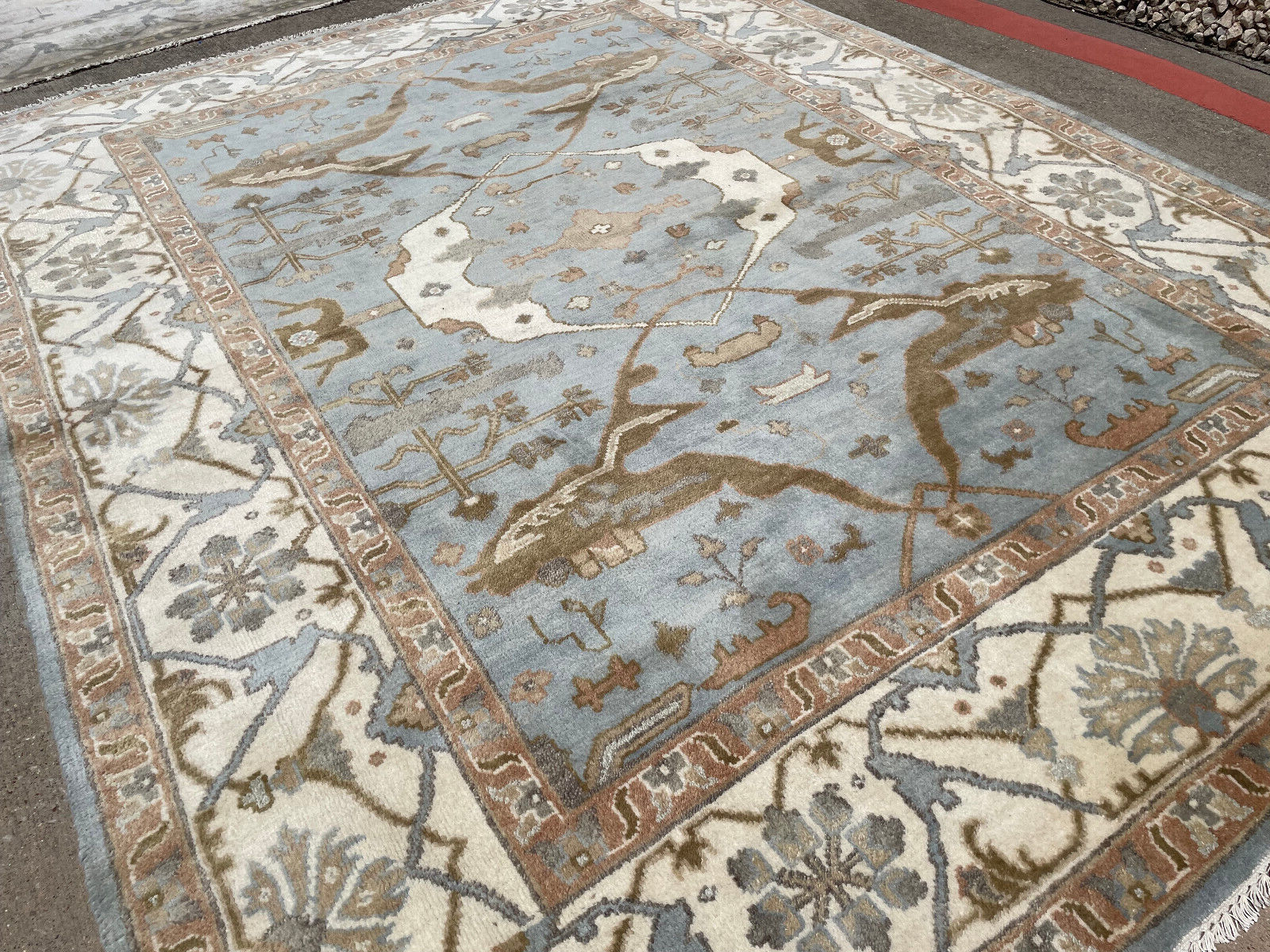
Now, for the rug, I love the Oushak-style rug with the grays, cream, and bronze colors. That will go in the seating area and will add a lot of warmth and interest.
The rugs below are also strong contenders.
Please click on any image for more info.

Please also check out the Hot Sales Rug page.
In the meantime, Dall had no idea what I was up to and coincidentally sent me another email yesterday with a rug his D-I-L has selected. It is nothing like any of these. It’s a contemporary abstract design.
It was then that I knew that Dall’s D-I-L was going to hate the direction I was going in. lol But, then, I thought. No, I’m going to do this post, anyway; my way. Maybe when she sees the board, she’ll change her mind; perhaps she won’t, that’s okay. However, it might inspire some of you guys for your rooms.
Oh my! I have to interrupt myself.
I heard from Flo-1 yesterday, and you will not believe what she did. I don’t have time to share it with you today, but I will add it to the post for Wednesday.
You guys are so talented!
Let’s keep going.
Below is the board design in progress. Please note that this is not the room layout. But, I do it to get in as many elements as possible. I like to put the furniture in an approximation of perspective.
Picmonkey now has a feature that lets you take out the background, and it’s surprisingly accurate 96% of the time.
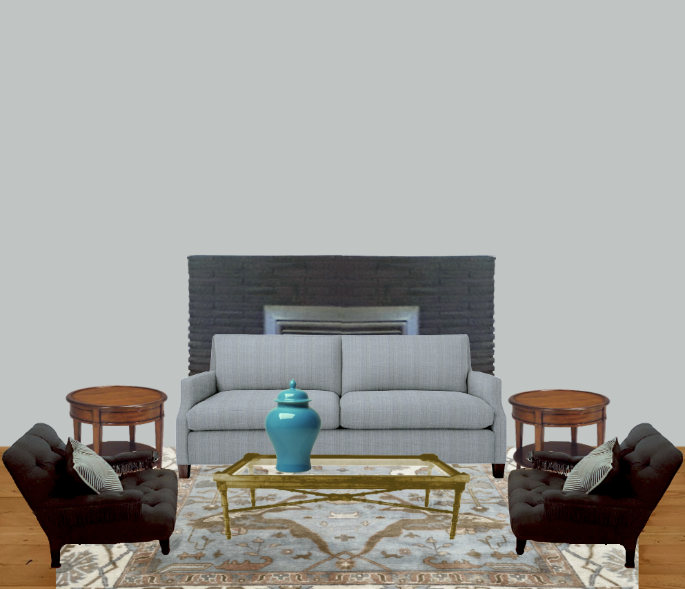
I think the space is looking better already.
My plan was to follow the 80/20 rule.
In this case, 80% of the room is contemporary and 20% vintage.
And, there’s another 10% that’s Chinoiserie.
I don’t want the room to be too formal. However, the dining room furniture and upholstery also indicate a space that’s not casual, either.
What about the coffee table, Laurel? Why did you change it?
I changed it because I think there’s too much black, and I also think the style of it is not in keeping with my overall design plan. Of course, it could be worked in.
Does the room HAVE to have 20% of another style that’s different from the main style?
No, you don’t have to do anything. ;] However, when looking at many designers’ rooms, I find that my favorites almost always do a blend.
In addition, I think that a painting over the fireplace would work better than a mirror. That will also add some beautiful color to that focal point.
By the way, there is a little art widget on the vintage HOT SALES page. I borrowed one of the paintings from there. ;] I did have to make it larger, however.
I changed both the end tables and the coffee table to vintage pieces. The lamps are vintage, too.
For more classic vintage end table and lamp pairings, please go here.
The chinoiserie design isn’t everyone’s taste; I know that; however, I love the colors and how it brings in an element.
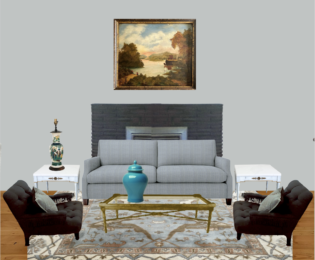
The painting works nicely, and I love the shot of turquoise on the Chinoiserie ginger jar.
I played around with the lamps trying others, but I came back to these.
Wait, Laurel? Did you forget about the three-year-old?
Are you kidding me? I haven’t forgotten. I’m still suffering from PTSD on account of my hellions.
The fragile porcelains are because I get sadistic pleasure from watching other parents suffer. That’s all. ;]
But seriously, I got Cale into Martial Arts when he was five.
He did it for ten consecutive years, took a break for about ten years, and returned to it in his mid-twenties. He’s 32 now.
Yes, I had him when I was eight.
Okay, where were we? Oh yes, the coffee table. I think it’s quite cool, but not in this room, necessarily. I feel that the coffee table has gone too far and besides, we need something with stained wood tones. (although Dall sent a better image later, I see it is dark brown, not black.)
So, I found in my library a vintage Ming-style coffee table, not too heavy and not too delicate.
All that’s left are the pillows, more fragile porcelains, and window treatments…
And uh oh. Can you guess what’s wrong?
Well, Laurel, there aren’t any windows.
Not now, but there WILL be windows. Unfortunately, they are not like the windows in the house, but it’s the concept that matters.
Laurel, sorry for interrupting, but the glass block? Don’t you think that’s contributing to the dated, dreary decorating?
Yes, I do, and I’m sure the homeowners would like to fix it, but it’s not a priority as they have their hands full at the moment.
I think it might be possible to sheetrock over it. But, I’m not sure if that’s doable. So, we’ll ignore it for now.
Okay, here’s what’s bothering me, and I bet some of you are too polite to interrupt. ;]
Yes, indeed. The fireplace surround. I don’t mind that they painted it black. However, I feel there’s way too much of it, however. It’s a big black thing, and it’s not adding much to the space.
It wouldn’t be too difficult to do a mantel over part of the stone.
So, let’s look at my finished plan to fix some dreary decorating.
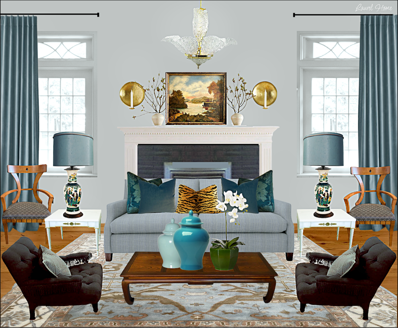
If that fireplace vignette looks familiar, it’s because it is.
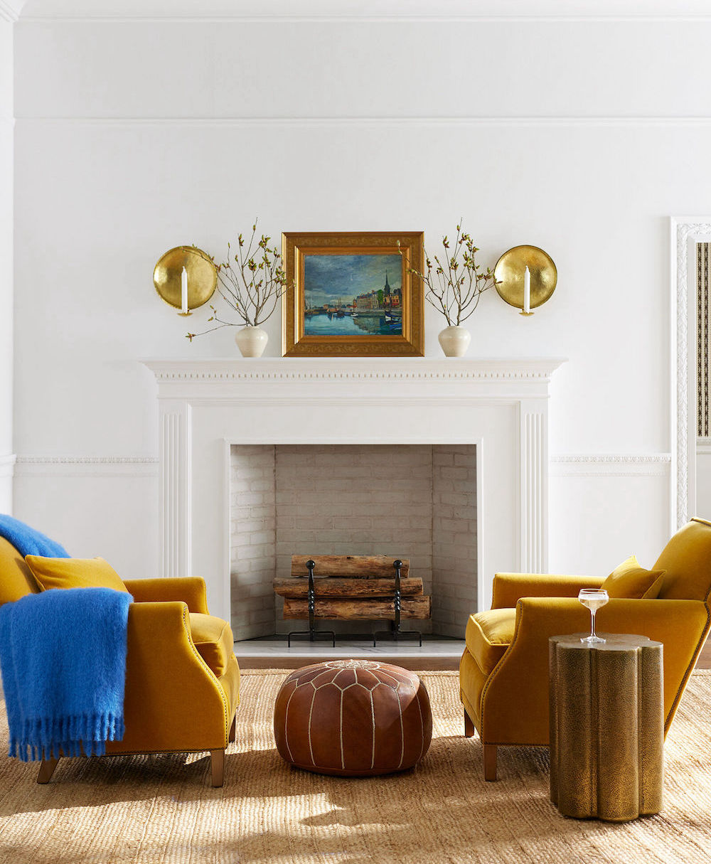
From Serena & Lily. I love those gold Canyon chairs!
Okay, I hope you enjoyed my fix for some dreary decorating; that isn’t terrible by any means, but it just needs some finishing touches.
Of course, there’s more than one way to do things. I could sit here for a month and make a different design idea.
Please don’t make me do that, though. haha
Thank you Dall, for sharing your kids’ lovely home and yours, as well.
I hope everyone’s having a wonderful long holiday weekend!
xo,

Related Posts
 Six Drab Paint Colors – Should You Try Them?
 Gray Walls? The Perfect Color Palette To Make Them Sing
 A Long Narrow Hallway – Help For A Dark Scary Mess
 Dark Rooms – Are They Handsome or Depressing?
 Your Home Office Could Be Dangerous For Your Health
 Crown Moulding and Why It’s Driving You Nuts!
 Bookshelf Styling-The Ultimate Guide with Templates!









37 Responses
Hi Laurel,
Love your suggestions! Oh, vertical blinds are one of my all time most “disliked” looks. Great post!
XOXO Nancy
Who makes the beautifu god coffee tabe?
I have a very similar Ming style coffee table, inherited from my great grandmother.
The final look is gorgeous!
Another wonderful post that illustrates how many “moving parts” there can be in getting a design right! Fortunately, there appear to some straight forward and cost effective solutions to now deter the dreary and give the young family an opportunity to infuse their environment with some life and color – turquoise, especially!
About the valances/soffits: Almost every house I have been in and certainly have owned, built during 1950-80, has had these dreaded valances. They do not cover pipes, ducts, or wires. Comprised of a long box built from lumber and covered with a sheet metal panel, with sheetrock, shiplap or plaster board, they run along the entire window wall. They appear to function as a “modesty panel” that covers the top of the drapes or blinds where they attach, concealing the mechanism. I gather that these were some sort of building convention. They are a pain to remove, necessitating demolition, patching and wholesale replacement of surface panels to allow the lovely new drapery rods to be mounted high, near the ceiling. Not sure that the young family is up to this. This may be where the notion of soft fabric Roman Blinds mounted along the width of that long picture window could be an attractive alternative.
I think those light gray walls would look great with crayon on them. And perhaps a scattering of “Little Tykes” items around the room for additional color. And lets not forget food crumbs and Legos for some added texture. But perhaps the son and DIL enjoy shades of bland and it is just Dall that doesn’t want his grandchild to grow up sensory deprived. All kidding aside, that room needs a serious shot of color and personality, books, personal items, plants, art, or what have you that takes away the bland. Do not add any more gray or much black to this room. Pick a color that you like and add a bit of a second color and go for it. If the walls have to stay grey for now, curtains, valances, or even good cellular shades would look better and add color. Ditch the gold mirror or paint it. Better fixture in dinning room. The hardwood floor is the item that really looks out of place with the furniture so add rugs in both dinning and living room. This is a starter home so rugs from Ikea or the big box stores are appropriate. Lighting looks like it belonged to someone’s granny. (I actually have a floor 1929 floor lamp from my granny that still gets complimented so someone else’s granny.) Pony wall could be covered with dry wall attached with construction glue, and a painted top rail to match trim. Fireplace needs a bigger mantel if they want to keep the black. They need some “slouch” as the living room furniture is so angular. The dining room furniture is curvy so they need to add roundish footstools, pillows, or something to tie the two styles together. My son the engineer did a better job decorating his new home with color on the walls, hand-me-down furniture, and the bits and bobs he picked up along the way. The prior owners had a thing for black which is supposed to be sophisticated but, for the most part, only works well for a LBD. My MIL is into antiques and always said it worked with kids and grandkids “as a few more dings didn’t matter”. She was fairly calm when she found our then 3 years old daughter playing tea party with some of her Spode and a pewter decanter. On the stairs no less. Breakables high, kid friendly low. And if they are really strapped for cash, Dall can buy the grandchild a copy of the book, “Harold and the Purple Crayon”. I’m sure the child wouldn’t need any additional inspiration to decorate the walls on their own. My son didn’t ….
DebMac,
Did you read the post? Can you find anything positive to say? If not, perhaps keep your comments to yourself?
I LOVE the finished room. I hope Dall’s DIL considers going with this look – it’s beautiful.
Love, Love, Love the paint color with coordinating drapes and rug you chose! They brighten up the entire room and make it a happy place!
Congrats on the new website! Very nice. And I’m totally with you on vertical blinds. No, no, no to vertical blinds. But, for the love of all that is holy, please don’t use grey. Flipper grey. Overused, abused, ubiquitous, tiresome, depressing grey. It’s a dead horse that people keep flogging…and flogging…and flogging. Any colour but grey. All the designers are using real colours now. Blue, green, pink, red, yellow, orange and purple and all the shades in between. Neutral is not only looking tired – it’s looking dead. Long dead. Haha, you get the idea. Love your idea boards, except for the grey. Colours are going to be much warmer and liven up the room. Grey has no soul. Neither does beige. We’re over it.
“The vertical blinds are one of my intense dislikes. Vertical blinds say 70s insurance company in a strip mall.”—-LOVE IT!
Hi,
First of all, I really, really like the new website, even the fonts.
I also love your final board. The turquoise is perfect. I agree with others that just changing out the throw pillows will make for an instant uplift. I’d nix the rug for now although the suggestions are lovely.
So thinking about budget and where to put money first — also the time constraints given there is a lot on the new owners plate — after pillows, I would paint the black hole fireplace white as a very quick uplift. It looks like there is a black stove insert which will need to stay, so the fireplace would still have a dose of black. Then later the nicer mantel could be added. Then I would choose between changing the chandelier and the window coverings depending on the relative prices of the choices. If it were me, I go with the roman blinds others have suggested as a first step. As everyone realizes the blinds are dreary and depressing in and of themselves.
Meanwhile in my life, I have a decorating emergency I need help with. I think I am going to email you. As of yesterday, I have a ten square foot hole in front of my kitchen sink because of pipe repair under a slab in the home I have just purchased for retirement. Before we began a nice upgrade renovation on the inside, we needed to address a water problem in the garage laundry area. That ballooned into a bigger and bigger problem. I need to make an immediate decision about what direction to take with my kitchen floor.
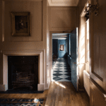
Completely off the subject, what is the title of the painting featured at the beginning of today’s post? I might need a print of that. Ty
Hi Babs,
Traci found it. It’s also in this blog post about beige rooms.
I love that painting too!
Hi Laurel, Absolutely lovely suggestions, per usual. I completely agree that the hanging blinds have to go. I’d go without a window treatment before having hanging blinds in my home, but that’s just me. I wanted to make an observation about the soffit in the living room above the large picture window. My guess is that the soffit is hiding some sort of duct work. The building or former owner hung hanging blinds in the DR without a soffit, so I don’t think the soffit was put in to support the hanging blinds. If that’s not the case and the soffit can be removed, I’d definitely take it out. But, if it can’t be removed, I’d hang the drapery rods on the soffit to camouflage it a bit. I’d then do something with 2x4s and drywall at both ends of the windows to make the remaining soffit look like more a nook. And, while this drywall work is being done, I’d take out the two(!!!) different types of glass blocks/panels and just do a solid wall the height of the glass block wall. Personally, I’d do this drywall work and repainting first before buying more/new furniture because I think it hugely detracts from the rest of the living room.
Laurel – At the top of this post is an oil of women and children by the sea. I’ve searched and searched but topic, and misc. artists to no avail. What’s the title/who’s the artist please/thanks.
I never reach the end of your posts without being educated on something, picking up a new idea, and expanding my mind. Thank you!
The artist is Francisco Miralles. The painting sold at Sotheby’s for between 20,000 and 30,000 pounds. ($22,000-$34,000).
Hi Laurel,
I’m loving the new website. It’s so much easier to find your posts on any given subject.
The suggestions for color in this living room are spot on. I would also add plants. It’s amazing how much life they bring to a space.
Your reader’s family was very fortunate to have come across the sale to obtain all of their furniture.
Enjoy what’s left of the weekend.
Super fun. I love redesign posts. I was impressed with you starting with the shades and chandelier. Congrats on the new website, btw! It looks fabulous!
Ohhh…I feel injured. I love the glass block pony wall. It’s so retro. And I love the black fireplace. We moved into a house with an awful orange and yellow brick, off-white firebrick, and covered with random black splotches. I painted it flat black and put up a mantel made of a 4″x12″x6′ cypress board from my g-grandfather’s 1850ish barn. I really love the chairs in front of the glass brick wall also.
Hi Nancy,
Hi Nancy,
Please don’t take it personally. :] Of course, you’re entitled to your opinion.
My take is: If the kids were doing mid-century style furnishings with a colorful palette, I wouldn’t mind the glass block. However, it is a bit strange that there are two glass block styles side-by-side. With the furniture they now have, I think it would be better as a solid wall. Or, a more traditional window wall. There are many examples in this post about homes that don’t have a proper entrance.
Laurel, what a difference with some contrasting color. Everything in the existing room is the same monotone color including the walls, no interest for the eye to land on.
The fireplace surround looks outstanding now and really becomes a focal point. What about adding a brass fire screen in front of the opening? If it’s a functioning fireplace they may need one to keep little hands safe.
Yes, the verticals have to go but they will need something for privacy. Replacing them with large 4” blade plantations? I’d prefer a pretty woven shade for texture but being in the front of the house I think they would want more control of light and privacy. Drapery panels, non-operating, will soften the window but there is the bulkhead above the window. Not sure how far that extends into the room? I would want the drapes hung as close to the ceiling as possible to add height to the room. Ready made solid lined panels would be most economical since they probably would not take these with them to another house due to the ceiling height.
Chandelier, rug, and art could go more modern even though it is a 1961 bungalow.
Something like the S&L Larkspur chandelier in brass with white shades. Since the ceilings are low this fixture would work well. Maybe one of the small Capiz honeycomb lights in the foyer.
Art, maybe something like a diptych, S&L, Californian.
Would be interesting to see what rug the D-I-L picked.
I like the vignette color choice that Dall sent. Maybe a rug with red and blues? Castillo hand knotted, S&L.
Can’t wait to see the Florida is doing…until Wednesday!
In addition to everything Laurel has mentioned, I would add some plants. They are a simple, immediate fix for adding a breath of life to a dreary or static space.
Hi, Laurel!
First off, I.love the new website! It’s clean, crisp, excellent layout, and I can find everything very easily. I’ve been binging on your blog and Kate Wagner’s McMansion site while recovering from a nasty cold. Thank you for delightful reading!
Second, my husband and I really enjoyed looking at Flo-1 and Flo-2’s posts. He said, having been carpenter with a home building crew, that Flo-2’s two doorways with different heights were probably a carpenter error, which the drywall guys just said, “Well, I guess that’s they wanted” and that’s how some odd decisions are made!
Third, I love this post!!! When I saw the teal ceramic urn or vase ( not sure which), on the coffee table, my whole response was “Yes!” I agree that the 3 y o will break it if it stays there, but bringing in that color, and the further addition of the rug and wall art just was like magic (move over, Hermione; we’ve got Laurel!!)
And I don’t have a living room rug right now, bc my guys like hard surfaces for setting up wooden train tracks, Legos tm, and other tiny things, so not having a rug right now makes clean up easier. But the softness on the floor might be good for a colder climate, especially in winter.
I think I’d definitely splurge on the art. I like fine art America, which often runs sales and I get large canvas reprints of classic paintings with no border…I like the modern feel of no frame with the texture. it doesn’t work for everything, but we’ve reprinted some 18th century paintings and they are relatively inexpensive. And hard for the boys to damage, even with Nerf gun bullets!
I hope Dall will send updates of what they do! And Flo 1 and Flo 2 as well. It’s so encouraging to see real-life fixes to bad construction. Thanks, Laurel!
I think you have provided some wonderful, fairly inexpensive suggestions to make their house more homey and inviting. Little touches will make such a difference. Adding color with a rug and replacing the mirror with a vibrant picture will do wonders. I don’t think they will even need to paint right away, if they introduce more color in their accessories. They might want to find some brighter pillows and if they buy another chair, get one that has a brighter upholstery, picking up a color from the picture. Starting out, we all tend to think everything should match but a room is much more interesting with a punch of color. Adding a picture in the dining area and changing out the chandelier will help, too. I love adding the white surround to the fireplace but that’s not an option now, and they really hate the black fireplace, they can paint it white to match their trim. Setting some things on the mantle will definitely help, too. Those things will be out of reach from their 3 year old, so no need to worry about them getting broken, unless throwing balls is allowed. 🙂 I like your idea of a tray with some unbreakable things on the coffee table, so it looks like someone lives in the house. Be sure to include some of the same accent color in the tray items. Thanks for sharing another interesting decorating challenge!
Hi Laurel, so my first thought was since this is a starter home, money is probably tight. And my second thought was that the pictures look dreary because there is not enough light. Also it has the feeling of a hotel room: neat, clean and orderly but impersonal. So if it were my first home I would put my money into custom roman shades in a brighter color (w/ help from my decorator) instead of the rug. I know we are all supposed to start with the rug but these days young people want bare wood floors. Everyone I know is pulling up there carpets and refinishing their floors. Also the fabric on the shades will add a little softness and subtract from the hotel feel. Second I would go after that chandelier as you recommend. And third I would add brighter pillows, child friendly, to the sofa. And then I would check my bank account. I am not sure about painting out the black fireplace because I think it works, but if I still had some $, I would change out the simple white PVC looking mantel for something more suitable – again I would consult with my decorator on material and style. I also would ditch the hotel looking mirror for a piece of affordable art that I like. Honestly I will have to look at it daily, so I should like what I am looking at. I think the coffee table is just fine and per another reader’s suggestion, I would add a bright colored tray with books and other non-breakables that we all know a toddler will pick up – no matter how behaved a child may delightfully be. And then I would just review how the light and color fill the room before making any other changes. And lets not forget – the number of toys that seem to magically increase with a toddler every birthday, holiday, any day. The mistake I made when I was younger was to try and finish every room as quickly as possible – very costly mistakes. My basement is filled with furniture that I should not have purchased, which now thankfully my bachelor-nephew is now taking for his first home.
I agree that a colorful rug is the key (and I hope they will go with your suggestion for a vintage style rug) there are 2 things that I think are adding to the dull look- the colors are close to each other and there isn’t any pattern, everything is very “one note” without any contrast . So a contemporary rug would again match everything else but some kind of vintage style rug would add contract . And I would add some color…starting with a warm paint color pulled from the rug. With the rug you chose I would paint a warm cream. If there is any DYI skill maybe paint one of the pieces of furniture. And I love the idea of a large ottoman as a coffee table with a young child.
I love the warmth your design adds to their home…the ‘before’ feels a bit sterile. The gold accents, warm wood tones, and shots of color are just what is needed to perk up the space.
Laurel, your suggestions are all so lovely. As usual, your style is my style, and I’d jump at the chance to have any of them. But the mom doesn’t mention a family room in this new home, so I’m imagining play dates with more young friends and perhaps a younger sibling in a year or two. So I’d like to suggest some alternative ideas to let the parents sit back on that lovely furniture instead of closely monitoring the playful youngster(s).
The current coffee table is stark, but they just bought it. I love the ones you picked out, but a toddler might slap a table in glee and break the glass, and the others (as well as the lovely vintage side tables) will get a lot of wear and tear over the next few years. Instead, add colorful toddler-friendly accessories to the current one. Place a large colorful tray with a stack of books, including some to read to the child, a faux plant in a nonbreakable pot (silk flowers in a rattan container, maybe?), and even a small wooden sculpture or puzzle. An even more kid-friendly yet stylish choice would be an oversized ottoman: no sharp corners, more softness and color added to the room, and possible storage. The small black table in the corner could be better styled with a turquoise lamp (or another accent color). The lamp on the console, as well. Some people spray paint lamps with good results, but we don’t know if she’s a DIYer. Either way, they need a bold accent color to offset all that grey, black, & white. I would go with your suggested turquoise, but if she doesn’t like cool colors, the orange-red in the chinoiserie vignette you showed would be fantastic. Or how about more cognac and bronze? Swap out some of the neutral pillows for colorful ones, add a throw or two, perhaps recover the DR chairs (she may want to wait till the three yo is older), and add a dramatic colorful bowl to the DR table. Give the room some life.
The verticals must go! Love the drapes you suggest, but how about some cord-free Roman shades? Or if she goes with cognac, bamboo blinds might look good; black-out ones are available if she needs them on the front window. The drapes could be added as another sophisticated layer in a few years.
Absolutely change the chandelier! It needs to be larger and more dramatic. If she loves the black FP surround (as many millennials do), she could do a more striking black chandelier, but more bronze would be good, especially if she decides to keep the FP mirror (which is crying out for something on each side, as you show). Then, break up all the FP black with two colorful poofs or other small hassocks right on the hearth for the child to sit on, or pull over to the coffee table for games, etc. If they have storage inside, it’s another place to hide toys. Add colorful accessories to the mantle, as this is the safe place to show off her treasures.
I love the carpets you suggest, and the patterns will hide stains. But if she prefers a more abstract one, again, it should contain some color(s), not just neutrals. More colors always means more stain hiding!
They can make this room look warmer and more inviting yet keep a sophisticated adult look to it while still making choices that will allow the whole family to enjoy the space more. Splurge on things like a rug, a new chandelier and art & accessories for over the mantle, but hold off on buying gorgeous but fragile draperies and tables.
Fantastic case of working with what you got. Enjoyed the gradual reveal and the evolution of the desicions. Thank you for being so real and sharing your skill. Never stop.
Laurel,
Who would own a fireplace and turn their backs on it??!!!!
(Love the rugs)
Lilli
I noted that as well…I’m thinking there must be some problematic layout not readily discernible to the viewer…I should know, I have a classic, lovely fireplace at the end of a 12’x30 living dining room (which we ‘divided’ with ‘walls’ and woodwork to be 2 rooms with a 6 ft opening…being only 12 wide, it was difficult to align the sofa with the fireplace as focal point without using 2 loveseats, instead of a sofa, husband nixed that idea, so we ended up with the dreaded sofa against the wall…I thought about taking pics and sending to our wonderful design genius, Laurel! But figured she’s probable seen that config 1000X before!
Laurel mentions the board is not the layout. It’s about seeing what all the elements looked like together, including the fireplace. 😀 😀 😀
Thank you, Michelle. I realize that sometimes people miss parts of the text because they skim and then they see the board, without realizing it’s not meant to relate to the layout. The chandelier, for example, is for the dining area.
Thank goodness someone said this! It was bugging me. Who puts a sofa back to a fireplace? You start a nice fire on a chilly day and nobody can see it or sit in front of it? I’m confused
It’s a visual aid so one can see how the various pieces of furniture and decor look with select architectural features of the home, like a fireplace. I think the ones Laurel producers are gorgeous and so much better than many designers who just throw things on a board randomly. It is most definitely not a diagram of how you are going to arrange the pieces in the room. That is a completely different visual aid.
Well, the reveal was as exciting as any TV show, Laurel! Beautiful. A great example of working with what you’ve got. I also love the way you share your thought processes. It really helps demonstrate that creating good design is not a nose-twitching exercise (just channelling my Bewitched geek there), even for seasoned interior designers. Good process = strong results.
Lovely suggestions, Laurel. I think the most important ones to make an instant difference are the white mantel over part of the black stone, and a heftier chandelier — the gold one third from left would make a bright spot even unlit. I think another quick fix would be to change the cushion covers — everything matches a bit too much. Some really bright turquoise, or coral, or both, would lift things with no risk from the cobra.