I was going to do a different post today, but then I felt I didn’t have enough information. So, fortunately, the blogging god came to my rescue. This afternoon I received an email from Serena about her horrid windows:
Dear Laurel,
Your blog is a frequent resource for my design challenges as we gut renovate our 1850s house. I haven’t seen you address what to do when your windows “literally” sit on the floor.
My husband and I managed to lift the second-floor windows off the ground by 8 inches, but we can’t do much more without messing up the historical facade of our house. There is a huge amount of wall space between the top of our window and the ceiling. Any thoughts or design ideas would be appreciated to fix our horrid windows!
Hope you are well and all the best,
Serena
***
Serena then sent me a pic of her horrid windows. And well, frankly, I’m pretty horrified.
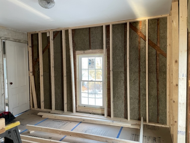
I mean, who builds a home with the windows so obviously misplaced on the wall? I’m assuming they were drunk. They had to be. Typically, for a six over six with an 8-foot ceiling, the sill is about 27″ above the floor.
Serena said the windows were actually ON the floor, and they lifted them eight inches. I think she means the actual window from the looks of the framing.
Could the windows have been made taller?
I don’t know, but it sounds like it wasn’t feasible. Suppose the house is brick or stone, fuhhhget about it. I mean, ANYTHING is possible, but the expense would be astronomical. If the home is clapboard or shingle, it would be easier. However, it looks like they are at the point now when undoing what’s been done would also be quite expensive.
However, if it IS doable, a good fix for these horrid windows might be the possibility of doing a transom window. At least they wouldn’t have to order an entirely new, very large, totally custom window or windows which would cost a fortune.
But, are transom windows historically accurate for an 1850 farmhouse?
Good question. Off the top of my head, I would say no, unless this home is in the south. Otherwise, 1850 was the tail end of the Greek Revival period into the early Victorian period. However, I don’t think it would be terrible to put in transoms.
However, is there a solution for these horrid windows that should have been about 15″ higher up on the wall?
And that means a solution that doesn’t involve the home’s exterior or the expense of adding an actual transom window.
Serena kindly sent me two ideas that would’ve worked if the horrid windows were merely a little low.
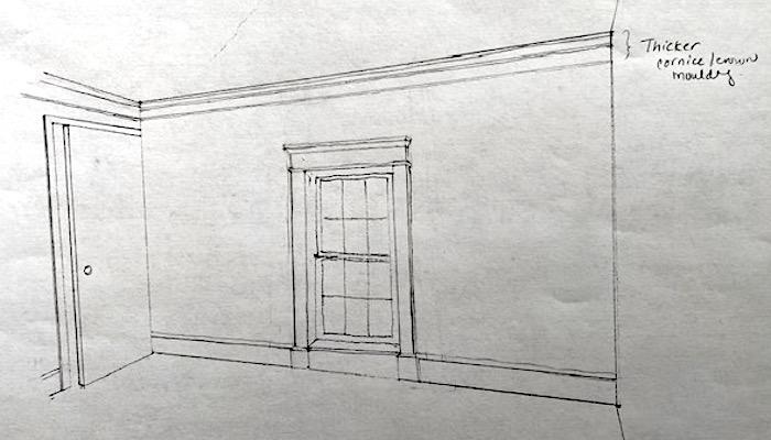
But, the windows aren’t a little low.
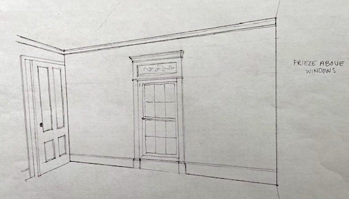
They are way lower than they should be. And, I think they still look strange, even though I love the mouldings Serena drew.
So, what’s left if we can’t move the windows, add to them, or add additional moulding to beef them up?
When all else fails, and you have a horrible interior design issue, there’s always smoke and mirrors.
Oh, come on, Laurel, what are you talking about?
I’m talking about illusion. Yes, just like a magician creates an alternative reality.
You know, like sawing a woman in half.
Would you like to know how they do it?
Here ya go. (If you don’t want to know how they do it, then don’t watch the video!)
Pretty cool, huh?
Yes, Laurel, but what are you going to do? Saw the window in half?
Ummm, no silly, but I will do a trick that will create the illusion that the window is at the appropriate height.
Here is what I propose to take care of the horrid windows. And, there are a few options, as well.
But first, please take a moment to think about what you would do and see if you had the same idea(s) as me. Or, maybe you have an even better idea.
Let’s begin by looking at the horrid windows if there were two side by side.
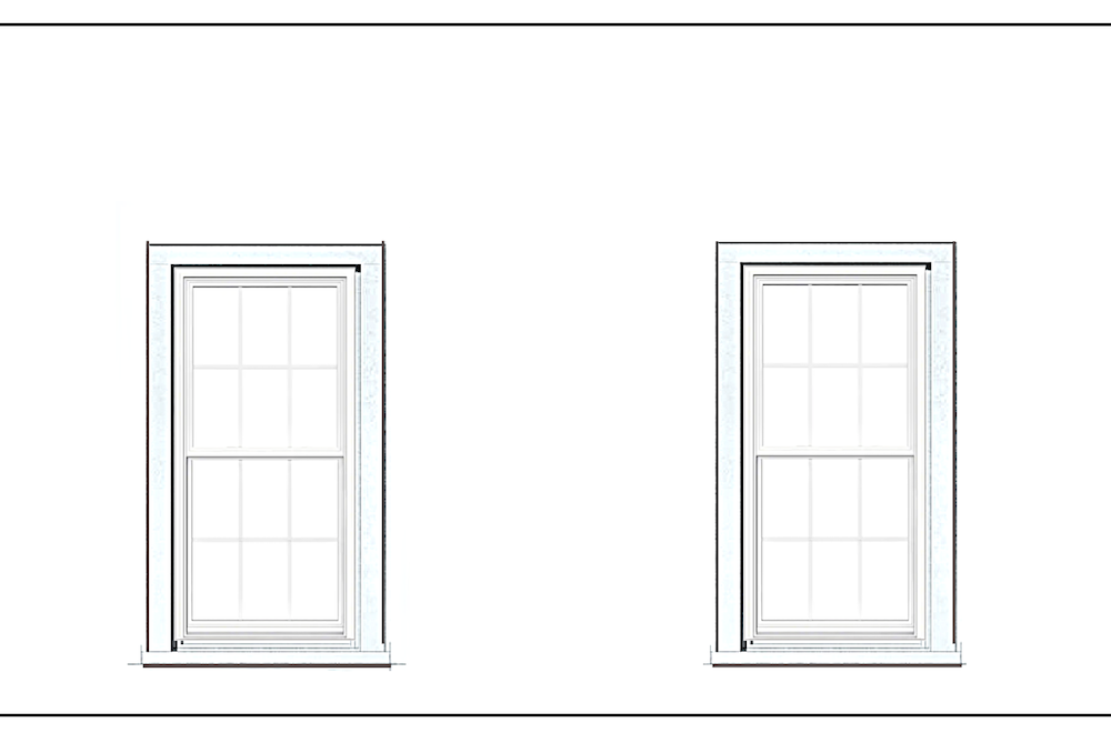 I left off all mouldings, including the baseboard. The measurements are approximate, and for our purposes, that is fine.
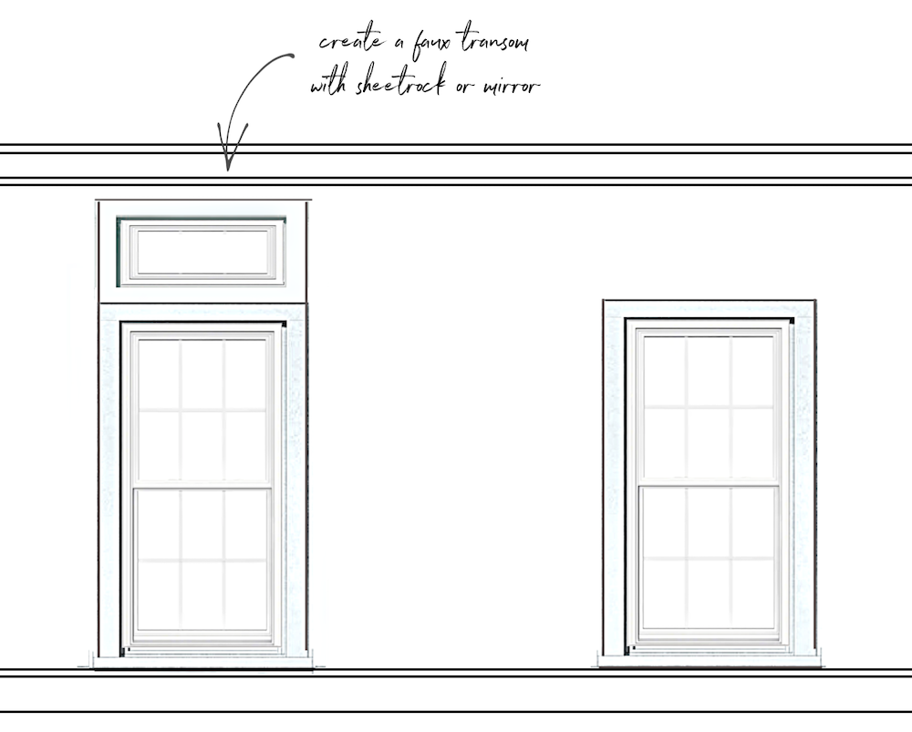 For this image, I added the crown moulding and baseboard trim. In addition, there is a faux transom added above the window.
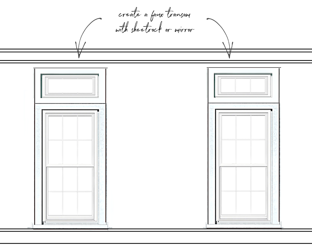 Above I showed that you could do the back of the transom with sheetrock, or perhaps with mirror and muntins to match the windows.
So, if you do the mirrored transom, you could just put up curtains and hang them under the crown moulding.
Will the mirror look funny above the window?
I don’t know. I’ve never done it, and if it were for a client, I probably wouldn’t take the chance.
However, my better ideas are coming up for the horrid windows.
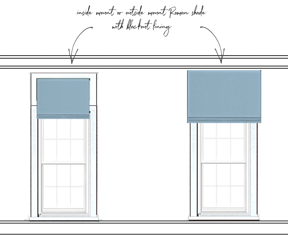
Serena could add an inside mount Roman Shade if she does the transom.
Please check out this post that’s all about Roman Shades.
Or, she could do an outside mount shade if she leaves the windows as is. The trick is that the Shade MUST have a blackout lining.
Lots of designers do Roman shades with blackout lining routinely. One reason is that light filtering through fabric changes the color(s).
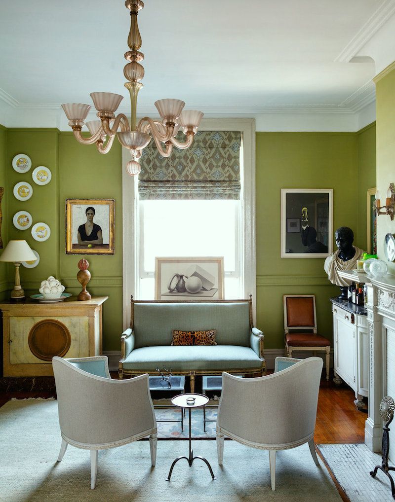 Lovely interior design by Sheila Bridges, who, as far as I know, usually does blackout lining for her Roman Shades.
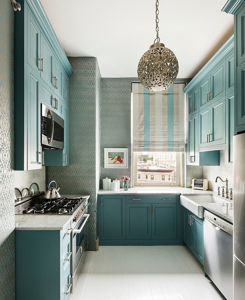
And, here in Sheila Bridges’ lovely kitchen is another Roman Shade with blackout lining. Remember Sheila’s wonderful Harlem Toile fabric?
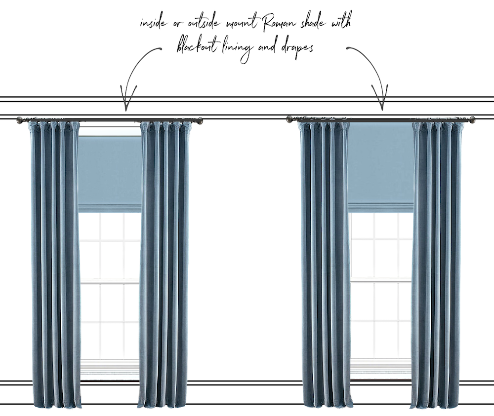 She could also add curtains. They don’t have to be this heavy, and they don’t have to be the same fabric. In fact, Serena could do woven wood shades.
However, I’m actually preferring the solution on the right with the outside mount.
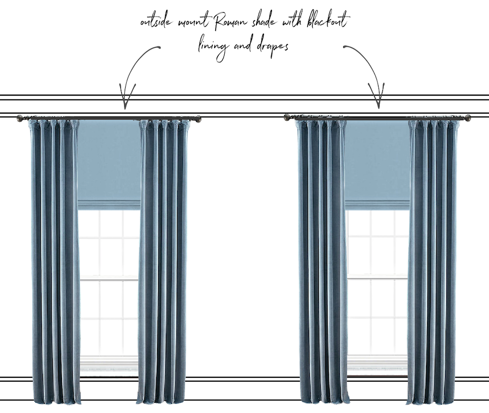
I think Serena could do this treatment with or without creating the faux transom.
The reason for doing it is in case she changes her mind one day about what window treatment to do.
One important note: If doing the outside Roman Shade with curtains, the curtain brackets will need to be a little deeper than usual. Five inches should be fine. Please check out this post, all about drapery hardware.

Above, from Sheila Bridges portfolio, a long Roman shade layered underneath draperies.
Who knows? Maybe Sheila used this same trick to camouflage the height of the windows in this gorgeous apartment on Gramercy Park in New York City. Please check it out here; the details are beautiful!
Another favorite post with lots of cool ideas for difficult windows is here. Plus a lot of other horrid windows and unsuccessful solutions, as well.
But, for the ULTIMATE WINDOW TREATMENT GUIDE, please go here.
In any case, I think this trick turned these horrid windows into stunning “floor-to-ceiling” windows. Therefore, instead of being an eyesore, the windows will become an asset.
xo,

PS: Please check out the newly updated HOT SALES and especially the Serena & Lily 20% off custom upholstery sale and new women’s clothing if you’re into that.
Related Posts
 The Interior Design Industry Could Be Dying – Here’s Why
 Here it is! A Palette For No-Fail Paint Colors
 Our House Floor Plan is Impossible to Furnish!
 Can A Modern-Style Home Mix With Traditional Mouldings?
 12 of the Best Paint Colors To Go With Red Brick
 40 Outdated Home Trends. But, Are They All Passé?
 How To Get Gorgeous Free Art That Looks Expensive


