There is nothing better than taking a horrid kitchen and helping a client make it a lot better.
Yes, I know…
I know exactly what you’re thinking…
What are we thinking, Laurel?
You’re thinking:
But, Laurel, you said that you stopped taking clients at least three years ago. Does this mean that you were lying?
“lie is so unmusical a word” – The Dowager Countess (Maggie Smith) Downton Abbey
No, I’m not lying. It’s true. I’m not taking any NEW clients. But, occasionally, I still help former clients with small projects. This client is one that I began working with in 2014. In fact, Mrs. F. is the result of my early marketing efforts I talk about in my blogging guide.
And, she happens to be one of my all-time favorite clients.
The Finkelsteins in Larchmont. (and no, that is not their real name. Not even close.)
In fact, I did a post about the Finkelstein’s adult party room which you can see here. Funny, at the time, which I can’t believe is nearly five years ago, nobody ready that post! And, look how puny it is compared to the posts of today! But, I still had interior design clients back in January 2015.
However, last year, Mrs. F said that she was ready to tackle her horrid kitchen. And, she virtually begged me to help her.
How could I say no? Being that Mrs. F is so delightful and easy to work with, I didn’t give it a second thought.
But, what made this one a particularly horrid kitchen?
Well, a lot of compelling reasons.
- Bad layout
- Dreary
- Fugly cabinetry in a weird pickled finish
And, one of the strangest aspects of this dysfunctional kitchen:
The hardware.
For some reason, that I can only conclude was due to some sort of psychotic breakdown, the previous owners had installed the hardware on an angle.
WTF is right!
Oh, Laurel, are you going to share the before images with us? Did you remember to take them?
Yes, I have before pics. Mrs. F had sent them to me before the demolition.
Here ya go.
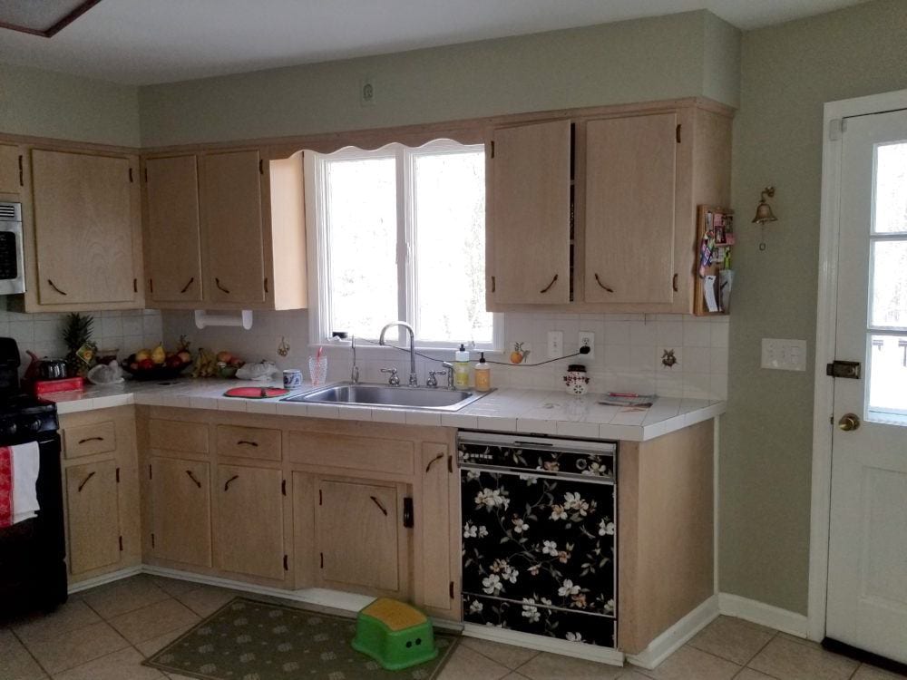 And here we can see the bizarre angled hardware.
But, there’s a whole wall of it on the other side of the room!
Actually, Mrs. F put the floral paper on the dishwasher after she read this post about clever ways to make appliances look better.
This was an interim measure shortly before the dishwasher died.
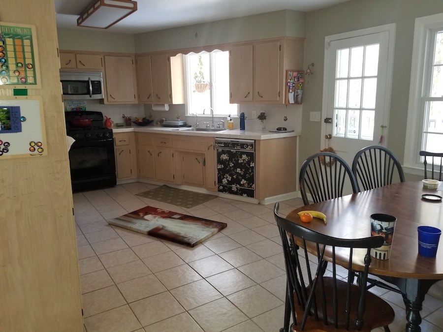
The ceramic floor is pretty icky poo.
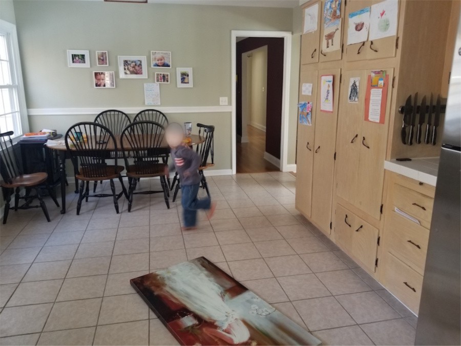
This is a home in a very expensive part of Westchester County. But, this kitchen certainly doesn’t convey that.
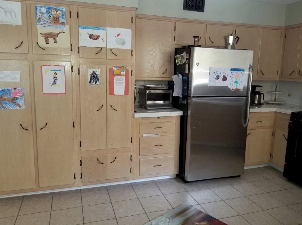
Pretty bad.
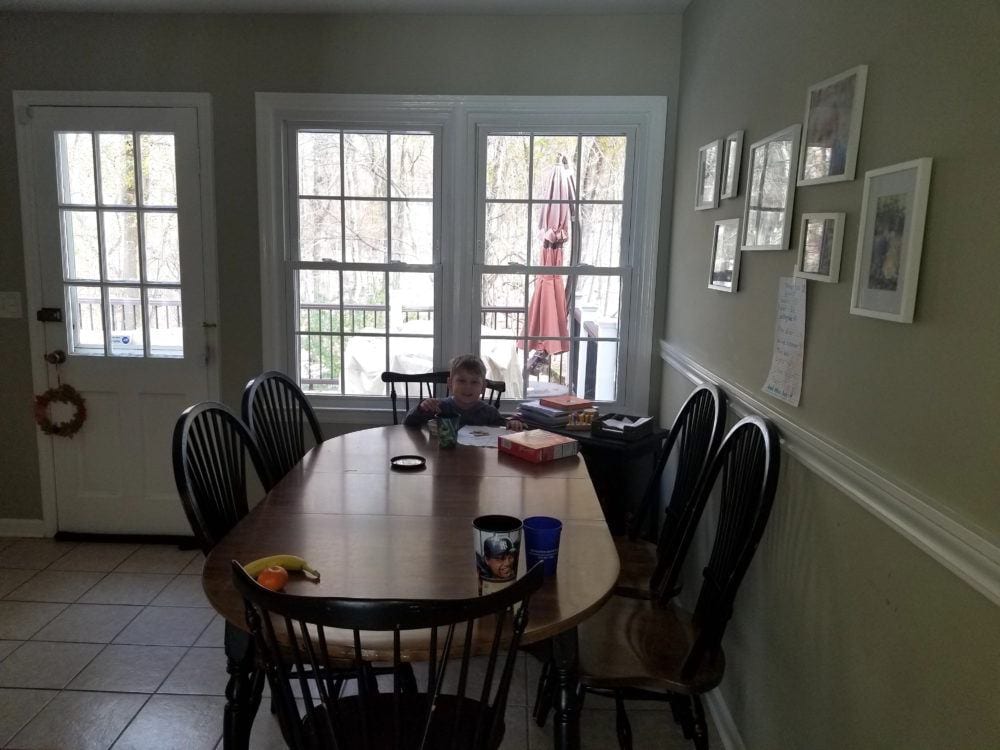
And, the eating area.
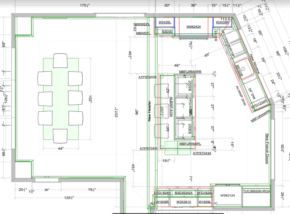
I did not design the kitchen, but I did consult with Mrs. F on a number of occasions. And, she always ran everything by me. We went back and forth for a time with whether to remove the wall between the kitchen and the dining room.
As you can see from the floor plan above, down the wall came.
Okay, for this post, I don’t have certain details, but will get them to you later on for when it’s all finished.
Early on, we decided on a white kitchen with a simple shaker cabinet.
Mrs. F chose a kitchen designer she felt comfortable with.
And, then she presented the plans to me. Most of it was fine except for the fridge wall. But, I’m not going to address that for today.
One thing that tickles me is that Mrs. F actually reads these blog posts and has been inspired by many of them.
One of them was this post featuring the hot tile known as zellige.
And, so she contacted Cle Tile…
Then, she sent me an email telling me what she had done. That’s fine. I love it when clients run with a good idea. I think she did run it past me first. But no matter, the tile looks awesome!
A few months ago, we selected hardware from Rejuvenation.
At that meeting last spring, we selected the cabinet door style and chose one of the stock white colors which looked soft and not too white.
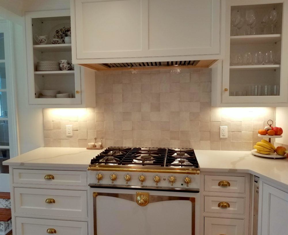
Then, after reading these seven posts, Mrs. F decided on this La Cornue range (below), even though it wasn’t in the budget. But, it’s a showstopper!
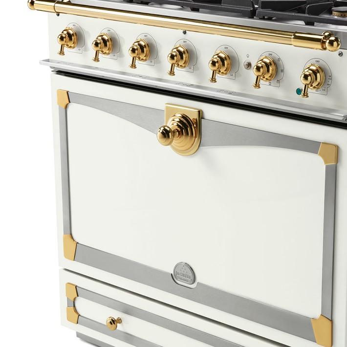 You can get a range like this here.
Okay, let’s look at some after pics. But, bear in mind that these are just some quick images Mrs. F took. Nothing is styled.
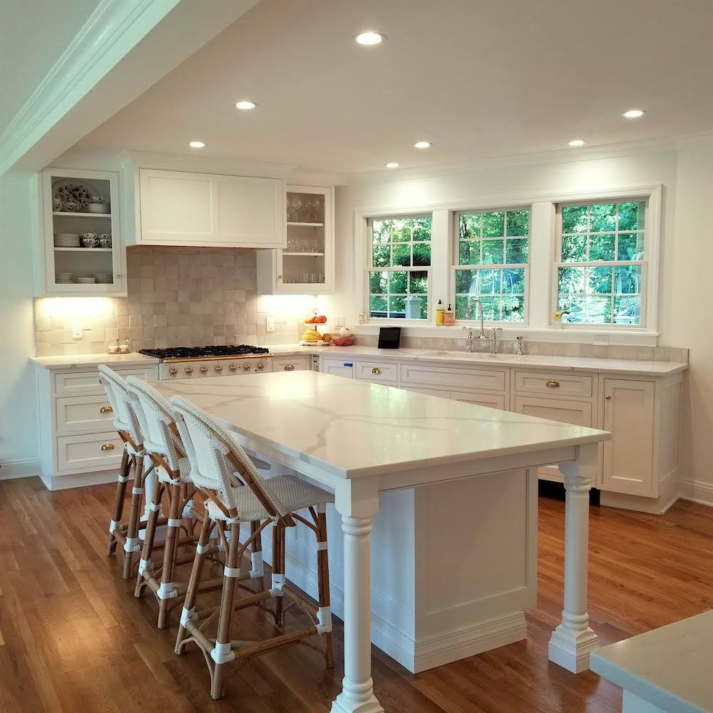
No more horrid kitchen!
Please note the range hood. Thank you Nancy Keyes for giving me the inspiration.
You can also see a similar hood in the kitchen Nancy designed for Melissa Tardiff.
Mrs. F showed her kitchen designer Nancy’s hood. That was easy.
And, yes, those are the Riviera stools from Serena and Lily.
Of course, Mrs. F got them on sale! (right now get up to 30% off on bedding and beds at S&L) As you can see, the contractor added two more windows to the sink area.
 And then Mrs. F ordered my favorite faucet from Perrin and Rowe (Rohl)
To the right of those windows, instead of the single door and double window, they put in a pair of French doors. This gave back the space to add cabinetry for the pantry, fridge and built-in hutch.
But, you’ll have to wait to see that because someone messed up and they sent the wrong doors.
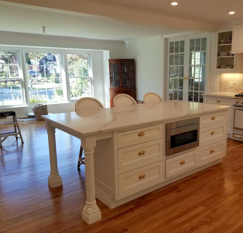
Now, we need to decide about the kitchen table, chairs, lighting and window treatments.
Yes, ideally, we should’ve, no wait, *I* should’ve done this weeks ago.
But, I am liking how light and open things are now.
I had told Mrs. F to go ahead and get the Serena and Lily Riviera stools. We’ll figure the rest out later.
Now, please listen to me carefully.
Don’t do as I do.
Do, as I say. lol
Make a complete plan. Do not order pieces ad hoc.
But fine. We’ll just do the coordinating chairs for the kitchen area.
Right?
Oh, wait. Mrs. F is wondering if that’ll be too much?
Well, it’s a good sized room now and I think it’s okay to have the stools and chairs match. But, even though I had already taken a couple of hours trying to figure something else out, I decided to take another stab at it.
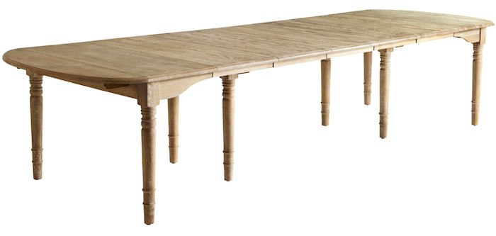
I had already decided on this wonderful oak farmhouse table from Wisteria. (discontinued as of March 2020) It can go from a table for four to one that you can squeeze 14 around. And, it’s currently on sale at Wisteria.
I like the light wood and also that the turned legs feel at home with the kitchen island.
For everyday use, the Fs will not need all five leaves.
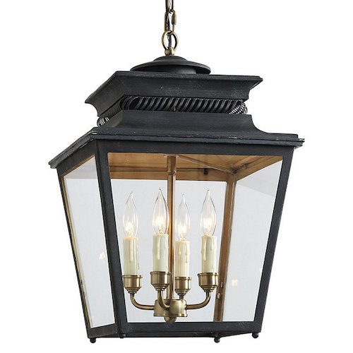
Then, I found these lanterns that are the perfect size and style at Ballard Designs. It comes in three other finishes, brick red, dark blue and white. I love them all, but think the dark bronze is best for this space.
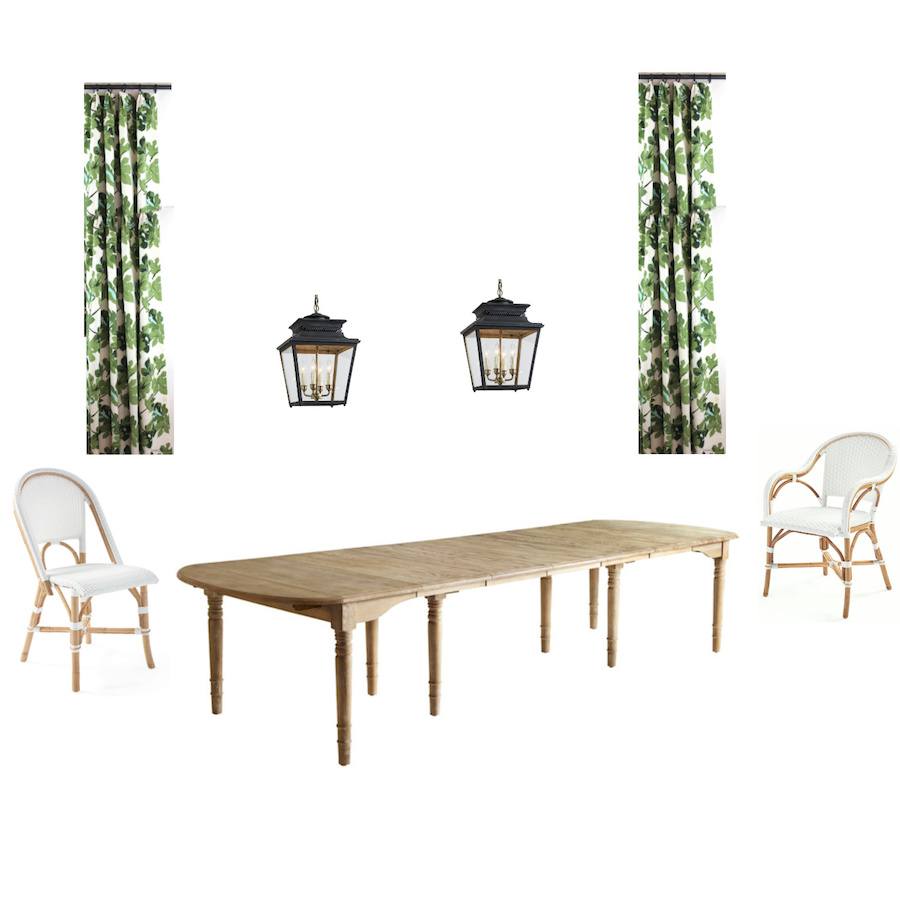 Above is the first board I made. I use Picmonkey to make all of my mood boards. If you’d like a free tutorial for how I use picmonkey, click here.
I’ve been making mood boards for clients since about 2010.
I think that most designers make them these days. But, I find that putting everything together is one of the best tools for conveying how everything will look together. It gives both the clients and myself more confidence that everything will look great together. And, in the long run is a huge time-saver.
The draperies are out of Peter Dunham’s modern-day iconic Fig Leaf fabric. Some of you may recall I used it for pillows in one of the mood boards in the Laurel Home Paint and Palette Collection
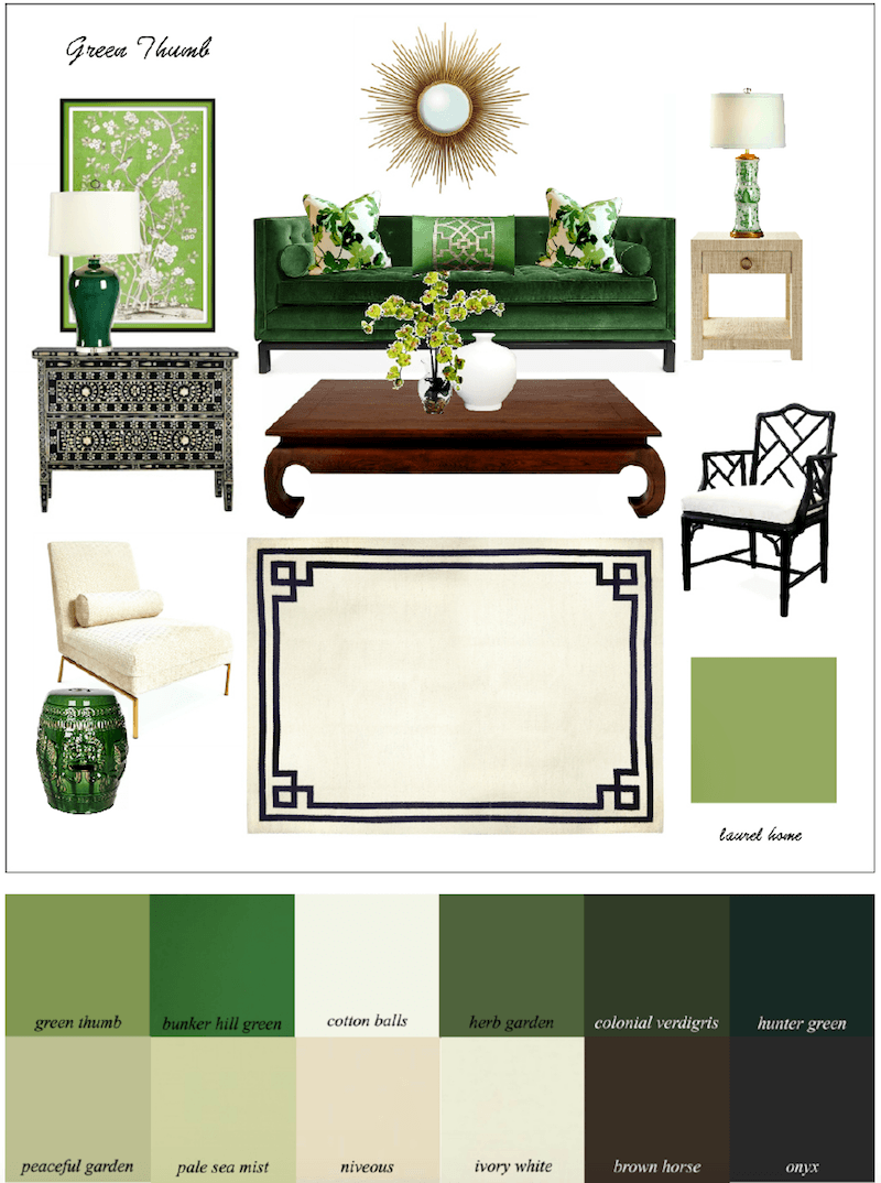
This is one of the first palettes I created. I love this analogous color scheme of greens.
But, let’s scroll back up and look at that window again.
Ugh.
Why is there a niche AND a soffit???
I do not like to do such short drapes, so that means Roman Shades. That big window faces the road and yes, folks can see right in.
No bueno.
But, those three big windows will need three big shades.
However, Roman shades when down are never a good look in this case. It’s just too much dangling fabric even with a pleat or two at the bottom.
Oh, BTW, we know that the pretty cabinet is too large for that corner. It was inherited. And, I’m all for making inherited pieces work, but we would need about six more inches of wall on each side and we don’t have that. So, it will be on its way soon.
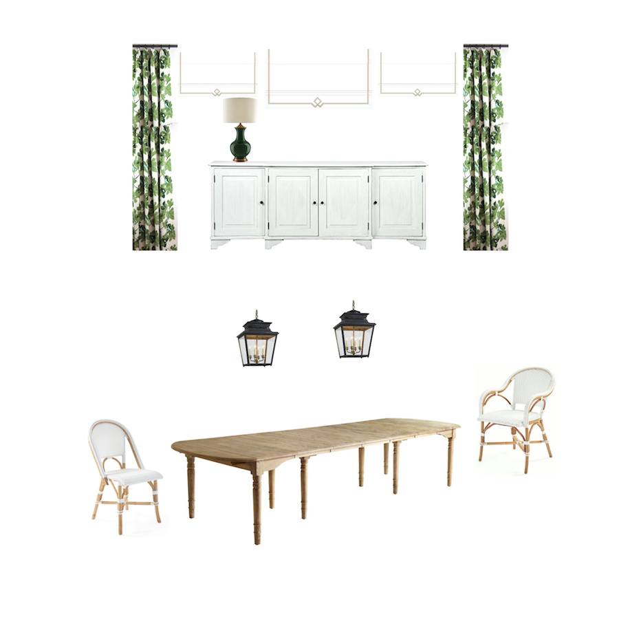 Above is mood board #2. My solution is to put a long sideboard in front of the window.
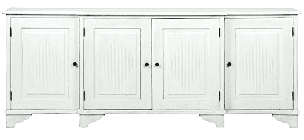
That way, the shades will not need to go all the way down and the Fs can have some privacy. The sideboard above is from one of my favorite brands, Noir Furniture. I’ve ordered from them for numerous clients and myself! You can purchase this piece at Wayfair for a very good retail price.
There might be an issue with the placement of the lanterns. We’ll work it out.
Back to the chairs. Mrs. F is always so sweet and that makes me want to work extra hard for her.
I was determined to come up with another idea for the dining chairs.
The chairs need to coordinate with the stools so that means there must be some white. And, they can’t be too formal.
I looked
and looked
and looked…
Finally on One King’s Lane I was reminded of Selamat. Selamat is one of 100s of wonderful sources in Laurel’s Rolodex that you might not know about. You can find most of the line at One King’s Lane.
And, then I found a terrific chair that’s brand new at Selamat!
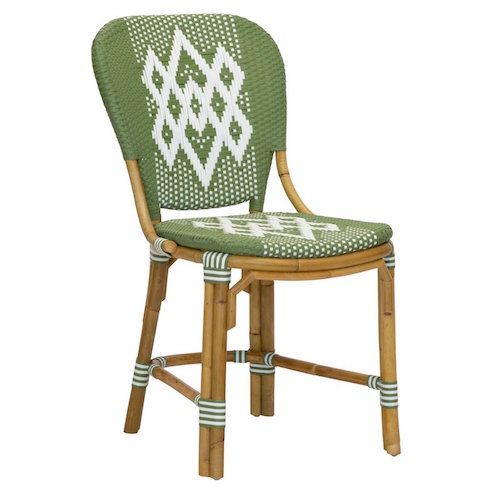 Hekla Chair Bistro Side Chairin green from Selamat
This chair is based on a William Morris design when he was in Iceland in 1871. And, it is named after the Hekla volcano in southern Iceland. The chairs are hand-crafted with a synthetic weave over a rattan frame and can be used indoors or out. I love doing this type of indoor/outdoor chair in kitchens. They are so practical, but also great looking.
There, is also an armchair version of the Hekla side chair; however, I thought it would be better to go back to the Riviera Arm Chair from Serena and Lily.
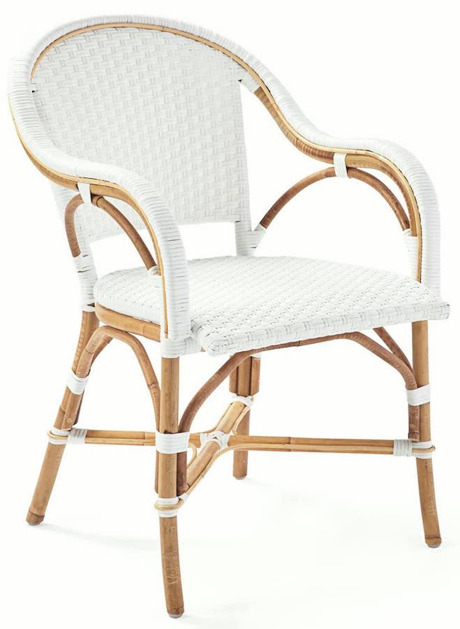
The Riviera arm chair from Serena and Lily for the ends of the table will tie everything together.
So, I made one last board and this time took away the curtains. This is a far cry from the once horrid kitchen and so-so former dining room.
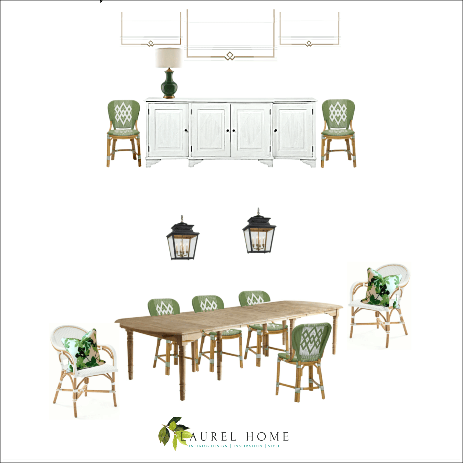
I didn’t discuss the Roman shades.
Some time, maybe a year ago, when I was messing around, I found some Roman shades with trim something like these, on the board. It is purely coincidental that they look so fab with the chairs– And sideboard.
I think that Mrs. F is liking all of this. But, we need to bring in some more green to the kitchen side.
No worries. I’ll figure it out!
It’s probably going to be several more weeks, but I’ll do one more post when the kitchen is all finished. It’s such a pleasure to see this horrid kitchen turn into one that’s a fresh country kitchen for a growing young family.
xo,

PS: Please check out the newly updated Hot Sales!
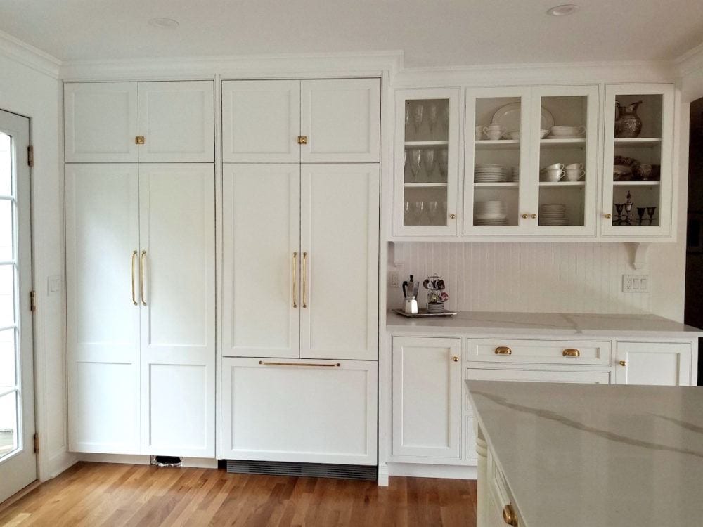
Edit – November 10. Here is the missing fridge wall. I LOVE how this turned out! In the original plans the piece on the right had nothing about it except a huge ugly VENT. Oh, no, I thought. We can’t have that!
In case you’re wondering all of the beautiful hardware is from Rejuvenation.
Related Posts
 Dated Kitchen And No Money – Can It Be Saved?
 I Just Inherited All Of My Granny’s Hideously Dated Living Room Furniture
 12 Of The Hottest Kitchen Trends – Awful or Wonderful?
 9 Fabulous Shades of Green Paint and One Common Mistake
 Difficult Windows – Window Treatment Dos and Don’ts
 Common Mistakes When Choosing The Best Pale Blue Paint
 Ranch House Decor Mistakes You Might Be Making












94 Responses
Thank you so much, Laurel! I have more blog reading to do. And now that I have seen boob lights I think I had better go to an actual store and see the lights switched on. 😀 But I will take your advice and use one of the ceiling lights to keep the focus on a pretty over the table fixture, maybe a gold drum style to echo two others I have in adjoining rooms. But that decision will be only after I look at all of your kitchen lighting suggestions!
Dear Laurel, It has been awhile since I read your blog – lots of distractions – so I was pleased to see a kitchen very similar to mine pop up today. The tear out will begin tomorrow to remove our 80s era nutmeg uneven bead board cabinets and almond countertop. We are putting in cabinets to match existing Simply White trim, and grey glass subway tile which happens to exactly match the Ozark Shadows wall. The countertop will be a simple quartz in Jasmine Pearl (a Carrara Marble lookalike) and we will have light gold drawer pulls. I wanted to ask you this: in our very similar kitchen we have a round table and very similar window over the sink. Should I try to find matching light fixtures. I had thought to get gold for over the table and have spent HOURS trying to find the perfect one. But I cannot find two I like in the same design. Can they be different colors or materials? They will have to be pretty close together. Or should I skip having a pendant over the sink?
Hi Jan,
I can’t say for sure without seeing the exact situation, but I would probably forgo the pendant over the sink and just do another ceiling light. Another option if you are doing recessed down lights for the central lighting, would be to have a semi-flushmount or possibly a regular flushmount ceiling light that coordinates with the hanging fixture over the table.
Hi Laurel.
The wall with the refrigerator looks gorgeous! What a great finish to the already lovely from fugly kitchen!!
Thanks so much Nancy!
Hi Laurel,
All I can say is Ms F is lucky to have you as a friend & have you helping her. Her new kitchen is beautiful. I can’t wait to see the final after pictures.
Thanks so much Mary!
Absolutely stunning! I’m sure the owner is loving this transformation. It is so classic that a pic 50 years from now will not invoke the shock, awe, and horror of those crazy catawompas cabinet handles! Beautiful work Laurel!
Thank you S!
The only thing to watch out for, Laurel, are the light fixtures. In my experience the ruddy things NEVER hang straight, and neither will hang exactly like the other. I’m hoping you have some trick up your sleeve that you’ve learned in your professional life. If so, girl, don’t hold back! Share!
Absolutely fabulous kitchen makeover. Could you share source for the brass cabinet cup pulls? They are such a lovely accent to the La Cornue. We are building a new home and using a LaCanche with brass fittings…they recommend unlacquered brass for hardware and I am having a difficult time. LOVE your work, blog etc which has been so helpful in our process to date.
Hi Lindie,
The hardware is from Rejuvenation. There’s a link in the post. But, no problem, here it is again.
Oh, and they are having a 20% off sale on everything + free shipping! Great deal!
Hi Laurel,
I love your blog and I have been reading it for the past 3 years. I bought your blog instructions, very helpful. I also have a certificate in Interior Design. In the interior design courses for kitchen design, there is discussion about the triangle. You know the sink, stove and refrigerator designed to have access. I wonder why the designer didn’t “tighten” up the refrigerator to the stove & sink? Adding the refrigerator on the wall with the sink and then the french doors next to that or even a single door or single door with side panel – depending on the dimensions would lesson the steps in the cooking process. Just a thought. Aside from that, I so look forward to your blog, your ideas, and your humor. I enjoy your excursions and comments. I am from California, and so, I love the traditional style homes where you live. Thank you.
Hi J,
Mrs. F and I discussed the location of the fridge as yes, you are right, ideally, it should be a few feet closer
to the sink and range. However, being the fit athletic sort, she felt having to take a few extra steps would suit
her very well. Aesthetically, putting the fridge on the window/door wall would not work. The only other option would’ve been
keeping the wall or part of the wall between kitchen and eating area. However, that would’ve not worked because the island
would’ve need to be much smaller.
Love the before and after pics, love the process. Thanks for sharing! You’re so unique Laurel! I’ve never seen an interior designer who is comfortable with letting the client to do so many things on their own and not freaked out… and help them bring their vision to life with so much help and sources, experience and expertise. So very high class in behavior! I really would appreciate that. That kind of relationship between client and designer is the best. Good job as always, Laurel!
Thanks so much L. I’ve always had the philosphy that a client’s home is theirs, not mine. Of course, there are some who wouldn’t get so much as a napkin ring without my help.
Hi Laurel, lovely post! We did Simply White on both the walls, cabinets and floors and love it. Kitchen is still not finished! It is taking forever, but will be worth it. The one thing I am absolutely loving is how having a white, low value contrast kitchen makes the things you want to pop, really POP!
By the way, there are some super perfect green Foo dogs at Ballard Designs that would look great in this kitchen….
Thank you Korina!
Laurel,
Always enjoy your posts and have shared your hilarious wisdom and experience with others. So glad to see this project which starts off with a “regular” looking kitchen and ends up looking so much better yet not glossy shelter magazine …okay, I’m sort of overlooking that beautiful la cornue range. Peace and humor be with you.
The caddywompus cabinet hardware was a thing (at least here in the south) when I was growing up is the 70s. I remember it vividly but that kitchen takes it to a new level. Wonderful progress in every way. You make homes “homeyer”
Way to go Laurel on both counts
Love the direction the kitchen is going and loving the range way too much
You don’t have to explain to us
We get you and we like you the way you are
The Dowager also said …Never explain… Well she said never complain too, but Ha
Thanks for the fun post. It is so much fun to see before and after photos! You did a great job and it seems like a wonderful collaboration you have going with the homeowner. I can’t imagine having someone drill the holes for that slanted cabinet hardware preventing swapping it out for something that would look more updated in the future. Thanks again Laurel!!
Thank you and the homeowner for sharing this wonderful project. And, congratulations to you and the homeowner (and The contractor and any tradespeople you wish to include) on this gorgeous transformation.
I also enjoy seeing a reno in a home with 8’ ceilings. That’s what I have. Of course, people renovate homes with 8’ ceilings all the time but there aren’t so many photos online or in print of those projects. It is great to see your client’s beautifully designed room and see the scale and proportions – including the furniture. Congratulations again, Laurel.
Thanks so much Libby!
The old hardware was nutso but in my brain the handles were all saying “whiz!” “zippo!” “pow!” which is not the worst thing hardware can say (that would be “blehhhhhhhh” like a dial tone which is what the stainless bar handles the builder of our house loved said to me).
Laurel,
I love everything this transformation, but I also thought shutters; they would give privacy from the road yet allow light in with the top half open-or just installing bottom halves. I have 2 road facing rooms I’m getting ready to redo & was thinking of shutters despite the price. Can you share more of why you didn’t go with them? I love it when you explain your thinking, it’s often something I never even considered. Thanks!
Hi Valerie,
I’m pretty sure that I did explain in an earlier comment. Sorry, I can’t see which one from the comment area in my admin area.
Lovely renovation. One question, with regard to placing a sideboard in front of the windows for privacy — will this look odd from the outside? If so, do you have plans that would make the back of the sideboard look more appealing as viewed from the street?
That’s a very good question. During the day, I don’t think it’ll be that noticeable and at night, the shades will be mostly down, so I don’t think it’ll be noticeable then, either. However, if it is, we’ll address it and find a good solution.
I have serious, serious, Cornue envy. That gold and white beast is just gorgeous…and I don’t even cook.
I grew up with cupboards EXACTLY like the old photo, except no hardware save the hinges. Ours was installed in the late 40’s/early 50’s, when they also added indoor plumbing to the house. It was considered high chic at the time (but I never liked it). 70 years later, it is still there so it definitely was durable.
Thank you for telling us about your second son. As I psychologist I have worked with severely psychotic people and their families and you are totally correct in saying that unless one has walked in those shoes, one has no right to judge or assume what it is like. It is a horrible and misunderstood illness for both the patient and his/her family, and I am so sorry for the pain you have experienced through your life. Bringing order and peace and beauty and knowledge to our homes is a wonderful counterpoint.
Thank you Celestial. I very much appreciate your kind words.
I just recently signed up for email updates and this is my first post from you. Loved it, especially the link to your pic monkey mood boards. I used to use Polyvore and I have struggled since they closed down. I have used pic monkey for photo editing for years so this will be an easy transition for me. Thank you.
p
Welcome Pamela!
nice – we have a similar issue with the wall between the kitchen and dining room holding a bar, desk nook, and pantry. Likely load bearing as well. We kind of want to knock it down but don’t think it’s possible. Plus we have a living room with TV open to the dining area and a separate space with another TV open to the kitchen area. Man our house is weird but we still love it
Hi Christopher,
Load bearing walls can usually be removed as long as there’s a steel header beam and steel support beams. But, of course, you would need an engineer or architect to determine the best course of action. I believe that the F’s wall was also load bearing. And you’ll see the support beam which I would add in case, to delineate the two spaces.
the placement of that cabinet hardware gave me vertigo!!!!!
seriously. haha
Hi Laurel
I’ve learnt so much from your blog and love what’s been done with this kitchen/dining area. But I have to ask, in the before photos there is a painting on the floor, did I miss something? Why is it there?
Mrs. F’s son was playing in the kitchen. I bet that has something to do with it. :]
Such a gorgeous transformation! The “before” photos look almost identical to the kitchen in my old house also located in Westchester County. I really love the freshness of the color scheme. Your clients are so lucky to have you.
Laurel, excellent. Taking everything one hears and reads personally is a choice that doesn’t serve anyone, yet it is a pervasive habit. Our lovely seagrass rugs would be blood red from walking on eggshells every moment. I would most compassionately suggest Ms Roche don a Teflon suit and be rid of the Velcro one.
Love you, your work and your fabulous sense of humor…and I own all your guides! I plan on putting all to good use. Hugs, Mary
Hi Mary,
Wise advice. I see that you’re a life coach. Cool!
I LOVE it Laurel! Super fresh yet still traditional – superb!!!!
Hi Laurel – I have followed you for years and have learned so much. It’s great to check in with your blogs when I have a question. I love what you’ve done with this kitchen. Can you share the quartz countertop name and brand? Is it Dinergy by Aurea?
Thank you!
Ann
Hi Ann,
Yes! And, I found that out by putting AUREA in my email search box and it popped right up. Here’s a link to their website.
Laurel, you and your blog are awesome. (I read every post as though i were cramming for exams.) Thank you.
haha
It doesn’t get any better. What a gorgeous outcome. Mrs. F is so lucky to have your help, Laurel.
Amazing transformation. Love the windows over the sink. Hard to believe it is the same kitchen. So light and airy now – love it!!!
Hi Laurel,
What a beautiful transformation. I love the new “window wall” above the Kitchen sink. And your idea to open up the room to the Dining Area. That long table you sourced is magnificent. I can see it being used for everything from Homework to Scrapbooking night to Holiday parties.
Beautiful work.
Warm regards,
Tara
see paint companies are introducing “Color of the Year” for 2020
Ahh.. Thanks for the heads-up Susie. I think I had googled this a few weeks ago and did know some of these. Not too bad this year.
So beautiful! And the green- LOVING that color. Helps that I did my new home here in California with green as an accent- of course we rarely find the charm that you do on the east coast. Have to add it here! I also love that you are practical when designing for a young family (indoor/outdoor chairs!) without sacrificing beauty and style. I am a devoted follower, mostly because your choices and advice are classic, not just trendy. Most people don’t want to spend money on something that goes out of style in a year! And you are pretty hilarious- life is serious enough without being too serious about interior design!
Thank you Dee-Dee! I’m rarely serious about much of anything. Humor is how I frequently handle situations that are anything but funny. Of course, I’ve had my moments of despair and heartache, just like we all do. xoxo
Isn’t it a joy when you discover that perfect item that dictates what goes and what stays, and pulls everything together? I don’t know that that is what happened here, but when I saw the dining chairs you selected, I had the feeling of THAT’S IT! Maybe it’s because I think those chairs are smashing. I love how the trim on the shades subtly mimics the pattern in the chairs. I appreciate that you include the process involved in making selections. Every choice influences the next selection and it helps to stay flexible. Those “no-longer-available” moments can upset the apple cart. This post has me eagerly awaiting the final pictures.
Thanks so much Tricia!
Dear Laurel,
I too have an adult son with autism and behavioral issues. I 100% agree with you on using words freely. You’re so right, people need to stop taking everything so personally.
Love your blog and learn so much from you!
Thank you Cathy. I very much appreciate that! A lot of us are dealing with unimaginably painful situations. However, life goes on. We have to take the good with the bad and understand that even in the most difficult times, there are blessings to be had. And, we cannot possibly know what someone else is dealing with (unless they tell us). And, it is foolish to assume they don’t understand.
Beautiful kitchen transformation! Love the green with the white. Not a designer but my eye wants to see brass/gold brought over to go with the hardware in the kitchen rather than bronze lighting. You have shown us so many beautiful gold lights I’ve drooled over. Also, since a few readers have recommended shutters, I have a house filled with shuttered windows that leave my rooms screaming for some fabric softness, color, and pattern. I finally ended up hanging nonclosing drapes alongside my dining room shutters just for more visual interest.
Hi Jean,
Actually, I feel in this case, that the bronze will give a deep note that will look terrific. But, of course, antique gold or brass could work too.
We are definitely not doing shutters for a wide variety of reasons. The issue is that this is not an easy configuration to deal with.
We love our top down/bottom up shades. They are so easy to change as the light level changes. It is a minimalist look, however.
I like those too.
Amazing transformation! I’d love to know the color for the cabinet finish and paint colors for the room. The whites of the range, countertops, cabinets seem to work so nicely together. Beautiful!
Hi Christine,
I commented earlier about the cabinet color. The walls are Benjamin Moore Simply White. We looked at a number of whites and Simply blended in the best. One really has to look at this on site, if possible.
How passe are cafe curtains??
People still do them. I did them in this kitchen. I considered cafe curtains here, but not terribly crazy about the horizontal line. At least with Roman shades one can vary the length.
This is my dream kitchen. Not massive but beautifully executed and functional! Most impressive! -Brenda-
P.S.: Any idea Laurel what the time frame was to achieve it? Am just curious as the last renovations I had done consisting of two bathrooms took a little more than six months regardless that all supplies were on hand, there were no hidden surprises and the contractor came highly recommended. (Thank you.)
Thanks so much Brenda! Glad you like the kitchen. That’s why I wanted to share it. It’s not over-the-top, but makes the most of this irregular space with an eight foot ceiling height.
As for length of time it takes. I believe that it’s been five months since they began. And actually, it’s not 100% done as someone made a mistake on the pantry and fridge doors. Six months is very common for renovations of kitchens and bathrooms. Occasionally, a month or two gets shaved off. Why does it take so long?
Well, it wouldn’t if everything was in stock, undamaged, as expected, the right amount and workers didn’t have emergencies on other projects. It goes on and on… Frequently, there are surprises that need to be dealt with. All of these things can create delays in getting the project finished.
Love your posts. This one is so helpful because it elucidates the process — considering different options, critiquing them, and finding different solutions. Invaluable! Thanks for taking the time to teach us!
You’re welcome Elle!
Hi Laurel – first off I LOVE your blog and look forward to it every morning! There are so many beautiful new tiles out there for back splashes etc but we are finding that when it comes to the end piece they do not come (or are not offered even custom) with a finished edge. I am highly apposed to “shluters” in any project. How did your client deal with the exposed edges of this tile? Especially the Zellige tile, which is pretty rough along the edge.
Hi Joyce,
Sorry, I don’t have the answer to that one, but it’s a good question.
As an “old” interior designer, I agree with above-skip the Roman shades. Wide shutter are perfect for letting in just the right amount of light and they look uniform across the window. She can close them when she wants privacy and open the slats when she wants light.
This is why I don’t let negative comments through, normally. Personally, I’m not a fan of shutters for this type of window, at all. Actually, I’m not a fan of a large bank of windows. You will never see that on an 18th century home.
Good Morning Laurel Don’t you find being a designer means you must hear but not be offended. I work in this field as a set designer and I aim to please the client and close my ears to everyone else. I have had the privilege of working on some television programs and one talent wanted me to change things. I refused. She is not the client. Many months later, the director went to the home of the person whose story we were doing. The director said, “Diana, you hit it right on the head, I felt I was on the set.”
There will always be people in the world who want to tell you how to do your job. If I know and respect their talent, I’m open ears, otherwise, no.
You are the best!!!!!!!!!!
Indeed, Diana. Usually, I don’t let those negative Nellies through. But, I had the comment moderation off while I was away. I always find it amazing those that give advice when none was asked for. And, sometimes I DO ask for advice!
Hi Laurel. I’m curious, will two of the lanterns work when Mrs. F has the table set up for four and doesn’t have the extra leaves installed in the table? I love your blog, and thanks for all the wonderful information you share!
Mary
Hi Mary,
There is an option to have that table be that small, but of course, they will always have two or three leaves in the table on a regular basis. The room is almost 17 feet wide.
Beautiful! Love the green! It is a nice break from the grays and blues that are EVERYWHERE in design currently. I happened to see a lovely new item on the Pottery Barn website yesterday that came to mind when you said you need to add green to the kitchen side of the room. They are called “Hunter ceramic vases” and they really caught my eye but not yet my pocketbook. lol. Thank you for everything you share with us.
I was interested in your comment about the niche & soffit. We just built a house and did something similar in the master. The ceiling in the bedroom is 9′ tall with a trey/tray that added another foot to most of the room. We bumped out the wall there three feet with windows on all three sides and dropped the ceiling (I didn’t think of it as a soffit) to 8′ to create a cozy reading nook. We haven’t added curtains yet but are thinking they’ll run floor to ceiling when we do. We’re very happy with the look! But maybe this is a different situation from a shallow niche. I do see what you mean about the short curtains there. Lovely work on the kitchen, Lauren. I bet it feels good to do something concrete now & then!
Beautiful!! I LOVE green. The transformation is perfect – it all just seems to fall together so effortlessly, wink wink.
Very happy to read your thoughts about the roman blinds on large windows. I am considering some for large windows and wondered about the look when extended. Maybe you could say something about the modern cellular/honeycomb/roller shades that are available. Do they EVER look right in a trad/new trad home? I think the answer may be no – you never mention them in your posts about window coverings.
Beautiful kitchen! Way to go Laurel! What paint color is used for the cabinets? What is the stain and type of flooring? Love everything about this kitchen; wonderful job!
Hi Mary,
I don’t remember the name off-hand, but it is a color used by the cabinet manufacturer. It is very close to Benjamin Moore Simply White, but maybe a hair deeper. Simply White is the wall, trim and ceiling color.
Hi Laurel, I am a huge fan of yours! I read every post, tell others about you….I think you are wonderful! BUT…please stop using the term “psychotic” or “psychotic breakdown”, etc. As the mom of a wonderful young man who became afflicted with serious mental illness at age 19, while in college, that term is hurtful. He has had psychotic breakdowns and it has taken 8 years to find the perfect combo of meds to prevent psychosis, yet not leave him a “sad zombie” He struggles every day to have a normal life. I realize this may not be the forum to bring this up, but I see these type of comments regularly….I know people don’t realize they are hurting others, that’s why I’m writing this. Again, thank you for all you do.
S,
Actually, your inference that I have no idea the suffering you have incurred couldn’t be further from the truth. I also have a psychotic son who’s 24 and WON’T take meds. He’s also autistic and has severe behavioral issues. It started when he was a toddler. That’s the son I never talk about. And, I had a psychotic father, but we won’t talk about him either or what he did to me starting at the age of three.
I am sorry you are offended, but I learned having a child with neurological difficulties, means having to get used to stares and “inappropriate” comments. And, those people do NOT have any idea what we go through.
I’ve been dealing with this for nearly 30 year, not counting my hideous childhood. My comment is not personal, so if you feel
hurt it is only because it is bringing up your own feelings regarding your son. It is not directed at you, so please stop taking personally that which has nothing to do with you or your unfortunate situation.
While your feelings are legitimate, your comment is not appropriate.
If you don’t like my choice of words, then please stop reading.
Gorgeous work… wish I was one of your former clients that you would still work with! Use of the buffet in front of the windows and Roman shades is a great combo. Like without the drapers. What is the material on the island counter?
Hi Kim,
The counters are a quartz product. Mrs. F sourced that. I have always had a philosophy of letting clients handle as much or as little as they like on their own, but just run it past me first.
When Mrs F goes for it, she really goes for it! It is beautiful. What a transformation. Love the table and the lanterns, and pretty much the chairs. Oh, and that buffet! It will be fun to see what you end up doing at the windows. Will the buffet make it awkward to open/close the windows?
Absolutely beautiful kitchen. Please show us the finished party room. I loved the mood board for it!
Hi Kathy,
There actually might be a short video of the room somewhere.
forget the roman shades…and do shutters on mrs. f’s kitchen..you are making this much too busy…and forget the drapes..just white shutters at the window…then they can close them at nite..so no one can see them in their pj’s having a midnight snack!
Hi Susan,
Maybe you missed the sentence where I had gotten rid of the drapes. This post is largely about the design process. Nothing is yet written in stone. Not that it should matter. I would not go on someone’s blog and tell them that they are misguided. That’s insulting. This is why I have to moderate comments. Of course, you are entitled to your opinion. You may think whatever you like. “Laurel sucks.” “Laurel is a sucky decorator.” “Laurel has no idea what she’s doing.” But,rubbing it in my face is not welcome.
Shutters are fairly uncommon in this part of the country. And, quite frankly, I don’t like the idea of those three big windows with dozens of horizontal slats. But, of course, I would not tell anyone to not do them if that’s the look they are going for.
Stunning transformation! The La Cornue range is gorgeous. Are there plans for lighting above the island? I’m currently looking for inspiration for my own kitchen.
Hi Siobhan,
We decided to forgo the pendant lighting over the island and only have it over the dining table.