Dear Laurel
I am wondering if you could do a blog post on curb appeal fixes. And, if possible, what happens when where you live is a completely different style, geography, everything from what you want.
Please allow me to explain.
My husband and I plus our four kids recently purchased a house my husband’s grandfather built out in Southeastern Utah.
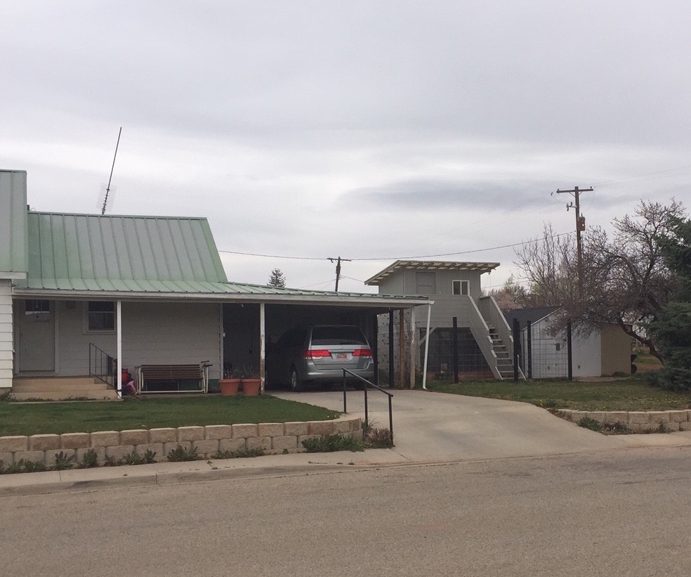
Here it is:
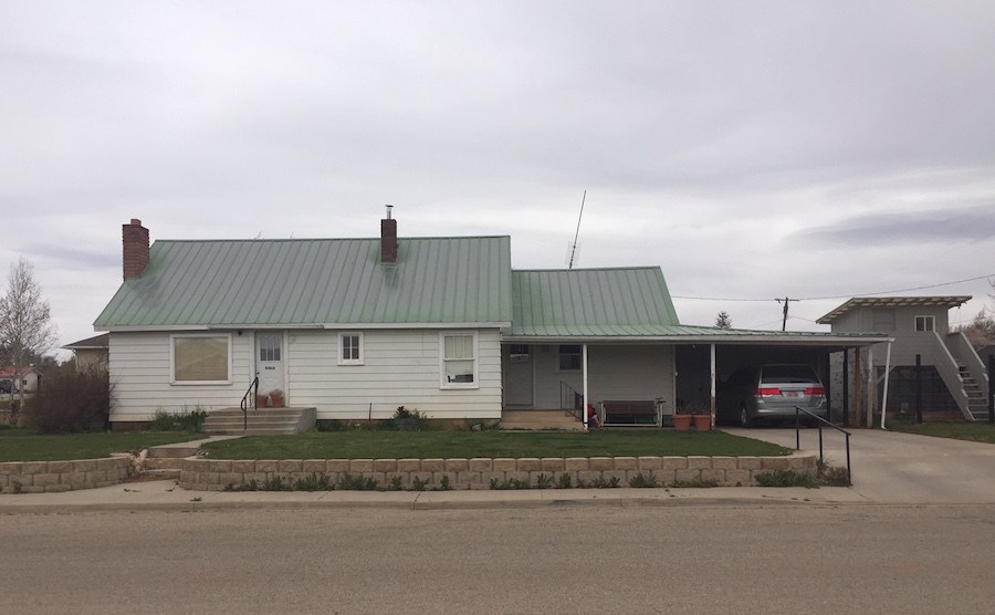
I guess it would be considered a cottage with really no architecture to speak of except great wood floors. And yes, I realize that the exterior needs a lot of work.
However, here’s the problem; or at least one of them.
I gravitate towards a Parisian look or a mixing of modern and traditional. Is it crazy to want something like that or do I need to bend to the will of the house?
See Laurel’s dream Parisian apartment.

Chris D’Angelo, via the Huffington Post
Let me be clear. The house is in the middle of freaking nowhere. Yes, it has some incredible terrain, However, it is an hour to a Walmart and 2 1/2 hours to a Target. The area is not affluent, so even if we had endless amounts to spend, it wouldn’t make sense.
However, we were living in Maine before we moved here.
My husband was a staff psychologist at the University of New England, but then this opportunity came up and we felt that we should move here to be closer to family. So, we bought this house for a song. My husband is starting a private practice here.
I am very sad to not get my Maine scenery anymore, but you know how life goes.
This summer we are redoing the siding, windows, and roof. We are also adding on three small bedrooms to the back of the house since we only have two bedrooms and a basement.
We are trying to keep all of that under $100,000. I don’t have an exact number on furnishings, but maybe around $25,000?
The kitchen is next on the list. I think I am just trying to recreate a cute white shingled home from Maine but not sure if that would be weird based on where we live.
I love old houses, architecture and moldings. I want things to be classic, not all trendy. The eating area with those cool windows sold me.
Thank you for whatever insights you can provide that you think will apply to other readers, as well.
Sincerely,
Leah
******
Oh wow! This is a real Dear Laurel note from a reader. I wasn’t sure if I could/should tackle this one or not.
While reading this, I kept thinking. Paris, Utah? (after Paris, TX)
And, coincidentally, my heart goes out to the people of Paris and the world, for that matter, for the partial loss, at least for now, of our iconic Notre Dame.

But, this corner of south-eastern Utah couldn’t be more different from Paris.
Below are some images I found of the surrounding terrain.

Liz Kaatz – Moab, Utah

Daniel Buckenmeyer – southern Utah
Amazing, huh?
But, there’s a reason that it’s such a long drive to go shopping. The entire population of San Juan County is just over 15,000. And at 7,800 square miles, that’s about two people per square mile.
Conversely, my county, Westchester County, New York with a population of 980,000 and 500 sq miles is 2,000 people per square mile! Of course, some areas, closer to NYC are more densely populated and areas up north, more sparse. But nowhere is it only two people per square mile.
True, I imagine that much of San Juan County, Utah is uninhabitable.

Here’s what San Juan County, Utah looks like in satellite imagery, via Google maps. Pretty rugged, I’d say.
For today, we’re only going to address the outside of the house– the curb appeal fixes. And, If enough of you are interested, I can perhaps take a crack at the inside.
The reason I am beginning there is because the outside is going to affect the inside.
However, the first thing I am thinking regarding any renovations is…
Anyone know?
Yes, Nancy, I think you had your hand up first.
Is it what the other homes in the area look like?
Bingo.
I mean, if all of the other homes in the area look like Leah’s and THAT is what people are expecting, then, we need to be very careful and ask ourselves these questions.
- How long are we going to be here?
- Is the area apt to change?
- Is this an up and coming area?
If Leah and her family are planning on being in this home for the next 10-20+ years, they can perhaps do a little more. Or, if the area is becoming somewhat more affluent for some reason, the same thing.
Otherwise, they may not get back their investment. And, that’s fine if that’s not important.
I did a search for homes for sale in San Juan County, Utah. You can see for yourself that most of the homes are quite modest.
The area couldn’t be more different from Maine OR Paris!
However, I am including one image of the eating area in the kitchen, so that you can get a feel for the inside.
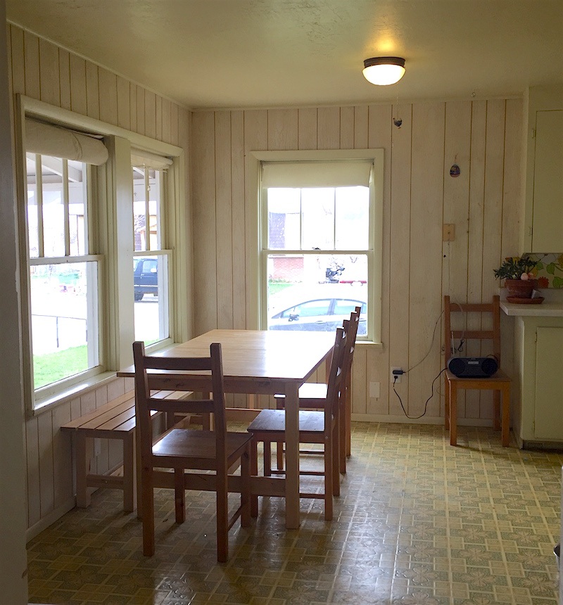
I love those windows too!
Here’s the good news.
It’s not an adobe style home. If so, then this would be even more difficult.
I think it would be possible to do something with something of an English or French Country feel. A good example of a cottage-y style home would be that of Ben Pentreath which you can see here.
When I am looking at the images, it is not clear where this home is.
While I probably wouldn’t say Maine, it could definitely be Kansas or Oklahoma.
Mainly, I see is a farmhouse-type home that needs some TLC. AND, some serious reorganization of the front facade.
Now, I realize that farmhouse style has gotten a bad rap recently. Actually, I like that style if it’s not over-done.
Let’s jump in with our curb appeal fixes and assess what might be done. Of course, none of this is mandatory, unless there are structural issues. Leah did say in subsequent email that they have an engineer.
That car port is worrying me. In fact, that entire porch looks like it could blow away with very little effort.

Okay. The first thing that’s bothering is the random configuration of windows and front door. Ideally, we should have a front door in the center with matching windows on either side. Or else, visually equivalent.
But, at the very least, I would like to see a double window like in the kitchen on the left and if possible, a double window on the right.
The roof will be replaced. I am fine with this type of roof.
The next issue is the front stoop.
First of all, it is dangerous. I would love to see it extended to form an entrance deck.
And then it could die into the rest of the porch area. I can’t see enough to see how that would be done.
However, my central focus for the facade that I think will really bring it to a higher level is an attractive railing.
One of my favorites is a cross X balustrade.
Below are some images for inspiration.
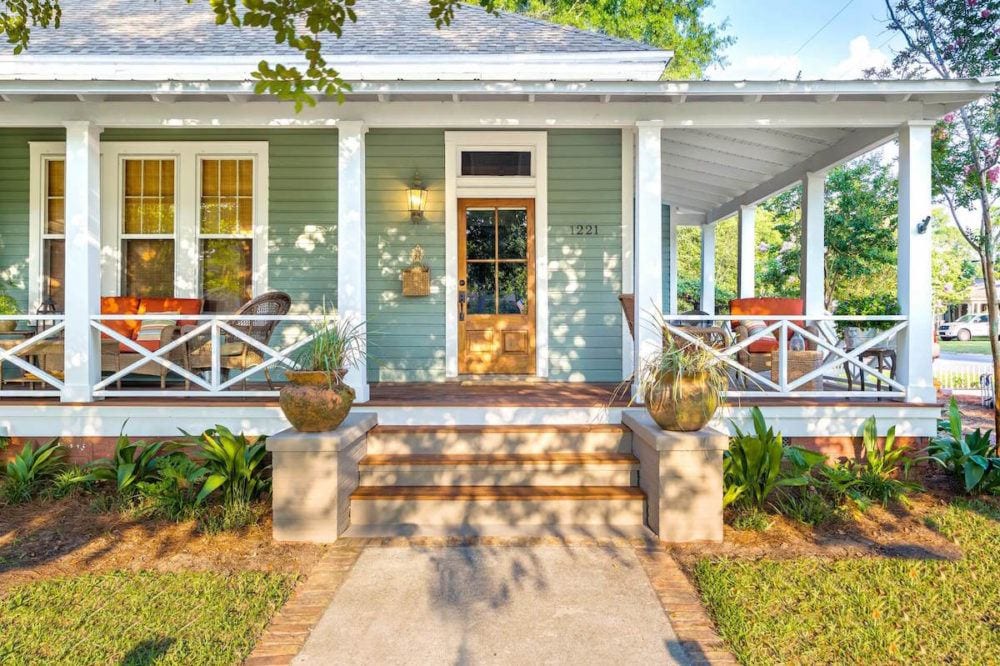
What a charming home in Florida.
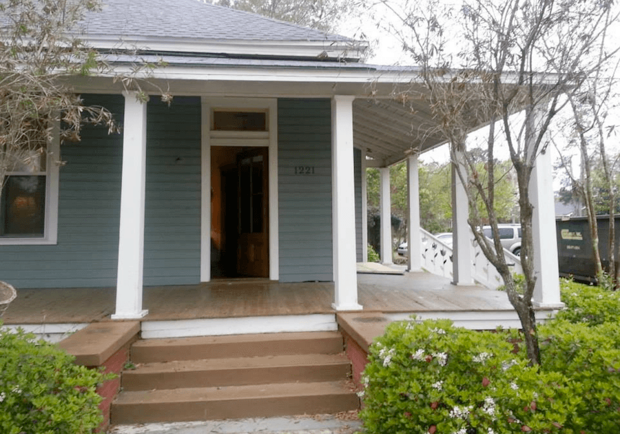 This is the porch before.
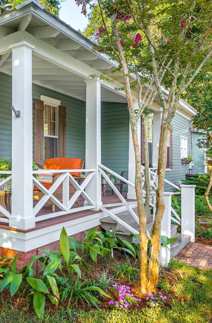
And, here you can see how the X balustrade would look going down some stairs.
Wonderful farmhouse style.
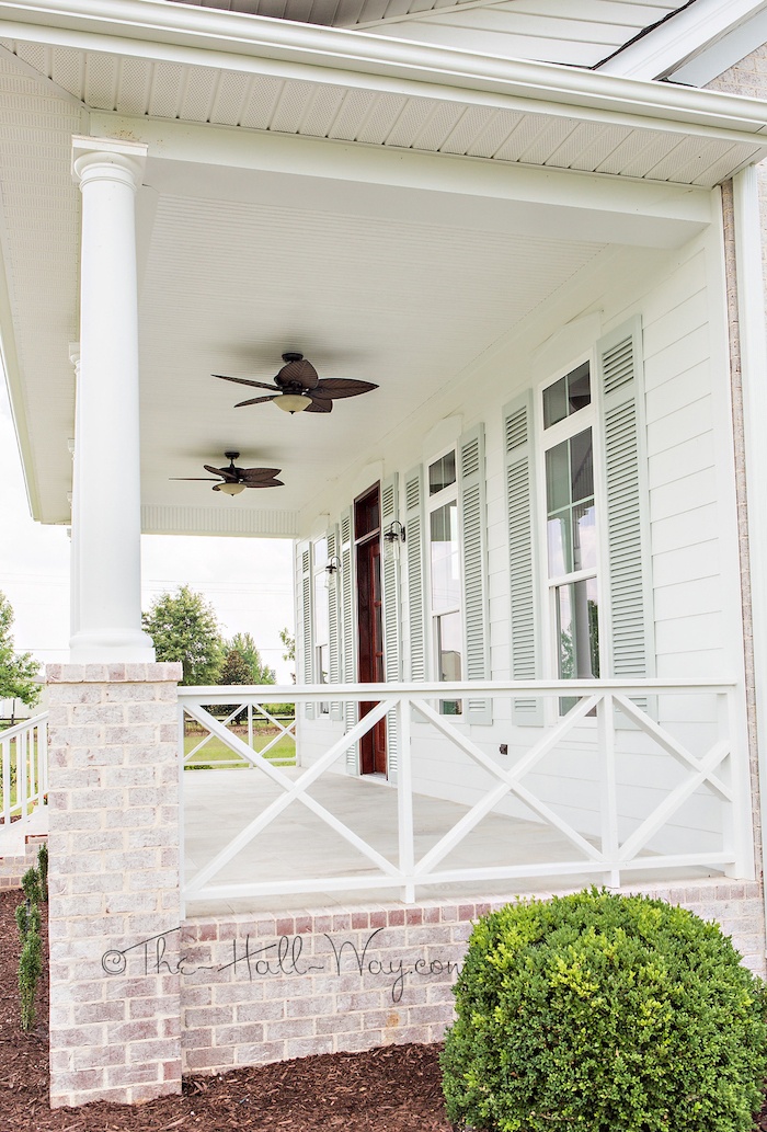 The-Hall-Way – Cross X Balustrade railing
How pretty is this! And I loved the parged brick.
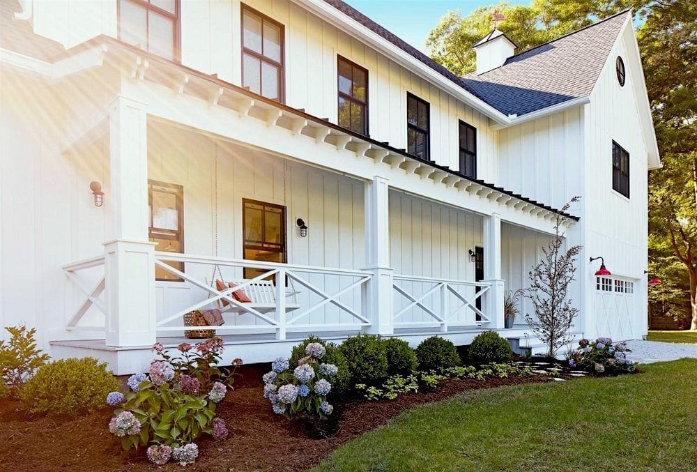
original source unknown
All of these have a porch, however, they could do just the bottom part as it would be on a deck.
The existing porch and car port look especially rickety, as I mentioned earlier. I would like to see heftier columns like the Barrow Building Group House.
 The last major issue is the cinder block and walk-way. I think the entire thing should be redone. If it is necessary structurally to have a structure there, then either real stone or if possible, some bushes. And of course, it looks like the entire walk way going to the house needs to be re-done. I would prefer stone to concrete but if that’s not in the budget, could we maybe do brick pavers with wooden stairs?
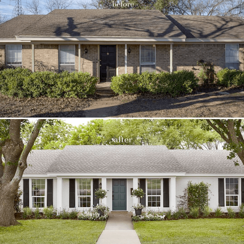
Above is another cool makeover by Joanna Gaines.
There are a lot more ideas in this post about home exteriors that you won’t want to miss.
But, below, I have a special treat.
Last year when I did the post linked above, I had contacted Steve the owner of this wonderful home (below) in Boston to ask if I could have permission to use his home on my blog.
If it’s someone’s personal space and they’ve penned about it on their own blog, then I always ask permission. Well, Steve graciously, not only said, sure, he sent me more images! But, because I only asked him the day of publishing, (typically me, unfortunately) I didn’t get the reply in time. Well, here it is, nearly a year later.
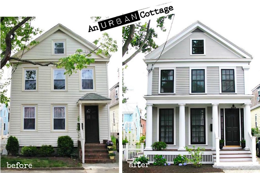
I adore what Steve did to this Greek Revival lovely. And the inside is beautiful too!
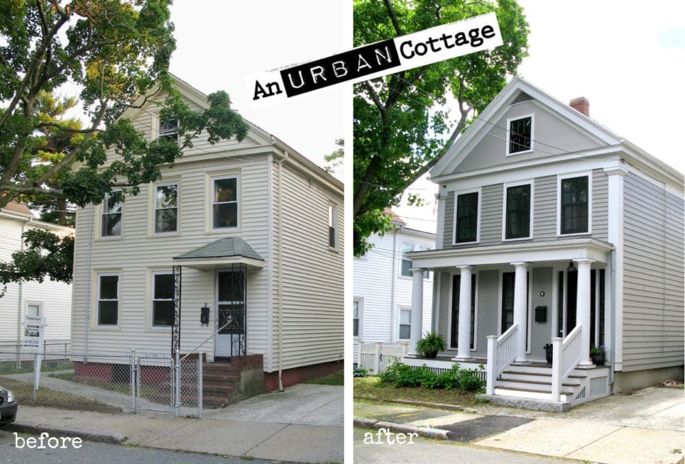
You can see much more and learn about Steve’s process on his blog An Urban Cottage. As you can see above, there are two before images. There’s the chain link, before, before and then an interim before in the top image.
Of course, whenever doing a post about home exteriors, I need to link to the best one ever by Nancy Keyes.
For exterior paint color ideas, please click here.
And for some great ideas for your front door, please check out this post.
I hope that gives y’all some ideas for some stylish curb appeal fixes.
xo,

P.S. – My dear friend and supremely talented interior designer Deborah Von Donop is giving away one Laurel’s Rolodex to one lucky winner. Click here to find out how to enter.
Related Posts
 Is There Any Hope For A Windowless Room?
 12 Amazingly Wonderful Exterior Home Makeovers
 Our Unique Home, Stunning View, But Difficult To Furnish!
 All About Hardwood Flooring + The Common Cleaner That’ll Ruin Them!
 An Exquisite Kitchen Restoration Has Charm To Burn
 The Guaranteed Way To A Beautiful Room (It’s Not The Wall Color)
 Finding Bathroom Storage For A Small Difficult Bathroom


