Hi Everyone,
Oh, my word! It finally stopped raining! Fortunately, no flooding in Boston. But, it sure is nice to see some sunshine.
Today, I’m featuring six drab paint colors.
And, they’re all by Farrow & Ball.
What inspired this post is that I was working on a different color post which I’ll get to later, but I remembered years ago a rep at Farrow & Ball told me about a color she adored. Alas, it had been archived. However, I recall her telling me that artwork looked incredible with it.
I asked her, “What does the paint color look like?”
And, she said, “Uhhhh… well… It’s difficult to describe.”
That’s when I know we have a good one. haha
But, she continued with her attempt to describe what this paint color looked like.
Ummmm… The color is called Pantalon. And, it’s not exactly brown, and I wouldn’t call it gray, either. It changes with the light. Sometimes it looks a little greenish. Yes, greenish, grayish, brownish. Oh, I’m not describing it very well. Would you like me to order a sample for you, Laurel?
I politely declined as I wasn’t sure what I wanted to do with my bedroom wall color. This was about 8.5 years ago.
She went on to say, “The important thing is that on the chip, it looks like one of those pretty drab paint colors. But, when it’s on the walls, it’s gorgeous. And, artwork looks incredible with Pantalon as a backdrop.
Fast forward, and several years later, Farrow and Ball sent me an Archive Collection fan deck. I had forgotten about Pantalon. That is, until today. So, of course, we’ll be looking at it in a bit.
These drab paint colors look wonderful in both old, traditional homes and contemporary or modern homes.
By the way, when I say “drab,” paint colors. Drab does not mean without life or boring. In fact, all of these are rich, complex colors. But, they’re not screaming out. LOOK AT ME! They don’t have to. That’s because they make everything around them look just as stunning.
These colors are not the star of the show, generally. They’re the supporting players.
So, today, I’m going to go over six of my favorite drab paint colors and talk some more about each one.
And, of course, share some beautiful examples of each one used in a residential setting. Interestingly, I did a post on some of my 16 Magical Farrow & Ball paint colors a few months ago.
Okay, two of them are repeats. However, the other four are not.
Five of the colors are quite deep, but one of them is actually off-white. In fact, it’s a color that was archived in the last two or three years. I know because, for some reason, I could only find one Farrow and Ball fan deck, and the color was still in it. But, it’s been archived.
For those that don’t know. Farrow and Ball, unlike other paint companies, rarely deviate from a set of 132 colors.
So, every year or two, they add from six to nine new colors, and that means they have to retire six to nine of the old ones. It doesn’t mean that they’re bad colors. Not at all. It only means that there’s another color that’s fairly close to the old color.
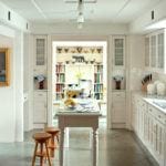
In fact, the first color, CLUNCH, which was recently archived, has one of the highest ratings of all of the paint colors on the Farrow & Ball website.

Kitchen in Farrow & Ball Clunch
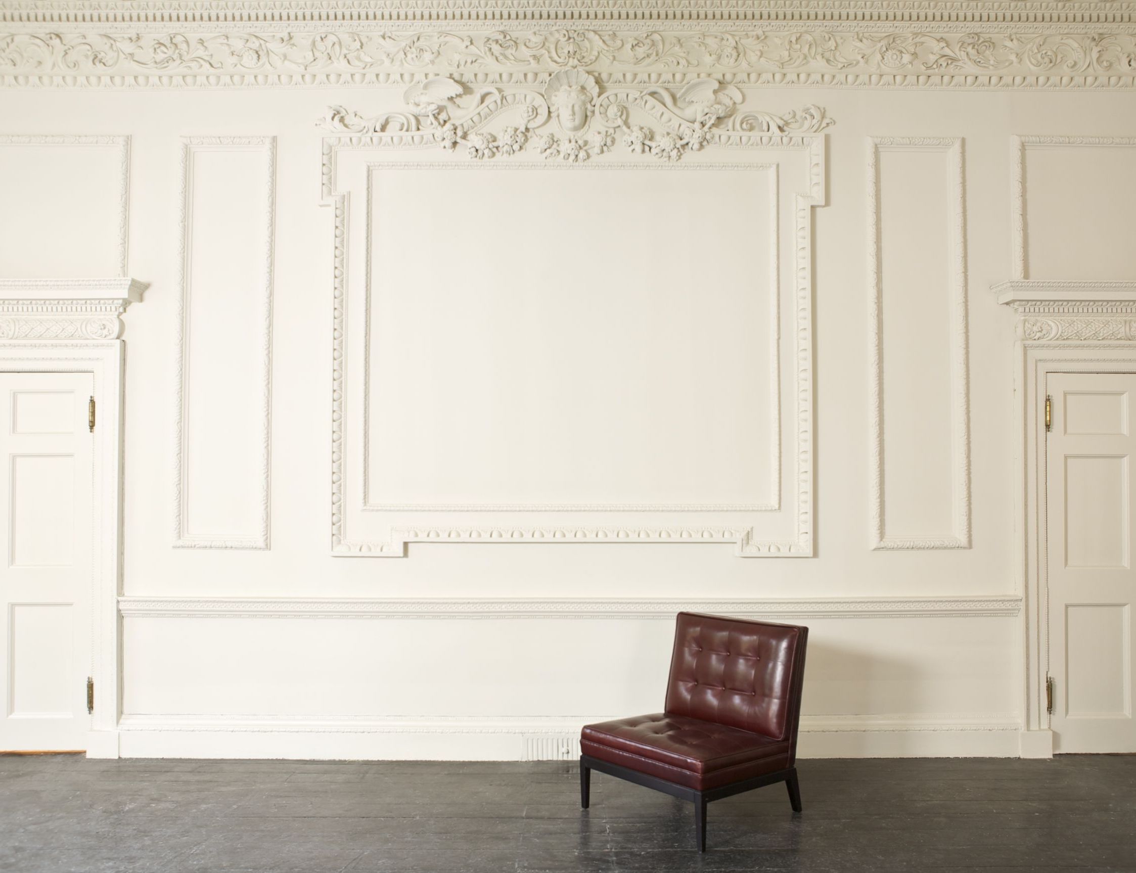
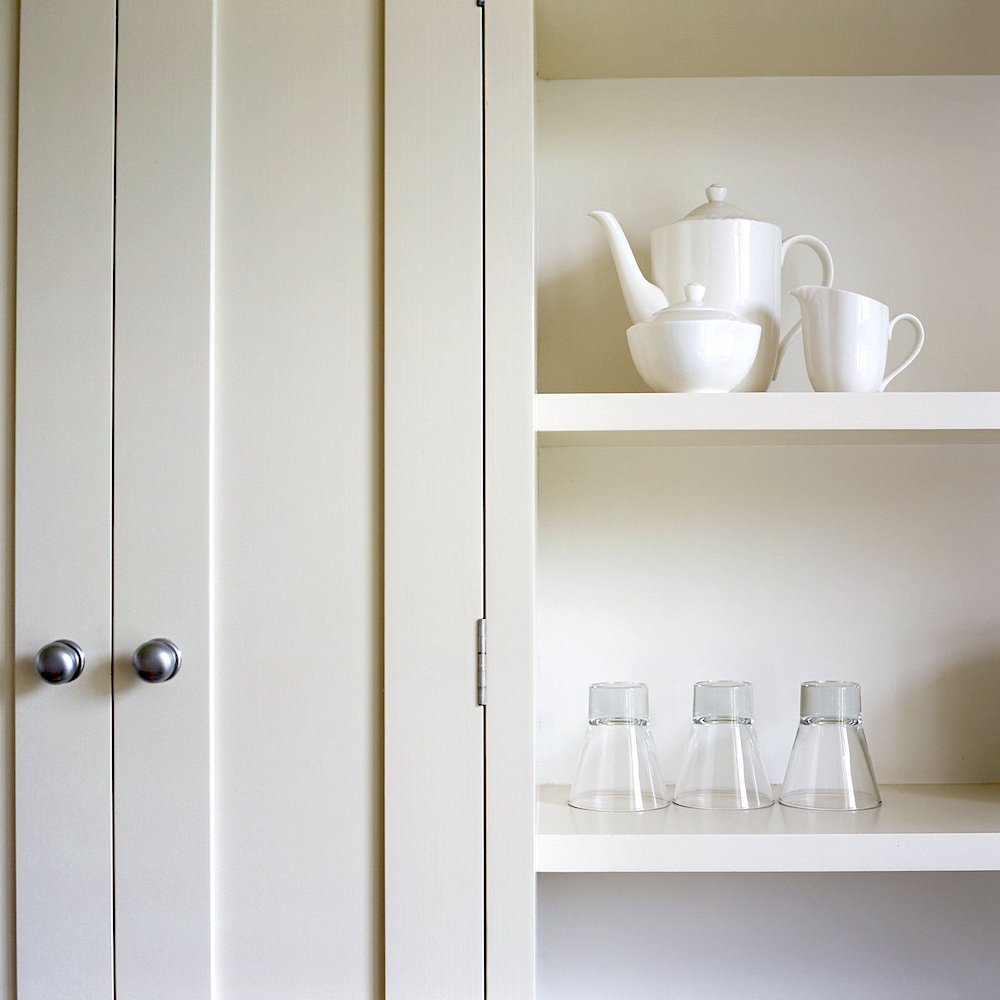
CLUNCH is a beautiful, soft, chalky, warm off-white with a yellow undertone. That means that in my apartment, it will look YELLOW. lol, Remember that oftentimes, on some walls, even Classic Gray looks slightly yellow in my apartment.
The next color absolutely has to be on any list of Farrow & Ball drab paint colors.

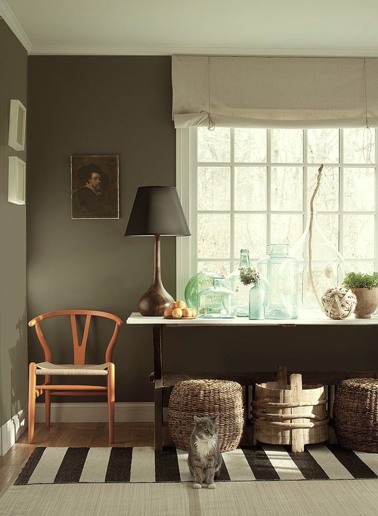
Actually, Downpipe should probably be on just about every top Farrow & Ball Paint Colors list.
Down Pipe has been mentioned on this blog a number of times. It is one of Farrow & Ball’s most popular colors. I can’t imagine they’ll ever retire that one. It’s a charcoal gray with a distinctive blueish, sometimes blueish greenish undertone. It looks like a medium-dark color in some lights, and in others, it can look almost black.
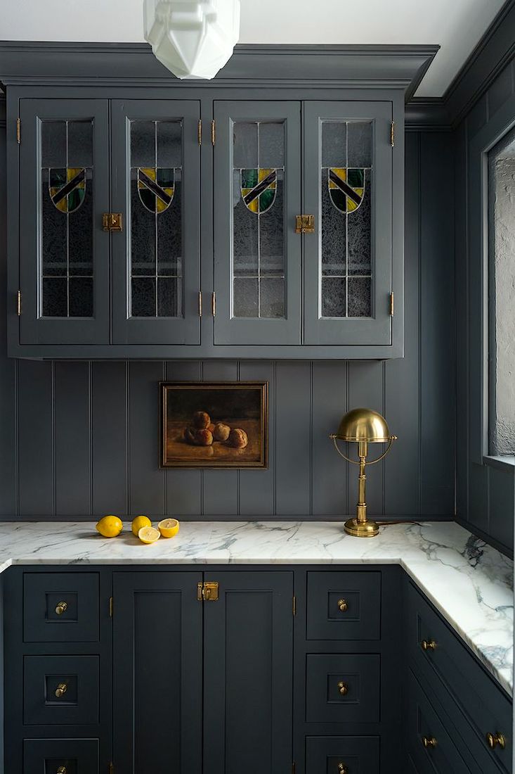
Interior Design – Whittney Parkinson – Sarah and Rachel Photography – Down Pipe in a gorgeous Butler’s Pantry! What a talented designer!
However, every color looks FANTASTIC with Downpipe as a backdrop.
Matt Carollo-Attic-Fire-Photography-Farrow & Ball-downpipe
Please note. I prefer dark colors in smaller rooms.
It’s harder to pull off deep colors in large rooms. It can be done, but it’s more work, I think, and it takes a lot of skill to make the rooms look good.
However, if using a deep, saturated color like Downpipe in a larger room, I would have lots of crisp white trim and lots of white in the artwork and maybe the window treatments.
Well, as I said, it loves all of the colors. Dark colors like this also LOVE to be paired with pure black as well as gold and brass. And, Downpipe also loves pale blue-grays. It is one of the best Universal colors out there.
A universal color for those who don’t know is a color that goes with all other colors.
Next on the list of drab paint colors is:

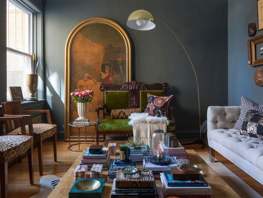
PANTALON is the aforementioned drab paint color that many of you have never heard of. That’s why I’m here. haha. Of course, some of you have heard of it. If anyone has it in their home or did have it, please let us know in the comments.

Above is the replacement SALON DRAB. It’s just a shade deeper and a half a hairless green. Or, maybe a quarter of a hair. ;]
This is F & B’s publicity shot for Salon Drab.
The thing is, I cannot find any interior shots painted in Pantalon. So, I found a couple of images of Salon Drab, and I manipulated them slightly to look more like Pantalon.
I believe these are both publicity shots from Salon Drab. But, if not, and you know who they belong to, please let me know, and I will credit the images.
Three Benjamin Moore brown-gray-green drab paint colors that are close to Pantalon are:
- Fairview Taupe
- Carter Gray
- Dash of Pepper
The first two colors are in the Laurel Home Essential Paint Collection.
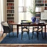
Above is a room created for Benjamin Moore in Carter Gray. I think these drab paint colors are so fantastic!
Above is one of my favorite spaces from Maura Endres’ library alcove.
It’s also in a similar shade to Pantalon.
Please follow Maura on Instagram if you aren’t already. Her posts are always a treat!
By the way, since I don’t know who’s seen what and when. However, you can now purchase samples as well as Farrow & Ball paint AND wallpaper online!

Mouse’s Back is a shade lighter than Pantalon but with a similar tone. It’s another beautiful, warm brown-gray with a slight green undertone.
Remember the exquisite Heckfield Place Hotel? I discovered it last year and just had to devote an entire post to it and how to get the look for less.
This is the living room, or maybe the old living room of Jack Laver Brister, AKA @tradchap, on Instagram. He’s one of my favorite Instagrammers with the most charming English style ever!
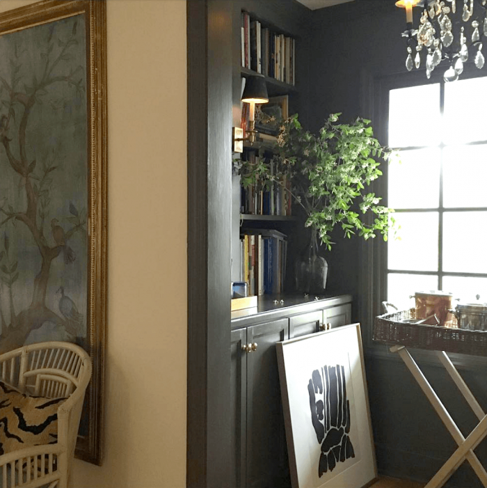
is our next of the six drab paint colors. It is the deepest shade in a line of colors, from pale to deep: STRONG WHITE, AMMONITE, CORNFORTH WHITE, PURBECK STONE, and WORSTED.

Nordic Collection – Farrow and Ball Mole’s Breath
Mole’s breath is another dark, drab paint color, but vibrant and complex. It can sometimes have a slight lavender undertone or, depending on the light, could even go ever so slightly greenish. Or, it could look like a deep, warm charcoal like the image below.
via remodelista – farrow and ball classic English kitchen – moles breath walls

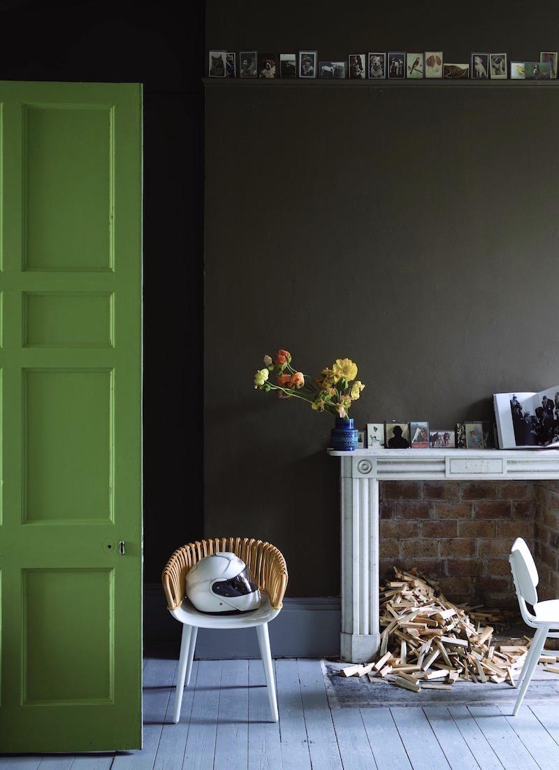
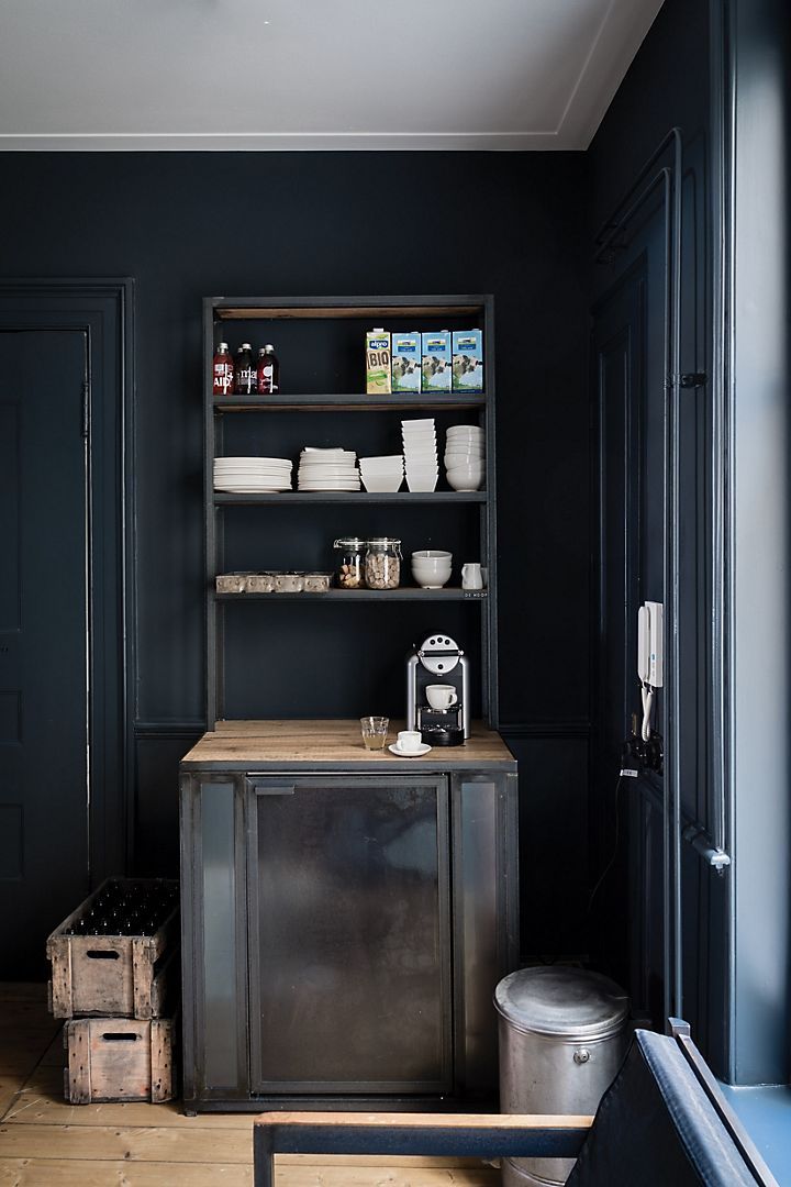
Railings seems to be one of the current darlings of designers in terms of dark, drab paint colors.
And, I guess I’m one of them because I’ve been a fan of Railings for years and have featured it on the blog numerous times.
The question is:
Is Railings black, or is it blue?
It’s a very soft black with a definite blue undertone. And, sometimes, it’s not so “under.”
Again, it’s this complexity that makes Railings such a beautiful color.
via @houseandgardenuk on Instagram @jamb_london – @farrowandball Railings wall color
However, like pretty much all navy paint colors, it’s most likely going to look pretty black at night. However, like other shades of dark blue, it looks fantastic with pure black and accents of white.
(Yes, you can also purchase Farrow & Ball paints and some of their wallpapers through Anthro! I’m not sure if they carry the samples, however)
Railings is a wonderful paint color for someone who’d like black walls but just can’t quite take the plunge and go with pure black.
The good news is that there are so many gorgeous examples of Railings online these days, I wouldn’t hesitate to give it a go.
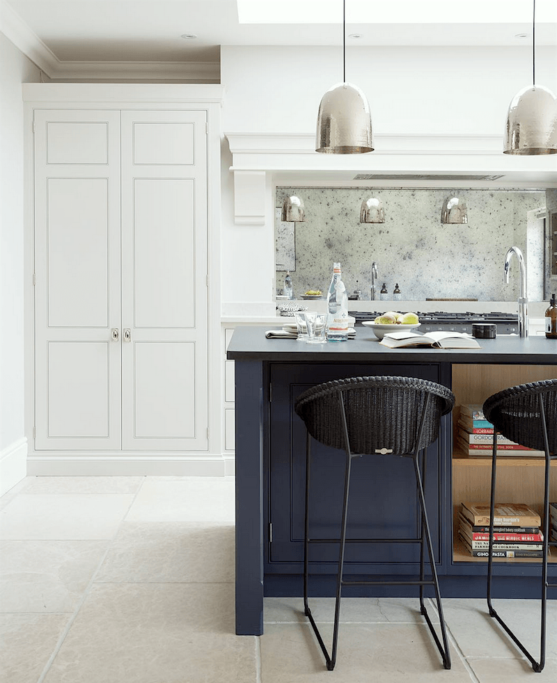 Humphrey Munson – classic kitchen – Island in Farrow & Ball Railings
Please check out this post on 12 Farrow & Ball paint colors for the perfect English Kitchen.
Also, if interested this is a conversion of Farrow & Ball paint colors to Benjamin Moore
Farrow & Ball Colors from Nature
Please pin to Pinterest for Reference.
These years as a designer who has specified dozens of paint colors, I have never had a rich, dark space, except for my old bedroom. And, I’d love to do one of these dar, drab paint colors someplace in my apartment.
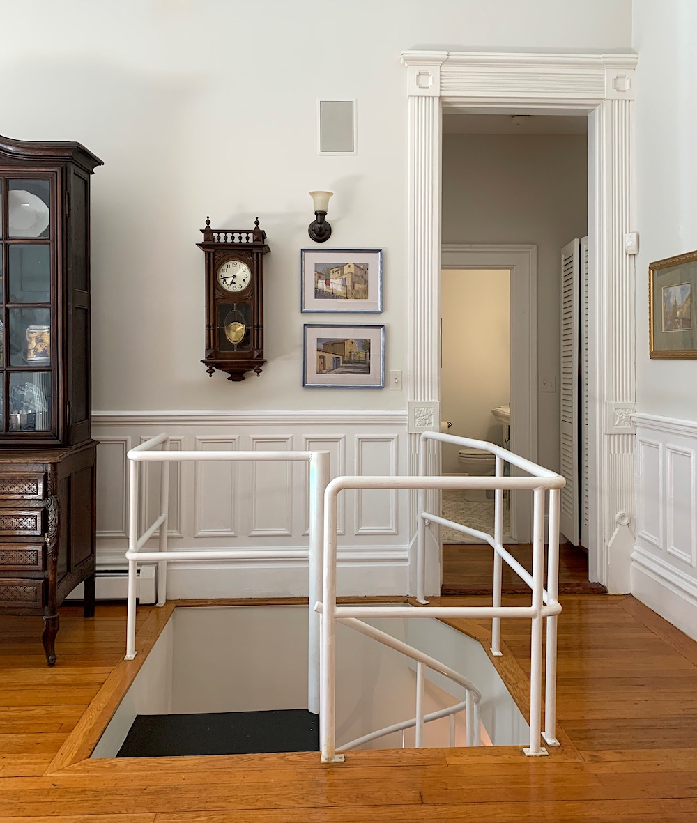
The little vestibule where the living room, den, and upstairs bathroom intersect, I think, would be a wonderful place to do an accent dark, drab paint color.
Maybe Down Pipe? Or, maybe Pantalon? We’ll have to see down the road.
Please let us know in the comments if there are any “drab” paint colors you’ve used and love.
Ugh. I still haven’t finished my drawings for all of my plans. But, I’ve vowed to finish them this week!
xo,

PS: Please check out the newly updated HOT SALES!

It is still early access for the Nordstrom Anniversary Sale. That reminds me. I have something to pick up. I don’t think I’ve ever mentioned this, but Nordstrom Rack is only a couple of blocks from where I live. Sick. I know. lol, I’m soooo lucky!
Related Posts
 He Loves The Phony French Country Kitchens
- Common Mistakes When Choosing The Best Pale Blue Paint
- Does Your Living Room Furniture Need To Go On A Diet?
- High-Low Furnishings + Sources and Secrets Revealed
- Ultimate Guide To The Best Kitchen Floor That Isn’t Tacky
- 54 Iconic Designer Fabrics To Make Your Room Look Rich
- 12 Classic Dining Tables You’re Going to Love