

Hi Everyone,
Oh my.
I know; I’ve been saying “Oh my” for quite some time.
So, before we get into Benjamin Moore’s COTY 2021 – Agean Teal, just a quick update on my home purchase in Boston.
This was an intense five days in mortgage land.
I know why they call it MORTgage. Mort means death in French. Thus, it’s really a deathgage.
The good news is that everything is digital these days, and they have it so you can upload everything quite quickly and also sign your name with one click. That sure works for me.
But, still, it meant numerous phone calls and emails, mostly to my accountant. I would far rather be doing lots of other things, like picking the fluff out of my naval. However, I did it. The listing now says “off the market.” The closing is in only 19 days!
And, thank you again to so many of you for your terrific suggestions.
Well, some are not possible. Or, they aren’t possible without ripping up the entire first floor, lobby, and lower lever and reconfiguring it.
I realized just yesterday that David’s brilliant plan goes about 4 feet into the part of the lower level that doesn’t belong to my unit. So, no matter what, that idea is not possible, I do have an idea which I’d love to talk about on Wednesday. Therefore, please hold off on discussing that for now.
Also, I think I will live there first before doing any heavy renovations. I will need to be close by in any case.
In the meantime, I’m getting my Bronxville apartment ready to be put on the market.
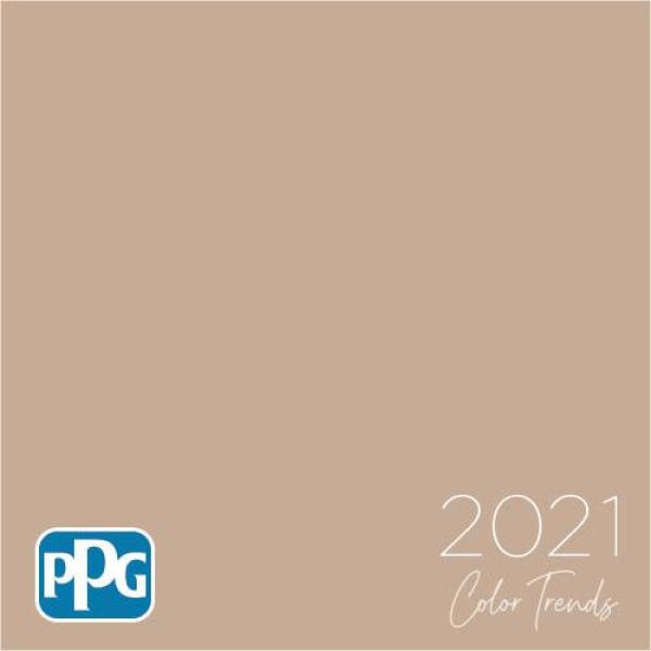
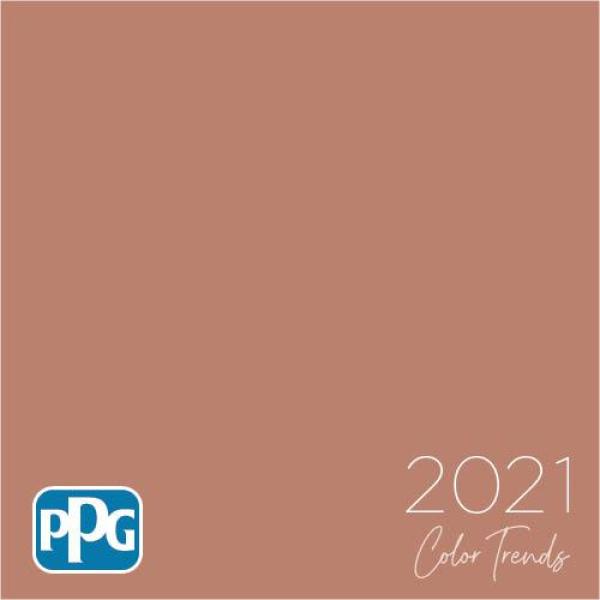
Okay, many of you know that Benjamin Moore came out with their color of the year 2021 a few days ago.
The color is Aegean Teal 2136-40.

How do I feel about it?
It’s okay.
I guess.
I mean, ANYTHING is better than PPG’s atrocious choice for this year.
But, why just okay with Benjamin Moore’s Aegean Teal?
Well, it kind of reminds me of the color they painted the cement floor in the girl’s lavatory when I was in elementary school back in the 60s. And, it was shiny enamel.
Lovely Andrea Magno (I met her once, and she is) over at Benjamin Moore issued the typical PR statement about our needing to be soothed, and Aegean Teal reminds them of the sea.
Plus, it’s a good color for kitchens.
And, since we’re spending so much time there, it makes sense.
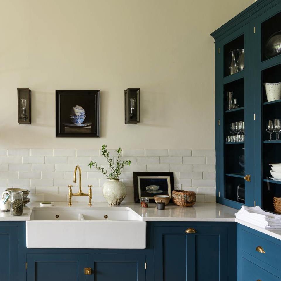
Now, that last bit I’ll go along with. I think it’s a good color for kitchen cabinets. Not *my* kitchen cabinets. But, somebody else’s. :] Still, I am struggling to see a big drink of this color.
However, I think Aegean Teal has the capability to be a fantastic color, if used appropriately. Unfortunately, we get the usual banal decorating, which does nothing to make this color shine.
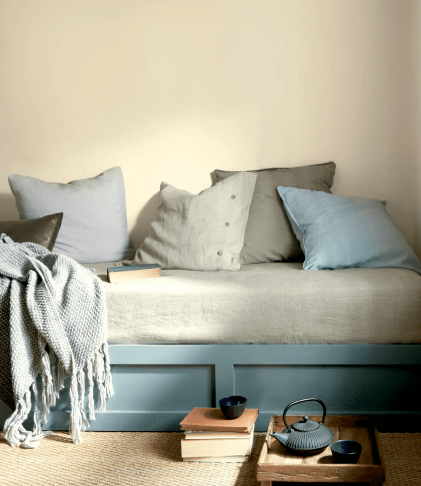 This vignette is pretty yucktastic, ain’t it? Although, they did manage to throw a little black in there.
And then, we get the secondary clashing “palette.”
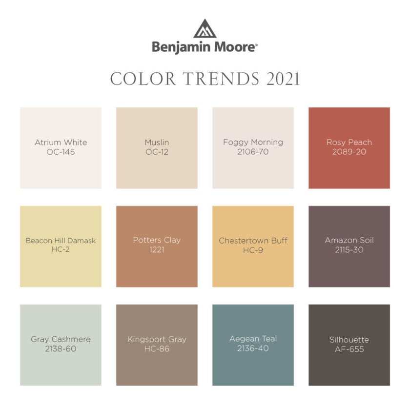
Why do they do that? Are they trying to stop us from buying their paint? It’s not that these are bad colors. Some of them are terrific.
Poor Kingsport Gray really got short-shrift in this video. It’s one of the best of the lot.
However, here’s what’s funny.
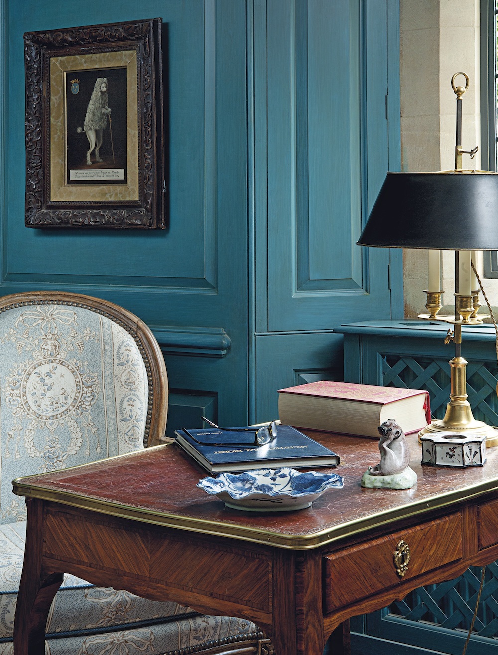
I’ve actually been thinking of the possibility of painting my den a shade of teal.
Here’s the reason why.
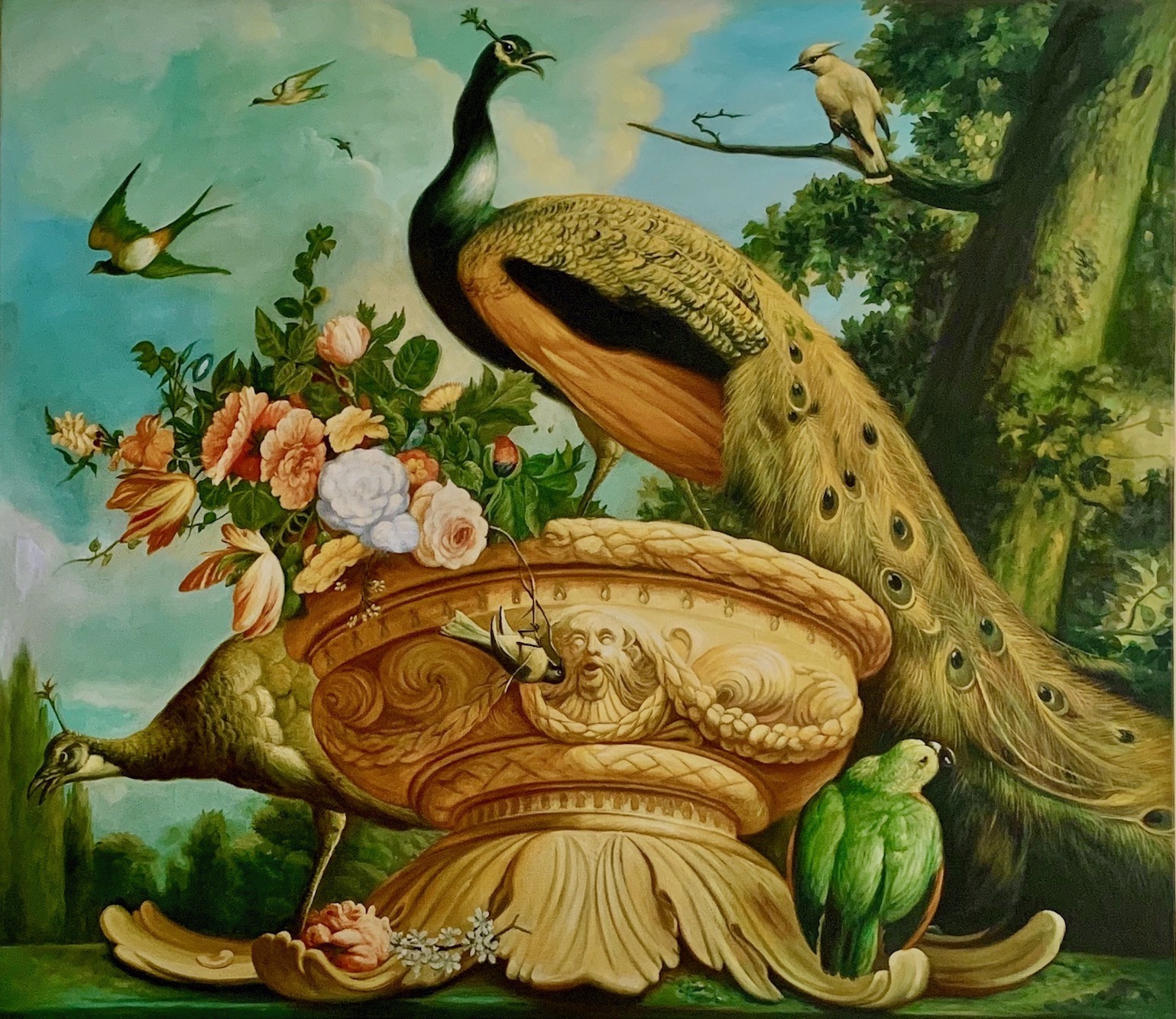
It’s my Melchior de’Hondecoeter copy. I thought it might look nice in there over a sofa.
Actually, it looks terrific with my current Hawthorne Yellow hc-5. However, I don’t want to paint that room yellow.

It would look terrific with Benjamin Moore Tranquil Blue 2051-60. But, I’m not sure if I want something this colorful for my Victorian home. Still, I should get a sample.
Also, Tranquil Blue (how’s that for soothing!) is one of the Laurel Home Paint Collection Colors. Nearly all of the blues in the collection have various amounts of green in them. That’s because I prefer warmer blues for wall colors. It’s not that all of them are teal or turquoise, but there are no indigo shades.
Indigo, in case you don’t know, is blue with red in it.

Benjamin Moore Admiral Blue 2065-10 is a classic INDIGO paint color.
Erroneously, indigo is the name often given to a paint color that has green in it.
Those colors should be called cerulean or teal. Cerulean is blue with some green in it. But, it’s not quite teal.
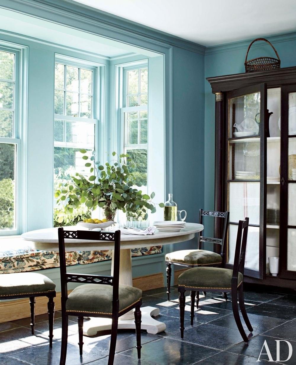
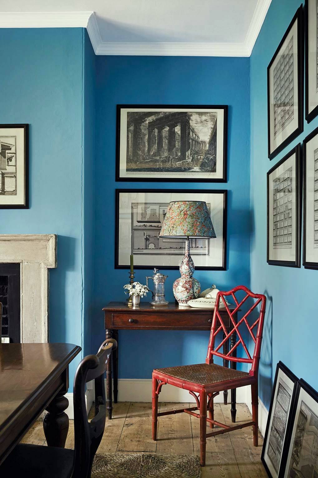 Ben Pentreath’s gorgeous dining room is painted Farrow & Ball St. Giles Blue. You can see it here, too. St. Giles Blue is an excellent example of a cerulean blue.

Benjamin Moore slate teal 2058-20
Another example of a darker cerulean is another Laurel Home Paint color, Slate Teal.
 Beautiful colors!
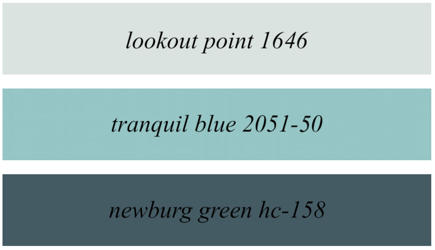
Above are three of the blue-green universal colors in the Laurel Home Paint and Palette Collection
There are 144 colors in the Laurel Home Paint and Palette Collection. However, there is a Universal palette of 66 of them. These three are warmer blues that go with everything. Therefore, they are universal colors.
Does Aegean Teal go with everything?
Well, according to Benjamin Moore, it does.
So, let’s see.
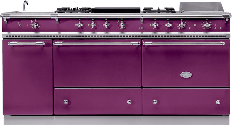
It goes with the purple Lacanche.
But, why anyone would want a purple Lacanche is beyond me. Okay, maybe Barney would like one. :]
Aegean Teal
cat gromitz
80s dated southwestern
Okay, Aegean is a universal color, but I’m not crazy about these palettes.
So, how do we make this color look good?
I would look at the work of Steven Gambrel for the answer to that one. He is the master of analogous blues and teals, paired with BLACK. Black is key and gold or brass accents are fabulous too, as is copper.
Please check out this post about black and blue paired together.

hamilton blue pm-6
That’s a wonderful, deep, saturated teal blue, IMO.
I prefer teal blues that lean more to blue than green.
This is from the post about 20 beautiful exterior door colors.
Another gorgeous and deep Cerulean blue is Farrow & Ball Hague Blue
Also, please enjoy this bost about dark blue paint colors.
This post is about medium blues.
And, this post is about some of my favorite pale blue paint colors.
You might also like this post about the best ceiling paint colors
My bottom line here, is that mid-tone blues are a little bit tricky to work with. The trick is mixing other shades of blue and black.
;
This is a wonderful example by Miles Redd with architecture by Gil Schafer.
And, with a much better color, I think, than Aegean Teal.

They say that it’s Benjamin Moore Bainbridge Blue.
Oh, I love this! It is close to Slate Teal. I do recall that it was on my short-list for the paint collection. Believe me; I agonized over these decisions. However, the paint and palette collection is only meant to be a guide. That’s the beauty of it.
Sure, that exact color might work for you.
It likely will; but, sometimes because of lighting or other situations, it won’t, and then it can serve as a Rosetta Stone of sorts. And, it becomes far easier to figure out the perfect color that might be on the next page or one up or down from the color.
I should get samples of these colors.

And this another fun post is this one about a woman who has a red sofa and can’t quite make it work.
Well, that’s it for me. How do you feel about Benjamin Moore’s color of the year, Aegean Teal? Would you use it? And, if so, how and where?
xo,

PS: Please check out the newly updated HOT SALES
***AND – get early access to SERENA & LILY’S FALL EVENT***
use code: VIPSONLY – for 20% off on nearly everything!
Related Posts
 A Secret for Creating A 25 Color Whole House Color Palette
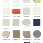 My 20 All-Time Favorite Benjamin Moore Paint Colors
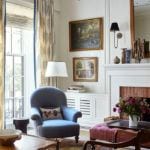 Easy (and affordable) Ways To Fix A Boring Room
 30 Cheap Table Lamps + Sources + What Size to Get
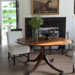 The Number One Decorating Mistake and How To Avoid It
 9 Fabulous Benjamin Moore Cool Gray Paint Colors
 Ultimate Guide To The Best Kitchen Floor That Isn’t Tacky


86 Responses
In the 80s seasonal color theory was all the rage, and I recall a majority of people are “winters,” thus it didn’t surprise me when we had a long decade of gray decor..People subconsciously gravitate to backgrounds that are becoming to themselves & their wardrobes, don’t you think? As a “spring” with teal eyes and reddish brown hair, I’m feeling like I’m having a moment, thanks to Benjamin Moore. Wondering if they have any redheads on staff? Might explain the new color palette.
I was so excited when I saw this color. I’ve tried a number of teals and none were right. I have a small snow white hall bath in which I have hung two hummingbird prints that are Native American art. In the hallway adjoining the bathroom and the stairwell leading to it are a collection of more Native American prints as well as a large wall mounted hand loomed Native American rug from Santa Fe. The Aegean Teal is exactly the color used in varying degrees in the prints and the rug. It’s going to be stunning I am sure. I think with a paint there can be the perfect setting and I feel I have it.
It looks like the paint companies are trying to throw back to the 1920’s. If you look at colors used in houses at that time, the muted blue is used. (Our last house was a 1919 build.) The PPG color reminds me of movie house silks or dresses of that period, but with the aging of time included, like they didn’t consider that those colors were brighter.
The Aegean Blue is analogous to the 1980’s Country Blue, methinks! All you need is a porch goose with a dusty mauve Little House on the Prairie bonnet.
So glad to hear that I’m not the only one who isn’t in love with the BM color of the year or palette 😝. I think if I painted my house in all those colors I’d grow tired of it really quickly and it would be very dated very soon!
Haha! I agree with the MORTgage comment. They say, “Oh rates are so low” and hook you in. Then you find a great place and bam the list from hell comes in. It will take me longer to get all the financials together than it did to find the house! Also I think the BM COTY is
MEH. The entry pic was cool but I would look like death warmed over in a room that color!
Keep up the wonderful work you do.
Dear Laurel,
Your post brought a smile to my face. Now that the business part of the transaction is done, you can get to the fun part. I look forward with great anticipation to what you will do.
Hate the colors that BM say are trending. Not in my house!
I can appreciate what you’re going through with your “new to you” home reno/remod – we recently purchased a lot and are going through the design process with an architect and I think I might die of old age before all the choices are made. I love teal in most of its incarnations and plan to paint my new library (walls, bookshelves, all of it) SW Riverway, which is a slightly darker richer teal than the BM Aegean Teal, which is a bit muddy and too greyed out for me.
The cat gromitz and blue mold comments were hysterically funny. I loved the video. Hey, if this color can unite the races, produce cute children who fly kites in a country field, and make you enjoy your coffee more…what’s not to like?
I gasped when I saw that this was the Ben Moore COTY. Last year we had 12 sets of exterior shutters painted this color for our Victorian double shotgun house in New Orleans. I wanted a slightly muted blue-green and this really works well against soft white siding in the Louisiana sun.
Sulking Room Pink? Cat Gromitz? Greatest names ever!!!
I saw this color and my first thought was: this is a great color for our bathroom walls. It’s almost a grey, and my husband wants it to be a very calm and soothing color. I think we will get a sample of this, along with bainbridge blue and Hamilton blue. I also think it will look great with some ferns in front of it, and maybe white dove cabinets and trim.
Thanks for the fun post and looking forward to reading about your new home as you renovate!
Hi Laurel. Agree with you on Ben’s COTY. I did just paint my front door with their Magnificent Blue, in a glossy finish. With my rose toned brick and black shutters, I like it on my Georgian style house. However, I actually think I liked the spark that BM’s North Sea Green provided more, which was the previous color. Also agree that Steven Gambrel is a great guru for mixing blues and greens.
I might, in a bedroom? It is strong but muted. I’ve been watching a lot of Wes Anderson lately & want to do single beds in the exact prep-school-floor feel you mention lolol. Maybe plaids & grey flannel. I’m constantly back & forth between blue, blue-green, or gold.
I don’t like this version of teal. It sure doesn’t resemble what I recall that sea looking like, vibrant and alive. This one is dull and dreary. I did paint our upstairs bath Behr Dragonfly which is similar color but similar is not always as good as. I picked it because it reminded me of the beautiful Baltimore historical BnB we stayed in for our son’s wedding weekend. The large powder room has William Morris reproduction paper with a green teal background which is why Dragonfly caught my eye.
I think it’s too muddy, too non-commital if that makes sense. I think it is so subjective, though. It may work really well in certain homes and light changes so much. But for me, just looking at it on the screen, it’s not clear and bright enough.
I love most blue green colours…this one is a bit too dark for me. MOSTLY THOUGH I AM SO HAPPY IT IS NOT GREY, BEIGE, OR GREIGE!!!
Is that a wallpaper sample? It’s beyond fabulous!
Not a fan! Reminds me of the 80s.
Your Laurel Home Essential Paint Collection cover has the top margin close to the Aegean Teal color. It bleeds into being in the Aegean Teal area. Looks Nice there.
Good catch, Diana! Yes, teal has and always will be one of my favorite accent colors. Please visit my home page.
I’m an architectural color specifier and I was flummoxed by this choice as a COTY.
From my experience in CMG and working with color for a few decades, a color of the year marks a moment in long-term color direction and is a new, unexpected or long-overlooked presence in the color trend.
So why would a value of such a pedestrian,safe go-to mix of blue/green/gray be seen as marking a moment? Or new or overlooked or unexpected?
If it were a blue with a different undertone that was moving forward in color use, yes that would be a COTY.
It is always a challenge to select a COTY from a marketing standpoint, something that consumers will be excited by but also an approachable enough color to try.
With that in mind, why not adjust Aegean Blue to a green dominate as we are seeing greens of all values emerging? And with less gray so it reads as a neutralized color not a complex gray.
Aegean Blue is much better suited to exterior placement where it is a complex blue. While in most interiors it reads as an interesting gray. That is why it is so ideal for cabinets and millwork, the lower plane and periphery of a space gets the least light and can bear the weight of a heavy, complex neutral.
While we have been trending through a comforting, encouraging, optimistic trend, this COTY and supporting palette read more comfort-able and safe.
Aegean Teal is a perfectly nice color, but a bit too muted for my taste. I love clear fresh colors, but not everyone does. This teal would work for lots of people who don’t like very bright colors.
I agree, Laurel, that if one is after that sort of colour, Hamilton Blue is a much better version. Aegean Teal is indeed more towards green, if my monitor can be trusted. Do I like it? Yes. Would I use it? Yes, if I had a different house. But as always it depends on the other colours around it.
What I find interesting is the prevalence in the comments of the idea that the colour is “dull” or “muddy”. I wonder if this isn’t a reaction against the prevailing grey/white trend which is nearing the end of its life-cycle. I also wonder if American homes aren’t more suited to brighter colours because of the larger amount of window. Ben Pentreath’s bright blue dining-room is possible only because of his large window area (and the black and white architectural prints which break up the expanse of wall). In short, a classic opposition between two views: is it “bright” or “lurid”, “muddy” or “muted”? I’m in the “lurid”/”muted” camp!
Sulking Room Pink… lol. I adore your humor!
Wait! No. That IS the name of the paint color!
NOOOOO….like this year isn’t enough of a dumpster fire and the paint manufacturers can’t even give us anything nice to look forward to in 2021? Ugh. This color reminds me of a certain brand of skin care lotion that is frequently recommended by radiation oncologists for their patients undergoing treatment. Don’t ask how I know, but it is not a happy color-just a medical, therapeutic thing. We all need a break!! Maybe they will get it right for 2022…
I remember the off-pink, off-blue, off-purple, off-green–all the colors were aw-ful!
Also..congrats to you on your purchase of the beautiful home in Boston. I went to Boston University and loved walking around looking into the windows of the gorgeous brownstones. It is a special place and I wish you happiness, joy and peace!
Aegean Teal is ho-hum. If you are going to go teal, then go for teal. I just did a ceiling of a powder room in SW6768 Gulfstream in high gloss and in the same house, the master bedroom is a gorgeous SW 9185 Marea Baja semi-gloss and the master vanity is SW6475 Country Squire lacquer.
All gorgeous and deep and rich. Aegean Blue is too muted to be color of the year.
Hi Laurel,
If memory serves me, Aegean Teal is the color I painted my lower kitchen cabinets about 6-7 years ago. My uppers were painted white. It looked nice against my wood floors.
LOVE the Steven Gambrel photo. I’m thinking black kitchen cabinets with our cherry wood floors and using the lighter blue shade for upper cabinet back wall behind the glass doors. Our adjacent Cozy walls are Hague Blue. Would his darker shade of the 2 blues look good for the tall bookcase there or should I do same black on it? lots of South/East light here. Thanks for this post!
I am an indigo girl all the way. Indigo and deep violet.
The color of the year never seems to speak to me. ditto the pallets which are always worse.
I do look at them all the time, searching for inspiration.
Cannot wait for the next duplex chapter in your saga.
I think it’s a beautiful color – for walls, that is. It’s a rich-colored jewel tone, but not overly drenched. If you like tapestry fabrics I think this teal will pull out many of the woven colors, both greens and blues. Just look at all the colors it compliments in your Melchior de’Hondecoeter copy!In my mind’s eye I see this color partnering with a more traditional decor, but I could be swayed otherwise. However, I wouldn’t buy any kitchen appliances or bathroom fixtures in a shade this distinctive – they become dated too quickly.
I love it!
That muddy, murky color is a hard “no” for me. I love rich, vibrant teals, but this version just feels drab and unhappy. And who is the target buyer that vignette is supposed to attract?
Teal is m favourite colour in the world because it is a combination of my other favourite colours, blue and green. But I would not use this colour or most of th,e accompanied colours because they look muddy to me. I prefer clubs that are more true, if that makes sense. Congratulations on you new apartment. Love it. Marianne
On my monitor it looks like a good match for Farrow and Ball Oval Room Blue. If so, I love it, it’s the colour of my living room.
I’m with you Laurel, it’s an okay color. It is similar to a color I painted my stairwell, up two flights and the hall in between, about 20 years ago. I liked it at the time but was tired of it and thrilled to paint over it with OC-20 Pale Oak. I’m sure you will decide on just the right color, and “color-of-the-year” will not influence your decision.
Seems like that Aegean Teal color has been around for a long time,, looks like a Martha Stewart color when she had her own line. I like the Gray Cashmere color, however.
I thought of this when you mentioned your den now is Hawthorne Yellow! My family room/home office was Hawthorne Yellow, which I love but I grew tired of it after being in this room so many hours a day. I knew I wanted to change to blue/cream color scheme so I reached into my Laurel paint guide and after much testing I painted it Opal Essence. I love love love it–somehow fresh, calming, soothing and fun all at the same time! Looks great with the Simply White trim as well as all my colorful artwork and even darker wood tones. Thank you so much for all of your color help–I always know I can reach for your guides and I’ve used your colors to paint my whole house!
“Beauty is in the eye of the beholder” for sure. I am seeing Agean Teal on my Mac and haven’t seen it “in person”, but I like it a lot. I like that it’s a “muddy” teal that doesn’t” scream” although it is dramatic by the depth of the color. I could easily see iton kitchen cabinets or an island or in a study on walls and bookshelves. The grey cashmere is lovely, too. The nod to the 80’s adobe colors are of no interest whatsoever. Lived through them before and didn’t like them then!
Dear Laurel, I love what you share about colors! Your blog is very helpful and entertaining! I am passionate about color and design and share your opinions on all of them. I painted my room Hague Blue by Farrow and Ball. So lovely! Never regretted spending the money. I have done a half bath in Hale Navy- just stunning with white cabinets and a touch of gold in the knobs. Thank you for your blog!!
Sincerely, StephAnnie R
Dear Laurel, I love what you share about colors! Your blog is very helpful and entertaining! I am passionate about color and design and share your opinions on all of them. I painted my room Hague Blue by Farrow and Ball. So lovely! Never regretted spending the money. I have done a half bath in Hale Navy- just stunning with white cabinets and a touch of gold in the knobs. Thank you for your blog!!
Sincerely, Steph a designer wanna be 🙂
Hello Laurel,
It amazes me that people don’t remember ROY G BIV
and indigo clearly sits next to violet 🤗
I do like the Aegean Teal, but maybe as an accent color and not all over the walls.
In fact I think it’s similar to my LR pillows.
Cat gromitz cracks me up! So true
I have two red chairs in my family room, more like BM Mediterranean Spice. White sofa, lots of black and shades of teal and green, just enough blue and white it’s not patriotic. Lots of green plants. To me it works.
I think there’s much prettier colors in your guide, we don’t really the new BM teal
I find Agean Teal to be right in the middle of the kind of palette that my hospital clients would select for clinics. So it’s very “meh” to me – dusty and flat and inoffensive I guess? Nothing that does a lot although if one worked really hard at the surrounding elements maybe it could work. There are a zillion other blues I’d work with first, though. Love your examples of medium and dark cerulean blues. Can’t wait to see what you work with!
I just painted my guest bedroom a dark blue- green from Sherwin Williams called “Watery” and I love it. I never had done a dark wall color before but decided to try it after reading your blog and looking at pictures everywhere. The rest of the room has white trim and at first I thought I had made a big mistake with the wall color, but after the furniture which is black and dark antique walnut went in, it looks great.
Next I want to choose a dramatic color for an alcove by the dining area and toying with the idea of a bold wallpaper.
Thanks for giving me the courage to try something that isn’t “safe”!
I’m not a big fan of that color either. I do think it would look nice like in person said, in a small bathroom.
I’d try out the color of the white flowers in your painting for the wall color. It’s the only really bright white color in the painting and I wonder it the artist did that for a reason.
I can’t wait to see what you do to your new home! Congratulations!!
I had a teal entryway, painted in a slightly less muddy color than this one. I used it with a tortoiseshell rattan hall table and it was really nice. With your print, if you want a darker color, you might consider a bottle green. I heartily endorse living in a home for a while before making changes. We lived in our condo a year before remodeling, and it looks much different, and functions better, than if we had not done so. In a small space where every inch counts, it’s amazing how much living in it tells you about its potential.
I had a teal entryway, painted in a slightly less muddy color than this one. I mixed it with tortoiseshell rattan hall table and it was really nice. With your print, if you want a darker color, you might consider a bottle green. I heartily endorse living in a home for a while before making changes. We lived in our condo a year before remodeling, and it looks much different, and functions better, than if we had not done so. In a small space where every inch counts, it’s amazing how much living in it tells you about its potential.
One other thing – the fireplace mantel is white – the walls beige, the couch is beige with navy pillows and there are two upholstered chairs in navy/beige/off white houndstooth.
Any commenters have advice on making
my newly almost remodeled kitchen pop?
White plain cabinets, large Virginia Tile
off white/beige flooring, satin brass hardware and Newport brass faucet, Cambria Brittanica warm quartz…kitchen is part of great room with beige, navy, green, red asian rug as focal point. Huge white china cabinet, black/gold credenza in dining room, coffee table is black with reverse painted glass top. Small black oval wooden table in breakfast nook with two painted robin eggs blue chairs. What do I do with the island cabinet color (white, black, dark navy?) and the backsplash. I would appreciate any suggestions.
I actually liked the color, until you showed the BM images and color palette. I’m in the desert so that palette is literally all anyone does and I’m very bored of it by now. Give me some of that Kingsport Gray though. Or Cleveland Green.
The most common statement about paint is that it’s not a commitment, you can change it! But it is a commitment, especially when painters are expensive and doing it yourself not the easiest for most. Teal is a turn off for me because it’s a color that meanders between warm and cool and just not one I gravitate towards.
First of all…congratulations on getting through the hard part of home buying ! No Aegean Teal ( yuk !). Love the Bainbridge Blue!
Best,
Pam
Ugh. This color reminds me of hospitals. In late 2020, is that our uplifting imagery?
Your color names have me some smiles this morning 😀. I used a color similar to the Agean 30 years ago in my kitchen. It was Martha Stewart’s Everyday Blue, but really more grey-green and very neutral to my eyes (in a way that beige (barf!) is for many). I spent a lot of time thinking of what to go with for trim and chose a bright chartreuse (yellow lettuce) and a purple-blue (bluebell) for the door. I honestly hesitated writing this because it sounds crazy but it made me really happy and I had a bright floral, very 90s, for my valences. I added on and repainted everything in 2001, but I still have a place where I have a blue grey green and a yellow green next to each other because there is something very appealing about it to me.
My son just painted his master bath in Aegean Teal. Trust me…I am not a teal, aqua, turquoise kinda gal…never have or will be, but I have to say, I like it in his bath. This bath has very little wall space. It has a large white tiled shower, large soft gray vanity with a white quartz top with light veining, a linen closet and entry door. All of the woodwork is white. Maybe I like it because it does have a gray undertone, or because there aren’t large areas of it.
The Gambrel analogous shades and the Redd/Schafer collaboration photos are further illustrations of your expertise. Without those, I would be left cringing at the vinyl southwest 80s wallpaper memories that Aegean Teal and the rest of the colors they tied to it have brought, in a flood. Ugh. Thank you for giving my color sense a higher quality focus point. Loved your made up color names.
Agreeing with the crowd here ….. that Aegean Teal has too much gray in it for me! Love tho’ the Slate Teal and Bainbridge Blue. Will have to get samples … they just might be the perfect shade in my guest bath to highlight my blue heron print! Wish I could insert, it’s a beautiful LARGE print with a black tortoise frame. Perfect for combining with the teal walls!
Hi,
We painted our living area a very similar color of teal last year. I find it to be very versatile and a good backdrop for many things. It goes especially well with a mossy shade of green. It looks great with a mustardy shade of yellow or even a brighter yellow. My rug has both navy and orange in it and it looks good with both painted furnishings and traditional wood tones. I’m not sure why everyone is so negative about this color. I have it paired with the darkest shade on the color strip (nearly navy) for a lower wall section in an adjacent stairway. Our trim is an off white that reads white when next to this color. We also have a set of shelves in espresso and the Black is rich and elegant next to this color. We considered painting “our” cabinets this color but have decided to be conservative and go with BMs simply white for bothuppers and lowers. You might find that you really like the teal color if you give it a chance.
HA! No surprise how you feel about BM’s 2021 color of the year and I completely agree. I won’t be using this color or the accompanying palette. I guess if BM’s objective was to muck up 2020 just a tad bit more, they succeeded. Feels kind of like when your kid makes a poor choice, you still love them and hope they’ll get it right the next time. So here’s to 2022 BM!
I think Aegean Teal belongs in the same Historic Errors Collection as Singed Flesh and Cake Makeup, but I know this designer who says that almost no color looks great everywhere so you really need to see it on your walls, in lots of different light, because it’s going to look different, for better or worse, on each wall you try it on. And you not mind so much once you furnish the room and pour a glass of something. That’s what she says, so I’m passing that on. Welcome to the Neighborhood!
Hi, Laurel! Congrats on the gorgeous Boston apartment. I’m sorry you’re not coming to Northampton, but frankly it’s not the same town. Downtown more and more resembles a set from a Mad Max movie. I stay away. You made a *very* good choice.
As to this COTY, I agree with commenter Carole. Aegean Teal looks drab and dead to me…muddy, too. No thank you.
Wow, that piece for your living room is stunning! I once went on a quest for the perfect teal wall color, and it took me well over a year to decide. I was after a certain hue in my mind, which seemed impossible to find and I had a heck of a time matching it to something in real life, in all light situations. I had pictures of velvet sofas for reference and magazine pages that never seemed to translate, they were either too green, too blue, or too grey! After swatching pretty much every color known to man, and exasperating my towns paint people I finally chose Benjamin Moore’s “Beau Green” and I love it! I found so many tips and tricks to finding the perfect color from this blog Laurel! If I hadn’t read your advice I would never have had the patience to keep searching knowing I could find the color of my minds eye. My next quest is to nail down the “racing orange” from your post “ my 20 all-time favorite benjamin moore paint colors “ For my dining room… Ive got it narrowed down to two reds so it won’t be long now! Thank you for all your tips, and congrats on your new dreamy space! It’s beautiful!!!!
Ugh. The moment I saw that Aegean Teal sample all I could think of was the early 1980s (late 70s?) when suburban houses were all this color or a matching pink color, with small patterned fabric and oak “Victorian” furniture with spindles. I didn’t like it then and still don’t!
I do NOT like the new color! What is up with BM? I won’t be using it for anything. 🙂
First of all Laurel thank you for the humorously delivered design advice I’ve enjoyed and utilized over the past four years. I look forward to your twice a week blog.
Seven years ago my husband and I moved into a 1930 Victorian cottage recently renovated in Nashville. There is a bedroom at the rear of the house with a large arched window that faces west. There is a smaller north facing window as well. The whole house had been painted SW Sedate Gray with Dover White trim.
Well, that particular room looked terrible so it became my first project. Since this room becomes rather warm in the summer I chose a cooler color that I thought would liven it up a bit. I chose SW Drizzle. Long story short, I had to rethink color of linens etc entirely. It was a gorgeous but very strong color that washed out anything that couldn’t stand up to it. I ended up with some bohemian bright red orange linens that energize the whole thing. From what I’ve learned of that particular color, it needs either whites or neutrals with lots of texture or bright colors such as coral or maybe even chartreuse.
Not sure how similar Agean is to Drizzle though.
Hi Laurel, I’m not a fan of Aegean Teal, but do love Hamilton Blue, and actually just received my large sample from Benjamin Moore yesterday to paint our MB. I also live BM Charlotte Slate, which is a little deeper and slightly more green. Your posts are so funny and just crack me up. I look forward to every single one.
Chuckle, loved the red sofa delima. We have red learher sofa and lounge chairs.
Impress the hell out of everyone, so daring!
Hi Laurel….Your beautiful piece going over your sofa is to die for! depending on how much light is in your future den Benjamin Moore has the most gorgeous teal color that is very versatile. We researched teal colors a couple of years ago for our dining room and finally found a teal that does not look like a beach condo. LOL as always with Benjamin Moore, the depth of color rains again with “Stained Glass”. we have noticed that during the day it tends to look teal blue and with warm lighting at night it frequently takes on a teal green look. This color is out of this world! not sure if it fits your new place but thought it would be worth mentioning. Jo
Hey Laurel,
I vote a solid no, not happening on Aegean Teal. I agree the pallet has lovely colors however together they look like an 80s Sitcom set.
I also prefer BM however if you are thinking blue you might consider SW Dutch Tile Blue lovely saturation and still refractive.
The light in my 1920s home made color choices difficult. I loved your e books and used several reams of paper to print it out. What fun. And superhelpful. Thank you.
In an entirely differert color direction. I have one I offer for your consideration. I like colors that change throughout the day. I also wanted something inviting and not too serious. Sometimes cream, sometines soft yellow, sometimes peach or pink very refractive- like candlelight. Very elegent warm and relaxing. I loved this color so much I used it on my very dark kitchen cabinets with a Rochfort colored laCornue- which I love with all my heart!
BM Tudor Cream.
Since I never follow directions, an new home comment:) Glad to hear you are going to live in your new home because, I am sorry to say, that sad kitchen wall must go away. Move the front door and enter past the bath into your den. You won’t regret it. Besides, this way your lovely shelves fit in the kitchen.- right where the existing hall closet is now.
Thank you for sharing you adventures.
Best wishes,
Deb
What beautiful rooms (not that one with the oatmeal and Color of the Year). And as always, you make me smile. No giggle. In this Covid year, that means a lot.
Oops, I meant Agean Teal…
I find Aegean Blue and the secondary palette to be muddy.
A wave of depression washed over me as I viewed Benjamin Moore’s 2021 color palette.
It is a perfect match with blue mold. Look at this!
https://www.moldguide101.com/types-of-mold/blue-mold/
OMG!!! I should hire you!!!
Hi Laurel, I think Aegean Teal might be a little too safe. On the other hand, too many times somebody paints a color they thought would be the perfect and it turns out to be brain-freezingly bright. The fact that it is toned down a little might make it come out fine once you get it on the wall or cabinets. I would have preferred a more cheerful yet still soothing palette overall for 2021. What do you think of the palettes offered here: https://www.diamondvogel.com/architectural/blog/2021-color-trend-report
Actually, I think it needs to be more gray. You know how colors that look gray on the chip look anything but gray on the wall? Yes, it’s true that there are far brighter shades of teal and turquoise, but they are usually lighter and then they are turquoise.
I like those palettes a lot! These make sense and are beautiful, IMO.
Bleh. Just where it belongs between Sulking Pink and Cat Gromitz. Enough said.
It’s a very fitting color for 2020. They both stink.
I actually do like this colour, i like dark moody colours but this is deep but not dark.
In my quest to brighten the midwestern world of beige, I would never use this color. Every green/blue example you showed had life; Aegean Teal has none. I *might* use it if painting an ombréd bunch of stair risers in related colors, but honestly, I have spent decades staying away from dull, *nothing* colors. I’m not going to start wimping out now.
Even worse are Benjamin Moore’s color pairings. The vignette looks like the “before’ picture that prompts the realtor to say, “Ignore this and make it your own!”
Hi there Laurel,
Benjamin Moore’s Aegean Teal is not a colour that I would ever use. It is ever so “muddy”, does not sing at all and is a rather “blah” shade. I love to use colors that lift the spirit and this is not one of them.
Hi Laura i have to say i absolutely positively do dont like this color, its to dark for me!