Hello, kind readers.
Some of you may already be scratching your head with today’s headline about PPG’s Color of the Year 2021.
What on earth do I mean? Beige is the new beige.
Well, you’re about to find out.
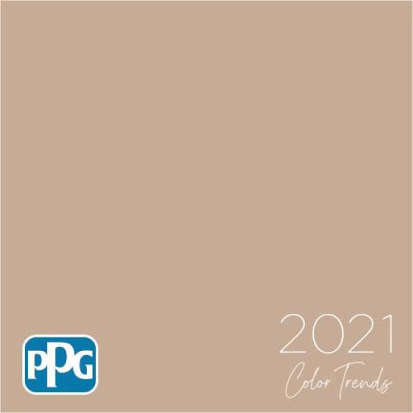
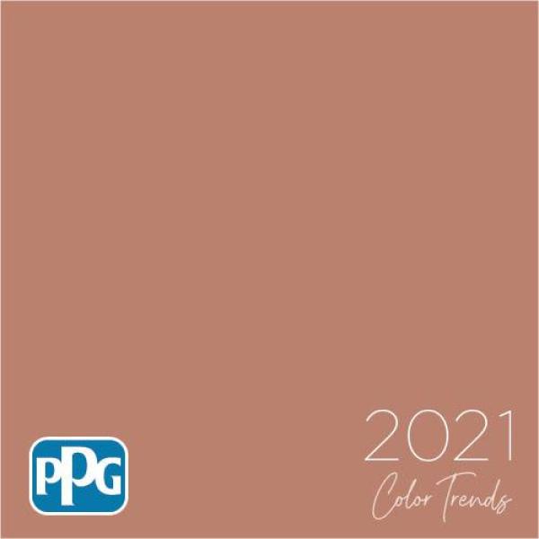
“Transcend,” is PPG’s Color of the Year 2021.
It’s a lovely name for a paint color. To me, it evokes something ethereal and airy.
Dee Schlotter, PPG senior color marketing manager, architectural and industrial coatings, said in a statement.
“This organic and hopeful palette represents what we have been longing for after decades of overstimulation and overconsumption – simplicity and restfulness.”
(side note: My Grammerly says that the above quote is a hard to read sentence. Ya think?)
Okay, I guess. I mean sure. However, they said that we needed to rest and relax when Pantone came up with the baby Boy (Serenity) and Girl (Rose Quartz) twins five years ago.
And, yes, we all know that it’s marketing bullshit. I mean, we’ve been resting for six months now.
However, when I hear the word transcend for the Color of the Year 2021, I am thinking of something that’s a whisper of color; ethereal. Oh, wait, I already said that.
And, a color that’s calming and soothing, right?
Let’s take a look-see what they came up with, okay?
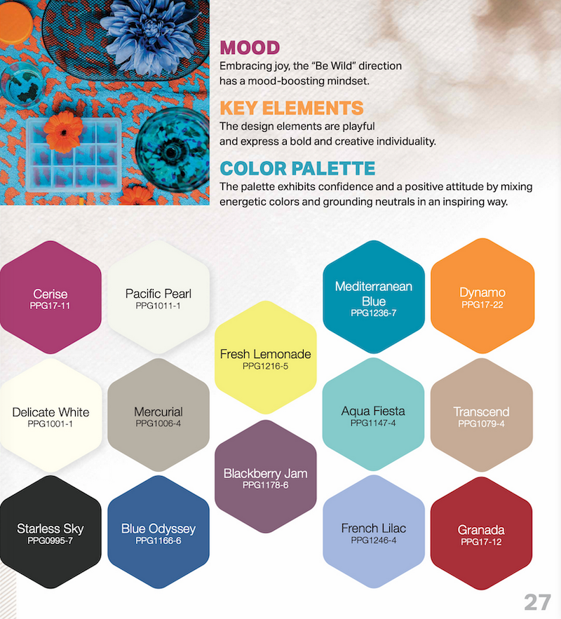
“Embrace nostalgic neutrals, simple comforts: ‘Be Well’ 2021 Palette of the Year
Softened hues serve as release for [the] over-stimulated, weary consumer.”
~ PPG
Okay, the sentiment sounds kind of okay, I guess. But I don’t feel any kind of release for my weary bones. This color, as I see it, is looks more like a pile of cat gromitz than anything remotely zen.

Oh, did I disturb you? My sincere apologies. I forgot that you’re eating your French toast while reading.
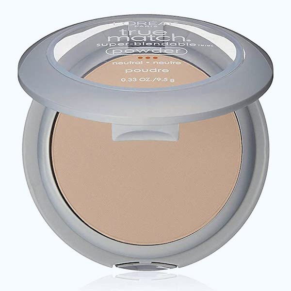
However, I’m just reporting what I’m seeing. But, fine, I’ll soften it a little because the color is also a DEAD RINGER for L’Oreal’s “True Match” pressed powder in their shade they call natural.
Here, you can see for yourself.
Haha. That’s pretty outrageous. But, I think I figured out how they came up with the color.
I bet Dee dropped her compact of pressed powder.
Who has done that, raise your hand? I know. It’s so upsetting when that happens. It’s just like when you bang your front tooth on a mug of coffee.
Did I really do that?
However, we all know what happens to the compact of pressed powder when it falls to the floor.
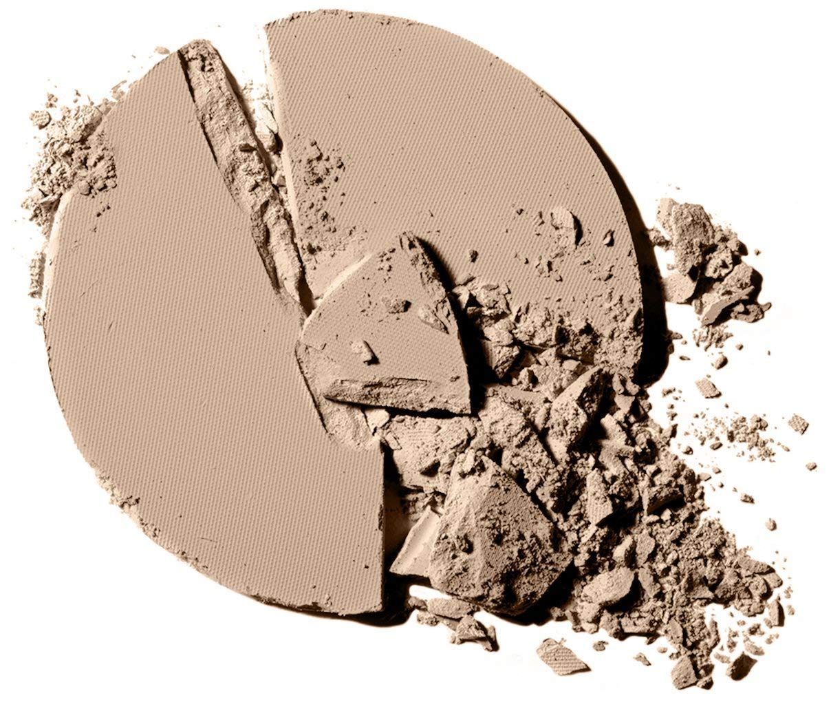
Yeah, and it’s always one with plenty of powder left in the compact.
I’m positive that she scooped up the remnants of her powder and ran right over to PR and said, “Here, this is the color of the year 2021, now leave me alone.” That has to be it because there is nothing restful about this color. Although, it does make me close my eyes. But, only because I can’t stand looking at it!
However, I just needed to make sure it’s not just me. So, I googled, “most soothing paint colors.”
And, when I hit the images tab, this is what popped up.
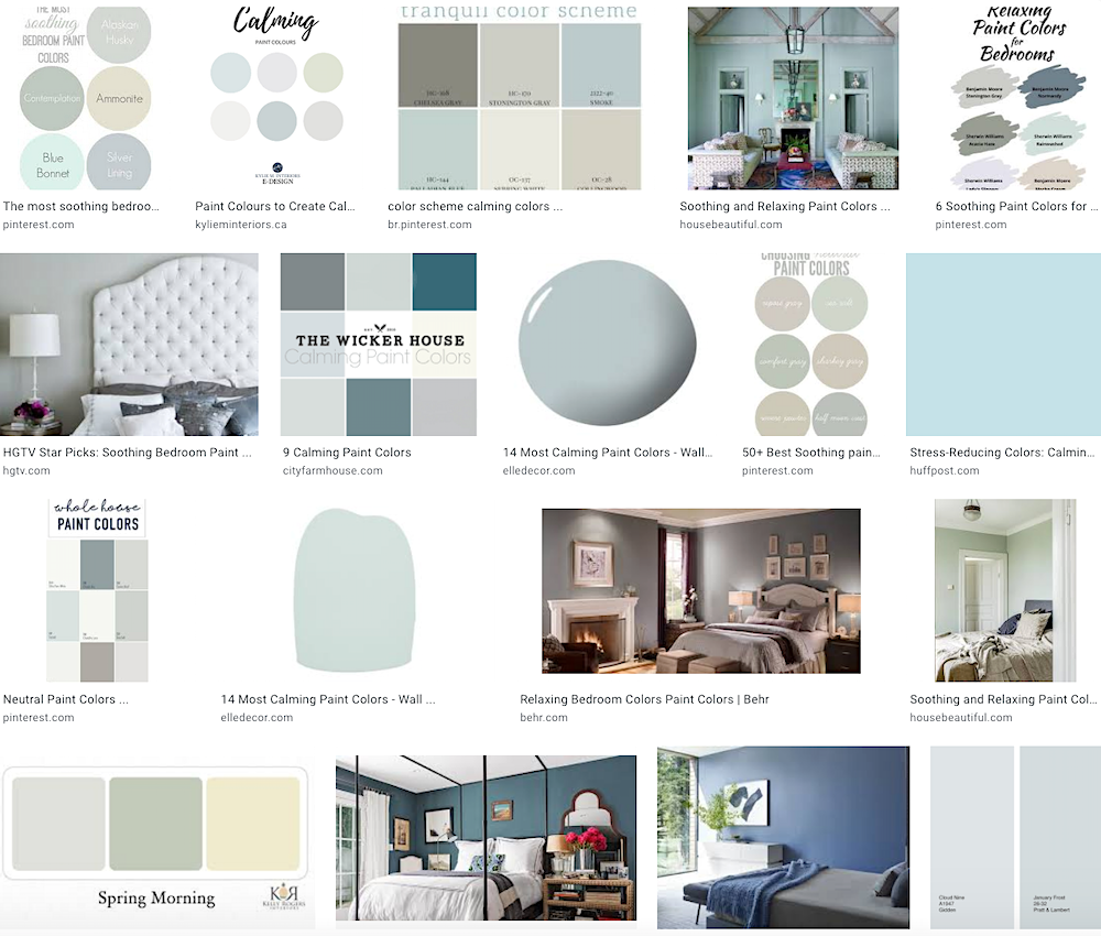 Right? Cool colors that mimic the sky, water and grass are the most soothing. I don’t see any weird shades of pinky beige
So, essentially what they are saying is “beige is the new beige.”
Well, I’m not buyin’ it. I didn’t buy it the first time and even less so, now.
But, there’s more color of the year 2021 craziness.
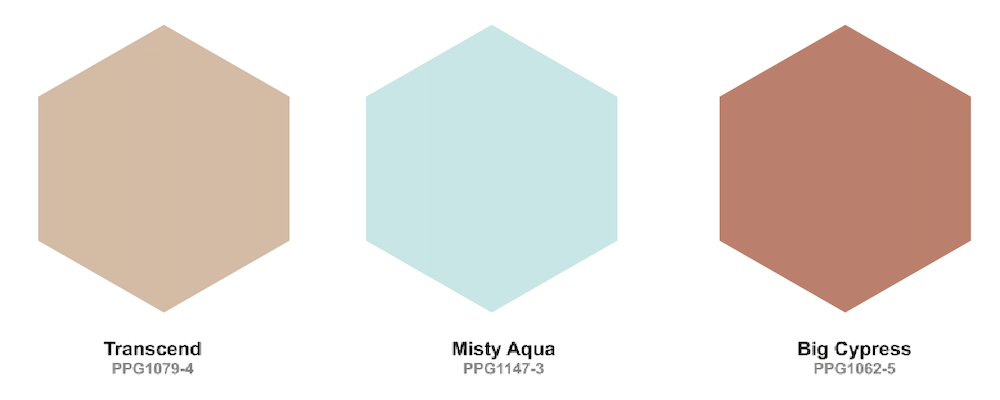
It’s the two other colors PPG decided to pair with Transcend.
Big Cypress
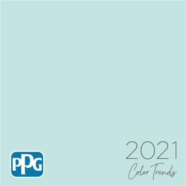
And, misty aqua.
Now, misty aqua is not a bad color. In fact, it is very close to one of the Laurel Home collection’s colors Dolphin’s Cove.

Benjamin Moore, Dolphin’s Cove


There is no Laurel Home color that is the same as Big Cypress.

The closest one is Benjamin Moore Golden Gate 033. But, Golden Gate has far more life to it.

Ahhh… Golden Gate is making me think of the last trip I took to San Francisco at the end of February. It feels like it was a decade ago.
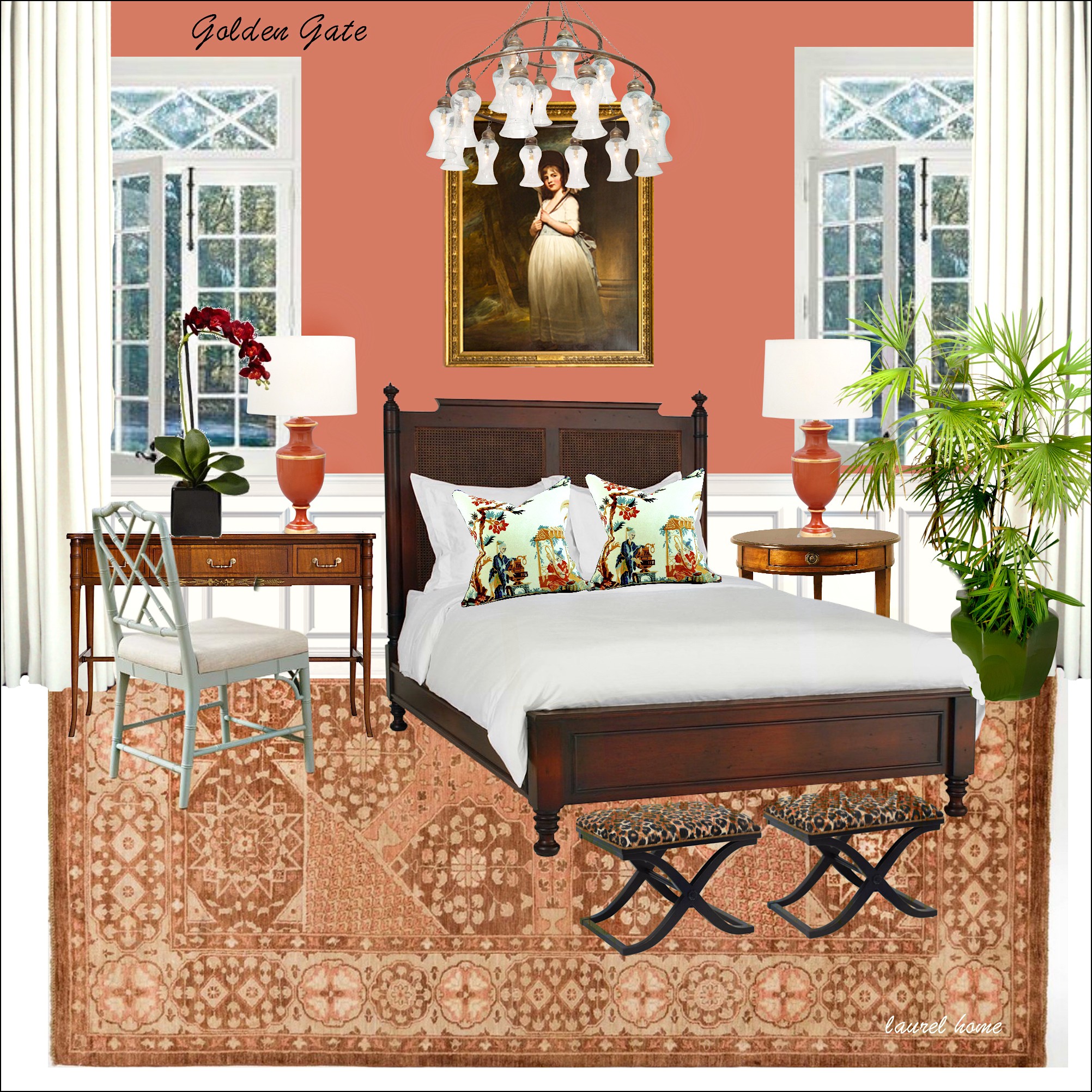
One of 40 mood boards from the Laurel Home Paint and Palette Collection.
However, let’s go back and look at all three PPG color of the year 2021 colors, together.
Oh man, this is like Ramada Inn circa 1984. I can’t deal.
But sure. I have an open mind. (sometimes.) Let’s see how they are using this palette in fake, real life.
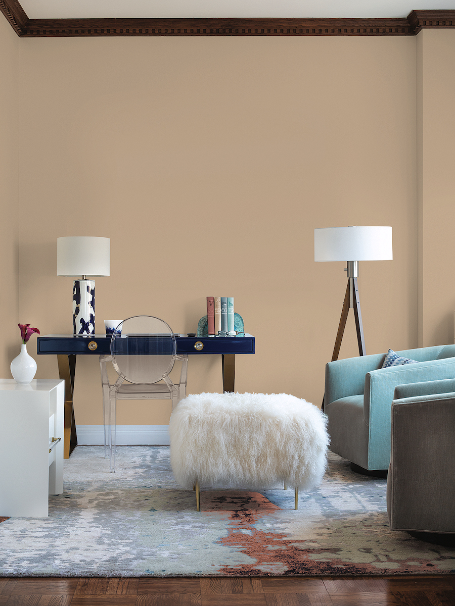
ummmmmmm… Like Austin Power says, “It’s not my bag, baby.”
I’m very much trying to wrap my mind around this tired, banal-looking color scheme. She said we need to relax, not die of boredom, if I’m not mistaken.
If you want to see more horrid interiors, go to their website. One of my favorite yucks is the kitchen with the neon BRIGHT white cabinets, which clash horribly with the counters, which clash even worse with the paint color. It’s awful.
Below are some artifacts from the 80s to hopefully make my point.
Remember these? haha
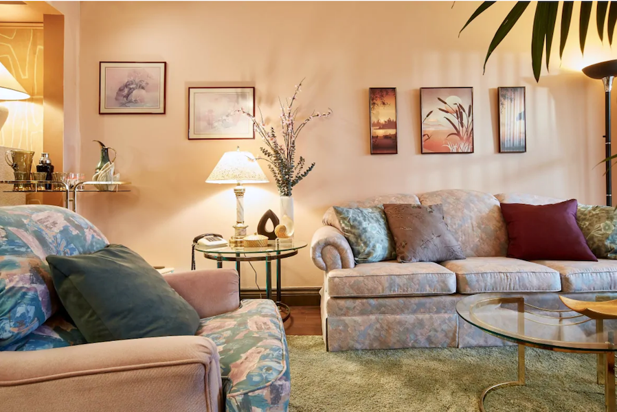
And, above and below a couple of pics I found from the 80s using similar colors.
You know, this dusty palette was terrible the first time around. If we’re stressed out, why would we go back to that?
Is that a giant spider on the ceiling?
It’s okay if you like these colors. But, please remember that most of us don’t.
It’s like some people look fabulous with gray hair, but most of us don’t. :]
But, remember when the director of marketing was talking about the need to go back to neutrals for more calm in our lives?
Well, I took a look at the online brochure on PPG’s website, and here are a few images from it.
Yes, this is very soothing and calm;
especially all put together as they are, like mutant strands of DNA.
very calm.
very, very calm. Cheer up, sweetiepie. You’ll graduate from high school– one day.
 Electrocution by paint
What do you guys think of all of this? I’m looking forward to hearing your comments.
***
In the meantime, I’m still searching for a new home. I got distracted for a spell. But, I’m back at it now.
My favorite homes in Boston are millions of dollars and way beyond my reach.
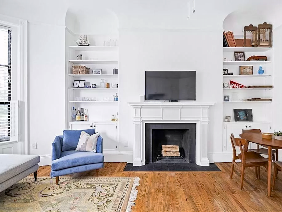
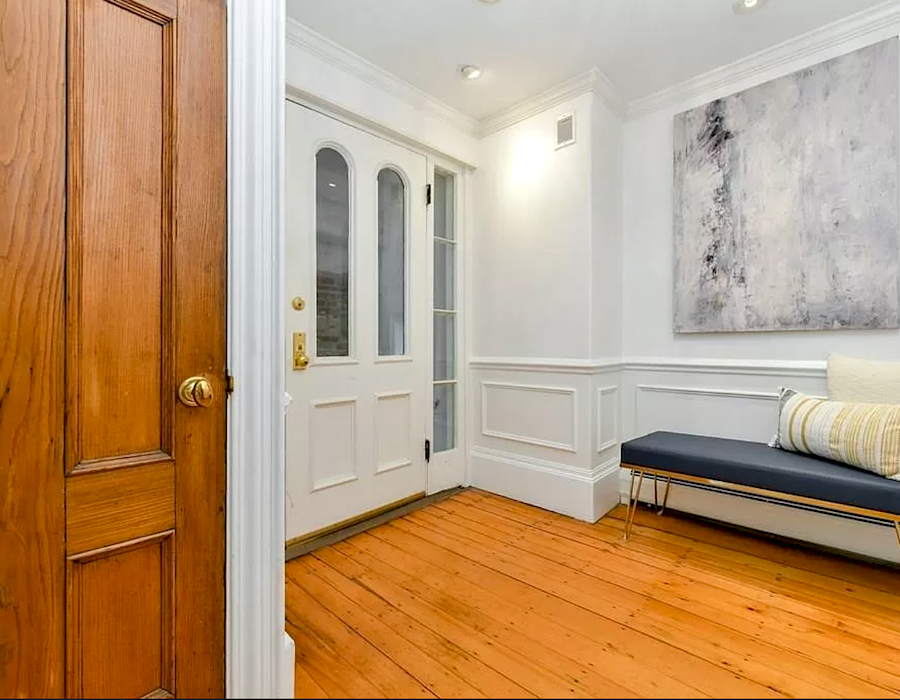
One home I found about a week ago, is very pretty. Lovely light. There’s one working fireplace in the living room. And, central air conditioning! 1100 square feet, two bedrooms, high ceilings, and big windows.
Divine!
Well, except for the recessed downlights. But, they could be removed.
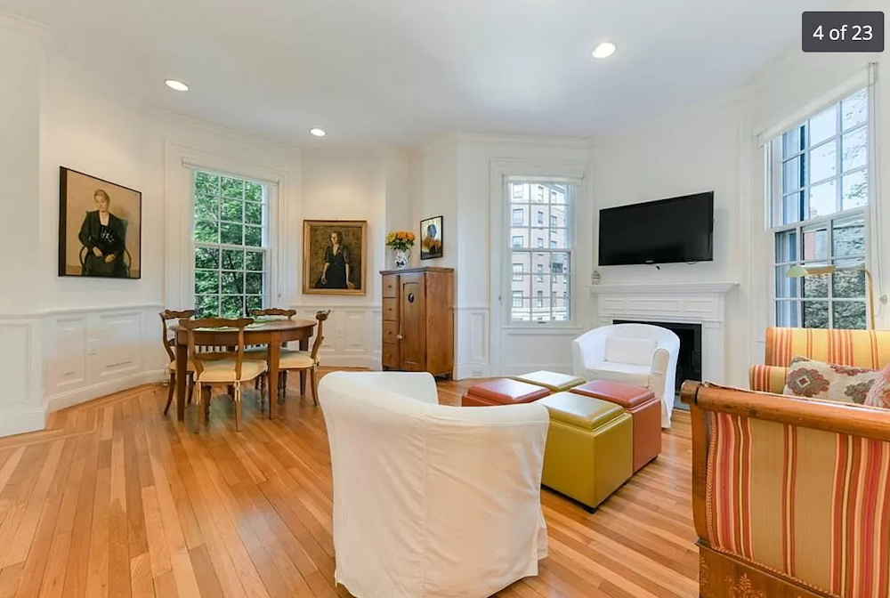
However, there’s no outdoor space and no parking.

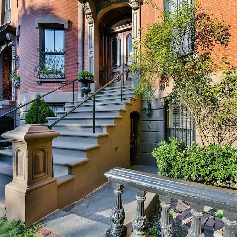
But it is in an excellent location in the heart of Backbay on Gloucester St.
By the way, a lot of places do having parking spots.
In addition, outdoor space, even a balcony, is on my wish list. However, it’s not as important as a working fireplace. Those of you who live with the long northeastern winter will understand. I’ve missed having one these years in Bronxville.
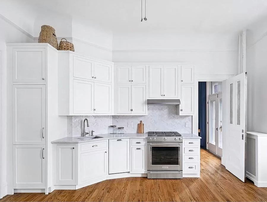
The kitchen even has white cabinets all the way to the ceiling!
Just one problem. And, it’s a doozy, so hang onto your hat!
In fact, it even ties in quite well with the color of the year 2021 nonsense.
That’s because whoever renovated this kitchen is undoubtedly related to PT Barnum.
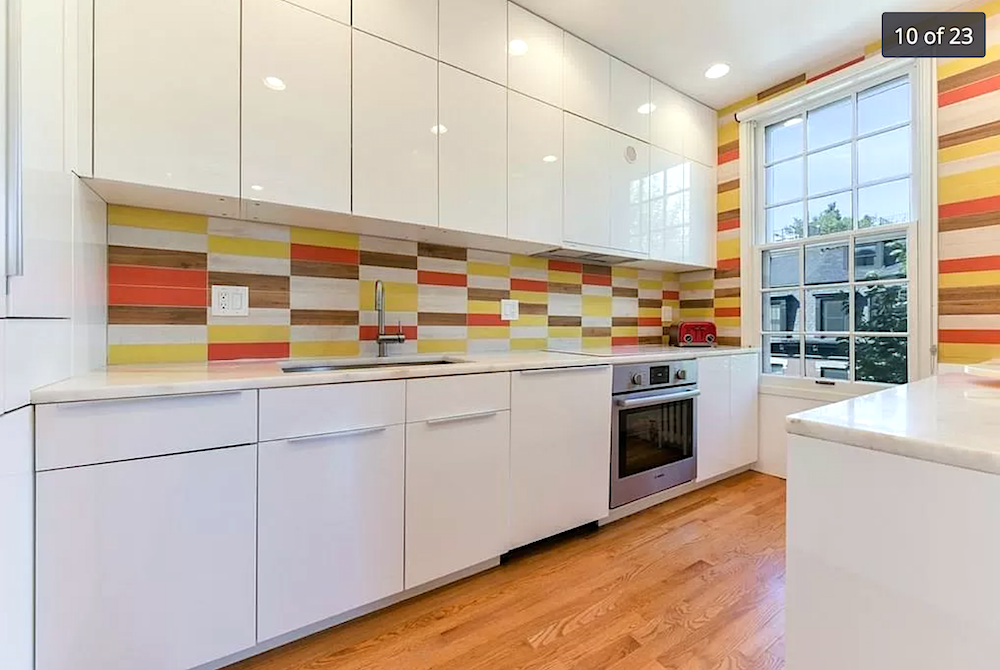
Have you ever???
But not only do we have the most psychedelic tile God ever created, but we also have THE shiniest euro-style (and totally wrong for this classical place) cabinetry.
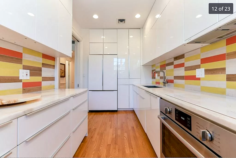
And, a lot of it.
The kitchen, itself is fine. There’s lots of counter space for me to make a mess on. lol And, there’s more storage than I know what to do with. Plus, there’s that huge window which I love. So many kitchens in Boston do not have windows.
Now, would it be possible to fix this baby without spending a lot of money I don’t have? lol
Well, yes. But, it would still probably be about 20k+. I could have a contractor paint – EVERYTHING. Yes, you can. You can even paint the tile.
Yes, the cabinets could be SANDED, and then they could apply a 3/4″ picture frame moulding to mimic panels. Then, comes the painting. They would need to be primed, sanded lightly, and then paint, sand, paint, sand, paint, sand, and seal. This is a labor-intensive process.
Or, the doors could come off and be sprayed.
I had this done years ago in my old home that had melamine cabinets.
Another option I could explore would be refacing. I might even be able to get it sponsored. But, I don’t know. I don’t have much luck with that sort of thing because I have no balls; no balls at all.
I wonder if I could rent some?
However, all of this is a moot point because this place is at the tippy top of my price range. And, I don’t want to move into a place with a big project like that. Also, the bathrooms and bedroom closet need some work.
If I was considering this place, I wouldn’t be showing it to y’all!
It just boggles my mind that with all of the gorgeous options, THIS is what they chose.
OH! One more. Just one more.
Sleep is so vastly over-rated. That is, until the next morning, when I feel like crap. But, I’m having fun!
This next place is doubly frustrating.
I love SO much about it. It is an architectural gem with THE most charming little balcony ever. But, at the corner of a busy intersection. No bueno. Oh, I could filter out the sounds and the polluted air.
But, here’s the problem again.
It’s the bloody kitchen.
What on earth do you mean, Laurel? That kitchen is gorgeous!
Yes, I agree with you, 100%. It is gorgeous. And, this should be what the kitchen looks like in the Gloucester St. apartment.
Or, this one from DeVOL Kitchens. Something like that. I could also see Lotte Meister’s kitchen in the Gloucester Street apartment, as well.
Just one very big problem.
This kitchen is IN the not-very-big living room.
Yes, just opposite the perfectly proportioned fireplace is where the kitchen lives. Yuck. Believe me. (I know that you do.) I spent HOURS trying to figure out a way to make a separation. And, I do believe if I were designing this kitchen from scratch, that would’ve been possible. But, alas, the way it is now, I don’t think it is possible.
Please check it out in the link. I adore that balcony off the room with the blue curtain.
There’s another place in the south end.
I’m not going to give you the listing because I keep coming back to it. It is as sweet as can be. What I love about this place is the entrance.
Oh my! See that little black door under the steps. That’s it! So, there’s a little walkway and then a mud room. And, then, this entrance!
Isn’t this entry wonderful?
But the ceiling looks to be only eight feet. It might be a couple of inches over that. But, I really do want at least a nine-foot ceiling. And, it’s just about 150 square feet too small. Plus, there doesn’t appear to be AC and I hate window air conditioners if I can avoid them. And, the fireplace is only decorative. Of course, I might be able to make a fake fire.
And, there is a parking spot, outside the bedroom. haha
Oh, I could keep going and going…
Can I get paid to look at gorgeous homes and write about them?
Wait. I kind of am! haha.
Hope you enjoyed all of that.
I don’t hate ALL COTYs of the year. In fact, it’s been a while since I have.
In addition, beige can be wonderful IF it’s done right. I wrote a post about that here.
And, also here in the death of the boring beige living room.
xo,

PS: Please check out the newly updated HOT SALES. There are some sensational sales going on this weekend!
Related Posts
 Gray Walls? The Perfect Color Palette To Make Them Sing
 What They Didn’t Tell You About The Best Yellow Paint Colors
 15 Serene Green Paint Colors Not Called Green
 Here it is! A Palette For No-Fail Paint Colors
 Have You Seen These Incredibly Romantic Paint Palettes?
 Laurel, Why Does My Decorating Look So Awful?
 A Secret for Creating A 25 Color Whole House Color Palette


119 Responses
I see beige and brown as something only attractive in natural forms. Mostly in woods or leathers, or materials like jute. Otherwise, pick a proper color, please!
I find this beige boring. Back in the 80’s my favorite beige was called Camel. It was in our master with a beautiful rich Waverly blue. Our main rooms were the very pale green called Celery Then we moved. No more beige. Then it’s trend nickname was sand box. Honestly I’m thinking my veteran son of 2 Iraq tours would not like tis color at all.
Suzanne, You are so right! We just bought a house and are in the process of gutting it. As I dream about finishes (not that we’re close) my eye is continually drawn to all the beautiful shades of rich greens out there!
LOLOLOLOL. Not only are you a talented designer Laurel but seriously… you are an absolute hoot! I literally peed a little through this post and it was WELL WORTH IT! Thank you for making my day and my home brighter (NOT PPG)! 🙂
That dusty mauve pink is close to the color the master bedroom in my house was painted when I moved in— I call it “pepto dismal.” Ugh. It was the first room I repainted!
Thanks for a great post, Laurel!
Love this! I was glad to see you’d included the kitschy picture of “Southwestern decor” because that’s exactly what I’m reminded of when I see those 3 colors together! I attended college in Arizona, and there are beautiful homes there, but they are absolutely not decorated in the garish “Southwest” trend that became so big in the early 90’s. My midwestern parents visited and apparently fell in love with the look. On my next visit to their house, I was surprised to discover that they’d embraced every tacky aspect of “Southwest decor”: pinky beige, peach, teal, even Kachina dolls and dream catchers. Oh it was a sight to behold! Lol!
Just reading now. Yay! It just takes 2 to form a cool kids club! We’re in! 😆
Do they realize this pink beige is what so many people have recently ripped out of their house to remodel from the Tuscan trend? We just did last year and nope, I’ll never go back to it.
In the mid eighties the Architecture firm I worked at finished a senior residential building that was finished in a terracotta stucco with a green roof. These colors were traditional in the town where the building was built. At the grand opening a board member came up to my boss and said “You know, there’s so many nice shades of beige these days.” Dang it if the board didn’t raise money to repaint the building.
Speaking of nice shades of beige this color of the year isn’t!
When I was a teen my aunt and mother had their wardrobe colors analyzed by a color/wardrobe consultant. I remember clearly them discussing a bit of advice they were given that I took to heart immediately: Don’t ever decorate your house with colors you wouldn’t look good wearing. I think that’s sound advice that I intend to stick to no matter what the PGG color of the year is. Who looks good standing in front wall or sitting on a couch the color of a raw chicken breast? Not anyone I can think of. I think their pick was completely misguided. I hate the whole color scheme. Blech!!
Hah! Great Beige post, so amusing. Yeah, I would not paint that in any room ever.
Your house issue is either small inventory or your budget. It’s so expensive to sell with agent’s commission that you have to LOVE your new place. Maybe Christmas will present some bargains.
Hi Laurel
If you are looking in Boston I have a recommendation for you.
I sold my house in Mass 2 years ago and looked for an apartment to rent in Boston. I had lived in Back Bay and Beacon Hill years ago so looked there as well as the South End. My real estate agent asked if I had ever thought about Charlestown and I hadn’t…I didn’t know much about it.
I ended up finding an amazing apartment there and I absolutely love living there.
I don’t think I’d live anywhere else in the city. I live in a beautiful old building with beautiful moldings and a fireplace next to a park. It feels like a little Beacon Hill and is a wonderful neighborhood with everything you need within walking distance. I even have a roof deck which many of the buildings do.
Check it out!
Kathy
I love me a good beige if it’s a true light brown without too much yellow or pink, but “Transcend” should have been named “Swine” because it’s got a lot of that piggy pink in it.
No, No, and NONONO. We refuse to return to ugly, depression-inducing Barf Beige, regardless of the political pressure to do so. What are PPG thinking?
When I worked as and Interior Design Specifier in Asia (80s-90s) we pulled from a library overflowing with the most beautiful textiles, wallcoverings, passementerie, etc from France, Italy, the UK, the US, Thailand, all over…but the ones from Belgium & German were hideous, rarely used. Their names, seasons, patterns, &n companies didn’t vary. Lockstep, they all relentlessly produced these same color combinations: dowdy & bland, depressingly monotonous, the ugly older step-sisters to 2021’s supposedly inspirational palette. I say we just skip to 2022.
BM’s Santa Rosa 1189 looks like it could be a dead-on match for Big Cypress.
I’m with Jane! My first thought was that they decided to take their last baby blue and baby pink choices that didn’t sell and mix it with all the gray that’s left over to make a new batch of base/under coat paint to sell. AWFUL!!! (By the way, the next time you drop your compact or blush, crush it up well with alcohol, smooth it back into the compact and allow to dry. Good as new!) If you end up with can lights in your new place, just put in a dimmer switch. You can get a really pretty lighting for different occasions from those “circles” on your ceiling. Thanks for the funny post! NO RETURN TO THE 80’s!!!
Uggy Ug Ug and Ug! I can’t even imagine what kind of lighting enhances a color like this!
Reminds me of a diner type color and all it needs is to be paired with battleship grey.
Oh my goodness.
Wow That Transcend color is hideous in the kitchen with the white cabinets. And no we don’t want to hit reset on the 80’s.
BTW- Old House Journal featured a really bad kitchen in Raspbery. Almost the color of the T-Mobile ad. Check out the cover! It’s so bad it made me feel nauseated just looking at. Can’t imagine trying to cook in there.
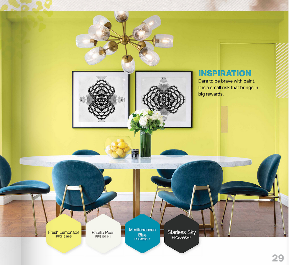
PPG totally missed the mark thinking consumers are over-stimulated and need calming colors. We’ve been in quarantine! We need stimulation! This is the year for bright green – the color of the outdoors!
I saw the colors a few days ago and am so glad I am not the only one who finds them horrible! Why even bother, PPG?
HI Have you thought of searching in Brookline for an apartment? Just on the Boston line. Really hate the color of the year!
Good grief! I’m living in this horrible color. My rental house is painted bandaid beige. Every single room. It’s the stuff of nightmares. I lived through the 80’s and never used that color.
This is hilarious! Now I’m definitely going to follow you more regularly. Thanks so much ~~ made my morning.
I just finished painting the inside of my entire new house in a frantic effort to rid myself of the 80’s version of Transcend. Felt like I was living inside a giant cardboard box. Well a pinkish brown cardboard box. Now to rip up the brown kitchen tiles and beige carpet!
I read your blogs all the time, Laurel. But like other readers I have never commented. But now I will. I have to tell you I am so very tired of any kind a beige, any kind of gray at all. Makes me want to rip my hair out when I see it. I understand about the neutral backgrounds. I get that. It’s just so be BORING! There are so many fabulous colors out there, why did they pick that? You sure were a good laugh this morning! Just what we needed for all this locked down, shut in! Gosh.
Very entertaining post Laurel! Laughing feels especially good this morning. I completely agree with you about the Coty colors and, no, I am quite sure they will never grow on me (it sometimes takes me years to accept current fashions and by the time I do, they are, of course, out). I keep wishing for you that you could just build exactly what you want where you want it. I’ve been through the “homes I love are WAY out of my $ range” hunt. And the ones I could afford always had something I couldn’t deal with and/or easily fix. The solution for me was to build but I suppose that would probably be impossible in Boston. Anyway, stick to your guns on the “must haves”, you will find it.
Not into the the color Transcend but LOVE Big Cypress!!!!!!
It is earth! grounding! connection to Mother Earth which is for me what 2020 is all about!!!! We must take care of her first and foremost! It is the color of clay and terra cotta tiles (which are back in a big way) It is the color of many peoples of this planet. I wish it was the chosen color. Transcend is also at least not white.I love that they chosse an earth and people tone so there cheers for that!
My Gramma’s apartment was painted this color. Loved her, but always hated that depressing paint! This was in the 70’s, so, no, nothing new here!
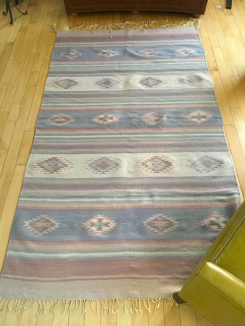
The second color looks like my Guerlain bronzer! Your musings crack me up! And the Dhurrie rug! hahaha.
Noooooooo! No to all the “new” colors. Awful. I call that “Bandaid Beige”. Death to it.
I don’t care how talented a designer is, how beautiful the architecture and furniture is, no one can create a beige room that I would be happy to live in. I’m allergic to beige walls.
hey friend!
well it’s that time of year again huh?
time for all the marketing BS from the paint companies…
If nothing else is makes for great blog topics for we designers to hash out, huh??
I hope you’re doing well, and am anxiously awaiting for you to find your new home so I can follow along and watch all the glorious things you will do!
xoxo and big southern hugs,
E
Cat gromitz! LOL so funny and appropriate! Never mind that pink beige is an ahem ugly color, but it’s such a hard color to work with in design in general. Maybe they still have a stockpile of it in their warehouses from the 80s that they’re trying to sell. lol.
As far as kitchens go, having upper cabinets right above a sink is utterly constricting. You’ll have to wear a helmet to do the dishes!
Best of luck on your house hunt.
Wickedly delicious. That Ramada Inn comment. I laughed. I cried. I will read this again, I am sure, when the world gets to be too much. From the bottom of my heart…thank you!
Our master room was this color in the early 80’s. It was very stylish then. Getting the correct beige is just as important as getting the right grey or white!
O…M…G…those PPG colors! I literally recoiled and my eyeballs about popped out of my head. No, just no. Nothing relaxing about any of it. That being said, the main color in my McMansion (it was the location that got me :])is BM Natural Linen and it is a restful backdrop for everything. (I would have painted it all Cotton Balls but the house is too big and too open and needed a bit more color.) What most people don’t understand is there is a big difference between a really good “beige” paint and cat gromitz. That’s why we make sample boards! At least we do if we listen to Laaurel….;)
I read every single post you do, but never comment. This post was epic! Your humor is delicious and appreciated. Thanks for giving us a part of you.
Ok I think I’m actually going to disagree with you on this one. I’m feeling it. We moved into a house last year with one of the rooms (the tv den) painted a nice soft tan (or beige I guess) color on the walls and a creamy white trim and once we moved in our very richly colored persian rug with the reds and the blues and the tans, and our blue sofa and our Paul McCobb travertine coffee table, etc etc…I decided I really liked the color! The rest of the rooms and hallways are all a really nice soft haint blue/gray and somehow – that combo is really nice together. So – I say take it easy on old beige. It’s like when people say “I hate white walls”. I just think they haven’t seen the right color of white on the wall. Like white – beige has many faces. xoxo
Oh, and the PPG colors are ugly.
I desperately needed a laugh today. Thanks so much!
Yikes! And I thought San Francisco was expensive. I love Boston and would live there in a flash if my husband said, “Let’s go.” But, I don’t think I would be able to retire. Might have to keep on working in order to afford food and stuff.
Literally LMAO! You are so right about the COTY. They must be desperate to do something different. And I swear the tile in that kitchen was inspired by McDonald’s 1990.
Whatever name they chose to give it, it’s not beige. It’s hideous. It looks like the color of death. Yes, the color of a corpse, and I can’t believe L’Oreal has a powder that color. (I loved Gaye Ingram’s comment about naming it “2020”. HA!)
I love the cat!!! Too funny!! To quote a friend of mine, who quoted someone else, “the middle class shits beige.” Sheesh! No!
I had the PC beige painted in our master back in the ’80s color matched from the floral wallpaper border. It looked exactly like a bandaid and I hated it the whole time it was there. Their 2nd color reminds me so much of the Southwest style also from that period. I didn’t do SW but friends of ours did it in a very authentic way and still do. They still use Mexican tiles and a few peaches, which she wears beautifully as well, but now have a lot of Adobe white. All the corners inside and out are rounded, instead of 90degrees. She will probably be happy to find textiles in these colors again but honestly they do not evoke calm to me.
When I saw the color they are calling beige, I could only think of the many down coats in mauve we sold in the 1980’s….not something to be repeated. Except to be close to your son why is Boston on your list of places to move?
I lived in NYC for 22 years only to wind up in the burbs of Boston. Not walkable like NYC and less friendly and terrible transportation. You may regret Boston….try a rental first or an Airbnb to see if it fits your lifestyle. New Yorkers are more accommodating. Good luck!
They should have named that wretched color 2020. Imagine lockdown surrounded by that ummm “beige.” Sitting here with my Cotton Ball White walls and the waning sun of September, when they look as good as they look in the dark of January or the brightness of June—thanks to you, I’m sitting here amid Cotton Ball White! 🙂
Hi Laurel!
Welcome to Back Bay and South End real estate, where kitchens end up in the living room much of the time. Builders know it’s a cheap way to renovate and and call it “open concept” while those of a certain age recall the studio apts we outgrew decades ago.
You’ve probably also seen your share of exposed brick walls or, as I call them, “opportunities for plastering.”
The Gloucester St place is a half block from us. Nice building, and I haven’t heard that the other two owners are crazy (but the seller did that backsplash — it was different when last sold, a few years ago). Note that it will be noisy there for the next year or two — a billionaire bought two apt buildings across the street (321-323 Marlborough, 19 apts) and will soon gut them to make a cozy home for his family of four. It could be why that unit is for sale. The noise won’t start much before 7 am and has to legally end by 6 pm, and I hope they don’t get weekend permits. (I just lived through two such projects, including 2 years of racket next-door.)
362 Comm. is close to Mass Ave, so it has more street noise, and isn’t considered a great building. In the past, brokers and locals have suggested that we avoid it, perhaps because it has a lot of rentals and absentee owners. You should investigate that if you’re serious, and ask about student renters, too.
Whatever you learn, I think it is still a better choice than that South End place! I suggest you google its street name, plus “neighbors” and click “News” to see the recent stories, and you’ll see why there’s lots for sale in that area. That block is borderline, but I’d still say it’s not a happy spot for you to begin your Boston adventure.
If your broker didn’t mention that to you, that’s terrible. He or she should have told you about the project on Marlborough, too, since everyone knows about it.
I love the idea of your moving to my city, and I think you’ll like it here! I hope my advice is helpful, not discouraging. Boston is small and dense, and it’s hard to find the right place, but you will if you keep at it! There are many good units on the market right now, as people are heading for the ‘burbs. And it’s apparently a renter’s paradise, for once, if you’d like to settle in while you look.
Those of us who truly love living here still love living here! It will be a great city for exploring, shopping, dining, theater, music, and everything else as soon as the pandemic is over, and it will eventually end, so have faith. And keep looking!
Oh, Laurel,
I agree with everyone that this is one of your funniest posts!
I clicked over to the PPG kitchen you suggested, and your comments are spot on. In fact, I think they simply found an old photo from the 1980s and photoshopped their new color onto it: dated granite with a mere 3″ backsplash, brushed nickle faucet does not pull out, cabinets do not go up to the ceiling, tchotchkes everywhere. A sleek 2020 kitchen, even if styled traditionally would not look like this.
Keep ’em coming, Laurel; you never disappoint!
My eyes hurt. So much ugly pinky-beige.
I hate to say this but my family room is the color of the picture with the Austin Powers saying underneath which was painted about 20 years ago. I am in the process of updating my home (using a decorator) and wasn’t going to change the family room at this time – now I guess I’ll have to.
As for the neon kitchen, you wouldn’t even need coffee to wake you up in the morning – the room would do it for you!!!
Oh my, I was going to say the exact thing Lisa Ellis said … thank you for such a good laugh on a Sunday! Everything about your post is said with wit and candor. No way would I go back to that beige and I never actually went there in the first place. I had to laugh heartily at the ugly tiles in the one kitchen. Did you notice that the tiles played off the ugly sofa? Maybe they will convey the sofa with the condo. LOL! Set your priorities and stick with it. I love the 9′ ceilings I have now, but I had 7’8″ ceilings in my Cape on the north shore of Boston. The other details in that house were so gorgeous that it didn’t matter. I had window air conditioners for 2 months out of the year. Can a non-working fireplace be converted to gas? Some of these old homes can’t be converted easily. Good luck on your search and keep us posted!
i was sniggering aloud as I was reading your post and fortunately, hadn’t just taken a drink of coffee first! I have the privilege of saying I agree with you and everyone about that pretty wretched color… so bad. I remember the 80’# all too well as that was the era we were renting our adult homes in various cities. There are some things best left in the past.
Best of luck on your search. Such a trying process, but there’s nothing like the feeling when you find the one that makes your heart skip a beat.
Oh, Laurel! Thank you for my morning laugh! I’m a recently retired interior designer and the gagging cat says it all. I love your marvelous wit!
“Although, it does make me close my eyes.”
LOL!!!
Haha you totally read my mind! That first image of the PPG beige my first thought was “bad makeup beige”, who would do that on PURPOSE? Good luck with your Boston home hunt…I do hope you find something that works – it’s a wonderful city!
Is this one of the colours you get by combining all your unfinished cans of paint?
Ohhh darn, I had just sat down to a perfectly lovely lunch and was treating myself to this post and then…that color! My appetite is ruined.
Seriously, what are they thinking?
Laurel–Is that blue chair by the fireplace (kitchen/livingroom) as wonky as it looks? I realize you weren’t shopping for chairs, but it has me fascinated (not in a good way).
I have been through that house search myself several times. The solution, and maybe you don’t want to hear this, is to look somewhere else. You have to get outside the expensive area you are looking in. You must consider the unthinkable. You’ll find a great place and after a year or two, it will no longer seem “unthinkable”. It will seem “extremely clever”.
Spot-on with your analysis! Thank you for the best laugh I’ve had all week. Something I stumbled upon recently are fireplace inserts that use water vapor and LED lights, and they have optional heating settings. They are really quite mesmerizing and realistic. They can be hard-plumbed and wired and there’s no mess to clean out of the fire box. You should check them out as an option to a non-working fireplace. You may be pleasantly surprised.
Oh, thank you for that info. That’s brilliant!
I like many beiges, but this one is horrible!
Laurel, once again you’re spot on. That beige looks like it has so many peach and pink undertones that I think it would be a nightmare to work with. It also reminded me of the outdated “southwest” color scheme. Out of all the lovely colors in the world why would anyone ever want to bring that one to the forefront???
Well all I can say about the kitchen is that it would certainly wake you up first thing in the morning! LOL. As far as the COTY the word that comes to my mind is “depressing”. It comes off as a pinky beige on my monitor and I’m not big on pinky anything.
Linda Swysgood, you have terrific ideas!
Hahaha! No beige for me! So horribly ugly. That misty aqua is okay, but hardly a new color inspiration. I am very much enjoying your posts on looking for your perfect place and I know sooner or later, you will find everything you desire!
I was trying to picture the shiny kitchen with a different backsplash, but the whole thing is such an odd choice!
Yes, indeed. So glad the 80s are in the rearview mirror…(though 2020 is nothing to crow about). We are currently battling the Seattle white-hot housing market. My husband and I play a game of “How Long From the Zillow Listing Date Will It Go Pending?”—the best ones are less then 24 hours. Sight unseen, all cash. Meanwhile the rest of us mortals wait. Why, I’d even buy a house painted in “Tranquil”. LOL
Thanks for the belly laugh 😂. It is way too early on a Sunday morning to look at that kitchen though. What were they thinking?!
You have me such a happy start to my day. I even read some of it aloud to Mr. Crabtree. I hate the colors. I hated the eighties and I will sit this one out! I could live with that beautiful white kitchen because I don’t actually cook. I only need a toaster, microwave and a coffee pot😂.
Very interesting that they already have a powder puff stool for the giant compact wall. It’s horrible.
The 3 colors together look exactly like the color scheme of my in-laws 1980 Pace Arrow RV. And of course my MIL installed geese with pink bows wall paper border right away.
Giant powder puff!!! hahaha – yes!
Laurel, you are spot on as always. ALL of those colors are gross. What fools are going to be sucked in to use them? The best part of this post was Lotte Meister’s kitchen. My kitchen is very similar but sans La Cornue. (I wish) I thought it was too plain, but I guess I was wrong.Now if I could only get those Hickman pendants, it would be perfect.
I always enjoy your wit, but this is the funniest post ever!! Thank you!!!!
Oh boy, it’s crazy how little a million gets you in this city. Personally I prefer the South End, but you need to be picky about what area of the So End.
And just to torment you, there’s a reason many folks leave the So End and come to Dorchester. Check this carriage house out for similar price – already under agreement and don’t think you’d like the neighborhood but just as a comparison
https://www.compass.com/listing/40-sawyer-avenue-unit-4-dorchester-ma-02125/602591765263947369/
Thanks so much Alison!
Wow – that color is really BAD. That would make the cat throw up every morning! What are they thinking?? Thanks for the laugh too! Have painted a lot but trust me it will not be that shade!
Agree! don’t settle. Wait for your outside space (critical during COVID), fireplace and parking!
Lol, my cat has been known to vomit in the mornings when I’m trying to read your post.
I’m seeing colors and styles from the past come back and I want to tell everyone, you know that’s optional, right? Let the past live in the past. Let’s move forward and create beauty, especially in times like these.
Laurel,
In my eyes there is beige and there is beige. I assumed from the name that the color would be truly translucent and much, much lighter in color. These new deeply saturated colors are bright enough to keep one up for a month/
‘Electrocution by paint’’. 😂🤣
I needed to read this! I haven’t laughed this much all week. I even had to share you with my husband, the laughter was spilling out all over the place.
I understand your dilemma. We have been looking for a bungalow in the GTA (greater Toronto area) for three years now. We found a little town we like but have a small list of must haves. I can’t believe how many bungalows have been renovated into unliveable spaces. We like walls, a cozy kitchen, no barn doors and some separation between the kitchen and living room. So many of the places we see have been renovated to look like a bachelor apartment (albeit, with a separate bedroom). And what is with all the crazy backsplashes?
I am not a fan of pinky beige. Or eighties decorating. But I loved your blog!
Now I am off to buy some maple syrup so I can make some French toast.
Thanks!
PS About the home search… my advice would be DON’T SETTLE. Whatever is bothering you now that can’t be fixed/changed will bother you even more if you move in. (Ask me how I know 😏). So, “no outside space & no parking” sounds like a major deal breaker to me. Patience…you just haven’t found IT yet. Besides, I’m hearing from some well respected economists there will be lots more properties to choose from soon.
@Anas. I too just painted a room SW Natural Tan. It is nothing like the PPG Ace Bandage wannabe version of beige. It’s soft and clean and light. We may still be allowed in the cool kids club after all.
Hilarious post, Laurel! The cat picture made my morning. Still laughing.
Laurel, you are so funny and wonderful! I know you will find the right place! Thank you for making me laugh this morning!
Two comments. One: we are in the beginning stages of planning a master redo. I can’t wait to paint over the horrid color I chose years ago for this room. What’s the color? you ask. It’s the SAME ugly beige as the color of the year!!!! Two: Eons ago, while I was at work, husband let our then 13-year-old son choose a new paint color for his bedroom and they, along with 9-year-old daughter got to work painting over the lovely almond colored walls with maybe the other most horrid color from your blog, the chartreuse shown in the dining room. I swear, when I drove into the driveway that night, there was an eerie glow emanating from that upstairs room, like something from The Exorcist. I lived with that color for 5 years, until he went away to college. Now it’s a pleasant green that doesn’t assault anyone’s eyeballs.
Thanks for the laughs to go with my coffee. There are plenty of wonderful homes here in NC if you want to come south!
Seafoam and mauve redux. Horrors!!
Hi Laurel, Thank you for the huge much needed laugh! Marc had just asked me if I wanted French toast as I was laughing about the cat gromitz. Perfect timing. Anyway, that color is so awful I lost my appetite for a few minutes. And paired with those others 70-80s motel room for sure. Aren’t we depressed enough? Hope you find a great place soon. All of the ones you have shown have had some wonderful features, so they do exist. XO
You NAILED IT, Laurel! Of all the colours in the world my least favourite of all time is ANY one of them that even hints of “pinky beige”. BLECH! 🥴🤢🤮 PS LOVE your work, your talent, your humour!
Laurel, I am still seeing that horrible “band-aid” color in homes…I can’t believe that it is back!!! Just Say NO!!
Dulux have announced Brave Ground aka beige as their colour for 2021. Beige is back!
pinky beige? I think I’m going to throw up. next thing you know we are going to bring back geese with little bows tied around their necks.
I agree with Kim. A kitchen in a living room? The one with the nice entrance; you don’t live in the frontentrance. Think about your ´must haves’. Seems to me that a working fireplace, 2 bedrooms and location are priorities. I have been to Boston several times, (BTW, love that city), The Back Bay sounds like the best option. You can redo the kitchen. You will never be happy with the other properties because the bones are not right. Love your post, you always make me laugh! Good Luck in your home search.
Yikes, that backsplash and the wall are nothing short of amazing (and not in a good way). However, I disagree about the kitchen as a whole. I think if the backsplash were replaced with a solid slab style matte finish marble like the counter tops and the hardware was replaced, which looks like it could easily be done, with some fabulous brass hardware, it would be a beautiful kitchen with an interesting contrast between the matte of the marble and the shine of the cabinet doors. The window wall could be painted a soft color and an appropriate window treatment would soften the space, too. Not sure about the pricing in Boston, but it could probably be done for much less than $20k. Another option might be to just paint the backsplash tile and the wall in a soft matte gray pulled from the marble counter-top and replace the hardware. I think it would give a similar result at a very affordable price. That could even be done DIY. Just a thought. Love your blog!
Oh Laurel
Cat barf city, blech 🤢
You are spot on as usual and hysterical, I can’t eat while reading I’ll choke!
You know, I say I cannot believe the crap they put out today…But then why not…There’s crap everywhere in our society.
I think they’ve stopped selling to people with taste and gone straight to selling for those who have far more dollars than sense.
Good luck with house hunting!
I couldn’t agree more with you and what everyone one else has said. Pretty colors make me happy.
As did your article this morning. You made me laugh!
You make me laugh! Love your style!
Laurel thanks so much for the laugh today, you are hilarious and spot on as always.
Regarding your house move, none of them feel right because they are not right.
Would you consider moving to Ireland? It’s gorgeous here and we now have the internet!
You could have a massive house, beside a city and not far from a beach, and a few minutes to the airport. We have old buildings, and Farrow and Ball to beat the band here (and you have the same sense of humour as us.) You would love it.
Oh, I have no doubt I would love Ireland, Colette.
Laurel – yikes – ugliest color(s) ever – I’m not going back! On the apartments – i agree the kitchen in LR just won’t work – too bad though because it has so many great features – maybe too small though? The wacky kitchen one – i know you said financially too high – but could you finance the reno as part of the overall price? i could so see white subway tile and white wood refaced cabinets in here. Maybe the purchase price is negotiable? Good luck – love seeing what you are exploring – much more interesting than the colors of the year!
Hate the beige which looks like an ace bandage, or bare plaster, to me. I love a cooler taupe, or greeney-golden beiges though. When we did up our house to sell here in the UK, we kept the kitchen cupboard carcasses and got new door and drawer fronts, for only a couple of hundred pounds, not the several thousand that a complete re-do would involve. And much easier than repainting and adding moulding to the existing fronts. I carefully sourced new handles, and it looked like a completely new (but classic) kitchen. I believe that you can also tile over existing tiles, so the only ‘scary’ part of a kitchen re-do would be removing the upper cabinets, plastering over and painting the wall, and adding open shelving. I’m guessing that even if you paid a contractor to do all of the work, you could create something that looks like your dream kitchen for well under $3K.
Laurel just include the living room furniture in an offer on the house with the lovely kitchen tile – problem solved 🤣
What the what were they thinking?!?
Beige just makes me sad. I have tried to like it and even went so far as sending for sample fabrics for a new sofa but they all were so depressing.
What were they thinking, this year has been bad enough and is looking to become even worse, how could they impose such a dull, sad depressing colour on us.
Laurel, I followed your advice to a “tee”
while renovating condo: Hardwood, 2″ Oak, Cotton Balls throughout, including ceiling..
except high ceiling going up the stairs..Pale Aqua like the sea..and ran it into master: all over(including ceiling). People RAVE about my condo…just sayin…..no beige…..next I am adding some colors….
I did put in Carrera on my counters..I love it..have butcher block island…
Your new fans need to trust you
Laurel- you are a voice of sanity in this ever more cacophonous world.In fact, if I didn’t respect/trust your opinions so much, I would have quit reading the post after the introduction of these truly horrible, vapid, depressing new colors of the year..WHAT were they thinking?? 🙂
I’m actually craving more colors! Did you see Ben Pentreath’s collaboration with William Morris? I would love to use one of the beautiful, happy, and now recolored by Ben, ‘Willow Bough’ wallpapers, in a room in my own house.
I dearly hope you will find a lovely new apartment soon..
No, I did not see Ben’s collab with WM. I’ll have to look that up.
Awwww, Laurel, white is cold and old when it comes to New England interiors. When u wake up to Jack Frost, you want warm, earthy walls. And as to turquoise, fine for South Beach, but nothing like the midnight blue of the northern Atlantic;) If you don’t have these colors in your palette, great excuse to write and sell version2!
There are 144 colors and yes, there are a lot of deep, gorgeous blues and other dark colors, as well. But, also a lot of light and medium tones in all of the color families.
You had me at the cat barf. One of your best articles ever. Hope you find the perfect spot for you to live and be happy.
I thought for sure I’d be in vogue with my SW natural tan walls. Hmph. Again, I’m not a cool kid. Oh well, I had fun reading your post!
Laurel, if there’s anything I’ve learned from you, it’s all about choosing colors. I love your cheeky style and punch! Colors come and go, and I’m certain beige returned from the 70s as shades of white today. Too much sheltering and isolation should have produced ‘Chocolate.’ Yum. Good luck with the hunt.
Stop it, Laurel! You’re killing me! But I did learn a new vocabulary word–gromitz.
ask your agent or whomever to show you bay village, it might be slightly cheaper and it a great little area in the heart if the city.
This post will absolutely become the most popular–your best work yet!!
Used to be that Pantone put out a COTY (back in the day), but now all of them have to be in the act. Mostly they are ALL awful, and so transparently marketing uselessness.
PPG is always the worst, and I wouldn’t go near their products. Awful graphics.
Good luck finding a new home. I love that last one, but I knew the problem was that the kitchen was in the living room!
I so enjoyed your humor and I agree beige is just….beige. Yuck give me creamy soft white, pale blue, light buttery yellow but beige. Beige makes everything look well….DIRTY!
This post is perfectly hilarious! Those colors are awful. No one wants skin colored walls and those other colors! Just no! Bringing back all the memories of the cat barf beige walls of dated rental homes I’ve suffered living in. I think all the home isolation has gotten to them. Poor PPG staff losing their marbles… I feel their pain, but they really should have done a focus group before putting this out. Yikes! This is not boding well for 2021…
Laurel-I laughed so hard reading this post. We just moved into a new house that was built in 2000 & it’s got that beige paint color. I can’t wait to paint over it. I’m glad to know that I’m not the only one that thinks the color is awful. Good Luck on your house search.