Hi Guys,
Greetings from the charming town of Northampton, Massachusetts! That is if you did not see my HOT SALES love note, (I call it) on Friday.
Why am I here?
Ummm… cause New York kinda sux??? Or maybe, just Westchester. I guess that opens up a can of worms. I better put the lid back on. lol No, it’s because my darling son is here. And, I decided to come up here for a few weeks and get out of New York and my life of solitary confinement.
Social distancing and mask-wearing. Absolutely! But, living ALONE, except for my pet plant, is no Bueno.
And, thank you too, for all of the great suggestions for my plant, Joe.
Yes, he’s here with me. I have him by the sunniest window in my lovely Airbnb.
Thank you, too, for your terrific comments about last Wednesday’s post.
It really is a mega-post, and I should have it for you, for Wednesday. It was supposed to be for today, but to do it right takes more time. I promise that it’s going to be go,od.
So, today, we’re going to revisit an old post that is newly updated with new content about 12 Farrow and Ball Colors for the perfect English Kitchen.
Or, it could be an American kitchen or a Brazilian kitchen. I don’t think the location matters that, much.
When this post came out, there were several requests to know which Farrow and Ball kitchen cabinet colors do the De VOL kitchens use?
At the time, I tried to find out from DeVOL what their colors are.
Oh, pretty please with a dollop of clotted cream on top?
By the way, have you ever had authentic English scones with clotted cream? If not, then you’ve missed out on one of the most heavenly things you will ever put in your mouth.
Okay, this was the answer:
Regarding our Shaker colours, although they are based on those Farrow and Ball kitchen cabinet colours they are not the same. We mix all the paint ourselves so we would really prefer you not to publish this information as they’re similar but are not a colour match. I hope you understand. Best wishes, L
I had a feeling they wouldn’t let me know. Alas, I don’t love them any less for it.
So, these may not be the exact colors, but they s,hould be fairly close. Please, always test!
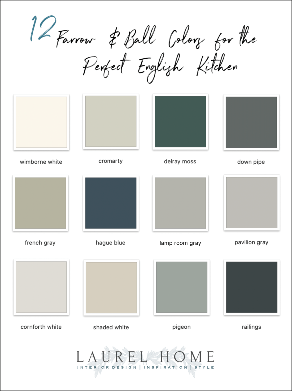
Here Are the 12 Farrow and Ball Kitchen Cabinet Colors
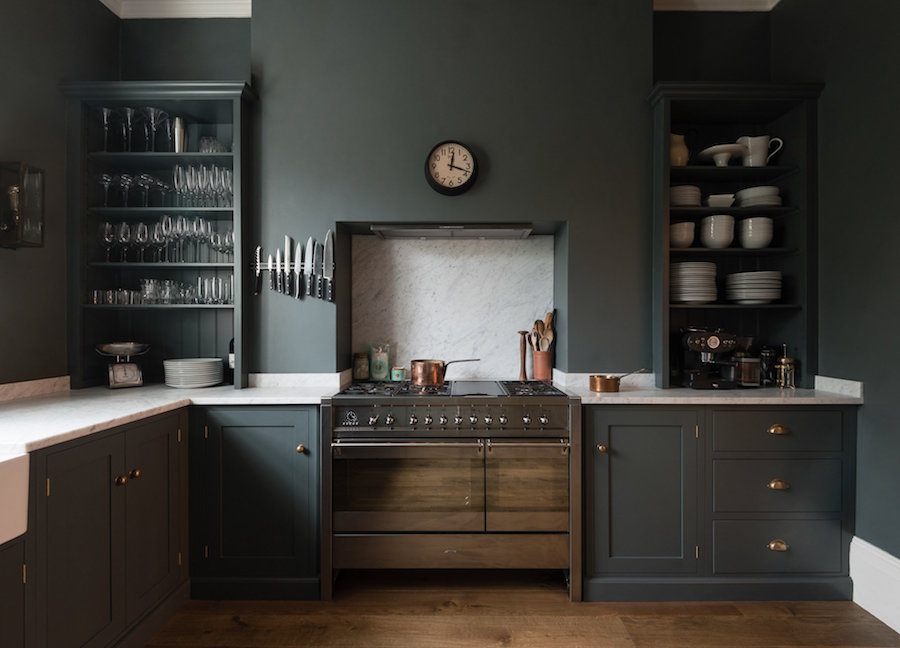
DOWN PIPE
Talk about the perfect English kitchen! Let’s begin with my tall, dark, handsome, mysterious hunk from De VOL that I’m mad about. Well, I’ve looked at many images, and I do know that the English are bonkers over Farrow and Ball Down Pipe.
And for a very good reason. It’s a wonderful color!
But, here’s the deal with Down Pipe;
it looks different in every photo I see. I’ve seen it look almost pastel to almost black. But usually, it’s a dark gray-blue-green or dark gray-green-blue.
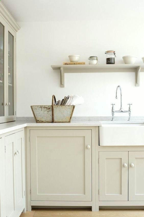
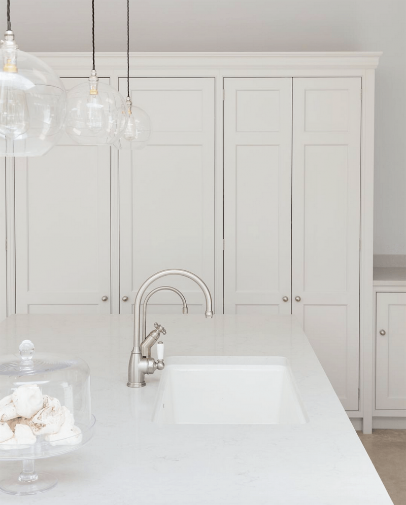
SHADED WHITE – Yes, this is the same kitchen as on Wednesday with as Benjamin Moore’s Halo. Are they the same color? No, but pretty close.

Shaded White is one of those colors that changes from a kind of soft cream, to a dirty cream, to a warm gray-green. I love colors like that and it’s a wonderful color to warm up a dreary, cold kitchen.
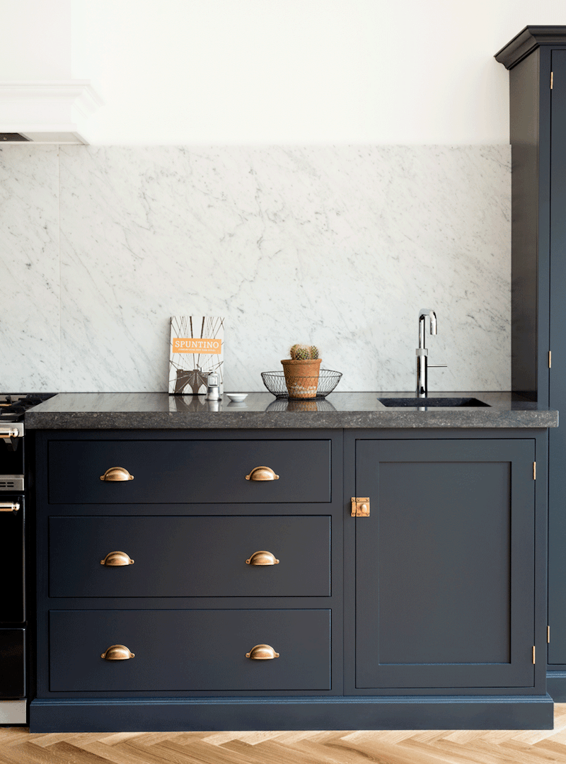
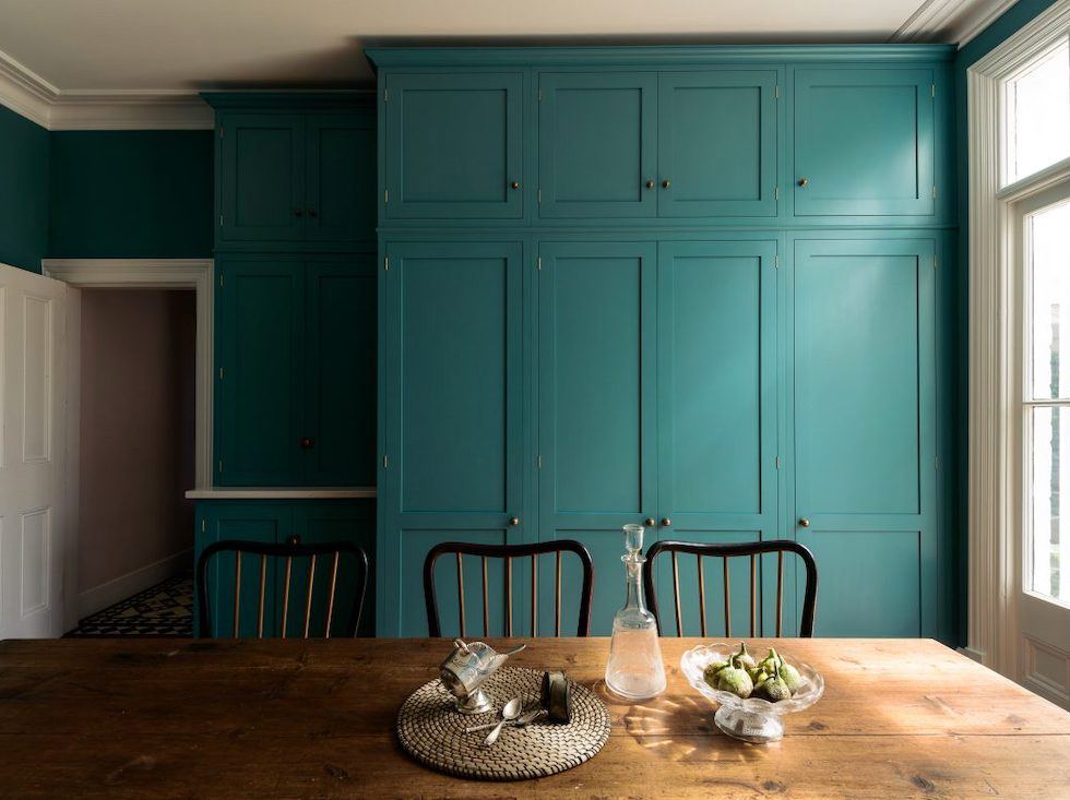
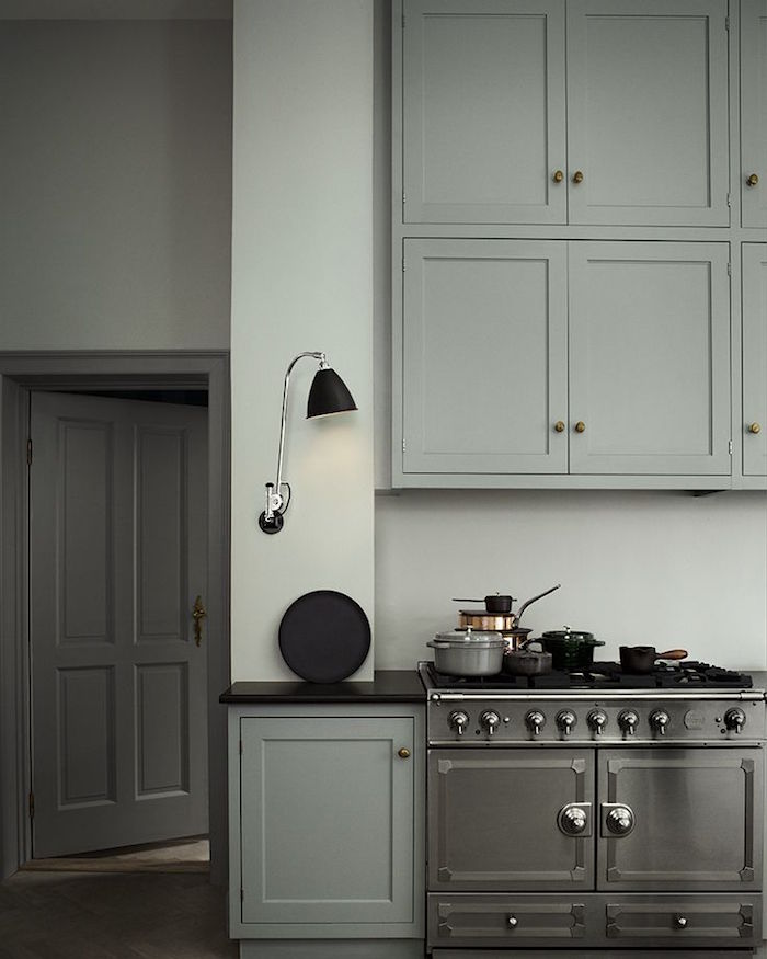
RAILINGS
Railings is almost definitely one of the De Vol colors. The chip on the card looks like black, but it’s really the darkest navy possible.
Railings on an island in a kitchen by Humphrey-Munson who Emily T turned me on to after Wednesday’s post. OMG. You must check out their instagram account. But go grab a drool bucket first.
Note: Humphrey-Munson has their own proprietary colors. They say they are not from Farrow and Ball.
Okay, I won’t argue.
The perimeter cabinets are in Humphrey-Munson Half Windsor and the Island in Humphrey-Munson Helm
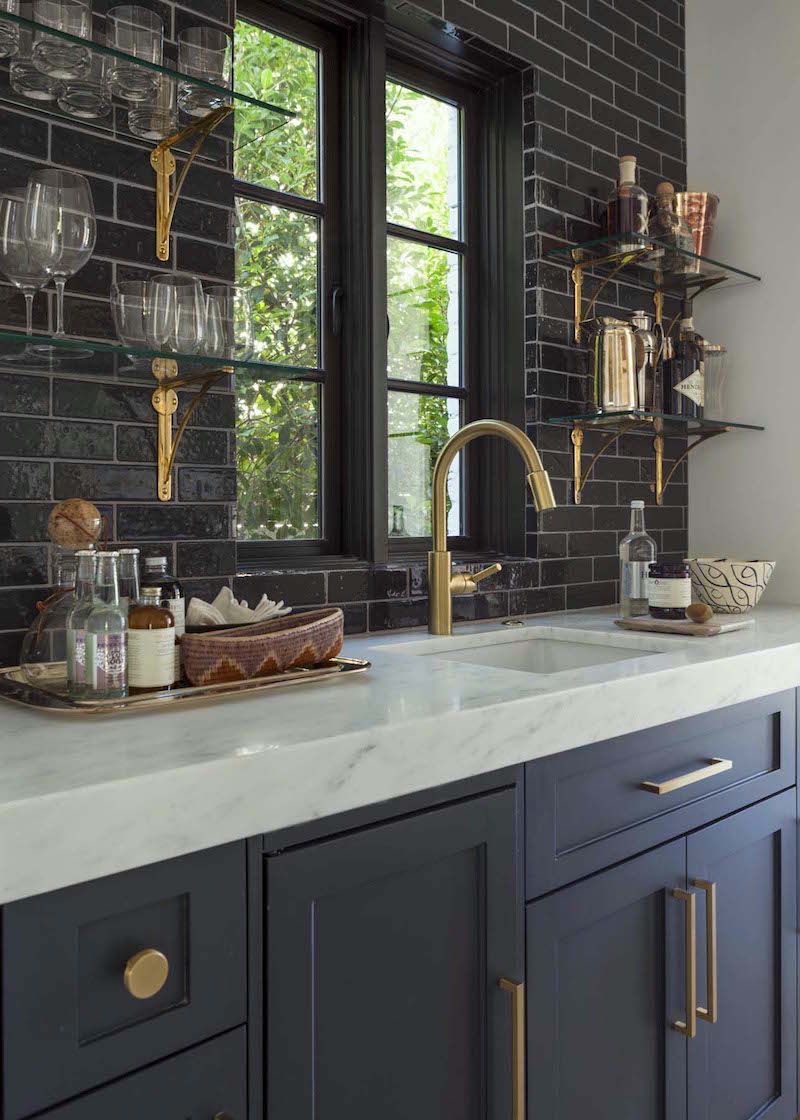
More Railings. I think this would make a fabulous butler’s pantry with the black subway tile.
Railings is a terrific color for exterior trim too.


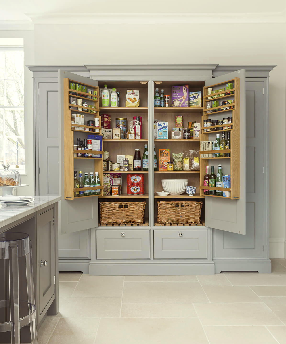
PIGEON
Seriously, this is the most clever thing ever. Sarah is installing custom doors over Ikea cabinets.
And yes, they are in Farrow and Ball’s Pigeon, which is a medium-gray-blue-green. There’s a lot of info in Sarah’s link about the process, the before images… Great blog!
Here’s the finished kitchen. The uppers are Wimborne White.
CORNFORTH WHITE
Well, it’s not really white, but it sure is one of the loveliest grays in the universe.
(The paint color is Humphrey Munson Lapel)
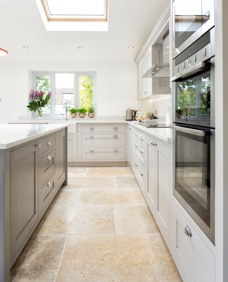
A lovely kitchen from Maple and Gray.
Another UK manufacturer of bespoke kitchens. And they also give out their paint colors.
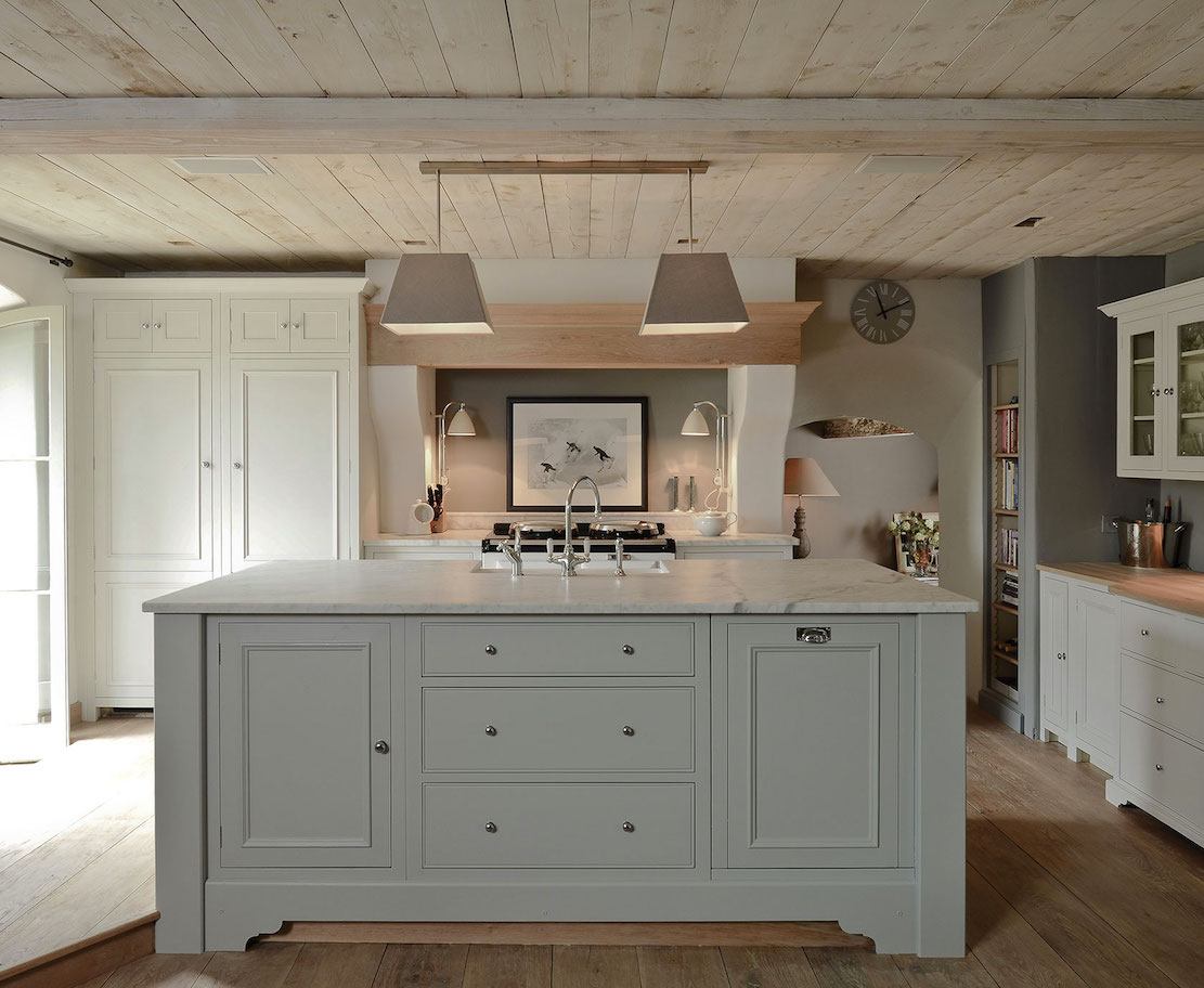
PAVILION GRAY
Farrow and Ball’s Pavilion Gray stays pretty true to gray and is absolutely gorgeous. Just like this exquisite English kitchen.
This is a really nice website and they DO give a lot of the Farrow and Ball cabinet colors that they’re using for their kitchens.
Well, I don’t see the big deal. If folks want to work with the company, they’ll still work with the company and if they ne,ver were and are only repainting or something, it’ll make them think fondly of the vendor and perhaps recommend them to someone. Just my thoughts.
Lewis Alderson is another beautiful English cabinet company. Someone said again that they are worried that in a kitchen with no uppers, there won’t be enough storage. No, there is usually MORE storage. Or, perhaps I should say, more efficient storage. This unfitted pantry is a wonderful example of that.
Essex Shaker kitchen from DeVOL
VARDO

This is one of Farrow & Ball’s colors that came out a few years ago.
FRENCH GRAY
French Gray is similar to Pavilion but with a soupcon of blue-green which is also very, very pretty and classic; just a little more color. And please check out Neptune Kitchens. Really pretty!
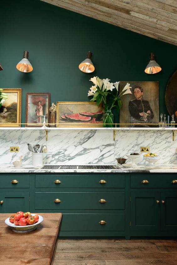
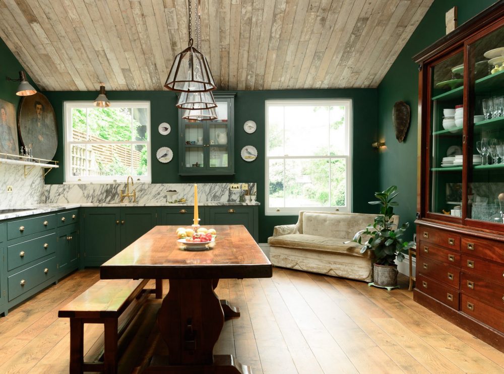
STUDIO GREEN
In any case, Everyone loves this De VOL kitchen even if they don’t like dark green. There’s just something inviting about this English kitchen.
By the way, did you know that De VOL spelled backwards is LOVED? It’s not intentional, I don’t think.
I looked at all of the greens. Hmmm… I even looked at the archived greens. Hmmm… again.
The one I kept going back to was Studio Green, but it is VERY dark on the chip and quite dark in most images. But the one below, came from the Farrow and Ball Website and looks like an exact match. So, let’s just go with that one.
For reference, please also check out Melissa Tardiff’s gorgeous green kitchen.
I’m not saying that it is… Please test. For Studio Green to lighten up this much, it would need to be in a very bright room!
However, tonight, I found another color by accident.

It’s from a company by the name of Motor City Paint called Delray Moss. I think it’s a pretty close match.
 Sometimes Studio Green looks like this. Sorry, not sure of the original source of this image.
CROMARTY
Cromarty is a pale watery, gray-green which was introduced to the line about a year ago.
If you want to see the other eight new colors, please click here.
original source unknown.
LAMP ROOM GRAY
Oh my, how handsome is this English kitchen with Lamp Room Gray Cabinets!
Lamp Room Gray is another classic– a rich sophisticated gray with just the right amount of blue and green.
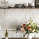
WIMBORNE WHITE
Wimborne White is my favorite F & B white. It’s just warm and lovely. A true white classic. It’s counterpart in Benjamin Moore is Simply White.
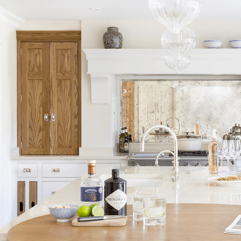
Another stunner from Humphrey Munson. Love the white on white. And the wood pantry is a stunning addition. I also love the antique mirror backsplash behind the range.
The cabinets are Linen by H|M and the accent wood Westminster Oak (a custom smoked oak finish)
 Another beauty from DeVOL Kitchens
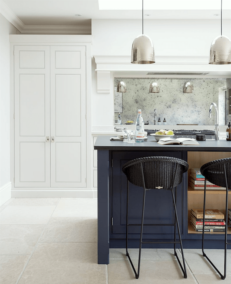
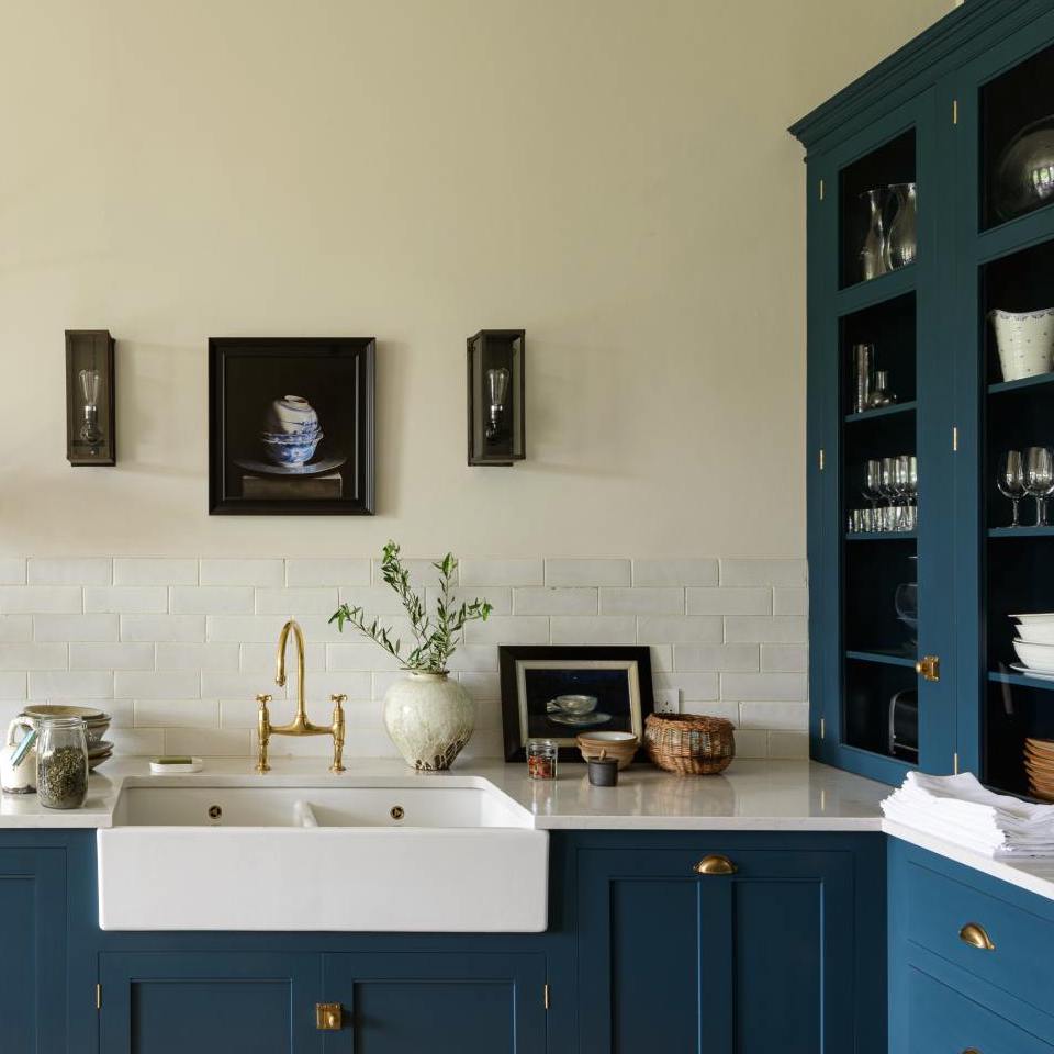
HAGUE BLUE
Farrow and Ball’s Hague Blue is my favorite navy, if I had to pick a favorite. There is no exact match in Benjamin Moore. It’s a rich, saturated navy with a welcome note of green, but stays just shy from being teal.
Is this similar to the graphic I made a few days ago? Yes, it is. But, those were for the perfect American kitchens and these are for the perfect English Kitchen. Of course, there isn’t a whole lot of difference in my world.
***Oh, an update in March 2021. Did you know that you can now purchase Farrow and Ball paints, samples too, and wallpaper ONLINE? Yes, you can, so if you go to their website, you can have access to this wonderful line.***
xo,

PS: If you are looking for the Benjamin Moore Equivalents to these Farrow and Ball Colors,
Please Click Here for the 2018 updates.
PPS: Please check out the newly updated HOT SALES. Lots of great early Memorial Day sales going on.
Related Posts
 Subway Tile Alternative Everyone Knows About But Me
 Ultimate Window Treatment Guide + Interior Window Shutters
 21 Common and Hideous Interior Design Mistakes
 40 Outdated Home Trends. But, Are They All Passé?
 Best Proportions For Interior Trim – Why You’re Confused
 The Granny Decor Mistakes You Might Be Making
 How To Hang Art – Little Known Ways + Mistakes to Avoid


30 Responses
My kitchen plan includes painting my cabinets very close to that Vardo with a creamy barely-yellow on the walls and a mix of copper and black hardware. Lavender and green art and such round it out. I love it so much.
FYI I’ve had great luck having sherwin Williams match Farrow and Ball colors. Just take the free swatch you can order from their website and they’ll match the color. I’ve been pleased with every color they’ve done—literally every color in my house is done this way, as well as a few friends’ homes. There is just something about F&B colors that other paint brands can’t get right. They’re the perfect in between colors. I know F&B claim it’s the paint formula, but I think it’s the color formula.
I want to say I love your blog! I switched over to Benjamin Moore paint for my recent redecorating projects, I used Cloud White & Cotton Ball. I love British Colonial and West Indies design, perhaps you could feature a blog with this design if you haven’t already. Your blog never disappoints.
I am in the FingerLakes, NY. Where can I get Farrow and Ball paint? Or order from? thanks!
Hi Lissa,
This is a link on the Farrow & Ball website for their stockists. Otherwise, there’s a contact number at the bottom of the page.
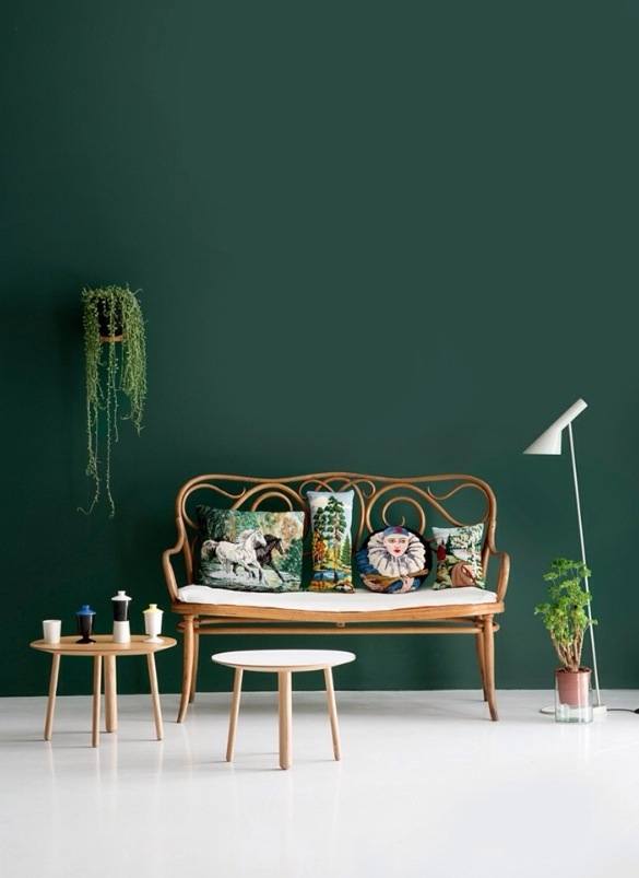
A sofa in the kitchen! And a trestle table instead of an island. How perfect! But mine (someday . . . ) is going to be painted Vardo.
I have been LOVING these posts about cabinets and cabinet colors! Coming at a wonderful time as we have put in an offer on a new home with wonderful cabinets and island, and have plans to paint the cabinets. Thinking darker color for the island. I don’t know what you have in store for us on Wednesday, but I know I’d love for you to share ideas for suggested coordinating perimeter cabinet + island + wall paint colors. I’ve learned so much from you! Glad you’re spending time with your son – we are doing the same thing this week at the beach. Heaven!!!
Such lovely kitchens!
The Studio Green rooms reminded me of a kitchen I had years ago, with walls just that color, a white ceiling and a warm, light colored, wood floor. No matter how many lights I’d turn on—and there were a lot of light fixtures—the room always looked like a black hole at night.
Hi Laurel, I’m the happiest with your awesome post! BTW a few months ago I wrote to Humphrey-Munson wondering about their beautiful kitchen colors. They said the same to me about custom mixing and I felt so shy and uncomfortable for even asking that, but after your post I realized that it was like Julia Roberts in the Pretty Woman store scene. Kind of. I still feel shy for even asking them, but now I’m relieved that you did too . I’m not the only admirer of them. Beautiful work and an amazing post! I learned so much from you and I’m itching to repaint something. Thank you again and take care.
My dream is to have an unfitted English kitchen. These pictures are so beautiful! Thank you Laurel for these posts and especially for matching B.M. paint colors to them.
note to Nancy Keyes: I love your kitchen. You bet I would welcome your design advice!
Sigh…just beautiful. Now I’m suffering from a serious case of kitchen envy. I love the clean, uninterrupted look of the cabinetry, counters and colors, along with the wood countertops, in these kitchens. Everything is just perfect. I’m always amazed when people have the courage to install hardwood floors in their kitchens. They are always so beautiful, but I just can’t imagine the care and upkeep they would require. (I especially love the chevron style in the dark navy De Vol kitchen.) What do you call the cabinet doors in the Lewis Alderson kitchen? They remind me of paneled shutters.
Thank you, Laurel! I am planning a kitchen remodel and love the look of an English kitchen best of all! Your post was so inspiring. I would love to know your thoughts about what elements make an “English kitchen,” in addition to paint colors. For example, I have wood floors throughout the house and rooms are visible to each other. Yet, in most English kitchens, stone or tile floors seem the norm. Thank you and I hope you enjoy the change of scenery in Northampton!
Oh, Nancy Keyes. You can design my unfitted kitchen any day. ☺️.
I’ll second that!
Hi Laurel, So happy for you to be near your son. Thank you for nourishing us with quality kitchen photos and paint colors. Just love them all. My hope is to get a kitchen that looks as good for less than half the price. We live in a house with good architectural bones but the kitchen is poor in layout( the refrigerator is half sitting behind a door to the mudroom). It lacks enough storage with some cabinets and drawers being too small and completely useless. The potential is there. I am going to look into Ikea with custom door and drawer fronts. Thank you Laurel. All the best you
Leslie
I like the idea of a soapstone countertop. I say negatory to the sofa in the kitchen–I would fall asleep on the sofa and my food would burn.
haha
May I just chime in and say Thank you SO much! You put a huge smile on my face!
Gorgeous inspiration photos! I find myself drawn to the light kitchens myself, but I do like some color brought in when there is an island, like in the photo with the Railings island from Humphrey-Munson or the Maple & Gray photo. Also, can I just say that my heart does a little leap when I see Nancy Keyes chime in! I love the posts you’ve done with her work! Laurel, have a wonderful time in Northampton with your son. I’m envious that you’re able to get away. I’m longing to roam myself 🙂
Hi Laurel,
Love, love, love this post! I am itchng to design a kitchen…NOT for myself though. I loved seeing the post on Melissa’s again and reread every word. I will ask her to send the upstairs bath photos. I ordered the sink she found for my upstairs bath refresh. Have a wonderful time away.
XOXO Nancy
Thanks Nancy. You can design my kitchen any day! And, I’d love to see the bathroom photos. xoxo
Hi Laurel,
That’s nice that you got to get away. And visiting your son makes it extra special. I hope you’re having a nice time.
English kitchens are just the loveliest. They just ooze with a sense of calm. But don’t you have to have a certain type of home for an English kitchen? Wouldn’t they look out of place in a typical suburban neighborhood?
Hello Laurel, Studying these pictures, I came to a realization: dark colors can go well in a kitchen, but on the whole kitchens (in my opinion) should never be dark. Also, some of those putty and off-off-off whites look good, but a purer form of white might look cleaner and better. I know I am being reactionary, but in general I like white kitchens.
–Jim
p.s. That knife rack in the gray (Down Pipe) kitchen reminds me that DeVol (perhaps a different one) wrote the music for “Whatever Happened to Baby Jane” and “Hush, Hush Sweet Charlotte”.
I know what you mean about the white kitchen. I feel that way too. Maybe the solution is to have two or three houses?
Laurel, so glad you could go visit your son. Your gorgeous post has inspired me on my virtual quest for new hardware for my not so new kitchen in my very old house. Now I have old darkened brass and brushed nickel. The bright shiny brass looks great on newly remodeled kitchens, but what about on older cabinets? Can you mix dark shiny and dark brass? So confusing. Take good care.
Hi Paula,
It’s really difficult to say unless I can see what you’re talking about. If you’re talking about what’s on the cabinets only, I would say, probably not. But, in the room itself, you can mix metals. This is part of what Wednesday’s post is about. The other thing is that if brass is bright and shiny, I only recommend unlacquered brass and it does start out as being bright and shiny. They polish the hell out of it. But, over time, it will darken. That process can be hastened with lemon juice. The tarnishing process can be stopped with butcher’s wax. A brass cleaner is probably better for removing the patina.
We just finished building our house and are in the middle of painting various rooms. We use colors from all of your palettes and we have had so many compliments. We are thinking about painting the outside a dark color like railings or downpipe.
Laurel,
So beautiful, I think the appropriate response is to sigh.
I’m envisioning my next kitchen remodel in my mind already with no actual space to remodel Yet
You have a wonderful way of igniting my imagination.
Thank you again
Laurel, thank you for another wonderful post. Hope you’re enjoying being away from confinement and getting some fresh air.
I so love the kitchen with the Lamp Room Gray cabinets. Yummy looking. Any idea of the wall color? Those two together are so sophisticated. Thanks, Liz
Hi Liz,
Well, first of all, I’m only guessing at the cabinet color. This is a pretty dark kitchen. And, then there’s the photo and our monitors. In addition, Laurel is sans real-life paint chips. I had thought about bringing them. But, in the end, forgot to take them. However, from what I can see, Dimpse looks good with Lamp Room Gray. The equivalent Benjamin Moore color to Dimpse is Gray Tint 1611.