

Hi Everyone,
Did you see the post the other day about monochromatic color schemes? If you missed it, you can check it out by clicking the link.
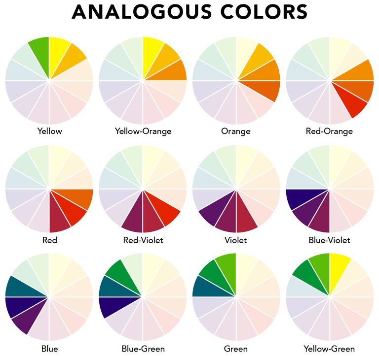
This post is about analogous color schemes in interiors. They are some of my favorite, but they can be tricky.
What are analogous colors?
Analogous colors are two or three colors that are right next to each other on the color wheel.
Below is a standard color wheel.
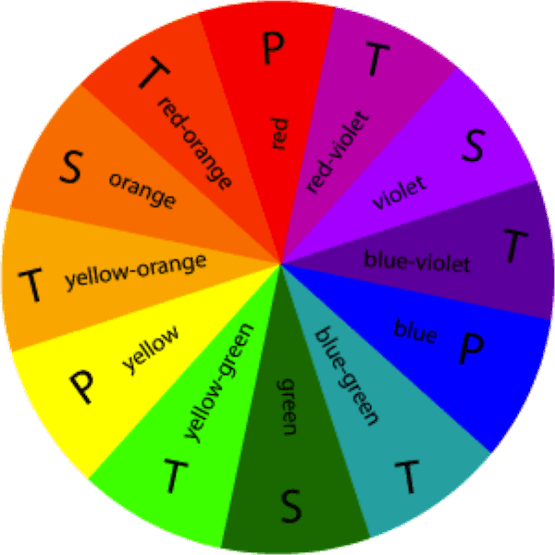
P = Primary colour : S = Secondary colour : T = Tertiary colour (which is a mix of the 2 colours on either side)
- There are three primary colors – red, blue and yellow
- Three secondary colors which are red + blue = violet, red + yellow = orange, yellow + blue = green
- Then, there are six tertiary colors which are a mix of two secondary colors.
An analogous color scheme is basically one of the following.
Color is all around us. Right?
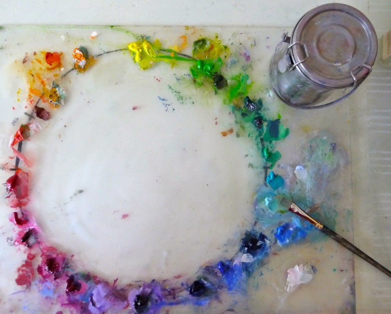
Maybe some of us don’t really notice this stuff. But, it’s never too late to change that, We can find inspiration in nature, gardens, art, fabrics, etc. So, I’m going to be interspersing room inspiration with art, flowers and fabrics to demonstrate that.
Above is an artist’s color wheel courtesy of artist Tina Wasselkeck.
So, I’ll just jump in here and we can start from left to right with the violet, indigo and blue. (I’ll be ending with those too.)
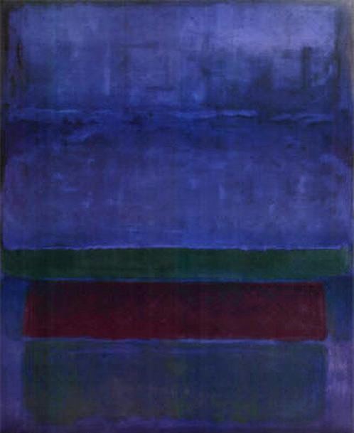
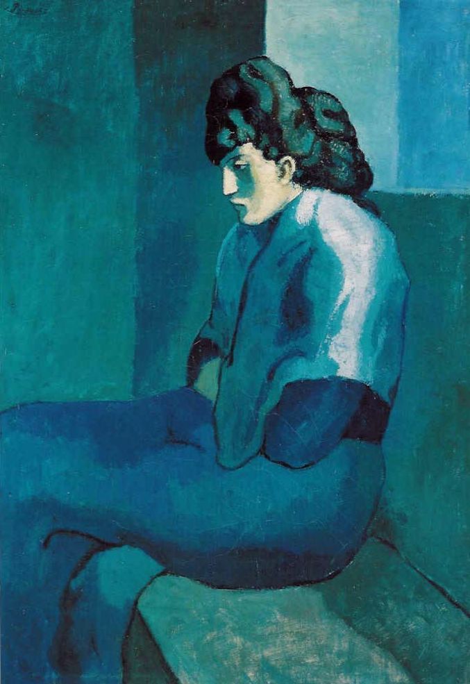
The unmistakable enigmatic work of Mark Rothko.
I imagine that Mark was a really clumsy kid and was always spilling his paints. One day he went upstairs and his mom shouted. “Mark get down here this instant and clean up this mess!” Afterward, she liked it so much, she hung it up on the wall.
Just being silly.
Analogous color schemes can also be pale and muted.
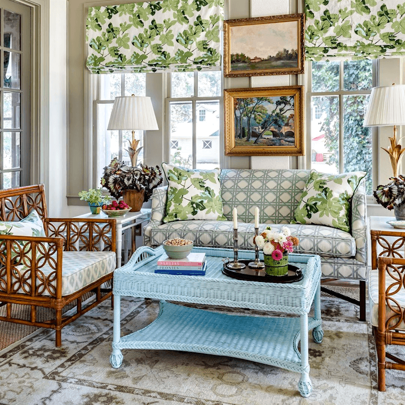
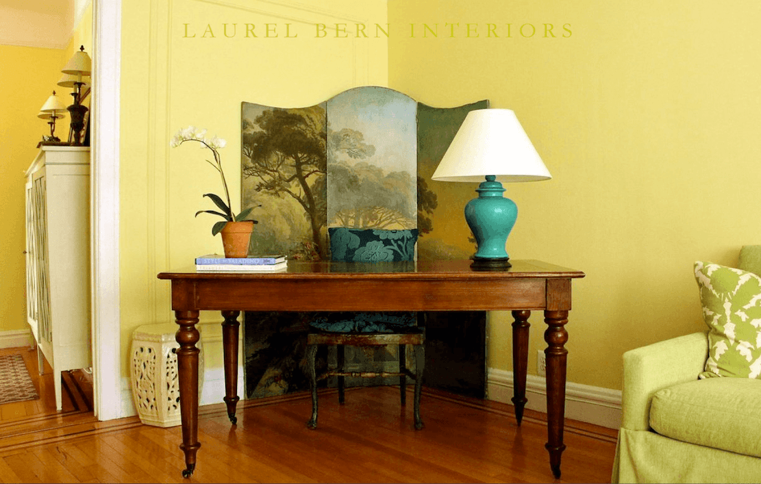
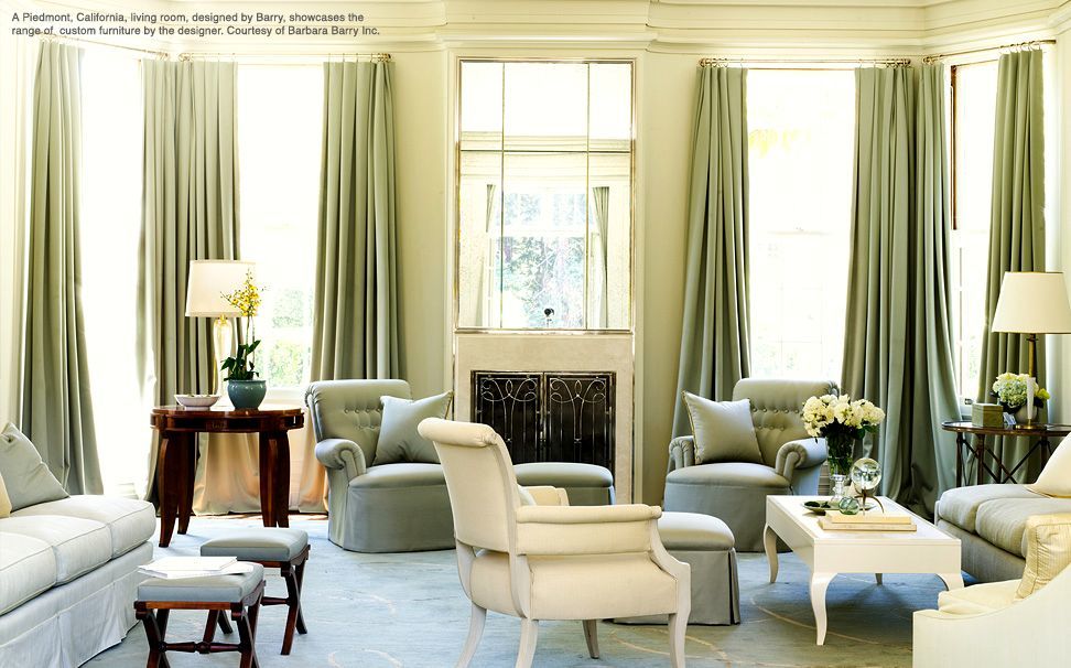
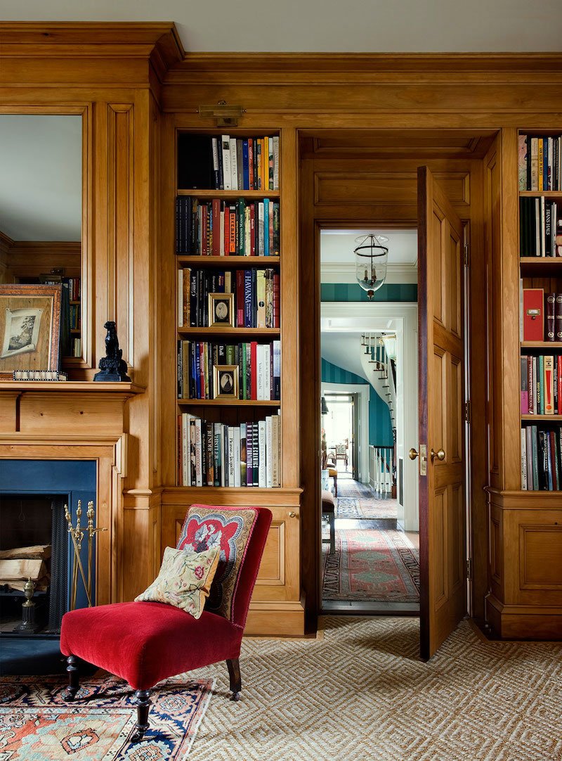
Blues and greens are probably the most frequently used in interiors. And, two prolific masters are James T. Farmer and Mark D. Sikes. They also happen to be two of my favorite interior designers.
blues, teal and green
James T Farmer photo Jeff Herr
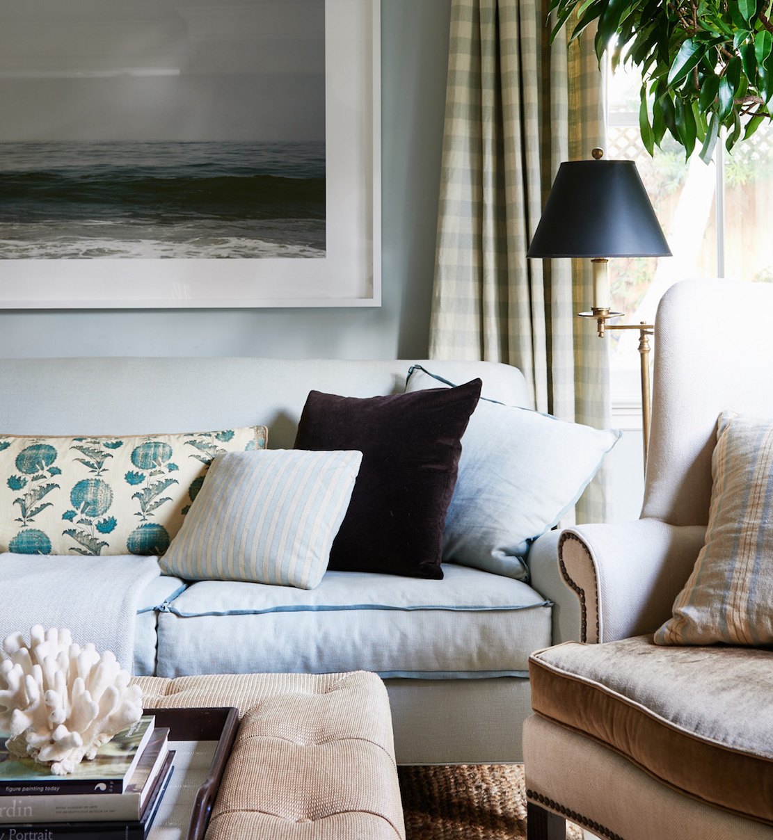
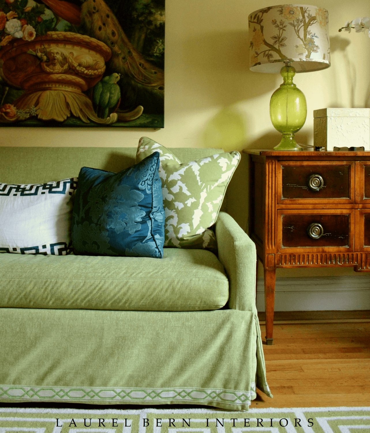
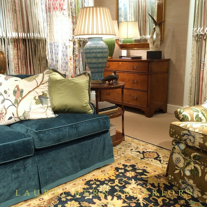
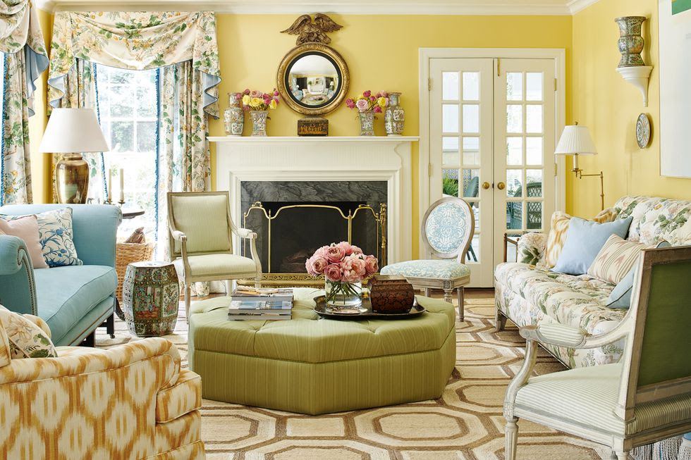
In the room above Mark D. Sikes mixes pale blues and greens with pale taupe. He rounds out his composition with a hit of chocolate brown, a black lampshade and a large white matted piece of art. His rooms are like a textbook in how to decorate.
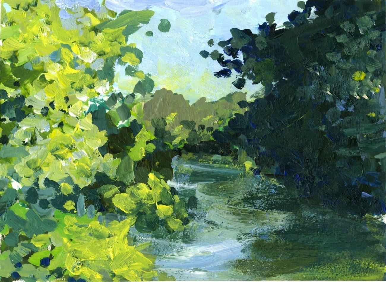
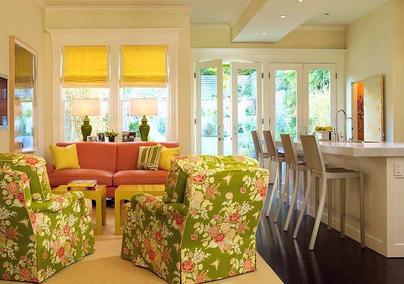
blue, green, chartreuse and yellow
Above and below, from my living room.

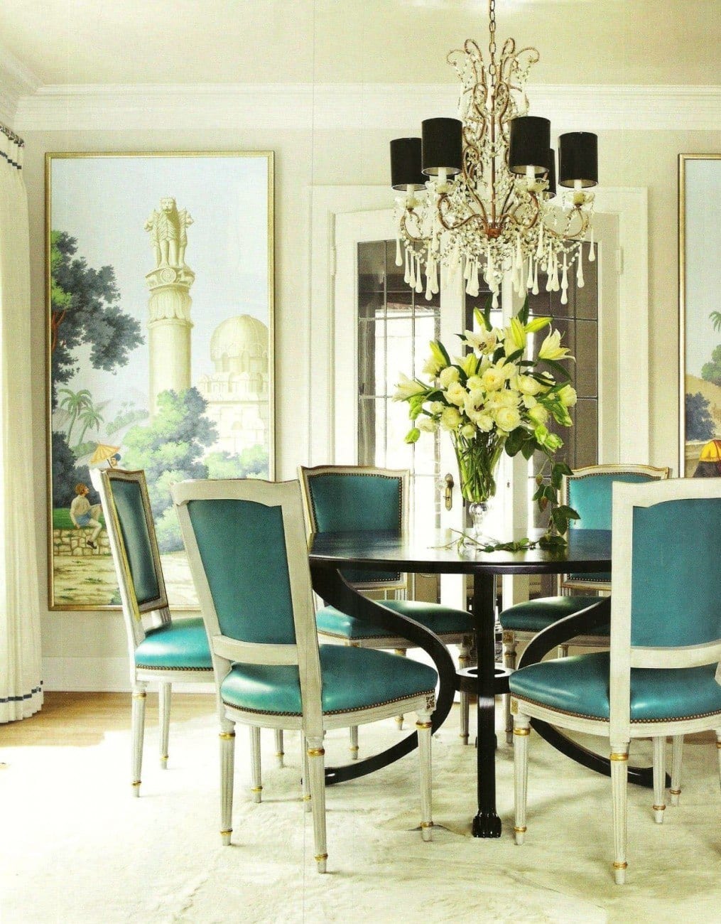
One more beauty by Mark D Sikes featuring an analogous color scheme of blues and greens
Barbara’s use of color is legendary. For more of her beautiful rooms and philosophy, click here and here.
A photo I took a few years ago during a trip to the D & D building in New York City.
This was in the Lee Jofa showroom
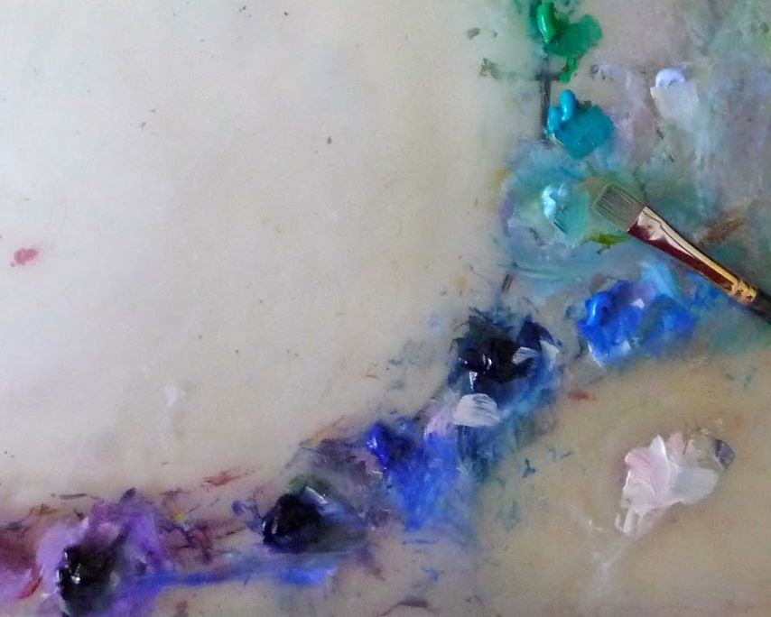
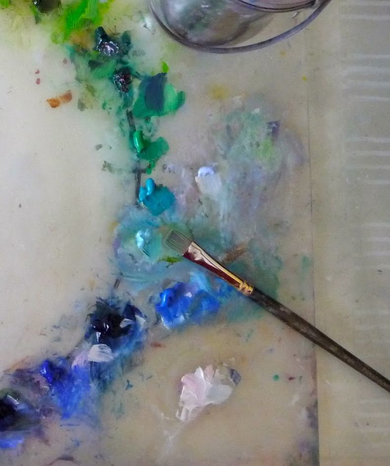
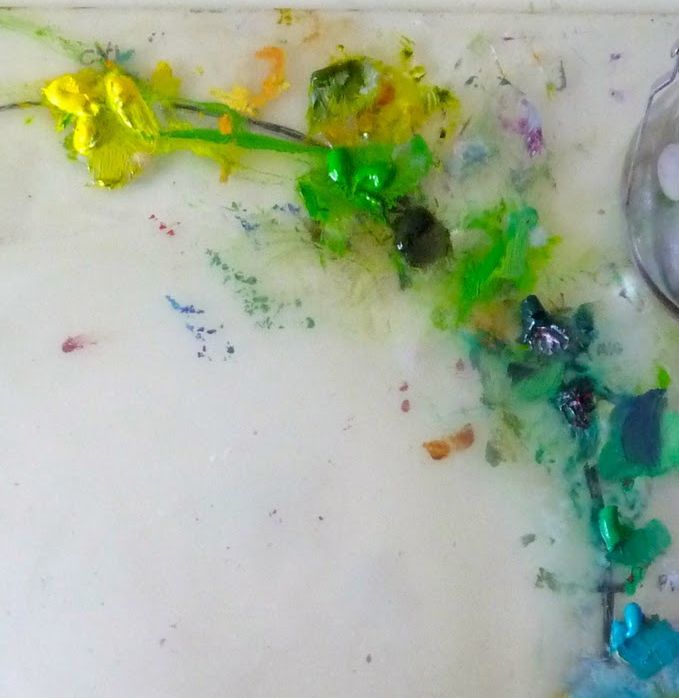
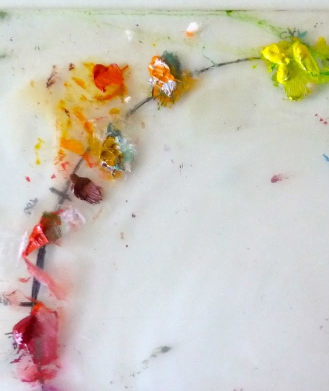
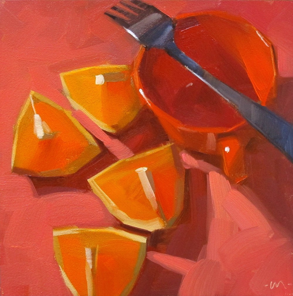
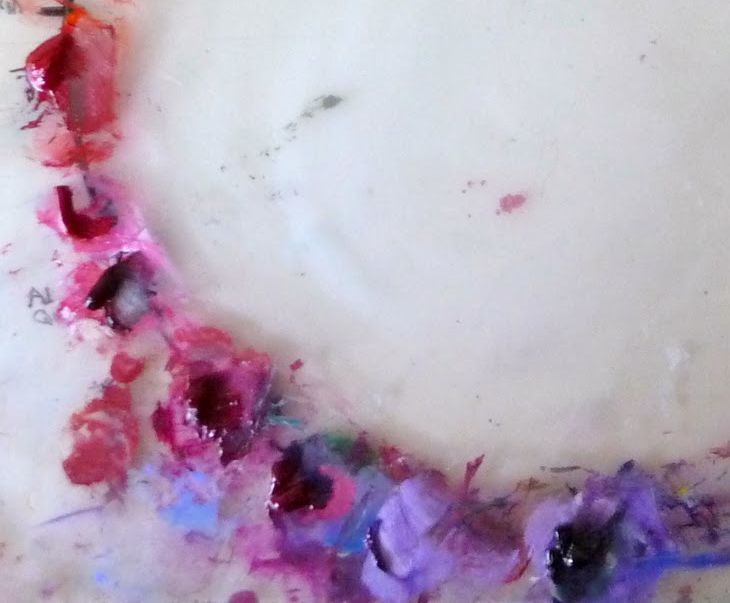
Love this quick analogous study by Sofia K. Wang
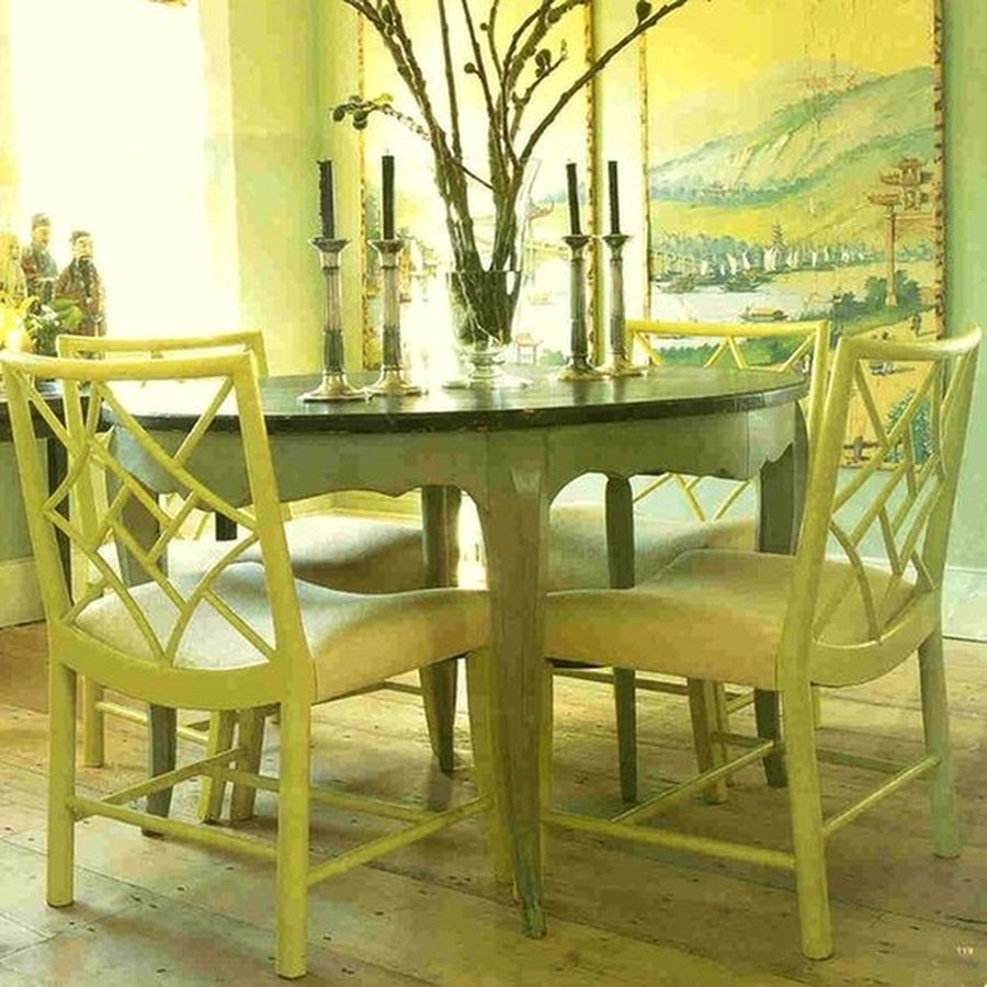
I included this in the monochromatic color scheme, but it is really an analogous color scheme.
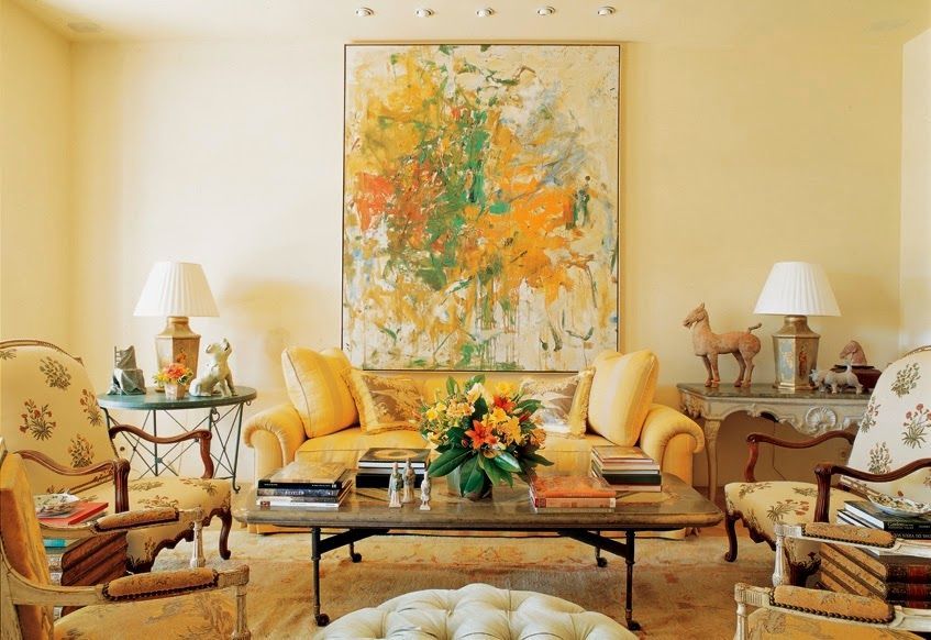
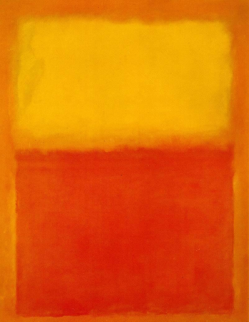
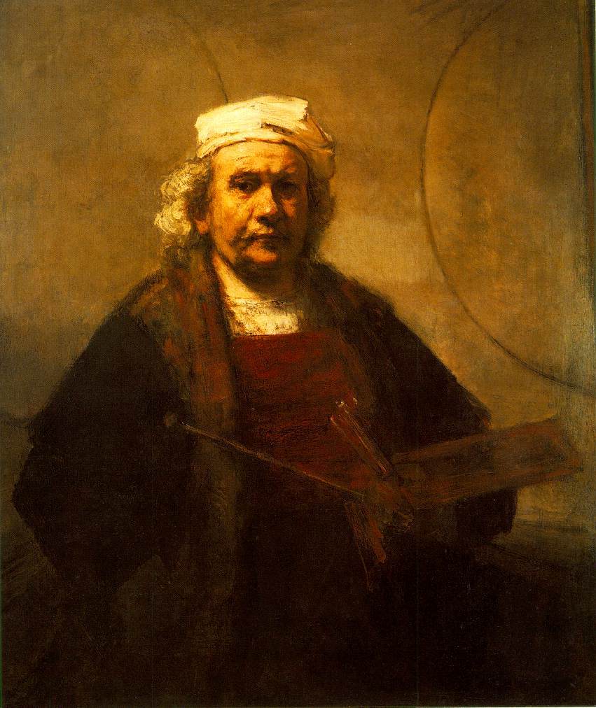
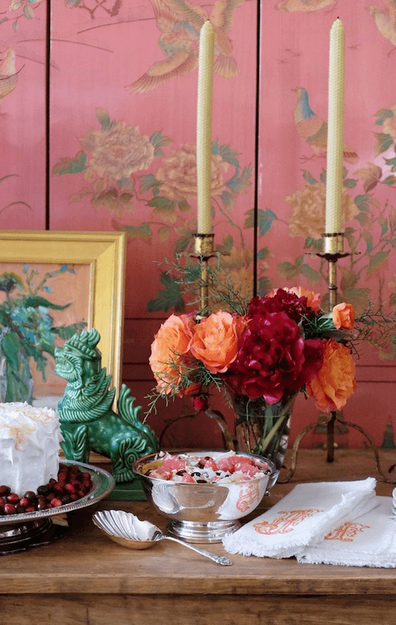
yellow, orange and red
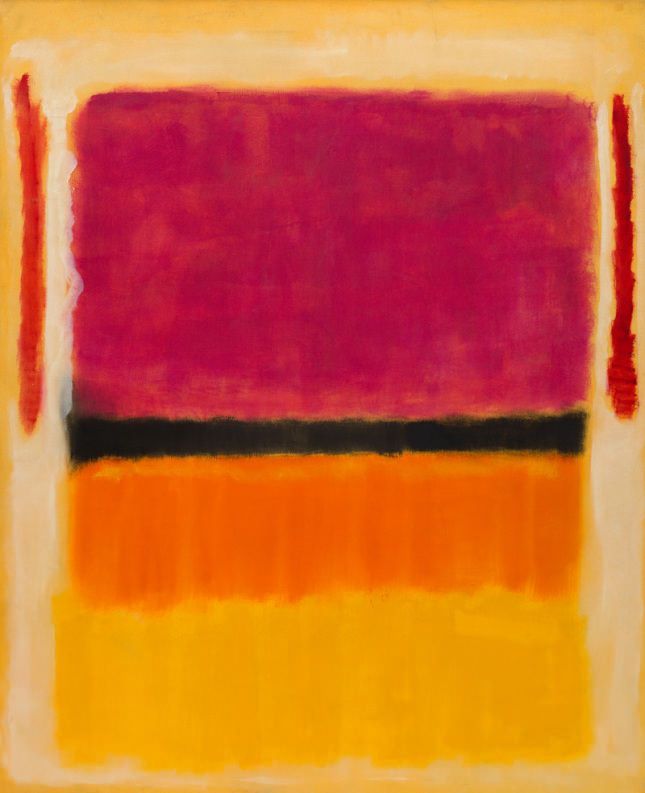
Mark Rothko
Mark D. Sikes – His use of color and pattern is always extraordinary!
Strictly speaking this is a triadic color scheme.
But, overall, it has a great blend of warm and cool which is always desirable.
A room I did in 2013 in Pound Ridge, New York
Mark Rothko
Interior design by Miles Redd and architecture by Gil Schafer
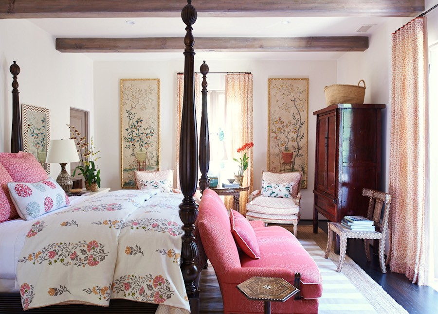
Mark D Sikes and one of my favorite bedrooms of his.
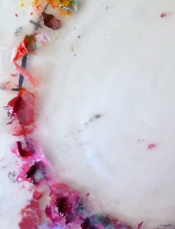
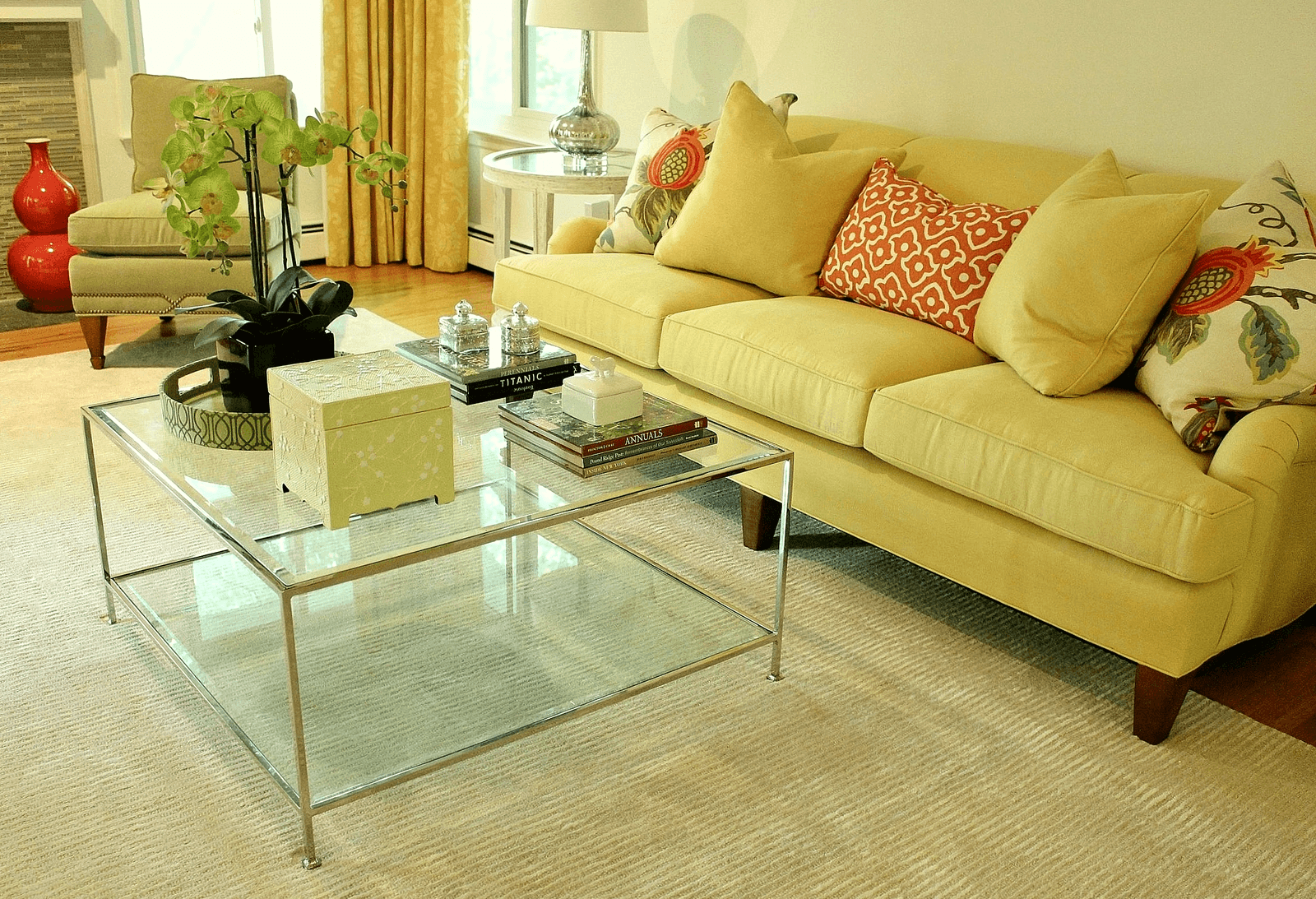
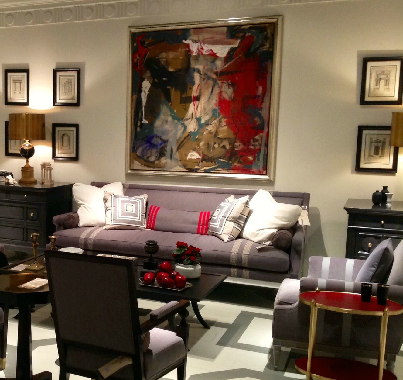
orange, red and violet
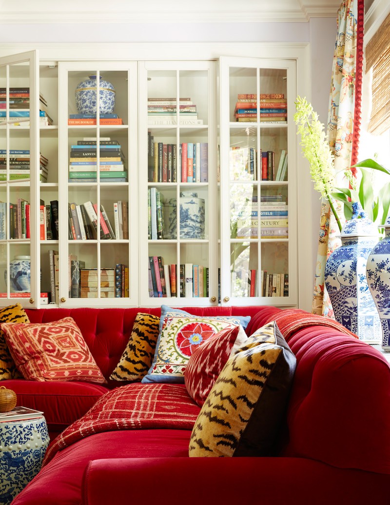
Analogous red, orange and gold in this striking room by Mark D. Sikes
@jamestfarmer on instagram analogous color scheme vignette
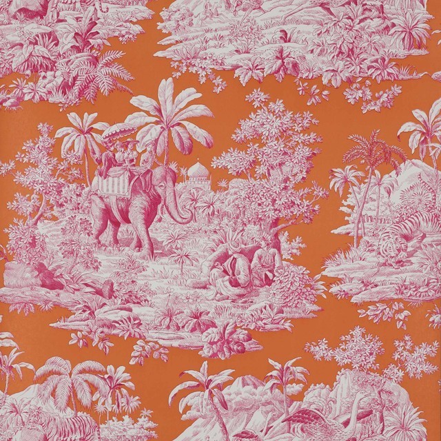
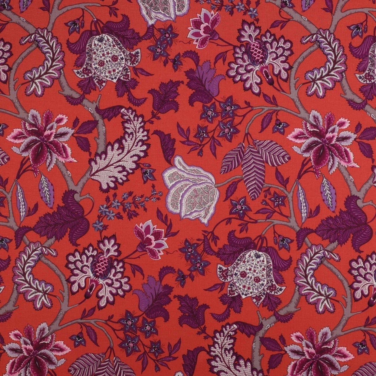
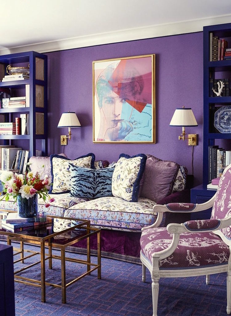
red, violet, purple, indigo
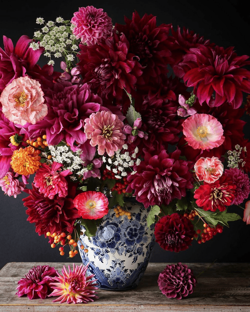
via @cakeatelieramsterdam on instagram – floral analogous color scheme
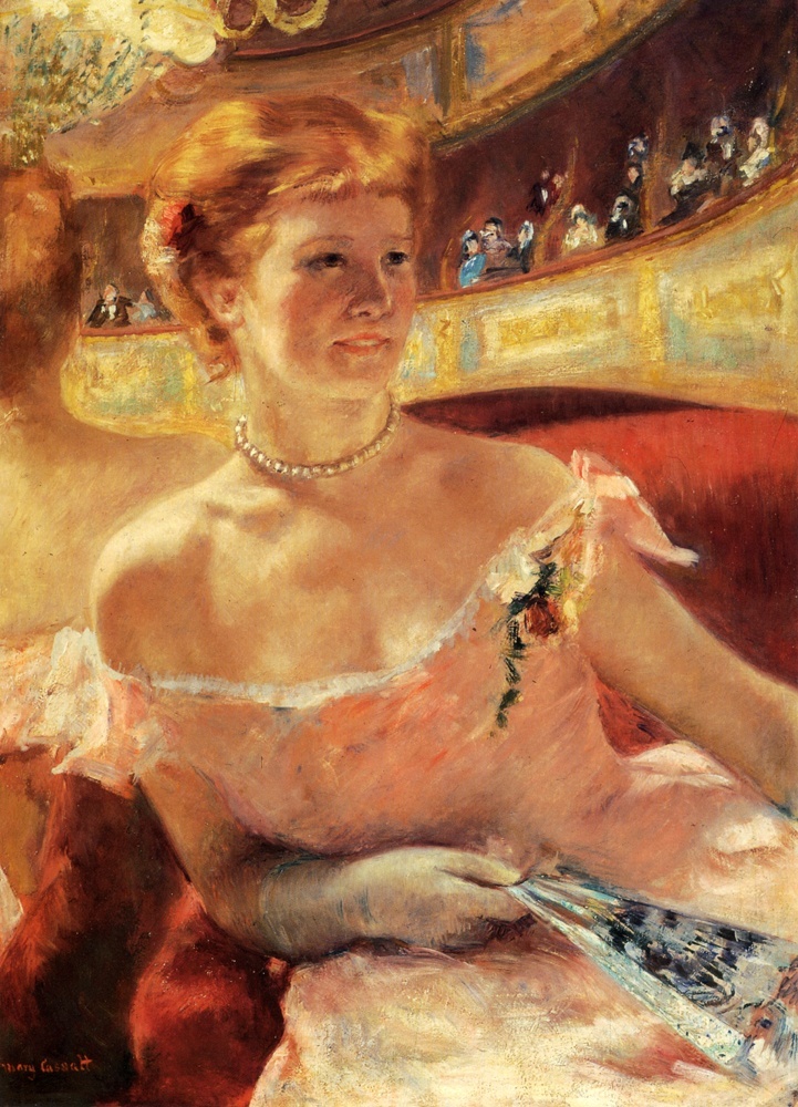
I took this lovely at the High Point Market in 2015. Mary McDonald’s room for Chaddock Furniture. See??? She’s so talented. Does she study the master artists? I bet that she does!
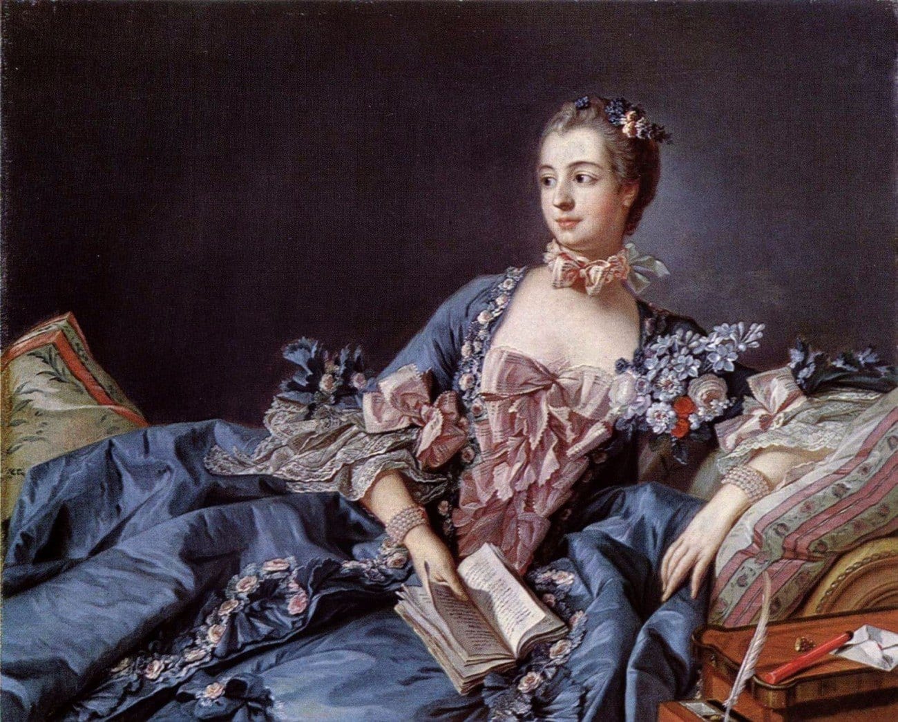
Francois Boucher Madame De Pompadour
I hope you’ve enjoyed this post about analogous color schemes
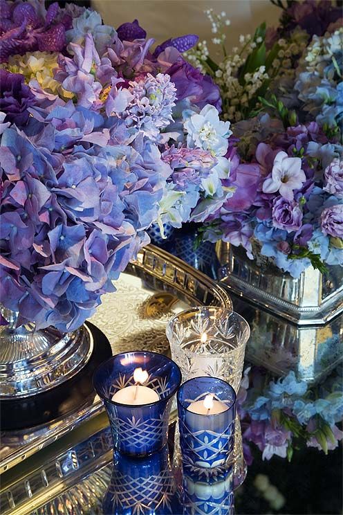
Colin Cowie-wedding hydrangeas
If you need more help and inspiration with paint colors and color schemes, please take a look at the Laurel Home Paint and Palette two-volume collection.
Hope you’re having a beautiful (balmy) weekend!
I am flying to San Diego tomorrow for a two-day intensive with supremo website guru NEIL PATEL!
But, you should be hearing from me on Tuesday or Wednesday, as usual.
xo,

PS: Please check out the newly updated hot sales.
Related Posts
 The Hidden Truth About Paint Colors That No One Ever Told You
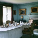 Our Modest Starter Home Might Be Our Forever Home.
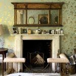 He Thinks That All Wall Mirrors Are Tacky
 A Universal Color You Might Not Be Using-Chartreuse
 Mistakes Guys Make When Decorating To Impress Women
 Dated Kitchen And No Money – Can It Be Saved?
 12 of the Best Paint Colors To Go With Red Brick


26 Responses
Wonderful post, Laurel. I’ve learned so much from you over the past year- I love color and am willing to take the plunge, but am not very skilled. Many of your palettes from your e-book seem to be analogous- is there a proportion that you would suggest for each shade? Also, in this post you mentioned they can be “tricky”. What do we need to look out for? Thank you so much. I have my main colors nailed down (well- painted on the wall) and would like to start filling in with analogous shades in the fabrics and furniture. Is that how it’s done? Thank you.
Thanks for helping me figure something out! I have a favorite color combination: powder blue with cranberry. For example, you might have a bathroom is 90% light blue, with one deep burgundy bouquet of flowers. A very cold, even icy, color scheme, but oh so gorgeous! Well, I think what it actually is is an analogous color scheme! If you made the value of the blue deeper, you’d see it is actually a purplish blue. And the ideal shade of red for this combo to work is a purplish red. Which means—voila!—they are right next to each other on the color wheel. It’s just the one being a pastel version of itself that tricks you into thinking it’s something else. I always wondered why I liked these colors together so much when supposedly there is a rule that blue and red “don’t go together” or worse, “that is going to look like the Fourth of July if you do that.” Thanks for the post!
Love this post. Think it’s amazing that you encourage people to think about fine art painting alongside the decorative arts for use of color!
Laurel, how do you feel about carpets under dining room tables? I will look for a blog on this in the future. Thank you today for an informative, educational and interesting post!
Hi Laurel,
Fabulous post. Much needed, so thank you. I also loved monochromatic. Are you considering posts on complementary and contrasting color ways? I have a question about the 60/30/10 approach (60% one color, 30% second, 10% third): if we are working with mono or analogous, do those fall under the 60%? Another thing, ever thinking of yourself as mediocre~that is your evil twin. She’s catching the flight to the North Pole while you are in the boarding line for San Diego!
Long time reader but first time commenting – I absolutely love the way you write about design and have recommended your blog to many people who could use some enjoyable and informative beauty in their lives.
I hope you are well and healthy in this new year. Please know I have been voting!
It’s an influencer award! So it makes sense for us to vote many times. You have worked hard to influence us all in such good ways. My family has been remodeling our new to us, 20 year old, seen better days, 6,000+ square feet foreclosure home that we won on a bank auction. I’ve been reading your blog and learning so much about what to do and what not to do. I worry over every purchase of paint, rugs, light fixtures, etc. I’m so not an interior designer. But because of you and your blog, I’m making really good choices and decisions. Our house is coming together so beautifully! And one of the most gratifying things about it is hearing my children say, My mom is really good at decorating! So thank you, Laurel, for sharing your hard-earned wisdom and for being an influencer! I’ll keep voting for you. You deserve to win!
Wow Laurel, I don’t know how you do it! Great post and wonderfully sourced visuals…I’m a fan, so thanks for all you do!
XOXO
Audra Slinkey
I really enjoy reading your articles and the levity that comes with them. I especially liked today’s on colour, but I believe that a tertiary color is a mix of a primary colour and a secondary colour. Thanks for the fun articles.
I’m sure that you’re right. I probably read it wrong.
Voted a couple of times, no problem. I’ll bet it’s that dang traffic signals thing. This post was so interesting! All new info for me. I do have a question. In the Mary McDonald room for Chaddock furniture, it looks like she spaced the framed art quite far apart because of the lamps? I’m curious as to what you think of this. To me, it seems off, like the lighting should be handled a different way, or e art should be elsewhere. It seems to highlight the spaces, rather than the art. I love that room, though.
Hi Pat,
She probably didn’t actually stage the room. I might be wrong about that. But, it was from a showroom at the High Point market a few years ago.
First of all, I agree: these last two blogs have been extraordinarily helpful!! Thank you. Today’s is simply beautiful. I just can’t get behind neutral monochromatic for my living space even though I think those rooms are beautiful. I have to have color, and this post is food for my soul.
I, too, don’t seem to have any luck with voting after trying several times. I think you might mention that to the powers that be. The problem is with the authentication problem. I never get the email to confirm. Curious.
But I will keep on trying on the chance that the system will fix itself.
Have a great trip. Jan/Feb in California is usually iffy, but not so much in San Diego. Hoping by the time you get there and approve this post, the weather will have changed.
Again, thanks so much for these two blogs. Maybe we need more color instruction in general.
Thanks so much for trying. If you have a different browser or device, that might make a difference. But, no worries if can’t do that for any reason. xo
What a gorgeous post, Laurel! And so informative. Every image is delicious, and there are so many rooms that I could just move into (do you think the Pinkett-Smiths would mind?)
Thank you so much Laurel!
Beautiful and informative posts on color. And beautiful images! I will mark them for future re reading.
Voted twice!
Have a nice trip to SD!
Gorgeous post! Can’t wait to sit down with a cup of coffee and slowly study all the details. Hope you win this trip, Laurel! Just as a heads up to all the voters—-the authentication process doesn’t work on my computer, but it DOES work when I use my phone!
Thanks so much for the vote and info. Yes, it behaves differently on different devices. I seem to be the only one complaining on the facebook page. And, it’s not like I’m hurting any. I so appreciate the immense amount of support!
Particularly informative and each color scheme more jaw-dropping than the one before. You not only entertain readers with poignant visuals, but you provide a pathway for us to attain similar results. It’s what sets your blog apart. Genius!
Good morning, Laurel
I got my vote in. (I had no trouble.)
It’s the least I could do for all the work you put into educating your readers.
Enjoy San Diego. I bet it’s warmer there.
Hi Mary,
When I booked this trip several weeks ago, I thought yippeee!!! A chance to get away from the frigid temps. Well, it is currently 66 degrees here in Bronxville/NYC and it is 53 in San Diego with an expected high of only 61. Normally, at this time of year, the high is maybe about 25 degrees on average. But, it could be down to zero or as high as 45. I was out before and actually sweating. Except that it is also windy. Very strange!
Thank you so much for the votes. And that goes for everyone. It makes me chuckle to kick some butt. I’ve always felt like the one who just didn’t quite measure up; not quite good enough– mediocre, at best. Always on the fringes. So, to be in this position at this point in my life is something that’s difficult to put into words. But, I’m immensely grateful!
And, it bolsters my assertions that blogging is not dead and has the potential to have a far greater internet reach than instagram. Yes, it’s more work; there’s no free lunch, but it’s worth it!
Well, I have to get packed and out of here for my early evening flight.
Hi Laurel,
I, too, am having issues voting – the same as Helene. I’ve tried 5 times with no luck. Cathy
WOW really great post! I wish all blogs on internet will be that kind of informative. I can be a professor of color schemes then. Or just to live better life. Make subtle but important choices. Thank you Laurel for sharing this super important information!!!
I’d love to read about warm and cool mix. I’m so interested, can’t wait. Mark D Sikes is so nuanced. He is the professor of color and subtle patterns. And timeless and serene, layers etc. I will never tire to read about his decorating tricks, formulas. He is so great that I never can deconstruct his work by easy digestible chunks of tricks alone in my own. Only strong decorator can do this. Thank you Laurel. I vote all day for your blog lol
I have LOVED this week’s post and last week’s on monochromatic rooms. With your breadth of knowledge of both design and art, you bring such depth to color scheme explanations! Thank you! Pinned many. Have fun on your trip … and your upcoming trip to Italy 😉 We’ll expect a full report!
You’re the best Laurel. This post has more useful information than the majority of interior design courses out there!
P.S. Of course I voted!! Sending you love from England!
Hi Laurel,
An FYI … Maybe it’s my computer (or me!!!), but I tried repeatedly to vote for you and the site wouldn’t accept my vote. The problem was with the authentication process; it just didn’t work (I’d click one image and be bounced out and then it would say I failed :().
Letting you know in case it’s not just me. I’ll try again.
All best, Helene