

Dear Laurel,
I can’t begin to tell you how upset I am. This is our first home and I wanted to create a calming space with soothing green walls. So, I picked what I thought were the perfect pale green paint colors.
After we closed, we did a number on the place. Floors, walls. Everything got painted and it cost a small fortune.
Today is moving day and to my horror, the soothing pale green shades we chose looks exactly like HOSPITAL GREEN!!! I’m so upset. Oh wait. I already said that. That’s how upset I am.
This is the irony. My husband and I are doctors, albeit just finishing our residency and poor as hospital mice! We want to leave the hospital behind at the end of the day.
Guess it’s not to be…
I’d be grateful for any words of wisdom you can share on the blog since I know that you can’t give individual advice. Please tell me that it’s going to be all right.
Holding My Breath,
Ima Little-Green
Hi Ima,
I’m actually on the plane winging it to the Design Bloggers Conference in LA.
First of all…
Breathe; because blue isn’t your color. ;]
Second of all…
Relax.
Third of all…
It’s going to be all right.
You’re moving into an empty home and a lot of colors look gross
when there’s nothing else in the room.
We’ve been through this point before too. Most rooms require the benefit of architectural detailing to reach their full-potential.
(and BTW, there is no Ima Little-Green. Or rather there are millions of her!)
Paint alone is not going to do it.
And then there’s the term “hospital green.”
Indeed, there was a time for a wide variety of reasons that hospitals and particularly operating rooms were and still are painted a light blue-green.
I can’t tell you how many times over the years, especially when sage-green was very popular, that I’d hear from a client “eww, hospital green!!!”
It does no good to argue with a client about their associations with color because it’s very difficult to break those ingrained thoughts.
But the problem with “hospital green” isn’t the green itself…
IT’S THE HOSPITAL.

Holy Scrubs! I think I may need to go to a hospital.
“Hospital green” never looked more beautiful!

Oh wait. I lied.
Take away the scary machinery and the horrible lighting.
Add a little moulding and now, that putrid green is a soothing green wall color.
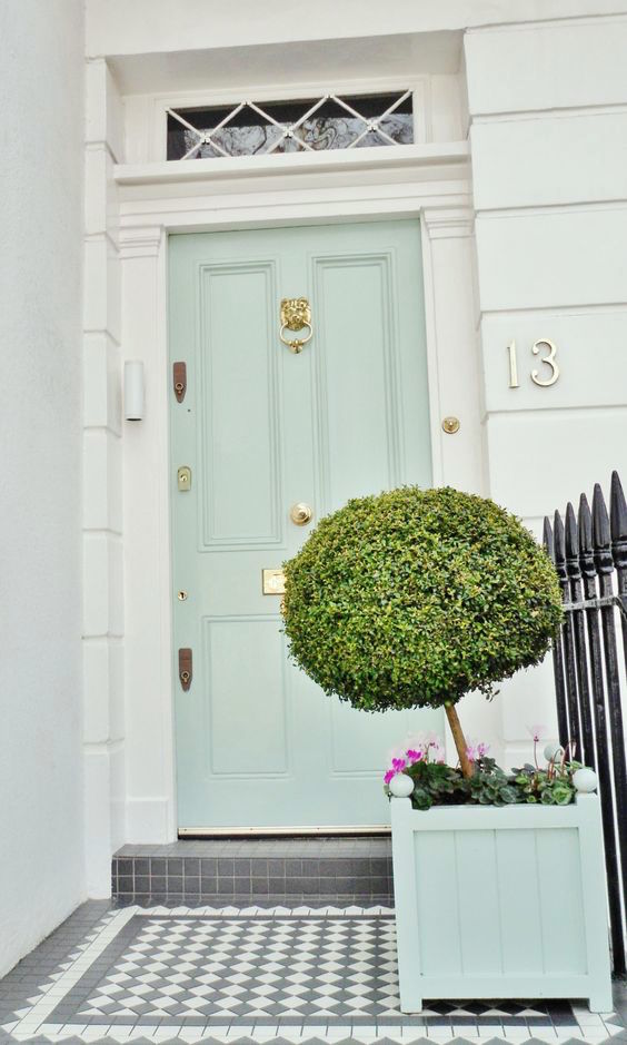
A beautiful hospital green front door.
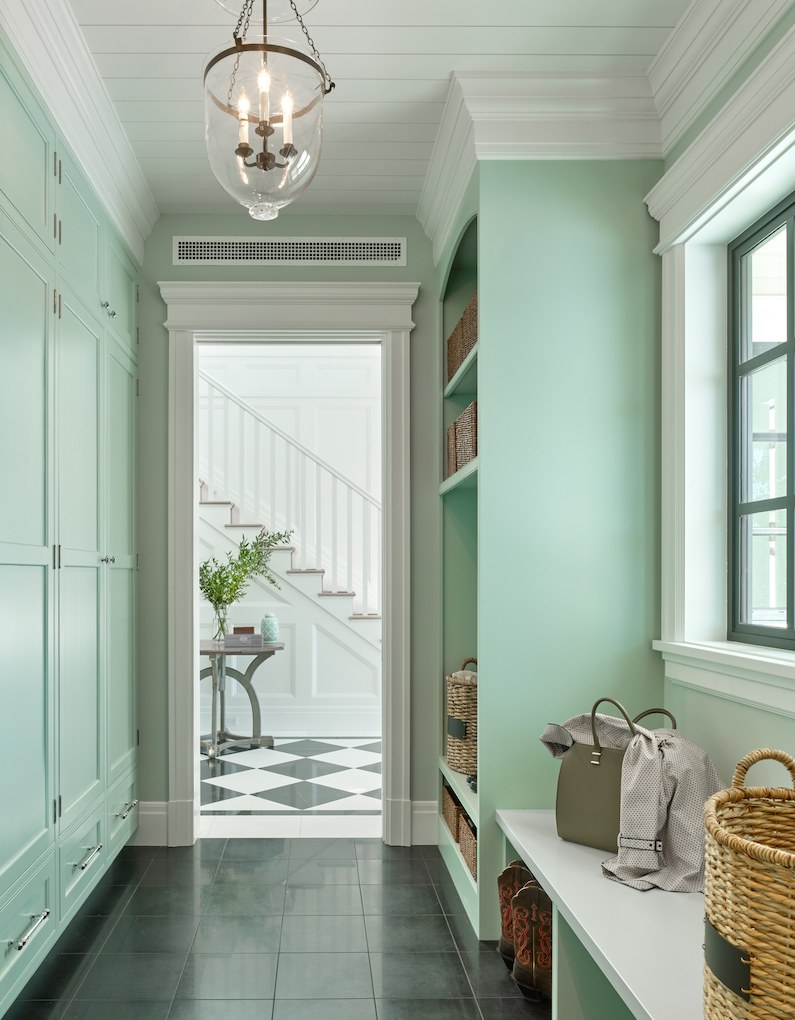
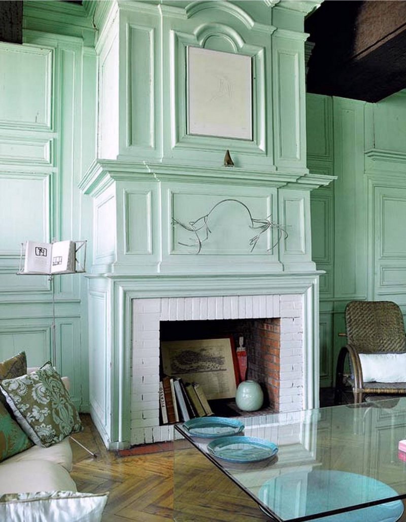
 Neutral tones plus white and touches of black harmonize to make a pleasing minty green interior.
And the big green bottle adds a lot.
If you have a color you’re not so fond of, just keep adding other colors
in the same family and it may turn around for you.
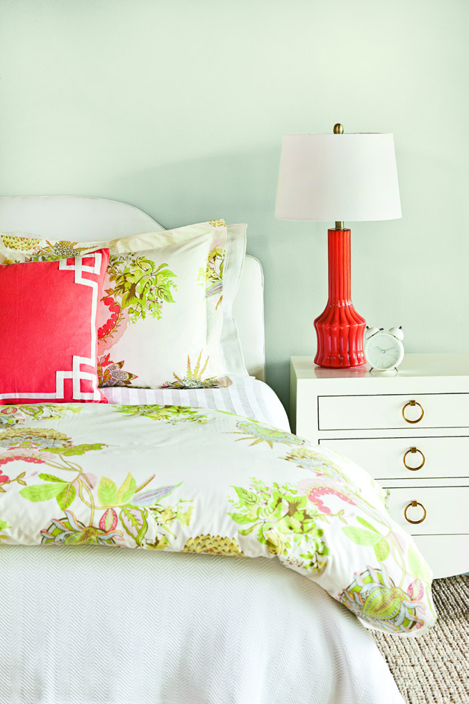
Caitlin Wilson’s charming hospital green bedroom with coral accents.

You know what they always say: “If you want to get sick, go to the hospital!”
Don’t they want people to get well? Guess not.
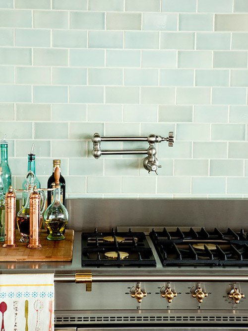
What’s better than this wonderful hand-made watery-green glass subway tile?
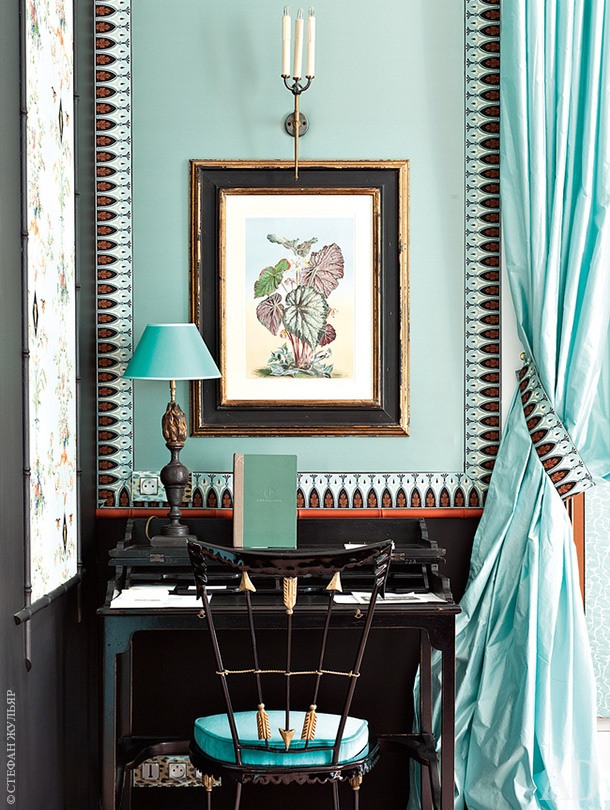
Mint green is another loaded word.
Sure… I’ve joked about walls looking like Crest Toothpaste. But really what it often is, is that the room is devoid of the necessary interest and thus, a minty green room can have a cloying toothepaste-y feeling.
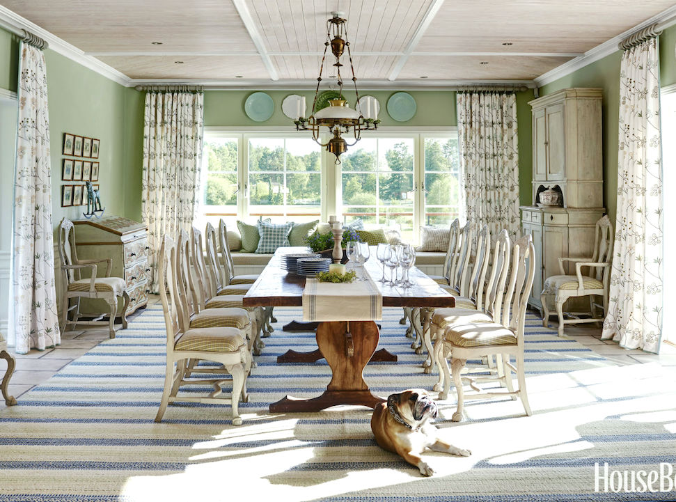
Fabulous dining room by Marshall Watson – photo- Luke White – House Beautiful
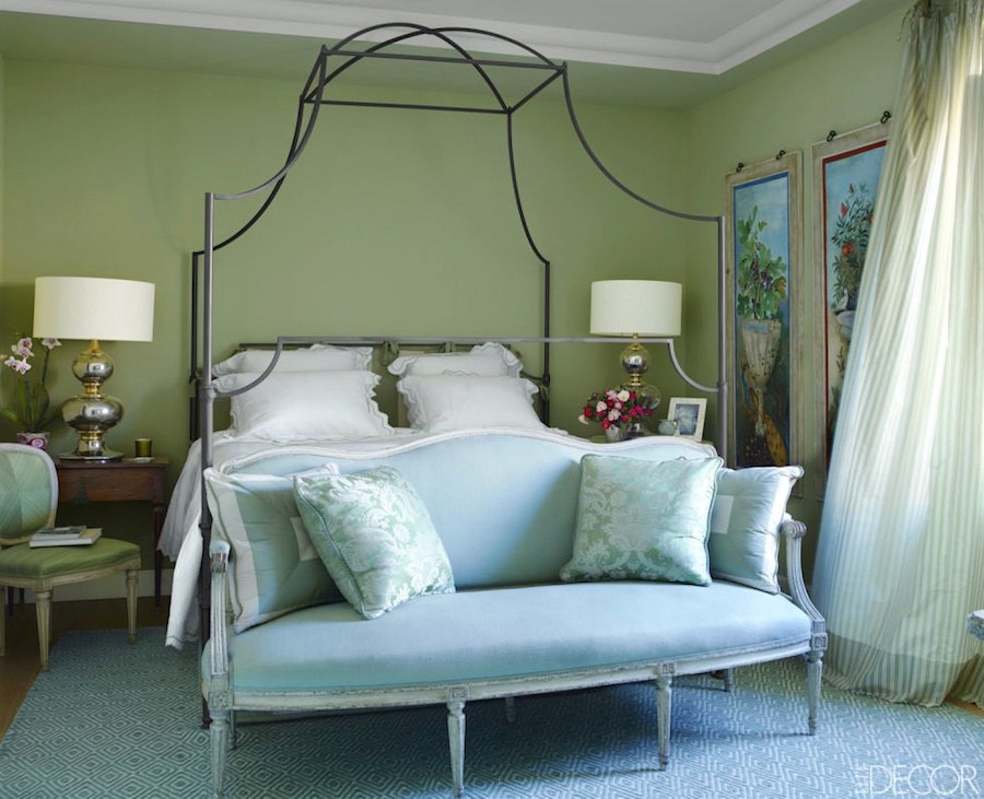
Green loves other greens and it loves blue and neutrals too!

I mean, would anyone look at this and go, “Eww, hospital green!?
Get me outta here!!!” No, we call it “sea foam green.” or “aqua-green” or “celadon green”
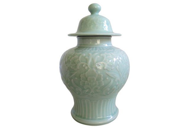
Vintage Celadon Hospital Green Ginger Jar
(vintage items may no longer be available)
A Celadon Ginger Jar by any other name would still be as wonderful!
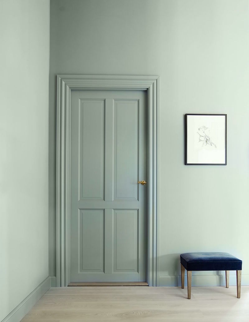
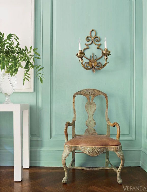
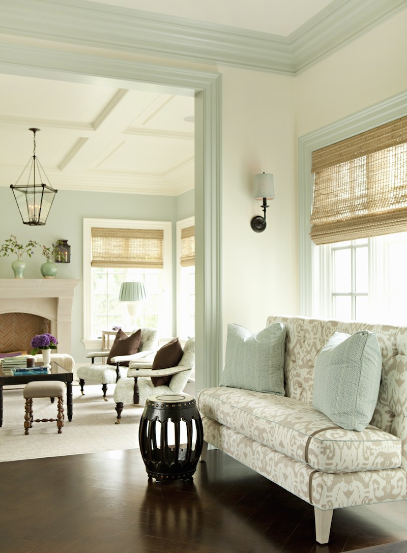
Love this simple tone-on-tone green room or hall. It doesn’t take a lot of artifice because just the addition of the beautiful paneled door and mouldings give this room elegance.
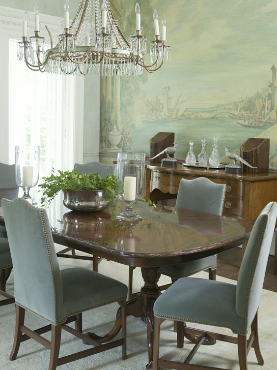
Phoebe Howard’s magnificent dining room with soothing green walls
and mural in shades of hospital green

Okay, I’ve beat that hospital green dead horse into the ground.
You get it.
I promise. This is the last time I will subject your eyes to another gross looking hospital.

I wonder how much they had to pay her to smile like that.
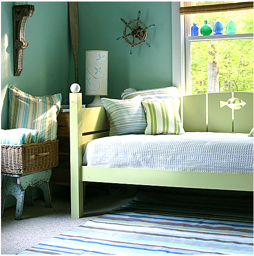
Love this charming kids’ room. Or it could be a guest room, too.
 One of my favorite rooms from at least a decade ago from Martha Stewart.
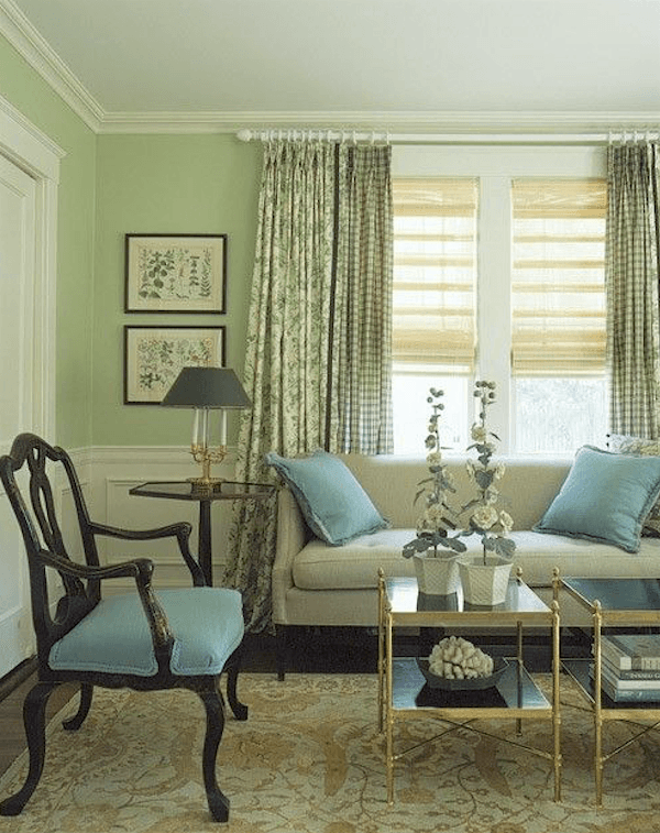
Love all the blues and greens and the Oushak rug.

Same colors… but…

More of the same colors. Many greens and a beautiful teal. Why can’t a hospital gown look more like this?
Why do you have to be sick and also have to wear the world’s ugliest frock at the same time?
Crest toothpaste never looked so amazing!
At the wonderfully elegant Hotel St. James in Paris
Fabulous green and blue bedroom by Alessandra Branca. I adore the settee and silk damask pillows!
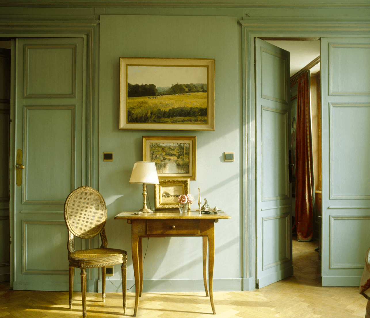
This is definitely a beautiful French Green. I don’t think anyone would ever call it hospital green.
The moral of the story is that color is contextual. And the colors and furnishings surrounding it are essential to the success or failure of it.
For more beautiful green rooms AND many green paint colors please click here, here, here and here.
Well, get this. We’re about an hour from landing and my laptop charger has been going in and out! Do I need that to happen? I’ve already scouted out an Apple Store about 2.5 miles from the hotel.
xo,

(Except for fugly hospital images, if images are not credited, it means that I could not find the original source. If you happen to know it, please let me know.)
Related Posts
 My Top 20 Best Shades of White Paint
 Will An All Blue and White Home Look Weird?
 Laurel, I’m Desperate! I Think I Totally Screwed Up My Window Shades
 Blue and Gray are Hot But I Prefer Green Decor; Now What?
- Common Mistakes When Choosing The Best Pale Blue Paint
 Creating A Chic, Cosy Home Library-Best Colors, Lighting and Furniture
 The Little Known Truth About The Color Of The Year 2017


53 Responses
Hi Laurel! Do you have any guesses on the color of the image by Lee Ann Thornton? I keep drooling over it…is it close to any of the colors in your collection? Par Four?
Hi Eleanor,
It might be. I don’t know what you are seeing on your computer monitor. I usually suggest to try a few samples to see if you can match up what it is that you’re seeing.
Please remember too, that what is appealing to you is not just the wall color, but everything else that’s going on as well.
Laurel, I love your blog!
I do have a question about this post. Can you give a source, manufacturer, etc for the coral colored ceramic lamp in the picture of Caitlin Wilson’s bedroom?
Many thanks, and as always, I will keep following your blog !
Hi Lisa,
I’m sorry, but I don’t know the answer to that one. I did check her website because she has a home furnishings collection, but it’s not there.
Thanks so much for checking, Laurel!
Keep up the good work!
Thank you for the laugh! I like green and it is an accent in this house. Back in 2013 I was staging to sell our home. I worked the design the wrong way.. painted a guest bedroom minty green first. Could not find that in accessories or linens. argh what a mess! In the end the room had a travel vibe and touches of mostly black with gold and cream. The black was fabulous. Enjoy your time in the sunshine!
Hi MAM,
I’m back but the sun was shining here and relatively mild. I think that we’re getting snow though on Friday.
In the1970’s, some genius decorator redid the lobbies of a giant Boston hospital in orange and green. It looked like Howard
Johnsons.
Hi Cookie,
hahaha. The 70s is definitely a decade that should be erased from design history. It’s funny how we didn’t notice at the time and I remember loving the cut velvet gold sofa my mom got for us. But I was young and dumb then. haha
Also, the post by Cote de Texas about finding the perfect house, Jan. 27, 2013, is a great post about classic homes.
Hi Kim,
Joni’s blog is awesome!
Hi Laurel, I’ve been reading deco blogs for a few years now and recently stumbled across yours. You have helped me realize that timeless, classic homes are the best. You can still add a little modern, a little asian, a little french, but classic bones is just smart decorating. You also helped me see that my small 1940’s cape is actually preferable (we’ve always liked it) to one of those new, big ol’ houses. You have the best posts and so much great information that is applicable to even the novice decorator. So appreciate everything in your blog! Kim
Hi Kim,
Thanks so much! I appreciate your kind comment as well and am glad that it’s helpful for you!
Maybe I should have read this b/f I painted my room! I tried several blue/greens, such as SW Halcyon and Quietude, but I just couldn’t take the leap. I kept staring at the sample boards I painted, thinking I would regret. So true…the decor would have helped. But another consideration…I live by the great lakes, and even when it isn’t bitter cold in the winter, we do get a lot of cloudy days and you have to be careful with colors that (I think) are “naturals” in the south. I found that out when I did a color called Pale Lichen (Behr) a number of years ago in my living room. I painted in the sunny summer and loved it, but we get a much longer period of cold and clouds through the fall and winter and it was chilly to look at in my not-so-well-insulated home! I ended up going with the trending at the time Revere Pewter and it warmed things up a bit, while still not being too rich/warm (not my taste).
I ended up doing Repose Gray (SW) in my bedroom and while it still has some cool moments, the taupe undertones works better for us, I think.
One green I am dying to do…Green Smoke (Farrow and Ball). I bought a sample pot and it was just too dark for the room but someday… I ended up using the sample to paint the urns by my front door and I get tons of compliments!
Hi Tanya,
It sounds like you have a great handle on what works or doesn’t work for you and that’s a good thing! Thanks for stopping by and sharing!
When our daughter was born and the nurse exclaimed, “Oh, she’s got RED hair!”, I told her, “No, it must be the lighting and the green tile!” 23 years later, she’s still got the beautiful red hair…hahaha!
Hi Tea,
Oh, how sweet!
Dear Laurel,
Do you happen to know the actual French Green color of the last picture above. The wall and trim? So pretty.
Hi Lorene,
I’m sorry, I don’t and the other thing is that even if I knew, I guarantee, that the color will not look the same in your home because we are looking at a photograph of a room and then that photo through the filter of our computer screens and the variables can be immense. And then, that’s not even considering the lighting in your room.
The best advice I have is if you like a color that you see on your monitor, go to the paint store and pick up some paint chips in that family and then look at them one at a time. Narrow that down to about three, go back to the paint store and get some test quarts and then go home and make your poster board samples with two coats of paint and tape them flat against the wall, one at a time and look at them in different parts of the wall and at different times of the day and night.
Very informative! Thank you for taking the time to post all the pictures. You made your case very well.
Hi Gwen,
Thanks so much. It was a fun one for me to put together too!
You’re SOOO freaking funny and always interesting!! I happen to love the room with scary machinery but I am a nurse. Also, as a nurse, I can tell your faithful readers never pack minty green PJs to wear in the hospital, you will look like death warmed over.
Hi Nancy,
That’s so funny about the “scary operating room.” And thanks for the tip about PJs. :]
Great post as usual. I recently went to a new hospital open-house and hospital green takes on a whole new meaning – now it’s SPA green. The rooms looked fresh and inviting with beautiful, Asian inspired decor. Honestly, looked more like a spa getaway than a hospital. Very soothing. Nice to know this hospital takes body, mind and soul into consideration.
I for one don’t “see” hospital green, just pretty rooms if done right; it’s the total picture.
Hi Lora,
Yes, there are some attractive spa-like hospitals these days. Thank God!
Great post. Thanks for reminding us that wall color alone in an empty space doesn’t tell the story of the whole room when it is put together. Many lovely rooms/ vignettes. My favorite photo is the dining room by Watson. What could be more satisfying than the sun streaming into a gorgeous room with… a dog enjoying the sunbeam!
Hi Faxon,
I love that room too! Fabulous design!
I love green and these photos proved how “neutral” green can be.
Years ago, I painted a sitting area in my antique home a green from Sherwin Williams, when Martha Stewart’s paints were in the S.W. line-up.
Color was Shagreen. It was absolutely a perfect green. Wish I could find t again.
Hi Judith,
Yes, it’s the most perfect neutral. Just look outside, unless one lives in the dessert or the north pole. ;]
Have fun in LA – I just got back from spending a week there visiting family.
I have a mint green north-facing bedroom (I thought I was getting pale sage green…lol). I hate it. I’ve paired it with pink accessories but it still looks icky. Thanks to you, I’m going to try coral or maybe even golden-yellow accents instead.
I’ve recommended your blog to many friends. So glad I stumbled across it. Your design advice is invaluable.
Hi Leah,
I always say if there’s a color one doesn’t like, add more of it and it becomes a neutral! Putting lots of greens together always look terrific. So maybe some art with lots of different greens or a chair with a deeper green. And yes, you can also add some coral and yellow accents.
Thanks so much for the recommendations! Much appreciated!
Hello Laurel – I know you don’t know me but you wrote this post about me. I live in a hospital green house (I didn’t choose the paint color) and I mean EVERY SINGLE WALL is a horrible hospital green. I also work in operating rooms and have to wear green scrubs for my job. Somehow I can’t get over the green no matter what and therefore my husband has started slowly painting ALL the walls which may take the rest of our lives. One day I was at work and looked around and it hit me like a ton of bricks why I hated my house so much! Thanks for the humor – at least I had a good laugh even if I still can’t stand green!
Hi Aimee,
That is too, too funny! What are the odds? And it’s true that no matter what, some people don’t like green and that is fine.
I have always love this shade of hospital green.
Martha Stewart brought this color to foremost minds in home decor. It goes back to the 18th centuray old homes in America.
I too walked in hospital .
Take hear,these,pictures,are,DEVINE
Hi Gail,
Yes she did with her Aracauna (chicken eggshell) colors from about 20 years ago. I look at her rooms from then. Truly timeless. I’ve always adored her style!
Thank you Laurel! I never get tired of reading your posts about green. It is my absolute favorite color and I am so glad it is getting popular again. I think a lot of my decorating mistakes over the years have been lack of accent colors with green. I can’t believe how awesome green looks when you throw in some teal, gold, black, or cobalt blue.
Hi Eleanor,
Green is a wonderful way to liven up any room, particularly the yellow-greens. It’s like the first buds of spring-time against all of the gray branches.
I honestly don’t see anything “Putrid” about that green at all. I don’t care for “olive” greens but those colors are beautiful. I imagine if hospitals use that color it’s because it is a feel good color! Of course if it is all just plain green like that hospital hall then naturally it’s icky but it would be to me no matter what color the walls were.
Hi Alexis,
Bingo. The hospital walls would look horrible in any color! But the point is that some folks associate certain shades of green with a hospital and therefore shy away from them.
You are right. Once she gets the furniture in and the pictures hung, she will love it. Green is a great colour – especially that shade. No changes needed.
Hi Cynthia,
Thanks so much!
Someone did write in recently about this issue, but Ima is an amalgam of folks who share this issue.
Great post on color and how it can be glorious and awful depending on the setting! I had to laugh at the references to Crest toothpaste because that was the exact color of the walls of the home I grew up in. In fact my mother used Crest to “spackle” nail holes when we moved. We had a cathedral or vaulted ceiling and on that great huge wall she did a fabulous gallery arrangement. It went clear to the top. When everything was taken down for the move it looked like someone had taken a machine gun to the wall. Out came the Crest toothpaste and viola, all the holes were patched perfectly!
Hahahaha! That is too funny for words about your mom spackling the walls with Crest and it was a perfect match! I bet that the room smelled nice too!
Love all this GREEN. Thank you!
Glad you enjoyed it Patti!
Fantastic (and hilarious) post. Have been mulling over a pale greenish for our living room but have been scared of the hospital/toothpaste effect. This makes me feel a lot more confident! Thanks!
Hi Catherine,
I painted our small den a pale grayed down, yellowish green. Very difficult to describe and this if funny, but I just mixed together a bunch of left over paint and samples I had. There was very little wall space in the room, but it always looked lovely.
Hello Laurel, I grew up in a room with light green walls, but until this minute I never thought of them as hospital green or mint green (as I recall, it was slightly grayed and darkened from the very lightest pastel shades–more like the lightest shade of verdigris). There was a lot to relieve the room of seeming an expanse of green–bookshelves, paneling, carpet, and a wall covered with cork panels, which was the best idea ever for a kid’s room–or even an adult’s (in addition to pushpins for hanging things, we had a dartboard there). Later, so many extra bookshelves and files were added that not much of the green showed!
–Jim
Hi Jim,
It sounds very handsome! I’ve done many green rooms but moreso about 15-20 years ago or so.
Be still my heart.
Even though I admit I already have a very similar color in one of the rooms..I think I’d benefit from having several homes:)
(I don’t really like big houses, so few small ones would do..))
Good luck on the conference, Laurel!!
Thanks so much Jenny! I too, need several homes and also prefer smaller to larger.
I so struggled with trying to find “that” green for my living room. I had so many huge patches of greens on the walls, it was dizzying and looked oh so tacky. Even though I love green I went with SW Queen Anne’s Lilac … anyone who knows me said “what color?” “lilac, that’s an Easter egg color isn’t it?” Well I guess it is but in my living room with the sunlight streaming in this is the most calming beautiful color. Was it a leap of faith, yes it was and I am so happy with the ever changing color depending on the light. It is so true that you can swatch until you are blue in the face, but until the room is painted, furniture placed and sunlight streaming in or a dusty evening you just never know. That plus a little help from a color consultant from SW, who had bright cotton candy pink hair who really “got me” LOL Have a lovely time at the conference.
Hi Betty,
I love that because you went with what your heart told you to go with. And that is what always works out the best!
And thanks for your well-wishes. I go on in 3 hours! Tho Ekthited!