Dear Laurel,
I’m sorry. I love you. I love your blog. But, I really, really do not want a white kitchen. Or let’s say that it’s just not right for my home. It’s a rustic contemporary in the woods. It won’t work.
But… most of the other homes around here are traditional.
So, are there any classic kitchens that aren’t white? Please say yes!
Okay. YES!
Yes, absolutely yes!
And this is something that came up on the design panel at KBIS. Something I said and I think it might’ve flew up over the radar. But I feel quite strongly that the wave of the future are the amazing kitchens that are coming out of England right now.
To me, they are like a latter-day Downton Abbey kitchen. Most of them are “unfitted” or the term I coined “unkitchen.” They are simple and feature, old-style hardware and natural materials for counter tops like marble, stone or wood or a quartz composite
And the backsplash if there’s tile, is almost always a white or off-white subway tile, even if the cabinets are not white. Or else it’s a marble slab or wood. Pretty simple. huh?
Many of these classic kitchens are a beautiful monotone in an earthy-type color.
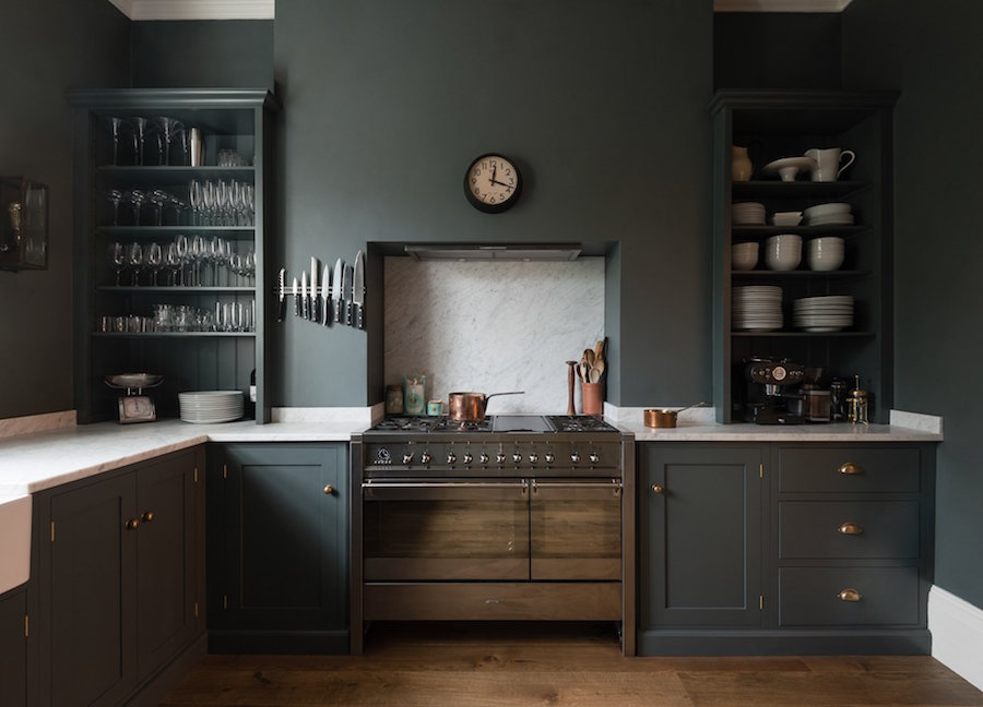
Remember this handsome thing? I wrote about him in graphic lol detail here.
The company is DeVOL Kitchens and I adore everything they do. What I love most is that these kitchens can go just about anywhere. I could definitely see them in a rustic contemporary home, a ranch, a split-level. But they could also work in every style of the 18th or 19th century, unless a super-formal home. But that’s not the way most of us live these days.
I found some other DeVOL classic kitchens for you as well.
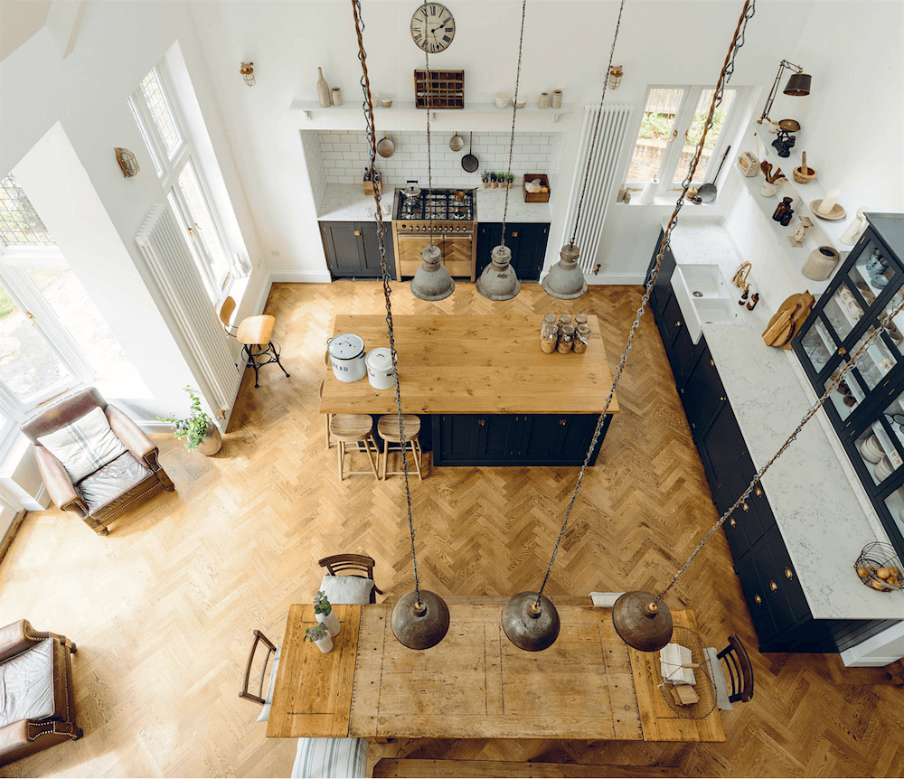
This DeVOL Kitchen won an award last year. For a shopping list click here!
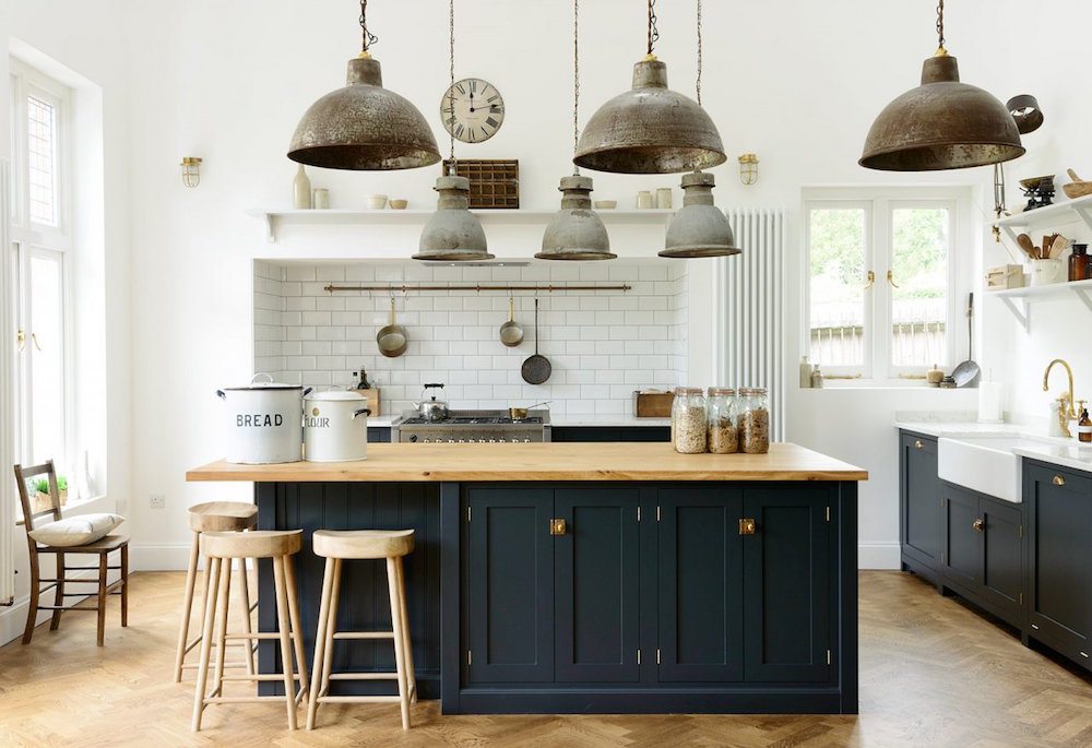
I love the mix of materials and how it doesn’t feel like the cabinetry is taking over the space.
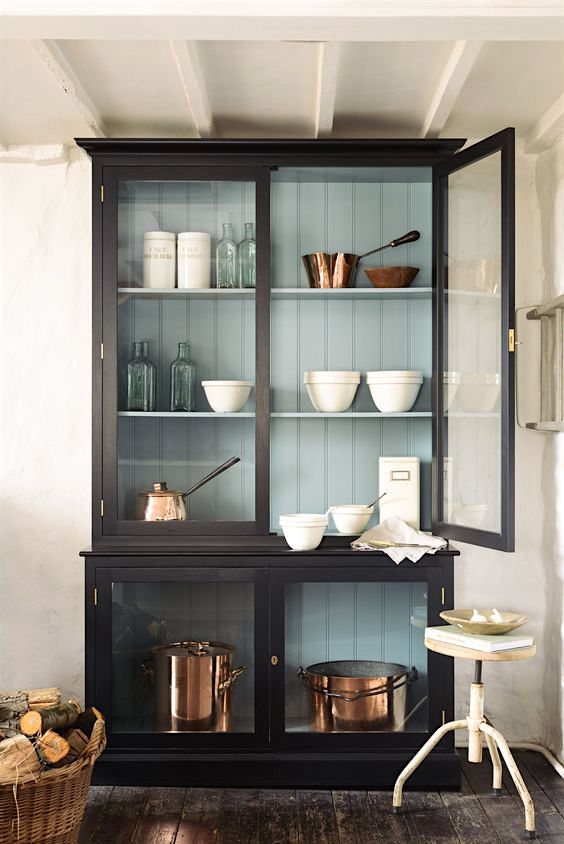
A free-standing glass front cabinet from DeVOL is a refreshing change from all of the built-ins. And I love the tongue and groove inside painted in a pretty blue.
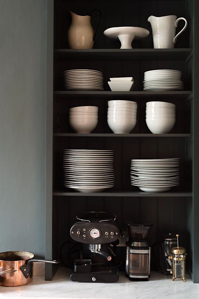
The contrast of the white against the dark gray is so handsome and striking. Metals look wonderful too.
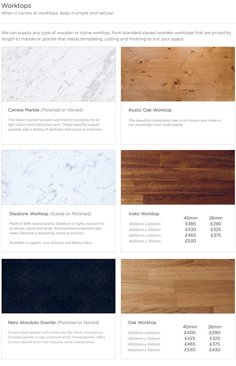
There it is. Pick one. Or better yet. Pick two different counter tops.
One for the counters and one for the island if there’s one.
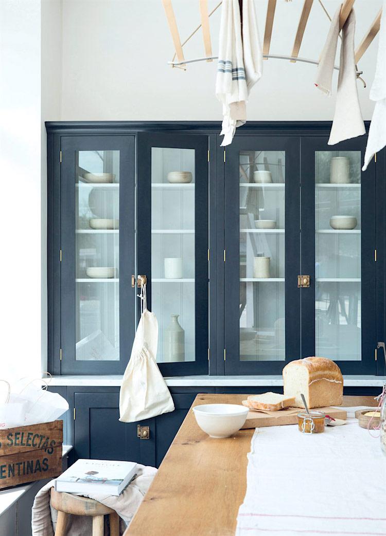
Have always loved glass fronted cabinets. Always, have and always will.
But somebody. Please explain. Any Brits in the room?
What IS that thing hanging from the ceiling holding the shmatas? (def here of shmata)
Forgive me. I get it. The rags get a chance to dry out, but I know that most of my fellow Americans are not going to want to have their skivvy dish towels hanging from the ceiling. Just sayin’…
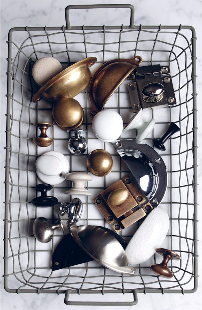
For classic kitchens – one needs classic hardware and DeVOL has it!
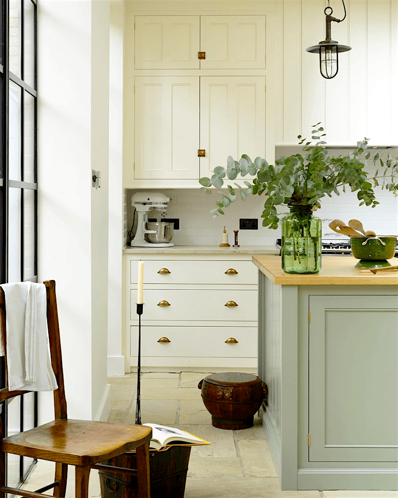
Not white, but a beautiful classic cream with a French Green island. Love the limestone floor.
So, so pretty!
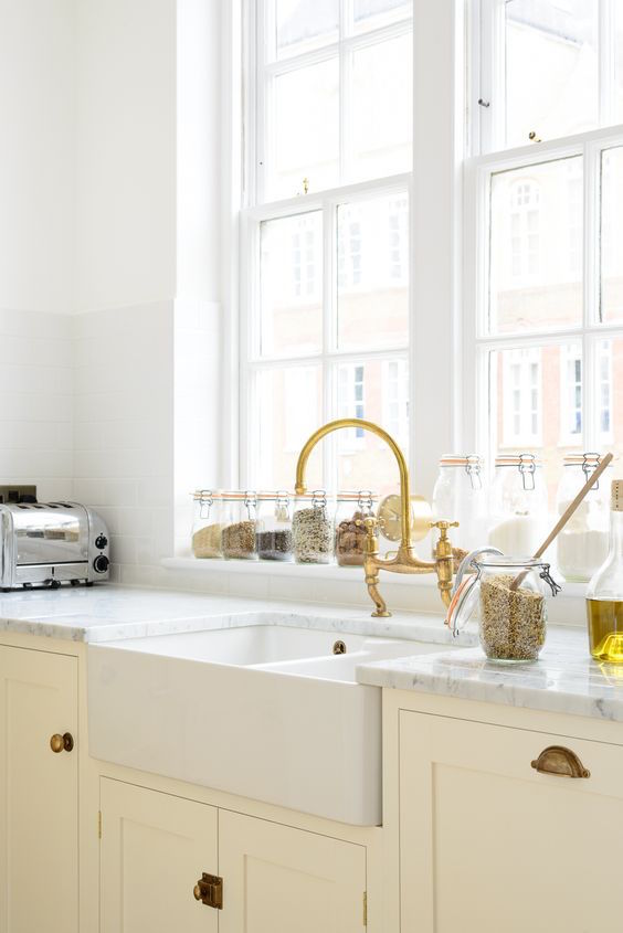
more cream in a light airy kitchen with a marble counter and antique brass fittings.
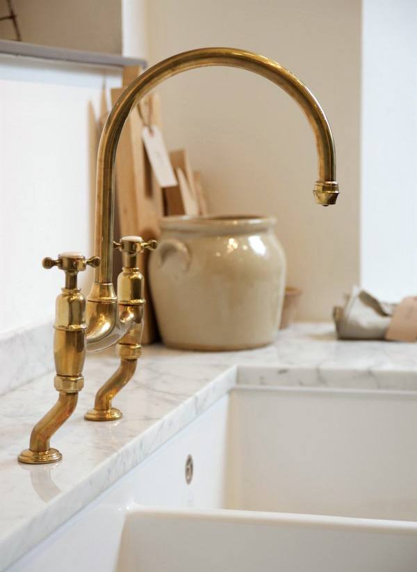
DeVOL’s favorite faucet from partner – Perrin and Rowe. Me like.
Oh, BTW, I saw TONS of brass at KBIS.
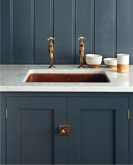
Not sure about the dual faucets though. But otherwise, very handsome little sink area.
<
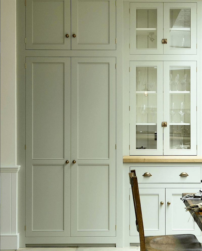
DeVOL also makes fitted cabinetry. This is pretty perfect, IMO. What’s for dinner?
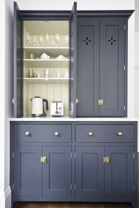
I would probably always need to leave the door open, but that’s just me.
I know that it would drive some people crazy. But with an interior that pretty, how could one resist?

For your pinning pleasure. Love it all!
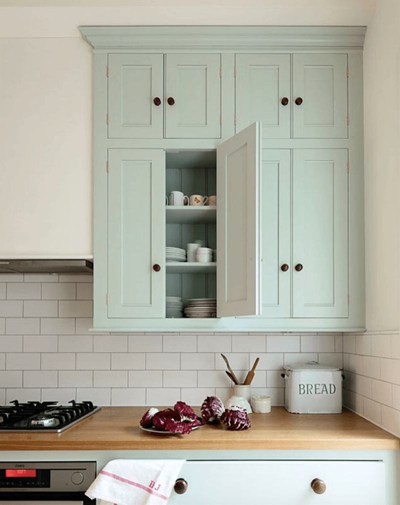
A soft not-quite-mint-not-quite-robins-egg blue is refreshing in this classic kitchen
with white subway tile and wooden counters.
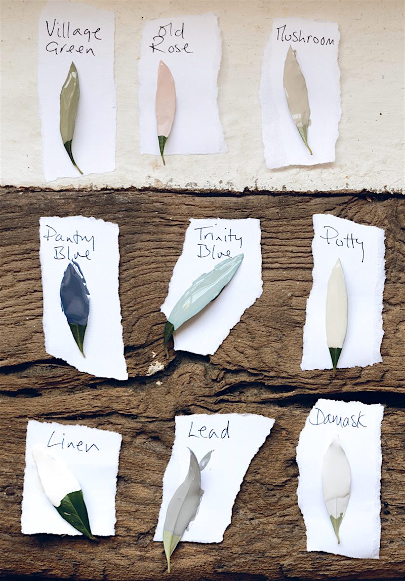
The DeVOL cabinet colors. Alas, all Bespoke and they ain’t giving up the formulas. I suppose y’all want me to figure out the equivalents in Benjamin Moore? No promises, but I’ll try.
Another English company that makes Classic Kitchens is Plain English Designs.
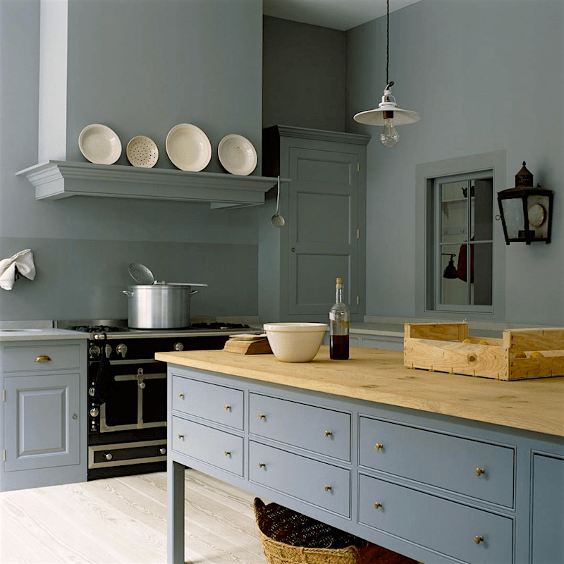
With Plain English Design, the concept is very similar. I do see a raised panel door which I don’t think that DeVOL has. And I have no idea if there’s a difference in price.
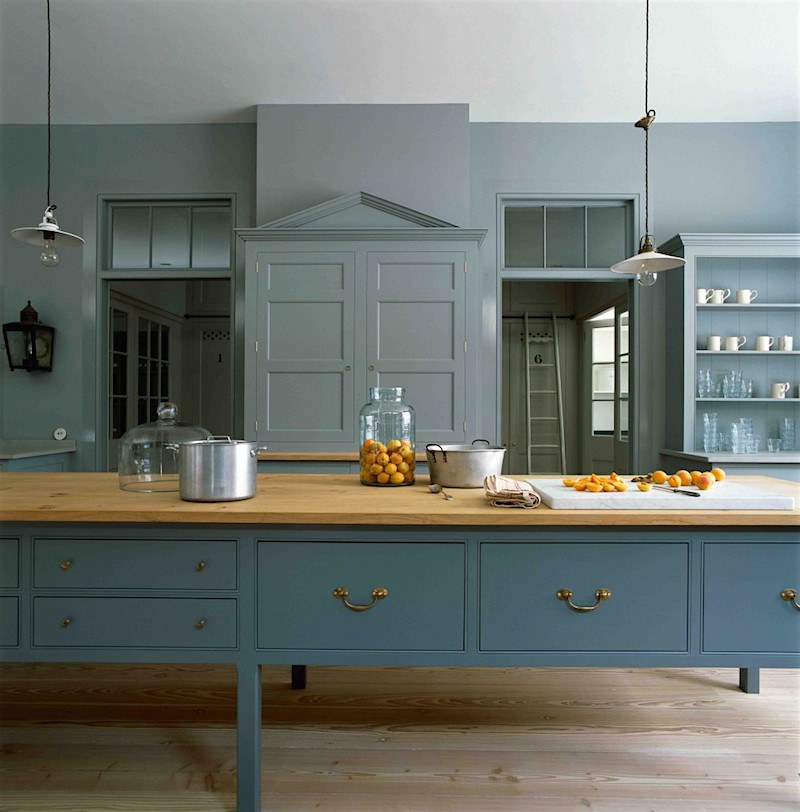
Same kitchen, but a different view. More brass! Fabulous color and I love how they just ran with it and painted everything the one color.
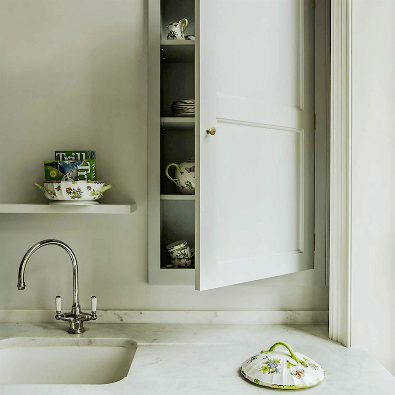
Recessed cabinet. How fabulous is that? Wonderful little lip of marble for the backsplash. I love this. How many loves have there been so far?
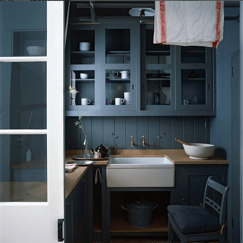
The English call this a scullery. I thought that was the laundry, but maybe it’s also a mudroom or butler’s pantry? I know somebody will be able to help me out here.
But whatever it’s called, have to say I love these small areas in the kitchen and this is a fabulous place to use a deep rich color like this. And uhmmm… more shmatas to add a soupcon of style? lol No judgment intended. You should see my kitchen. I just find it curious, that’s all.
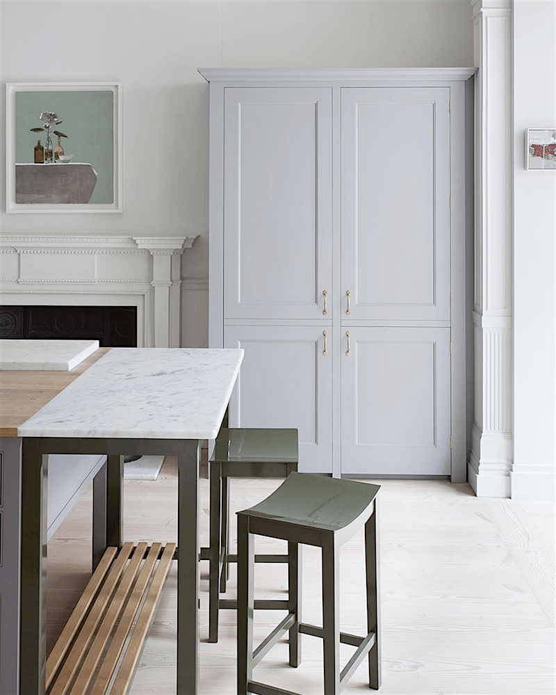
Oh stop. This is so pretty, it hurts. But it doesn’t hurt so badly, that I wouldn’t seriously consider sleeping on the floor.
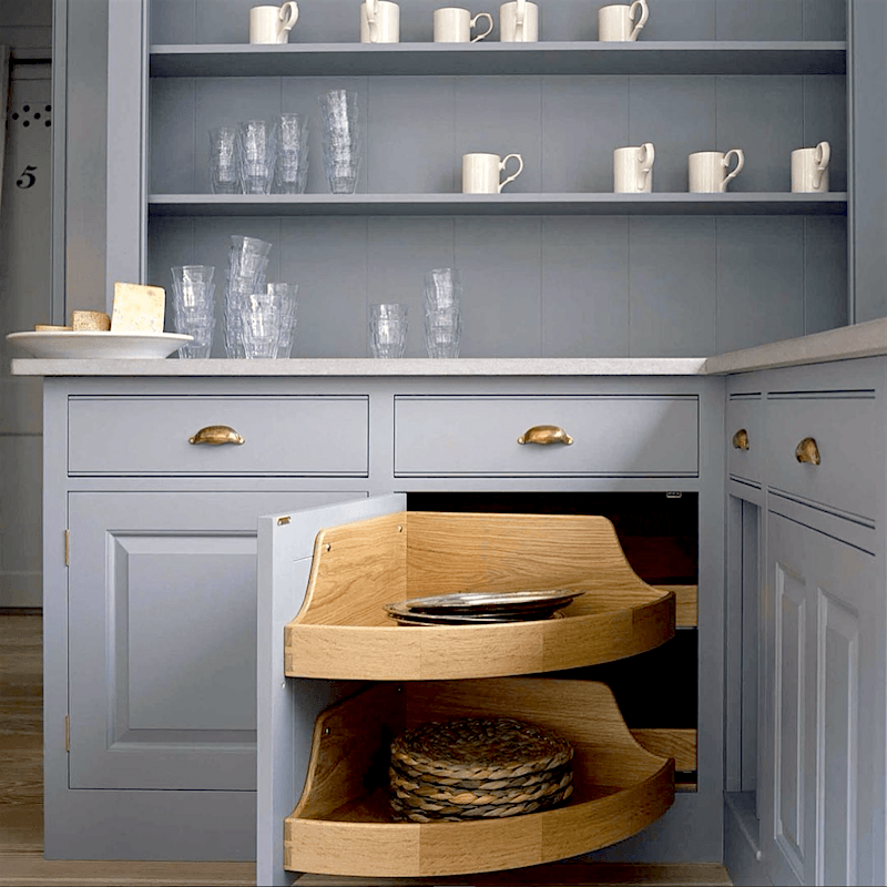
Love the detail in the corner cabinet and beautiful cool gray cabinet color.
And I know, you would never have the glasses and mugs like that, nor would there be so little. But it’s just so artfully done. So, let’s allow for a little artistic license. Okay?
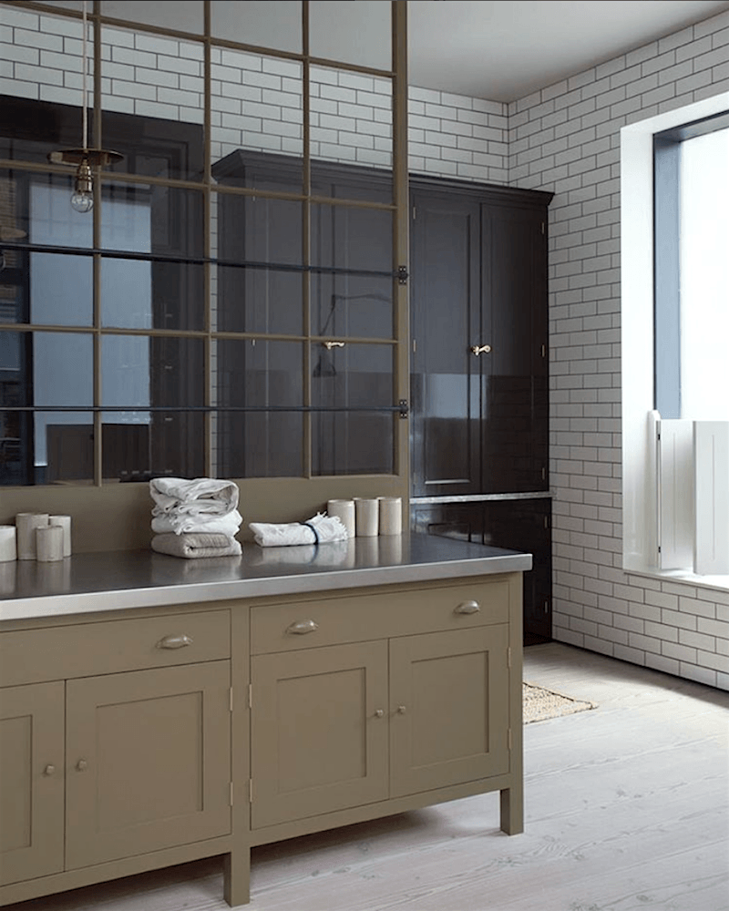
The English companies also show a lot of these interior windows and dividing doors which I love, love, love! You can see another one in this post on kitchen trends. It’s such a stylish way to create some division while keeping in the light and airiness of the room.
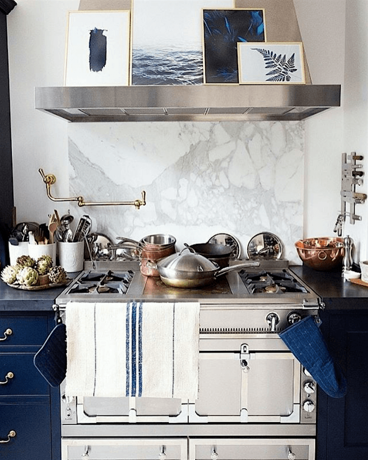
Above and below. Lovely detailing in a kitchen by Plain English Design for Peony Lim.
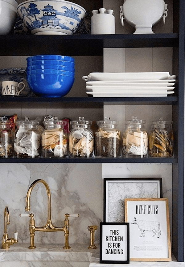 More brass!
Is it here to stay?
Well, in a classic kitchen like this with elements of rusticity, I say yes. But it needs to be an unlacquered brass just like they had a couple hundred years ago. Well, almost. You had to go outside of course, to get the water.
Hope you guys enjoyed this one. I guess by now, it’s pretty clear that I LOVE these kitchens!
You might also enjoy these posts about kitchens.
12 of the hottest kitchens trends – awful or wonderful?
the one kitchen trend that should never leave
the death of the boring white kitchen KBIS
Oh, some news! Tomorrow night, I am attending the Young Collectors Night event and the Winter Antiques Show, in New York City.
And you’ll never guess who else is going to be there.
NATE!
I signed up for the committee several months ago. I had no idea!
Also, just so you know. “Young” means that you still have a pulse.
xo,

Related Posts
 Interior Design Lessons We Can Learn From The Masters
 Top 25 Must See Kitchens on Pinterest
 A Startling Discovery About An Online Home Furnishings Source
 I Can’t Afford 150k for a Kitchen Renovation | Now What?
 Will An All Blue and White Home Look Weird?
 The ONE White Trim Color That Works Every Time
 The Laurel Home Paint Palette and Home Furnishings Collection is Here!












135 Responses
Lovely article. I was over white kitchens two years ago. I still love white granite countertops, and use Benjamin Moore’s Nantucket Gray now. I’m still in love with the combination.
Hi Laurel, Re-reading this post as I get ready to finish up my stop-gap kitchen remodel. If it helps anyone else, beware of unlaquered brass if you don’t like polishing. I love the look of the unlaquered hardware we installed after I painted the cabinets but it does need some maintenance. Some of it ages well and evenly and other times, in high use areas, near the sink, it is just not attractive and I will be using Brasso. It all depends on the look you went. The thought of an unlaquered brass faucet frightened me, so I chickened out and went with Delta’s beautiful champagne bronze finish faucet. Some of the matte gold or champagne bronze hardware can give you the same look with less maintenance if you are OCD about the hardware looking pristine, it just won’t look quite as rustic and authentic.
Hi Eleanor,
I was told years ago, that butcher’s wax stops the oxidation, but from my standpoint, I would not polish it, but let it tarnish and look old and worn. But that’s just me. I see the polished version as being more contemporary and there’s a place for that too.
Agreed, Laurel! Polished brass is not my thing. Thank you, I will try the wax and see if that helps even it out. I want it to age but just enough to give it character.
Please let me know how it works.
Laurel
A bit late to the party but…
1. DeVOL kitchens (no idea why they capitalise like that) are pretty pricey – for that first, award- winning kitchen, you’d be looking at £70k to £80k.
2. The pulley-operated overhead airer – often called a Sheila Maid – would only have been found in Victorian houses to get clothes dry in the warm kitchen (no central heating, cold rooms except in the employers’ rooms, and limited space in the kitchen, so go upwards).
3. In a grand house, the scullery was where the washing-up took place. The Butler was the most senior servant, so his Pantry was his private sitting room and mini-office. Sometimes, it contained locked cupboards with the silverware in it. Keys to the wine cellar, etc. Laundry was a separate area entirely, with several maids working there full-time.
I love, just bloody love, these kitchens. Champagne tastes, lemonade wallet, as the saying goes. Still, at least we both know we could spend our lottery winnings on tasteful kitchens! ( One friend who is genuinely “Landed Country Gentry”, living in the house his forefathers built in 1776, actually has two kitchens, because it’s too far to walk to the main kitchen! Grade I Listed house, unsurprisingly, so even painting the windows the same colour as existing needs permission). How the Other Half lives!
I am IN LOVE with this “DeVOL Pantry Blue” color! Wow! That mixed with the white cabinets, Carrera marble and an accent color (like the lighter blue) is what I’m now thinking about for my next kitchen.
Hi Emily,
I’m in love with them too! Glad that you enjoyed!
Some further comments on the background to sculleries. In our scullery in Scotland we had a sink for dishwashing and veg prep and a deep laundry tub for laundry. It was also where the laundry was hung to dry on the pulley (airer). The scullery was the room where there was water. The kitchen did not have water -it was for cooking and had the cooker(stove) and central island work surface for bread making, baking etc. the Pantry was where all the dry goods were stored. Kitchens, Sculleries and Pantries were purely practical places. In my mother’s day the owner would not use the kitchen – it was where the cook and scullery maid would work. The owner only went into the kitchen to discuss the meals etc.
Hi Dorothy,
Thank you so much for all of that!
But no water at all in the kitchen? How interesting. Since most of us across the pond don’t have cooks and maids to schlep the water from room to room, lol we’d probably want at least one sink. No wait. That’s a definite!
But I do like the sound of only going to the kitchen to discuss meals with the cook.
That sounds about right, Dorothy! My scullery kitchen also had a dish-drying rack installed over the sink. (Didn’t mention that before.)
I’ve been following DeVol on Insta for a while now and am constantly in awe. I also came across Humphrey Munson (another UK business) recently and … drool.
We purchased a 1916 house over the summer and it’s in desperate need of a kitchen reno. We’re about 2 years away on that but any of these unkitchens would be perfect here!
Hi Hollie,
I featured Humphrey Munson on the following post (last Sunday) and warned subscribers to go get a little brown bag in case they started feeling faint. lol
Here’s the link to the post, if you aren’t already over-saturated.
https://laurelberninteriors.com/farrow-and-ball-kitchen-cabinet-colors/
Please use “tongue and groove”! (Not tong) I love your blog, Laurel! About the “scullery”: Wanted to tell you that I lived in a home in Italy that had a “scullery” kitchen, although I didn’t think to call it that. At first, I was put off, but then I grew to love it, and would design a kitchen like that in the future if I were able to. The small room, which was off a larger area of kitchen, had a sink, counters, dishwasher and fridge. The dining room was just off the larger kitchen area where the stove, more counters, and cabinets were. This, then, led to the scullery. So, picture: dining room to main kitchen to scullery–one to the next. When I entertained, which I did a lot back then, some food prep was done in the scullery, and the rest was done in the area where the stove and counters where. After eating, everything went right into the scullery, out of sight and out of mind for the rest of the evening. Then, at clean up, the entire mess is right at hand, easy to clean, and put away. I loved it.
Hi Louise,
Oops! I fixed that. I do know that it’s supposed to be tongue!
The kitchen sounds very charming. I do love the idea of this too. It’s like a kitchen within a kitchen.
Yes, exactly. It is a kitchen within a kitchen! I’d never seen it before or since, but I would re-create it if I got the chance.
Hi Louise, can I ask you a question – if the dishwasher was in the small room, did you keep the washed plates, bowls, etc. in the cabinets in the same room? I am just trying to imagine the logistics – things that are needed for cooking and serving (in the larger room) are washed in the smaller room. So you either had to bring them to the larger room after washing, or before cooking. Which is more convenient? We are going to renovate our dilapidated kitchen and extension that is linked to it, so I am collecting good ideas.
Thanks for your question, Val. The scullery was small–really just room for one person to move around in. I wish I could include a diagram! There was only one wall of upper cabinets which held pantry items rather than dishes. All dishes and pots and pans would be stored in the larger kitchen area, which means, yes, the dishes, once cleaned, would have to be returned to their homes a few feet away from where they were washed. Collecting cleaned dishes and moving them in stacks is not really that inconvenient compared to the convenience of being able to corral all the dirties out of sight and out of mind for an evening. It was a good system that I came to appreciate. (If I were designing a kitchen with a scullery, I might try to include another, smaller sink somewhere out in the larger kitchen area too. But in this case, I only had one full-sized sink area, and it was in the scullery.)
Thank you Louise 🙂
Laurel, (and anyone else that wants to comment!) we are updating our early 80’s home to sell. We have GREAT cabinets – solid wood, to the ceiling, etc. This is a very small ranch house, so the cabinets are a big deal. Planning to paint them the same white as the wood trim. I have begun to hate the exposed hinge. Does it make much difference when selling? Would have to do new fronts to change the hinge. Not sure it’s worth it. What do you think? BTW, love all these deconstructed kitchens. Reminds me of the family house in Colorado renovated in 1898. One of my earliest memories is my great-aunt (born 1894) baking. The kitchen had a big table in the middle where all the kids congegated. The house is now on the Historic Register.
Hi Ann,
I appreciate your need to get some advice, but it sounds like you need someone to come out. I can’t see what you’re talking about and a 100 other things I would need to know. And I’m not sure what the question is regarding the hinges. They might be able to be painted too. But, I’d research that one and discuss with your painter too. Sorry I can’t be more help.
Ann, just paint the hinges the same colour as the cabinets. All the built-ins in my house are like this and I hardly notice the hinges.
Great advice Val! I love the look of painted hinges, but I think they probably have to come off and get dismantled first so they don’t get stuck. I think it also probably works best if they are sprayed, first with a primer and then a finish coat or two.
I agree, it is better to dismantle. As these are kitchen cabinets, it is easier to take the doors off before painting anyway. And a good primer is essential, except if Ann would like to use chalk paint or similar.
But – I have painted door’s hinges without dismantling the doors (I mean the doors of the rooms, not cabinets). In this case it is necessary to slightly move the door forth and back from time to time while the paint is drying, so the 2 parts of the hinges don’t stick together.
Thanks again Val! Yeah, I would definitely take the doors off. Imagine running around opening and closing umpteen doors. But then again, I don’t actually paint anything. I just crack the whip! haha!
Love all these examples, however, my home is sighted facing East, so I get no “morning sun” in my kitchen and sunsets in my eyes when making dinner. My house is dark…a dark kitchen would send me into a deep depression…my current “cream” kitchen is getting a paint job and going as white as I can…I think white kitchens are super reflective and “cheerful”…even in the middle of January, in a dark house.
Hi Thea,
This is not meant to criticize, but if your home faces east, isn’t that when you see the sun and in the evening when the sun sets in the west, your home would be dark. I think your orientation may be the opposite of what you said, but no matter, please be sure to test your whites.
Dark rooms can do funny things with colors. But then again, the lights will most likely always be on in a dark kitchen. I had a fairly dark one, that faced north-west but with a huge hill behind. What saved it was a sort of a bay window and a glass door.
Another great blog post – thank you! I had my kitchen painted floor to ceiling in Benjamin Moore Cameo White. The color looks orange on a sample strip but it’s a gorgeous classic cream on the walls. Love it! Covered up all the noisy wood grain in my ’80s oak woodwork. My painter grumbled the whole time – took seven weeks and three coats of oil-based paint, but it was worth every penny I paid.
Hi Judy,
That color does look a little peachy on the chip, but you’re right, far less so, up. My neighbor used it years ago for a bright south facing living room and I recall that it was quite pretty.
I started following Devol on Instagram because of you, Laurel. It may be a couple of years but an “unkitchen” is definitely in my future. I am so itching to get rid of the original 1993 cherry cabinets and laminate countertops. Although it’s my prefernece, a white kitchen may be a bit much in my reproduction saltbox so seeing these options is so helpful.
Hi Sue,
Well, you can also mix and do part white and part something else, or not. Just depends on what else is going on.
If nothing else, I want to try to get folks to think of their home in a more holistic way.
Laurel, I am on board with you 100%.
Generic kitchens NEED to be gone.
My husband & I have designed, spec’d,
and had 4 custom kitchens built in our houses. The deal that makes a great kitchen is CHARACTER. This is what has been absent. The reason that your comment went out into the stratosphere unheard is because you are AHEAD of the curve.
I’m riding that wave with you.
Paula.
Hi Paula,
YES! That’s the word! And I think it applies to all home furnishings. But thanks for hi-lighting that element.
Hi Laurel. Thanks for the beautiful color palette for January. A painted DeVol kitchen would coordinate very beautifully with the blue, cream and green palette.That stainless stove with double ovens and glass doors you like is a Smeg cooker “Opera” line, maybe the 150cm model (there are 12 in the Opera line) and there are other lines. I don’t want to tell you how long I searched for it online. I overlooked the shopping link you posted in the blog. Duh. In the “Opera” line there is a cream and a black but most finishes are stainless. I’m sure plenty of readers recognized the Smeg by sight…
Thanks for all the inspiration, info, humor and fun!
Oh yes, Smeg! Thanks for cluing me in, Libby. I didn’t realize it was that company, but now I won’t forget. And thanks for all of the research.
Look what they had at KBIS.
https://www.instagram.com/p/BPSzayAgY6i/?tagged=blogtourkbis
Quite different.
While I enjoy and learn from all of your posts, this one is a real treat. Thanks so very much for sharing!
Glad you enjoyed it Ani!
These are beauties all right, though still not QUITE enough to sway me from my white kitchen dream (cream really). One question – for years I have hated my visible hinges from the 70s, as all the “newer” kitchens have hidden hinges. Now I notice that all these kitchens have visible hinges. Are they coming back, or is it just a “retro” look here? They are pretty subtle here, but I’m definitely not a fan of what I call the “polka dot look” in which light colored cabinetry is dotted up with high contrast hinges and knobs.
Hi Anita,
Oh, I can’t say if it’s a trend or not. I don’t mind these hinges, but I’m with you that I dislike the high contrast ones and probably prefer no hinge.
It is a pulley hanging from the ceiling. We have one in Scotland and also in our place in Canada. It used to be used in Scotland to dry all our laundry (called washing in Scotland) because you could never depend on the weather staying dry for long when you hung it out on the line (clothes rope in Scotland). We use it in Canada in our drying room. It is on a cord and you pull it up to the ceiling and out of the way when you have hung the laundry over the rails.
Love the kitchens, by the way!
Thanks so much Dorothy. So glad so many of you are weighing in!
So now we’re supposed to pay lots of $$$ for a kitchen re-do that doesn’t look like a kitchen re-do? I think i get that. Call it “english”, call it “country” call it “farmhouse”, call it “industrial” – it seems to me it doesn’t matter what it’s called- what makes it “hot now” is that SOMEONE is calling it SOMETHING and we all follow like sheep. Now it’s white kitchens. When we redid our bathroom it was brass fixtures. I recently began to hate them but if you look long enough you will see everything comes back in style! That’s to be expected-we want what we don’t have and they want to sell it to us! It’s what makes the world go round, isn’t it. We all need to realize you can’t have it all at the same time. Even with “CLASSIC” choices there is always something that can be changed to make it fresh and the latest hot trend. Maybe the secret is to stop looking at Pinterest and what others have and be happy with what we do have!
Hi Joanne,
Did you see this post?
https://laurelberninteriors.com/nate-berkus-design-trends/
Not to sound like another trend, but “OMG!” How did I miss that one? Out of the mouths of babes, and yes, Nate is certainly a babe, isn’t he?
“Trends exist to make people feel badly about what they don’t have.”
I feel so much better. Thanks for catching me up!
At the risk of sounding like a sexist pig (I’ll take a chance-lol) – YES! He’s a babe!
I have been about to bust a gut over the WKM (White Kitchen Movement-possibly Manifesto). Yawn. Give me color!!! Curiously, our cabinets that were just completed for the huge kitchen renovation are cream with a sage island. Since there are existing 110 y/o built-ins, we already had a cue to follow the aged brass trail. Thank you for this nod to other tastes. Loved the read!
Thanks so much Gina-Lee. Glad you enjoyed!
Love your blog. It’s the only one I allow and it makes my day to sit with hot Russian tea and read every word!!!
Bought a foreclosed house with almost new high quality dark cherry cabinets and brown/gray granite. But l want white cabinets and lighter counters!!! Any suggestions on living with it? I’m just too frugal/stingy to demolish and start again or should I bite the bullet and redo.
PS: My friends, who I always forward you to, (ending with a preposition! Ekkk) and I NEED to have your ideas on updating older furniture pieces. I want my daughter to use my 2 Henrydon Natches sofas which are old and worn in her new home. She refuses and wants a more casual look and has no vision of an updated look. Or should l just toss them?
Oh Glinda,
Thank you for the kind words, but I’m not sure if I can answer those questions for you. You could paint the cabinets and change the counters. I wouldn’t go white, however, but perhaps one of the deeper neutrals would be awesome. If your heart is set on white, perhaps consider refacing.
Maybe your daughter and/or you could have the sofas slipcovered. A white or off-white cotton duck or denim would do the trick. Win/win.
Thank you for posting that first pic of the dark gray kitchen. My house is dark, my kitchen is really dark!!! Maybe instead of wringing my hands, wearing coal miners cap with headlights, with a parakeet on top, all the whilst I cook, I should embrace my dark kitchen and go with dark paints. Hmmm… worth thinking about.
Hi Diane,
Can’t say for sure. But just know in a dark room the colors will look darker than they would in a bright room. duh. So, just be sure to test carefully.
I would so love those flat, fitted cabinet doors if only for those little brass cabinet latches! If there were a way to retrofit my raised builder grades with flat doors, I would. Ours are dark “cherry” stained and as time wears on, the stain has worn off and faded in spots and I’m hoping to convince my husband that deep gray would make the place look even more spectacular. But there’s the rub: these cherry cabinets are EVERYWHERE. In the laundry room, the baths, the loft, (even the spectacular banister is cherry) and he thinks if we paint the kitchen, we have to paint them all. Bear in mind, none of these rooms are open to each other, so no one would know unless they were doing a walk through. It’s also why I don’t have cabinet knobs. He wanted all 58 doors and 26 drawers to have matching hardware. I simply could not.
What are the design rules for matching things in a home? I understand cohesion in design but it feels very limiting. I saw it in almost every home we looked at. Same tiles, same faucets, same door knobs, same boob lamps. Yet the post above shows that delicious black and tan combination and I don’t find it jarring at all.
Hi Mitzi,
I adore those latches too! Love, love! I think as long as the color coordinates with cherry that’s in other rooms, it’s absolutely fine to paint the kitchen and not the rest. But maybe when he sees how fabulous it’s going to look, he’ll want to do it all!
Hi Laurel,
Swooning over these kitchens! A really beautiful post!
XO
Thanks so much Nancy! xoxo
Hi Laurel- Fabulous post.
Here’s some more info on that rack over the counter- a Sheila Maid.
https://en.m.wikipedia.org/wiki/Sheila_Maid
I lived in London for 5 years abd discovered the Sheila Maid in my friends out of town homes. It was usually installed above the Aga to dry clothes. Also used decoratively in the kitchen to hang dried flowers. I have one installed in my laundry room. Line dry clothes are up and out of site.
Thanks so much for the info Sally. Much appreciated!
One word I kept saying while looking through the pictures in this post:
DAAAAAAAAAAAAAAMN
Thanks for all the gorgeous inspo!
haha! Glad you enjoyed it Sarah!
This post makes my heart flip!!! I have wanted this vintage hardware for years. Every picture is absolutely gorgeous….pinned them all! Love, love, love this look!
Hi Lynn,
So glad you enjoyed the post! It’s one of my favorites too. Ahhh… maybe one day? Who knows. Never give up hope!
I’m just wondering – if one does brass in their kitchen, are they then required to use it in the bathrooms too? Any rules about that?
That’s a good question Leslie. I guess it depends. But I have no problem mixing metals either.
I love that you never see the big ‘ol ugly fridge. When I was in England decades ago my aunts had little bar like fridges under the counter.
Hi Diane,
I like that too! But of course, Americans need to have a fridge to hold enough to feed 50 people even if only there is a family of four. But I have thought of having fridges under the counter, but then will get the groans about lack of storage. Again, what are people storing that they need all of these cabinets for? Or if so, there should be a butler’s pantry (even a small one) and a food pantry. (larder, I guess if we’re speaking “English.”) ;]
I have one of those airers in my kitchen, yes it looks a bit of a bugger but it’s great for drying washing in the winter! Sadly I don’t have a DeVol kitchen- but I do have a room which used to be the scullery (basically a room for all the messy kitchen stuff like washing veg and dishes)
Hi Jennie,
It all sounds very charming and homey!
Not sure about the dual faucets laurel ?!!!
Well, I am!
Fed up of these other faucets that curl like snakes & deep sea monsters, looking so out
of keeping (in my opinion!) with a butlers sink.
Notice in the photo of the scullery how authentic they look.
I am thick & I get so confused now, in other peoples houses, & spend minutes ( what is
she doing in there?! ) trying to get a glass of cold tap water, having to run a gamut of
temperatures coming out of different orifices .
I have Just renovated a Georgian cottage & went for the simplicity of dual faucets (taps)
with, of course, an ‘un-kitchen’. I have included paintings on the walls & they don’t have
to compete with scary faucets &, I think, look more in keeping & less attention grabbing.
Great article, Laurel, as usual, & my feelings are not really hurt ( as I write, through the
tears).
Jo (from England)
Hi Jo,
Forgive my ignorance, but if they are dual, isn’t one side freezing cold and one side boiling hot? And what if you need something in between. That’s all I’m concerned about.
As for the albatrosses posing as faucets (I like the word tap though!), I couldn’t agree with you more!
He-he, yes, they are freezing cold and boiling hot (well, maybe the boiling hot doesn’t come straight away, if you havent’t been using the tap for a while). I live in UK and we still have 2 separate taps in the bathroom. The traditional British way of using them is to fill the sink with whatever mixture of hot and cold water you want, and then wash yourself, or the dishes, or whatever, with this water. As I am originally from continental Europe, we changed to 2 taps in the kitchen with a mixer tap, and the bathroom is going to follow soon 🙂
Hi Val,
So, then there’s a third tap? I guess it’s a plumbing issue. Thanks for the explanation and I can see it working, except for rinsing the dishes. Or maybe they rinse differently than I do.
Oh, I forgot to say this – they do not rinse the dishes. I couldn’t believe it the first time I saw it. They just put the dishes on the drain rack with soap dripping from them. This was the very first thing I asked my partner when we started living together – Honey, I love you and I don’t want to change a thing about you, but, please, please, please, rinse the dishes! :))) I suppose the younger generation does the things differently but this is the traditional British way.
And, yes, it is a plumbing issue. Again, in the traditional British hot water/central heating system, there is a hot water tank, which is usually placed in a cupboard upstairs (in a 2 storey house) or sometimes in the loft. This means the cold water comes under pressure from the mains, while the hot water is driven to the tap only by the gravity. That’s why they cannot be mixed in a tap, the pressurized cold water would push the hot water back to the tank (later on mixer taps have been designed for such systems but they are different from the “continental” taps). This also means, if the hot water tank is on the same floor as the bathroom, the hot water wouldn’t reach the shower head, as the tank is lower than it. When a shower over the bath became a popular feature, the homeowners started adding special pumps to bring hot water from the tank to the shower. It is really a very archaic system but it still exists in many British households.
Hi Val,
Well, that is all very interesting and thank you again for explaining the deal with English plumbing.
BUT OMG! I’m a little OCD about rinsing dishes. Nothing worse than a soapy taste in your tea! However, earl grey tea has always tasted like soap to me. lol I prefer just regular ol’ English Breakfast tea.
Fascinating. In the US, it is necessary to keep the hot water tank temp quite high so bacteria won’t grow in the tank (extremely rare in any case) and so that the water will be hot enough so that the dishwasher will sanitize dishes. Then, if people are concerned that children or the elderly may scald themselves, temp controls are added at the taps and shower head. In this way of thinking, separate taps are a safety issues as much as a convenience. Just a bit of trivia. Not as fun as looking at gorgeous eye candy plumbing fixtures!
Hi Faxon,
Now, I’m confused. Did you mean to say UK instead of US? Then, what you said, makes sense to me. I see it that the dual tap is more of a scalding issue if a child turns on the wrong one.
I meant to write “dual taps are an INconvenience”. Instead of filling the sink per use of dual taps a child may just turn on the hot tap and scald themselves. Sorry if I was not clear. Trying to follow you and board plane at same time. That’s how much I love your blog!!!!
Haha! That’s okay! I’m incredibly flattered!
We just ordered a Devol Kitchen and had it shipped to the US. They have an amazing (free) design service, too. It should be appearing on my doorstep tomorrow! Their “bespoke” colors are actually copies of Farrow & Ball colors and they are transparent about that. Pantry Blue is Railings, Village Green is Olive, Damask is Blackened. I’m not sure about the others but I bet they would tell you.
Oh wow! Thanks so much for the inside tip Jessica. That helps a lot!
Just commenting to tell you how unbelievably jealous I am of your Devol Kitchen!! I don’t suppose you would hint at what it cost to do something like this?
Yes, I’m curious too if you feel up to sharing that info Jessica. If not, that’s cool, too.
The Plain English Kitchen (link above) starts their “kitchens” at £45,000 with no other details provided. So that is “cupboards”, hardware and countertop.
Yeah, pretty expensive and that is the starting price. So, that would be a small kitchen. Does that include installation, I wonder? I doubt it.
I am making the assumption/conclusion that “kitchen” includes the countertop and hardware because specific features are shown and the site states kitchen and not cupboard or cabinet only.
Thanks Libby. Here, it would be only the cabinets not including installation or anything else!
The cost depends entirely on your design, of course, and I think the Shaker line is the most affordable. Check out the catalogue for details: https://www.devolkitchens.co.uk/kitchens/shaker-kitchens/catalogue
Shipping for the seven cabinets we purchased was quoted at £8,715 and they were able to deduct the 20% VAT from the furniture prices because it was being shipped out of country. The team was extremely helpful at every turn.
Hi Jessica,
Thanks so much for the info!
I’m so jealous! I’ve been drooling over DeVOL kitchens ever since Emily Henderson posted about them last fall. Dying to hear how it goes in and so glad to hear they can be shipped to the US!
Laurel– this post is just flat out the best. I’m so glad the unkitchen is going to be in because that’s exactly what I have. Please please please do the colors–esp that French Green. . I am fixing to (as we say in the Deep South) redo counter tops and freshen up with paint but have always loved the basic feel of this not so perfect kitchen–which right now has a big ole precious bernedoodle puppy in crate training mode right in the middle of it. I enjoy your post and learn so much from them and always forward to my three grown girls. Thanks❤️
LaMarr Winn Greenville, MS
Thank you so much LaMarr and for sending to your daughters as well. I’m working on the colors!
Lovely kitchens. I love the small print that reads, this kitchen is for dancing. Any idea where it is from?
Hi Pamela,
I tracked it down! Lovely company, it looks like too!
https://desenio.com/us/
As noted, the “thing” above is an Edwardian airer. They are still in use, especially over Aga stoves. They work on a pulley system: lower them to a height where they are easy to load with clothes etc that need to dry, then winch them high up and out of the way.
Best if you have high ceilings.
Details here from one brand: http://www.pulleymaid.com/edwardian_airer.htm
Thanks so much Atlantic. Yes, very high, like 20 feet high. haha. But I definitely see the practicality behind it.
Haha…..yes…..schmatas dangling overhead not my idea of pretty! I love the unkitchen look but wonder about the lack of storage space for all my kitchen accoutrements….still like all white kitchens the best!
Hi Nancy,
There’s plenty, plenty of storage! Please look at this post.
https://laurelberninteriors.com/clever-kitchen-storage-ideas-new-unkitchen/
It’s a different way of thinking about storage.
I, too, love these kitchens! Thank you!
My pleasure Patti!
Love this post. . .drooling.
I never thought I was a gray person but some of these shades of gray are so stunning. Maybe an old dog can learn a new trick or two. Thanks.
Hi Ahrisha,
It really can be elegant, but gray needs black and white and wood tones too, (usually) for balance.
Hi Laurel,
I just wanted to mention Humphrey Munson, another English cabinet maker who, in my non-professional opinion, does an even better job than DeVol.
I know, I know! Heresy at this point with all the love that DeVol is getting. Anyway, check them out for loads of inspiration as well.
Lastly, I do adore the kitchen love lately- I chose to paint mine BM Great Barrington Green and I beyond adore the way it’s turned out, but it didn’t seem very “conventional”. Pish posh to conventionality!
Hi Emily,
Oh wow! I just checked them out. Gorgeous! I got on their instagram account which I find is sometimes easier to see their products. Fabulous photography too!
Great Barrington Green, was on my short, short list for my paint collection. It’s a really lovely color. I think why it didn’t make the final cut was that I had too many greens and had to be ruthless. LOL At one point I was going to make the collection 180 colors and then realized that would definitely have killed me, so I knocked it back to 144.
Yes, I would love for you to figure out what would be the Benjamin Moore equivalent for the “sage green” in the first kitchens, and that wonderful bright navy blue in the last kitchen. A lovely inspiring post.
Hi Beverly,
I promise to do my best. Thanks so much!
What a breathtakingly beautiful post, Laurel! I pinned non stop, shmatas and all, lol
Aha, and now I know that my color would probably be DeVOL Mushroom..if the kitchen was DeVOL. And no, I couldn’t find this gray in BM, SW, or Farrow and Ball (well I didn”t check all of them just a lot)..they all looked amazing when they were laying horizontally. They turned to be too cold when I’d put them vertical-as they should be installed.
Luckily there was a painted sample in the cabinetmaker’store (he saves all the samples from all the clients. amazing guy, really). It was custom mixed by some designer for her clients in Malibu. And it worked. After me comparing these 14 or so samples for a week in different light..:)
Maybe she/he knew the DeVOL formula, or just tweaked it until she got it?
Anyway, I love this Mushroom whether it’s theirs or mine. I love all the other colors too.
The details are amazing. To die for. Pure gorgeousness. And it all really, really makes one(by “one” I mean me) to go to the kitchen and to make a big cup of tea at least..:)
PS BM does have this Kingsport Gray color that might work..I have it on a mirror in the entry-the company customizes their colors. But it’s a very little expanse when cabinetry’s really wide. Anyway..it does look very intentional which I was hoping for. So it might be a close greige color.
OK. can’t wait. The Mushroom’s calling:) I have an Old Rose too(aaa!!!what a beauty!) but just in an art for now.
Have fun tomorrow-it sounds like huge fun!
Hi Jenny,
Thanks for the great comment. Kingsport Gray is in my paint collection. Really great color for cabinets. A classic putty for sure. I need to see what I can come up with.
Great post! Beautiful images!
Thanks so much Kari!
I’m in love with every kitchen! They are all so homey and beautiful, excuse me while I wipe the drool off my mouth. The dark colors, not a stainless steel appliance in sight, simple country kitchens. Sigh. Heaven.
Hi Betty,
The dark green one at the beginning, I love that range to bits. It is metallic, I’m assuming stainless steel but maybe it’s some other metal. It’s more like aluminum. I just love how sleek it is. And yes, the fridges all seem to be clad in cabinetry or they are in another part of the kitchen.
Love all of these kitchens! I am drawn to the simplicity of the English in their decor. I think that is a retractable drying rack with the towels. I saw this in Ireland. The kitchen I saw had very high ceilings and the kitchen was the warmest room in the house, especially if they have an Aga stove that stays on. Here is an example: https://thenewclotheslinecompany.com/collections/lofti-laundry-drying-system
Hi Patti,
Yes, that’s another version. (if you see the responses just before yours) Well, form follows function. That’s for sure.
You are correct Laurel. I DO love this post. I really love a white kitchen myself but I also love all of these gorgeous kitchens with interesting colors and surfaces. There are some beauties. As a Brit living in the US, I had to laugh out loud at your reaction to that god-awful thing hanging up above in one of the kitchens with the towels!
We used to call it a pulley because it could be moved up and down with a pulley lever system. You see, it rains A LOT in the British Isles and back in the 1950’s and 1960’s and even the early 1970’s, few people had electric clothes dryers. People hung out their clothes to dry in the back garden on a clothes line. Well, what were we supposed to do when it rained or snowed?! That’s where the pulley came in. (Hot air rises, right?) Although we certainly didn’t hang our kitchen towels there. We put our clean clothes and sweaters up there to dry believe it or not. My apologies if this is too much info! Now that pulley you show in the photo looks very elegant and I’m sure it has a new fancy name, but I completely agree with you, I definitely would not want any kitchen towels hanging above my head in my kitchen! Oh and yes,we had a scullery, which was sort of like a small room adjacent to the kitchen,or sometimes it’s just the section of the kitchen where the dishes were washed and the plates were stored. Our kitchen/scullery was nothing like these beauties however. These are really lovely kitchens.
Hi Maggie,
Thank you for coming to my rescue! All very interesting. And I did a little more research and found that indeed, DeVol makes this accessory and calls it a laundry maid.
Here’s the link to the info on their site.
https://www.devolkitchens.co.uk/interiors/home-accessories/laundry-maid
My favorite childhood book was “A Little Princess” and if you read it, there’s a character named Becky who was a scullery maid. I knew it had to be some place, one wouldn’t want to spend time in. From what I understand, 19th century and early 20th century kitchens, even for the aristocracy were not nearly as glamorous as depicted on Downton Abbey.
Laurel, thanks for that link. Laundry Maid is a much more elegant name than a pulley for the “thing”! I love The Little Princess and yes I remember Becky.
Such a great book!
The drying rack is called a Sheila maid. They usually hang over the Aga when you see pictures on t.v. I have seen them for sale from Williams Sonoma and 1 or 2 other places in the U.S. I would love to have room for one of these.
Gorgeous! Thanks for the delicious post. I agree about the towels. Unless they are brand new and never used.
Hi Faxon,
It still seems odd because it does look messy. I don’t mind a little lived-in look, but towels hanging over my head seems odd; especially with such elegant kitchens. I can see why they do it, because the towels would dry much more quickly up there.
I LOVE KITCHENS—they’re the heart and soul of the home. Love unlaquered brass, a little sad it’s a trend again but was going that route anyway before it was popular again. Laurel could you somehow enable Pinterest pinning on the images you post? My home remodel is light years away (maybe 9 months) but I’m such a researcher I need that much time and maybe more to feel 100% about a design. Pinterest really helps. And Houzz!
Thanks for your wonderful posts Laurel, always. xx
Hi Heidi,
Thanks so much. The pinterest thing is a technical issue I’m trying to work out. So boring. I do have a working pin it button on desktop/laptop and probably tablet, but it doesn’t work on my mobile which is half my traffic. Sucks. The reason is because it is working from a plugin called WP touch.
Are you asleep yet? lol
But just yesterday wrote to the WP Touch folks about this issue. Still waiting for a response. They’re usually pretty good. If you can get to a desktop computer, you should be able to pin away.
Oh that works!!!! I’ll pin for days on my laptop—so happy I asked!! Tnx
Hooray! And thank you too!
I don’t have an “unkitchen” but I love the concept. Do you follow Lauren Leiss’s work? She designs beautiful kitchens and her own homes are always very “unkitcheny” and, I think, European in style. Her family’s lake house kitchen is stunning.
Hi Michele,
Yes, I love Lauren Liess’ work and have featured it in several posts. If you type in Liess in the search box, in the sidebar, the posts will pop up. One is a duplicate, because of server issue I was having early one Sunday. Long story. :]
As I understand it, a butler’s pantry is not necessarily part of the kitchen, it is where the ‘good’ china and silverware is kept in (mostly) locked cabinets and the butler polishes the silver. A scullery is attached to the kitchen and is where the dirty work is done, eg, the washing up and so on. These days it seems that the scullery has become known as a butler’s pantry, but it bugs the heck out of me, lol. However it is a good thing especially in open planned living/kitchen areas.
Hi Christina,
That all makes perfect sense to me. And I love the idea of separate areas where the “staff” lol can prepare, cook, bake, and clean.
I really enjoyed this post and the ideas you included. Thanks for sharing.
You’re welcome Ani.
I’m in love. With all of them. Sigh. It makes me wish I could totally rip my kitchen out and start over. Maybe I should just build a new house?
Hi Carey,
Haha! Me too. Me too!
Hi Laurel,
Love your blog! Follow it religiously. I notice in your post though, you don’t feature any dark wood cabinet kitchens as “classic” although I seem to find some stunning ones when looking for inspiration. Especially a walnut cabinet with white quartz or granite for a counter top. The right combination I find is stunning. So I guess my question is, is that not classic or timeless?
Hi Hillary,
That’s an excellent question.
Wood can be classic. Absolutely, but not the way most people do it. I do have some wood kitchens or partially wood in some of the other kitchen posts.
I just thought I would focus on this option as I think that this style is the most timeless. And there is a lot of wood in some of these kitchens, just not on the face of the cabinet doors.
But a lot has to do with the style of the home too. There are some styles where it wouldn’t make sense to do anything but wood, but that’s not most of our homes.
Thanks for the kind response! I totally agree, I love the look of these kitchens but convincing my husband that they are classic is a tough feat! I’ll have to dig back and see what other posts you’ve done on Kitchens. I really admire your style! My house is stuck in the 80s currently so deciding whether I do a wood or white kitchen has been a struggle, thanks again. 🙂
Oh husbands! Good luck with that!