Farrow and Ball Colors Update – 2018 + Matching

Hi Everyone,

Taking a break from the Copenhagen trip photos because not everyone is interested, but I do have more to share that I think you’ll enjoy. If you missed those posts, you can see them here and here. (where I added a pic of me about to take off in my “rocket” outside Christiansborg Palace) ;]


In the meantime, many of you know that the Farrow and Ball colors 2018 just came out.


And I ordered my color card (or colour card) immediately! :]

Nine new colors, they added!


Plus, there were nine new colors about two and a half years ago. You can see those paint colors here.

Interestingly, Farrow and Ball does not keep adding to their collection. It always remains at 132 colors. If they add nine new colors, they take nine colors away. And, they send the ones removed to their archive collection. You can still get the old colors, they just don’t promote them. Although, I believe that there is an Archive Collection fan deck. I got one when I went into the city for an event at the Farrow & Ball showroom in the D&D Building a while back.


Since it’s been three years and so many changes now, I decided to update the color chart which matches up the colors to Benjamin Moore.


The old chart that I did that three years ago, is here, for reference, if you’d like to see it.

For the new chart, I removed the 18 archived colors and added the 18 new colors. (and, fixed a few boo boos I had made)

FYI, this is the list of the archived Farrow and Ball Colors from now back to 2016.


Fawn

Book Room Red

Terre D’Eygpte

Yellowcake

Hound Lemon

Tunsgate Green

Olive

Castle Grey

Cat’s Paw

Clunch

Cream

Farrow’s Cream

Archive

House White

Smoked Trout

Chappell Green

Drawing Room Blue

Black Blue


The nine new Farrow and Ball colors are:


please note that the colors you see on your monitor may differ from what they are. To see the real colors, you’ll need a color card or the actual paint to test.
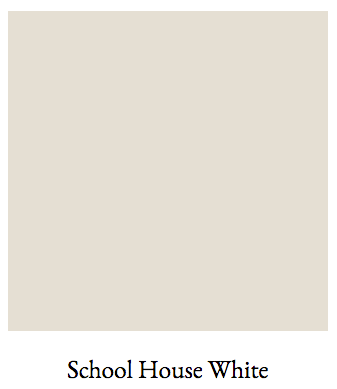
Really, a pale gray with a bit of a green undertone
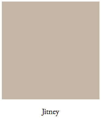
 

A lovely English taupe


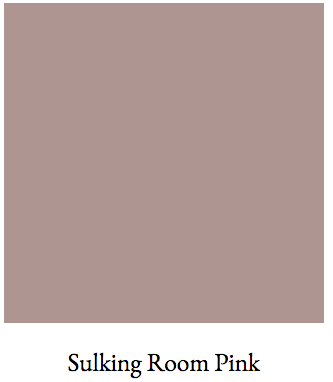
Mauve. Which is a dirty word in America thanks to the hideous brass/mauve era in the 80s. But, this is a lovely color; just difficult to match-up, because as I said, it’s a dirty word.
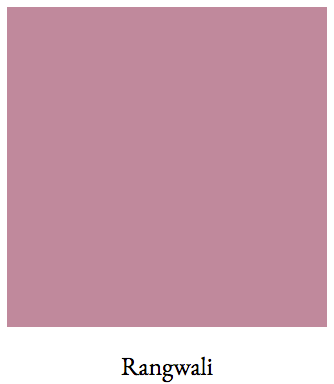
hmmm… This color is the paint color equivalent of Marmite. No American should ever try it; ;] except maybe for Miles Redd. It’s fine if you like it. I do, but only as an accent color.
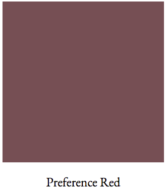
A Classic Aubergine.
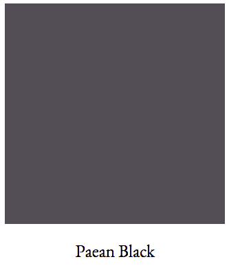
The darkest purple you can get.
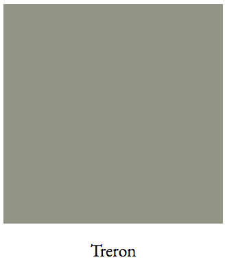
The second I saw this color I knew that it matched perfectly to the beautiful Rolling Hills 1497. That’s one of the Laurel Home Paint/Palette Collection Colors.
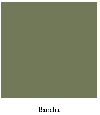
This is my favorite of the bunch. I love this rich, saturated, woodsy green.
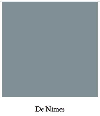
An interesting deepish grayish-blueish-greenish. (in that order) I think that it might make a good house color.


For examples of the colors used in room settings, please check out the Farrow and Ball website.
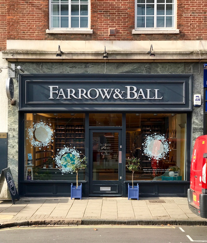
 

Farrow and Ball store - Cambridge, UK - Farrow and Ball colors - Farrow and Ball Paint Colors UK2018
That reminds me. I took this photo of a Farrow & Ball store a year ago during the trip to England when we were tooling around Cambridge.


And, coming up is the revised Farrow and Ball Paint Colors 2018 matched to Benjamin Moore. But before you dive in a few words.


The colors on your monitor may be off from the real-life colors. What you see is Farrow and Ball’s rendition of their colors and some of them look horribly off to me. The color matching I did was done with the real samples from both Farrow & Ball and Benjamin Moore.


This is an exercise. It is not meant to disparage Farrow & Ball in any way. In fact, I love their paint and recommend that if you can afford it and can acquire it easily, that is recommended.


In addition, I’ve written about them on here and linked back to their company dozens of times. One of my favorite posts is this one about the best Farrow and Ball paint colors for kitchen cabinetry.


I also love Benjamin Moore paints. Finally, I cannot promise that the result of any matching will be a satisfactory result. One reason why is that sometimes the paint chips are a little off. So as always, please test your colors!

Some stores may claim to have the formulas. Please, please, please do not assume that they are the same, either.


Now, for the new chart for the current Farrow and Ball Colors 2018 matched up to Benjamin Moore! (please pin to your pinterest boards for reference)


farrow and ball colors 2018 - benjamin moore matched

please don’t forget to pin this graphic


*** Important notes***


Not all of you open up or subscribe to the hot sales and that’s totally fine. I do not expect everyone to be interested. However, Friday, I wrote a short post about some important changes happening here that you might want to read.

Plus, there are some wickedly amazing sales this long holiday weekend. So please check out the Hot Sales pages as well.

And Happy Columbus Day!

xo,

PS: Did you know that you can now purchase Farrow and Ball paints as well as samples and wallpaper – ONLINE? Yes, you can, so just go here to their website to find out more.


38 Responses

  1. Do you color match other paints to BM? For example Sico paint? Not sure if that is something available in the US or just Canada. They have some nice colors, but are not always preferred use by painters – more do-it-yourself.

  2. Hey Laurel,

    For some reason, the link which is supposed to show the archived 2015 colours refers back to this 2018 post. This is the link I’m talking about:

    https://laurelberninteriors.com/benjamin-moore-paint-colors-matched-to-farrow-and-ball-2015/

    My cousin, who does conservation & restoration of buildings, relies on F&B , and BM as her second choice. Hubby and I are poised to paint our common rooms BM Dark Linen, which my cousin let us know that you compared it to Tunsgate Green. Since there are no pics of rooms in Dark Linen, but a few of Tunsgate Green, it kinda gave us an idea of how the colour might appear over large areas of space.

    We are contending with low light situations (the south side of our 1960’s storybook ranch gets less light than the north, even though north light is obviously cooler), four different wood stains on 3 different woods, and two types of masonry with a double-sided fireplace. We are NOT painting the wood and masonry, so once we are finished, we will try to take decent photos so that others with mid-century (40s-70s) houses can see an example of wood stained trim with Dark Linen. We are just getting started, and budget dictates a slow pace, so progress will be made in increments. Painting the walls is an easy project, as it is with most homeowners.🤓

    Thanks!

  3. Just an anecdote: I sampled Sulking Room here in Central Texas light. It is brown. I would not even call it mauve. Perhaps mauve-ish-ish brown. Rangwali, however, is a winner!

  4. Hi, I dont see a match to the F&B color WORSTED. Its their color between Purbeck Stone and Mole’s Breath. I would love your thoughts on this. My good friend swears by F&B but to your point, contractors prefer SW or BM, and the price is so much better.

    Thank you so much! Love this information.

    1. Hi Kristy,

      Worsted is there. In order not to have to do the entire chart over again, (gotta draw the line somewhere!) a few of the colors are out of order and located in places where they look okay amongst the other colors. Worsted is in the second row from the bottom. Please also note that F&B’s rendering of the colors is not at all accurate in many cases. The colors were matched with real-life swatches. Conversely, BM’s online swatches are quite close. Well, as close as can be on a computer monitor. I’m on a macbook pro.

      In addition, I’m pretty sure that I linked to the post from 2016 when that color came out, but just in case, here it is. (I can’t see the post from here, only your comment.)

  5. Laurel,
    I must say that I got many lookers because of you! I’ve had four offers on my home and I’m considering one , the buyers want it 95% furnished. I am looking to really downsize and wanted to know if you’ve heard of anyone Furnishing a home with all Chairish or Local vault finds. I was not familiar with these sites until I followed you. I am still a rabid follower! Hope you enjoyed your latest sabbatical.
    Addicted fan,
    Cyndi

    1. Oh, that’s wonderful Cyndi! That really made my day and I’m sure it’ll be a relief to sell it. I suppose it would be possible to furnish a home with all Chairish or local consignment shops.

  6. Laurel – you are just so gosh-darned THOROUGH!!

    For reference, I love using Farrow & Ball paints. I find I only get their famous “look at how the colour of the wall paint changes throughout the day” with their more matte finishes, however, otherwise one may as well go with the Benjamin Moore versions, except for one thing that’s a deal-breaker for me, but others may not find it an issue:

    The big advantage of Farrow & Ball paints, for me, is that they’re 0 VOCs, so, for example, I was able to paint a bedroom the day before the occupier (my sainted Scottish auntie) moved in, with no fear of grumbles about paint pongs. And the floor paint only takes hours to dry, so we were able to move the furniture in the day we painted as well!

    In contrast, it has been my experience that any of the Benjamin Moore paints we’ve used are relatively smelly, like most regular paints, which I can’t stand, and that smell takes a good few days to dissipate.

    I also find the Farrow & Ball coverage to be significantly better than the Benjamin Moore paints we’ve used, so that, although a can costs more, you end up using less, so it all evens out eventually.

    It’s always surprising what colours F&B decide to retire, isn’t it.

    Ooh, and by the way: Happy Canadian Thanksgiving, all! Laurel especially 🙂

    1. Hi Fenella,

      I am wondering if you’ve used Benjamin Moore recently? I’ve used Regal select for myself (and clients) and even painted with it (badly) in my bathroom. It is very low VOC and the smell is completely gone within 12 hours. My bedroom was painted a few months ago and I was totally fine in here and I’m quite sensitive to that. And then, there’s their Aura formulation which is NO VOC.

      https://www.benjaminmoore.com/en-us/interior-exterior-paints-stains/product-catalog/awip/aura-interior-paint

      However, a few years ago, I specified BM Regal Select and walked into the client’s home and horrendous odor and paint in a plain white can. hmmm… not my painter and the entire thing was a fiasco. He obviously bought an off-brand and tried to pass it off as BM. The color did not match the chip. Well, it matched the chip, just not the one we selected. It matched the one above it which was in the 800s, so all are pale on the page.

      It’s so funny. Some are saying that F&B is thin and now, you are. My experience is that BM covers all in two coats. I’m beginning to wonder if what you had was really Benjamin Moore? If you are positive, then I’m wondering if you are in Canada if that means that the paint is different there than here? The names/numbers are largely different, so it’s possible, I suppose.

      1. Thank you for the follow-up, Laurel!

        We – and by “we” I actually mean our wonderful painter, lol – did use BM paints recently – in the all outside said bedroom, actually – and I did notice quite a strong smell from it. IIRC we used some of the Aura paint, which he swears by. He prefers to use BM, and buys it from a BM dealer, so it was definitely BM paint. He now rather likes F&B, lol, but unfortunately the dealer is way the other side of town.

        Yup, I’m in Canada. Do you think the formulation for BM paints is different here? That’d be a bit odd, although I’m not arguing with you, for sure.

        Oh – and we didn’t find the F&B paints thin at all – quite the opposite, actually!

        I’ve read on the F&B website paint feedback pages that their high gloss is miserably uncooperative to use, so I’ve never dared to use it!

  7. Thank you so much for that clarification on Croquet color. I will go tomorrow to my local Benjamin Moore paint store and get a chip .. and request a fan deck. You are most kind and patient in all your posts.

  8. Thank you for this most helpful post! I do have a question about Vert de Terre matched to Croquet. I cannot find Croquet on either of my Benjamin Moore paint fans. I think I really like it for my cabin in the woods wall color. Has Croquet been discontinued? Renamed? Thank you for any assistance.

    1. Hi Margaret,

      That is a very good question and I forget that not everyone understands the codes next to the numbers. First of all, good ol’ Benjamin Moore has FIVE fan decks. In addition to the two main ones, there’s the Color Stories (csp), Williamsburg (cw) and Affinity (af). hc- stands for historical colors and oc for an additional layer of confusion are the pale whites and off-whites. I believe all of those or most of them also have other numbers, usually from the Color Preview fan deck.

      Croquet is from the Affinity fan deck. If you don’t have those fan decks, they can be ordered or you can see them of course, at any Benjamin Moore retailer.

  9. This is a great guide, Laurel! Thank you! But why would ANYONE name a paint color “Dead Salmon”??? Can’t you just see the lady of the manor sashaying around and saying “oh yes, and we did the parlor in dead salmon” ? LOL and I thought the winner of horrible paint names was nacho cheese (ran across that many years ago), but I think it’s dead salmon for the win!

  10. We splurged on a can of F & B Hague Blue for our front door last Spring. The glossy color is lovely and rich but the paint bubbled in the heat of this past summer. We spent more time preparing the door for painting (de-glossing/cleaning/sanding etc.) than actually painting it, so I’m convinced this was not the problem. Our front door faces the east and gets a couple of hours of bright sunlight in the morning, but we never had this issue with the Benjamin Moore paint that was previously on the door. I don’t think the exterior F & B paint was a good match for our sunny, hot, midwestern U.S. summers, but I sure love their colors. Maybe I’d have better luck indoors with their interior paint.

    1. Oh, I’m so sorry that happened to you Becca. Have to say that my choice for Hague Blue is as close as I could get, but it’s not exactly the same. The blues are difficult.

  11. Hi Laurel! Thank you so much for this information. I have tried to pin this chart but I haven’t been able to. Not sure why…

      1. Using my tablet there is no pin button.I changed to a desktop and had no problem. Sorry for my delayed response.

  12. Thank you for converting these F&B colours Laurel ! I’m liking the School House White and I’m loving the deep green of Bancha. But they archived one of my favorites, Clunch. I’m sad to see it go.

    1. Hi Maggie,

      I just noticed that some of the archived colors were missing. I have no idea how that happened. And then, the place where I was saving them, I had deleted thinking I didn’t need them anymore. But I just resurrected the missing ones. So, the list is complete now. I noticed that they got rid of a lot of gold colors. And they have added a lot of colors that are purple-ish. Interesting, since they are the complimentary of the ones they archived.

      And you can still get Clunch; not sure if I made that clear or not. It’s just that they don’t have it on their website or promotional materials.

  13. Hi Laurel,

    As a painter and decorator, I use the F&B colours quite frequently and you are correct that a client cannot rely on the conversion formulas available at paint stores when switching brands. I don’t use the F&B paint because I don’t like it’s coverage and it is so expensive. Plus, you simply can’t beat BM Aura paint for durability, coverage and beautiful results. Regal is good too but not as good as Aura for coverage. When I want an absolute match to the F&B paint chip, I buy the sample cans, paint them on a 1’ x 2’ panel board and bring it in to my BM paint dealer and they do a wonderful job matching the colour because then they can apply the paint straight onto my sample board as they are mixing it. Note though, you need to find the best colour mixer in the shop- some are better at it than others. Having worked as an artist for many years, I am super picky about getting an exact match. I also carry all the colourants with me so if needed, I can always tweak a colour myself. If you hire a good painter, they should be able to do this for you.

    1. Hi Margaret,

      I love this comment so much! It triggered a memory I have of one of my favorite assignments while in design school. In fact, I had to do it while under the throws of one of the worst colds of my life! We were given a number of colors on a sheet of paper and we had to create an exact match of that color from scratch. I could’ve done that for hours!

      Color is incredibly interesting. I remember in my old house I had a soft, warm not yellow, not green, not gold from Pratt and Lambert called Flaxseed in my kitchen. For the little den next to it, I created a custom color with some extra flaxseed and other colors that made it a little greener. Well, there was one wall small wall painted the kitchen color, and it usually looked the SAME as the den color even though it definitely was not the same. You can see the floor plan of that first floor here.

      Conversely, how many times have we seen two adjacent walls that ARE the same color but actually look like two different colors. And sometimes colors that “clash.” It’s the light that’s doing that.

      1. yes, colour can look so different on every wall. I did a house this year in Vert de Terre; but I altered the colour on the north walls because it just didn’t look right. – I think I tinted it. Making panels in advance though really helps because they are large enough to get the feel of the colour and you can move them around so easily. Vert de Terre is a beautiful green with a lot of warmth and complexity. Loved your Denmark posts.

  14. Good morning Laurel,
    I first want to say that I’m looking forward to more of your vacation pictures. I have really enjoyed them.
    I know you said we should be cautious with Rangwali but I was struck by that color. I’m in the process of redoing my laundry room. It’s also our mudroom since it’s right off the garage. Since it’s the first room we see when we enter our home & because I spend so much time in that room doing laundry, I want to make it a fun space for me. I’m going to get a sample of that color. I may want to use on the ceiling!! I already have a bright blue & white wallpaper picked out for the walls. My only concern is it may look a bit to muddy next to the paper.
    I can’t wait to see it in person!

  15. Dear Laurel,

    Thank you for doing this chart. It really saved me last winter when I was choosing paint colors. Here’s why:

    When I lived in the UK, I loved F&B and used it a lot. Actually, I found most of the British paint brands superior to what I had used in the U.S.

    When I moved into my new apartment last winter, I predicted I would splurge and use F&B Borrowed Light. I bought a sample can and was appalled at how difficult it was to use. It took five coats to cover plain poster board. I then tried priming first, and it didn’t help that much. According to an article I found, F&B changed its formulas in 2009 and the new formulas are very watery. (Indeed, the old ones were oil based, which is part of why they were so good.) Some decorators (what they call painters/paper hangers in the UK) are refusing to use F&B, while others are up-charging as much as 100%. The finished F&B product is still lovely and generally more interesting than less expensive options, but I decided that, for me, the expense was not worth it. Thanks to your chart, I found Glass Slipper. It’s very nice.

    One final thing: I’ve heard from pros that there seem to be some quality issues. Some cans may have clumps in them. If you’ve had paint delivered, you may want to check a can or two before the painters arrive.

    1. Hi Tsippi,

      Thanks for sharing your experience. I’ve not heard this, but not surprised, either since this seems to be the way of the world, on the whole. Farrow & Ball has certainly grown as a company. It was not easy to get the paint around here and now the local paint/hardware/decorating store, about a mile from me sells it. I have actually only specified it for one client who had a friend who told her what color to paint her family room. I didn’t hear any complaints but this was four years ago almost.

    2. This may be helpful … Farrow & Ball Paints do appear to have a relatively short shelf-life. I’ve had a few dud sample pots, and I told the store and they replaced them. Most dealers seem to be good to deal with, so if you get a dud, return it – iirc one has 30 days.

      Unfortunately it was my experience that dealing with F&B UK is an exercise in how rude the English can be! I was pretty taken aback when I asked a question online about some paint issues we’d had … they were all sweetness and light until I mentioned i wasn’t in the UK, at which point they became downright snotty, rotflmao.

  16. Good Morning! Wow! What a resource! I’ve never used F&B, but find their method interesting! I will go back and read the “sales” post. Thanks for all you do to keep us informed!

Leave a Reply

Your email address will not be published. Required fields are marked *

This site uses Akismet to reduce spam. Learn how your comment data is processed.

Welcome To Laurel Home!

laurel-aarons-18th-e1456449963926

Hi, I’m Laurel, and Laurel Home is the website and blog for Laurel Bern Interiors.
I’ve been creating new-traditional interiors since 1988. The blog is where I share all.

New Edition, November 2023! Get The Indispensable Guide For 100s of Home Furnishings And Interior Design Sources That Everyone Is Raving About

laurels-rolodex-final-book-cover-master 10th edition 23-24

laurel home archives

Categories:

Please click the image below for more info about my rockin’ Interior Design Guides for 2024!

Laurel Home Interior Design Guides 2024
Amazon ad

please click below to check out my favorite decorating & design books

Laurel Bern's Favorite Interior Design and Decorating Books