

You may recall that I did a post in January about Gustavian Swedish colors, furnishings. From the beginning I had intended to do a follow-up post because there is so much to share.
This post will focus on the colorful side of Gustavian Swedish colors and design.
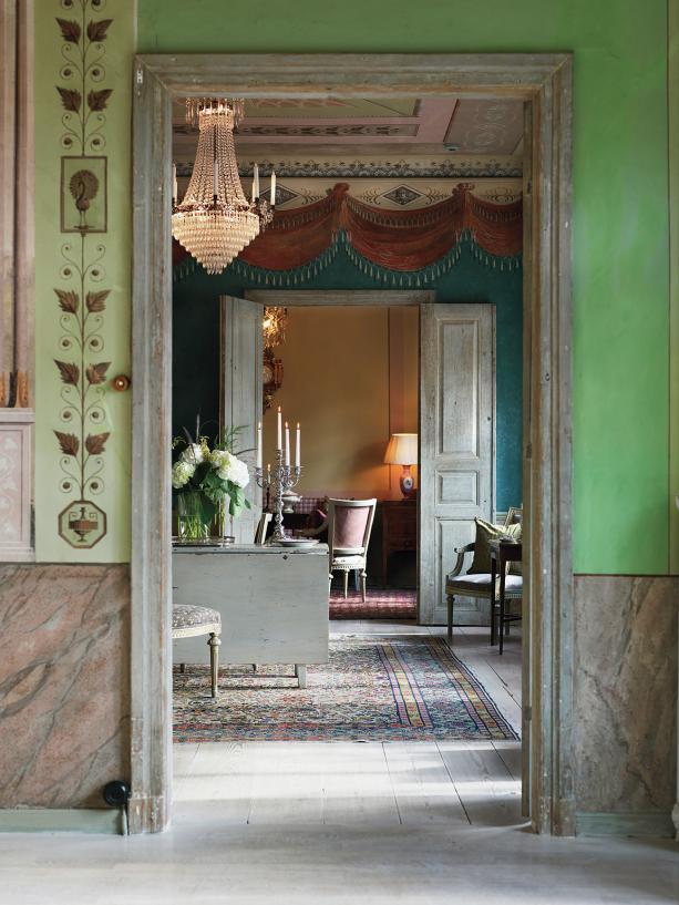
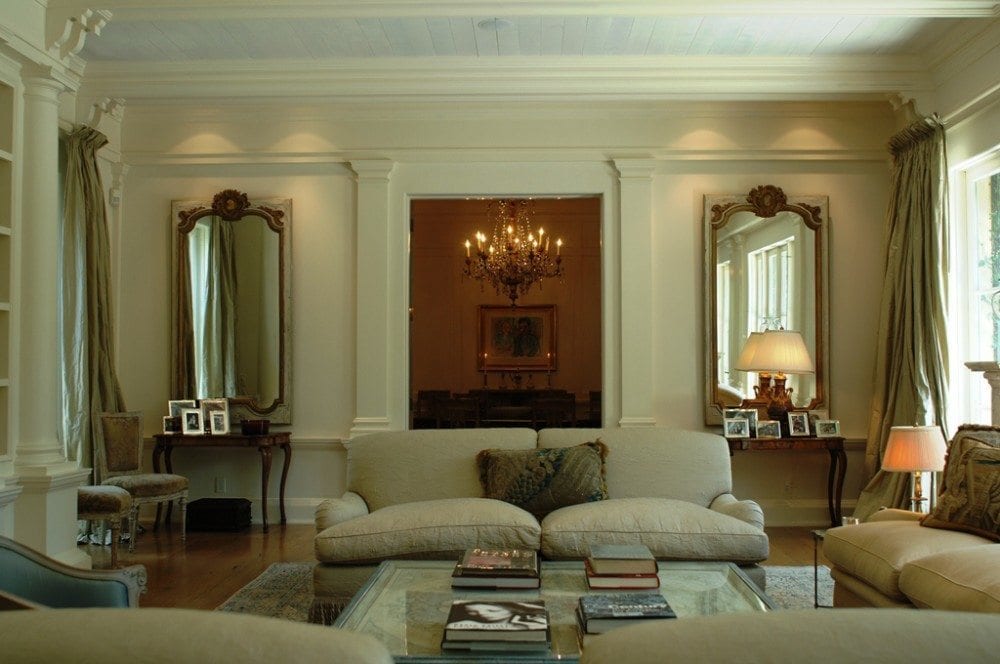
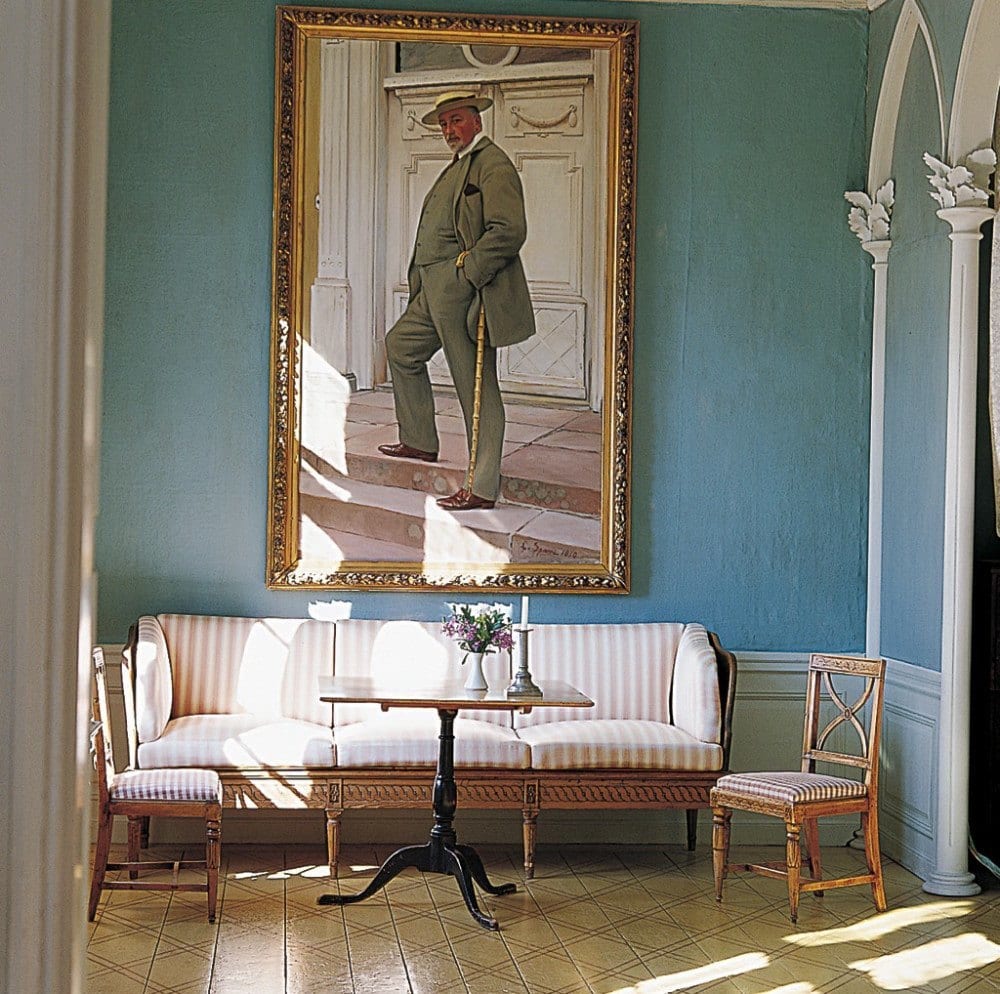
Much of the Gustavian Swedish colors are very muted with lots of grays and creams.; but not always. The Gustavian Swedes of the 18th century loved color too!
This colorful post is my tribute to the burgeoning spring that has suddenly popped out here in New York! Thank God!
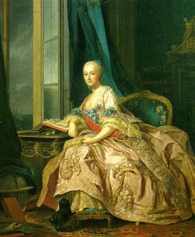
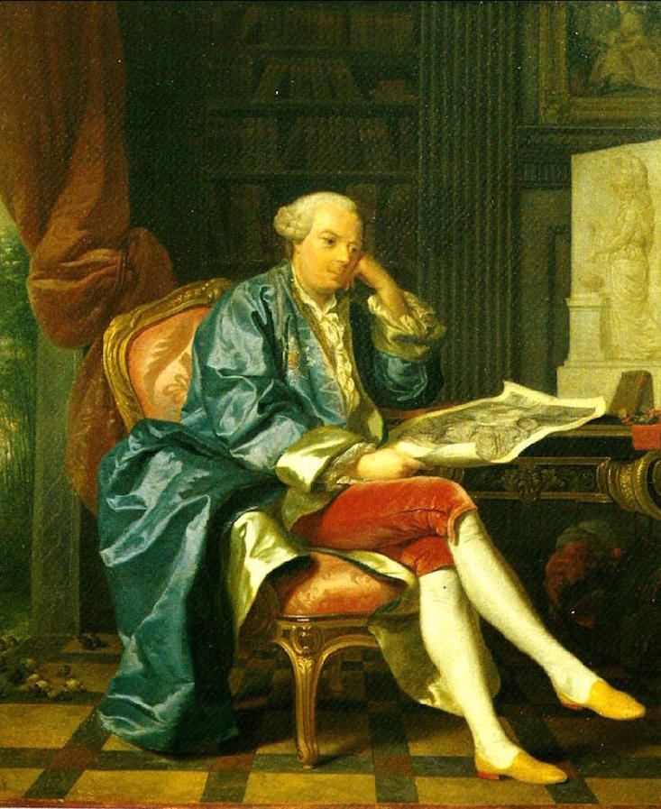
You may recall he was the Swedish John Singer Sargent of his day.
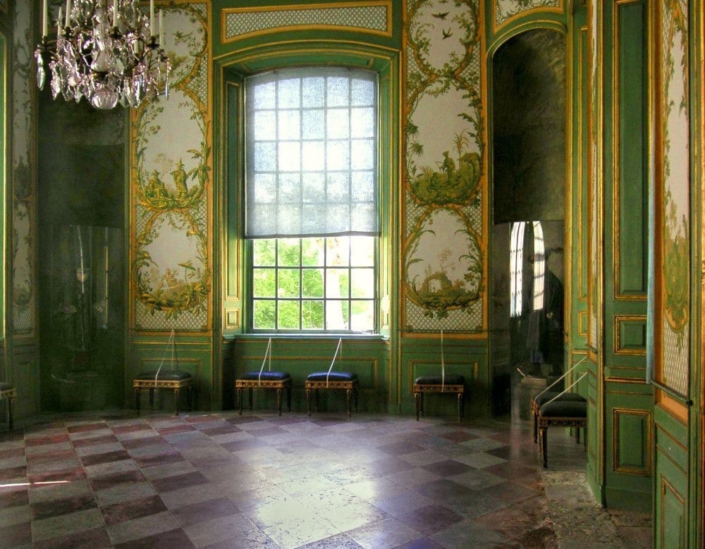
Chinese Pavilion at Drottningholm
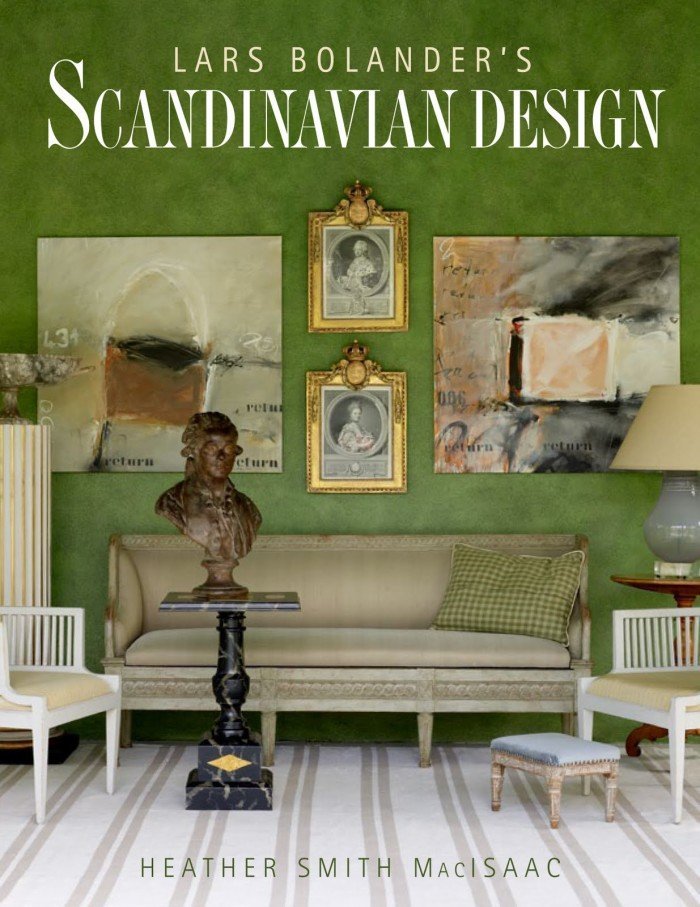
Lars Bolander wrote this gorgeous book about Scandinavian Design.
Gustavian Apple Green?
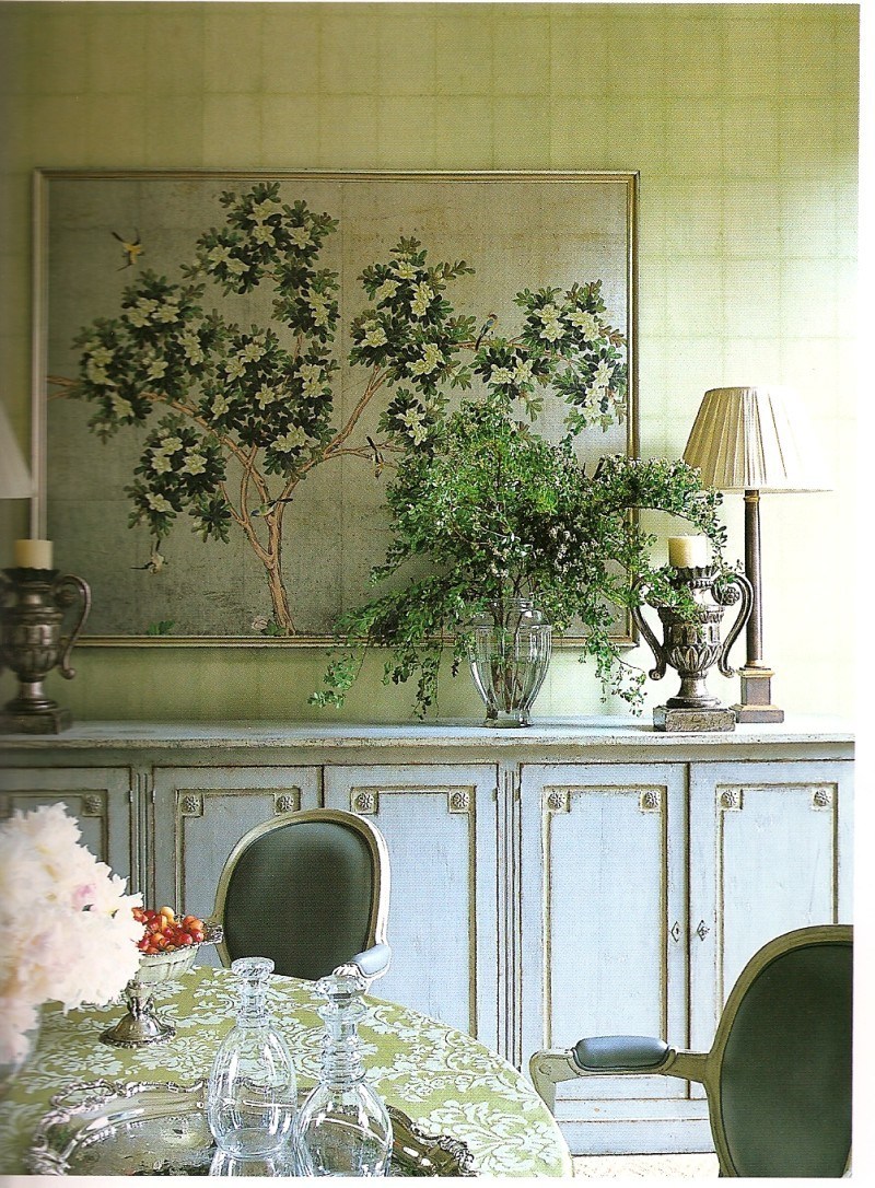
Can I tell you how much I adore this combination of the Gustavian sideboard with the colors in the art and wall?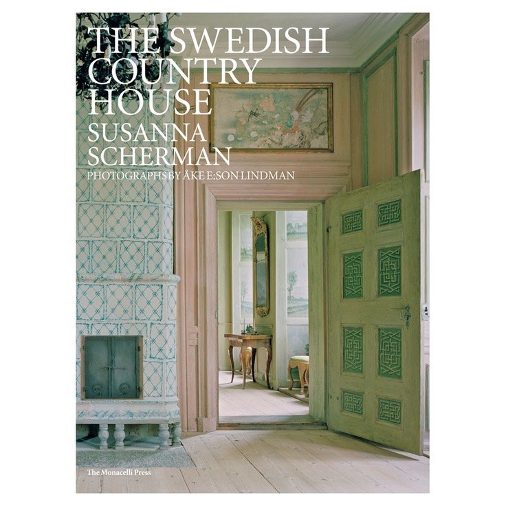
The Swedish Country House by Susanna Scherman
A detail of an antique Mora clock found on 1st Dibs
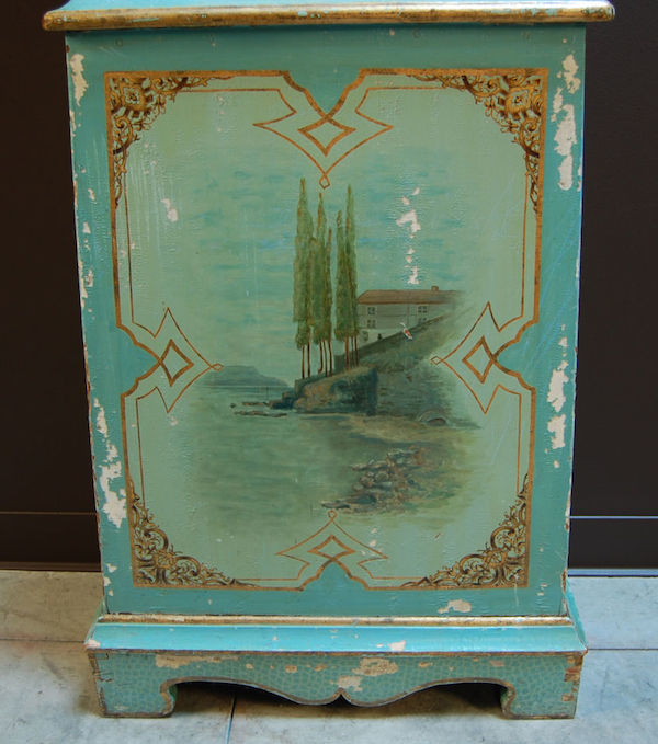
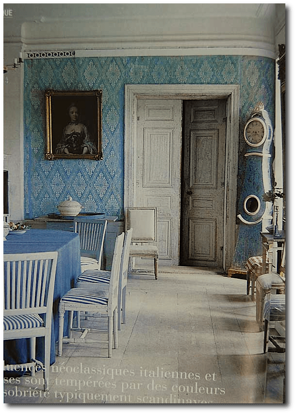
Gustavian Teal?
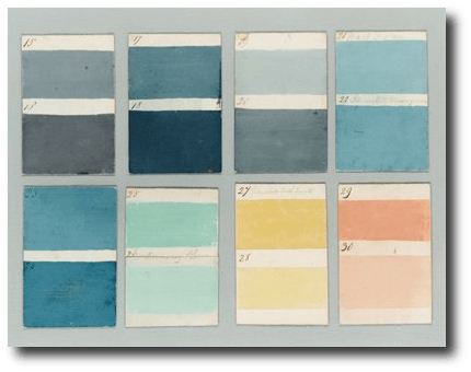
These are colors that were used in European homes in 1807. I’m not sure if they are specifically Gustavian, but these colors were used frequently, in addition to the more muted grays and whites.

Gustavian Pink?
Lars Sjoberg
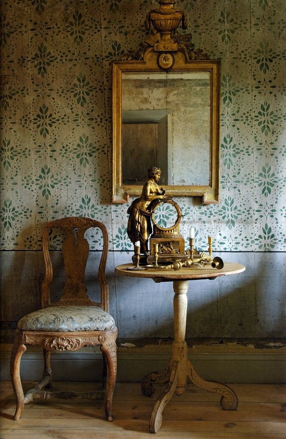
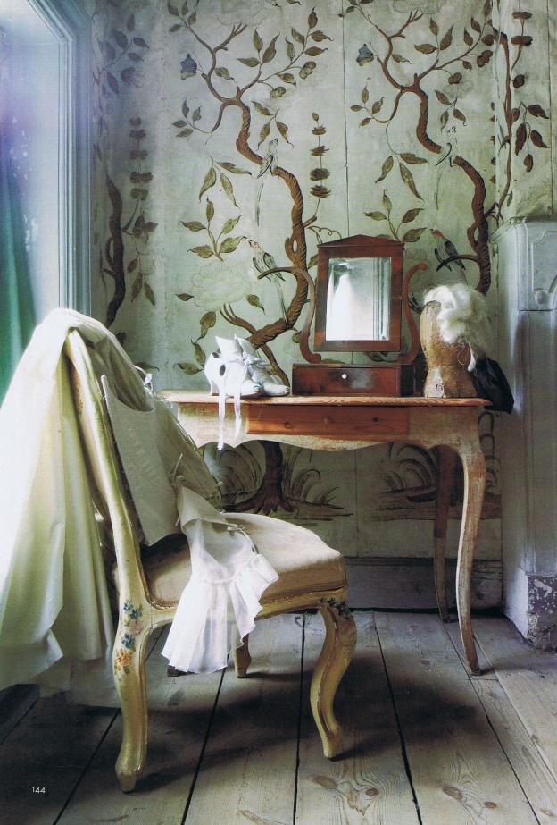
I adore these colors, the beautiful wallpaper and the antique, scrubbed painted surfaces.
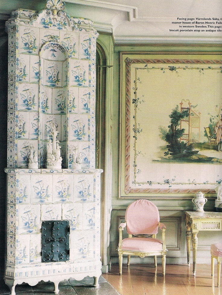
The Chinese Room at Varmsland Saby
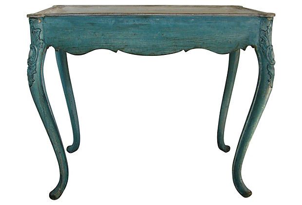
Circa: 1790. Period: 18th Century. Swedish Rococo Tray or Game Table.
An elegant monochromatic mix by Lars Bolander
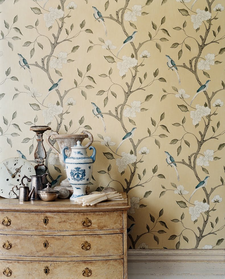
In the Swedish style, a contemporary wallpaper by Zoffany
photography by Gilles Trillard via Trouvais
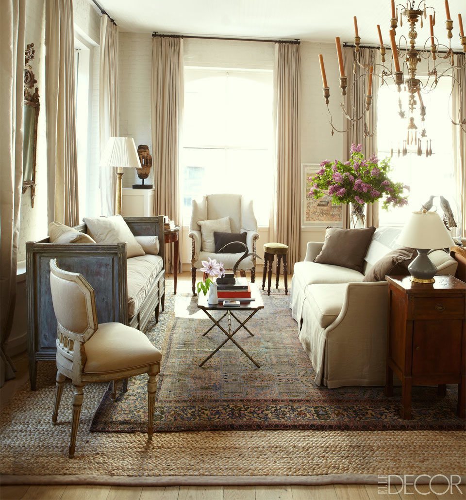
Courtnay Daniels in Elle Decor
A great mix of old and new; I love how she’s incorporated the Gustavian Swedish bench into the modern-day furnishings. Fabulous jute rug layered under an antique rug.

original source unknown
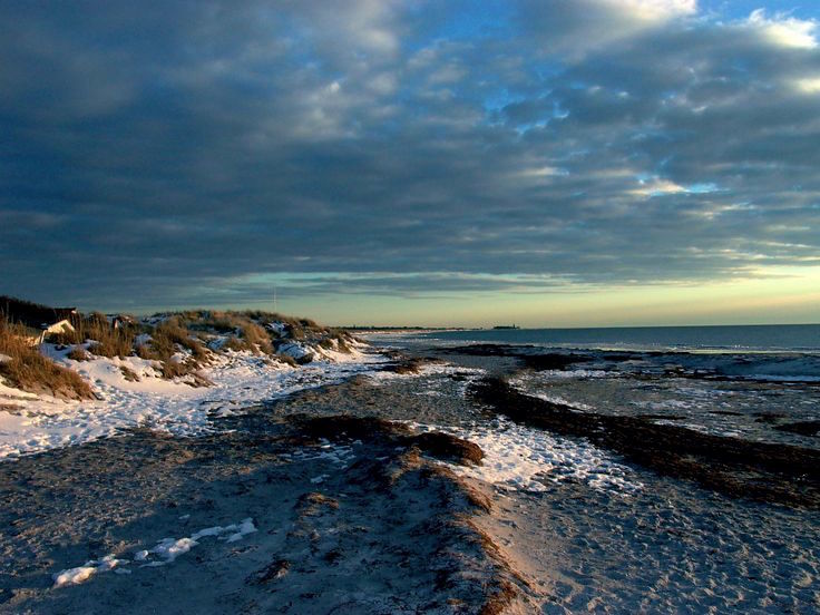
Winter Beach Skanor, Sweden
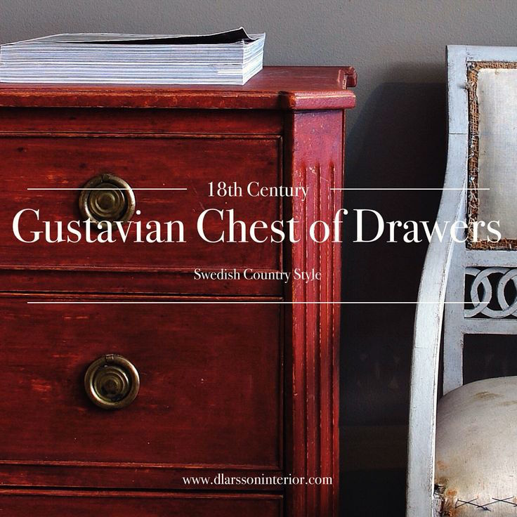
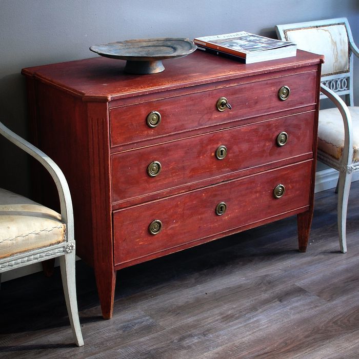
Gustavian Red?
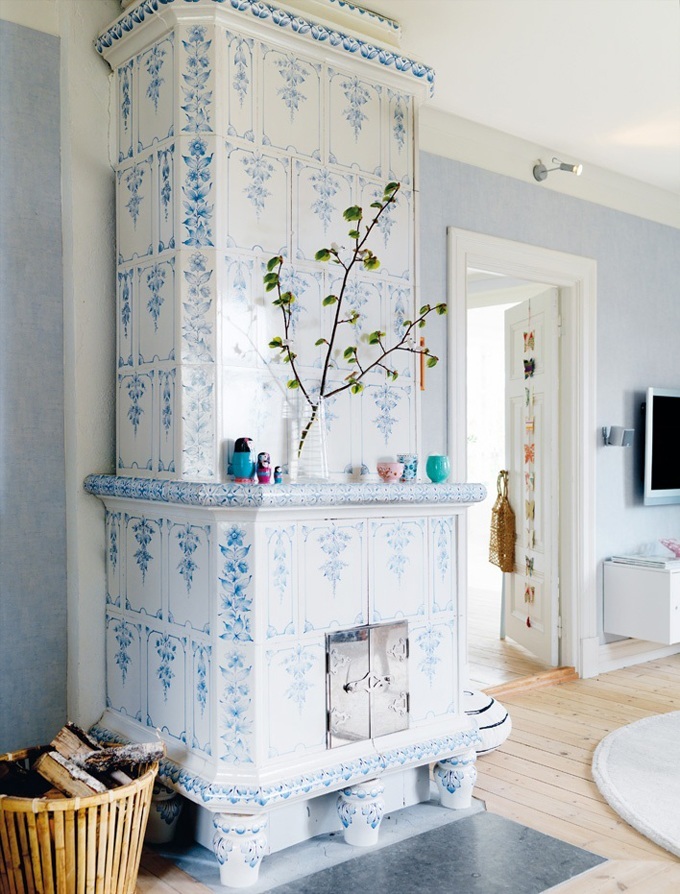
Back to the traditional Swedish interiors. Love these Swedish tiled stoves!
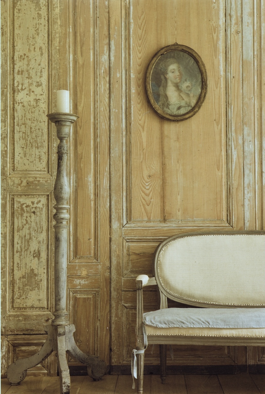
I adore Gustavian Swedish interiors and furnishings, the scrubbed floors, walls and peeling paint. I like paint that’s not peeling too, but the former feels like love.
I’m working on a couple of treats for y’all!
xo,
![]()
Related Posts
 5 More Fabulous Interior Designers I Would Hire {part II}
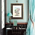 Help! I wanted Soothing Green Walls and I Got Hospital Green Instead!
 The Guaranteed Way To A Beautiful Room (It’s Not The Wall Color)
 Blue and Gray are Hot But I Prefer Green Decor; Now What?
 The 9 Best Kitchen Appliance and Refrigerator Makeovers!
 Chicago As You’ve Never Seen It Before!
 A Genius Paint Tip You Need To Know About


13 Responses
Laurel, Thank you for your kind reply! It’s the long winters and short summers that made and make us long for rich colours in our interiors.
Hi Marie-Helene,
Now, it’s beginning to make more sense. I’ve always wondered why people starved for light and warmth would decorate in colors that are reminiscent of winter. I have to say that I love that pale tone on tone look. However, I like color too!
So sorry, the all white/beige version of Gustavian style is definitely a 20th century invention, of course!
Well, here in Scandinavia the all white/beige version of Gutavian style is definitely a 19th century invention. 18th Century Gustavian interiors were very colourful, including dove blue (duvbått, a greyish mid blue), and red, for the middle classes, and pale blues and greys for aristocrats and the court, but never all over pale. Love your pages!
Thank you so much Marie-Helene. I’m not surprised at all because in my research, I found a lot of color in 18th c Gustavian. Even the clothes of Gustav and his brothers which I put up a while back were mostly deeply saturated colors. And those buildings in downtown Stockholm are practically blindingly bright. (alright, a bit exaggerated lol) But I love it all and I love mixing Gustavian pieces with other styles. It always looks fresh!
Laurel, I’ve recently discovered your blog and am thoroughly enjoying perusing present and past posts, trying to hone my eye to interior decoration as I do a lot of tweaking in my own home, many years after the major renovations to an old farmhouse which had four walls and a roof and not much else.
Lovely to see Gustavian with some colour — much as I love Tone on Tone’s serene monochromes, I know that I’d soon be longing for colour! And great to see so much on using green, my favourite colour.
Two main comments here on earlier posts (I’m too late for both really):
1) Farrow & Ball paints (I wouldn’t dream of using anything else in spite of the eye-popping price): when you buy F&B, you’re getting three things you don’t get from cheaper paints: the depth of colour (because of the high proportion of pigments and expensive titanium in their paint); a completely washable, scrubbable finish — yes, even for their flat Estate Emulsion, which I have on my kitchen walls; quality control second to none — I have a cloakroom whose walls are painted in oil eggshell on the upper half and water-based Modern Emulsion on the lower half (after water damage) and I defy anyone to find the “seam” line — the paints were bought at a 20-year interval. Oh, and a limited colour card with very useful comments (for many of the colours) on the date for the colour and its undertones.
2) Gallery walls. I think a mix of items (not all paintings, not all prints, not all photos) but with a unifying theme for the frame colours and for the subject matter, and a colour palette kept within certain limits, works best for the asymmetric version. I’m currently doing one for my sister-in-law (a rented flat with all bright stark white walls and ceilings everywhere), using frames I’m gradually collecting from charity shops and brocantes (there’s no budget to speak of). All the frames are either/and burr walnut, black, gold, but there’s a mix of shapes including an oval mirror, and there’s going to be a round clock; where there are mats, they’re all black or cream; the theme of travel has led to images of nautical instruments, ships, a mappemonde, etc. I work on the layout by laying a white sheet on the rug in front of the wall and arranging on that. Easy to see where there are gaps and where you need a different shape.
Apologies for the length of this — hope these comments are useful in some way.
Hi GL,
I LOVE long comments and such wonderful useful information! I haven’t heard the term “cloak room” for a while. My in-laws are South African.
How funny you should post this yesterday, as they finished sanding my floors down to the bare wood and my whole house was looking pale and bare yesterday. It was quite pretty.
I felt the same way when I had hard wood floors put in 18 years ago. They looked so lovely unfinished. They looked great finished too. I didn’t want to put anything back! haha!
Hi Taylor,
Thanks for stopping by!
Second time since last night that I am enjoying this wonderful post.I was never a fan of white/gray color schemes, finding them beautiful to look at, but never wanting to live without color..These Gustavion interiors feature such wonderful and sophisticated colors thatI have to say that they ‘just rock my boat’:-)
BTW- as a child I once lived in a Garmisch farmhouse that had such a huge and warmth giving Kachelofen in the main downstairs room. And,even for the upstairs bedrooms, the only heat source was that same stove.The upstairs floors simply had a hole cut through the fllors to the downstairs so that’some’heat could rise.You would get dressed very quickly!
Hi Dolores,
Wow! That’s what they are called— Kachelofen. Must look that up. Too funny about the hole through the floor. I wonder if that would pass home inspection in the US. haha!
I love white and pale gray as long as I can have my shots of chartreuse! I have some of that right outside my window right now. The sun is hitting the yellow-green leaves so beautifully; they’re glowing! xo
What gorgeous colors..beautiful post!