

Thank you all so much for the terrific response to my last post about the hideous interior mistakes I learned the hard way. Well, many of them.
And there’s more to come and more color posts. I have so much that I want to share with you.
However, I have an idea brewing and it has to do with eclectic gallery walls.
You know, the ones with a bunch of mismatched frames and cool art that just seem to magically have come together.
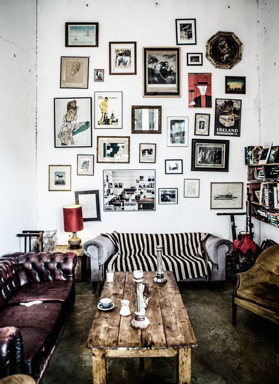
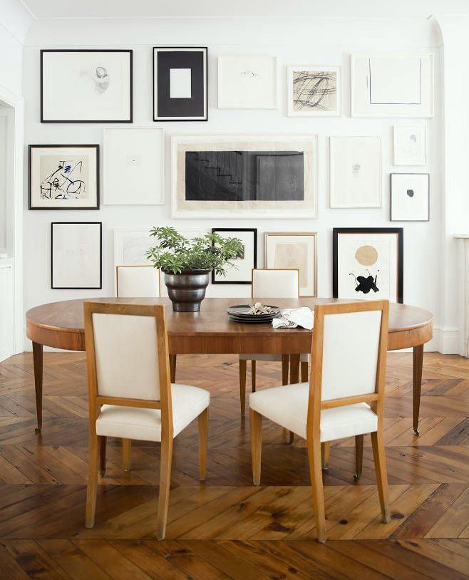
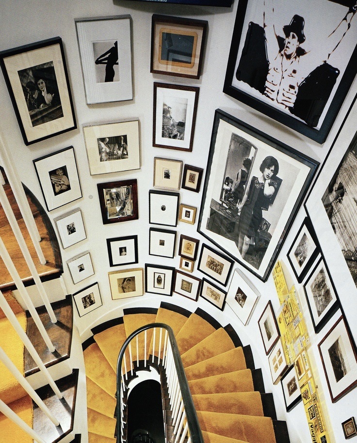 source unknown
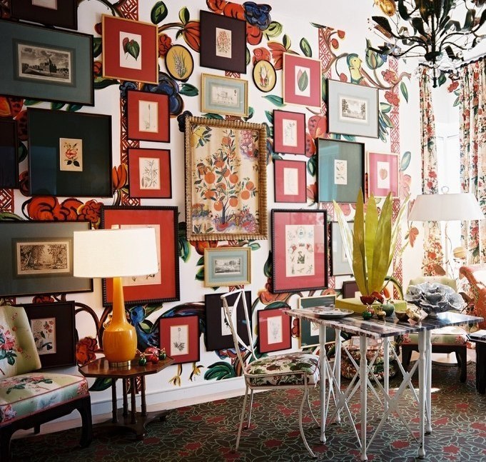
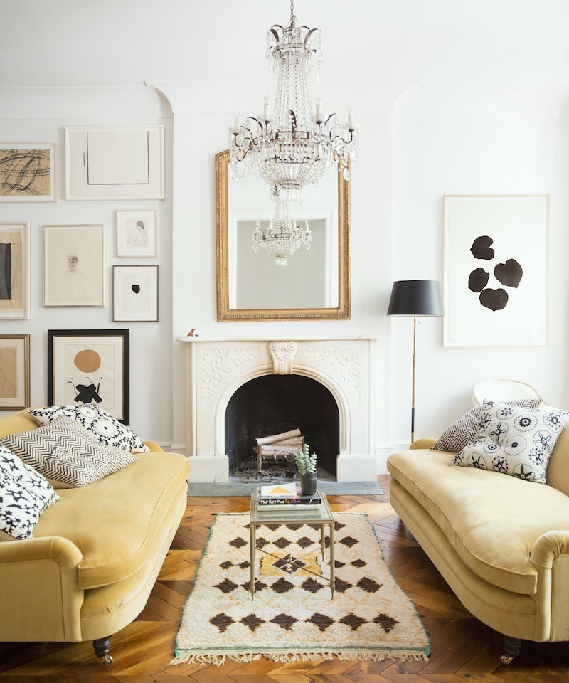
Ever try to do one?
If you have, you’ll understand that there’s no magic involved. I’ve already written about this subject twice, you can see in the links below.
The second post about why you should be afraid of them hi-lights the fact that it’s very easy to muck them up.
Too often eclectic gallery walls are:
too busy
I know that there are some people who would love this, I’m just not sure I’m one of them.
two crowded
 seriously?
not crowded enough, unbalanced, poorly spaced
not straight
too straight.
Then there’s the issue of symmetry vs. asymmetry.
This is why I need your help with eclectic gallery walls.
I’m working on a little project which I can’t talk about just yet. Your input, however, would be immensely helpful!
- Do you do them for yourself or clients if you’re a designer?
- Do you like them?
- Would you be more willing to do them if they weren’t so difficult to put together?
- Would you do them if there was an easier way to do them?
- Do you prefer asymmetry or symmetry?
- Does it bother you if one piece is out-of-place, or does it bother you if everything is perfectly spaced?
You don’t need to answer all of these questions, but if you have a chance to answer any or all, in the comments, I’d be grateful.
I tend to go towards symmetrical. I definitely do if the wall is open on both ends and the wall isn’t really huge. Even if asymmetrical, it makes me uncomfortable if it’s off-balance. How do you feel about that?
I love these prints and the way they’re arranged
I very much like this from Sherwin Williams in cahoots with Pottery Barn. I think I would’ve left the small wall by the door blank. (these are not affiliate links)
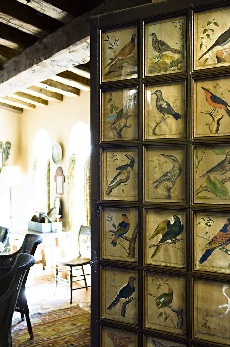
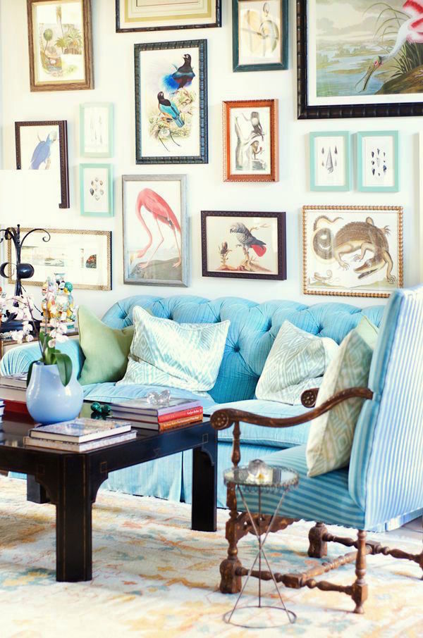
This is not an eclectic gallery wall, of course, but I think it’s way cool with the vintage bird prints hung together like a sort of wallpaper or screen effect.
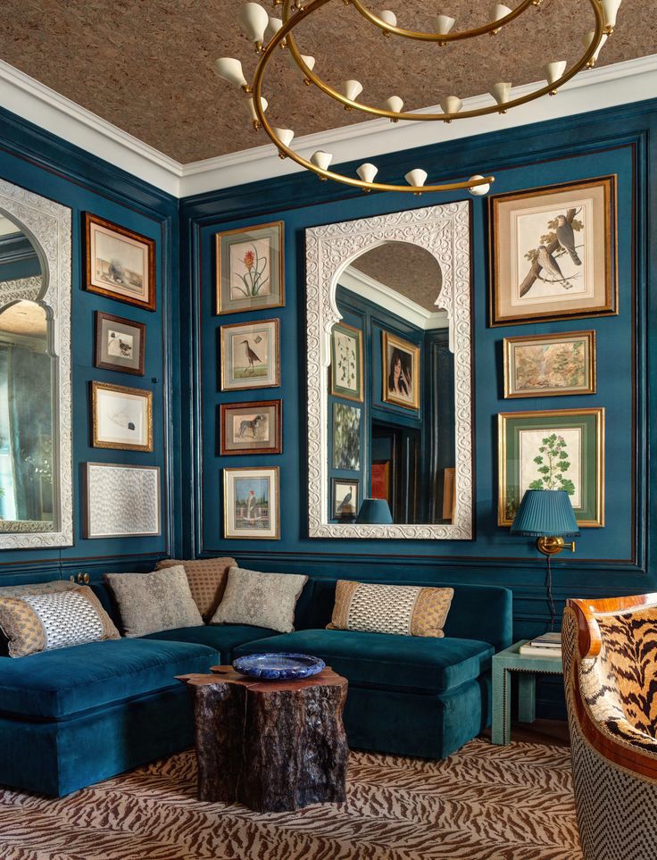
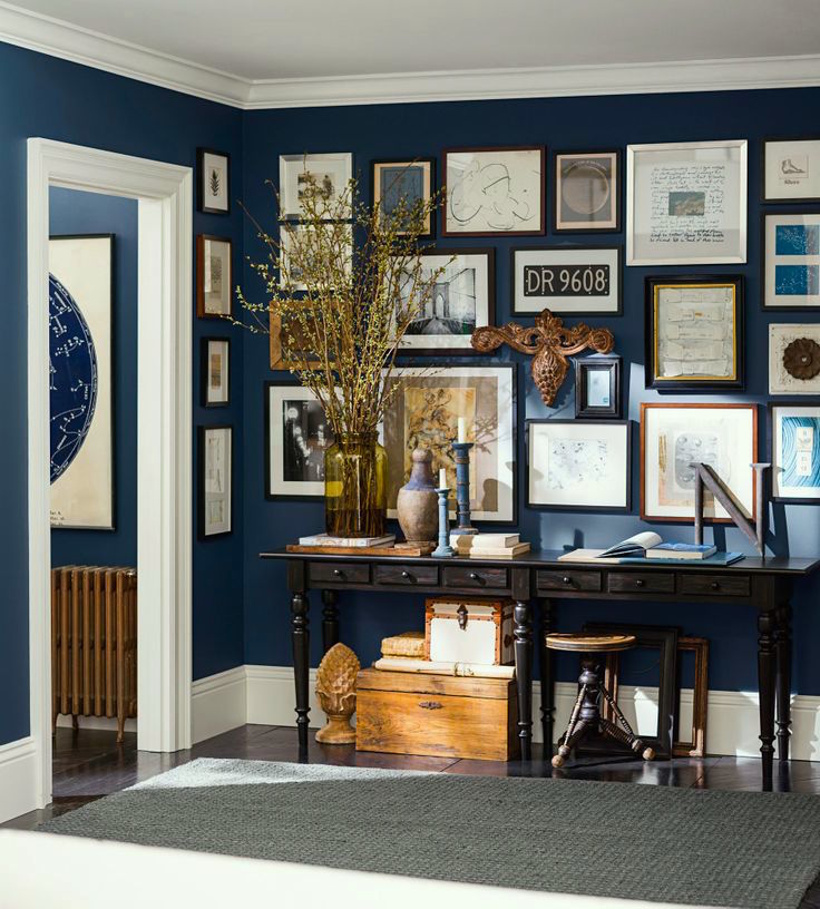
Just fabulous by Markham Roberts for last year’s Kips Bay Showhouse. I love the masterful composition with the wonderful Moroccan mirrors. This is also a case where there’s a deep rich background color which is really an accent in the room. Food for thought.
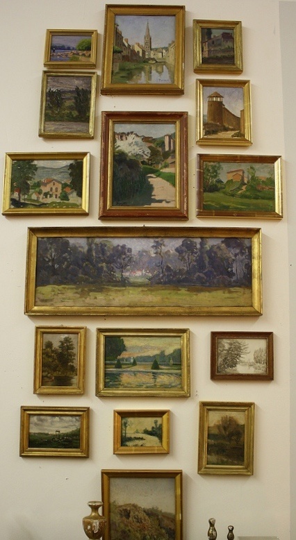
Love these vintage French Prints with their antique gold frames
Wonderful composition by Windsor Smith. Another important element is: Does the art complement the rest of the design?
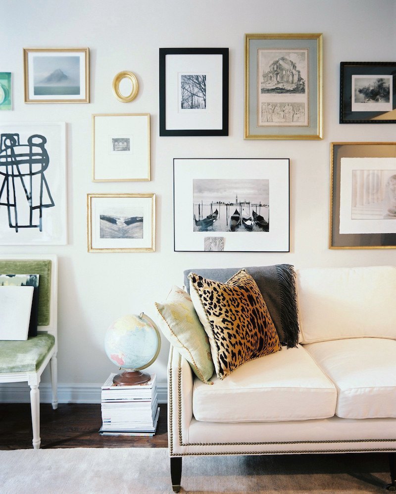
The rest of the room in Ali Cayne’s apartment. What’s funny here is please notice that the art on the left is the same as in the previous shot. I guess they moved stuff around for the photos. ;]
Fun. I might’ve preferred if the small images could’ve been interspersed a little more, but otherwise, wonderful!
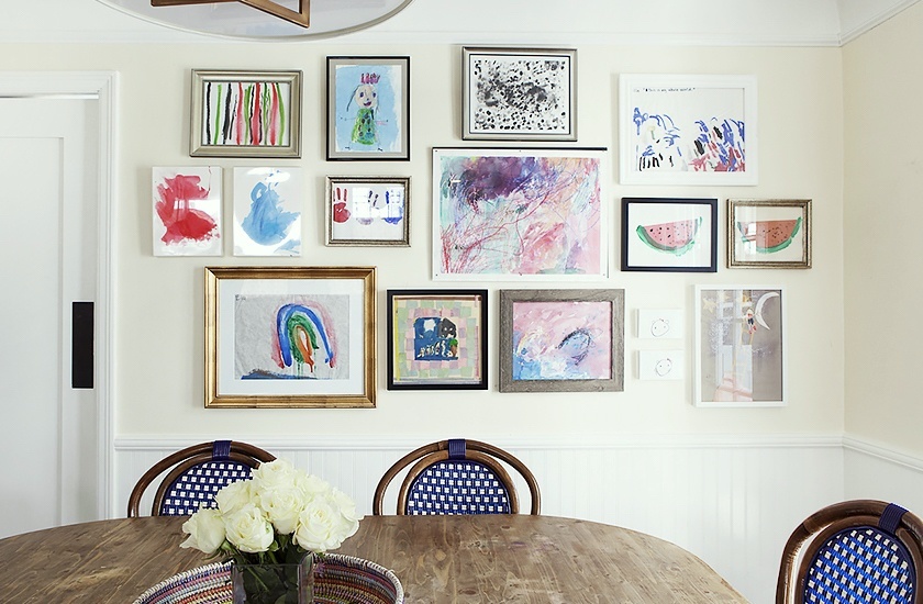
I always thought I was going to do this when my kids were young, but I didn’t. I did frame a few of their pieces and displayed them but not in a gallery like this. I think that this is a great idea for a family kitchen with a blank wall. It could be a fun project to do on a weekend.
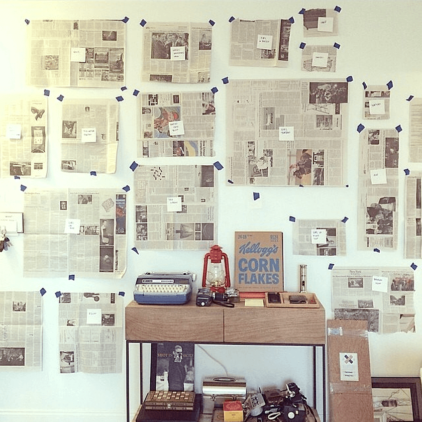
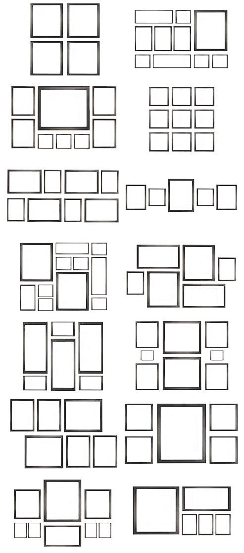
A great tip from Simply Framed for doing this is to cut out of newspaper where you want the pieces to go on the wall. Lift up the back of the back wire as high as it will go. Measure that distance. Let’s say it’s 3″ from the top of the picture. Then the nail will go down three inches on center from the top of the piece of newspaper.
I want this. I want the entire room!
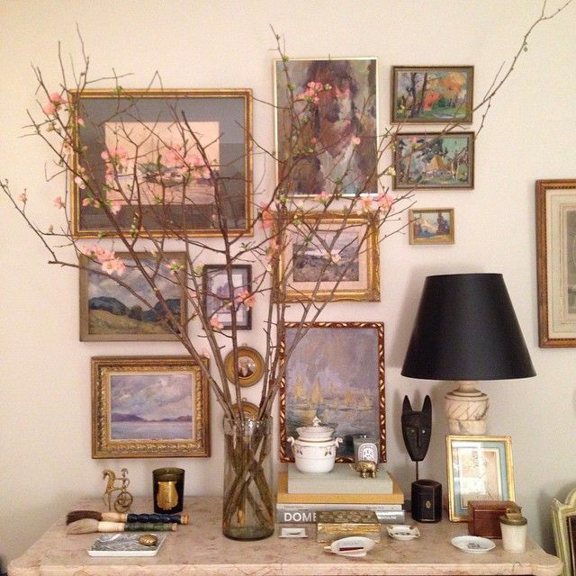
I have posted this one before. I really love it!
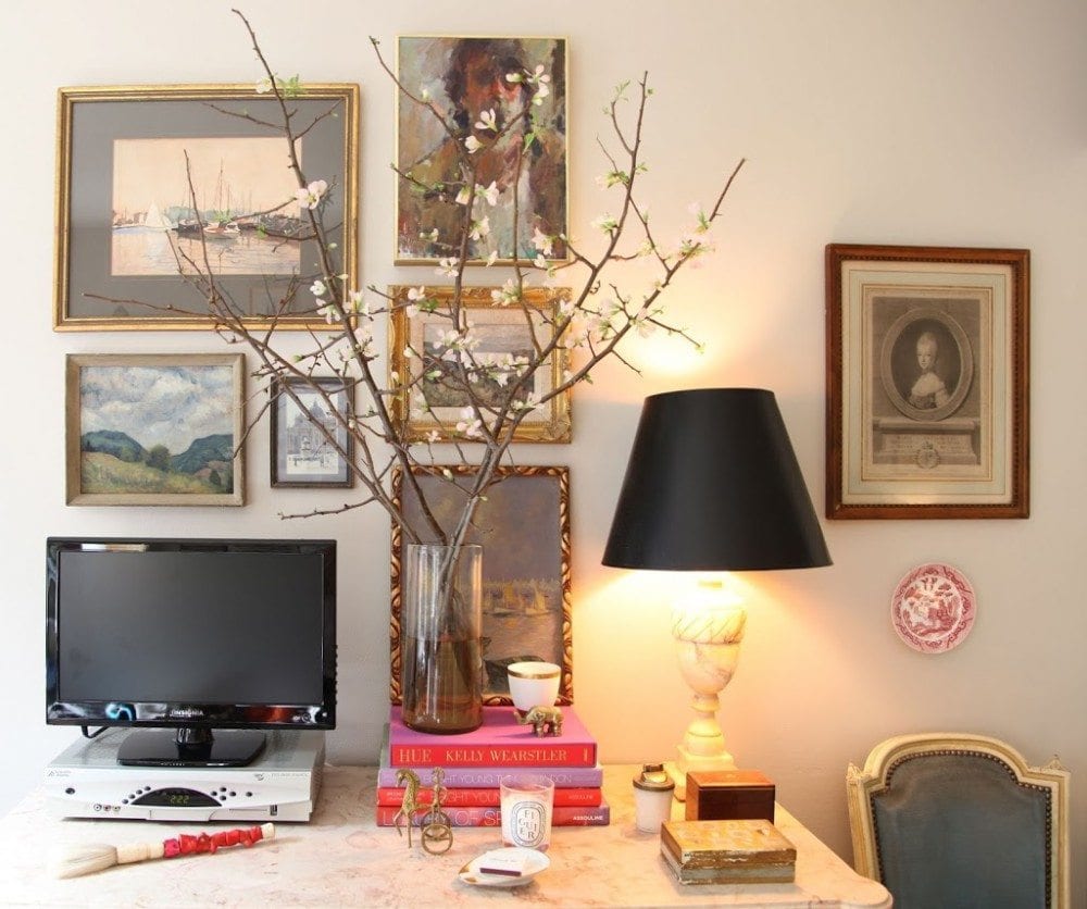
I love this charming vignette by Heather Clawson of Habitually Chic. I can’t see the entire wall so it’s not fair to say. I might’ve moved the picture to the right behind the lamp. I think it’s fine to have art behind a lamp–especially when there are numerous pieces like this. I guess it depends on the situation and how much room there is.
Oh wow. Here is an earlier iteration of the same vignette.
I think this is perfect for a young woman’s apartment.
How do you feel about eclectic gallery walls?
I’ll look forward to hearing from some of you in the comments!
xo,
![]()
For more art walls click here, here and here.
Related Posts
 20 Great Fireplace Mantel Decorating Ideas
 What is the Hottest Decorating Trend 2015 That Is Never Going to Go Away?
 Nine Fabulous Benjamin Moore Warm Gray Paint Colors
 I Hate My House | Help For a Small Living Room
 Decorating on a Budget | Can You? | Yes!
 What is the Best Palette for No Fail Paint Colors?
 Home Staging Ideas You Won’t Hear About on HGTV


69 Responses
Hi Laurel–hope it’s not too late to put my 2 cents in!
I’ve created a few eclectic/asymmetrical galleries over the last few years, and here are my personal pros and cons:
Pros:
1) It’s an affordable way for a person to start collecting original art, which, when you think about it, is kind of like diamonds in a ring–a few smaller pieces clustered together are a lot cheaper than one huge one of the same quality. So for someone who is truly interested in acquiring interesting pieces, these galleries let you start small and mix high with low.
2) It can be a great way to add texture and detail to an otherwise featureless wall, hallway, stairway, etc.
3) It can be a great way to centralize, edit, and display a client’s existing (and maybe scattered?) art collection and/or or photos.
4) The “eclectic mix” of thin frames and (mostly) modern art and photography is a very hot look now so it instantly updates a room.
Cons:
1) Because it IS such a hot look now, a lot of these young & hip modern art/photography gallery walls (as seen on Lonny, Domino, Apartment Therapy, etc) are all starting to look alike to me. It’s all part of the larger midcentury modern/organic trend that continues to dominate the current aesthetic but I worry will eventually look clichéd and derivative like every other trend…
Gallery displays per se never go out of style, but the way they’re presented definitely does… (I’m old enough to remember when Mario Buatta’s dog portrait gallery–completely symmetrical, elaborately gilt-framed and ribbon-hung–was the cutting-edge rage!!)
2) It’s very hard to do well. Not just the spacing between frames, which, for me–no matter what newfangled tools or logical measures I try to employ ahead of time–requires several hours of trial and error (and a ton of spackle and touch-up paint!), but also the selection and arrangement of the art–mixing different styles and media, not to mention framing, matting, etc.– is extremely tricky. There has to be at least one unifying element to the grouping but nothing can look too matched…!
So with those pros and cons being said, if the idea/project you’re considering is a product or system that can help make the gallery arrangement process any easier, I say it’s definitely something the world needs right now!
Hi Sandy,
Wow! What a great comment and no, you are not too late at all! I feel as you do that they are not easy to do if one is starting completely from scratch. There are so many details.
And yes, that is what I’m trying to do which is come up with an easier way to do them. Of course, that could be many different things. The point is that whatever I come up with, it won’t be right for everyone, but it’ll make it easier to create something beautiful and fun!
thanks for the great comment!
1) I think the ones with pix of family are a great way to display them.
2) Re: the ones with art, I love about 10% of them and think the rest look like clutter stuck on the walls.
3) However, a collection of something does look better in this kind of display.
I much prefer equal distance between all the frames – like a puzzle where each piece fits just right. That probably means you have to buy some frames made to just the right size. If that is not an option, then do the ones in the middle with equal distances and put the others on the perimeter.
I did a collage for my friend who collects civil war newspaper art of African-Americans. A half page would be devoted to the art, which she framed – some professionally and others not. With about 10 mostly large pictures, I spent 3 hours arranging them (including changing pictures between frames) and 3 hours hanging them and driving myself crazy with trying to keep them straight.
The things I learned were: a) if there are a couple of pictures that you can’t quite get right — give up and don’t put them in the collage. b) Use double sided tape or rolled up scotch tape or similar on the bottom corners to keep them from moving.
Hi MH,
Great advice! I also prefer it if the space is fairly equal or at least that there isn’t some overly large gap/crowding somewhere. It looks sloppy.
I too think that many gallery walls are too busy. I think the best ones have some unifying factor. The totally random is not a look that i care for.
Having seen this look a lot it’s so rare that it doesn’t look too busy. Frankly it terrifies me, I can imagine all the holes in the wall, to try to get it just right!
Hi Jeanelle, Yes, that’s what I’m trying to avoid and come up with a much easier way to do them. I agree that they can look busy. I think that some of the pieces need to take a back seat to others and almost blend in with the wall. Not every image can be the star of the show. I think that applies to design, in general.
I like gallery walls, but have never done one for myself (not a designer here). It’s something I’ve considered but find rather daunting.
Yes, I would probably do one if it were easier.
I’m a big symmetry fan, but asymmetry done right can be fantastic.
It does bother me if a piece is out of place. I’m fine with perfectly spaced.
Hi Molly, Thanks so much for answering the questions. Much appreciated!
I adore gallery walls! It wouldn’t surprise me if someone coming into my house thought that I had too many gallery walls – they are practically on every wall!
I prefer asymmetrical because I think it looks more eclectic and developed over time (which every gallery wall should be). All my gallery walls have different themes: I have an ancestry wall, a modern (color) family photo wall, wedding photo wall, travel art wall (collected on our travels) and college wall (my diploma, artwork, and awards from college).
I don’t find them difficult to hang. I’ve never used the newspaper method because it seems too time consuming. I use a picture hanger tool that I purchased on Amazon (it’s called Under the Roof Hang and Level), and just start hammering into the wall. I think you get the eclectic look if you don’t over-think the arrangement.
Oh wow! I have to look into that tool! Thank you Rebecca. That’s very helpful!
Hi Linda,
The sheet music sounds cool! My sons are musicians! We certainly used to have a lot of that laying around! Sure, please send me a photo if you like. I’d love to see it!
Hi Karen,
I don’t know why, but I never learned to use any kind of design software. I do so many other things on the computer. But, I decided that I actually prefer my hand-drawings. However, for this sort of thing, I could see how that would be handy. Usually I’ll just make a board with the images. When I started doing that a few years ago, I found that it helped to sell the idea so much faster!
Glad to have helped Betsy. Let me know how it goes with your new home!
What a timely post Laurel–thanks! I’m working on one as well and will keep these great ideas in mind. I am doing the layout/design work using chief architect software. Wall items are easily created moved around so that I can quickly present options to the client showing the differences in negative/white space. To make things even quicker, I think I’ll create a new pinterst board to help my clients quickly get a feel of how much white space they prefer before I design. Thanks for another great post! xoxo
Another fabulous post Lauren! I am primarily a color consultant but have done design projects. I have a gallery wall of framed mirrors in my bedroom. However I have never done one in a clients home because of the difficulty as you point out. I have studied the way the visual merchandisers at Pottery Barn do gallery walls which is masterful! I do have a current project which is essentially a brand new house. I need to do a stairwell wall photo/art gallery soon. So, thanks for this timely post!
My sister did a gallery wall in her music room of vintage sheet music. The frames are all the same size and are black. They are perfectly spaced in rows. She changes it seasonally. If you would like to see it, I will send you a photo of it.
Great post as usual Laurel and very helpful. I love gallery walls and have been doing them for several years in my home since I collect vintage art and it is a great way to display the art. I recently completed a gallery wall on my TV wall trying to help the TV blend in and was intending to write a post on this topic so would love to provide a link to your blog. I recently found a pair of very large gold framed spectacles at an auction to add to my wall!
Hi Jo,
That sounds so cool! And yes, please link back to my blog. I would be honored!
xo, Laurel
As a designer, I’m not crazy about gallery walls, but think they’re OK if the look of each art piece melds with the others to almost form the idea one large painting. For example, in the Domino photos, all the pictures & frames are black, white and tan-colored shapes. The French landscape paintings, all with gilt frames and soft, watery colors also work well as a unit. The examples with really random pictures/colors/sizes are just too frenetic looking for my goal of soothing interiors, which do rely on balance and symmetry. Maybe the really eclectic examples are too young and bohemian-looking for me, too. The subject matter is also key; for the “cool couple” photo that says Alessandro Uzielli beneath it, I love each photo they’ve chosen. They probably wouldn’t seem quite as cool if these were simply old family photos. I once hung a gallery wall in my husband’s office at work– he had about 75 framed diploma/certificate type pictures that he wanted to cover one wall. They were random sizes & colors. I traced each one on a sheet of newspaper, numbered it with a sticky note, then wrote the number on the newspaper. Then I taped each sheet onto the wall & into a puzzle-like arrangement (just like your example!). The maintenance people at the office then came in and hung them, but unfortunately with 1 nail, not two. So then there was a wall of totally crooked documents. My husband, himself, remounted them using 2 nails each. OK, so the subject matter was ugly, but at least they all had the same type of look. And I have to admit that the sheer number pictures also made the wall into an interesting statement. I love, love, love your blog! You are the absolute best writer! (And designer!)
Thanks so much Joanne. I can see how a wall of diplomas in beautiful frames would make for a lovely gallery wall. I wonder if there’s a rule about the size of the piece before it’s better if it has one or two nails. But maybe it’s also something to do with the wire. If it’s a bit loose might make a difference.
And thank you so much for that last comment especially. That means a lot to me!
Hi Laurel, what a great topic for a post – you’ve really got me thinking. I’ve never managed to get a gallery wall together for exactly several of the reasons you’ve included – I’ve just haven’t managed to come up with an overall design that I could live with… without forever fiddling and rearranging. I love to see a truly eclectic gallery when it’s speaks of the people who live in the house: family events that mean so much to them, but might even look ordinary to us looking on, quirky portraits, images that shout about how much they care for each other – all in beautiful frames. I feel like I’ve been invited to enjoy a moment in their wonderful life which is a privilege and a treat. Or a theme that transports me to another place like stunning wildlife images or paintings that I can’t walk by until I’ve absorbed each and every picture. That said, I haven’t managed to get my oh-too-neat brain to settle on a set of images for my own gallery without balking at either a lack of symmetry or the noise of too many colors! My most favorite galleries ever are those that create the illusion of having been built on over years to create a wall that sums up all the images those who live with them can’t get through the day without enjoying.
Thank you so much for the very thoughtful comment Laura. That’s how I feel too. The problem is creating the feeling of having been built over years when it actually occurred in a manner of weeks or even days!
i do my gallery walls by “eye”. I build them gradually & they evolve. Tooprevent too
much “theme” going on I mix the subjects with an unexpected Item..usually not a
painting.
For example with a gallery wall with the theme of flowers, to prevent it looking too
fluffy or twee I may place some farm/garden industrial..a beautiful old garden trowel
with a now polished well grasped handle or even a tractor wheel. These items are
usually loosely collected to the subject.
If the wall is seascapes I may hang an anchor.
if the wall is movement I may find a lovely leather bicycle seat polished by bottoms !
Mirrors are also useful interspersed with the paintings for a softer look.
I find these objects rest the eye which allows better appreciation of the paintings are great fun to do, stop the wall being overtly prescriptive & add an extra dimension that prevents the display becoming static.
So don’t be too anal with your gallery. Start in a small way, experiment & have fun. After all, the walls your oyster!
Hi Jo,
That sounds very interesting. I love mirrors too in art walls and sometimes other objects. It all depends on the style of the home and other decor in the space. Thanks for the lovely comment!
!. I have done gallery walls for clients and I do have one in my own home (mostly to deal with awkward vestibule / AC thermostat placement).
2. Like them only when they are done very well.
3. Don’t find them particularly difficult to do. I just treat them as sort of a collage.
4. I don’t often think of them as a design element, but rather as a solution to a difficult space or subject matter issue (like preferring twenty million family photos to be displayed in an upstairs hallway, rather than all over the house).
5. The question of symmetry or assymetry depends upon the framing of the pieces, the style of the house/room, the subject matter. Casual rooms need less symmetry as a rule.
6. As far as spacing is concerned, I am less obsessive about consistent spacing when assembling an asymmetrical display than I am when doing an symmetrical one.
Hope that helps. Good luck. Love your blog, Laurel.
Hi Leslie,
That is all very helpful. I think for me what is difficult is if a client wanted one but we are starting completely from scratch. If they already had most of the art. (and yes, that’s different from a photo wall) then that would be a different matter. In fact, I may be doing one soon with clients who have tons of art from their old and larger home.
Most of the time, they have nothing to start with. I did do a few small ones for clients about 3 years ago from scratch. They are all impressionist prints, but the frames were mismatched and they were asymmetrical.
Coincidentally, they just contacted me and I’m going over this weekend. They turned out really well but they did take me many hours to plan and execute. Thanks for the thorough comment!
I have done them and will do more soon. I like them to have a general feeling. That everything looks comfortable together, not like the person who shows up way over or under dressed. I want the wall to be the supportive back drop not grabbing attention from behind. I go with how the pieces want to hang together form wise.
Hi Anne,
I agree with that premise completely. I very nearly posted Reese Witherspoon’s living room with an art wall that might be cool if it was in a room with nothing else in it. IMO there is just way too much going on.
Done loads of gallery walls over the years, mostly asymetrical… I don’t think there is formula you can use to dictate where to put the pictures. The only way to get it right is trial and error with the arrangement. Persistence, don’t give up, will eventually get you to that aha moment.
Thanks so much for your in put Lynn!
Laurel! Your blog is so entertaining; it is a joy to read. Yes, I love love love gallery walls. I recently picked up Sotheby’s Jackie O auction catalogue and can’t wait to frame some of the photos. I want, no I need symmetry. Otherwise, I’d slowly go out of my mind. The frames and subject matters needn’t match but things must be evenly spaced. But, I must include vintage mirrors as well. If you’ve got tips on how to make it easier, please pass ’em on.
Thank you so much Val! As for tips to make it easier. That’s what I’m working on. But it’s more than that. It’s something that won’t be for everyone, but some people might like it and that’s all that matters.
you can’t please everyone.
I also like interjecting mirrors and vintage mirrors are way cool! I’m not as big on other 3-d things as rule. Of course, there’s always an exception.
Thanks for stopping by!
Hi Laurel-I’m just not a huge fan-99 per cent of them just feel like wall clutter instead of being too many trinkets all over the place, they are all on the wall-the 1 per cent were those cool bird pics with the pretty blue couch. I actually really loved that! If I were going to do a gallery wall, it would have to be spaced perfect and totally symmetrical , because i think I have a bit of Ocd-when I go to friends houses with walls like that, i straighten them when they are not looking-when people slam doors and the floors vibrate, pictures tend to get a bit crooked ad that drives me crazy-LOL
Hi Kathi,
This is so helpful getting all of this feedback. Crooked pictures also make me a bit crazy. Even when we hang drapes, I stand there with my evil eye and crack the whip! haha. The guy will hold up his level and tell me that it’s “level.”
Errrmmm… no. The rule is: if it doesn’t look straight, it’s not!
Do you know about those little gel pads for the corners? They really work to hold the pictures in place.
I have my own hallway gallery of photos of my granddaughter and grandson. Each photo has one child or the other in it, no group pics and I have them printed in a sepia tone with varying sizes of ivory frames on a wall with antique dark gold textured wallpaper with ivory painted trim and moulding. I love it, I just worry about running out of room as they are only 6 and 5! Love your website, you always make me laugh!
Hi Liz,
That sounds incredibly beautiful! Running out of room. Yes, that’s a big problem. I’m sure it’s impossible to part with any of them! Maybe you’ll need to build a new wing. haha! And thank you so much. Glad you’re laughing!
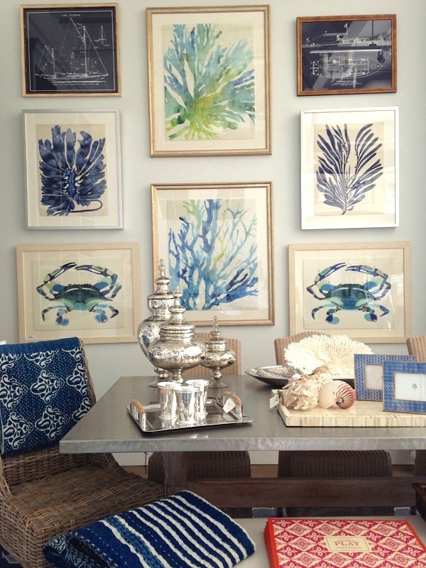
To be honest I have mixed feelings about gallery walls. I have seen some that I really liked and thought to myself “I would like one of those”. But they can be a bit of sensory overload, IMO – especially if there are a LOT of pictures or I can’t find anything that unifies the pieces. I do prefer asymmetrical. Of the pictures you gave, one of my favorites is the one with the Moroccan mirrors because they let my eye pause for just a moment before I move on. They also introduce a bit of negative space which I also find restful. And those last two pictures…those three little pics over the lamp made the lamp part of the composition – how cool is that.
Hi Catherine,
I love that one too! Negative space. Great term! Sometimes I think folks think they need to fill every nook and cranny with something. I think that’s a mistake. And one thing I often say to my clients is: “not every piece is the star of the show. Some are supporting players and are no less important but just not as obvious.” Thanks for commenting
OK, you asked so I am expressing my opinion. I am not a fan of any of these eclectic gallery walls. They are way to distracting for my taste. I would prefer a contrived, organized gallery wall of like pictures, frames, matting or perhaps even a series of pictures that correlate to one another.
Hi Barbara,
There is nothing wrong with that at all! You are definitely not alone with that view. And that is also part of my research. So every answer is helpful and valid. I very much appreciate your help!
I don’t think I can add anything to all your wonderful comments…love the examples – all of them. Newspaper “blocking” is a great idea…I will try that! I’m always inspired not only to decorate, but also to paint/draw when I see these kinds of walls…Thank you for sharing theses!
Hi Deena,
So nice to “see” you here. haha! Hope all’s well with you out in the mid-west! Yes, I think that putting up either newspaper or maybe brown paper so that newsprint doesn’t get all over the wall is a great idea for the spacing.
I love gallery walls! I would definitely appreciate an easier way to put it together. I like it when the collection fits the space. Sometimes an asymmetrical design works great in an odd space. For more symmetrical spaces, I prefer a symmetrical grouping. I have a kid’s art wall in their playroom. I have a gallery wall of the kids photographs in my office. I would love to learn how to pull together an eclectic gallery. love the little french paintings gallery and the nautical one you posted!
Hi Karen,
Yes, I love those two a lot for different reasons. And I also love the Florida one with the exotic birds. I think I just love the colors in that one and it’s very balanced. I think it also enhances the over-all scheme of the room. Thanks so much for stopping by!
I love gallery walls and have been collecting them on a Pinterest board for that day when I need inspiration to do one. I haven’t done mine yet because collecting the artwork that creates the feel I want is what is holding me back. I am an asymmetrical person but the style of some rooms really calls for symmetrical. The layout and installation is the least of my worries. I know I could handle that. It does bother me if something is crooked or not spaced properly.Things don’t have to be super exact to the 1/8 of an inch but that bird frame touching the frame above it….that would drive me crazy. Good luck with your project. Hope you gathered the info you need.
Hi Tricia,
Thanks so much! I’m glad I’m not the only one who is bothered by the frames touching. The information is all helpful for my project. I think for those of us who don’t do them all the time, we are held up by what it is we’re going to put up if we don’t already have some vast collection. And then there is the framing and spacing. Lots to ponder. Thanks so much for responding!
Fun to ponder…some are too busy but love the spare, calm pictures best. The photo in Ali Caynes apt is correct. Left side I believe is dining room and other side is living room so don’t think pictures were moved….
Hi Katie,
I think the furniture was moved for the photo. Maybe the sofas were really at right angles but they felt it looked better to have them across from each other for the photo.
I agree, if the walls are too busy are the paintings go from floor to ceiling on a big wall, it can be overwhelming. That is, unless there is unless the images themselves are spare and fairly neutral for the most part. Thanks for helping me out!
I specialize in gallery walls. I don’t find them difficult at all, but I do have “rules” about them. 1) There has to be a unifying element whether it’s the framing, the theme, the color. I’ve done an entire room in “girlhood art” which included samplers, needlepoint, theorems, and pen wipes as an example. 2) The entire wall including the furnishings, windows, etc has to be viewed as one large canvas. As an example, if you are doing a gallery wall over a couch, the couch is an element in the wall design. 3) Include 3 dimensional objects in the design. Example, a group of cow prints topped by a carved piece of wood. I don’t think in terms of symmetrical or a symmetrical, I think in terms of weight. ex: a large painting balanced by four small ones arranged to be hung within the dimensions of the large painting. Personally, I do not like mixing graphic art of different media. I also don’t like mixing graphic styles, unless there is a unifying theme.
Hi Janet,
I very much agree with all of your points. I also like there to be something that unifies the pieces. And I agree about balance as opposed to perfect symmetry. I think that’s what I was trying to say. Sometimes I’ve seen compositions that don’t make sense to me. They are asymmetrical just for the sake of it and it usually looks “off” to me. I don’t see a link here, but if you have a website, I’d love to see your work! Thanks for the helpful response!
To answer your questions:
Yes I do them for myself, old family photos of generations past, kids art and photos in thier rooms, etc.
I love hem and would certainly do more and be more adventurous/eclectic if they were easier to do.
I like assymetry but with balance.
It bothers me when one peice is not spaced right. I don’t mind perfect spacing bu I usually play with sizes and spac to get a sense of balance.
I just discovered you and couldn’t be more thrilled with the timing – about to paint an entire house before moving in. Where have you been all my life! Going back now to read every single one of your posts.
Thanks!
Former Houzz addict turned LBI addict
First, I’d like to start off by saying just how much I enjoy your site. You have such a wonderful sense of humor that makes me feel like you are a friend and we are just chatting and loving our subject. Now, to your question! I love the wall of Things That Inspire. I wish it was easier to know if a wall is looking appropriate or cluttere or like a museum. How do you make a grouping? I like them even and straight. If you have a grouping in one room is it too much to have another grouping in a different room?
I do like gallery walls! I prefer symmetry, or at least balanced. I don’t mind if some of the spacing is different. And I do prefer that the pictures/paintings have a similar theme or color. Love your blog!
Eclectic walls! They can be so beautiful if done JUST right!!!!! But what is right? The first pic in this blog would drive me crazy with the big bird frame butted up against the smaller, other than that it’s great. The pic labeled Things To Inspire not so inspiring to my eyes. There are others that effect me the same way. Four that truly make my heart race they are so beautiful. So maybe it’s all about “in the eyes of the beholder.” And a whole lot of planning.
Love your blog and ideas. I love balance. there are time that I throw that to the wind, all depends on the space. 🙂 I have a small area that has photos and another that has old sheet music (1940). All my frames are the same color, but not the same size. I pictures in every room, even the bathroom. 🙂
Hi Judy,
That’s a cool idea to frame the old sheet music. Or incorporate it with other things that might suggest music. Don’t generally
like anything that SCREAMS theme, if you know what I mean, but there are subtle ways to do it. Having all the frames one color but different sizes is also a very effective way to do an eclectic gallery wall. I love gold and I also love all white.
Laurel, I would have to agree with Delores. I find that informal gallery walls evolve over time. As additional pieces are collected, they can either be added to the wall or exchanged with an existing piece. In answer to your questions, I do them for myself and for clients, I don’t find them difficult if they are asymmetrical, but symmetrical is more difficult.
The newspaper layout you show is always helpful, as is what I call a “tack ruler.” That’s simply a small screw that is screwed through a wood ruler at the 1″ mark, with the sharp tip of the screw protruding out the back of the ruler just a bit. Hang the picture on that screw head on the ruler, then hold the ruler up to the wall, get the picture where you want it, and press on the picture. The screw will leave a tiny mark exactly where the nail should be placed in the wall. To do this, you would have to start at the bottom of the pattern and work your way up.
Beautiful examples. Love your work and your posts. Smiles….
Hi Jo,
Oh wow! That’s a great idea with the ruler and screw! I’ll have to try that. Thanks for helping me out!
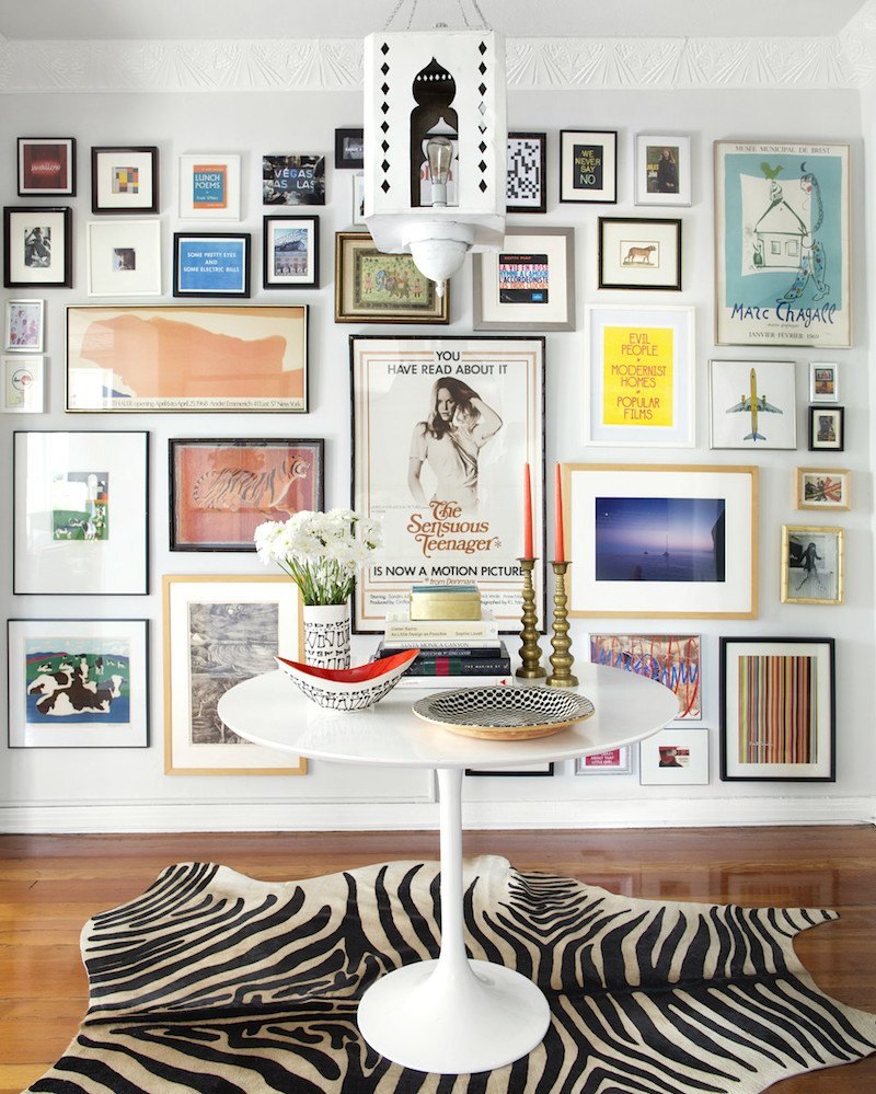
Great examples. My company sold antique botanical prints in the Chicago areas north shore for 25 years; and I visited many homes/estates “trying” out the proper art for a specific location. The “idea” of putting up newspaper I don’t believe to be helpful; as it is most important what the art is…Al C’s apartment here is a favorite of mine, and Uzielli ditto. Al C has all similar pieces which is why it works, and
the Uzielli couple have very nicely included a few massive sizes and medium and small similar to the “rules” in flower arranging – vary the size. They both did large mats – which I always recommend and simple framing. Lying art on the floor preferable on top of a say white rug if your wall is white … or on the floor can be helpful too. If you can view from a second floor balcony that gives you the whole
picture.
Love your posts. I’m fretting over white AGAIN. So will re read your post on whites. I’m soooo loving white!
Hi Phyllis,
Thanks so much for your comments! That is all very interesting and helpful.
I love white too! I could happily live in an all white room with a little chartreuse here and there!
As far as the paint goes, the popular ones are popular for a reason. If you want to narrow it down, the last post about the only 6 white trim colors you’ll ever need is good. Actually, I think there are about 8 colors listed. It’s not that the rest on the post about the 20 best aren’t good. They are too. The ones for trim are also good for walls and ceiling as well.
Good luck with that and let me know how it goes.
Love gallery walls and the more eclectic the better. But I do think that the subject matter and arrangement all depend on the overall style of the space. To say that a traditional room needs gilded framed oils or a modern space should only have picasso prints is to miss out on beautiful arrangements like some you have shown here. Look forward to seeing what you put together.
Hi Deb,
I agree. I love a mix of both modern and more traditional images as well as frames. While I was researching this, I came across this one image that was so out there, however. There was a pretty English landscape-type painting next to some purple geometric thing. For me it was too jarring. Thanks for helping me out!
I collected etchings and prints for many years, mostly from antique shops and flea markets. It didn’t occur to me until last year to gather them up from all over the house, and create a gallery wall in a first floor hallway, and I love it. I kept the lower edge and one side straight, and filled in the center with the rest. Frames are a mix of gold tones and wood. It wasn’t until they were all together that I realized that almost every single piece pictured a rustic scene with a cottage or village scene and nearby water. They were meant to be together.
Hi Joanne,
That sounds really lovely. I think it does help if one has already collected a bunch of art instead of trying to figure out what to put up from scratch. Thanks for your help!
Laurel, I’ve always loved a gallery wall and the more eclectic the better. I grew up with walls like this in my parents home and my grandmothers house. I have one in every room in my house. Some nights I find myself counting the frames above the mantle in my bedroom with 50 plus. What I find odd is when I walk into a home and find the walls barren of photos and books. I immediately ask the client if I can decorate they’re walls regardless of the house project and 9 times out of ten they jump on the idea and let me run with it…
Hi TKraft, Wow! I’d love to see that! You must have high ceilings too. Thanks for the response!
I love gallery walls and in my study, I have an entire wall hung with antique landscape paintings dating to the 1800’s. I just love the richness and depth of the various gold frames, and the repetition of muted greens and the blues of skies and streams and ponds.I tried to have a water feature in every painting I bought..When I first hung the pictures there was a sort of symmetry but as I accumulated more art- I sort of hung them as there was space.Now I have paintings on all four walls in my room, and they give me the greatest pleasure! I would never part with them.
Come to think of it, there are paintings in every room including the kitchen..
Hi Dolores,
That sounds wonderful. I think it’s nice for an art wall to evolve, but sometimes I’ve seen them run amok. But then again, it’s possible to move other pieces to accommodate the change. And I think that change is good too, because after a while, I think you start not to see things as much. It’s funny, but my grandmother in Chicago had a good-sized wall where she put up the art work of all 5 or her grandchildren. Nothing was framed, but it was so much fun to see our artwork on display.