Last year, some may recall, I ran a little giveaway for a free consultation and a young woman named Katy was one of the winners.
Of course, one never knows what they’re going to get, but in this case, I got an AMAZING home in St. Louis.
And a mess of a kitchen.
The young couple with two school-aged kids had already lived in and renovated several homes, but wanted something “different” for this home.
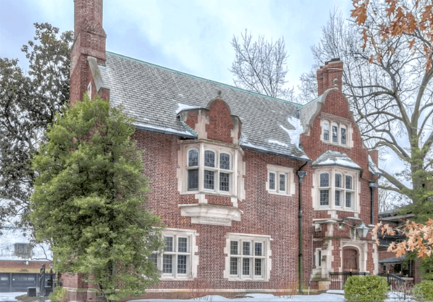 Here’s the house. Stunning, isn’t it?
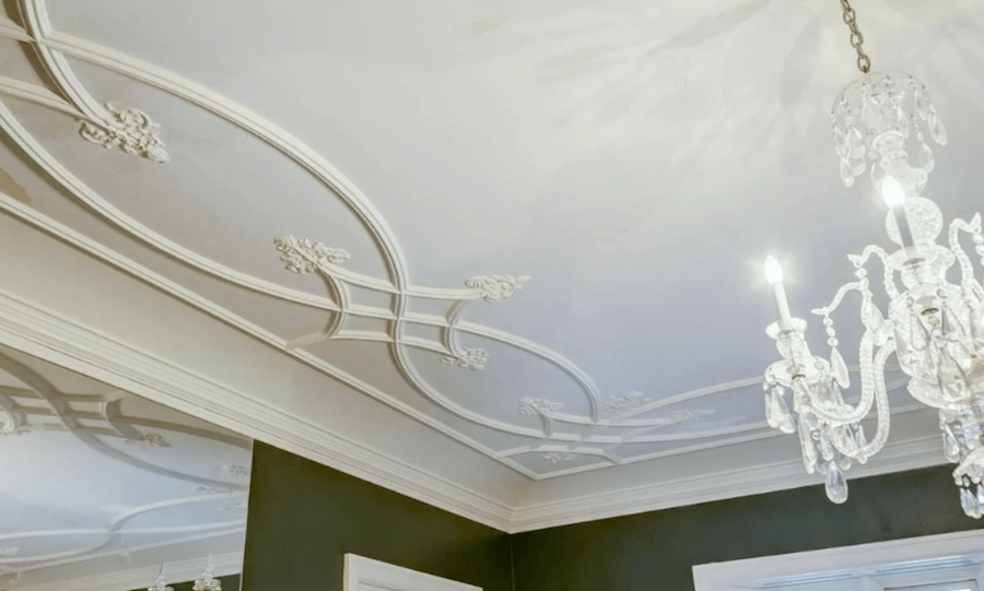
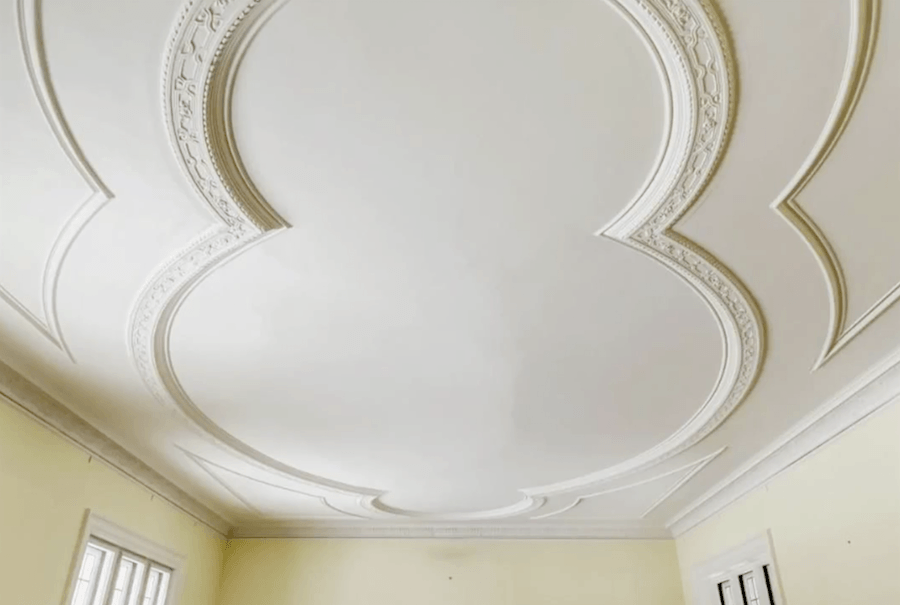
More stunning above and below with two detail shots of the gorgeous ceilings.
But Below is the old, but definitely not original kitchen.
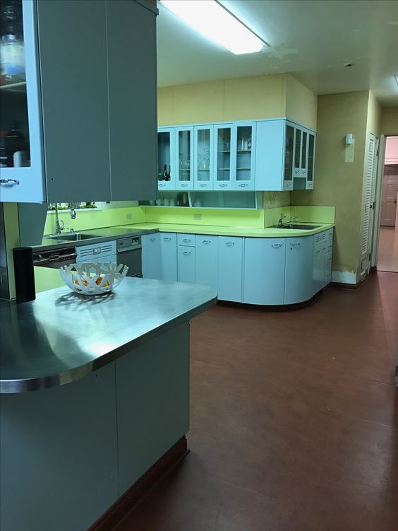
Different, it is, but not the good kind of different.
And oh man. And this is only HALF of the kitchen.
I think that at some point the cabinets were painted white, but still, this is not the right kitchen for this elegant Edwardian home.
I advised her to change the kitchen, to a black and white with a bistro feel but got a little resistance.
At first.
But I told her that although she might be tired of doing the same elegant kitchen over and over, the next owners will probably want something far more in sync with the classical Edwardian design. A mess of a mid-century kitchen is not going to cut it.
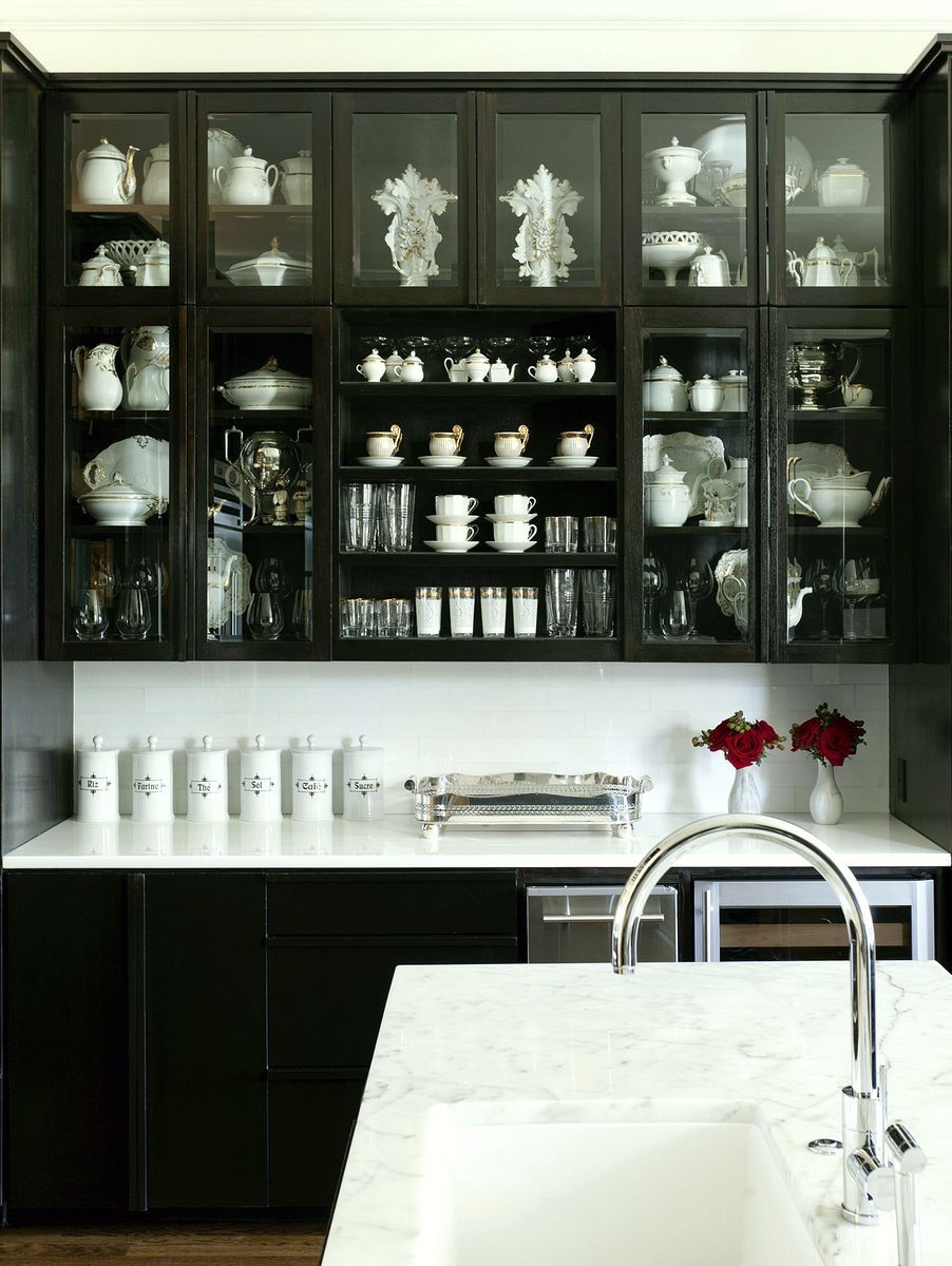
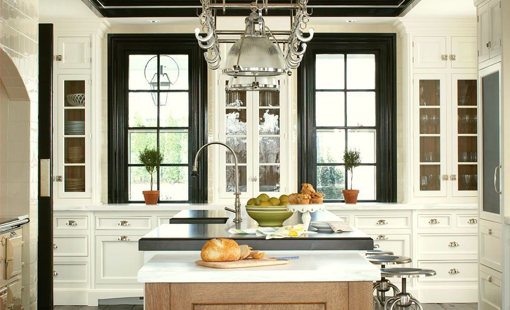
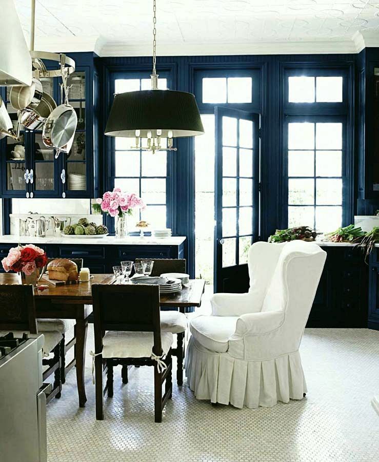
I shared some black and white kitchens that I felt would give some good inspiration to the look she should be going for.
Some of these I didn’t show her, but no matter.


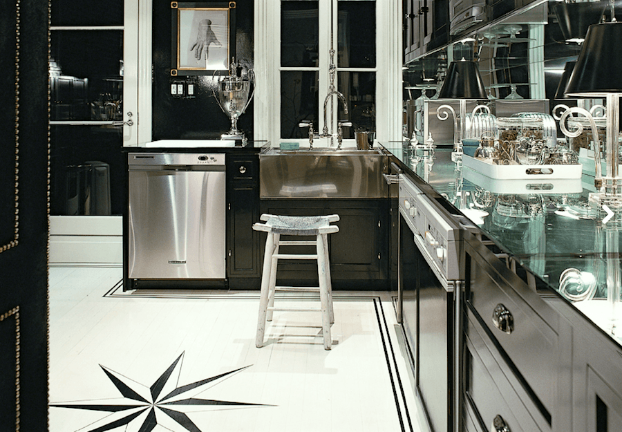 Two different iterations of Miles Redd’s gorgeous black and white kitchen with glass counters! I’m not sure which one is older.
But if I had to guess, I would say that the top one is newer since it looks like they painted over the laminate floor. I imagine that Miles’ place came with that floor and he figured that he’d just live with it.
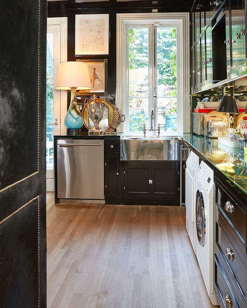
Love the lamp and all of the accessories.
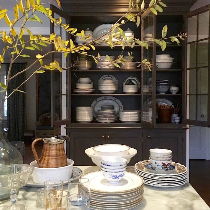
Maura Endres’ kitchen isn’t black and white, but the dark gray and white is also beautiful. For more of Maura’s beautiful home and kitchen click here.
And if you don’t already subscribe to Maura’s instagram, you are losing out, IMO.
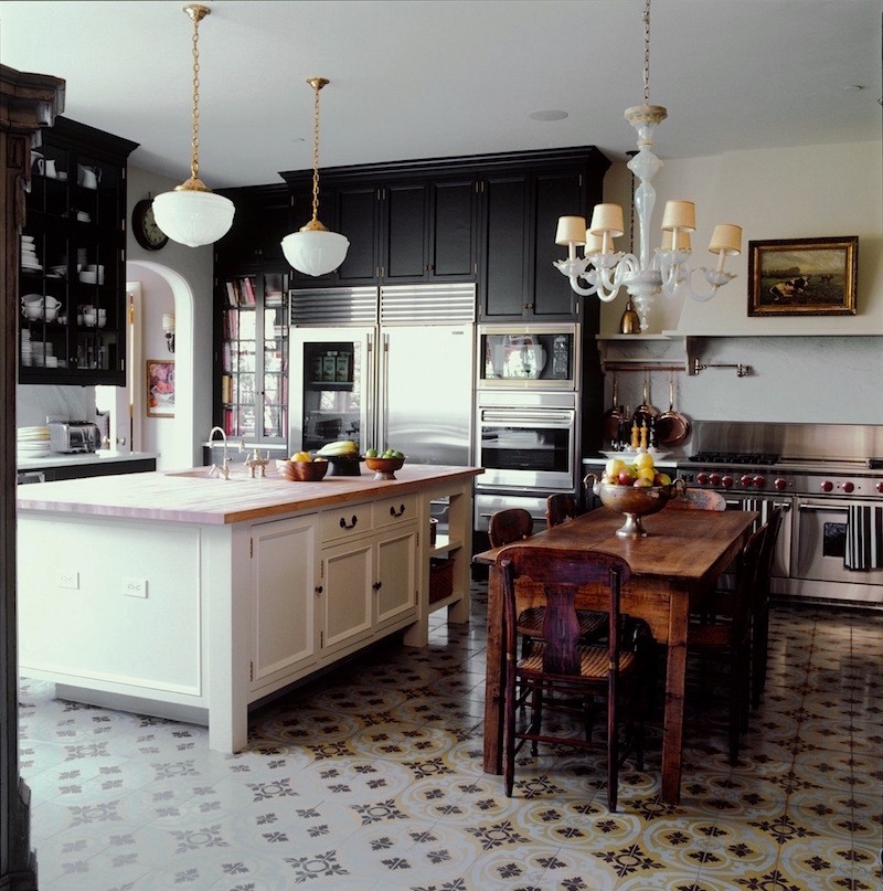
Kristen Buckingham
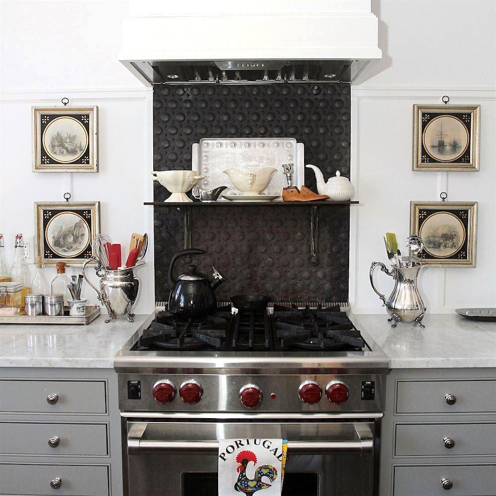
Nancy Keyes gorgeous range area. I want everything!
For more of Nancy’s beautiful kitchen and home click here.
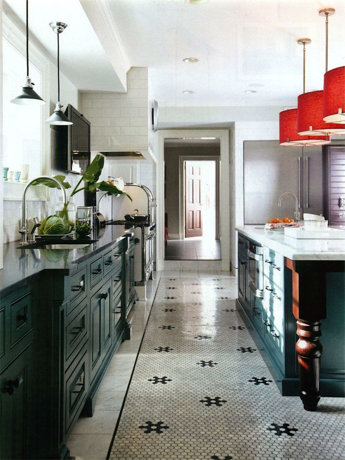
Mitchell Gold via Traditional Home
And that was that.
The other day, I received an email entitled
Fast-forward, a year later
This is the email verbatim. [except for my comments in brackets]
I promise you, that Katy is not a PR agent; at least not for me. I don’t have one.
Hi Laurel, Hope all is going well!
Not sure if you remember me, but last year I won your giveaway for a consultation. We had recently moved into a 1910 Edwardian house in St. Louis.
[Yes, of course I remember you! Okay. Fine. You’re right. I don’t remember you at all, but I do remember your gorgeous house!] ;]
At the time, we planned to retain and work around the 1950/1960’s era kitchen which you strongly advised against….the husband agreed
[WHAT??? He did???]
And a year later. We are just about done. Thought you might like to hear and see what ended up happening! (I’ve included a before pic to jog your memory too!)
You’re going to think I am a stalker, but I used post after post of yours to guide me during the process and I can’t thank you enough for sharing your insights!
[From one stalker to another; Thank YOU!]
This “unkitchen” post convinced me that I didn’t need upper cabinets everywhere.
Plus we are short, so without stools, most of the shelves are wasted on us. Without the upper cabinets, the leaded windows now take center stage (debating on shades still). Plus, considering our lower cabinets are in black, the abundance of white on top doesn’t make the kitchen feel the least bit dark.
[These are her links below and I don’t know why they’re appearing like this, but I like it. I remembered in time, not to copy and paste from G-mail. G-mail and wordpress are like oil and water for you geekettes out there.]
https://laurelberninteriors.com/are-you-making-this-mistake-with-your-kitchen-design/
The “Devol” post became my jumping off point for cabinets in terms of style. Seemed fitting with our home and I scoured their website for pictures for my carpenter that built the cabinets.
https://laurelberninteriors.com/beautiful-classic-kitchens-not-white/
I also didn’t think twice about not including a backsplash after this post…
and only added a full height soapstone backsplash behind the stove. It’s worked out perfectly and I have a feeling it won’t be as trendy as some of the tile back splashes out there today.
https://laurelberninteriors.com/freaking-kitchen-backsplash-countertops/
Then I used your paint palettes “religiously” to guide me on color.
As I mentioned, I used to buy 10-12 samples at a time – knowing I needed to test them – and I would still get the color wrong. Now after trying many of your universal colors and knowing you know your stuff inside and out, I just go to your Paint Palette, pick a couple I like, get 2-3 samples, and I’m done.
[I think that I need to put this girl on the payroll!]
– buy a couple to make sure my lighting isn’t odd and I’m done. Invariably one of them always works. For the kitchen, I went with your “Simply White” palette with the walls in White Dove and Onyx for the cabinets. (Tried Soot, but too navy and had to send the cabinets back…worth a $500 repaint for sure.)

[This is what Katy is talking about. It’s one of 40 palettes from The Laurel Home Paint/Palette Collection.]
Aside from a few odds and ends, the only thing left to do is figure out my chairs. I’d like to pick up the green or maybe the gray from the “Simply White” palette, but don’t want all my chairs to match (as I’ve read the post below too).
I’ve considered recovering that chair in the picture with an olive or gray velvet or leather and I scour Williams Sonoma, Ballard, Restoration Hardware, West Elm, and Anthropologie websites nightly to find just the right match, but haven’t been able to make a decision yet.
https://laurelberninteriors.com/help-please-husband-wants-matched-set-dining-room-furniture/
Anyway, sorry for the long email
[Are you kidding? You just wrote half of my post for me!]
And thank you so much for all your help both initially and virtually through your blog as you have made some agonizing decisions so much easier!
And then Katy sent me some images of her beautiful new black and white kitchen.
Are you ready?
Let’s go inside.
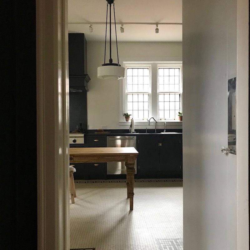
That’s much more like it, but poor Katy. I made her send me three sets of photos. But I wanted to show off her beautiful work in the best light.
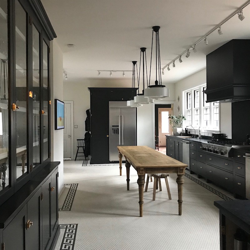
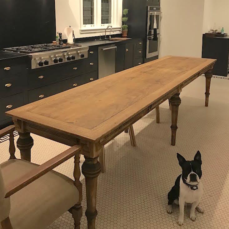
Oooooohhh… Look at all of that beautiful GREEK KEY PATTERN!!!
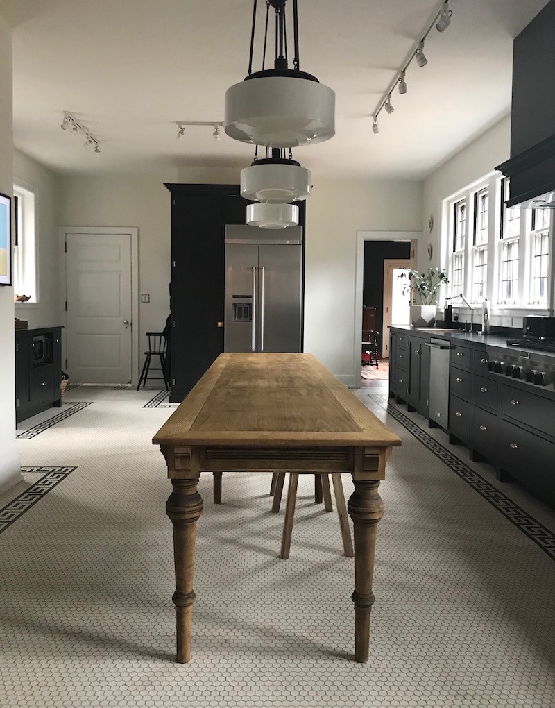
Katy told me later that they had the table custom-made based on an antique.
That wood element is wonderful and makes the room, I think!
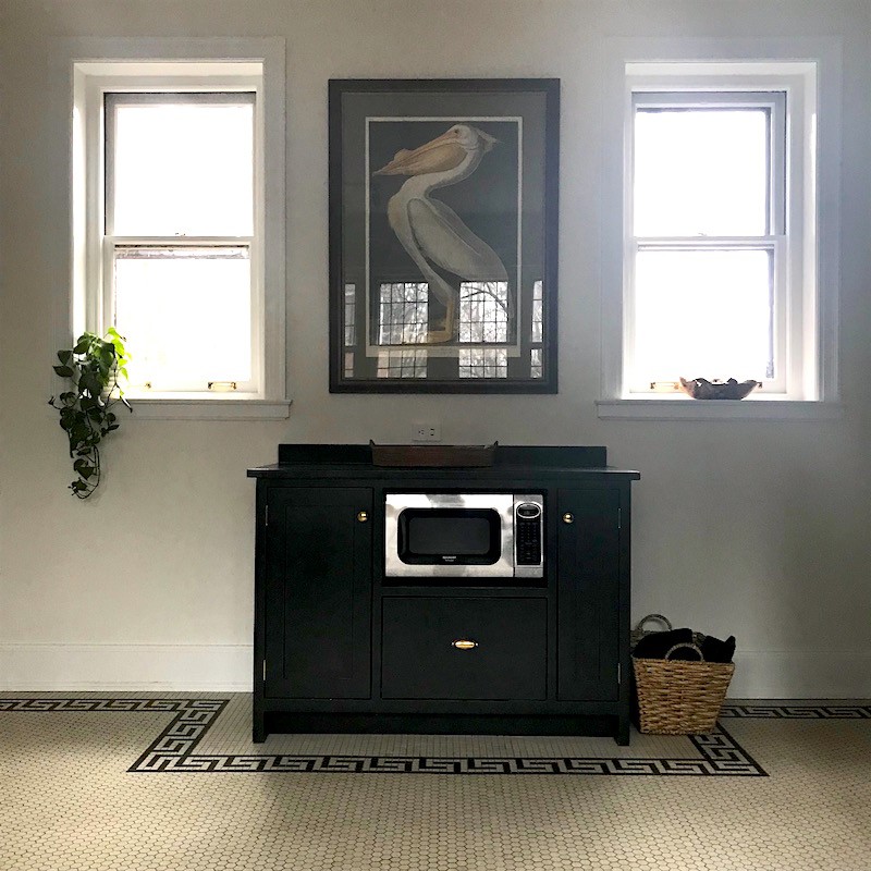
The baking station with a lovely print over it.
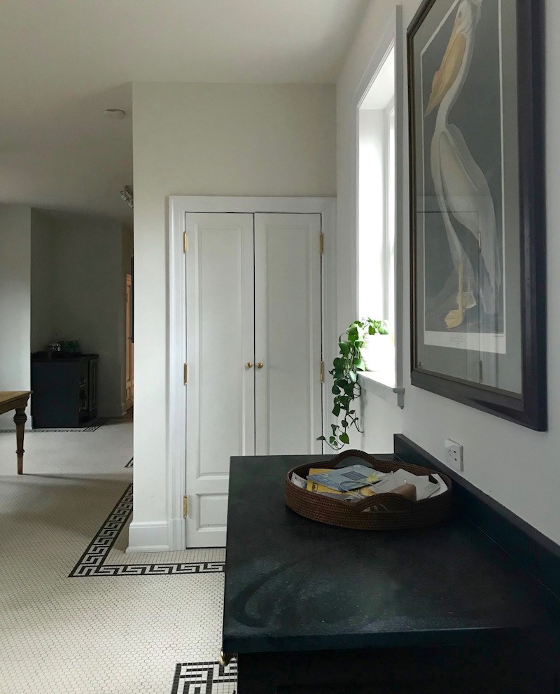
Please note that all of the white is WHITE DOVE but different finishes. That is why the colors look slightly different and why it’s not necessary to use different shades and possibly get a combination that’s not going to look so great. For more of my favorite white paints click here.
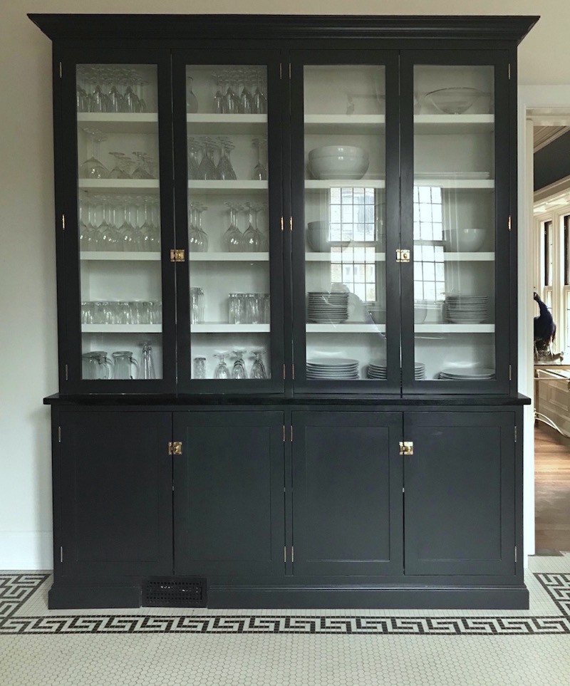
Love the china cabinet!
As we can see, it’s pretty much just the kitchen and it needs the finishing touches. And it’s the details that make a room sing. So, for fun, I put together some things to finish off the kitchen.
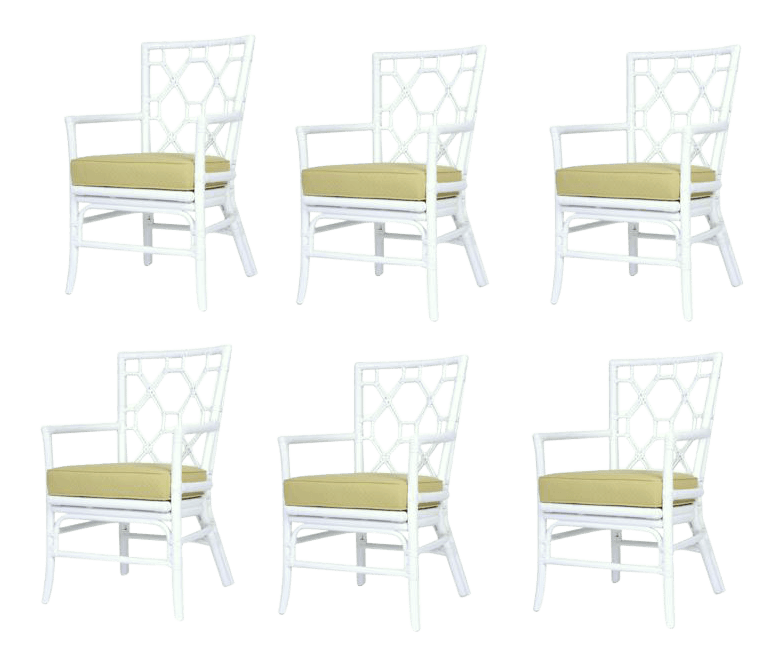 These David Francis chairs are in the widget but are difficult to see.
There are several chairs that could work.
One think I often do, is get an inexpensive chair and reupholster it in a nicer fabric. And I included that in one of the options.

Don’t worry honey. Of course you’re staying!
You look fabulous in the new black and white kitchen.
xo,

PS: Please don’t forget to check out the newly updated hot sales pages.
Related Posts
 Seven Different Winning Combinations For Your Bedroom
 The Most Amazing English Country House Of Them All
 Love Me A Warm Color Scheme But Is It Going To Look Dated?
 Need a New Kitchen But Can’t Get Myself Off Of the Kitchen Floor!
 The One Kitchen Trend That Should Never Leave
 Benjamin Moore No Fail Paint Colors | Bedrooms | part II
 25 Sumptuous Kitchen Pantries – Old, New, Large, Small and Gorgeous!











98 Responses
OMG! Love it Katy!! What a wonderful job! Congrats!! Thanks for sharing your photos.
Hi Laurel,
I think I’ve read all of your posts, and I don’t remember reading any about black and white bistro kitchens. I’m really interested in learning more about them. Are they considered timeless or trendy? What design elements would they incorporate? How would you style one? What style of house would it work in? Or not work in? Do you think you could do a post on these types of kitchens? Or, if you already have, will you let me know what post to look for? Thanks
Hi Marilee,
It was the recent post about the black and white kitchen. I think that bistro-style kitchens are timeless. I have done some posts and I believe that they are linked to in the last one. Or, just type in ‘kitchen’ in the search box in the blog sidebar and they’ll all pop up.
This is so insanely beautiful. I don’t even have the vocabulary to convey.
And, uhhhhh, any chance there will be another contest some day? 😉
xo
Hi Sarah,
Yes, there’s a chance! ;]
Wow, wow, wow! Congratulations Katy – you NAILED it. Your house is gorgeous and your taste impeccable.
Laurel, thank you for the inspiration and guidance you give. I just decided to add green as an the accent colour to my B&W bathroom and here you are using green too. Yeah – I’m learning. Those light fixtures are spectacular!
Thanks so much Gail! I love adding green. You can’t ever go wrong. Otherwise, we need to start painting the leaves and the grass!
This is one of my all time favourite kitchens! I can’t stop myself from staring at all the gorgeous photos. What a great tag team you both make. Laurel your posts are chock full of information and advice (Let’s not forget all the eye candy!) but it’s like leading a horse to water – just because you read it doesn’t mean you can do it! Katy did an incredible job of interpreting all your advice. She must be a designer herself! I don’t know how but I will have a kitchen like this in my future!!! There, I put it out there, lol!
Thanks so much for all of your kind words, Maxine! And I will pray that you get your kitchen!
Looks FABULOUS!
This is an example of how much you are helping people.
These people used so much of your advice and knowledge. And it is wonderful how she explained how she did this and made it her own.
I especially love her comment about being short and not being able to get to upper cabinets, so why have them? So well thought out. I think people who put in cabinets to the top of the wall are going to be quite accident-prone in the years to come.
And the $500 repaint to get the color right. I love that one too.
Thanks so much Rose!
Now THAT is a beautiful unkitchen! I especially love the Greek key tile. I wonder if there is a Greek Key parquet wood floor in the rest of the downstairs? And that table is GORGEOUS. I never thought about having a table copied, much less in a different size to fit the space! Genius.
It’s funny, when I first read about unkitchens, all I could think about was the New England farmhouse kitchen of my childhood, and how much my mother hated it because she had few cabinets and absolutely no counter space! We always had to use our kitchen table as a counter and my mom was way too tall to use it comfortably. Baking bread and pie was especially torture for her. I love that the new unkitchens actually have cabinets and counters. I will say, though, that my mom was very creative with what she had, and made use of the huge brick wall and its defunct ovens. She had my dad put shelves in the oven spaces and used them to store her dishes.
Hi Kiera,
What lovely memories of your childhood kitchen! I have those too, because my mom was such a good cook and baker!
Thanks Kiera. Actually, there isn’t a greek key pattern in other parts of the house, but in the downstairs powder room and an upstairs bath, we uncovered the old tile which was a 2″ hex with a 2″ square border. So when designing the kitchen, we used that hex/square pattern as inspiration!
Katy’s house is stunning, and so is her beautiful new kitchen. What a great post.
Looking at Miles Redd’s very glamorous kitchen with the glass counter tops, I’m wondering how durable/bullet proof/practical they are. Any thoughts or opinions on this?
Hi Lisa,
I don’t know anything about glass countertops, but they sure are pretty!
Daymmmm, that was some consultation. These guys ran with it…and then some. This kitchen is so flipping perfect and gorgeous and incredible!!! Definitely further un-kitchen inspiration for our remodel this summer.
Yes, Unkitchen!
Holy ****. Amazing. Jealous. I want.
Me too Amy!
First, I think this is a Jacobean home, not Edwardian. I’m basing that on our Glensheen mansion in Duluth, MN, of which this home is a miniature replica, and is described as Jacobean. Anyway, I am a devotee of the white kitchen, but I have come to love the rich black cabinetry as well. Add some soft aged brass and I am all in.
Hi Down,
Well, your home might be Jacobean in style, but that period was in the late 1500s – early 1600s and in England. This home was built during the Edwardian years– approximately 1901-1910 +/- making it Edwardian. Maybe your home was built at that time as well?
Oops, I didn’t mean that this home belongs to me (I wish!), but to my home state. It is the famous/infamous 39 room mansion built by the Congdon family, and where a much nationally publicized double-murder was committed in the late 70’s. It was built over a 3 yr period, 1905-1908, and described as “built in the Jacobean architectural tradition, inspired by the Beaux-Arts styles of the era.” So yes, I did mean Jacobean in style.
Whew! I just took my kitchen from the early 1990s to a black and white French bistro. When I saw the subject of your post, I thought, “Uh oh. What if Laurel thinks black and white kitchens are a bad idea.” So I read your post while bracing for impact and was blown away by Katy’s kitchen. It is fabulous! The Greek key pattern and that china cabinet are to die for. Great job to both of you. By the way, I have a tuxedo cat who matches my kitchen. He thinks the new design was all for him.
Hi Kelley,
Sorry to make you nervous! And of course the kitchen is all for kitty! ;]
I’m so glad they took your advice. It’s going to be a lovely kitchen that will last for years and years.
I think so too Julie!
Wow! I am super impressed by the gorgeous kitchen Katy created (based, of course, upon your awesome blog posts and help). Great job!
Sorry if I missed your comment Claudia. Thanks so much!
Gosh, it’s more gorgeous than I anticipated! I loved the hex tiles in that one post: my favorite one of the lot. I also loved the idea of a china cabinet instead of kitchen cabinets….then lo and behold, Katy did tile and a china cab in her kitchen. I love the wood table; provides some warmth and earthiness against the tile and the black. Love the black gallery frames Laurel put in the widget, and agree that greenery will be amazing. So refreshing to not see a generic or 1950’s kitchen in that beautiful home. BTW: was it a church, or always a house?
Thanks so much Maryanne. I believe that it was always a house, but some churches do look something like that.
Absolutely gorgeous! Perfect for that house. You and Katy are geniuses!
Why thank you Mary!
Thank you for a wonderful post, laurel, and, Katy, for sharing that beautiful, inspiring transformation of a non-belonging-to-the space kitchen. Truly amazing. The colors and overall vibe..
There’s feeling of art. A great art. IMO that’s where the staying power lies. In that deep feeling, that very personal intent that one’s able to execute in such a way it shines through.
PS love that Schumacher’s fabric suggested. well love everything, but Schumacher’s fabric ..and the dog of course..were especially fun to see:)
Thanks for the sweet comment Jenny!
Wow! What a beautiful kitchen! Your posts have always helped me too Laurel. 🙂
I’m so glad Lauren!
I like the hexagon tiles on the floor. The dog is the perfect accessory. Love your paint palette.
Hi Susie,
It would appear that the kitchen was designed FOR the cute doggie! lol
OMG! I literally gasped when I saw the first after photo. So elegant and fitting for that house. Timeless, classic, yet modern and fresh feeling all at the same time. Just fantastic! Kudos to the homeowner for diving in and following your wonderful advice. And you should be so proud Laurel, knowing that you had such a hand in making someone happy every day in their home. Thanks for your blog and for doing what you do!
Thanks so much Cathy! And yes, I am so proud and it’s a great way to keep my hand in design without having to deal with damaged furniture and stuff on a six month back-order which then becomes nine months and in the 10th month is discontinued. It happens!
WOW! This kitchen is gorgeous! I cannot believe it is the same space. IT is classic and timeless and fits the house.
Hi Elizabeth,
I think so too!
O!M!G!…I have serious kitchen envy. I’m surprised at how light and bright your examples are as well.
I have serious kitchen envy too!
And another thing: The widgets are amazing, too! The bistro or bamboo chairs would perfect. Grab those white Murano lamps before someone else does!
XO
Hi again! I know! They are tooooo fabulous!
WOW! Laurel, That is stunning! What a quick study! How lucky for you to consult on a home like that. I have been talking about liking track lighting again.
Katy, you did an amazing job. I adore the floor! Hope you love the faucet. I love mine!
Hi Nancy,
I love the faucet too!
I LOVE those Kohler faucets. Had one in my last kitchen too. When I need to mop the floor I simply spray it directly on the floor, add a little cleanser, and then go to town! Was hoping we could install it in the wall, instead of the countertop, but not enough room to make it happen. :9
I went back and looked at Nancy’s kitchen and found it was a fireplace insert, so sorry for that!
Cindy
No need to apologize at all! I’m just swamped today and going out this evening. But I’m so glad that you found it!
Gorgeous remodel with fabulous advice from you! I had a moment’s sadness for the mid-century modern kitchen–looked like cool metal cabinets–but the remodel fits this house so much better. Wonder if there’s room for a cushy armchair by the “baking station” so one could relax and admire those fantastic windows? Maybe in one of your fabrics above…. Reminds me of the English unfitted kitchens.
Hi GGG,
The kitchen is very large and isn’t at all in keeping with this turn-of-the-century home. It would appear that whoever put it in, unless it WAS in the 50s thought that because it was retro, that it would be fine. But, IMO it wasn’t working for a lot of reasons.
Actually, it was put in in the 1950’s! The lady who lived here moved in around 1953 and lived her until the late 90’s. When she passed away, the following two owners didn’t touch it. Don’t feel bad for the cabinets though, we sold them on Ebay within 24 hours of posting and they went to a woman in New Jersey who had a house they would work in!
Win-win-win!
Stunning kitchen that totally slays, but I am assuming that the track lighting is there, either because the home is on some historical registry or they would have had to chop up some really good looking plaster and lathe ceilings. Good job all around.
Laurel, Wow! I can’t thank you enough! As usual, everything you selected was spot-on, but more importantly wasn’t something I would have thought of!
Absolutely love the artwork and will definitely be doing the prints alongside the range – might have my kids take the closeup nature photos when spring arrives – to make it more our own! Birthday is around the corner and the Rolling Hills art print will definitely be on my wish list.
I went to snap up the silver urn, but sadly it was taken. Luckily, I have some similar items in an old tea set from my grandmother in the basement, going to see if that works!
As for the fabric, those are actually two of my favorite prints from Schumacher (love Chaing Mai in any colorway) and I even have the Chenonceau wallpaper saved on Pinterest for my downstairs powder room – thinking it would go nicely with the greek key in the kitchen.
Love the chair options. I would have thought to bring in the green in the chairs, but it makes much more sense to go neutral and bring them in with the accessories. Leaning towards the bistro chairs as it would coordinate nicely if we ever needed to bring them outside for extra seating. (Our porch is painted in “Laurel approved” colors Onyx and Edgecomb Gray). Need to find a really cushy one for my husband, but might just recover the one he likes in one of those fabrics!
As for plants, that is my passion, so no problem adding them throughout. The kitchen seems to be the one spot I always remember to water them too!
Again, thank you, thank you, thank you. Love everything you do and really appreciate all your insights! Give me a few months and I’ll send you another fast-foward email!
Fabulous Katy! I’m so glad that it’s helpful. Time got away from me yesterday, especially with the Olympics on, but I could spend even more time on that part. The bistro chairs were my first idea, but wanted to give options.
Sorry about the pitcher! If yours doesn’t work, there are zillions on Etsy!
Wow! Beautiful kitchen. Good teacher, good student.
Hi Mariah,
Katy has superb taste and great instincts; not much teaching here!
Beautiful! She did an amazing job. I,like Katy,am a shameless stalker trying to design my own space. Your awesome posts are invaluable. Thanks so much.
I’m so glad that the posts are helpful Julie!
Wow!!! Fabulous from top to bottom, Katy!!! This is one of my favorite posts, Laurel! The romantic in me is loving every photo and suggestion you offered to Katy, and Wow!! the hex tile, milkglass pendant lights, paint colors are perfect for the timeless feel of this gorgeous home. Classic beauty never goes out of style in my opinion! This has an “Upstairs-Downstairs ” feel , but looks modern at the same time!!! I’m looking forward to more updates from Katy! All the best to you,Laurel.
Hi Lisa,
That would be so cool to see what chairs and accents she ends up with.
Just placed an order ten minutes ago for one of your suggestions! Stay tuned!
Oh, how wonderful, Katy! Now, I’m dying to know what it is!
Hi Laurel,
Could you please tell me what is the back splash behind the stove in the Nancy Keyes kitchen? I also have a black and white kitchen in a new build, so I am looking for something like this or a tile scene. Any additional ideas would be great!
I am planning on writing you in the near future with the same content as this woman did. I have learned so much from you in designing my new home and I know it has made all the difference,in the final results.
Thank you, you are a gem!
Cindy
Hi Cindy,
I’m sorry, I don’t know the material, although I believe that Nancy has mentioned it. And she might see this comment and answer it.
Regarding sending me something. That’s fine, but I can’t promise anything because I’m inundated with requests. Hope that you’ll understand if it doesn’t work out. Katy won her consultation in a giveaway I did last year.
Great post!
You must be so proud, inspiring such a wonderful transformation.
Thanks so much Susan!
My initial response to Katy was:
“you just killed me!”
That’s how proud I was!
Beautiful home. I’d love to see more of it.
Maybe we can, Leasa! We’ll have to see…
Still a work in progress, but happy to share as we go along!
We would love that!
LOVE it all – looks like it came with the house. My only thought was that I would have done something different above the range…maybe a plaster hood with a similar wood detail to tie in the table. BUT wow – love the black and white!
Thanks so much Maurie!
Thank you! Had the same thought on the hood to keep it all white above the countertops! A lot of the Devol kitchens do that…looks more hearth-like I think done in plaster. I think I was just “over” all the plaster and drywall dust by that point when it came time to make that decision!
Wow! That is some gorgeous kitchen–it works perfectly in the house. She did a great job, with your help of course!
Hi Diana,
I did very well except to give the suggestion. Katy has done a lot of kitchens and they’re all gorgeous!
Oh my gosh, Katy! What an amazing kitchen you have created. I love all of it. Thank you for sharing all of those inspiration posts. Going for another coffee and spending the morning reading all of these! Thank you so much Laurel, you are the best.
Hi Eileen,
No YOU are the best!!! For those who don’t know. Eileen is my primo webgeek and I’d be pan handling in a gutter somewhere without her.
What a gorgeous transformation! And what a HUGE kitchen. For someone who loves to cook and bake I’m a lil’ jealous. I agree, I think the warmth of the table in the center really ties the whole room together beautifully. I’m really loving those pendant light fixtures with the glass shades, VERY handsome!
My partner has an Edwardian home. It’s no where near as grand as Katy’s abode but it’s still very elegant. A few years ago he hired a designer to remodel his kitchen who suggested a black and white theme. At first I thought, “black and white?! That’s so 1980’s!” Little did I know it was a classic color combination for much older homes. It turned out beautifully. But his has white cabinetry all the way to the ceilings capped with crown moldings and black granite countertops/backsplash.
Back to Kathy’s kitchen. I’m really impressed with the hex tile combined with the Greek key design on the floor. Notice how they painstakingly cut every other hex tile to allow one inch black square tiles to butt against them creating a perfectly straight line. Excellent craftsmanship.
Thanks for sharing this!
Hi Adrien,
Yes, I know re: the floor! But it’s worth it. It makes the room!
Thanks for noticing! It is actually rectified tile (meaning they are completely flat vs. slightly raised in the center like most of the box-store/tile shop hex tiles). The advantage is it is a breeze to sweep as the floor is completely flat and it is period appropriate. The disadvantage is that you have to have an amazing tile guy and a perfectly level floor. No joke, it took them five months to get it done as they had to do it and redo sections again and again to get it looking the way it does today!
Oh wow. I am not familiar with that, but it makes so much sense, because all of that slightly recessed grout would be a total PITA!!!
OMG! Five months! Wow! That is quite a long time. You must have been stressed with having to go that long with a torn up kitchen floor. It’s definitely looks like it was all very well worth it.
The reason why I noticed your hex tiled floor was because I am about to embark upon the task of installing one inch hexagon tiles in a small bathroom (50 s/f). I’ve laid down tile before but I don’t think I should try rectified tile. It might be a possibility if I can use a self leveling compound over new 3/4″ plywood and cement board I installed over fir wooden joists. But one person advised against it as it would add quite a bit more weight to the room.
Hindsight is 20/20, but I may have reconsidered and gone with a pressed tile instead of rectified if I had known of the pitfalls. We have done the pressed hex tile in a mudroom and two bathrooms so far. They look great and the grout lines are more evenly spaced. Cost is also significantly more for rectified….There are only two companies in the US (that I know of that make them). Restoration Tile in Arkansas and Heritage Tile in Chicago (that is where we got ours). There might be one more in the Northwest…If you’re looking for inspiration or to learn more, check out their websites!
That’s very interesting, Katy.
PS. Actually my dog matches my kitchen in its current state – scruffy, greige and in need of a good hosedown. But we are living in the middle of building operations…
hahahaha!!! Thanks for the good laugh Jane!
OMG that is fabulous! I just want to move in. Your advice was priceless Laurel.
Thanks so much Alison!
Oh spiffy, even the dog matches. I love the first two kitchens you showed us, and Katy’s kitchen is up there with the best – with the advantage of being a Before and After so we can gasp over the transformation. I even glanced around my kitchen, which is awaiting its own transformation, to see if black and white would work. (It wont because I am going to base it around a magnificent painting I have, but I was definitely tempted.)
Hi Jane,
I almost posted one of my top favorite kitchens which I have numerous times. It’s the one designed by Donald Lococo and Darryl Carter. It’s 95% white but has wonderful black accents.
You can see it in this post:
https://laurelberninteriors.com/decorating-genius-darryl-carter/
Bravo to Laurel & Katy! Kudos & congratulations to both of you…the kitchen is fantastic, and now fitting of your architectural gem of a home!
Hi Catherine,
Sorry I’m late in starting to answer comments and I have to go out in a couple. Thanks so much!