Dear Laurel,
This question was sparked from the convo that’s been going on about the Furlow fronds. Oh, I like the way that sounds!
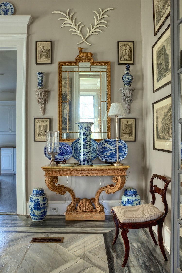
Furlow Gatewood wall decor vignette in Cuthbert House in Americus, GA
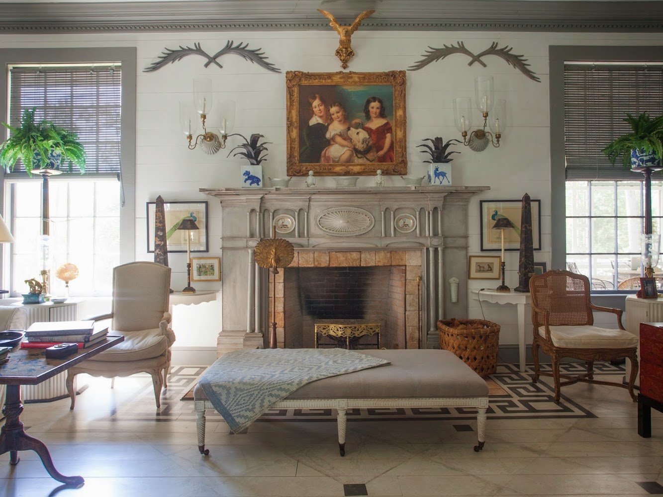
Another example of beautiful wall decor in Peacock House, created by Furlow Gatewood.
I read Terri’s comment that mentioned the company you found on Etsy, Heartwood Carvings, can do a custom size. You should have them make them and then sell them on your website.
But, anyway, this leads me to wonder this: How do I know what size palm frond, or for that matter, anything, to get for my wall decor?

You said the Heartwood wooden carved palm fronds are too small and that Furlow’s Peacock House fronds are about 42”-48″ wide. How do you know that by looking?
However, my thought is as follows: As there are rules for furniture planning and placement, I’m assuming there must be rules for wall decor.
What I’m curious about are what are the wall decor rules for:
- What to use so it doesn’t look dumb. I don’t want wall decor that shouts out Granny Bleak! (I adore that “granny decor mistakes” post!)
- How can I figure out what sizes I’ll need for the various items?
- What should the placement of items be related to the wall and each other?
Oh, and maybe some common mistakes people make when they decorate their walls might be helpful.
Wall art hanging rules and mistakes can be found here.
Since wall decoration is so “in your face,” it’s pretty important.
I hope you’ll think so too, and do a blog post sharing the info I mentioned in the bullet points.
Sincerely,
Fronda Palmer
***
Oh, Fronda. You know I have a friend in New York named Fronda, a 90-year-old ballet dancer and aerobics teacher! She’s a fantastic lady!
The topic of wall decor rules is a terrific idea, and you’re right, Fronda, it is important.
Therefore, today, I will go over some of the best tips, tricks, and rules you can use when creating wall decor vignettes.
So, let’s get started. We’ll be using the first wall decor vignette as an example to learn from.
The first thing I think is always helpful when planning our wall decor is remembering the 12-step decorating plan.
Those same techniques will work when planning our wall decor and everything else. A wall is an element of a room that should integrate with the space’s style, colors, and overall feeling.
Many of you already know that before Furlow Gatewood began building his houses, he was an antique dealer for decades. From a young age, he had honed in on his style and what he loved.
Furlow and I and many other designers loved everything classical.
Everything from that style goes together.
Of course, this doesn’t mean one has to do their wall decor in this same style. However, these elements always look great together.
What are the elements of classical wall decor?
- Well, anything related to classical architecture and furnishings of the late 18th c. early 19th c. classical period.
This includes the furniture of Thomas Chippendale, Robert Adam, and other classical architects and furniture makers of the period. - Art prints or paintings of the period are fantastic.
- Architectural and decorative brackets
- Wall sconces, either electric or candle
- Classically inspired mirrors
- Blue and white Chinoiserie porcelain (but all Chinoiserie porcelain is classical)
- Wall sculpture with beautifully rendered classical motifs such as palm fronds, laurel wreaths, acanthus, etc.
However, please beware of the exceedingly tacky metal wall sculptures in the marketplace in the form of “granny tacky.”
For Example:
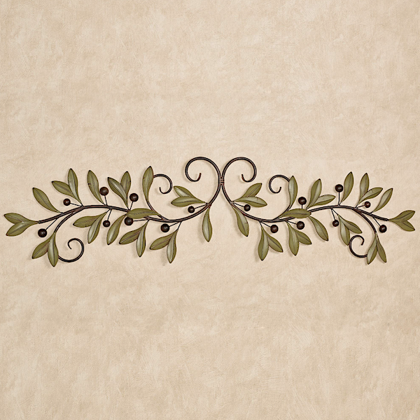
There’s this piece of drek wall sculpture from TOC. (Touch of Crass)
Let’s compare this to the image below, which would be lovely for a wall decor vignette.
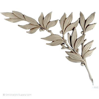 But, even something like this lovely laurel branch from Decorator’s Supply can look a tad precious in a wall decor vignette. I did post some lovely carved wall decor pieces in Sunday’s post.
In addition, Furlow has some items from the Rococo Period (Louis XVth) preceding the neo-classical period. (Louis XVI). One example is the exquisite console in the wall decor vignette.
Laurel, I noticed that Furlow never seems to have any huge expanses of wall.
That’s true. There are a few, but not a lot. However, if you have a long living room or hall wall, please go here for some ideas.
Today, we will look at one of the most recognizable vignettes in Cuthbert House to use as our learning example.
Um, Laurel. Cuthbert House has 16-foot ceilings.
Yes, yes; that’s what it said in Veranda. However, please understand that much of what you read in magazines is false. It’s not intended to be that way; it just is. I would bet $100 that Cuthbert’s ceilings are not 16 feet. My ceiling height is 13’-6”, and they are bloody tall. Furlow’s can’t be 2.5 feet higher than mine.
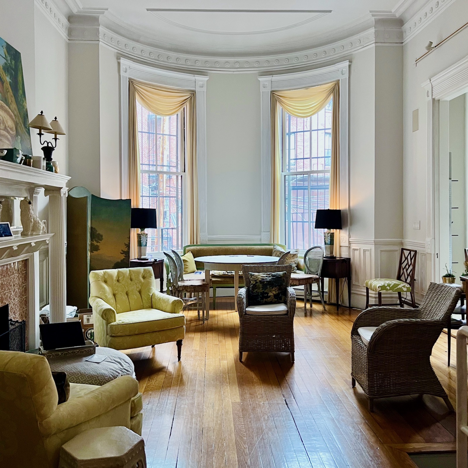
My Boston living room last year after I brought up the wicker chairs for company.
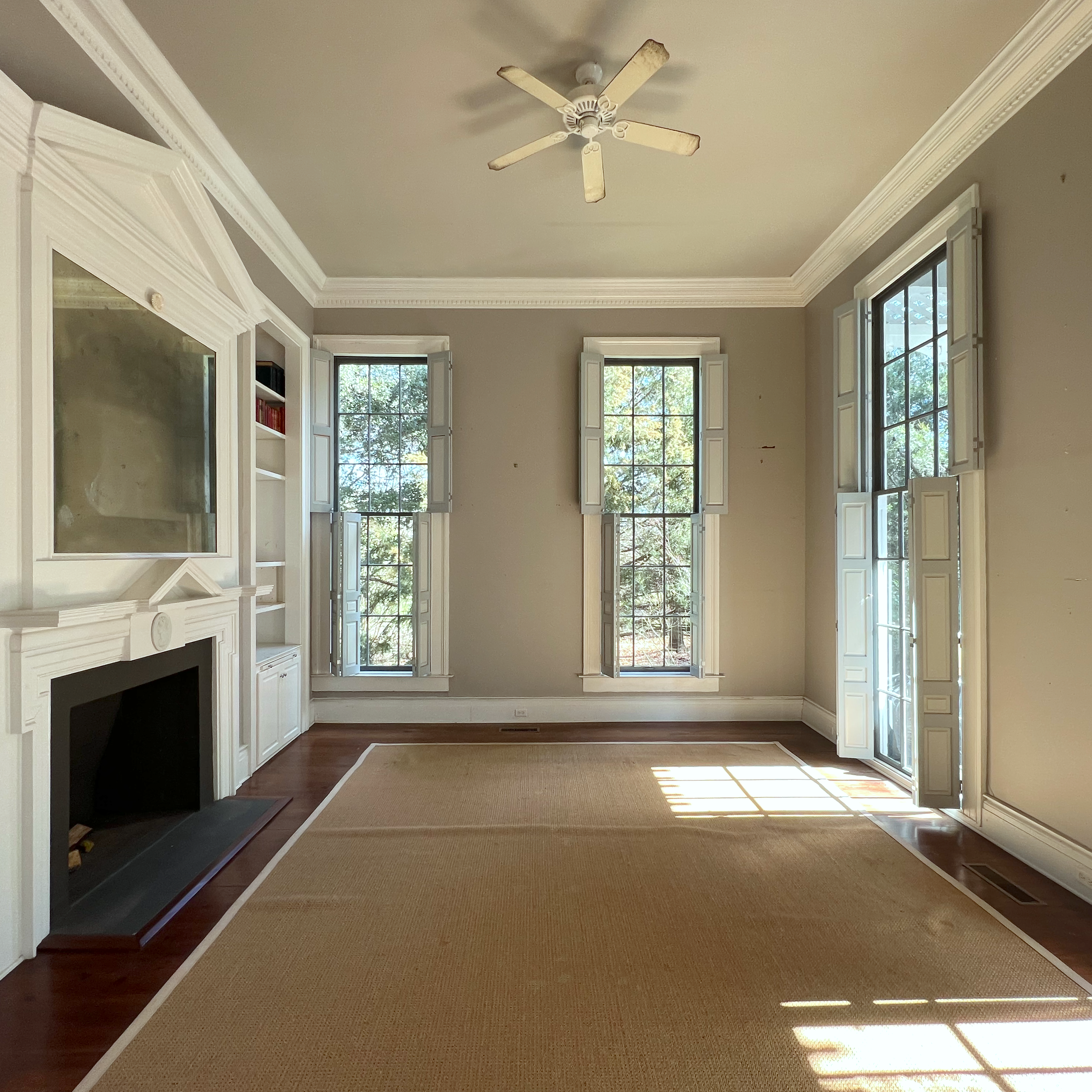
How do I know they aren’t 16 feet? Experience is part of it. But, you can see there’s no way these ceilings are 2.5 feet taller than mine. Those window panes would be over two feet high, and I know they are not that tall. They are about 20″ tall.
However, what I do when I want to know a measurement, but cannot physically measure something is find anything in the image, ideally on the wall, in this case, where I do know the measurement for sure.
So, we know that electric plates are 2.75″ wide. From there, I can calculate the baseboards are about 10″high. And, to the bottom of the window sill is one foot.
Then I manipulated this image so that one-foot area equals 3/8”. It could be half an inch or a quarter of an inch, but today 3/8″ worked nicely for me. This way, I could verify that to the top of the crown moulding is 14 feet.
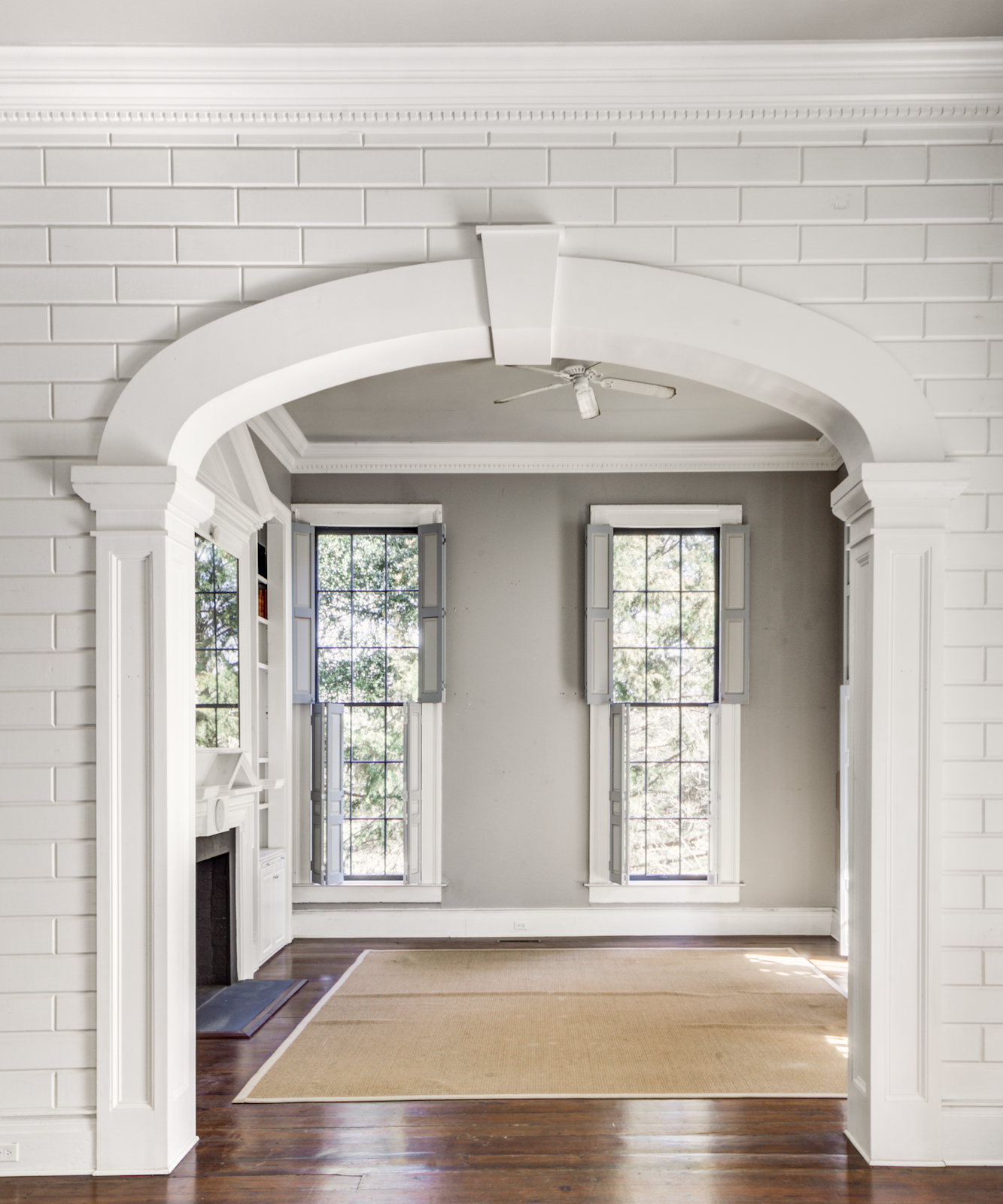
Still, I wanted to be even more certain, so I looked at the beautiful center hall. I believe these blocks were custom-made. And, I am pretty sure they are about 6″ tall with the mortar. Adding them all up, including the baseboard, I come up with the equivalent of 28 blocks. 28 x 6″ is 168″, which is 14 feet.
Still, that’s a seriously high ceiling that probably less than 1% of readers live with.
Wait, what am I saying? That is not true because many of you have monstrously high ceilings, like 17 feet high, in the form of the ubiquitous two-story “great room.” I hope this post will give you some good ideas.
Alright. Let’s look again at the famous vignette with the antler fronds, lol; I’ll call them.
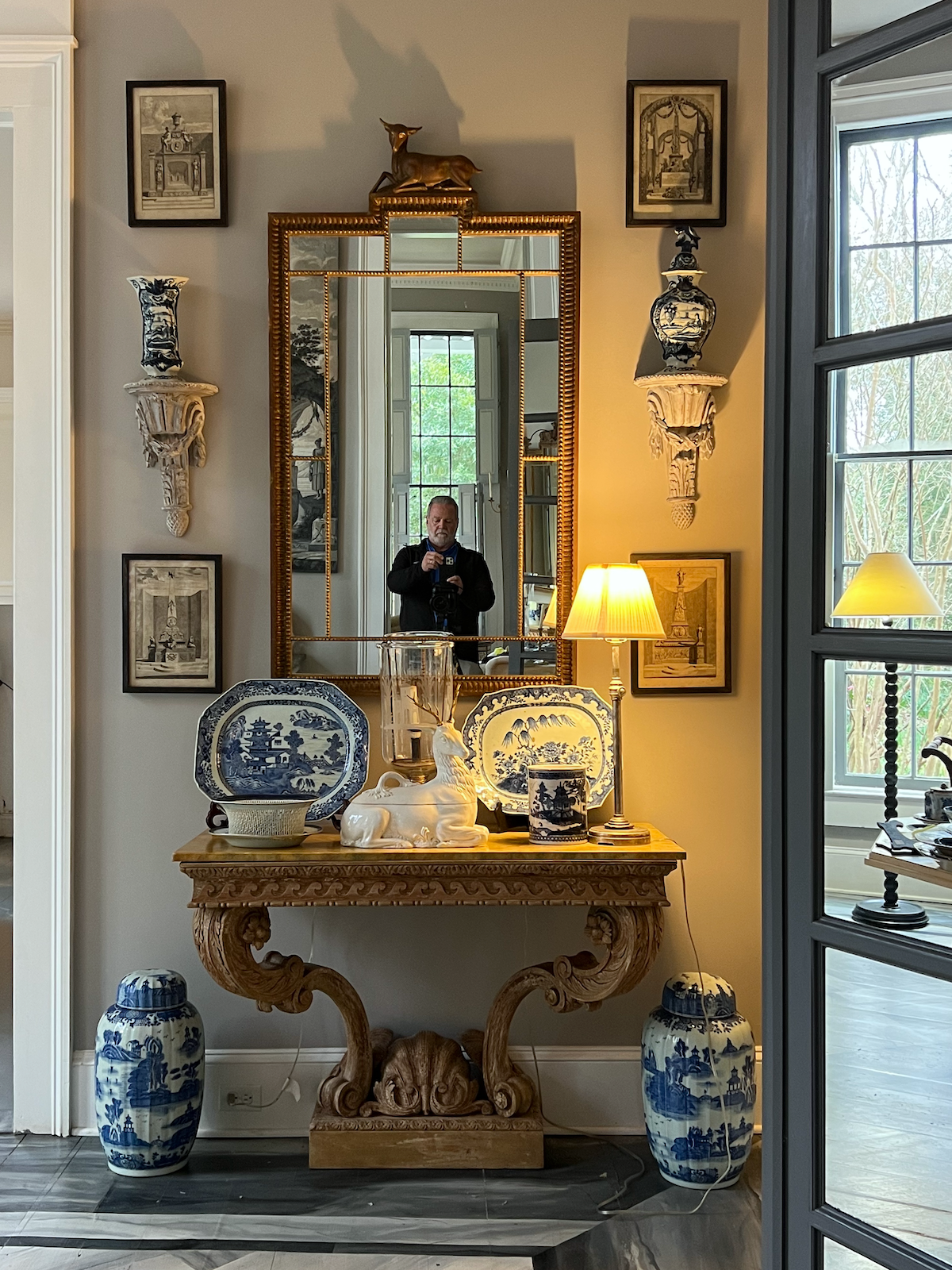
There’s Rod Collins, the photographer of these beautiful images, in the mirror.
But wait, just a red hot minute. The fabulous antler palm fronds are gone! I looked at other images taken after Furlow passed, and those fronds were gone too! Maybe they have been willed to some lucky person.

Anyway, here is the entire vignette. There are some slight differences.
Laurel, Cuthbert House has 16-foot ceilings.
Were you napping just now? We just went over that, perhaps a little too much.
But, Laurel…
Yes?
You can’t compare an eight-foot ceiling to Cuthbert’s 14-foot ceiling. It’s still nearly double the height!
Yes, you’re right. Maybe it won’t work. But, let’s try to have some faith, okay?
Let’s continue.
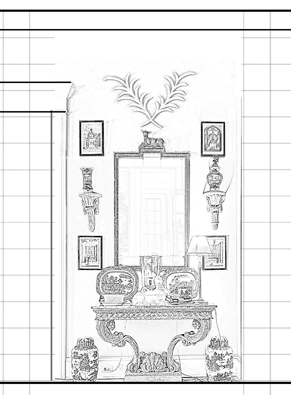
I turned Furlow’s wall decor vignette into a line drawing with a grid behind it so I know how big everything actually is, by the way. The 14′ ceiling height does correspond to the sizes of the furnishings.
Now, for the fun part.
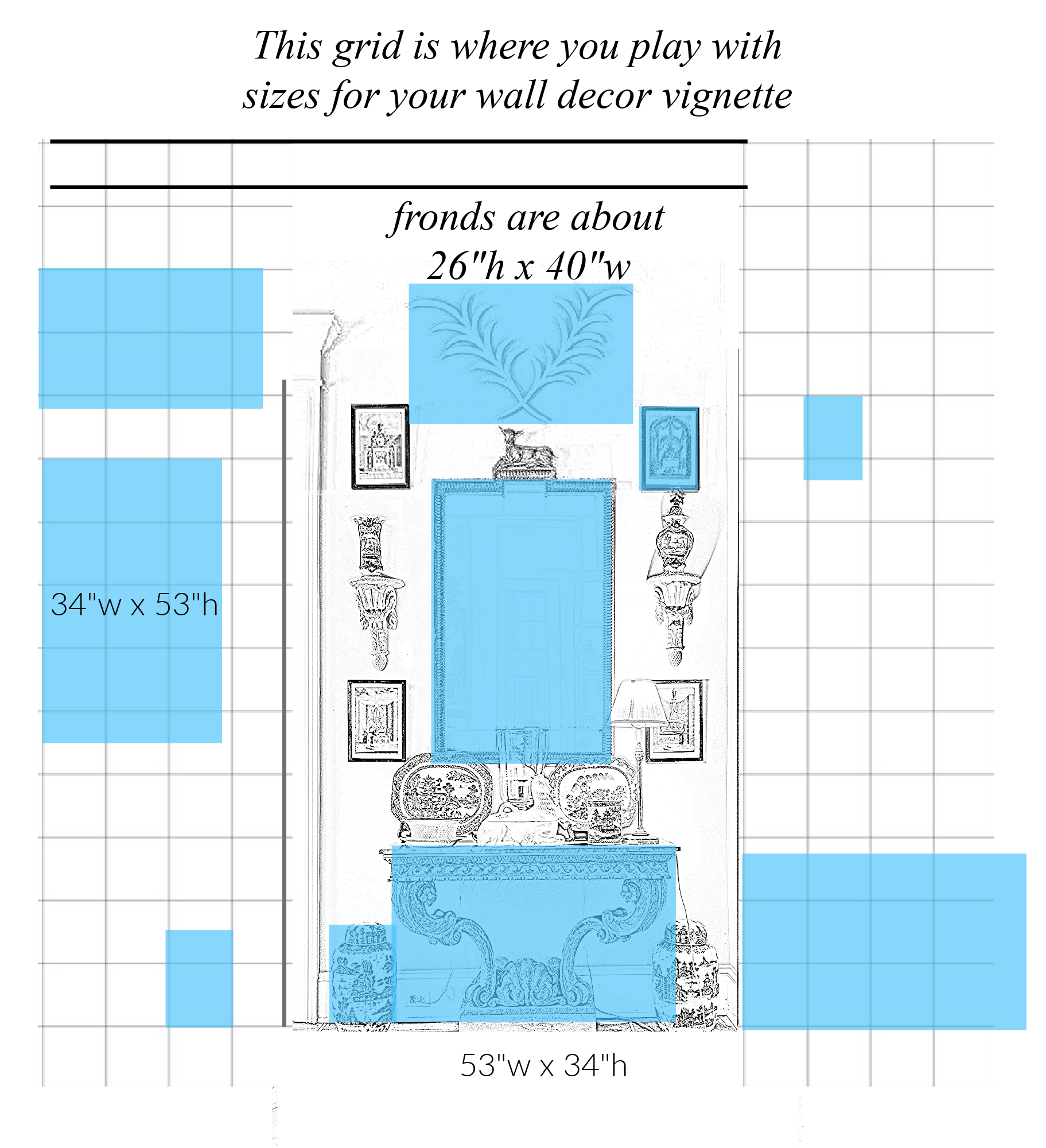
For clarity’s sake. I took a translucent box over each element, duplicated it, and measured it with the grid.
I love that the table and the mirror are about the same size, just reversed measurements.
If you were to copy Furlow’s fronds exactly, you would need them to be approximately 26″ x 40″.
Here’s where most people are going to mess up. They will put something up that’s like 10″ x 15″. That’s too small.
How much room between elements?
Here’s where it gets more complicated. The bracket on the right looks higher, doesn’t it? Usually, no matter what, there should be a couple of inches minimum between elements. I don’t mean on the table but on the wall. I prefer 3″ – 4″, but on a large wall like this, 6″ is fine.
However, this is why planning out the wall decor is so helpful before you even buy anything.
It’s okay if you do already have elements you wish to incorporate. However, putting them down on paper and making a scale drawing will save you time and frustration. Plus, you won’t make a lot of unnecessary holes in your wall.
You can also do the real-life model where you cut out pieces of contrasting paper (like a paper bag) and tape those to the wall. However, that would not be easy on a ginormous wall like this one. The scale mock-up works just as well.
I also went ahead with further analysis to see why Furlow’s design is so pleasing.
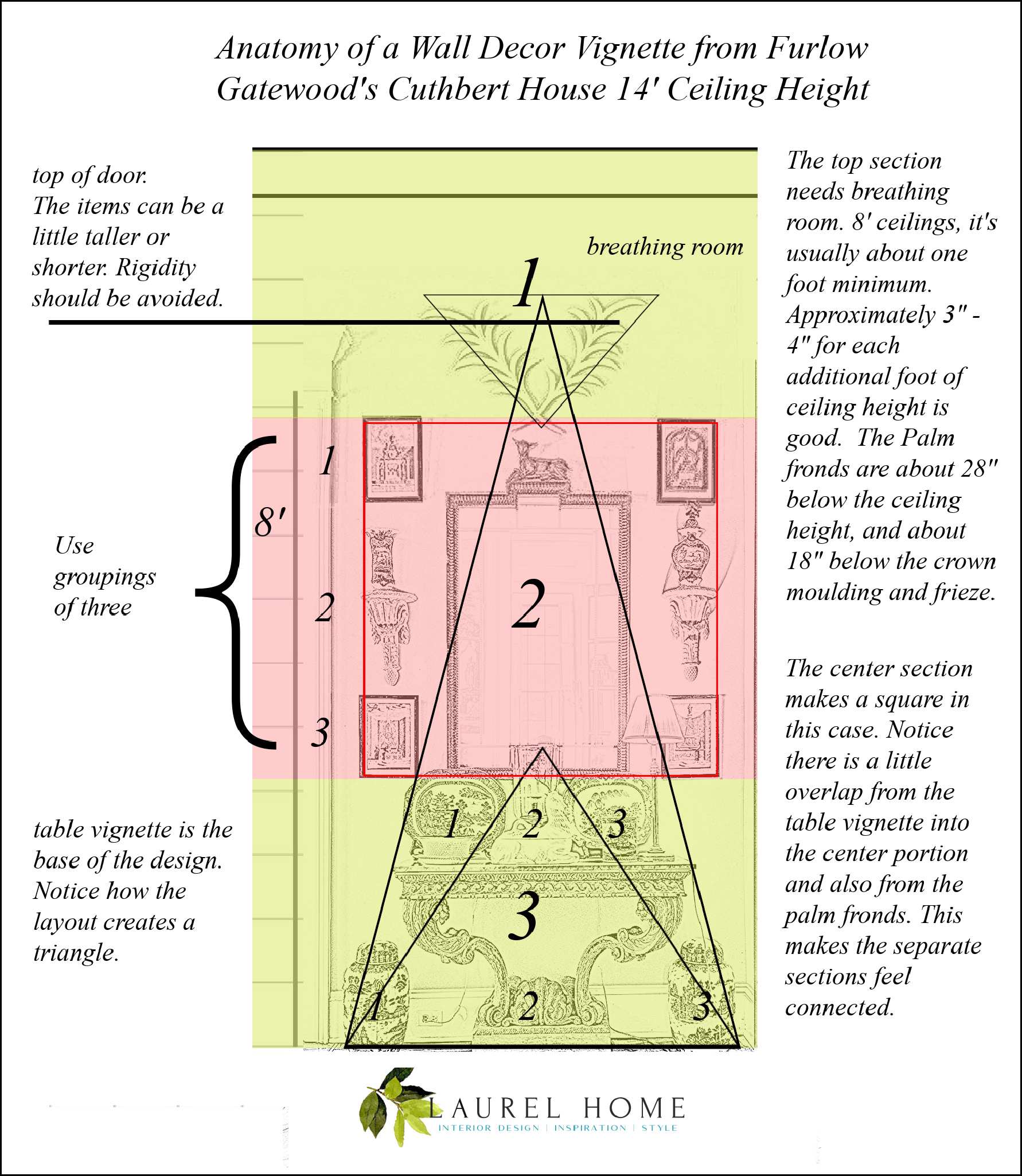
I divided the main sections into contrasting colors and discovered that the bottom and top are about the same size. The middle section items create a square.
Did someone do this intentionally? Well, I don’t know. However, Furlow’s eye was so incredible he probably did it without even thinking about it. Everything looks so natural.
By always thinking in threes, you can’t go wrong.
In addition to threes and the obvious symmetry, there is a great example of visual tension in breaking the symmetry on the tabletop. This is necessary because it would soon become tiresome if we had perfect pairs on each side.
Notice how the fronds on top and the hurricane on the tabletop overlap into the center section. This gives a flow to the entire vignette, keeping it from being too rigid.
I marked where the 8′ spot would be.
Hehehehe, Laurel, I told you, you wouldn’t be able to do it. There is no way this can translate to an eight-foot wall.
Are you sure about that?
What if I told you I did create Furlow’s vignette without crowding or using nursery school furniture?
I’ll believe it when I see it.
Okay, are you ready?
Here it is!
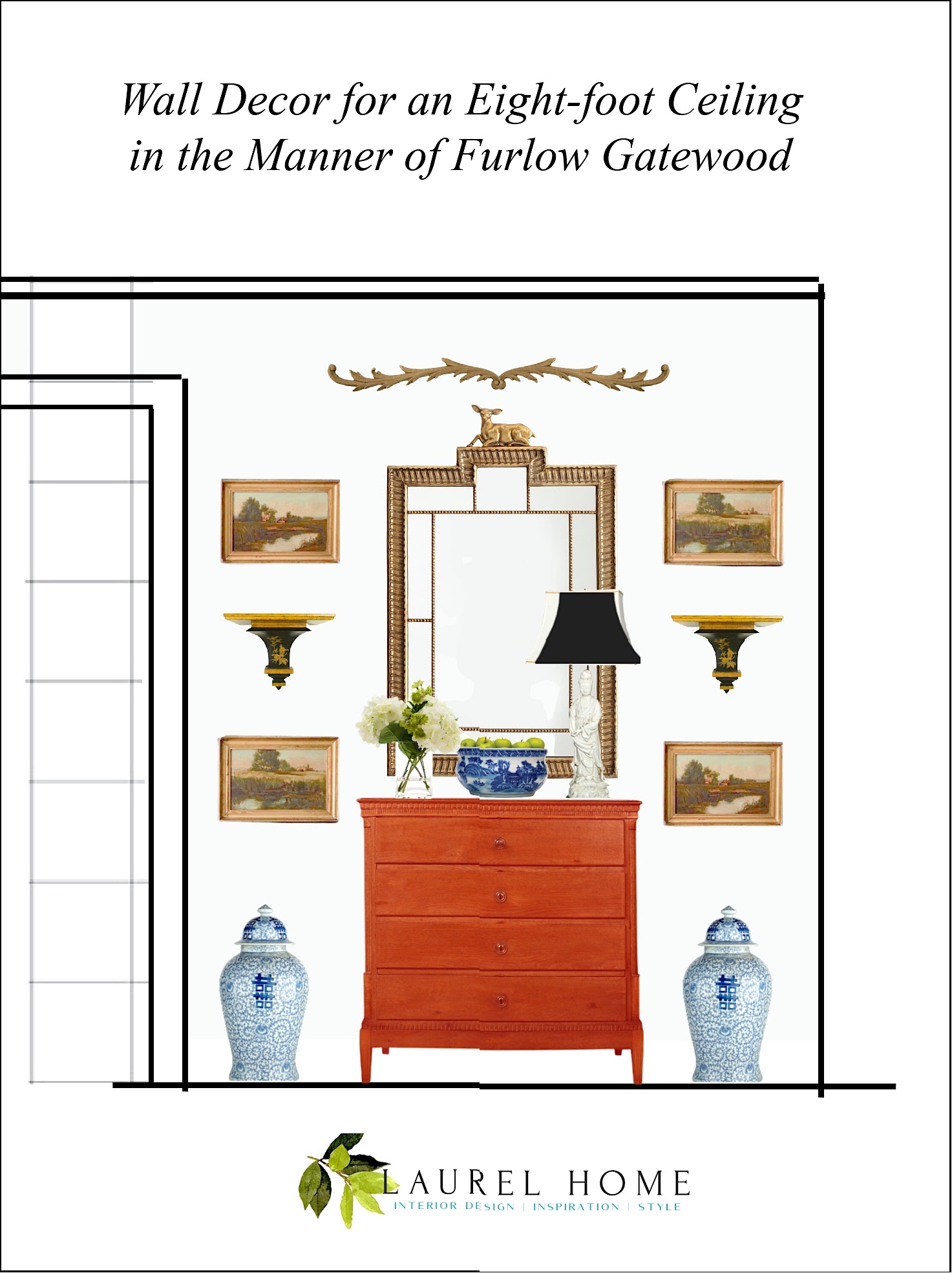
I didn’t copy all of his furniture. However, the chest is Louis XVI.
Below are some of the measurements; you’ll see that these are normal-sized pieces.
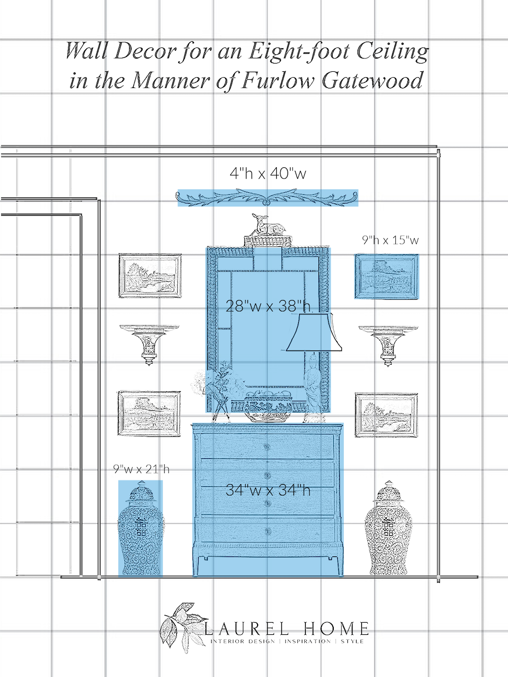
Actually, those ginger jars, on closer inspection, look to be 10″ wide. But, you get the idea.
Laurel, how wide is the wall?
It’s 6′-3″, just like my darling son, Cale, who just landed in the middle of Kentucky for a three-month work-study-mentorship for timber framing. Yes, he wants to be a builder. Isn’t that cool?
Okay, let’s summarize. I believe I answered the questions Fronda had in her bullet points.
- So that your wall decor doesn’t look dumb or kitschy, look to the masters for ideas.
Gosh, guys. That’s what Furlow did. He did not make all of this up. He just did it better than everyone else. It has all already been done, but not in such a fresh, natural way.
- For sizing, you need to get some graph paper and a pencil, or you can play on Pickmonkey like I love to do.
- Spacing looks good to your eye, but I usually like at least 2″ – 4″ between most elements.
Again, the rules have a little leeway.
Okay, I played around some more, and one last image.
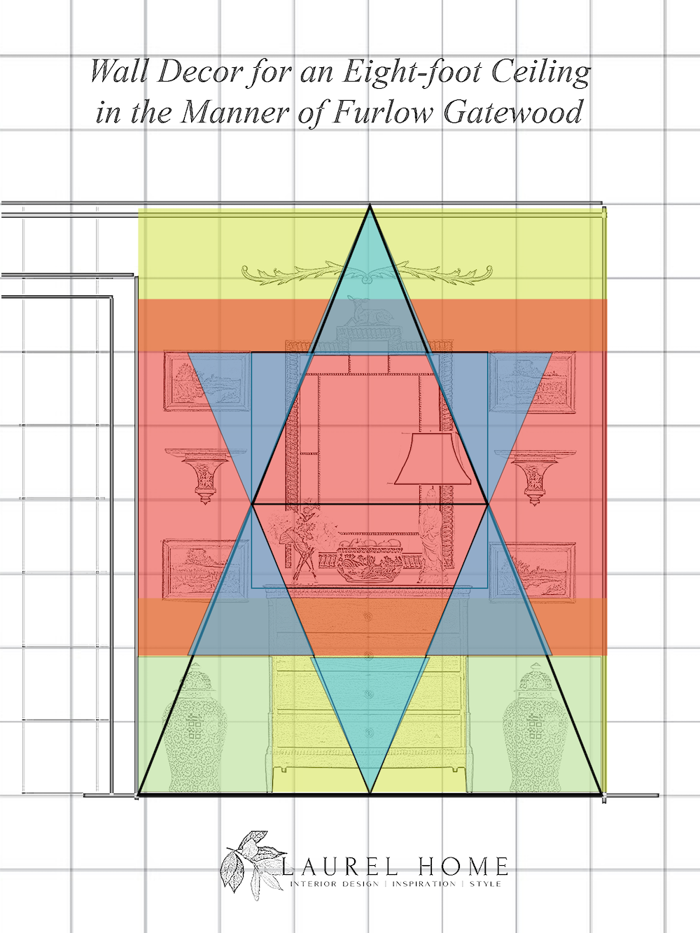
Look at that geometry! I created the three main horizontal areas.
The orange stripes overlap between the chartreuse and the prints’ top and bottom. And then, look how naturally the triangles fit in to create a six-pointed star. I’ve never done this before, and I’ve never seen anyone else do it. However, it makes so much sense.
Laurel, could you do this with walls that are a different size?
Yes! Absolutely.

I recommend getting Furlow’s book if you don’t already have it. You can find it here.
You can also learn a lot going through Rod Collins’ Smugmug. And that’s free. However, he has dozens of folders, and you can’t always tell what you’ll find on the inside by the outside. Still, it’s an incredible gift Rod has given to the world.
I hope you enjoyed this post and got more clarity when creating beautiful wall decor vignettes.
xo,

PS: Please check out the newly updated HOT SALES
Also, Mother’s Day is coming soon. The Gifts for women has been updated. You’ll find it on the same page as the outdoor furnishings, but you’ll need to scroll down.
***Are you planning on doing some shopping on Amazon some time soon?
All you need to do is click the link above and forget about it if you’re not ready to shop this minute.
Or, you can click the graphic below before you do your shopping. I will earn a small commission at no extra expense for any orders you make within 24 hours of that click. I very much appreciate your support of this website.
Related Posts
 The Secret For Getting Cohesive Room Colors
 How To Build A Unified Interior Color Palette
 9 Little-Known Paint Colors Decorators Are Obsessed With
 16 Best Wall Colors to Go With Stained Wood Trim
 Is It Classic Furniture or Something I’ll Grow To Hate?
 The 21 Funniest Laurel Home Blog Posts
 Chinoiserie Decor – What Is It? & Why You Need It


