Hey Guys,
This is a continuation of our exploration of:
- a modest starter home
- One story homes
- 50’s-60’s ranch homes (or split-levels) or even boring two-story homes
- boring builder’s homes
- homes with ceilings 8 feet and under
The last post focused on homes with low ceilings. I showed an antique home with seven-foot ceilings that I designed 16 years ago!
I want to show you something a wonderful reader sent me a few months ago.
She sent me her starter home that she purchased in her 20’s in 1979.
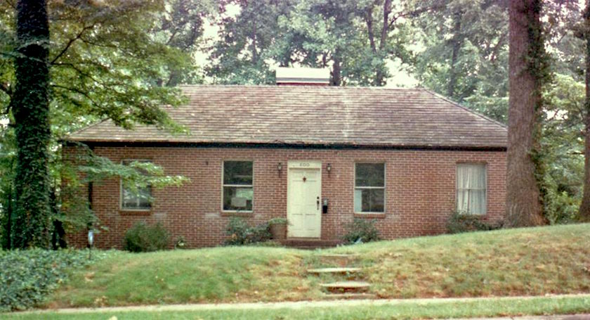
She said that she only went in because at the time, she was a realtor and needed to use the john. Once in side, she fell in love with the square-ish rooms and high ceilings. And she realized the immense potential.
Fast forward 29 years later when she and her husband put their starter home on the market.
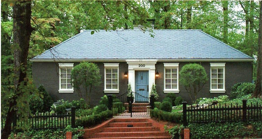
I’ll give you a sec to pick yourself up off the floor. I know, because I ended up there too!
From the plainest-jane starter home ever to curb appeal for days and days! I wouldn’t change a thing!
Sorry, we don’t know the paint color, but here are some other wonderful exterior paint colors.
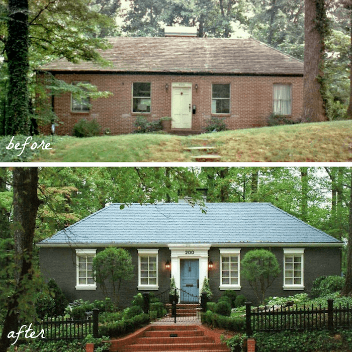
A graphic if you’d like to save to pinterest
I have to get something off my chest.
A lot of you are afraid to make changes for fear that they will look silly. And that is a realistic fear. There is so much in the marketplace that is misleading.
This is one of my worst.
The so-called “Traditional” Front Door.
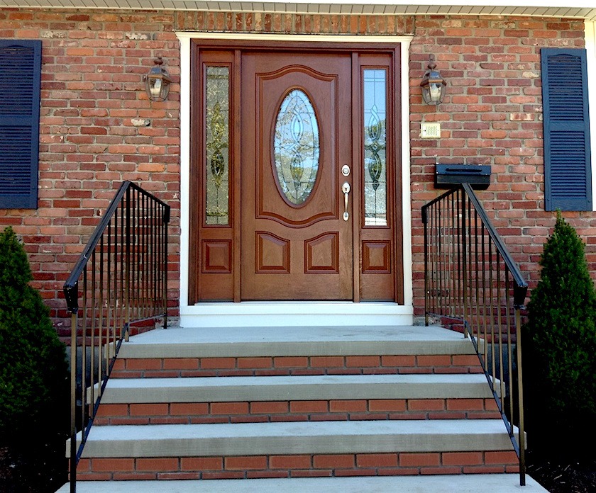
There is nothing about these doors that is historically accurate. They are imitation, faux, ersatz, fake “leaded glass.”
This is not an upgrade and these doors are definitely NOT traditional, modern or Victorian.
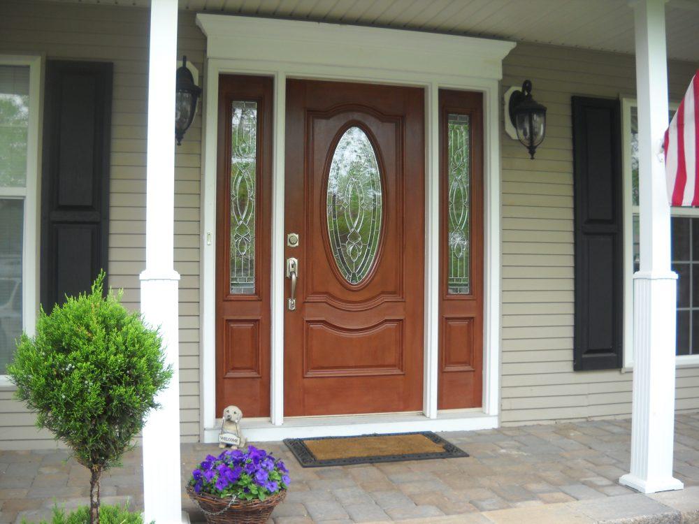
They are wrong. The oval. The curve. These do not exist anywhere in history. But we’ve been exposed to them for so long that we think that they must have existed before.
Go ahead. Prove me wrong. I have searched but I can’t find it. The curve exists in some old French pieces, but it would be wonderfully weathered and decayed and definitely not made of cherry wood!
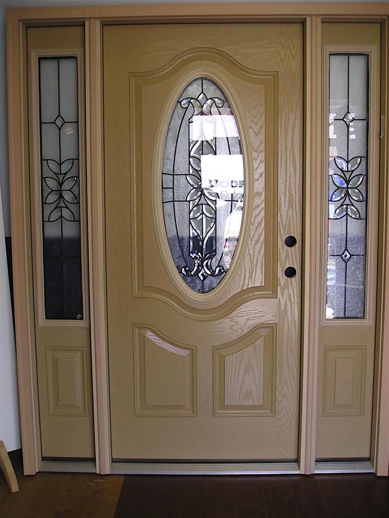
And definitely NOT fiberglass fake wood grain.
eww.
Here is my rule of thumb.
If it’s sold at Lowe’s or Home Depot and is called “classic” or “traditional” it probably isn’t.
How can you find out?
Research it.
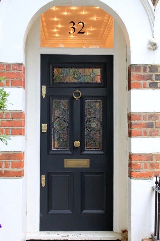
Of course. Leaded glass definitely did exist!!! But it looked like the above in Victorian or Edwardian homes. Couldn’t find the original source but it is said to be painted Farrow and Ball – Off Black.
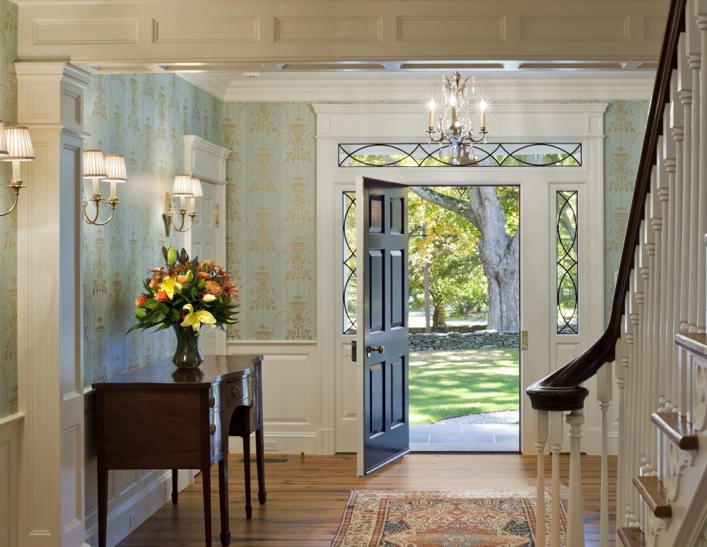
In Georgian, Colonial, Federal homes the leaded glass often took on a shape like these lovely side lights and transom.
Let’s go back to homes built primarily mid-century in the 1950s and 1960s. There are a LOT of them and some of them are in some very expensive areas. While they may look like starter homes, they may be forever homes too!
I once worked on a total piece of crap split level in Larchmont that was sold for 1.3 million dollars back in 2003!
But, did you know? I grew up (until I was 15) in a 50’s ranch home in southern Indiana.
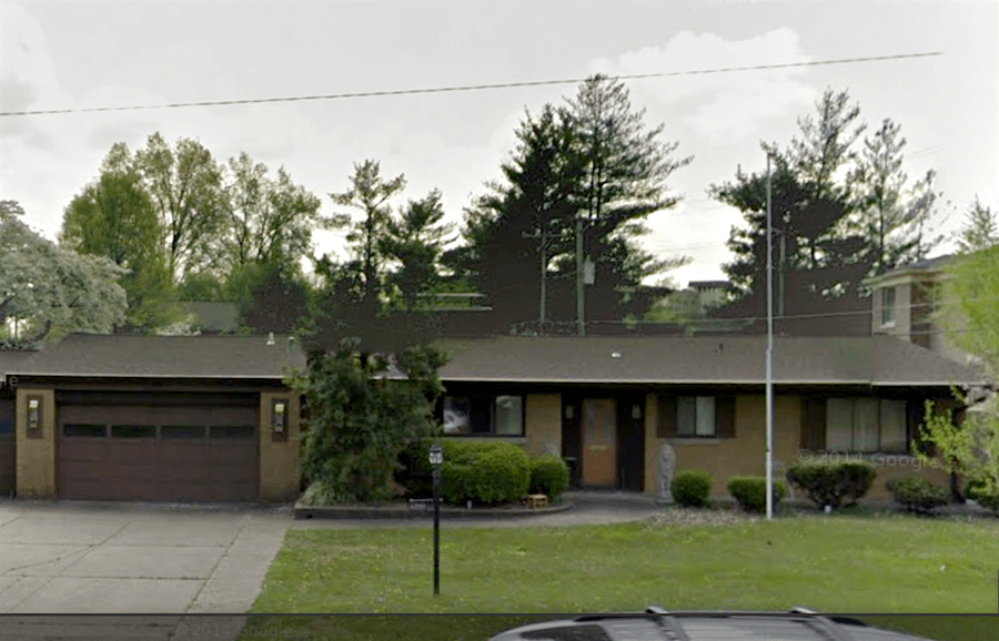 This is it. And it’s hardly changed except for the big maple tree in the front that died.
I wish I had some interior shots. But, I remember it vividly. The front is achingly typical, but the living room in the back of the home had two walls of nearly floor to ceiling windows.
Otherwise, it featured every single cliché decorative element of the era.
Raise your hand if you’ve ever lived in a home with one of these multi-colored slate floors.
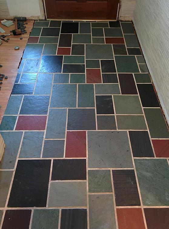
This was our floor— exactly!
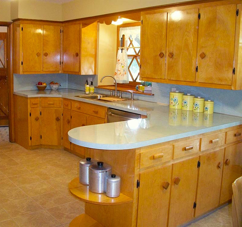
It butted up against a modest sized eat-in kitchen that featured orange-maple cabinets with a coarse grain.
Our knobs were big, flat and round.
Good God, we had those exact silver canisters!
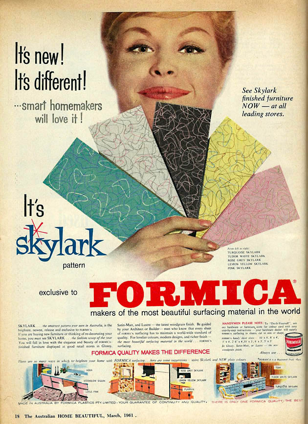
And we had the de rigueur boomerang formica counter-top in turquoise.
Below, the quintessential ranch home.
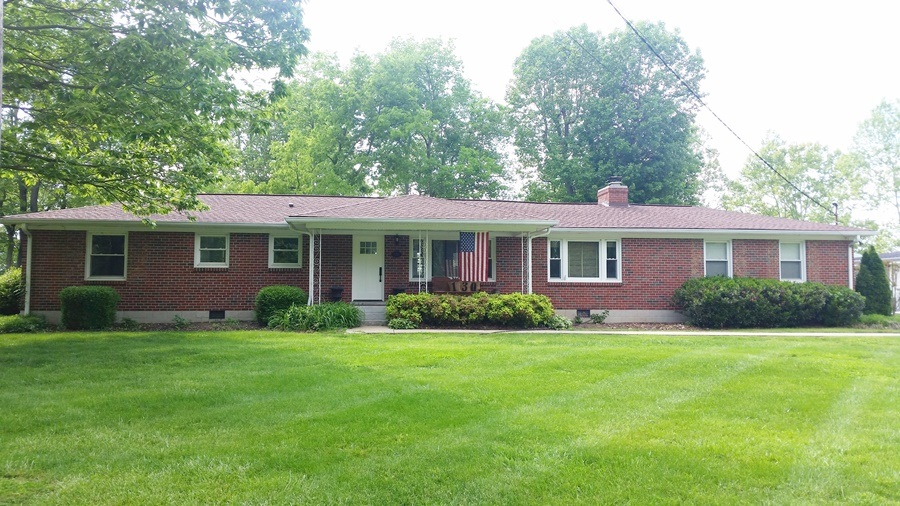
For starters, I would paint the brick and then beef up the portico. This one has a lot of potential.
But maybe your home looks like the one below.
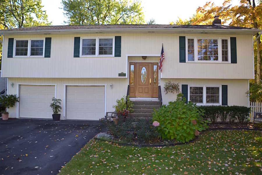 There’s “the door!”
And no worries. I will still love you if you have one of these–even if you just went to Lowes and bought it today and even if you love it. That’s all that matters. :]
If your home was built in the 1970s.
Well…
That’s an extra challenge, for sure, but please check out what fabulous interior designer Lauren Liess did with her 1970s mess. Via Hooked on Houses.
Let’s look at some typical things that need to go.
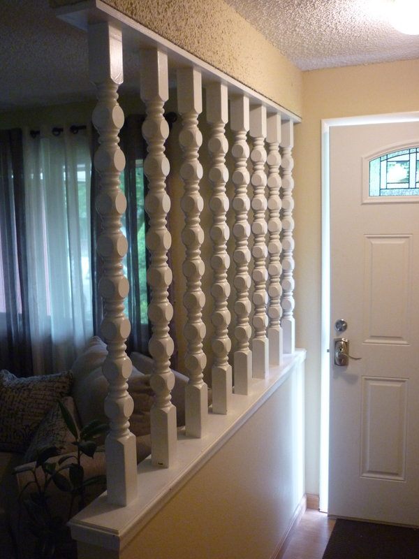
I could never figure out these weird spindle things. Usually, they are oak. Painting them white makes them go from a zero to a one. Please get rid of them!
The popcorn ceiling and walls have to go too. Options are 1/4″ sheet rock or sometimes skim-coating will work if it’s not too pronounced.
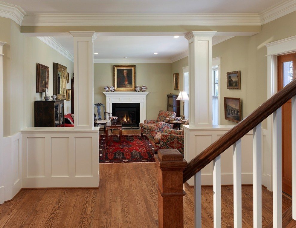
original source unknown
Instead of the weird spindle divider, I would possibly just make it a wall. Or put in a half wall with columns. Sometimes one side is a cabinet or a book-case.
OR
How about interior windows. I love this look!
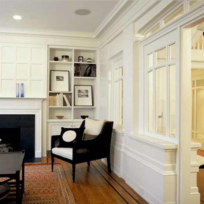
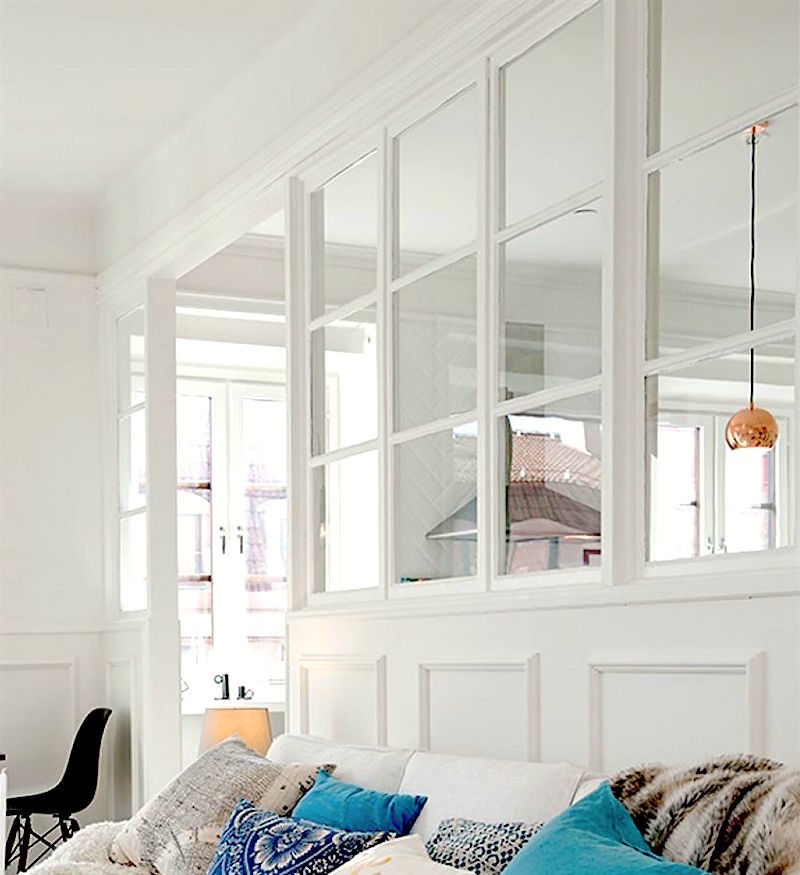
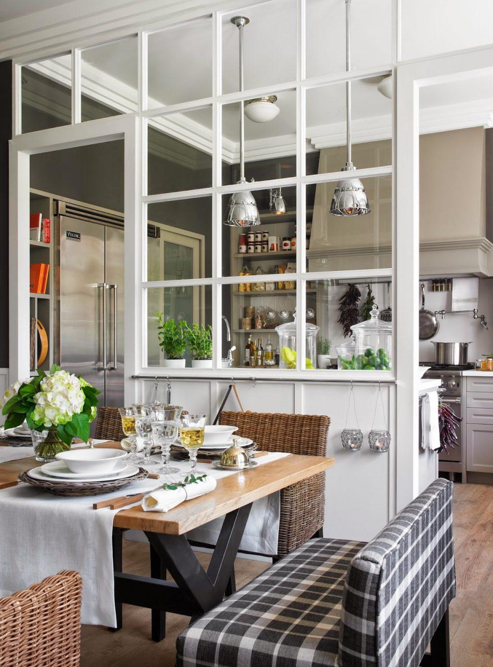
very chic!
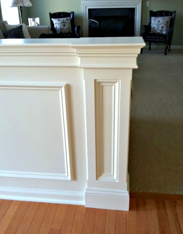
Mouldings can go everywhere that’s a flat ugly wall.
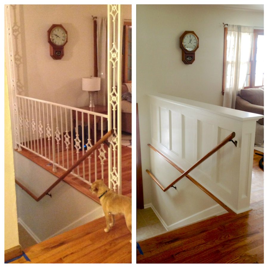
Remove dated, fussy railings and replace with a beautiful paneled railing or a wooden railing
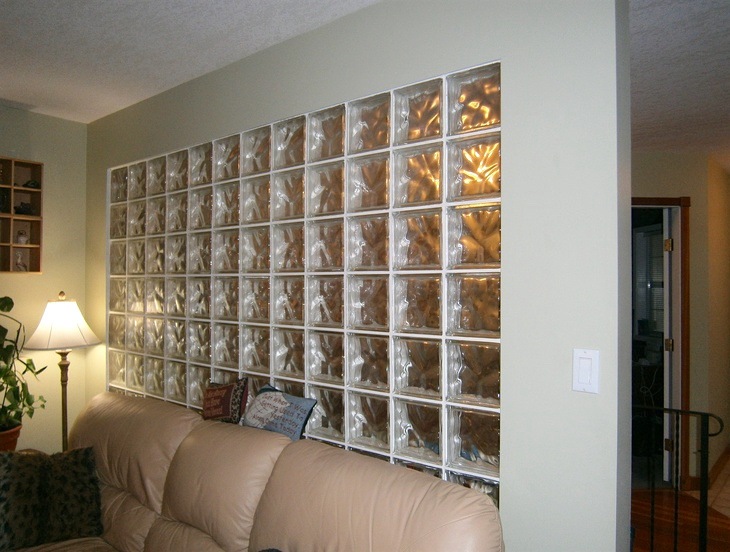
Glass block almost always needs to go. Replace with a real wall or interior windows as shown above.
Things like wall-to-wall carpeting need to go too, unless it’s something like sea-grass or it’s a bedroom or basement.
I’ve left out some stuff, I’m sure like ugly wood or pine paneling that was installed after 1950.
Paint.
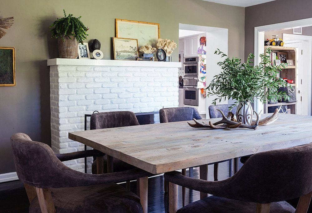
Ugly brick
Paint that too.
Tricks to make ceilings appear taller
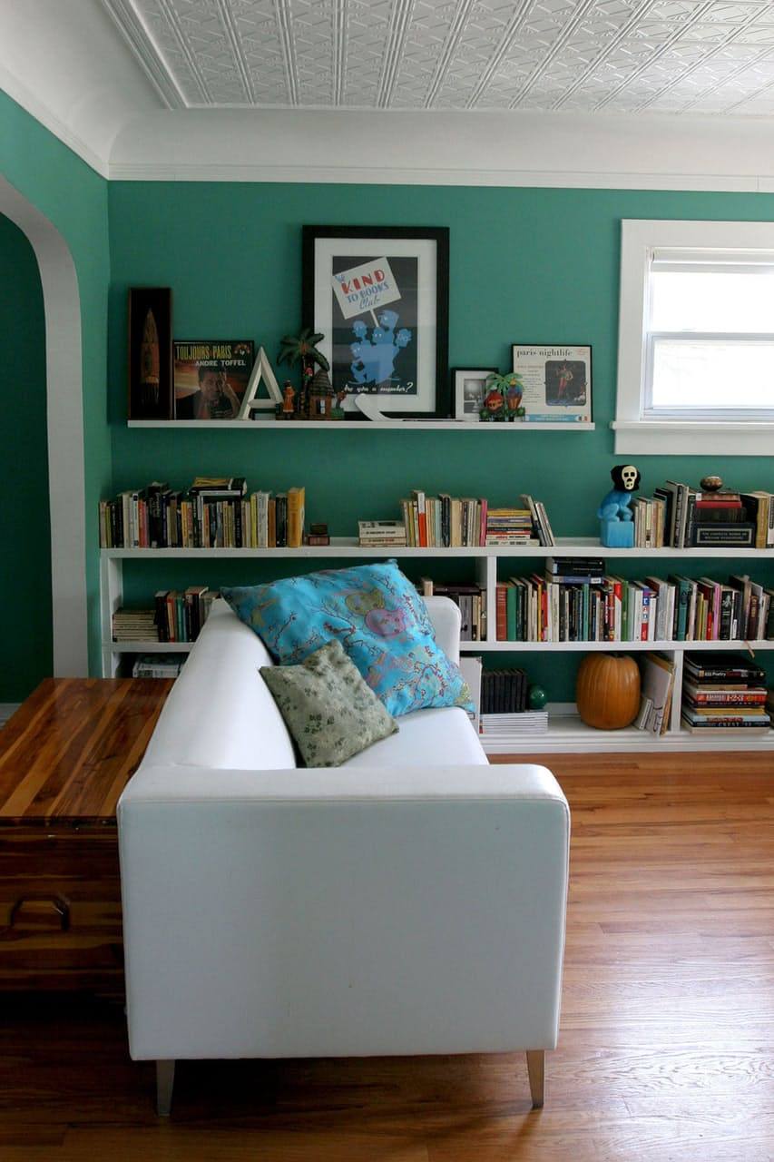
The large cove moulding is a wonderful trick for extending the height of the ceiling. If you notice, where the curve begins is actually where the ceiling begins but because of the curve, there’s an illusion of greater height.
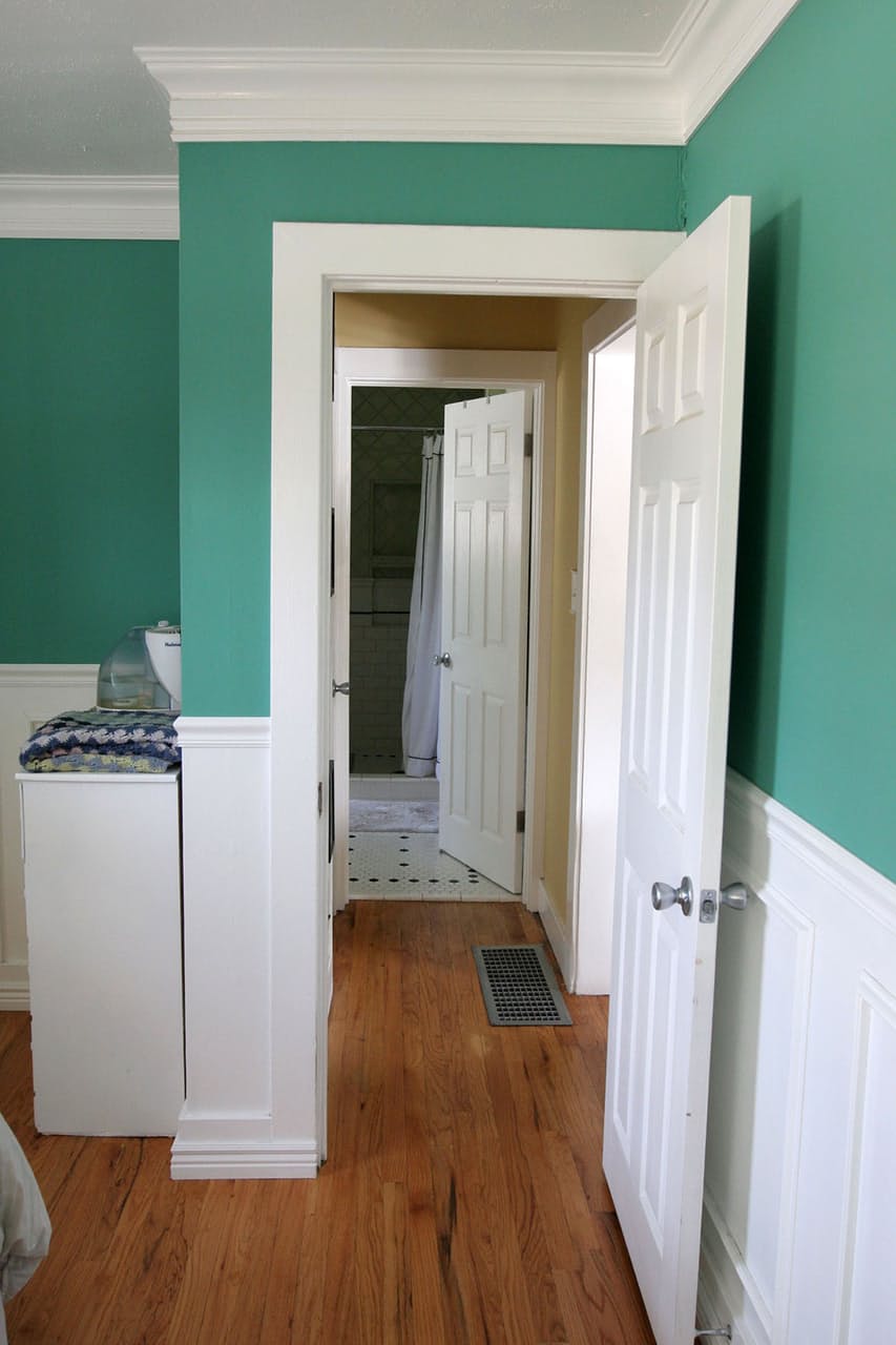
Beautiful crown moulding and wainscoting add so much to these rooms.
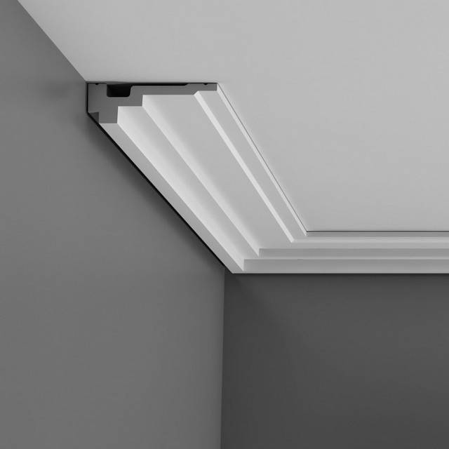
This crown moulding that extends out over the ceiling also creates the illusion of more height. This would also be a great moulding for a more contemporary look.
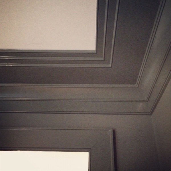
This is another way to extend the height of the ceiling.
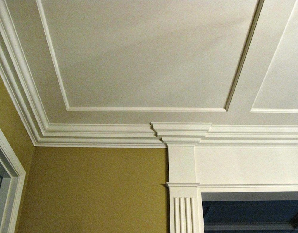
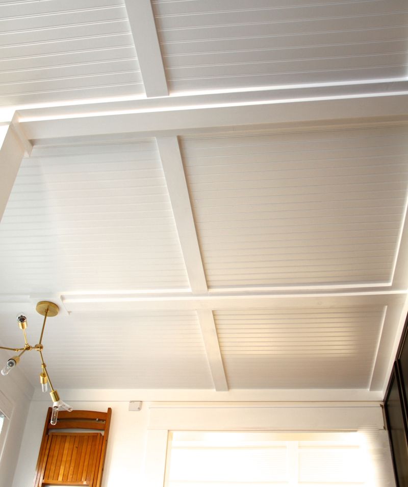
Wonderful custom-millwork. Love the shallow coffer, too. More of that coming!
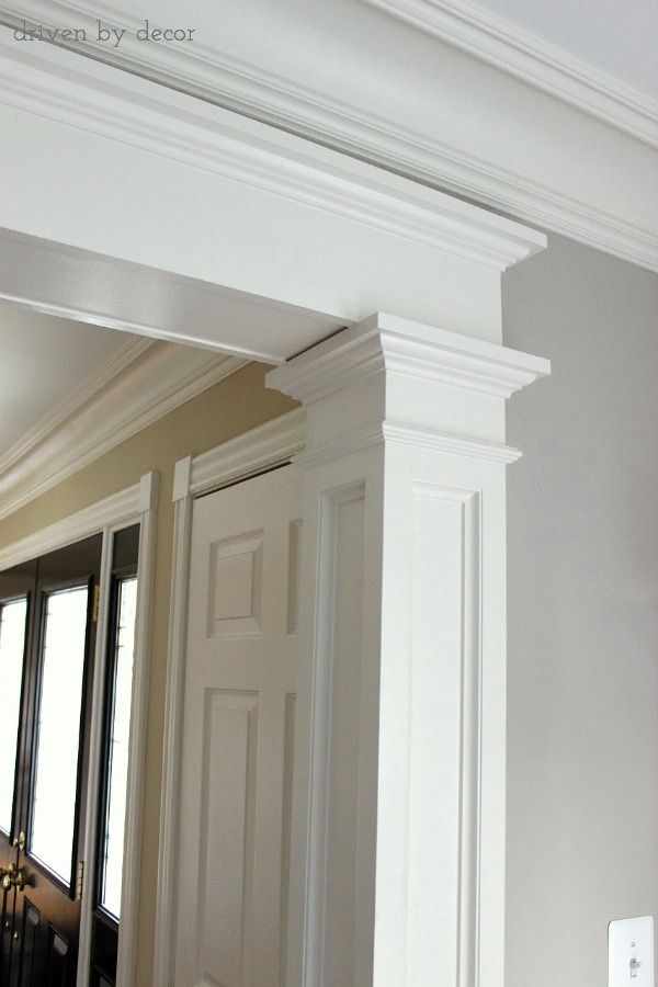
Another home with an eight-foot ceiling and beautiful architectural detailing.
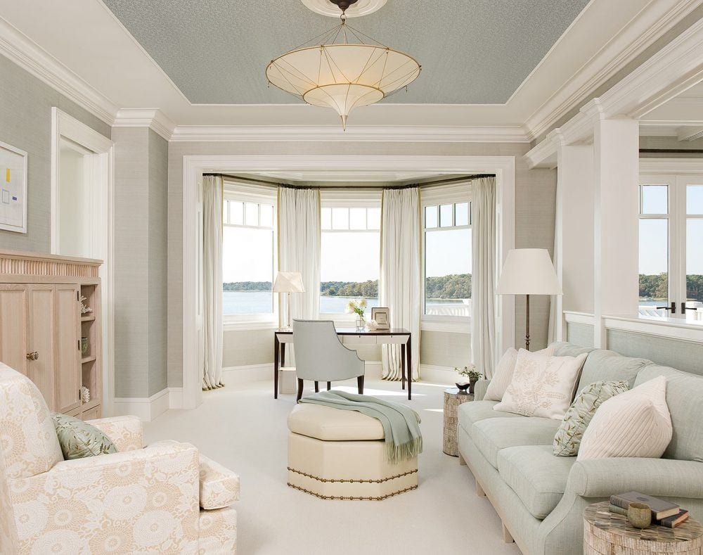
Painting a ceiling a deeper shade will make it appear to be higher.
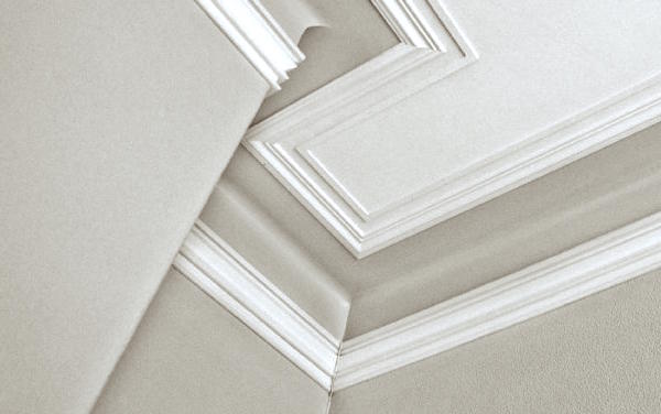
This ceiling moulding lifts the ceiling up higher than it is.
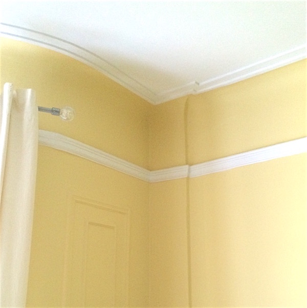
My living room with a cove ceiling and moulding applied to the ceiling.
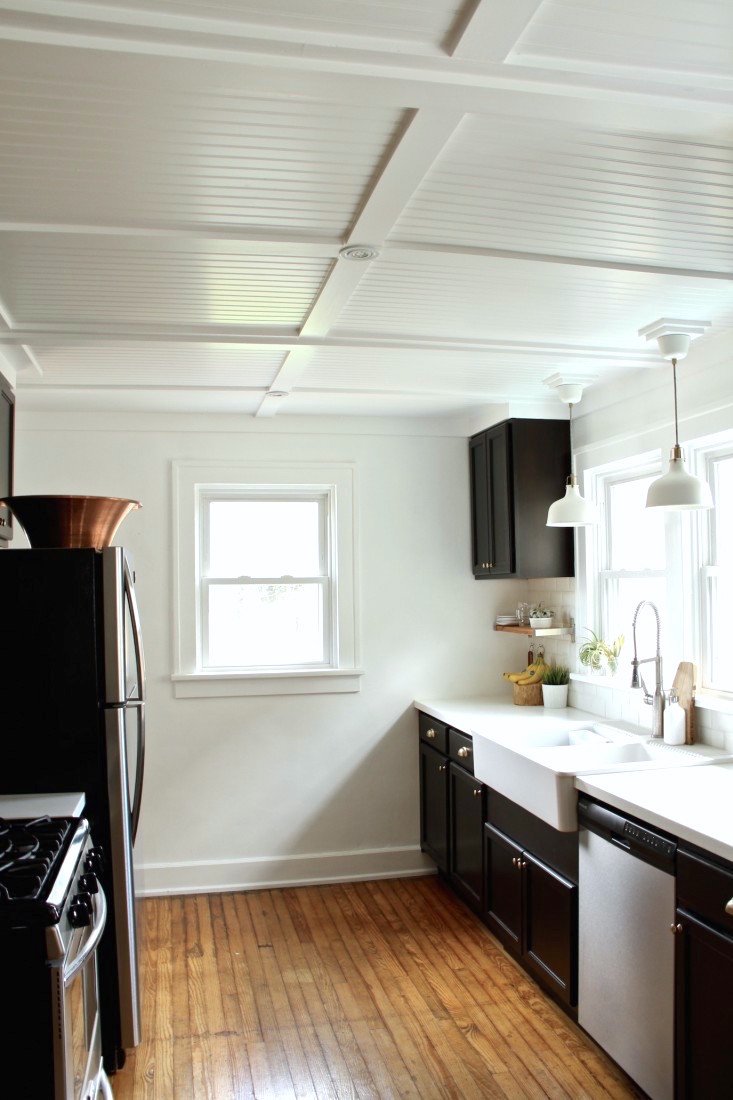
Here is another version of a shallow coffer. This one has beadboard but it could be done without, as well.
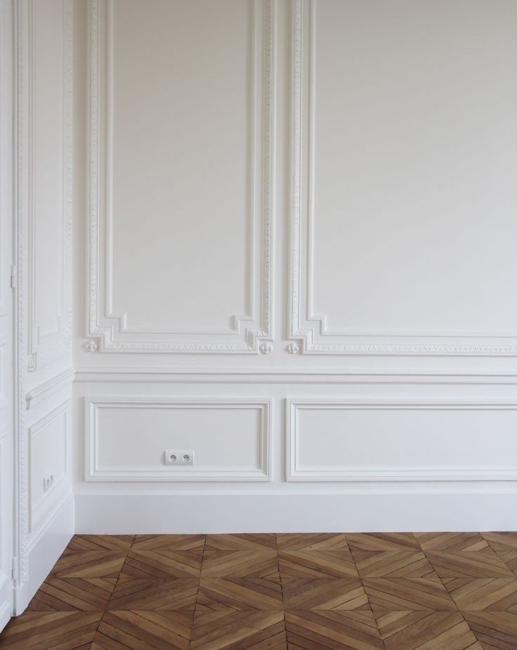
While this wainscoting is going to be too fancy for most homes, especially with a lower ceiling, what I want to point out is that for an eight foot ceiling, the chair rail should be no higher than 36″.
Do not ever cut the wall in half with a chair rail and wainscoting. Oh, I’ve seen it and it’s awful looking.
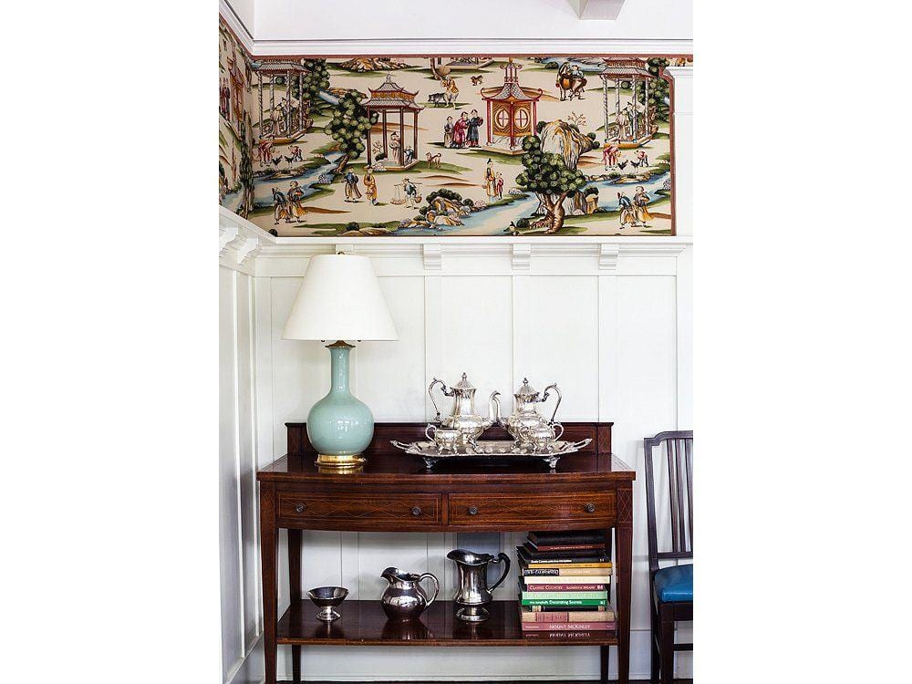
A chair rail that’s at about 66″-72″ is fine though. Love this treatment with Scalamandre wallpaper.
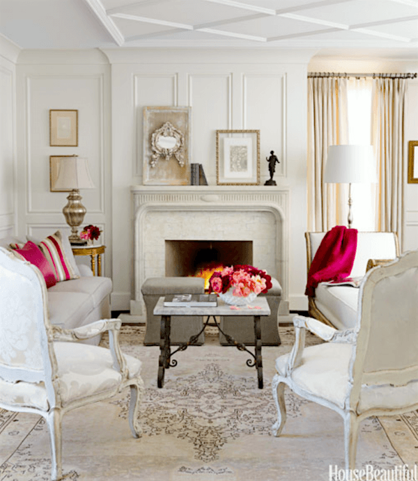
Beautiful detailing
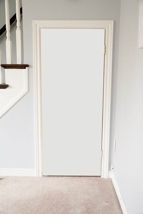
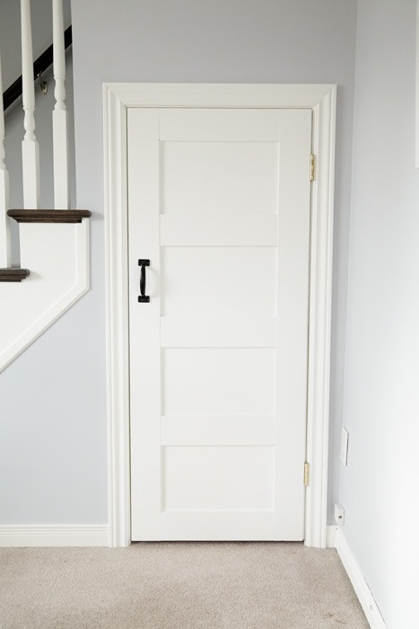
So many mid-century homes have boring flat doors. Jennifer Squires did a post that shows how she turned her flat, boring door into one of distinction.
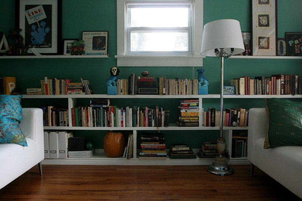
Small windows in your mid-century home? Here’s a trick that integrates the window into the composition of the wall so that it feels natural.
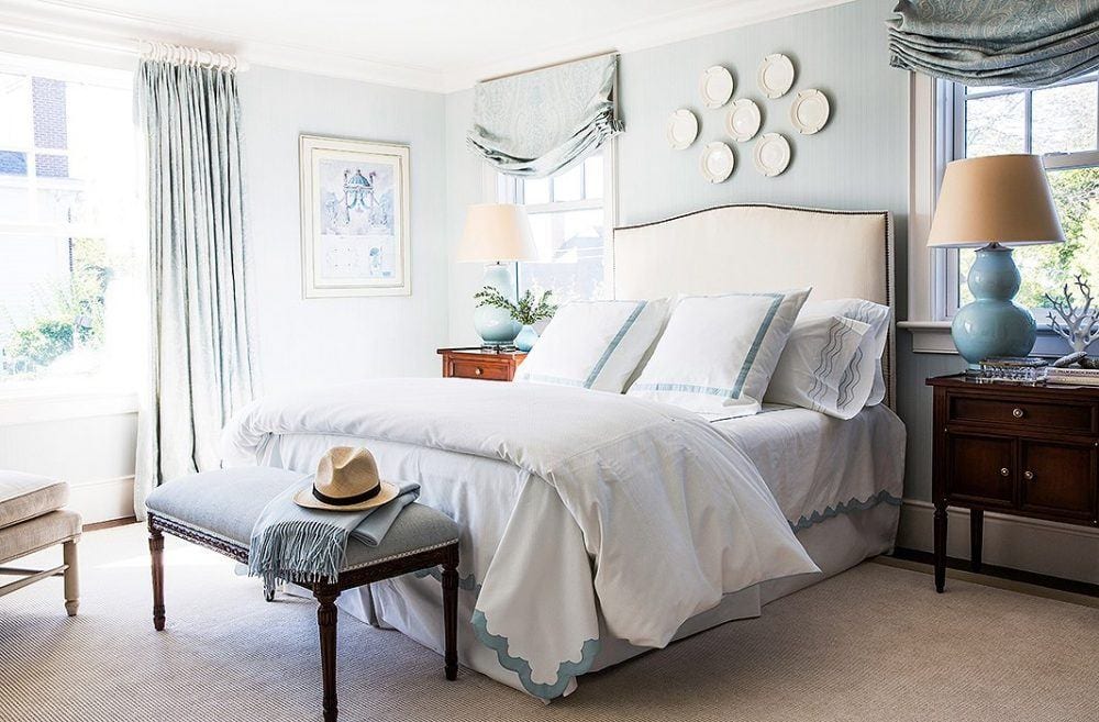
Of course, always put window treatments up as high as possible to lift the eye up.
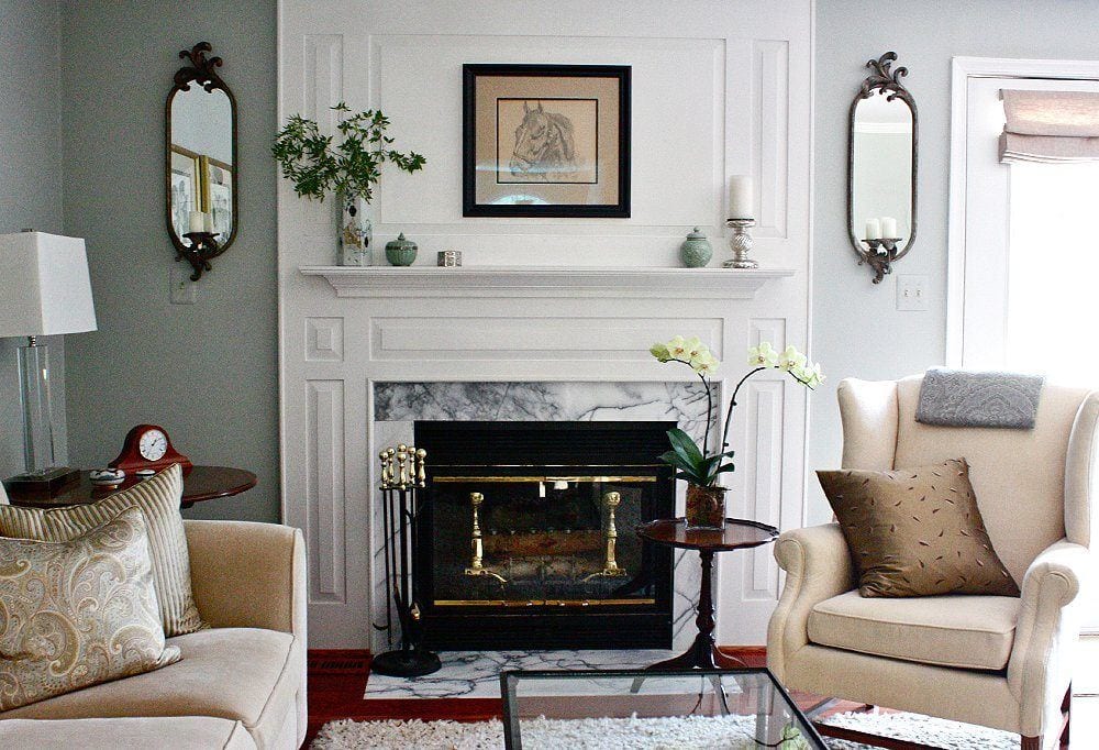
Photo by Leah Moss, Interior by Amy Strunk
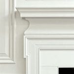
I love this beautiful panel surround for this fireplace, making it a special focal point of the room
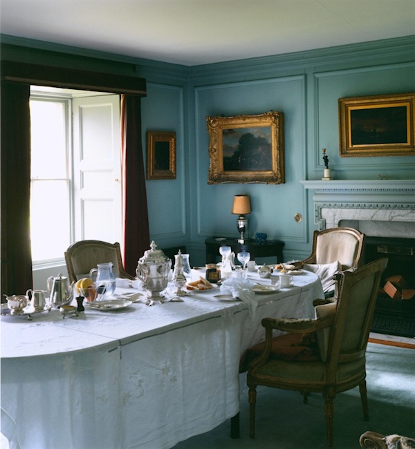
Beautiful mouldings, but a lower ceiling. Don’t be afraid of color, particularly in smaller rooms. While this is most likely an old home because of the deep windows, there’s no reason that one couldn’t turn their boxy dining room into a close facsimile of this.
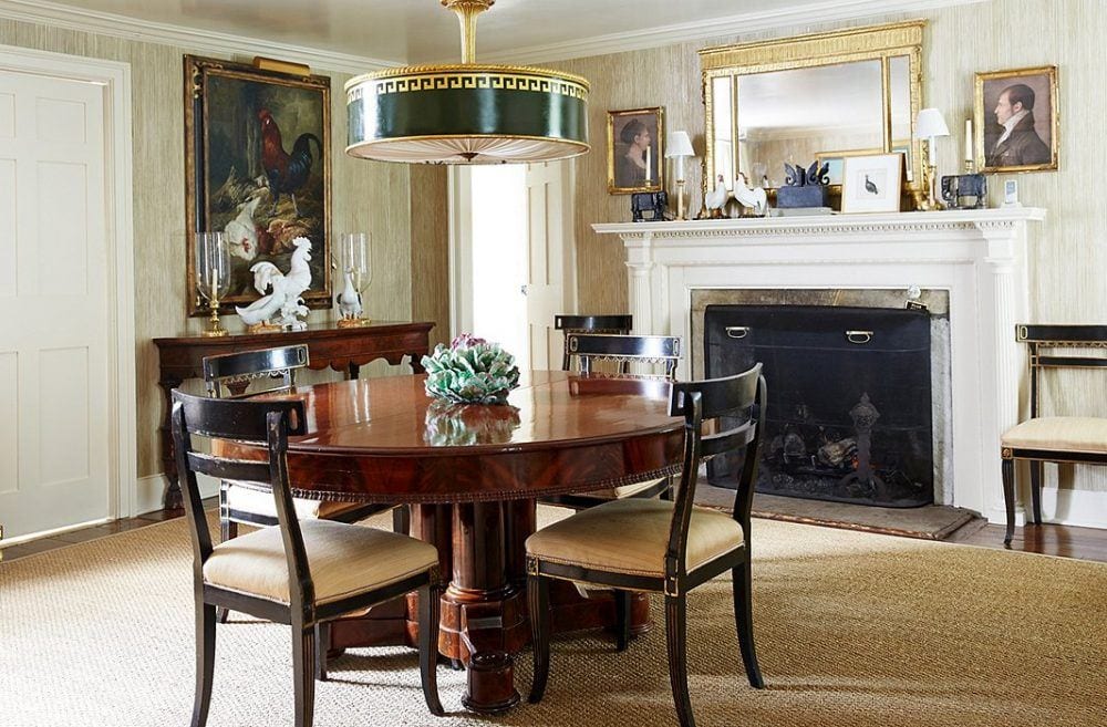
Bunny’s and John Rosselli’s home doesn’t have particularly high ceilings. But charming details and elements that go up under the crown give the illusion of more height. It’s important to know that a lower ceiling height doesn’t mean keeping everything small and dinky.
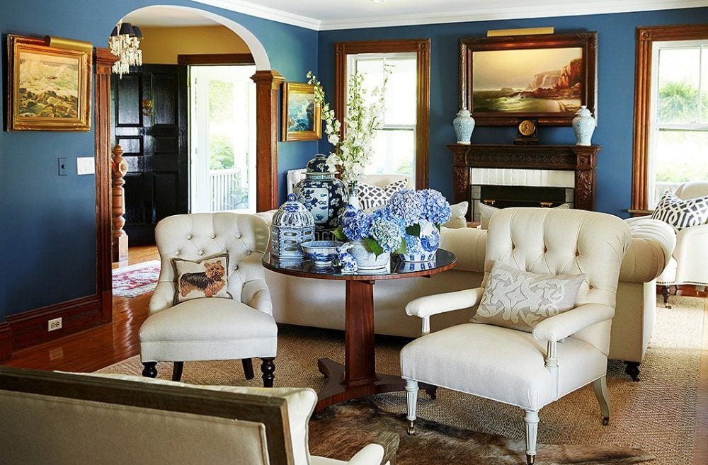
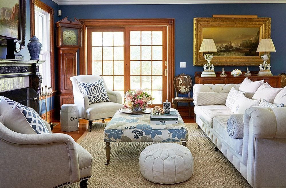
The image above and the next two are the lovely home of Kelli Delaney
The ceilings are dedinitely not more than eight feet. I love her use of color and look; she has stained wood trim! The beautiful artwork has picture lights and that contributes to a soft ambient light.
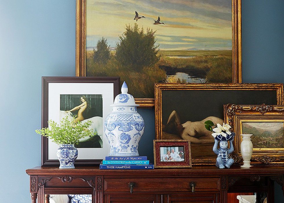
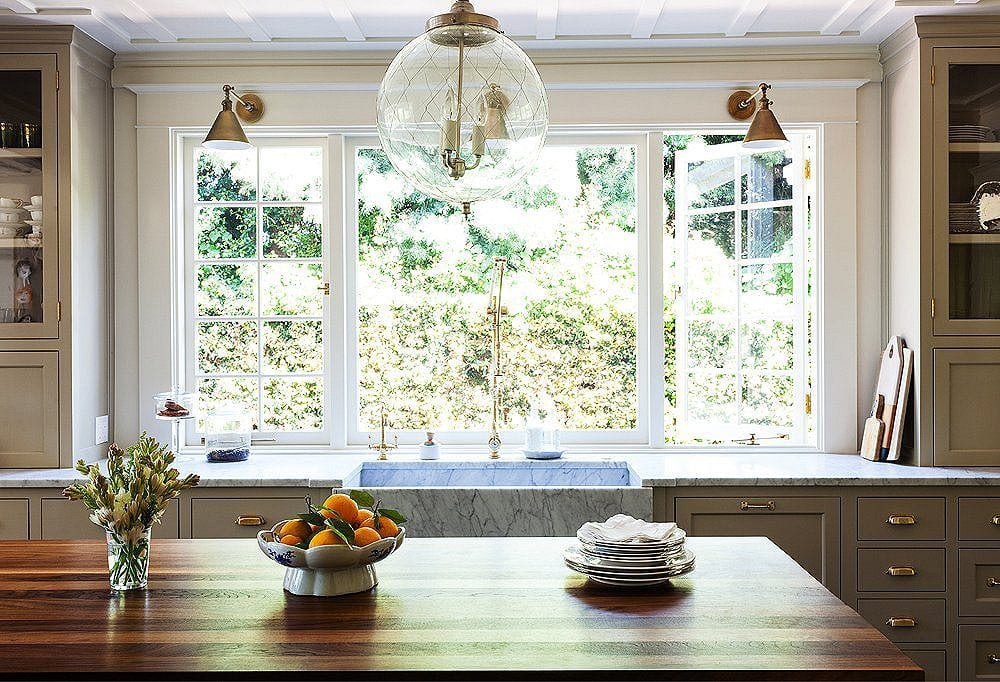
I love this kitchen! Megan’s attention to detail is interesting but not too much. There’s the wonderful ceiling detail and the cabinets go right up to meet it. I think this is the sort of kitchen that would look fantastic in most ranch homes. It’s not overtly traditional, but not contemporary either.
Well, I think that’s it for today.
Oh wait. For more of Nancy Keyes’ fabulous kitchen please click here.
Hope y’all in the US had a wonderful Thanksgiving. My sons were here and it was such a treat!
xo,

Related Posts
 Are You Making This Common Kitchen Design Mistake?
 How Much Does It Cost To Do A Smart Kitchen Renovation?
 The Top 20 Best White Paint Colors
 16 Magical Farrow & Ball Colors For Your Home
 Top 25 Must See Kitchens on Pinterest
 The Shocking Truth About Restoration Hardware
 The Guaranteed Way To A Beautiful Room (It’s Not The Wall Color)








131 Responses
Love your ideas. However, isn’t applying all these heavy and traditional millwork and other architectural features on MCM homes a contradiction to your arguments about being architecturally accurate? Wouldn’t the right treatment to a tack ranch simply be to make it clean and modern or use better materials from the same architectural period? Here in Portland OR we have incredible MCM architecture and most here would shudder at the idea of turning it into a colonial or farmhouse which most of these ideas reflect. Just one degreed architectural designer’s thought.
I agree with a lot of your comments, I hate that synthetic stained glass doors! I live at the end of a T intersection and my front foyer gets its photo taken anytime someone comes down the street at night. I removed the mullions in the windows and had a local artist make 3 stained glass panels for the side lights and transom. Privacy and worked great style wise in a transitional 1990’s home. I also grew up in a 1950’s ranch and had almost the exact kitchen with the rounded end island and birch ply cabinets. Very period but I still love the MCM ranch. Really was early ‘open concept’
Hi Aly,
Sounds very cool! Thanks for stopping by.
I’ve always hated oval glass in doors. To my mind it screams ‘trailer home’.
I did replace my door with one with a square glass panel. It needed the window. The front hallway is a dark tunnel and a door without glass would be unthinkable
Hi Lynn,
Yes, indeed! And plain glass is absolutely fine in a square or rectangular shape.
Laurel, Another excellent blog post, thank you!
While scrolling through the photos of those so called “traditional” doors with unattractive oval windows, I thought of an invaluable architectural resource book I have in my design library. It’s called, “Get Your House Right” by acclaimed architectural designer Marianne Cusato. It illustrates what to avoid and what is architecturally correct, regarding shape and proportion, for exterior and interior design elements; such as moldings, arches, fireplaces, roof lines. I wish every builder, architect and homeowner lived by these historically proven guidelines; the world would be such a prettier place!
❤︎
Hi Melissa,
Thank you so much for the book reference. I’m going to need to look that one up!
That book sounds great! I will look for it, too! Thanks!
I wanted to jump in and second Melissa’s book suggestion. I have this book and it is, indeed, an invaluable resource! It’s one of the 2 dozen or so books in my personal library regarding classical architecture. Brent Hull’s “Building a Timeless House” is also very good, and I believe he even had some “additional reading” suggestions somewhere in his book, “Get Your House Right” being one of them (if I recall correctly). Those were the first two I bought, and they are wonderful!
Thanks so much Rebecca! I hope that Santa’s listening! (well, reading) ;]
Hi Laurel – Your ideas about how to make a low ceiling look higher are so interesting. I just purchased a 1950 center entrance colonial that needs a ton of work. I’ve read that using a paint with a sheen on the ceiling can throw light around and make the ceiling seem taller. I wonder if anyone has found that to be true? We have 7.5′ ceilings throughout most of the house, with an addition that has 8.5′ ceilings. I thought that crown molding was out of the convo as it would make the ceiling look lower, but your ideas to focus molding on the ceiling itself sounds wonderful. Thanks for having such a great website that is so inspiring!
Laura
Hi Laura,
Thanks so much. Yes, putting the moulding on the ceiling is an optical illusion.
Also painting the ceiling a pale blue-green-gray like Benjamin Moore Opal Essence 680 for example– one of my favorites will make the ceiling appear to be floating.
You can use a slight sheen on the ceiling but the surface needs to be very smooth and so does the paint or it could be a gloppy mess.
Laurel,
I really loved this post. It has made me more aware of the architecture of doors. Something I haven’t thought about a lot, even though I love Interior Design. I always learn something when I read your blog, which is why I like it so much.
Thank you for educating us!
Cathy
You’re welcome Cathy! And as y’all learn, so do I as I certainly don’t know everything.
I think I’m going have to remodel my kitchen. Just like the one in the last picture. Love it! I also love the blue paint color of the second to last photo, ‘Beautiful Vignette’. I have wood stained moldings in my home too and think that color looks good with them. The photos and post are really enjoyable. Thank you Lauren.
Thanks so much Marcy!
Laurel,
I feel like a comment hog…I don’t think I’ve ever commented on one of your posts as much as this one! I’m truly finding the information fascinating and relevant to my current ranch reno. Thank you! I have a question about that beautiful kitchen by Megan Rice Yager. Those pulls on the cabinet are very nice, but when do you use those instead of the traditional open pulls? I don’t even know what those are called. One website called them “cup pulls” (is that correct?). Would you put knobs on cabinet doors and those pulls on all the drawers? Also, just as a side note, I LOVE antique brass. I used to hate brass because the only thing I knew that was called brass was the shiny gold they used to put in 1990’s houses. But this duller brass with almost the look of a patina is gorgeous! I’m just having a hard time finding it, but I will keep searching for that perfect finish!!! You should see my pinterest page…I’m going crazy with all these photos and information, lol! Thanks again, Laurel!!!
“Would you put knobs on cabinet doors and those pulls on all the drawers? ”
Yes!
Try House of Antique Hardware
http://search.houseofantiquehardware.com/search?sc=15&search=cup+pull
You want the unlacquered brass.
Laurel,
Thank you for confirming that! Although, I think you misunderstood…I don’t want the unlaquered brass, I want the antique look. 😉 I found this one that I really like! AND, they have a whole line of hardware in this same finish. http://www.houseofantiquehardware.com/bin-pulls-classic-3-3-4-abh
Thanks for the website recommendation! There is a lot of beautiful hardware on there!!! WOW! Yeah, I could go a little crazy on a website like that. I know it sounds stupid, but I could spend money on websites like that they way some women spend money on clothes, shoes, and jewelry, lol!
Unlacquered brass will age naturally and become what is genuinely antique looking without the fake antique lacquer finish. That’s what they had in the olden days. :] And if you don’t want it to oxidize further, you can stop that process with some butcher’s wax. But it’s up to you. Their finishes are lovely at the company.
Oh, I understand now. 🙂 I don’t know how long I can handle that bright gold finish waiting on it to age naturally, ha ha!!! I’m glad to know the information now though.
Hi Rebecca,
I forgot to add that you can put some lemon juice on the brass to hasten the oxidation. I had a client oh gosh, maybe 18 years ago who purchased a very expensive unlacquered brass light fixture hanging over his dining room table from Ann Morris Antiques. Well… he put lemon juice all over it and it worked beautifully. Maybe get one handle unlacquered and experiment before getting a whole bunch of ’em.
Thank you Laurel! This is more than a blog post, it is hope! My 1993-built Cape Cod style home has some of these issues, including 7 foot ceilings and I am helping my mom make decisions on the renovation of her 1970s ranch home for re-sale at the same time. Between your paint palette collection and articles like these, things are looking great with both projects.
Hi Eleanor,
Thank you for such a sweet comment! So glad to be of help!
I SO AGREE on those faux “traditional doors!” Like white heels in winter, only worse. The worst offense in my neighborhood near DC is a cool modern house going up, with a faux traditional door! I have to drive by it a lot, and I’m always fighting the urge to stop and do damage to it so they’ll have to replace it. Who ever thought this butt-ugly style was a good idea?
Hi Jennifer,
Too funny. We had neighbors next door in our townhouse who bought the most ginormous concrete urn I’ve ever seen. TACKY, to say the least. I too, had the urge to smear it with bright orange spray paint.
One day, I noticed that the base was beginning to crumble. I knew that the end was not going to be far off and sure enough, a few months later, it was gone.
Hey Laurel! Had to drag myself away from the political scene which has become a horrifying reality show! Lol but not funny. This post is so chick full of brilliant ideas that I don’t know where to start! Omg, that before and after square ranch is simply OUTSTANDING. Right? I think the paint colors are Kendall Charcoal on the brick and BM Whipple Blue front door. I just spec’d the same door color for a cape in Northport. I too abhor those etched glass faux Victorian doors!! A pet peeve of mine for years. So much nicer to have a personalized colored front door. I don’t mind ranches or even split ranches…we have a zillion on Long Island. But split levels. Ugh . Just the worst architectural design in American history. To walk in the front door and simultaneously see the LR FLOOR ar eye level while also seeing the ceiling of the lower room is beyond bad….Did color consulting/ drapes for one client one time in a split. It’s the ultimate designers challenge for sure.
What else…..love the pics of mill work. I had mentioned that my sister recently completed an entire reno of a 1950-60s colonial w water views….not done decorating yet. Anyway her asshole ‘custom” builder did coffered ceilings in her LR/DR great room that were TOO DEEP for a 8′ ceiling. Plus I’m embarrassed to admit they layer out the beams so that the fireplace mantle was BI-SECTED rather than FLANKED!! I know! Such a huge FAUX PAS. I try not to blame myself because my sister had control issues, did not ask my opinion and I ASSUMED ;(ass out of u and me!) that builder knew what he was doing….She wanted beach styled so should’ve done simple shallow suggestion of a coffer….ugh
I had a heart attack when I saw it! It would b one thing if it was a client and I never had to see it again. But every time I’m there, like thanksgiving I cringe and blame myself, leads me to the point which u didn’t mention: I don’t think coffers in an 8’ ceiling room should be anymore than 4’….right? Think her’s are like 8″….soo f’ing bulky and TOP HEAVY. OK, that’s enough out of me. Oh, love that deep blue LR!! Wood trim really does work well in richly colored dark toned rooms! I think of English libraries. Wondering what that Blue is??? Close to BM Van Deusen Blue or possibly Buckland Blue?? Not green enough to be Jamestown Blue….your opinion??
Meant coffers 4″ DEEP (not wide) …would love your take on appropriate proportion for width and depth in low ceilinged rooms…another thing I forgot: painting brick in cold climates is quite tricky, no? I see peeling brick on so many retail/ commercial buildings in my town Huntington Village, LI….what is the secret? Oil based paint for sure so it soaks in. Latex woul lay on top and flake off. Looking forward to your replies!❤️❤️🇺🇸🇺🇸🇺🇸😳Betsy
Hi again. Good question about maintaining the brick in cold or hot climates for that matter. Actually, I love the flaking paint look, but of course, one wouldn’t want it flaking a little bit.
I would use a primer and paint meant to go outside. It should be alright. I don’t have enough experience with that to know for sure. I always consult with a painter or store I trust, or even Benjamin Moore to see what they recommend.
Hi Betsy,
There are mineral paints that are meant to bond with the brick (lime or silossanic). Romabio makes good ones and they color match to Benjamin Moore. I just painted my 70s ranch Nantucket Gray in a 50 year Roma paint. It did wonders for the place.
Hi Susie,
Thank you for that! I knew that there had to be a good paint for brick, but actually have never had to investigate it. I do believe that a client or two who has painted exterior brick used Benjamin Moore but the brick was already painted so a different situation.
Hi Betsy,
Not sure of the blue but on my monitor it has very little if any green in it, but doesn’t appear to go periwinkle or indigo either. Maybe closer to Champion Cobalt 2061-20.
I think for an 8′ ceiling that a 4″ coffer would be the absolute max. Otherwise, yes can look way too heavy. 8″ OY! That would need at least a 10′ ceiling but I prefer that coffers not be more than 6″ in any case. There are probably some that are very ornate and the ceiling is 20 feet or something. That is different and not going to apply to 99.999% of us.
I love your blog- so helpful. We live in a house built in 1977 on the Oregon Coast. A bungalow 1356 sq feet. This is the first house (and we have moved a lot) where the kitchen (12x12ish) does not have a window- none! We do have a skylight at one side. I do not enjoy looking at a wall when I am doing dishes. We have an island that is really too big for the room but contains the only drawers in the kitchen. We need to use oven from the side because when oven door is open it is about 1 inch from the island. Any suggestions or future blogs on difficult kitchens would be so much appreciated. Did I tell you I love your blog…
Hi Maureen,
Oh dear. Sounds like folks who decided they didn’t need a kitchen designer and just went hog wild with mistakes! I’m presuming that a redo is not an option?
Laurel Bern—-I just couldn’t love you more!!! You speak my language and your taste is exquisite! This is just a little love letter to the best designer I have seen in the 40 years I have been in this field. LOVE, Cat
Oh wow! That is just too, too kind. Thank you so much Cathryn. I need to save this for a day when it feels like the world is caving in! xoxo
feeling silly commenting twice, but -windows! one can’t stay silent..:)
so we have-in our newly remodeled place that’s almost ready- two original wonderful windows-real deal windows-one bay window in the dining area, and one-garden window in one of the bedrooms, totally charming, added later(I guess to compensate on a total lack of any view but the row of cypresses..)) Both wooden grids-white in the dining, stained in the bedroom. I love garden windows because they have window sill..something that I’m used to have but in another hemisphere.
(ok they tiled the window sill and some tiles have flowers on them..as much as I’m nuts about flowers-these are not the best examples of florals..I’ll probably use tile stickers over them. at some point)
We also have one window that’s too wide that’s you probably are talking about, and it has this wider separation in the middle(family room). I can’t say I hate it. I c a n say I’m perplexed as to how to dress it. 4-5 drapes? a bit silly. Shades or blinds? never tried these. Ok, I guess I’ll figure it out.
All the rest of the windows are new and newer and you know what it means in the state of CA, right? you’re not allowed to have single pane (well fine with me since we back to the street..but even if we weren’t -you can leave old windows, but the moment you have to install new ones, no inspection will let you do single pane.Energy saving code.
the GC covered some of these for us, and it’s quite a cheap horror.
Then we decided to change the sad door to the patio and realized there are options, lol. The customer service was sick and tired of us since we bugged them for a week-but the door looks much better. First, the grids are outside, not taped inside. Second, we made it with that option of leaving just the narrow side panels to open and close, if we don’t want it open. Huge improvement. Yet it is still vinyl. Because..well..it’s really really really expensive to install a decent window. And if you need several?
I saw some amazing ones. If I was only changing windows and not gutting the place and building it from the studs up-I might’ve considered it.
Also, local thing-y-termites. These always win here. So people less go for wood because of that too, in my opinion.
I so, so agree-windows and doors make the house. We went to see one place when house hunting..they were 2 days on the market.Nothing special. But gorgeous windows(only on the front side though..)) I told my husband “they’ll sell tomorrow”-and right I was. Because of the windows.
PS yes to 50% paint on the ceilings!..I even went with more than that in the living where the ceiling is slanted, and the paint is lighter.
The GC said he had never saw a house yet with so many cans of paint. He works with all sorts of big guys, Malibu and all-so I didn’t believe him.
On the other hand-he likes the colors.
I was surrounded by men, and men only during all this remodel. So hard. You constantly need to calm them down, even putting everything else aside.
PPS And of course I’ve pinned everything too. What’s new.
These are amazing series, agree with everyone else!
Hi Jenny,
Thanks so much for all of that!
I notice in the Roselli house the switch plates and plug in plates are white against colored backgrounds. I’ve always tried to hide them by painting them the same color as the background. Your opinion please.
Thanks.
Hi Mary,
Do you mean the Delaney home? The captions are always below unless otherwise specified.
I don’t have an opinion about that. I don’t mind white switch plates and I’ve never painted them. My paper hanger will cover them with the wallpaper though which is nice.
One thing I’ve noticed because I take my own photos is that things that jump out in a photo, would probably not be noticed in real life.
Now that I’ve picked myself up off the floor,(you weren’t kidding LOL), any idea what the name of that gorgeous paint color the realtor painted the brick of her starter home? I’m in awe! Anyway, love your blog. Glad that I stumbled upon you and your amazing talent! Thanks so much and keep ’em coming!
Hi Sondra,
It is lovely, isn’t it? Maybe Nancy will tell us. And thank you so much for the lovely words!
Sorry, but I mixed the color myself. We moved and I don’t have of it to color match…
A true artist!
Oy, please please interior shots of the jaw dropping brick ranch- 4 square!!! The landscaping makes this house so amazing. And yes please do a post on curb appeal or even curb landscaping! About wood mullioned/grid Windows…I love them so much and had an estimate done to put them into my 90’s house…well first off, I was told hardly ant big companies make real wood grilled Windows.and the ones that do are all custom work and for a normal human, prohibitive in cost. Also, he told me that a window cleaning service charges by the number of glass panes, so with 6-8 or more small panes per window, that also cost a fortune. And very time consuming to do it yourself if you have lots of windows. So I have been searching for alternatives, like making removable grids out of wood for inside, and/or outside. But the issue then is the empty space between both glass panels in double glazed Windows becomes prominent and looks dumb. I did just recently see an open house which was a new construction in style of a modern farmhouse that has grid Windows that looked lovely even thou they were new. I spoke to the builder and he said that these were originally the kind of Windows with the fake dark colored aluminum grid placed between the 2 sides of glass AND with a wood grid on top of then secured with industrial double-sided tape and clips. It sounds weird but looked exactly like the real thing because it eliminated that void between the 2 Windows. And I am a real stickler for the real-deal in all things, but this was a good look. Laurel if you or anyone else has info on mullion/grid widows and how to get them onto old non grid Windows, I’d love to hear about it too. (Why is my spellcheck making Windows capital???). BTW, are you close to the Clintons? Gosh, I would love to see Hillary reach out to you to decorate the new house they just recently bought in Chappaqua!!!
Hi Chris,
Oh wow! I’m having trouble visualizing the weird but great looking muntin treatment. But your question is a great one, indeed!
I do live in the same county as the Clintons. I used to live a lot closer four years ago when I lived in northern Westchester County.
But… I did have great clients several years ago who lived on the same street!
What a coincidence! What a small world it is indeed…the same street! Now that Hillary may have some unexpected extra time on her hands, she just may just google Westchester County designers and call you. Wouldn’t that be a hoot for us all!
Hey, ya never know!
HI Chris,
I have sent a few interior pictures to Laurel.
not sure if I am using the reply right – i do not have any vaulted ceilings, all are 8′. under 1000 sq feet, 1967 ranch, is like an apartment with a yard (!), how to remodel/improve without breaking the bank, these photos are of a house I will never have in my lifetime! So hard to figure this out. How to spend $ wisely, while knowing it will never be super, just tons better. I could send pics but you might faint. Thanks. I enjoy your site anyway.
Hi Lee,
Do you know about the tiny house movement? It’s quite fascinating and I did a post on it a while back.
https://laurelberninteriors.com/small-space-living/
1,000 sq feet is like a McMansion. haha! But still, I hear ya!
O.M.G. Our house was every “before” picture you posted. Spindles in walnut color. Popcorn ceiling. Wrought iron railings by the basement stairs. Stingy or non-existent moldings and flat hollow-core mahogany doors. My husband took the spindles down, the rest remain until I find modern updates to the rest (because sometimes doing nothing is better that doing it wrong).
When I retire in eight months there’s going to be a lot of sawdust and hammering sounds and paint smell in the air (yes I’ll open a window).
A thousand thanks for your wisdom and comments!
Hi Nancy,
There are millions of these homes out there! Best wishes for your reno!
The thing that stood out to me was the cement lion by the front door. OK, you really don’t need Chicago Art Institute cement lions (or any other type of cement statuary) unless you have a house the size of the Spelling Manor!! That also goes for African-American jockeys holding up little lanterns, etc., etc. Maybe if you have a very nice garden, you can put in a cement frog or something similar. But please, no mansion statues in front of a house unless it is a mansion!!
Hi Susie,
Lol. I agree!
But there is always an exception! My maiden name is Lyon so I have one small lion on my front porch. And I call my home “The Lyon’s Den”.
Hi Cathy,
Well of course! And it sounds charming too!
Laurel,
I was waiting for this post! Thank you! I think the first house works so well because it is very Georgian. She has a center front door with symmetrical windows on either side that are taller than they are wide. I’m having trouble with mine because they are double windows that are 84″ wide and 60″ tall. I don’t see any examples of window dressings for windows like this in the post, but would love to see some if you continue this series (you mentioned you might do a curb appeal post as well, yea!!!).
The second old kitchen with the red and green linoleum floors? Those are almost my cabinets…pine with the knots in the doors, except that it looks like those doors are actually made with the knotty pine panels…which is what my walls are (oh my!!!).
I may send you some pictures of my house…you may be able to use them as the “don’t” pictures, lol!!! I’m thinking of painting my brick, enhancing the portico over the porch, replacing the wrought iron posts with wooden ones, already removed my shutters (they aren’t appropriate for those wide double windows), and replacing my front door (probably a traditional 6-panel door, but definitely with a new coat of paint).
Keep it up, Laurel! I love all your posts, but these are so great for me because they are applicable to the project I’m currently in the middle of. We are remodeling our whole house, a 1960’s ranch in north Texas, and we are taking everything down to the studs and gutting the kitchen and baths. The examples of wainscoting, trim, crown molding, and even the kitchen are wonderful for giving me a visual of what can be done in my house when it is finished. I just need to make the decisions and go pick out the elements that need to go in the house after the drywall goes up. Yea! I’m so excited now! I feel like I have a jumping off point now!
Hi Rebecca,
Love your comments and so glad you’re finding ideas that are helpful.
I know… Double windows that are wider than they are tall started appearing in the 20th century and then after world war II went into massive overdrive along with the ubiquitous “picture window.” yuck.
And now, we’re stuck with ’em. Well, it is possible to change them, but that comes with a hefty price tag and if it’s a masonry home, fuhhhget about it.
I almost always do drapes on those wide windows. So, no window seats under them! If there’s a wide center mullion, that helps, because then Roman shades are possible. But it’s an awfully wide expanse, in any case.
Hi Laurel,
I’m looking at the first two pics of the realtor’s before and after. It looks beautiful, but the house is very symmetrical, and I’m wondering why she did not line up the iron fence gate so that it is directly in front of the front door. (Maybe it’s just the angle from which the photograph was taken. I’m not trying to be critical or sound picky. I’m amazed at her talent for turning an ordinary wallflower kind of house into a glam queen, I just notice these little things).
Hi Lisa,
Good point! It does appear to be a little off-center. If I had to make a guess, I am thinking it might have to do with the big tree on the left.
Hi Laurel and Lisa,
The gate and path are exactly centered…just the angle of the photo! Thanks for the nice comments!
Oh, good to know and a great case in point about things being centered in a room as well. I always say that if we have to fudge a chandelier a few inches, no one will know because you would have to be standing in the one exact spot to notice and that is not that likely.
I am guessing that the second picture was taken off center. Look at the big tree on the right. In the first picture it is slightly overlapping the house but in the second picture is a little distance away from the house. Although as I look at the first picture again it appears there are two large trees on the right. Oh well. good theory.
Hi Nancy,
Nancy K confirmed that the gate is dead center, just an optical illusion that it’s not.
Dear Laurel, This wonderful piece reminded me the two other major irritants to me:
1. Stingy narrow wood trim and baseboards. It’s a major cost/effort to replace, I know, but makes a huge difference to do so.
2. Also let me say about the “authentic” detail of the white split-level house you picture at the beginning of your piece:
a. No modern house should have shutters because there is no point to them. They are reduced to trim to “dress up” a house.
b. But if you must have them, then they should be wide enough to pretend they could be closed against the elements. Even though I have seen worse, the shutters in the photo are still too skinny.
Hi Barbara,
Great point about the shutters. People forget that originally, they were not merely decorative. They actually SHUT for privacy and/or to keep out the elements.
I’m definitely one to not add them unless they make sense. In fact, if you go to Wednesday’s post and look at the first image of the antique home in Waccabuc, please notice that there are no shutters.
Before the reno, there were. And I found them phenomenally cluttered looking. The client was going to put new shutters back with a squirrel motif cutout. Aside from that, the house looked so beautiful without the shutters, I told her that I thought it would be a mistake to add them back. The decorative artist agreed with me wholeheartedly. I don’t remember the exact number, but she saved tens of thousands of dollars! And she would not have made it back on the resale. Nope!
The transformation is amazing and gives me hope for our starter home which is an 1956 side split-level. It’s hard to find ideas on how to modernize the look and feel of the house without a complete tear down! Really enjoyed this postand would like to see more. Thanks!
Hi Genevieve,
Thanks so much for the feedback and glad you found it helpful. There will definitely be more!
I would love to see more of the exterior (and interior!) on these older ranch style homes. Our kids finally left the nest, and we were to the point where we hated(!) the ubiquitous “open floor plan” and refused to purchased another one. So, we downsized, and purchased a 1950’s ranch on a beautiful treed lot, which we are now in the process of fixing up. It looks almost identical to the red brick one’s you posted. And FYI: That kitchen pic with the gray walls is a lot like the look I was going for in our kitchen which we just remodeled (on a budget.) And I am going to use that pic for more inspiration. Especially the black and white checked fabric bench. So cute! Thanks so much for this post!
Hi Michelle,
Ooooohhh, I LOVE that kitchen with the interior wall separating the eating section. I think that’s such a clever idea!
That tile floor…it was a must have…called “Kentile”, the advertisement boasted it would last a lifetime. Pretty sure it is an asbestos product, so if anyone is motivated by this wonderful post to remove it, follow the rules.
What I appreciated most in this post is the spotlight on front doors. I hate, hate, hate the phony leaded glass and ridiculous attempt at a Victorian look, which usually turns up on a Cape Cod house. It rivals vinyl shutters, drilled into the siding, which don’t fit the windows properly.
Thanks for the great article. I hope a million people read it and learn.
Hi Judy,
Oh my on the Kentile. The floor might last forever, even if it sends the inhabitants to an early death. :[ Hopefully, it’s only a problem if one tries to remove it. And yes, follow the rules!
Yes, yes, yes to the phony leaded glass doors showing up on Cape Cods which we have a lot of in New York.
Good Morning, Laurel!
I had to pick myself off the floor when I scrolled down and saw our house (before) that turned into our “dream house”! We still miss that house! It was published a couple of times and I do have interior shots.
We are lucky to have 10′ ceilings on the first floor of our present home but only 8.5′ upstairs. 8.5 isn’t terrible but they feel lower because of the height downstairs. When we remodeled the master bath we used moldings similar to the “painted house” on a smaller scale and a black ceiling. All helps in raising the feeling of height.
Thank you for using our photo and not wanting to change anything! Quite the compliment!
Hi Nancy,
Well, incognito no more! We’re all on the floor! lol I would LOVE to see the interior and would love to do a post on your current home if/when it’s ready and if you’re game for it.
Hi Laurel,
I will send you the interior photos on your website. You are welcome to use them. I will put together some before/afters of our current home and send them in a few days. Thanks so much!
Nancy
Hooray! Can’t wait!
Another great post. I have those doors 🙁 The good news, I didn’t buy them. It is going to cost a chunk of change to replace them too. Our development is full of them. Full, I tell you. They ruin many a lovely lady(house).
I vote yes on exteriors.
Hi Teresa,
Thanks so much!
My old hood also had a plethora of them. Like I said, I have lots of stuff about my place that if I could wave my magic wand, would change, but alas, some will have to stay. Thanks, too, for the vote!
Ba da Bing! This is a terrific post! Touching all of my pet peeves although I’ve been blessed not to see a popcorn wall. I’m a realtor and it is discouraging when I see endless raised ranches and 60’s (and 70’s, 80’s etc.) capes that have stayed “faithful” to their original design, spindles and all.
So many good examples here of what can reasonably be done to enhance your home.
By the way I KNEW I was going to love this particular post when you started with the oval glass doors!
Thank you.
Hi Pat,
I’m heartened to find so many who feel the same way about the oval fake glass doors. I remember the first time I saw one and it was in a small Cape Home.
There’s just too much of this sort of thing and it exists in all walks of home furnishings!
Hi Laurel,
Great post as usual!! Do you have any idea what paint/color she chose for the living room and dining room? Love them. Thanks.
Hi Terri, I’m not sure which rooms you are referring to. But even if I knew, paint colors in photos and then shown online are generally a lot different than what you are seeing, in any case.
The main reason the starter house in the beginning looks so much better in the second photo is the fenestration. People have no idea how much they are ruining a house by taking old, true divided light windows out. Huge mistake. In this case, she ADDED the divided light windows, and what a difference. Where I live in Hudson, if the old windows still exist (sometimes homeowners don’t throw them away), then the new owners take the new windows out and put the old ones back in! They realize that nothing can take the place of an old window to make a house beautiful. If the old windows are gone, then the next best thing is to buy the right windows – which is what the lady in the first photos did. You can see what a good decision that was, and she probably got way more money for the house because of it. I see far too many houses that start out beautiful and are stripped of their looks by adding the wrong windows. I call them “Little Orphan Annie” windows, because they have that ugly, blank stare. Any good insulator worth his salt will tell you that new windows are the worst possible way to spend your money on an old house. Repairing the old ones (if they are divided light windows) makes the house retain its value and appearance.
Hi Cynthia,
Once again. Couldn’t agree more! New windows suck! One can get gorgeous 100% custom new windows but they are a fortune!
Cynthia,
I agree 100%!!! This is a HUGE pet peeve of mine. The depth that a true divided light wood window gives a house is part of what MAKES the house. The flat, faux-gridded windows that they use now (replacement windows) lack the depth and character that the house needs. I am watching remodelers in my town throw out original wood windows and touting “new windows!!!” as a selling feature. Yuck! I absolutely LOVE what the lady did with that first house. It’s gorgeous! Also, it’s very Georgian. I love the symmetry and the tall windows (as opposed to the “wider than they are tall” windows in my house).
Hi Rebecca,
Thanks so much!
Although a lovely home, I don’t see this home as a ranch – the architecture is that of a single floor four square typically found in tract home developments that also offered ranch/rambler style homes prevalent throughout the Midwest. The prairie homes of Frank Lloyd Wright – ranch or rambler – are very different from the four square’s symmetry of windows and pitch of the roof.
Hi Shirley,
You’re correct; it’s not a ranch. I put it up to show what one can do with a plain one-story home.
Can you do an actual ranch from the 60s, 8 foot ceilings. Please! These are gorgeous rooms but would overwhelm a 60s ranch. Something non-Atomic Ranch. I am in Boulder Colorado, there are a million of them.
Hi Lee,
Most of these rooms are eight foot ceilings. I can tell by the position of the doors and the size of the windows and also the size of the furniture.
But I need to research Colorado ranch homes because maybe stylistically there’s something in them that makes visualizing these changes difficult.
Certainly vaulted ceilings create an extra challenge, but there are still plenty of things that can be done that would look terrific.
And there’s more to address, like stone fireplaces and what to do about them if it’s not your thing.
Okay I see. In my ranch I’ve maintained a neutral palette throughout and find that by painting ceilings at 50% of wall color, the ceilings seem higher. And, using drum shade, I get as much up light as down light which also helps. My ceilings are the typical 7.5 ft. And contemporary/minimalist decor also helps open floor plan appear expansive.
Hi Shirley,
Those are great ideas! Thanks for sharing! Definitely a color on the ceiling that’s a little deeper than pure white is always a good idea and ensuring that the light goes up, not just down is also very helpful.
HI Again,
I am just seeing so many comments on house. I actually never referred to it as a ranch either. It is a one story “U” shaped house custom built in the mid 40s. We loved that it looked so much smaller than it is.
As for the windows! One of my HUGE pet peeves are new windows. Yes, those are single pane true divided light windows that were custom made because “no one” wants them anymore.
Our current house was built in 1910 and has almost all of the original French casements. When we renovated the kitchen I had single pane windows made We are now in the North East everyone thought we were nuts. Oh well…they are pretty. The best thing was when we were building or garage there was a house around the corner throwing out the same, but smaller, French casements!
All very interesting Nancy. Thanks so much for filling in the blanks!
Thank you so much for this wonderful post– the beautiful eye candy made my day! 🙂
Thanks so much Deb!
Thank you, thank you, thank you, Laurel, for your comments about the pseudo-Victorian, big-box store doors. They are one of my pet peeves. They look wrong on every house I see them on, because they are just wrong; period. It kills my soul to see someone rip out period doors and put these in. They are expensive – silly people think it’s an upgrade but it is just a mistake.
I would love to have those curved cove mouldings, but can’t find them anywhere. Any suggestions?
Hi Cynthia,
Good question about the cove mouldings. I have seen smaller ones, I think at Dykes. I’ll have to investigate later on.
Haa, I know I am in the minority but I would be so happy to have those midcentruy kitchens, turquoise counters are rare and sought after, I love glass blocks, though not that example. If I could find a 1800sq ft mid century ranch in our budget I’d be so excited. The only decade I flat out hate is the 80s with all that terrible oak and tile. Ugh.
Hi Celeste,
Well-done mid-century IS cool! And yeah… the 80’s pretty much suck except for folks who stayed above it and ignored the trends!
Hi, Laurel
Thank you for such an informative post! My husband & I have downsized into a small mid-century ranch that we think has a lot of potential (in Indiana, no less!), so your post was of great interest. I have a question about choosing mouldings for rooms with 8′ ceilings. Is there a rule of thumb for size so that the mouldings look in proportion to the ceiling height?
Also, I’d love to see a post on improving curb appeal for these homes.
Thanks, again, for all your terrific posts. I look forward to checking my inbox every Sunday!
Julie Hawkins
Hi Julie,
That’s a great question concerning size of the crown mouldings. But it has to do with the shape of the moulding. If doing a classic moulding, I wouldn’t go larger than about 5″. Some of these are larger because the bottom part is straight and then there’s another moulding below. An example is the green room with the white wainscoting.
But, for a lower ceiling, better to go smaller than too large!
OMG, I liked you before but I love for sure now. Your review of those pretend front doors had me jumping up and down. Finally someone is willing to call it what it is. An abomination! I live in a neighborhood where all the homes are over 110 years old. Many of these homes have been beautifully remodeled/restored. Unfortunately some drank the kool-aid and installed doors like the ones you pictured. It is such a shame. I will close on a happier note. Great information in this post, Laurel. It’s one to earmark for later reference.
Hi Tricia,
I lived in a neighborhood which had largely vintage 1980 colonial style homes and Cape Cod style. Half of them have those doors and in every case look ridiculous. Sorry folks in your hood did that to the grand old ladies. They just don’t know any better. But I feel if one is going to own a piece of history, it would be a good idea to learn more about it before mucking it up.
Preaching to the choir? lol
Exactly what I wanted to comment, Tricia! 🙂 We just have to LOVE Laurel! Those horrible doors, sadly are most of my neighbors’ idea of Upgrading this 1955 Ranch house neighborhood!! And window replacements typically have the fake tape like grids (UGH!) instead of true divided lites or beautiful wood mullions! One neighbor turned their front garage into living space and replaced the garage door with a larger double door version like the one Laurel posted here!! A Designer friend of mine said, “It looks like the entrance to a PUB!” HORRIBLE! Why don’t they get it? 🙁 I can’t afford to move, so it’s upsetting that I’m in a “Plastic Shutter neighborhood” but have “WOOD Shutter taste!” LOL! Oh well. Love this post Laurel!!
Hi Jackie,
And I’m sure their interiors are full of fugly ersatz “traditional” (not) furnishings.
Fine. Call me a snob. lol I don’t care if someone doesn’t have a lot of money. It’s not about that because the fake and phony is sometimes quite expensive.
And it proliferates everywhere. I live in the shadow of New York City and it is surprisingly and phenomenally unsophisticated on the whole. Oh well.
If nobody ever says anything, how can it possibly ever change? And yes, the faux muntin windows with the tape are gross. I typically see that on the grotesquely overscale Palladian window. Another travesty of primarily 1980s “architecture.”
Me thinks another post is forthcoming!
Yes!!! Please do post about windows! And shutters! I hate the fake muntins. True divided lights are the way to go! Also, you probably know this, but there are rules for shutters. They are supposed to look like they are operable, even if they are not. You know what I have in my neighborhood? Well, first, I’ll tell you what I just ripped off my house: 24″ shutters on either side of an 84″ double window. If they really did close, it wouldn’t cover the entire width of the window! In my neighborhood I’ve seen the following: arched shutters on rectangular windows; shutters installed on the outside of a brick or wood trim around the window, several inches away from where it should actually hinge in order to close; very skinny shutters on a window, the kind that would never cover the window when closed; shutters that are shorter or taller than the actual window; a window with a shutter on one side, but not on the other side because the window is at a corner. Oh my goodness…it’s madness out there!!! I would love to see a post regarding windows in greater depth.
That’s a great idea too! Thanks so much Rebecca!
OMg! For a second I thought maybe I was the author of your comment and just didn’t remember…haha! shutters are a HUGE issue for me, I see them crazily hung all the time. No one seems to care, tho. Everything you listed drives me NUTS. I love shutters but I have double width windows so I’d need to find folding shutters that would open up large enough to actually cover each. Anyway. Tnx for this comment!
Fantastic post, Laurel! Soooo many ideas in here. Our first home was a 50s ranch in Nashville. It was so ugly in the realty picture that I didn’t even want to drive by. But by the end of the day, we were so depressed that we couldn’t afford anything nice, I conceded. We ended up loving it so much, working within its style. It turned out beautifully and was really my first jump into renovating and decorating. Now, when I see ranches, I see them as made for families and — if not beautiful yet — full of potential!
Hi Amy,
Thanks so much!
I’ve walked into many home that didn’t look like much on the outside, but inside was full of wonderful surprises.
Good morning, interesting post. For a moment I thought you came and took a photo of my kitchen’s lovely (not) glass block wall when I wasn’t home. I’m sure it was installed when the back enclosed “porch” was added so the entrance to the cellar (definitely Stephen King cellar … brrr) needed to be inside along with someplace for a washer (exploding Samsung washer) and dryer. At least whoever put that extension on did think to make two walls of windows so that I have tons of light in my kitchen through that block wall plus two windows. Doors, let’s not forget the “beautiful” (smile) half moon doors which I am looking at right now. I love the stained trim but not the white electrical outlet. I also noticed that an added small table and chairs behind a couch is ok if a little higher than back of couch phew this has been driving me nuts since I put a little eating area in my long, narrow living room. Laurel to the rescue once again. Have a lovely day.
Hi Betty,
My home is full of things I wish I could wave my wand and change. But over-all, it gives me a great feeling every time I come home. That’s all that matters!
My husband and I have purchased a small 1400 sq ft house. 1963 vintage.
While walking it was discovered on a corner where lovey,trees graced its “homely” Exterior.
I later went to the door and kindly asked the gentleman had he considered selling .
As the story,goes we were able to make a walk thru … we were convinced it was going to,suit,our,needs as soon to,be retried”couple.
Now here’s the kiick:
May I send pics ?
We are taking it to a more d century faux eiisher design .interiors can easily,be minipulated. . Low ceilings which we each,prefer.
2’bed 2″baths. GarAge attached.
Spacious living area.’kitchen and dining/ library promises.
Gail
I am running,out of room.
I have never pinned an entire blog post, this post calls for the exception, brilliant! After years in a center hall 1904 Georgian, now in Houston builder basic, your pictures give me hope. Thank you,
Chris
Hi Chris,
Sometimes hope is all we have. I’m grateful for it when it exists! :] And thank you for pinning the entire post! Pinterest is my favorite social media platform and by a huge margin! It’s the gift that keeps giving and not only that, the prize keeps getting larger!
Gorgeous homes, gorgeous post. Love everything. You know what I especially love? the beautiful central lights. The first one-transparent, translucent-is mind blowing. Everybody always says how you shouldn’t put a central light if your ceilings are standard-and I listened and listened, and decided not to listen in the end. It doesn’t bring attention to “oh ceilings are so low”. Quite the opposite-you have something beautiful to look at, instead of a sad expanse of the ceiling. So I broke these rules in every room lol, which makes me very happy. Except for the guest room-the light there is amazing being rose glass..but the lamp itself seems missing details..)) so I try to figure them out. i put there some crystals but it asks for more/different, and in a very loud voice at that..
Amazing examples and explanations on colors and moldings. We were to add moldings-but then when we gutted the place it appeared that a) no insulation b) roof needs to be redone c) asbestos abatement guys cut off the new HVAC parts, just in case..in short, no moldings. lol.
Our new place was built either in 68 or 70. But you know what? It had such a wonderful vibe. With all its shortcomings which were plenty. So I was impulsive.And frankly, stupid too lol But. Almost everything can be improved, to some degree-the intangible feeling you’ve arrived is either there, or it’s not..
Love Lauren Liess, and this home of hers is a work of art.
That was supposed to be a short post.
Thank you, thank you, thank you!
Yes, would love post on exterior..even though in my case-more interested in backyard that suffered greatly during the freaking remodel. But it doesn’t matter that much-I mean either you go out this door and want to feel great, or you go out that door, still wanting to feel great..))
Hi Jenny,
Thanks for such a wonderful comment. I couldn’t agree more that a large expanse of ceiling needs to be broken up.
Wow – I love all the information on ceilings and moulding, and if I can ever get back into a house that has normal, flat ceilings, I’m putting crown moulding in immediately! For now, I’m stuck trying to renovate a mid-70’s California house that has ceilings that slope from an impossibly high wall down to a normal height wall – in every single room (okay – I take that back – the kitchen and bathrooms have normal ceilings, thank goodness). Have you done any posts on what to do with these monstrosities? I mean – not only does all the heat go to the top, it seems there is just no hope for adding any character. Please tell me I’m wrong!
Hi Joann,
Did you see the link in the post to Lauren Liess’ home. I think it is her previous home. It is the classic 70’s architectural monstrosity. But inside, she created something cool, casual and immensely stylish!
But, I was also thinking that this would be another good topic because a lot of people have this situation.
I am loving this series! Thank you!
I’m a retired widow that recently downsized to a sort of ranch home that is 20 years old. It’s a basic builder house that had only one owner and was never updated. I’m having a blast putting my touch own on my new home! But I’m also trying to respect the era and location – a cul-de-sac in the suburbs of a small rural town.
Hi Cathy,
That sounds wonderful! I always feel badly for clients when the previous owner, in an attempt to upgrade spent a lot of money on terrible mistakes!
wow! Just wow! So much curb appeal for a little rancher. It shows what can be done with a plain Jane. I would love a peak inside.
Hi Joanna,
Thanks so much! and me too! But they sold the home several years ago. I even tried putting the image of the exterior in google images to see if anything would pop up and nothing came up.
Hi Laurel…I have interior shots if you or Joanna want them!
YES!
That would be great Nancy! Share when you can, Laurel.😀