Dear Laurel,
You know when they say “renovation fatigue,” they just aren’t kidding. We’ve undergone a year-long massive reno of a classic four-square and I do believe that every last brain cell devoted to decision-making has been wiped clean.
It’s the light fixtures that are going to do me in. I mean, how do you coordinate lighting that looks smashing, not like you went to Home Depot and got something ordinary?
And, especially the hanging fixtures. There’s a kitchen with an island and a table. That’s two hanging fixtures and two sconces. But just outside the kitchen, there needs to be another hanging fixture. And across from that is the dining room with yet chandelier of some sort.
So, right there, we have four hanging fixtures, plus sconces, plus lamps that need to work together in some sort of cohesive way.
In addition, while our home is traditional, and we’ve taken great care to retain its authenticity, we don’t want it to look like a museum. Our taste is an eclectic mix of modern and traditional.
Of course, I’m not expecting you to choose our lighting, but am hoping that you could do a post on what to look for and how to deal with four + hanging fixtures in adjoining rooms.
Thanks so much,
Faith Fulrieder
Thank you Faith! ;] And, I hear you on this dilemma of how to coordinate light fixtures.
If anyone tries to tell you that it’s easy, they are sorely mistaken. Although, Lotte Meister from a recent post makes it look like nothing. But that’s because she’s very talented. You can see for yourself here.
As a matter of fact, in my 800 square foot apartment, I four different hanging fixtures in a relatively small area.
- There’s my entry chandelier which I don’t mind, but the finish is wrong.
- Across from it is the kitchen with two ceiling light fixtures which do the job, but nothing I ever would’ve chosen.
- Moving from the entrance, just out of site is the rest of the hall which has a third hanging fixture that I rather hate lol
- and that leads into my bedroom which is a fourth fixture that is pretty embarrassing.
One thing I’d like to point out from the start is that when one has to coordinate lighting fixtures and so many are attached to the ceiling, they don’t all necessarily need to hang
And that is especially true if the ceiling is under nine-feet.
And that brings me to the number one mistake and that’s that people either don’t look at the measurements, or can’t translate them into what they mean.
STORYTIME! and this is a classic and 100% true (Only the names have been changed) ;] regarding some former clients who messed up big time while trying to coordinate lighting fixtures.
This is how it began…
The wife half of a glamorous young couple contacted me for a potential job in a gorgeous home they had just purchased in an affluent section of Westchester County. The wife, we’ll call her Endora was sure that I understood WHERE the house was.
At the time, I ignored that small amount of pretentiousness, but when she was talking about their parent’s home and I asked about it because I did not know her parents. She countered with “Well, their compound in We’vegotmoremoneythanGodtown, is very well-known.”
Is it? I see…
That one, I will never forget for as long as my brain synapses are firing.
This was at the beginning of our third meeting. The second meeting, Endora was not there, but her young, handsome husband, Darren was and we went over everything on their wish list and I took careful measurements. And then, I started working on the plans and spent hours and hours
It was a beautiful home– great bones and I could just see the amazing photos I would be able to get after it was all done for my portfolio.
In the midst of this, came a plethora of emails of items on their wish list including the desire for a custom table to replace the $19,000 “antique” they saw in New Orleans. (it was most definitely NOT an antique table!) I drew that one up too and submitted it to one of my favorite vendors in Laurel’s Rolodex (one over 30 that I can’t live without)
And then, they sent me a link to the HUUUUGEST chandelier I’ve ever seen.
It was one of those minimalist things that we’re all sick of. You know the black iron kind. But in addition to that, this one was 48″ tall and over two feet wide. And while their family room has high ceilings, it is not a terribly large room. These would look cartoonish in there and I delicately told them that I did not think that they were right for the room for that reason, but that I would find something similar that would be perfect.
They also sent me a chandelier for the kitchen table – 42″ diameter. Their table would be no more than 60″– round. But again, for the space, that size would be way too large. I would’ve not done a chandelier more than 32″ in diameter and probably smaller.
This was our first real meeting and I had a big bag of fabrics and four floor plans. But, just as we were about to begin the meeting a petite well-groomed older woman showed up and was introduced to me as Endora’s mother. Endora senior.
She looked at me as if I was covered in vomit.
Simultaneously, I couldn’t help but notice that something was going on with her uhhh… face. I felt badly for her at first, because it looked painful. The only way I can describe it is, you know how when you put your favorite jeans in the dryer for too long and then try to get into them again after Thanksgiving and Christmas have passed? And since you have nothing else to wear, because everything else is at the dry-cleaner, you have to make do? That’s what her face reminded me of.
Oh, I’m being as kind as I can possibly be, because Endora Senior was about as rude short of spitting in my face as one could be. I mean, she went on and on quite frequently with Endora Junior as if I was not even in the room, often whispering in her daughter’s ear. And then, when Endora #1 did allow me to speak she went out of her way to undermine me make me look like a nincompoop.
By the way, the entire time this farce was going on, Darren stayed as far away from the three of us as he could– pretending to be entertaining their toddler. Smart guy.
There’s a lot more, but I’ll spare you. It’s fine. These clients were not a good fit for me and I was grateful that I found out early on in the job. The next day I kindly emailed Darren to tell him that it’s not possible for me to work on the same job with other designers.
Yes, that’s right. Mommy is a decorator! (sort of) And thus, they blessedly fired me! Can’t tell you how relieved I was.
What is my point in telling you this sordid tale?
Well, about a year later, I was chatting with a contractor who had worked on the house.
He said, “Laurel, OMG! You should see the lanterns in their family room. They are HUUUUUGE!” And the fixture over the kitchen table is also way over-scale.”
Apparently, they had gone with the fixtures that I had warned them were too big for their home.
Oh well.
So, how do you know what the right scale is?
That one is tricky because light fixtures, particularly chandeliers, lanterns and pendants have many different configurations and some may be a large-scale, but have a “light feeling.” And some might not be that large measurement-wise, but because of the shape and materials, have a lot of heft.
A common rule of thumb to find the correct size chandelier is to measure two sides of the room together, such as 14 + 20 = 34 and that is the width or diameter of your chandelier.
Yes, pretty much so, unless your dining room table is only 36″ wide or your ceiling is only eight feet.
But, I have read in numerous sources that the same formula holds true for a lantern. No way, unless the ceiling is six stories high– at least! A lantern that is 34″ wide is absolutely ENORMOUS. (assuming that it’s a vertical piece.)
No, the formula for the diameter should be more like 14 + 20 = 34 ÷ 2 = 17 inches wide. If it’s going in a dining room, I think that there should be at least 18″ chain. Therefore, since you need there to be about 60″ between the bottom of the piece and the floor, for an eight-foot ceiling, your lantern cannot be more than 20-24″” tall and probably only 12″=13″ wide. If the room has a nine-foot ceiling or higher, you can go a little larger.
The other thing to know, if you don’t know already, is that the height is measured to the top of the fixture and ends where either the cord, rod or chain begins.
The reason that so many are having much stress over this is that today, there are an insane number of options. So, we need to whittle down the choices.
Here are some things that one has to consider when is coordinating lights in one’s home:
- The style of the home
- location – city, country, beach, lake, etc.
- style of the furnishings, materials, colors, etc.
- Size of the rooms
- Number of fixtures required
- Budget
One way to begin to coordinate light fixtures is to coordinate the finishes.
Does that mean that they all need to be the same?
No, but what won’t look good is to have antique gold and then chrome followed by bronze and then nickel near each other. And then, there’s the other hardware.
Most of the time, unless it’s art-deco or some more unusual style, I prefer warmer metals like brass, gold and bronze. But, those all work well together and you can also mix them with nickel.
To begin to get some inspiration you might enjoy these two posts about kitchen lighting I did a while back.
Why is kitchen lighting the hardest thing to get right?
My kitchen light fixtures are driving me bonkers
Now, I would like to share with you again Nancy Keyes’ beautiful kitchen.
She and her husband Marc created a show-stopping piece, a chandelier made with white tubing. (for more images of Nancy’s beautiful kitchen click here)
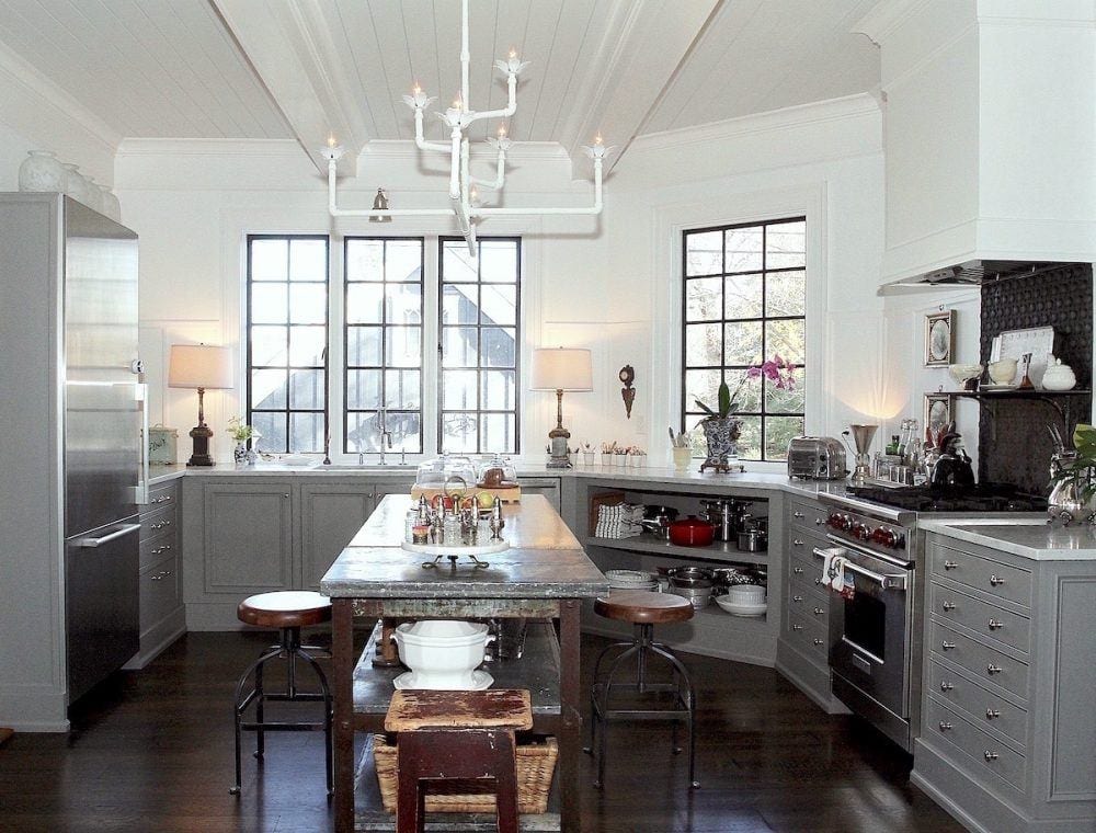
Nancy Keyes’ Perfect Kitchen!
Below, is the inspiration for their kitchen chandelier.
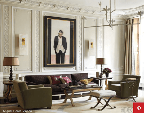
designed by Jean – Louis Deniot via Elle Decor – photograph – Miguel Flores-Vianna
I love that they saw something that spoke to them and then sought to re-create it. All of the lighting in Nancy’s home. Well, all of the furnishings are very personal and full of style and warmth.
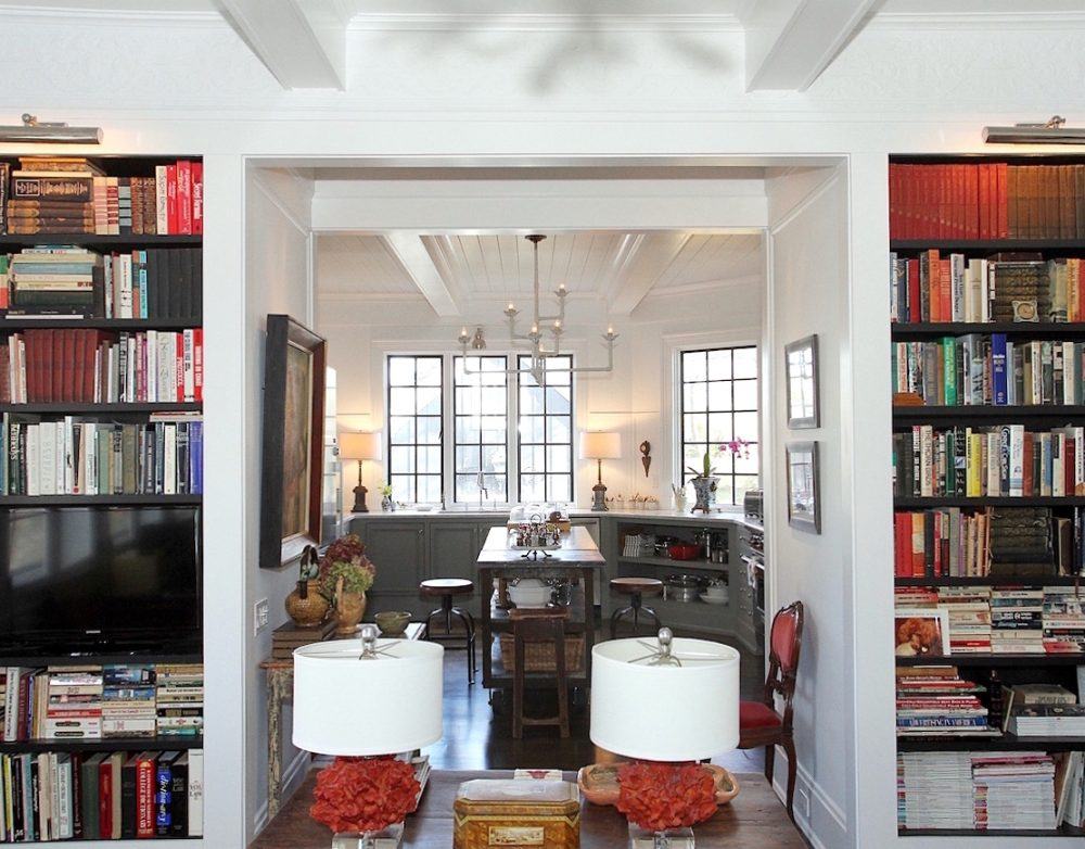
Nancy is using the adjacent room as an all-purpose “keeping room,” and I have no idea if there’s a hanging light fixture in it or not, but I thought it would be fun to take Nancy’s home and share some ideas for more ceiling lighting to go with what is already here in terms of light fixtures that I can see.
And, let’s say that the keeping room is being used as a dining room.
What piece would we choose for over the dining table and why?
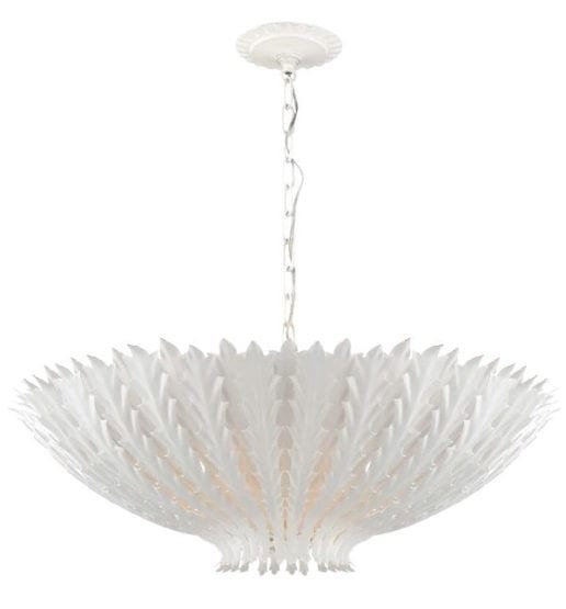
I love this Aerin Hampton Chandelier in white. I think that this would coordinate beautifully with the kitchen chandelier in color and they enhance each other with a similar theme as both have an organic leaf as part of their design.
However, the shapes are distinctly different and that’s a good thing too.
My feeling is that the kitchen chandelier is the “star of the show.” But the Acanthus chandelier makes are beautiful supporting player.
Therefore, the idea is that there are one or two things that unify the various pieces, be it color, shape, style, theme or a combo of those.
Do you do more white?
I wouldn’t. Not for the finish, most likely, but white for the shade(s), yes!
Let’s look at Nancy’s hall.
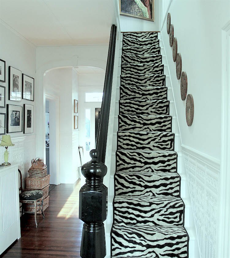
I do not see a hanging fixture and there definitely does not need to be one. Or, there might be a hanging, flush-mount or semi-flush-mount fixture in front of the staircase, or by the front door, not visible here.
What would I do?
Well, I see that the predominant theme in Nancy’s home is black and white. That is a big consideration.
And then I am looking at her other main space, her living/dining room. Everything needs to work together.
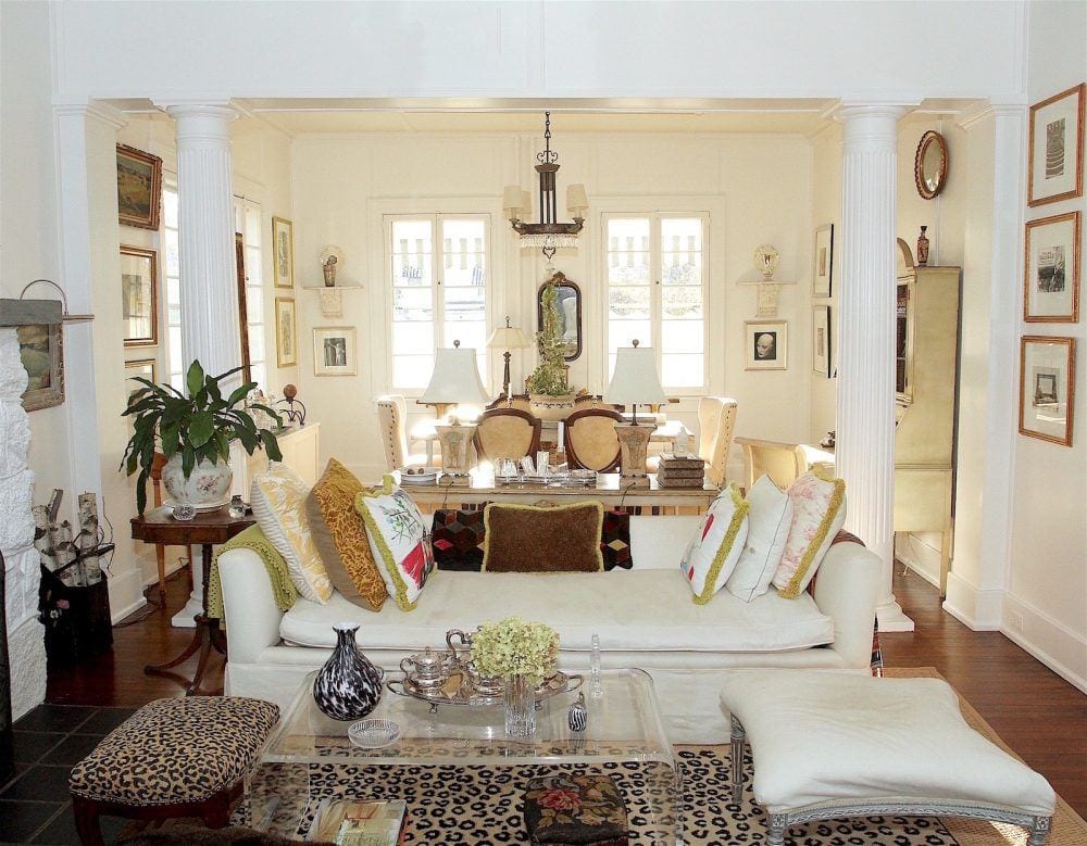
This is probably the most frequently seen photograph on my blog. haha. Why? Because I love it and it’s the perfect “textbook” to convey many lessons, but in a totally non-textbook-y way.
Over the dining room table, Nancy chose a beautiful antique bronze and crystal vintage or antique chandelier
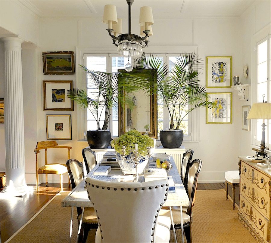
This is another view from an image I swiped off of Nancy’s beautiful instagram account. Please follow her if you are not already.
Some of you may ask if this chandelier goes with the other two. And I say, YES! Definitely. And that is because I am not just looking at the lighting. As you might notice here, Nancy’s style is stylishly eclectic. She pairs a rustic table top with a mid-century base, contemporary chairs and vintage French chairs. It all works together because of color, proportion, scale and the lines of the pieces.
Nancy is a true decorating artist.
But, how she does it all is like trying to describe how John Singer Sargent does his paintings. Even he most likely wouldn’t have been able to tell you how. .
I am going to offer a few options for the hall for ceiling light fixtures so that we can have more ideas for how to coordinate lighting beautifully.
Let’s bring that hall and staircase back down here.

It’s a long hall, so that means that we will need at least two ceiling light fixtures.
I am thinking something very simple for the hall. Our star is the amazing animal print runner.
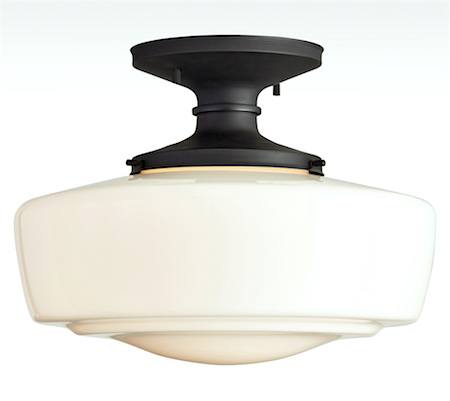
Option # one is from Rejuvenation. It is their Eastmoreland semi-flushmount fixture. But, in actuality, while I like it, I think that this one is better suited to Melissa Tardiff’s charming home that Nancy helped Melissa with, than Nancy’s home. I love it, but I think that Nancy’s home is a touch too continental for this. And Melissa’s home definitely has more of a retro vibe, if that makes sense.
But, let’s begin here anyway, because that is part of the design process. And, there are still some things to discuss that are relevant.
I believe that Nancy’s ceiling height is nine feet, so she has room for something that hangs down more, but it doesn’t have to and I like that whatever might be there is more tucked out-of-the-way.
This is one of the schoolhouse type shades. But, here’s what’s not readily noticeable on Rejuvenation. There are SIXTY different shades to choose from and ten different finishes.
I choice the oil rubbed bronze. It could be black, but high up like that, it will look black. But, there is a true black finish if you would rather have that.
I love semi-flushmount fixtures because they allow the light to bounce around more.
TWO – this is a better style I think for Nancy’s home.
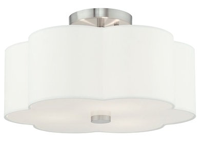
This is a pretty piece I found on Wayfair and it’s not expensive.
I love the scalloped design and the fact that there’s a diffuser on the bottom to prevent glare. Alas, the finish is in brushed nickel and that, I don’t think will be ideal.
But… it could be painted. I would probably just paint this one white because from underneath, I don’t think you’ll see much of the canopy, anyway. But you will see the little piece on the bottom.
I think that I should do a high-low lighting post.
Would you like that? I’m seeing a lot of fixtures that are a fraction of their expensive twins. Some are better than others, however.
THREE
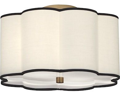
And then, I found this lovely piece from Robert Abbey
The black trim makes a stylish accent.
FOUR
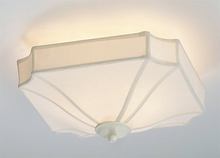
This is a pretty piece from Shades of Light that I’ve specified a few times.
In fact I did it in this home for the front entry hall between two fabulous antique chandeliers. It was just the right piece to not fight with them.
Let’s say that we want to add sconces in some of these rooms.
1800 Lighting is a terrific source. But, man, too bad about the name. 1800 anything sounds so déclassé , however, they have a huge variety of price points and some of the more difficult to find high-end lighting. And they have the full-line of Visual Comfort!
Please click the arrow because there are a few more out of sight.
I hope you enjoyed this post about how to coordinate lighting.
xo,

Related Posts
 The Ultimate Guide To Fireplace Mantel Decorating
 A Typical American Home With Common Issues!
 Cotton Balls, Benjamin Moore’s “Secret” White to the Rescue!
 Two Doctors Try To Save Man’s Eye After Dining Room Lighting Accident
 Don’t Take Away Our Ceiling Fans – We Need Them!
 21 Common and Hideous Interior Design Mistakes
 Make Your Table Lamp Cords Disappear Like Magic


