Hey Guys,
So glad that many of you enjoyed last Sunday’s post about scale. I’m going to continue the subject this Sunday, but in the meantime, I want to give you an update about the unique Benjamin Moore paint palettes I’m working on. I’m tho ekthited about this project, I just can’t tell you!
In case you are just tuning in… The paint palettes are the next phase of the Laurel Home Essential Paint Color Collection which was released last May. There are many nice words said about it on the page, but here are a couple I recently received:
I can’t thank you enough for all of the HOURS of hard work you put into your “Laurel Home Paint Color Collection”. I bought it just as I had painters coming in to paint my living room and kitchen.
My kitchen wall runs into the back wall of my dining room and I wanted color in the kitchen so it had to work with my dining room and living room walls which run into each other.
I chose Saybrook Sage for my kitchen and back dining room wall and Niveous for the remaining D.R. and L.R. walls. They look beautiful together. The green undertone in the Niveous works beautifully with the Saybrook Sage. I chose white dove for the trim and doors. THANK YOU! I love, love your colors.
Julie – July 3, 2016 – 12:43 AM
***
Thanks for the great offer Laurel. I love my Rolodex and paint guide. There is so much available to the public at retail that I had NO CLUE about, especially regarding furniture. I though I was forever going to be stuck in the Lamps Plus, Pottery Barn, RH rut. These tools you have worked so hard on are a super value and I think all your readers should buy them!!
Karen – July 28, 2016
***
I echo others who say yours is the one blog we never miss. Your Essential Paint Collection is spectacular and a wonderful investment. Thank you, thank you, Laurel.
Jane – July 29, 2016
The paint palette collection is going to be released on November 2nd.
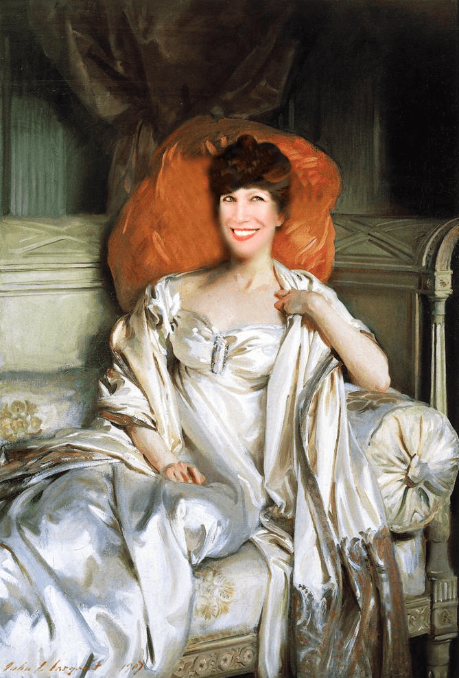
There, it is written in stone. (barring a God forbid-disaster). Deadlines are the only way I get anything done.
It took me a while to figure out the best way to convey the paint palettes and then it came to me. I am creating a mood board of a room for each palette.
here’s what is behind the mood board idea for the paint palettes:
- Each board will have a wall color and then possible alternates from the paint collection.
- There will be the actual palette of colors that one can use in the home and how and where.
- In most cases, there will be examples of other rooms from other boards that go together to make for a coordinated home– and a super palette (consisting of more than one palette)
- While the colors are paint, the colors may not necessarily be a wall color. A color could be in art, a painted piece of furniture, fabric or an accessory.
In addition.
- Most of the furnishings on the boards will be shop-able, meaning there will be a link to a source that sells it. (at least at the time of publishing)
We will delve further into possible trim/ceiling colors and wood floor finishes to coordinate.
Next, I want to share some of the boards that I’ve been working on.
They are not 100% complete but some are more than others.
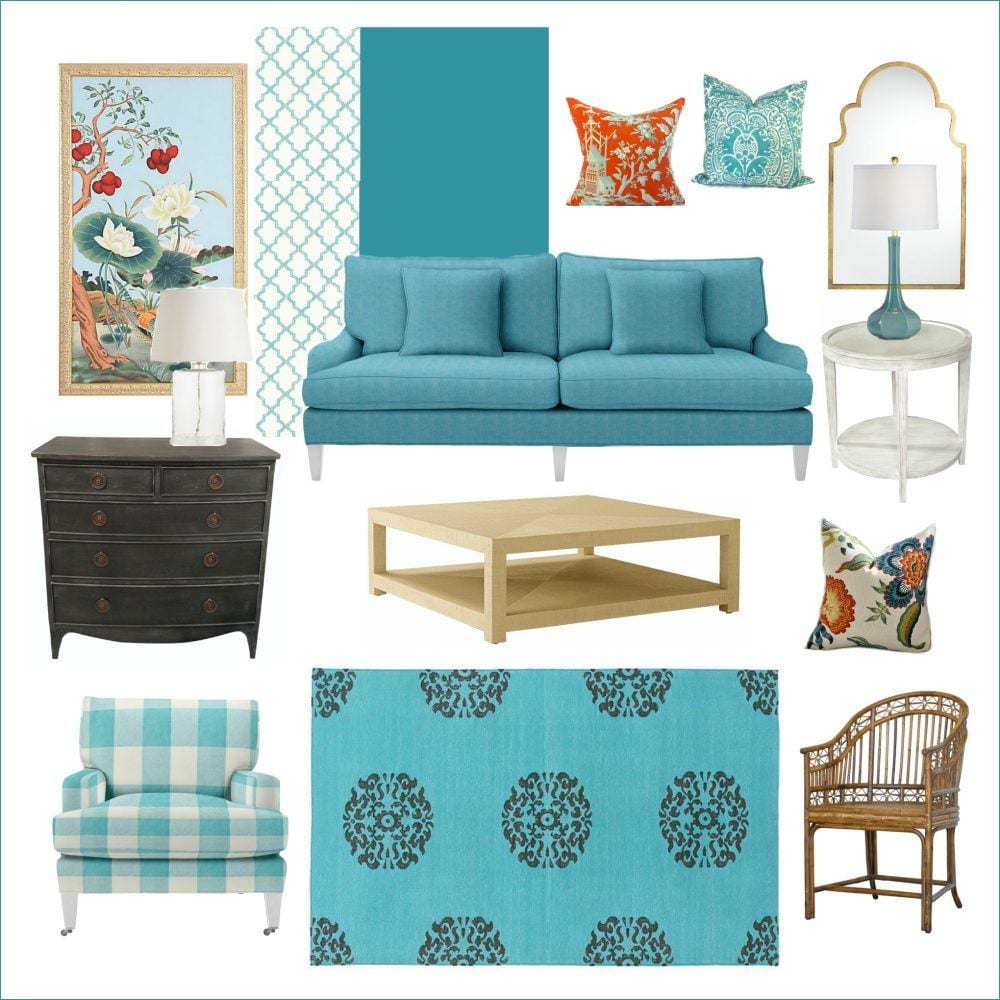
This was the first board I made. The finished boards will have numbers next to the pieces that correspond with the links of where one can purchase the furniture. These are sources that are reputable. If you are working with a designer, it’s not meant as a way to “shop” your designer. Of course, you know that, but I realize that it’s a sensitive subject amongst many of my colleagues.
Of course, all of the sources are in Laurel’s Rolodex!
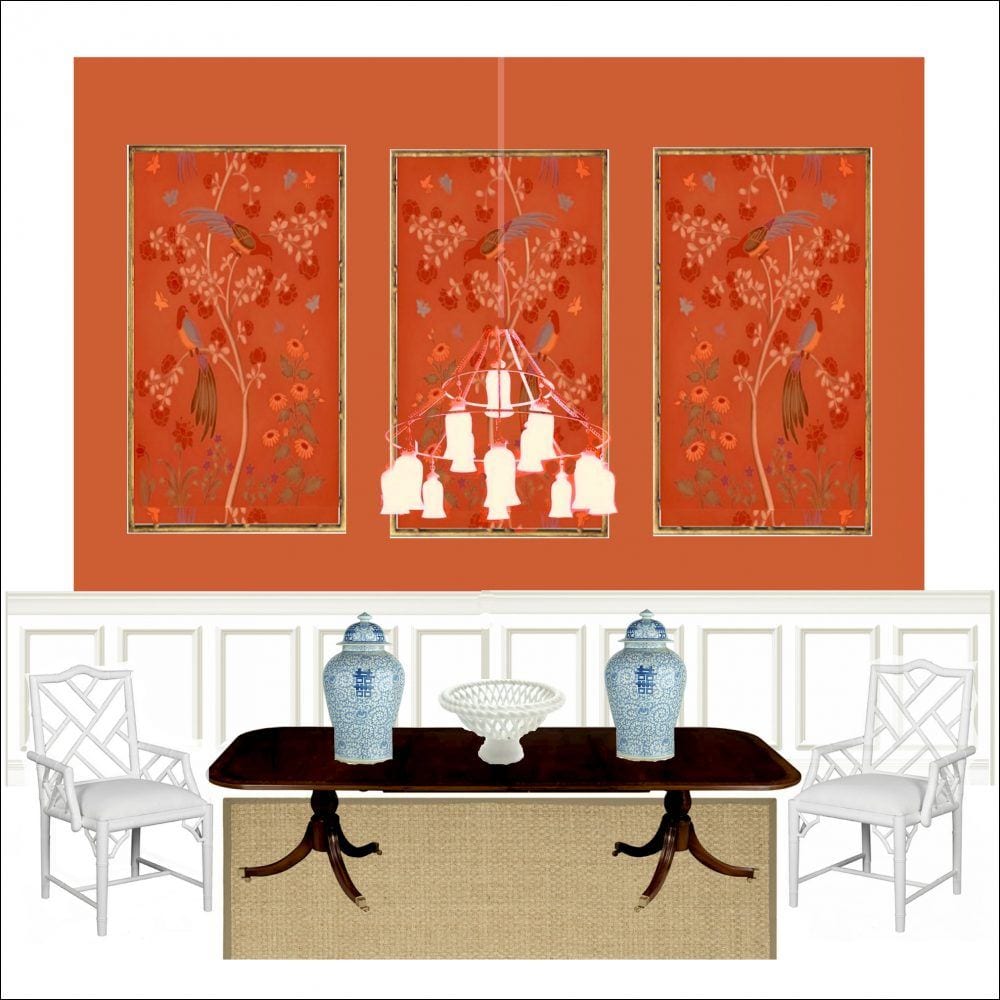
Another early board of a (duh) dining room. Don’t ask me how I got the chandelier to do that. Please notice how this room goes with the first room. They could be in the same home. Therefore, the palettes will be able to co-mingle with other palettes. No worries, I will spell that out.
As I went along, my mind started going places… ;]
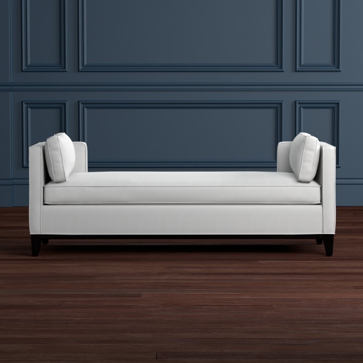
What if???

I took a piece of a paneled wall and used it to make a whole wall by piecing it together in picmonkey?
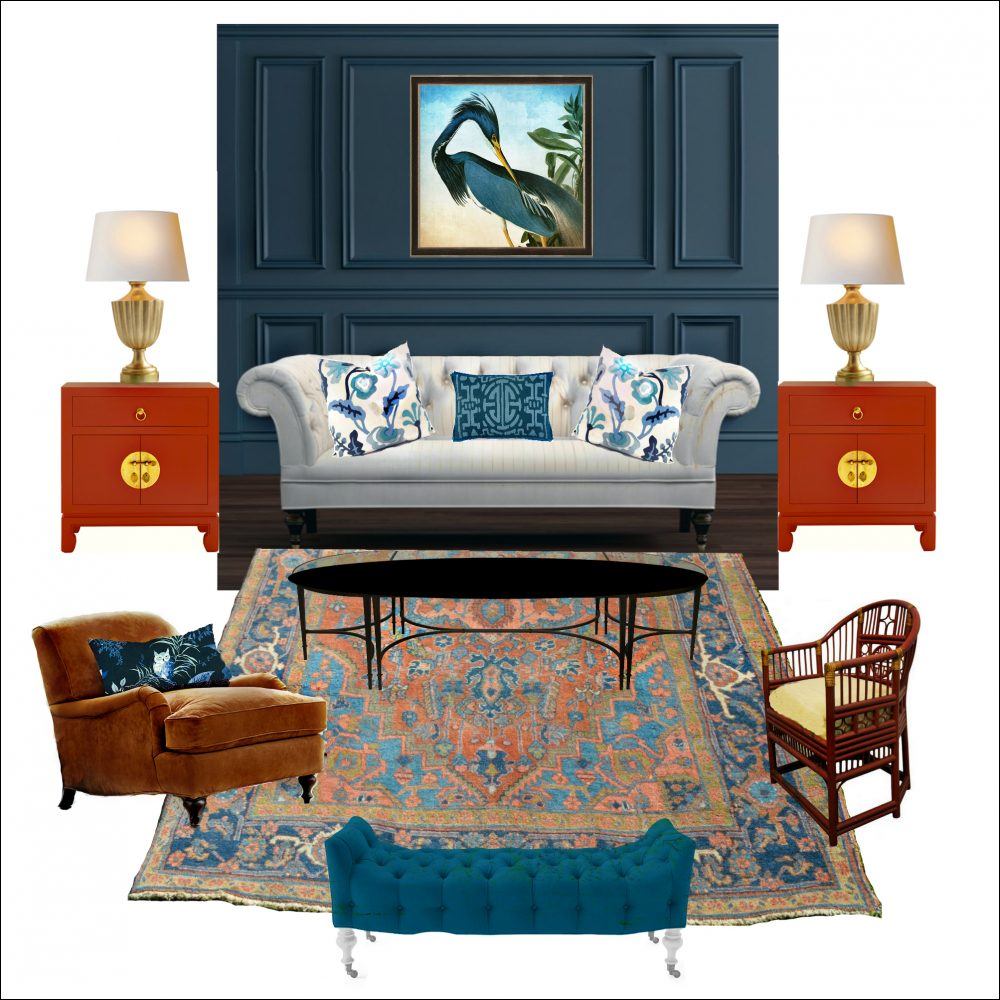
And then manipulate the color so that it matched perfectly, the Benjamin Moore paint color it’s supposed to be. (By the way, this room also goes with the coral dining room.) The wall color is Gentleman’s Gray.
Could I make the wall any color?
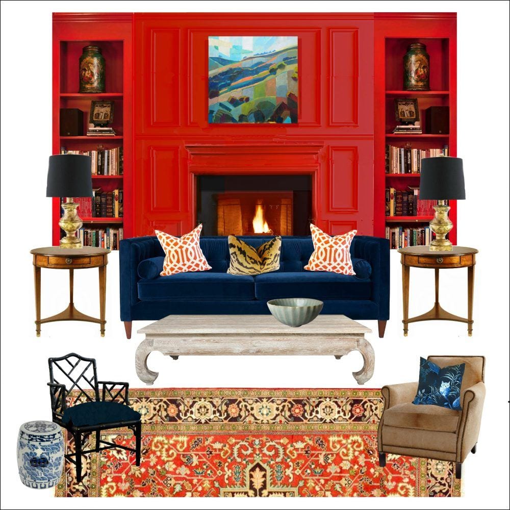
Guess so. Yes, I turned dark blue-gray into a saturated red! Admittedly, this one took quite a bit of coaxing. It’s Benjamin Moore Chili Pepper, one of my favorite reds.
Does that mantel look familiar?
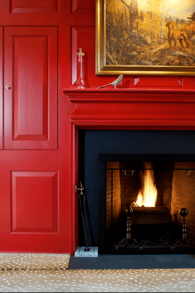
From February 2015-Villanova Archer-Buchanan Architects
I can’t tell you how much fun I’m having!
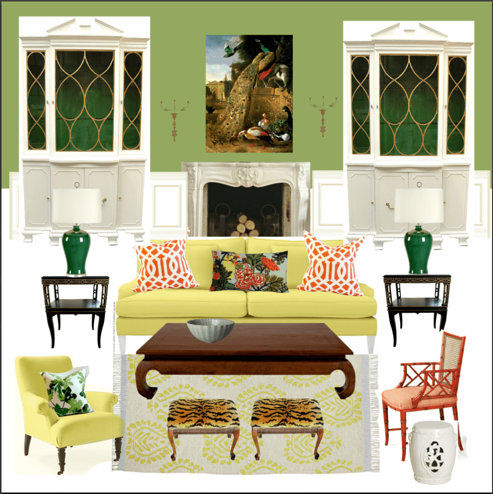
I made another one that was inspired by my living room. Although it ended up looking quite a bit different from my living room. It’s not finished, but I love the way it turned out. Oh! Surya has already discontinued my Greek Key rug. The nerve!
The cabinets in this case, are vintage and one-of-a-kind.
Why can’t they make furniture like this now?
I think I need to put frames around most of the paintings so they don’t look like posters. lol
And yes, all of this takes gobs of hours.
However.
Laurel has finally gotten some help! Yes, she has! I found this darling young woman (well, she’s saying she’s a woman) :] on Fiverr to remove the backgrounds on the images requiring that. It takes me forever and this is going to help move the process along.
But, let’s go back to our panel wall.
How light can we go?

Whoa! As light as we want! Can you believe that is from the same little piece of wall? Here is Benjamin Moore Simply White oc-117 It could also be Cotton Balls oc-122. They are very close. Too close to fret about.
Now, that I have that trick down, I have lots of cool walls planned for you!
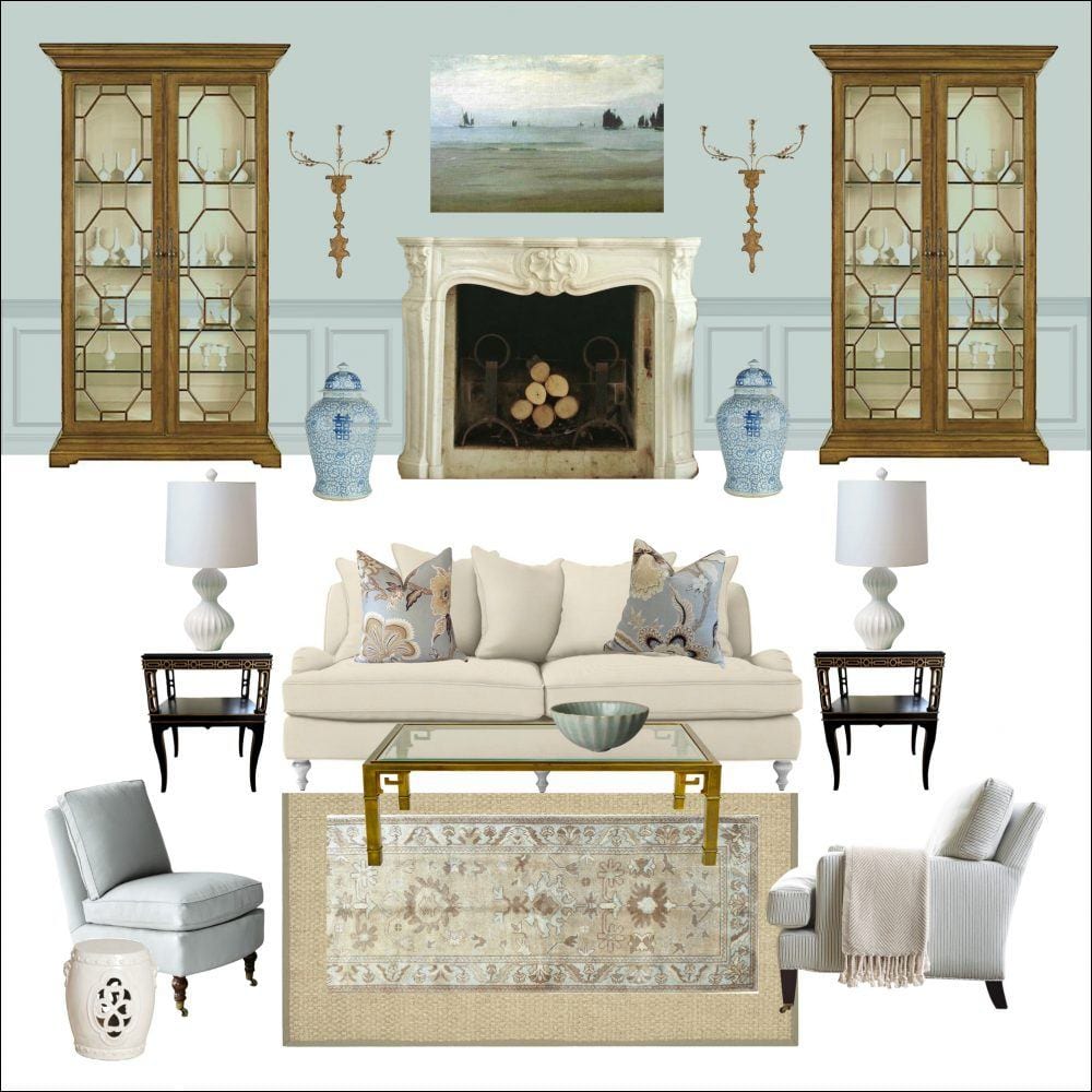
Some with fireplaces. I painted the wainscoting here to match the wall, in this case Woodlawn Blue.
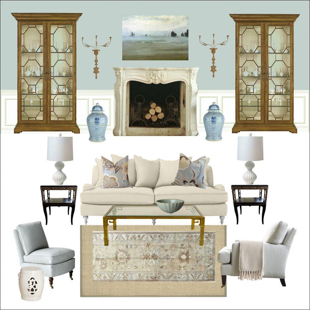
And then duplicated the board with creamy white dove oc-17 wainscoting. Which do you prefer? I can’t decide. (Yes, Laurel has trouble making decisions too!)
How many boards for these paint palettes?
Minimum 36. If I feel that 36 doesn’t cover it, I’ll do more.
Most of these don’t have the wood floor showing because I feel it starts to look a little weird, but there will be some rooms that will be sans rug and then I’ll have a floor.
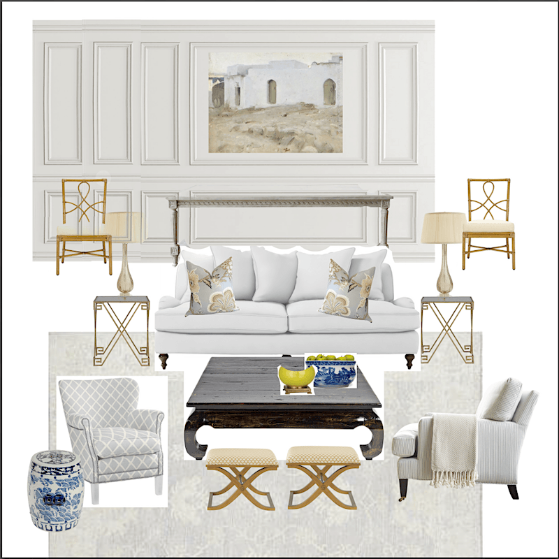
This is one I was working on yesterday— still very rough–obviously, but it’ll give you an idea of the process. (if you’re interested) :]
I didn’t bother finishing the wall because this is only a mockup for the final board. The wall color is– can you guess? Classic Gray!
(Yes, that’s a Sargent. lol Did you know that dude did some 30,000 paintings? Talk about prolific!)
The plan is as I said to make the board shop-able; not that you must do it as is. Not at all!
Let’s say you don’t have the budget for an Oushak rug or you don’t like Oushaks or whatever. You could always do a coordinating flatweave or sea grass rug instead. The idea is to give a solid foundation for whatever it is you want to add.
But most importantly, I think the boards will give greater context to the palettes.
So, there it is. This is how I’ve been spending my days and now, maybe you can see why I’m not able to take on new clients.
In the comments, if so compelled, please tell me if I’ve missed anything. Or if there’s some piece of information that you would like to have in this paint palette collection. This is for you and I want it to be helpful.
xo,

Save
Save
Save
Related Posts
 Nine Fabulous Benjamin Moore Warm Gray Paint Colors
 Ugh! I Hate My New Wall Colors! 6 Easy Steps For Getting it Right {the first time}
 What is the Best Palette for No Fail Paint Colors?
 One of My Favorite Interior Design Tricks {it’s cheap and easy!}
 15 Hideous Decorating Mistakes I Learned The Hard Way {part 1 fabric nightmares}
 9 Fabulous Benjamin Moore Cool Gray Paint Colors
 A 25-Color Whole House Paint Palette, A Surprise And A Warning






61 Responses
awesome I am going to order is it a download or is it a book that gets in mail
Hi Karin,
It is a PDF file that gets downloaded (saved) to your devices. Thanks so much!
Hi I love your wok. I was wondering so if you purchase your sources guide does it list all of these boards and sources. Thank you
Hi Karin,
Yes, it does! The boards and the sources, both retail (an online source that I think is most likely reliable) and wholesale (for designers) and with LINKS to both! Some of the boards have changed a little (for the better!) since this posting. And there are 40 boards in the final product.
Together parts I and II equals nearly 500 pages. There’s more info here.
https://laurelberninteriors.com/laurel-home-paint-palette-home-furnishings-collection/
This is so much fun, I didn’t realise just how much I miss this doing this (long story short – too disabled, too old).
In the room where you changed the panelling below the dado from blue to white, I would like to see it the other way around: blue on the bottom and white on the top.
I can’t wait to see more of this.
Thanks so much Christina!
Beautiful, Laurel! Are you *sure* you want to get out of taking on clients? 😉 These would be so lovely realized!
Hi Amy,
Thanks so much Amy. You know those super designers who seem to do it ALL? Big office. Two offices, three offices? They’ve written a book. They blog. They still have kids at home and a demanding husband a dog and a cat.
And a second home.
And then, they are traveling every other week to a conference to speak or to do a showhouse.
But still find time for vacations 4 times a year to Aspen, Paris, Rome and the Hamptons, of course.
And then they are the darlings of instagram and facebook and tweeting away! Snapchatting. (I haven’t even dared to look at that one)
You know those people?
I know some like that. But I don’t think they’re really doing all of that. Do you?
I think that they’re sending somebody else to go on the vacation and maybe even to deal with the demanding husband. lol
Just fabulous! Loved every vignette. How do you do the graphics and colors?? As an aspiring color consultant I have put together a book of best BM and SW paint colors complete w paint chips for each. Of course it includes many of your favorites. Also included are those suggested by Maria Killam, Phoebe Howard (pales), Tobi Farley. Also I use those colors I have experience with both in my own home and in friends and clients homes. I saved every image. I assume that you’re putting together a list of palette combination the way Martha Stewart did (but better) when she was at Kmart, before she went to jail (which was a total travesty since as I worked on Wall St this sort of insider trading happens there like once a second lol). Anyway I have your Roladex and paint color reccs. Hopefully u will offer a discount to previous customers. Ttyl
Hi Betsy O.
I do the graphics on pic monkey. By the colors, not sure what you mean? The actual colors are what BM has put out but the palettes are in my head.
These moodboards are gorgeous–what a great idea! I especially love the rug in the Chili Pepper moodboard–is that something in the rolodex or is it a stock photo?
Hi Alice,
Thanks! That particular rug is a Heriz Persian rug and one-of-a kind, however, there are sources in the Rolodex where you could source something similar.
Hi Laurel–
Love, love, love the boards!!! I second one of the others…please add bedrooms. YOUR blog is the ONLY one I read.
I’m still trying to decide whether to buy the Rolodex. I’m not one who likes to redecorate every three or four years. We did just purchase a villa in Florida, and I am redecorating in some of the rooms. Your thoughts, please…
Hi Susan,
I’m so flattered. Thank you! I think the rolodex is helpful to anyone because it’s easy to surf through and check out different manufacturers as well as retail companies to see their offerings. There’s also an approximate price point in a code.
I think it would be useful, because you may see a vendor whose products you like and it might be one you hadn’t heard of before. Even if you don’t know where to get the products, many companies will give that information out on their website, but if not, you can always contact them for where to purchase.
What a fabulous resource this will be. Mistakes can be sooooooo expensive! This will be worth every penny and I’m saving mine now to splurge on this.
Terrific EE! I’m excited about it too and enjoying creating all of the boards.
As do not have your Rolodex & Paint Guide Laurel so am speaking namely for myself; you had me scrambling in cross-referencing the colours you used to those in my BM Fan Deck … ☺. That said; understanding that lighting is extremely important a) Will you be considering recommendations as to what ‘exposure location’ these palettes are best suited for as a jump-off point? i.e.: North, East, West, South etc. b) Will you be adding a colour suggestion for window coverings to the mood boards? i.e: Similar tone to the walls, a colour chosen from a fabric etc.? Reason for asking and regardless I do sew my own; I know they can be a major investment when dressing a room. -Brenda-
P.S.: Your last Mood Board using Classic Gray on the walls (which I ♥ BTW) is basically the palette I used in one of my four recently upgraded bathrooms.
Hi Brenda,
Some of the boards will have window treatment suggestions. However, I very often do a fabric that coordinates with the wall color unless I want a contrast say with dark paint and then most likely, it would be the trim color. I can’t say that’s 100% of the time, but very often.
As for the direction issue. Big sigh. It’s very difficult. The light is changing ALL DAY LONG. But less so, in north facing rooms.
But a south/west facing room is going to act like a north facing room in the morning! I know, because that is my bedroom. My Tropical Dusk (a “dirty” purple) looks very muddy in the AM and then brightens during the day.
Then, there are cloudy/rainy days.
The seasons. Leaves on. Leaves off. (well, here at least)
Plus, the sun angle.
Plus the size of the windows.
Plus the houses that aren’t facing any exact direction. Or the walls aren’t perpendicular ( like my place)
Or the room is long and narrow with north facing on one end and south on the other.
Are there a lot of trees?
Is there a big hill…
I could go on and on… and that is why I’m not going to go into all of that too much with a lot of confusing rules that might NOT apply because of all of the possible variables.
This is why my mantra is test, test, test!
Classic gray is a very lovely color. And it’s also one that changes in very lovely subtle ways.
Thank you Laurel for your reply and explanation. With appreciation -Brenda-
Hi, Laurel.
You asked whether there’s any info we’d appreciate having in the paint palette collection. Can’t actually think of anything, but your question called to mind something I’ve wondered about while using the paint guide and in years of reading your incomparable posts: you never mention the Light Reflective Value (LRV–“the percentage of light reflected from a surface”). Benjamin Moore supplies one for each paint color, and I’ve found them useful, esp. in relative terms. Is this something you put no stock in?
Hi Cathy,
That’s a good question. To tell the truth, I’m not sure how that’s particularly useful. Maybe in some situations? I’m not sure. Obviously, the more reflective the color, the lighter it is. I figure, that’s pretty easy to see.
This is what sets you apart from everyone else…you’re willing to share (secrets, ideas, sources, etc. etc.). So very much appreciated and such a treat to read!
Hi Joan,
Thanks so much!
You know that old axiom, “the more you give, the more you get?” Well, it’s true. :]
I’m going to photocopy your photoshopped portrait by John Singer Sargent and paste it on that peculiar sofa square “pit” you showed in the last blog. That’s the only way I can figure to get on that thing. I love that you are always thinking of how to communicate conceptions to your audience. Education is the answer to bad design.
:]
Oh Laurel, I SOOOOO wish you covered the UK! The beautiful furniture and materials you use are simply not available over here (to mere mortals), as there isn’t the same sence of style and articheture. I’d buy your books and rolodex in a flash if it would do me any good. But, I am truly thankful for your web site as it gives me ideas, feeds my dreams, and reminds me so much I miss my country.
Hi Christine,
It’s so funny, but I think the opposite. I’m always seeing wonderful furniture in the UK that’s not available here!
Laurel, plain and simple…you are the awesomest girl on the planet!
oh, haha! that is so sweet!
Lauren, I am new to your blog and love it. As a designer and studio owner, it’s great to get new ideas and I love your style.
Keep up the good work as I can only imagine how many hours this must take!
Mary Nigh
M Design LLC
Chicago
Hi Mary,
Thanks for stopping by and welcome!
You’re so damn impressive Laurel. I can’t believe your technical abilities in addition to all your design talents. My copy of the paint palette that I had printed at Blurb is so well worn now from use and study. I really don’t need anything else. Bought twin English roll arm sofas today in light blue velvet (Marilyns Dress), tufted backs, to go with the spring palette I am working on for this house. I don’t think I can wait to get the new palettes until November, so I am going to stick to the one you got me started on. Avocado looks great in my dining room with a new chartreuse, limey sectional peeking through from the family room area. I have a designer helping me, I just hand her your images and go, “Can we just copy this”.
Hi Karen,
That is too kind! But yes… copy is the word! More about that on Sunday!
So. Excited. The Essential Paint Color Collection has saved my sanity! I have been painting my entire (new to me) house since January (walls, cabinets, trim, ceilings…) and then next year is furniture painting time. Your blog posts on colors really helped me get started picking colors but the collection made it a breeze. I am looking forward to getting some more ideas for accent colors w/furniture and repainting one or two rooms where I screwed up the wall color before I got my hands on your guide:) I have used 5 colors from the collection and they have all been great except for one and that was because I got cocky and didn’t test it first….
Hi Eleanor,
Thank you so much! I won’t say “I told you so.” But just the other day I was at a friend’s home and they had painted ALL of their walls China White. I ranged from a COOL almost with a a hint of lavender gray to a weird dirty warm pale beige and everything in between.
Just beautiful, Laurel. Just make sure you stamp your brand across those boards, so no one will be tempted to lift them. I may go back to work so that I can employ you.
Ahh yes, good idea Jayne. Thanks much!
Laurel, I can’t wait to get my hands on this! I was just at my local BM store today picking out exterior paints for my house, and there was a woman trying to figure out what to paint her kitchen. I sang your praises and showed her my Essential Paint Color Collection on my iPad (but only for a minute, told her to buy it 😃).
Hi Mary Jane,
Wow! Thank you so much! You never know, maybe she will. Too bad it wasn’t the president of Benjamin Moore. LOL
Another excellent, inspiring, educational post! At the risk of sounding patronizing, clients often don’t realize how much we put into our visuals to sell a color, a concept, etc, as well as to educate them (that was the patronizing part!). May I please ask: What is the software, app, site, etc used to create the mood boards? Have never tracked down this source & would Iove to use it.
Thanks again, I look forward to your posts each week!
Hi Stephanie,
I love it when people ask what I use. I remember for a couple years asking other people and being met with no answer.
That is why I have resolved to answer everyone. It’s no fun to be ignored.
I use picmonkey. picmonkey.com
I love it because you can make a very nice hi-res board and you can always reduce the file size later.
There are also all sorts of editing features. I use the make-up one a lot–even when I’m not putting on makeup. haha.
the way I do a board is just to start out with a blank canvas and then everything else is an overlay. You have to play around with it. The only problem with picmonkey is… you can’t save anything. The other day we had a brown-out in a thunder storm and yep, loss internet connection for a few seconds and four hours of work went down the drain.
I do have the paid version, but it’s not very much $. I think it’s an annual fee.
Thank you, you are an angel and I looked again this morning in the article and saw that you actually have pic monkey mentioned – – Duh!!
I marvel at how you do it, but you have by far the most informative, up-to-date, and damned ntertaining blog out there! Plus clearly are just a nice person – – rock on!!
Hi Stephanie,
No worries at all. I’m a very lazy reader and often miss key points. And thanks for the kind words and encouragement! It really helps!
You are simply amazing! Kinda like a prodigy for the paint world. Have you given thought to having a category of the boards paint colors such as beach house, lake house, mountain home, East coast, West coast, NY townhouse or style of home such as colonial, craftsman, etc. I’m a proud owner of the Rolodex and paint collection guide. Can’t wait until Nov 2!!!!
Hi Cindi,
Yes, as a matter of fact, I had those exact thoughts and do have names in mind. It’s a lot better than palette #26. Thanks so much for your input!
Love it… Can’t wait til November to see the rest of the boards!
Thanks so much Jennifer!
Laurel, These are beautiful! They are so helpful. Can’t wait to see the entire group. Thank you for such wonderful inspiration.
Hi Janet,
Thank you for that and for help spur me on!
Laurel, This is Brilliant!! You are one smart and talented cookie:)
Hi Angela,
Thank you so much! And definitely older and wiser.
Hi Laurel, please include mood boards with bedrooms. Thanks.
Hi Irina,
Yes! Thank you. I will!
Hi, I think it might be helpful because sometimes it’s hard to see colors in pictures/online accurately to reference the major color undertones in the items. I have your paint collection product and have found it very helpful at narrowing down my color choices. But, sometimes for the novice determining color undertones is difficult and knowing them helps one determine selections.
Thanks so much and I enjoy all your blog posts!
Robin
Hi Robin,
The problem with “undertones” is that they change. They change with the light. I’ve seen colors go blue and green and yellow and it’s all the SAME color and in the same room! It’s all lighting.
The worst however, is picking a color in a magazine. It’s rarely accurate.
Wow, that is some project, Miss Laurel! I love it (and I prefer both the wainscoting and wall painted Woodlawn Blue — I rarely see that done here in the States, but the style was everywhere in homes I visited when I lived in London). Looking forward to the November unveiling. Godspeed.
Hi Susan,
I love the mono paint look too! People are often asking me when painting their wall a shade of white, what trim color will look best? hmmmmm… Thanks for your well-wishes too!
I love every one of the rooms you put together. You are so talented and generous to share all this with your readers. Thanks.
Hi Terri,
Well… it sure beats having to deal with damaged furniture. lol (not really funny though when it’s happening). Thanks so much for your kind words!
This is a fabulous idea, and I think really fills a void!
Thank you Melissa!