Hey Everyone,
I recently received a real “Dear Laurel” note and here it is:
Hi Laurel,
I’ve been following you blog for about 6 months now and love it.
I have bought a house in Nashville, TN that is very traditional and I’d like to do it in all blue and white. Is there a way to do this without looking totally ridiculous? Most of my case goods are mahogany, cherry, walnut and black Chinoiserie.
I want to change the upholstery and I like varying shades of blue. I’d like it to be cozy, not cold (I know, cool colours). I have very traditional taste. I don’t expect a consultation, but I didn’t know if my question could be answered in your blog “how to do a whole house in Blue and white“. Thank you for your time, either way.
Kind regards,
Karen
***
I thought this would be a terrific topic for a post because it gets to the heart of something that I feel is helpful no matter what color-scheme one chooses.
And that is:
One of the easiest ways to come up with a color scheme is to choose one color.
Yes, that’s right.
One color.
And then riff off of that one color using colors in its family. Analogous colors. I wrote about Analogous color schemes here.
But— in this case, Karen wants to use a blue and white theme throughout her home and I think that’s pretty wonderful!
It wasn’t that long ago that I thought of myself as a “green person.” And I know I’ve said this before, but in recent years, realize that I adore blue just as much and sometimes even more than green. So, this is a treat for me to put this together for y’all.
Here Are Some Do’s and Don’ts for Decorating with Blue and White
- Unless you are painting your floor some other color, you scheme is actually going to be blue and white and a wood tone. In fact, Karen already has lots of wood-toned pieces and some black which is wonderful because
- Blue and White LOVES black! I mean LOVES IT!!! In fact, all colors love black, but blue in particular whether it is pale or even navy adores black.
- Having a Blue and White home doesn’t mean that there can’t be any other color.
- In fact, there will be other colors.
Because every great room needs a little TENSION
What do I mean by that?
I mean something that creates interest. It could be another color or another style. For instance a contemporary painting in a traditional room.
In fact, art is a great way to bring in some other colors.
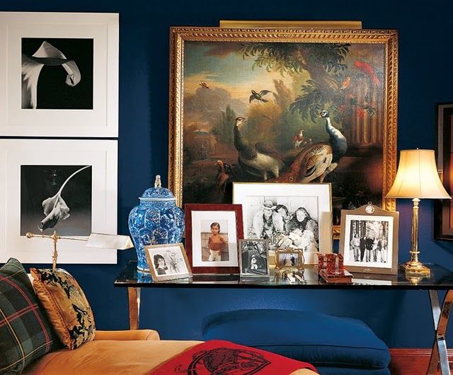
Here is a great example by Ralph Lauren of art bringing in other colors and then the black and white photography which is an additional unexpected element. Notice that the art is not blue and white. It could be but it doesn’t have to be.
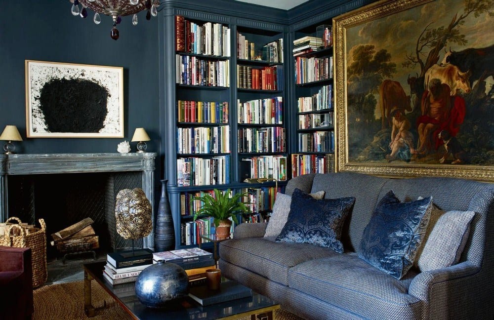
Gorgeous library by Aerin Lauder
Other colors can be brought in with rugs– particularly Oriental rugs if doing more traditional styles. The above is unquestionably the quintessential traditional English blue and white living room. All that’s missing is the tea and scones!
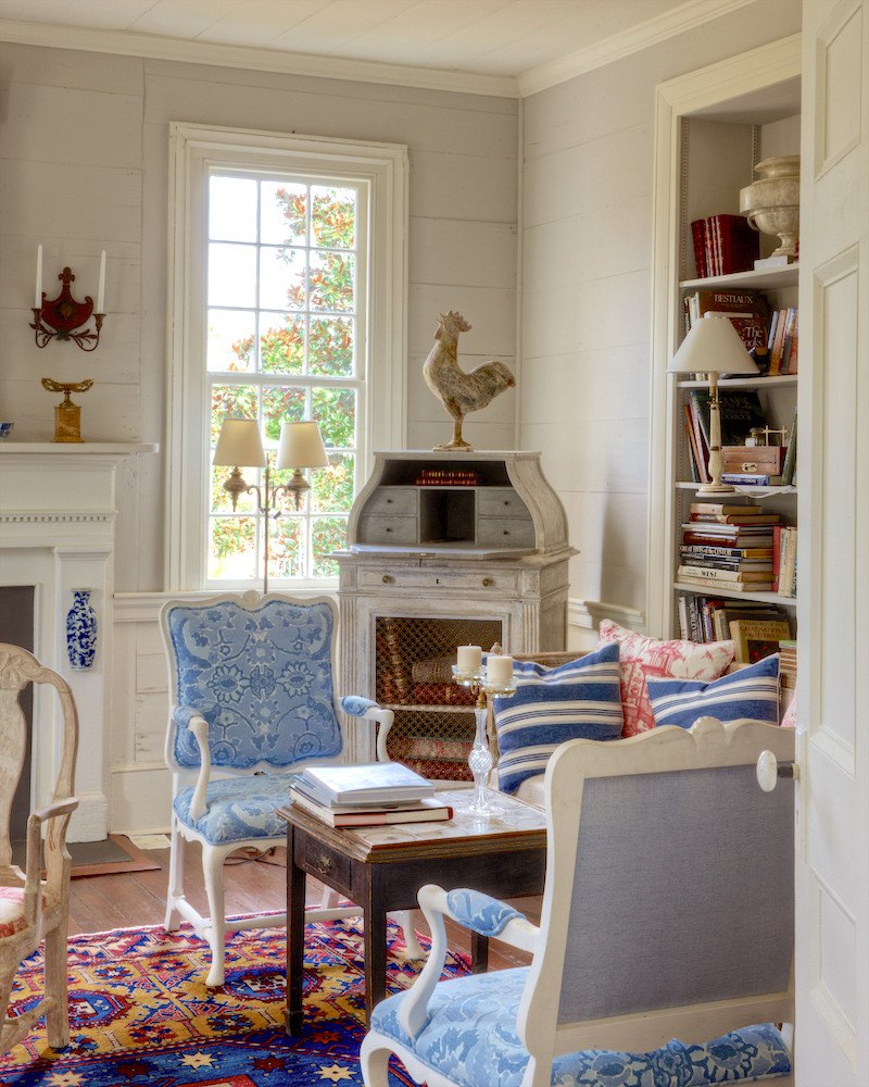
Furlow Gatewood’s homes are a wonderful example of using a lot of blue and white but also other colors. To see more of Furlow’s exceptional homes click here.
Another way I love to use tension (or variety really) is to do a room that has very little blue such as a wood-paneled library.
The two rooms below are by the amazing Suzanne Kasler
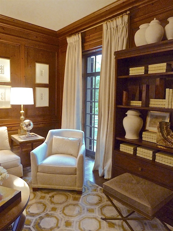
While the room above doesn’t have any blue, it certainly could in the accessories, rug furnishings and drapes. Or just small amounts of blue.
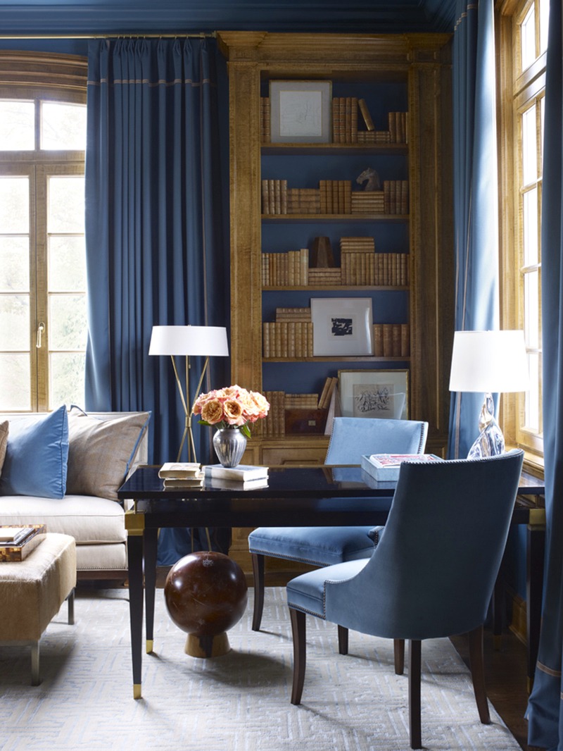

If the room had an Oriental rug something like this, it would make it have a more traditional feel. It’s not that there’s anything wrong with the rug that’s there, it’s only to suggest that it could be something else as an option.
OR, you could take a color from the art or a rug or a fabric and do a room around that color. There would still be a lot of blue in the room.
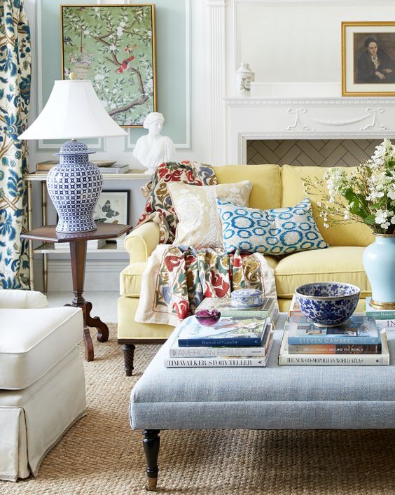
This was found on One King’s Lane so I guess it’s their room. It sure is pretty. This could be adjacent to a dining room that is all blue and white.
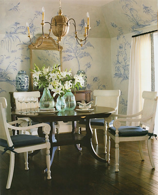
Maybe something like this stunner from Phoebe Howard.
On making a blue and white room cozy.
No one does cozy like Ralph Lauren. Right?
What’s the trick to coziness?
- Well, first of all, a cozy room should be on the smaller side.
- But, as I see it– it’s the layering or as some call it, “clutter” :] that makes a room feel cozy and warm.
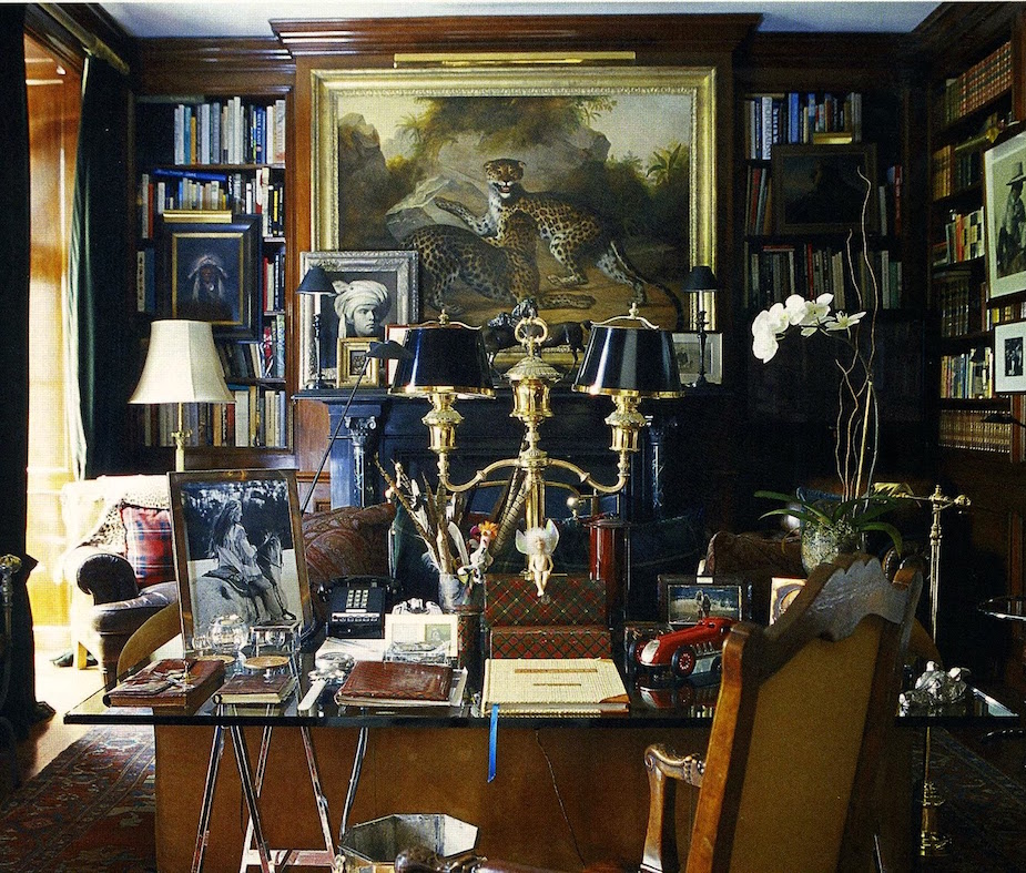
Ralph Lauren’s Home Office
Yes, I realize that this will make some people nuts. haha
But here are two other Ralph Lauren rooms that are classic blue and white rooms; still cozy but with less “clutter.”
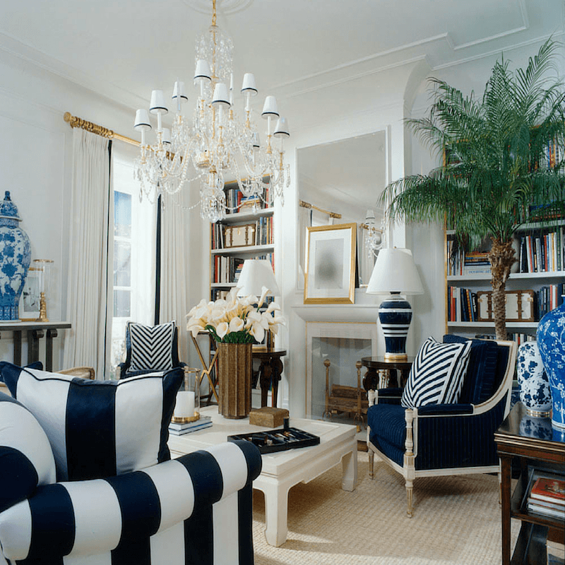
I love this mix of different shades of blue and white.
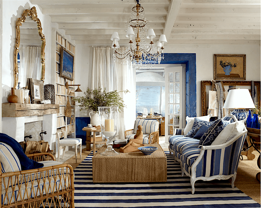
Some say that you can’t mix stripes. Well Ralph has proved them wrong. I count four different ones and I’m fine with that; it’s all fun and fresh.
As for a blue and white room looking warm
The room above is proof that a blue and white room can feel plenty warm. It’s the balance of the warm tones in the furniture and the layering over the seagrass rug that gives it warmth
and

Blue and white LOVES GOLD!
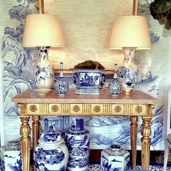
No one does this better than Mark Sikes for the designer’s windows for Hollyhock. via Quintessence.
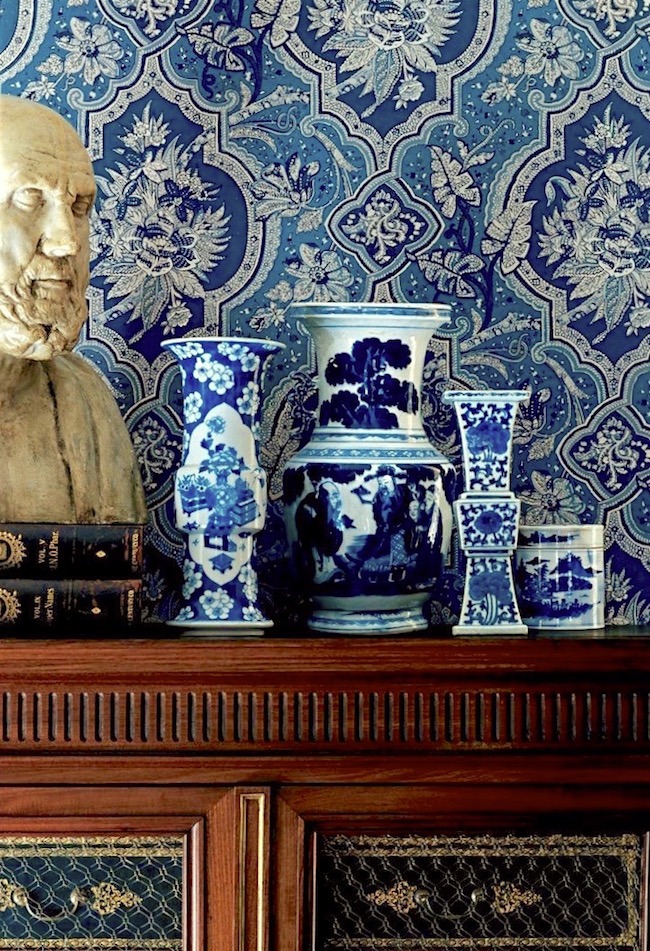
Another Ralph Lauren vignette. I love the varied shades of blue in this traditional vignette with Chinoiserie porcelain.
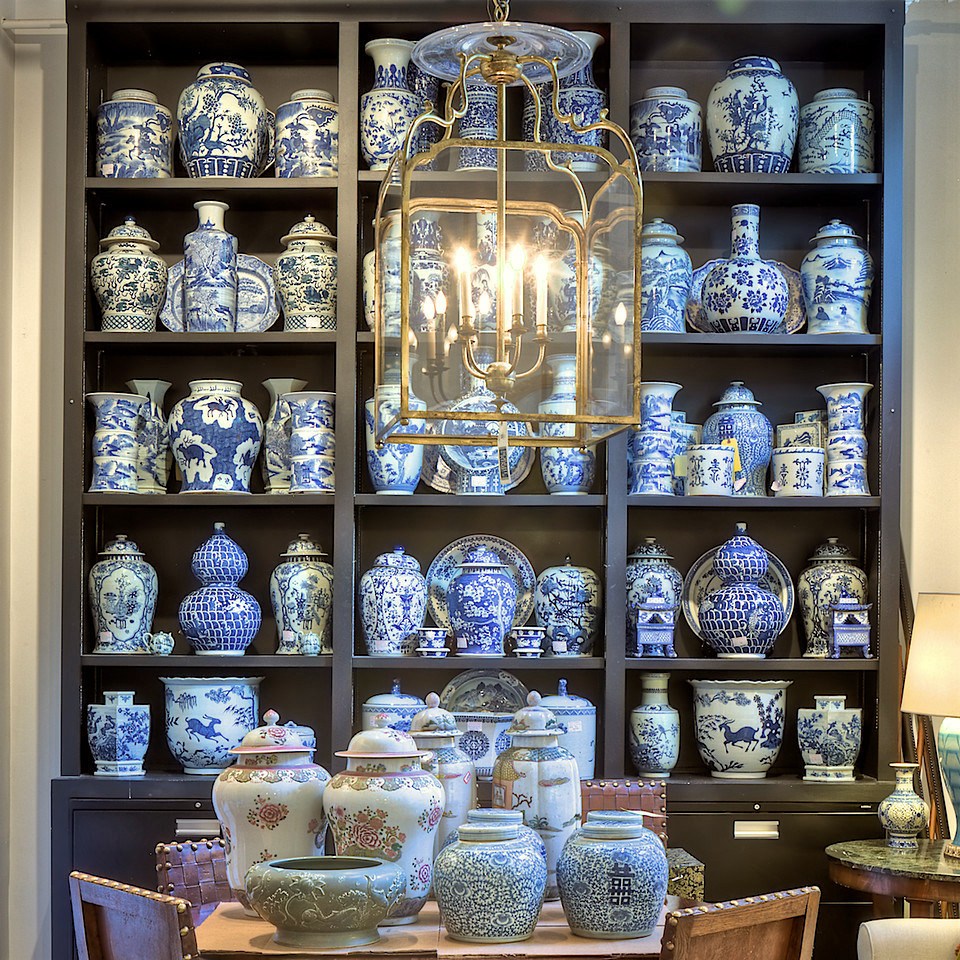
photo: Rod Collins
Bring on the OCD
Obessive Chinoiserie Disorder
haha! You really cannot have too much blue and white Chinoiserie porcelain as demonstrated in the wonderful shop belonging to John Rosselli. (Bunny Williams’ husband)
Speaking of the Williams-Rossellis.
I have no doubt that blue is most likely their favorite color.
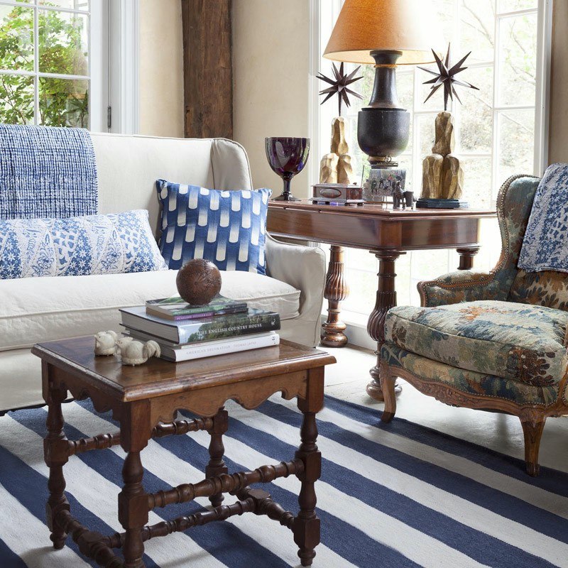
From their home in Sharon, CT- Rug by Dash and Albert
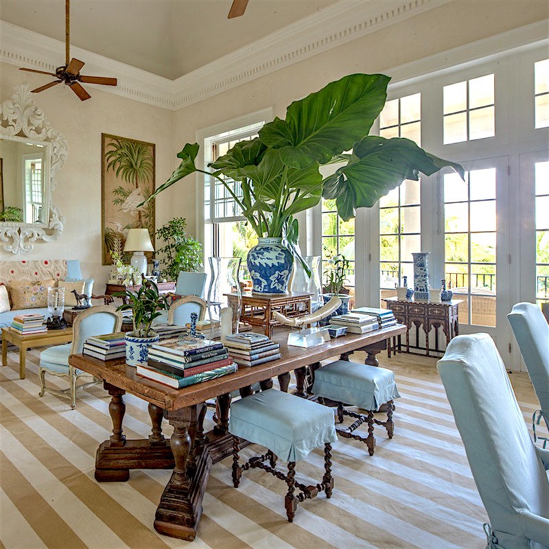
photo: Rod Collins
Their exquisite vacation home in Punta Cana. Do you think they really take vacations? I mean, I know they go there. Oh, never mind. :]
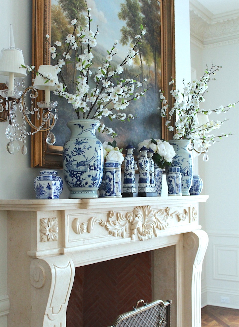
Beautiful fireplace mantel and styling with blue and white chinoiserie porcelains and a fine oil painting.
Below are some of my favorite blue and white fabrics from F. Schumacher.
I think they have become my favorite source for fabrics and wall coverings these days. Brilliant company!
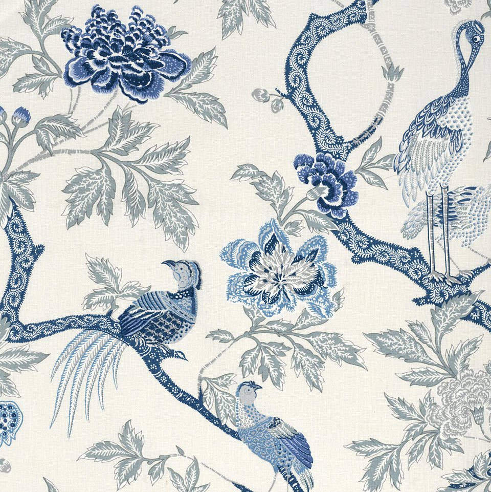
Arbre Chinois
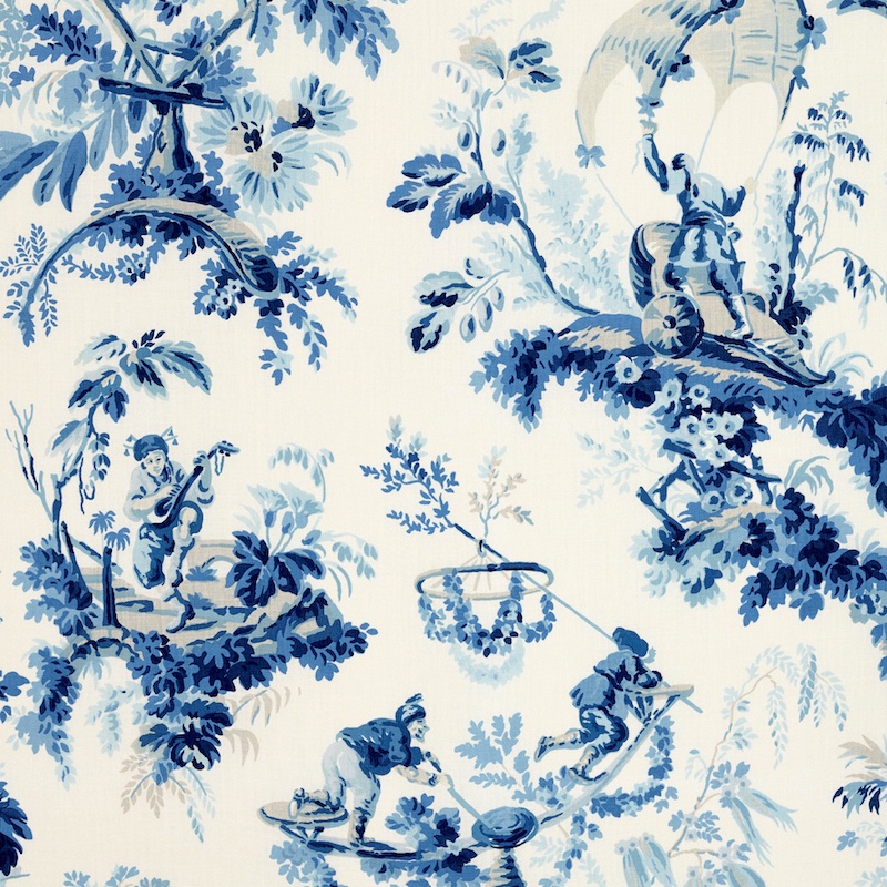
Plaisirs de la Chine
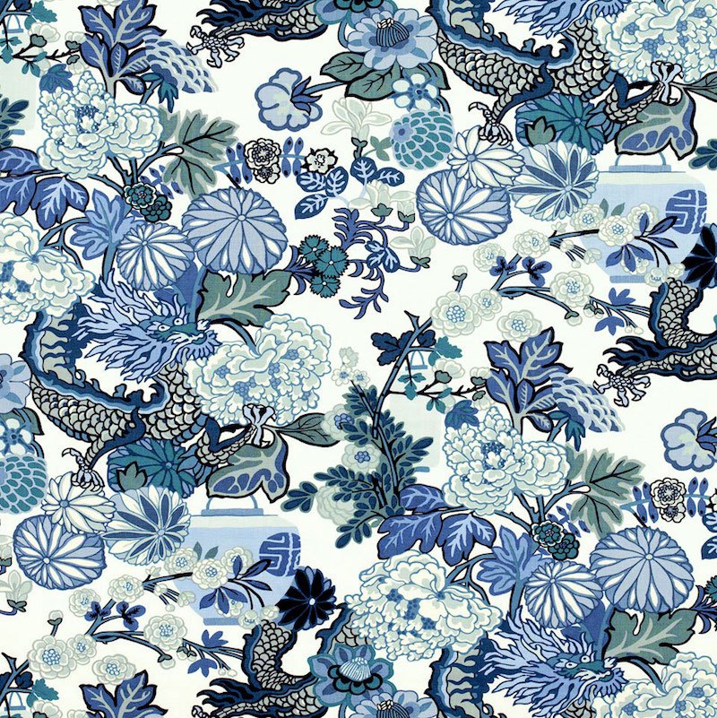
Chiang Mai Dragon
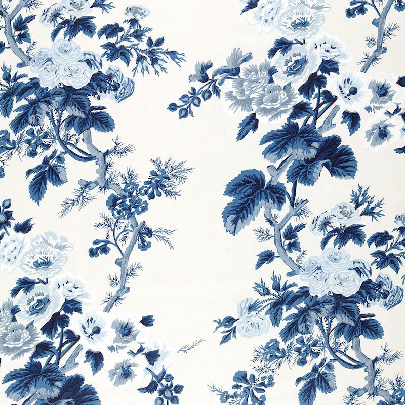
And! The Pyne Hollyhock in a blue and white colorway!
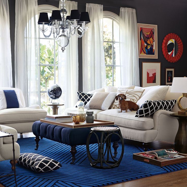
Although this is a far more contemporary room than the others, if the rug were changed, the pillows and drapes, perhaps, it could easily become a more traditional room.
As for wall colors in Blue and White Rooms.
I would not paint every wall different shades of blue. In fact, the walls could all be white. Or maybe only one or two rooms are painted blue. (on one floor) Maybe one room is painted a pale cool gray. There are so many options and it all depends on what else is going on.
In the Laurel Home Essential Paint Color Collection, the blue section is the largest, with 21 gorgeous shades of blue. Plus, some of the cool grays veer towards blue.
And finally, as evidenced above and below, most classic blue and white homes have at least one wallpaper and/or mural somewhere.
To Recap.
- Blue and white rooms are classic and some of the most beautiful. And there are so many variables. And while it’s perfectly possible to only do blue and white, I think it’s important to add warm tones with wood, natural fibers and gold.
- And it’s certainly lovely to add accents of color in accessories as well.
- Layering adds warmth, richness and a cozy feeling.
- Use art to add other colors and help make the room feel more evolved.
- Consider having a room that is a wood tone or maybe one of the secondary colors.
- For traditional blue and white homes, consider using a fabulous wallpaper somewhere
- vary the shades of blue in each room but carry at least one shade from room to room
How do you feel about blue and white? I’ve never had a blue and white home, but I could see myself living in one!
And if you want to know more about blue and white interiors, please check out these posts:
How To Get The Mark D Sikes Look (for a lot less money)
Timeless Interiors Or A Passing Trend?
xo,

Save
Save
Save
Save
Save
Save
Save
Save
Save
Save
Related Posts
 Oh My! I’m Black and Blue! Black and Blue Decor
 The Only Six White Wall and Trim Colors You’ll Need
 Area Rugs, Best and Worst Fibers + Myths + Care Tips
 The Shocking Truth About Restoration Hardware
 Benjamin Moore Color of The Year 2016 – Anything But Simple
 The Number One Decorating Mistake and How To Avoid It
 Blue and White Interior Architecture and Mouldings








88 Responses
Always enjoy your posts. Love the black desk in the Suzanne Kasler picture. Do you know anything about it? I checked her site but still couldn’t find the information.
Thank you for another great post Laurel! You’ve just solved my dilemma. I want to redecorate my house blue and white. We even discussed it with my daughter and were not sure whether it would look too cold, especially during the winter months. I am going to email her the link to this page 🙂
Hi Val,
Glad to have helped! Thanks for stopping by!
Hi there Laurel,. First, many thanks for another fabulous post by my fave blogger! You just manage to find the best photos to illustrate your esthetic. My favorite rooms here are by the ultra talented Phoebe and Ralph.
Although my two favorite colors are turquoise and red, I prefer to use these rather saturated tones for accent colors only. My small craftsman home features varying shades of blue with white/cream, beginning with the exterior which is red brick lower field& BM Thunder (greige) upper field, navy blue Windows, & red door.
r. My LR is navy and cream/off white with a few red and light blue accents. Wood tones , an Oushak RUG, gold frames & lighting warm the ambience. I too have used four different stripes ala Ralph Lauren. (Btw, I found five stripes in that photo. Lol…see the little bench in front of fireplace!), my DR is navy and white inc. a wall of ironstone pottery (I sent you the pic). My kitchen is light blue (BM Summer Shower), white Cabinets w/ a few black and red accents to link with LR/DR.
Down the back hall is just one bath and master BR. My bathroom is a paler grayed down Aqua BM Palladian Blue and white. My BR is the only aberration. It is yellow and white with small hits of aqua blue to link to bath. I rent the second floor for the income so no control there.
BTW, I agree with you that the LR/den by Kasler would be better with that beautiful oriental rug!! Definitely. Again, your dedication does not go unnoticed. Regards, Betsy O
So, my primarily blue& white color scheme is very warm
Hi Betsy,
Your home sounds so beautiful! And right. I put your ironstone on instagram and it was an instant hit!
But wait. I did count the stripe on the little bench. So there’s that, the rug, the two chairs and the sofa. What am I missing? I do see something in the distance that looks like a roll of fabric hanging out. haha.
I love your posts and your taste in decorating. Please keep them coming.
I live in Nashville and the painters are coming next week to paint the exterior of my 82 year old cape cod style home. What is a good blue — blue/green color — to paint the ceiling of my veranda? The color that is on it now is a pale baby blue which is not at all appealing to me.
Hi Joice,
Thanks. Palladian Blue is a classic porch ceiling color.
Just when I thought I didn’t care for blue. You are a magician! I agree Sheryl, she gives so much! Thank you Laurel for giving us all a chance for a beautiful home.
My pleasure Teresa! I love it when people discover something they didn’t realize before. That happens here too!
LOVE Blue and white! (And this post- which I’ve bookmarked.) For me, other colors with it are what make it work so beautifully. Blue and white porcelains with the warm colors I prefer, look so clean and crisp in a room. Amazing how they seem to function as a neutral, and can go anywhere!
Hi Geo,
Yes! It’s true. Blue and white porcelains go with pretty much everything!
This is one beautiful post. Thanks you so much. It makes me feel “normal.”
I would have blue in every room but one (which faces a wooded hillside to the north and needs the Dixie Dawn pink color on the walls).
Now I can see a clear picture of what to do with the stash of furniture in the garage (blue/white/gold) and what to do with all the walls from a previous ‘dating’ period with yellow. (Glad we didn’t marry…It would not have lasted..LOL)
Blue has always been my color, but styles cycle and in the past often I’ve not been able to find blue items in the stores where I shop! Better stock up now for the rest of my life!
I agree with Jo. This is a B.B. (Brilliant Blog post)
Hi MJ,
Of course, you’re normal! I can show you abnormal, but let’s not go there. I would say lol, except that it’s not really funny. :[
And thank you so much for your kind words too. Much appreciated!
So beautiful. And I’m going to try some of these tips in my soon-to-be all-white-walls home.
Question on the navy and white striped rug from Dash & Albert in the Sharon, CT photo: How does one clean such a thing? I bought a pretty big D&A cotton rug and when it had to be cleaned, ran it through a commercial washer 3x and dried it 3x. It didn’t come completely clean. I love that rug and would love to own it.
Hi Eileen,
I love the cotton rugs. But… here’s the deal. You spill grape juice, the proverbial red wine, or the dog drags the turkey carcass over it…
Life is over.
For the rug.
They are biatch to clean.
I used to do them all the time and the super expensive ones from Elizabether Eakins before Dash came along.
Instead, Dash and Albert also has a fantastic collection of indoor/outdoor rugs and those you can take outside and hose off. Those, I’ve sold at least a dozen and they are wonderful. They don’t look synthetic at all.
I have a little one in my bathroom. It’ll be four years in December. It still looks new. I wash it maybe once a year but just because I think I should probably wash it. haha
For your rug, you might try talking to a professional rug cleaner to see what they have to say. But since you’ve washed and dried it three times, the stain(s) may be set and not possible to remove completely.
Laurel, When you wash your bathroom rug, do you just hose it off outside?
Hi Mary,
haha! Well, I could if I had a hose.(I live in an apartment building) It’s a very small rug– 2 feet by 3 feet which is perfect for the world’s smallest bathroom.
Actually, I just throw it in the washing machine!
LOVE this post. Love all of your posts really. Your advice is so thorough. Thanks so much for all of the time and energy and thought you put into these. They are a real pleasure to read and I always learn something.
Thank you Karen! I very much appreciate your kind words. It spurs me on! And BTW, I learn too!
Sometimes, I truly don’t know something because believe it or not, I don’t know everything. lol So, I have to research. But the other aspect is that these posts force me to really *think* about how I do things and why they work or don’t work. And it’s the knowing what doesn’t work that’s also useful, I think.
You have even surpassed yourself, if that is possible, Laurel.
B.B = Brilliant Blog.
Thank you for the hard work.
You put the F for fun in inFormative.
Oh, that is so sweet Jo. I just try my best each week. Fortunately, you guys are giving me so many topics to write about and I’m grateful for the help!
I’ve enjoyed reading and rereading this post. Karen posed a great question and you have outdone yourself with your answer. Your analysis, suggestions and choice illustrations are so helpful and inspired and inspiring. The concept of tenisowe was outlined brilliantly!
My first exposure to “blue and white” was in the form of my aunt’s blue willow ware. I found the pattern exotic and fascinating as a child.
I love the Ralph Lauren interiors. Never tire of seeing The Vase wallpaper. Don’t know when it was designed and wonder whether it was designed in his lifetime or later, by his firm. The Schumacher fabrics are fabulous.
Hi again Libby!
I believe that David Hicks did design the paper himself. Maybe his firm brought it back or they created more color-ways. Clarence House sells it. I’m so impressed with Schumacher. They are constantly reinventing themselves, but not in a way that’s jarring. It’s a gradual, yet steady change. But when I think back on the line, even 10 years ago, it has changed enormously.
I love blue and white, but only if it’s a warmer white…and with another color or colors–apple or sage green, bluish red (cranberry?), lavender or maybe even some orange-ish hues–thrown in. Now that I read that, it sounds rather like a mess, but I’m talking about only one or two accent colors per room. Blue and white alone feels rather beach-y to me, however. Beach-y or not, these were wonderful photos with which to end my Sunday! Thank you, Laurel! (But, yes, that Ralph Lauren office would make me nuts. 😉 Maybe not so much all the stuff, but rather the deeper blue walls combined with all the stuff.)
Hi Joyce,
I’ve never lived in a home with a dark wall. Oh wait. What am I saying. My bedroom is pretty dark. It’s medium-dark but lots of windows and two white doors and white drapes.
Have to say that at night it’s really amazing. I have a mirror that I love on my dresser and there’s a lamp in front of it and the light it gives off is quite beautiful.
It’s all about lighting.
Very good points! Laurel, I believe we all need you to do a post about lighting, how to choose proper lighting for any given space. That is one thing I struggle with, and I’m sure I’m not the only one! (If you’ve done one in the past, maybe you can point me to it when you get a chance.)
Hi Joyce,
I’ve talked about it hear and there and there’s one old post about overhead lighting which unless it’s a small space like a hall, is usually dreadful.
It’s a good idea. Thank you!
I like blue and white rooms in other people’s homes. We’ve tried doing it, because we like how clean and restful it is in those homes but we just don’t feel comfortable living in it. I’m always jealous of people so secure in their tastes that they can commit to a look like that. Ours is forever higglety pigglety with lots of florals. I always go back to them, it usually looks comfortable but kind of haphazard. Our walls are chocolate right now, and we covered up the dreary bluey gray that we hated.
Sounds yummy Celeste.
This is so timely, I think you’ve tipped me over the edge. I’ve been wanting to all blue and white forever. So thank you. Question do you know the name of the Ralph Lauren wallpaper in thr 14th picture, the picture with the bust of mans head and blue and white porcelain. I’ve been searching and can’t find it anywhere.
As always I ended up pinning many of your featured pictures.
Christine
Hi Christine,
I looked for it too. And I believe it’s discontinued. :[
PS just read the very interesting comment about purple; yes, for the past several years, it’s more like me..:)
I agree the purple gets killed when it’s too garish and flat; you need depth to pull it off, whether it’s depth of a jewel, or more grayed, matte depth..
Off to reading all the links in your answer!
What an amazing post, Laurel! I love how you explain coziness; indeed, if I think about it-one never can feel really cozy in the desert or looking into open sea-he starts thinking about big and abstract things, like the meaning of life, and it’s hard to feel cozy when contemplating that:) That’s a bit like looking into the abyss..
But one can easily feel cozy in a cheerful forest with layers of flowers and leaves and sounds and what not:) Unless it’s getting really dark and lonely of course.
The rooms are magnificent; together with that, as much as I love both blue and white, I would never go for it. I will always have warm whites and ivories and bone colors in my place; will always have warmer blues and turquoise; but I won’t choose going full force for this palette. I don’t exactly know why; would make my husband very happy for example. He’s in love with blue and white porcelain, between the two of us..:)
Thank you, thank you for this gorgeous post. And for making me look forward to Sundays, since I’m usually not a fan:) I don’t like having Mondays hover over me I guess:) But your blog helps in enjoying right here and right now.
Hi Jenny,
Well… my dream is to live in an all-white house! But I would love to accent it with the blue and white porcelain and then another collection of creamware and ironstone. Ahh… heaven!
I hear you about Sundays. When I was a teen-ager, it was the only day I didn’t dance and what faced me instead was a mound of homework. I was always so blue. My mom called in “Sundayitis.”
Dear Laurel, I thought I commented on your great post today but it hasn’t shown up. Did I do something wrong? I hope it isn’t that case that my comments were too irrelevant or dumb to print !
Oh never! There are a lot of comments today and unfortunately, I had to turn on the comment moderation which sucks and I realize that sometimes people will see other comments before I’ve had a chance to post and answer. If I post before I answer, then I get confused if I’ve answered it or not. So, sometimes there’s some lag time between when you post and it shows up.
It’s rare that a comment doesn’t post. They are ALWAYS anonymous and designed to be hurtful. I so appreciate your thoughtful contribution. It warms my heart! xoxo
It’s taken me 40 years to realize I’m a true blue and white person. So, when we bought a new house, I decided to go with my addiction. Every room in our house is blue and white in some form. The walls in our den are painted a French blue, and the trim and plantation shutters are white. The rest of the house has become very comforting and warm in varieties of blue and white. I have lots of blue and white porcelain to continue the color scheme in all the rooms.
Hi Mary,
That sounds wonderful! And it’s okay that it took a while to discover this. There are so many influences in our lives and sometimes those take over. But great you allowed your true-self to shine through!
You have my heart with this blue and white post! I’ve loved blue/white since I was a little girl. I’m 70 now. I am so aware how important it is, especially late in life, to try to keep a fresh eye in decorating our homes. I struggle to use the things I love while editing enough to keep our home cheerful looking.
Laurel, you read my mind. With all the blue and while I’ve collected over the years…I now feel free to branch out and use it more creatively with the new, more modern paint colors I have just put all through our home. By the way, I had beautiful blue/white wallpaper several times in our different homes as we moved frequently over 50 years.
Thank you for confirmation AND inspiration.
Thanks so much Katy! I never know how a post is going to go over. Seriously. I thought this one is so specific and that might knock out a lot of readers, but not so! It’s not that I’m trying to please everyone. I know I can’t do that, but I’m heartened to see how many are relating to this post.
Hi Laurel, I love blue and white, they are the common colors throughout my house. But I definitely use other colors too, greens, soft yellows, soft pinks and corals, along with warm wood tones and gold/aged brass.
BTW, I’m so happy the warm metals are back, I’ve always loved them. Same with blue, true blue-pale to navy. Do you remember a few years ago when all you could find was aqua, teal, turquoise, etc.? Nothing wrong with them, but it was so hard to find my true love, pure blue. I’ll guess the trade always had plenty of access to it though.
The exterior of my house is a very pale, soft yellow, and my front door will soon be painted a dark grayish blue, of course:). It would be nice if the house was white but I can’t change that, so it’ll have to be enough that all the exterior trim and porch will be white.
So I guess that’s what I’ve done, started with one color (blue) and chose white instead of cream, and then added other colors, but kept the common thread of blue and white throughout. Works for me!
Hi Kim,
Sounds gorgeous and classic. Love that! Actually, where I live… it wasn’t that long ago that everything was golds, olives and fall-like colors.
Gorgeous eye candy!!!!
Thanks so much Kelley!
In my first LA apt, everything had to be blue and white. Then I became enamored
with everything Monet and segued to blue and yellow. My interior design teacher insisted that wasn’t a color scheme unless I added touch of red (which I hate) but hot pink worked! Now that I’m older and an empty nester, I’m totally girly — blue and pinks. Loving pink – the color that most husbands absolutely eschew! But now in our mid-century state, it’s like OK who cares, go ahead. Yay!
Hi Allyson,
It’s funny, but there are some pinks that men DO like. Or at least, when they see it, they go– “oh, I do like this one.” I think they *think* they don’t like it because it’s always been associated with little girls.
I have a son who’s a man now – lol. Well, he’s 26 (how the hell did that happen?) and he loves pink! Albeit, he’s a little color-blind. haha.
My middle son’s favorite color is pink as well. We’ve been planning his pink bedroom for after we move. I’m going to do a pink garden under his window too. I found some fantastic pink madras for him.
Hi Celeste,
Is your son a musician too? Mine is, but he’s also into disk-golf.
What a fabulous post!! Patricia of PVE dieted me over knowing my obsession with it. FYI the mantle shot with the jars is my home so if you can credit it to The Enchanted Home, that would be appreciated.
I love it and to me, there can never ever be too much:) It is classically beautiful and just makes me happy! Lovely:)
Oh Tina,
I’m so embarrassed! I changed it right away. I’m so sorry, but their image was very high res, so I figured it was theirs as I couldn’t find it attributed to you or anyone else.
Thank you for being so gracious about it. I do try to credit everyone and am frustrated with bloggers who think it’s okay to not credit to the original source.
Someone told me that one well-known blogger who I’m sure you know who I mean, said “I don’t have time.”
gross. When I see her images on pinterest, I will not pin them.
Patricia is a doll and coincidentally lives just a few miles from me. So talented she is too! Had to laugh at the dieted typo. I like it! But if you want me to change that too, I will. lol
I never appreciated the blue and white porcelain until just a few years ago. It’s not that i didn’t like it; it just wasn’t on the radar so much, but now, I can’t get enough of it! And your blog is so gorgeous too!
It’s clear to me that I need more blue and white in my home! I wouldn’t mind having tea and scones in that Kitty Tuttle living room then retiring into that absolutely gorgeous library by Aerin Lauder, enveloped in dark blue, with a good book (and maybe have Maggie Smith drop by for a chat). I never knew how much I could love blue, especially dark blue. As always Lauren, a very inspirational post. Thank you for showing us how to use blue so nicely without it being “cold”.
Thanks so much Maggie.
I think that there are at least two Maggies here. But I think the other one is Maggie S. Being such a visual person, it would be helpful if I could see people’s faces.
This is what I’m trying to do in the house we just bought. Spent 3 weeks painting everything ourselves (3000+ sq. ft.) and my main colors are 3 different shades of blue, a BM white called Snow White that has just the tiniest blue tint to it and a yellow called Butter ( all Benjamin Moore). I’m so glad that you said that blue and white loves gold! I had seen a picture with some gold accents in it and thought I should go that way. Great blog, Laurel!
Hi Suzi,
Thanks so much! And yes; That is one way we learn about what goes with what. Look at what someone else did. I do that all the time when I’m feeling stuck.
Thanks for another great post. I could get on board with an all blue home! The first time I saw a home with a totally blue scheme was about 25 years ago on a home tour. I remember being intrigued….yet something looked a little off. Looking back, I’m guessing some of the key points you mentioned were lacking, namely the introduction of different colors through art to make it feel more evolved. I specifically remember the pure white carpet, and thinking what an “optimistic” choice the designer had made! A natural fiber rug or an Oriental would have probably made the room much more approachable and appealing.
I have to say that your Sunday morning posts are a real joy to me. At first my “new mail” had not loaded and I thought you had taken the day off! I was like “Laurel, how could you? What the heck am I supposed to read with my coffee???” Have an awesome day, and thanks for the inspiration.
Hi Elise,
No days off for me! haha. In fact, that’s one of the things I tell wanna be bloggers and that’s if you want to reap benefits from the blog, you must be consistent. Sure, if somebody died, okay.
Another nice blue and white home is by Miss Mustard Seed — https://missmustardseed.com/
It is really more of a white & blue home (because blue is more of an accent color) done in a very different, more casual style.
Hi Maggie,
Oh yes! I love her home! Thanks for sharing that.
I love this posting!! I went back and looked at analogous color schemes. My home uses the cool spectrum of the color wheel from aqua to blue purple.
***I would be ecstatic if you would do this same sort of posting for purples.**
I made the core of the home’s walls as neutral as possible with butter cream walls (no white for me at the time as renting forced me to live in white most of my life, but I feel I could go just the right shade of white now). The rest of the home is blue/purple and with aquas and a smidge of green, mainly in plants. I love purple, but especially blue purple. And amethyst is a healing and spiritual color. When people disparage purple, I almost reject them as it is clear they don’t have a spiritual clue.
The bedrooms and the sunroom are the most luscious shade of blue purple not on any of the major paint company palettes. My builder required me to use a local paint store which had this beautiful color on their chips. Lucky me. I can now match with a more recognizable paint brand. I do not think I will ever live without this color on some of my walls. So the core of the home’s walls are buttercream and the outer edge of rooms arrayed against this core are blue purple.
The dining/living room is now being blue/purple-ized against more neutral pieces and the addition of purple in pillows/cushions throughout the open dining/living room. I just got a white Sunbrella Hickory Chair sofa and am switching out different shades of purple on the pillows. Just purchased ikat from Turkey via Etsy. It is blue/purple against white. I have a sample and am waiting for the 11 yards seller had available to arrive.
The blue purple is visible from this main room because the sunroom is also in this blue purple (the paint company actually called this color blue iris). My cat is named Iris, and I am planting lots of iris in the yard. The sunroom is mainly glass, but the blue iris shows up above and below the glass. So in dining/living room we have the background hit of the blue iris in the sunroom through the French doors and side windows along one wall of the living room to which I am adding blue/purple and grey purple.
A designer who had been in many of the homes in our development told me that one house in the development is all in different shades of purple. A brave woman had the courage to do that. I never thought of diving in that thoroughly. I would love to see that house. I don’t know how to find out which house it is.
Laurel, your blog is inspiring.
You are bring beauty into other people’s homes. While some think of designers as only for the rich given most people’s budgets, you are helping some of us improve our homes for free or next to nothing.
I would like to thank you for this.
Hi Ramona,
What a fabulous comment! I love it when someone has passion for a color or a design or something. It’s the sheep of the world that worry me. But some people need to be sheep, I guess.
Are you an Aquarius or at least born in February. I am and as you probably know the amethyst is our birth-stone.
When I was a child, I adored purple but something changed and I didn’t feel the same about it in later years.
It’s true; its gotten a bad rap and part of that is because people don’t know how to use it and they choose a purple with two much chroma. (brightness). That’s why on my paint collection, all of the purples are knocked back with brown and cool grays.
The blue-purples which are more like indigo are very beautiful too as are some of the very pale shades.
There are a few images on here that use purple. Hang on. I think I can remember one of the posts from a while back. I’ll dig it up for you.
This is one:
https://laurelberninteriors.com/interior-decorating-plants/
This one has some nice purple images:
https://laurelberninteriors.com/cheaters-guide-choosing-color-schemes-analogous-colors/
https://laurelberninteriors.com/ten-colorful-paint-colors-that-act-like-neutral-paint-colors/
(my bedroom is very close to the one that says Tempest)
Here’s the one I was thinking of. It took me a bit to find it! Love those purple chairs in the room by Anne Hepfer
https://laurelberninteriors.com/one-cheap-and-easy-interior-design-fix/
Did you know that my bedroom is purple?
Thanks, Laurel, for a knockout selection of blue and white décor. I don’t have a large house — and feature blue and white as the color scheme in a guest room, sun room, and entry hall. Since I’ve been collecting blue and white Asian objects for a long time, amongst the three rooms I’m able to use most of them. There’s plenty of color — wall colors in the three rooms are saffron, peach and emerald green.
I don’t like the way Suzanne Kasler dresses the bookcases in the rooms shown — I’ll take real, multicolored books ala Ralph Lauren any day!
Hi Bfish,
I agree about the bookcase in that room. It’s a showhouse and it looks like she had an assistant fish out some of the stuff from her Ballard Design Collection. But I was having a problem finding a nice image of a wood-toned library that would still go with blue.
Great post and wonderful ideas for featuring one color. Would love to see your take on the new it color dark green. (See Jessica Chastain living room in curren Arch Digest–wow.) Am considering farrow and ball “green smoke” as I redecorate.
Hi Susan,
Well, I love almost all greens except for billiard cloth green, except for when Miles Redd does it. I love him. Some of his rooms are waaaay out there and then he’ll do something relatively sedate. But he’s fearless and I love that!
In fact, in my mood boards, I did one as an ode to Tory Burch’s green living room. It came out great. I actually mixed two of the laurel home collection colors. And that is part of the point of the collection. It’s a jumping off point and yes, 90% of the time, what’s there will be fine, but maybe someone wants to experiment or maybe they’ve moved into a home with a different color and want to work with what’s there.
I also love Windsor Smith’s dark green sunroom/dining room. I have it on this post.
https://laurelberninteriors.com/9-fabulous-shades-of-green-paint-common-mistake/
So Beautiful! Used blues in my first 2 homes. I’m a Barn Red, Tan, and Cream gal now, with Black thrown in the mix as well. Hey, maybe you need to do a post on this color combo??? I’ve had my share of problems with it…
Thanks Penny,
Sounds like it needs a touch of blue (and green too) to calm down that horse in the barn. lol
Hi Laurel,
Funny you should mention the blue and the green. Just told DSH that I wanted to start mixing in another color. I like both, but think we’re leaning towards the green. I love green. We want to paint our kitchen cabinets and we have black appliances. I have seen green with the black and love it. And of course, I have some brown as well. Lol sounds like a mess, but it is truly earthy. Our home is small but cozy. Have to have a touch of red and/or black in every room.
I love your post and all of your professional hints and helps! And once again, right on target with adding in another color.
Thank you for all the fun reads. How could we survive without you!!
Hi Penny,
Green with the black appliances sounds great. And green is IN, in kitchens. Like really IN!
I was leaning toward a palette similar to what you described. I felt if I went blue that it would be more muted. It did not occur to me to look at green. And in that I can see where different shades of green could work ( apple, sage….) Great idea Laurel!
Thanks M A M!
As someone who has used blue& white + salmon(or a variation thereof) in every room on my first floor- I will tell you that this is probably my most favorite post of yours ever-until the next one comes along :-)I never ever tire of the combination.
I wanted to tell you that last Monday- I received my copy of Parish-Hadley ‘Tree Of Life’- ( FABULOUS book, co-authored by Bunny Williams)), and there- on the cover, was the room you had chosen last Sunday for your discussion on that most beautiful of fabrics, ‘Pyne Hollyhock’. I felt like I was an insider, thanks to you.
The one salient point that every former designer who trained at that august company affirmed, was that Parish-Hadley was all about” teaching and sharing” design knowledge with their staff, and you too fall into that category. Thank you!
Oh Dolores,
This brings tears to my eyes. Truly. I so appreciate not only your kind support but also your knowledgeable and discerning comments. xoxo
Love this blog! Blue and white one of my favorites
Thanks so much Laura!
Excuse me while I wipe the drool from my mouth – those Ralph Lauren rooms love, love, love them. I can see that his office could make a person (of a certain type) hyperventilate, but I think its beautiful. To me his rooms are comfy, cozy and look like someone actually lives there. I love the huge artwork, but I do wonder how does one incorporate a large print into a room without it totally taking over the room after the initial viewing? This is a great posting (as always) I’m glad to see the “clutter”. I love cozy.
Hi Betty,
What do they say? It’s not clutter. It’s curated. lol I think part of that image is the angle with all the stuff on the desk that’s difficult to see what’s behind. I’m sure that it’s intentional.
Someone just wrote me about art and I’m going to do a post about that; not just art walls which I’ve done a few times, but how to get that “old-money” look on a far more meager (or meagre) budget.
One thing I’ll say right now. Someone asked me “how do I make my HUGE TV disappear?” Yes, yes… dump it. lol
But no, I said, to paint the wall (or walls) in a dark color so that it blends in.
Oh I can’t wait for the “old money” look post. I’m glad I don’t have that TV issue – don’t have one LOL I’d love to hang one of those giant artworks on my brick fireplace, but don’t know how or what, should there be space around the art if on a brick chimney, when is a “theme” of one thing too much (hunt, horses, etc.). Can’t wait.
Thanks Betty. Me too!
Great tips and a timely post for me. I have never used blue before in my home but spent last evening making a mood board for our entry using blue patterned wallpaper, fabric and accessories….wood tones and black as contrast. Great minds think alike.
Hi Ann,
It’s so funny that you’re talking about mood boards. I don’t know if you saw my post from a week or so ago about the mood boards I’m making. Well, so far, I’ve done 22 and each one seems to get more elaborate than the one before.
But what is really cool is that it’s a great way to see everything together. I’ve always known that, but these have a little bit of perspective as well.
I’m not overly fond of the boards that go overboard with that, but a little gives some depth and shows the relation of sizes to each other, fairly close– at least.
But I was thinking that a young designer with no portfolio could do a mess of these boards and if done well, I think could easily find work as it would give prospective clients a handle on their style.
Dear Laurel, I had indeed seen your blog post with mood boards from a few weeks ago and I loved them. They were an inspiration to me (as are ALL of your posts). I am on my own jag of mood boards right now and using picmonkey happily due to your suggestion.
But most importantly, as has been stated here in many of the comments…your posts are rich and generous with information and inspiration and this recent one on blue and white is no exception. Thank you!
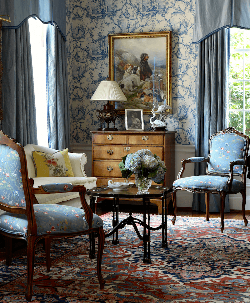
Ps. Dare I ask if you know the wallpaper in the Kitty Tuttle photo? I went on a toile wallpaper search and could not find it.
Hi Ann,
Sorry, I don’t know the source of the wallpaper. But thank you for your kind words!
My favorite room is the Tuttle small living room because I feel that one could walk in that room wearing any shade of brown or green or red and not feel she needs to move somewhere else because she doesn’t go with the room, that she either gets lost or sticks out. That’s what I personally don’t like about some of the other beautiful rooms, especially the dark stripes. The use of colors in the oriental rug, the painting, the different woods, the color in the chair’s upholstery, and the green outside the windows makes me feel comfortable. And what sumptuous curtains! While I might not want to live in an all blue-and-white house myself, I love these rooms.Another inspired blog, Laurel.
Thank you so much Gaye! That is indeed a lovely, gracious room and as timeless as they come. I love that too!
OMG Laurel! This article spoke directly to me. I’ve been told enough blue and white already! Well, screw that cause it makes me very happy. I might be OCD with blue and white ceramics, jars, lamps and plates but prolly because I was too unsure of how to decorate other items and decor in those .
Your post covered many of the misgivings and questions I have pondered. You are a pro who has given me permission and wonderful ideas! God I love ya Laurel!
P.S. Your writing still cracks me up. Thanks!
Hi Sheryl,
Glad to help and thanks for such a lovely comment! Here’s to OCD with blue and white Chinoiserie!
That’s it, I’m ready to redecorate a whole new house!
haha. me too! Maybe two houses!