Happy Father’s Day Everyone!!!
Although, this post is probably going to look more appropriate for Mother’s Day.
Some of you know that I got to go on this amazing garden tour in Greenwich Connecticut last weekend.
My beautiful friend, interior designer, blogger, influencer, and fellow design hound, Deborah Von Donop invited me to go with her.
Yes, please! And, so we did. It was a magnificent day in early June.
“Nothing so rare as a day in June,” my sweet mother always said.
As promised, I’m going to share the photos I took. Of course, I always wish I had taken more, but I think I got some nice shots which will give you a good idea of the various homes, architecture, scenery and gardens.
This annual garden tour in Greenwich Connecticut is called Grandiflora and is produced by the Greenwich Botanical Center.
In addition to Greenwich, the private residences that hosted the tour are also in the neighboring towns of Cos Cob and Riverside.
But, first, where is Greenwich, Connecticut?
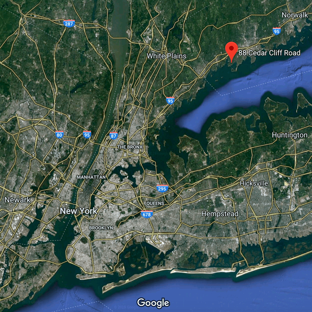
Above is where one of the homes is located in Riverside, CT. Greenwich and Cos Cob are to the left.
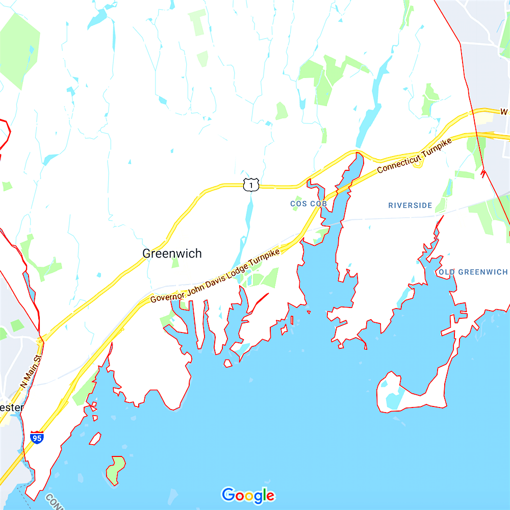
You can see the towns better on this map. Deborah lives in Old Greenwich.
These towns are in the affluent county of Fairfield in southwestern Connecticut. It is situated on Long Island Sound. The land mass on the other side of the sound is of course, Long Island. And to the left of long island is New York City.
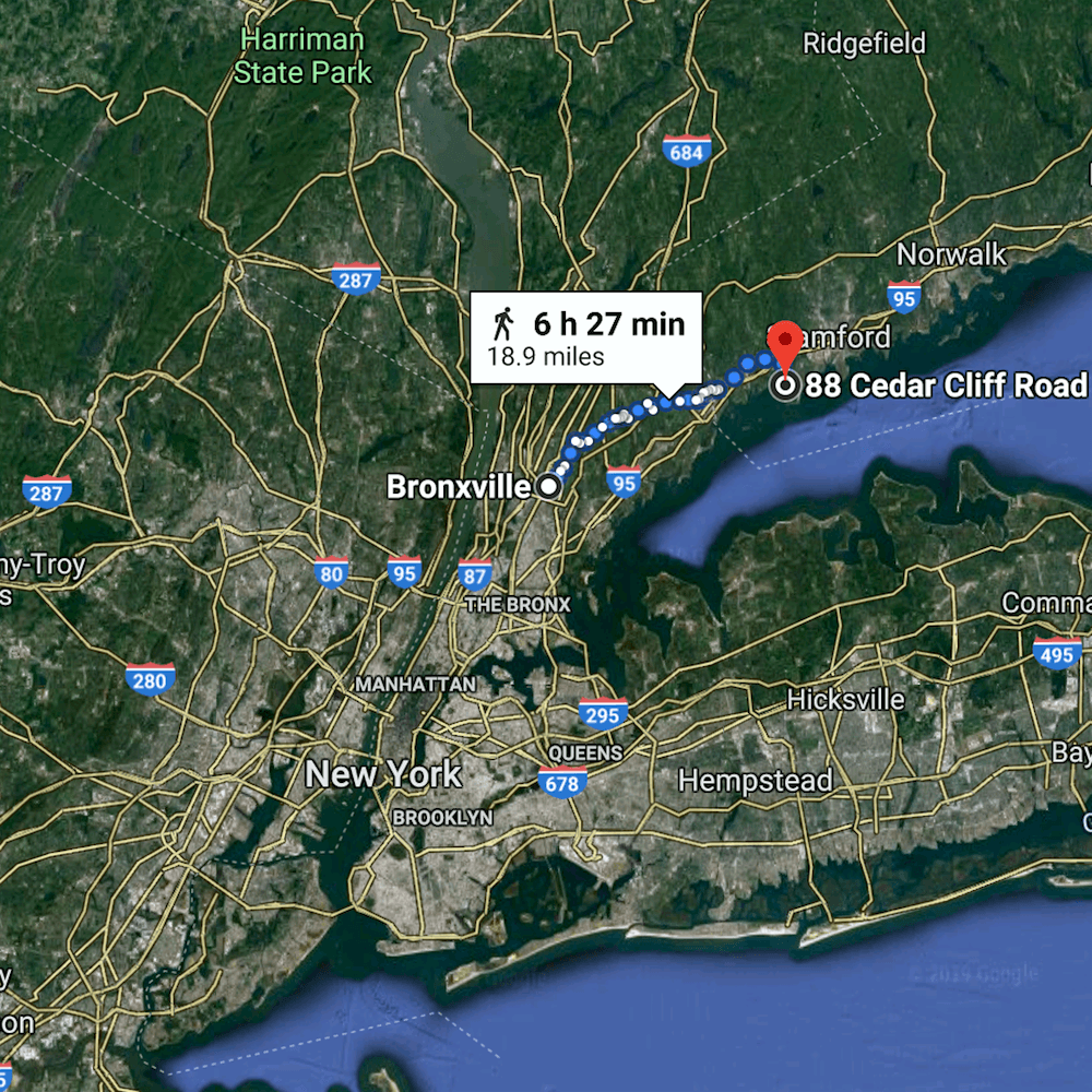
This map shows where I live in relation to where the garden tour was located. Of course, I wouldn’t walk, but I put that in because google maps offers a few different driving routes and it’s easier to see, this way.
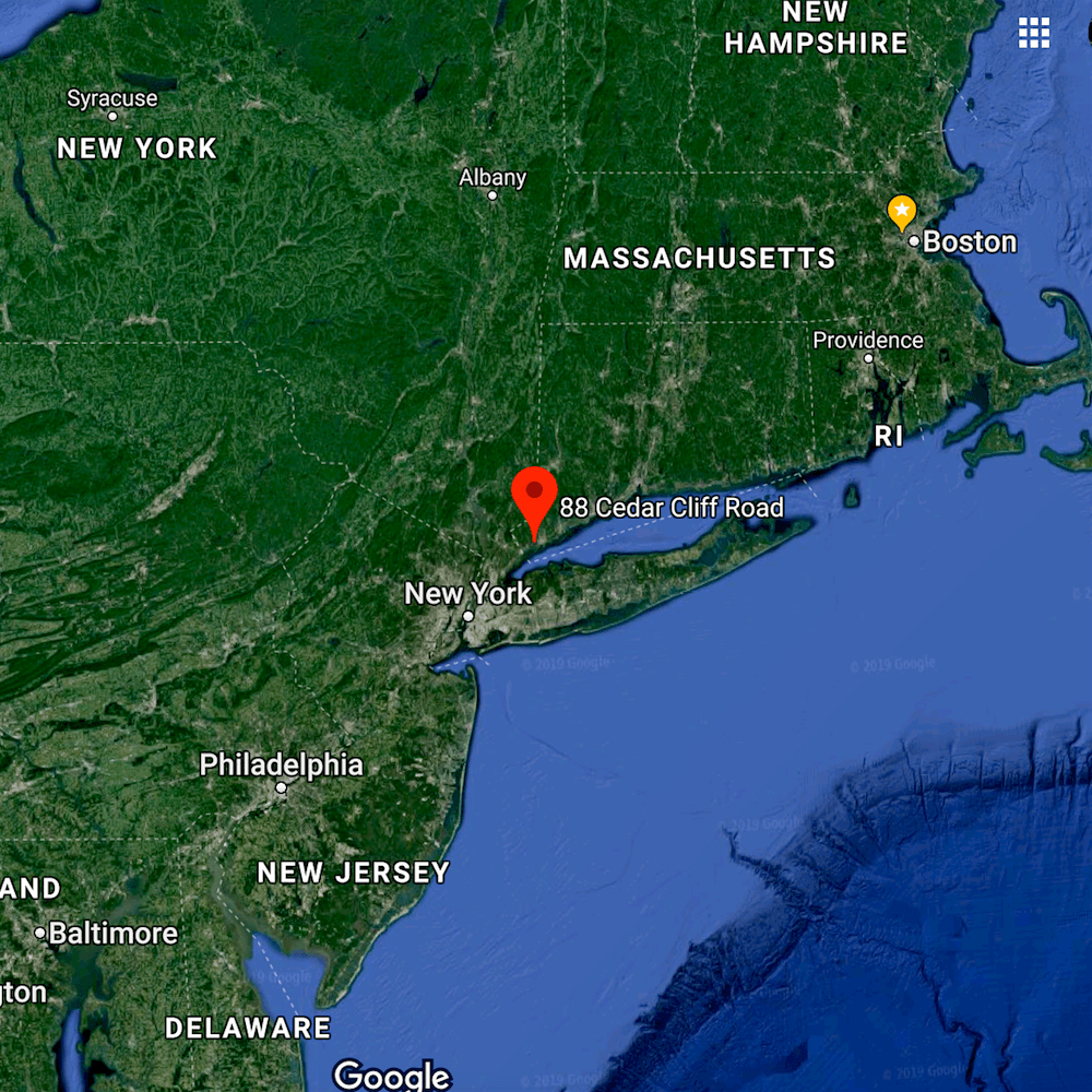
Above, I zoomed out the view for those of you who still have no idea where this is.
I met Deborah at the Greenwich Botanical Center as she lives close by. Then, she drove us from house to house.


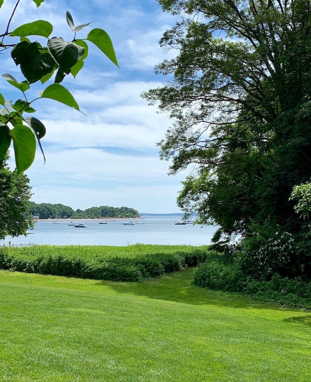
We began our garden tour at a classic Clapboard home on Lake Ave in Greenwich.
Of course, what does Laurel do? Does she take photos of the gardens?
No, of course not! She takes photos of the house! haha!
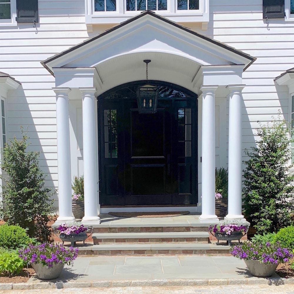
Adore this classic Georgian style front door area. After all, it is NEW England!
BTW, Deborah also just did her own gorgeous blog post of this tour. She’s an excellent photographer amongst her many talents, so please be sure to check out her post as well.
And while you’re there, also please sign up for her blog and follow her on instagram if you’re not already.
A few of our photos are quite similar, but she has some incredible shots I did not get. Believe me, I wanted to swipe some of them!
I really like this image just to the left of the front door
Then, somehow I forgot to take pics of the gardens in the back and exquisite pool.
But, then the property keeps going down, down, down a hill until we come to a babbling brook.
Sorry, no photo of that either. I know… it sucks. But rest assured that there’s much beauty coming your way.

And no, I don’t mean me! Even though it certainly sounds like I mean me. haha.
It’s just that Deborah took a nice pic of me down in that area. It was her idea that I should be walking towards her.
Yes, I know. I’m quite fair. It’s how I got a part in this 1983 film.(and other amusing stories)
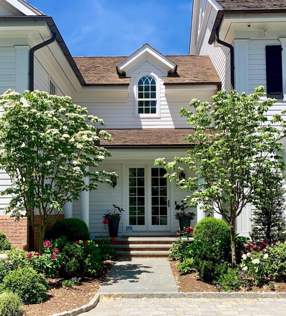
Moving on… The next garden on the tour couldn’t have been more different.
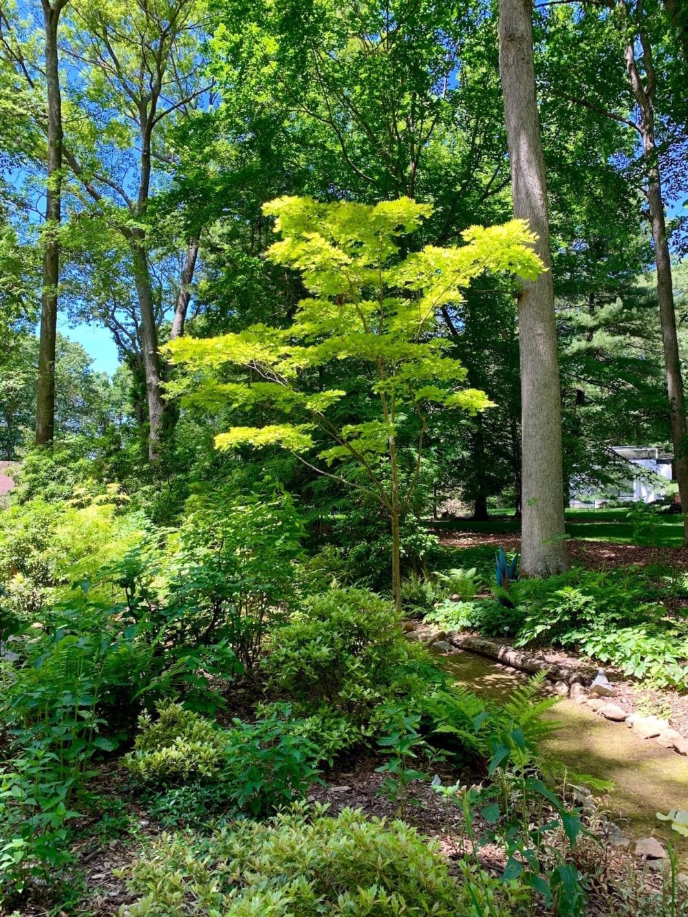
The home is modern and the garden very natural and heavily wooded.
 You can see a bit of the house on the right side of this image.
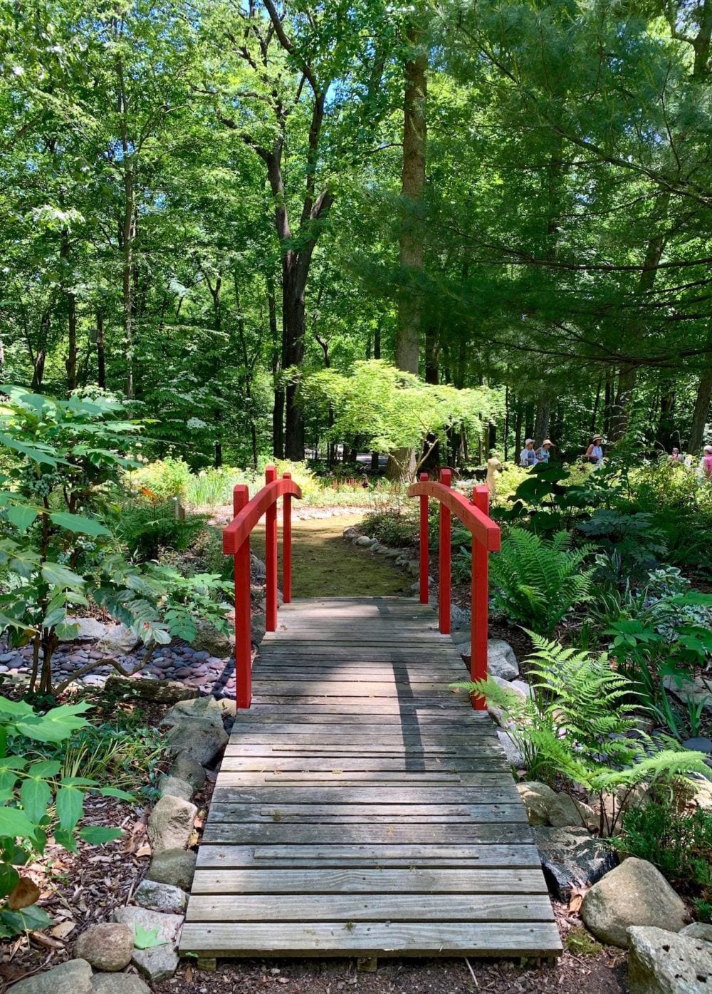 Love this bright red bridge juxtaposed against all of the lush greens! And, I bet it looks just as charming in the winter.
Deborah and I chatted with the incredibly delightful homeowner who does all of her own gardening.
I reckon that the garden itself is at least an acre. She obviously has a passion for it!
She told us with a twinkle in her eye that in the spring and summer months, she has a permanent stain under her nails that will not come off. She said that it’s easier to handle the plants without gloves. I totally get that. Besides, it’s so nice to feel the earth with ones hands.
However, I saw no evidence of any staining. Instead, I saw a pair of perfectly manicured and polished nails.
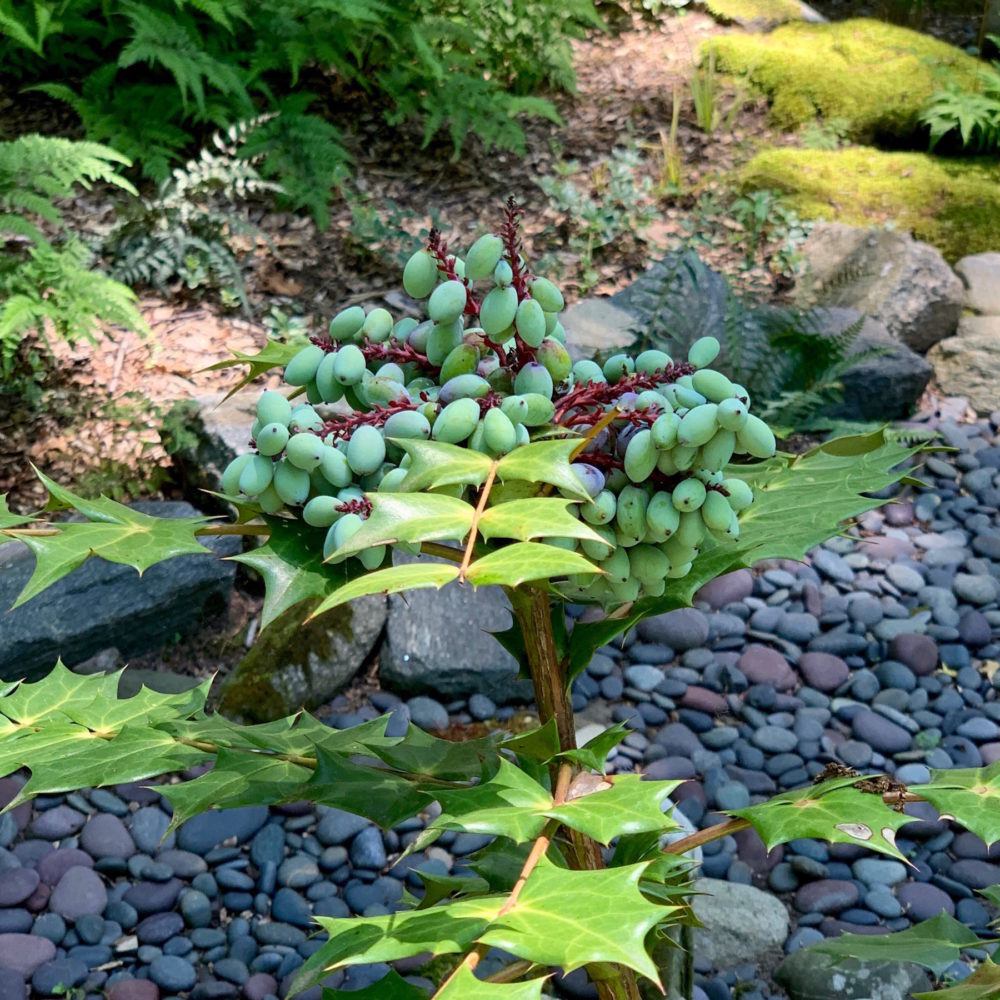
I have no idea what this plant is with the grape-like pieces, even though it does look familiar. I know that someone reading this will clue me in. But, don’t you love all of the varying shades of green!
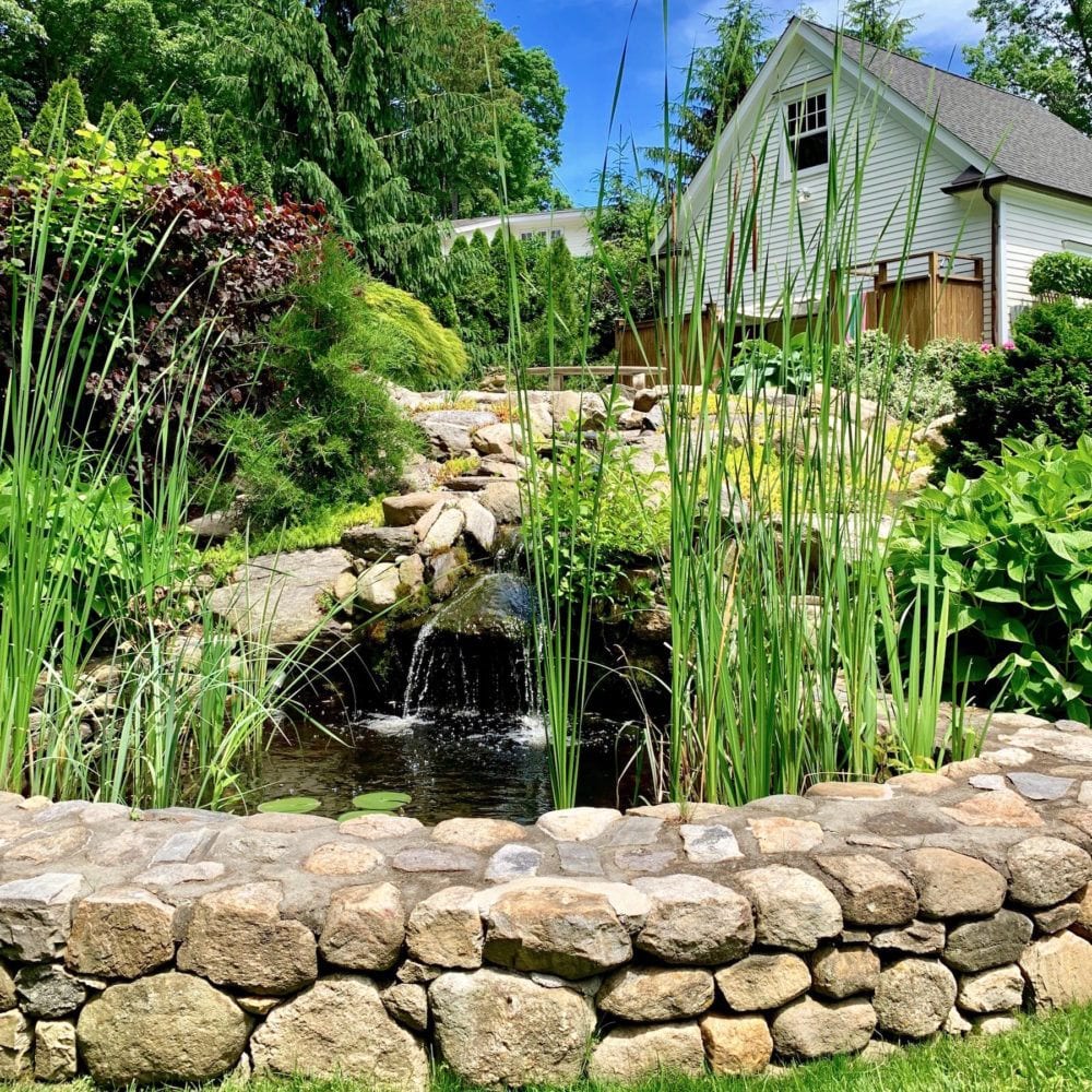
The next place on the garden tour in Greenwich Connecticut, I also didn’t take photos of.
It’s almost a running joke with me. But, it was a completely natural garden and mostly tall grass. Really cool. I just forgot to take photos. Sorry. However, I did take this photo of the pergola and two women on the tour taking a rest.
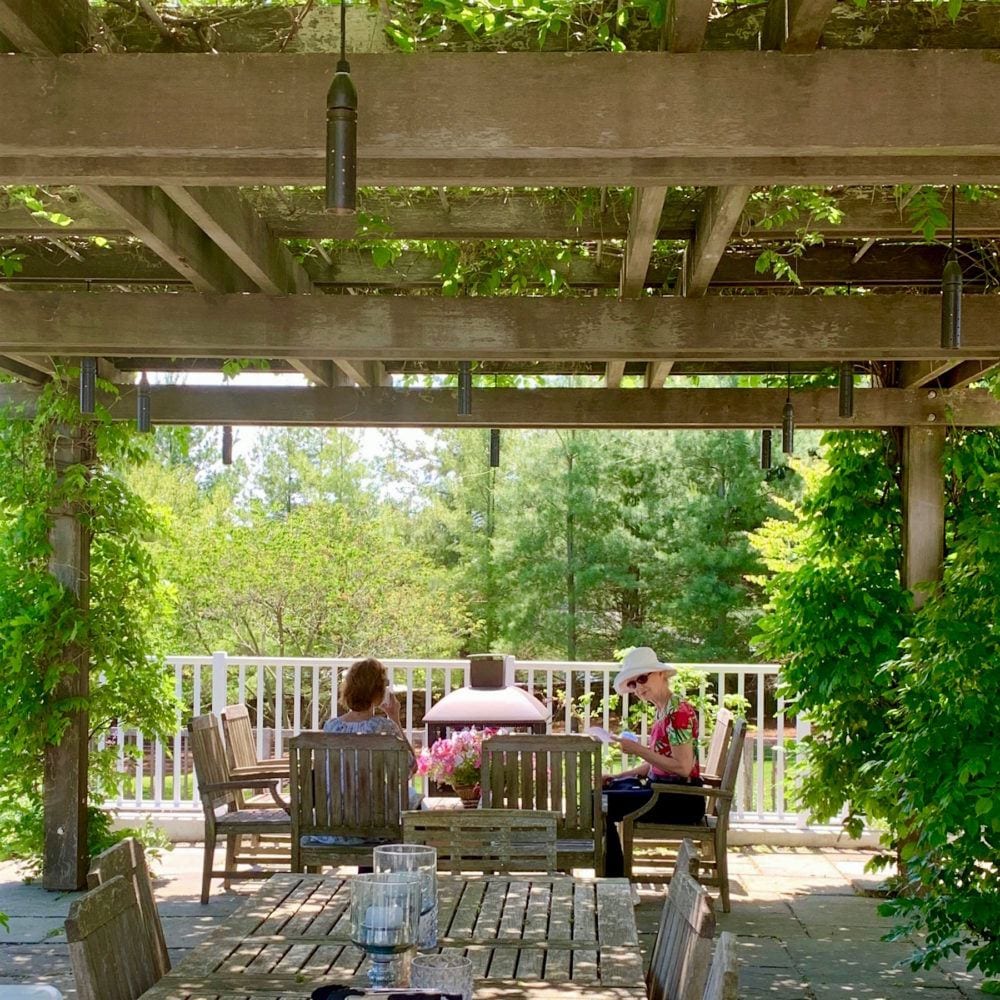
Cropped out of the photo, was a very welcome cold glass of lemonade. Great touch!
Deb and I also chatted at length with the homeowner who we enjoyed talking to a lot. Her name is Olivia Graham who is a very successful fashion photographer. Please follow her on instagram.
Olivia said that only a couple of weeks earlier, the wisteria was in full bloom on the pergola, but alas the blooms had finished.
If you love wisteria as much as I do, please check out this beautiful garden post.
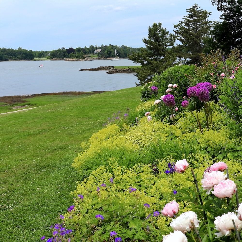
We saw two more homes that are only a stone’s throw from each other in Riverside, CT but in completely different styles.
 HOLY CRAP!!!
(As an aside. Somebody shat all over me the other day for saying “holy crap.” And, while I certainly have no intention of offending anyone, there was no choice but to delete her subscription. Shaming others for the way they express themselves is not acceptable behavior. The blog and notes to subscribers are elective reading. Well, 99% of you get it!)
But, yes, HOLY CRAP!!! I don’t really need to say anything else about this architectural gem amongst gems.
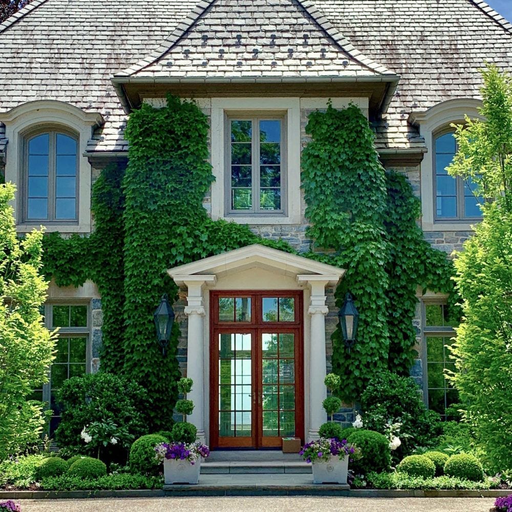
I put this one on instagram (please follow me.) and it burned up my feed immediately! My new I-phone X takes some killer pics! And, I don’t know how they did this, but you can see straight back to the water. Yes, that’s Long Island sound behind the front door!!! Extraordinary in the extreme!
Now don’t worry your pretty little heads for one second. ;] I took a LOT of photos of this place! The house AND the gardens!
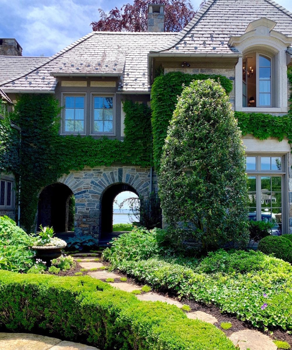
And below, zooming in a little.
Sick, ain’t it?
Oh wait. I found something really cool. Hang on a sec, please.

The property outlined in white is currently for sale.
The house on the tour in these photos is the one opposite the left bottom corner of the outlined area! If you scroll back up, you’ll see on the maps that piece of land that curls back on itself at the top of the photo.
I found the image by googling the address.
As a professional stalker, please take note (if you don’t already know) that you can glean a lot of info by googling both addresses and phone numbers.
Deborah and I began to make our way to the back of the house, but on our way we found much to drool over.
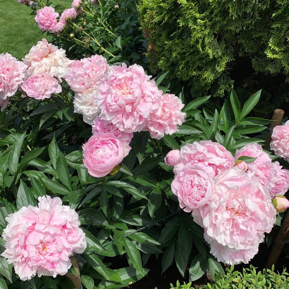
Like these exquisite pink peonies that we both were plotzing over!
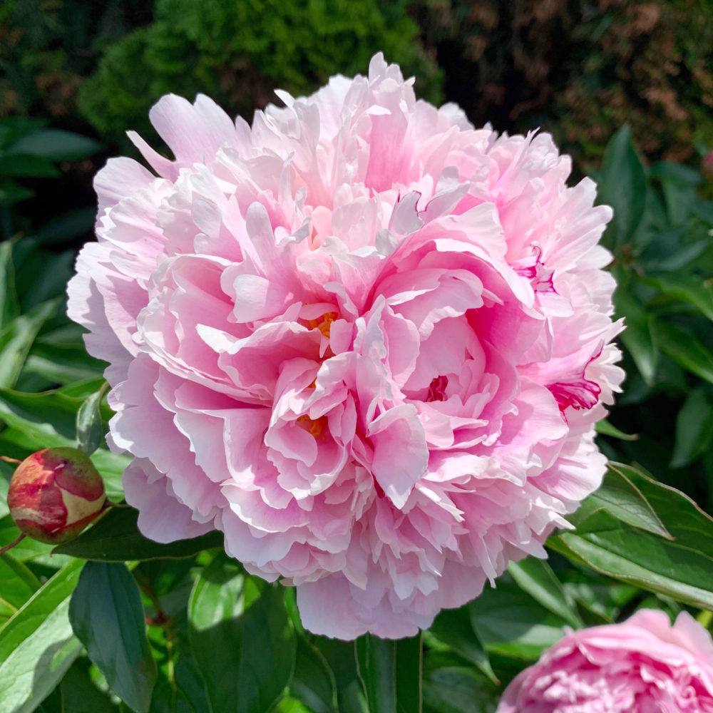
Incredible! It reminds me of the gardens my mother had when I was growing up. I remember the peonies blooming in May in Indiana.
And then, Deborah and I happened upon a secret garden. Actually, more of a meditation space.
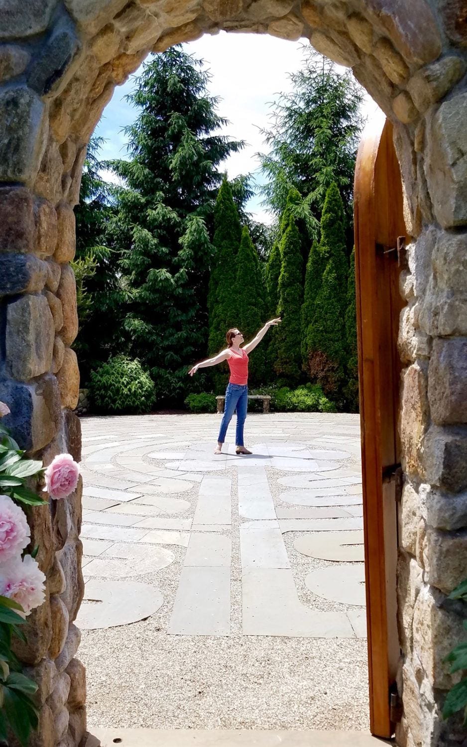
I couldn’t help but strike a little ballet pose.
Okay, let’s go around to the back of the house.
I know…
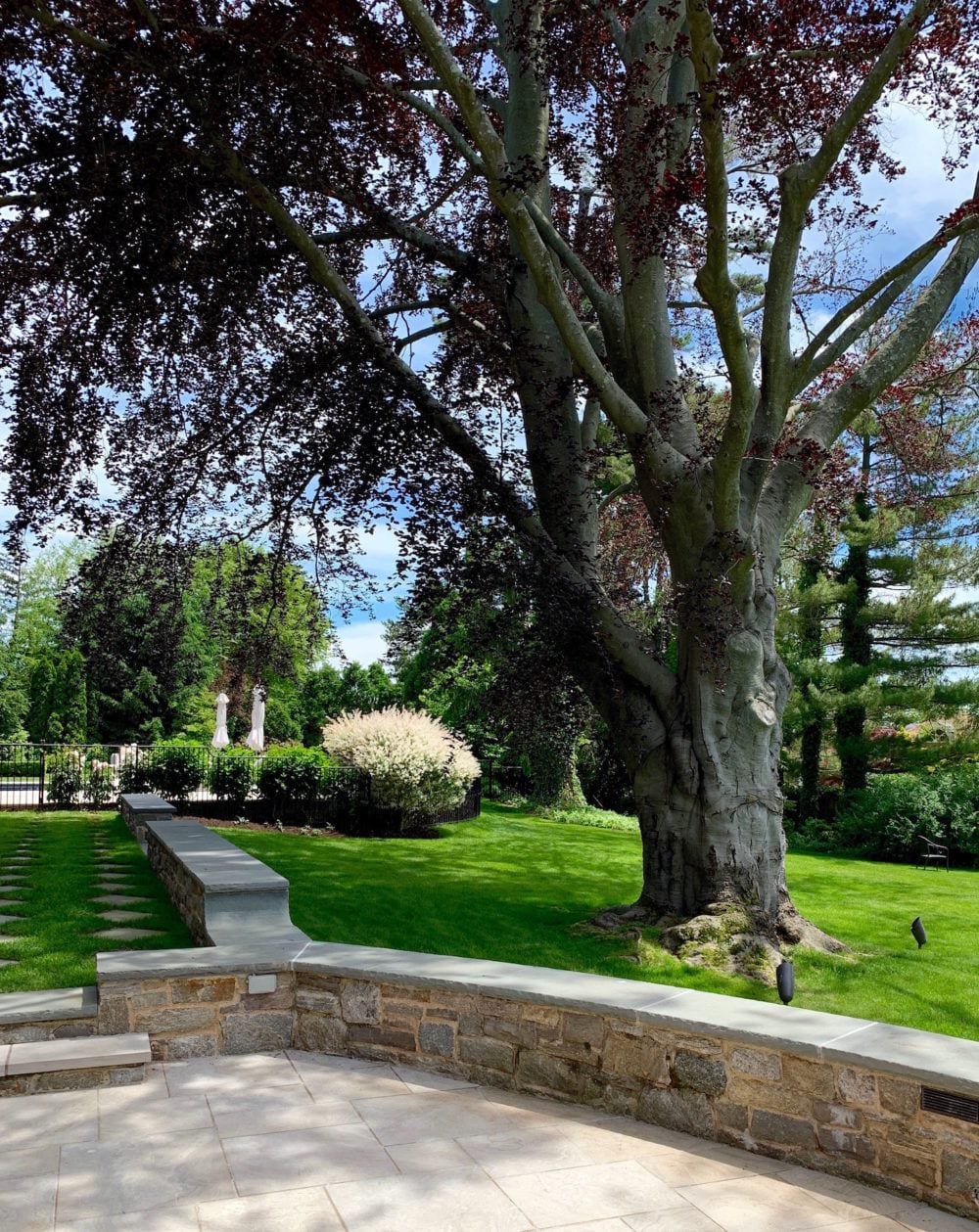
That tree!!!
Yes, that’s the pool to the right behind the black fence.
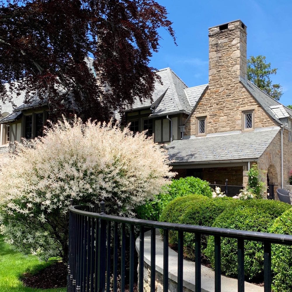
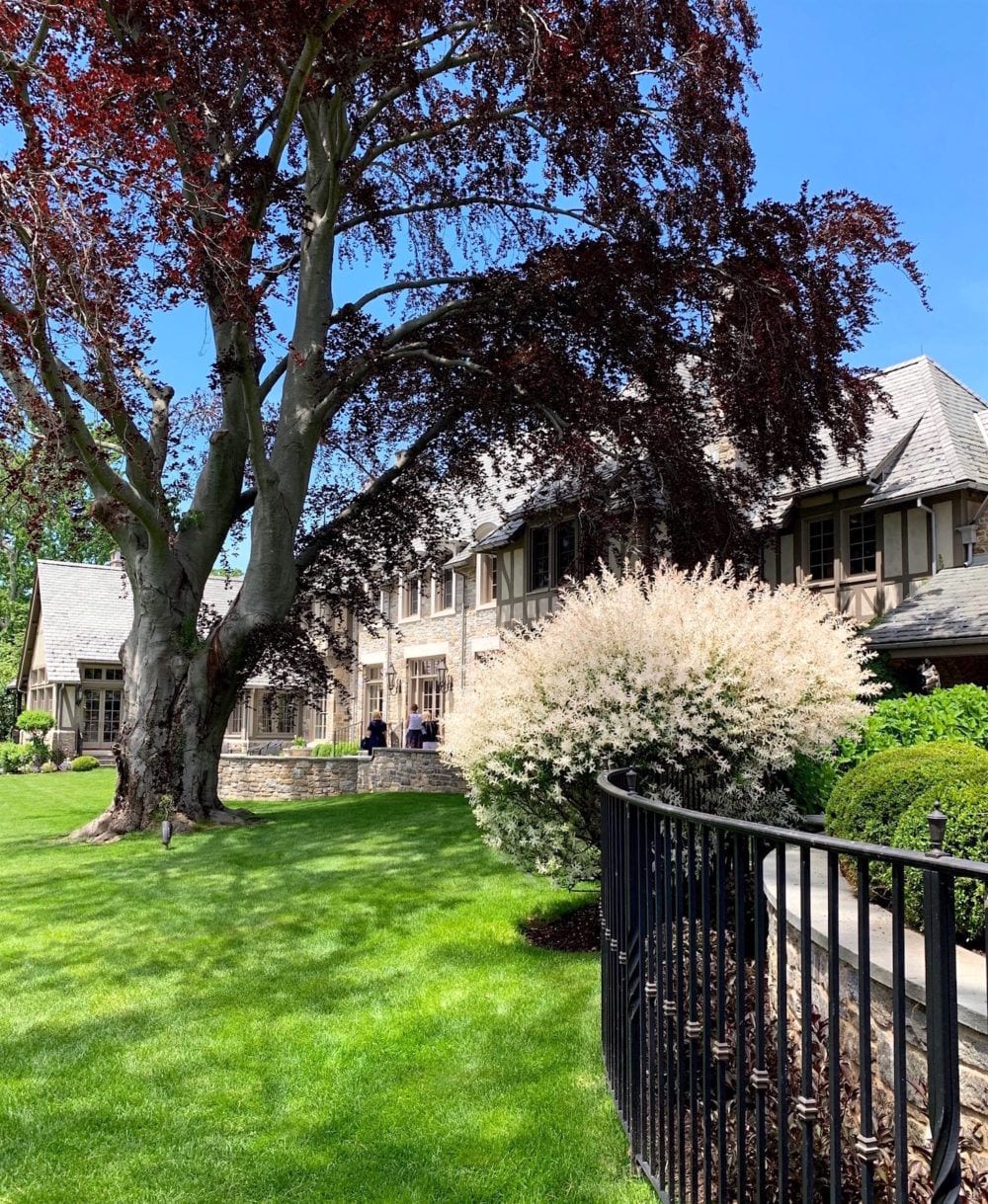
Does anyone know what this white shrub is? Really cool and a refreshing note amongst all of the greenery.
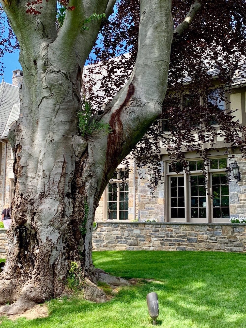
I love the plant that’s growing out of the middle of this ancient tree! Does anyone know what kind of a tree it is? We were given sheets with the names of all of the trees and shrubs on the property. There are DOZENS of each.
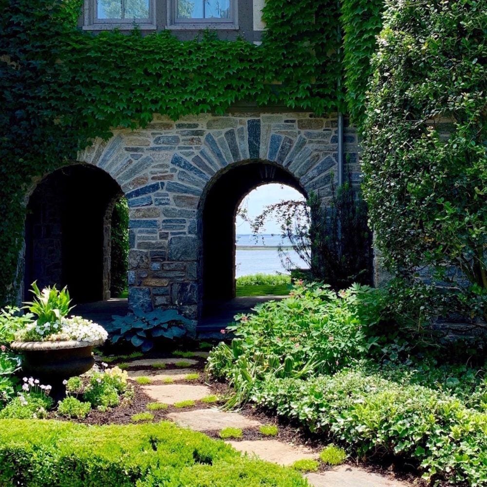
We walked through the neighbors’ property to the last house on this garden tour in Greenwich Connecticut (Riverside)
Actually, just this one photo is courtesy of the Greenwich Botanical Center. I don’t know who took it.
Wonderful landscaping and gardens
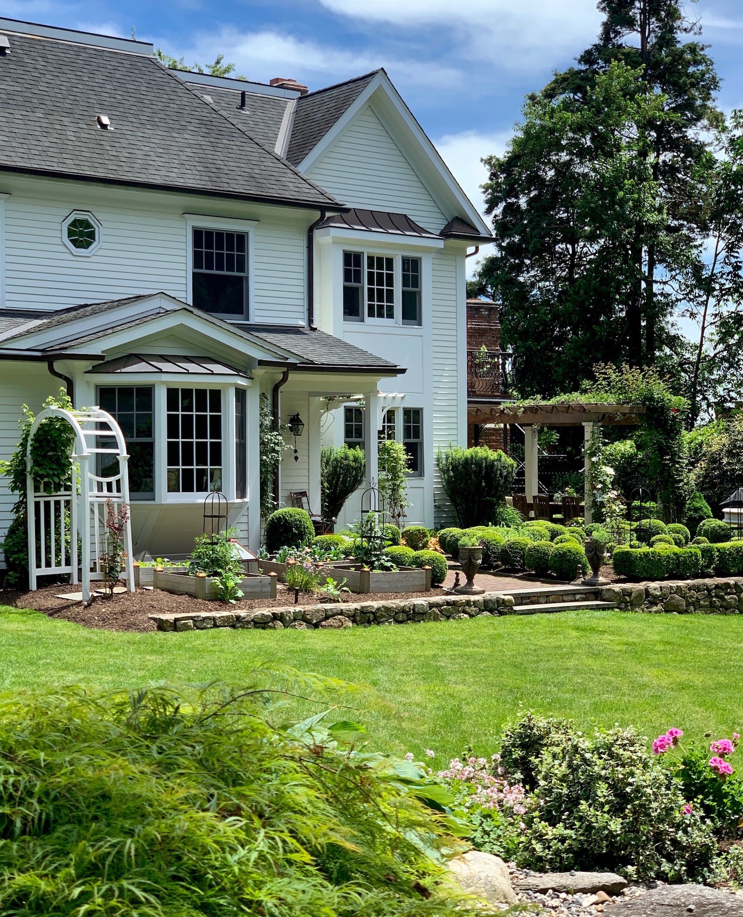
The house is a classic New England clapboard style with more gorgeous property and a beautiful English garden.
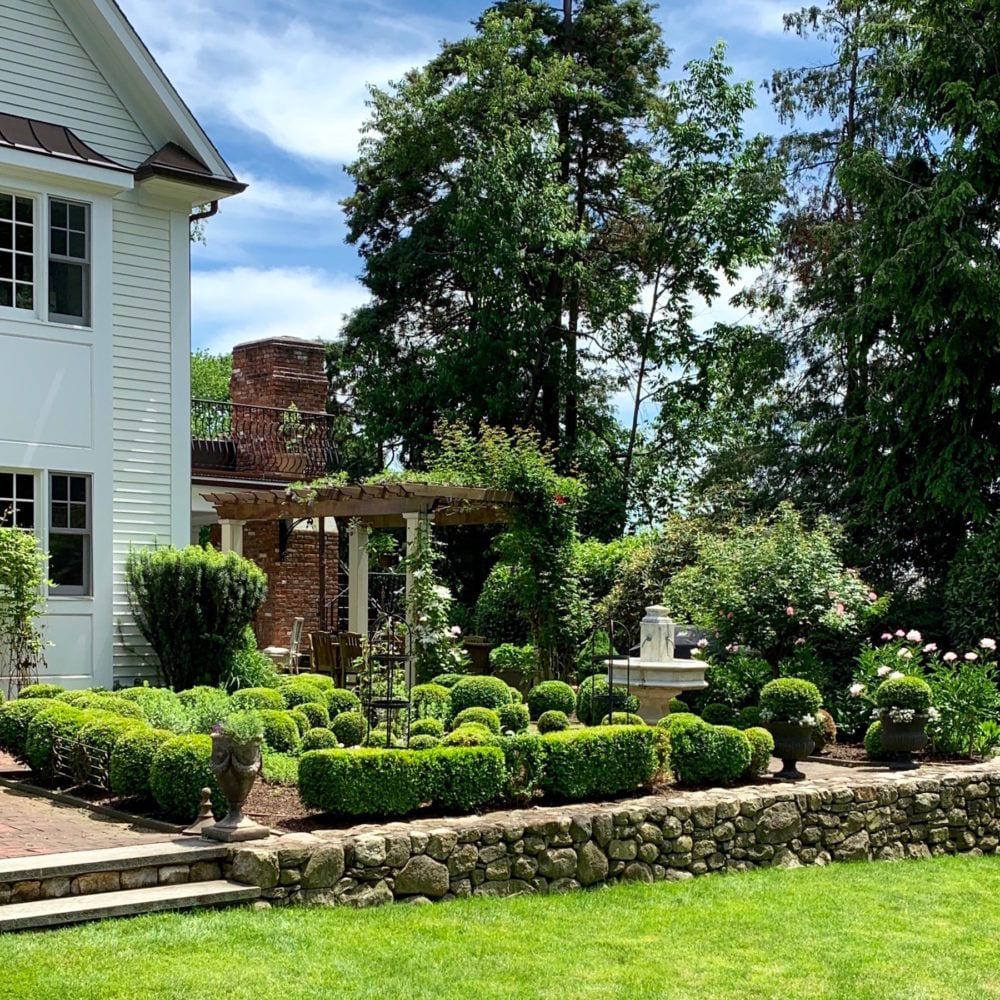
Love this bed of manicured boxwoods.
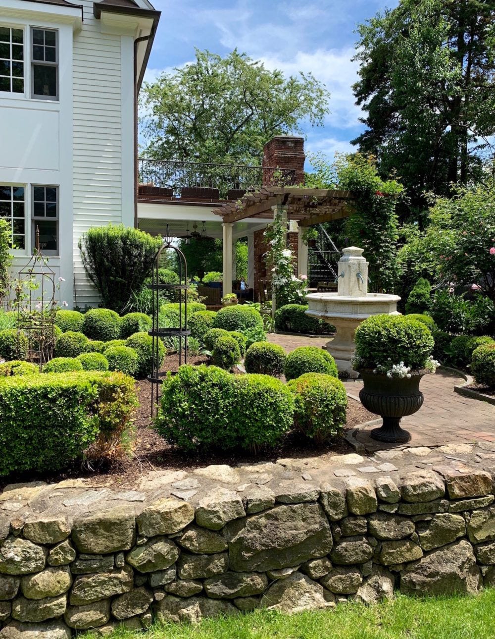
Oh, another pergola!
Perfect!

We finished up the tour with a selfie and then Deb took me out to lunch at a fabulous place near her home in Old Greenwich.
Thank you Deborah for showing me a great time! And thank you to all of the people who worked so tirelessly to put on this exquisite grandiflora garden tour in Greenwich Connecticut!
xo,

Please check out the newly updated HOT SALES! Lots to see this weekend and some sales are ending very soon!
Related Posts
 24 Cheap Sofas and Chairs That Look High-End
- The Granny Decor Mistakes You Might Be Making
- My Top 20 Best Shades of White Paint
- The 12-Step Decorating Plan That Works Every Time
- Here it is! A Palette For No-Fail Paint Colors
- 30 Astonishingly Gorgeous Front Door Paint Colors
- The Only Six White Paint Trim Colors You’ll Need


118 Responses
Some amazing gardens and houses pictured here. Than you so much for sharing this with us.
You’re welcome!
That Copper Beech brought tears to my eyes- my grandparents had a house up the coast in Guilford, CT with a similarly aged specimen. It was there when my great-grandfather bought the place in 1943 and generations picnicked under it.
awww… sweet memories like that are the best!
P.S. Loved, LOVED this garden! Beautiful, thank you for sharing!
Glad that you enjoyed it, Linda!
Laurel,
Mahonia is one of the top five invasive plants in the southeast. It is very aggressive and spread by birds. Folks should not plant it. Before I started planting only native plants I also planted Mahonia–that’s life–mistakes were made! ;-D
P.S. I’ve got to go to work and didi not get to read the entire thread of comments so forgive me if someone already said this.
Oh, that’s interesting.
I think it is too early blooming to be Sweet Autumn Clematis, which is one of my favorite vines. Happy to see above comments identifying it as a dappled tri willow shrub, but research indicated it might not thrive in our southeastern NC heat zone.
Oh, sorry about that, Pauline! But at least you have your more mild winters!
The spikes on the slate roof break up the snow as it slides down. Otherwise you get the entire roof area of 5″ of snow and it all comes down in a thunderous kaboom! Could kill you if you were outside. Even with the spikes, the sound of the snow sliding off a slate roof is loud. As kids, we delighted in the sound, like a scary movie!
Hi Laurie,
Living in the northeast for most of my life, you’d think that I’d know this. I imagine that the spikes are there on other homes with slate roofs, but are not as decorative. Thanks so much for the info!
I believe the things on the roof would maybe be for snow. Some sort of prevention for an ice dam I would expect.
Yes, that makes sense.
Love your Cabi top– I have it in white & black!
Thanks so much Jeannette! I also got it in white.
Laurel, I love your blog. Thanks for the new post. The plant appears to be Leatherleaf Mahonia. I used to see it frequently, but rarely so now, excepting the one that appears to have been seeded by birds to the side of my house.
Thanks so much!
I am completely in love with the all black Georgian front door! What a stunning contrast and stylish statement! Definitely different from the usual, but still classically elegant, I am very much tempted to borrow this look (shamelessly copy) for my own similar door. 🙂
June is the best time for gardeners and visitors alike, I am so glad you were able to visit these stunning grounds!
Thanks so much Inna! There’s nothing new under the sun. Believe me, they (or someone) “stole” the black door idea from someone else, as well.
First of all, you still look like a ballerina to me; wonderful perfect posture and poses. These gardens are wonderful to see but I cannot help identify anything as I live in Zone 4 (Minnesota) and they are all a mystery. My question regards the “Holy Crap” house. On the roof shingles, above the triangular house pieces (gables?) are little tiny structures that I have never seen before. They are between the shingles, but not over the entire roof. Would you know what those are? I am in the sciences (not design, architecture, textiles, furnishings) and your blog teaches me every day I read it. And I will be praying for you and your mother that her passing is peaceful and pain free.
Hi Celestial,
I noticed those too, on the roof, but don’t know what they are for. And thanks so much for your kind words, too!
Laurel, you look extremely beautiful. The goddess… no less! I mean that. How did you quit acting btw? Sorry no questions about garden for today.
Thanks so much Val. I got to a point when I was 30 where I realized that I wasn’t getting anywhere and didn’t really want to subject myself to any more of the BS, so I decided to stop trying. I was working in an art gallery in SoHo but two years later, decided to go back to college for interior design.
Thank you so much for answering my drapery question! I can’t wait to show you my before and after pictures. I am redecorating my whole home and bought all of your guides. You will be proud!
Hi Laurel,
I don’t know if you’ll see my comments amongst the 100 others, but I so enjoyed seeing the tour through your unique lense.
Thank you for sharing.
haha! Thanks honey!
In my 4th incarnation in this life, I got my first garden, a 2.5 acre garden, at 57 years of age and no experience.
I am now 60, and I can honestly say, hats off to all these “gardeners“ that do it themselves. No feat if you have an army of Gardeners. If not, and you really do it yourself, U can honestly say it is the hardest physical work I have ever done, the most endless knowledge needed out of any jobs (and that includes my medical schooling as an osteopath) AND, a good dose of intrinsic artistry needed…along with a lot of patience, money, blood, sweat, tears, lack of wild deer that will eat everything…and JOY.
Topped with the knowledge that the next person that buys your house, either when you sell, or are carried out feet first, will probably pave it over and set up a basketball court.
Well, hats off to you, Chris, for not paving it over and for taking on the challenge. That is a massively huge garden, too!
Hi Laurel,
Thank you for sharing these gorgeous gardens. I live in Southern California, where we also have beautiful gardens, but, sadly, we cannot grow peonies -it’s just too hot and dry.
I’m sorry Candace. But when we’re freezing are arses off in January, we’d gladly exchange places. Or, at least I would!
All the mahonia votes are correct I think, and I’ll add that the common name for the plant is ‘Oregon grape’ – a PNW native plant (although there are many cultivars). 🙂
Thanks so much Ruth!
Beautiful houses, beautiful gardens, beautiful pictures! There’s just something about a garden that lifts my spirits, calms me, and makes the world right again. Thanks Laurel. I think I’ve mentioned this to you before, but whenever I see a house with vines climbing up the exterior walls, number one, I’m always struck by how beautiful it is, but I always wonder how the homeowner keeps unwelcome critters from climbing up.
Hi Lisa,
That’s a very good question. I don’t have an answer, either. But I imagine that they get regular visits from the exterminator.
What a lovely tour! Reminds me of the gardens on Long Island. My husband and I vacation there just about every summer, as his grandmother used to live on the North Fork. I love the types of plants that grow in this area. I do wish we could grow things like peonies and hydrangeas in Texas. Thank you for the beautiful photos!
Hi Erin,
Hydrangeas are my favorite flower and peonies are second. I guess it’s our gift for having to endure months of bitter cold.
great tour Laurel! off to see Deborah’s post but before I do, here are the names of plants you asked for. The whitish leaved shrub is in the willow family called Hakuro Nishiki, the tree is an old Beech tree named ‘Copper Leaf’, this one is an oldie!
cheers
Debra
Thanks so much Debra! So many horticulturists reading!
That plant is Mahonia, you can say Holy Crap whenever you like, its great to see when great wealth is combined with great taate, and your ballet pose is lovely.
Hi Elizabeth,
Yes! It’s true. Money definitely doesn’t always = great taste. And thank you so much!
Info for you, Laurel. The shrub with those grape-like berries and holly-like foliage is a mahonia. To judge by the size of the racemes, it’s a mahonia japonica, or perhaps one of the hybrid winter flowerers, mahonia x media, which is not very hardy though.
The white-leaved shrub (grown as a shrub here, though I think it’s even better as a standard) is a Japanese willow, salix integra ‘Hakuro Nishiki’. As the leaves come out in spring, it’s pretty much green, and then suddenly you’ve got pink and white tips all over the branches. It needs hard pruning, hardy in zones 6-8. I was so taken with the first one we put in, I installed another this spring.
Thanks so much Gilly for that incredible knowledge!
Gorgeous tour! (And you are looking fab, Laurel!;-)) It looks like the “meditation space” you found was quite a large labyrinth from the lines in the pavement. Might be cool if you have any other photos of it? Thanks for sharing these gardens.
Hi Marsha,
Thanks so much! And yes, that’s what it is! A labyrinth. Although, I had never actually seen one like this. So what do people do? Lock their kids inside until they figure it out? Just kidding. ;]
The shrub looks like a dappled willow.
Thanks so much Al!
Hi Laurel, the first shrub is a mahonia. I’m not as sure about the second white one, but think it may be a variegated willow.
I also want to thank you for all you do. I’ve learned so much from reading your blog. My mom, who died in 2011, was a talented amateur designer. Of course I didn’t ask her all the questions I should have, about lots of things. Typical foolishness of youth.
But reading your posts often feels like getting to ask her advice. I like thinking about how much she would’ve loved reading you too. Thank you again—
Thank you so much Richard. I’m so sorry for your loss. My 96-yr-old mother has severe dementia and is in hospice care in Wisconsin. I got a call from the head nurse the other day that the end is near for her now.
I remember once, we were driving up to Vermont early in ’03 to visit my sister and Mom was going on and on about her life long before I was born. To be honest, I was a little bored with it all. But, I would give anything to get that day back now. It’s a wonderful reminder to appreciate our loved ones– always and no matter what. {{{big hugs}}}
Thanks for the morning inspiration!
The plant with the grape-like berries is a “Mahonia Aquifolium” common name Oregon Grape Holly!
Hardy in zone 5-9!
Hi Christine,
Of course, I had to look it up. And it’s proximity to the water and lower elevation keeps it a little more mild as it is where I am. A little more mild is a low of 0-5 degrees Fahrenheit. Of course, that’s without wind chill and factoring in humidity. And that is zone 7a. Same as where I live.
Laurel, thanks for the beautiful pix (including of yourself)! That big tree with the elephant-hide bark looks like a copper beech.
Thanks so much John!
Hi Laurel
Hello from Savannah
Very lovely garden and homes
Beautiful photos!
That shrub is a Dappled Willow or Tri color
Dappled Willow
Susan
Hi Susan,
Thank you too, for the photos! Would love to visit Savannah one day!
Oh Laurel!!!!
HC is short!!!
That looks like paradise. Those peonies! I am sure I would have also forget of taking pictures being amazed at such beauty.
The shrub with the grapes looks like Mahonia, the tree seems a Fagus and no idea about the white shrub, would love to know.
You look beautiful too!
Thank you!
Carolina
Thanks so much Carolina!
Mahonia Holly ….the plant with the grape looking berries.
Thanks so much Jayne!
That shrub is a dappled willow. Comes in a soft pink version also. Very pretty! Quick question: is it ok to have different header styles of curtains throughout the home? Example: one room has inverted pleat and another room has french pleat? They are different fabrics. Or should the header be consistent? I read all the posts on drapery, but didn’t see anything specific. Thanks
Hi Elizabeth,
Thank you for the info. I think that you can have different headers, unless the windows are very close to each other. But even then, it’s probably okay, too. You’re probably the only one who would notice.
Dreamy Dreamy that is that;) I admire the semi formal gardens and you took some wonderful photos. Thank you for sharing:)
Thank you so much Kim!
Hi Laurel,
Thanks for the fun post and beautiful pictures!
The bush with sharp leaves and grapes is mahonia. It blooms gorgeous yellow flowers in February/March creating winter interest in the garden. There is a newer variety that is lower growing with smooth leaves.
The white leafed bush by the metal fence looks to me like dappled willow. Willows are aggressive growers (both above and below ground) but my neighbor has one and it seems she can easily contain with seasonal pruning.
Best wishes
Karen
Thanks so much for all of the terrific info Karen!
Laurel-
To be more specific, it’s tri-colored dappled willow.
(Should have said that before!)
Beth
I believe it is a dappled tri willow shrub which also come in a small tree form. We have many in my area in Hamilton Ontario. they are very attractive with the pink tinge on leaves. They can be pruned into a ball shape which looks amazing in the tree form.
Thanks so much Maureen!
Laurel,
Thank you for yet another beautiful blog full of glorious pictures and inspiration. I was scrolling down only halfway paying attention ( I usually revisit your posts a couple of times, ha) and came to the magnificent “holy crap house” and just stopped! I could feel my eyes widening. lol. Unbelievable! I love and appreciate many types of architecture but… that house….wow. Holy crap is truly fitting. Too bad we can’t see the inside. Thanks again for sharing what most of us will never get to see first hand.
Thanks so much Diane. Yes, very lucky that these people allowed 100s over two days to trample all over their exquisite property to see things we normally only get to see on paper!
The first plant, the one that looks like a holly shrub had a bunch of grapes dropped on it, is Mahonia. The one at the pool looks like a very old, abundantly thriving Deutzia. The smooth white bark with horizontal lines indicates a Beech tree, although this one isn’t as straight as normal. Maybe it was damaged as a sapling. It’s beautiful anyway.
And you look fabulous and glamorous in the shoot!
Thanks so much for all, Sarah!
Hi Laurel-
The white plant you asked about is willow. In the spring the new growth is pink and is called “catkins!”
Our local library has it in front; I asked for the trimmings while it was being cut. Willow has such a strong growth hormone that you can just stick it in the ground and it will root! That particular kind can also be trained into a tree instead of a bush. So if you know someone who has it, just ask for a few clippings! Beware though, it’s a fast growing plant that can quickly get out of control!
Thanks so much Elizabeth for that great info!
The ancient tree is a copper beech. I hope it’s under the care of a knowledgeable arborist – definitely needs treatment. Not sure about the other shrub.
Hi Linda,
I imagine that the tree is being looked after quite diligently.
Hi Laurel – The plant with the grapes is a Mahonia. The whitish shrub is a dappled willow, Salix Hakuro Nishiki. It’s new growth also gets hints of pink before it fades.
Thanks so much Kristen! I’m so impressed with the knowledge so many of you have with plants!
Absolutely beautiful! What a dream area and dream homes and gardens. You look great Laurel 😉 thanks for the post.
Thanks so much Stephanie!
went on a garden tour of homes on Cape Cod one summer, lovely!!
Ahhh… my son is on Cape Cod right now with his dad. Bittersweet.
The bush with the grape like berries and the axe, pointy leaves is a Mahonia. The berries turn a beautiful purple and the birds love them. Gorgeous pictures of the gardens!
Thanks Lynne. I’ve seen the plant before and sometimes in floral arrangements. Just didn’t know what it is.
Mahonia is the shrub that looks like a holly with a bunch of grapes growing out of it. Looks like Deutzia at the pool. And the white bark with horizontal lines indicates a beech tree, although that one is sort of wobble sided. Maybe it was damaged when young since they are normally straighter. All are native-ish and easy to maintain.
And you look fabulous in the shoot!
Thanks so much Sarah!
The plant with the grape leaves is a Leatherleaf Mahonia. All is beautiful!
Thank you so much Fran!
Laurel, the only appropriate statement about that home is “holy crap.” One must always use appropriate terms while in “good” company.
W
hahahahaha! I couldn’t agree more!
Hi Laurel
Beautiful, beautiful house and gardens. That is a Dappled Willow by the pool. Great that the weather co operated. Here in western New York, we haven’t seen much of the sun all month.
Hi Pat,
Oh, I’m sorry. And, you get all of that snow too!
Hi Laurel,
What a beautiful post! I kept trying to imagine what it must be like to live in such beautiful spaces. Breathtaking for sure. How nice that you and your friend had such a lovey day.
June is the best month of the year, IMO. Take care.
Connie
Hi Connie,
Yes, it is definitely the best month weather-wise. And, it’s my first born’s birthday on the 18th.
Laurel,
What a gorgeous post. I’m a plant nerd and couldn’t help but chime in. The plant with the grape like fruit is a Mahonia. It blooms in February which makes it special to me. The beautiful old tree is a Copper Beech.
Thanks you for sharing your talent and knowledge,
Wendy
Thanks so much Wendy! I knew that you guys would be able to help me out.
Hi Laurel, wonderful post! I love gardens and these are so beautiful. Greenwich CT is probably the most exquisite town in the country (and the most expensive!)
To answer your question, the large tree with the burgundy leaves is a Copper Beech, very stately and prevalent in New England. We also have a fair amount on Long Island. That one looks to be very old.
The white shrub is a type of willow. They are becoming more popular these days–I planted one a few years ago and I see them in the nurseries and in gardens a lot.
Thanks again–I look forward to reading your posts on Sunday mornings–it’s a highlight of the week!
Thanks so much Diana! You know in my adult life, I’ve never actually had any real land to do anything with. But, you never know. I never imagined that I’d be writing for a living either.
The plant you’re trying to identify is
Mahonia aquifolium, commonly referred to as Oregon grape berry. The berries follow along after small yellow flowers have appeared.
Thanks so much for the info Rusty!
Laurel you look amazing and love all the info on your blog, thank you!
Thank you so much Judy!
Hi! I’m pretty sure that white bush you were asking about is a Japanese willow. They are popping up around where I live in upstairs New York and I just LOVE them. I just have to find a good spot for some in my yard…
Hi Donna,
I usually fix typos if I see them and I realize this must be your phone correcting “upstate” haha! Just had to leave it in. If one lives in New York City anything outside the city is “upstate.” hahahaha
The plant you questioned is a Mahonia. Great post, and great garden tour!
Thanks so much Jayne!
Oooh…I wouldn’t know where to look first…what beautiful properties!
The white bush is a Dappled Willow by the way… We have them, but ours have been grafted into a tree so they’re more like a topiary. They keep that lovely color and a touch of pink all season. FAST grower and perfect for hiding unsightly neighbors!
Thx for sharing this lovely day! The snaps of you were also beauteous and elegant!
Gosh, are you guys in the same room? haha. Or is God just entertaining himself with your comments that make it appear that you were just talking to each other before commenting?
Great post. I was swooning over that gorgeous house with the door that let you see straight through to the water. The bush beside the black fence around the pool is a dappled willow bush. They are very showy with pale peachy-white fronds in the spring and if aggressively pruned, will continue to grow more over the summer. You also see these grafted onto trees. They’re beautiful! I have 3 of the shrubs and they grow very rapidly, making them an ideal shrub for privacy or garden colour.
Hi Elizabeth,
Dappled willow and showy indeed! Thank you for sharing your wonderful knowledge!
Wow! All I can say is Holy Crap! Couldn’t resist 😉
You guys are really making me laugh today! Out loud, too!!!
Gorgeous, Laurel, thank you!
The plant in the picture after the red bridge is Mahonia, probably Mahonia aquifolium. The large tree looks like a mature Copper Beech (Fagus sylvatica cv), and the whitish shrub near it may be a dappled willow (Salic integra cv.)
I worked for a local botanic garden for 25 years, lol.
And that holy crap house!!! Holy Crap!!!!!
That’s three for Copper Beech! and haha!
That looks like a copper beech tree. Thanks for the beautiful photos!
Hi Charmaine,
Thank you for that! A landscaper wrote me the same thing. So, Copper Beech it is! That must be a very old one to be that size. I’m sure that it’s coddled like a newborn baby!
The white “shrub” looks like a Sweet Autumn Clematis, which is actually a vine that grows so abundantly that it can appear to be a shrub. We had an old one that looked just like this, in Kansas City.
Thanks so much Gail! I am pitifully ignorant about anything that isn’t a common plant. I just know what I like when I see it!