

Hi Everyone,
I know what you’re thinking. You’re thinking I’m a fraud. Lol, I mean, how is it possible that I selected a color that sucks?
Oh, it is possible, especially when one is tired, the lighting is bad or non-existent, and the test paint pots and gallons of the end product are faulty.
Here’s what happened.
The other day, my painter, Chris, asked me what colors we should test for downstairs.
Yes, it was already painted Simply White but Simply has an exceedingly passive red undertone. Who knew? It’s usually not noticeable. However, you can see it if you compare it to other shades of white. As I’ve explained, I am living in a sea of red brick outside my bedroom door and window.
My bedroom frequently reflects this pink.
In addition, the “warm” LED lights look yellow and pink.
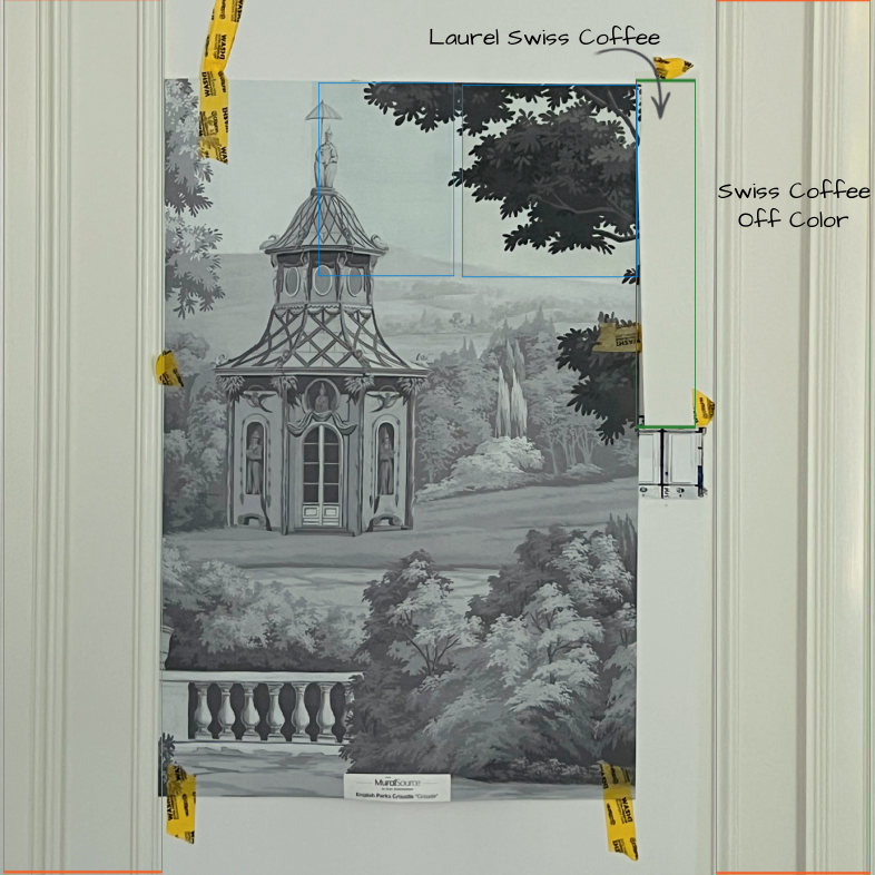
The other day, Chris brought over the following 18″ x 24″ samples on poster board:
Cotton Balls
Simply White
Swiss Coffee
White Dove
White Heron
Luckily, there was a clear winner and none of these made the cut. (More about why they didn’t in a bit)
- Cotton Balls was too yellow.
- Simply White looked as expected.
- White Dove looked slightly peachy.
- White Heron was the worst, looking like a cold, lifeless bright white.
And the winner…
Swiss Coffee oc-45! I bet you’re shocked, given the post’s title, haha.
However, this version of Swiss Coffee was significantly brighter than White Dove. That isn’t possible. Still, I loved how this Swiss Coffee looked. No matter the hideous lighting, it had just the right amount of gray and warmth. It also looked great with the wallpaper and was terrific in the bathroom.
Still, I could see that this was a brighter version of Swiss Coffee. I guess coffee with an extra shot of milk.
I told Chris and he said that was fine. He would have Johnson Paint make a custom mix to match the sample.
So, on Thursday, the painting crew began painting the trim. I must admit that I wondered if it was darker than my sample. However, like most other things that have gone wrong, I tend to go into a state of denial. It’s like if I can just push it aside, it will go away…
Of course, it never does; Denial only gives the brain (heart and soul) time to process and deal with things when it can deal with the harsh reality.
Friday, I went downstairs at noon to check on things and saw that the guys had done more painting.
Yep, it sucks, but it’s wet. I’ll wait until they leave to form a real opinion. Oh, I knew the answer already.
I grabbed the paint sample Chris had made for me and tiptoed to the bedroom.
Whoa!!! It was completely different!
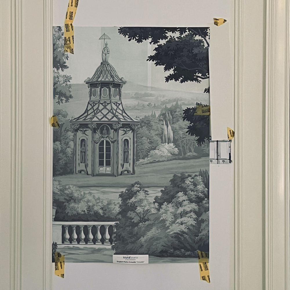
On the left, you are looking at a door casing/wall and panel moulding. On the other side of the switch, there is the panel moulding, a 4″ piece of wall, and another door casing.
Above the light switch and barely noticeable is a piece of the sample Chris made for me.
Incidentally, you’ll also notice some test tinting of the wallpaper.
The color has a weird, ruddy undertone. I don’t remember Swiss Coffee looking like this! *Please remember that thought.
Long story short, I got in touch with Chris, who told me to go to Johnson Paint on Newbury Street, which I did early this afternoon. Eduardo (Ed), his favorite paint specialist, was expecting me.
So, today, I waded through thousands of tourists all the way across Newbury Street and walked into a virtually empty store. After all, it’s the end of July in Boston, and most natives clear out at this time of year.
So, here’s the bottom line.
*Not only was my sample way off, so what was on the wall!
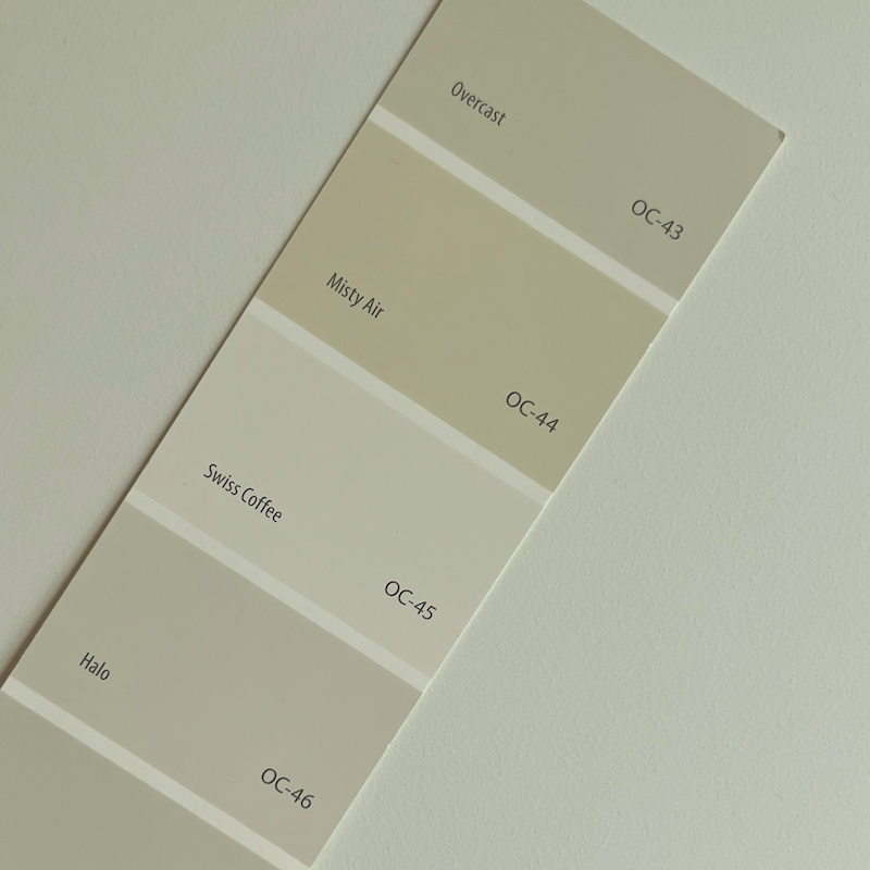
Above is the real Swiss Coffee Color on top of Chris’ paint sample. However, the wall color is even deeper than what you see on the chip above!
Below is a closeup of the off-color paint on the wall, next to a piece of Chris’ paint sample.
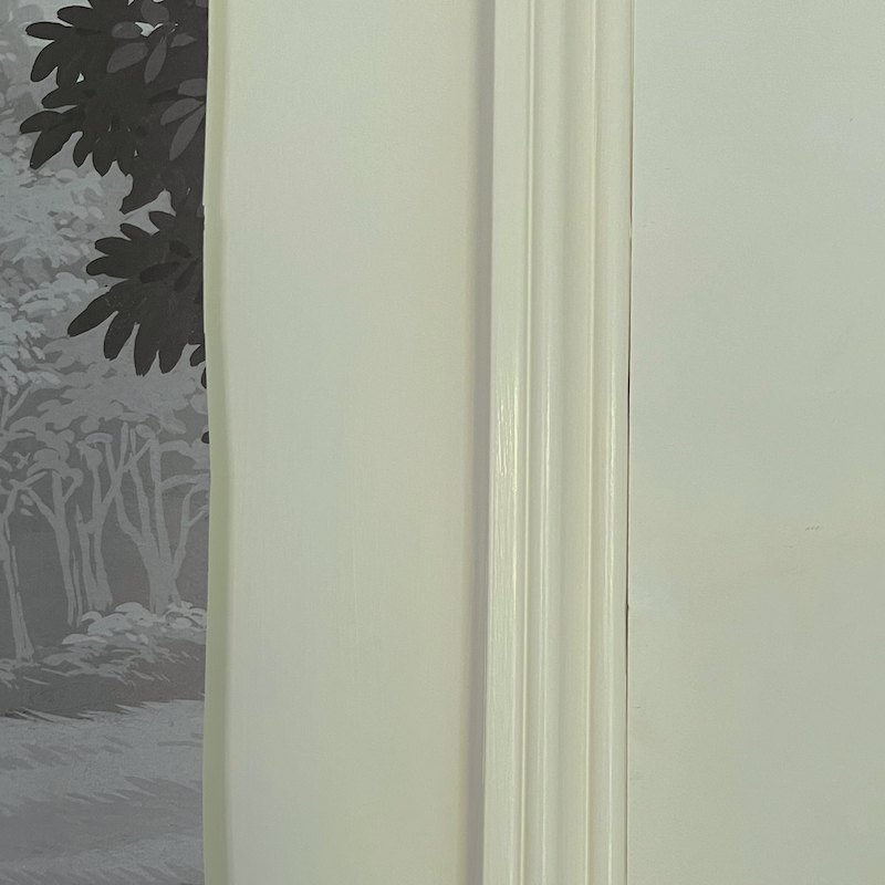
BUT, look at that gorgeous paint job!
So, what happened?
What happened is several things.
(When disaster strikes, there are usually multiple calamities occurring simultaneously.)
- One, the little test sample was off-color. But, in the best possible way. I like it!
- Somehow, the real paint was also off-color, but not in a good way.
Then, there’s another factor, and that is the formulation.
Unbeknownst to me, there are few new formulations Benjamin Moore is now offering. (Yes, it would be nice if they sent this information to interior designers, but I’ve never gotten anything from them.)
Chris introduced me to a newish product at Benjamin Moore called Scuff-X, and I decided it would be the best option for my job.
Please give us a shout-out if you know about Scuff-X, have used it, or have it in your home.
It comes in finishes from matte to semi-gloss, has a super quick dry time, is very durable, and, when applied properly, is very beautiful.
However, I learned from Ed that the bases of every Benjamin Moore paint have different colors. While they try to get the bases as close to each other as possible, they are still a little different. Thus, the formulas for the paints are different.
In addition, he recommends never getting a sample smaller than a quart. Even then, some colors are very difficult to make in quart sizes.
Then, Ed confessed something I’ve always suspected.
It’s about the calibrations of the pigments they use. Sometimes, they use only a drop of color. But the size of those drops can vary widely. So, if you’ve ever selected a paint color you used somewhere else and this time it sucks, it might be that the color wasn’t mixed properly. It does happen!
In addition, these samples were half pints. Why don’t they just call it a cup? As you know, a quart is four cups. Dividing down some of the formulas often yields a color that’s a little off.
So, if the color is off, what use is the sample, Laurel?
Beats me!
The good news is that I love the “new” lighter, slightly cooler shade of Swiss Coffee. This is not to say that normal Swiss Coffee is a bad color; it’s one of my Laurel Home paint collection colors!
However, for me, the new Swiss Coffee that Ed named Laurel’s Swiss Coffee, lol is perfect for the wallpaper (tinted or not), and also looks great for the bathroom.
So, Laurel, wouldn’t Cotton Balls have worked?
Well, here’s the thing. The sample for Cotton Balls was also off! All of them were. So, yes, the real Cotton Balls probably would have been fine.
The story’s moral is that we should always test the paint before applying it, just in case. (This is where being exhausted comes into play.)
So, now what?
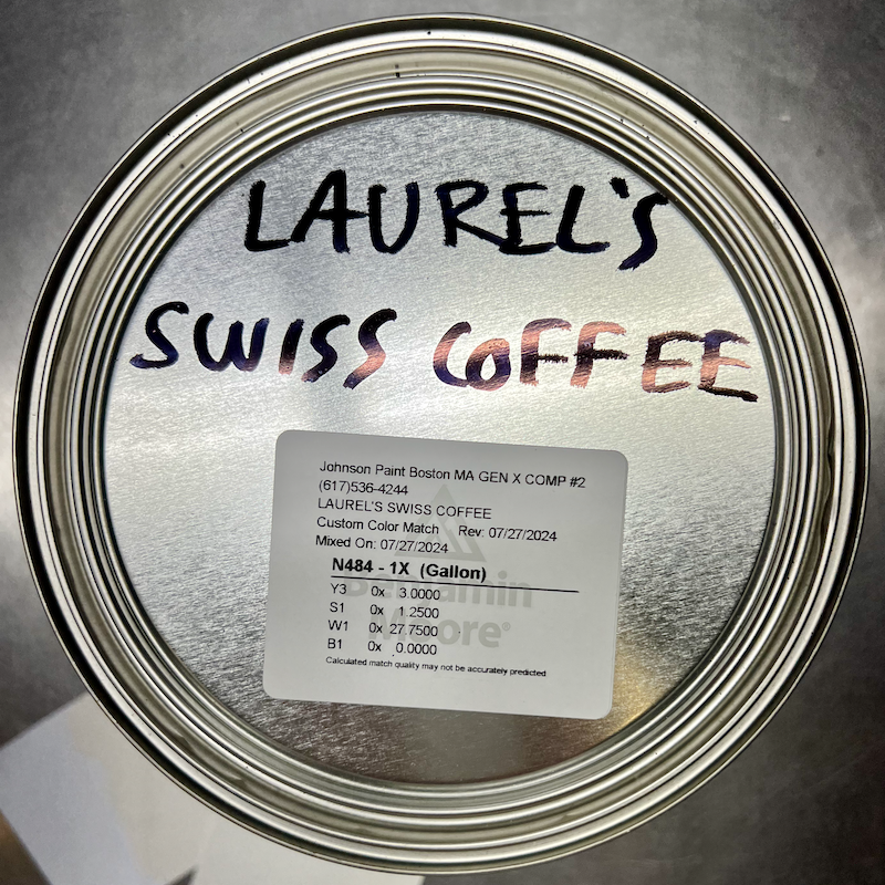
Oh, I forgot to tell you that Ed whipped up a gallon of Laurel’s Swiss Coffee, and the match is so close that I have trouble seeing it on the small sample piece I brought over. I also brought over a card with the off-color Swiss Coffee that went on the walls. Ed said he was going to send the sample to Benjamin Moore and wasn’t going to charge us for the two new gallons of paint.
I looked to see if another color was already formulated that was the same as Laurel’s Swiss Coffee.
Moonlight White and White Dove are fairly close.
The small square on the lower right is Laurel’s Swiss Coffee, and the larger square is Benjamin Moore White Dove. So, maybe you can see that LSC is a hair brighter and cooler, but no less gray than the ever-popular White Dove.
So, on Monday, bright and early, Chris’ fantastic painting crew is coming back to paint the bedroom and will also begin working on the den.
Yes, my lovelies. The den is done, and I can’t wait to show it to you.
xo,

***Please check out the recently updated HOT SALES!
There is now an Amazon link on my home page and below. Thank you for the suggestion!
Please note that I have decided not to create a membership site. However, this website is very expensive to run. To provide this content, I rely on you, the kind readers of my blog, to use my affiliate links whenever possible for items you need and want. There is no extra charge to you. The vendor you’re purchasing from pays me a small commission.

To facilitate this, some readers have asked me to put
A link to Amazon.com is on my home page.
Please click the link before items go into your shopping cart. Some people save their purchases in their “save for later folder.” Then, if you remember, please come back and click my Amazon link, and then you’re free to place your orders. While most vendor links have a cookie that lasts a while, Amazon’s cookies only last up to 24 hours.
Thank you so much!
I very much appreciate your help and support!
Related Posts
 Laurel’s Home Renovation 2024 – News & Deets!
 Paint Color Selection – Little Known Secrets You Need to Know!
 Renovation Woes and Then the Contractors Went on Vacation Parts 1 and 2!
 Renovation News and Deets!
 The Bright Light at the End of the Renovation Tunnel
 Please! Help Me Choose a Bedroom Mural!
 Reno Rant # One – You Won’t Believe What’s Going On!


46 Responses
I have lost many an hour of sleep over white paint. Thank you for this post; it validates all the angst!
We recently had a Swiss Coffee hiccup as well. The actual paint ended up brighter than the sample, and although I was skeptical about how it would work, it ended up not sucking at all. It is clean, and warm and cozy, at the same time. Everyone who enters wonders what is different and no one has guessed that we repainted our white walls white.
I specified ScuffX for my apartment’s shared laundry room about a year ago. It looks great, and is holding up to wear and tear from banging laundry carts and the like beautifully. It is the matte finish, and it does not look plasticky at all. Highly recommend. My building super prefers matte or semi-gloss ScuffX — he says the intermediate sheens show rings if you touch them up, but I don’t have personal experience with that.
I know your home will be beautiful when it is finished. I am interested to know just how many things have had to be redone. It seems when I read a post something else has gone wrong. I have done 5 homes and of course there are things that have to be redone and have had a numerous pints of paint cans from BM trying to get the right color. And we know how hard to get the paint just right. I hope things come to an end soon without something else going wrong.
Your contractor is either loving you for all of the changes or dreads to hear the words “it is wrong and needs to be redone”.
Like I said I am anxious to see the perfect and decorated results.
We moved to a home in 2021 and painted every inch. We used Scuff-X on all new cabinetry because it was spring covid and it was hard getting paint. The local paint store said to give it a try….I loved it and my painter, who is very meticulous, loved it. So when we built a custom ranch house in the middle of Texas which was finished one year ago, I used Scuff-X on all cabinetry, molding, doors, and some walls. Indestructible so far and I have a two year old grandson who likes to ride his trike into the wall. For one of the bathrooms, I used a color you had recommended some time ago, Gentleman’s Gray in Scuff-X, and it looks stunning. I used White Dove on kitchen cabinets. This is a house that gets used by a lot of men during hunting season and everything still looks brand new. I noticed BM added more sheens since I first started using it in 2021.
Laurel, sorry. The paint name I mentioned before is wrong. It’s actually another food – Mayonnaise OC 85. BM says that it’s “a bright white with a touch of creamy yellow”. Probably not what you want right now but I love it.
Benjamin Moore Mayonnaise oc-85
I used it in my open plan home which includes the entry hall, dining area, great room, kitchen and eating area. Most of the light in my house comes from the south and through 2 large skylights. My walls are very neutral but warm too which is what I wanted.
Hi Heather,
That’s a great mix-up. I know mayonnaise well. It’s a lovely cream.
Well, unfortunately, I find paint mixing a bit of a crap shoot. What’s really horrible is when you’re in the middle of the project and discover the only can of paint left is off by just a shade off as you did!. White is so tough to pick. Myself, I have used swiss coffee, but find depending on where I want to use it, it’s a bit too gray for my taste.
Glad you’re back on track.
WOW, So complicated and overwhelming….for me anyway!! LOL! What you are doing with this renovation is STUNNING!!! It will truly deserve to be in Architectural Digest !! I love reading your updates. You are nearing the ‘finish line!’
Love Swiss Coffee, I used it in two upstairs bathrooms and one bedroom it did not look so good in my darker room though.
Someday maybe you can look at BM Marshmallow Cream. I think you might like it..
Hi Heather,
I went on the BM website to look for it and can’t find it.
So glad you figured it out…. How maddening! Now I need to figure out why I thought you were doing White Dove? 🤔
Hi Renee,
We did White Dove on the floor.
I’m pretty sure you will get the award for the most screw ups during a remodel. Ever time I see your email in my inbox I can’t believe it! Geez are all the people who do trades in Boston just idiots?. I’m wondering when your travails will ever end. Hopefully soon. I’m not sure how your sanity is surviving.
Hi Laurel! Just back from a long European trip, so still jet legged and have a few of your posts to catch up on, but I saw the name Scuffex and it hit me like a lightning rod, as I’ve just had a very bad experience with it recently at our house reno and thought to mention it. We used BM Aura for walls and Aura Satin for all trim everywhere, it looks beautiful and I made sure that every can that came into the house was indeed Aura (I am sure Regal is equally nice, though I never used it). Then my painter was going to paint our big library which has lots of shelves and cabinets and talked me into Scuffex. He said it was going to look just like BM Aura Satin on the trim elsewhere. I have to add that they spray painted it on the trim, cabinets. When I went it to see it I almost fainted, the trim finish looked a very cheap finish, a very even factory look, the finish you see on doors and windows from that are not real wood, the Scuffex Satin had no shine, it was as dead and lifeless as you can imagine, it had no depth, looked so thin, very cheap. It was very smooth all right, and I am sure very durable, but it’s not the ‘always has been there’ look I wanted, and honestly I don’t care about durability, there are no children here and we’re very careful with our things, as I’m sure you are too. I lived with Farrow Ball trims in my recently sold condo for 14 years and they still look new, so is everything we painted with Aura. I regretted listening to him and I knew I could not live with it. We ended up redoing the whole library walls, cabinets, trim, with FB wall and trim finish at our own cost, and I love the look. The painter insisted on leaving just the top of the media cabinet with the Scuffex finish (just because it is sooo durable), which I agreed to, and I can definitely tell the difference between the two finishes. So, no Scuffex for me, I’m sticking with Aura Satin and FB trim finish for that classic look. Others may have had a better experience, and it may have been a one off occurrence, also, I am not sure if the spray painting had anything to do with it, but when he redid it I asked for everything to be hand painted.
Just to add, in some rooms I wanted warmer whites and discovered some nice shades that are new to me, I used BM Capitol White (a very warm white without being yellow), and love it, BM Vapor and BM Seapearl (I know this is Gil Schafer’s favorite white) and I love them all. I was going to use BM Swiss Coffee too but worried about the greenery around the house effecting it. I loved Seapearl so much that I used it on my bathroom cabinets (also in Aura Satin). It looks nice against the Dolomite tile for a little contrast. Good luck! And I am glad you are so close to being done!
Hi SM,
Oh, sorry your experience wasn’t so great with the Scuff-X. However, your new white colors sound lovely!
Ben Moore is famous for changing their bases without letting anyone know. It makes color matching over time a bear! We did what you did – painted several samples on the wall before choosing a white. Problem was, we didn’t label them correctly, so what we thought was Cotton Balls was actually Simply White. We whipped up 5 gallons of semi-gloss Cotton Balls, put it onto the trim and said, “uh oh”. After taking it back to the store, we tweaked it to get it as close to Simply White as possible. When are rep asked me what I wanted to call it I said, “ I don’t know. It’s complicated…”. So now all our trim is done in Complicated White!
Complicated White. haha! That’s a good story, Erika!
I loved scuffex! Bought gallons of it to paint my home. and then ( without telling) they changed the base formula. I was thick and creamy. I covered a dark green with white in one coat. They changed it to a watery paint. that drips everywhere with no coverage. I was told that since professionals use it…. it was better for sprayers. I am certainly not a professional! It is ( or was) the best for wear . I had them scour around for old base but have almost gone through that! Sorry it was not an easy task for you. I wish they would just quit messing around! Thanks for the article
Hi Meg,
That’s so weird about the base formula changing. How frustrating!
I had trouble too with white…on my kitchen cabinets! I wanted a creamy white (paired with Chantilly Lace on the baseboards). I finally chose BM Crisp Linen, very similar toSwiss Coffee you chose. It’s gorgeous & gives a subtle beautiful off white in my classic white kitchen!
Before moving to my present abode, I had my only love White Dove REGAL everywhere my beautiful house. For my next abode I requested White Dove REGAL quality. Unbeknownst to me the painters used WD Extra Spec 500, the cheap builders grade. I did not even know such an animal existed. This White Dove is ugly, flat, not like my previous lovely rich deep REGAL White Dove. Too expensive to change and I hate it. Time was of the essence, we had to move in. Benjamin Moore – you are to blame for creating all these complicated products that no one tells you about. Especially cheap grades with same name. Buyer beware.
Ugh – I’m sorry that happened, but glad you got it all straightened out. This is how I managed to end up buying literally dozens of gallons of different whites just for testing when we built our house. Expensive, yes, but it needed to be right! (And I didn’t trust the colors in the sample pots or quarts for the reason you described.) I finally ended up getting a custom color mixed, and also ended up realizing that a big part of my problem was that the windows have a green tint. The windows in our previous house were as old as the house (late 70s) and had no tint. That was skewing the colors, probably the same way your red brick glow is. We were still living in our previous house and I would buy the paint, paint sample boards, and look at them there, and then get to the new house and the color would be completely different. Anyway, I can relate!
Hi Anita,
It never occurred to me that windows might be tinted, but come to think of it, glass, unless it’s corrected is naturally a little green.
However, when I lived in northern Westchester County which has grass, trees and bushes in abundance, we often had issues with interiors, particularly north-facing, skewing green. The only exception is an exterior color. If there’s any pink in the paint, from some angles, the house would glow slightly pink instead of off-white. That only happened once and the client never said anything. Phew!
I hope that you someday put the saga of redoing the Boston flat into book form, complete with photos, so that it will be available to those embarking on a similar project. You have had more stop points, bad decisions, and clueless workers than most could ever imagine…and you know what you are doing!! The majority of us don’t have a clue, so if this happens to you, how much more vulnerable are we?
I am truly grateful that you write in such detail about what is happening because it demonstrates how complex interior design and construction really are. I can do a lot of things well but I could never, ever do what you do and I am in continual awe of these kinds of skills. Thank you for educating us all and I pray that your house will be done soon. I know it will be done well.
I was told those paint chips from the paint store are computer generated colors. You should sample actual paint or actual painted samples from places like Samplize. Could this have been the problem?
Hi Ellen,
I realize this saga is a bit confusing. However, Chris did make large samples from the actual paint, but in an 8 oz size. That paint is considerably lighter than what we ended up with in the gallon made with the Scuff-X formulation.
Yet, that paint is also off-color from the color on the chip which should be very close. In other words, what’s currently on the wall is not how Swiss Coffee is supposed to look.
However, I thought I was getting the color of Chris’ sample. So, I took a piece of the large poster board to the paint store and Ed made up a gallon to match the test sample that was painted on that poster board.
Incidentally, while samplize claims to use real paint for their samples, it doesn’t look or act like real paint.
Another point is that samples themselves can vary as well. As long as it’s a slight difference it should be okay.
This column makes me glad that there is no white in my house! 🤣
Hi Janet,
This can happen with any color.
Jane,
I wouldn’t say I like it better than Advance. It’s just different. Advance is for cabinets, doors, trim, and it’s great. But Advance doesn’t come in a matte for walls. And I do like the Scuff X for wall as well as trim. I think I’d use Advance if I were doing a cabinet application because it really is made for that, and it’s great. Regal Select is also great, but Scuff X is next level IMO.
Can’t thank you enough for the paint “tips”. Between paint formula inconsistencies and LED/incandescent bulbs, both of which I’ve experienced too, it’s remarkable that anyone’s home looks beautiful. But, with your perseverance, your’s will be gorgeous! ScuffX reminds me of the Satin Impervo that was beautiful and durable.
Dee_Dee
Do you like the Scuff X better for trim than the BM Advance?
@Monica — before you use LSC and get an. Unexpected Result…. please realize that LSC was formulated to work with the Scuff X base ( ie the “white” paint that gets tinted to whatever color you choose). The Regal Select base will be slightly different…., therefore LSC will be slightly different…
Thank you, Juanita. You are correct. BTW, I’ve always specified Regal Select and used it in my own home for the walls and Advance for the trim after they removed our oil-based paint.
Hi Laurel,
It can be a gift & a curse to be able to see the minute differences in paint colors. And you obviously have that gift.
I finally painted my bedroom & it turned out different from what I saw on the paint swatch. But I’m too tired to paint it again. I say “It’s fine.” a lot. No one will see it but me. Someday, when I have some money saved up, I’ll have wallpaper hung.
Hi Mary,
It’s worse in person than it looks in the photo. Unless someone is outright color-blind, they’d see it. Or at least see that the value of the wall paint is significantly darker.
I know you have commented before about LEDs vs. incandescents and are on the side of Right and Good (ie incandescents) but I’m here to say that the paint will never look right until you have ONLY incandescents in there!
No one wants to hear it, but it’s true!
Hi Leila,
Chris knows a fantastic electrician. I very much want to change the recessed lights. There are only six of them except for the closet which I don’t care about.
Your headline made my heart skip a beat as I’m getting ready to have our primary bed and bath painted in Swiss Coffee this week! I’m driving to the BM store first thing tomorrow to get the paint and will share your formulation with the “mixologist” :). It’ll be interesting to see what the formulation is here in Atlanta and to see if there’s any difference. I’m not using Scuff-X but am using BM Regal Select.
Was the formulation on the first cans actually different than what was used for the replacements cans? Or was the color difference just attributable to a difference in how the machine injected the tints when the paint was mixed? As always, thanks so much for sharing your wit and wisdom!
Hi Monica,
It may have been multiple factors. However, the moral of the story is to do a test from the gallon before putting it up everywhere. My bedroom has lots of small walls, so if they had tested on one of those first, we would have caught the discrepancy.
Of course, they have to do this at a time when they are able to work on other things while that’s drying.
I moved into my condo eight years ago. The walls were painted in Sherwin Williams “White Tail” and it has been just fine.
Hi Susie,
Most of the time, that is the case.
In your pictures above, I see white, white, and … some more white. 😂 While some of that is probably due to my screen, I do wonder if you have you ever heard of tetrachromacy? There is evidence that a few rare people see color through four different cones, one extra than the rest of the population that has three types of cones. The average person can distinguish between 1,000,000 distinct colors but tetrachromats see an estimated 100,000,000 colors! I bet you are one of those people!
This is a fun online test that is very basic but very difficult to get all the questions correct. Lens Store
game I scored right in the middle percentile.
I also used to try to play this game on my phone called Hue, where you have to arrange colors in various increasingly difficult spectrums. I played it for a few days but it was too hard and frustrating for me. I bet it would be a cakewalk for you!
Hi Laurel, so sorry this has happened to you. Maybe all these problems are happening so that you can warn us all of what could happen in our projects! In the meantime you get to be miserable- not sure it’s worth it.
I have used Scuff X for 6 years since it came out, and I have to say I love it. All my clients do, too. I haven’t noticed any colors being off. I use the matte for walls and the satin for trim. It holds up to anything- especially darker colors which can notoriously show light scuffs when using flat applications.
But not Scuff X- it’s really impervious. I have it in my whole house in the matte, including the bathrooms. I have 9 grandchildren, and they cannot wreck it. And they play mini golf in my hallways!
The matte does dry with a slight sheen. But it changes as it cures, almost becomes a ceramic finish- still not quite matte, but I think really beautiful. I really love it and so do my painters. It applies and covers really well.
Excellent eye perceiving color – unless you have it, you don’t get it…
You are amazing Laurel … hope the Tylenol is within reaching distance some days…
Your ability to analyze and think things through to get to where you need to be is inspiring.
What a beautiful space your home is becoming…
Thanks for taking us along for the ride… it’s exciting…
Sounds like Ed is one of those rare paint people who actually gets it. And cares. I think some of us are particularly sensitive to color and the rest of the world thinks we’re crazy. I’m glad you got it fixed to your satisfaction.It’s going to be dreamy.