

Hi Everyone,
This is the start of breaking down the lower level and discussing the lighting, finishes, fixtures, and colors.
However, today we will begin with the garden-level, moody entry.
First, a little Laurel-update, as once again, I am “late” with the post.
We can begin with the scorching heat we had earlier in the week. Something is seriously messed up when Boston is hotter than southern Florida.
Folks visiting this week got a sampling of what goes on here. It was 100 degrees on Tuesday, and today, two days later, it’s 66. Believe me. I’ll take the latter. I walked to and from physical therapy where they are LIT TER UH LEE whoopping my butt as I went back this afternoon.
Laurel, now that you’re having hip and back troubles, can I tell you, “I told you so regarding moving into a place with a staircase?”
No, you may not tell me “I told you so,” and please wipe the smug grin off your face. Thank you. :]
The stairs are good for my degenerating ass. Okay? If anything, I need to walk up and down them more than ever.
For those who aren’t aware, to keep bones and tissues strong and healthy, we need to use them. And as I am fully realizing, that includes doing strengthening movements that burn like hell. Yes, I hate it; it’s no picnic, but after the first PT appointment, I was already feeling better.
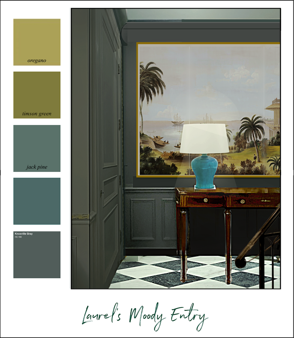
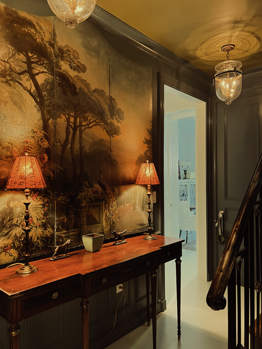
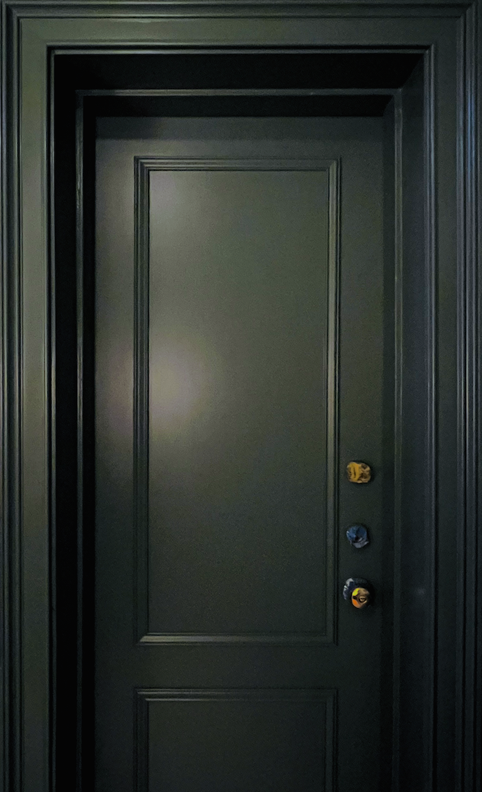
Okay, let’s take a closer look at the lower-level moody entry.
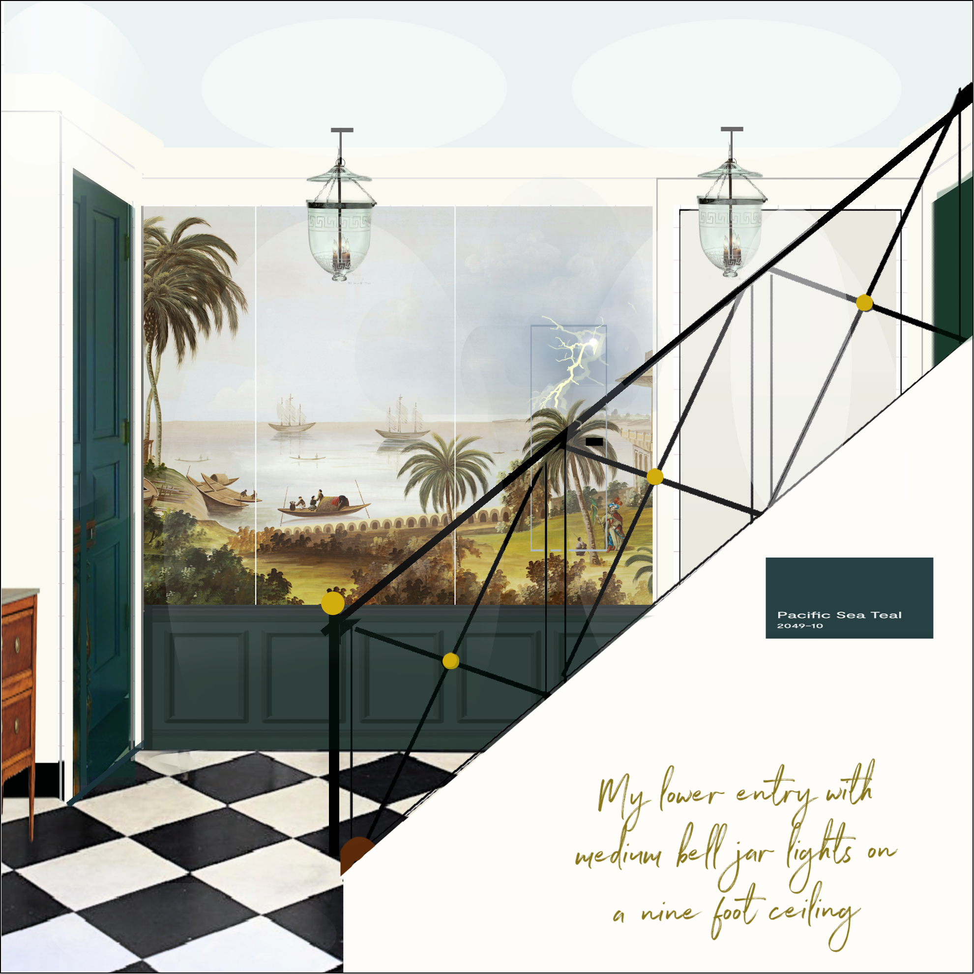
Many of you will recall that I went through two other iterations of colors before settling on Benjamin Moore’s Knoxville Gray HC-160.
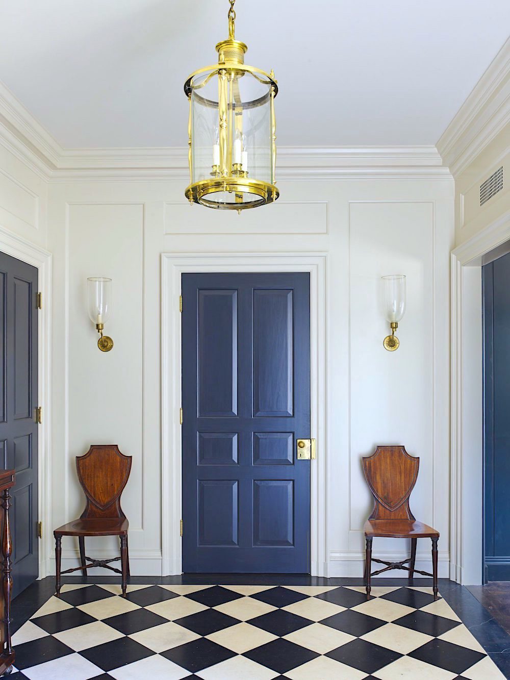
The first idea was inspired by the architect James Carter’s magnificent neoclassical entry, which I’ve shared a few times before.
Above and below.
Below was my (rough) version.
Don’t you love the construction mess in the bedroom? haha.
The view that doesn’t exist. :]
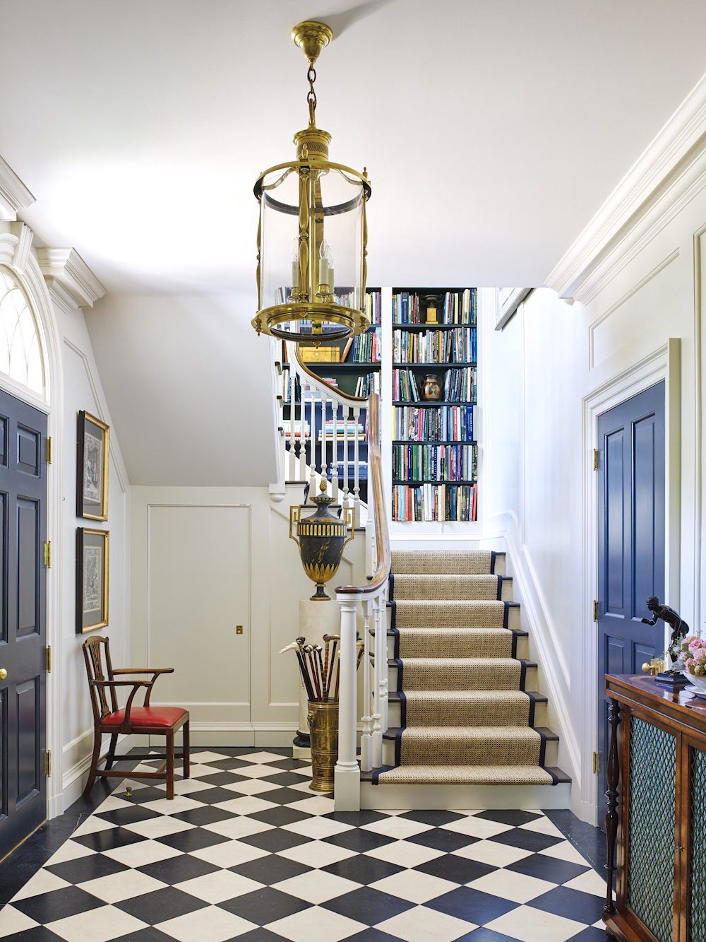
But then, after the Upstairs Downstairs staircase took hold, I decided I’d love to have a color closer to the blue-green background behind Keeley Hawes’ body with my face superimposed.
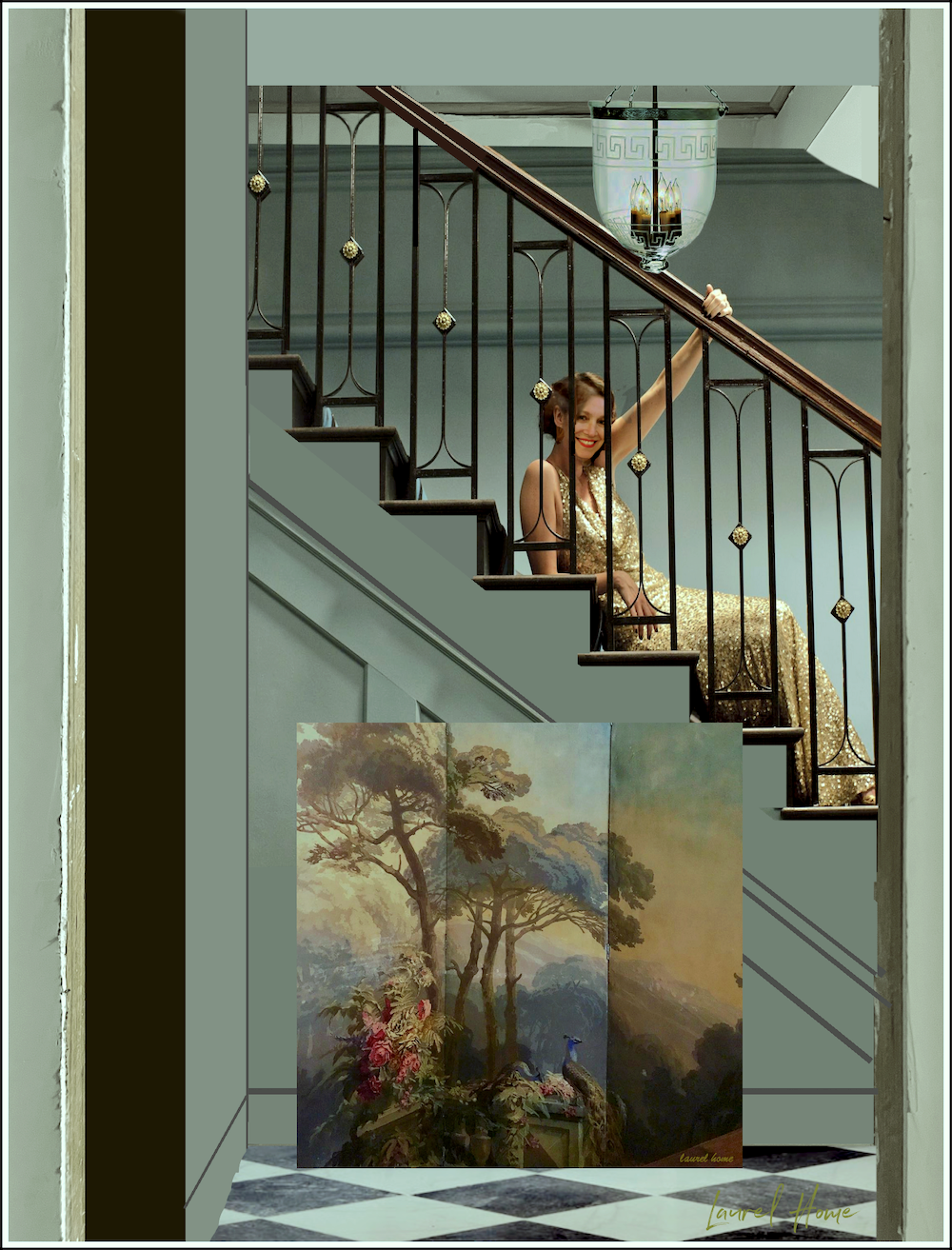
Well, Keeley with my face on her body.
Below is 100% me.
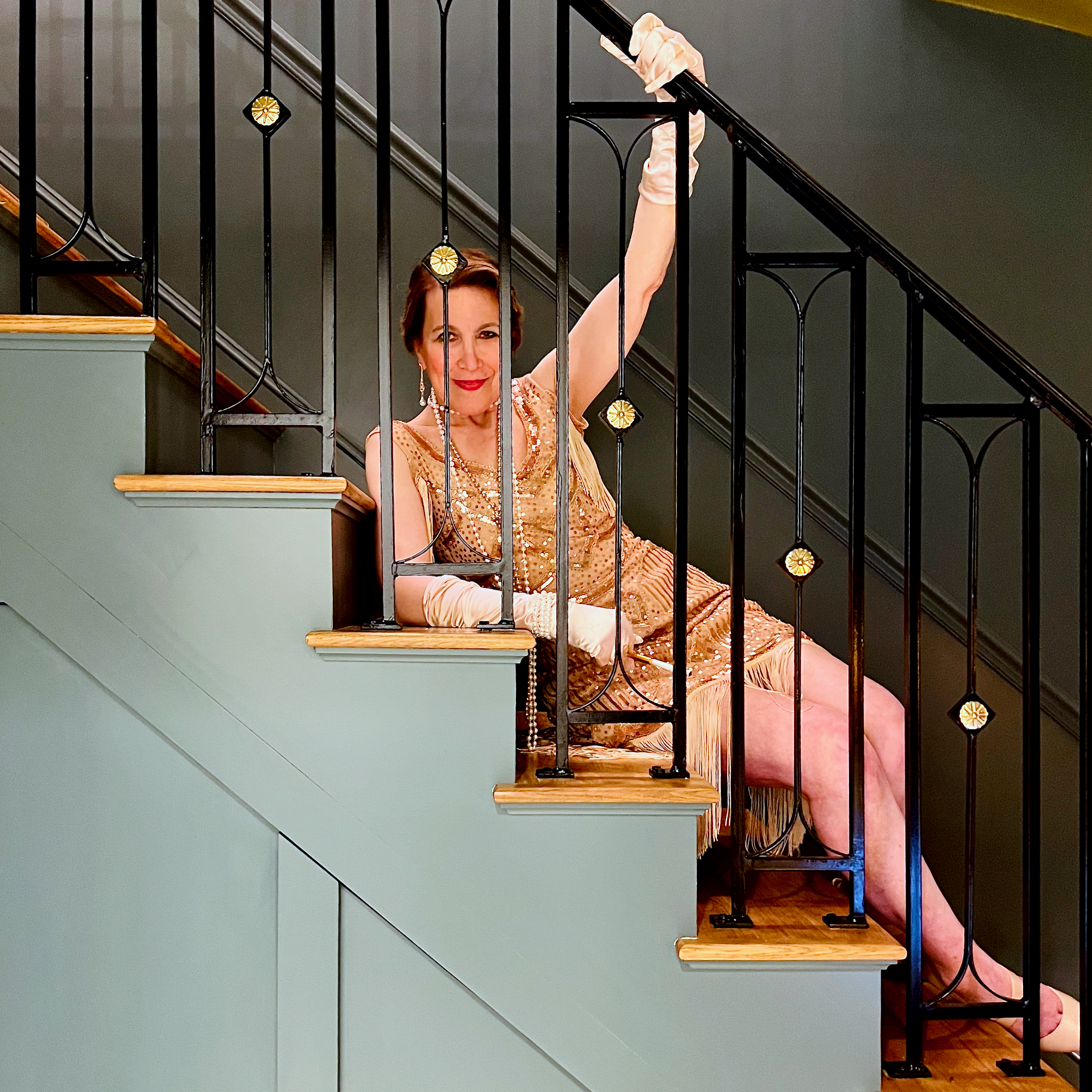
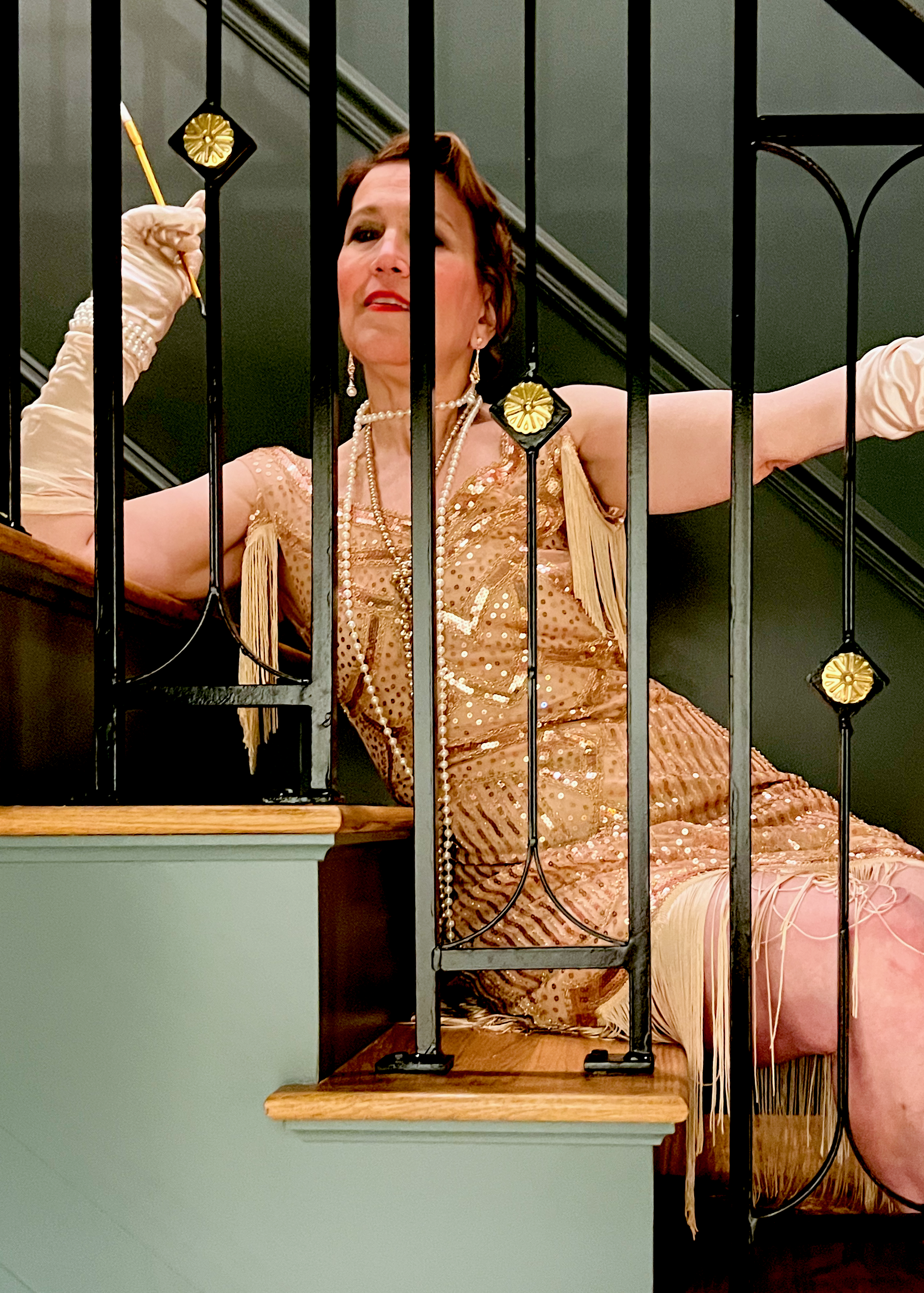
Haha. The color looks the same in the photo. Too funny!
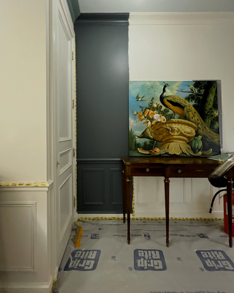
However, there was an 11th-hour change in the paint color, and the explanation for why is below.
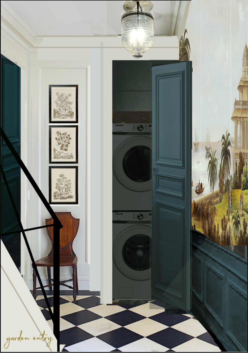
The painters misunderstood and did a wall sample downstairs of the Knoxville Gray, the color for the upstairs entry.
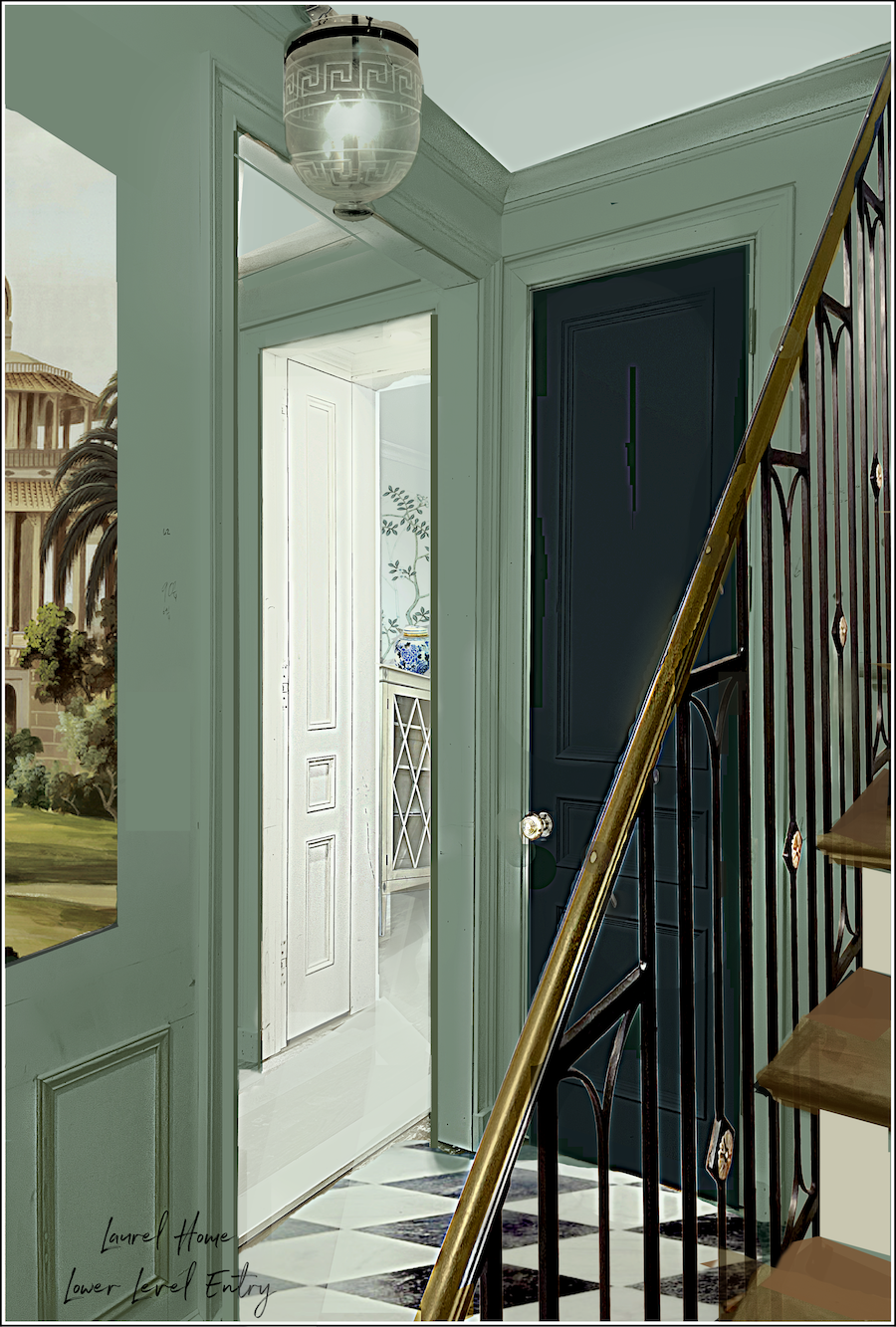
The Knoxville Gray looked fantastic with the console table, so I created a rendering (below), and I was in love.
I have to admit, I was nervous when it was halfway painted.
But once finished, I was thrilled with how it looks, and nine months later, I still am.
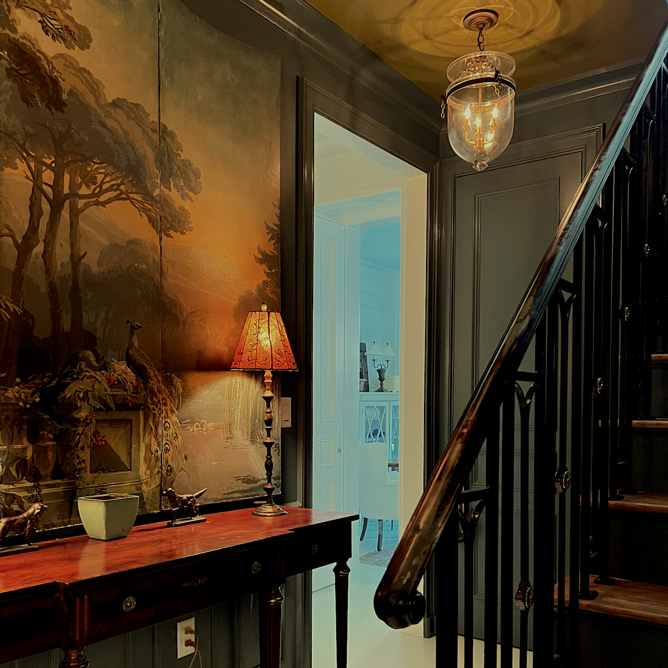
I adore this view into the bedroom.
Now, let’s discuss the lighting for the lower-level moody entry.
This is one place I goofed. (but it was rectified without much fuss)
Originally, I thought the one turquoise table lamp and the two lanterns would be sufficient light.
Nope. Not even close. Fortunately, it wasn’t a big deal to add an outlet behind the console table.
Those two lamps did the trick.
Currently, they only have 25-watt bulbs in them. The bulbs appear dimmer than they actually are in the images.
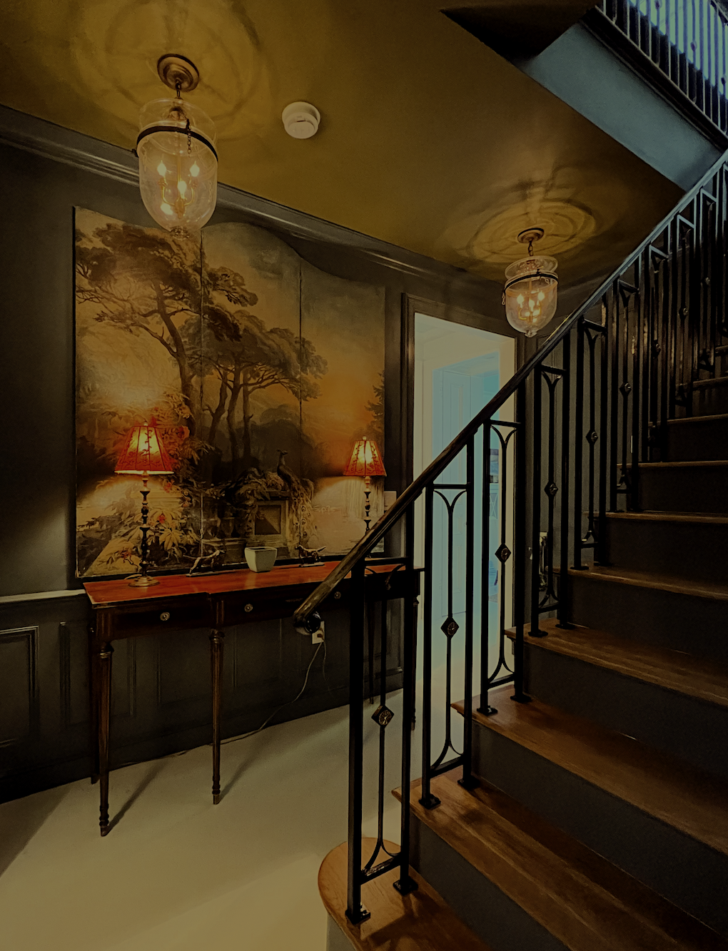
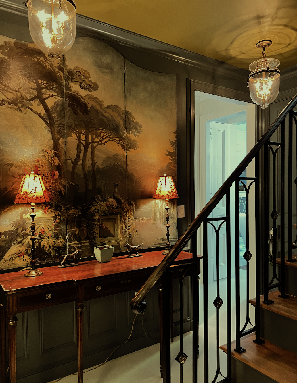
I took a lot of photos, and while some of these are similar, each shows something a bit different.
The one below is an overview of the area, but please note that the eye cannot take in all of this at once. The camera lens is capable of seeing much more than our human lenses can see.
There is significant distortion due to the wide-angle lens.
You can see it with the lanterns. They look all wonky, but of course, they’re not.
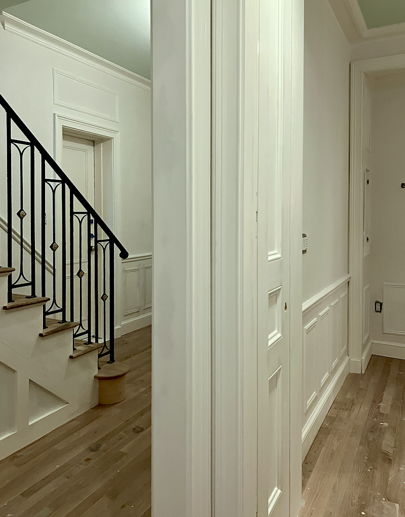
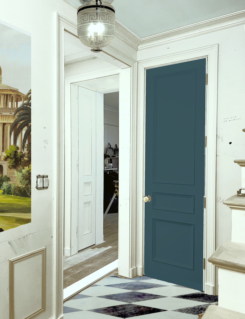
The space, like all of them, looks deeper than it is. The entire space is only seven feet wide. The doorway to the embrasure hall is 42″ wide. It seems less than that.
Additionally, the screen measures 67″ in height, and the table stands 34″ tall.
Originally, I was concerned that the dark versus white would look odd, but that is not the case at all.
I chose the image below because I love the way the stair railing appears juxtaposed against the rest of the space.
Please ignore the wires. You do not see them in real life. Unfortunately, I have to say this because someone is going to chastise me for not hiding the wires.
If the complainers saw me last Monday, there would be no complaints. Instead, they’d send Meals on Wheels over.
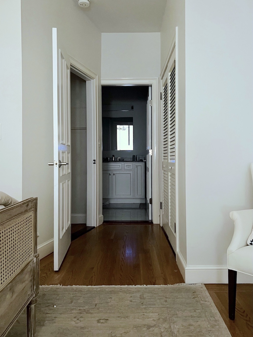
Here’s that view of the bedroom again, with a better look at the linen closet.
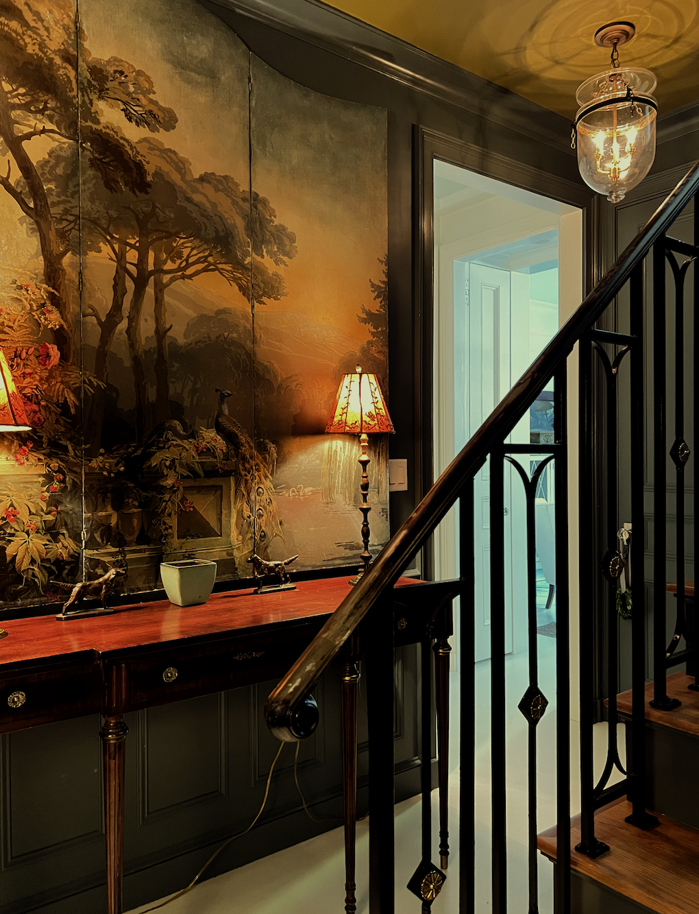
And one more with less distortion than the first image.
I have had those table lamps for at least 25 years. My sister gave our late brother the bronze dogs as a gift, and I got them after he passed in 1987.
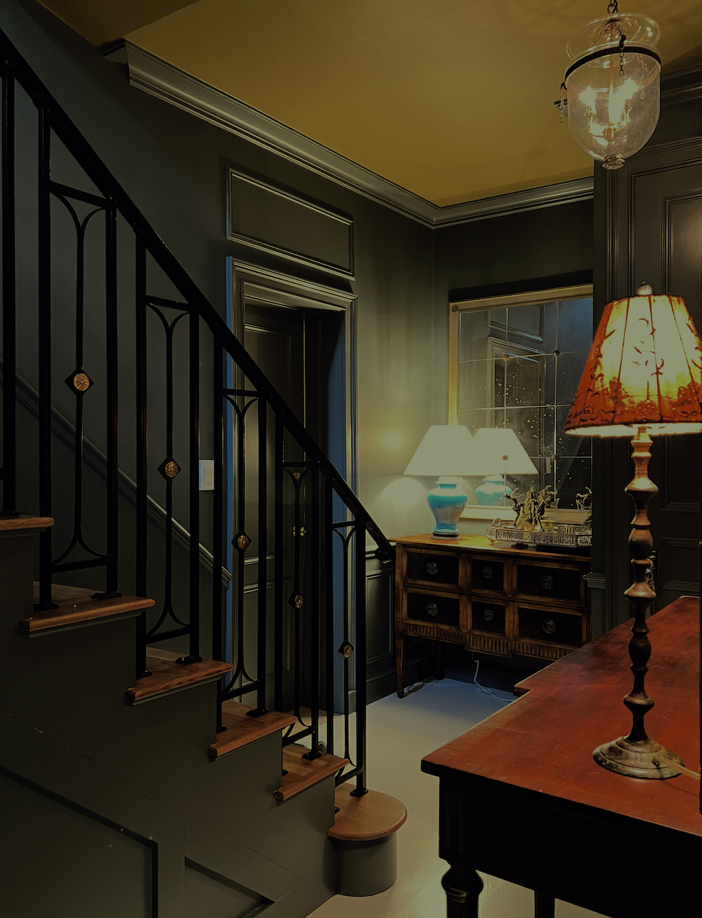
Now, for the opposite view, looking towards the egress door that was formerly in the bedroom.
But first.
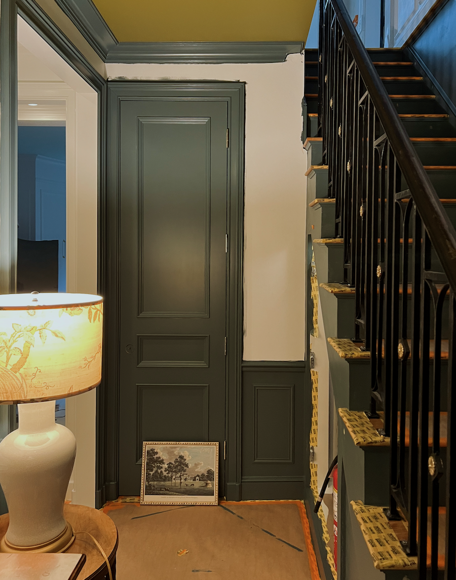
Remember this nightmare from January 2024? (below. duh)
To refresh your memory, the arch you see in the bricks was an existing original doorway that was covered by the wallboard. Butted against it was where the bedroom egress door was moving to.
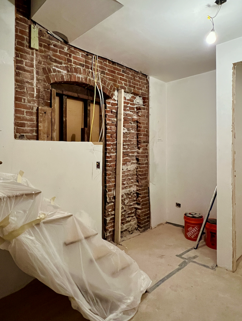
And, below is how it looks 16 months later.
The one above is a fairly realistic perspective and very close to the before image.
However, the one below is closer to what the eye sees– at the most.

You see, you don’t notice the lanterns or the ceiling when walking through the space.
But…
Could the lighting for this moody entry be better?
Well, no one is performing surgery in this space.;]
At night, the upstairs lights spill down, and the embrasure door hall three recessed lights also spill in, so it’s totally fine.
Also, the closets light up when the doors are open.
If I had to do it all over again, I would not do that. I would install a switch for the lights inside the closets, especially the laundry closet, because I need to leave the door open when clothes are drying and after wash cycles to air them out. It would help if I could mask the light bulb with masking tape to warm it up. It’s an LED. It won’t overheat.
That’s one of those things I needed to experience to realize it wasn’t what I wanted. It sounds cool, but mostly, I find it annoying.
While I’m overall totally happy, if I were to do this again, I would’ve added a sconce by the door at the bottom of the staircase. Yet, it’s also fine without it.
As for the lighting, I chose.
For decades, I’ve adored the Anglo-Indian smoke bell jar lanterns. I found these on Chairish as they were exactly what I was looking for.
I purchased the turquoise lamp on Etsy in 2012 for my apartment in Bronxville. (You’ll see my screen here, too!)
The console table lamps I’ve had for at least 25 years!
Otherwise, at the moment, all of the lightbulbs in the moody entry are incandescent. They emit a beautiful, warm, and soothing glow.
So, in answer to the question, was the deep, rich, moody entry color a mistake?
No, just the opposite. The dark, moody lower-level entry is one of my favorite parts of the renovation. And everyone who walks down the stairs admires the space. A woman at my party last February said, “I would never have the nerve to do a color like this, but I love it!”
What color is Benjamin Moore Knoxville Gray hc-160?
Well, it’s not gray. I see it as a muted, deep, cool green. That’s green with blue in it, but not quite teal. It’s more of a soft pine green. It is one of Benjamin Moore’s historical colors, and this one truly lives up to that claim. After it was all painted, this moody entry feels 100% 18th-century; maybe something from the Federal period. In other words, it predates the upstairs by a century.
What about the floor, Laurel? Are you ever going to do the checkerboard stencil floor?
At this point, I’m unsure. However, I adore the white floor. I mean, I can’t tell you how much I love it.
What about the ceiling, Laurel? Do you still like that color?
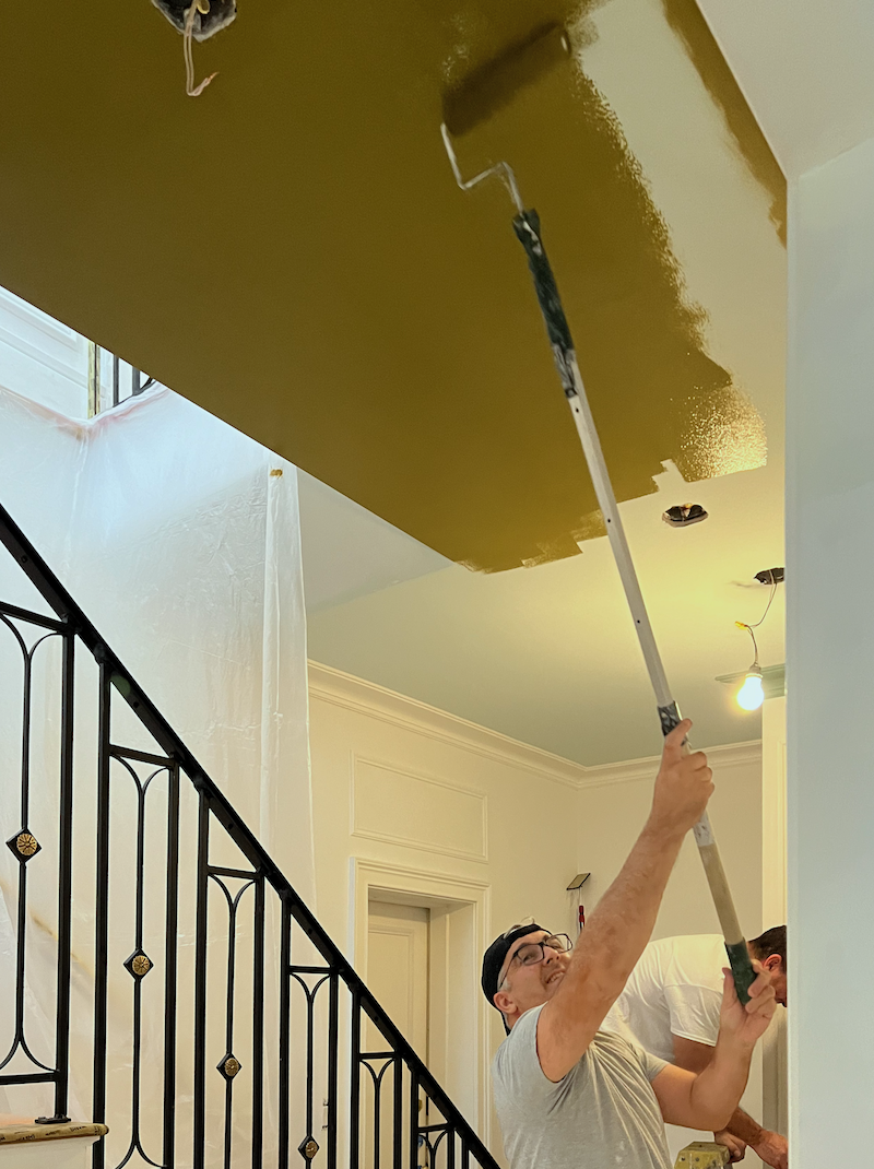
You know I do love the Newt Green by Benjamin Moore, but it doesn’t stand out. The space feels as I was hoping, like a warm hug.
The other thing the moody color does is it makes the space its own and distinctly not part of the bedroom.
Walking in from the outside hall, this moody entry feels more like it belongs to a house rather than an apartment. Even though this side has no windows, I don’t miss them.
However, the thing I love the most is that one is no longer coming downstairs and then standing in the bedroom, or taking two steps the other way and standing in the bathroom, as it was before. (see below) There’s a wonderful sense of entrance, plus more useful storage than I had before.
The spiral staircase ended just to the left of the door on the left.
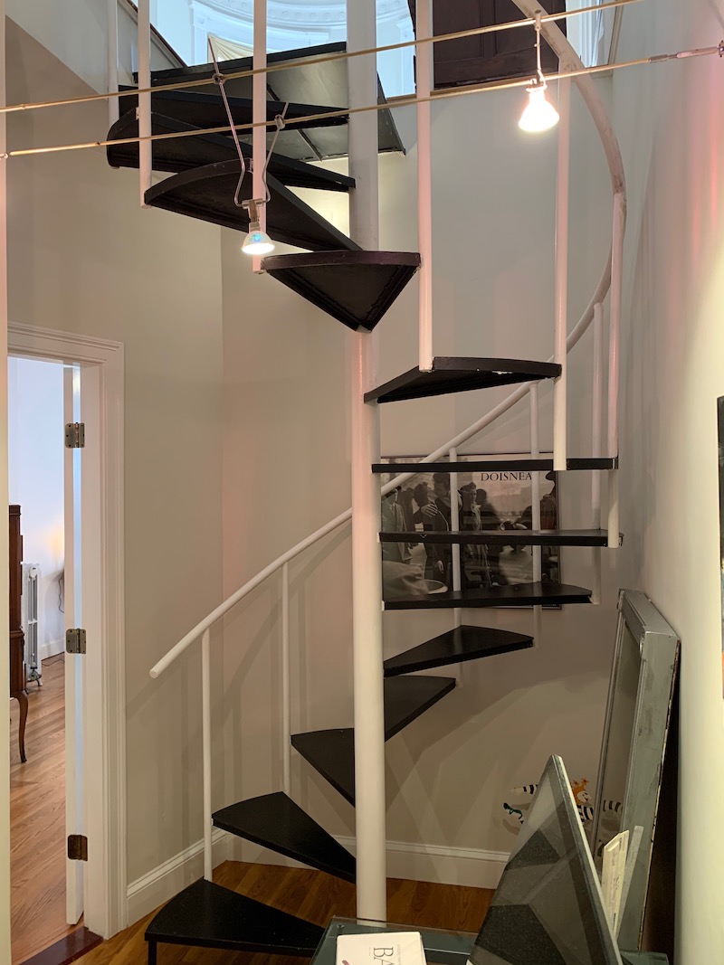
See what I mean?
This post is the sister-post to its next door neighbor, the primary bathroom and embrasure hall. You can read more about them here.
My Bathroom Design- How It Evolved and the Big Mistake I Almost Made!
The full shopping list for the living room and den can be found here.
This link goes to the complete shopping list for the kitchen and upstairs entry.
xo,

***Please check out the recently updated HOT SALES, and hang on for more of my favorites from the big 4th of July sales!
There is now an Amazon link on my home page and below. Thank you for the suggestion!
Please note that I have decided not to create a membership site. However, this website is very expensive to run. To provide this content, I rely on you, the kind readers of my blog, to use my affiliate links whenever possible for items you need and want. There is no extra charge to you. The vendor you’re purchasing from pays me a small commission.

To facilitate this, some readers have asked me to put
A link to Amazon.com is on my home page.
Please click the link before items go into your shopping cart. Some people save their purchases in their “save for later folder.” Then, if you remember, please come back and click my Amazon link, and then you’re free to place your orders. While most vendor links have a cookie that lasts a while, Amazon’s cookies only last up to 24 hours.
Thank you so much!
I very much appreciate your help and support!
Related Posts
 Styling Ideas for Tables, Chests, Consoles {etc.}
 To Brass or Not To Brass In the New Un-Bathroom
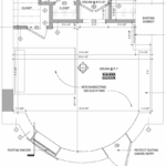 The Bedroom Entrance Looks Like a Renovation Mistake!
 Embarrassed By Your Summer Cocktail Party Skills? Here’s What To Do
 Interior Designers Who Inspire Me | Vicente Wolf
 Hidden Treasures in Murano and Magical Italian Vineyards
 The Shameful Ways Design Bloggers Make Money


