Hi Everyone,
Before we delve into the virtual kitchen design, I want to know how y’all are doing? You don’t need to answer. And, this post is not going to be about the pandemic.
Not really.
But, really.
What I mean is that from now on, everything will be about the pandemic.
It’s just a difficult time, so a friendly reminder to be kind to yourselves. It’s okay to spend a day–
NOT:
- cleaning
- being productive
- knowing what day it is
- wanting to talk to anyone or work.
- exercising even though you know it will make you feel better
But, try to get some exercise anyway. It really WILL make you feel better.
Well, I could go on, but I just want you guys to realize, if you don’t already, that everything you’re thinking and feeling is normal. I looked it up. It is normal to feel foggy, cranky, uneasy, anxious and depressed. Therefore, please go easy on yourself.
Okay, that’s the end of today’s pep talk.
That’s because I can’t wait to talk about today’s topic.
Actually, it’s not just about virtual kitchen design, but all virtual interior design.
I believe that more than ever, it’s the wave of the future.
Now, is it as good as the designer coming to your home?
Ideally, the designer should be there at least once. But, it is possible to do the design 100% remotely. Or, sometimes all you might need is a consultation. That is money well-spent, IMO.
The idea is that if you can’t find anyone in your area, you can hire a designer thousands of miles away to help you out.
However, not everyone is suited to work virtually. A client who needs a considerable amount of handholding is probably not going to be a good fit.
But, if you:
know pretty much what you want
have an easy-going personality
understand that perfection doesn’t exist
Then, you’re probably a good candidate for virtual kitchen design and other virtual design services.
If you’re interested in some other posts about client/interior designer relationships both good and bad, you will enjoy reading the following posts:
My Interior Design Client is Giving Me Sleepless Nights.
How to Tell if Your Decorator is Ripping You Off
My Interior Designer Just Fired Me. Huh?
I Hired The Decorator From Hell
By the way, if you are looking for an amazing kitchen designer. I highly recommend by friend Deborah VonDonop. She doesn’t know I’m recommending her. And, this is in no way sponsored. Please click the link to check out her beautiful website. And, also subscribe to her blog. She gives out a ton of great information, there, as well.
Okay, the rest of this post relating to virtual kitchen design is actually a continuation of another post I did several months ago.
Remember Mrs. F? She had a horribly dated kitchen that she couldn’t wait to get rid of.
If you missed the post or want to refresh your memory, of the dated kitchen, please check it out here.
While you’re reading that, I’m going to go out for a quick walk.
Okay, I’m back. It’s beautiful out and the Bronx River park was CROWDED with parents and kids, not social distancing. Fine, if they’re all quarantined together. Methinks that they are not, however.
Oh well, just trying to do my part to keep us all safe. Is everyone back? Great.
Laurel, I’m a little confused about the virtual kitchen design. Didn’t you go see your client a few times? That isn’t virtual.
Yes, I did. And, that’s because Mrs. F only lives about 8 miles from me, in Larchmont. However, I did most of the job virtually. And, if I had to, I could probably have done all of it remotely.
Mrs. F is the ideal client to work virtually. She enjoys handling parts of the project herself and had a clear vision of what she wanted. And, as you’ll see in a minute, she gets the job done.
In fact, if you go back and read the post.
Mrs. F ordered that furniture, the day after the post came out.
She wanted it for Thanksgiving. Really? haha. I just snickered to myself. Thanksgiving 2020?
But, no. I couldn’t have been more wrong. Three weeks later, Mrs. F sent me an email telling me that everything had just arrived and she loved it all!
Impressive! And, it was a good two weeks before Thanksgiving. By the way, she only saw the furniture when you guys did. But, doing a mood board is a terrific tool for visualizing how the furniture will look together.
So, I wanted to share with you, some photos of the finished kitchen and especially the incredibly lovely dining area.
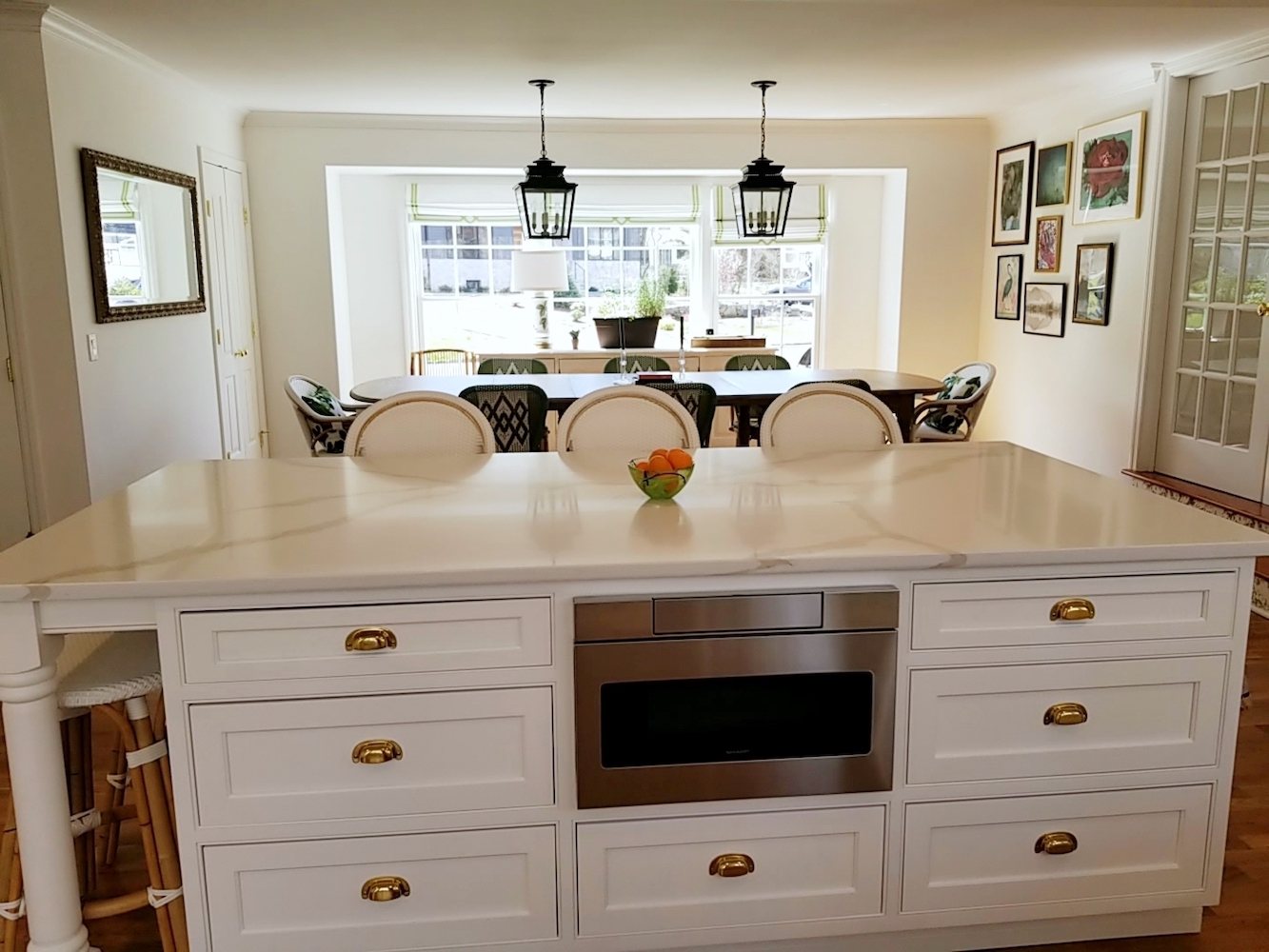
Here’s the view of the kitchen looking towards the dining area. Again, if you missed it, please go back to the original post. That way, you can see the kitchen before. The dining room used to be a separate room. There are also more images of the kitchen.
In addition to Mrs. F’s organizational abilities, she did the gorgeous art wall completely on her own.
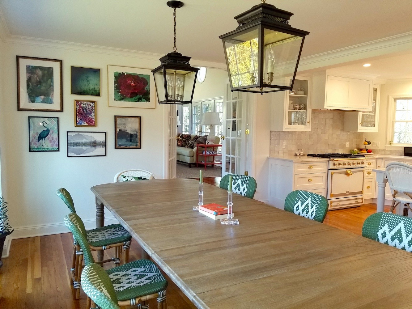 Here’s the Wisteria dining table. Oh, dang. It’s sold out already. The other items are linked to in the original post.
But, if you notice. The room behind the French doors is an addition, the Fs had just done when I began working with them in 2014. You can see the post about the “Grown Ups Party Room” here.
I love how the spaces are now flowing.
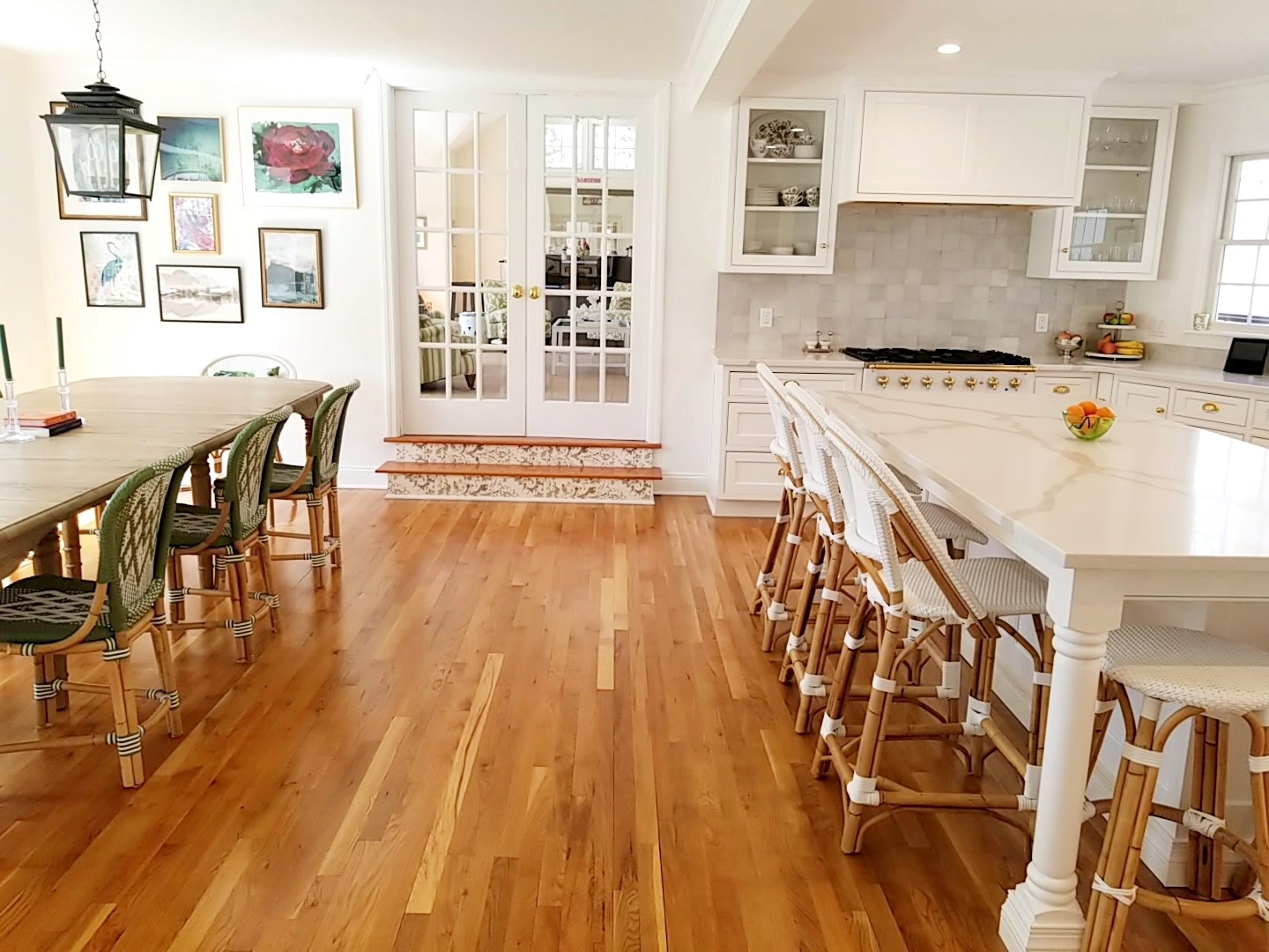
Another view of the path between the dining area and kitchen. The stairs were already stenciled and Mrs. F decided to keep it. I think it’s a fun addition. The chairs are from Selamat and the stools and host chairs are from Serena & Lily.
BTW, everything is still 20% off at S&L. It won’t be forever. But, I imagine it’s due to you-know-what.
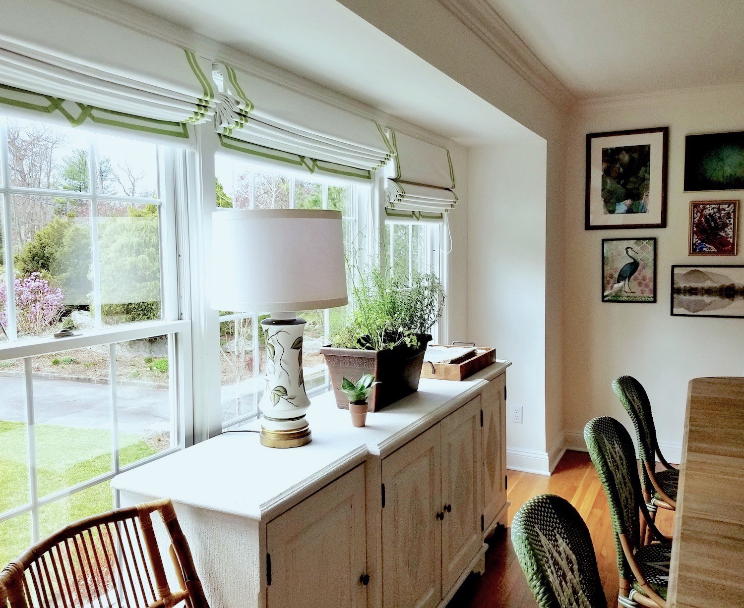 Here we have the gorgeous Gustavian sideboard from Noir Furniture. But sold at Wayfair. You can find it in the Hot Sales widget. (below the OKL only, widget)
The lamp is from Chairish. There are two of them and they are vintage lamps. Mrs. F had to get the lampshades as the lamps did not come with them. I told her to take the lamp over to where they sell them to get it fitted. It really is the best way to do it, if you’re not sure. For a great post about lampshades go here.
But, the best part might be the Roman shades.
You may recall that you first saw this shade in this post about decorating details and my bedroom.
Here’s what happened.
I did go over and measure for the shades. And, then I tried to reach Deb Cronin. And, Mrs. F tried. We both tried repeatedly. I don’t know what happened to her. But, we didn’t hear back. I hope she’s okay. She does beautiful work and sounds very nice, too.
So, it was around Thanksgiving and I let it go.
Mrs. F did not. But, she didn’t bug me either.
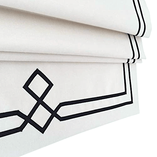
But, get this. She found a workroom who was already making that style shade with the ribbon design. I have no idea how she found them, but she did. The company is called By Harrington.
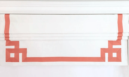
They make numerous styles. One of my favorites is this Greek Key Corner Roman Shade.
Their prices look very reasonable too.
Anyway, about six weeks later, Mrs. F had her beautiful Roman shades.
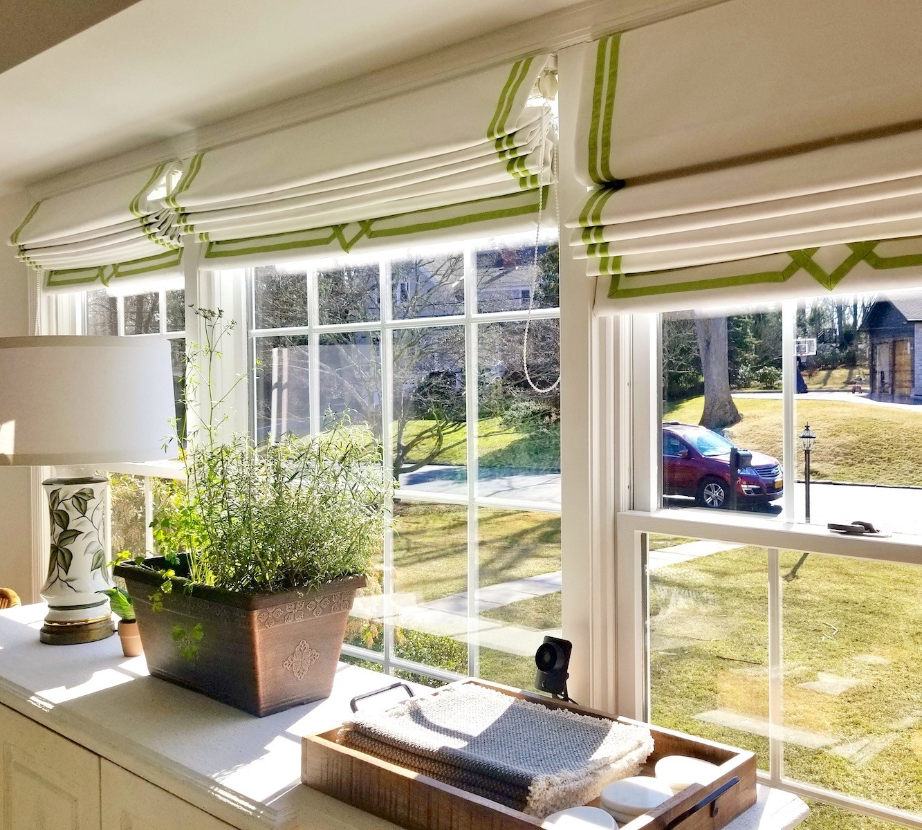 Yes, it’s true that the design is cut off on the bottom when the shade is up. Neither of us minded that, however. I think they look great. I had helped Mrs. V. virtually with the grosgrain ribbon color as well. Actually, I think it was from Etsy. No, wait. I found the ribbon on Amazon.
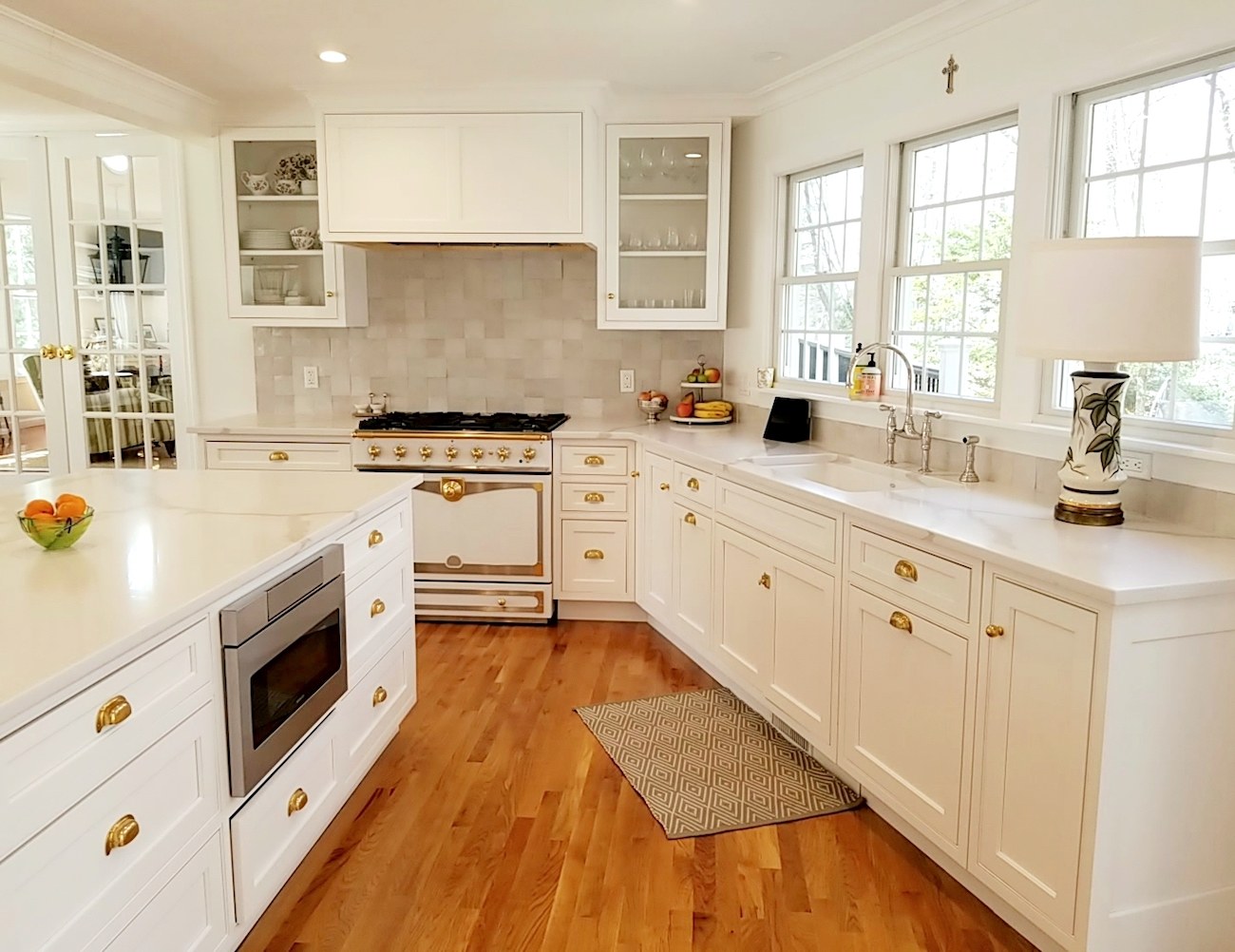 The other lamp is over here.
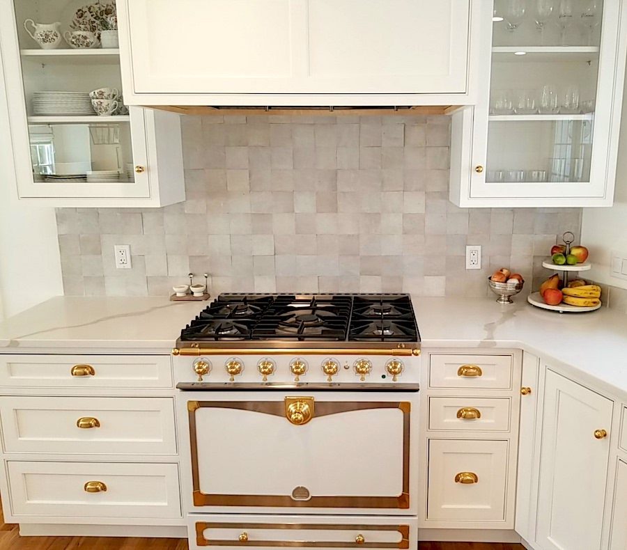 Benjamin Moore – Simply White wall color and the cabinetry is a similar color from the cabinet company – Zellige tile – La Cornue range- Williams-Sonoma
Love that range!
And, now I have a little surprise, not related to the virtual kitchen design.
A year earlier, I also helped the Fs with their family/TV room.
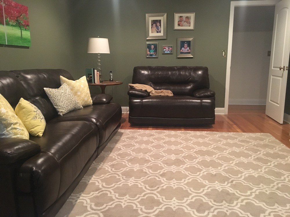
Mrs. F had already painted the room Benjamin Moore Rolling Hills 1497, one of the beautiful Laurel Home Collection colors.
But…
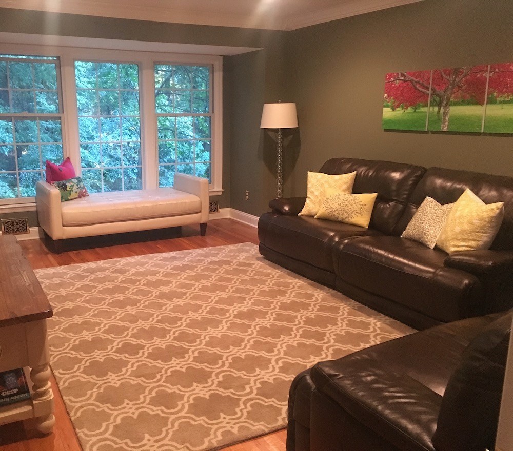 Yes, I know.
And, these are recliner big black sofas.
Mrs. F could not wait to get rid of them.
And, she wanted a new rug too. Something timeless, soft and durable. And not too expensive.
Well, at eBay, I found this beauty. For others that are similar, go here.
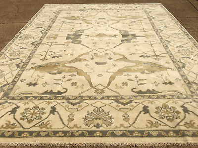
It is a hand-knotted Oushak style and it was only about $700.00! And, she got it super fast. From there, I was able to put together the rest of the room.
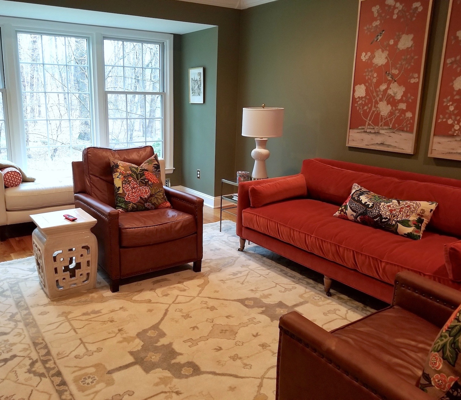 And then we did a sofa from Anthropologie in a persimmon velvet. And two leather recliner chairs from Pottery Barn. Mrs. F got the pillows from Etsy. The end tables are also from Pottery Barn. And, I believe the lamps are from Wayfair.
And, she surprised me and got the two gorgeous Chinoiserie panels. I don’t know where they are from. But, I love them.
Well, that’s all for tonight. I hope you enjoyed seeing Mrs. F’s beautiful home.
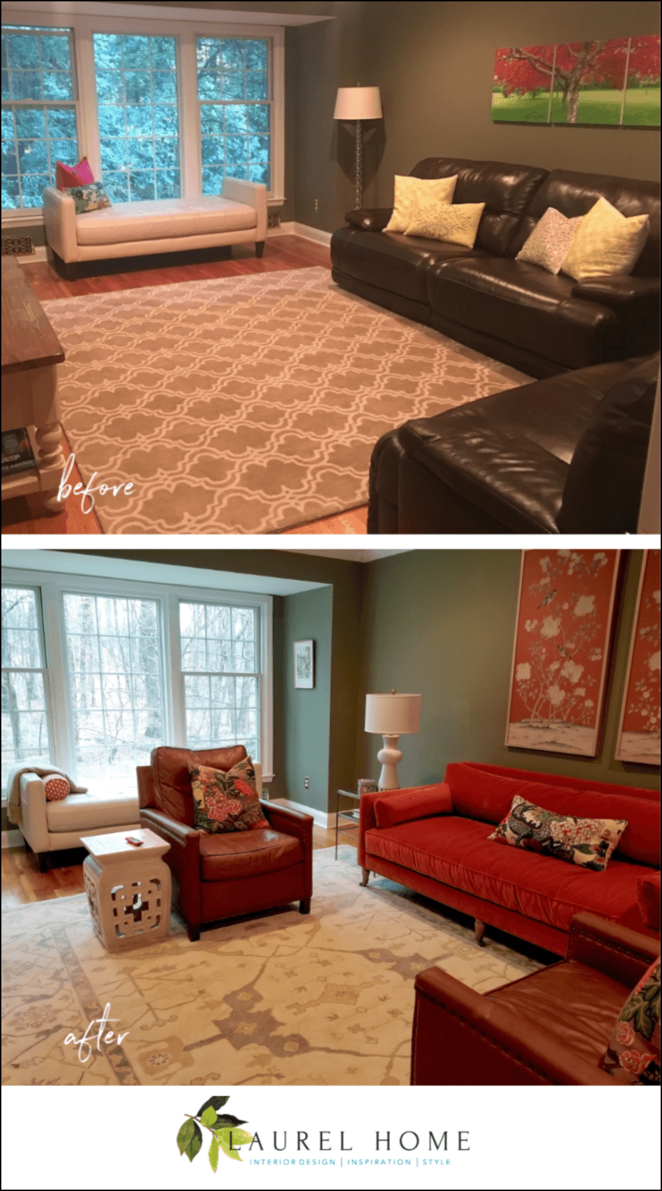
please pin to Pinterest for reference
And, many thanks to Mrs. F for taking all of these lovely photos!
xo,

PS: Please check out the newly updated HOT SALES!
Related Posts
 The 9 Best Kitchen Appliance and Refrigerator Makeovers!
 How To Create The Mark D Sikes Look For Your Patio Furniture
 12 Of The Hottest Kitchen Trends – Awful or Wonderful?
 My Top 100 Timeless Furniture Pieces
 Renovation Challenges for a 140 Year Old Townhouse
 Curtain and Drapery Hardware – What You Need To Know
 Classic White Kitchens – How To Avoid The Sterile Look


