Dear Laurel,
I love your posts about gallery art walls. However, I don’t think you’ve done one recently. I hope it’s no bother, but I’d love to do a staircase gallery art wall.
And yes, from scratch. And no, there are no artists in my family, like darling Maura Endres has. In addition, there are no colleges around with advanced art programs. But, even if there were, I have no idea what I want, how large to make each piece, how to frame, and how to hang many pieces of art so that they look good.
Okaaaaaay???
Plus, there’s color, and I don’t know what goes with what.
HELP!!!
If you could do another blog post to address some of these things, and maybe some things not to do, that would be immensely helpful, and I’ll be grateful.
Best,
Artura Waul
***
Thank you, Artura, but I’m not sure if you realize that it’s very likely to kill me if I do all of this.
Or, I will get raked over the coals for not supporting “starving artists.”*
However, I will do my best, and of course, I support starving artists! However, right now, I’m also concerned with supporting myself, as well as people reading this blog.
*For starving artists, may I recommend taking your best work, then hire a professional photographer (unless you can do it yourself) to take high-res pics of your art. Then, open up an Etsy shop and sell digital prints of your art. You can sell the originals too. Win-win.
It’s a digital world. What can I say?
I saw the handwriting on the wall back in ’06 regarding the Internet and how it was wreaking havoc on my business. At the time, I was plenty angry, too. The Internet had managed to make my life a living hell. Or, at least it had a huge part in it.
But, then I figured it out, and here we are in 2022.
Okay, it’s time to talk about a staircase gallery art wall.
Now, much of this will apply to ALL gallery art walls.
However, for today, I will focus on staircase gallery art walls.
That’s because it tends to be a bit trickier. Plus, there are numerous configurations. Obviously, I can’t do a template for every situation.
But, it’s pretty easy to adapt the template like the one you will see later is quite large.
In fact, I think the most difficult part is picking out the individual pieces.
However, some super-smart people figured that one out and have created some gorgeous gallery art walls with as many as 30 pieces.
So, we will explore more of what I recommend, but first, let’s go over some of the common mistakes I see.
I will accompany these with images. However, some of these images are heavily disguised by other bloggers. I don’t know who they are, and none of them, as far as I know, are trained, interior designers.
This exercise is done as a learning experience, not to judge. It’s taken me many years to figure this stuff out. And, it’s not easy to put these walls together. That’s why I love to create templates for you to copy or use as a guide.
Here are the most common mistakes I see for staircase gallery art walls and all art walls, in general
1. There is a poor layout of artwork or photos.
What makes for a poor layout?
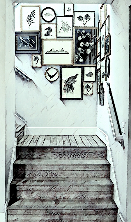
- The spacing is too close together, too far apart, or sometimes some of both.
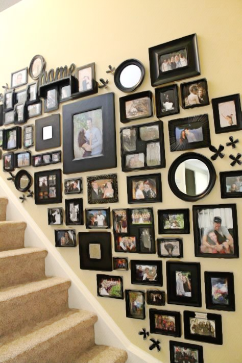
- There are too many images, and it looks crowded.
- The sizes of the images are too small.
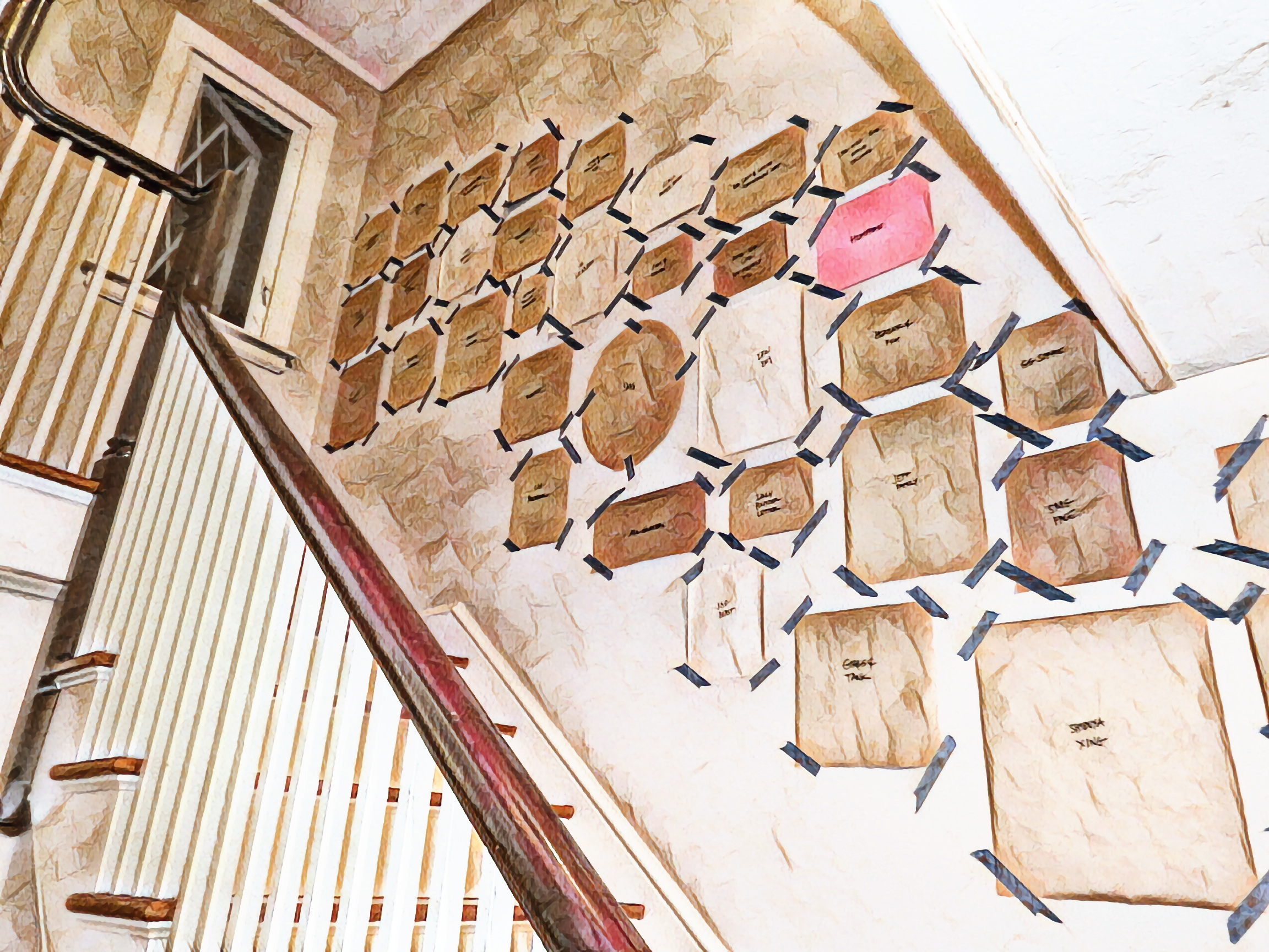
- Or, sometimes, they are too varied.
However, in the image above, making a paper template before nailing in your wall art is a great idea.
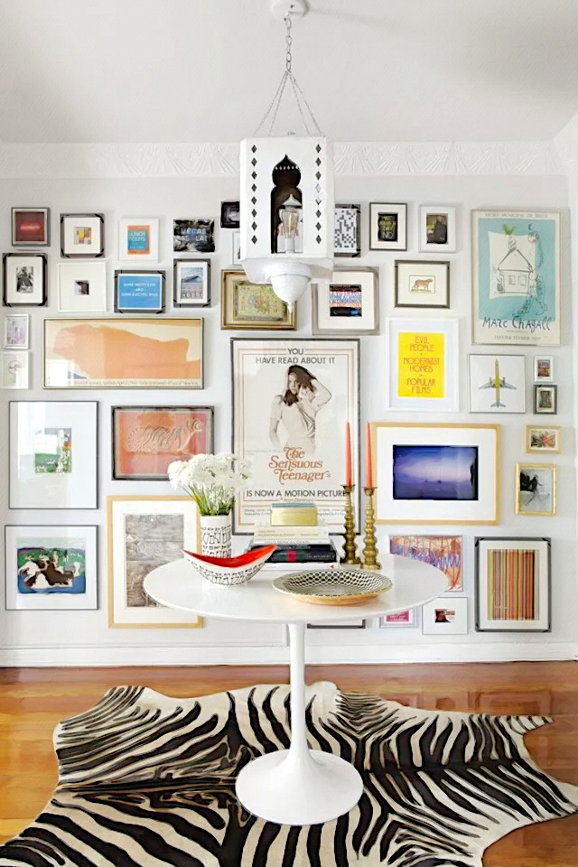
The gallery art wall above, in my opinion, has too many tiny pieces near the top. I think these would be better on a smaller wall, as they get kind of lost here.
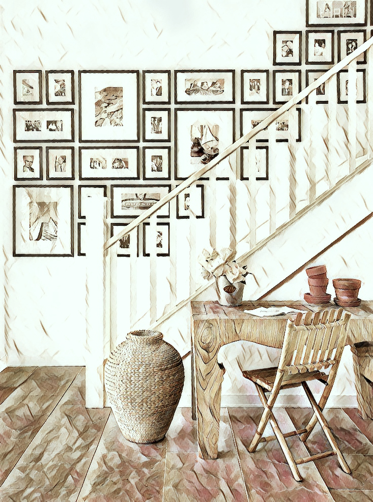
2. Another common issue I see with staircase gallery art walls is that the design is TOO stagnant.
What I mean by that is that there is a repetitive pattern throughout. Or, like the one above, which isn’t terrible, the frames are all the same, and there are only three sizes of art pieces.
This next issue with staircase art gallery walls is one that I see a lot, and it usually looks funny.

The stairs are on an angle, so yes, the bottom of the staircase gallery art wall should follow that angle. However, the angle will continue at the top of the composition. The result reminds me of a snake going up the stairs. So, what should it be?
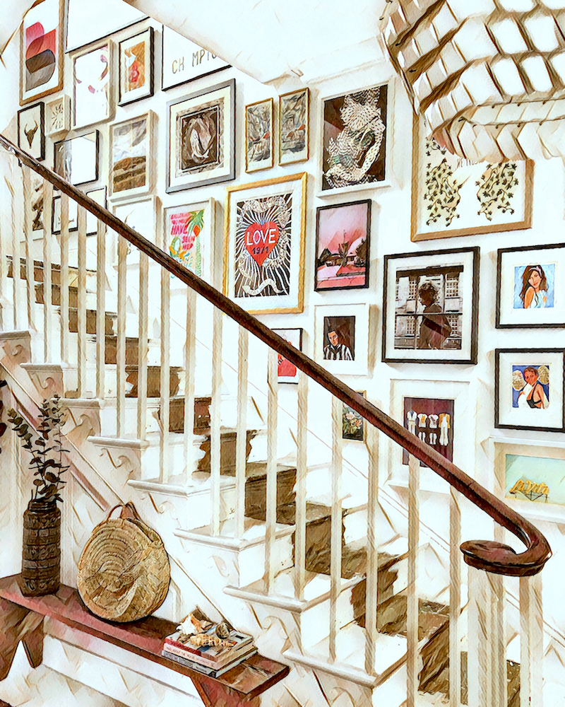
I prefer all of my staircase gallery art walls to have somewhat defined edges parallel with the other walls and ceiling. The above example by Lisa Dawson is pretty perfect.
But, Laurel, it is challenging to hang art on a staircase eight feet or higher.
Yes, I know that. ;]
I recommend that you hire a professional to hang the art that’s out of easy reach.
And, for God’s sake, do NOT HANG PRECARIOUSLY OVER THE BALCONY, to hang your art, like I just read someone did!
Ugh.
However, if you do want to tackle hanging the art yourself on a staircase, it is definitely a two-person job at all times, and you should get a special ladder like this.
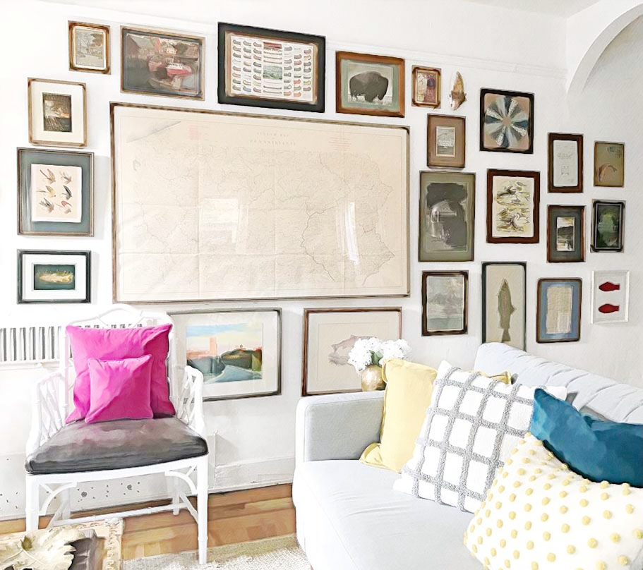
Another mistake, albeit not the worst, is to have one HUGE piece of art in the middle and then lots of small pieces surrounding it. The most significant piece should not be larger than four medium-sized pieces if they were in a composition.
Again, this isn’t the worst thing, but I think it could be better.
Where should the super large piece go?
I think, if possible, it should go on its wall, over a sideboard, console table, sofa.
How many different sizes can you have for your staircase gallery art wall?
That’s an excellent question. Part of the answer depends on how large your wall is.
However, I think that an interesting wall has some areas of symmetry and many areas that are balanced but not symmetrical. I think it’s possible to have about two-thirds of the pieces in unique sizes. However, I think it should be at least a third of the pieces.
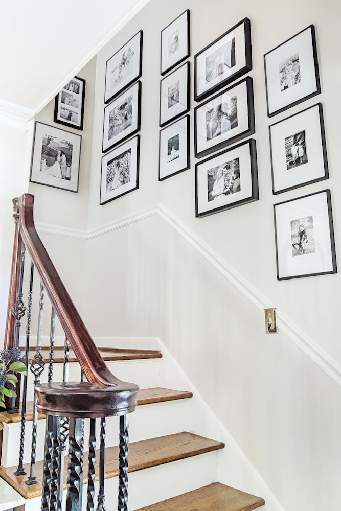
Another issue is the art itself. Some art is very heavy, and if you have 30 pieces of mostly very heavy art, it can feel stifling.
One remedy is to have some or all of the pieces framed with large white or off-white mattes. This will give a much lighter look. The above example is good from the standpoint of matting. However, the spacing could be improved, and I would like to see some more variety in sizes.
There is a similar issue with frames for all gallery art walls.
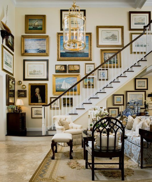
Generally speaking, the pieces are not going to be terribly significant. There are exceptions, such as a formal space, but for most gallery art walls, I prefer thinner frames from 1/2″ – 1″ wide.
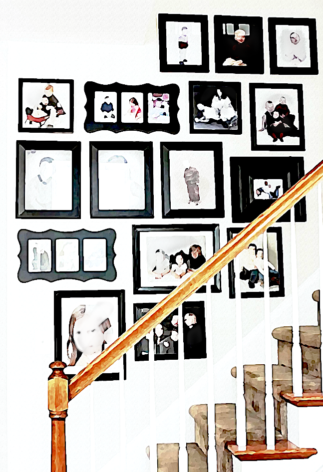
In addition, unless the frames are skinny, please be careful with all black frames. These thick black frames are what I see first, not the images.
Can you do all of the frames the same?
I think that’s a good design choice. It tends to look more contemporary.
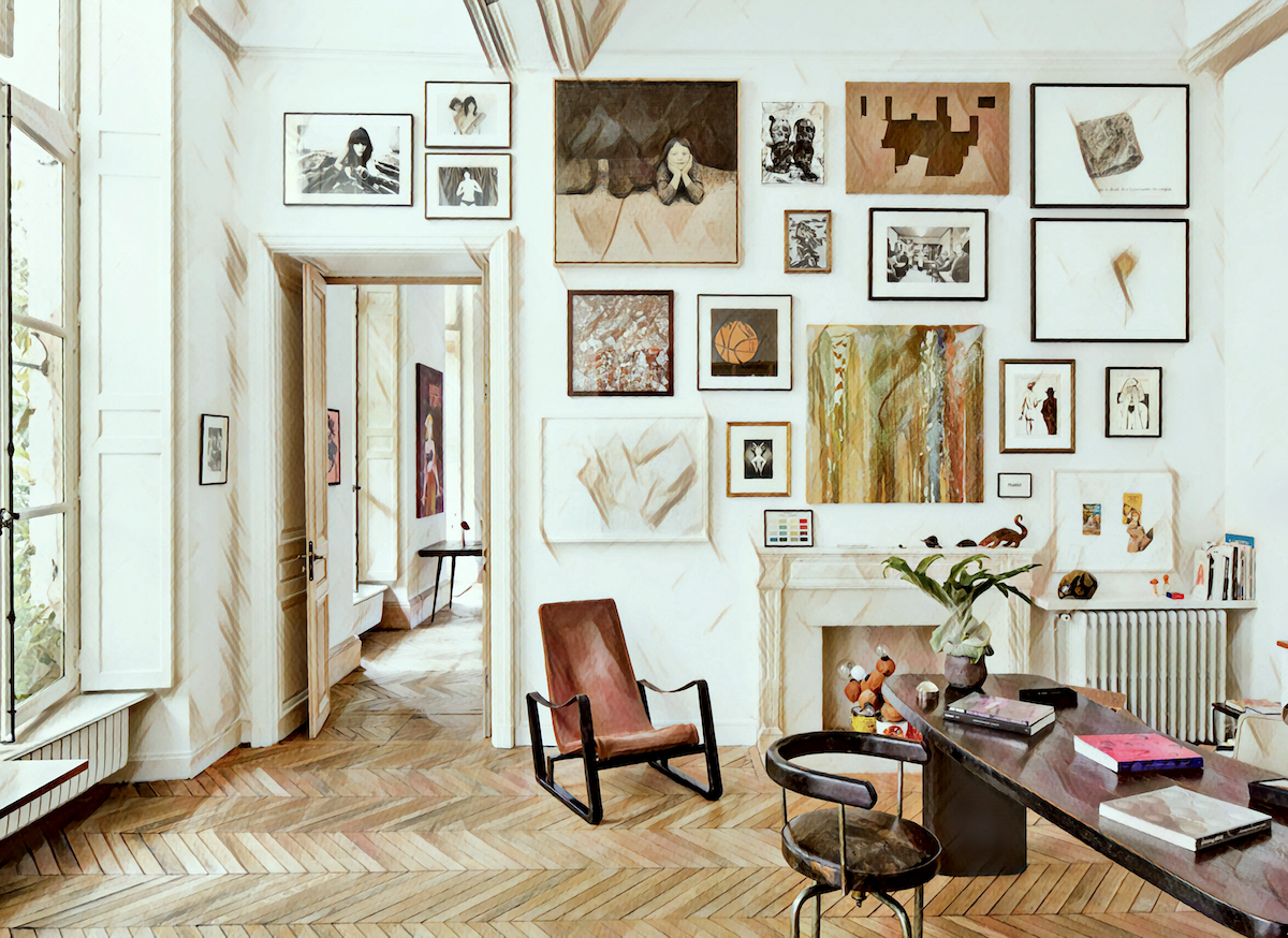
How many different frames can you have?
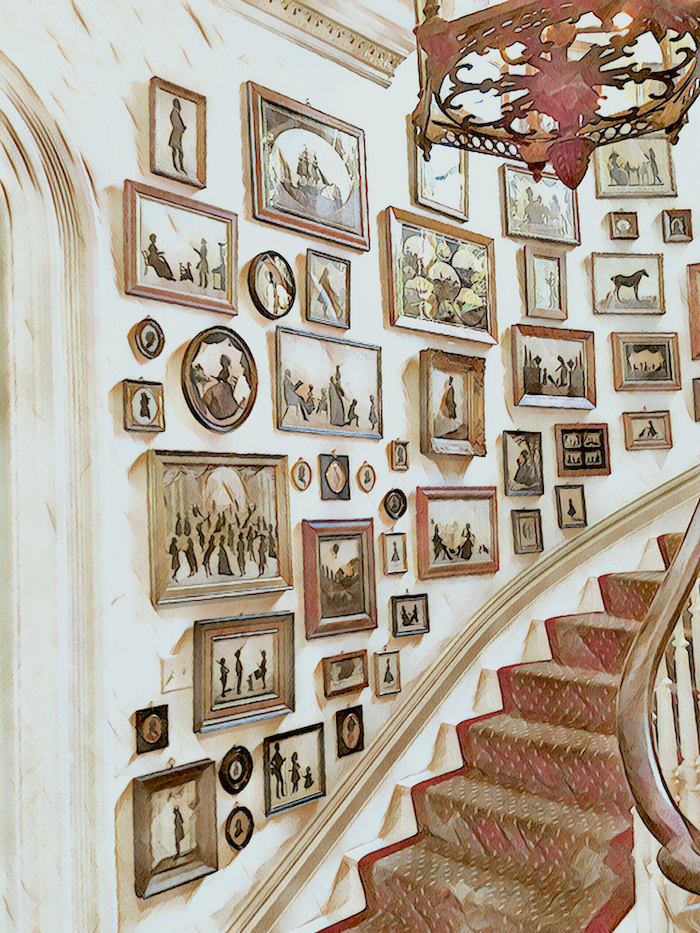
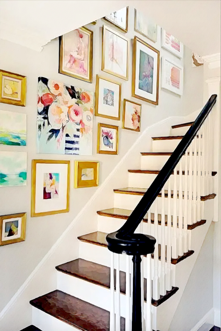
That’s dependent a lot on the art– and the staircase. For example, I think the eclectic and sometimes whimsical art looks fantastic on this curved, Victorian staircase.
Here’s what I ask myself, and I’m serious.
Would Gil Schafer, Darryl Carter, Gerald Bland, Furlow Gatewood, etc., do this in a room of theirs?
If the answer is “no,” then don’t do that!
In other words, the compositions may tell a story, but not with the letters S, E, R, I, O, U, S, L, Y,? A, B, C, D…
And, what about these reminders “Happy” or “Be Kind” “Grateful.” Sure, but that’s what post-its are for.
In addition, I’m not saying no, but it takes a lot of skill to work in circular shapes in a staircase gallery wall.
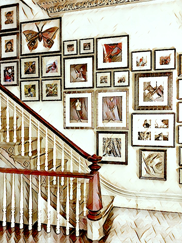 If you prefer more irregular edges, I think this one did a great job with the interest and variety.
So, before I get into the template I created for you for your staircase art gallery wall, I want to talk about some successful art gallery walls.
The first one I found on the 21st of February. I had never seen this source before. And, very cool, they put together a few super substantial gallery walls. But, get this. The following night, I got a notification that they were no longer selling on Etsy. So, fortunately, I had the source open on another table and at least got some good screenshots of some art gallery walls.
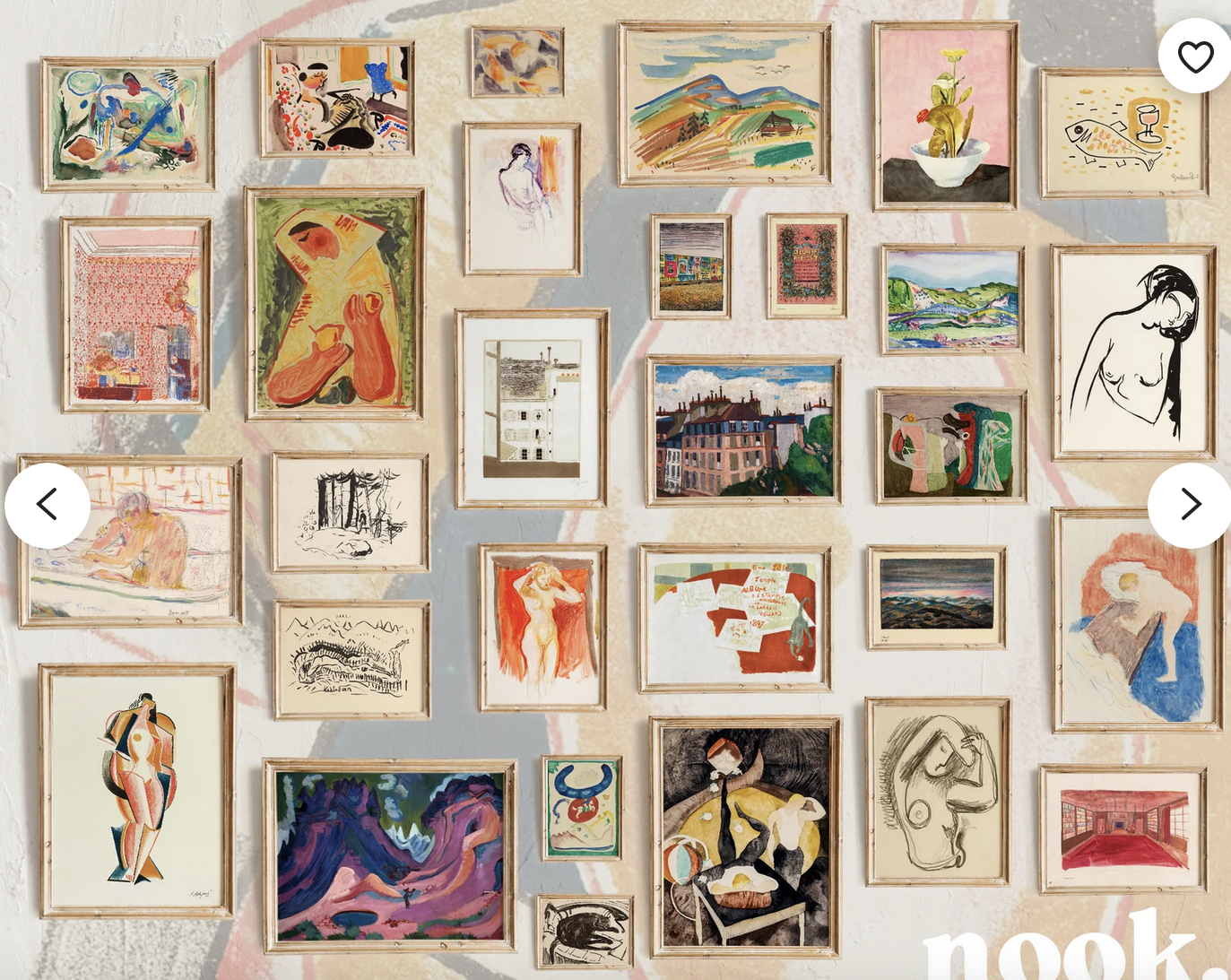
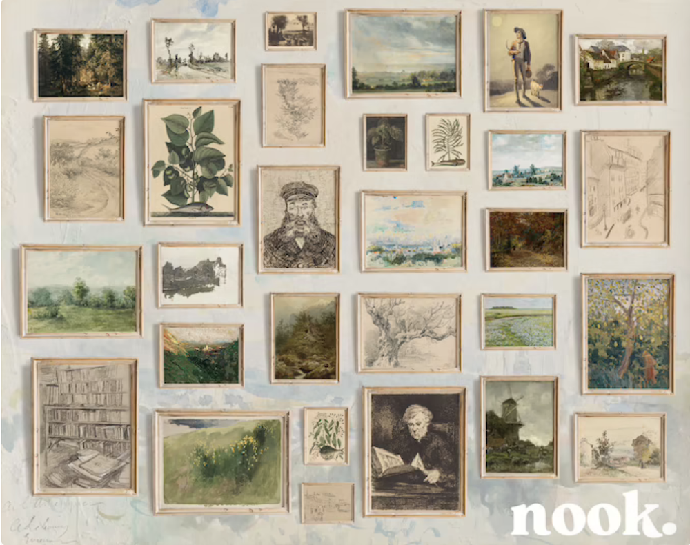
Please notice that the template is the same, although the art is different!
Another good source for art and also art gallery walls is Artfully Walls.
Now, many sources sell art prints on Etsy. I’ve listed many of them in the extended Etsy Guide that lists over 150 Etsy vendors. However, I am constantly finding new ones. When I do, I note them and will add these new vendors to the guide next year.
The other day, I found a new source with gorgeous art prints.
Their name is North Prints and they sell on Etsy.
It’s important to note that these are digital downloads. They do not make the prints for you. That is up to you.
Remember this post when I talked about printing on canvas or at least a paper textured like canvas? I think that would be super cool and then put a varnish over the art to protect it. That will bring out the image and make it look more like an actual painting. Plus, you won’t have to put glass over it. I think it’s weird to put glass over a piece of art that’s meant to look like an oil or acrylic painting.
Anyway, these digital downloads are absolutely gorgeous and a super affordable way to get a beautiful piece of art. However, you still have to obtain a frame. And, if you have an art wall with 30 pieces of art, that could start to add up.
Okay, and now it’s time for the staircase art gallery wall template I created.
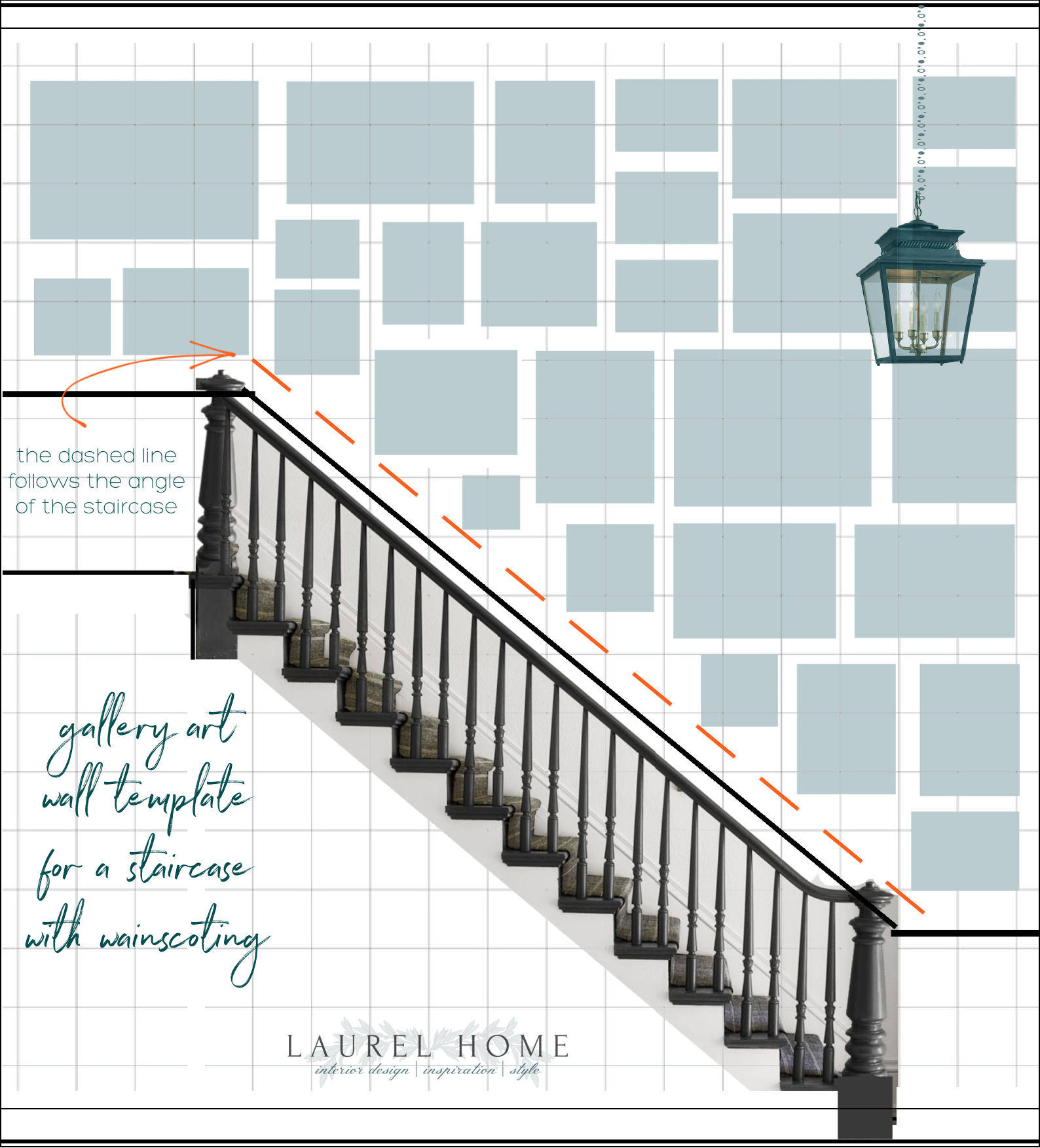
Above, you can see a staircase spanning two floors of about nine feet each. The measurements are approximate, but the graph paper for reference indicates one square foot.
There are about 30 pieces of varying sizes and a combination of squares and rectangles. In addition, each piece is from about two-four inches apart. Two inches is an excellent minimum distance, and it is better not to go more than six inches, if possible. It is essential to keep it fairly consistent, but not like soldiers lined up.
You’ll notice that some areas of this staircase gallery art wall template are aligned. But, some areas overlap.
The red dashed line indicates the approximate place that a corner hits to create the line parallel to the stairs and wainscoting.
Okay, I was going to fill in the art pieces. That would be fun to do for another post. That would be to create different schemes and colors with art.
However, I have created a widget of some gorgeous groupings of decorative art digital prints from North Prints on Etsy. They are having a sale that’s going to be over in 24 hours, they say.

I hope you enjoyed exploring the making of a staircase art gallery wall.
For more beautiful art walls, please check out:
How to Get Gorgeous Free Art That Looks Expensive
Why You Should be Afraid of Art Walls
A Fabulous Art Wall for Cheap!
Staircase Decor and Three Common Mistakes
xo,

PS: Please check out the newly updated HOT SALES!
Related Posts
 Mirror, Mirror Over The Mantel – What Size To Get?
 Quick-Start Interior Design Guide 2019 – Plus News!
 Otis House-Surpising Lessons From A Late 18th C. Home
 The Ugly Truth Behind The Pretty Interiors On Houzz
 Easy (and affordable) Ways To Fix A Boring Room
 6 of the Best Classical Architects People Should Copy
 How To Get The Mark D Sikes Look For A Lot Less Money


