Hi Everyone,
I hope you’re having a great week! Apologies for making you slog through the wallpaper nightmare post. Well, I didn’t make you. ;] But, it was a big gulp of words. Still, if you missed it, you might want to take a gander over there to check it out.
So, today, to make up for that, this is a pretty and hopefully inspiring paint color post.
The idea here is “little-known” paint colors that designers are obsessed with.
What’s difficult for me, in some cases, is knowing if the color is genuinely little-known. Just because I know and see it always doesn’t mean that most of you have. But, you might have. had a tremendous amount of press with magazines and interior design bloggers.
In addition, five of the nine colors I’m featuring are in the Laurel Home Paint and Palette Collection. And, I think I’ve written about each of them before, as well.
So, let’s begin with the first of the little-known paint colors. (These aren’t in any particular order)

Benjamin Moore Marilyn’s Dress
My guest room bathroom is painted this color. It came that way!
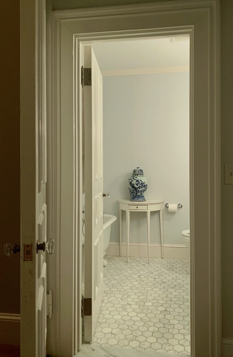
And it is so incredibly soothing and ethereal in this windowless bathroom. Coincidentally, it is also part of the Laurel Home Paint and Palette Collection. I knew it was a terrific color. It looks terrific paired with Benjamin Moore Super White.

Benjamin Moore Salamander
It is the darkest green ever, I think. However, a semi-gloss finish will attract the light, and the green will come out.
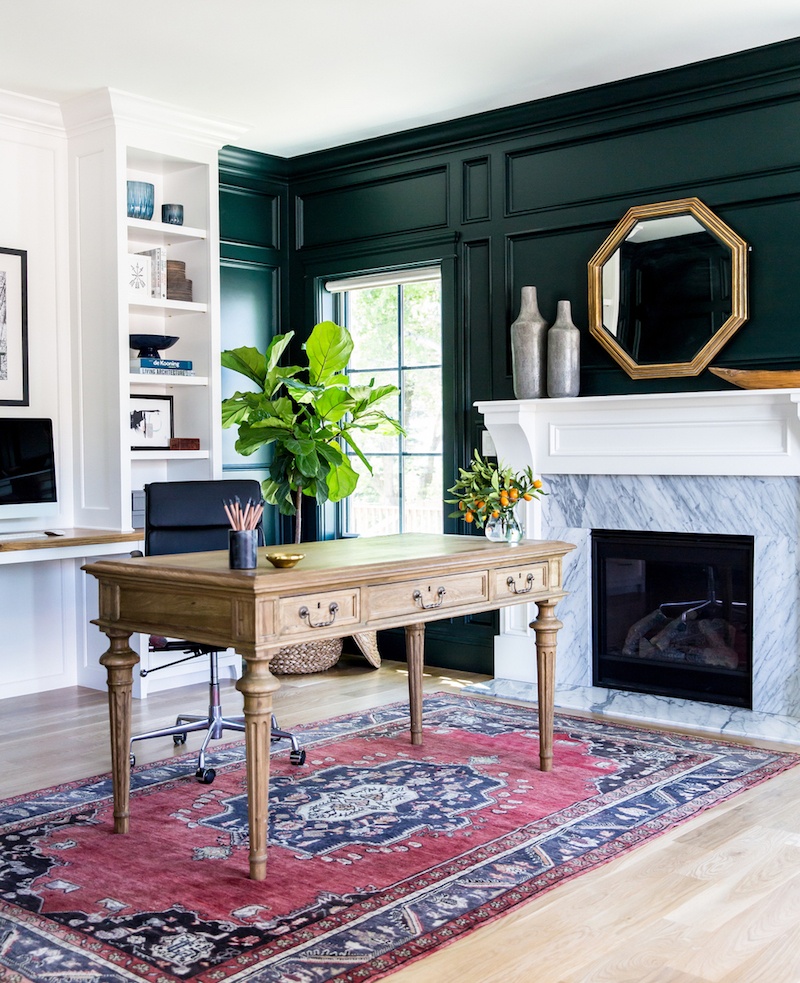 This is another favorite by Studio McGee and looks so handsome in this library. @lindsay_salazar_photography
Picking little-known paint colors that designers are obsessed with is not an easy feat. Most of us love the usual suspects such as White Dove. However, there’s one shade of white that I always hear, “Oh, I’m so happy that you included______! It’s my favorite white!”

Benjamin Moore Swiss Coffee oc-45
It’s this one, above; swiss coffee. It’s a creamy, soft off-white that is warm but most often won’t read as yellow. It might read ever so slightly gold, but not in an obnoxious way.
Swiss coffee is a paint color frequently used by the now prolific interior design firm, Studio McGee. And, it is also part of the Laurel Home Paint and Palette Collection.
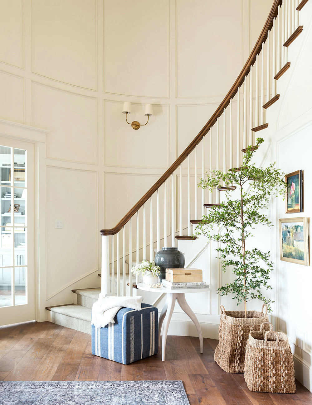
You can see more of this lovely project here by Studio McGee.

Benjamin Moore Silver Lake 1598
Silver Lake is one of the five paint colors included here that is also in the Laurel Home Paint collection. It is under the cool grays, and this one does have a lot of blue in it and is quite lovely.
I chose Silver Lake because Suzanne Kasler loves a similar color. That color is called Limoges Blue by Glidden. However, I could not find that color on the Glidden website.
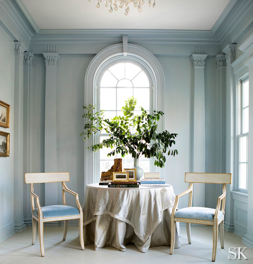
I’m not sure if this Limoges or not. However, it does look to be close to Silver Lake.

Farrow & Ball Pantalon
This is definitely a little-known paint color. However, we did look at it not too long ago in a post about “drab” paint colors. It is a color currently in F&B’s archive collection. However, I’ve heard wonderful things about it from a couple of sources.
I love these dark, handsome colors.
For more beautiful, dark colors, please go here.
Pantalon definitely has a green undertone but in a rich, bronze-y way. I’d love to be able to try it out sometime.
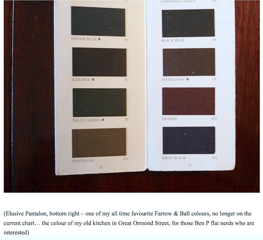 But, get this. Just today, I found out that Ben Pentreath loves this color, too! In fact, as you can see from his 2013 post, he used it in a previous home. What’s funny is that it’s almost the fourth anniversary since I met him in England and got to have lunch at his incredibly charming home in Dorset, UK!
It was like my Instagram account had come to life!

Farrow & Ball Tallow
This is a beautiful, vibrant cream. I can’t attribute to any designer, in particular; however, most designers love working with cream like this. It’s very flattering and glows at night. This is also an excellent color for a darker room. It’s a cream with a very slight pink undertone, so it’s terrific for a bedroom.
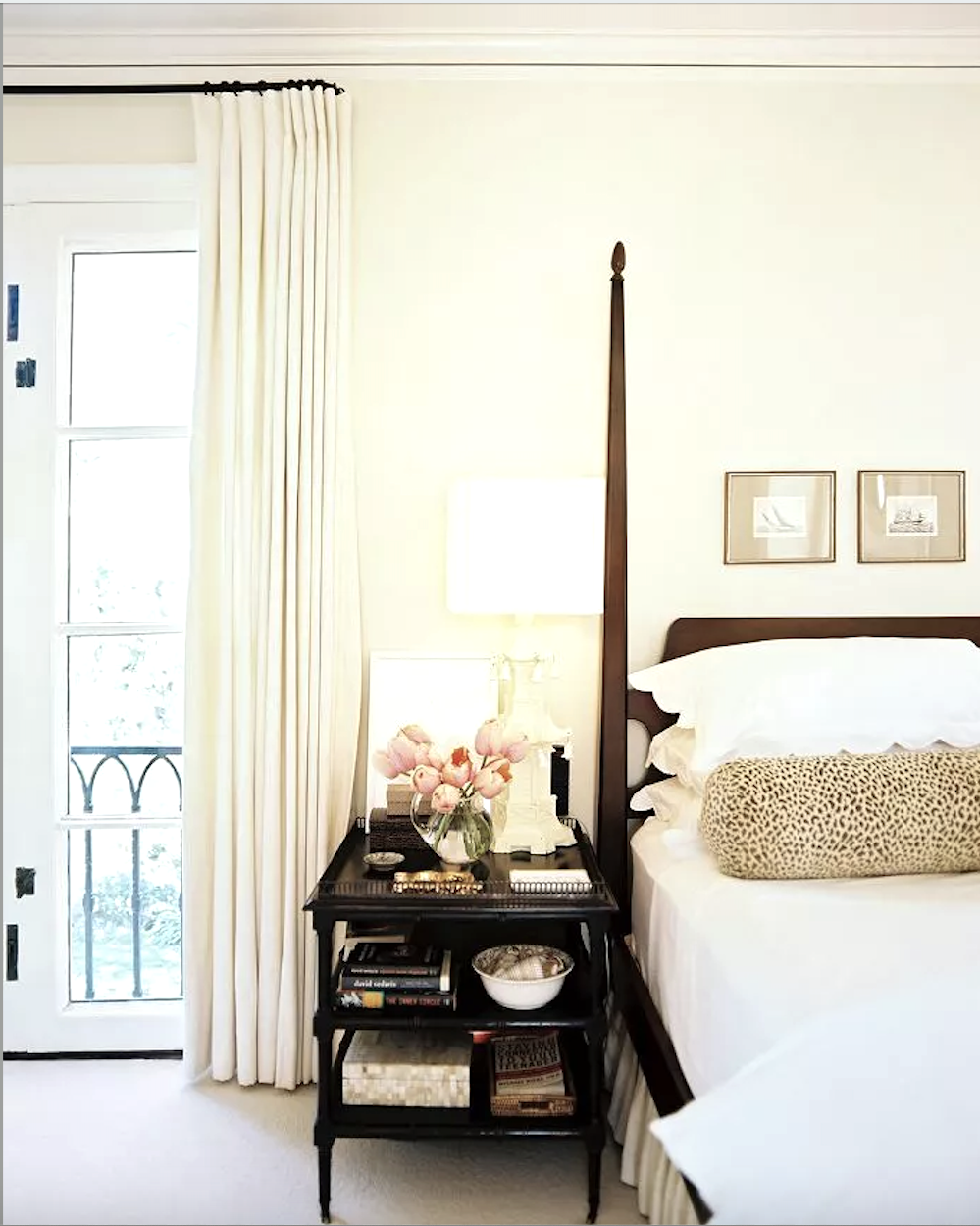
Via: Domaine – Farrow & Ball Tallow – photo: Patrick Cline – Design – Betsy Burnham
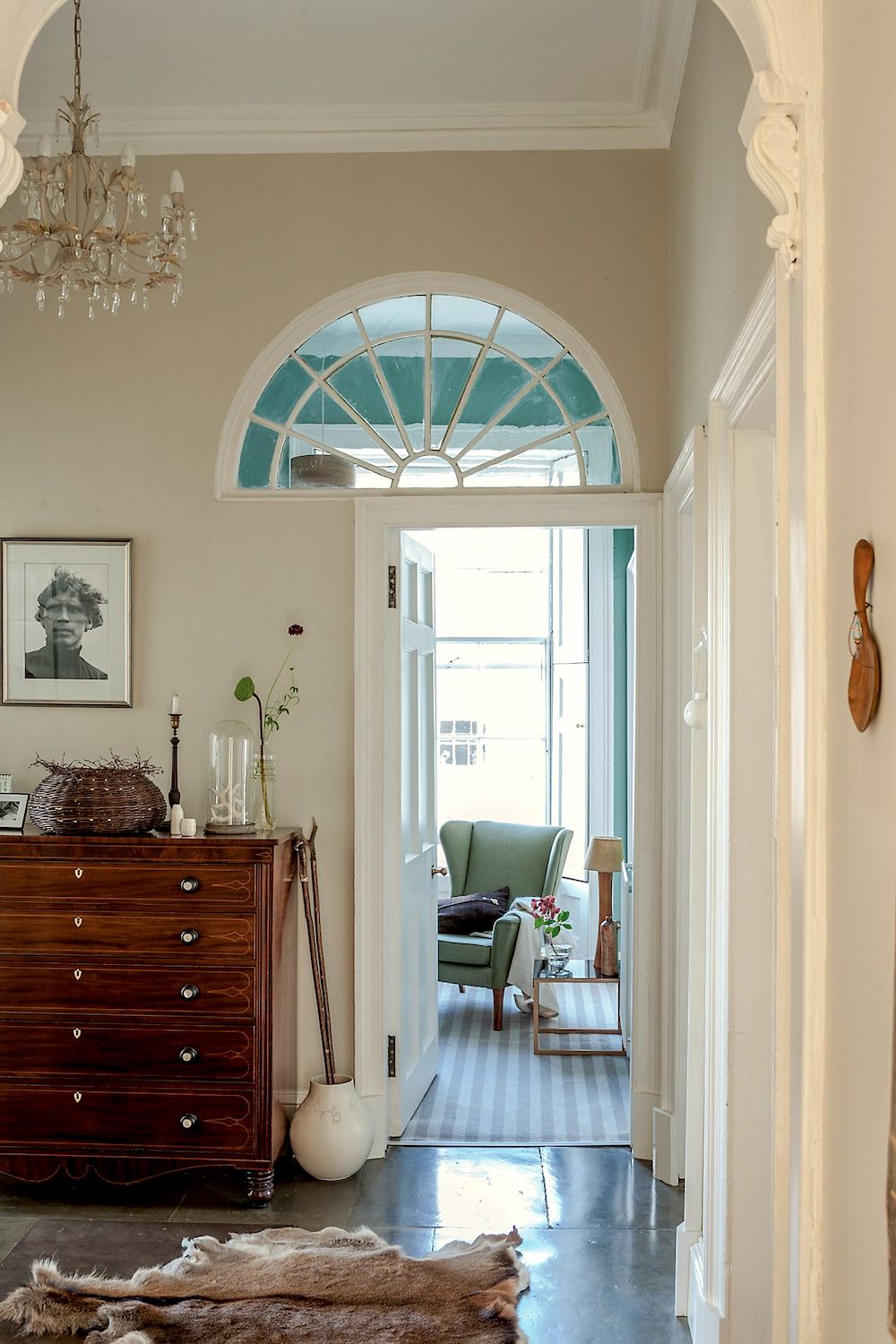
Tallow – via Anthropologie. They sell Farrow and Ball at Anthro. But, you can also purchase samples and larger amounts online at the Farrow & Ball Website.

Farrow & Ball Bancha
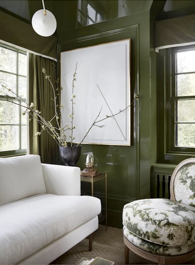
Bancha was introduced at Farrow and Ball in 2018. But, it was right after this beautiful room was done. (above) as it was custom-colored. So, I wonder if it is the same color and F&B put it in their line after creating it for Wendy.
It looks fantastic in the high-gloss finish.
Bancha is such a beautiful, rich, warm green, and I think it’s classic and a fantastic neutral shade without being boring. You can purchase samples and gallons of Bancha here.
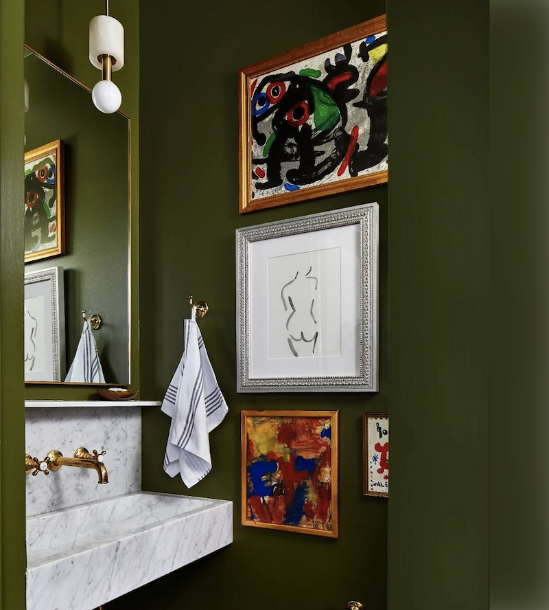
Fabulous bathroom with Bancha walls. I think this little-known paint color is going to be around for a while. Well, at least I hope so!
That reminds me. Remember Mrs. F’s bathroom that I’ve been working on? She has decided to go with the dark green bathroom. Great choice! It’s my favorite, too.

Benjamin Moore Dolphin’s Cove
This is a color I’ve featured a few times. But, I don’t believe it’s terribly mainstream. Although, I might be wrong about that. It is the color of the Grace Home Furnishings store walls, a small chain in California. Apparently, 100s of customers have become obsessed fans of the color.
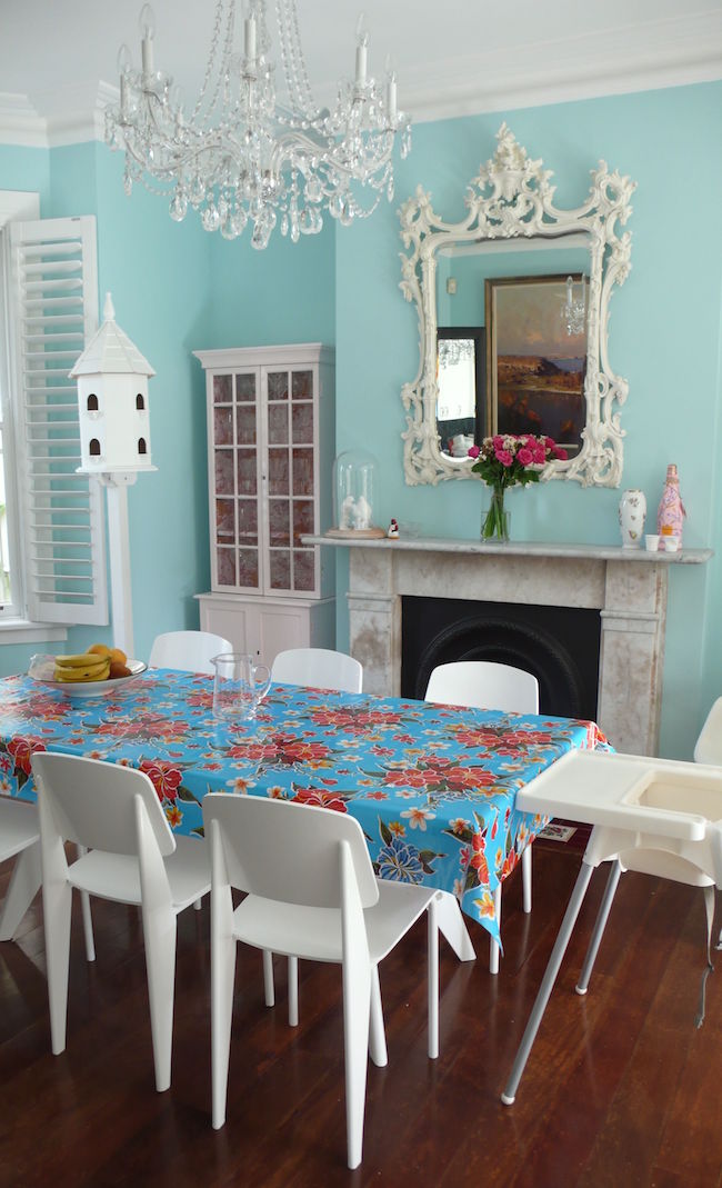
I can see why.
One of the things I love about Dolphin’s Cove is that it’s actually a fantastic Universal Color. My definition is a color that goes with every other color. And, that is why they chose it for the color of the store walls. It’s cheery and colorful but doesn’t take over the space. And, everything looks good against it.
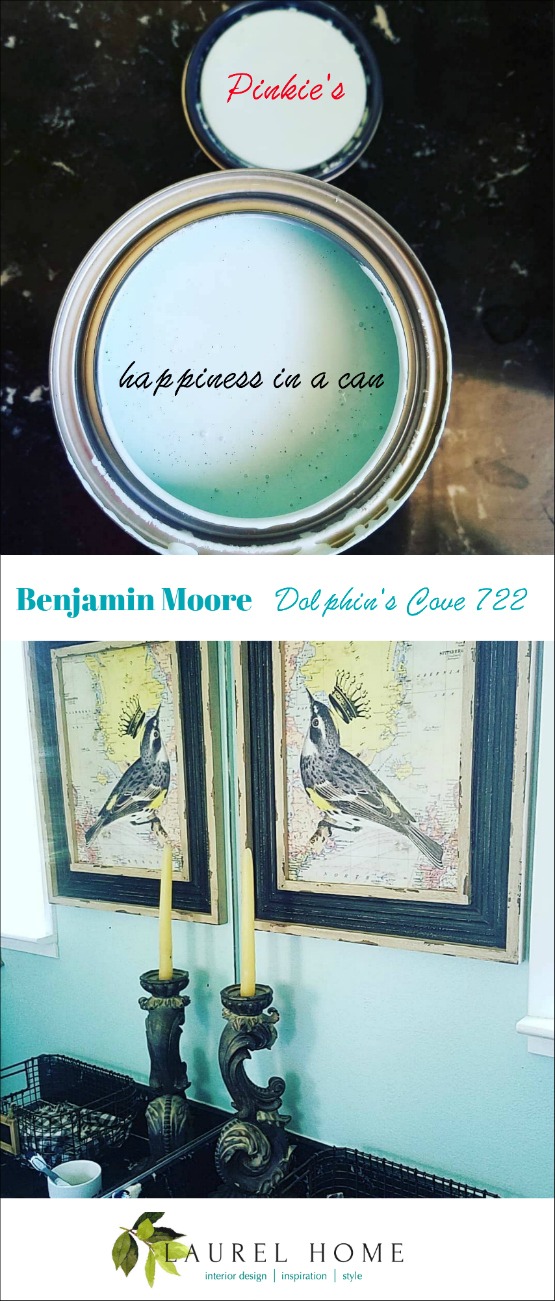
Via my friend, Pinkie Crabtree.

Benjamin Moore Kendall Charcoal
Okay, I realize that this color isn’t obscure. And, I have written about it numerous times. In fact, it’s part of a small no-fail paint color palette I created several years ago. The updated version has been going on for three years.
Kendall Charcoal is a deep, excellent charcoal gray with the barest hint of a green undertone. But, it will not read as green, just a bit of warmth which is very nice and handsome.
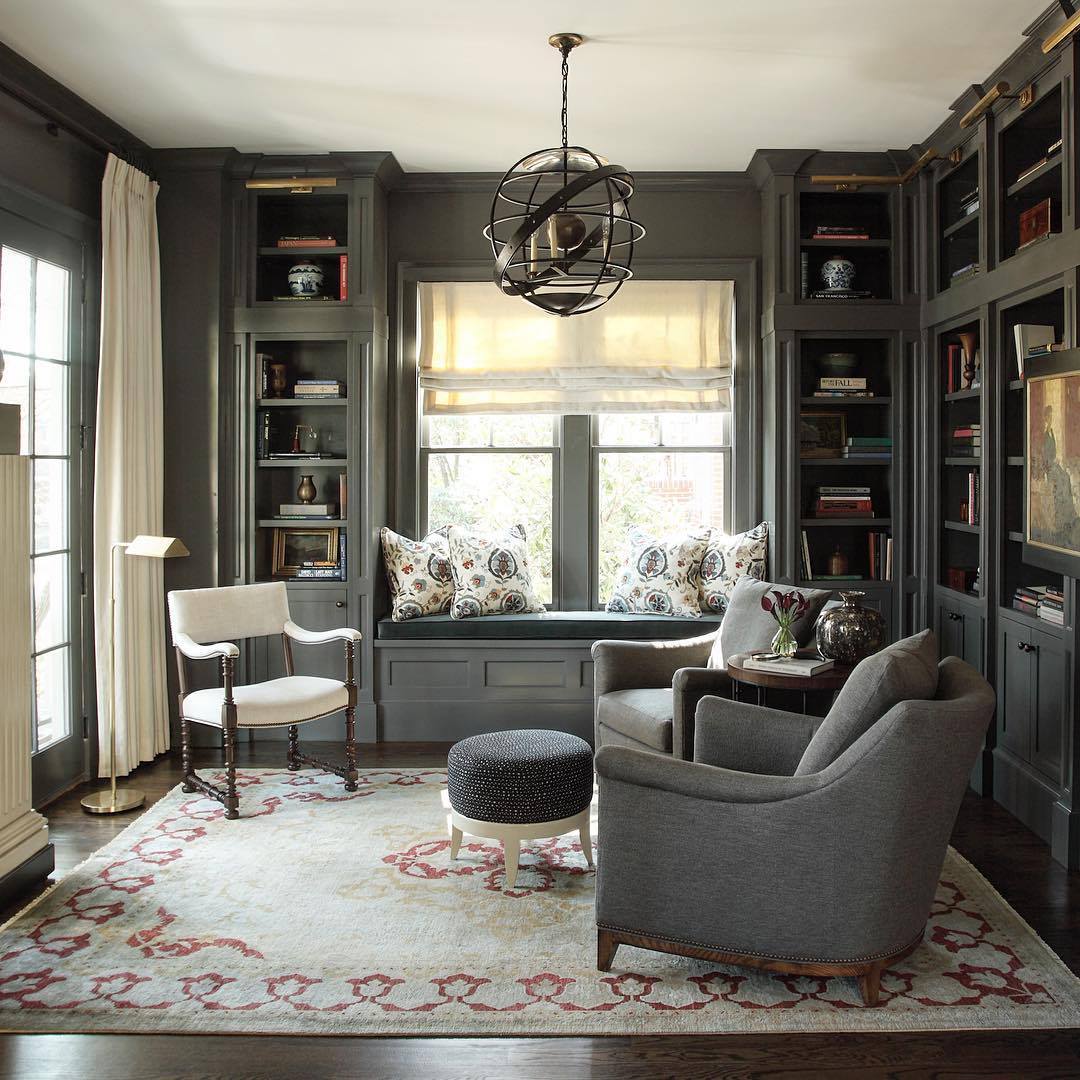
Beautiful library-office by Nina Marie Nash. Oh, you must check out her Instagram. It is sooooo pretty! I want her dining room!
Okay, that is it for the little-known but fantastic paint colors used by designers and enthusiasts alike.
How many of the colors did you know? If you’ve used any of them, please also let us know in the comments.
xo,

Related Posts
 How To Select The Perfect Color Scheme For Your Home
 Painted Brick-How to Easily Change It Back After Painting It
 Nine Fabulous Benjamin Moore Blue Paint Colors
 20 Favorite Exterior Paint Colors + Doors and Trim
 21 Best Hidden Storage Ideas, Stairs, Kitchens, Bathrooms
 Best Proportions For Interior Trim – Why You’re Confused
 5 Classic Kitchen Combos, Cabinets, Hardware, Lighting…


