

Hi Everyone,
I think it finally stopped raining in Boston. But, it rained something fierce when I was in Bronxville last week. In fact, I had dinner with one of my best buds, Deborah Von Donop, under a tent in a raging thunderstorm. Pretty wild.
That was fun.
I stayed with a woman who started as a client in 2015 and has become a very good friend, Mary HC. She lives a half-mile from my old apartment in a beautiful section of Westchester County called Cedar Knolls.
Originally, Mary found me from a google search.
(As an aside, I realize it still says “Westchester Interior Designer” all over the place. My developer and I are in the process of doing another refresh of my website. It’s long overdue. Like five years overdue. haha)
In fact, Mary was the second to the last new client I took on before deciding to focus solely on my blog and website.
You can see some photos of Mary’s home in these posts:
Throw pillow post. Hers needed to be cut down as the workroom did not do standard measurements.
And, this post shows most of the fabrics and furnishings used in her living and dining room.
Here’s Mary’s pretty mantel at Christmastime. (The one that says, David and Mary).
You can also see Mary’s lovely entry painted Classic Gray – and Stella, her black cat! I love decorating to coordinate with people’s pets. haha.
Oh, and of course, the post that features her home’s beautiful draperies in How to Get Window Treatments As You See in Magazines.
Before I left New York for Boston, Mary made me promise to come and visit, and so I did and will do so again.
Her home is old and large and very homey and comfortable.
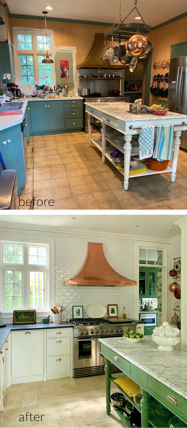
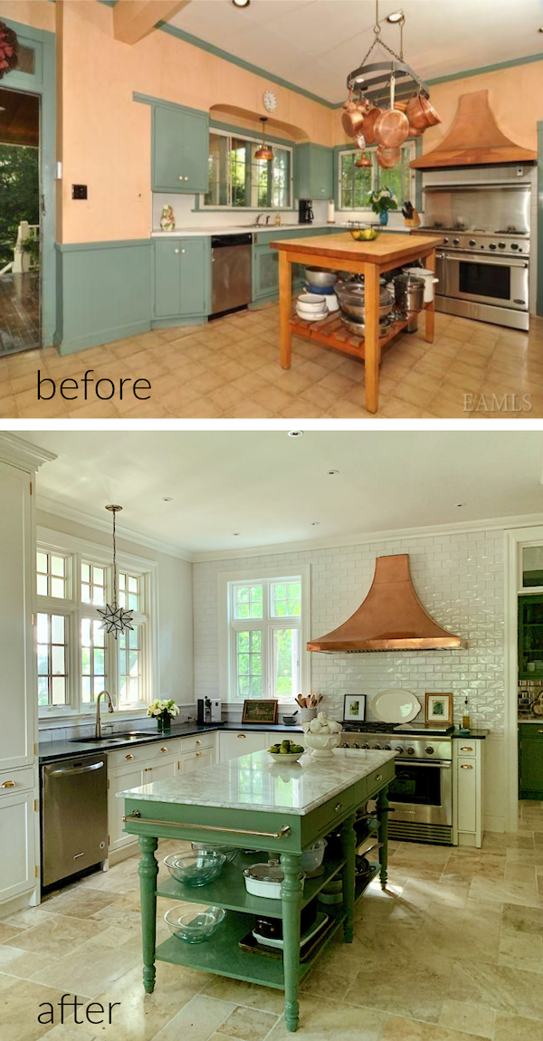
Besides, Mary just completed a kitchen renovation. I know—another kitchen.
However, this one is a turn-of-the-century, historic home. And, while it also followed the same footprint as Dottie did with her kitchen, this one was a complete gut renovation.
The other difference is that this was a very old and funky kitchen. It wasn’t as old as the house, but still very old.
But, here’s the thing. Mary’s young adult kids loved the original kitchen. And, would’ve been perfectly happy to keep it as is.
And, truth be told, it did have a certain bohemian-ish charm. However, the cabinets were falling apart, and it was FREEZING in the winter. The cabinets had no backs nor insulation. The heat loss in New York’s long, harsh winters cost a lot of money as it affected the entire first floor.
Plus, the floor itself totally sucked.
No, there was no way around this one. It was time for a complete overhaul.
There was no saving anything, except for one thing, which we’ll get to later. Can you guess what we kept? Please tell us later if you guessed it right.
Mary and I planned the kitchen last spring into summer. We had our own Covid pod, as the kids say.
She told me that she wanted an English Kitchen, “you know, like the DeVOL kitchens. And, I want to do some wallpaper.”
Really, I acted more as a sounding board. This is Mary’s design in terms of cabinetry, appliances, and many other things, which is a big deal.
Mary told me she was definitely planning on putting in a radiant heat floor.
Yes, please.
However, before we get into the wallpaper and paint colors featuring Farrow & Ball Calke Green, let’s look at the original kitchen. Then, we’ll look at some changes made a few years ago before the big reno.
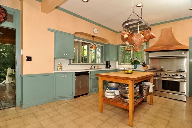
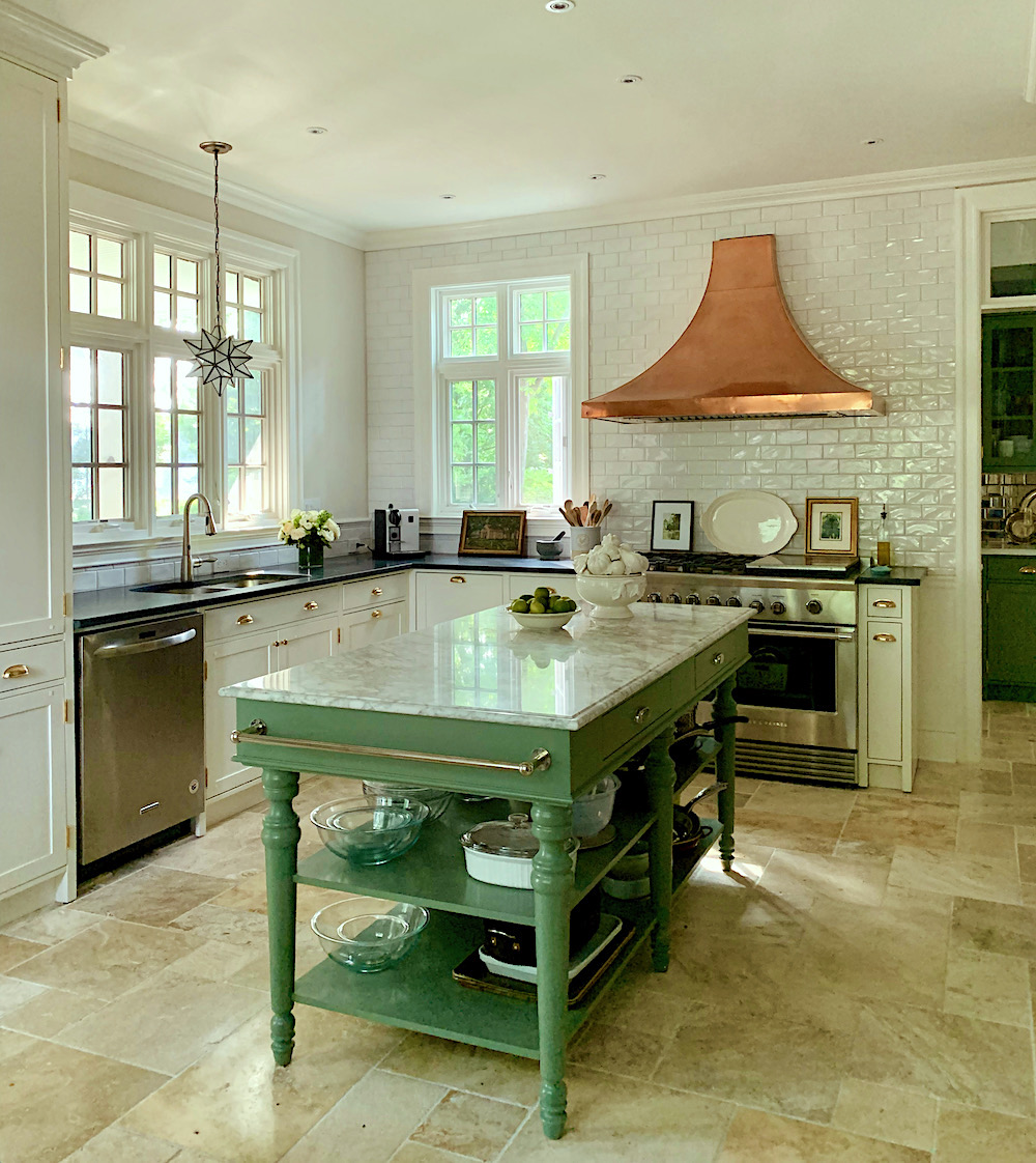
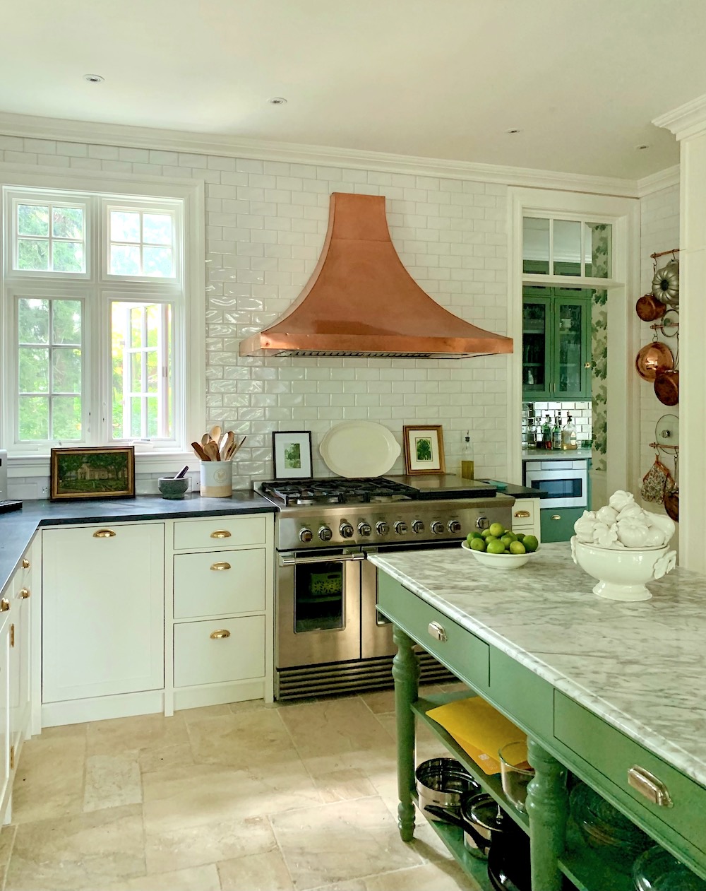
This is how the kitchen looked in 2014 when the HCs purchased the house. This photo is from the real estate listing. That is an older Fisher & Paykel range. And, that is the crappy linoleum, ugh, faux stone (?) floor. In real life, the kitchen felt nicer than this image makes it look.
About four years ago, they changed the windows. The reason wasn’t only aesthetic. There was a tremendous amount of heat being lost through them, as well.
Below is what the kitchen looked like just before renovations began last October.
Above is the new kitchen island from Williams Sonoma Home
You can also see one of the new windows. They already made a huge difference.
One thing Mary was sure to do is to move the window over to allow the hood to be moved over so that the stove wasn’t singeing people as they walked by! I mean, as you can see, the range was only four inches away from the door casing. Horrible.
Above is the island from the Williams-Sonoma website
This, addition helped the kitchen along quite a bit, as well.
Another view including the eating area. This is quite distorted, but you get the idea.
But, notice that big honking fridge. And, it’s much bigger than it looks here.
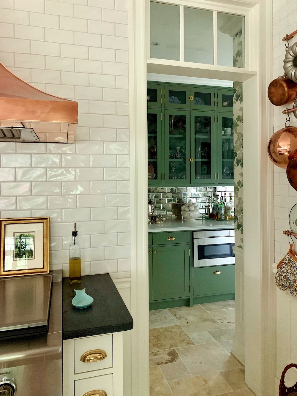
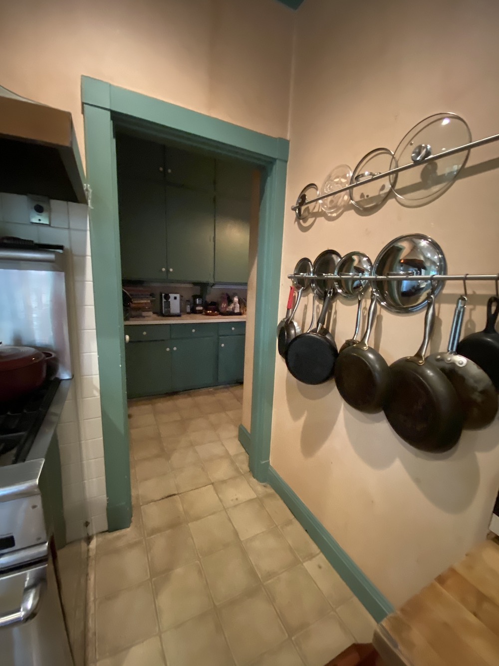 A view into the scary, dark pantry.
I knew this space had tremendous potential.
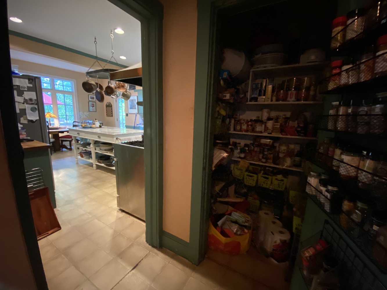 The view from the pantry looking back into the kitchen. In the distance, you can see the new and much larger windows in the eating area.
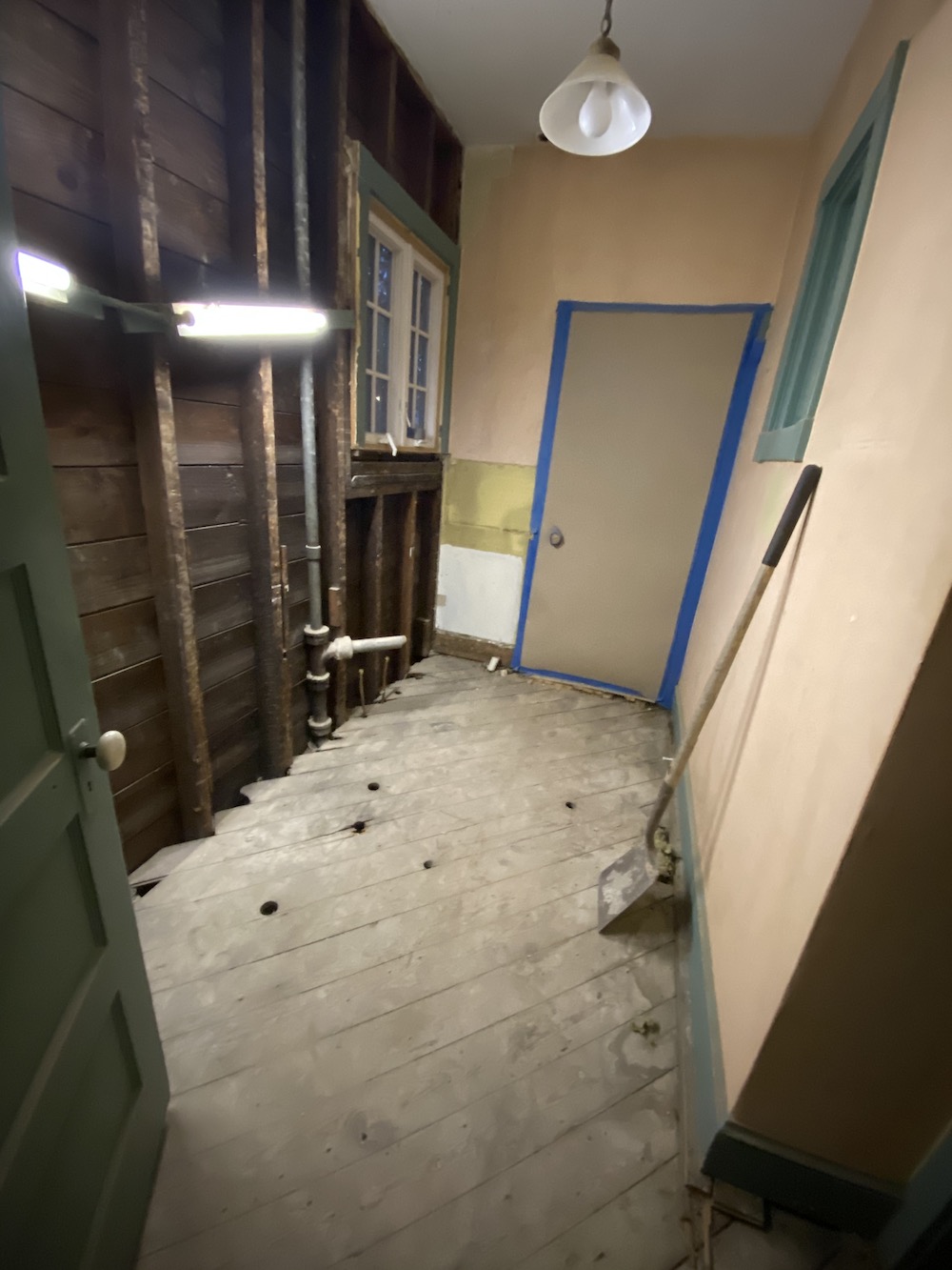
And now, it’s time to get the sledgehammer!
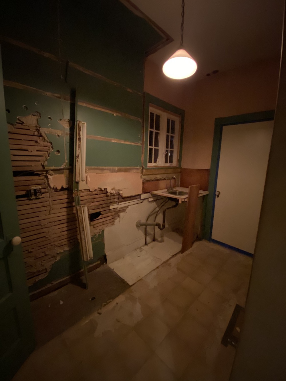
pantry partially gutted
Pantry fully gutted. That is the door to the dining room closed off, of course.
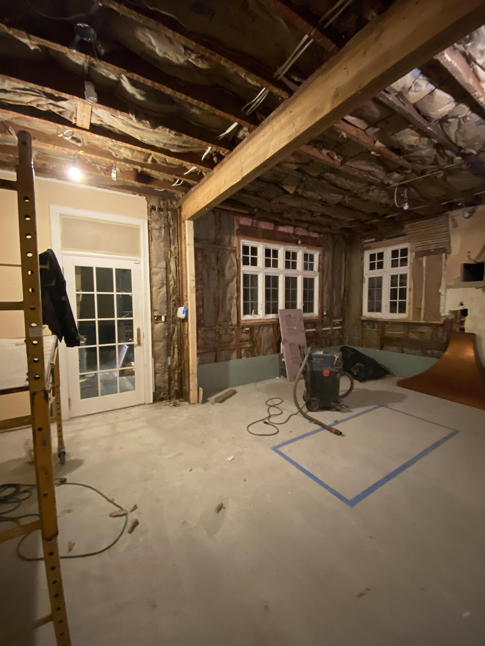
kitchen gutted and insulated
The support beam was previously covered with the salmon wallpaper. Yes, that’s wallpaper. And, Mary thought it would be cool to make it look like a wood beam. That is what it would’ve been 120 years ago, most likely. Kitchens were not for show in those days.
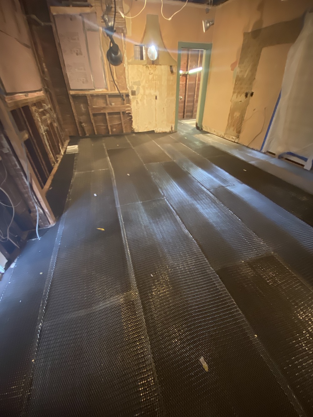
The new radiant heat floor. It’s always darkest before the dawn. haha
Mary had a makeshift kitchen upstairs, and we would get takeout and visit, which was fun.
The last time I came over was actually supposed to be my original moving day, December 16th. I came over just before it began to snow and snapped some pics of the progress.
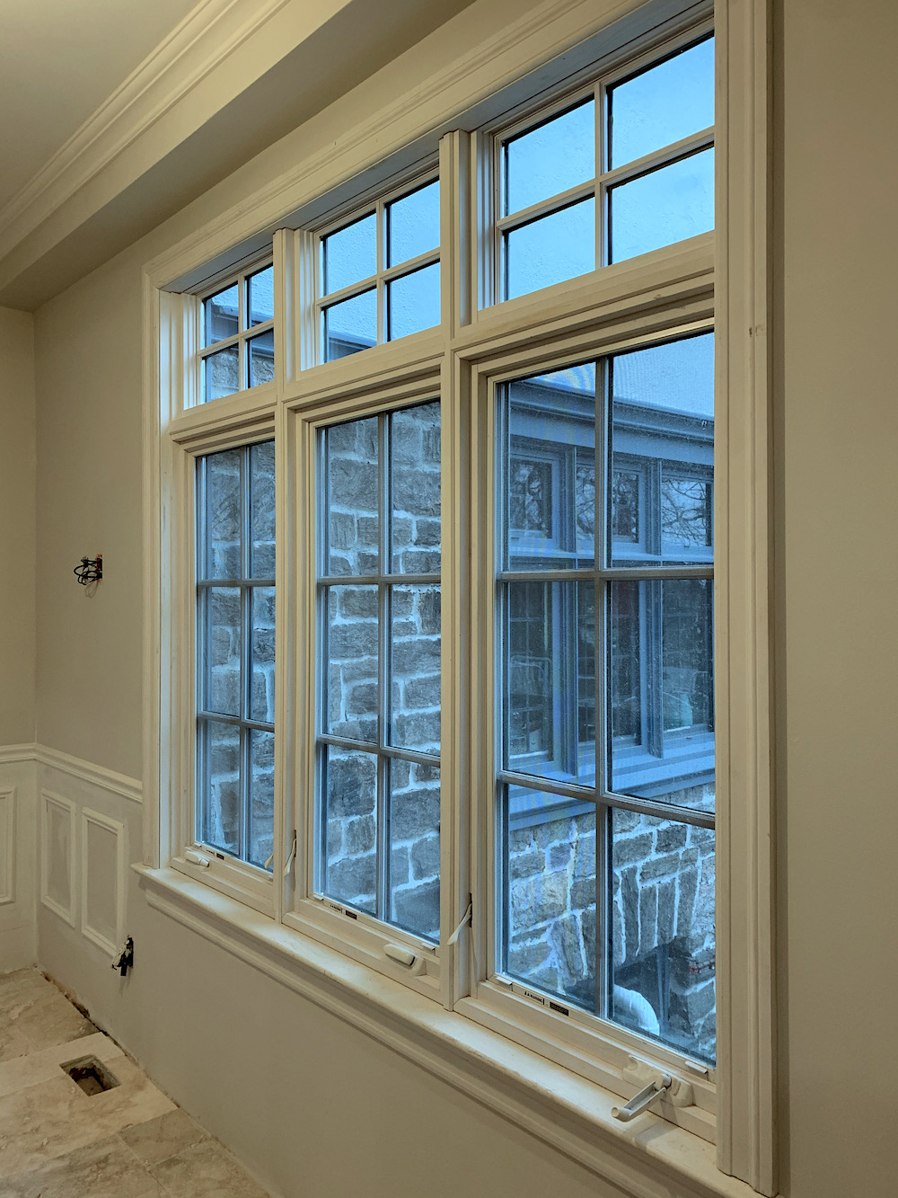
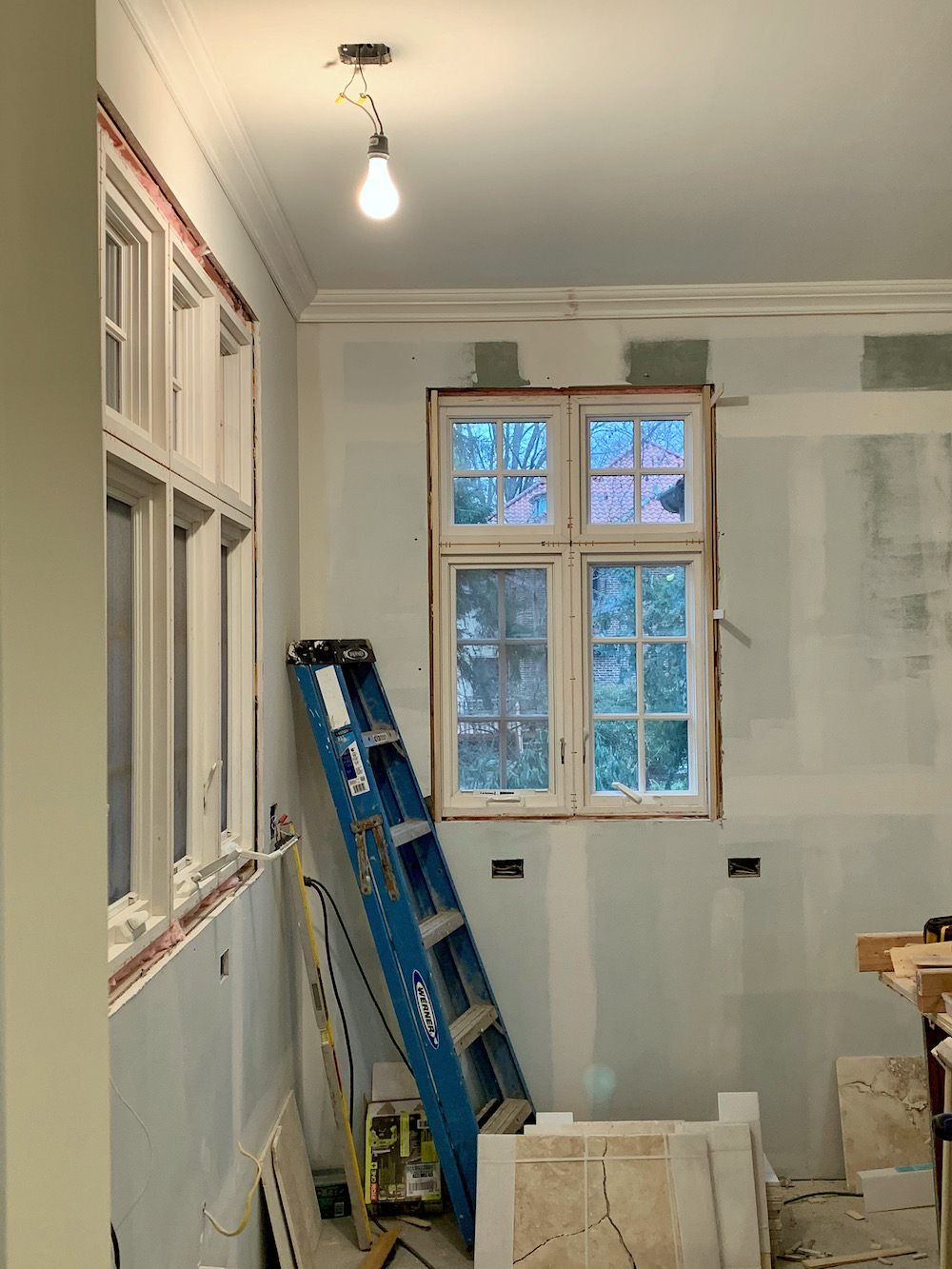 Above and below, you can get a better look at the beautiful new windows.
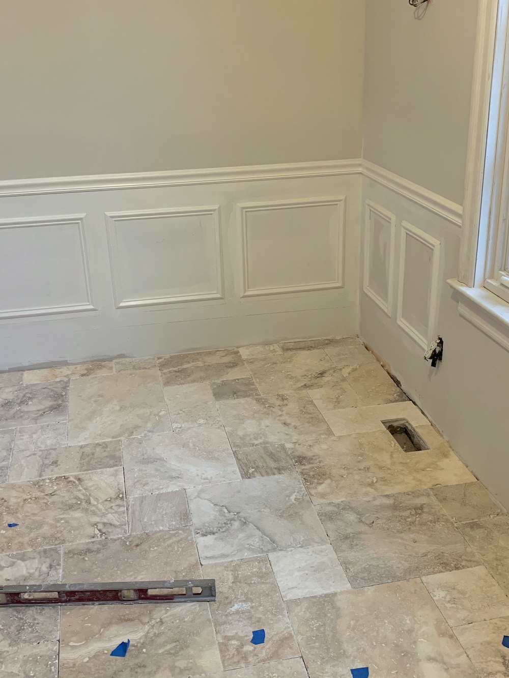
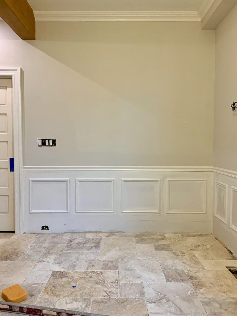
Above is the new stone floor going in and the new wainscoting.
I don’t remember where Mary found the stone, but it was online. They sent some samples, and we selected one that we both liked.
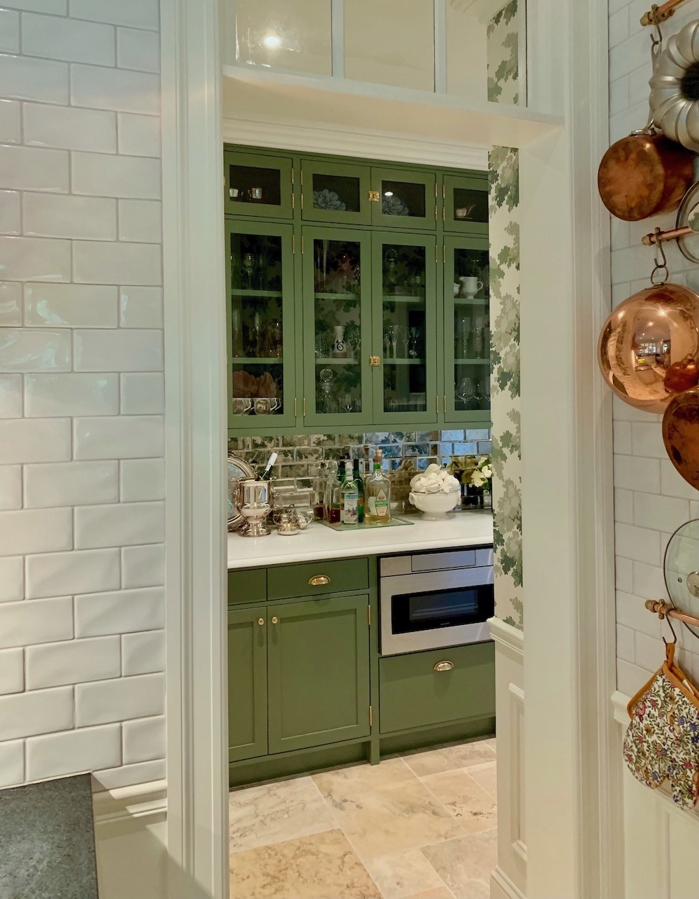
Here is the last look into the new pantry with the beginnings of the new transom over the door. That was completely Mary’s idea which she didn’t run past me, but I love it!
Mary and I had many discussions about the kitchen.
Important to her, and I concur, is keeping the charm of the kitchen. She did not want it screaming, NEW KITCHEN.
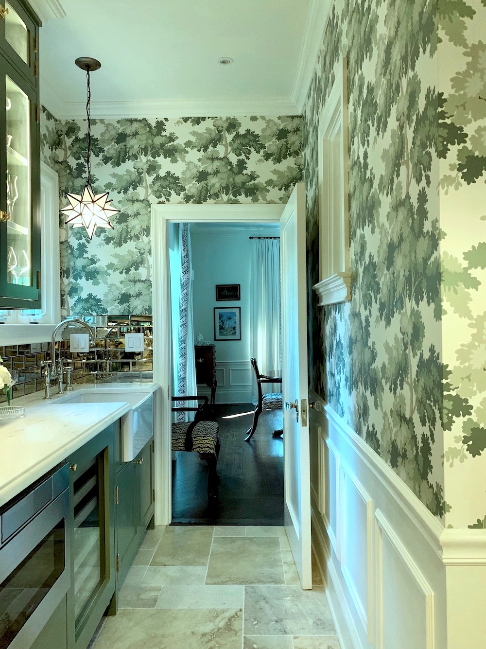
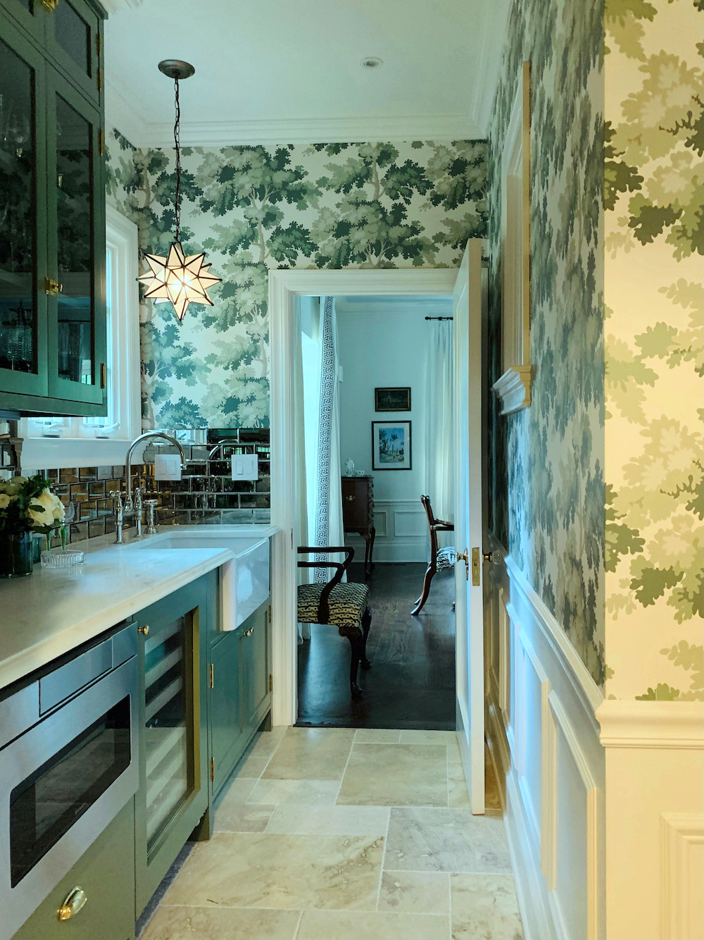
Farrow & Ball Calke Green walls via Tradchap on Instagram
And, Mary loved the green but wanted to tone it down a notch. I wasn’t thinking about Farrow & Ball Calke Green at that point. Although it is one of their best colors and makes a guest appearance in this post featuring some of the best Farrow & Ball paint colors.
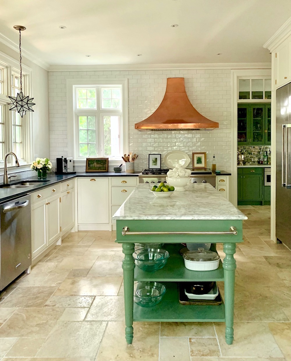
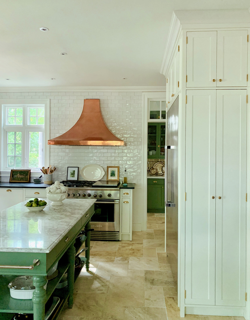
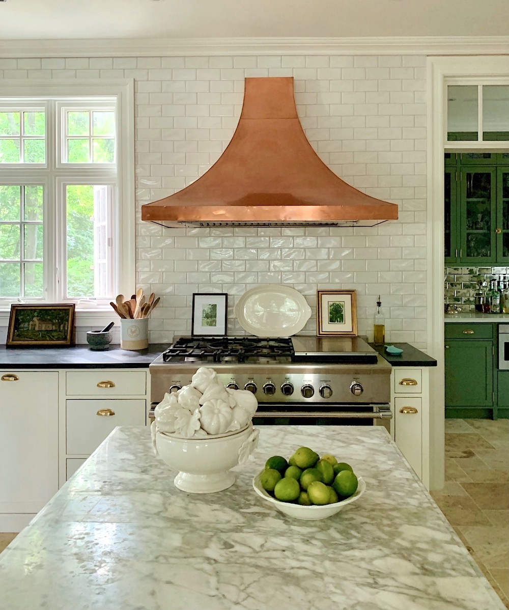
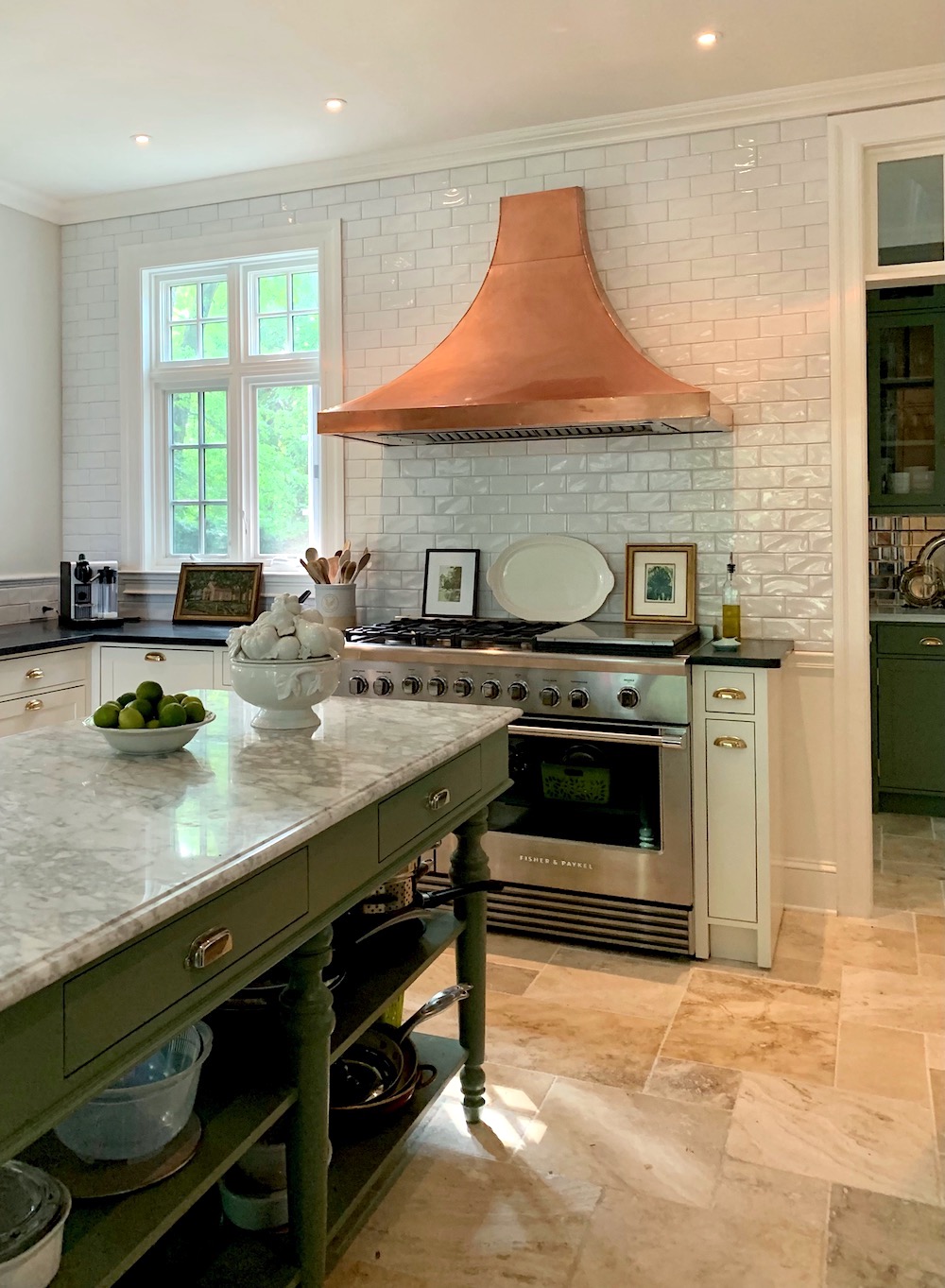
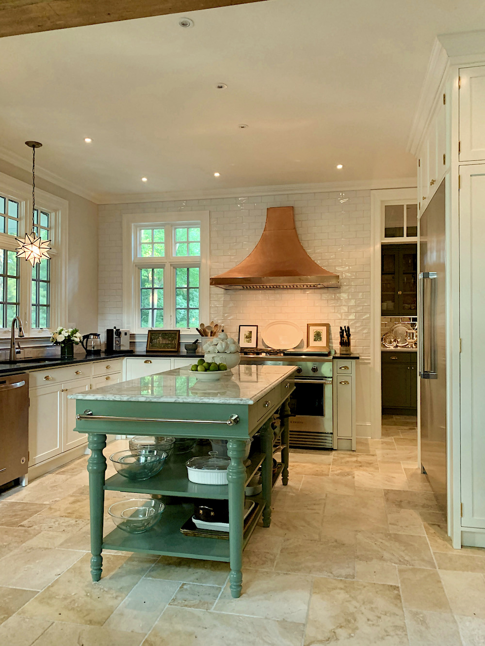
She also wanted to keep the copper hood.
How many of you guessed it, right?
I agreed with that because it looks terrific in there and already had that old patina. Mary’s contractor disagreed. hmmm… Nobody asked him. I’m not too fond of it when they do that. Just say, “yes, ma’am.” But that’s okay. We got our way!
Mary said she wanted to retain green in some of the cabinetry. However, she had already decided to paint the main kitchen cabinets Benjamin Moore Cotton Balls. She had it on the walls and trim in her living and dining room and loved it.
That reminds me. That contractor told her it would look like the inside of a refrigerator. Seriously?
We decided on white subway tile as this is authentic to the period of the house.
Mary wanted soapstone for the main kitchen counters. And, she wanted a white marble for the pantry.
So, how did we select Farrow & Ball Calke green?
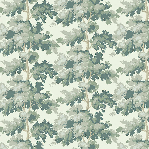
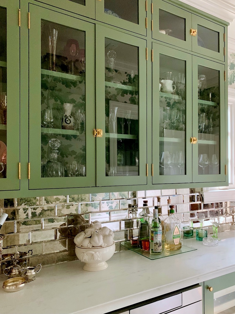
I showed Mary one of my favorite wallpapers, the iconic Raphael by Sandberg. (you can purchase it here)
She said, “that’s it!”
Then, Mary got many samples from Farrow & Ball, and we knew right away that Calke green was the one for the wallpaper. It matches perfectly with the second to darkest green in the paper.
Incidentally, you can get samples and paint (and wallpaper) from Farrow & Ball online now!
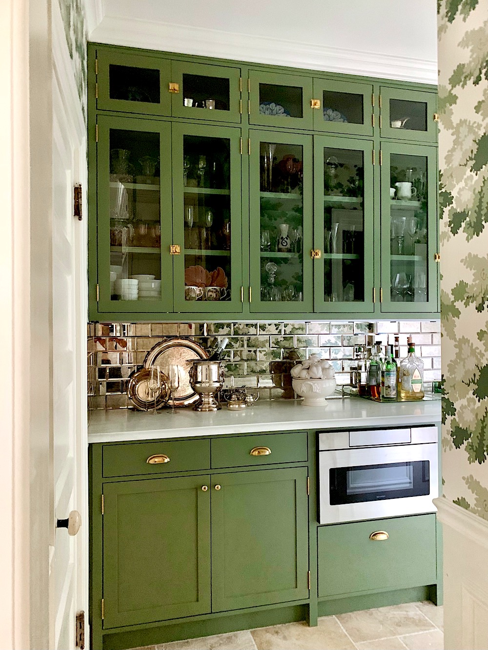
I thought it would be fun to do a mirrored backsplash in the pantry. This would also help brighten it up. Mary went shopping and found a beautiful beveled mirror tile. We chose one with minimal antiquing, which looks just right.
So, let’s take a look at the before one last time.
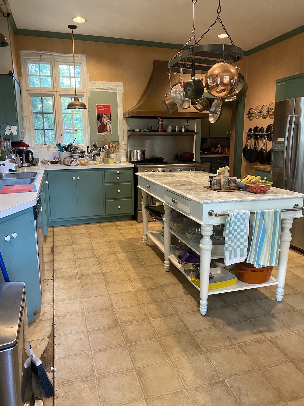
And, now, the after.

Yes, that is the same island, but we decided to paint it Farrow & Ball Calke Green to tie the kitchen and pantry together.
Mary and I had a lot of fun styling the kitchen for the photos.
By the way, Mary is an art historian with a PH.D. So, there’s no shortage of cool art in her home.
Let’s keep going with more photos, and I’ll explain things as I go along.
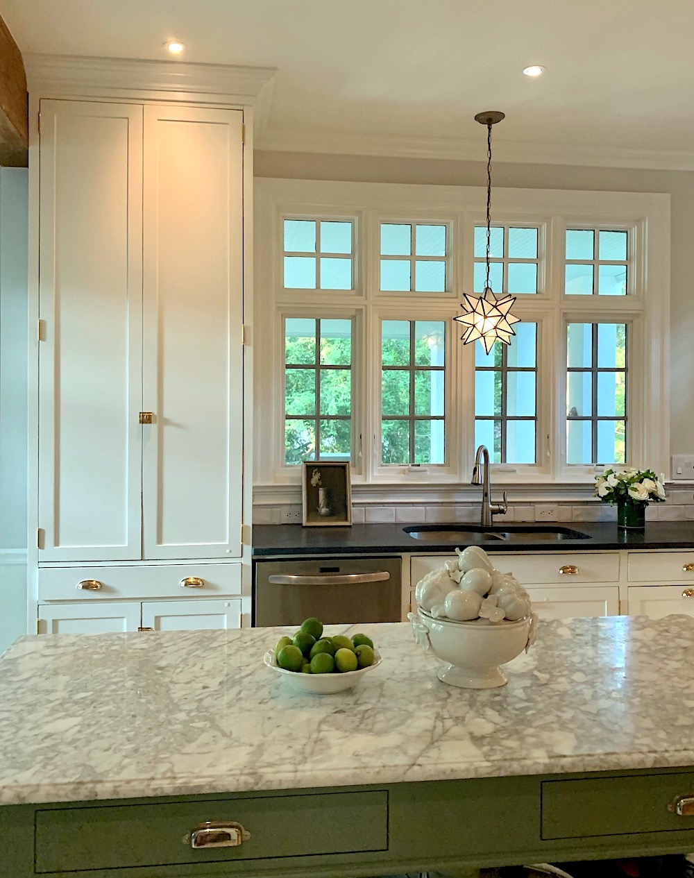
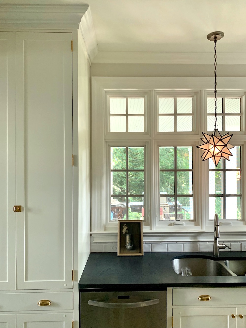
I thought that a Moravian star pendant would be fun. I forgot where it came from, however. There’s another one in the pantry. Wayfair has them, for sure.
Oh, wait. I’m pretty sure it’s this one from World’s Away.
 One surprise that is so cool that Mary designed is the cabinet for the Fisher & Paykel counter-depth fridge. On either side is a shallow cabinet, one for brooms and the other houses a ladder and some other utilitarian items.
On the opposite side of the kitchen is a tall pantry. This is the quintessential “unkitchen” I’m always yapping about.
I love these pics I took on Thursday morning. The sun was softly filtered through the millions of leaves on their beautiful property.
Another point is the mix of metals. Brass, gold, in a beautiful chandelier you can’t see, copper, chrome, brushed nickel, stainless and a touch of bronze on the star pendant, and stainless steel. It ALL goes just fine.
Mary and I concurred that the new kitchen feels much more “at home” in this lovely center hall Tudor-style home.
Plus four different kinds of stone. There is enough that matches that make the unmatched elements part of the charm. This is something that’s taken me a while to really sink in. (no pun intended). However, I feel it’s the secret to that evolved look many of us are striving for.
The photo above was taken Thursday morning, but with different lights on, and then I turned them all off.
In case anyone is interested. Mary IS a fantastic chef and really uses her kitchen.
Okay, I know you’re dying to see the pantry.
I’ll take you in this way. :]
This one was taken the day before, later in the day, with more lights on. I adore how you can see a little sliver of the paper from the kitchen.
And, I like the styling better the next day.
That drawer microwave is fantastic!
That cabinet does close. I don’t know why it wasn’t closed all of the way here, and I didn’t notice it until I was back home.
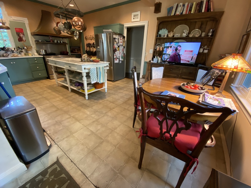
I love the view into the dining room. Yes, that too is Benjamin Moore Cotton Balls.
This is a similar image but with the cabinet light out.
The cabinet is gorgeous lit up, but the photos didn’t turn out so well.
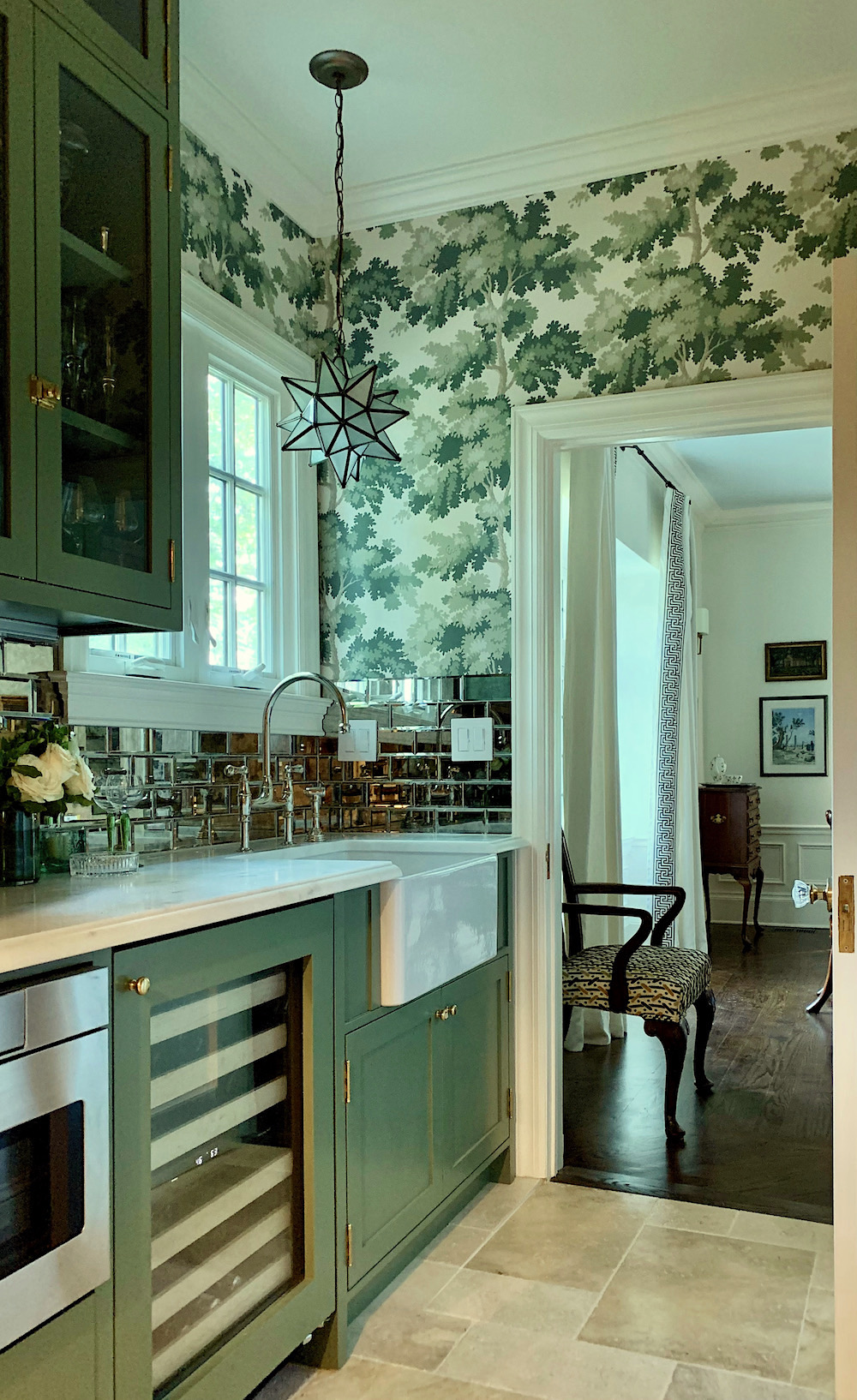
I love this image because it feels trad, but with a lot of personality! Every opportunity, I used this entrance to go into the kitchen. It feels amazing being in this little jewel box of a room.
And, yeah. That’s my fave Perrin & Rowe Bridge Faucet in polished nickel. Yummy!
If you missed that link earlier, you can purchase this wallpaper here. And, you can also purchase the other colorways. If you click on any of the images, you’ll be taken to the source.

Important note: This is a European size roll which is almost a double American roll but not quite.
Please consult your professional installer for a precise quote for how much wallpaper you’ll need.
Back into the main kitchen taken Wednesday afternoon with more lights on. The kitchen looks amazing at night. I did take a few images, but they are more difficult to take at night and don’t give the right impression.
I forgot to add that the walls of which there aren’t many are Benjamin Moore Classic Gray. It’s such a chameleon color. Remember how yellow it looks in my living room?
One last point before I hit send is the cabinet color.
It is color-matched to Cotton Balls. It is not actually Benjamin Moore’s Cotton Balls.
 You can see it clearly here. The trim is cotton balls, and the cabinet looks darker. In-person, the cabinets look either a lovely cream or the palest khaki with a slight green undertone. It’s a beautiful color and actually, a happy accident. I think it really suits the space beautifully.
However, if a precise color is important, then please get a strike-off (sample of what they are using)
Above and below, please pin to Pinterest for reference.
I hope you enjoyed this post, but if you didn’t or found something, not to your liking, please keep it to yourself. 99% of you are beyond lovely. This is for the 1% who seem to forget that this is someone’s home and we are invited, guests. Please be respectful. I’m only saying this because I had to delete a couple of comments last weekend.
For the complete source list, go here!
Thanks, guys!
xo,

Related Posts
 Subway Tile Alternative Everyone Knows About But Me
 The Granny Decor Mistakes You Might Be Making
 Stunning Photos of San Francisco While Attending the DIC
 I May Have Found “The One” in Boston!
 Is He Right? Are White-Painted Walls Boring?
 Two Doctors Try To Save Man’s Eye After Dining Room Lighting Accident
 The Ultimate Guide To Fireplace Mantel Decorating


146 Responses
Wow, nature-inspired kitchen wallpaper was a great choice. It really ties the kitchen look together.
Gorgeous. I mean, absolutely gorgeous. I love it. And she will love it forever. It’s classy and timeless but fresh and chic. Amazing.
It is absolutely lovely! The kitchen is warm and inviting and it would be a pleasure to spend time in there.
The kitchen and butler’s pantry look incredible – never would I have thought that mirrored tile could look so great! Or the wallpaper. Or the copper hood. Just a note on the floor tile, though, as many folk have commented on it. It looks like travertine to me, and it’s important to be aware of how it wears over time, which isn’t for everyone. We recently renoed our kitchen and I was honestly quite happy to see the travertine tile go – dirt very quickly gets embedded in it in a way that looks more ‘rustic’ than I’m comfortable with. The travertine was there when we bought the place, and we paid to get it refinished when we moved in (which made a world of difference to the look of it), but three years later, it was looking very dirty again. Like marble countertops (and wooden ones, for that matter), people’s tolerance for this kind of patina will vary, which is why I mention it. The point is that if you are bent on travertine tiles, you have to be okay with the fact that they will visibly darken over time as dirt settles into the cracks/pits. They clearly suit the period of the property and the owner is clearly fine with patina (given that she didn’t let her contractor talk her out of her copper hood), but it’s important to research how your materials wear and whether that suits your own aesthetic.
All I can add is “gosh, that’s darn pretty”.
Even though you’re not actively practicing interior design, you still have the knack/gift for pulling disparate pieces together in a way that’s beautiful, respectful to the home’s style and usable.
Pulling together and balancing the elements of the gorgeous wall paper, stone floor, using the existing hood & work table and the reflection of the mirrored tiles-absolutely lovely.
Really nice job, Laurel.MAKS
Is it ok if i move into that butlers pantry!???
STUNNING!
By the way can we see the dining room a d is there also a formal living room?!?
What a stunningly elegant and handsome kitchen. The colors are perfect and oh my . . . that Butler’s Pantry. I’m salivating over those green cabinets, the elegant display . . . my one itty- bitty concern: the stone floor. As so many of us age, arthritis is a big issue, and one that is incurable and ongoing; it leads to joint replacements . . . and surfaces without any give are far more painful on which to work. The stone is certainly gorgeous, classic, and elegant. I would have opted for a bleached wood floor and my poor knees would concur. LOL!
I really like this new kitchen reno. You made use of color with both the island and in the copper hood. And the subway tile isn’t generic white, but has tone and texture to it. Your client should be happy and proud to be using this space for real cooking endeavors!!! This space works well, and beyond awesome!
This is so beautiful!!! And I guessed correctly, the hood 🙂
I am still working on my kitchen, dining area and living room….I have decorators paralysis! I am taking a break and this has given me inspiration to stat again!! I really have to finish this area of my home before going onto the next room
Take care!
You are awesome!
Keep writing!
Sue
Oh wow, it is SO good!!!! I want to live in the pantry. Can you share a pic with more of that exposed beam that Mary wanted to be visible? I just see it peaking out a little but would love to see it clearly! The mirrored tile is a stroke of genius. Brava!
I love it, I love it!! It’s absolutely beautiful, every detail.
It’s lovely, with the most beautiful floor I’ve ever seen! I like the green. Windows are fantastic. Moving the stove over so it’s safer for those who walk by was very important.
I’m floored and stunned at this beautiful kitchen! It is truly a dream kitchen. I love every detail, especially that butler’s pantry. I did guess that you would save that hood – it’s awesome! The kitchen doesn’t look stark like so many renovated kitchens do. It’s warm and homey, but still has that “WOW” factor. I love the color of the stones on the floor; I think they help to balance all the elements. Thanks, Mary and Laurel, for sharing this visual delight!
Best. Post. Ever. I had no idea I wanted to read about yet another white kitchen reno, much less about the color green. But you told the story in a way that had me on the edge of my seat. And the photos, oh those photos! Really really loved your noting all the various metal finishes used…is that what makes this kitchen such a stand out in the sea of white kitchens? (And we haven’t even gotten to that pantry yet).
I have a circa 1900 house in Ocean Grove, NJ. An old summer house, not ever intended to last over a hundred years, yet here we are. We are moving to it after selling our family home of 25 years, and oh how I’d love you to have a look at our kitchen. It was certainly fine for summers, and for our vacation rental business. But now I think we’ll be needing something a bit more clever with better use of the limited space. Any ideas?
Marybeth
This is just beautiful! I’ve been reading your blog for at least five years, and I think that this is my very favorite post!
Lovely! What a makeover. Respect to both you and the owner. And I love the ‘glass part’ above the pantry door!
I love everything about this kitchen and pantry–oh, how wonderful to have a butler’s pantry!–especially how sensitive it is to the period of the house. It is what I would aspire to in my turn-of-century house if I could afford a gut. My only disappointment is the removal of the pot rack. Not the one on the wall, but the one over the island. I know it makes the kitchen visually cleaner, and that no one seems to have them these days, but still…I know it’s a minority opinion, but to me putting up that (Enclume?) pot rack would be the perfect homely touch for a cook’s kitchen. But Bravo! This is the best kitchen ever. 🙂
Oh, this is fabulous!! It’s gone straight to my Pinterest for our historic home reno. Enjoy your beautiful kitchen, Mary!
This is one of my favorite kitchens ever! It looks updated, but full of character. Those are the prettiest stone floors I’ve ever seen, painting the island green was genius, and this the best application I’ve seen for that wallpaper ever. (I guessed she was keeping the copper vent!!!)
Stunning. Knocked me out with this one. Brava! Bravissima!
So incredibly beautiful – every last detail. I especially love how the mirror told reflects the wallpaper! but really, it’s all gorgeous and perfect and livable and functional. I swear I can smell a peach pie baking! I hope Mary and her grown children enjoy lots of cooking in here – I can just imagine the bustle next Thanksgiving.
I love this!! I especially love the mix of metals and stone. It looks like it evolved over time. Thank you for sharing.
Laurel, I know how frustrating it is to have mediocre photos of delicious spaces.
My photos always turn out crap-a-doodle-doo. At least you got a few great shots out of the roll.
You gals did a bang-up job with the staging.
I snickered at your contractors comments.
I had to stop recommending an amazing contractor because he kept steering design options.
He would bring in new tile choices AFTER I’d spent hours helping my indecisive clients choose a tile, for example.
I was working on a flat fee basis at that time. He didn’t see the problem even after I tried explaining the math. Sigh.
Thank you for sharing your “Hot-D*mn!” design work. It brings a smile to my face.
You’re absolutely right, Kate.
So gorgeous. This is a dream kitchen! I love everything about it. It’s so beautiful but also so approachable and comfortable.
Laurel, you blew me away with this post! I was totally unprepared as to how much I would love this kitchen design. Classic, yet so fresh. The green island, the beautiful faucets, the to-die-for pantry space… I wish you were my friend too and came to my house to do my kitchen. Gorgeous! You have great talent and the proud owner has great taste.
This is my favorite post. I have been wanting to update my kitchen which like this post is large, more on the rustic and earthy side and incorporates green. I used F&B pigeon on my island. I love the copper accents and soapstone that you used. I also like incorporating wood. I have been looking for the perfect wallpaper for my adjacent pantry and mud room and love what you used. I just ordered a sample. Thank you for the great inspiration.
Love it! Love your posts, too. Detailed and helpful. Thank you 🙂
Beautiful! How hard was it to move the hood and the stove over closer to the window?
I love everything about this kitchen and butlers pantry. It is perfection. That green is to die for.
Thank you! Absolutely gorgeous! More inspiring than the layouts in the expensive subscription design magazines! And you present this at no cost to us. I will not be renewing now. Please keep sharing your knowledge of great design, products, and resources!! You’re the best out there! Much appreciated!
I simply adore this kitchen! I am about to remodel my kitchen and butler’s pantry. This is the look that I want. I had planned to do White Dove kitchen cabinets and Colonial Verdigris in the butler’s pantry. I am also trying to find a tile floor. I love the look and the feel of this kitchen. Thank you so much for posting the details. The perfect inspiration I need.
Can you tell us what the Kitchen faucet is
please — all the details are stunning
I keep coming back to study this kitchen. What is it that draws me in? I’ve decided it’s that real life happens here. After a $100k renovation, Mary displays her ordinary pyrex and old burnt cookie sheets right out in the open, on the lower shelf of her $4700 island. That’s the essence of the un-kitchen. It’s what makes it so endearing and timeless.
I absolutely love how this came out. That Butler’s pantry is a jewel box!
Oh, this is lovely! Looks perfectly fitting for a historic home, and the pantry and kitchen play off each other beautifully. Definitely the right decision to keep the brass vent hood. Just wonderful.
Gorgeous! Inspiring! Love the mix of materials and the color palette and the shape of that copper hood!!
Looks really good…
I’ve been seeing a lot of green cabinets lately in kitchens.
What are your thoughts on the counter edge…like when to use one of the other? I think I see the dupont for the marble and a flat edge for the soapstone.
you know that Raphael wallpaper is my favorite!! I refer to it as the “blue oak leaves” wallpaper.
Oh, gosh, this is soooo gorgeous. Working with a client with such flawless taste and with whom you work so well must be a true joy.
Kitchen Heaven, oh yes, perfect description. I am joining the chorus to express my love. Such a dream kitchen! Just beautiful, and agree that it exudes a great feeling on top of its visual appeal. You two really hit it out of the park.
Laurel, I’ve been reading your blog since you began, and I think this may be one of the most beautiful things you have ever posted. Amazing.
Oh my. . .this kitchen and pantry are so wonderful. Love every little bit!
Hi Everyone,
I’m kind of blown away by all of your darling comments and I know that Mary is too. I’m working on a product list as a follow-up. So, please hang tight!
Also, that broom cabinet…so clever! I may have to steal that idea in the future.
Absolutely brilliant! DeVol couldn’t do it better!
Kudos to you both.
Wow! This is really stunning. I guessed the range for the item that was kept, but after you brought my attention to the hood, I was like “that’s a no-brainer”! All so gorgeous.
Love all your work but this is going to the top of favorite list! Please let us all know if you find a source for the stone floor! Thanks Laurel!
Beautiful. this reno drew me in, like i was in my favorite aunts home. Initially skeptical, this wasnt my style, but I was won over completely with the finished product..Thank you for sharing this post with us.
Laurel, I think this is one of my favorite kitchens ever! It just feels right. Thank you so much for sharing with us.
Yes, yes, yes…and yes!
What a lovely transformation, Laurel. That wallpaper is heaven. Can’t wait to see your own kitchen reno too!
Another fabulous kitchen post Laurel! Any chance we’ll get to see the breakfast room also?
People are forever saying they want a “timeless” kitchen. That is exactly what this is! Beautiful, job well done!
Everything looks beautiful!
You and Mary really nailed that timeless look we all aim for.
This make over is for the a-g-e-s! Thank you for a fabulous, inspirational story. A feast for the eyes.
STUNNING !!! The best word to describe this renovation …
absolutely stunning………..
absolutely spectacular remodel… The Calke Green strikes a cord with me. Perhaps because my whole downstairs is green ( different shades, same undertones – all graduated shades of the deepest color) I wish I could explain why greens affect me the way they do. Anyway, fabulous job and as a former designer myself, I love your blog!
I would love a post not only on the details of this house (especially the tiles) but the finer points of making the new not seem out of place in a super old house. I’m living outside Boston in a house from 1800, it’s not a grand house (8 ft ceilings, no plaster work or fancy trim) but it’s charming. We are trying to not loose the charm it needs massive updates.
Laurel,
LOVELY work. Everything FEELS good!!!
So happy for Mary to have a shiny new kitchen with lots of light.
Also, love all of your blogs. I look forward to one of them. I have been a Interior Designer for 39 yrs and love every day and always welcome other designers ideas… Thanks for sharing.
Michelle Eaton
Wild applause, Mary and Laurel! Thank you for the tour…a good reminder that it looks pretty icky before it looks wildly beautiful, and so glad you took all those pictures (I always forget in the middle of projects to do that!)
Would it be terrible to say I want my kitchen to look like the pantry? I like the bright, white kitchen, but love the “jewel box” room…I would find lots of reasons to be in that space! The rooms together remind me of a jade and white chess set we once had when I was a child…perfect contrasts!
Again, applause!!👏👏👏👏👏
Jesus, Mary and Joseph and all of his carpenter friends! I want to live in that pantry!
I am so in love with this renovation!!!!!
Excellent choices—every detail superb!! This new/old room will age SO gracefully as a result, which to me is the absolute pinnacle of good design! Y’all knocked it out of the park with this one. I’m sure it’s even more sublime in person. Very well done, ladies❤️
All I can say is WOW! What a transformation. It’s fabulous! Now I’m suffering from a serious case of kitchen envy.
Absolutely beautiful. I think I would just live in the kitchen…LOL…so stunning!
oh gosh. I’ve already ordered Dottie’s kitchen but now I want Mary’s kitchen! Mary, your kitchen is simply sublime. I love the copper vent! Seriously, from the transom window to the stone floor, it is perfect.
Love this!! And the butler’s pantry is to die for… Well done!
I never comment on blogs, but I HAD to comment on this kitchen – it’s amazing!
Really beautiful. Also warm and homey. You didn’t say how her children like it?
COULD YOU TELL ME THE MAKE OF THE GOOSENECK FAUCET IN BRUSHED CHROME FINISH THE KITCHEN – HANDSOME AND SPACE SAVING
LOVED this at 2am this morning when couldn’t sleep – and LOVE it again this afternoon:) Would seriously like info. on her STONE flooring. Could bring my own pillow and camp out in the Pantry – OMGG – mirrored tiles, green paint and wallpaper – I’m in heaven. Kitchen is awesome and love the green being brought in from pantry to Island. Am curious on ONE thing – Why did she not do a “Pot Filler”? Anywhoo – fabulous collaboration IMHO.
Jealous! Farrow and Ball Chalke Green with envy. Congrats to all.
I have some beautiful kitchen photos saved in Pinterest, but there’s usually one or two things that I would change….now….THIS Kitchen is absolute perfection – I would NOT change a thing!
Just lovely. Can’t decide which I love more … the beautiful kitchen or the gorgeous pantry. What a fabulous transformation!
Absolutely stunning. Feels like home. Love the mix of all the metals. It all works and feels like it has been there forever. Great use of what she had to incorporate and save a dime! Love love love it!!!
You have made my Sunday! I’m thrilled that the kitchen isn’t done yet! Hopefully we’ll get another follow up visit!
Be still my heart – this kitchen is gorgeous. I love the view into the pantry from the kitchen – the way the mirrored subway tiles relate to the subway tiles in the kitchen, as well as reflect the wallpaper on the opposite wall. PLEASE PLEASE if you could ask Mary the source for the stone flooring?? It may be perfect for the foyer of the house we are building.
I wished you had a source for that stone!! I love it! Is it all one brand or are there a mix? Is it porcelain tile or travertine?
Besides wanting that stone…I could live and die in this kitchen and pantry! That contractor knew not of what he said! Well done!,
So, so lovely! I am definitely filled with kitchen envy (in the best way!) and love how fitting the renovation is for a beautiful and gracious older home.
What an incredible kitchen! Perhaps a table lamp would be nice in the corner to the left of the range?
A beautiful kitchen/pantry that is practical, eclectic, unique, and sentimental (the hood!) to the homeowner and family. Love it!
Laurel & Mary (in alphabetical order): it’s beautiful, and one of the very few kitchens I’ve seen that make me a little envious. The green links kitchen and pantry, and balances the copper — a perfect choice. The transom was also an inspired decision. And the stone floor is lovely, just what I wish we’d got (snif, as we say in French). Congratulations!
I lingered over this gorgeous kitchen/pantry transformation a long time, because the stone (if it’s stone) flooring in the kitchen is exactly right for our home. We bought a raised ranch in 2020…with carpeting in the dining room! Looking for flooring to cohesively redo the flooring in kitchen, laundry room, dining room, areas at front door and back deck, and as a ‘firebreak’ in front of wood stove and fireplace. Plan to scour the internet for Mary’s flooring (or as close as I can get).
Hi Laurel, Oh my! This kitchen is lovely and warm and masterful and functional. The butler’s pantry is a gem. Every choice and decision feels so considered for real living and cooking. I love that Mary chose to keep the hood and painted the island, not replacing it with a built-in. I love everything. My charming kitchen suffers from many of Mary’s former ailments.
Thank you for sharing this inspiring space with your readers.
How much do you want to bet that the contractor will show this kitchen to all of his future clients, telling them that he talked the owner into saving her range hood and using those colors?
An absolutely gorgeous and delightful kitchen!!! And the pantry is beyond charming! Excellent transformation! (I could move right in!)
Beautiful, beautiful! I love everything about it. I hint I recognize the wallpaper but would you mind sharing that?
I just purchased an 1888 Victorian in historic Franklin, TN, This is a true inspiration and every inch is perfect.
Thanks so much for all your lovely posts. They are always fabulous.
Absolutely fabulous & beautiful!
I think this might be my dream kitchen. Mainly white, soapstone and marble, with just the right amount of a rich color. Just beautiful, so timeless. Would love to see a front photo of the built-in refrigerator cabinet. And I almost laughed out loud seeing the ironic photo with the dark scary pantry and in the same shot on TV the Jack Nicholson pantry moment from The Shining. 🙂 🙂 🙂 Made my morning!
And what do the.adult children think? And who cares, it is all perfection! Thank you……..
Stunning!!!!! What a treat to read this Sunday morning. Thank you.
This is a true WOW!! What an amazing transformation! The green & mirrored tile in the pantry is so exquisite!! Love it!!
I love this kitchen and possibly the butler’s pantry even more! Are the countertops in the kitchen soapstone? I’ve always wanted to do them, and last week’s update has only strengthened that urge.
LOVE!!! I just renovated my kitchen and did a similar thing – a soft creamy white for the perimeter cabinets and sage green for the island and laundry room that is off the kitchen. Instead of subway tile, i used a brick and lime washed it myself when the contractor poo pooed the idea. I love making a new kitchen look old and have learned from your blog to stand up to contractors who try to dissuade you from your vision.
Another stunning kitchen!!Not having any upper cabinets really elevates the look of the kitchen…alas those of us without a pantry closet need to keep some uppers.
I will be studying this room to see all the many fabulous touches!
Can you tell me where the white subway tiles are from? Love both the before AND after kitchens.
This kitchen & pantry are beautiful! I’d make up reasons to go into that pantry as often as possible.
Oh my gosh!! This is the most beautiful kitchen! Thank you for letting us see it. I personally think this is prettier than the DeVol kitchens. Just lovely.
Me too! I want to see the other side of the kitchen, please! This is so beautiful!
I love everything about this.
I loved the mirror backsplash. It reflects that lovely paper under the cabinets which is very chic.
The copper range hood is gorgeous and it looks beautiful on the white tiles.
Always so nice to see people be willing to pen their homes to your readers so we can be inspired.
I lingered longer on this post than ever before! Thank you Mary for allowing Laurel to share this beautiful space with us today. It is absolute perfection. Enjoy it!
Such a timely post for me, as I, too, live in a turn-of-the-century home that we’ve gutted, insulated, and plumbed for comfort. We are now in the process of rebuilding and furnishing. Because of the beautiful mix of materials, this one helped me whittle down the various white paint swatches I’ve applied everywhere to Cotton Balls and takes the overwhelming feeling of other decisions away…a little, at least. I so look forward to finding your posts in my inbox!
My favoite is the pantry for multiple reasons. You can see it from the kitchen. The mirror tiles reflect the perfect choice of wallcovering and it passes into the dining room. It screams charming!!! I was surprised by all the mixed metals. The mixed metals don´t bother me like I thought they would. I love the whole renovation. So personal and comfortable. Kiddos to you both!
The transom and windows the homeowner chose herself really add to the history and elegance of the space. All the selections are beautiful. A great collaboration. I love the use of the green.
Stunning!! I’m all about green so this is right up my alley. And I’m with you on contractors piping up with design opinions. What’s that about?
Gorgeous!! Love it!
It looks absolutely timeless and perfect and it doesn’t scream “I’m new!!!” Really a very interesting and thoughtful plan that can be studied over and over again for ideas. I had never heard of a butler’s pantry until I started following Ms. Laurel. This one is like a dressing room for the kitchen.
Yes, haha. Dressing room for the kitchen. I love that!
When you said “mirrored backsplash” I thought “ugh,” but I think it’s my favorite design element here! I love how the wallpaper reflects in it and the glass front cupboards. The whole kitchen is lovely and that pantry is just PERFECT!
Love the whole Reno! Could you please show the eating area? Thank Mary for sharing.
How fun to follow along with all of the decisions that resulted in such a lovely result!
You kept the charm!! This is a gorgeous kitchen, elegant and charming…hard to do but this is it!! Great job!
Absolutely gorgeous kitchen & pantry renovation, I love everything about it. Thank you for sharing.
I had planned to garden today but now am so inspired I think I’m going to paint my kitchen cabinets which I have put off for a few years!
Very pretty kitchen/pantry. Love the Caulke Green, but, isn’t Benjamin Moore’s Vienna Green close to the same, but, a bit brighter.??
What a fantastic kitchen and pantry. The mix of metals, cabinet colors and that wallpaper! All I can say is wow! Thank you and Mary for sharing her beautiful kitchen! This is one of my favorite posts!
Loved this kitchen because it’s a cook’s kitchen and looks so fantastic. Loved the pantry with the wallpaper so classy. Loved everything about it!
This is so beautiful, and I had to keep scrolling up and down so I could compare the before and after photos because it’s hard to believe it’s the same space! I wouldn’t have dreamed that moving the hood over, what, 8”? Would make such a difference but that’s why you get paid the big bucks. I love the tile with the copper hood, and the island is so much prettier in green! Did the hood get buffed? I’ve grown up going to the DuPont houses in Delaware and Pennsylvania (Winterthur in Delaware and a more modest home in Kennett Square, Pennsylvania) and the butler’s pantry is PERFECT. Both of those homes, upon which imprinted as a child lol, have mirrored back splashes. Thanks for sharing!
PERFECTION! Everything is gorgeous and, YES!, the pantry is a jewel box. I need both you and Mary for my kitchen/pantry reno…pretty please?
This is absolutely gorgeous! I would love to know sources for the stone floor and the mirrored tiles in the pantry. What an amazing transformation that honors the home and the owner’s (and her designer friend’s) great taste.
Hi Lisa,
I’ll see what I can find out. I should’ve thought to get that list from Mary. She really did do all of the legwork.
Hi Laurel,
This kitchen is so beautiful it makes me want to see more. You must go back to take more pictures. I’d love to see the eating area. Did they keep the hutch? And I’d love to see the wainscoting.
Great job, ladies!
Hi Mary,
Yes, the hutch is still there.
What a gorgeous kitchen! I love the pantry with the beautiful green cabinets and that wallpaper is divine!
So classy and beautiful!
I loved this post. But I wanted to see the other end of the kitchen too! Where the table was in the before pictures?! Great example of pulling ideas together. Is Mary helping you with your kitchen? I always look forward to Sunday morning and reading your post with my coffee, thank you Laurel.
Hi Anne,
Well, that end of the kitchen is not finished yet. Mary wants to reupholster her vintage chairs.
Truely looks like it was always there and mix of metals adds so much! I think the imperfect subways tiles really fits in the feeling of age, can you tell us the exact tile she used ?
Hi Delila,
I don’t know, but I can try and find out. I can also suggest some similar tiles. Maybe in a follow-up post?
Splendid kitchen! I’m not surprised that the children were afraid of a remodel but you’ve managed to keep the atmosphere of the old kitchen while updating it. This “unkitchen” Is such an inspiration for my kitchen remodel. Love every bit of it!
Wow! Wow! Wow!
I love how you kept the suspense of the green paint – I was totally wondering all the way where will they possibly use the green?! Amazing transformation. So welcoming and livable
Love the transformation! Really love how the butlers pantry really ties it all together!
Great job!!!
I love before and afters!! So beautiful and inspiring. Not having things matchy-matchy gives kitchens a soul. Is there still an eat-in area on the opposite side? Even with radiant floor, I would throw in a vintage runner, in front of stove or sink. and lastly, are those items leaning against subway tile at stove waiting to be hung? I love all that you share with us, it has taught me how to incorporate my champagne tastes on a vino verde budget!
The kitchen is beautiful! Is the floor real stone or porcelain tile?
Hi Maggie, It’s real stone.
So soulful & collected. Wonderful, also, how you were able to reuse the hood & island. And, of course, I love the green 🙂
What a wonderful Sunday morning read! I do not normally post comments, but this one calls for it. The kitchen looks amazing – so bright and open. I am such a fan of the green color, and the wallpaper is fantastic! You ladies did a wonderful job of mixing so many different metals. Perfection!!!
WOW 🤩 love it
Wow, what a transformation! I love the mix of materials, and that the homeowner kept the original footprint. The layout and style perfectly fit a turn-of-the-last-century Tudor. And the green! Love the green and the wallpaper! The mirrored backsplash and glass fronted cabinets in the butler’s pantry reflect the wallpaper beautifully.
Thanks for a most interesting post, Laurel!
loved this post, perfect early Sunday morning entertainment.
That floor is great. It looks like an art historian does live here with the seemingly simple, but actually not, color palette. Great decision to paint the table. Now, instead of the pantry being a dark hole in the wall creeping you out even further while watching The Shining (see one of the “before” photos above)–it really is a little gem that flows really nicely into the dining room and the kitchen. It makes you want to poke your head in their to “check it out.” Like the transom window above the door–adding more light. Nice idea for the broom closet, etc….Beautifully done!
I’m in totally in love with every single element of this kitchen. You ladies did an amazing job. Glad no one listened to the contractors opinion on the gorgeous copper hood vent. The green in the island is perfect. The kitchen looks like it could have always been there. I’m truly in love!!!
This is absolutely beautiful and inspiring! Brilliant post too! Thanks Laurel!!
This is a wonderful post. That kitchen and the pantry are absolutely breathtaking, plus I love the mirrored tiles, the wallpaper and the F&B paint color. But I am most enthralled with the copper vent. It is so gorgeous!
Laurel, would you consider doing a post some time on copper? I’d love to know if you can get copper pulls and handles, lighting, and other home items like the vent in copper and keep that shine, which I prefer to the patina, without a servant to polish it every day.
Oh a lovely, lovely reno. I could only dream of having such an elegant kitchen, with so much charm. Very nicely done….I am totally jealous, in the good way haha.