Hi Everyone,
There have been some requests to go over the new Farrow and Ball paint colors 2020. Actually, I believe they came out in 2019, but they are still new.
These colors, Farrow & Ball, say they were inspired by nature in a collaboration with the Natural History Museum in London.
If that name sounds familiar, it’s because I’ve frequently featured the museum in my December holiday posts with their charming ice skating rink. You can see the Natural History Museum here.
And you can also see the museum in this Christmas post.
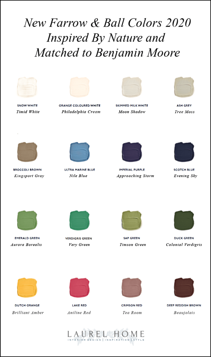
And, like the very popular post where I take the main Farrow and Ball colors and match them to Benjamin Moore, I am also doing the same thing with these 16 new Color (or Colour) By Nature colors.
In addition, I’ll also be doing a mini-review of each color. Some of them I think are wonderful.
And, some, not so much. At least for a wall color.
Or, at least, not for most of us, in the US
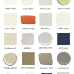
Below are the new Color By Nature Colors
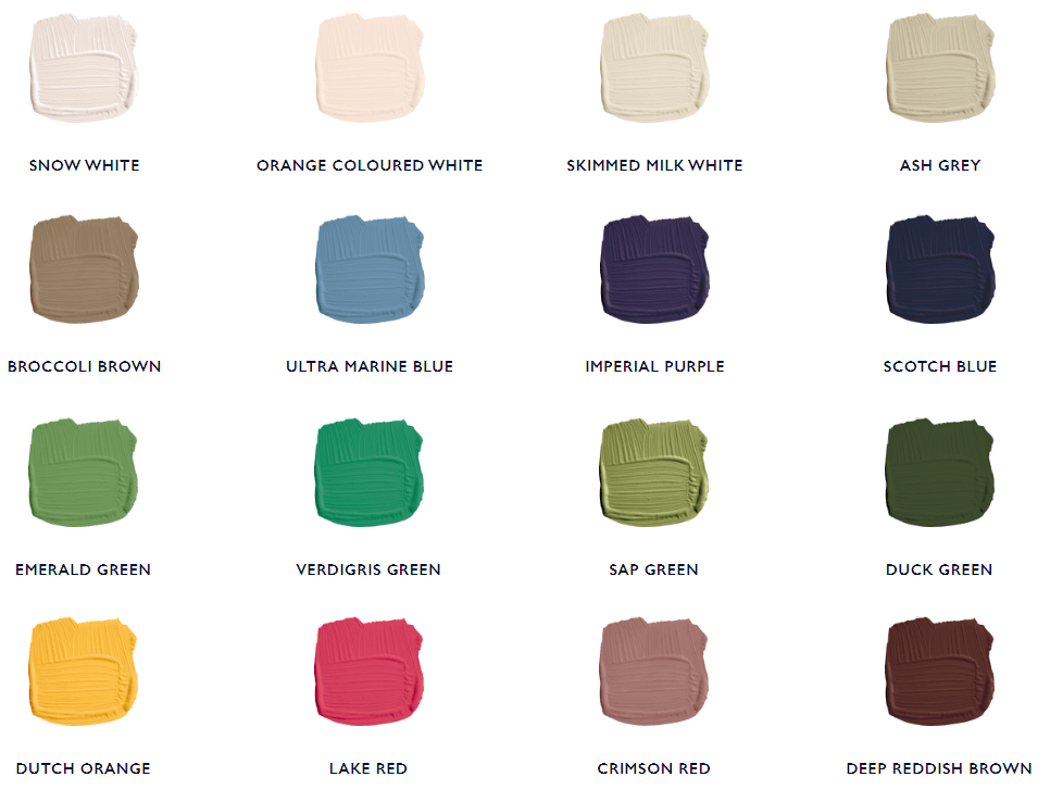
Each color will have an associated image.
Please note, that the wall color in the image may or may not actually be the one I’m saying it is. I have tried to make it look like the color. And, I will also post the corresponding Benjamin Moore colors. However, there won’t be images of all of the Benjamin Moore colors. But, there will be, if I have a point to make.
Yesterday, I went on a long walk to a neighboring town and went to a store that sells Farrow & Ball.
The clerk in the store was very nice and gave me both the new sample card for the Natural History colors.
And, he gave me a fresh card for the regular Farrow & Ball collection colors 2020.
As a means of saying thanks, I told him that I would put a link to the store on my blog. He gave me a “thank you, that’s nice, sweetie” look. Not that I expected him to bend down and kiss my feet or anything like that. haha It’s just that some of you think I’m famous. Nope.
On the Farrow & Ball colors 2020 color card, they state the inspiration for the color via animal, vegetable, and mineral.
Although, some colors are inspired only by one or two of the above.
And, the first color is:
SNOW WHITE
This is a very pretty off-white which is close to Benjamin Moore TIMID WHITE oc-39. It’s also very close to both IVORY WHITE and ACADIA WHITE. You might recall from previous posts about the best white paint colors that IW and AW are the same color.
ORANGE WHITE
This is another lovely color with an interesting name. And, it was not easy to match. The closest I found is PHILADELPHIA CREAM hc-30. However, I have two different fan decks with Philly Cream, and one looked a little closer than the other. But, it is a very good match, I think.
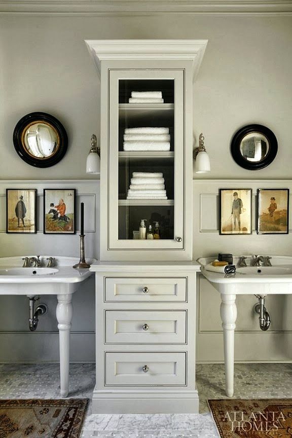
Atlanta Homes
SKIMMED MILK WHITE
On the Farrow & Ball website, they really botched this color and the one below. Both are actually a gray-green. Skimmed Milk White is a lighter gray-green. It is close to Benjamin Moore MOON SHADOW 1516.
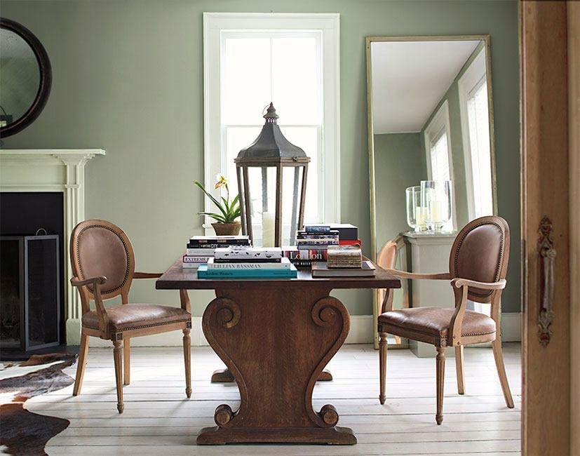
ASH GRAY
As I said above, it’s a light gray-green. The corresponding color is Benjamin Moore TREE MOSS 508.
BROCCOLI BROWN
Okay, since when is broccoli brown? I mean, admittedly, I’ve had broccoli in my fridge that has gone brown. And, that means it’s time to throw it out. Right? In addition, I could not discern any green in the color. If anything, I would say that it’s slightly taupe. However, the color samples on the card are roughly 5/8″ square. So, just a little extra challenge.
One color that looks very close is RUSTIC TAUPE 999.
However, just as good for my money is KINGSPORT GRAY hc-86. Kingsport was on the shortlist for the Laurel Home Paint Collection, but there are other similar colors I wanted to include. So, it didn’t make the final cut. However, it’s a very handsome color.
ULTRAMARINE BLUE
Or, sometimes known as Gymsuit Circa 1968 Blue.
Now, don’t get me wrong. It’s a fine color. But, like most Farrow & Ball shades of blue, it’s very difficult to get an exact match.

However, Benjamin Moore Nile Blue csp-560 is quite close.
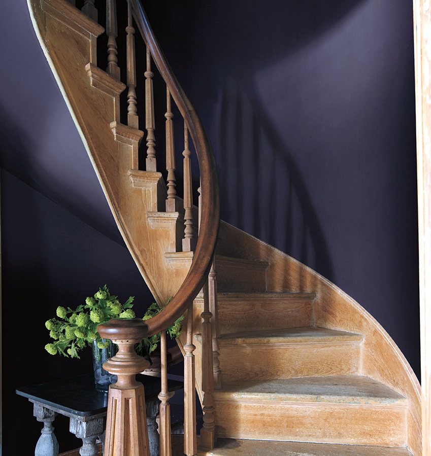
IMPERIAL PURPLE
This was another difficult color to match. However, I found one that’s close enough in the Color Stories fan deck.

That color is called APPROACHING STORM csp-535. It is reminiscent of Benjamin Moore’s color of the year from 2017 – SHADOW. You can see Shadow here.
And, you can see Shadow here, too.
SCOTCH BLUE
I don’t normally associate Scotland with blue but I’m sure that’s just my ignorance. And, I just learned that this is the color of the throat of a blue titmouse.
However, we aren’t allowed to say “titmouse” in the new world.
I probably spent a good hour obsessing about this one.
Seriously, Goldilocks has nothing on me! You know. This one’s too green, too gray, too saturated… And, well. In the end, I went with a classic – HALE NAVY hc-154. It is very close, but just a hair warmer than Scotch Blue. It’ll do. Hale Navy is a fine color.
EMERALD GREEN
Okay, this is what Farrow & Ball’s emerald green looks like.

It is close to Benjamin Moore AURORA BOREALIS 565.
However, I am not fond of this green for a wall color. It’s just a little too intense for my taste.

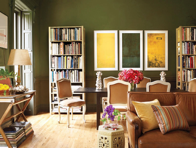
But, I am quite fond of the 566 which is the next one down on the fan deck. And, it’s also a Laurel Home Collection color, BUNKER HILL GREEN.
Here you can see Bunker Hill Green in a post about a child who picked a horrid paint color. And, you’ll also learn how I recommend handling that if you have young children.
VERDIGRIS GREEN
Farrow & Ball has some lovely greens in their collection. And, they claim that this was inspired by copper oxidating into green. Really? Well, I don’t think so; this deeply saturated green does not look like copper in any form.
That’s better. I don’t know what shade of green their copper is, but I would probably avoid that one in large doses.
SAP GREEN
This lovely green is closest to Benjamin Moore TIMSON GREEN CW-470. A lovely olive, but not too olive green. You might enjoy this post about a beautiful 16 color whole house spring color palette.
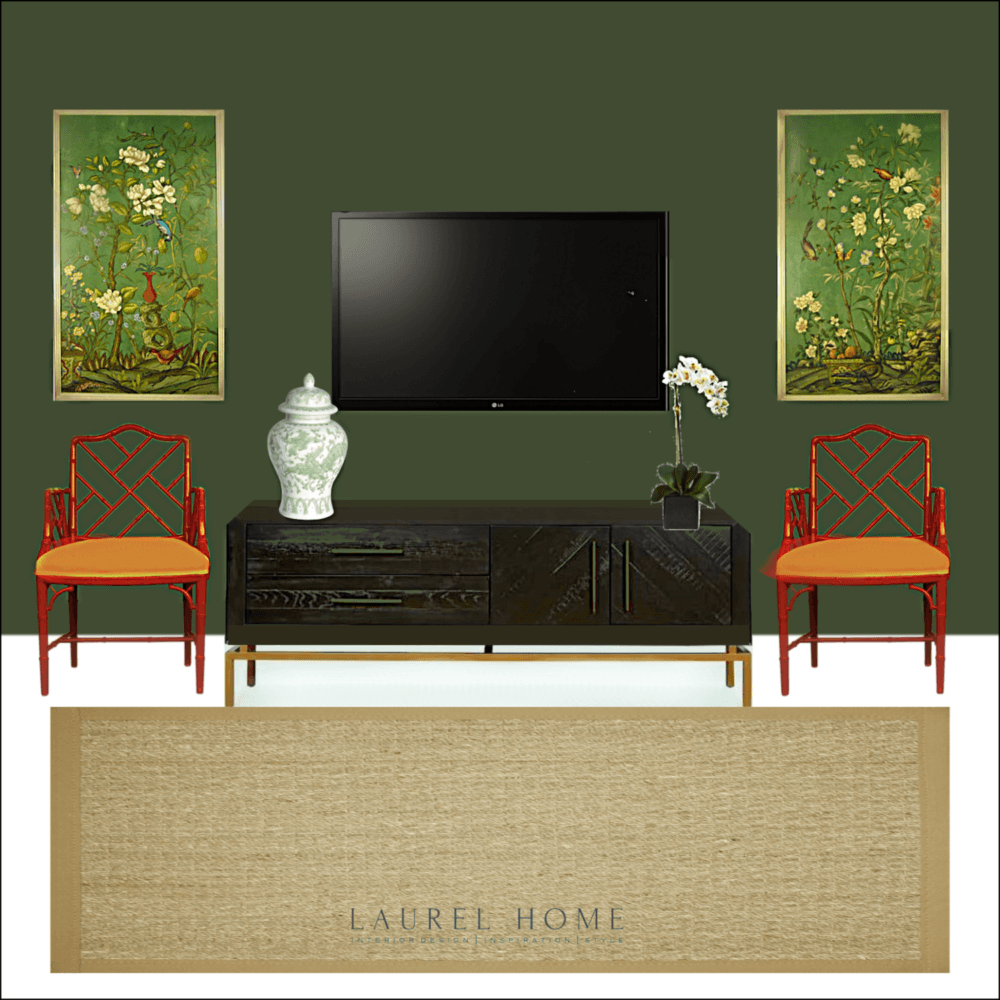
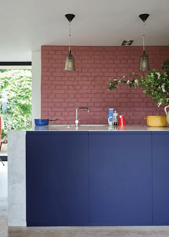
DUCK GREEN
This looks closest to Benjamin Moore COLONIAL VERDIGRIS CW-530. That is another Laurel Home Paint Collection colors. So, of course, I love it. Also, I used it on the above mood board in this recent blog post about an open concept home with gray walls.
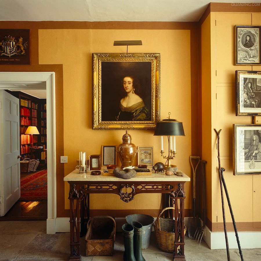
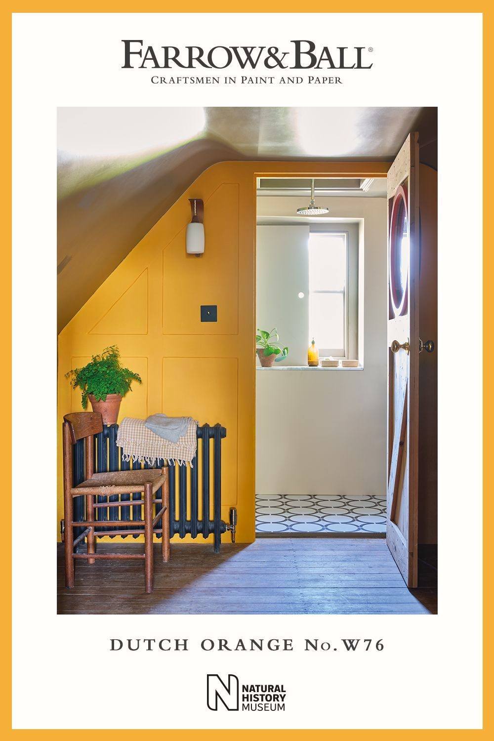
DUTCH ORANGE

It’s pretty bright. It might be okay for some spaces. The closest Benjamin Moore Color is BRILLIANT AMBER 161.
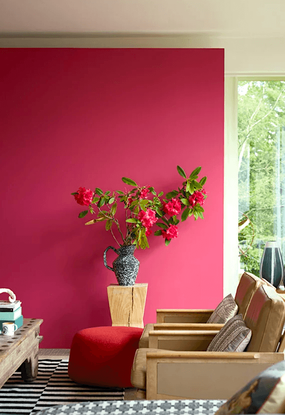
LAKE RED
I’m confused. Since when are lakes red? Anyway, I would call this one Bright FUSCHIA.

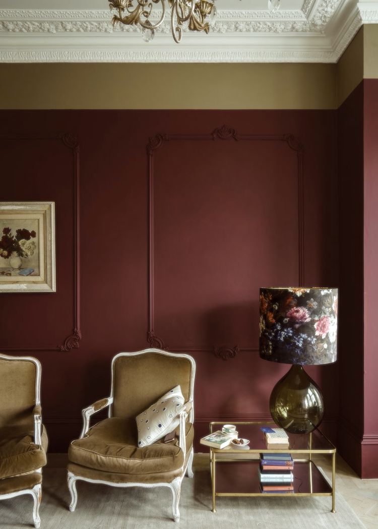
The closest match if you like this color is Benjamin Moore ANILINE RED.(above) It’s not exactly easy-on-the-eyes, is it?
However, I prefer the color below, I used many years ago. It’s a soft red with just the right amount of blue in it.
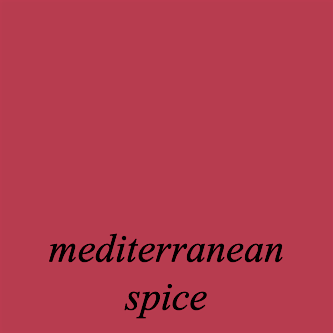
MEDITERRANEAN SPICE 1337
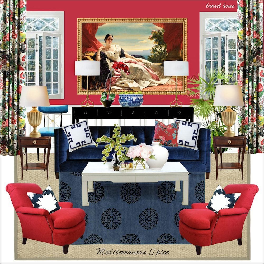
Here it is on a board from the Palette portion of the Laurel Home Paint and Palette Collection.
CRIMSON RED
You know, I nearly forgot this one. And, I think I know why.
It sucks.
It just plain sucks; at least for us Americans.

And, please forgive me, but that is not crimson. It’s not even red. It’s mauve. Unfortunately, most Americans feel about mauve the way we feel about marmite.
In small doses, it’s okay, but not usually a great wall color. Yes, I’m making a sweeping generalization. And, I’m totally fine if it’s your favorite color. You’re clearly an Anglophile. ;] I am too, but not when it comes to mauve in large doses. Small amounts of it mixed with a lot of other reds are fine. Or, as an accent along with chartreuse. It looks even more horrid mixed with the saturated blue above.

Anyway, this is crimson, a deep saturated red. Thank you for humoring me. I feel better now.
And, the last color from the Farrow & Ball Colors 2020 – inspired by the Natural History Museum is:
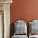
DEEP REDDISH BROWN
I’m struggling with this color, as well. It’s not quite Aubergine (eggplant).

And, it’s not brown, either.
But, F&B says that it’s like the dead leaves of green panic grass.
I dunno. Is it good marketing to call your product dead anything?
I guess it’s better than dead fish. (Dead Salmon) Or, dried blood. Remember that hot barfy mess?

However, if you like this color, the closest I found is BEAUJOLAIS 1259. It’s a hair brighter.

I prefer a true Aubergine like Benjamin Moore CAPONATA af-650. This color is stunning in high gloss.
please pin to Pinterest for reference
So, what do you think of this new collection of Farrow & Ball Colors 2020?
Please note that I do like or even love most of the colors. And, I also love Farrow & Ball. I would always recommend first going to that company for their colors. Their product is beautiful. However, not everyone can afford that premium paint. It is at least double the price of Benjamin Moore, I believe.
As always, please test your paint colors!
I made my matches based on tiny samples. And, colors, as we know, can change quite a bit once on the wall.
I hope that this was helpful.
xo,

Oh, I hope you didn’t miss my San Francisco post. If you did, just click the link. It’s gorgeous, and I worked hard on it. (not trying to make you feel guilty. haha).
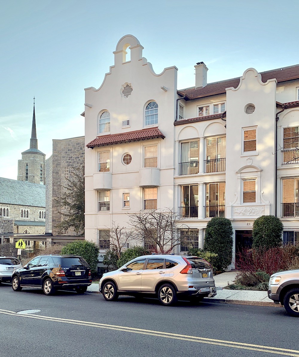
But, I have one more.
Only, this isn’t San Fran! I took it yesterday, in Bronxville on my way to the paint store. Yes, for you locals, I walked up Sagamore to Tuckahoe, which can rival any hill in SF. Well, almost. And, it was dry and 70 degrees too! So mild for March 9th!
Well, that’s all for now.
Oh, and please don’t forget to check out the HOT SALES!
Serena and Lily are now giving 20% off of EVERYTHING. The promo code is on the hot sales page.
Related Posts
 All About Hardwood Floors + How To Ruin Them!
- 12 Farrow and Ball Colors For The Perfect English Kitchen
- My 20 All-Time Favorite Benjamin Moore Paint Colors
- 333 Decorating Rules You Need To Know is Here
- 12 Of The Hottest Kitchen Trends – Awful or Wonderful?
- 30 Inspiring Butler’s and Kitchen Pantries, Old and New
- Coral Paint Colors, Another misunderstood Color