Dear Laurel
I’m at a loss to figure out what to do with this window.
It’s in the dining room of my Connecticut Antique Farmhouse.
The house was built in 1825 and is loaded with antiques– and charm. Well, we think so.
I usually have a vision but I’m struggling with this one. I don’t want it to look fuddy-duddy. Back in the day I would have done a swag and jabot, but right now I’m stumped. Should I just leave it naked?
Maybe this could be a blog post?
Thank you,
Susan
PS: By the way, I have enjoyed following you for several years. Not only are you extremely talented and helpful, but you have a terrific sense of humor!
*********
Thank you Susan! This is a recent email I received.
Please know that I can’t help everyone, even though I wish I could. However, if I hear the words “Connecticut Antique Farmhouse” you stand an excellent chance of hearing back from me:
“please send back, if you like, a half-dozen or so photos and I’ll see if there’s something I can use for a blog post.”
And, she did.
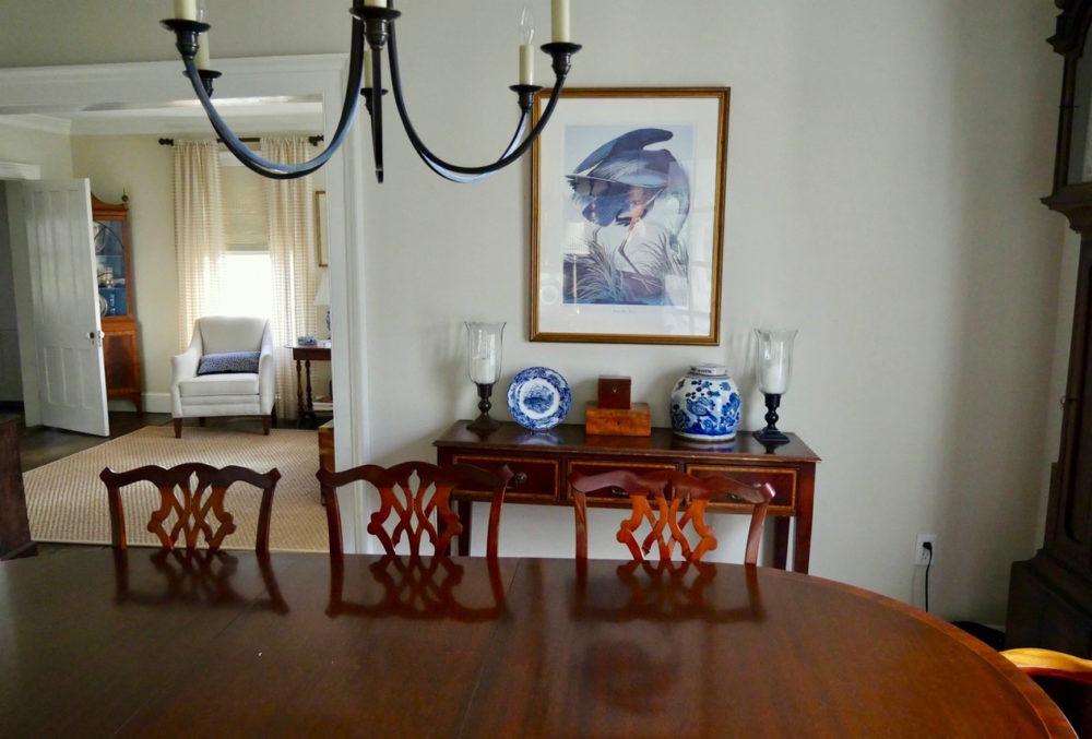
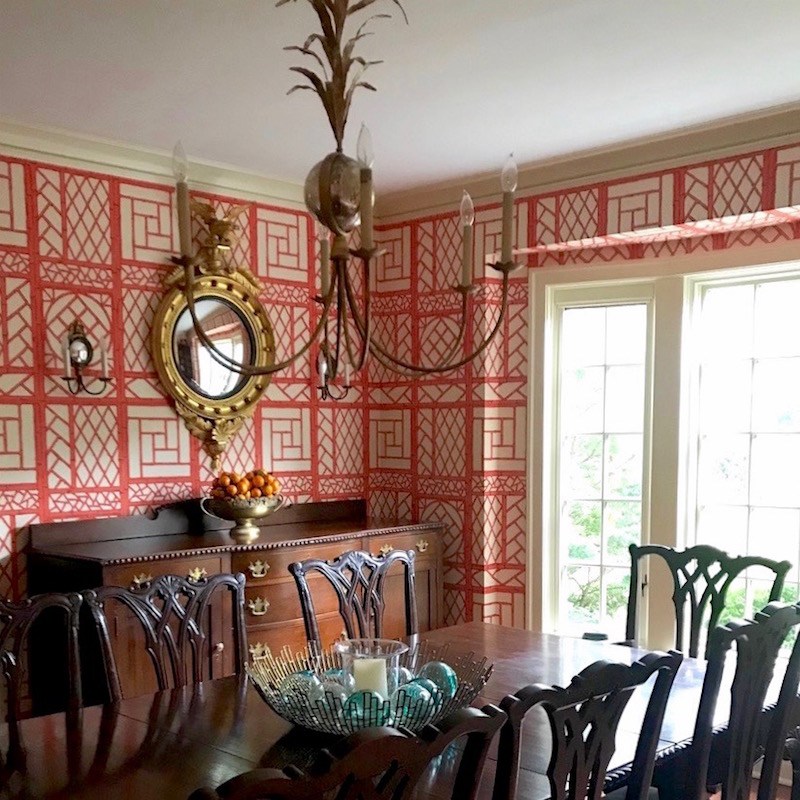
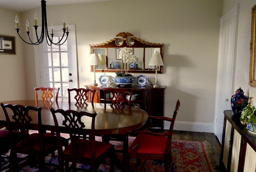
But, then, Susan had this to say about her antique farmhouse dining room:
While I’m at it, here’s the drab dining room. Everything feels so dated to me. How can I give this decor a facelift? I feel like I’m living in grandma’s house. I’m not going for the millennial Pottery Barn house look, but this just isn’t working for me.
BTW, when I went to grab the link, just saw that PB is having a MASSIVE bedding sale!
However, when I looked more closely, this was from a much earlier email from the fall of 2016 when Susan had sent in a few images from this beautiful antique home!
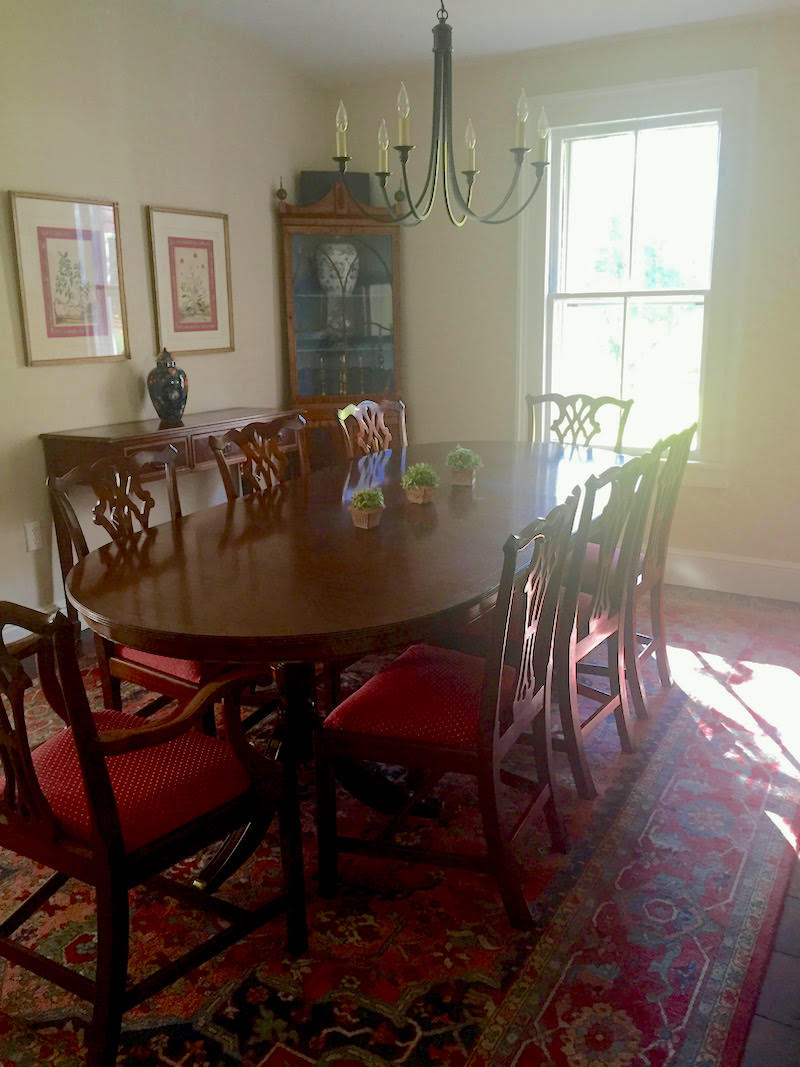
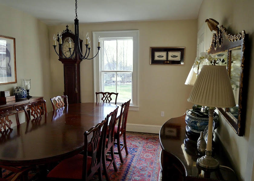
This is one of the old photos
The rest of the photos are how her gorgeous antique farmhouse looks today.
And then, we can see if we can help her with that window treatment.
 That’s a better shot.
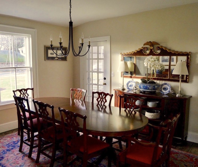
My immediate thoughts were that the room is not terribly big, but looks quite heavy with a lot of brown furniture against the pale walls. I LOVE that cache pot and orchid!
As for the window treatment, I could see why Susan is struggling. While the room has many things going for it, to me, it feels that the balance is off.
In addition, the area rug while very beautiful, is a little too large for the room.
Susan later gave me the measurements and she said:
The dining room is 13’11” x 11’5” and the rug is 12’1” x 8’8”.
Ceiling is 8.5 feet high.
Window is 5’10” x 3’6”.
However, it’s an old home and the dining room is a little short, so we probably need it to be that long. Ideally, I would like to see at least a foot of wood margin and usually a little more all the way around.
My next thought was that what would make this room really work would be a lovely, soft red on the walls as it would balance out all of the brown wood.

Maybe Like Benjamin Moore Strawberry Red, one of the Laurel Home Paint/Palette Collection colors
I used this in a darkish living room once and it is magical!
Next up for me is the chandelier.
I feel that it’s a little too rustic/casual for the more formal mahogany pieces. Chandeliers are so difficult, so when I find a really great one, I tend to use it again and again.
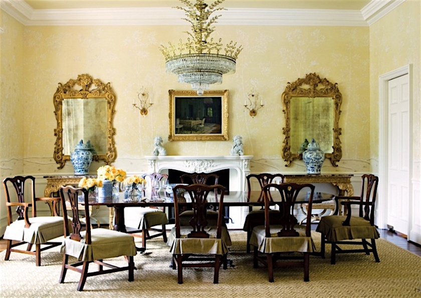
I think that the 24″ Paris Flea Market chandelier would be the perfect size and style for Susan’s Antique Farmhouse dining room. Above, you can see it in this dining room we did a few years ago.
This is such a pretty piece. The photos don’t do it justice.
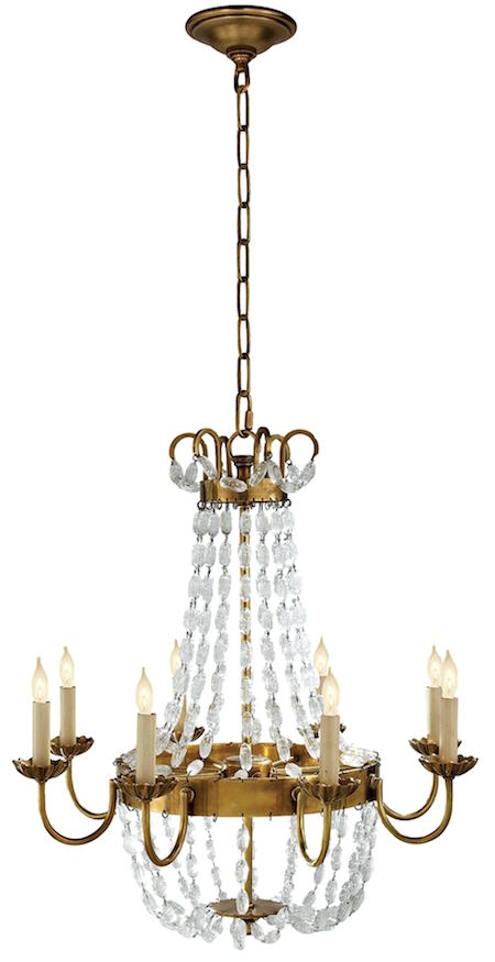
And you can find it at 1800lighting to purchase.
For more great chandelier ideas please check out this post,
Still, I know better than to be giving advice without seeing what else is going and so I asked Susan to send in some more images of the other walls and adjoining spaces.
And, here they are.


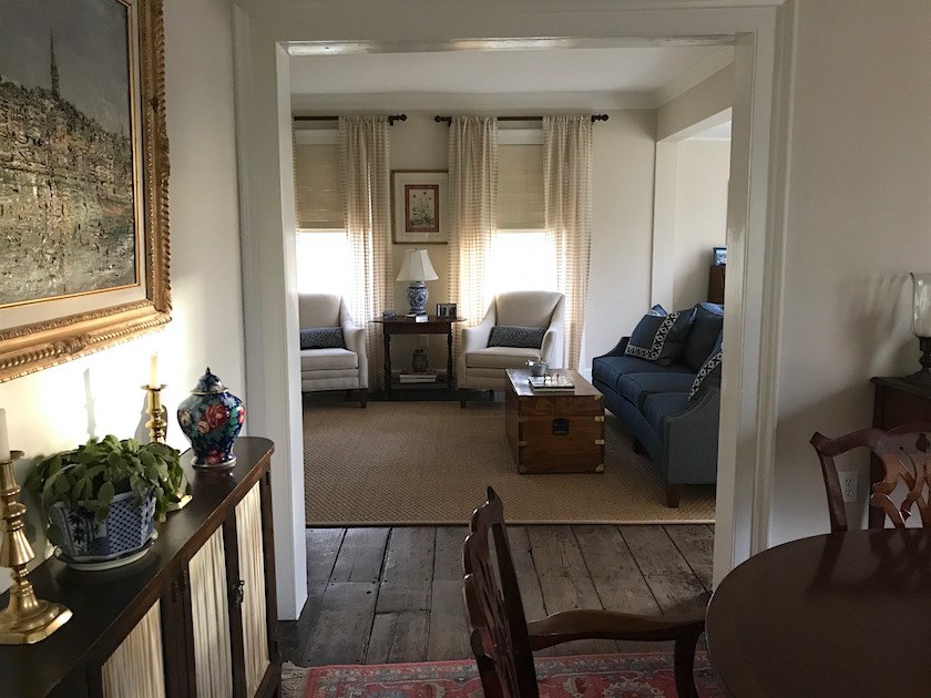 Here we can see the fourth wall and into the living room. Don’t you just love these old floors. I believe that they are pine but they could be something else.
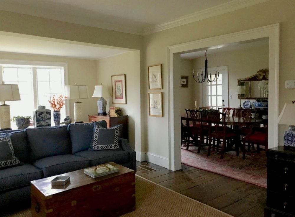
I love this shot. This is a very lovely home, but it is falling a little flat in a few places.
The first thing I noticed now, is that the color is okay, but it’s creating a drag. However, now that I’m seeing the larger picture, maybe painting the dining room red will feel too much.
This here, is the perfect example of why I go a little nutso when someone asks me what color to paint something without being able to see what else is going on. It’s a dangerous thing to do.
I would, however, like to see more creamy white in pillows and window treatments. Not solid white, but I feel that the rooms need a little more white– and a little black.
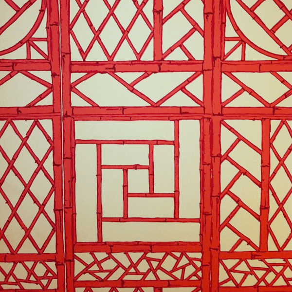
And while I am now rethinking the red on the dining room walls, I do think that they still need something beefier going on and that made me think of beautiful Sarah Wagner’s wonderful dining room and wallpaper.
I think that something like this Quadrille paper could work nicely and help balance out all of the heavy brown furniture. BTW, have you seen Sarah’s beautiful new blog, Sarita and Gail?
Eileen Lonergan helped Sarah and I believe it was one of the last jobs she took. I miss Eileen so much!!! But, she will always be with me.
Or below, I also love this wallpaper from Schumacher
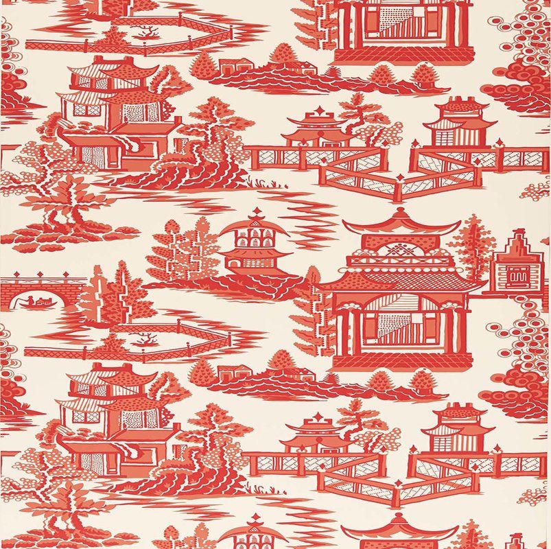 Schumacher Nanjing Wallpaper in Coral
Petite Rustique found on Overstock
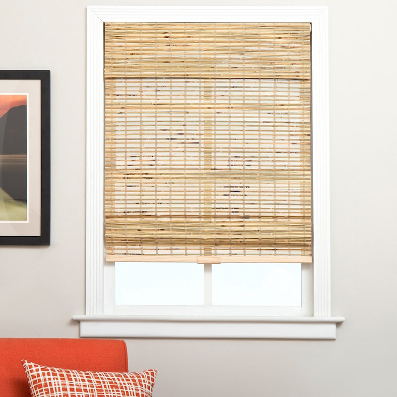
I am thinking maybe a bamboo or some other natural wood Roman shade would be nice in the dining room.
Let’s discuss the wall color a little further.
Susan says that the wall color is Benjamin Moore White Sand oc-10 but with a little added green to take away the red undertone.

White Sand

And here, I added a little green the white sand image.
This is actually quite close to a Laurel Home Paint and Palette Collection color – Niveous oc-36.

My feeling with mixing paint colors is that unless you’re fixing a booboo, it is better to get a color that is good without having to manipulate it.
I brought this image back down so that you don’t have to scroll back up.
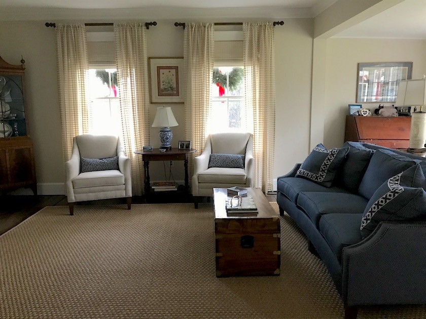
I notice that these are the only windows with window treatments.
However, the other windows in the living room should also have drapes, unless there’s some compelling reason why they can’t. And, while these aren’t terrible, they are clashing a little, as is the chair fabric. Of course, it could just be the photo. I’ve learned not to trust colors completely in photos!
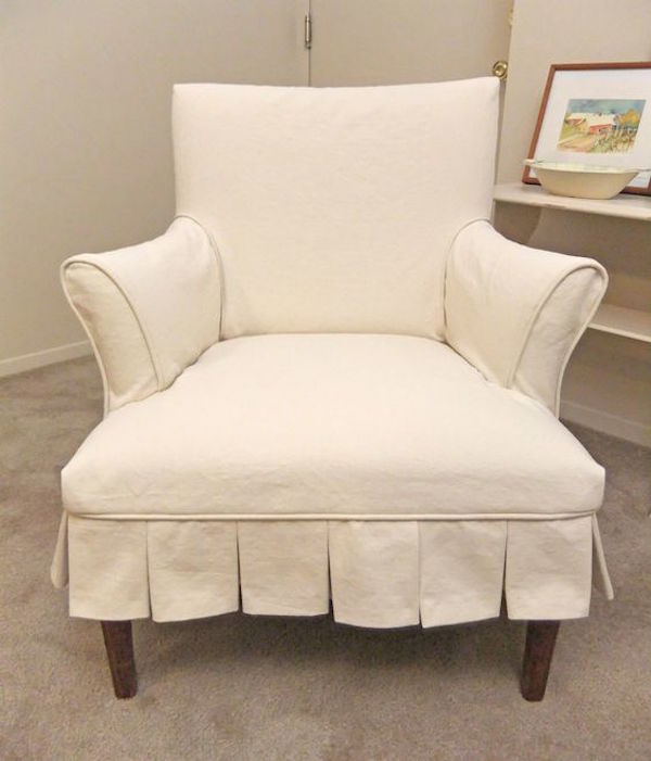
I would do a lighter creamy white and have slipcovers made for the chairs with a skirt. Maybe something like above or it would not need to have the box pleats. I feel that the chairs, while nice look a little too contemporary in this space. But, this is just me being nit-picky. The chairs are fine as is.
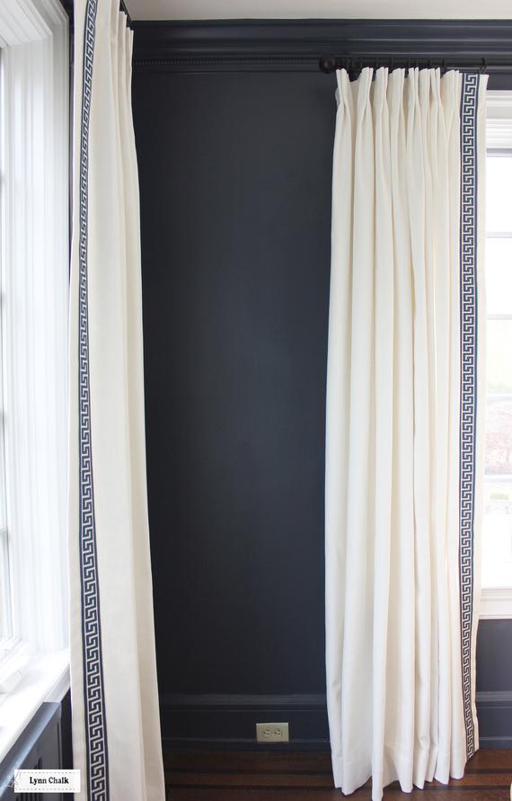
For draperies, I’m thinking something like this or with a plain ribbon trim. These are by Lynn Chalk.
Please check out her page on Etsy for dozens of gorgeous draperies and pillows.
Susan said that she bought the lumbar pillows on the club chairs from Pop O’ Color on Etsy which she found here. They are one of the 75 I think it is top sources I put in the vintage and hand-made update on Laurel’s Rolodex last November.
She also said that the throw pillows on the sofa came with it and then she added the Samuel & Sons trim which she purchased at Good Goods in Darien.
Very clever and fabulous!
Another idea I have to spark things up would be to add some varying shades of blue in the living room in accents like other pillows will make a big difference.
for terrific throw pillow ideas, click here.
Here are a few other ideas I put together in this sliding widget. Please click on the individual images for more info.

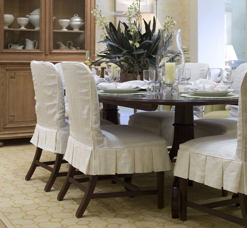
Oh wait, one other idea. It’s the dining room chairs.
They can definitely be left brown, but I think that it would be awesome if they were painted a chalky black. It would add another dimension to the room that I think would be quite pleasing.
And then, I would add a slipcover skirt.
Here are some ideas for that.
This is the basic idea of what I’m talking about. It would add a lot of style and make the room a little less formal feeling. Beautiful dining room by Suzanne Kasler
This style without the back part would be lovely too. Room by Phoebe Howard
I very much recommend Karen – The Slipcover Maker.
There is also some of her work featured in this post about slipcovers
I’m sure that you guys are chomping at the bit to share some of your ideas for this lovely antique farmhouse.
I could keep going, but they are all exceedingly minor things. This is such a fabulous home! I think with a few tweaks, it could be a showstopper. Although, it already really is.
Before I sign off. As you know, I do moderate comments.
Fortunately, 99.9% of you are incredibly wise, thoughtful and kind. And it pains me to have to say this for the .1% of you who aren’t. But, please remember that Susan has graciously allowed me to post her home and she will be reading your words. Please bear that in mind while writing your comments.
However, as I have to say about once a month or so, I do not allow nasty comments and unfortunately two people got their subscriptions deleted on Sunday. Not only were they snarky comments directed at me, but they sent them out when I was sick. WTF?
Talk about kicking a dog when she’s down.
xo,

OH! PS: Please go to the newly updated hot sales page if interested in getting a 20% off promo code for Serena and Lily!!! It’s good until February 22nd!
Related Posts
 White On White Decor Inspired By A Top Magazine Director
 A Room That’s Chock-full of Interior Decorating Lessons
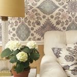 How To Get A Sunroom Like Tory Burch (for a lot less money)
 Roman Shades Weren’t Built In A Day – What Until You See!
 Our Unique Home, Stunning View, But Difficult To Furnish!
 Can This Boring Bland Living Room Be Saved?
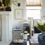 Will My Warm Paint Color Palette Look Dated in Five Years?


