Hey Everyone,
Bedroom update! The focus is the decorating details; there are a lot of them.
We’ll touch on how to get the mix right with colors, finishes, accessories, remaking/refurbishing some furniture pieces and window treatments.
But first of all, I couldn’t be happier with how things have turned out so far and the big stuff is done; that being, the paint and wallpaper.
To see the bedroom, before, click here.
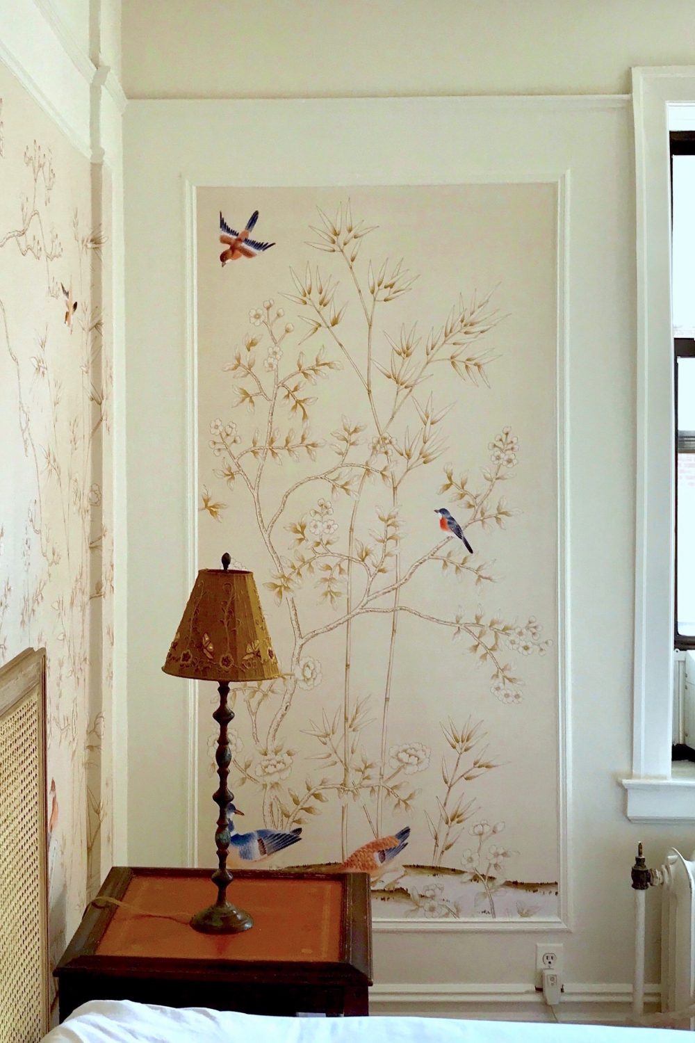
Please believe me when I tell you that these photos do not do justice at all to the wonderful colors in the wallpaper from Mural Sources who have graciously donated the paper after I begged them. ( didn’t have to beg hard) ;]
Unfortunately, the radiator cover hasn’t materialized yet, but I am told that Friday the carpenter will be coming. Did I tell you that I’m going to have one made in the manner of this one here, but of course, much deeper.
One thing that they did is to paint the two bookcases which were a cream bordering on yellow in some lights. I had them use the white dove paint and what’s interesting, is that they look slightly different from the walls which I expected.
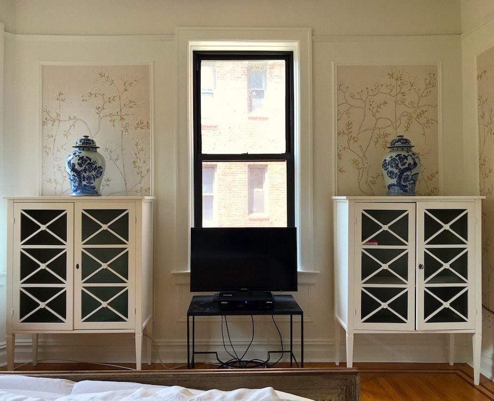
And in this late morning light, they look different from each other! Doesn’t the building across the courtyard look like a painting? That’s because my windows are filthy!
Yes, we already discussed the wires. When I’m looking at the TV, in bed, all I can see is the top of the table and TV.
But…Please be rest assured those of you who donate regularly to the electrical wire police. The glass was removed from the doors and in its place, they will put a piece of plywood painted the same white paint color.
To see what that looks like, you can see a similar look in the built-in tall cabinet.
Then, they will put the TV inside one of them. In its current place, I think that I’ll put the round ottoman that’s cowering in fear under my desk, at the moment.
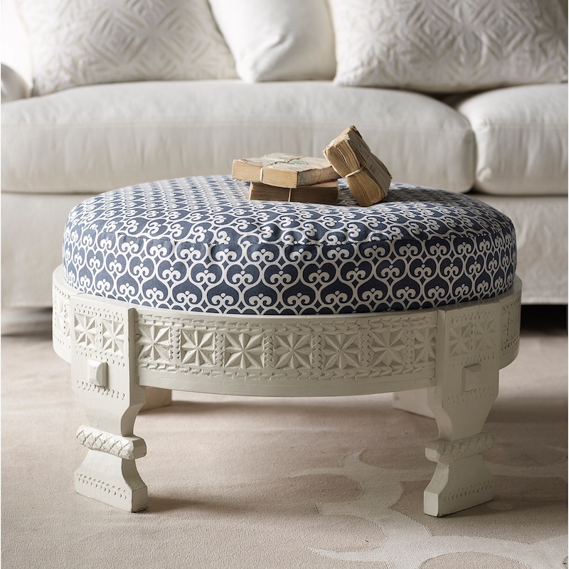 It’s like this one only the fabric is a pale gray-blue and beige geometric. It’s from Serena and Lily, however they discontinued it about three years ago.
The wall mural from Mural Sources is beyond exquisite. The background color is actually a soft, pale taupe. The leaves usually look bronze with a green-y gold tinge which I dore. And the birds are fabulous. I don’t get to see too many because of the furniture, but we’ll be getting to that.
I have been asked about mixing furniture in a room.
Or, rather, mixing furniture styles. And then there’s the issue of wood stains. Should they match? And if painted, how many pieces painted and should they all be painted the same way?
But, these decorating details are super important.
After all, we don’t want a matched set of furniture–ever.
However, we also don’t want our rooms to look like a vignette from the Salvation Army. Even IF everything came from the Salvation Army. Hey, I’m fine with that!
Let’s begin with the pieces of furniture in most bedrooms.
- A bed(s)
- nightstands or small chests used as nightstands
We could stop right there, because if there’s a large closet, you might not need anything else IN the bedroom. I have had that situation happen in at least one bedroom I’ve worked on.
But most people have a dresser and/or a chest(s). Some have an armoire or wardrobe. I have bookcases.
So, it’s possible to have a bed, nightstands, dresser/chest, and then one or two of the following, highboy, armoire, wardrobe, or bookcase(s).
In most rooms, I do a combination of paint and stained wood pieces.
The stains do not need to match, but they do need to coordinate. It varies, but usually I have more painted than stained, but sometimes its the other way around.
As for styles, if one stays with a general period, for instance, my furniture is either Gustavian Swedish in style or Louis the XVI (straight tapered leg.) Those two styles always look great together.
A big issue in my room is that the floor is orange-y and the bed is cerused oak. Normally, I would say “icky poo,” And on top of it, there are mahogany nightstands!
But, there’s also mahogany ribbon banding in the floor. In fact the night tables, with the orange-y leather floor are very close to the floor colors.
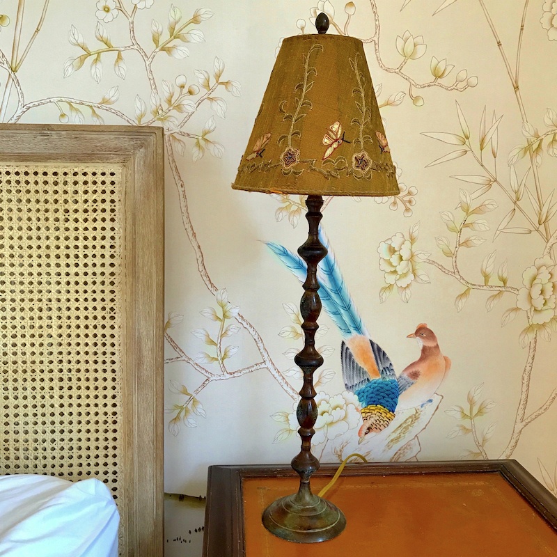
I think that all looks very nice together in a kind of collected, slightly funky way. What saves it, is that the Harbour Cane bed from Serena and Lily (which I adore) looks so great against the wall mural. Oh, and that is the only place that one sees the big blue bird we saw here except for a little bit of the tail. He looks like he’s about to take a bite out of the lamp cord!
Speaking of lamps. I have had these for a very long time and was going to replace them. But they actually look quite nice. We’ll see.
The bigger problem is that the nightstands are really a little too big and a drawer we be incredibly useful. Believe me. I have looked at night stands. But I also have had these for 19 years and love their shape which you can see here.
Uhhh… maybe if I cleaned the crap out of my dresser, I’d have more room?
No worries. We’re getting to that! Not today and not tomorrow but soon and it’s going to be radical!
But Laurel, I thought that you were putting the bed in front of the window???
Oh, yes. Thank you for reminding me. Well… The window is not centered in the room but the bed would have to be centered on the window and that would leave about 15″ between the bed and dresser for 15″ of overlap. No Bueno.
If there was no dresser, then it would work. But, I am not going to spend a small fortune re-configuring my closets, so the bed has to stay put.
Okay, this next pic is when it begins to feel like I’m in the grocery store wearing only my bra and undies.
BTW, no judging.
Fine. judge. Think whatever you like, but please don’t shame me for the missing drawer pulls. Thank you. Nobody’s perfect.
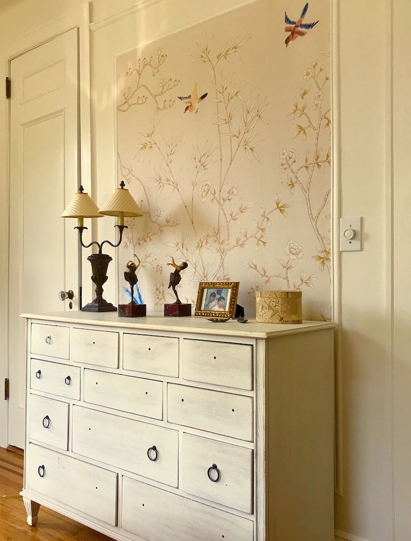
Yes! Of course, I’m getting some new hardware! Do, I even have all of the loopy things? Who knows? haha
 I’m loving the Filippa pull from Anthropologie in white and cast brass.
Now, that the mirror is gone, (well, not gone, but resting against the wall in the hall) I’m thinking a new mirror. It’s not that I don’t like the other one. I do love it, except that it weighs a ton and it’s too big. Well, too tall.
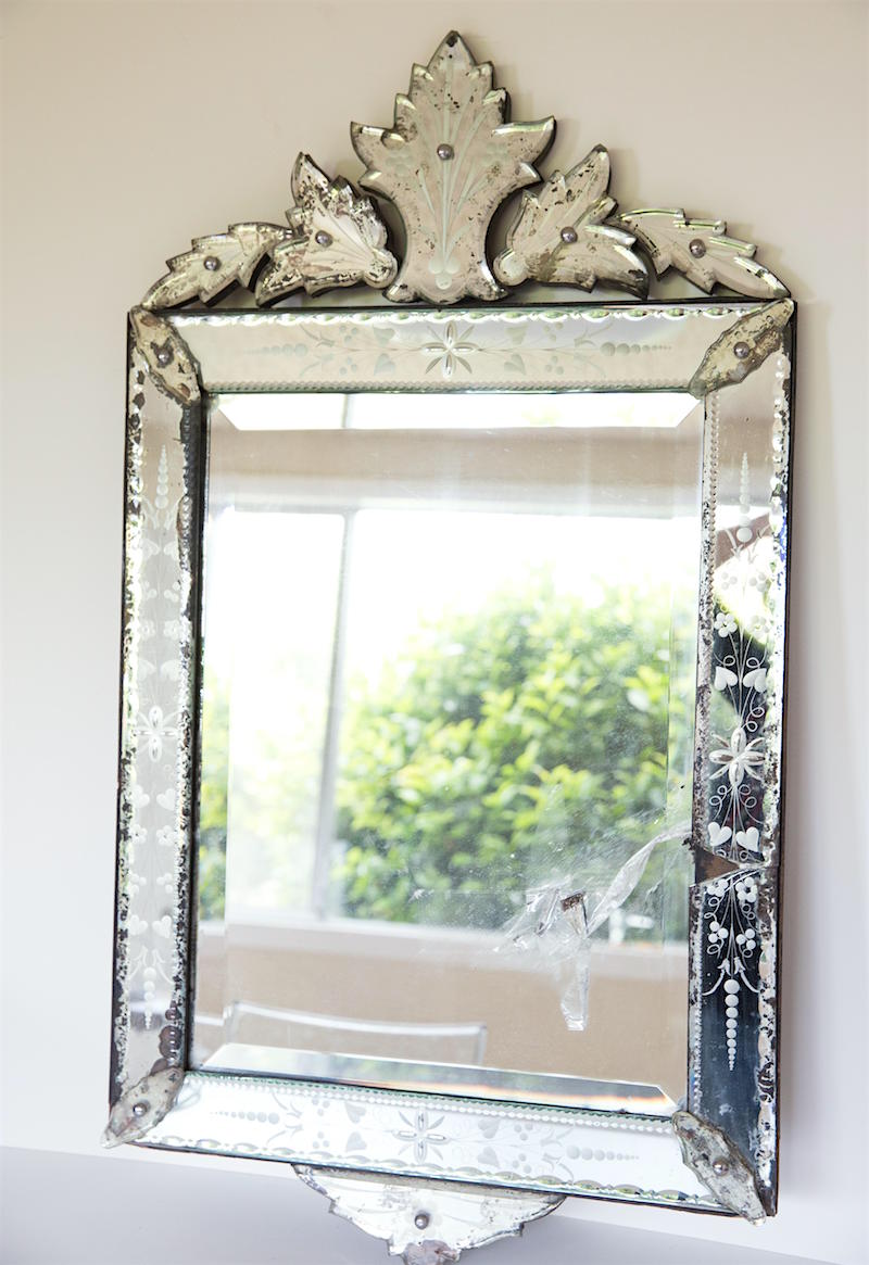
Yes, I know that it’s a train wreck. lol I actually love that. The missing piece is taped to the mirror which is what that mess is. It reminds me of the mirror in my Paris apartment bathroom.
And if I don’t like it over the dresser, then it would also look fabulous in the bathroom, whenever that gets done.
 These lovelies were purchased a few days ago from Chairish! I was going to put them in my widget on the vintage sales page. But I’ve learned my lesson, because if I do that, they’ll be gone in the morning. ;] They might look nice over the bookcases, but if not, I’ll find another place for them.
Can anyone think of a non-tacky way to illuminate them a little? (other than by candle-light) It would be great to get a little light over the bookcases. Yes, real sconces would’ve been nice, but didn’t get that one together and not sure that hardwired sconces would’ve been an option, in any case.
The rug is still hanging out in the living room. I would attempt to drag it in and install it under the bed but I would need to grow a pair of balls and I don’t think that’s a good look for me. ;]
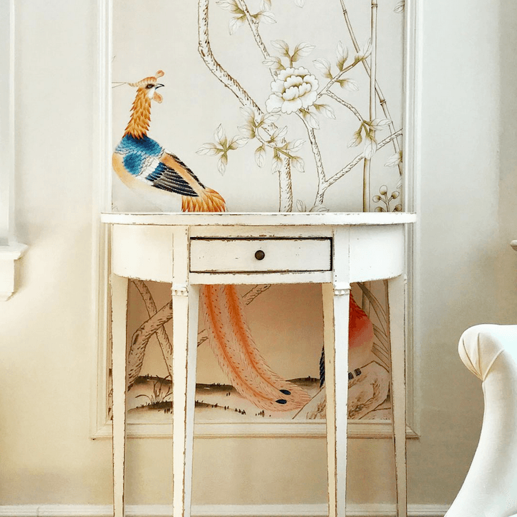
I had no idea this bird was so gorgeous– and bright orange! I can also see it behind the door. But the door is usually open in front of it.
Laurel, what about the windows? And what’s taking so long?
Well… this is how long it takes! Usually from start to finish with clients, the average is about six months for a room. Sometimes I’ve done them faster, but five-six months is about average.
I did decide a while back that I want to do a layered window treatment. I need a solar shade because from the end of September until the end of March in the later afternoon, it is BLINDING in here.
And then, I want to do a Roman Shade. You can read all about Roman shades here.
In the meantime, I came across a new image that I love.
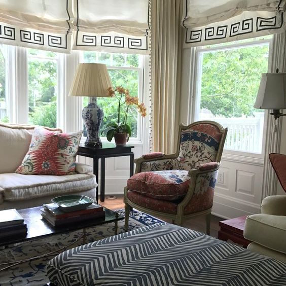
I’m looking at the middle window because it is similar in size to mine. And sorry, but despite my best efforts, could not find the original source. If anyone knows who this image belongs to, please let me know and I will add it.
And while I do love this, I think it would be a bit much for the bedroom, even with a much lighter shade of gros-grain, either in a bronze-y-olive or taupe-y-sand.
So many ideas for how to do the Roman Shades have been swirling around in my head—for weeks!
Here’s why (and it’s also a lesson for interior designers to understand how their clients live.)
I love laying in my bed and looking out the window. And being on the third floor, I can see quite a bit of sky. I can see planes coming in because the approach often directs planes from the south and then they turn to go more easterly which makes sense since the major airports are south east of me.
Sometimes I can see Venus which one time it was so big and bright, I thought it was a plane, but after five minutes with no discernible movement, decided it was not a plane. :]
And in the summer, I can see my beloved thunderstorms rolling in (like we had this evening) and brilliant, fiery sunsets. (like we’re having right now!)
Are you beginning to understand? I adore my little piece of heaven, right outside my window!
And the thought of covering any of it up, even with my glorious Greek key pattern. (I love them all!) is causing the system to crash. And of course, the windows should’ve been the first thing that was on order!
This is really the sun’s fault. Or maybe it’s my fault for living so far north. Whatever, something has to give.
Options
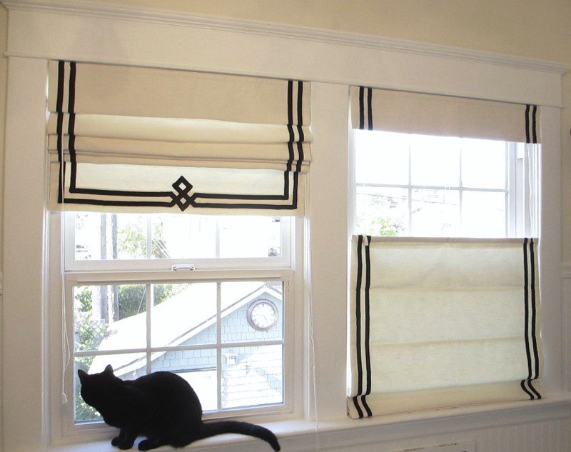
This as you can see is the top down-type Roman shade. Do check out her link. (under the image) She gives a detailed tutorial on how she does the trim. No offense, but please, we should not drag our shades on the window sill. Use a cord cleat to tie up them cords! Kitties love dangling things and those are quite dangerous.
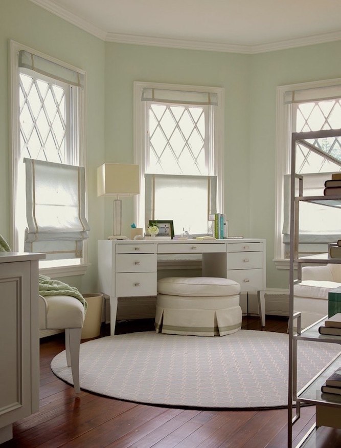
Laura Tutun did a similar design in this charming office. But you know that whoever sits there, does not sit on an ottoman. haha. They do all sorts of wacky things for photos.
Looking over my Roman Shade post, a memory was jogged that some of the best photos were by a local workroom which at the time, I did not realize was a local workroom!
And I love her work. It’s Deborah Cronin, owner of Leatherwood Design Co.
Now, here’s what’s really funny.
Remember this post where I went into great deal about a lot of info about Window Treatments?
And see that handsome young man?
That’s Mario. And get this. Deb told me that Mario had mentioned me and I think it’s possible that he had mentioned her to me, but it didn’t sink in at the time. Too funny!
Well, it looks like Mario has gotten a new job, but he’s a fabulous installer. Sooooo important!
Deb couldn’t have been lovelier on the phone and I can tell from her blog and the conversation that she really knows her stuff. So, I’m going to be working with her. Her workroom is only about 20 miles from me. I know that she’s going to whip up something extraordinary for me and so excited about that.
Well, I was going to get into more options, but this is already over 2,100 words!
There’s more to come– soon!
But, this room isn’t going to be finished for a while. In the meantime, I’m enjoying seeing it unfold.
xo,

PS: Coincidentally, just found out that there’s a terrific 20% off beds and headboards going on at One King’s Lane if you’re interested.
Related Posts
 Eegads! My No-Fail Paint Color Failed. What Went Wrong?
 Difficult Windows – Window Treatment Dos and Don’ts
 The Simple Decorating Trick That Designers Don’t Want You To Know
 The 12-Step Decorating Plan That Works Every Time
 Everything You Need To Know About Classic Woven Wood Blinds
 The Most Durable Painted Kitchen Cabinet Finish-13 Pros Weigh In
 The Worst Decorating Mistake You’re Most Likely Making


