Hi Everyone,
First of all, it’s Monday night, and I am feeling night and day different from 48 hours ago. All I can think is it was the flu, but because I had my flu shot in September, I was able to fight it off quickly.
Thank goodness, because being sick is not something I have time for.
Second of all, and this is super important if you are a subscriber. (And if you’re not, why aren’t you? We have a lot of fun here!)
If you’re not a subscriber, you may skip ahead to here.* Or, here,** if you like.
Okay, My lovelies. Do you see the new graphic at the top of the post? Yes, it is new! After seven years, I finally changed my freebie. However, guys, if you’re already subscribed, PLEASE DO NOT CLICK ON IT TO GET THE FREE REPORT. This is for people who are NOT yet subscribers.
Of course, current subscribers can have this report for free too.
I sent it to you last night, November 14, 2022, at approximately 5:52 PM ET. If you can’t find it, I’m terribly sorry. I will send it out again, but not right now because there have already been two extra emails this week.
* BTW, I am also in the process of updating my blogging guide. No matter when you purchase it, you will get the update. Speaking of other updates. The latest version of Laurel’s Rolodex is due to come out after Thanksgiving, on November 29. The Etsy Guide is coming out then, as well.
Please note: I will always fetch your download link.
However, please try to find it in your email first. Any download link you have from Sendowl (my shopping cart) for any of my products will work, as your links never change. When you download your guide(s), you will always get the latest version. After I update, I am only sending out an announcement with a new link for convenience. However, it is the same link you received when you made your purchase. All changes are on my end.
And, because I am trying to remain sane and healthy, the blogging guide update will probably be ready on December 6. 90% of it is the same. The parts that are changing are technical, plus a few things I’ve picked up since the last update in 2019.
**Okay, let’s move on to Redend Point. I promised you I’d work with and try my best to make this challenging AKA horrible wall color look good.
Let’s see if I succeeded.
WAIT, just a red hot minute! Excuse me? What the hell do you think you’re doing? ;] ;] ;] You are not allowed to scroll ahead. ;] Please be patient!
Yes, thank you, I’m feeling much better!
I’m so glad many of you are enjoying this mini-series inspired by Benjamin Moore’s and Sherwin Williams’ colors of the year. If you missed post number one introducing the two colors, you can see it here. And, if you missed Sunday’s post that focused on Benjamin Moore’s COTY, you can see it here.
Today, we are going to focus on Sherwin Williams’, in my opinion, bizarre selection, with an equally odd name– Redend Point.

At this redend point in the process, I began looking at various print fabrics from Schumacher. They have some of the most beautiful with wonderful colors of all kinds. I was hoping that doing so would give me some inspiration and further insight into what will work and what doesn’t work with my horrible wall color.
Basically, I found that a lot of the fabrics either looked blah or dreary; especially cool-toned fabrics.

What does look good is Redend Point’s complementary color, which is some shade of yellow-toned green, like Timson Green above. Dark greens look good too.
And, with this horrible wall color, reds from light to dark and eggplant look good.
Any white colors paired with Redend Point should be warm and a little dirty, like Benjamin Moore’s White Dove, for example. The dirty (slightly grayed down) is because Redend Point is pure dirt.
A dirty wet hot dog.
However, Redend Point, I would classify as a shade of mauve.
But, wait! Didn’t whoever decide on this COTY over at Sherwin Williams learn anything from the 1980s?
Well, apparently not, and my guess is because they weren’t yet alive to remember the ghastly mauve and gray trend. And, mauve and gray paired with shiny cheap brass.
Yet, here we are again.
Mauve is a dirty pinkish purple. However, this dirty purple has a lot more red than blue. It’s a warm red. Most mauve shades have more blue in them. I have several dirty purples in the Laurel Home Collection, and none are near this color. That’s because RedendPoint also has a lot of brown or tan.
Above is Redend Point and below are two of my dirty purple shades from the Laurel Home Paint and Palette Collection.

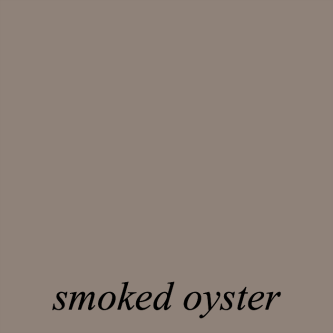
I have used both Elephant Gray and Smoked Oyster (both are in the Laurel Home Paint and Palette Collection.) Both are beautiful and easy on the eyes. Yes, they are much more gray, but I can assure you that the purple under-tone comes out. But, it’s not PURPLE.
After working with Redpoint End for two days, I’ve come to realize that it is more in the dirty pink family.
Okay, it is now Tuesday night, and I’m virtually ALL better from my achy fever on Saturday and Sunday.
I mean, that’s so weird. I could barely get up the stairs Sunday morning. (Note: I love my stairs and am glad they are there because the exercise is good for me.)
Soooooooo, I have been having fun.
Too much fun, actually.
I have made three boards using Redend Point,
But first, I wanted to see what the two dining room boards from Sunday would look like with Redend Point.
You could go back and read Sunday’s post if you missed it.
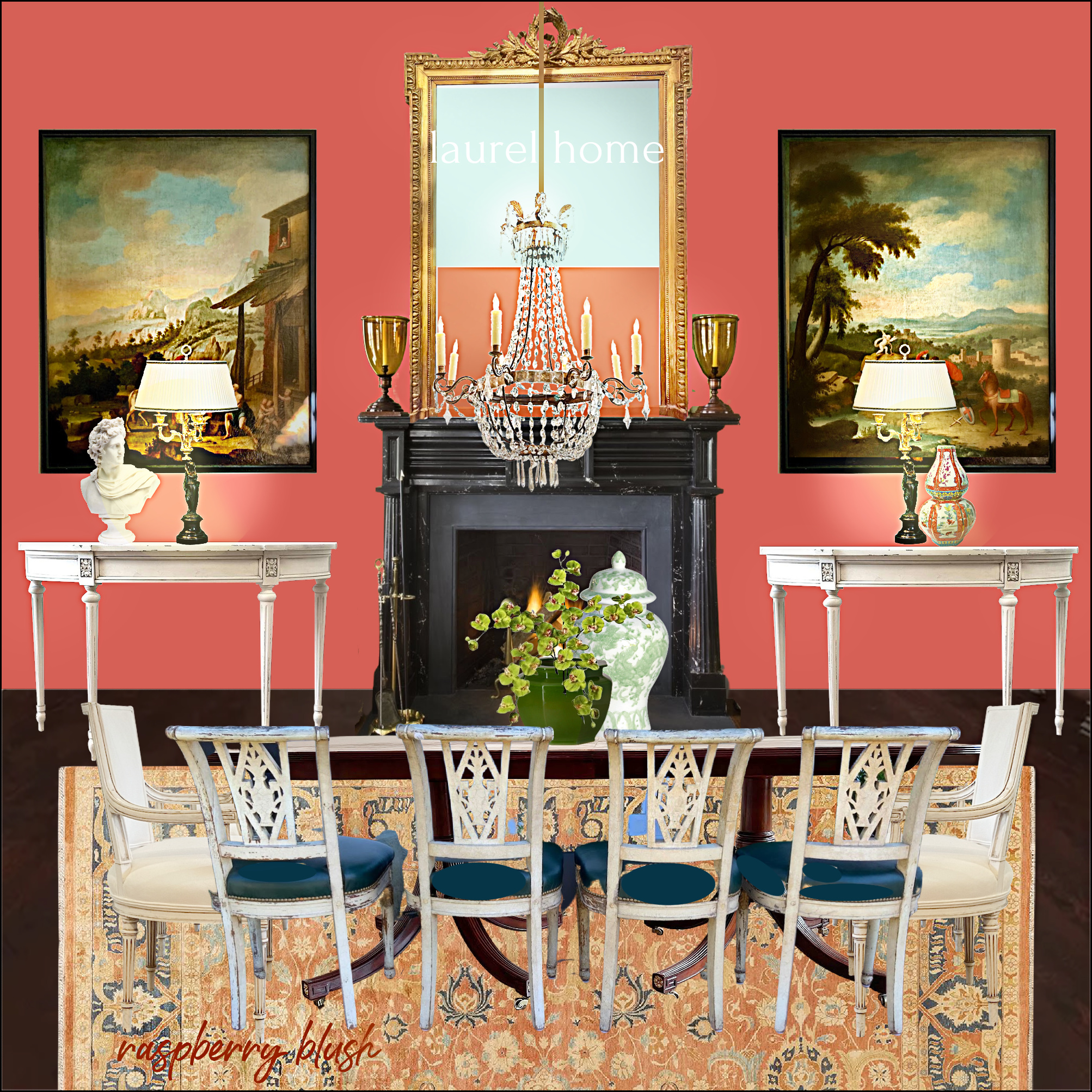
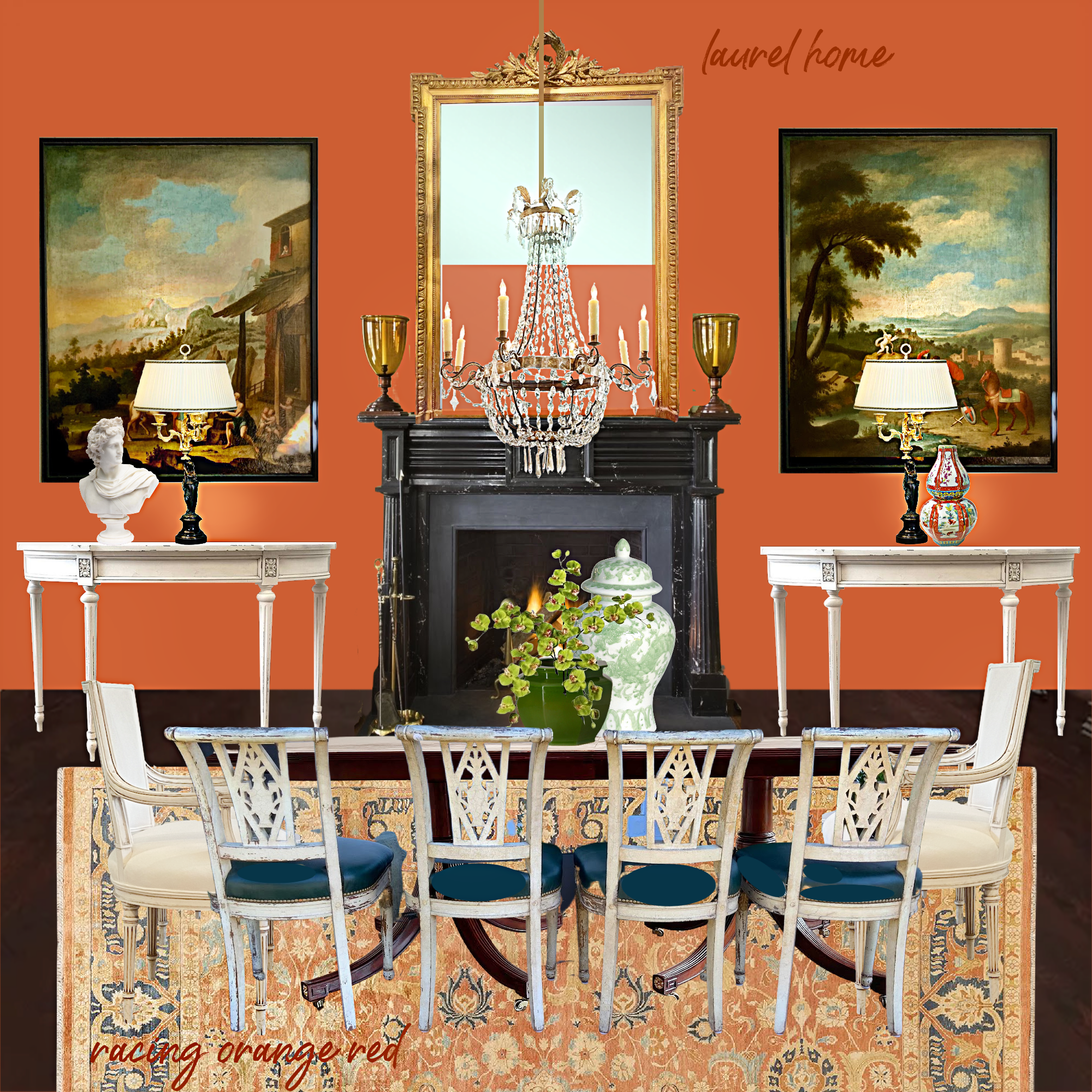
I also tried this scheme with one of my Laurel Home Paint Collection colors, Racing Orange Red. There are a couple of others that are a little lighter that I think would go well too. If I had more time, I would work on this one more.


Okay, please get ready. I am going to post the horrid wall color, Red End Point, in this same dining room.
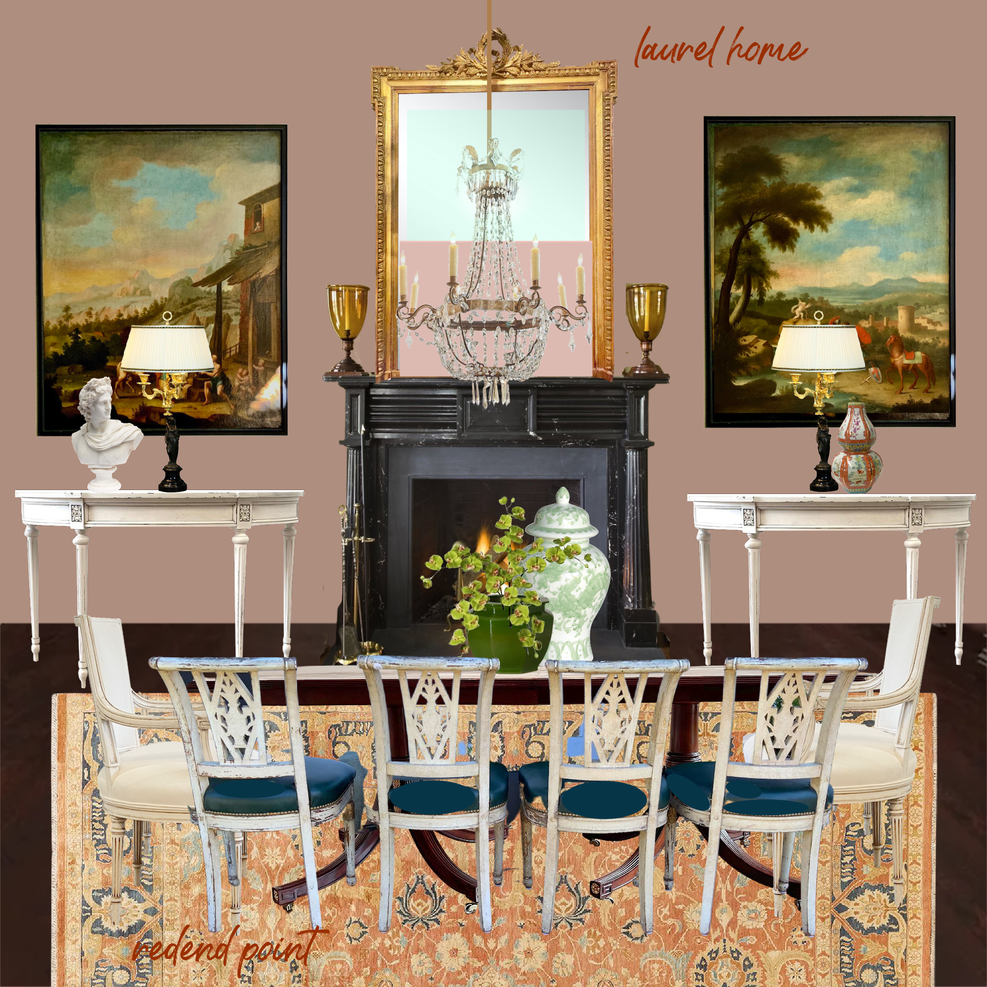
Would it work better with different art and a different rug?
Perhaps. But, why on earth would you subject your guests to a paint color reminiscent of the early stages of *necrotizing fasciitis? And, while they’re eating, mind you. That is unless you’d rather not see them again.
* Yes, yes, I know. That is a sick, highly inappropriate joke. Please forgive me.
Okay, I promised I would do my damnedest to make this horrible wall color look good.
Then it won’t be such a horrible wall color, after all.
And since I can’t stomach this color for a dining room, let’s do a living room.
PLEASE NOTE:
YOU WILL SEE A SOFA FACING AWAY FROM THE FIREPLACE. THIS IS A MOOD BOARD, NOT AN ACTUAL ROOM. THE FURNITURE IS LAID OUT THIS WAY SO WE CAN SEE MORE, NOT TO INDICATE AN ACTUAL ROOM LAYOUT.
SORRY. I mean, sorry for shouting. It’s just that the last time, or one of the previous times I shared a mood board of a living room, several people criticized me for showing the sofa facing away from the fireplace.
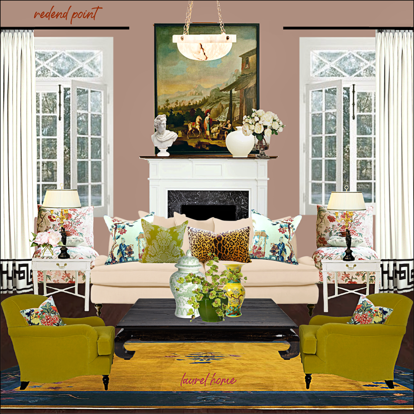
Horrible Wall Color Board # One
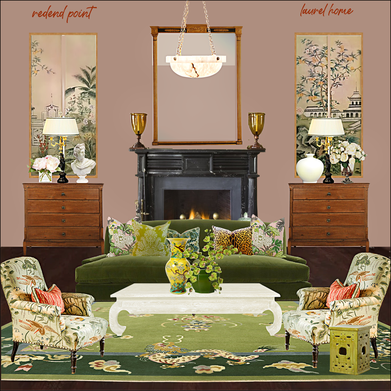
I created a color scheme featuring numerous shades of green, yellow, a touch of coral, pink, gold, black and brown, and creamy, warm white.
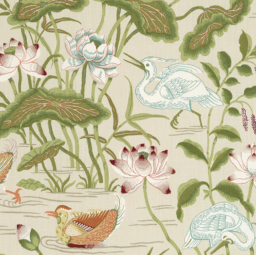
I found a fabric, Lotus Garden by Schumacher, that I think looks great with Redend Point.
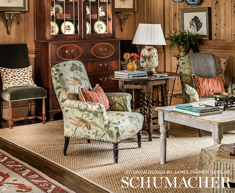
And, yes, I stole James’ gorgeous chair and put it in my virtual room. I hope he doesn’t mind.
In case you’re wondering, while fun, yes, it’s pretty tedious making these boards. I make all of them on Picmonkey. I find it’s a superb tool for helping visualize color schemes; plus, the boards help show how colors and furnishings will look together.
Horrible Wall Color Board # two
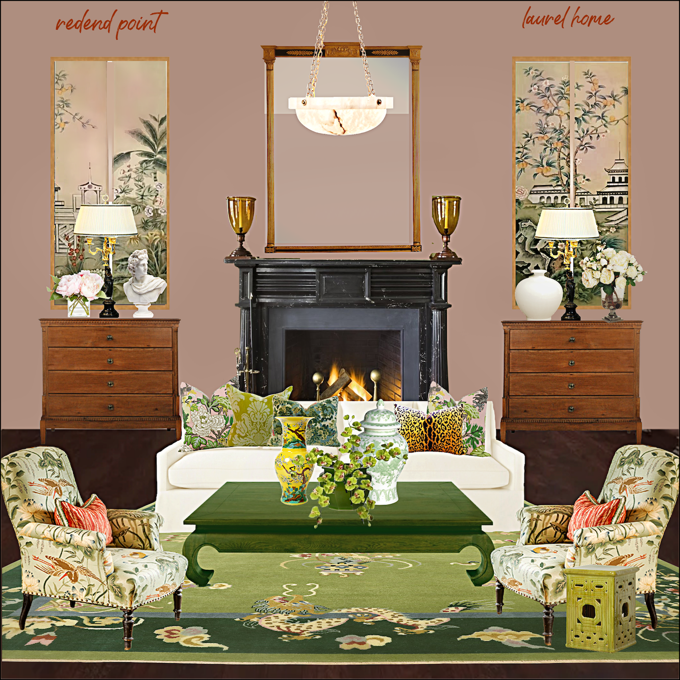
I kept everything pretty much the same for this one, except I made the sofa a creamy white linen and did the coffee table in a rich, warm green. I suppose this version is better for summer and the one on top for winter. Of course, you don’t have to have two coffee tables. ;]
Please know that I could sit here and make boards for weeks. Yes, even with a horrible wall color.
How does that work, Laurel?
Well, I decided the best way to work with a muddy, weird, unappetizing color is to use the British Method of decorating. Please listen very carefully. Here’s the secret.
The method is not giving a bloody damn.
In other words, our friends across the pond are far less concerned about such matters as a horrible wall color, and here is why.
“What horrible wall color? You can’t even see the bloody walls because every square inch is covered with the art I’ve been collecting for the last 46 years. You Americans are all hung up on everything “coordinating” and your bloody color schemes. Nobody freaking cares, and all colors go together just fine. So, please stop giving a bloody damn, and you’ll find life is so much easier.”
Okaaaaay… Let’s do it.
Hehe. Pretty, ain’t it? Acid gold with our horrible wall color. It’s fine. I don’t give a bloody damn.
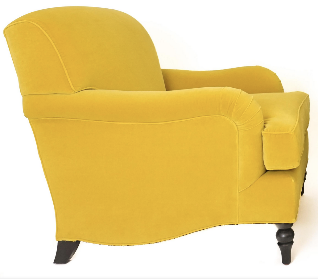
Yes, I could leave the chairs this color, but I love my yellow greens, like Timson Green above and chartreuse too! So, I changed the color of the chair. By not giving a bloody damn, it doesn’t mean you have to use colors you don’t like. Well, except for the wall that you can’t see, anyway.
And, below is horrible wall color board #three.
Yes, that is the trim I broke the code for that Kelly Wearstler designed. You can find the pattern here in the ultimate window treatment guide (blog post.)
You know, in a quirky, I don’t give a bloody damn kind of way; I rather like this room.
Would I do it for myself? Parts of it, I definitely would. This board reminds me of one of Ben Pentreath’s rooms where the colors are usually kind of I don’t give a bloody damn. But, the decor is laced with plenty of “pretty,” so it always works in an interesting, off-beat way.
Okay, please be kind. It is fine not to like any of them. However, for both Redend lovers and dislikers, what do you think now about this color? Is it just as barfy as ever? Or, could you see it used successfully in certain situations?
Someone mentioned something about a brown sofa. I was going to do that, but time is not on my side. There is always more to share.
However, I promise this is the redend of this series. I hope it was a good exercise in expanding minds (It sure did mine!) and that you had a few chuckles along the way.
xo,

PS: Please check out the newly updated HOT SALES!
And the recently opened HOLIDAY SHOP!
Related Posts
 The Secret For A Cheap, Chic Kitchen Refresh
 F&B Calke Green + An Iconic Wallpaper = Kitchen Heaven!
 The Guaranteed Way To A Beautiful Room (It’s Not The Wall Color)
 Small Living Room Decor -Should It Be Pale or Dark?
 How To Hang Art – Little Known Ways + Mistakes to Avoid
 Can This Boring Bland Living Room Be Saved?
 A Fabulous and Rare Upholstery Sale by One Of my Favorite Vendors


