

Now nothing. Green is an amazing color!
And green decor is classic and timeless.
a true story…
Many moons ago, when I was in interior design school, my color teacher, Ms. Fax loved to tell a story about a student who said that she loved blue. Ms. Fax told her, “you just think that you love blue…
…You don’t love it; you hate it. What you really like is indigo or teal, but not blue.”
I sat there thinking that I wasn’t particularly all that fond of blue [then, that is]. Perhaps her assertion had some validity, if maybe a bit harsh? After all, she was the professor and what did I know?
Now that I’m a lot older and well, just older, ;] I would probably be thinking… “What an arrogant b^tch telling that poor young woman that she doesn’t like blue. Ya know, she can just take her Munsell Color Chips and shove them up her mechanical pencil!”
Point being. If you love blue or green, taxi cab yellow or Barney purple, who the hell cares? If you love it, then go for it. My job is to help you make your favorite color(s) the best they can be!
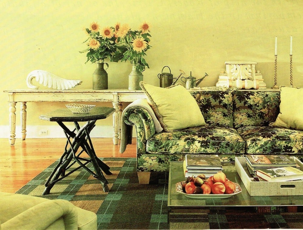
I have always loved green and green decor. And by the end of this post I think you’ll know why.
I first fell in love with green in design school. I soon discovered that many different shades of green mixed together was very pleasing to my eye.
In the early 90’s there was an editorial of Ina Garten‘s Hampton Home in Metropolitan Home. I stared for hours and hours at the photos. I still have them.
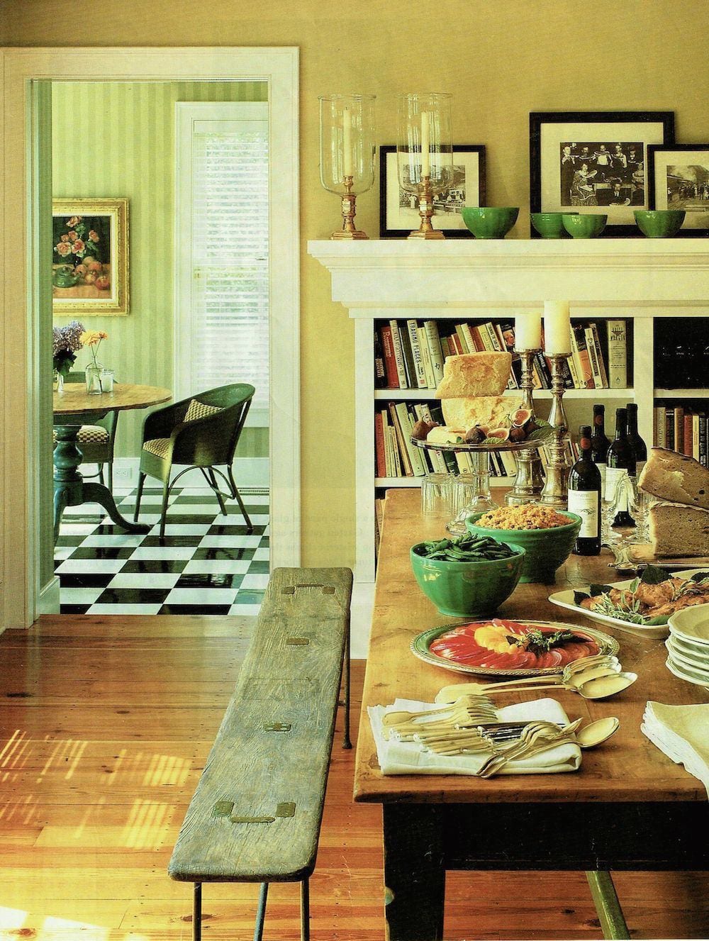
Tell me, aside from the quality of the photography, can you tell that this was done well over 20 years ago?
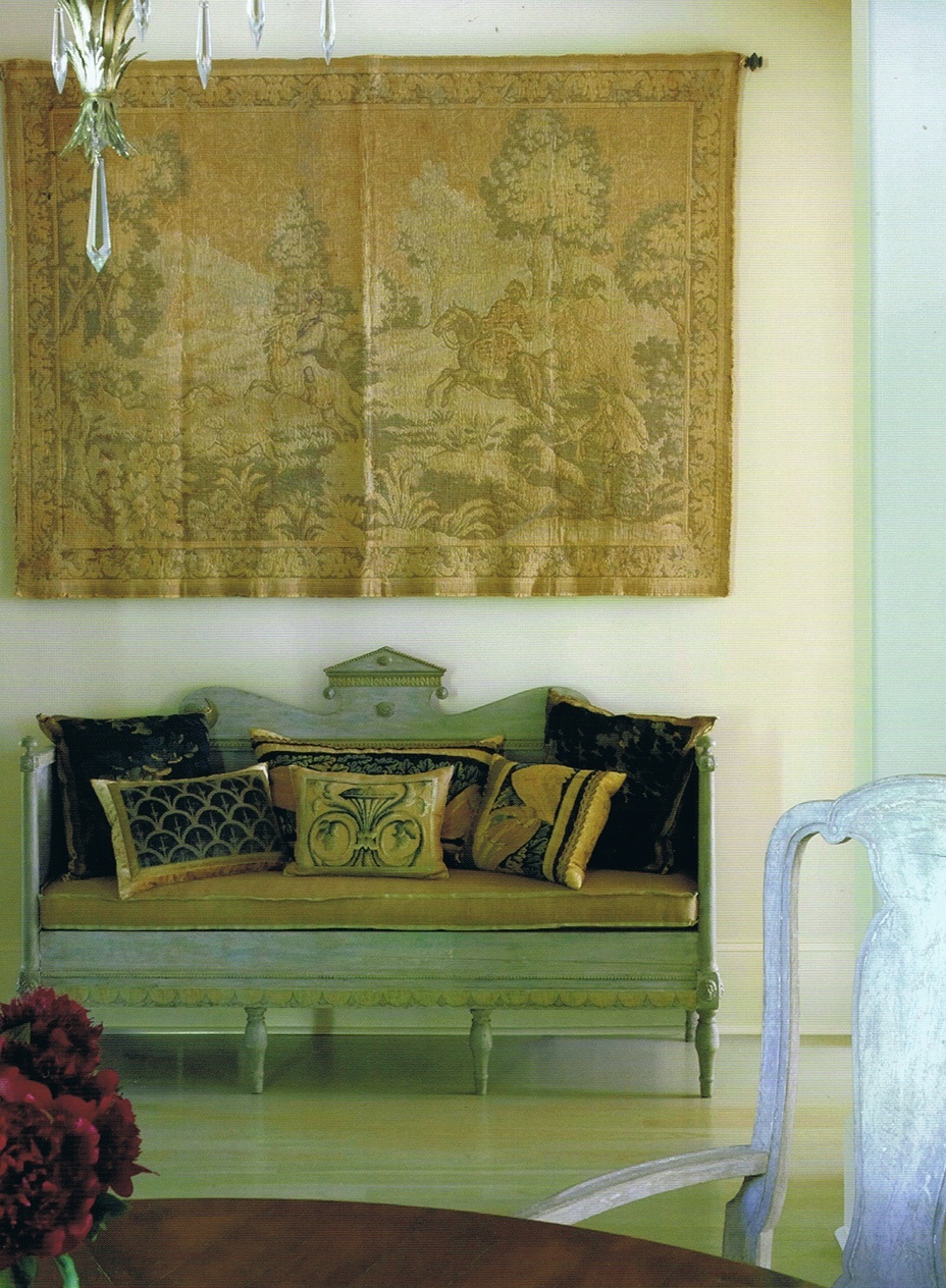
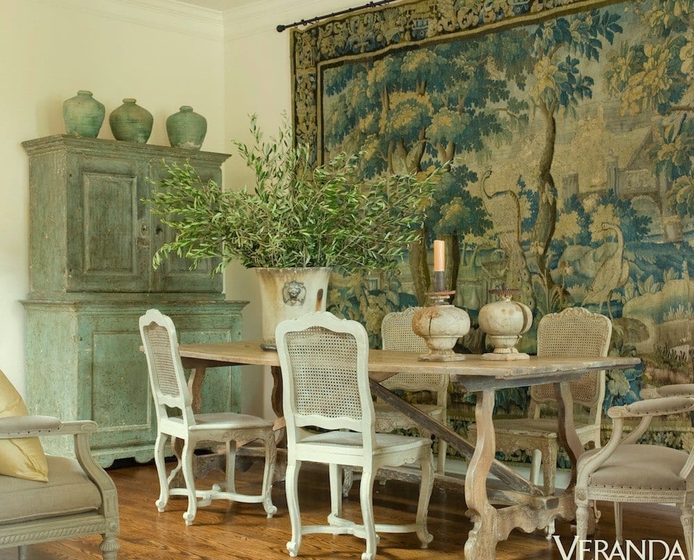
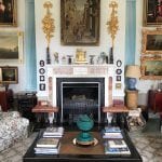
The lush tapestry on the sofa is from Clarence House, so I had to get a sample. Back then, the NET price was $200/yd. I was working on my white on white living room and knew that I had to have pillows made out of this fabric! So, I went for broke and ordered 2.5 yards.
Here are the pillows today.
I love them just as much as I did back then. It’s a fabulous fabric which in this closer view is full of depth and richness of color. It was worth every penny!
The associations with green are oft-times polar opposites; I find that quite interesting.
Green is:
neither warm nor cool, but perhaps by association with some green things like grass and mint is perceived to be more cool except in its yellower shades.
- soothing [unless super bright, of course]
associated with
- wealth and stability,
- charity and greed
- vitality and illness
- envy
- hope
For this post, I decided to have a lot of fine art to express my points. Interspersed will be rooms which mimic the art work in color and often in emotion.
Hang on!
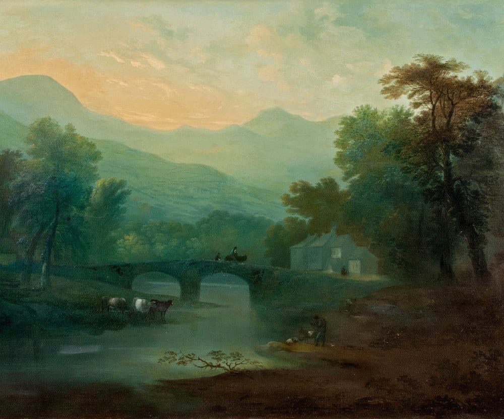 Late Summer English Landscape by the Circle of Thomas Gainsborough circa 1780
I adore 18th century European landscapes with their rich wooded greens of many hues.
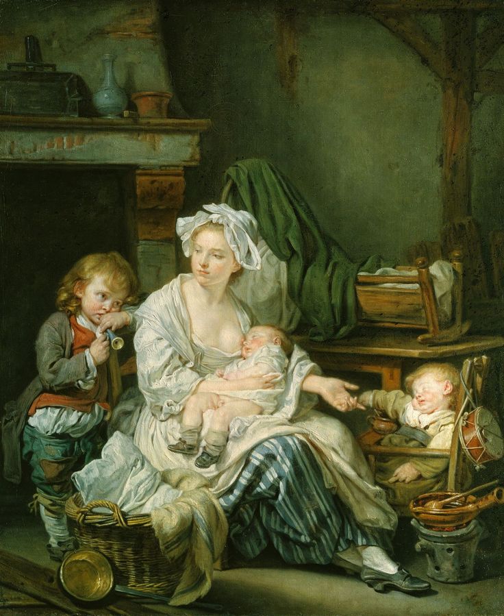
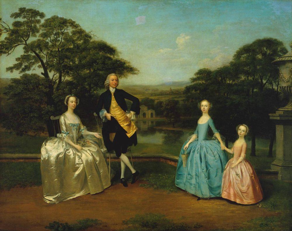 The James Family by Arthur Devis 1751
The artists back then really loved landscapes and greenery too. Notice how it appears that the family is super-imposed on the landscape that isn’t really behind them. They were most likely posing in their parlor.
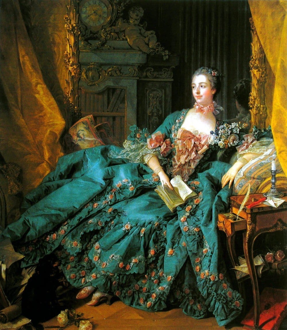 Marquise [Madame] de Pompadour by Francois Boucher 1756
I certainly knew the name but didn’t realize that she’s was Louis the XVth mistress. Looks like she was well taken care of. Big magnificent teal green silk dress. Impossibly tiny feet.
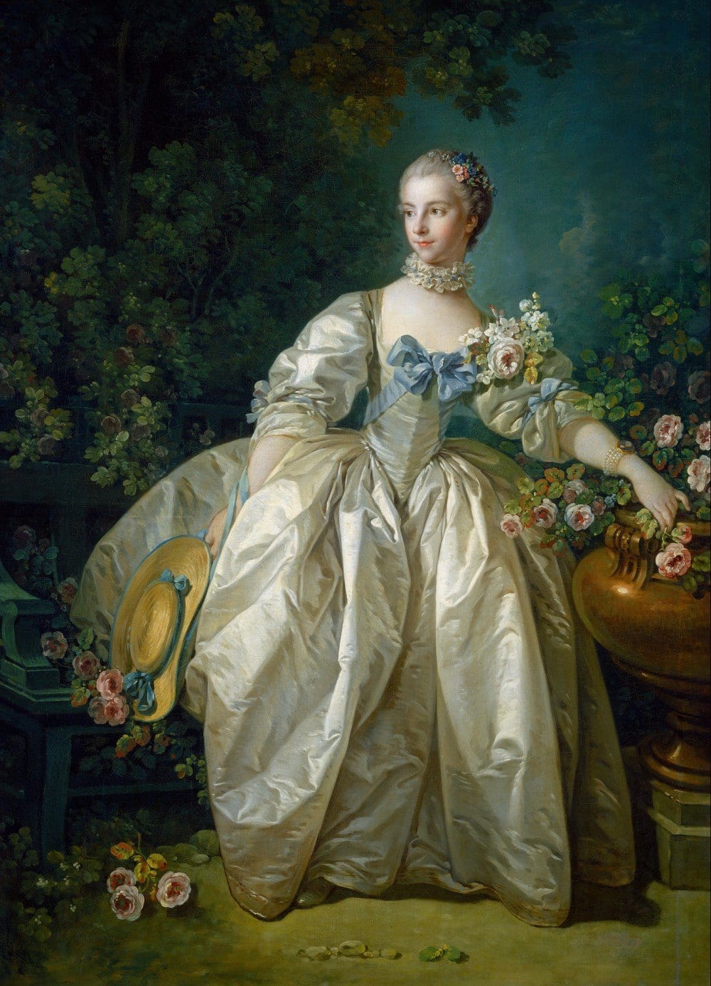
Another masterpiece by Boucher. Not sure how someone’s waist can only be slightly larger than their fore-arm but again, I’m sure that artistic license prevailed. Notice how both women are looking in the same direction? I wonder what they’re looking at?
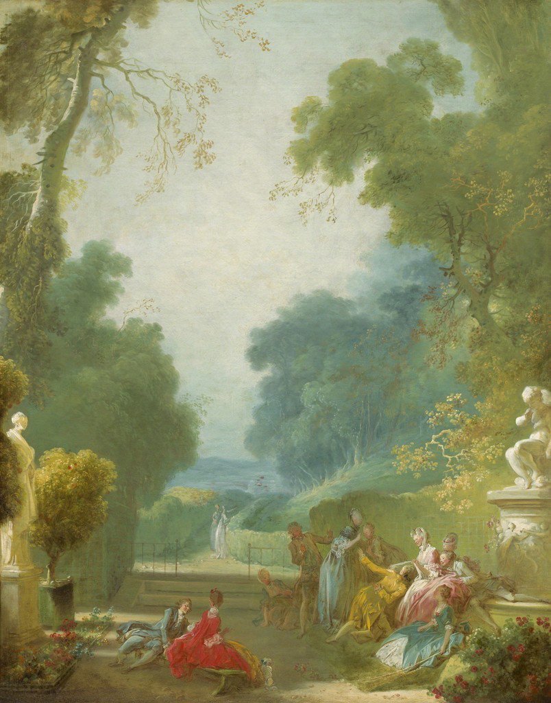
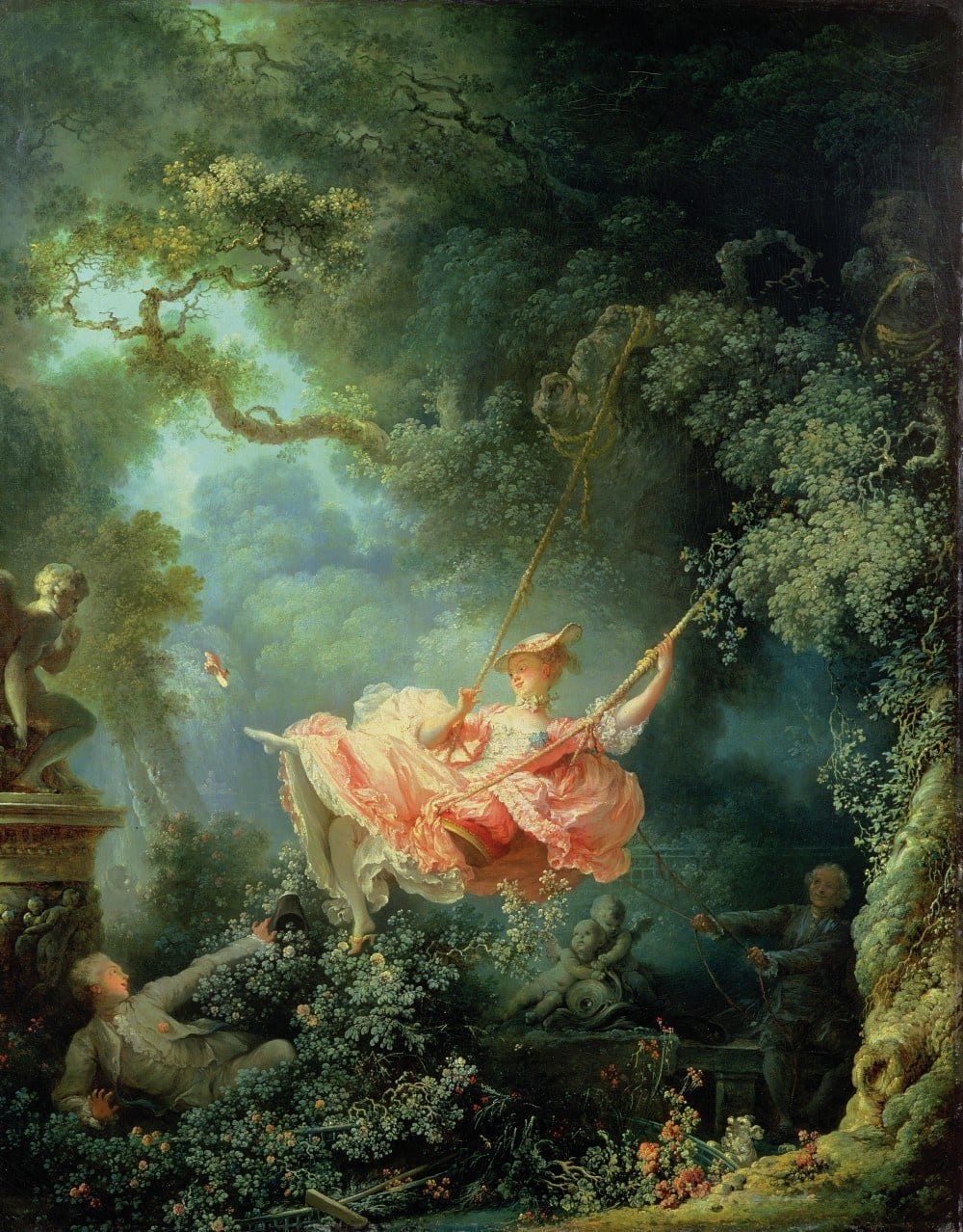 The Swing by Jean Honore Fragonard
Did y’all ever see the musical “Contact?” I was lucky enough to see it on Broadway shortly before it closed after September 11th 2001. My favorite show ever! The show is comprised of three vignettes. The first one brought this painting to life with the brilliant choreography of Susan Stroman.
Ahhhhh… the idle rich…
 Jean Honore Fragonard – A Game of Hot Cockles
Yes, that’s what it’s called! I have no idea what they are doing but as long as no one gets hurt, I’m fine with it. Fabulous colors!
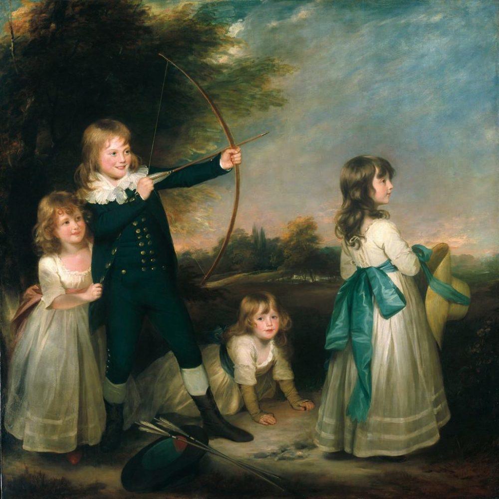 William Beechey, The Oddie Children, 1789
 Jean-Baptiste Greuze “Silence” 1759
This poor woman looks like she could use a hand. Wonderful colors!
 Portrait of Isaac van Rijneveld painted by Louis Tocqué 1738. rijksmuseum
There’s the hand in the waistcoat. Just like that dude Napoleon. Apparently, for whatever the reason, it was a sign of gentlemanly good breeding. Forgive me, but Mr. Van Rijneveld looks like an arrogant pr^ck. Maybe he just had a case of bad gas? No matter, the colors are divine!
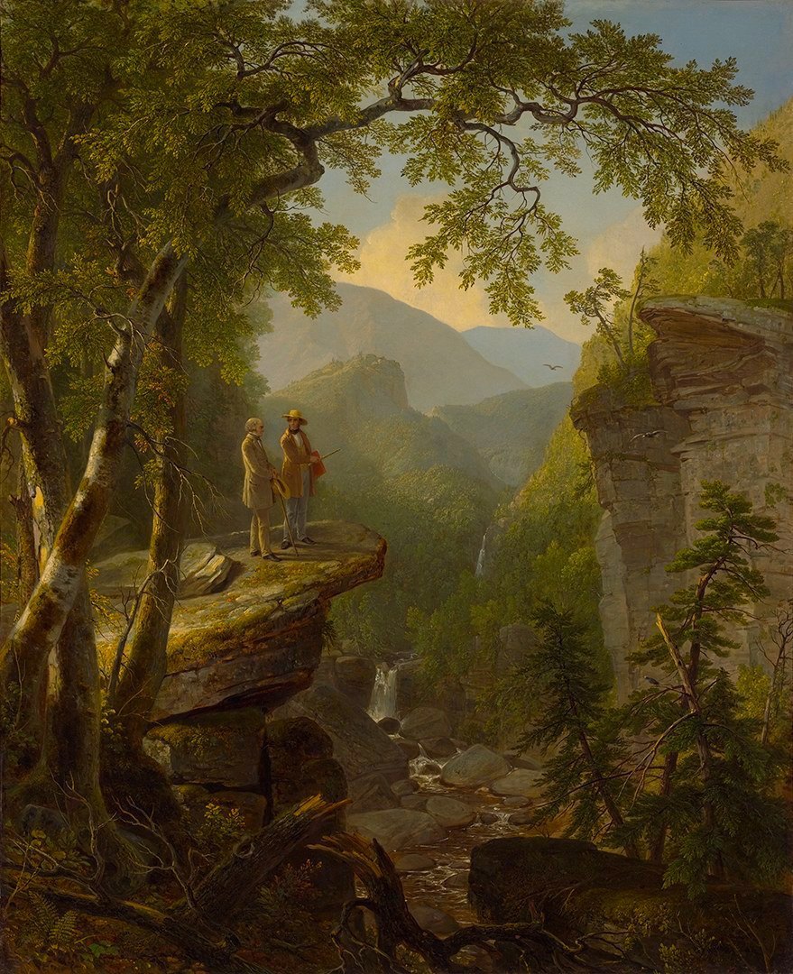 “Kindred Spirits” (1849), a tribute to Hudson River School founder Thomas Cole by Asher Durand
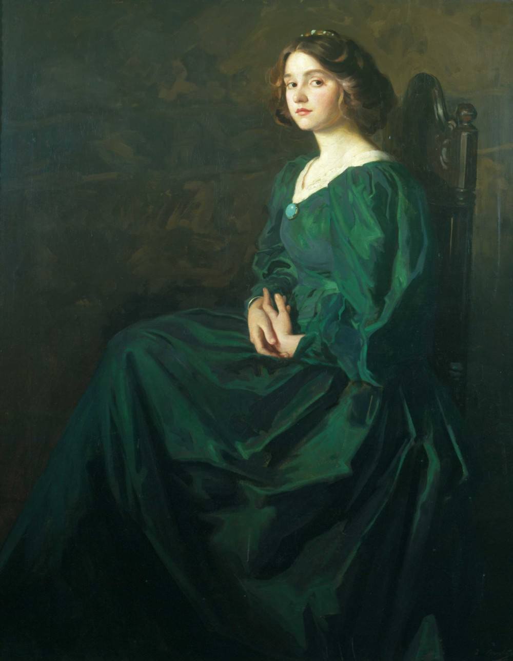
Thomas Edwin Mostyn Circa late 19th c “The Green Dress”
I love this young woman. Her face says it all.
“I have a headache and my period… this dress makes me look fat, are you done yet?”
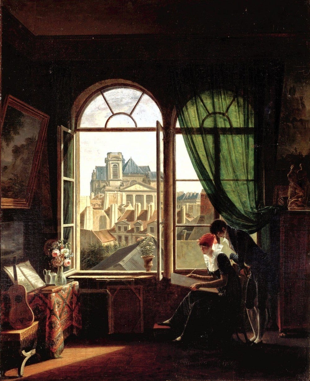
Martin Drolling (1752-1817), “Interior With View of Saint Eustache”, 1810. From the Metropolitan Museum Show “Room With a View
What would this magnificent, enigmatic painting be without that translucent green drapery? Don’t you wanna know what’s happening next? I think I know. :]
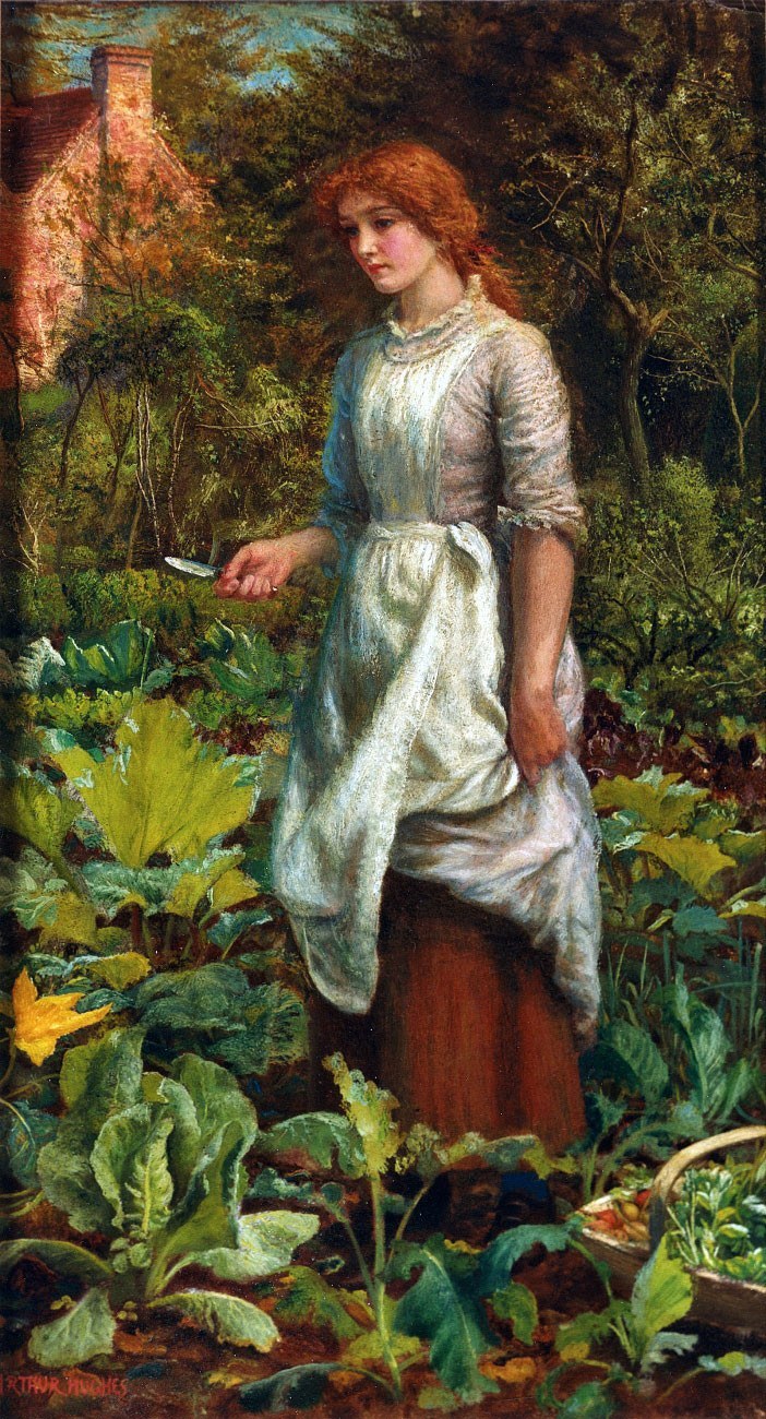 Arthur Hughes, The Gardener’s Daughter 1842
luscious.
How do you feel about green?
It was a gray rainy day here in New York. Soon the black snow will be all gone and my favorite color will appear. Chartreuse. [one of my first posts!]
Big week ahead! More about that coming very soon!
xo,
![]()
Related Posts
 The Ultimate Guide To Fireplace Mantel Decorating
 Nine Fabulous Shades of Green Paint You Need To Know
 A Secret Decorating Trick Designers Won’t Tell You
 How Much Does It Cost To Do A Smart Kitchen Renovation?
 Cost-Saving Decorating Tricks and When to Splurge
 It’s Easy Being Green | Green Decorating
 The Most Handsome Black and White Interiors Ever!


31 Responses
I am in my 60’s so maybe that’s saying something, but I still love jewel tones. In redoing a lot of our rooms in new paint colors, I’ve had a really tough time because all I see is gray, greige, and more gray on Pinterest and the Internet. I can appreciate it as a wonderful color to tone down other prettier colors but I just don’t want a house full of depressing, sterile grays.
But like you say, if it is a color that makes you happy, then go for it!
I love the artwork here…simply gorgeous with all the greens. Never goes out of style in my eyes.
Hi Betzie,
I’m in my 60s too! I hear you on the gray/greige rooms. The problem as I see it is there still needs to be some color and it might in a plant or flowers, or art– and there needs to be some black and white and gold is always nice.
And also– I think that all rooms need something old. Even modern/contemporary and ugh– the dreaded “transitional” room.
I love green!! I now can quit trying to like blue!!! Thank you!
haha! Glad to be of service Pam. My aim is for people to embrace WHATEVER colors that make them hum. And it matters not if the rest of the world likes something you don’t. For instance, a lot of people just *think* they like gray when in fact, they are just afraid to rebel!
Hi, Laurel– Your blog makes my week! Like you and the other commenters, I too, love green and would like it to be the unifying color in my house. I am dying to paint my bedroom walls the color of the teal dress if I could only figure out WHICH of the many colors is actually the right one. Aside from that, I am looking to paint my living room a color something like yours. I know colors on screen can look very different in real life but would you share the color you used? Also, I love that Clarence House foliage tapestry fabric. Do you know its name and are they still making it? Thank you!!
Hi Lauren,
Thank you so much!
I didn’t paint the walls that color. They came that way! But the color is Benjamin Moore Hawthorne Yellow HC-4. It is very lovely and especially at night! The room just glows! It is a soft buttery yellow–not at all icy.
The Clarence House fabric no longer exists. It was called The Verdure Tapestry. I know… I still love it 20 years later!
The Green Dress-your interpretation. ..exactly what I was thinking!…love your blogs-keep inspiring and sharing your entertaining and educational stories
Thank you so much Deanna.
Wasn’t thinking the same thing about that Professor!! It’s Professors like that that take away ones creativity and makes then insecure. And BTW my favorite color is yellow.
Hi, great post. I love green too. It’s classic and reminds me nature. It also looks great with cherry furniture. Thanks for sharing.
Thanks so much for this post! I feel as if you wrote it just for me. I also adore greens, loved Ina’s house, and remember that spread. I even have some prints of the artwork you’ve shown! And, I have a green velvet sofa with leafy tapestry pillows. I’ve always had lots of green and gold in my homes, which look great with gilt frames.
I’m a color consultant, and of course, I do my best to make my clients happy. But, personally, I’m SO not into gray and blue! (IMO, cold, dull and depressing.) Thanks for talking about options – diversity is a good thing. I get trends, but I choose to do what makes me happy in my own home. Why should all our interiors look the same?
Well, we most be soul sisters then! I have a few and a few soul brothers too. It’s so nice when we find each other. That’s one of the best things about blogging. Although it took nearly 3 years for anyone to find me! And yeah… here in the northeast very few want gray and if they do it’s always the warmer shades. What I find interesting, is that some of those warmer shades look like cool grays in their photos.
Thank you for another wonderful post, Laurel. I was never too fond of green because I am a blue girl-until I saw the cover of Charlotte Moss’s book Winter House. One luscious green velvet sofa surrounded by blues did the trick… That green sofa just POPPED!
I used to not be so fond of blue until recently and now I love it! That’s a very pretty book cover!
So glad to see that you and so many other design fans love green as much as I do! Sure, certain shades may get overplayed every few decades (avocado, hunter, sage) but it’s always been my core “neutral” no matter what the prevailing color trends.
Green-lovers looking for a wall or or cabinet “white” might want to check out Ben Moore’s Tapestry Beige OC-32. It has a whisper of celadon that satisfies my need for green in every room without being overwhelming or competing with other colors (especially all my other greens…)
I have yet to get tired of it!
I haven’t used that color but I’ve heard other talk about it. I’ll have to look at it more closely. I did a consult last summer and the woman had painted her great room French Canvas. It had definite green undertones. She didn’t want green. That was one where you could plainly see it in the chip.
Thanks so much for this post. I love all the gorgeous paintings to illustrate various palettes and moods of green.
I also recently used Georgian Green, for our teeny tiny dining area, and it looks lovely, so much better. It had been a much brighter, kind of hideous green, which I’m embarrassed to say I chose myself and was forced, by my husband, to live with for a while. The color, like all colors, I suppose, can be hard to get right, and I’ve made a number of mistakes with it, the most egregious being the former dining area. I’d love to see a post like you did with whites and greys on your favorite warm and cool varieties.
Thanks again.
Hi Sarah, I’ll be doing a post or probably more than one about greens soon. The color posts take a verrrry long time to produce. But in the end, I think that it’s worth it
How to pick green paint so as to avoid the “institutional green” feel would be great. Green paint is tricky (unless you go with warm olives, which seem easier to manage). It’s easy to get too intense or too grey.
And after that, the much neglected purple shades. Poor purple never gets enough love.
Hi Ceriwyn,
Those are both great ideas! Thanks so much!
Can I have your tapestry pillows? 🙂 Green is my favorite color – it reminds me of the garden! I use various shades – from apple to forest – of green as accents to a neutral palette. xo
Yes, I remember seeing in your old home the most beautiful chartreusey green flowers on the coffee table and it
gave me the same feeling I get when I see the first signs of spring!
My pillows? haha. xo
I have always loved green, I painted my laundry room Georgian Green, almost went for Guilford 2 years ago to match a chinoiserie vase and my Harrison Howard print. If I could afford it I would upholster a chair in Scalamandre’s Marley, to me its old world but organic. I have a question: is that a painting/print in front of your tv or is it screen saver? I am so glad I found your blog, you’re a informative but such a hoot. I have a horrible potty mouth!
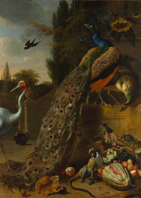
Actually, it’s a reflection of the painting over the sofa. It’s my reproduction Melchior D’Handecoeter painted in China. The first one they did, was horrible, so I told them that I wanted a refund. Then, the guy who was very nice promised me that they could do better and they did! It’s a lot of fun and the colors are amazing!
Sounds like a gorgeous laundry room! I love Scalamandre’s Marley. I have always loved those classic leafy tapestries. Nobilis makes or used to have a very lovely one too. And I believe that Schumacher has one that’s less expensive. Cowtan and Tout has a heavy linen. You can see it on my instagram account. Hold on…
https://instagram.com/laurelberninteriors/
I need to look into that heart chakra Emilia. That sounds quite interesting. Thanks for stopping by!
Yay for Green! I love how we never think of all the different greens in nature clashing with one another! I always appreciate the humour in your posts Laurel and the naughty language of course! They always make me laugh so thanks for that! I just painted my back entry BM Gray Wisp, a gray with a lot of green in it. Cheers!
haha! What naughty language? Once or twice, I’ve been admonished when I said something like “friggin” [yes, “friggin”] on someone else’s blog, to keep my comments “family friendly.”
Are they effing kidding? Where do they think I learned the words from? My kids would shock a sailor! They learned it on the school bus. lol Now, that they’re young adults, I have lost all control. That is if I ever had any anyway!
Gray wisp is lovely! xo, Laurel
Thank you for this post Laurel. In the past ten years I have been using various shades of green a lot more – cabinets, painted walls (BM “Spa”), wallpaper (Ann Gish) and bedding. All the shades created a beautiful, peaceful, soothing and inviting mood. I was asking myself if I was using it too much. But, now I will not doubt my growing love of green. It is natural and obvious to love this color. By the way, green is color of the heart chakra.
Laurel, thank you for the luscious pictures-you are just ahead of everyone else-isn’t Benjamin Moores color of the year, Guilford Green? Also, thank you for your great posts on Gray-I sent them to my daughter and she picked her colors for her new renovated kitchen from them. We loved the way you described each one,it was so helpful-thank you for sharing the secrets of your trade-you are so generous!
yes, lol it is Guilford Green. Ya know, I don’t pay all that much attention to that stuff because it’s all just marketing hoopla. Glad the posts are helpful!
Like Billy Baldwin, I’ve always been a decorator, never a designer. Yes, somewhere along the way, I read your story of the seedy and sordid world of FABULOUS Florida decorators masquerading as designers — perish the thought. Life in prison for those crooks. Worse than murder. (I’m being facetious — the state was beyond stupid in pressing charges, and I loved the photos you showed of so-called designers’ work. Still laughing) I prefer the term decorator. Oh, you know what I mean. I’ll get to the point — let’s see, what was the point? Oh, yes…
My worlds have always been green, in every shade. Others can have their neutrals, their blues (and indigos and teals), but give me green, more green, lots of green, loads of green. Spring, apple, emerald, chartreuse, forest, lime, avocado, and yes even the sometimes boring sage, and definitely envy green. Paint my world green. I’m with you. Smiles….