Ahhh, now that we are well into October, it always feels appropriate to bring out one of the most misunderstood, but actually awesome colors.
ORANGE!
I say misunderstood because orange is often thought of in negative terms. We discussed why a while back in this post.
And, in another old post, we can see that one of the most classical colors is actually orange!
However, the truth is that orange as a wall color makes for a beautiful, warm, back drop.
The lighter, more yellow shades positively glow at night. It’s a delicious color in a dining room. However, I am going to share many places and ways to use orange. And, by the end of the post, I hope that those of you who dislike this color, may begin to feel differently about it.
Even as an accent color, orange paint colors and furnishings are a welcome and refreshing note in an otherwise banal color scheme.
In addition, for all of you “orange haters,” it is very likely that you are already living with copious amounts of the color. Not all, but most wood tones are some variation of orange or its baked-in-the-sun-cousin, brown or rust. A favorite post featuring paint colors that look great with wood trim.
Orange adores its compliment which is blue, if you don’t already know that.
For one of my favorite posts on this magnificent marriage of colors made in heaven, click here.
The primary two companies are Benjamin Moore and Sherwin Williams. In secondary roles (but not secondary colors!) are Farrow & Ball and Pratt & Lambert.
These are all wonderful paint companies.
Kudos goes to Sherwin Williams for the tenacity it took to break through the Benjamin Moore monopoly! And for good reason. SW has a tighter more consistent line, over-all than BM. While the latter has many, many exquisite colors, there are too many duds, IMO. And, since Sherwin Williams has an exceptional collection of orange paint colors, I’m including them, as well.
Please don’t ask me about other brands. I am not familiar with all of them.
However, the numerous fan decks and some 3,500 Benjamin Moore colors is the reason I created the Laurel Home Paint Collection. And, I feel that sticking with one brand would be in everyone’s best interest.
It’s confusing enough with just one brand!
But, the paint and pallet collection is a wonderful tool to help you choose colors. Of course, I’m a little biased. ;] However, there is so much information in these guides that you can’t find anywhere else. And, I share which are the best trim colors for each color in the collection.
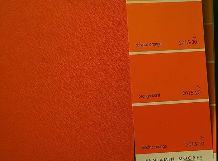
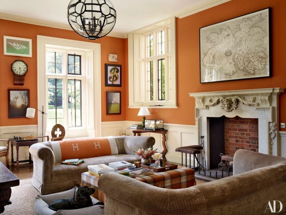
Someone tried to match up a Benjamin Moore orange paint chip with a Hermes handbog. The electric orange is pretty close. It’s actually REALLY bright!
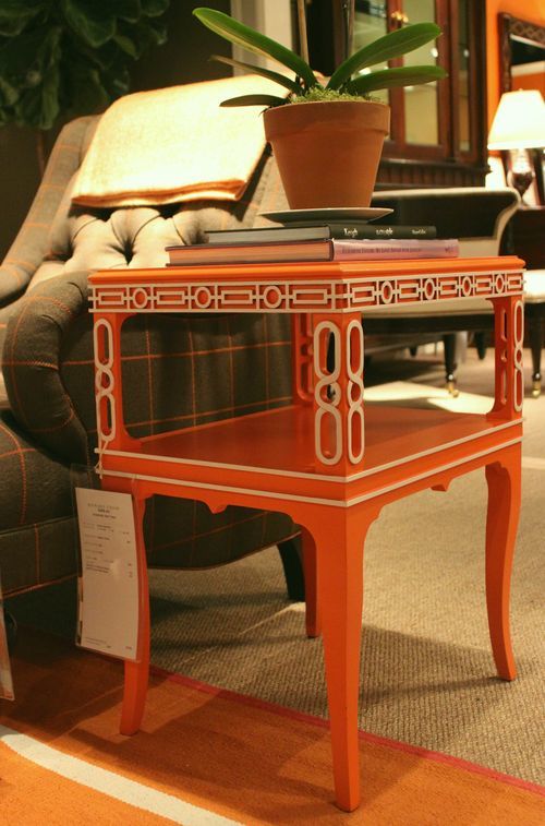
Love this chinoiserie end table which Alexa Hampton designed several years ago for Hickory Chair.
Now, that we’ve established just how cool, historical, classic and rich orange is, let’s get on with the point of this post which what are some of the best shades of orange paint to use on our walls. And, also, other ways to use orange in our rooms.
At the end of the post will be a shopping widget of home furnishings that will bring this vibrant color into your homes.
So, what are the best shades of orange wall paint?
*********
20 {GREAT} SHADES OF ORANGE WALL PAINT
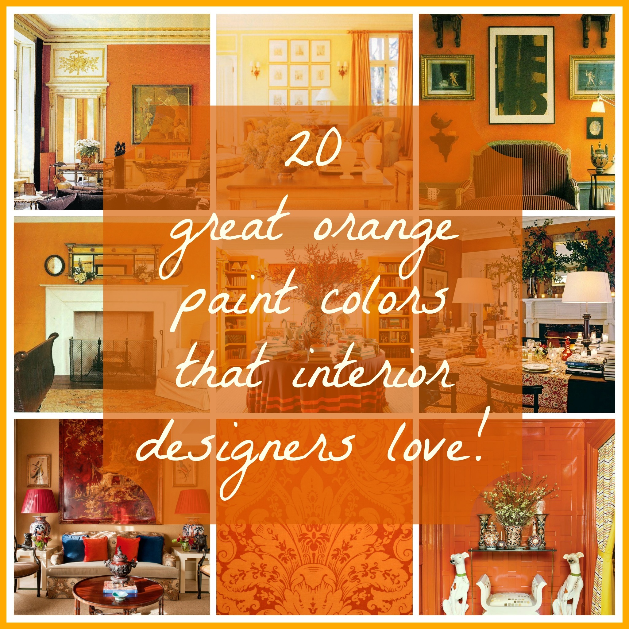
please pin this graphic to your pinterest boards for reference
*Before we begin, one important note*
The colors represented in the photos may or may not actually be painted the color they are representing. However, it really doesn’t matter because how many times have you seen a color in a magazine that looks nothing like what they say it is? Therefore, I chose images with great design that look close to the color I am talking about. In addition, some of these images are very recent and some were done years if not decades ago. Orange as we saw in the last post is timeless and forever.
Therefore, what I always say is this. If you love a color that you see in a photo, it matters not what it is in real life. Just match what you see.
We discussed this in a recent post.
In addition some of these images depicting the best shades of orange paint and furnishings are from clippings I’ve been saving for years. I love that. Because if something I saved 25 years ago still looks current, then to me, that is the very definition of timeless.
Let’s start with pale and work up from there.
This is a warm, wonderful, pale, pale warm, tawny peach. Farrow & Ball’s colors are always wonderful as they are made from complex formulas adding to their richness.
BENJAMIN MOORE PALE DAFFODIL 2017-60


This is a warm beautiful pale orange that glows like candle light.
The next two images are by one of my design idols, Stephen Shubel whose work I’ve admired since the 1980s. His blend of antiques with casual elements and soft, blushy colors has distinguished him his entire career.
This is a room from the early 90s. I remember because I cut it out. And then, I used that chandelier for a couple of jobs. It’s really cool!
In fact, you can see it here, in a dining room I did in 2003.
via – thelordedward.tumblr.com – David Hicks entry London
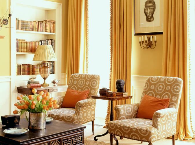
BM SEMOLINA 2155-40
Semolina is veering on yellow and a very cool, well warm, modern color. Totally fabulous for a “night room.”
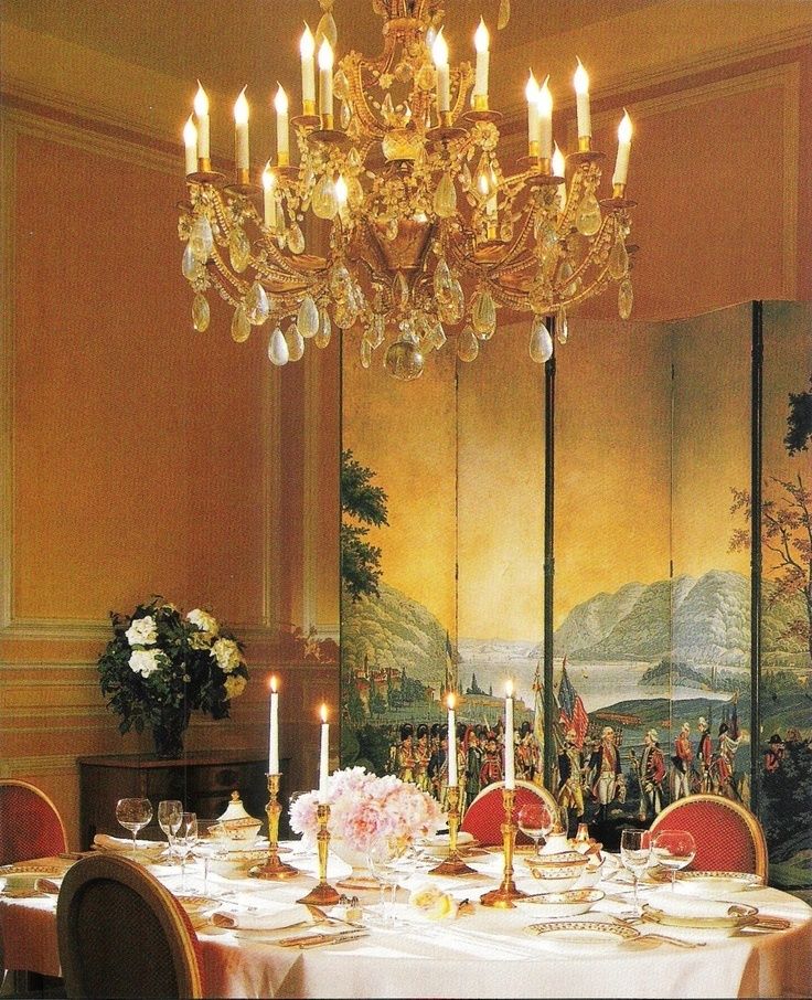
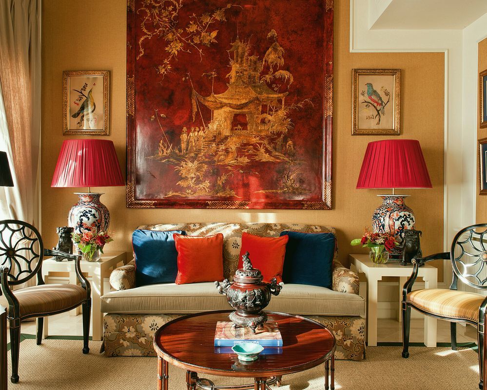
William Hodgins – Zuber screen dining room
The color? Who knows, but it looks like this.
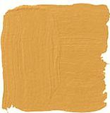
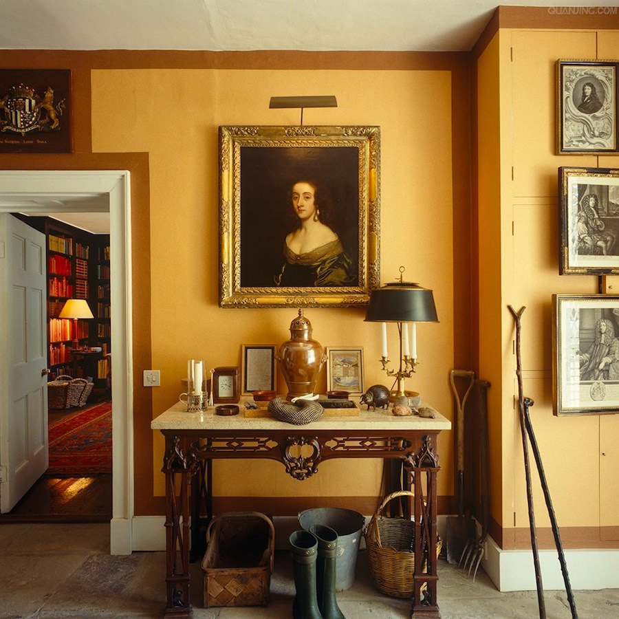
FARROW AND BALL ORANGERY
Interestingly, Farrow and Ball has archived this color. However, you can still get it.
The next three images are also in orangery.
This is one of my favorite shades of orange paint
above and below
Gil Schafer architecture and Miles Redd interior design
For more of this amazing home, click here.
Orangery is the color on all of the above.
This is not a pure orange but more orange than gold. It is warm and a wonderful choice for someone not ready to go with a more saturated orange.
Oh, if only we could truly test out a color and if we don’t like it, just flip a switch and it goes back to what it was.
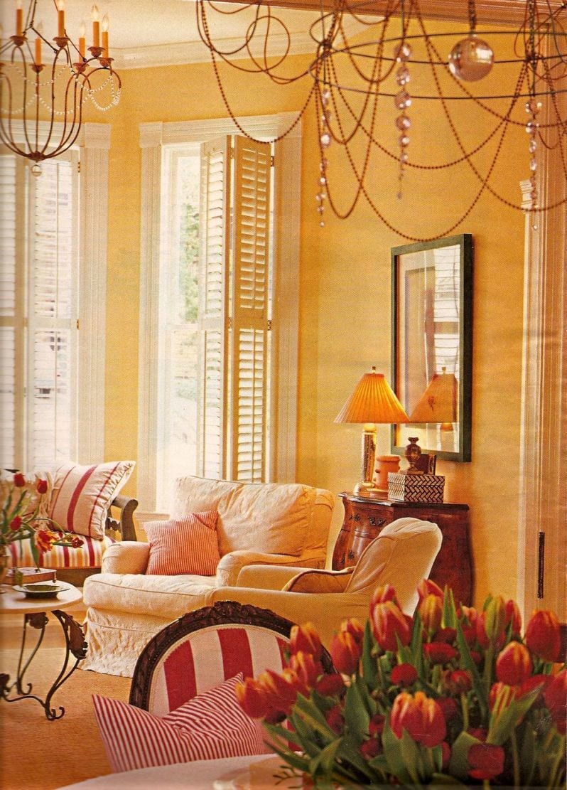
BENJAMIN MOORE 166 ORANGE ICE
Orange Ice is a color similar to orangery– just a touch lighter and brighter– but ice is a misnomer. The picture is attributed to Donald Kaufman who also has a brilliant line of paint, but it’s harder to get and I’m not as familiar with it. However, I do own two of his books.
BENJAMIN MOORE 168 AMBER
This is a dusty warm, terra cotta.
Miles Redd
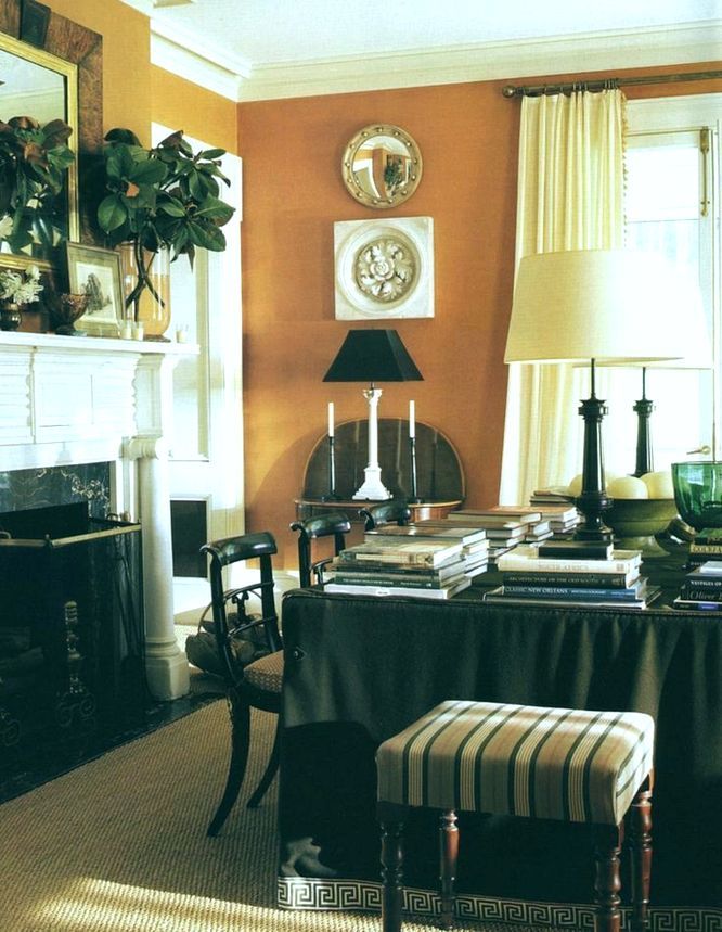
BENJAMIN MOORE 034 SPICED PUMPKIN
Spiced pumpkin is a color I’ve used a few times and goes up looking a bit brighter than it does on the chip. It is more rust than terra cotta and a very lovely warm, rich color.
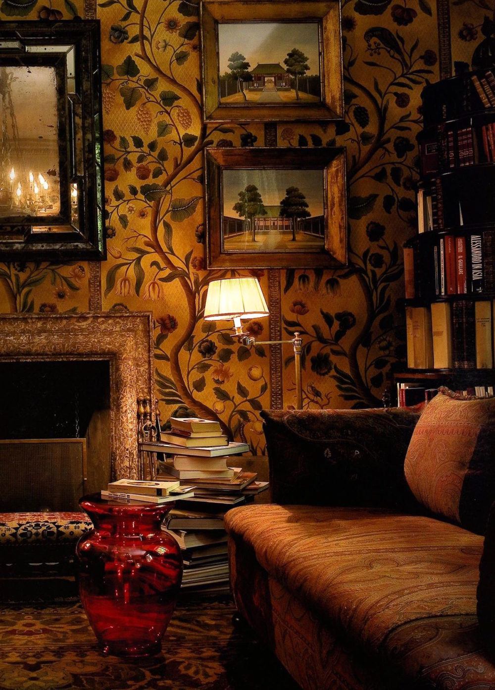
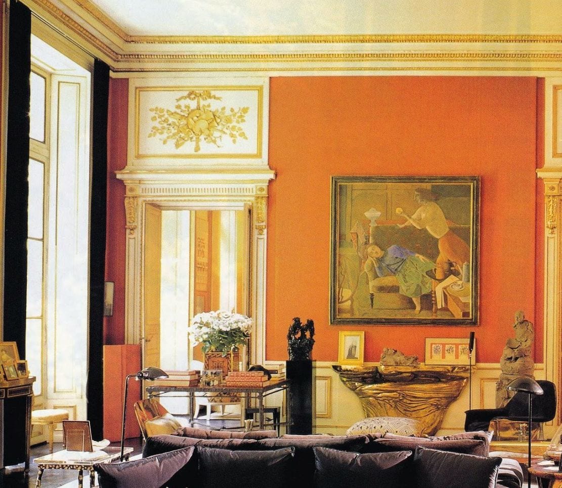
Amazing room by Studio Peregalli
I could not find a website for Studio Peregalli. They are an Italian duo from Milan, Roberto Peregalli and Laura Sartori Rimini. Their work is known internationally. I would classify it as old-world timeless. This article is a short interview with them about their process.
Sorry, at this time, I could not find out any further information about this room. However, if you know, please let me know.
If you’d like to see another cool room of theirs, click here.
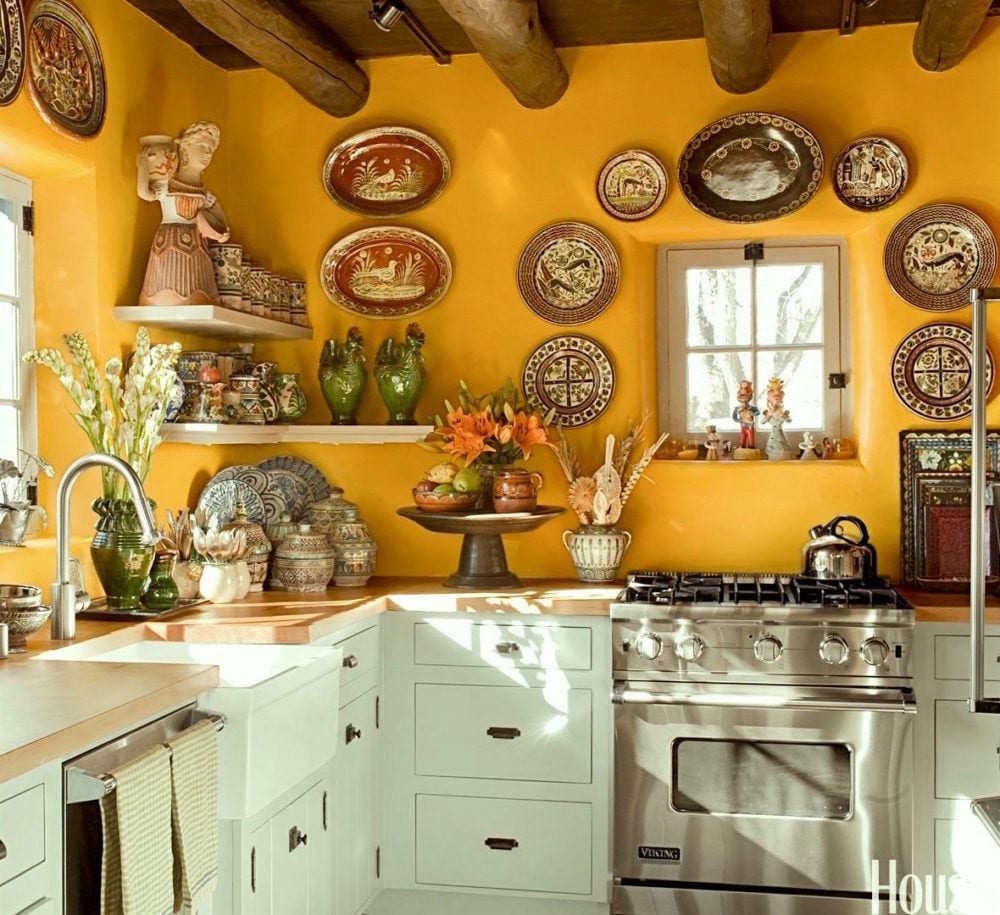
kitchen by Judith Espinar, Jim Deville, and Scott Robey. Photo Peter Vitale via House Beautiful
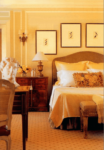
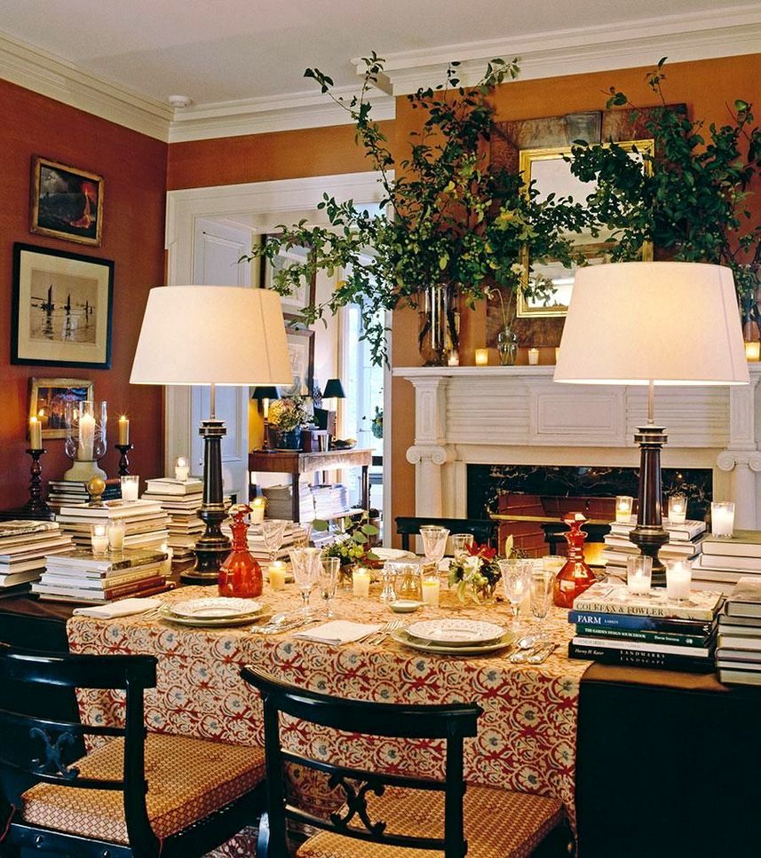
BM GRAND CANYON 118
This is more of an adobe colored light orange.
Makes a wonderful backdrop when used with brighter colors. And what a gorgeous color scheme here!
Miles Redd
BM BRONZE TONE 2166-30
BM BUTTERED YAM AF-230
design by James T. Farmer.
SW DETERMINED ORANGE 6635
Love that name. As you can see, determined is an orange with a lot of red in it, but still orange. I guess that’s more coral.
It’s funny that he describes this dining room as eccentric. The ONLY thing I find eccentric are the drapery rods. They are not parallel to the window as one end is attached to the fireplace wall.
Otherwise, the room is sublime! I’m just wondering if it was intentionally done that way or it’s a mistake they thought no one would notice.
Amelia Handegan
SHERWIN WILLIAMS 6647 EXCITING ORANGE
Exciting orange has a lot of life without being too in your face. I think it’s quite versatile
SW KUMQUAT 6648
Kumquat is a shade deeper than Exciting and also wonderful.
I’m going to let you in a little secret right now. I struggled the most with the SW colors. Why? Because they are all so unbelievably gorgeous! Really, I don’t think you can go wrong, but I still want to break it down for you.
So what shade of orange is Tory Burch’s fabulous library?
Ahhh… well, of course, these secrets are not given up easily if at all. However… I have examined this one very carefully and weighed in on other factors in the photos and the hands-down winner is…

SHERWIN WILLIAMS 6887 Navel
BM ORANGE BLOSSOM 2168-30
Orange Blossom is a soft coral color. Very pretty. Vignette via James T. Farmer on instagram

FARROW & BALL 268 CHARLOTTES LOCKS
Charlotte’s Locks is a densely pigmented color from Farrow and Ball. It has more red than a true orange.
BENJAMIN MOORE RACING ORANGE 2169-10
Another lovely orange red that’s not too bright

BM PUMPKIN CREAM 2168-20
These deeper shades of orange paint look so yummy lacquered!
BENJAMIN MOORE CORLSBUD CANYON 076
This is a very soft coral. Me like.
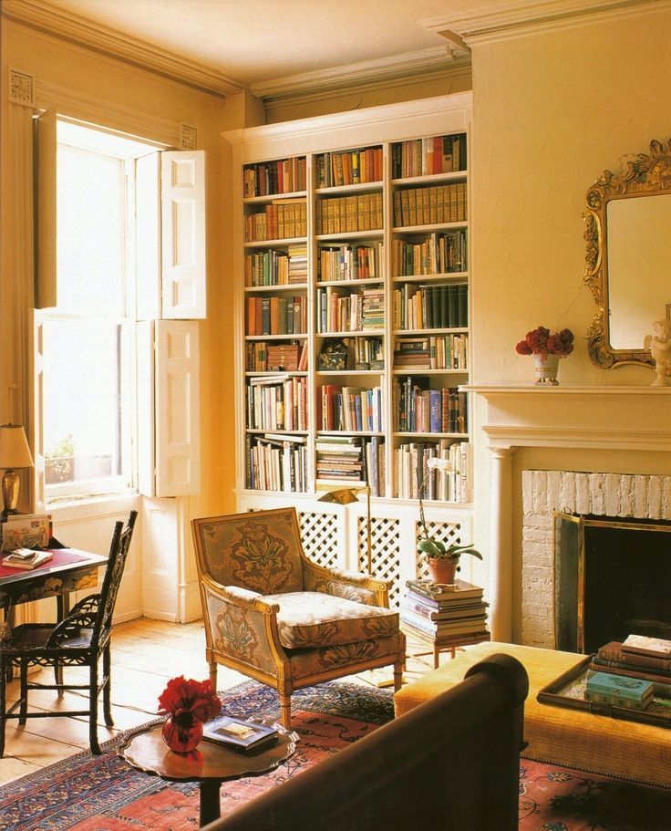
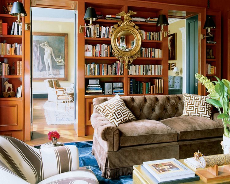
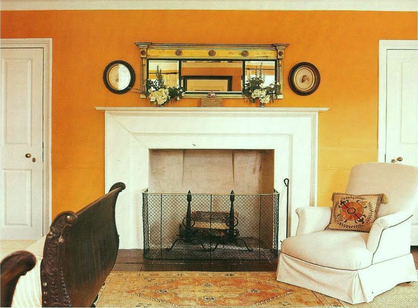
And finally our deepest hue for our 20+ best shades of orange wall paint– a rich deep saturated, warm rust. Perfect for a library or den
BENJAMIN MOORE 070 TOPAZ
This is a rich terra cotta and looks great glazed as it is here.
One last image from James T Farmer. I so adore his work. And, he looks like he’d be a lot of fun to work with too. The colors in this room are absolutely incredible.
If you enjoyed this post, this is one of my favorite posts about rooms with warm paint colors.
A reader wanted to know if they would look dated.
And, below is a widget featuring home furnishings with orange. Please click on the individual images for more information.

xo,

PS: Please check out the newly updated hot sales. Many fabulous sales going on this holiday weekend. And, the Serena and Lily sale is ending the 14th at 11:59PT
And, speaking of orange, a friend up in the Lake George of the southern Adirondacks invited me up for the weekend.
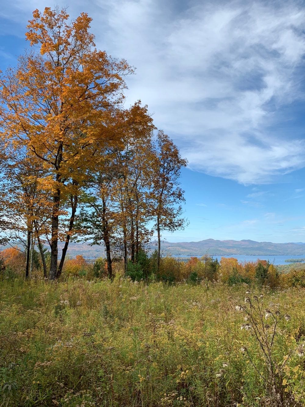
Fall foliage with Lake George in the background.
“
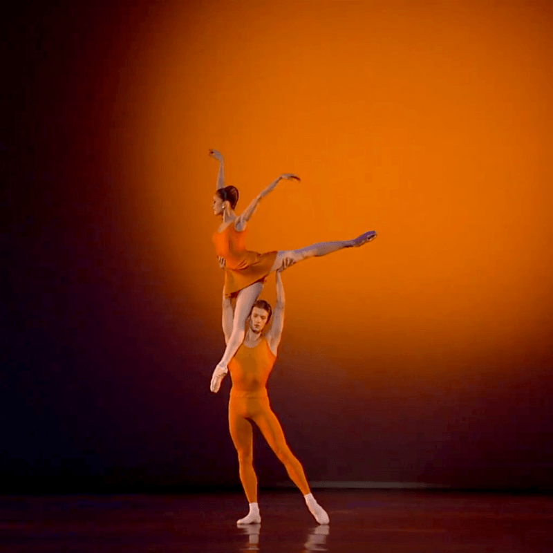
And, as promised , a cool photo of Marianela Nunez and Rupert Pennefather doing an exquisite pas de deux from Kenneth Macmillan’s Concerto.
Related Posts
 How To Style A Coffee Table and How Not To
 The 9 Best Kitchen Appliance and Refrigerator Makeovers!
 The Number One Interior Decorating Dilemma and How to Get Past It!
 36 Cheap Sofas and Chairs That Look High-End!
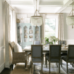 How To Mix Dining Room Chairs Like A Pro
 9 Little-Known Paint Colors Decorators Are Obsessed With
 Please Tell Me Your Biggest Decorating Problem


68 Responses
My living room is teal with burnt orange accents and one narrow wall painted orange. My bedroom is orange and black. Love it. Thanks for all the great photos.
Dear Laurel,
Thanks for a new word – lambrequins! I shall have to install some lambrequins just to be able to use ‘lambrequins’ in general conversation.
Great post, my favourite colour. I’ve used touches of orange to lift the rather sombre palette of my oh-so-trad house.
I wonder if I could sneak in some orange lambrequins?
You surely deserve nothing more than to be happy.
This was the best news ever..
xoxo
I LOVE orange! From pumpkin to terra cotta to coral – I love it all! I would change the adage “every room needs a touch of black” to “every room needs a touch of orange”!
I designed our bedroom a few years ago, and surprisingly, my inspiration room for our bedroom had orange walls! While I did not paint our walls orange, I used the color palette in the inspiration photo which was orange, yellow, and green with rich wood tones. We wanted a tropical feel to our bedroom. Our orange is in the curtains and a few pillows on the bed. It turned out fantastic. I am a die hard Texas Longhorn, so we do like our burnt orange, but it’s not usually a color I gravitate toward in design, though I do really love orange and navy. I think that’s why I’m wanting more navy in my home, as I have a lot of orangey wood tones and I need to balance out the warm with a cooler color. I am often inspired by colors in nature, and orange is no exception (though we don’t get fall colors here in central Texas, but we do get some beautiful sunsets), but I usually gravitate toward cooler colors, probably because it’s so dang hot here! Thank you for your insight on this color.
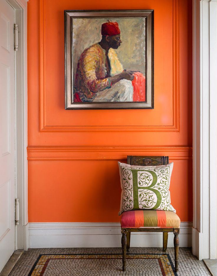
I was also fascinated by the portrait. I thought it looked familiar but apparently not: from the slideshow to a 2013 NYT interview with Sheila Bridges “The painting Ms. Bridges found at the 26th Street flea market.”
Thanks for that information Ivis!
Love orange! Love to wear it, and I have it sprinkled throughout my desert southwest home, mostly is rust, terracotta, and golden shades. And I love that photo of you on the ATV 🙂 We have a place up in the mountains and that is the funnest thing we do – ride ATVs all over the place!
helluva lot of fun riding on that thing.
I do love these shades of orange. My kitchen started out a beautiful dusty rusty terra cotta, and it looked fab. BUT. It was a hot room. Every time I walked in, I psychologically felt the oppressive heat that was outdoors was seeping into my kitchen, when all I wanted to do was cool off. I soon found that my favorite warm “northern” wall colors had to get iced down after I moved to a much warmer climate. Something to consider.
It’s funny, but the most prevalent southwestern/Mexican colors tend to be the warm tones. I never understood that. Why warm colors when it’s already so hot?
Laurel & Barbara: I found this a great look too, so rooted around Google to find out more. In my experience, Command strips are totally useless. The adhesive plate hangers Laurel references get negative reviews for silver trays, but there’s one blog which gives advice for using them: clean the back of the tray very thoroughly, wet the adhesive and allow 5 minutes to become tacky, apply to the tray, place a heavy weight on the back of the tray and dry for 8 hours before hanging. This she says works well.
But I note that even those who are fairly happy with the system says that the adhesive holds for about 6 months only, so would need to be replaced at such an interval.
My own idea would be to use magnetic paint on the wall and then about 6 heavy-duty magnets on the back of the tray. After several coats of magnetic paint, you can cover it with the normal wall paint with no loss of adhesion, thus the magnetic panel is invisible.
That’s a brilliant idea Gilly! I did not know that there is such a thing as magnetic paint. I’m wondering if there are any other issues with it. That’s the sort of thing I hated using my clients as “guinea pigs” for lack of a better word. Sometimes, we just had to, however.
The problem with having a father who believed in purchasing the highest quality carpeting he could afford was that the burnt orange shag he installed in 1970 was still there in 1993 when my folks moved. This post made me think of him and smile. . .
Hi Laurel! Once again you have read my mind. I am still (slowly) working on my dining room/living room. I started to wonder why I couldn’t wrap myself around all the blue and white, not that it isn’t lovely, but because I realize now that I am a “cream” person. I love the oranges, leaf greens and deep blues, but not bright whites.
I was so happy to see Schumacher Celerie Kemble Hot House Flowers in Spark in the widget…I just sent out my wing chair to be reupholstered in that fabric. I love that the background color is creamy and I will use some of the orange and blue throughout the room. It is bold and should really wake up the room!
Looking forward to sending you pictures when I am further along.
Looks like you had a lovely time in NY state, so glad you are taking time for yourself.
Best Always,
Pam
I’ll look forward to seeing that Pamela. Sounds like it’s going to be a gorgeous room!
I think the best use of orange has to be the Nancy Myers set design in The Parent Trap movie London townhome — the staircase with the art wall with the orange hue was fabulous.
Dear Laurel,
Loved that post – so much so that most of the rooms were already scattered all over my Pinterest boards! Happy to have the paint colors though.
If no one has given you the information on the Studio Peregalli room, it is in an Art Nouveau building in Milan. The sofas are covered in antique cashmere, the stylized trees are painted on a golden ochre background. Drop dead gorgeous! You can find much of their work in “The Invention of the Past,” published by Rizzoli in 2011.
Thanks so much Barbara!
Gorgeous post, Laurel! My mom painted our kitchen walls a very bright, saturated orange in the 70’s. I was a teenager and I thought I was going to die of embarrassment. Hahaha! Now, I love orange in just about every shade. The examples you featured are beautiful.
Isn’t it funny how our tastes change over the years.
Thanks so much. I find that my taste has broadened, but the basic things I’ve loved since the late 80s, I still do. However, 70s orange was a different animal, because it was usually paired with dark brown, that sickly green and gold. That’s a difficult combo to make look good.
Last week I thought the painted brick blog was my favorite, ever. This one on orange ranks right up with it! Most of our first floor walls are painted tawny peachy gold. All the things you say about it is why I love it. The way art looks against it, how it turns to candlelight in the evening, how it becomes sunny in the morning. Years ago everything was cream in my home. No more! Thank you, Laurel!
You’re welcome Patricia!
For a NY woman you look pretty happy on that tractor thing!
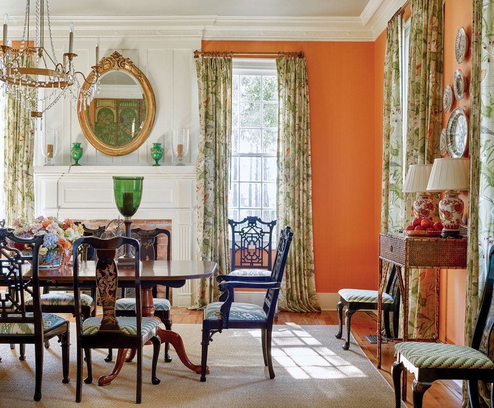
The first 2 James Farmer photos look like the same room to me although you attribute 2 different paint colors.
I used to hate this color, then used a lot of it in one of my upstairs rooms. Now I really like the energy it brings.
Yes, yes, and yes!
Love those orange rooms, although I would lean toward the terra cotta side, rather than the really saturated orange.
BTW, my daughter was married last October and chose orange and navy as her wedding colors! Just beautiful!
I must be one of the few people that really loves orange – everything from the palest apricot, to coral, to sunset, to the orange color of Hermes boxes. I love them all. Thank you for this warm, cheerful orange post, Laurel. (Great picture of you on the tractor. I’m guessing that’s what that is. I’m not a farm girl.)
Hi Lisa,
That is an all-terrain vehicle and helluva lot of fun to ride as a passenger.
Thank you for all the orange ideas! I like orange and do not like grey so this is great. I still miss a sofa I had upholstered in bittersweet corduroy and at the moment I’m sitting on an adobe colored sofa.
Ps my Christmas tree is decorated mostly in gold and white.
I once decided to paint half the family room (divided by a chair rail, the other half was a darker warm white) in a deep rusty red….but it dried on the wall looking like the “Amber” room in your post! I was horrified at how orange it looked and only painted one corner! But the more I looked at it, the more I loved it, and we ended up using the orange! That room was shady and we used it mostly in the evening, and what light we did get just made the room glow! It also set off the darker wood furniture and leather we had in there. People always loved that room and Often didn’t even notice half the room was orange until I drew their attention to it! Great post 🙂
Well, there it is!!! :]
Perfect post for Thanksgiving weekend – Canadian Thanksgiving, that is. I love how you provide a different lens to see things through. I would have labeled may of these colours yellow before reading this. Happy TG and enjoy your get-away.
Thanks so much Gail!
You did it! I came into this thinking how much I hate orange…then I realized it was the solution to a problem I had. Planning to paint an old (late 80s) pine cabinet with lots of dark brown knots–a very solid piece. It’s in the dining room I painted navy last year. I just couldn’t decide…gray, black, green…Then I bought 3 succulents in terracotta pots, put them there, and loved the way they looked! (the pine is almost a light terracotta color now) Also realized that hanging above this cabinet is a framed poster from a Cézanne exhibit in the Orangerie–a painting of oranges that I thought looked fabulous against the navy wall. You explained it all! I will not paint the cabinet but I do need to change out the 1980s round wooden knobs. That will be a wonderful decision to think about! Thank you Laurel!
You’re welcome Ivis!
Wowza! You really outdid yourself with beautiful photographs this week! I can’t stop looking at them. Several years back I selected SW Dishy Coral for my guest bath. Before the painter started, he said “you’re going to hate this color”. I loooooove it with my indigo blue accessories, and I’m still not tired of it. Laurel, would you happen to know anything about the painting of the Moroccan man in the red fez in the Sheila Bridges photo? I am in love with it. Thanks for a great post!
Sorry, Roxanne, I don’t know anything about the painting. As for the painting contractor. Yawn… It’s getting old now.
Laurel,
I laughed when I red the subject of your email. I’m not an orange person, and I don’t wear it. I can remember one orange sweater that I owned in the 1970’s that I wore with a lovely orange and brown wool plaid skirt. And of course my house was decorated with the typical 70’s decor. I haven’t used orange since, yet I find my favorite holiday decorations are the Fall colors I put up immediately after Labor Day and remain until after Thanksgiving. And I do love the Fall colors in nature. Go figure! Your photos are lovely and a good representation as to how these colors can be used successfully for those who love the color!
Beautiful post, Laurel. I never tire of reading about colors and seeing them in a well appointed setting. There are some colors in your post that didn’t catch my eye in the color deck. Just goes to show that a well designed and artfully decorated room can certainly sell a color! I have some favorite BM colors but, as you mentioned, so does SW and I have found the SW website much easier to navigate for sample color sheets. SW also does a lot in my area with workshops and they are very generous with their color kits and decks. I must admit having the SW colors divided into 8 small binders with 3×4 inch removable samples has made me an even bigger fan.
Thanks so much Tricia!
Gorgeous post – glad to have found your blog!
I love orange in small bursts, there’s almost nothing like it for giving a room or piece of art the finishing touch. Given that I have a lot of old oak (ie orange wood) – this might be why I gravitate away. Thanks for the aha moment there. I also have a hard time wearing orange, especially bright shades. Laurel, do you have an opinion or theory about using colors in the home that are also in your wardrobe? Have you found a connection between the two in your experience? Just curious.
Hi Paula,
Certainly, if you wish to color-coordinate your wardrobe to your decor, that’s fine. I guess most people gravitate towards certain colors. So, it stands to reason that they might use the same colors in their decor as their wardrobe.
Great inspiration, Laurel! Orange shades have such a warm, welcoming feel, and you’ve collected the best of the best images of them! Determined Orange was on my short list of weird paint names LOL – It ended up not making the cut as there were even weirder ones (Farrow and Ball is infamous in that department!), but I am continually amazed and amused by paint color names!
Just a bit of trivia…..Orange was Frank Sinatra’s very favorite color….Now Ole’ Blue Eyes, cannot be wrong…!
Indeed!
Great post, as usual! I love the creamy oranges as well as the saturated ones you featured. Orange can scare the heck out of people because the wrong one can be hideous. But when used in the right palette, it’s a stunner for sure.
I’m partial to saturated colors dating back to the Sunkist orange bedroom I had in the 70s when I was a teen. My sweet dad lovingly painted it, including the ceiling! With hardwood floors and a medium blue Karastan carpet it looked fabulous.
Thank you for sharing your knowledge and ideas with us! Orange surely is timeless… Mother Nature features her in the sky, the leaves, North Carolina clay soil, and the sun that makes life possible.
It’s true. Colors found in nature are always timeless!
Wonderful photos! I have always been drawn to orange, and am seriously considering painting our sun room one of the SW colors above (Navel, Kumquat, or Determined Orange). I think orange would be a beautiful backdrop to green foliage seen through the windows. Thank you for this inspiration!
Love these beautiful, rich warm colors, Laurel! They bring to mind one of my favorite rooms ever: Gil Schafer’s remodel of an 1860’s New York Town House/Apartment living room. The design is by Miles Redd. I was hoping to see your thoughts on that particular wall color. Do you have any ideas as to what it might be?
Beautiful shot of you in the great outdoors! We don’t get those gorgeous fall colors down here in the deep South. Sigh.
That home is in this post, but older images than maybe you have seen before. And it’s featured even more, in another post. I think I linked to it. Not sure. I can’t see the post from where I’m moderating comments. Hang on. Here it is!
I love orange. Biggest problem is Christmas…always buy any orange ornaments I can find to use with caramel, chocolate, mineral blue and olive. I have an unusual Christmas tree.
So good, as always. I have historically shied away from orange citing it too bold or jarring, but these vignettes are gorgeous. Now I’m wondering how i can incorporate more orange into my life!
Love these warm, glowing spaces. Sadly, I am not adventurous enough to paint walls in deep colours (I actually just finished repainting all the walls to cover up some pretty dismal dark colours), but I LOVE orange, and particularly orange and blue, so I confine myself to using it as an accent in pillows, etc. (although I see now I could branch out to side tables and chairs…). I use orange and blue at Xmas (with green), rather than red.
Hi Paula,
It’s funny, but I actually looked up orange for Christmas decor.
So glad you were able to get away! One of my best friends lives close to Lake George, and it is indeed a lovely spot to visit. I loved this post–such beautiful images. I am inspired to find some orange accents to work into my decor. And you do look quite “boss’ on that vehicle, whatever it is. All the best to you!
Connie
That is an all-terrain vehicle and it is called such for a very good reason. My friend is an expert driver, but we went on some very rough paths! Too much fun!
Great photos and discussion. I notice more and more orange front doors lately, any thoughts on that?
I guess it depends on the shade of orange and what the rest of the house looks like.
Hi Laurel – just wanted to share that I love your middle of the night blogs when I’m up feeding my baby! They are something to look forward to. You wrote your Parisian dream home blog after my comment. 🙂
So sweet. Thank you so much Courtney!
Wait a minute, the two Farmer pics (dining room and vignette) are the same room, so in real life same wall colour. Just goes to show how photography can change the colour.
I have experience of using F&B Orangery on walls. A word of caution: it’s saturated and pretty bright!
The walls shown here are mostly broken up (with architectural elements, artwork, mirrors, plates, etc, so that there is no single vast expanse of the colour — an important point, I think. But the rooms are indeed stunning.
Hi Gilly,
Great points! And yes, colors like orange, especially look best with art, etc. and walls broken up with doors and windows.
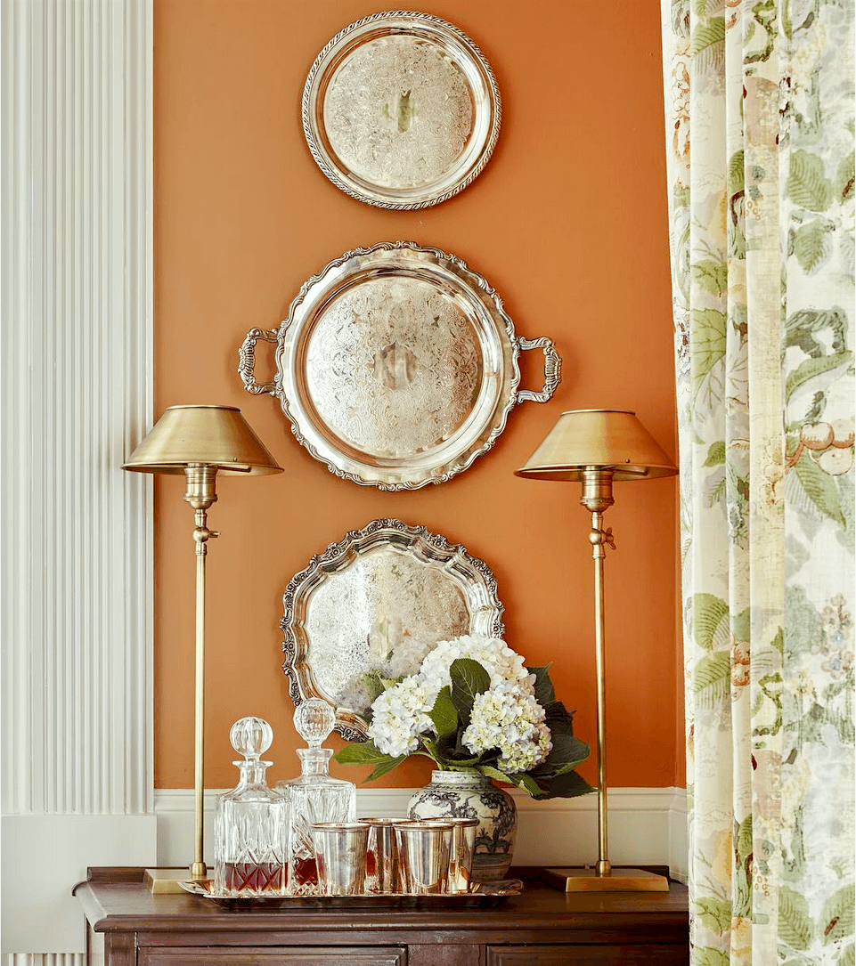
Wow! I would have never considered orange, but these rooms are beyond gorgeous. Thank you for opening my eyes. I am also intrigued by the silver trays hanging on the wall in the James T. Farmer photo. I have beautiful trays that aren’t used–how in the world did they do that?
Thank you for your fabulous posts.
That’s a very good question, Barbara. I found this product. These self adhesive discs come in different sizes. But, I think something like this would work. There are undoubtedly other ways. If this doesn’t work for you, perhaps do a google search.
Dear Laurel, thanks for a timely post – again! I am just forcing my husband to paint some cupboard for my office/library. The outside is denim blue (from a norwegian company), the inside is similar to Charlotte’s Locks from F&B. He thinks I’m nuts – now I can show him your posts! Take care!
haha!
I love orange! I have it living room and my showroom. I have an Navy blue buffalo check soda in front of it and it’s stunning!
Love orange and navy!