Hi Everyone!
Happy 4th of July if you live in the USA!
Guess where I am?
Yes, I’m back in Northampton, MA. I’m here for the holiday, and also the new house is getting a big inspection on Monday.
And, I’m happy to say that things are moving along quite nicely.
I’m almost ready to sign a contract with a closing date of November 9th. And, it’s unusual, but the sellers are allowing me to move in on September 1st with rent going towards the purchase price.
That one thing alone is a huge plus, given the closing date is still over four months away. It gives me a huge head start in getting things ready to go.
Soooooooooooo… How are y’all doing?
I’m so happy to be here in Mass. And, am once again struck by how much more conscientious folks here are about mask-wearing and social distancing.
Oh, and guess who’s keeping me company again, while I’m working?
Yes! My darling Joe!
Where are we?
We’re back at the Elm Street Inn, a four apartment Airbnb in the historic district on Elm Street. And, believe me, this place IS the real deal and has been lovingly restored. I highly recommend it.
So, let’s get into the subject at hand which is the biggest decorating mistake we ALL make.
And, when I say WE, I mean Me too! Although, only for myself. When I was taking clients I would obsess over every detail.
Of course, the biggest decorating mistake is decorating without a plan.
I don’t care how straight-forward you think your room is. It rarely is.
But, sometimes, the space is so incredibly challenging, it’s infuriating. Did the builder give ANY thought to furniture placement? Apparently not.
It’s so frustrating, you feel like screaming. It’s not coming together and you’re so afraid of making an irreversible decorating mistake!
Raise your hand if this is you.
Oh, man. I tried to take a selfie with my hand raised, but I forget to attach my third hand to snap the pic!
But, even worse, is just going out and buying a bunch of furniture without a plan. That is going to result in a whopping decorating mistake, almost guaranteed.
And, this mess was published. Please tell me how is one supposed to open the cabinet doors? There’s a lot of logic in this business. But to avoid hideous decorating mistakes like this one, you need a plan. I can’t say it enough!
To create a decorating plan, you need to do a room layout, floor plan or space planning, we call it.
With the view to go over how I create my floor plans and using myself as an example, yesterday I began working on the plan for my soon to be spectacular double parlor living/dining room.
In my mind, I already pretty much had it “all worked out.” But, after all these years, I should know better.
But, I don’t.
What’s the problem? Working things out in our heads can only take us so far. And, therefore, it’s exceedingly dangerous as our mind can play tricks on us. This is the biggest decorating mistake.
However, I knew with almost 100% certainty that I would not have two seating areas like sickly talented Steve Cordony created in his Rosedale Farm home.
But, here’s where not having a decorating plan can get one into BIG, expensive trouble.
And, we ALL do it.
We start fantasizing and imagining. And, then we start LOOKING at stuff. And, sometimes we find things that we like– a lot.
For instance, the other day I found the most amazing round dining table.
However, it’s 66″. And, that’s a pretty big table. Is it too big?
The table above which I had custom-made for a client is 72″ and opens up with one large leaf.
I love a big round dining table. And 66″ can comfortably seat 8 and maybe 9 if the chairs are 21″ wide or less. And, the people aren’t too large. Round tables are a little more forgiving in terms of getting more people around them, I think. Normally, you should allow at least 24″ per person. If you seat 9, you only have 23″.
***For hundreds of other rules you need to know,***
please consider getting my 333 Rules and Tips You Need to Know Guide Book. It’s only $49 and I think well worth it for the vast amount of information in it. Please click the link for more info.***
Laurel, can we see the table?
Ummm… sorry, but no. And, here’s why. It would be easy for some of you to find it. And, I don’t want anyone scooping it up from under me.
My point in even mentioning it is that we must be careful not to get seduced by what we think will work before we know that it WILL definitely work. That is definitely a decorating mistake you can’t afford to make. And, yes, as I said, I have foolishly made purchases without knowing for sure.
If you have an already existing room, and you see a piece of art, or lamps or end tables; that sort of thing. Then, yes, all need to know is if the dimensions work for you.
Oh, I hope the lovely sellers are not reading my blog. I don’t want to make them nervous.


But, that amazing double parlor living room as magnificent as she is– nearly empty, is the bitch of all bitches.
And, here are some of the reasons why:
- the room is wildly asymmetrical– all four walls. And, from front to back. I mean, nothing lines up.
- Let’s also not forget that this 33-foot room is the only pathway to get to the bedrooms, bathroom, kitchen, keeping room and three-season porch– from the front door.
- That means that there must be a MINIMUM THREE FOOT PATHWAY, the entire length of the room!
- But, it shouldn’t look like all of the furniture is hanging on the other side of the room. Just one more ball-busting challenge after another.
Could I possibly open up the hallway that’s currently closed off?
Oh man, that’s another story. It is a possibility, however, we are talking a tremendous renovation, which equals big bucks. And, there are trade-offs, as well. For instance, I would lose the double parlor, and maybe even one of the fireplaces.
In my initial attempts to conquer this space, I tried putting up two small walls of about 2-3 feet. It didn’t matter where I put them, it pretty much sucked; at least on paper. However, if this happens. Please take heart. Do not throw in the towel immediately. That’s also a decorating mistake.
I can’t tell you the number of times I began to work on a client’s room layout and it wasn’t going so well.
Stressful, much?
I would leave the plan out where I could see it. Sometimes just coming back a few hours later, I began to see something I missed the first go-around. And then I’d sleep on it. Well, not ON the plan. You know what I mean. In the morning, with fresh eyes, I always saw things differently.
In addition, sometimes, I needed to work with some of the client’s existing furniture. Well, I have the same issues when I design for myself.
I realize too, that most of you are doing your own decorating.
So, you need to be extra vigilant and take extra care. Decorating mistakes are incredibly easy to make.
Therefore, before you get serious about purchasing anything, you absolutely must create a floor plan.
Now, I want to go over HOW to create a room layout. This is the key to avoiding costly decorating mistakes.
More details are in the 333 rules and tips guide, but, this should be enough to get you started.
Here is what I recommend that you do:
- You begin by giving yourself a little quiz. What do you want to be able to do in this room? How many people would you like to be able to sit in it (comfortably)? The people before us used this room as the dining room, but maybe this should be the family room instead because we don’t need such a large dining room? You explore the possibilities.
- I would go to a place like Staples and buy a pad of 1/4″ graph paper. 1/4″ will equal one foot. Then measure the perimeter of your room with a heavy-duty steel measuring tape like contractors use. (I recommend a 25 footer). I do a rough draft on my pad indicating an approximation.
- Then I go back and redraw it on a new sheet using my architect’s scale (see below) for a more precise measurement. For a straight edge, I use my ruler (architect’s scale). I was taught to use something else, but it really is not necessary, IMO. As you do your drawing, you will map out where your doors and windows are and a fireplace, if you have one. If you have a furniture template in 1/4″ scale, that would be very helpful. I have used one exactly like the one below since 1988 and you can order one like it here.
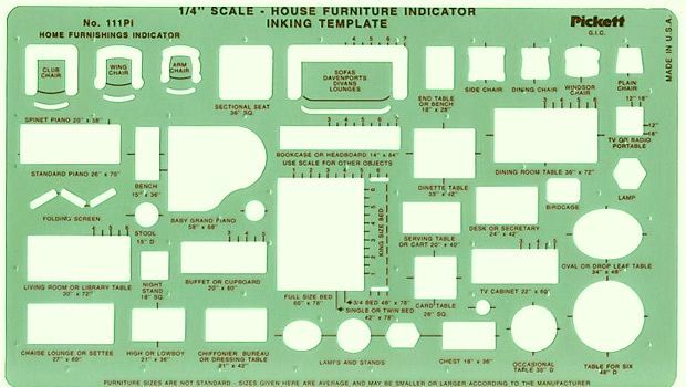
You will also benefit from using one of these tracing templates.

Don’t get nervous. If you are not familiar with this handy device, we call it an architect’s scale. (using it will make you feel like a badass architect.) It’s really just a ruler with different scales of measurement. You will be using the 1/4″ scale. :]
Don’t worry. It’s clearly marked. You will need it to more accurately scale out the inches. Don’t worry if you are a couple of inches off here and there. That is alright. Once a new client gave me a floor plan measured by someone else.
Well, the room was actually 42″ LONGER than indicated on the drawing. Yikes is right! And that was not the first time that had happened.
So, that is another decorating mistake I dodged at least twice.
Do not rely on other people’s measurements no matter how qualified. (of course, if you hired someone and they goofed, that’s on them.)
This will be your FLOOR PLAN. The floor plan is as if you were a bird and looking straight down at your space. Oh, and yes… there are online ways to do this and quite frankly, I still don’t use any of them. And, doing your own hand-drawn floor plan is fun and frighteningly easy.
(shhh… this will be our little secret as some of the other designers want you to think that it’s some complicated thing that takes YEARS to learn. It doesn’t.)
- You will also need two or three really sharp #2 pencils with erasers. However, I prefer those yellow mechanical pencils. You never need to sharpen them.
- Then after you have accurately drawn the perimeter of your room, you can start playing around with the space planning. This is really a lot of fun and the most essential thing you need to do before you get caught up in the quagmire of purchasing new furniture.
Quick Space Planning Primer
- Create a sense of entrance. Do not block the major entry into the room.
- Make sure there’s a focal point and build your seating area around it.
- You will need about THREE FEET for major passageways. Or at the very minimum—30″.
- The space you need between a sofa and coffee table is about 12 inches.
- Try not to line all your furniture up against the wall. No more than one case piece on a wall unless it is a pair of something flanking a doorway, window, or fireplace.
- Do not overlap furniture at right angles.
- Once you have your space planned, now is the time to think about what those pieces will actually be. Some will be easy. Say, you know that you need a sofa. Should it be 60″, 72″, 78″, 84″, 90″? Depends.
However, bear in mind that unless the room is for watching TV, 99% of the time, no matter how long, the sofa will only sit two people for conversation.
So, don’t let the salesperson try to sell you the standard 84″ sofa, when you only have room for a 72″ sofa! Figure out what other seating/pieces you need and draw them in using your template.
- You might want to do this while looking online at specific manufacturers and seeing what pieces you might like that they are selling. (Do you have Laurel’s Rolodex? It is chock full of 100s of wonderful vendors!)
- Think about scale. A lot of today’s furniture is REALLY BIG. The store will have pieces in a vignette, but even though, it is still in a LARGE room with a very high ceiling usually. Please pay close attention to scale. But also, do not make the mistake of getting only very diminutive furniture for a small room. (I know… sounds contradictory, but it could make it look too much like a doll-house)
Feeling stuck? Even more scared, confused? I know, I did too, in the beginning.
Okay, it’s time to take a closer look at my darling bitch of a room.
I have two versions of the plan.
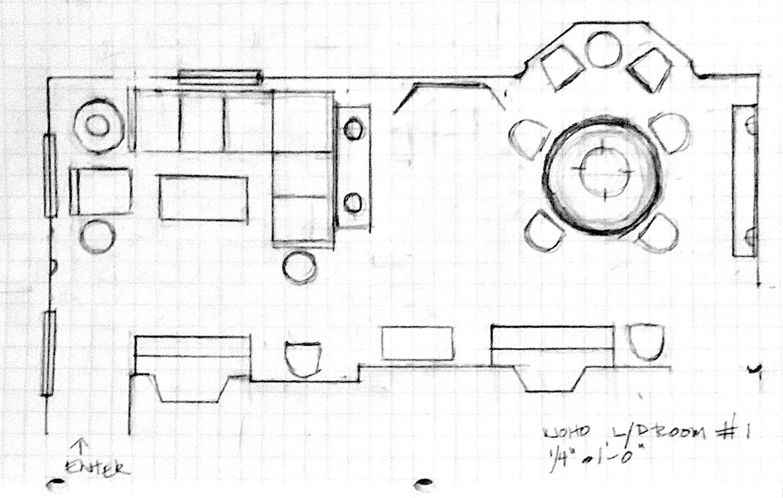
Version one features a sectional from Serena and Lily and the large dining table. Rather than keeping all of the chairs around the table, I created some other places for some of them.
The table, here, is centered on the bay window. To the right of the table is my large, medium height painted bookcase.
Please note the prominent spot for my lovely Zuber screen. (you can see it here behind my desk)
I think that this is a very good first attempt.
I don’t really know if I want a sectional for this house. If the space were strictly for TV viewing and I had a good-sized family, it would make sense. Or, if I had frequent gatherings of 6 or more people. I don’t in New York, but six people in my apartment is already getting close to the limit.
I think the size of the table is fine. Although a round table that opens up with leaves would also work. It’s a toss-up, except I could see doing some beautiful styling on the large table which would be stunning.
Let’s look at version number two.
After I did version one, I began to see where the small walls could work!
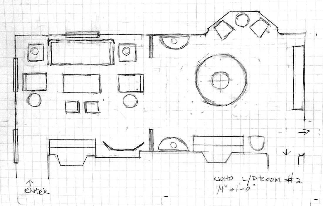
Please note that I created a symmetrical seating area which is a lovely way to enter the room.
I also moved the screen and the way it’s placed, hides the uneven walls. And, for occasional TV watching, I could mount a TV behind the screen. Move the screen, for viewing. And then, put it back when done watching TV. It also hides the thermostat.
The sofa is one of my favorites that’s often in the One King’s Lane widget on the HOT SALES page.
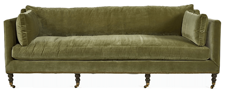
Margot Sofa, Moss Green Velvet
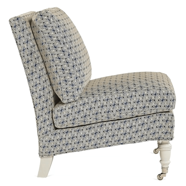
I also love the lines of the Lewiston Slipper Chair by Lillian August.
It’s reminding me of this post where I was bemoaning the paucity ( a big word I learned from my wasband) of the pretty club and slipper chairs.
I keep seeing all or most of the upholstery slip-covered in heavy off-white denim.
I’m not going to show any more furniture at this point. Again, it’s really best to have the plan in place, before selecting specific pieces. Sometimes, if there are two or three viable plans, then one can see what’s out there that will make the plan come to life.
This time, I centered the dining table on the fireplace. I think that over-all, this is a better location for the table for this floorplan.
Where are all of the dining chairs? Well, three are in the room. The other five are in other parts of the house. If company is coming, just gather them up and put them around the table.
Another option would be to use this chest I’ve had for years, instead of the bookcase and put the bookcase in the keeping/breakfast room. Then, on either side of the chest, I could add two more chairs.
The bookcase would fit on either of these walls, perfectly.
I also incorporated my two demi-lune tables.
Of course, there’s more.
Which of these two plans do you prefer?
Well, I hope this post has helped you. And if for no other reason than from making a whopping decorating mistake.
It’s so easy to do. But, if you have a cohesive and comprehensive furniture plan, you’re less likely to make one. However, if you want to read about more hideous mistakes I made with fabrics and upholstery, please check out this post.
xo,

Related Posts
 Beige Decor — How To Make It Go From Boring To Sensational!
 To Brass or Not To Brass In the New Un-Bathroom
 The Secret For A Cheap, Chic Kitchen Refresh
 New Traditional Decorating – Little Known Ideas You’ll Love
 The Frieze – One of Architecture’s Hottest Elements
 Subway Tile Alternative Everyone Knows About But Me
 A Secret for Creating A 25 Color Whole House Color Palette


