

Yes, I know. It’s August 16th, and there are still 4.5 months left for 2023, and we’re already talking about the Sherwin-Williams COTY 2024. They announced their choice on Monday.
Persimmon HGSW6339

They call it Persimmon.
It’s part of their new Renewed Comfort Color Collection.
If that’s the case, then why have I been so nauseous writing this post? And, does it mean that their previous collections were meant to make folks uncomfortable?
In addition, I don’t recall ever seeing a persimmon this color. It’s closer to red clay.
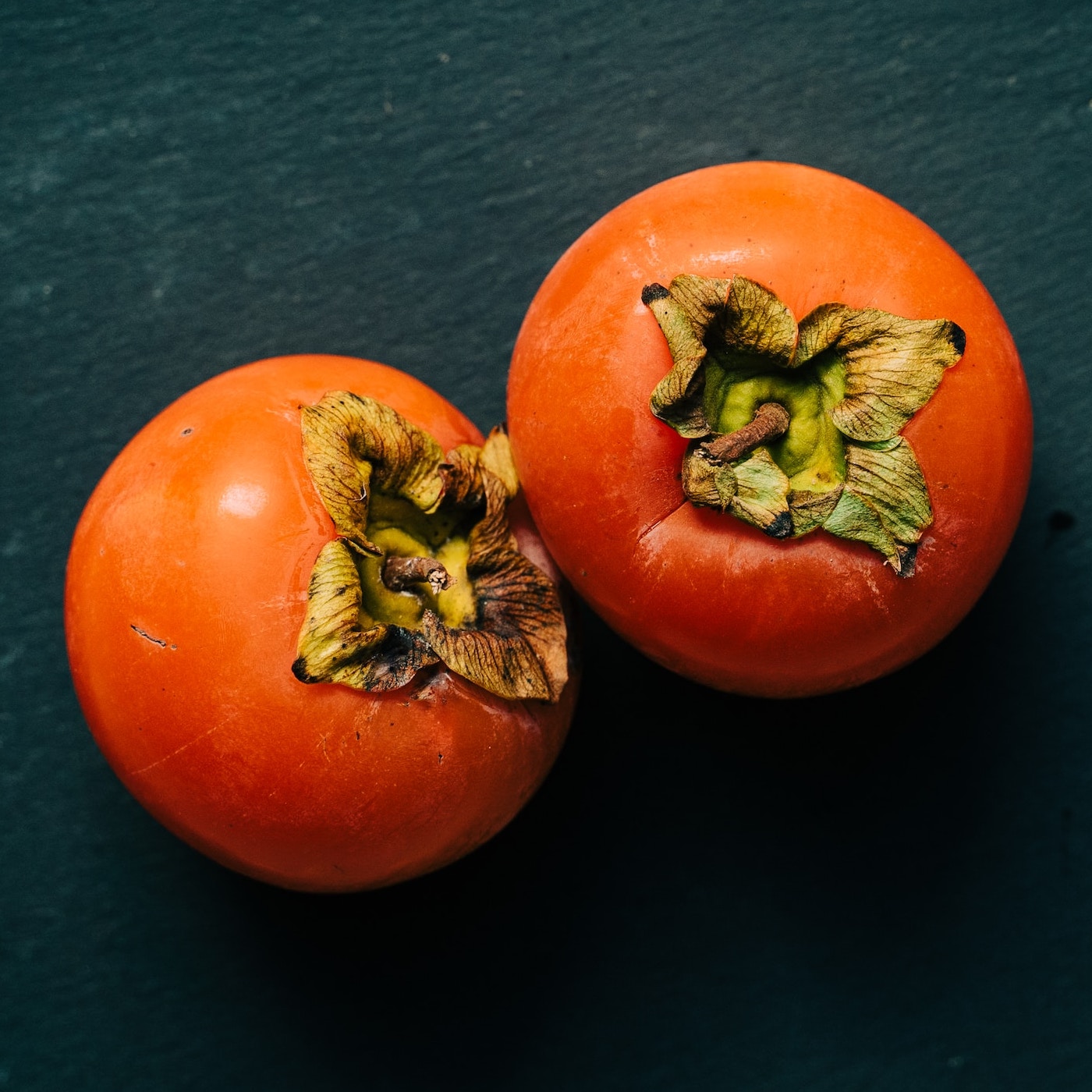
Photo by Gabriella Clare Marino on Unsplash of two persimmons.

According to this website, the hex code for Persimmon is #EC5800.

Or, hex code #FF5733.
The top one, I think, is closer, but these are radio-active persimmons. Haha.
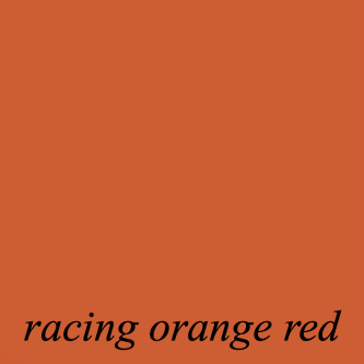
Benjamin Moore’s Racing Orange Red 2169-10 is one of the best representations of a persimmon color.
This is a color I’ve featured many times and one of my favorites in the Laurel Home Paint and Palette Collection.
But, the mystery of the name was solved when I read that the Sherwin-Williams COTY 2024 was previously named:
Pave’ Peach HGSW2085
Aside from the misleading name, is it a good wall color?
Well, it’s not the worst, and it’s a far cry from the massive failure of 2023’s horrid Redend Point; still, I long for it to be a little warmer and deeper. The problem with this color is that in the wrong hands, it could quickly look a little tired and dated. However, it might be nice in a darker room and at night with some warm lights on.
In any case, if given an architecturally stunning room, this or a similar color could work.
S-W’s marketing lacks the styling that helps colors look their best.
Another issue about the S-W choice for COTY 2024 is; I can’t find any rooms that have used this color. Not always, but most of the time, it might be a good idea to look at another paint color.
However, I found one very close image, and it was easy to manipulate the color to look like Persimmon.
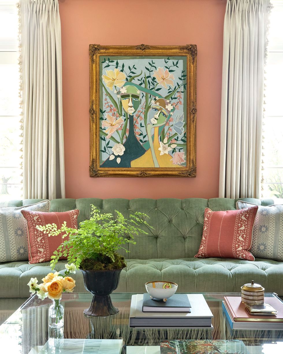
photo-Aimee Mazenga – design – Alexandra-Kaehler
It looks lovely here, but the thing is, it’s only an accent color. Please check out the link for some other beautiful spaces with coral colors. The real color is Benjamin Moore Mesa Peach.

Benjamin Moore Mesa Peach 1200
I’m not terribly fond of this color, either.
However, the Sherwin-Williams color below, I think, is fantastic.
The color above is the next color in the fan deck and a little deeper. Sherwin Williams Baked Clay 6340. They featured this historical home on their website.
In addition, Sherwin-Williams has some other gorgeous colors I would’ve preferred to see instead of the lackluster Persimmon.
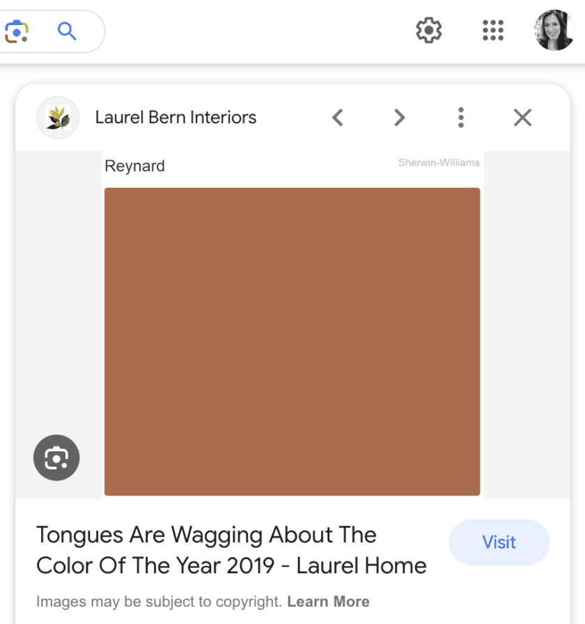
One of them is Reynard sw 6348.
But, here’s what’s funny.
During my research, I came across this:
I began chuckling to myself when I saw that I chose Reynard back in 2018 as the preferred COTY over the one they selected.
Another place you can see a similar color to S-W COTY – Persimmon is in Gil Schafer’s portfolio of the William Gatewood House.
Below are two more S-W colors I prefer over Persimmon.
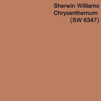
Sherwin-Williams Chrysanthemum sw 6347
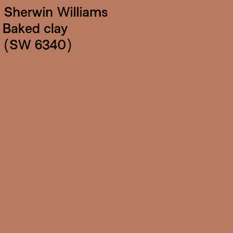
Above is Sherwin-Williams Baked Clay sw 6340
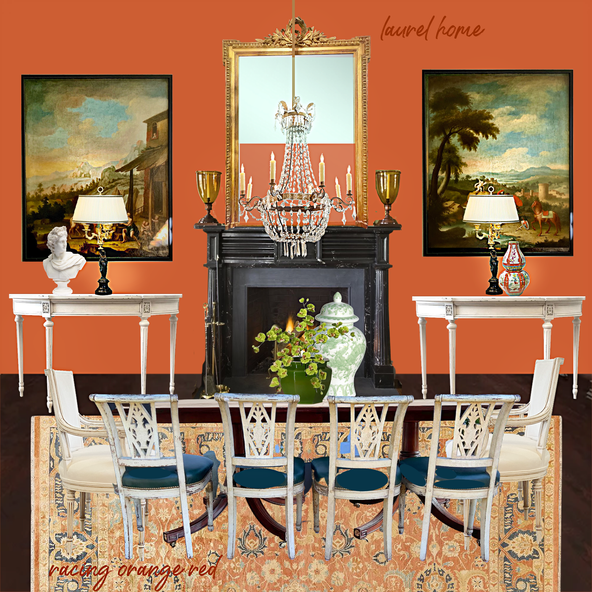
Last year I did the board above with Racing Orange Red. As I mentioned earlier, this one is wonderful if you’re looking for a beautiful Persimmon color.
While doing one of the more muted shades, I feel they look best a little deeper than Sherwin-Williams’ COTY selection.
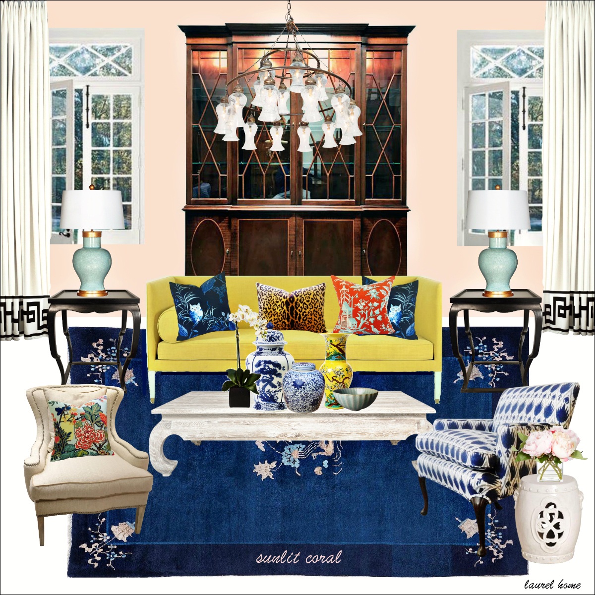
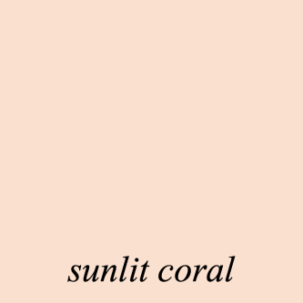
Otherwise, I think this color family is easier to work with in the more pale shades, such as another Laurel Home Paint and Palette Collection Color, Sunlit Coral 2170-60
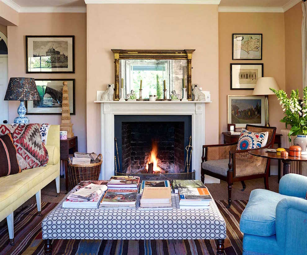
Ben Pentreath’s charming living room inspired the board above.
What do you think of Sherwin-Williams’ choice for COTY 2024?
I think the problem with these colors is that the words peach and mauve got demoted after the 80s glut of those colors. I confess. My bridesmaids wore peach-colored dresses for my wedding in 1988.
xo,

Please check out the recently updated HOT SALES!
There is now an Amazon link on my home page and below. Thank you for the suggestion!
Please note that this website is a free service. However, it’s very expensive to run. To provide this content, I rely on you, the kind readers of my blog, to use my affiliate links whenever possible for items you need and want. There is no extra charge to you. The vendor you’re purchasing from pays me a small commission.

To facilitate this, some readers have asked me to put
A link to Amazon.com is on my home page.
Please click the link before items go into your shopping cart. Some people save their purchases in their “save for later folder.” Then, if you remember, please come back and click my Amazon link, and then you’re free to place your orders. While most vendor links have a cookie that lasts a while, Amazon’s cookies only last up to 24 hours.
Thank you so much!
Your support of my work and website means the world to me!
Related Posts
 Sisal Rugs Shocker + A Gorgeous Home You’ll Want To See
 30 Cheap Table Lamps + Sources + What Size to Get
 A Common Renovation Mess – Can it be Fixed?
 My 20 All-Time Favorite Benjamin Moore Paint Colors
 Coffee Table Styling Using What You Already Have
 Original Old Home Details – Is it OK to change them?
 Residential architectural Mistakes – Easy Fixes


37 Responses
Great post–I couldn’t agree with you more! It’s an awful color. I think what you show as a true persimmon color is interesting, but not that dull, odd shade. Blahhhh!
I will never forget my first bite into a persimmon as an army airborne bride in Fayetteville, North Carolina, in 1979. The neighbor women had encouraged me to try it as they said they loved them. I did, gagged, and spit it out in front of people.
Although the persimmon I ate was not the SW color, the SW color was gag-mo once more!
It’s not my favorite, but I can’t say I hate it. I’ve been seeing similar grayed peach-like shades lately in Scandinavian design – on exteriors in Malmö, Sweden.
This is specifically the HGTV home Sherwin Williams color — so no surprise this isn’t popular here. I suppose it’s to try to warm up the white, black, and grey. Does feel really eighties.
I agree, this is a color waiting for a bad outcome! One of the folks responding said that it would be ok as an exterior color on a Victorian home – well, I live in an 1890’s (what some would call a Victorian) house – and NO, this neighborhood in Connecticut is in the National Historic Register and the colors of our homes are appropriate to the architecture of the houses. Olive, mustard, cranberry (food colors all!) – yes – “Persimmon” NO!
No. Uh-uh. Absolutely not.
This color of the year looks well past its best before date, like it has been lost in the back of the fridge. Bring on the fresh persimmons!
Sherwin-Williams should hire you as a color consultant Laurel!
WTF?!
Just add some Navajo White, turquoise and a howling coyote figurine along with some fake native pottery and we’re back to the early 90’s
Yuk! It’s terrible. So blah!
My sister in law painted her living room this color in 1992 and it was awful. I agree, if the color were actually the color of a persimmon it would be beautiful. This color? Not so much.
I was expecting worse after the barf of last year, but I can see this easily working in New Mexico. They have much different sunlight out West.
It matches perfectly, a clay pot on my porch, that is decorated in bright red, yellow green and blue SW theme.
Warm colors are not comfortable to me – soothing cool tones work well. I think we’re stuck with all shades pink for 2024 ala Barbie. I even saw pink for Halloween. Yuck!
My bridesmaids wore peach too! Exactly this color in 1993. It was a thing. I even let them choose what they wanted.
Well, in terms of paint colors, I think it could be nice for a bedroom or office, but not an exterior unless it’s a Victorian in Florida or South Texas.
agree with Commenter who said this is a sea change signaling the gray battleships are sailing off into an orange hued sunset… can pinky beige be far off in its (ignominious 😳) return?? I’ve now lived long enough to have watched all the real estate photos of interior walls go from a warm beige to gray…. and we’ll see what it’s gonna do from here on out….(!)
It looks like old Silly Putty! Not a fan.
But I love the way your readers are now (almost) as funny as you. The gross bandaid and tomato bisque soup comments had me laughing out loud!
1979 wedding: maid of honor in shades of peach! And we all think we’re original.
Sugar and Spice by Sherwin Williams was very popular in 1990’s in the south, especially Lafayette, Louisiana. My favorite for years!
Sorry, don’t like it. I’m a blue and green person.
Horrid! I had a soft peach nursery and used a very light peach in my living room in the 90’s and loved it. I would never use this color, even in small doses.
Yuck! It looks like a gross Band-Aid.
This color was popular in the early 90’s. What goes around, comes around.
IJBOL, Love your humor! Sherwin Williams needs you as their consultant.
It is so difficult to assess any colors on a laptop. These look too orange for my taste. I used Canyon Clay SW6054 in my laundry room and I love it, although the SW description says it has a cool violet undertone?
Yowee my wedding dress was pale peach in 1985. Im a redhead with blue eyes so a good look! LOL To keep with the theme I sponge painted my dining room pale peach in 1992 and I also had an apricot velvet sofa in my LR that I paired with shades of blue. Love a sophisticated pale peach that isn’t pinky. This SW COTY Persimmon however makes me gag. Too neon. Love you Laurel! From Marsha H a Southern gal
Yowee my wedding dress was pale peach in 1985. Im a redhead with blue eyes so a good look! LOL To keep with the theme I sponge painted my dining room pale peach in 1992 and I also had an apricot velvet sofa that I paired with shades of blue. Love a sophisticated pale peach that isn’t pinky. This SW COTY Persimmon however makes me gag. Love you Laurel! From Marsha H a Southern gal
I love tomato bisque soup but don’t want it on my walls.
In the 1920’s this colour was called Tea Rose. My mum made her bridesmaid dresses in Moss Crepe in this shade. I’m not mad about this shade and I would never use it. It is a bit Blah.
My bridesmaids wore “apricot” for my wedding in November 1975…
I accidentally ended up with a colour like that by asking my local Dulux centre to colour match me something they decided they had a named colour for. Yuck. Washed out terracotta does nobody any favours. I ended up mixing a deeper version myself from odds and ends and a box of artist’s acrylics. But even with some depth you need skill to decorate with these colours. They don’t look right with a white trim or ceiling for one thing. I just love the Alexandra-Kaehler picture though. It’s perfect.
You were being kind. The color is hideous!
Not a color I would choose. Maybe an accent color in small doses. I agree with other comment that I am sick of grey so bring on some inspiring colors
To say I am underwhelmed is an understatement. BUT at least it’s a color and we are ( hopefully ) done with the days of sad grey and cold white. Shudder.
Rotted persimmon perhaps? Yuk! I wore a lilac floral print at my sister’s 1982 wedding and peach for my 1990 nuptials. Thankfully, I’d put my head on right by the second trip down the aisle and wore a cream silk.
IMO, They’re trying too hard. Big mistake. We need to surround ourselves with grounded colors, colors that soothe us and inspire cooperation. Instead they give us murky and ambiguous. Comfort? Doubtful.
Those colors are horrid. They look like skin. I can’t imagine what furnishings would look good with them. Did they go thru the color wheel and just say – here’s a color we’ve never used.
Your choices are infinitely better! Baked clay or chrysanthemum should have been chosen over persimmon, honestly. However, I could see persimmon being used effectively in smaller amounts with a contrasting color, such as the green in the House Beautiful photo, but its not for me as a wall color.