Hi Everyone,
It should come as no surprise to anyone reading my blog for a while that one of my favorite interior designers is Mark D. Sikes.
Everything he touches is absolutely beautiful and masterfully designed.
Mark understands scale, proportion, and color and greatly appreciates classical architecture and furnishings.
Therefore, when developing the best bedroom ideas, Mark D. Sikes’ work is one of the first places I go for inspiration.
Oh, I hope he’s gotten oodles of new jobs as a result of my writing about him many times over the last eleven years.
(Next week is my 11-year blogiversary!) However, I imagine, being one of the top designers, his fees might be more than most of us can afford.
So, this is for those of us who admire and want the look but can only afford a far smaller fraction of the price. I’m breaking it all down and have combed the marketplace for some less costly options.
To begin with, we’re going to look at some of my favorite Mark D. Sikes bedrooms, and then at the bottom, I’ve created a widget filled with the best bedroom ideas and furnishings based on Mark’s work.
One thing I love about Mark’s designs is that one could take a piece from bedroom A and use it in bedrooms B or C.
His color palettes for all rooms, especially bedrooms, tend to be one of two possibilities.
A monochromatic tone on tone with white, cream, beige, and a touch of a soft gray-blue.
Or, a bedroom that is light blue with cream and white.
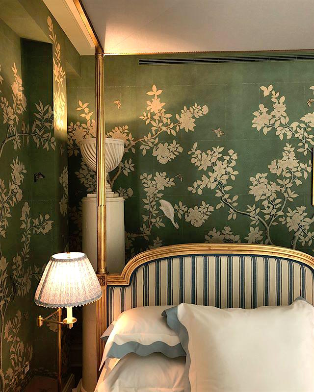
However, a few years ago, Mark did this stunning bedroom for the Kips Bay Showhouse, which was primarily blue, green, and white.
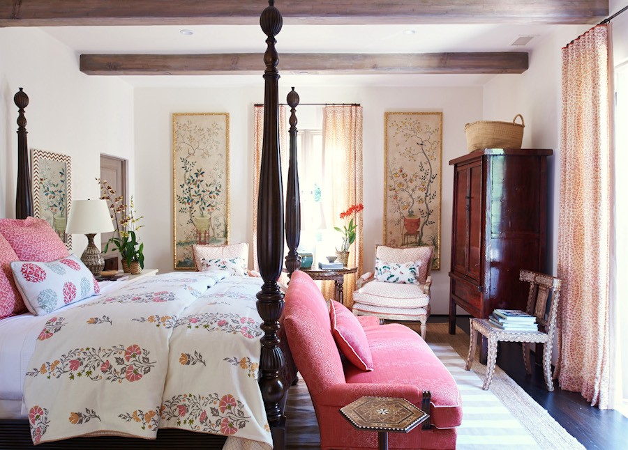
And, he also did this gorgeous room that incorporated some beautiful pink and rose tones.
However, the next two bedrooms are so similar that I needed to take a very close look at first glance. And, actually, they are quite different but have the same feeling.
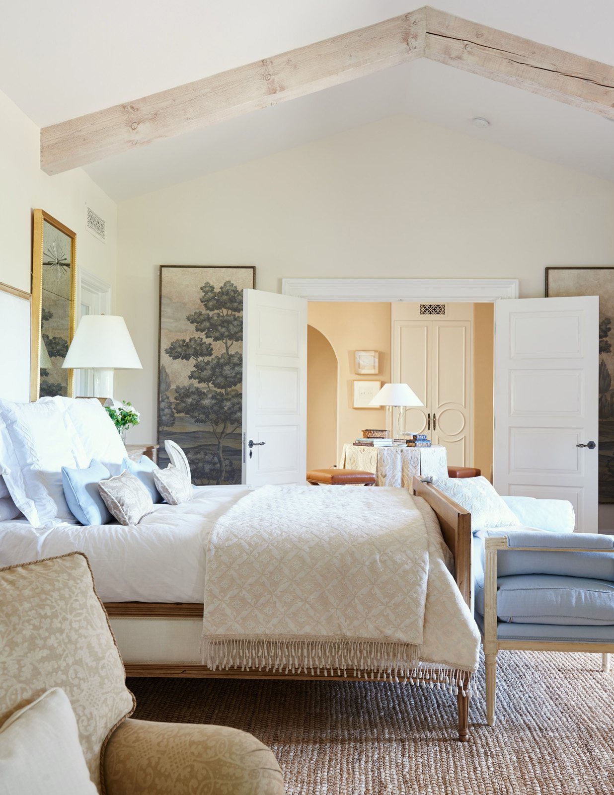
Above and below are two wonderful bedrooms designed by Mark D. Sikes.
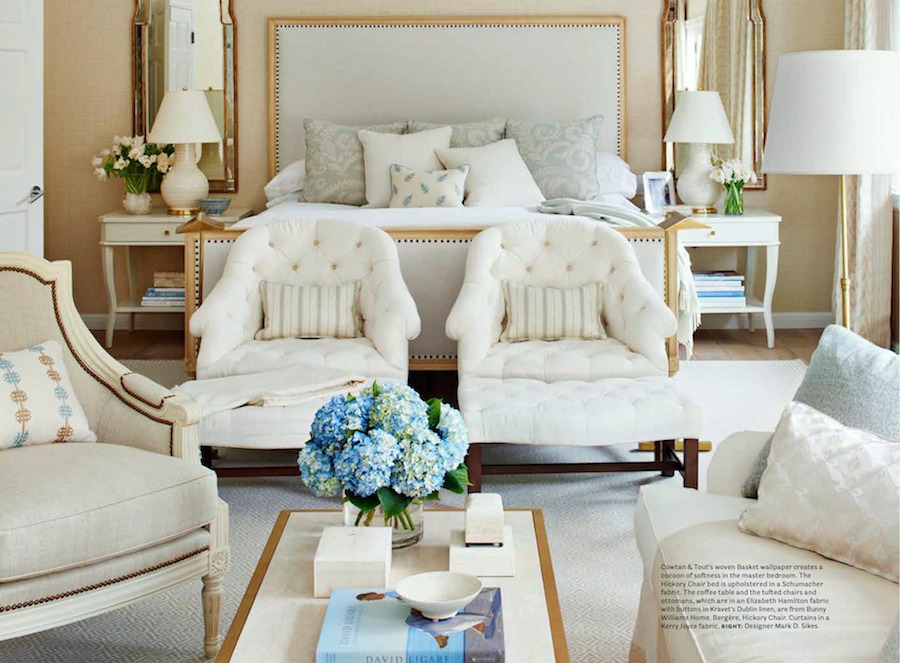
House Beautiful November 2016 photo: Amy Neunsinger
There’s a lesson there.
Using a master designer like Mark D Sikes as the inspiration for the best bedroom ideas and furnishings or any room usually doesn’t matter if one gets the exact item.
In fact, since Mark sometimes uses antiques or has custom-made pieces, it would be impossible to copy his rooms exactly.
In addition, we might have a room quite different in size and architecture.
But, what I love about Mark’s bedrooms is that they are:
- super easy on the eyes with soft, flattering pale colors
- classic
- stylish
- beautifully coordinated without there being any matched sets.
We all know the latter is a big no-no, if possible. (Please read 21 Interior Design Mistakes You Might Be Making.)
But, Laurel, I already did that no-no, and now what will I do, freak out?
No, please don’t freak out. Despite what it might seem flowing out of my hand, there are many things FAR more important than whether the furniture is a matched set or not. However, sometimes part of the matched set might work in another room. Then, you can get something else that coordinates and solve the matchy-matchy problem.
Before I get into the bedroom furnishings, some of you old-timers may also recall another fairly recent post, how to get the Mark D. Sikes look for a lot less money.
Here are two more Mark D Sikes bedrooms used for inspo.
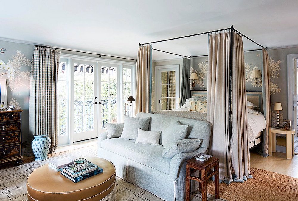
These, as you can see, have more emphasis on blue shades, but still have plenty of warm neutral colors, and white. Also, notice how Mark infuses this room with black accents.
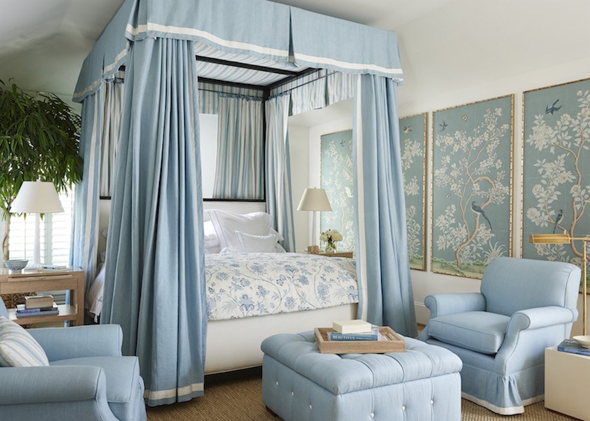
Mark is well-known for using Chinoiserie panels in many of his rooms, especially his bedrooms, as you see above. The ones he’s using are usually created by Gracie and are super-expensive.
There are many places where you can get more affordable Chinoiserie panels.
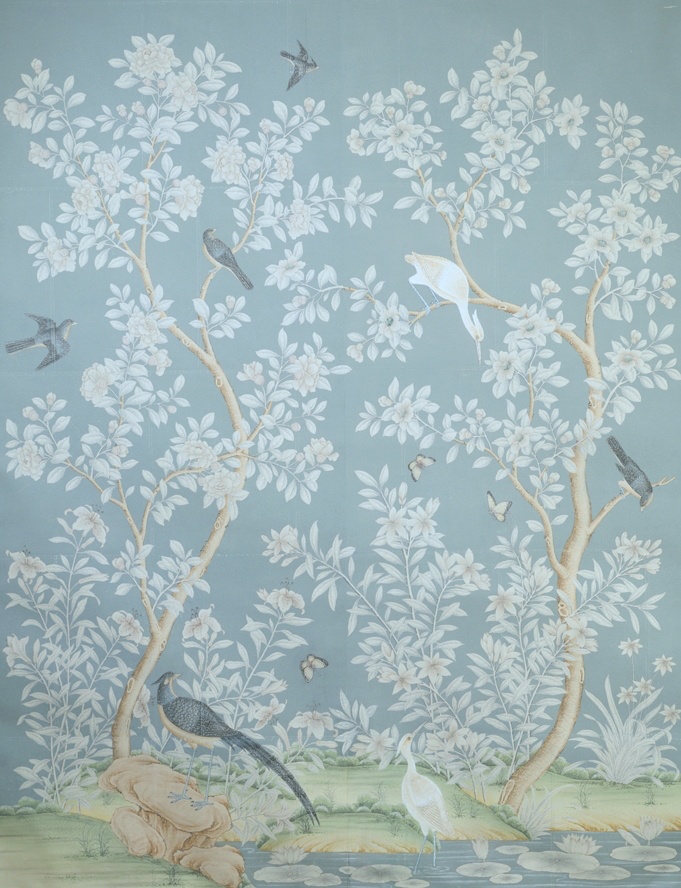
If you want the Gracie-type designs, I have found two Etsy places linked in the widget.
Last year, a few of the sources on Etsy were getting some very bad reviews. However, someone commented that they used Chinoiserie Home Deco and received some gorgeous panels. I’ve taken another look, and the designs look authentic and recent. Plus, the images are clear, and there are close-ups. In addition, you can order a good-sized sample before ordering your large panel. They have thousands of sales and hundreds of five-star reviews.
There’s a new source that also has some beautiful designs.
I’m including some of David’s exquisite designs in the big widget coming up soon.
Some may wonder where you can purchase the gorgeous bed curtains and canopy. Well, years ago, they made some horrid ones that were too short. I saw those on OKL, but not recently. I am almost 100% positive Mark has these made from a custom workroom.
How much will that cost?
Wellllllll, it depends on where your workroom is and if you can get a trade price. You can ask lovely Dianne at By Harrington if she can make them. Basically, except for the canopy, what you need are curtains, and you can use ready-made. The easiest way to attach them to the tester is with ties. But, you could use shower curtain rings. (Although, I’ve never done that.)
As for the canopy, I imagine you could use a ready-made bed skirt. It won’t be as pretty when you look up, however.
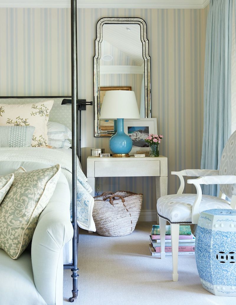
Laurel, how much for the custom-made bed curtains and canopy?
Oh, right. Well, for a good quality linen lined with this beautiful stripe and then trimmed with the white ribbon, you can expect to pay in the neighborhood of $10,000. And, it might be more than that. Or, it might be less in some parts of the country.
However, if you do some ready-made curtains, already lined but without trimming, you can find some lovely ones at Pottery Barn with a coordinating bed skirt. They would be well under $1,800. If there’s no coordinating bed skirt and you can’t sew, you could always get two panels and have someone make a coordinating canopy.
Some fabulous news!
Before we get to the widget, some of you have already seen that the beautiful online company, The Well-Appointed House, is offering the readers of this blog a 15% non-published promo code for 15% off the entire site. Only a few brands are excluded, which you can see near the top of the HOT SALES main page. Use promo code: LAUREL15 for your 15% off.
While the promo code doesn’t work for sale items, WAH also has a lot of terrific items on sale. And, in ALL price ranges. Below is a mini-widget of some super lovely nightstands starting at $98.00!

Below, is the big widget featuring some of the best bedroom ideas and furnishings in the manner of Mark D Sikes.
While most things are far less than super-high-end, I wouldn’t categorize some items as cheap. The more expensive items are a good value for what they are. Plus, on Etsy or 1stDibs, you can always negotiate the price.

I hope you enjoyed this post about some of the best bedroom ideas featuring Mark D. Sikes. If you missed the other post with even more cool Mark D Sikes furnishings, please go here.
And, you might also enjoy these bedroom posts
For much more inspiration please check out Mark D. Sikes’ amazing website.
Also please follow Mark on his fantastic Instagram account.
xo,

***Please check out the newly updated HOT SALES and the special Well Appointed House widget
***Many thanks to many of you for clicking this Amazon link before making your Amazon purchases.
If you shop on Amazon, please click the link above before you put your items in your cart. The price is the same for you. The vendor pays me a small commission, which helps keep this blog running. I so appreciate your help! You can also click the banner below.
Related Posts
 Yellow Walls – Why Do You Hate Them So Much?
 Little Known Ways To Score Free Furniture (or nearly free)
 Their Contractor Hates The Rich Paint Color Palette
 I Got Hit By A Car Today, While Walking On A Sidewalk!
 The Best White Paint Colors-20 Classic Shades
 Small Living Room Decor -Should It Be Pale or Dark?
 An Easy Renovation Idea To Increase Your Home’s Value













16 Responses
Thank you Laurel for a very inspirational 11 years. Your posts alway come across as letters from a very good friend. (If only I could locate a designer in the Houston area that was as down to earth as you. Alas, my luck hasn’t been very good in that area.)
I love Mr Sikes blue bedrooms. To me they are tranquil and restful. Ours is a pared down version of his, using a tone on tone color scheme.
I have been trying to summon the courage to begin remodeling our en-suite, which will ultimately include our master bedroom. Though the dust and inconvenience keeps me procrastinating, I know that the bath fairies will not surprise me and I will ultimately have to begin.
Keep on generating your very helpful posts. They are welcome and needed! I am certain that all who subscribe thank you too!
Kindest regards, Toni
I loved this blog post! Mark Sikes is one of my favorites… so I quickly open this up when I finally had time to sit down tonight. I have Mark those Etsy sellers who sell the wallpaper panels that look like the Gracie panels one day. I’m going have a room that I can use those in!!! I did find a little Chinese lacquer, covered exactly like the one in your inspiration photo on Facebook marketplace in Santa Barbara. My girlfriend who lives there drove over and picked it up and bargain the price down to $75 for me it had a few little things that need to be fixed and I have a wonderful furniture refinisher who fixed it up for a mere $100 .. so when I saw that the price on that was $975 I figured I had really gotten a bargain and could go off in splurge on Gracie wall paper panels! However, I still don’t have a wall to put them on. I love all of Mark Sikes’ works, but I tend to love that little bedroom done in the pinks and blues some thing about that just speaks to me.
I absolutely love Mark’s bedroom in your third photograph, and I think it’s because of how it transitions so effortlessly from the adjacent hallway. I’m becoming more observant of how one room flows into another.
I wholeheartedly agree with Diana Mclean!
Many others have stated how much they appreciate your sense of humor and your generosity.
I heartily concur with those sentiments as well!
Thank-you.
I loved this post and how many of us went to work recreating mark Sikes bedroom after reading this? I DID!
Yes! Want to emulate a master designer. Really appreciate your links especially to those superb wallpaper, chinoiserie panel and natural rug sources. They all look like superior suppliers. Thanks!
The first pic is my very favorite. The beautiful rich colors makes you want to never leave the room.
The pic via style beat where everything is blue looks more like an expensive “let’s match everything look”.. -“Not liking this”
Laurel, you are much more creative than these pics. Time to stop idolizing him as you have surpassed him.
Congratulations on your blogiversary. 11 years! That is quite the feat! I only discovered you a couple of years ago and am enjoying all your posts, past and present.
If you look at the Sun Valley post in the Mark D. Sikes portfolio, 3rd photo from the bottom, is that the Raphael wallpaper?
Yesterday I googled “Mark D Sikes bedrooms”, so my jaw dropped when I saw the title of your post today. 🙂
The look for less – what a great idea to use a dust ruffle for a bed canopy. It occurred to me that one could use two dust ruffles in the same or different prints/solid; one with the right side facing down to the mattress and the other with the right side out facing the ceiling. It would look like it was lined. With minimal work, the two could be stitched together, maybe even with very light quilt batting between them on the flat section. Now I need a canopy bed…
Great Sunday treat as I always expect from you. Loved your inclusion of Bucks County Estate Traders. I’ve gotten some lovely pieces from them. Super quality and great service.
Thanks Laurel……
I agree with Rachel, this is a great post. Just another example of how to get the look on a reasonable budget too.
The shapes in these rooms, how a curve registers against a rectangle, are compelling. That shape story is what really grabs me!!!
His rooms with a bit more color really grab me. Also, the styling goes right to the edge of just enough but not too much for my taste. I am trying to understand why I find his work gorgeous but want to up the color story a notch. The Kipps Bay picture above is my favorite in these selections.
How to get a Sykes feeling with that up a notch color story? Now I would really like to see a post about that.
As I look further into his posted work, I cannot do his red, white and blue — that is too intense. Wishing he would do some blue, green, purple.
The more I look at the curves against the rectangles, the more I like them. This is precisely what I adore, just the right amount of what I see as French curve. Also, his use of metals is just right and the punch of black here and there. His rooms, while photographed as perfect, feel as if you could walk in with a book and a drink and sit right down.
Just reading the title in my in-box made my heart go pitter-patter. Waited to read til I could sit down with hot coffee and a fresh blueberry muffin 🙂
We have a classic 4-poster mahogany rice bed that my darling hubby surprised me with a few years ago. I had admired it for years and when the manufacturer discontinued it, he wanted to make sure I got one (what a guy!) Since then, a move + a new larger home to furnish and the bedroom has been at the bottom of the priority list. So I still have the old side pieces (nightstands, bureau etc) and cannot decide what to. Definitely don’t want a room-full of all dark mahogany but I feel like I can’t go ‘too’ casual due to the formality of the bed. Long story short, I’d love to see a follow up post to this one with different styles of beds and nightstands, etc. that would work with them—*if* you think that would be of interest to readers, of course!
Thank you for the informative read and lovely photography. Off to peruse WAH, it’s one of my favorite sites!
I’m hoping to start working on my bedroom this year. Unfortunately, some other things need to get done first. This post is great inspiration & I’ll be coming back to it.
great post, Laurel!