For some reason, I have an online subscription to Zillow. You know that online real estate listing place that has something called a “zestimate?”
The zestimate is total BS, BTW. I’ve had confirmation from several realtors. Still, I like to look at places in my hood since I’m a property owner. (and I’m dying for a spot in our garage. Soon, I hope as there are 3 units in my building for sale!)
The area that I live in is a tiny section of Bronxville that is a two block square of apartment buildings. They were all built in the 20’s and 30’s.
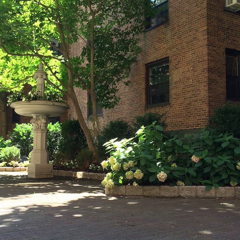
Here is our lovely courtyard garden in my building known as Tudor Arms
All of the buildings have high ceilings and interesting detailing. (unless someone has mutilated them into something else.)
The other day, a 3-bedroom duplex for sale, with a roof terrace caught my attention.
The building is a stone’s throw away. It’s on the market for $800,000. That’s a lot of $ for an apartment, so I figured that it must be really nice.
Well, it’s not; not for 800 large.
But, it could be. Yes, it would cost some money, however, I have seen apartments around here sit and sit and sit and sit… Then, what happens is a price reduction. Once, twice, three times… and before long it’s been on the market for many months with the homeowner potentially losing tens of thousands of dollars.
And Why?
Usually, the main reason I think is that they are hideously finished and decorated.
Horrid remuddling.
If the homeowners had made the necessary changes before putting their botched classic on the market and priced it correctly, a place like this should not be sitting.
For more info about what to do if you’re serious about selling your home please click here.
Let’s begin here.
The kitchen.
Everyone knows that kitchens and bathrooms sell homes.
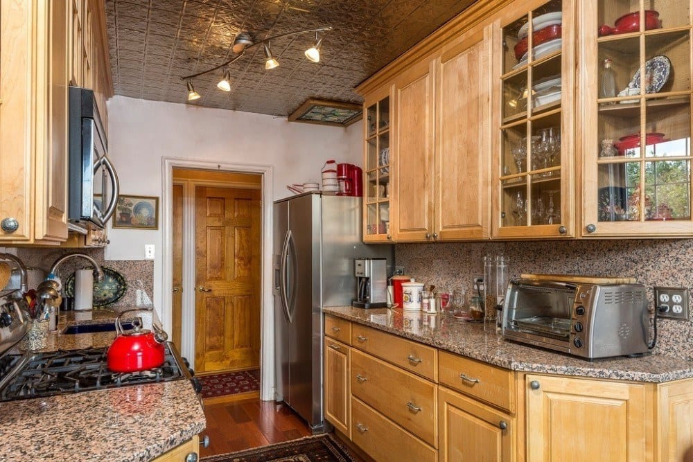
not this one.
This isn’t the worst disaster I’ve ever seen but this is a kitchen in a home worth 800k? No. Here, we have the classic fugly oak kitchen cabinetry (actually, this is probably cherry but still…) with pinky barf granite.
I really can’t stand it anymore!
I’m quite sure that God never intended this stone to be unearthed for anything except maybe as a trough for slopping the pigs. They must’ve gotten a great deal on this stuff because they ALSO used it (as you can see) for the backsplash for an extra dose of hideous.
Look. I don’t expect to see an authentic 1920’s-1930’s kitchen. We live differently now. We NEED more storage. We have 25 different flavors of corn flakes. We need to put it somewhere!
Before we dig in here, let’s first look at a few kitchens from 80-90 years ago, so we have a point of reference.
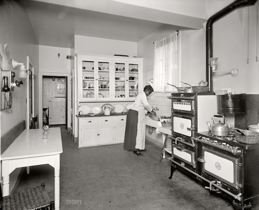
This is a classic kitchen from the 1920’s. There is only one cabinet which was for the crockery, glassware and silverware. But notice how modern it looks! Behind it undoubtedly was a very large storage pantry. Behind that looks to be a butler’s pantry. And is that an ICEBOX? Oh wow. But we do have a lovely counter for preparing the meals on. Love the stove! Ain’t that a beaut!
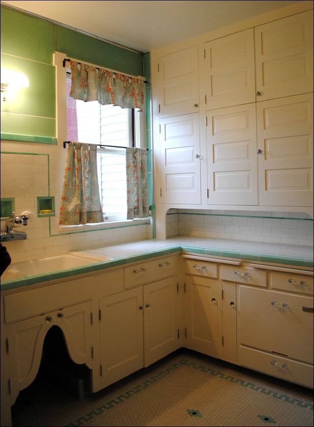
Two kitchens from the late 1920’s – 1930’s above and below.
I don’t see any oak.
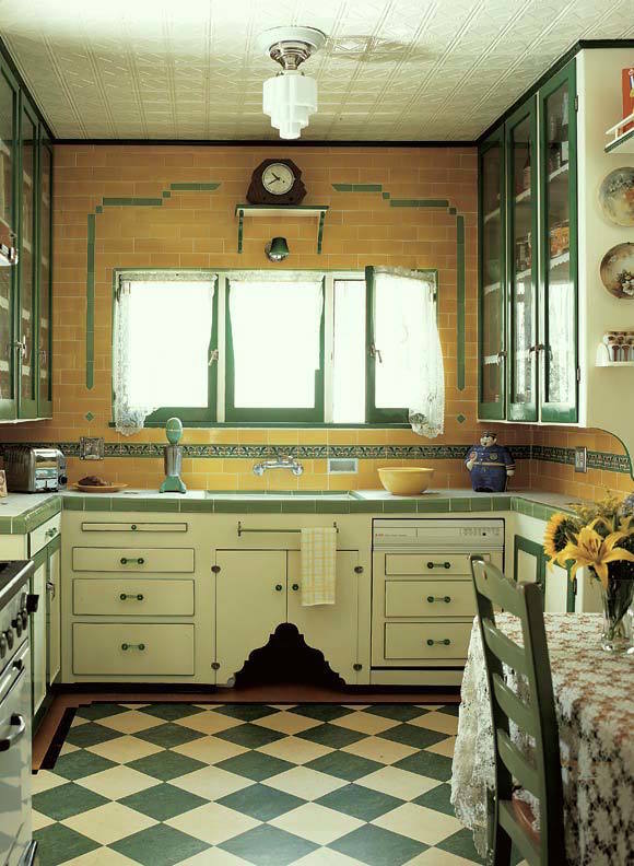
I believe that the cutout under the sink was for the doggie. That’s where his food was kept. So sweet.
Look, it’s not that you need to put in something exactly like this. I wouldn’t do that either because it wouldn’t look right today either. However, if you choose to live in a historic building, then why not at least design it with respect to its heritage? That means NO OAK cabinetry. Oh man, I’ve seen it thousands of times. There are a few exceptions, but for the most part, no oak.
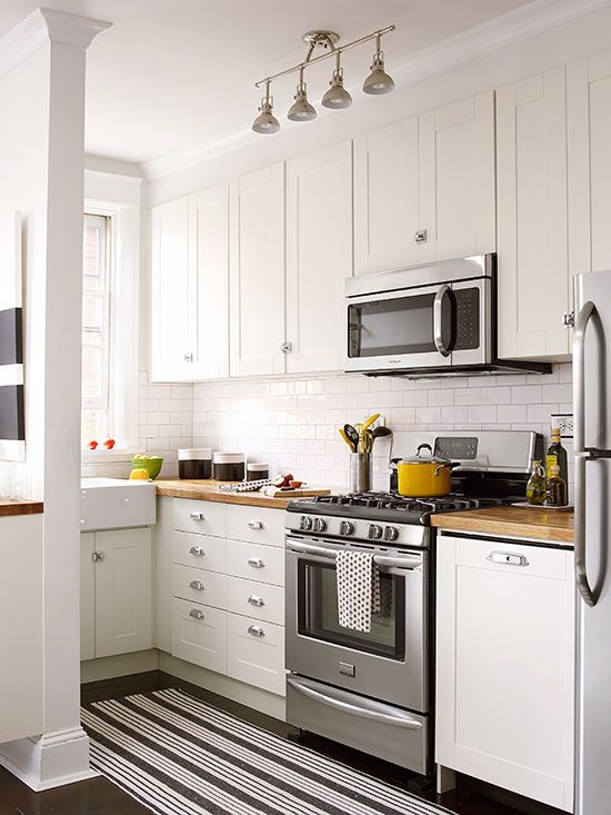
I feel pretty strongly that white in a small apartment kitchen is always best, or at least painted cabinetry. And yes, subway tile.
For those of you who are going to give me flack saying that it’s difficult to keep white cabinets clean, that’s fine. Paint it a khaki color or gray or buy a different home. I like to see the dirt so that I know what needs to be cleaned! :]
If you are planning on staying in your home until you die and it’s all paid for, then I don’t care if you paint the entire thing in purple zebra stripes, but most people stay in their home an average of 7 years. I wish people would be smarter about this. If you’re selling your home sometime in the future, then this is for you, whether it’s an apartment or a free-standing home.
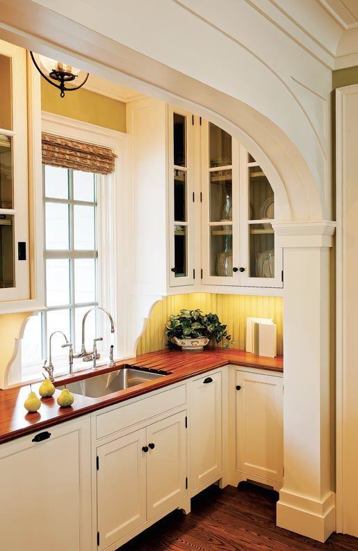
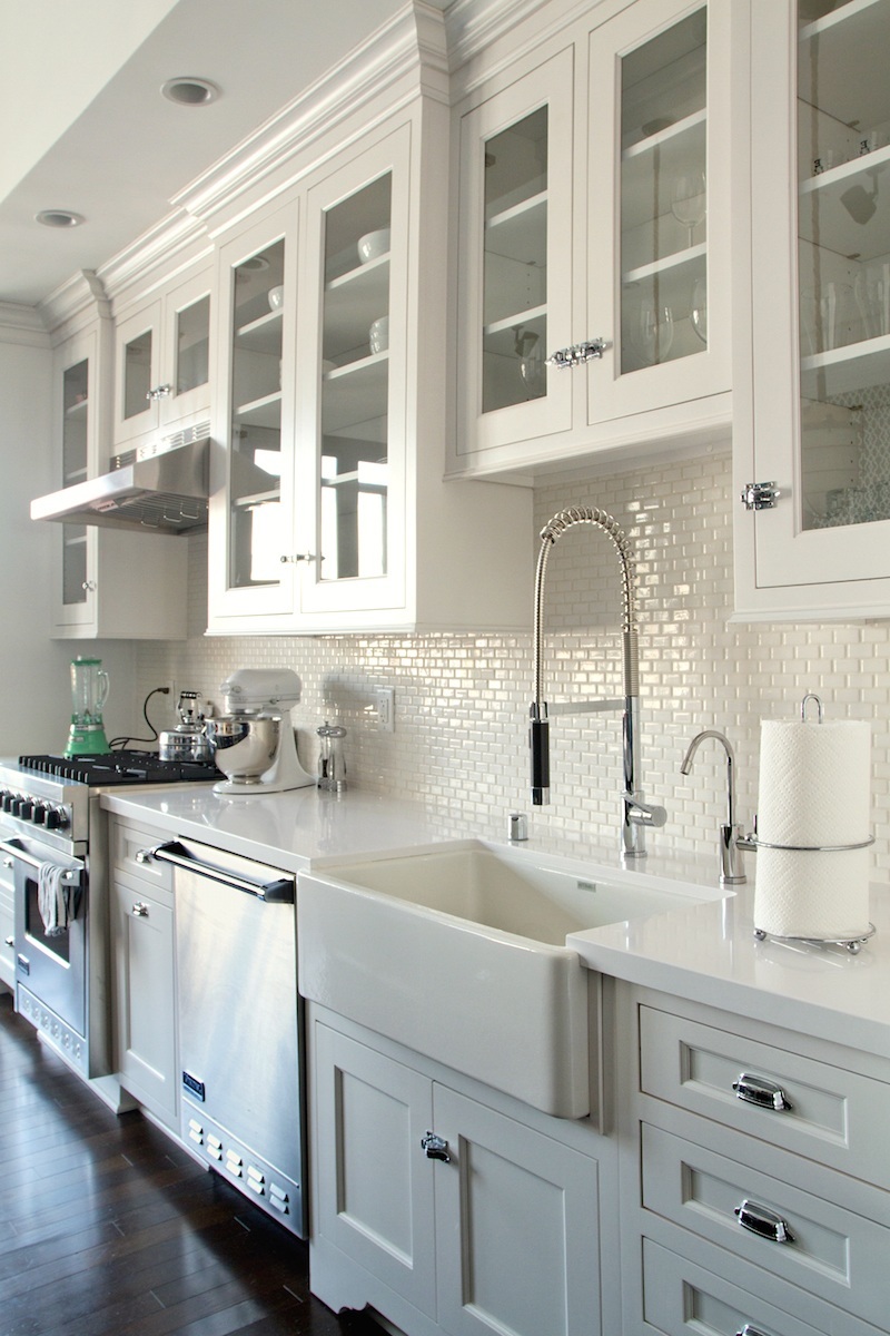
Here are some beautiful small kitchens that would be appropriate for an apartment built in the 20’s-30’s or any time really.
I think I could stop right here. This one is absolutely perfect!
This kitchen looks very vintage-y but it’s not.I think some adaptation of any of these would be perfect for an older home, OR a new home too!
What About Our Seller?
For about 10k-20k— tops, (which they would get back and then some!) they could make this kitchen something to make prospective homeowners take notice and begin to want to live here!
Remember, if you are selling your home or thinking about selling it in a few years. Buyers want move-in ready. But… check this one out. These are the original cabinets covered in what looks to be shelf lining paper. lol
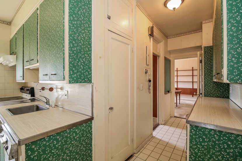 oh my word!
Let’s now go back and see what it would take to make our $800k duplex worthy of that price tag.
Before I talk about what’s wrong, what’s right is the ceiling, but it should be painted a shiny white.
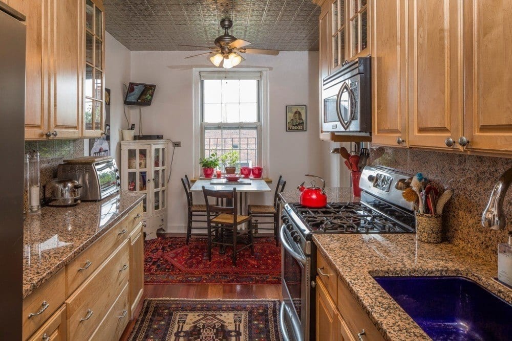
the cabinets
They’re actually nice except for the fact that they’re brown. They can be painted.
You can find info here about painting your cabinets.
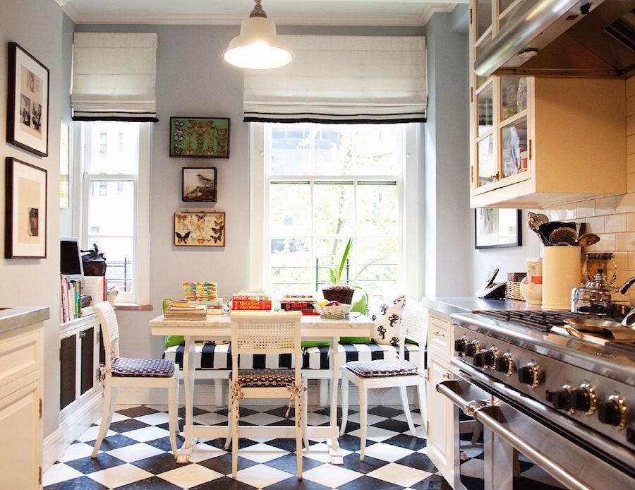
The wonderful vintage-inspired kitchen of Andy and Kate Spade, designed by Stephen Sclaroff
This is much more like our $800k home kitchen should look like. It’s clean, fresh, classic and inviting.
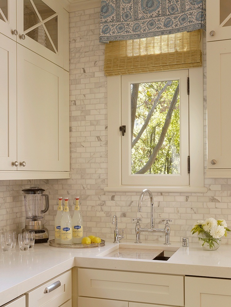
the counters and backsplash.
I love the engineered quartz counters by Caesarstone and Silestone to name two companies who manufacture this great product. It’s very durable and easy to maintain. Again, I like white but you could do another neutral color. Don’t worry about mixing your whites. In fact, they should all be a little different. That’s a richer look. The tile above is calacatta gold. It’s very expensive and lovely, but ceramic is absolutely fine.
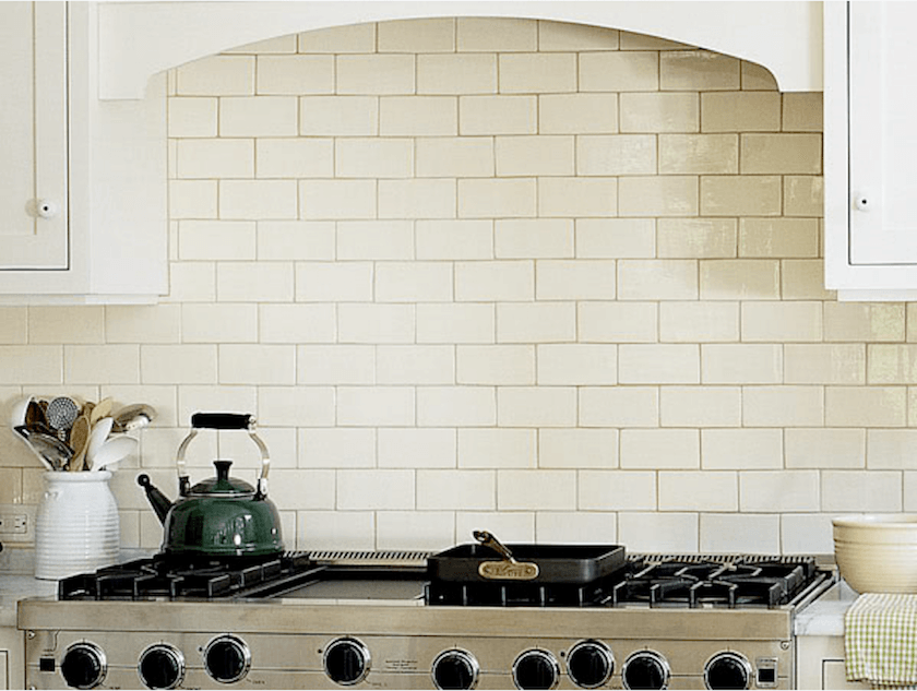
Subway tile.
There is some confusion I find as to whether this is a trend that’s going bye-bye in a few years or what.
Well, yes, it’s a trend, but it’s also completely classic. It did go away for a while and then came back with a vengeance about 20 years ago. It’s not going anywhere. And it’s what should definitely be in a vintage apartment.
Ideally, you would find a reclaimed subway tile. They don’t make it like this any longer. Oh, wait. Hold on. I have something to show you that’s really for the next post. Hold on…
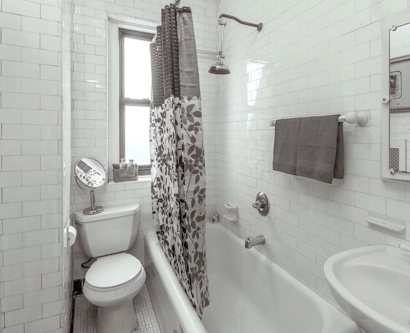
Here. This is an apartment in my building that’s currently for sale. I wish they had put up a white shower curtain, but they didn’t ask me what I thought. ;] This is the original tile from 1920! And a lot of the apartments here still have it! One of my neighbors couldn’t wait to get rid of hers. No comment. And yes, she just put in a new cherry kitchen. She’s a very nice lady. I’ll forgive her. (I guess) :]
Below is a close up of some reclaimed vintage subway tile.

Of course, you don’t have to do this. It’s expensive, but if you have a tiny kitchen with only 9 ft of backsplash, maybe it’s worth it? You can also get the hand-made stuff like they sell at Walker Zanger or Ann Sacks. One 3 x 6 tile is about 25 bucks. Plus labor of course. Then, you can get tile that’s less than $1.00 per tile.
For the sellers, I’d go cheap. Not so cheap that it looks tacky, but no sense in spending $5,000 on the backsplash. We just need to get rid of the fug.
To grout or not to grout. Meaning, should it show or blend? Well… the contrast is okay if you know how to pull it off. It’s more difficult. It’s a funkier retro look. I usually prefer it to blend. It’s never a mistake.
Size? The standard subway is 3×6. It comes in everything from a tiny .5″x 1″ to really BIG. I like either the standard or the 2×4. Although a few years ago, we did a lovely backsplash with the mini version in Thassos Marble.
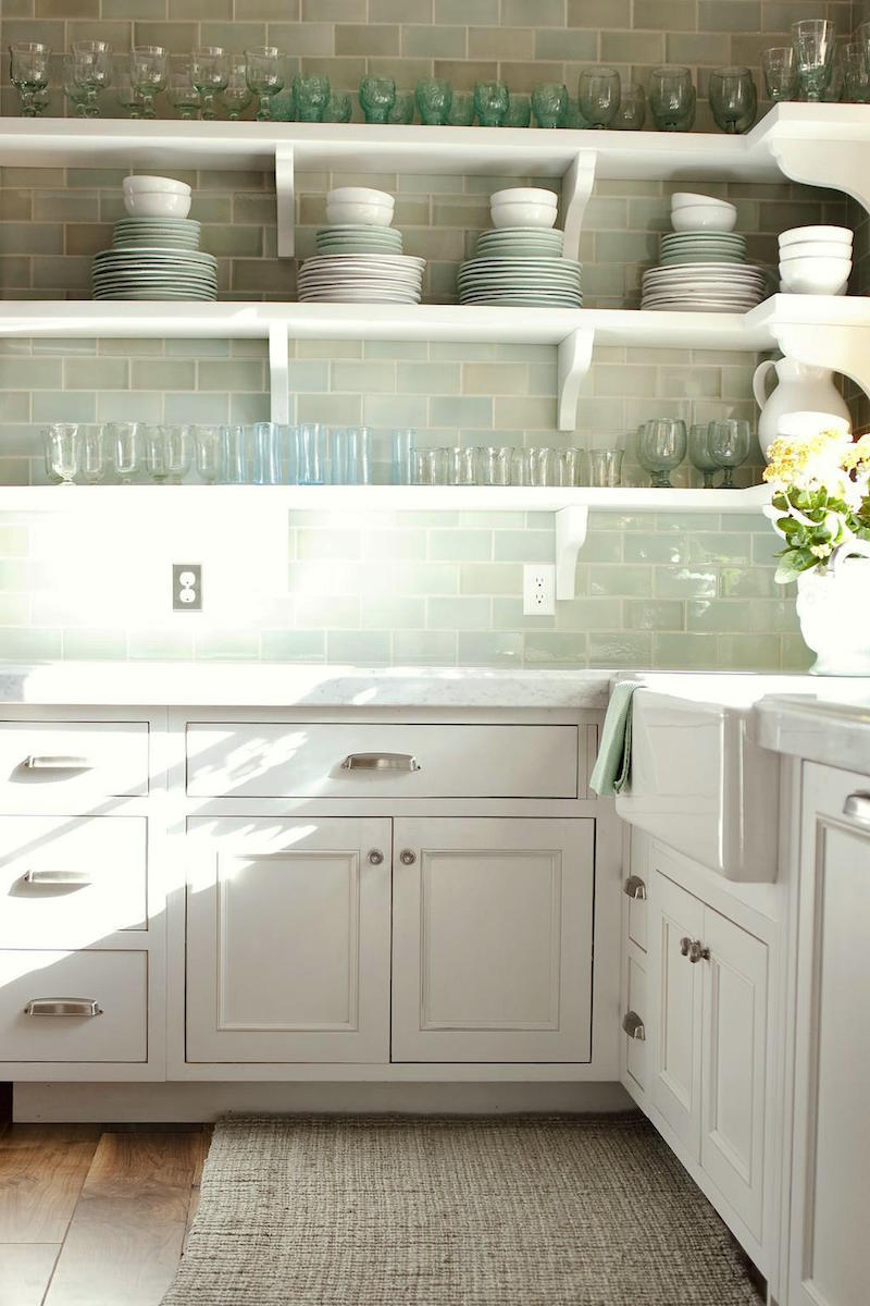
Another viable option is a colored subway tile. If you really can’t stomach all-white, then this would be a great option. This bottle green was very popular in the ’20s and ’30s. Glass is also lovely but more contemporary and expensive.
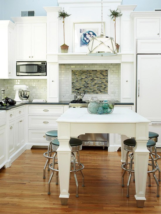 Whatever you do. Please do not do this to your backsplash. Lovely kitchen, mucked up by weird contrasting non-classic tile over the range. I don’t understand the necessity of this. Oh, sure. If you must, you can change textures for a feature, but I’m sort of over that one. I prefer it to be plain. (like the image above with the green tea kettle)
Some will say it’s boring. “Boring” is okay. The backsplash is not the star of the show. It’s an integral part but it’s not the star.
Should the entire wall be tiled up to the ceiling? That’s a good question. It is classic and it’s also a recent trend. I think it depends on a lot of factors, but if done well, it’s a beautiful look.
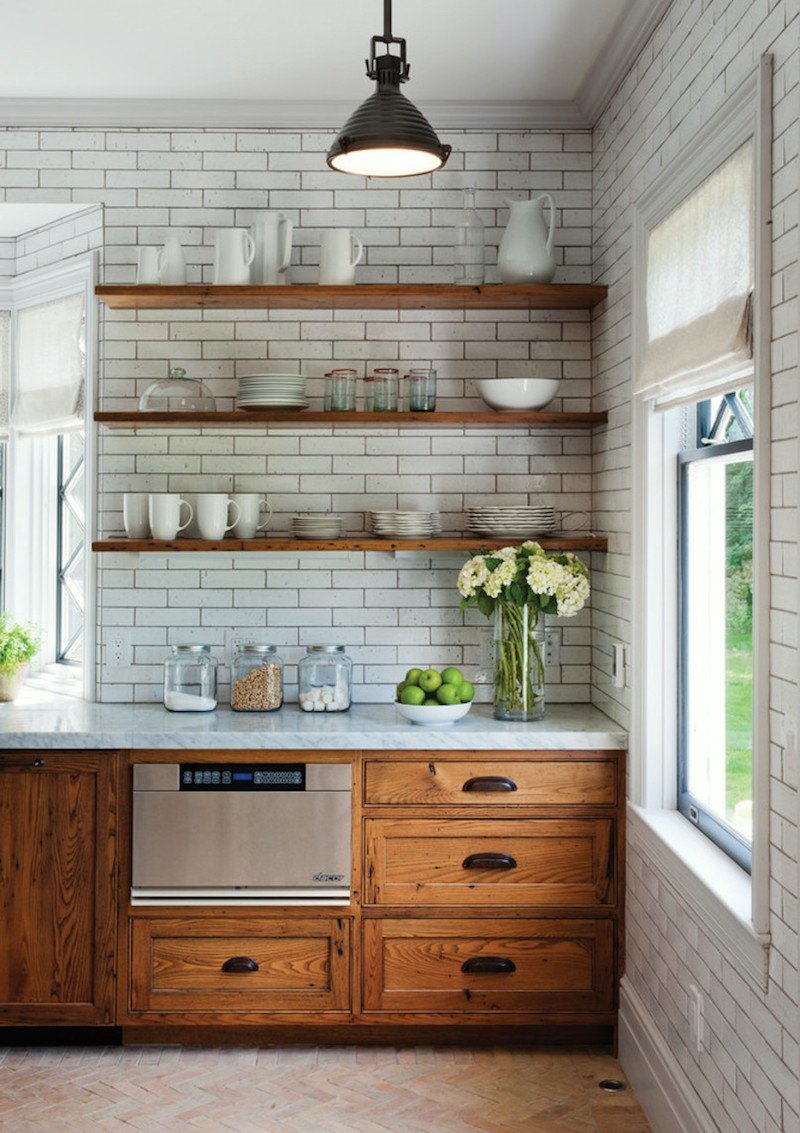
Here’s a kitchen that has the tile up to the ceiling with dark grout and brown cabinets that work. The trick? Lots of white, airy shelves and no uppers. I know… it’s hard to give up your uppers. :]
Lighting.
We have to get rid of that horrid fan and that other monstrosity as well. By the way. I have a similar monster in my hall. lol.
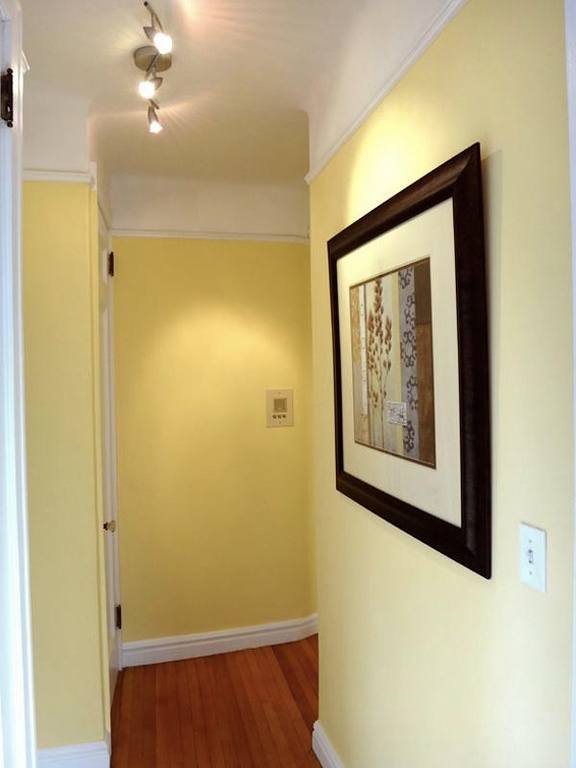
I know… I’m such a hypocrite, but my apartment is not 800k and it’s just the hall. The little hall is one of the things I love best about my place. There are some changes I’d like to be making soon.
back to our kitchen
Below are several ceiling fixtures all from Circa Lighting They have a fabulous collection in all different price points. Our ceiling is 9′, so you could do a pendant but it really shouldn’t come down more than 24″ over-all.
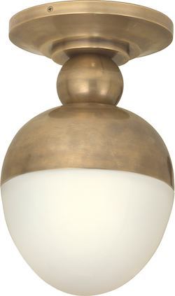
I don’t know what this is called, but I think it’s really cool. There’s a pendant version as well.
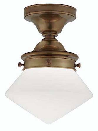
This is a variation of the school-house fixture.
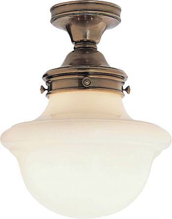
regular school-house
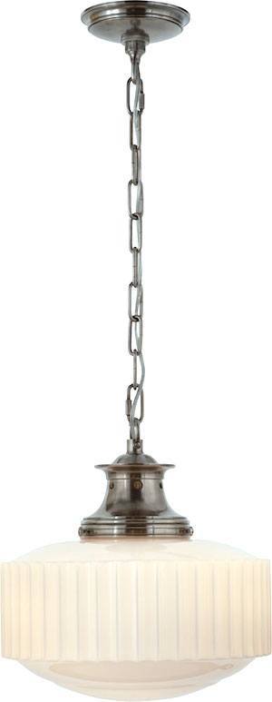
Another schoolhouse variation by Thomas O’Brien. I did this one a few years ago over an island and they looked great!
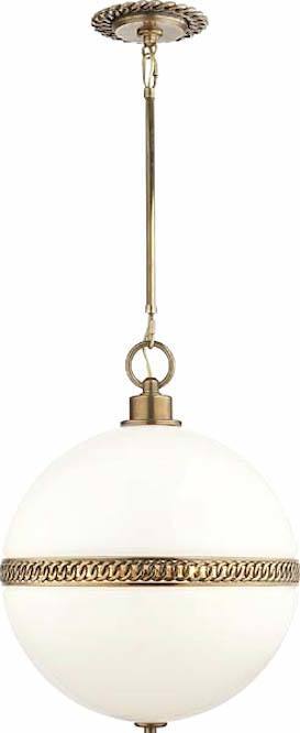
This one is very expensive but I just had to include it because it’s my favorite. It’s designed by Ralph Lauren.
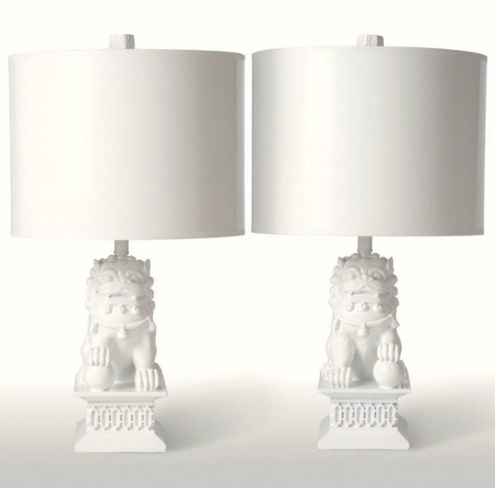
Lamps
We don’t usually think of lamps in the kitchen, but that’s unfortunate because table lamps in the kitchen are wonderful! They add a lot of warmth. If you have upper cabinets the space between the bottom of the upper and counter is usually 18″. It’s not easy to find little great looking lamps. I love these Foo Dog lamps by Barbara Cosgrove.
Hardware
Finally, we need to switch out the hardware. I love nickel if you can swing it. I also love mixing metals such as nickel with gold and brass, but nickel and chrome don’t look well together.
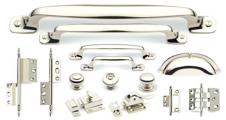
This beautiful collection of polished nickel is from Cliffside Industries
Other wonderful sources for hardware include
Well… that’s the kitchen. I’m not done.
Wait until you see the bathroom!
xo,
![]()
Related Posts
 Plaster Ceiling Design + Architectural Mouldings
 Freshen your Home for the New Year {Part I – home lighting}
 I Can’t Afford A New Kitchen. Can You Paint Stained Wood?
 Laurel’s #1 pick for the best sofa (addendum)
 20 Interior Designers I Would Hire {part I}
 Summer Whites {with a little red and blue}
 The Only Six White Paint Trim Colors You’ll Need










57 Responses
I was told that the cutout under the kitchen sink was to let the kitchen heat get to the plumbing pipes under the sink so they wouldn’t freeze. There was little, if any, insulation in homes in those days and frozen pipes were a common problem.
Laurel — I am obsessed with the first flushmount you show (eggshaped, above schoolhouse light). You say it is from Circa lighting but I do not see it there. Do you know who makes it? Thanks!!! Great article.
Hi Amy,
It’s there, but no worries. They have a lot of fixtures.
http://www.circalighting.com/details.aspx?pid=3325
THANK YOU! I definitely plan to paint it the same color as the cabinets. I have a very clear vision in my head for this house, as I’ve been working on it in my head for four years 😉 We found the house four years ago this month, and it has taken us this long to get to the point we are now, of beginning the inside (which hubby and I plan to do mostly ourselves). While the exterior is an almost exact replication of the original house (built in the early 1900s), I don’t want the interior to be a “museum.” I want it to have the original bones, but look like it evolved in all the good ways over the last 100+ years. We will use as much original flooring, trim, doors, ship lap walls, etc. as we can, but make it a functional 21st century home. As an aside, I noticed that quite a few of the pictures on this post feature a Kitchen Aid mixer on the counter…we are cleaning out my in-laws house, and my MIL had one of those. I had about decided I didn’t need it (I rarely bake, and I have a perfectly good mixer, though not high-end), so was about to garage sale it. Then my younger daughter spoke up for it, which I was happy about, as I was beginning to think maybe we shouldn’t let it go. Now I’m thinking maybe I should have kept it for myself, haha! (Another aside, I should have said “there is a ton of beadboard” instead of “there is tons of beadboard” – I’m a grammar freak, but I was in a hurry and made an oopsie…) Sorry for the long ramble, but thanks again for giving beadboard a thumbs up.
Hi Laurel,
I love white kitchens, including the ones you featured. I’m not a huge fan of subway tile, however. How do you feel about beadboard as a backsplash in a historic Craftsman/farm house hybrid? As I explained in a comment on another post a few days ago, we are rebuilding such a house that we bought and had deconstructed (it was being sold to be torn down or moved). There is tons of beadboard from the original house which will not all be reused in the original manner, and I would really like to use some as a backsplash (similar to the hutch you featured in the link to a kitchen you helped with).
Hi Anita,
I love beadboard, especially in a country or craftsman home. So, I say go for it! If the cabinets are painted, I would paint it the same color. Years ago, a client of mine did a pine kitchen and did beadboard. We painted the trim and walls in the adjacent den HC-22 which is greeny-gold color. You can see it in this post with the checkerboard painted floor.
https://laurelberninteriors.com/im-losing-sleep-north-facing-room-paint-color/
It was in Better Homes and Gardens! This was taken in 2004 and the color looks much more green than it is. It was perfect though for this antique farmhouse with seven foot ceilings! And they just stuck that rocking chair there for the picture. Oh well…
Hi Laurel,
Nice pictures and good information. My husband had a house when we got married and it was an old power plant in a small town in Ohio. Over the years, I have tried to convince him that oak kitchen cabinets with cathedral doors, green formica counter tops and light oak parquet floors just don’t work anymore. Finally he agrees that we should paint, redo the counter tops and new flooring as we are putting the building up for sale next year. Yay! We have very high ceilings (11 feet) and I wonder should I put another set of cabinets above the first for storage as the ones now are just standard stock cabinets. Not a lot of storage and work room, very odd layout as the building was not meant as a home so was not set up for convenience.
Hi Sue,
I’m sorry that I can’t help you with this in the comments. Perhaps you need to consult with someone in your area.
Love your comments – had to laugh when you described the granite counters! I’m searching for a country house in Litchfield County (btw, we are neighbors, I live in Brooklands!), and night after night I have to turn off the computer in disgust.
On Zillow I start with the kitchen and generally don’t get any further. Generally, my first comment is “OMG, it’s HIDEOUS.” And I can’t stand it when doorways are ripped out and replaced by large rectangular spaces (no moldings, of course), and all those half-walls. Skylights everywhere, some of them angled with squared-off ones in the same room! One particularly notable renovation included a giant jacuzzi bathtub on a platform in the MBR. WHAT ARE THEY THINKING? I put this down to a contractor that constantly uses the word “sexy” in his suggestions for improving a house.
I bought a wonderful third floor walk-up in Brooklands and the couple I bought it from had the kitchen re-done by their “friend”, a contractor. In italics because he made some really stupid errors. It took me four years before I could figure out what to do with the kitchen and now it’s my favorite room in the apartment! I kept the tile they selected (fabulous off white, hand made) and painted the walls Farrow & Ball’s Cream No. 67. Gutted the pantry and put in a china closet,
The cabinets were glazed in a very streaky yellow ocherish color with pistachio trim. I painted them off white – (Donald Kaufman) DKC 82. Now the kitchen is the show kitchen it was meant to be! The couple had fabulous taste, but their contractor just didn’t know how to translate it into what they probably wanted it to be.
Added thick molding around the ceilings. It’s FAB!
Hi Linda,
Wow! We ARE neighbors! Love Brooklands. Just a shame that some of the lower units are prone to flooding. But the buildings are so lovely!
Litchfield County is beautiful! My son went to a boarding school in Washington, CT — very close to New Preston. That sounds more hoity toity than it is. It was paid for by our local school district because he has special needs!
Ixnay on the original cabinet color. Ocher and pistachio trim… errrmmmm… no.
The apartment featured in this post is still on the market. I was in a sister apartment of that one a couple years ago. It has so much potential!
Your blog is so refreshing, especially for an owner of an historic home. We own a 1928 Spanish Revival in California. We have had it for 16+ years and are finally doing a big reno of the bathrooms and kitchen including re-wiring and new plumbing of the whole property. The kitchen is my biggest challenge because there is a balance I want to strike between age-appropriate and functional. I’ve already settled on white subway, white cabinets, and soapstone. Built in fridge and dishwasher to hide them. My biggest struggle is the stove (range). I love to cook and am leaning toward a solid pro-style range but heavy stainless steel doesn’t seem appropriate. Have you had any experience with this issue? Any recommendations? At the end of the day I would just put one in and not worry about it but it seems like there is something better. Ideas?
Go for the range you want. It’s fine. Form follows function said Frank Lloyd Wright.
Laurel, I’m a new subscriber to your blog…Wish I had discovered you 5 yeas ago!
About oak kitchens: surely there must be some fairly great ones out there somewhere.
If there are, could you show them to me? I could use a bit of inspiration. THANKS!
Is it me or is there a dishwasher to the right of the sink in the second colour photo of kitchens from the late 1920’s – 1930’s?
Oh wow, Stu! Great eyes! It is a dishwasher but I don’t think they had them back then. Presuming that this kitchen is from that era, it looks like they used the drawer fronts to conceal the dishwasher. Very clever!
Hi Lauren,
I’ve just discovered your blog and love it. By the way- that apartment with the green contact paper on the kitchen cabinets… I’m the buyer. It’s even worse in real life.
The new kitchen will be white.
SS
Stop! Really? Well, then… we’re neighbors! Let’s have coffee! lol
Agreed; the wavy Ikea-type light (also in your hallway) is not attractive. But what might be a solution for a kitchen eating area, (of this time period) where the (round)table is slightly off center and lots of bright light is preferred?
Hi Debbie,
Well, kitchen lighting is its own post. I usually do chandeliers over tables even if they are off-center.
P.S. That fake-looking pressed tin ceiling has to go – it is hideous, and those sorts of ceilings would have been found in commercial buildings (not residential) built about 20 years or more before this apartment. (I went to grad school for historic preservation, so I’m a bit of a wonk!)
Hi Laurel, I’m a new subscriber and loving your blog. This discussion about the appropriate kitchen finishes for a 20s-30s era kitchen in a ‘Tudor’ style building is most interesting. About 10 years ago I almost purchased a SFH in the Tudor style in an architect-designed neighborhood, laid out and landscaped to look like a F.L. Olmsted neighborhood, in a medium-sized city in your general region. It was beautiful, and everything that made the house great was intact. The kitchen had smaller tiles for the backsplash and slightly larger ones for the floors, and, natural oak cabinets which had darkened and ambered over the years. I actually think the folks who are trying to get 800K for their overpriced apartment should keep the cabinets, replace the flooring with lincrusta tile or a checkerboard tile of some sort, replace the countertops with something like soapstone (I HATE tile countertops – they never get clean!), and the backsplash with something like the milk glass/bottle green subway tile you showed above. (And I agree with you and all the others – that granite is hideous!) And, of course, the light fixtures and cabinet hardware (and probably the sink fixtures) need to be changed out to something appropriate.
My kitchen is about the same size as the one you featured- except that it has three doors coming off of it, and light cherry cabinets. Terrible, right? I love my house but hate the dinky kitchen..Since I am doing new counters( hopefully, soapstone, a new stove, vent hood and a new sink) I was soo tempted to get my paint brushes out on Sunday morning before my husband had time to wake up and stop me! I will have to keep sleeping on in ..
Laurel- back in the 70’s we would be in Bronxville on a regular basis visiting my sister in law and her husband, who lived in a lovely duplex on Bronxville Rd in a building similar to yours. I just asked her today if she knew about Tudor Arms- and it turns out that they had friends living there..small world..
Oh wow! That is too funny Dolores! The buildings are mostly similar. Most are red brick on the outside and vaguely Tudor in style.
I love, love, love the look of white shaker cabinets in the kitchen especially with satin nickel knobs and cub pulls. Love subway tile too, but prefer it to add a little color (like pale blue or green). Classic and timeless.
Love all the white kitchens, but love the pale green glass tile the most. We moved to an older home last year, and the cabinets were painted off-white. BUT, the countertop is pinky beige, and the backsplash tile is pinky lavender. I hate it, but want to gut it and start over, so I’m waiting till that time comes! But it’s hard to live with it now. Thanks for all the great tips.
I hear you Diane! I have no idea what people are thinking sometimes. My old home was a lot of mauvey-pink and gray. Not the nice gray, either. I was the happiest woman on earth the day we ripped out that pink carpeting and put in a lovely hardwood floor. Then came the mouldings and creamy white paint. I hated to put the furniture back. lol
You said something made me say “YES! Someone else agrees with me!” When I wanted to paint my cabinets white, several of my friends said, “it will show all the dirt,” to which I said, “good, then I’ll know what needs to be cleaned.” So I went ahead and painted our oak cabinets white and have never regretted it.
That said, we just bought a new house, and I’m finally getting to design a kitchen for myself instead of for clients. But surprisingly, I’m not going with white cabinets in this kitchen. This time I’m going with buttery yellow cabinets with white subway tile.
Hi Loribeth,
That sounds very pretty. I’ve been in a couple of buttery yellow kitchens that are really yummy. I think it depends on the house.
I agree. It really does depend on the house. In this house, our kitchen is the entire north side of the house, so it gets very little natural light. It needs something to make it feel sunny. Otherwise, I would be all over having white cabinets again, because I love them.
What do you think about using slate for countertops in a white kitchen?
I’ve never used slate, but sometimes we use soapstone which is really nice too. I like it oiled because it’s a richer look. It is a softer stone but actually not very porous. They are two different things.
Dear Laurel,
Do you teach interior design classes anywhere? The reason I ask is, (1) your posts are so very instructional and informative, and (2) your writing is so much fun to read. Two must for anyone who teaches, I think. You make me think of another blogger – slimpaley.com. She does not write about interior design, though, but many things. If so, I would love to take classes from you, but alas, I live in California.
Cheers to you and your wonderful blog!
Lisa
Thank you so much Lisa! It’s food for thought. I am in the process of putting some things together. It’s just taking a while!
Found the source for the green subway tile kitchen.
Designer: Alice Lane Home
Photographer: Ashlee Raubach
Thank you again! I made the change. Much appreciated!
Thank you for sharing all the whys and hows. I would love to know the paint color of the green glass subway kitchen…dreamy! I personally like a combination of wood and white, but here’s someone selling their home last year in D.C. that did exactly as you’re suggesting.
http://karsonbutlerevents.com/house-tour-ambers-capitol-hill-row-house-606-3rd-street-se-washington-dc/
Looking forward to your bathroom post!
Hi Ennis,
Thanks so much for that! Great article. And yes, what they did is perfect!
Great article! I read a lot about design and lots of comments. No topic is as polarizing as white kitchens and white walls. It is not rare to read comments like “I hate white kitchens” or “I hate white walls”. Why is this topic so polarizing and emotional for some? Personally, I would never even consider a “wood colored” kitchen. Wood grain is for furniture in my mind. I don’t want to be cooking on furniture. The thought is kind of unappetizing to me. A nice white kitchen on the other hand is appetizing, as I can see the cleanliness of it… and can clean away the splattered alla arrabbiata sauce splatters easily right away because I can see them. They is also why I don’t like busy patterned granit…You can’t see the dirt!
Hi Chris,
Well… It’s possible to make an ugly white kitchen too. I’ve seen it done quite a few times. Usually it’s when the cabinets are stuck to the wall and too short and a stark, cold white. Lighting and accessories, the rest of the furniture, window treatments and the architecture itself,(that one’s huge!) all play a part in how something turns out. And I also do love wood floors and those amazing walnut butcher block counters and even sometimes a wood island in the right kind of kitchen. Or other wood accents. I think it’s how things are combined that matters most.
Totally agree on the granite – trite, overused and unappealing. The funny thing is I’d swear the wood cabinets in the 800k Condo are Maple…and the brown wood ones in the kitchen you like with no uppers…they look to be a rustic Oak! Anyway, point taken about using classic lines and materials. Another potential counter is soapstone for those looking for a darker toned counter…any thoughts?
Hi Maureen,
Yes, the rustic one is definitely oak, but it’s cool oak. Not builder’s yuck oak. And 800k kitchen is not oak, but yes, probably cherry or maple or something like that. I love soapstone too. I had a client who used it a couple years ago. I think I have some photos as I put it up shortly before it was completely finished. Hold on… here it is. https://laurelberninteriors.com/a-kitchen-renovation/ It really isn’t finished. The backsplash is divine! I didn’t design this one but consulted with certain details.
I truly love everything on your blog! Your advise is always spot on, as far as I’m concerned! I’ll be at NY NOW next week helping my friend with her booth. Are you going? I’d love to meet you! -Rose
Hi Rose,
How kind you are! Yes, I’m planning on going.
Love this week’s blog, thank you! Quick question: is that a cover over the left hand part of the sink in the picture “ANN SACKS MARBLE BACKSPLASH”?
Thanks!
Hi Carol,
Good eyes! I have no idea what the deal is there. I’ve never heard of a sink cover, but I guess it’s possible.
I really appreciate your advice and love reading your blog. So much helpful information and inspiration!
Thanks,
Paula
Thanks for stopping by Paula! Much appreciated!
This blog is perfect timing! We’re restoring a 1927 Sears Kit, the Magnolia, and I’d already fallen in love with your aesthetic enough to go through every single blog post to repin pictures that get at the feel I’m going for. You’ve capture what I hope to accomplish in the kitchen (and why) just beautifully. Thank You!!!
Hi Deirdre,
I’m phenomenally flattered! Thank you so much and please let me know how it goes!
Hi Lauren,
I always love seeing pictures of white kitchens. Especially the vintage ones.
The kitchen with green shaded backsplash was the kitchen that finally gave me the ammunition and courage I needed to paint our oak cabinets white.
I believe I have the source for you on the white kitchen: see the first house featured in BHG”s spring/summer 2014 issue of “Country French”. The Section is “French at Heart” page 14. The featured home is in Utah. Photographer is John Granen, writer Mara Boo, producer, Bonnie Broten. The article says the house was owned and decorated by Desiree Ashworth, interior designer who subsequently sold the house to a new owner at the time the article was published.
I absolutely adore this house. I thought it looked beautiful! I could live in this house!!!! ( I live in Ontario near Toronto). I do prefer a white painted trim but somehow in this house the poplar trim with gray stain doesn’t bother me.
I know you are very particular about giving credit to your sources and so I thought you might appreciate this one.
Love all your posts! I have even sold my sister onto reading yours now and she’s a tough cookie!! ?
Hi Kelly, Thank you for the info. I really appreciate that! Someone else also helped me out. I don’t know why I couldn’t find it! It drives me nuts when I see 500 iterations of a photo and none of them are credited or have any clue to the original source! The home is in Provo Utah and is in the portfolio of Alice Lane Home. However, there are several designers in that firm. I have a different photographer, however. Perhaps there was a spread that’s different than this shot but similar. That can happen.
I adore a white kitchen, I could not have anything else. I think you should reference back to the post you did about becoming emotionally detacted when selling your house. As soon as you decide to sell it’s not about you, it’s about making the house appealing to the masses. Great post to pour over with my morning coffee, I feel a project coming on! Thank you Laurel.
You’re so right Eileen. That’s a tough one for a lot of people.
Some good tips you’ve listed, …and I’m a lover of the old and vintage styles that match the house (or apartment building in your case). It’s jarring to my senses to walk into a Victorian or Craftsman (name your era)style exterior and then the interior is ultra modern. Or visa versa, a modern exterior with antiques all over the interior. I like the consistency of the outside matching the inside, or close to it. I have seen some well done mixes but it still feels like something is off a bit. It breaks my heart when I see before and afters of homes with beautiful vintage details ripped out and modernized with straight plain walls, no details. (They should have just bought a newer house!)I agree, in your 80 to 90 year old neighborhood, the white kitchen cabinets are a much better fit, the white also helps bounce light around for a brighter work space. Good article! Loved the photos of the older vintage kitchens, too!
Thanks so much Diana! I had a client once who lived in a classic old Victorian with a Poggenpohl kitchen. It was so revolting, I just can’t tell you!
Not living in the $800 thou bracket, its hard to say, but I think I would take the apartment if it were in the right location with the sun rising on the side I wanted it to and so and so forth. Then I’d buy the kitchen i wanted. Surely if i can spent 800 thou on an apt., I’d have enough to do the kitchen over to my own taste. If not, perhaps i need to look at the 700 thou level.
I’m getting my country house ready to sell, and leaving the old kitchen as it is. What I would do if I could live the past 20 years over again, is extend it to include the dining room area, or alternately, push out the back wall. If I did over the cabinets, etc., they might not suit the buyers or the buyers might see it as a real re-hab job and my expenditure would be wasted.
Or do people really expect to just settle into someone else’s choices so easily?
I do like your taste, but need color, so all white would make me edgy….(which is no reflection on your talent or taste….) Thanks for sharing your ideas…great read….
Hi MJ,
ahhh… but the apartment isn’t worth 800k. It’s over-priced. And it’s not JUST the kitchen either. The bathrooms are even worse. A lot worse. But the post was really getting long.
I do these types of kitchen facelifts all the time and they do not look at all rehab. They look like a brand new kitchen for a fraction of the price! Of course, it’s best to get professional advice. That way you’re not guessing what it is that the majority of people want. But they do want move in ready and most people want a classic design that doesn’t clash. Most people do not want to be saddled with a big reno to begin with–unless the place is a total wreck and they’re getting it at a bargain basement price. But that’s not the deal here. There’s a lot of competition and this is by far the most expensive place around. $455/sq ft!
The other thing is that it’s a common misconception that you will not get the $ back. It’s best to consult with your realtor but usually you not only will get the $ back, you’ll usually make more $ and sell the place faster.
As for all white. The walls don’t have to be white. Color can be added with accents. In an apartment like mine, the kitchen is maybe about 100 sq feet at most and in an apartment of this vintage, it looks so right. My grandparents lived in a 20’s apartment in Chicago. I’ll never forget their kitchen it was so charming!
Thanks again for your thoughtful comment.