You might have recalled from my last post that I found two fabrics to build a whole house color palette from. Today, I’m focusing on the second fabric which I think is particularly beautiful.
However, it is lending itself to a gray, trendy color palette.
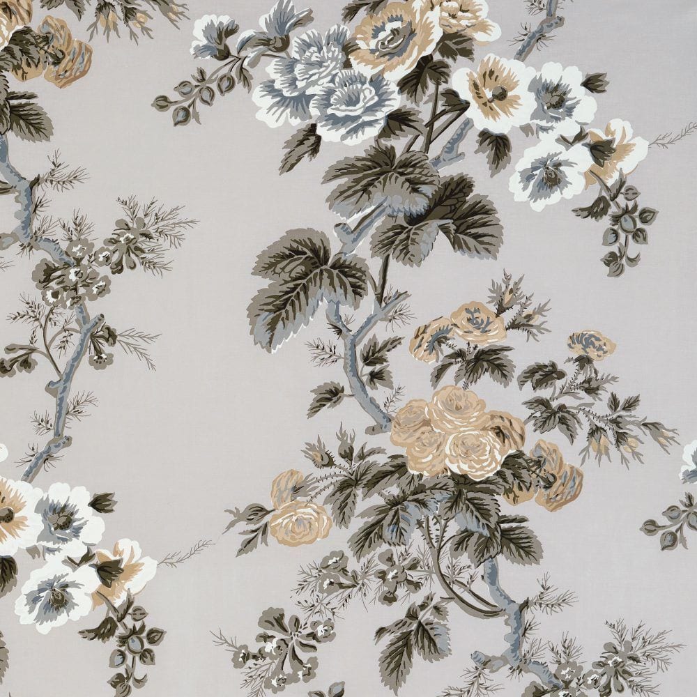 Schumacher Pyne Hollyhock Print in Grisaille
I’m going to show you how I used The Laurel Home Essential Paint Color Collection, combined with several other fabrics to come up with a unique whole-home color scheme that just happens to be a super trendy color palette.
But with a twist.
The trend is gray and the twist is gold.
First, I went “shopping”– online. Since I’m “in the trade” as they say, I went to e-designtrade.com. They carry several lines including Kravet, Brunschwig and Fils, Lee Jofa and a bunch of other great designer fabric companies. If you’re not in the trade, there are several sources online that carry these fabrics, or you can look individually on their consumer websites.
I also went to F. Schumacher where the luscious beauty above came from. This company may have been around for well over a 100 years, but there isn’t anything remotely tired, stodgy or dated in this unbelievably gorgeous collection.
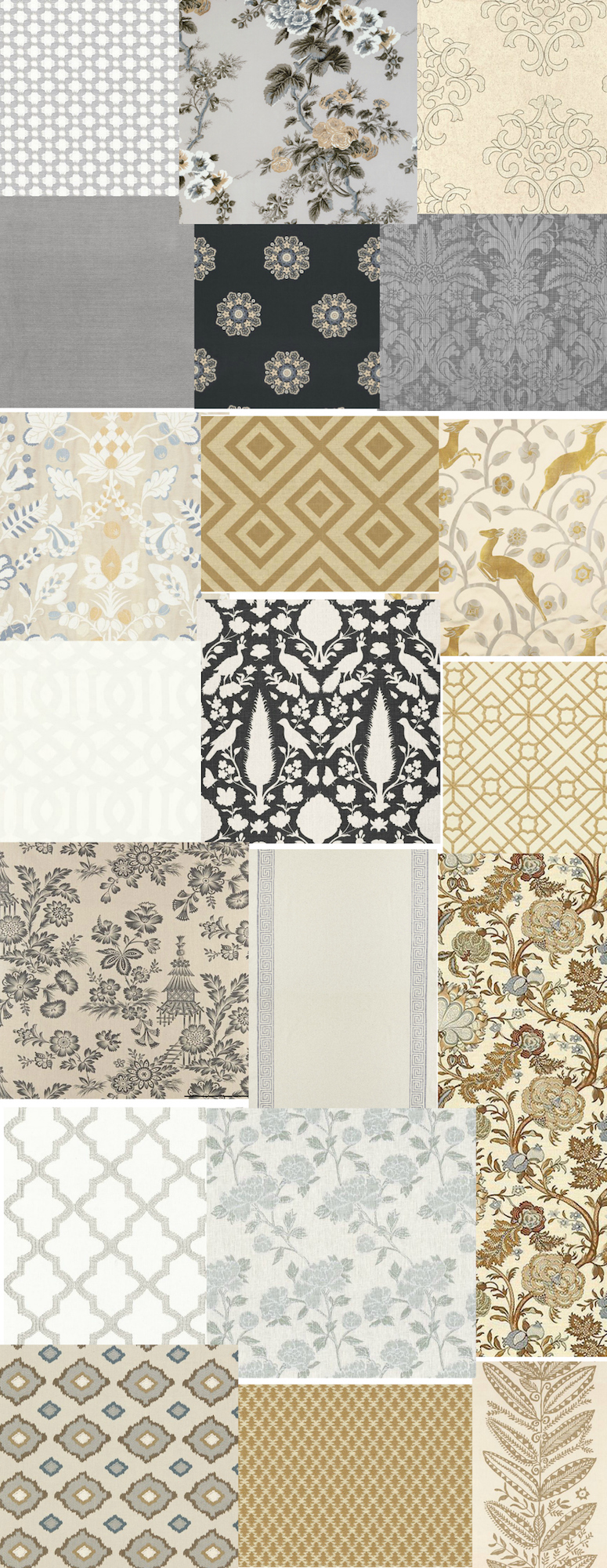
I put some of my faves on a board.
This doesn’t mean that all of these or any of them will go in this home, but it’s a great start when wants a beautiful, classic whole-home-color-palette.
You don’t have to put your fabrics on a board; you can just keep them in a folder. But I put them on a board so that you can see them more easily. Believe me when I tell you that this is only about a third of what I saved!
Also, this is an exercise, not necessarily fabrics I would put together in one room, but many, I definitely would.
And from here, I was able to select colors from the Laurel Home Essential Paint Collection to create a wall color palette for the entire home.
Note: I put the lead fabric in place of the garage. :]
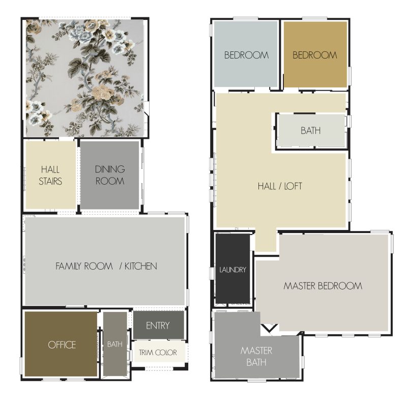 All paint colors by Benjamin Moore.
And no, there is no sponsorship, because I was told, “we don’t do that.” Maybe one day!
To be clear– while the colors are on the floor, these colors go on the walls.
I think a hardwood floor, something like this would be gorgeous. To replicate this color, you might try Minwax English Chestnut. But if I stress testing your paint colors, I triple that with hardwood floor stain. And then, it’s still a bit of a crap-shoot; just because of the nature of hardwood floors.
Benjamin Moore SILVER HALF DOLLAR 2121-40
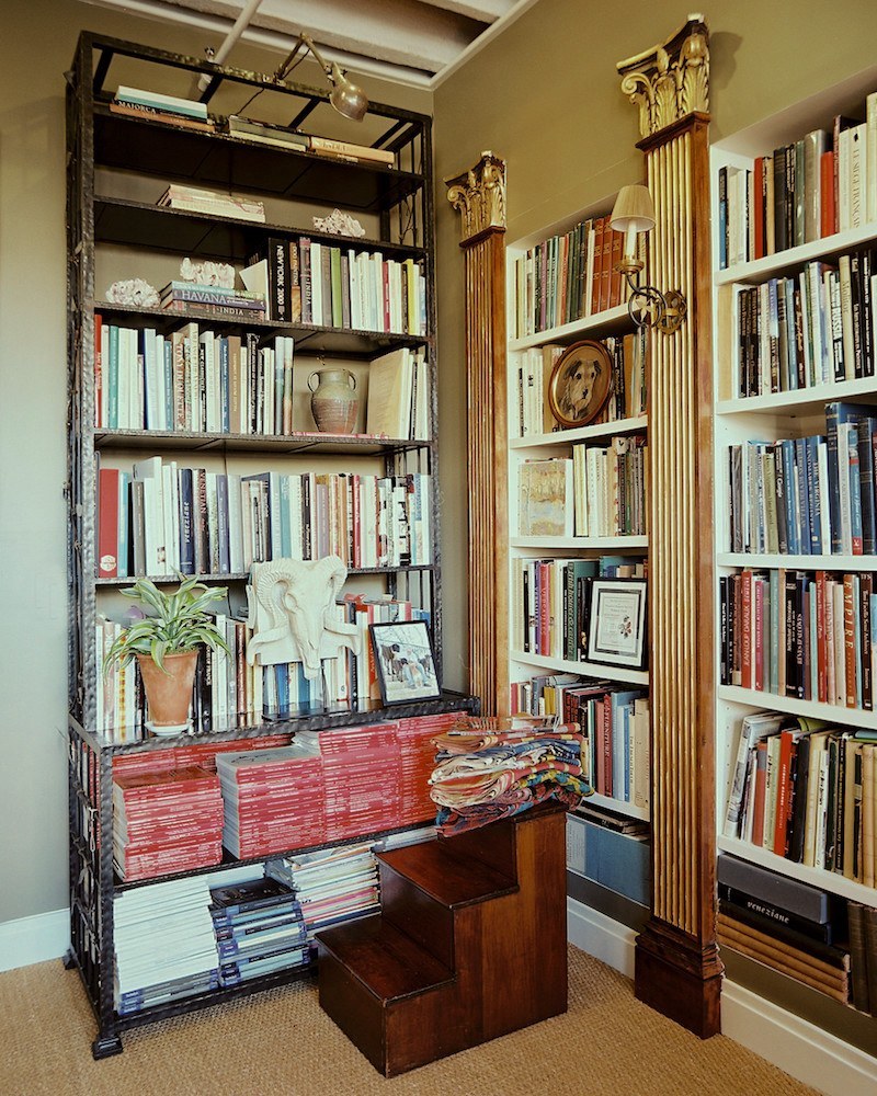
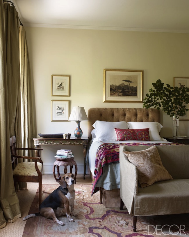 Julia Reed House via Elle Decor September 2012
Benjamin Moore ELEPHANT TUSK oc-8
Bunny Williams’ office painted Benjamin Moore CLEVELAND GREEN 1525
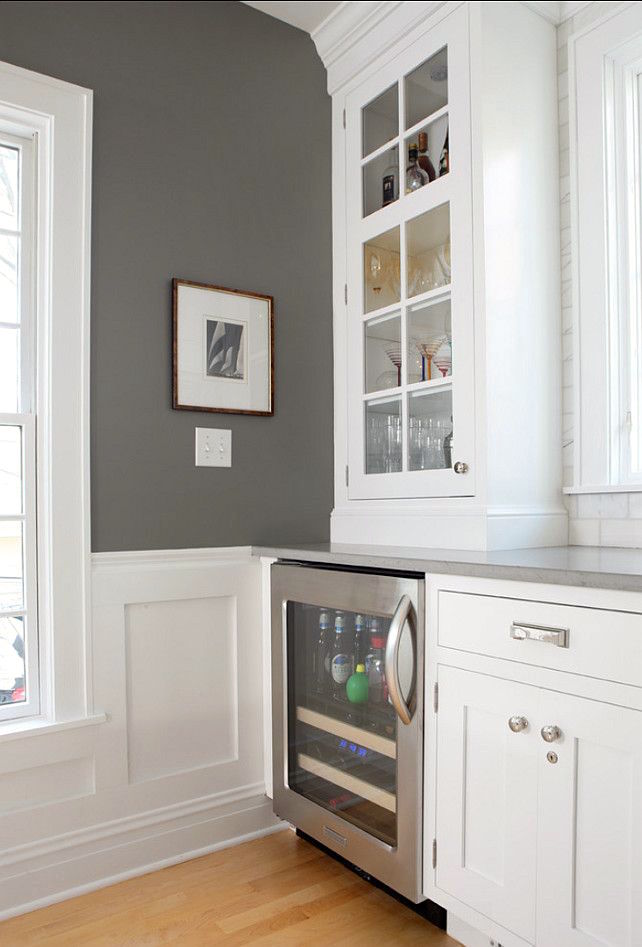
Benjamin Moore CHELSEA GRAY HC-168
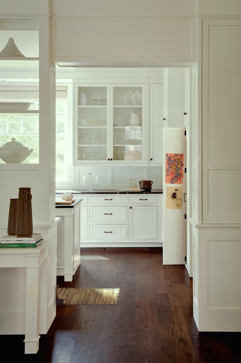
For the trim color, I selected Benjamin Moore WHITE DOVE oc-17.
And there it is!
Must get outside. It’s a gorgeous spring day!
xo,

Related Posts
 A 16-Color Spring-Inspired Whole-House Paint Palette
 What is the Best Palette for No Fail Paint Colors?
 60 Downton Abbey Colors +10 Palettes {like you’ve never seen}
 The Most Handsome Black and White Interiors Ever!
 The Best No Fail Benjamin Moore Gray Bathroom Colors
 A 25-Color Whole House Paint Palette, A Surprise And A Warning
 Nine Fabulous Benjamin Moore Warm Gray Paint Colors


