Dear Laurel,
My name is John, and I’ve been following your blog for a while and love it.
My partner and I live in San Diego and we bought a house three years ago.
And, we still can’t agree on exterior paint colors.
Our house was built in 1955. I’ll send you some photos.
Here’s the deal; everyone in our neighborhood has for their house color the following:
- yellow
- drab green
- poopie brown
- tan
- or some sort of sage green.
My partner wants a masculine house. So, he thinks it should be a dark exterior house color. I’m not so sure. I just want a house that just looks good. Seriously, I do not care what the neighbors think. I already described what they had…
Could you help? I know the colors that are there now, aren’t so great. But, I’m afraid of a dark house color. However, I trust your opinion in regards to color.
Of course, feel free to use us as an example, on the blog.
Thank you,
John
***
Hi John and Everyone!
John actually sent me this email two days ago, along with a few photos of his home in San Diego.
Ahhhh, it seems like a decade ago. But, I was just in San Diego in mid-January of this year And, I very much enjoyed my time in this eclectic, vibrant, and sophisticated city in southern California.
San Diego has some of the best weather in the world, not just the US. It is over-all, dry, and mild. Of course, it can get quite hot, but not like Texas. And, of course, it never goes below freezing. Actually, I don’t want to know if that’s true or not. haha
Let’s first take a look at John’s home in San Diego.
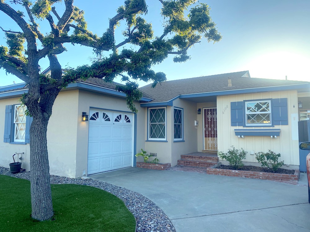
That’s a sweet house.
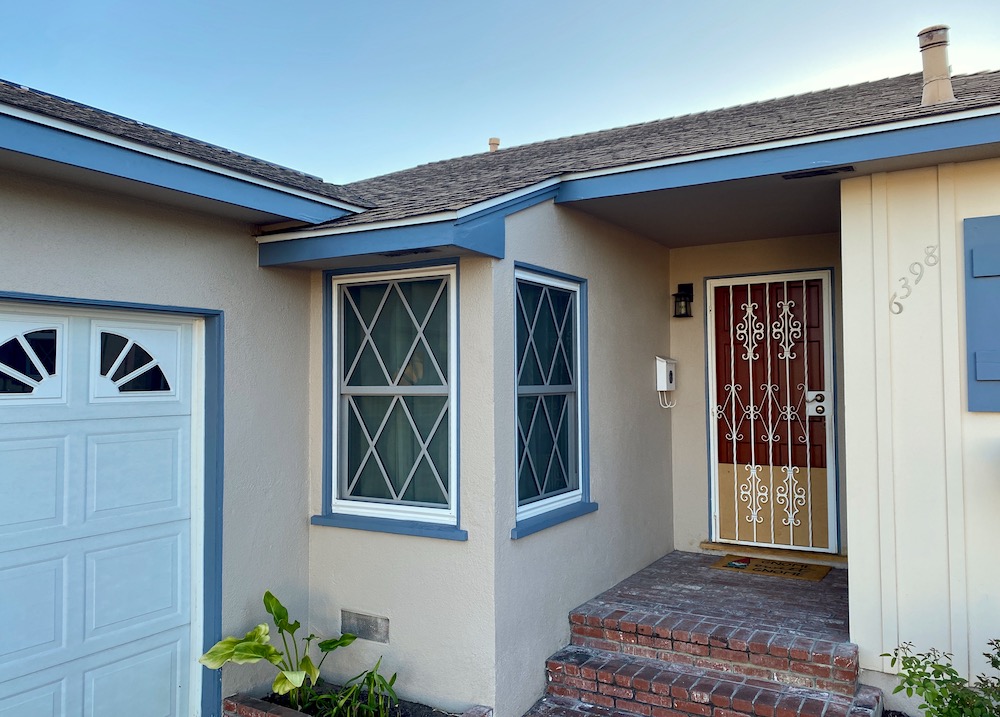
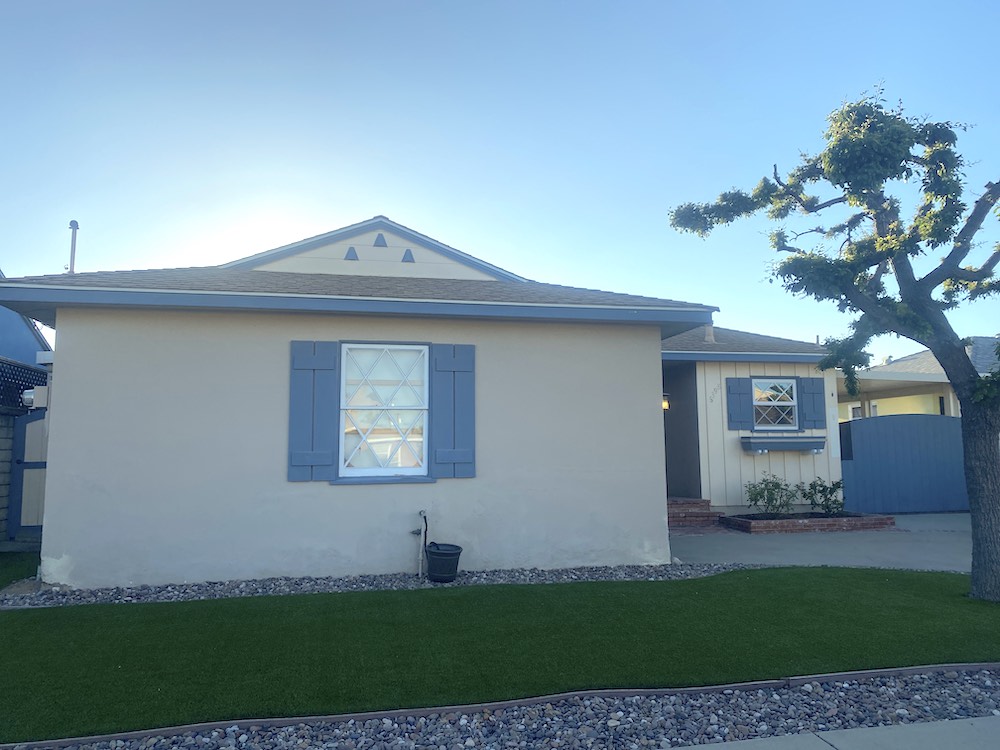
I realize that this is San Diego, but one thing upfront that I think will make a huge difference is landscaping.
Okay, John forgot one color in his list of neighborhood colors.
Baby Barf Beige. Although, this house is actually more like a creamsicle but lightened 50%.
And, with blue trim too.
Well, John and his partner already know this color scheme is not working for them. It’s tired and dated.
Architecturally, this home is not going to turn any heads. However, is it possible to make this place a showstopper? You never know. Paint can do miracles.
Since I am starting this post only hours before publishing time, it’s a high wire act without a net. But, hey, it’s only paint.
So, let me pretend to brainstorm what paint colors might be better. ;]
haha. I already have an idea.
However, many times when I used to work with clients, I had no idea. So, I would look for clues, and we have some here, as well.
John’s partner said he wants the house exterior to look more masculine.
I agree wholeheartedly with that. And by masculine, I am thinking dark and hunky. The reason for this is, this house needs some drama. Right now, it looks like granny and her sister are living here.
Oh man, am I going to get flack for that. I know that at least a third of you out there are grandmothers. And, I’m certainly old enough to be one and have been for a very long time. Hell, there are great grandmothers younger than me.
When I say granny, I mean all of the grandmothers who are no longer with us. And, of course, it wasn’t all of them, either. For more about “granny decor, please check out one of the most popular posts on this blog.
Laurel, aren’t dark houses kind of trendy, right now? Won’t people be going in 30 years: “Hey, look at those dark exterior house colors, they’re so grandpa.”
Very funny.
Well, that could happen. But, who cares? Just paint it something else.
Let’s stay on track here with our dark exterior house color idea.
Here’s what else I do at this point and especially if I’m stuck. I go searching for inspiration.
I find it incredibly helpful to see if someone else has already done my idea. Sometimes I’ve already seen my idea but just need to see more of it.
In fact, we can start right here. In this post about the best paint colors for exteriors, are some dark houses.
And, this is a good post too about 12 wonderful exterior home makeovers.
However, the post that I think may give some terrific ideas is this one about the best colors that go with red brick.
One reason, the red brick post is so helpful is because I introduced the Benjamin Moore color tool. We’re going to use that in a second.
In addition to my blog, of course, there are other blogs and inspiration. For that, I always go to Pinterest. There, you can put in your search terms. When you find an image you like, scroll down because Pinterest will show you dozens of other images that resemble the one you’re looking at. It’s bloody brilliant.
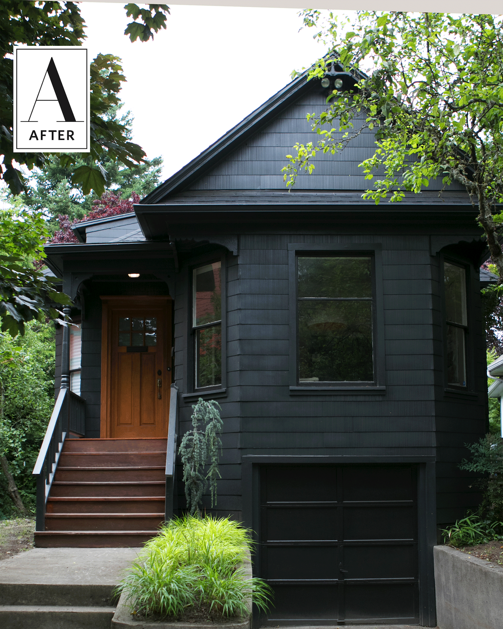
This dark house exterior color is handsome, but I’m thinking of a shade, just a little lighter; more like a deep, rich cool, charcoal. But, not one that might go violet.
 Benjamin Moore blue note 2129-30 is a charcoal that is really a navy but, with a lot of gray in it.
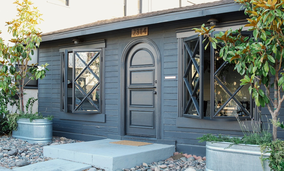
The McCaw.studio – San Diego -the little black house
I like this dark, blue-gray color.
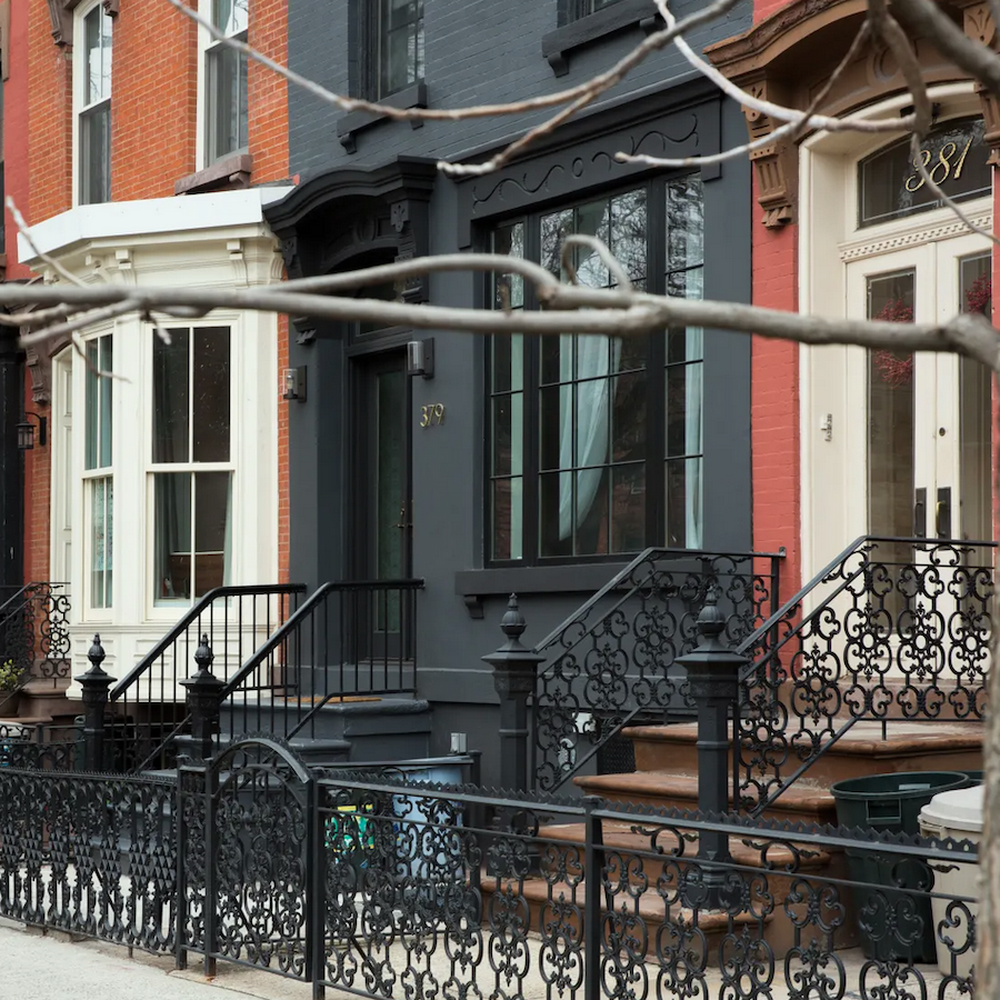
I also love this charcoal gray townhouse with trim painted Benjamin Moore Onyx.

One thing to remember about dark paint colors. It depends on the light, but often-times they look lighter outside.
I also messed around with the Benjamin Moore Paint Color Tool.
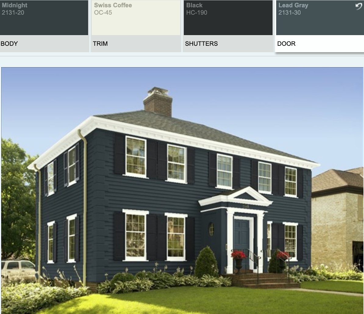
Okay, are you ready to see what I did for my dark exterior house
color palette?
I made two versions. The only difference is the door color.
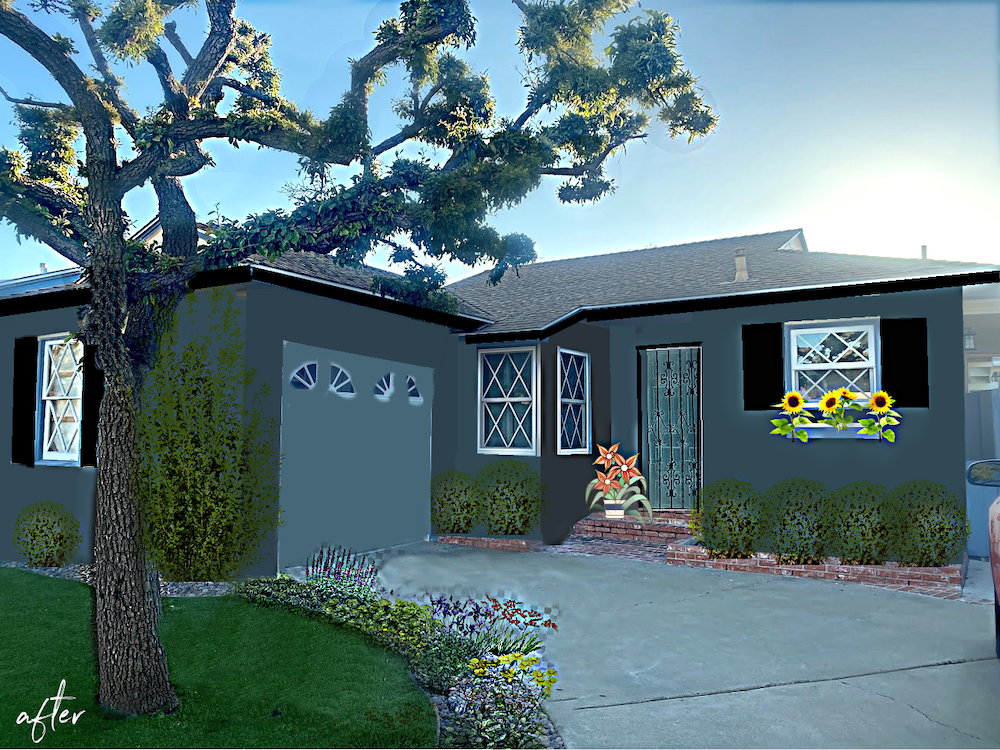
I know! I can’t believe it’s the same house.
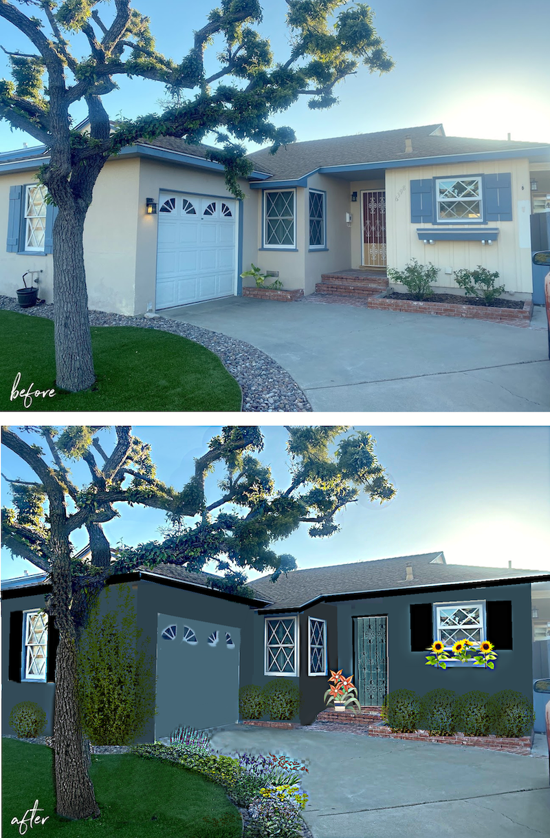
Oh, Laurel, what did you do? What colors are these?
Pleeeeease calm down. ;] We will get to all of that in a sec.
Let’s first look at version #two.
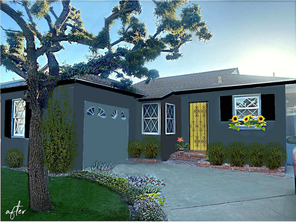
I thought it might be fun to do a bright yellow door. It depends on John and his partner’s personalities and design aesthetic.
But, also what’s making a big difference is the landscaping and flowers.
I should’ve done one without any landscaping. However, I think it makes a huge difference. It’s essential for the garage wall with the lone window. And, it could be bushes or a trellis with something climbing. But, whatever it is, it should be great for the dry, warm climate of San Diego.
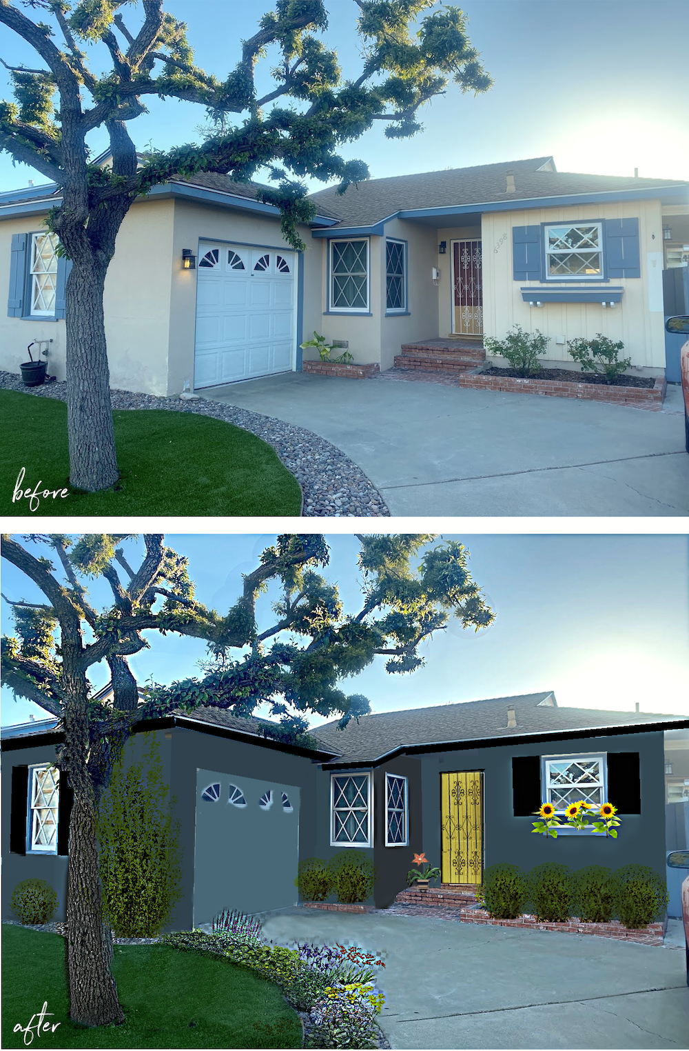
Here is the before and after with the yellow door. Please pin these to Pinterest for reference.
The body of the house is all one color, but I simulated shadows by making some areas darker.
Okay, let’s begin with how I did this.
The Benjamin Moore program is difficult to do with your own photo. However, I suppose I could’ve done it first with that and then cleaned it up in Picmonkey.
Instead, I did the entire graphic in picmonkey. It’s a little messy, but you get the idea.
My favorite part is how I manipulated the door to have the iron door painted black instead of white. And then create two colors for the doors.


If you’re interested in learning how to use Picmonkey, I created a Picmonkey tutorial a while back. Some things may have changed a little. However, it’s very intuitive. I’ve never read anything or taken a course. But, the tutorial I wrote will give you some ideas that took me a while to discover.
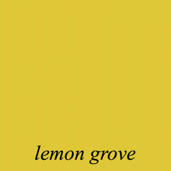
Benjamin Moore Lemon Grove 363

Benjamin Moore Newburg Green hc 158 might be a good front door color.

Benjamin Moore lead gray 2131-30 is another lovely gray for either.
Both of these paint colors are in the Laurel Home Essential Paint Collection.
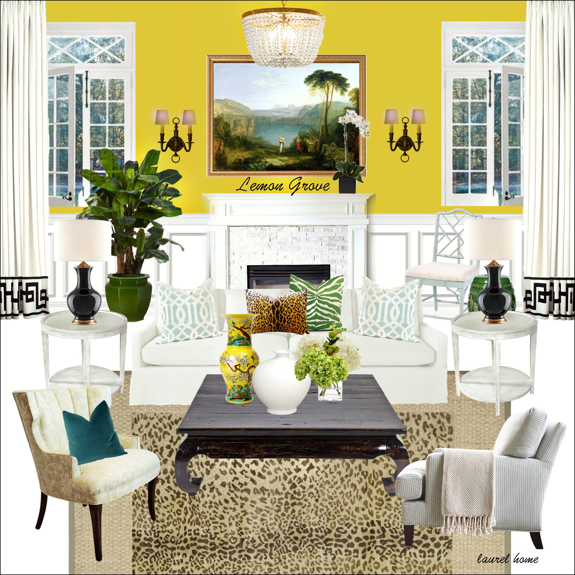
Above is a board from the palette portion of the collection, which includes 39 other boards.
Oh, there’s the yummy Kelly Wearstler trim. Please go to this post about making budget window treatments look expensive, if you’d like to see a template I created for it! That was another fun challenge.


The shutters and everything that’s blue in the current house is painted black in my rendering.
Below is an interesting lesson. The bottom image caught my eye as a terrific color.
But, guess what?
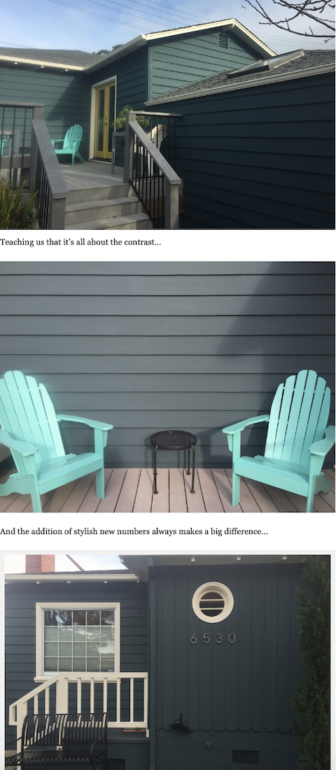
Lovely coastal home painted Narragansett Green by Benjamin Moore. But yes, all three images are the same house painted the same color. I can’t drive this point home strongly enough. Never select a paint color strictly from a photo. This is why when I’m asked, “What color is that?” It’s like chalk squeaking on the chalkboard.

Other body color possibilities include Benjamin Moore blue note 2129-30
It’s a very grayed-down navy.

Soot is the darkest charcoal with a slight blue undertone.

This is very close to the above Narragansett Green.

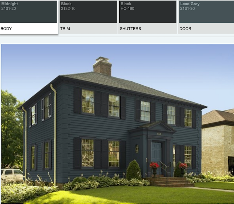
Benjamin Moore Midnight 2131-20 is another lovely almost black color for the body of the house.
This looks terrific with the Lead Gray below.

Lead Gray 2131-30 (body or door)

I brought the black down so you can see them together.

If those almost black shades prove to be too dark, then Anchor Gray is another possibility.

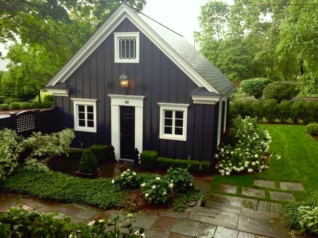
And, of course, no post about dark exterior paint colors would be complete without Nancy Keyes’ exquisite garage painted in Raccoon Fur!
Please follow Nancy on Instagram if you’re aren’t already. I love everything she does!

Body

Garage
And two other terrific charcoal gray paint colors.
 Rocky Coast by Benjamin Moore
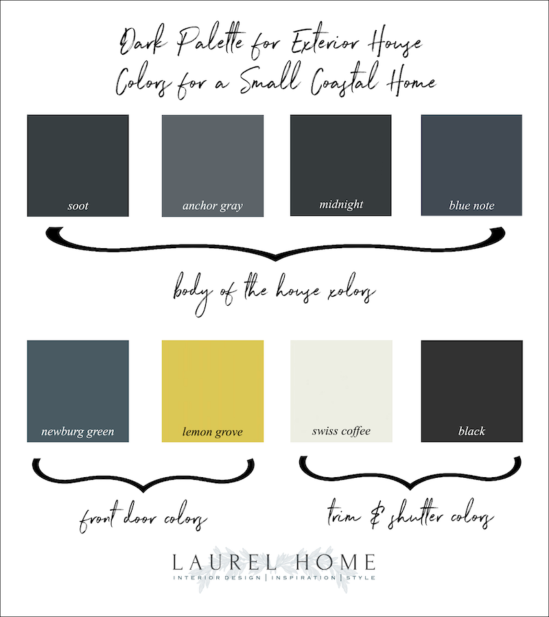
Please pin to Pinterest for reference
I hope you’ve enjoyed this post about dark exterior house colors. And, hope you found my process helpful.
But, a reminder. Always, always make samples! (for myself too!)
And, look at them in many different lighting conditions. In other words, don’t just go full steam ahead on my recommendations. Your perfect color might need to be tweaked. But, these colors are a good starting point.
For more colors, if you don’t already have it, please consider getting the Laurel Home Essential Paint and Palette Collection.
xo,

PS: Please check out the newly updated HOT SALES. And, time to make your wish lists for early access for the Nordstrom Anniversary Sale. It can’t get here quickly enough. I need my La Mer before my face falls to the ground. haha
Related Posts
 20 Breathtakingly Gorgeous Ceiling Paint Colors and One That Isn’t
 120+ of My Favorite Interior Design Books + Gardens!
 18 Secret Doors You Will Be Inspired To Have!
 The Best Neutral Paint Colors Full of Color!
 Mirror, Mirror Over The Mantel – What Size To Get?
 Little Kitchen Details That Make a Huge Difference!
 Ceiling Lanterns – How to Figure Out What Size to Get







64 Responses
Hi Laurel!

I love the house colors!! I am picking out a color for my home right now. My husband is looking for a dark color
We decided on a dark but not too dark a color. we had a few paint swatches on the house, and in different places on the places
The people at my local paint store know me by now, they knew i would be back for more paint samples- crazy and smart!
thank-you for your wonderful and informative blog! I look forward to reading them
Have a great day!
Sue
What a difference–I hope they show us pictures once they get on with it.
I wonder if part of the reason the dark brownstone is looking so good is because it is couched between two red brownstones.
I love the colors! But colors like these do matter if you live, as I do, in an area where I think the sun might be trying to kill us. There is a beautiful house near us painted almost black.It is beautiful and exotic and stands out. Even here, with all the crazy house colors.But everyone just shakes their collective heads knowing the guy will soon have a light grey house.
I’d love to see a photo of how that turned out! Sounds beautiful!
I love your suggestions! I also love the SW color, Hale Navy if you’re looking for a dark gray navy.
We bought the ugliest house on our street last year and have been renovating it ever since. Just this week, we are finally having the exterior paint finished. It went from filthy white, to Indigo Batik by Sherwin Williams. I love it! A few months ago, while we were staying home to flatten the curve, I painted the walls of the exterior myself in Naval by SW. And although I adored how it looked, it got too hot in the Florida sun. So, we went a few shades down and it makes such a difference in the amount of heat it absorbs. Still navy, just lighter. Makes quite the statement, to say the least.
Wonderful ideas Laurel! You made the house so inviting.
It appears that the roof is brown with lots of blue sky as the background. My personal preference would be to use a very dark blue.
It would play off the sky and be good with the improved landscaping and brown roof.
Unlike many others here, I love the scroll door and the windows. Those give the house character and interest. If you change those items you destroy the personality of the home, which is probably in character for his area.
Your bright door and black scroll is spot on, a genius idea. Thanks John and Laurel. This was fun.
I have loved Daniel Keely’s home since I saw it the first time. It does remind me of ours and I didn’t have to spend money on brick as ours had crappy brick already.
Over 300 new followers on IG. So the Laurel factor at work again! XOXO
I like the yellow door! But I agree with others who suggest ditching the scrollwork thingy.
For energy efficiency, I think roof color matters more than siding color. And it doesn’t get blisteringly hot in San Diego. Unlike here in Pittsburgh lol.
Timely post for us as well! The exterior paint job is in progress! I tried and tried and tried… and ended up with Wythe Blue, Ballet White trim, and Newburg Green accents. It’s a foursquare house with some Victorian elements. The first floor is brick. Oh and Heritage Red for the front door. Laurel, you probably recognize all of those from your post on exterior colors with brick! So so helpful!
I do like dark houses but I think in general it’s easier to make it work with small houses. A big dark house could be imposing.
Spray paint those diamond windows if they are vinyl to make them disappear or replace them with wood windows. 86 the yellow door idea. Paint the garage door the same as the house,and landscaping will be the frame on the canvas!
I would also like to suggest Bramble by Benjamin Moore. It is a dark gray with a bit of brown. It makes all colors pop. another thing I consider in color for exterior is if the color oxidizes what is it going to do. I wouldn’t want to end up with a purple house.
Love a dark house, but not in this climate, for two reasons. One, the dark color will absorb the heat and your cooling bills, and energy usage will increase – not environmentally a good choice. The second reason I would say no, is that blue paints fade quicker than other colors, so it will start to look dingy soon. What about a monochromatic combo with lighter and a bit darker greys. I also would consider changing the garage door inserts to match the windows. You’ve got three window patterns in a small area.
We had this exact same floorplan (with two-car garage) in the South LA area for many years. Toning down the contrast is really helpful, and the landscaping – oooh-lala, what a difference!
I think they are trying to make a cottage-style home into something it is not. As a result, they will not be able to get it the way they really want it – just kinda of like they want.
Instead, I think they should lean into the style of the house and update it. They could go with a more rustic look with warm wood shutters & garage door & front door along with decorative accessories. Exterior color could be cream, light sage or light olive. No window diamonds.
Or go full cottage with the window diamonds, more window flower boxes, more flowering landscaping.
Or go Spanish Mediterranean.
Well my one observation about blues grays and greens is they fade/chalk faster outdoors because the blue pigments are less UV stable. Just plan on repainting sooner and demand the absolute best grade of paint possible from your contractor or do it yourself. And if you get any sprinkler spray on it its going to get a bunch of visible white mineral buildup. This goes for any deep color. That might be reason enough for landscaping to expand the beds near the house so sprinklers are further away. Looks pretty cool though.
I don’t consider that color combination to be “dated” – a word I prefer to relegate to describing archaic electronics and kitchen appliances. I do agree with the querents that the house color is not particularly masculine, and that ideally getting a color profile that more complements the red brick is certainly in order. Dark does work here.
Hi Laurel. Thx for sharing the refresh of this cute house. I’m in agreement with many of the comments. For this house to look more masculine the window mullions, garage door, and screen door design need to be changed. A more modern garage door with horizontal smoked glass panels would look clean and updated. Along with the cottage style mullions the windows appear too white for the rest of the color scheme. Painting them a more creamy tone than Swiss Coffee may be good. I’ve used Swiss Coffee on several exteriors and it reads very white. It would look good to also paint the trim the same as the window trim. As for the body color, the deeper colors with either a blue or green undertone would complement the roof, which appears to be mostly brown. The grayish blacks may not coordinate as well. I like the yellow door and would even be tempted to go a bit more towards orange! Coastal style lighting and low water usage landscape incorporating grasses and succulents would be low maintenance and really help to modernize this house.
The house is not that big, but the exterior was stunning. Love your paints! John’s house is impressive.
I couldn’t agree more. Underestimating the sun’s toll on exterior paint is setting one’s house painting budget up for a shock. Also, dark colors absorb heat, the last thing a homeowner needs in Southern California. Dark colors will also go chalky, creating a film over the paints surface.
See if you can find a paint formula that won’t fade in bright sun. My mother recently painted her house in Florida and that’s what they had to do.
Am planning to implement some of the ideas that you have shared. Thanks for this piece.
Ooo, I feel so bad for the tree trying to recover from it’s butchering
When chosing a house color, it is important to take into consideration the climate. In So Cal. we have lots of bright sunny days ie blazing hot, with long hours of color bleaching direct sunlight. My neighbors painted their house a stunning dark plum color 3 years ago. Today their color is fading to a sort of medium orchid. A masculine dark red could well end up a girly pinkish color in a shockingly short time. Our once lovely green 2 story house is being repainted as soon as we can escape from lock down. The reason? color fading. My sister in Seattle has no problem with colors being sun-faded, however mold is an issue. We ignore mama nature and pay the price.
I live in the San Francisco Bay area, and there are so many houses that have gone gray over the last 8 years. Really dark grey/black-painted houses are a trend that’s time retire! (See the links below to 2 recent articles about this fad.) To me, it indicates gentrification and the exit of average folks from urban neighborhoods. That being said, I think painting John’s house a mid blue-grey is a nice idea, and that color would work well with the red brick. Please DON’T remove the diamond-paned windows– they are charming and give the house some character. Painting the window muntins & trim black could help them feel more stylish.
https://www.sfchronicle.com/bayarea/article/Paint-it-black-architecturally-speaking-Better-15290427.php
https://www.sfchronicle.com/culture/article/Welcome-to-grayspace-San-Francisco-s-new-14493024.php
Keep in mind that when you have a dark exterior house you will lose natural light inside your house because the sun won’t be bouncing around those light exterior colors into your windows anymore. It makes a big difference!
This is a really cute house. My first thought was the same as others have expressed–remove all of the window and door grills, window box, replace house numbers and replace the garage door if it’s in the budget. Also replace the small wall lamp beside the door with something updated and more substantial. A terracotta ( or terracotta look alike) roof would look good too if the budget allows.
Dark colors look better than the existing blah beige/blue but how about the opposite–Caribbean or Florida colors such as turquoise, tangerine, or peach could look stunning with tropical landscaping. Those colors can stand up to the summer sun and cheer on the fall/winter cloudy wetter days. This of course depends on the interior decor.
I enjoy the darker colors. Raccoon Fur looks to be a wonderful color to work with. Not crazy about the yellow door – too bright for any the dark colors, in my estimation. I know that landscaping can add a bit of curb appeal and that is much needed.
Dark and handsome indeed! I agree wholeheartedly with the landscaping and changes to the dated detailing as part of the exterior upgrade. There’s a little stucco bungalow in my neighbourhood that just went from baby poo yellow brown To the most fabulous navy with white trim. An absolutely astonishing transformation with only paint.
Sorry to hear about your technical troubles. I hope you get some sleep today. Thank you for starting my Sunday morning with some lovely eye candy.
We had an addition to our house which was originally a horrible dull cream brick with gray mortar which always looked dingy. We painted it a dark blue gray with white trim and a bright but buttery yellow door with maritime style exterior lighting and people stop and tell us how wonderful it is! And I’m a flower addict and the flowers just pop out against the backdrop!
Love the look with the yellow door. I live in southeast Wisconsin and white is making a comeback as an exterior house color. I like white.
Well, this is timely…My house is being painted as we speak (write). It’s a 1924 southern cottage with wood siding and 4/1 windows, which would have originally been white but was a pale (dirty) yellow when I bought it. It’s on a busy road that throws up a lot of dirt. I went back and forth and ended up buying 7 cans of sample paint, but ended up with these SW colors: Cityscape (gray but not blue) for the siding; Grizzle Gray (darker gray) for brick foundation, porch pillar bases, and gable; Byte Blue for the porch ceiling (must be blue in the South); and the color consultant provided by the painting company got me to switch from super white to Alabaster for the trim. My doors are Decisive Yellow. I couldn’t be happier and already have gotten compliments from my neighbors and friends on Facebook. There were plastic shutters on the front windows, which I removed because now the lovely wooden trim on the windows really stands out. I’m going to paint my porch swing glossy black next week.
I am painting the exterior of my cottage, Raccoon Fur. I love it. It was a rather nondescript gray and now it has so much depth. I am just leaving the trim crisp white. I thought it would be too dark but now I think it could even be darker!
I was so interested to see your take on dark exterior paint. Recently, we had a home in our subdivision painted a very dark brown. This is a brick, traditional, l Georgian style colonial. The house is being flipped (ugghhh). The windows and all trim have been painted BRIGHT white. That looks bad enough but, instead of painting the small amount of aluminum siding on the second story the same dark brown as the brick, they chose a pinky, beige……WTH???? It looks awful. NOTHING else on that exterior relates to pink/beige and it looks like they ran out of paint and decided to just go with it! I have not been inside but, I would bet that the entire interior is a sea of grey and pinky beige. Because, you know….that’s so updated, LOL! My point (besides being snarky, LOL) is that people should be careful about painting trendy colors on an exterior….they may work for a while but, not as well as classic colors. I know it is “just paint” however, if you have to hire the work out, it’s a significant investment.
I live on a corner.
This year one neighbor across the street painted their yellow cottage-style home a dark color. It looks great even though it does not blend it terribly well with its neighbors. I love to look at it. The color changes with changes is sunlight level. I do wonder how it will look it winter when it is not framed with tall deciduous trees and landscaping.
The other house across from me is a great original MCM-style house. It is mostly stone. The owner painted it Art Gallery White with black and dark wood trim and 13-outdoor lights. I looks like a White Castle.
It blends in with nothing, even its own landscaping. Those who advise painting houses white should maybe think again. It will probably look good on a real-estate listing, but in place it is an eyesore morning, noon, and night and will be in summer, winter, spring, and fall. Luckily, I have few windows facing it. I pity those who do have to see it all the time. If the owner has in their shoes, he would not be a happy camper.
This house would be great in a darker tone and I agree with the other writers on ditching the dated decorative elements. Those metal screen doors are a passionate no from me! Modern house numbers and a richly stained wood front door and garage door would be stunning with the new dark exterior. San Diego is the perfect climate for bougainvillea, one of the bronze/orange varieties would complement the wood doors. And a bronze/red leafed canna Lily planting in the bed. Plumeria and gardenia, tree ferns, all those lovely subtropical plants would be delightful here. Please don’t use one of those ugly twisted cypress from the photo shop image!
The diamond pattern windows, the arched garage doors, the iron door grill, and the shutters all need to be replaced…such a mish-mash of styles. Love the dark green color for exterior and wonder about soft white trim and doors color. Lots of white flowers growing. Love your posts . Sorry about the house in MA.
Hi Laurel. I love the colors you chose, but I’m worried about summer and fall heat waves. Most homes in San Diego do not have air conditioning, and I’m guessing dark paint will add several degrees to the interior temperature, especially if the home is not well insulated, which is true of most older homes in California. It’s something for the homeowners to consider, I guess.
Hi Laurel. I absolutely LOVE the yellow door. In such a sunny climate, I think it would be stunning, especially with the right landscaping. The only thing I would change in color scheme 2 is making the trim Swiss Coffee and just leaving the shutters black. I love the way a light trim makes a dark color pop. My house is BM Lush (rich green) with a red brick front and White Dove trim now, after being putty or gray in preceding years. Door is BM Fiji, and this scheme looks great with the sky and trees. Much more fun than putty or gray.
On another note, dark exteriors have been around or centuries and are stunning. They do not look grandpa-y when done right. I grew up in a small town in northern NJ with some big Victorian homes, and many were painted dark colors and were stunning. My fav belonged to my childhood sweetheart and was barn red with black trim. He recently sent pix of our childhood homes and his house has been painted a light color and is now boring and unnoticeable. Dark colors done right will always be showstoppers.
Re yellow doors: two of my neighbors tried out yellow doors for a short time and they were amazing, imho. One is gray with strong violet undertones, and the other warm gray with a brick front. They did not feel it, and the violet toned house ended up with a red door and the brick front a light gray.
Thanks for another great post. Be well.
Anne
Enjoyable post and very instructive. Has anyone experience with heat absorption of dark colors in sunny, warm climates? The colors will absorb rather than reflect heat and could lead to running the a/c more and higher energy usage?
Hello Laurel, I agree that this house has lots of potential, and I also agree with many commenters who say that the details are killing it. Before I even paint, I would see how many of those could be eliminated. If the diamond panes are just inserts, I would pull them out immediately, otherwise I would start pricing window sashes. The “country” shutters disappeared well enough when painted dark, but why not just remove them. Your reader who said that working shutters were elegant is 100% correct, but here a horizontally-oriented window would still have to endure the mismatch of vertically-oriented shutters. Also, your window box looks great (you’ll have to do a gardening post on how to grow six-inch tall sunflowers) but I notice that it is not now planted, and if the owners are not the type to take care of it, it could go also. The house’s most egregious sin is the rounded garage windows. Perhaps this could somehow be covered if it is too expensive to replace the whole door. There is still the side garage window (diamonds to be removed) to let in light.
This house is a good example of an attractive plan, with the garage and main wings forming a welcoming courtyard-like entrance, that has gone berserk with unattractive and irrelevant details. Once these are gone the house will seem more cohesive and the color could be decided upon (I do like your gray) but perhaps the desire for dark was just to make all the cutesy details go away.
–Jim
Thanks, Laurel, for such a useful post and the great ideas! Love the dark paint. If the window trim stays white – and the white window pane dividers remain – I think there needs to be more white included elsewhere. If the fascia and soffit were white, as on Nancy Keyes’ garage and on the Narragansett Green house, the dark would really pop.
Working shutters are a classy look, I agree that they would add some substance to the exterior. I would make the shutters on the front facade longer (to match the garage), and put a smaller window box between them.
If they are on a budget, they could explore replacing the top panel of the garage door, not the entire door.
Great ideas and a fun read!!
PAINT IT! Paint is an accessory. I hope if John and his partner do paint their house, they send you photos of the after. Great post!
My own experience with a dark colored house has not been great. Did you know spiders and bugs excrete “something” that looks drippy white when it dries on a dark colored wall? So, from the street the house looks great and uniform, but as you walk up close you can see all the bug splatter. The solution is frequent sweepings of the soffits and corners, but you will always miss some. I know some don’t mind an extra bit of maintenance for a feature they adore, just wanted them to know that this is a thing.
Agree with the mixed styles of diamond divider windows, fan style windows on garage plus ornate storm door infused with a cottage style house is visually confusing. Removing the diamond dividers on windows, windows on garage and steel insert will give uniform look. Like the dark colors and landscaping will direct the eye to the front door allowing the rest of the house to be a supportive to the entry. Decorating is following/ supporting the architecture of the house.
All such great ideas. Love the color schemes you put together. The home is wonderful – so happy for the owners. One thought. Investing in real, operable, working shutters would add a major “oomph” to the finished project. They always seem to elevate a house to another level. Good luck to the owners – they picked a jewel for sure.
I love the idea of this being a dark house!! Someone mentioned getting rid of the door grate and I agree. Some modern house numbers would look great, too! It appears the roof has brown tones, so I’m thinking the paint should, too. Sean Anderson’s “after” home is a great example. And so is Daniel Keeley’s, which was featured on this blog. I would also love the windows painted dark so everything flows…I think it would give the house a larger appearance. A light stained door similar to Dan’s, copper lanterns and lush green landscape would be icing on the cake. Of course, all IMO.
No, no, no, no and NO. It looked better before. Dark colours are depressing. They have no curb appeal. Houses are not meant to be that dark. And they are so ubiquitous now. All the lemmings are using dark paint, to everyone else’s chagrin. On all the house forums I’m in, everyone is complaining about it. It’s so 2 years ago and trendy. Please stop.
Oh, gosh, tell us how you REALLY feel Cynthia.lol That’s what makes the world go round. I like both white and dark houses. And, I stand by my choice to make this small home dark. But, it’s fine, of course, if you don’t like it. xo
I can’t remember if you’ve ever written about Daniel Keeley’s home in Arkansas, it was in Southern Living a few years ago. It’s one of the best transformations I’ve ever seen, right up there with Nancy Keyes’ home in Atlanta. I love smaller homes painted dark colors. Thanks for another great post.
Hi Terri,
Indeed I did. I should’ve linked to that post too. But, here’s the post with his amazing home before and after.
Great post! You know I love a great dark color inside and out. Thanks as always for including our garage! We never tie of looking at it. When I woke to see so many new followers I knew it must be because of the Laurel factor. Thank you!!! XOXO
Oh, that’s so cool, Nancy. As always, I’m grateful to you, too! I’ll never forget when you said you wanted to send me some pics of your house and in my jaded, sarcastic way, I thought to myself, “oh, brother, this should be good…” And, then, holy crap every photo you sent BLEW me away! That sure taught me a lesson! And, being able to publish them gave me a tremendous boost, as well. So cool!
I painted my house Narragansett Green last year and I couldn’t be happier! I have a mid century ranch house with natural wood paneling in the front and the green just makes it pop. I live in Oregon so the cloudiness really brings out the moody bold teal. The other dark colors I tested looked a little flat due to our lack of sun and Narragansett really shone through. It also makes my landscaping look really sharp.
I get so many compliments from my neighbors and random people walking down the street. It’s definitely a statement, but a good one. If you want the WOW house on the block don’t be afraid to go with a bold darker color. Just make sure you test it on all sides of your house so you can see how the sunlight effects it.
Excellent advice Erin about testing on all sides. The images I posted are a testament to how the color does change in different lighting situations.
I live in California and my favorite house exterior was a house I had that was Aubergine ( brown with subtle purple undertones). We put a Spanish tile roof on it but not orange. You can get Spanish tile in multicolors of brown, taupe, and a few pieces of light charcoal. Sounds bizarre but somehow it nestled into the landscape. I agree with you that the house you featured would look better dark. Another way to go dark in CA is with a brownish terra cotta but that is very tricky and can go very wrong. Only other thing I would do is change the garage doors to dark rustic wood.
Your home (or former home) sounds wonderful!
What a cute house. The ornate front door, diamond windows and garage door windows are not cohesive. I would remove the ornate front door grate and camouflage the garage door windows. There are some good ideas on Pinterest. Then add a nice pop of color for the front door. The yellow is perfect.
I agree, with that, however, I think painting the door grille black makes it almost disappear with the darker, door, anyway.
I’m wondering if you can paint that garage door? It’s vinyl? Will paint adhere to that? Any primer tricks?
If it were me, I’d go with those lovely dark colors you picked out, and swap that garage door out for a wooden one. Something about the faux fan light doesn’t go with the style of the rest of the cottage, IMO.
The wooden garage door is a terrific idea and will complement the red brick. However, vinyl can be painted. Of course, it needs a killer primer and sanding so the paint sticks.
John, please take Laurel’s advice, which is spot on,and your partner’s request, to heart! Your home will be the one people slow down to admire, which is the ultimate compliment IMO, and you will wonder why you waited so long to go dark. One thing though, please also paint that vent pipe on the roof!
Your color suggestion looks great! I’d pick something along those lines too. I’ve always been drawn to dark color palettes – interiors, exteriors, clothes – you name it. Dark colors are more dramatic and elegant. Who cares if it’s trendy!
And as for that yellow door, I think any other bright color would work great too. Heck, the owners can repaint that door a new bright color every couple years, just for kicks.
I also think Modern House Numbers/Letters would make a big difference.
Love your paint schemes!
John’s house reminds me so much of my first house in California— complete with those diamond paned windows. Not to hurt anyone’s feelings, but what on earth were those builders think of. A touch of Tudor in subtropic CA?