I think I Just Made a Terrible (and costly) Decorating Mistake

Dear Laurel,

I’m so upset. Years ago I nearly fell over in my chair when I opened up my Elle Decor and saw Lindsey Buckingham‘s kitchen.
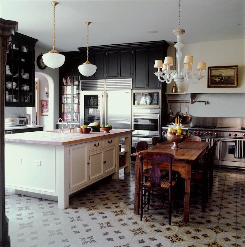
kristen-buckingham--2-portfolio-interiors-american-country-beachcoastal-french-provincial-georgian-traditional-transitional-kitchen

I don’t know if it is the black cabinets or that way cool tile floor, or all of it with the brown wood table. But whatever it is… I’ve been working with a kitchen designer and just ordered a new kitchen to the tune of some $200k+.

So, what’s the problem? This is the problem. I just read somewhere that you shouldn’t really do anything but white cabinetry and subway tile. That is the only thing that’s “classic.”  The article showed a floor in the same style as the one above and thought it was nothing but a passing trend.

Is that right? I didn’t even realize that what I was doing was considered “trendy” or a decorating mistake. I just thought it was cool! What do you think?

Helen Uvtroy


*********

Oh Helen! Well, everyone is certainly entitled to their own opinion, however, no one, not me or Martha Stewart or Bunny Williams has a right to say what you should or shouldn’t put in your home! I love white cabinetry and subway tile too but there are other great choices as well!

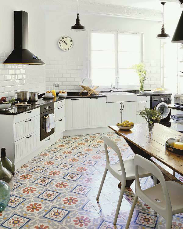
Furthermore, I disagree that the tile in Lindsay Buckingham’s kitchen is just a passing trend. That floor tile is nothing BUT classical! It’s made of cement and is called encaustic cement tile. Here is a great post that explains exactly what it is. That stuff has been around for 100s of centuries. It has its roots in Moorish designs. It has been popular in many countries throughout Europe from medieval times on.
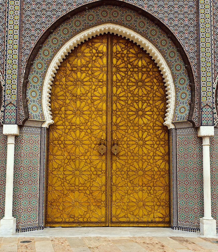
CY8Y46

Fez, Morocco. Brass Door and Tile Work at the Royal Palace, Dar al Makhzen

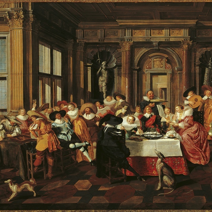
renaissance-dutch-paintingvia

Renaissance Dutch painting c. 1628

Check out that floor!
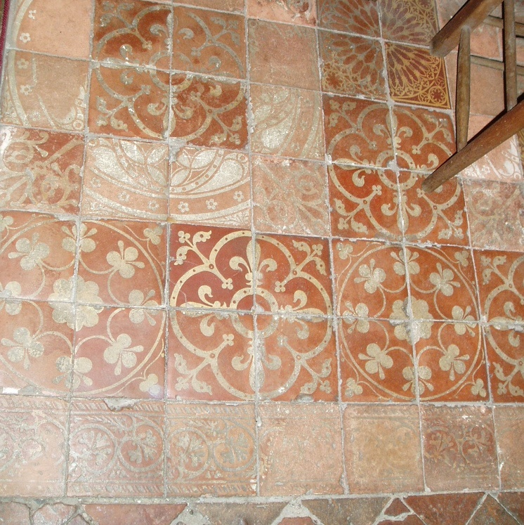
sanctuary floor at Wyre piddle, composed of fine 15th century encaustic tiles
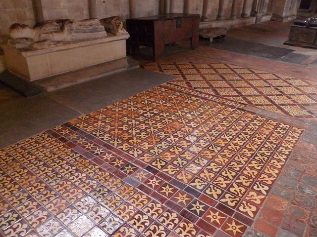
Above sanctuary floor at Wyre piddle, composed of fine 15th century encaustic tiles

westminster-abbey

 From the floor of Westminster Abbey built in the mid 16th century

And… it’s made an extremely popular comeback now.

barf-linoleum-tile

NO, not this! This is the fake linoleum version made so popular in the 1970s so-called Mediterranean style.

yuck

house-nerd-photo-meghan-plowmanvia

Design: Etica Studio

photo by: Meghan Plowman

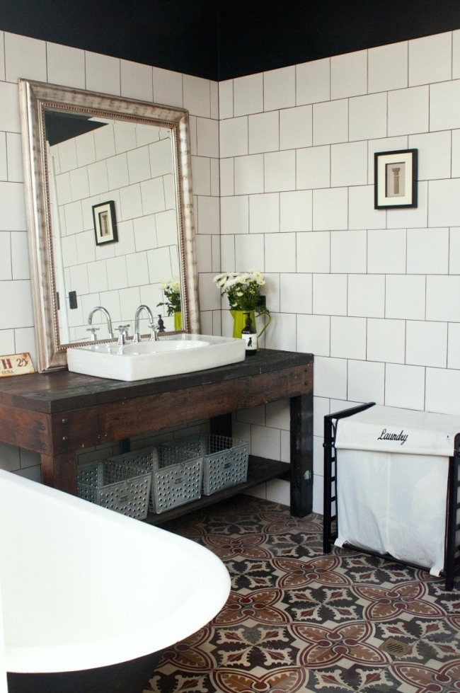
This is the good stuff!

micasarevista.com

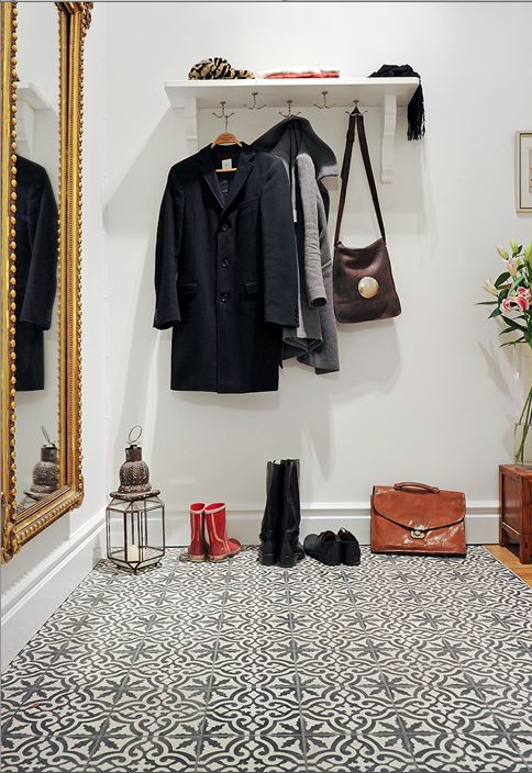
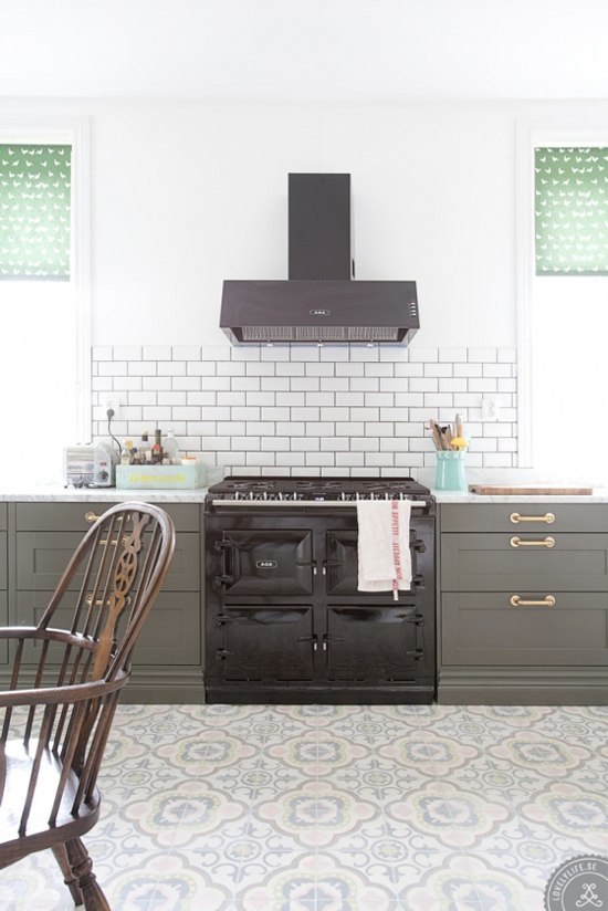
my-paradissi-patterned-home-sweden-lovely-life-9via

Encaustic cement tile floorvia

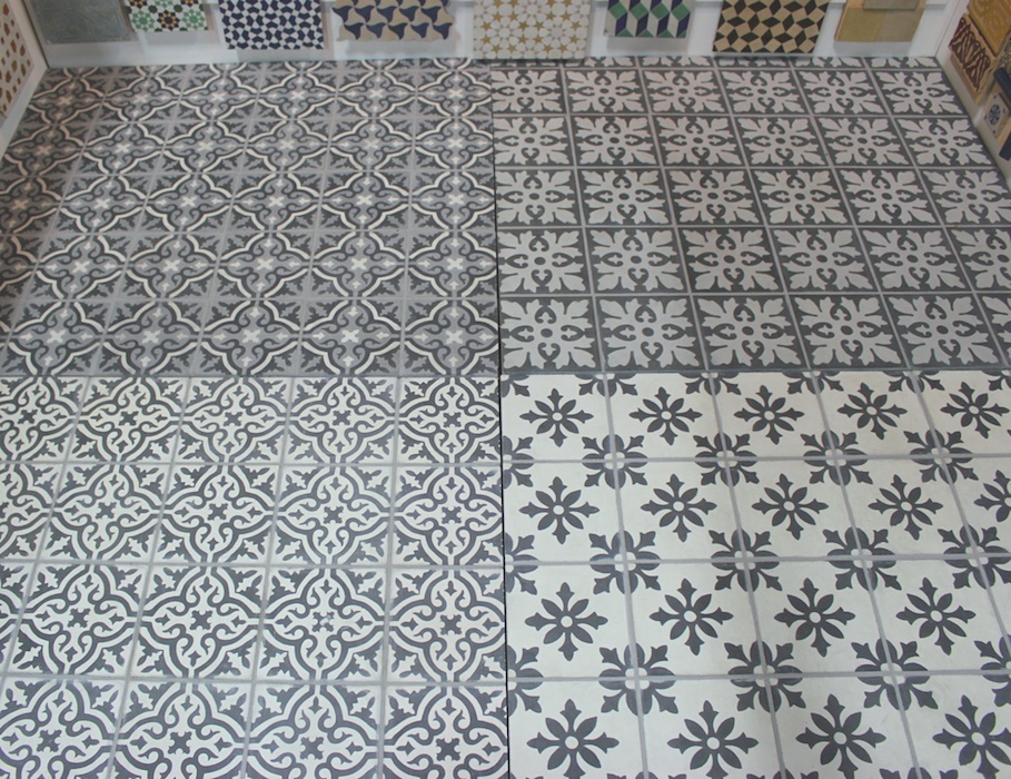
cement-tile-shopCement Tile Shop has lots of wonderful new patterns to choose from

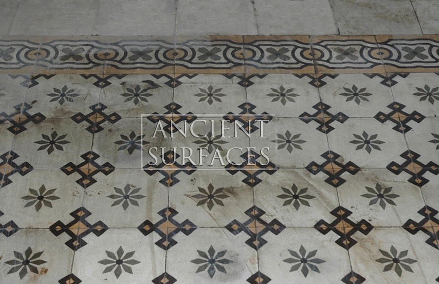
Antique-Encaustic-Cement-Tiles-10Ancient Surfaces

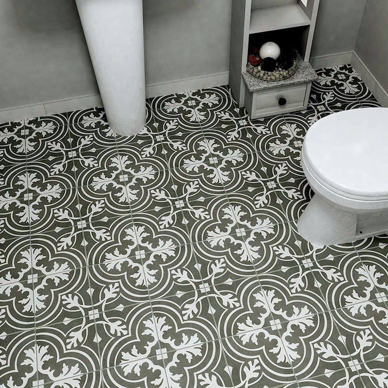
Companies such as Ancient Surfaces sell salvaged encaustic cement tiles and of course they are very pricey. Even the new stuff is fairly costly.
e64602de-d9f2-4ef7-b94b-f9689897e76d_1000

However, Good Ol’ Home Depot has this stuff for only  $2.00 a sq. Typically the new tiles go for about $8.00. Of course this does not have any custom options.
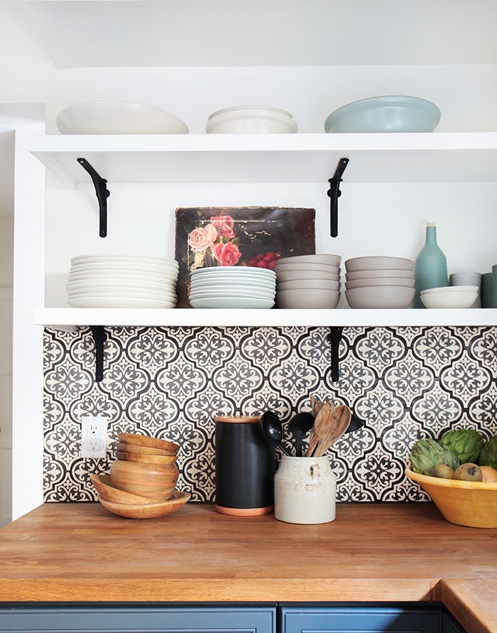
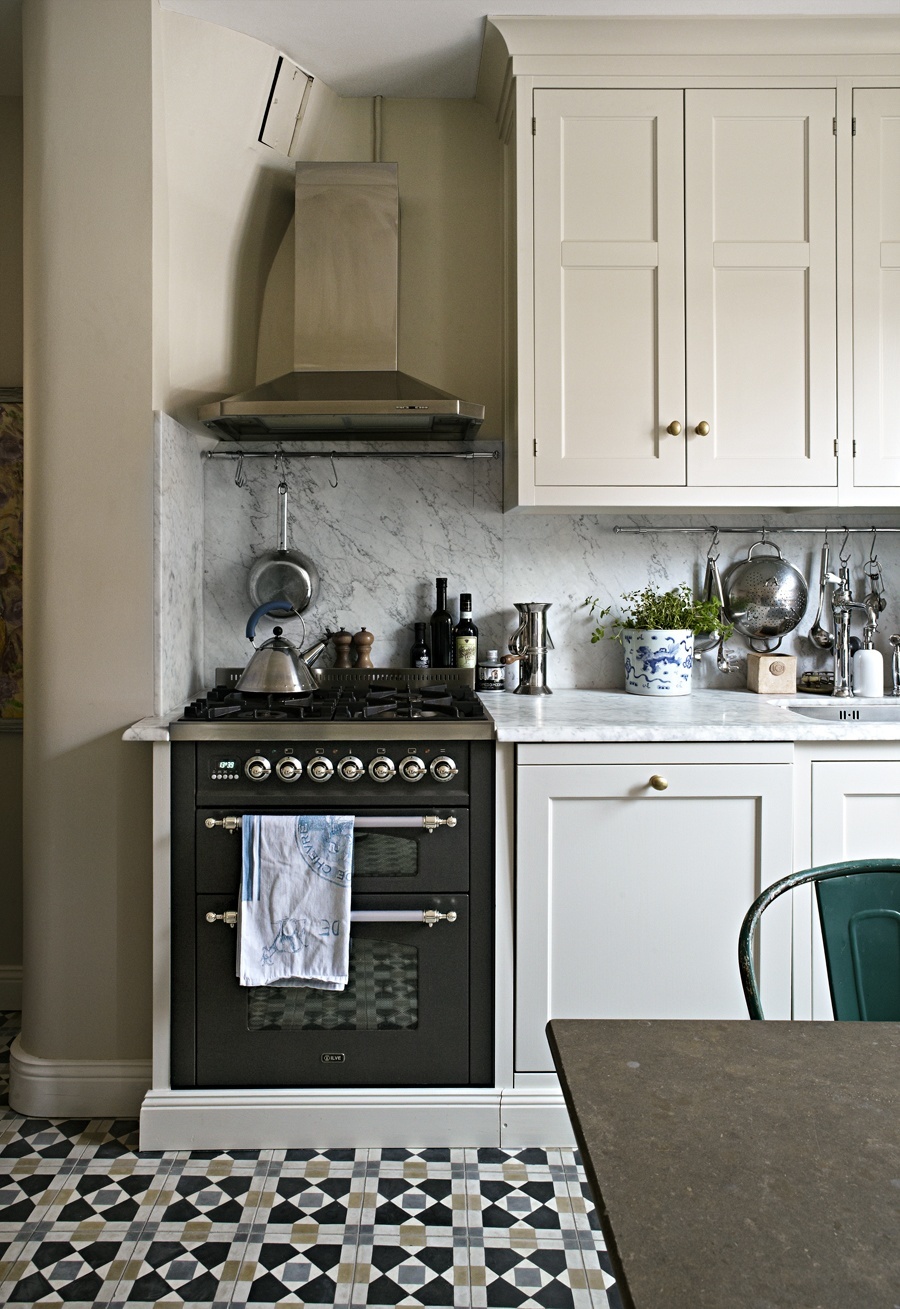
bistro_kok_skonahem_cement_tiles_kitchen_trendSkonahem

California-Country_Kitchen_Emily-Henderson_blue-wood-concrete-tile-open-shelving-causal_3

Above and below, the fabulous stylist Emily Henderson redid her kitchen using this type of tile.
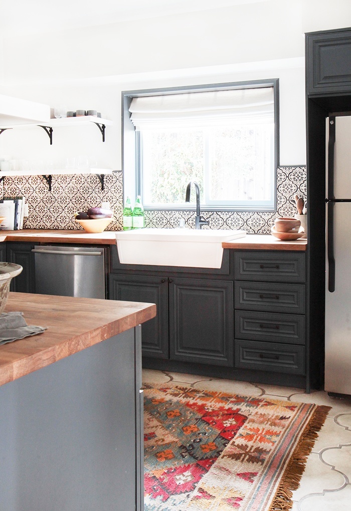
California-Country_Kitchen_Emily-Henderson_blue-wood-concrete-tile-open-shelving-causal_5

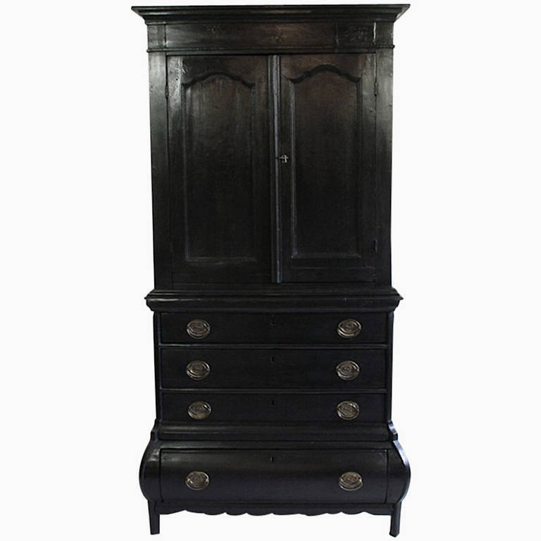
Oh wait. You were told not to do black cabinets too. Who is this person? Wait. You don’t have to tell me. But you can find all sorts of antiques from the 18th and 19th century that were painted black. The Swedish loved black and dark painted cabinets. And of course, the Chinese used black lacquer all the time.1st-dibs-black-swedish-cabinetAbove and below from 1st Dibs
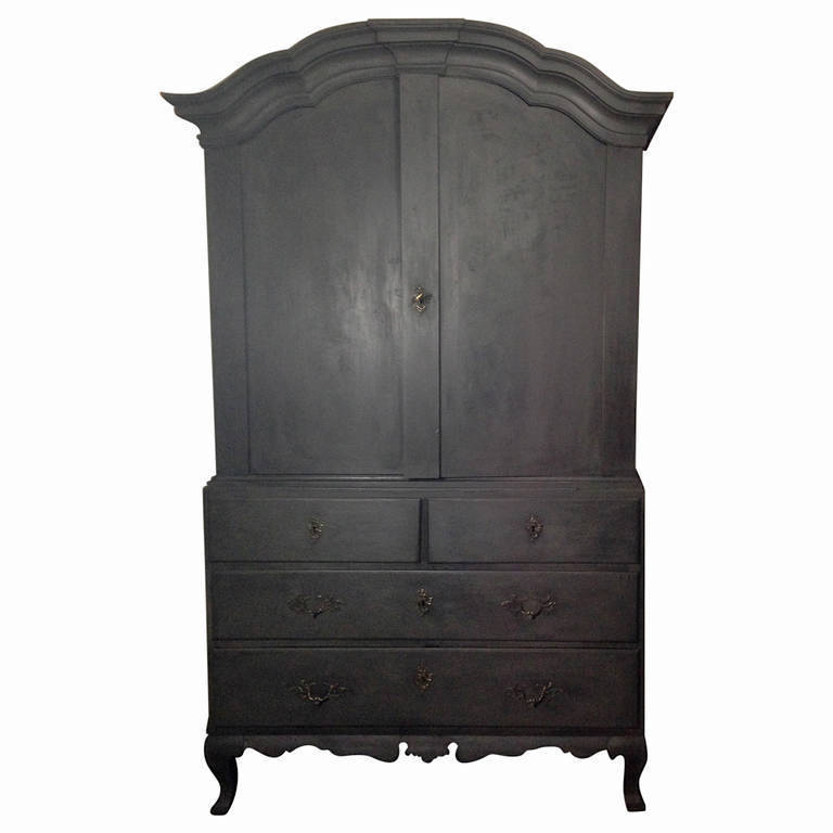
18th-c-dutch-highboy-black


Helen,

I hope that helped to make you feel better. As well-meaning as the person was who wrote that, it’s not true. If it were, then subway tile which made it’s comeback about 20 years ago would also be a passing trend. Some trends are classics.

While this look might not be for everyone, you love it (and you’re not alone!) and that’s all that matters. Life is just too short not to go for what you love. If it’s quality and has been around for centuries, even if it’s a re-emerging trend, it’s still classic.

By the way, Lindsey’s wife designed that kitchen! What a lucky dude!

For more fabulous kitchens please click here.

xo,

laurel

Save

49 Responses

  1. Haha thanks for your comment, if I had read your post before today I most certainly would have thought you were talking about me, I don’t think anyone preaches subway tile more than me 🙂
    And my advice is for the masses. The person who really doesn’t know, will not have a designers help and will most likely get a trendy tile wrong and then regret it bitterly (as you know).
    Love your post!
    x
    Maria

    1. Hi Maria,

      Thanks for stopping by! I agree with that wholeheartedly! I’m sure you’ve seen what I’ve seen many times is someone putting in some hideous granite or tile to spruce things up for resale. It always upsets me because the new homeowners don’t want to rip out something brand new. :[

  2. Great post and comments.

    I am slowly looking at all your old posts. So much information and lovely pictures.

    I love that Helen found a kitchen that she loved and is now coping/adapting it for her home. When we love something for years that is the best living. My Mother once said things either wear out or ugly out. Your goal is to never live with ugly.

    That said my ugly can be different from your ugly. If one is happy living in their home, “Life is Good”.

    That designer some times does things that are in my ugly book. Her Christmas garland a couple of years back was a very bad fake. Some of her accessories are less than stellar. Yet I have learned lots about color from her and see her blog as a must read, not a bible.

    1. Hi Rebecca,

      Thanks for stopping by. I’m sure that some people don’t like what I do too. In fact, I know so. Once I commented on Vicente Wolf’s blog and some idiot told me I needed to go back to design school. What an ass! (another designer came to my defense) I looked at his portfolio and it was very modern and cold. No place I’d ever want to call home but obviously, some people like it.

  3. Great advice Laurel and I am sure she wishes she had spoken to you before hooking up with her current “designer”. IMHO, no designer worth their salt would make those types of comments to a client and I hope she continues to produce something i.e.the black kitchen, that she has loved for so long. Just proves to me she will probably not tire of it anytime soon…what she will tire of are all her friends her will think she is so cool and brave! I hope she shares a completed pic of the new kitchen.

    1. Hi Diane,

      You’re not alone in your thinking, but my Dear Laurel letters are all fictitious unless I expressly say otherwise. However, I hear stories! And yes, absolutely, there are a lot of designers who are exceedingly opinionated and won’t take no for an answer. I’ve never been like that unless it’s something that’s clearly a big mistake. I like being open to new ideas. It’s how we learn and grow. Thanks for your lovely comment!

    1. Oh that is so sweet Dolores! Thank you! (in response to the previous comment). I had to look up encaustic tile too! I’ve learned so much from writing this blog. I certainly don’t know everything and there’s always something new.

  4. I do, Laurel! Try to read it all; you’ve almost become an obsession- but in a good way!:-) I have learned so much from you. Pretty soon I’ll be the one asking, under my breath, “What would Laurel do..”
    I do understand your point..

  5. Another great post, thank you, Laurel! Laurel..that fake Mediterranean vinyl flooring you showed made me smile as I recognized it immediately- it was what I picked for the kitchen of our first little ranch house, some 40 yrs. ago. I was so happy to have found a remnant for little money, and it went so well with the kitchen cabinets that I had painted a bright lemon yellow, with the obligatory white antiquing glaze that was de rigeur during those days.And, I also remember that it was a total pain to keep clean as it was supposed to be a very good imitation of irregular tile, with all its tiny crevices to hold that dirt.
    I am aware of the blog that you referenced here- and I see your point as well as the blogger’s. You are both correct, in my humble opinion, but she writes for a difference audience.I think you might have a different clientele, with maybe more disposable income than the average soul who can afford to change things out when styles change a lot? The kitchens you show are extremely beautiful, and I would love any one of them, but they must be terribly expensive- taking them out of reach of the average homeowner.Then those poor souls, if they didn’t use practical, unobtrusive, less showy materials, would be stuck for an eternity with extravagant fixed elements, or if they want something exquisite like those beautiful tiles you show, must resort to using badly done facsimiles,as I did with the fake Mediterranean vinyl floor, which, along with the Mediterranean furniture, was all the rage back then..All I can say in my defense is that I was only a ‘babe in the woods’. Thank god I couldn’t afford that massive furniture back then..:-)

    1. Hi Dolores,

      Oh gosh, we all had some of that hideous stuff and loved it! Oh well… young and dumb as they say. lol

      This might be a surprise but, most of my clients are extremely budget-conscious and don’t have anywhere near a Lindsey Buckingham budget. Once in a while,I get a job with a very handsome budget but 95% of them, no. Most of my clients are just starting out and furnishing their first home and starting their families! The goal is to give that very high end look without the very high end price-tag.

      Albeit, the encaustic tile is on the pricey side. The reclaimed stuff must be massively expensive. But some of those kitchens could be recreated with a more or less normal budget. I’ve also helped several clients do a facelift on their kitchen for a fraction of the price and it looks like a brand-new very expensive kitchen!

      I don’t know if you read some of my other comments but I DO love white cabinets and white subway tile!

      Thanks again as always!

  6. I just read your May 10 post on kitchen trends. Great post. How about those almond melamine cabinets? I don’t think paint will fix those.

    When I redid my kitchen when I moved into this house, I was all for upper cabinets only. Unfortunately, there wasn’t enough cabinet space as it was, even with the uppers. I quit unpacking when I ran out of cupboard space. But I love the look of no uppers, although I won’t ever have it since I am never, ever moving again.

    1. Hi Teri,

      My old home had those hideous melamine cabinets. It was in a townhouse and I couldn’t afford to rip them out so I had the guy put up a small picture frame moulding and then he sprayed them creamy white. I was a very happy girl!

  7. Just re-read this & noticed mention of black cabinets–Gawd, I am a design fail: Have a bit of that, too.
    Btw, black is a dust magnet–shows wear & tear, worse than white!

    1. Hi Susan,

      That is such a good point. Black anything can be just as bad as white. Those ebony floors show every fleck of dust! But black is a necessary element. And I love a well-done black room!

      1. Yep, Laurel–I too love a touch of black in my decor, worth the bit more effort to keep it pretty 🙂

        1. I think that some black is essential. Even in white on white rooms, if you look closely, they usually have something black in them. Definitely for pastel rooms because otherwise it can all look like an Easter Basket!

  8. This was so timely for me, since we’re redoing our kitchen – and it’s funny how strong opinions are on this subject. I couldn’t agree more with Susan (and your blog post), that “timeless” and “classic” are just matters of perspective.

    I’m having angst about the gray cabinets and dark wood floors that I adore. But I finally decided it all comes down to how hard it is to keep my pristine kitchen, pristine.

    Having had a white kitchen for years, I know that for me, white is only nice if I never cook or make any kind of mess. Red spaghetti sauce, green pesto, melted chocolate – my OCD wouldn’t let me enjoy the party until I’d wiped every speck away. And don’t get me started on fingerprints around the knobs and handles!

    And lets talk subway tile grout. Grout, grout, grout. It stains, gets yellowed, falls out… On the floor, it collects crumbs and makes sweeping a nuisance. I’m all about seamless backsplashes and floors now. Less time cleaning = more time eating what I produce in the kitchen.

    In fifteen years, I’ll probably look at my trendy gray cabinets and want to change. But those fifteen years will be worth it!

    1. I’m replying to my own comment because I also meant to say — I LOVE your blog. Thank you for the fabulous inspiration, guidance, and reality checks!

    2. Hi Melissa, Here’s an AMEN to your comments! And, I think your gray cabinets & dark wood floors sound beautiful! Ditto, ditto on the business of grout! I hate the stuff! We will soon renovate our master bath. We’re busy researching options for a (near) seamless shower.

  9. Thanks for this post! The topic has been on mind courtesy of the near constant litany of subway tile as the “only right tile”!
    IMHO, today’s TREND is acheiving the illusion of “classic” & “timeless”. Wonder what drives this laser focus on having hard surfaces that will endure the ages. Environmental consciousness? Still “mentally” recovering from The Great Recession? I do think lots of us are searching for a recipe approach to “timeless” decor. Maybe it is an allergic reaction to all the bad decor of the past 40 years!
    Still… My husband grew up in a “old” house with classic subway tile and I too lived for awhile in a 1908 house with “classic” finishes. Did either of us feel “on trend” or timeless? No. We felt like we were living with old (tired) tile! To this day, my husband hates subway tile. And a copper sink leaves me shuddering–copper (and brass!) “patina” can lose its appeal when in use, daily.
    Our current kitchen was built at the tail end of the “brown” trend. In that context, I felt like my choices were “classic–after all, we had hardwood floors–in the kitchen! What I then perceived as a white kitchen is now identified as “cream”. In 2009, I saw my granite as a neutral “black”: Thanks to the internet, I now hyper-focus on the gold veins. When we chose our backsplash, we loved the look of Honey Onyx and went with it. I thought I was ahead of the curve in resisting the salesman’s pitch for a 3-ring circus (in brown) posing as a backsplash! Current trends have me sometimes questioning my kitchen choices. However, I’ve come to realize that I still love my kitchen–and all the good stuff that happens there (food!)

    1. Hi Susan,

      So interesting. I grew up in a pre Brady Bunch ranch in southern Indiana. My mom made my sister and me some hombre drapes in pastel pink purple and blue. Not a fan of hombre. lol

      I’ve had clients who’ve hated caning because it reminds them of their grandmother. It’s all very interesting.

      But in the end, your last line says it all.

  10. First off: i hope you set Helen’s heart at ease with your beautiful examples and incredible knowledge! I just returned from a trip to Santo Domingo, Dominican Republic; not only the first capital of the New World but also boasts many other firsts such as the first catholic church; first university first hospital and monestary and convent…Needless to say this city is ripe with history and architecture! We stayed in a 15th century mansion turned boutique hotel -and that’s a whole other fairytale like story but if curious google ‘Palacio’ on Tripadvisor!.. From the rooftop of the Palacio where the pool is located we could peer into the small villas (now apartments) across the way. Picture them with the black wrought iron curly-cue balconettes with ladies hanging out, resting their arms on cushions chatting with their neighbourhood. At first glance I thought each space had the same patterned carpet in brilliant colours..then I realized I was looking at the most beautiful encaustic tiles!-still vibrant after all these centuries! I’ve never seen anything more timeless and beautful. Enjoy your kitchen to the fullest Helen!

    1. Hi Deanna,

      My “Dear Laurel” posts are all fictitious situations unless otherwise stated. But the world is full of Helens! Your trip sounds amazing! My trips are going into Manhattan to see the ballet. Thanks for the lovely comment!

  11. Hi Laurel!

    I am really enjoying your blog! I have a “Farmhouse Ranch” and have kept it more timeless. We are currently doing our small pool house and I am stumped on choosing a floor. After seeing this post I am wondering if the tile you mention at home depot would be a good option. Classic but different. I am doing white cabinets, white walls, and dark counter. I know you can’t make recommendations without seeing the space but was just wondering your opinion if this type of tile would even be something to consider for the space. thanks

    1. Hi Cynthia, Actually, I think it would be awesome! Oh, and the encaustic tile can be used outdoors. The HD tile is a derivative I’m sure. At that price, it must be! I didn’t check it out thoroughly, but I’m sure the specs are there. Honed black granite or oiled soapstone are both great for dark counters.

  12. LB’s tile is beautiful, but look at the context: high ceilings, plenty of space, with ultra-high-end cabinets, appliances, and other finishes. Just gorgeous.
    This kind of tile is classic, as you say.
    I think that some of these details would look out of place in a typical middle class home with 8 ft. ceilings, average quality cabinets, minimal millwork, average sq. footage, and appliances from HD.
    The other blogger’s advice is meant to prevent people from making choices that would scream “trendy” in a home that is better suited to a simpler (or just different) style. Can you picture this tile in a raised ranch? With a couple of exceptions, the “don’t” examples she showed would probably not age well or complement the average home. That said, if you love it, go for it.

    1. Bingo Joanne! Actually, in the high end mags, you almost ALWAYS see high ceilings. At least 9 feet. It’s like a model. There’s a reason why they are all six feet tall! The height creates more drama and elegance. It’s back to the bones. If you have a boxy room with two tiny windows and an eight foot ceiling, well… it’s all over. An ugly woman wearing a beautiful dress will still be ugly– just nicely dressed. lol

  13. What a great post! Rest assured, I am a student of the blogger known for her white kitchens and subway tile. There is one beautiful image after another on the internet. However, in defense of her, this is her aesthetic. Classic and clean. A huge part of this opinion comes from years of hearing people say that they hate the choices they made 10 years ago but feel stuck. Her goal is to try to save US from that conundrum while we invest our hard earned $$$$$$ into our homes. She does say if you love stained wood cabinets, then have wood stained cabinets. What’s sad is that a lot of today’s choices are made with busy patterned back splashes with accent tiles galore on top of busy patterned granite on top of busy patterned flooring. Throw in cabinets in two different colors and it’s very likely that you’ll find it unpleasing in the very near future. Plus, you won’t be able to change any accent colors because the fixed elements will boss you around forever. Resale potential goes down, as well. I’m currently doing a redesign of an OPEN living space for a client who has gold and black blotchy granite (not changing) and natural maple cabinets. Immediately our choices are extremely limited because we can’t ignore the yellow/gold dominance of this color. She LOVES white kitchens but without painting the cabinets and changing out the granite, we’re stuck. For me, I’m building a traditional/rustic house in the woods next year. My forever house. “I’m leaving feet first”, I tell my kids. (aka, dead) I will NOT be doing a white kitchen. It’s a rustic house in the woods. It doesn’t seem right to me. I will, however, keep the quartz and back splash very simple and use wood flooring. I’ll change my accessories without clashing anywhere. Laurel, you did a terrific job of putting this woman’s mind at ease while she ponders her decision ($$$!). The examples of that style kitchen were great. If she loves it, then she should do it, as long as she’s examined the pros and cons. Sorry this is soooooooo long! I hope I’ve said something of value!

    1. Hi Gina,

      No, there’s no such thing as a too long comment! You guys are terrific and your sweet comments warm my heart!

      I agree with you 100%. I’m a less is more kinda girl. Don’t think one needs to add lots of trims and frou—anywhere. Hate those little mosaic accents in a contrasting color. Totally not necessary, IMO.

      And what you are saying is a perfect example of why one-size doesn’t fit all. I DO love painted cabinetry over wood. Unless it’s just the island that’s wood. However, again… I’ve helped clients do cherry because they really, really wanted CHERRY. I won’t do that hideous honey oak however. Never. Just fire me. lol

  14. Laurel..you are so funny and refreshing!! Really enjoy you blog. I am so glad you posted this since I do follow that “white cabinet,white subway tile” blog as well and was beginning to think along those line of classic and timeless. ( a little boring) and really I am too funky for that being a child of the 60’s!! However, I was also beginning to think what about individuality??? I am not a professional but total design junkie so I really appreciate your comments. Keep it up!

    1. Hi Jackie, I think I mentioned earlier that I DO love white cabinetry and white subway tile. If someone asked me what I recommend, it would BE that very thing. However, I would never tell someone they had to do it. I think that’s the distinction I was trying to make with the post. I’ve helped people do lots of kitchen facelifts. If you have a seventies modern home and lots of wood trim everywhere, the white kitchen won’t look right. Several years ago, we did paint the cabinets, but painted them a rich khaki color. We did subway for the backsplash. (replaced ditzy flower pattern) and changed the counters to oiled soapstone. And of course the appliances and hardware. It was an amazing transformation. Wish I had taken photos!

  15. Laurel enjoyed the new blog post as well as the hot topic comments. Again supported by fabulous imagery and beautiful references. Having choices is what makes our spaces all unique and everyone an individual. Glad we don’t have to be cookie cutters. You’ve certainly given us food for thought…

    1. Thanks so much Theresa. I didn’t realize that it was until now. I think 90% of design comes down to the bones of the home. For the design to be timeless, or non-trendy, the home itself needs to be fulfilling that as a whole. A little boxy home with low ceilings is always going to be a tough sell.

  16. I agree!

    I think subway tile is only really “timeless” in older houses that would have had subway tile originally. For every one else-IT IS TRENDY!! There is no way you can say ANYTHING that is being put in 80% of homes is anything but trendy.

    When I did my new bathroom I used other white tile that isn’t super popular so it won’t scream the date when it was done.

    1. That’s a very good point Maggie. One of the most beautiful subway tiles we did a couple years ago was in a lake house. The backsplash is this gorgeous pale blue glass. It was as if the lake had migrated inside. And the home was built in the 30’s. It all felt quite appropriate, but still in this century.

  17. The whole idea of having to make your design decisions for “resale” leaves people paralyzed and often unable or unwilling to design for their own pleasure. Yes, when we were house hunting we saw many ugly kitchens with awful colors. But we also saw many ugly white kitchens where the owner was obviously trying to play it safe and appeal to everyone, but things were just “off.” There are some beautiful white kitchens with white subway tile, but it is also a look that is going into every builder’s special spec home in the area these days, and these kitchens are often less beautiful.

    Though we started off not wanting a fixer home, in the end we found it preferable to buy one so we could make our own decisions and not pay extra for someone else’s choices that were not to our taste. And I’d rather make and learn from my own mistakes than live with someone else’s. Not everyone would choose our mint green kitchen cabinets, but they work in our home, and they make me happy. I grew up in the era of bad 70’s wallpaper, and I’m not advocating we go back to that look, but it seems to me there may have been something more fun about decorating then that has gotten lost in our futile obsession with “timelessness.”

  18. I so appreciate the angst of the writer! I live in the Midwest and am in the midst of building a new house. We’re doing natural cherry cabinets which apparently is the epitome of repulsive crap according to designers it seems. Our house is mid century modern meets arts and crafts meets Asian and I’m thrilled with architecture. I have learned to go my own way on the three houses we’ve built because I’ve found designers like to decorate my house to their taste. Fortunately I’m very rebellious!

    I so appreciate this blog and have found it a great inspiration! Keep up the great work!

    1. Hi Abby,

      I think you hit the nail on the…some homes would look odd with certain styles of kitchen. And thank you for your kind words of encouragement!

    2. I also have natural cherry cabinetry and I think they are classic and timelessly elegant. I love the rich tones that they give. I have a 20 year old home and these (Brookhaven) cabinets may still be here for another 20 years. They are like a beautiful wood floor, they never go out of style. What went out of style in my kitchen is the white ceramic tile floor and speckeled granite.

  19. While I absolutely love that blue floor in Lindsey Buckingham’s kitchen, most of the other floors and backsplashes would drive me nuts.

    Needless to say, I have a white kitchen (cupboards, subway tiles, Torquay quartz countertops) that I designed and love.

    I think we take advice from the people (and bloggers) we relate to best. So no need to “trash” someone whose aesthetic is different than your own.

    When I was house shopping, I saw so many kitchens and bathrooms that I knew I couldn’t live with. Some of them were brand new, but the colors were all wrong for me.

    I’d give up my white kitchen for LB’s kitchen. 🙂

    1. Hi Teri,

      I’ve only had white kitchens. I adore white cabinets and tile. Even when a few years ago, they were deemed to be too “sterile.” Never was fond of the tumbled marble look and lots of other “looks” like the pickled pink oak or ash. Horrendous from the getgo for me.

      Gray can also be dangerous.

      However, my point here is to point out that there are other classic looks besides white cabinets and white subway tile. However, I do agree that it’s fabulous and definitely the best idea for resale.

      I too have seen so many mistakes like adding a dumb trim to an otherwise nice bathroom or kitchen. It’s not necessary to gild the lily!

  20. I LOVE these examples! I had a white kitchen with some black cabinetry and fabulous tile backsplash that the blogger would have said was wrong. I miss it so much it makes me want to cry!! Do what you love instead of doing what someone says is the only way. That is not a real designer in my opinion. No one wants to see the same thing over and over and worse yet – in their neighbor’s kitchen. That’s what makes YOUR kitchen fabulous.

    1. Thanks for the lovely comment MWare. Really appreciate it! Some designers are verrrry opinionated and that is their prerogative, of course. I happen to like lots of different things. Some would say that’s no good. Oh well… can’t please everyone.

      I do, however, think that some choices are mistakes. I wonder… brass is back—unlacquered. It looks great, but are we gong to regret it in 10 years? Even doing too much of one great thing can be too much. LB’s kitchen aside, I think the patterned tiles tend to look best in more contemporary kitchens which would be in a more contemporary home or a loft-type space.

      I think one needs to respect the style of the home. Oh, I could easily live in an all-white home! 🙂

Leave a Reply

Your email address will not be published. Required fields are marked *

This site uses Akismet to reduce spam. Learn how your comment data is processed.

Welcome To Laurel Home!

laurel-aarons-18th-e1456449963926

Hi, I’m Laurel, and Laurel Home is the website and blog for Laurel Bern Interiors.
I’ve been creating new-traditional interiors since 1988. The blog is where I share all.

New Edition, November 2023! Get The Indispensable Guide For 100s of Home Furnishings And Interior Design Sources That Everyone Is Raving About

laurels-rolodex-final-book-cover-master 10th edition 23-24

laurel home archives

Categories:

Please click the image below for more info about my rockin’ Interior Design Guides for 2024!

Laurel Home Interior Design Guides 2024
Amazon ad

please click below to check out my favorite decorating & design books

Laurel Bern's Favorite Interior Design and Decorating Books
Subscribe To The Laurel Home Blog And You Will Receive A FREE Guide Where I Share How To Get Your Paint Colors Right, The First Time.