On Sunday, after the last post came out about my favorite decorating trick, Ramona asked some compelling questions in a comment.
Her questions relate to creating a unified interior color palette.
Here’s what she said:
Today, I have a chance to really thank you for your work, Laurel. I come here to decompress from the not-so-nice realities of daily life as I am generally in tune with all of that. Here, I can get my dose of creativity while the world spins on. I appreciate this very much at this moment.
Second, I adore that Thorton room at the top. I wonder if you could do a post that takes a lovely room like that and changes it to give us perspective as to what direction any given design can transform into without losing what attracts us in the first place.
For example, if the room was painted red or conversely blue, would that affect the design, and if so, how?
I am asking this because I often see something I adore, but I know I would not want to live in that room as it is. Instead, I often want to change the colorways, which seems to lead to something entirely different. So, there goes the unified interior color palette.
I have a pretty distinct set of color desires, which I know work, so it is not that I am mentally doing something which is a mistake. And also, I am often attracted to very neutral rooms but know that I don’t really want a neutral space. Yet when I add color, everything seems to go haywire. It is not the colors per se, but something else that I cannot figure out.
I guess what I’m trying to say is how does one create a unified interior color palette from room to room?
I cannot quite figure out what goes wrong, and I’m not even sure if I’m making sense. lol So, the best I can say is that a post that takes an inspiration room through a series of changes would fascinate me.
***
Thank you, Ramona, for your kind words and interesting questions regarding creating a unified interior color palette. If I understand this correctly, there are a couple of parts.
One, if you find an inspiration room, but parts of it aren’t working for your situation, how do you make substitutions?
Two, how do you create a unified interior color palette, in general?
Now, let’s go back to Summer’s beautiful room in Naples, Florida.
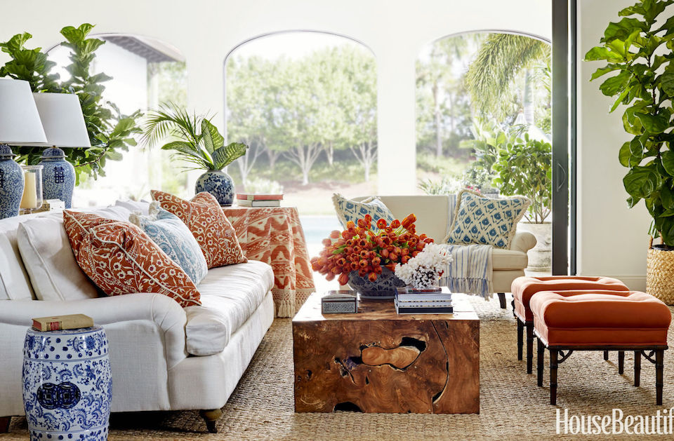
What I’m going to do is link to the entire project in her portfolio.
Here, we can see the entire home and how Summer deftly used every color in the palette in various concentrations for the different rooms.
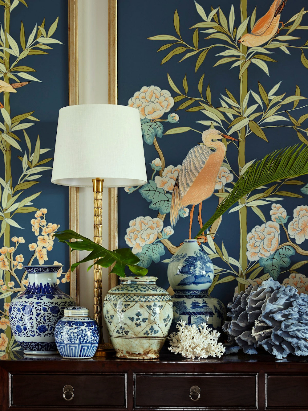 Looking at each photo, you will see that Summer’s entire interior color palette is keyed off the gorgeous vignette in the entry featuring the exquisite Chinoiserie mural painted by Allison Cosmos.

Above, I created a palette of 12 colors from the Laurel Home Paint Palette Collection which has 144 Benjamin Moore Paint Colors.
Folks, if you don’t yet have the two-part paint and palette collection, I highly recommend you do if you’re struggling with paint colors and palettes. You can read about the palette collection here. They are sold together for less than the cost of the paint for most living rooms.
As it happens, there are already boards in the Laurel Home Paint and Palette Collection using these same colors.
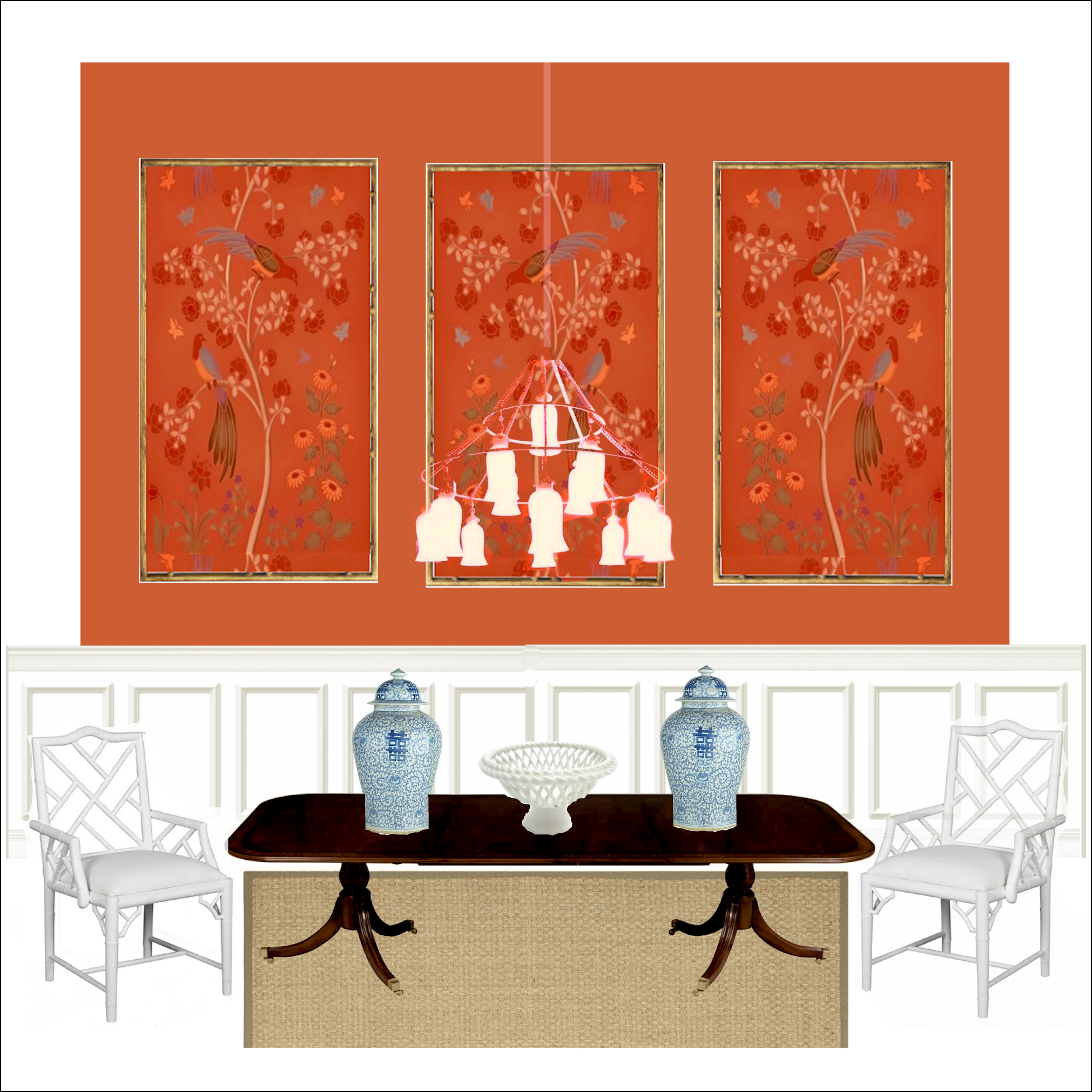
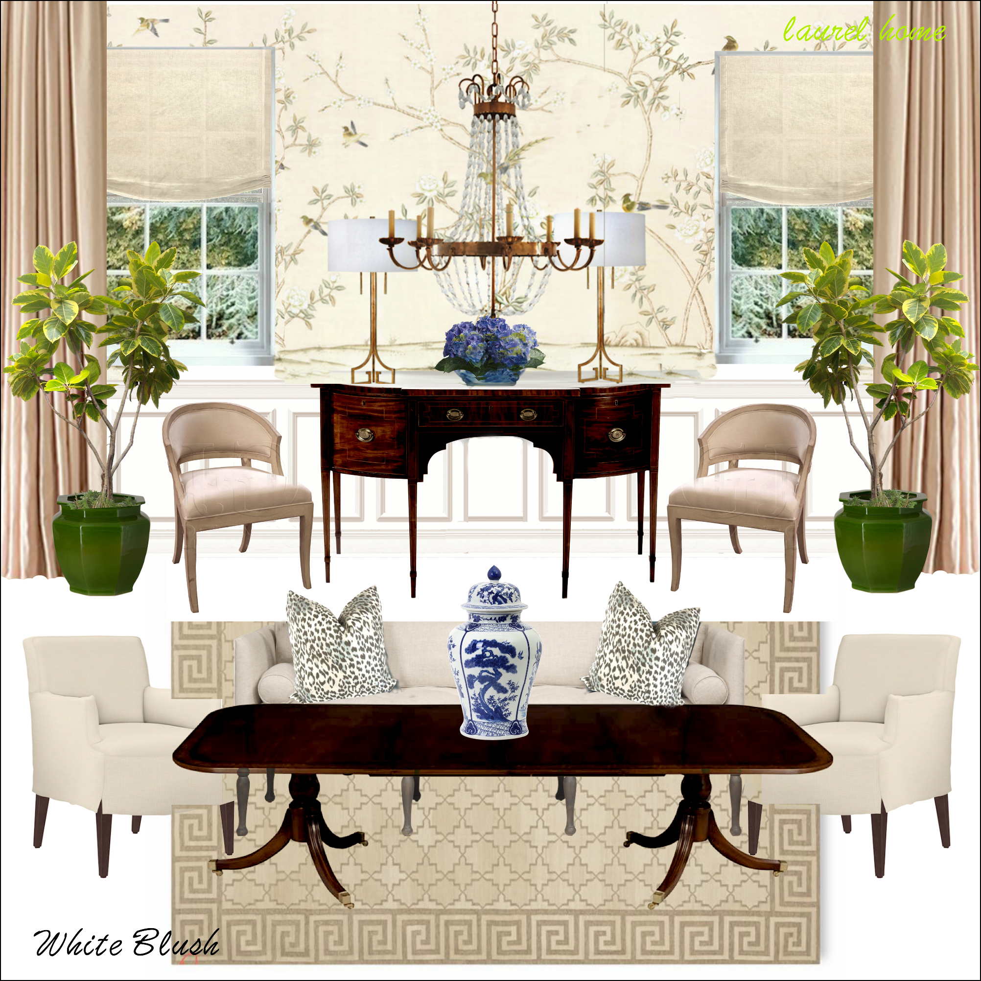
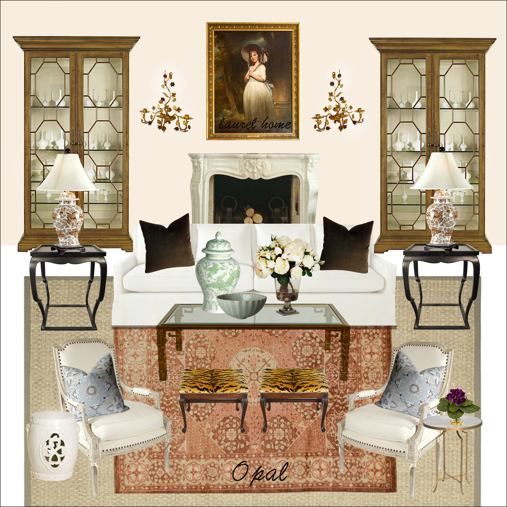
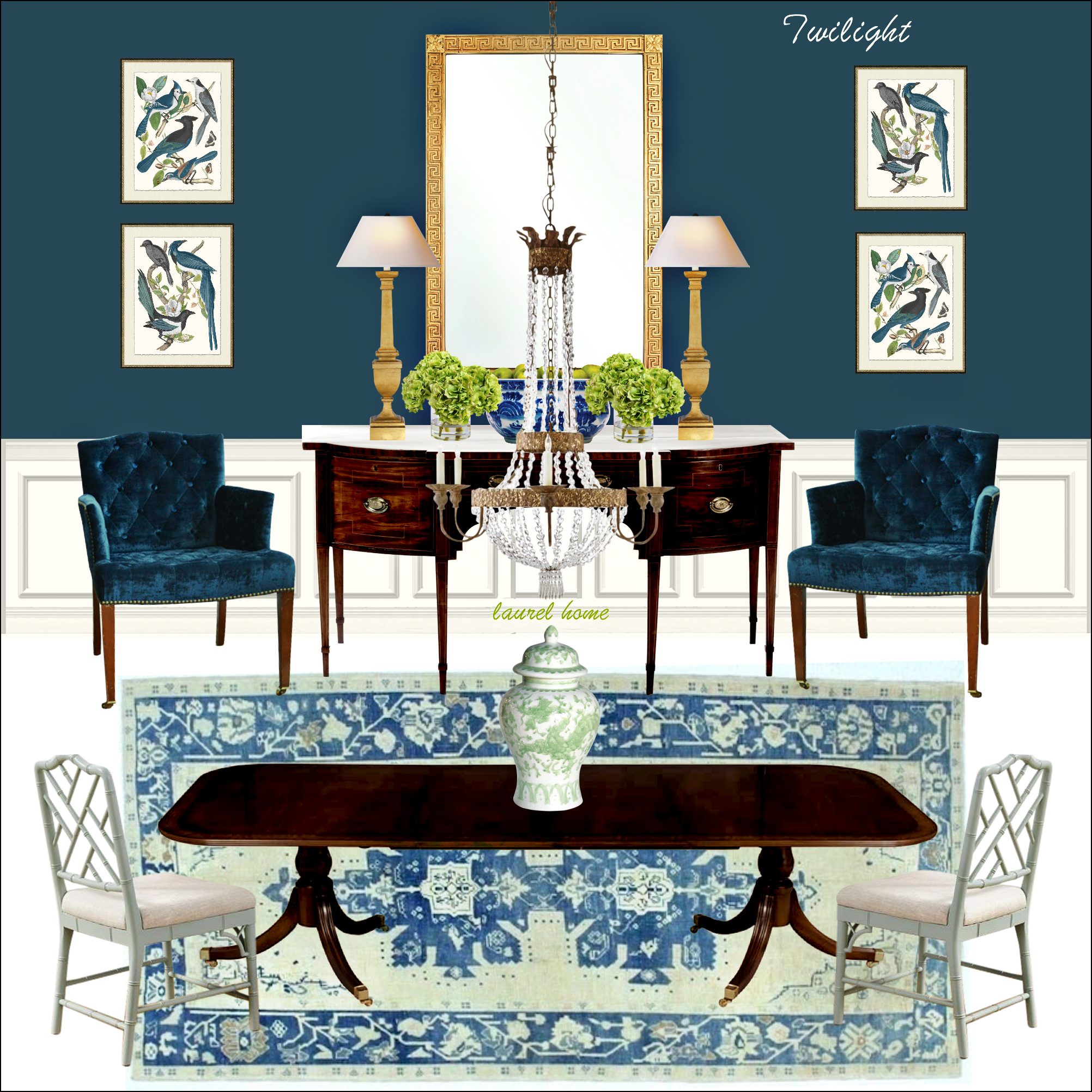
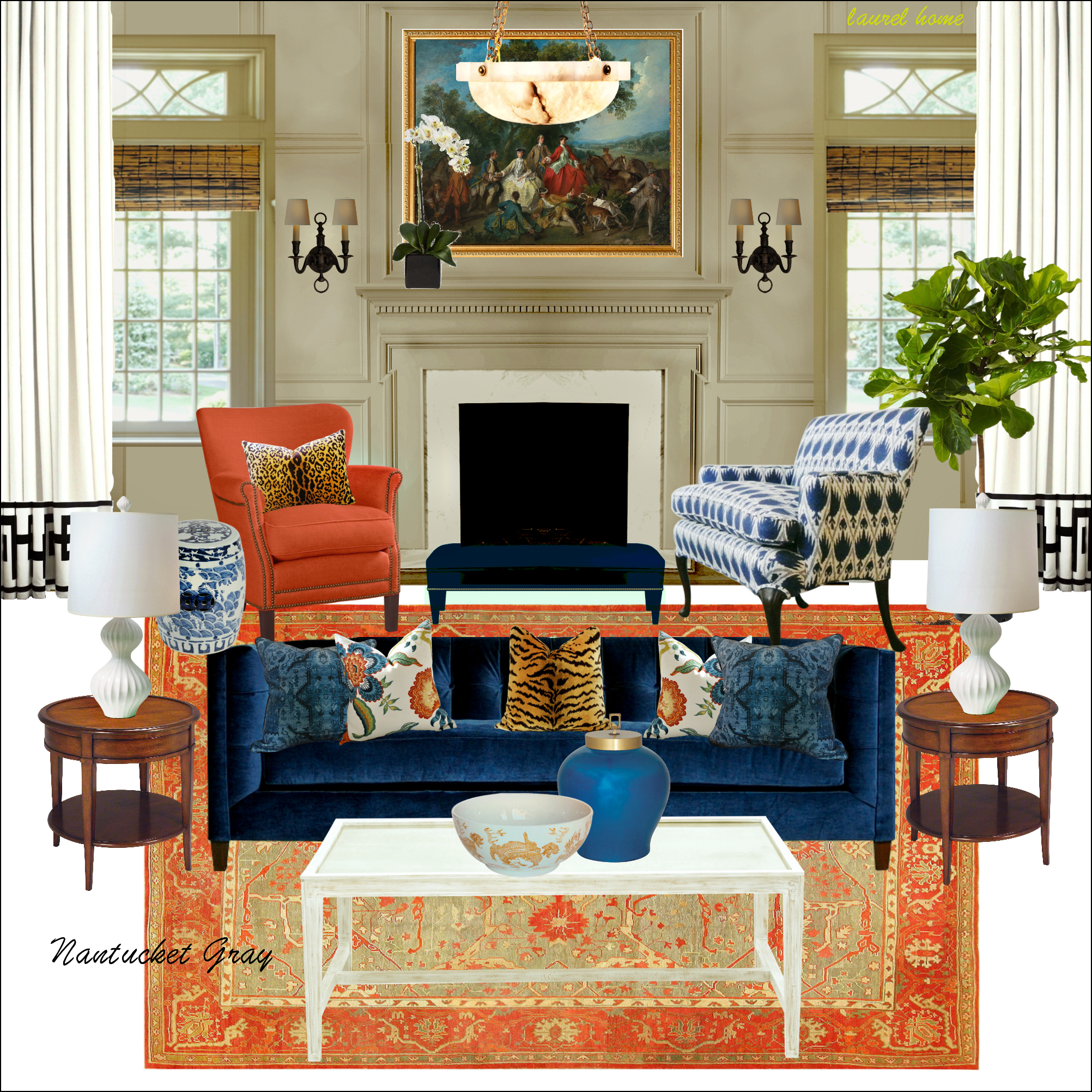
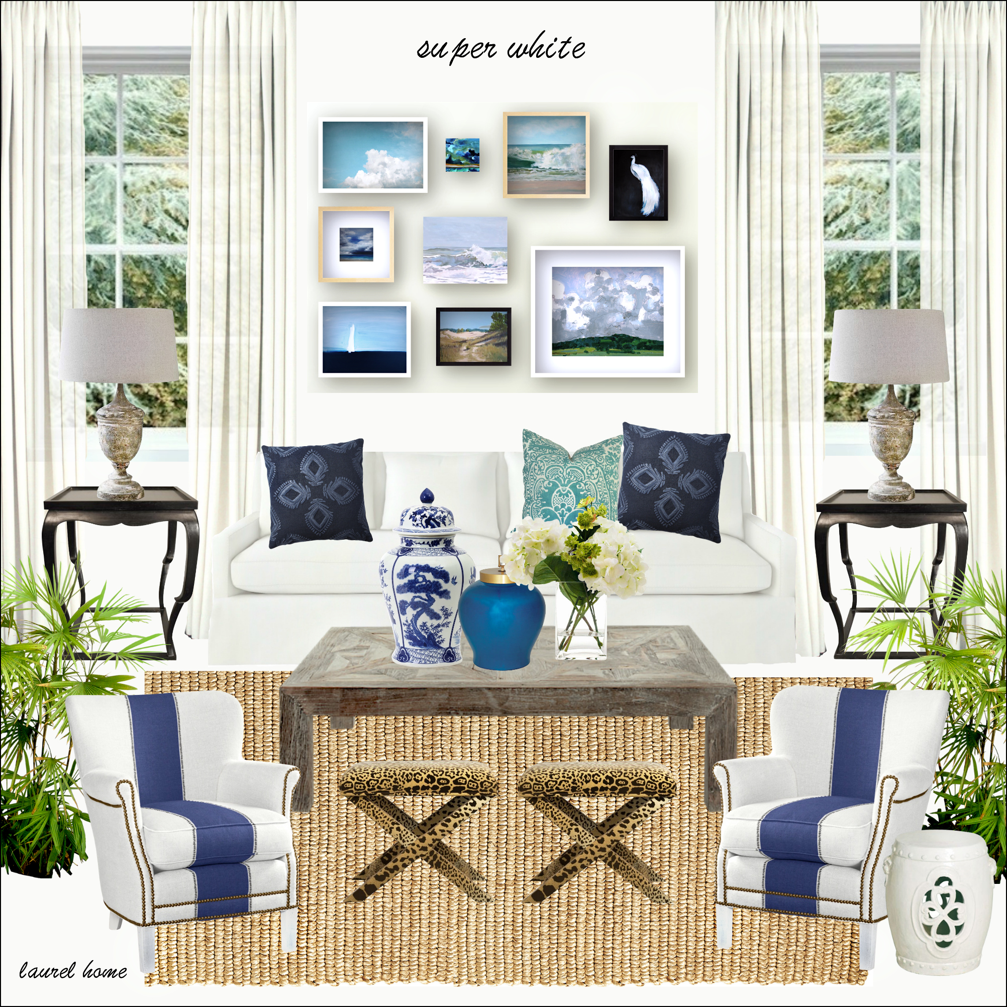
Hopefully, you can see that the boards and palettes I created are a helpful tool to provide inspiration and a unified interior color palette.
Another idea you can try if you’re not sure is a virtual wall color change.
I use picmonkey to do this. Here’s a Picmonkey Tutorial. They’ve changed their site around since I made it, but it’s not difficult to figure out.
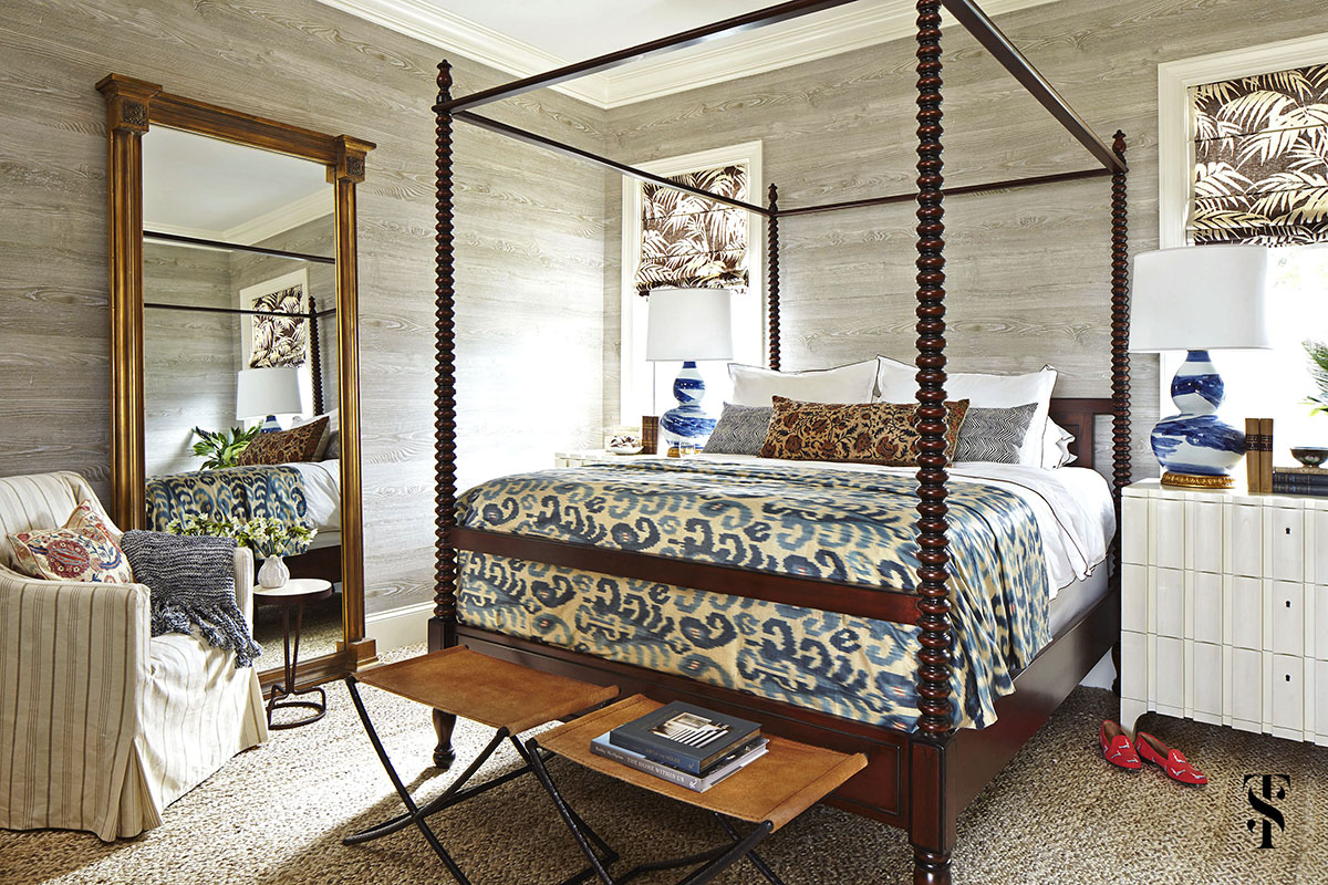
Let’s say that you love this bedroom. But, for whatever reason, you don’t want to do the wood-paneled walls.
So, what I did, was try different colors on the walls. In some cases, I changed some of the other elements.
The first color I chose is the Racing Orange Red 2169-10.

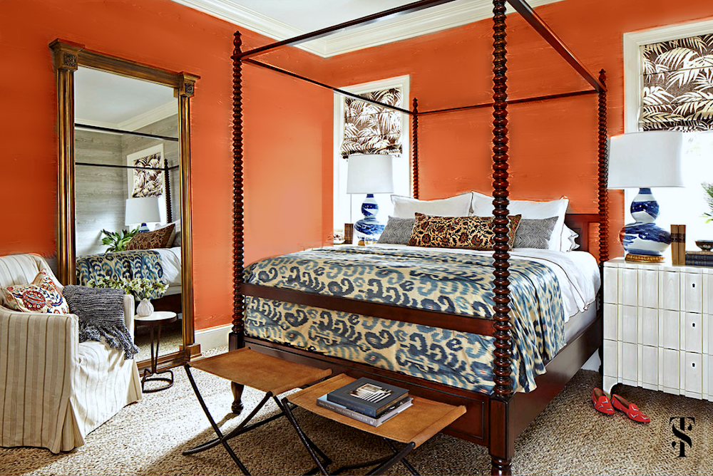 I think that looks great. It’s a different look, but I think it works. Of course, this scheme could also be used in a den, office, dining room, etc.
How do I change the color of the walls?
I use the Touchup tab in the sidebar. Then, I find that for changing a color, the eye shadow option works well. You can try one of their preselected colors, but I find it better to click on the palette icon and pick a specific shade that works. You can play with the concentration to get the effect you want.
In addition, because of the heavy wall texture, I the airbrush option works well to smooth things out.
Next I tried Benjamin Moore Twilight, which is a saturated, deep, warm, almost teal blue.

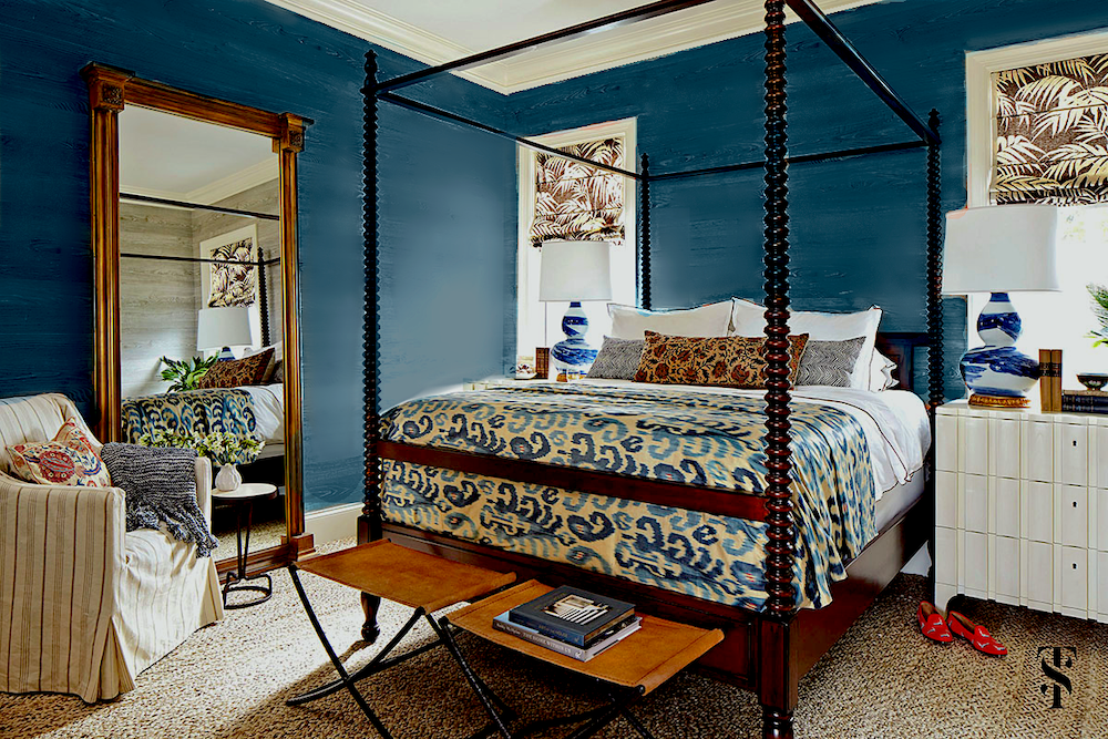 That’s lovely too, I think. I’d like to see some more art on the wall, however.
Sometimes, if something doesn’t look right, it’s either the architecture or the balance of the design elements.
The last color is brown. So, I took the classic Brown Horse 2108-30.

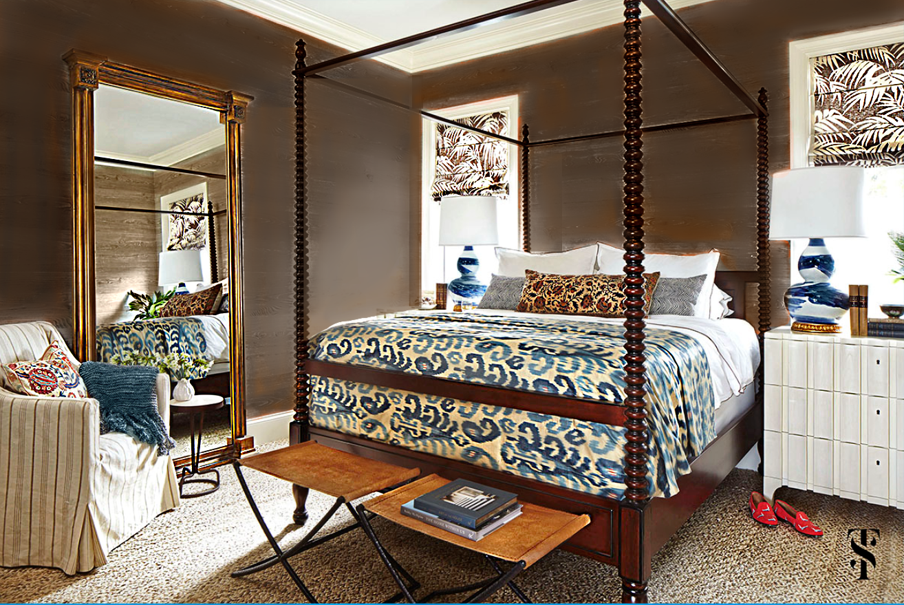 I think this is a handsome and interesting variation. Please note that I changed the color of the throw blanket.
However, I went a step further using a slightly warmer brown.
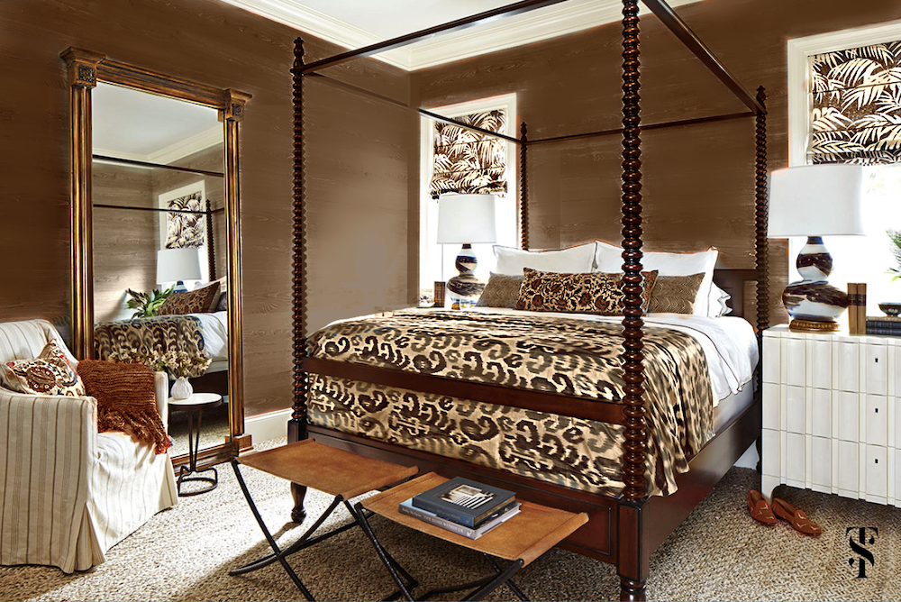 As you can see, I eliminated the blue for a more monochromatic neutral color scheme. I also changed the color of the lamps and bed covering.
I like this version, as well.
So, the main point of this exercise is to create a strong, unified interior color palette, one must have a jumping-off point.
Good choices are fabrics, art, wallpaper, or a rug.
That’s all there is to it. However, yes, a certain amount of talent is required to put the colors together in the right concentration. Please look at the fantastic job Summer Thornton did with this home. There’s a reason that many shelter magazines have published it.
Now, I’m not going to post any images of another Florida home recently published in Veranda. This is the Kips Bay Showhouse 2022. Yes, it was done by numerous designers who apparently didn’t consult each other about their palettes.
No further comment about the decor, the colors, or furnishings for most of the rooms. I guess no comment, IS a comment. lol
But, you certainly can comment, if you like. Please do not mention anyone’s name, however.
In closing, I hope this palette exercise will give those struggling with paint colors a means for creating a unified interior color palette.
xo,

PS: Please check out the newly updated HOT SALES!
And, too funny. After the last post where we talked about one of my favorite decorating tricks, I was asked how often Serena & Lily puts their gorgeous furniture on sale. I only found out on the 7th that the sale was beginning on the 8th of March. This is a great opportunity to get 20% off on almost everything on their site.
Related Posts
 Your Home Office Could Be Dangerous For Your Health
 Is A Dark Exterior House Color A Good Idea?
 She Wants A Classical Home in Florida. And, Cheap too!
 77 Budget Fabrics That Look Rich + Sources!
 The Classic Kitchen – A Complete Source List
 She Loves A Brown, Masculine Room, But He Doesn’t. Huh?
 One Living Room Layout – Seven Different Ways!


