Her Family Room Addition Is Tricky, Or is it?

You really have a gift Laurel. I’m glad you share it! It helps all of us right brain people out there not get so irritable when trying to create a nice home.

My dilemma is attached. It’s our family room addition; I fondly refer to it as our dorm room!

We aren’t committed to keeping anything or anything in its place (although the curio cabinet may not fit anywhere else in our home).

Thank you again!

Karen


Thank you Karen!  And this is not the same Karen from a couple of weeks ago. This is Karen A and that was Karen B.

This is a lovely home! And the reason I chose it, is because this is the quintessential family room off the kitchen. Sure, not everyone’s looks exactly like this, but close enough.


In another email, I sent Karen a little interview for some pertinent information I needed to know.


I found out that the A family is located in a suburb of Baltimore, MD. They have a 17-yr old son and a 7-year-old whoodle named Willie. I’m assuming that’s a cross between a whippet and a poodle?


So, let’s first take a look at the photos Karen sent me of the family room and adjacent dining room.
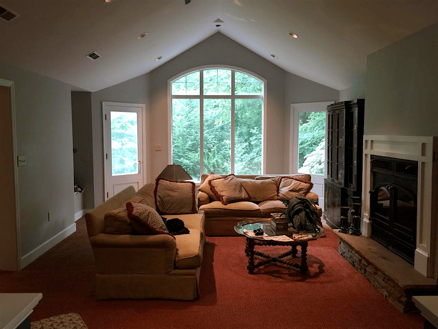
 

family room addition lights on

The furniture is 15 years old and was originally purchased for another more formal room. The lovely wall color is Benjamin Moore Revere Pewter. Please notice how different it looks in the image below.
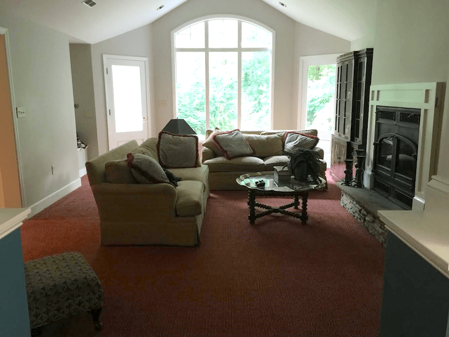
Lights off, obviously.

But Revere Pewter is a pretty changeable color depending on the light.

But, it definitely has a tendency to go greenish.
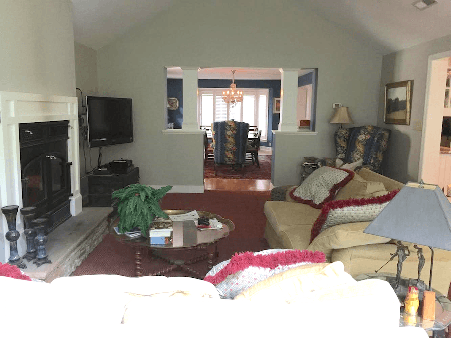
 

family room addition -dining roomThe opposite direction which looks into the dining room. To the right is the kitchen.
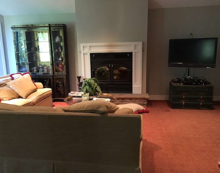
 room addition fireplace wall beforeView from the kitchen coming into the family room
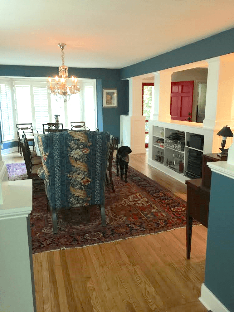
Close up of the dining room. Love the wall color and gorgeous rug, too! Hi Willie!

I don’t know what the wall color is, but it looks like one of my favorite shades of dark blue.
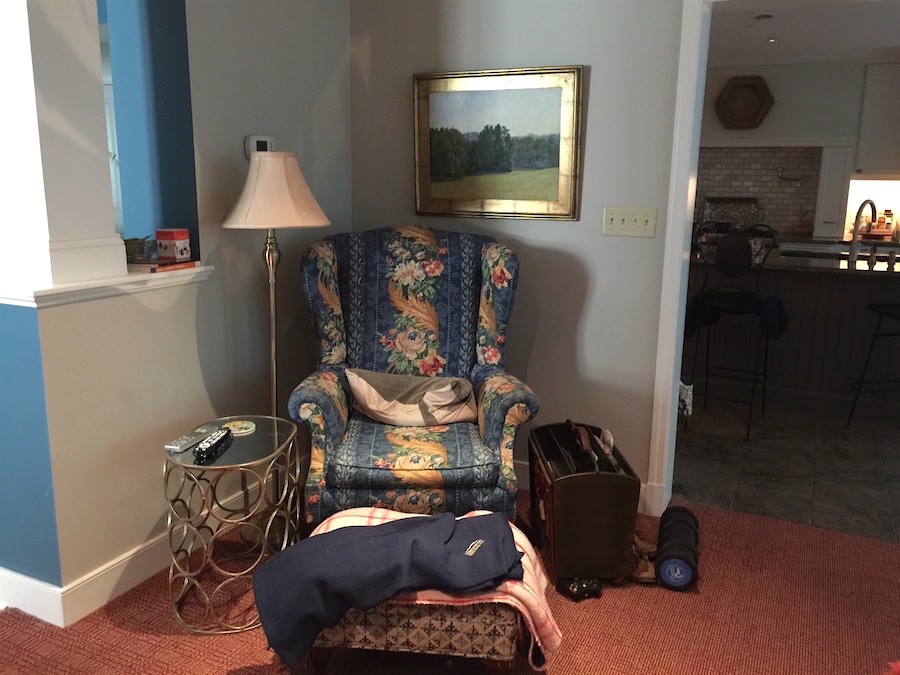
 

wing chair in family room addition

A cosy corner. Karen’s office? :]


And, below is Karen’s scale drawing.
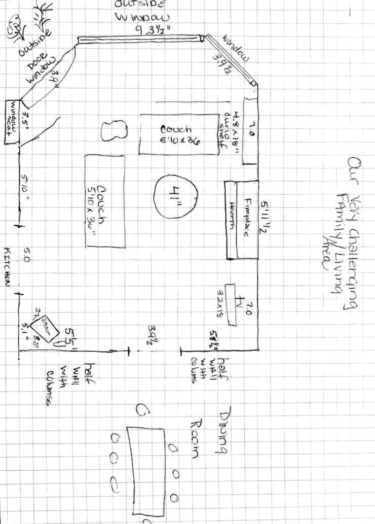
 

family room addition floor plan number 1

I’m having a problem because these measurements add up to 13′-7″ but there are 18 squares across on the drawing. Now, please. I don’t expect Karen to know what she’s doing. It’s brave of her to do this, in any case.

And believe me, I’ve made measuring mistakes.

Plus, I’ve been GIVEN whopping measuring mistakes by professionals who should know better. In fact, two times it was an architect. Fortunately, they were caught before things were ordered.


But, that’s another way that one can do EVERYTHING RIGHT, as in make a plan and still mess up.


Never, ever guess. And definitely never assume. The old axiom, Measure Twice; Cut Once is a good one to remember, but measure three times, just to be safe.

I wrote Karen back and asked her to give me the over-all measurements. That way, I could pretty much figure out the rest, or close enough for our purposes. If you are your own designer, or even a pro and aren’t confident in your measuring skills, then I would hire a service to do that.
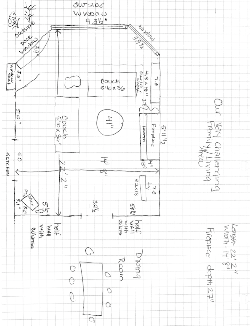
family room addition floor plan number 2
After Karen’s revision, we see that the room is 14′-8″ wide by 22′-2″ long.


That’s a nice sized room family room.


For me, this is a pretty typical family room. I don’t find it particularly difficult except that it’s not a blank slate.  Yes, there’s a doorway from the kitchen to the dining room. But, it’s not unusual.

And this is not to say that Karen isn’t being truthful. First of all, it is always more difficult to design for oneself. Remember?

But, there’s another layer here, and that’s because she’s not trained and hasn’t already done a hundred rooms, presumably. It would be like me trying to do my own bookkeeping. I would rather walk on hot coals that are embedded with shards of glass than attempt to do my bookkeeping. Just the thought, makes me break out in a cold sweat!

Raise your hand if you feel the same way. :]


Okay. Time to jump in. Let’s begin with the lighting.


While the recessed down-light thing is standard for the majority of homes in this US, having that as your primary source of lighting pretty much sucks. As you can see, it’s creating shadows and glare. Yes, they are on a dimmer. That’s good. I would put them on, very low. And then supplement with table and/or floor lamps. And, maybe even a chandelier since we have such a nice, high ceiling.


Now, it’s time to move on to the furniture.


That’s a gorgeous curio cabinet which they inherited. It’s vintage Drexel. It’s probably a little formal for this room, but that’s fine too.

Karen’s measurements for the sofas are off too, but it’s a common mistake. Even manufacturers make this mistake sometimes. When you measure sofas and chairs, one needs to make a plum line down from the top of the back. That line is always behind the legs. In reality, these sofas are 43″ deep. However, 7″ can make a big difference.

Karen said that the TV cannot be moved to over the fireplace because the room is too shallow.

Actually, this room isn’t particularly shallow. But we do need a path behind the main seating area. The thing I see is that the sofa is pushed a little too close to the fireplace. I don’t consider the door to go outside a major path.  If the sofa were back towards the wall, a good foot or maybe a little more, the distance would be about nine feet.

However, putting the TV over the fireplace might be a moot point, because I don’t think that over the fireplace is what I think will be best upon further reflection.

Yes, some of you can exhale now.  ;] I know that there is a good-sized faction of people who abhor the TV over the fireplace. Of course, there are remedies for that too!


But… the TV situation as it is, is not good, either.

Forgive me, but the TV with that neck thing and sitting on a trunk that’s too small, is reminding me of an alien creature. And, the TV is on an angle, which I totally get because that is making viewing easier. But it looks make-shift; at least, in the photo.

And yes, I know. My TV isn’t any better. One day, God willing, it will be.

The TV on the angle is the right idea, I think. In fact, it should be on more of an angel. A 45 degree angle.


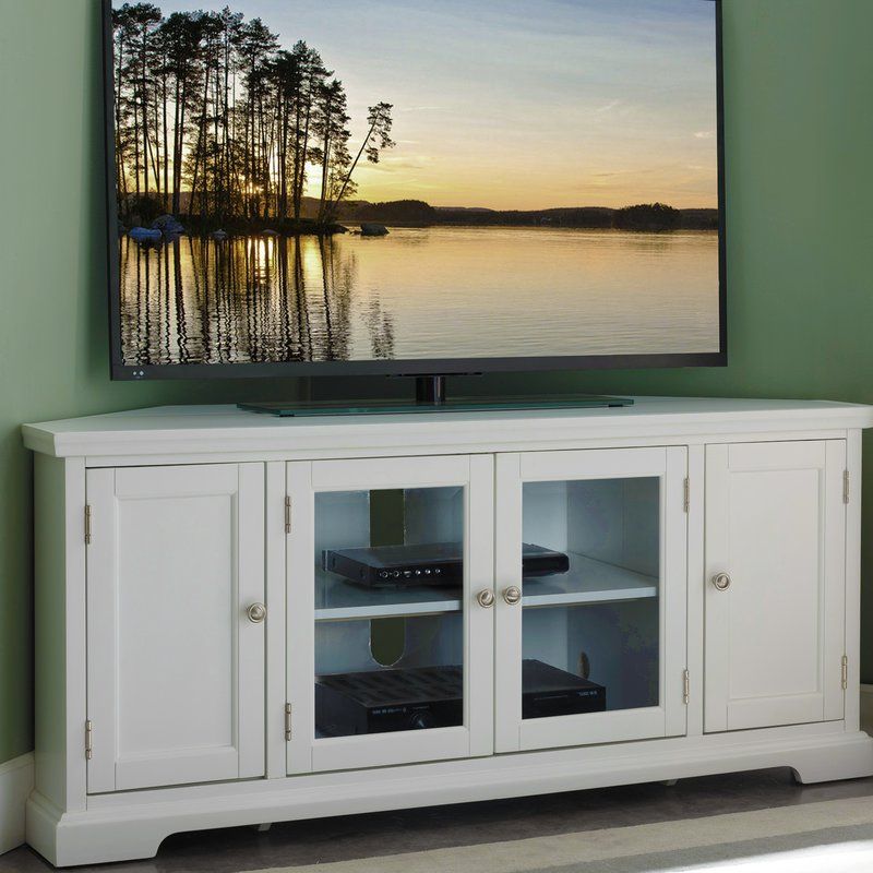
Alcott Hill Corner TV cabinet

Alcott Hill corner TV cabinet at Wayfair


So, how about we actually put the TV on a lovely corner cabinet. Then, we can hide all of the wires and associated equipment. It’s in the widget below. I believe that the color is most likely more accurate here. If desired, this cabinet could be painted. It’s really cheap. But the reviews are excellent.


Let’s address the carpeting.

I don’t recommend wall-to-wall carpeting in living areas (excluding bedrooms) for a lot of reasons. But, Karen says that it needs to stay for a while and that’s fine. We’ll work around it. There is only a sub-floor under the wall-to-wall carpeting, so it can’t be ripped up.

One reason I’m not a fan of wall-to-wall is that there’s a sea of sameness that can make a large room look rather insipid. However, I know that a lot of people still like it. Please note that designers, generally don’t. In addition; if you open up any edition of House Beautiful, Elle Decor, etc. you will never see wall-to-wall carpeting in a living or family room. The only exception is sea grass. Sea grass, wall to wall looks great.


There is a remedy, however.


And that is to break it up with an area rug. Of course, it needs to coordinate with the dining room rug. That rug looks to be vintage or even antique, or else a fine reproduction and definitely hand-knotted wool.


How do you know all of that from a little photo, Laurel?

The same way that you can tell that a building is red brick from a 100 feet away. :]

WALLS

Love the one painting by the wing chair. We need more of that.

I’d love to see a beautiful art wall on the back wall. It could be a series of prints, perhaps.

Over the fireplace, I am thinking a mirror. Nothing too formal. One of my favorites from Anthropologie is in the widget below.

I could see a vertical row of three or four small prints on the wall opposite the Drexel cabinet. I do think that area might need a little more light. That one I haven’t figured out, just yet, however.

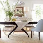
And then, I would love to see some dramatic draperies with a wrought iron pole/rings hung just above the arch. What they would be, I’m not sure at this point, but I have an idea for the dining room in the widget below.

Furniture

Well, I think it’s time to bring out my floor plan. And I apologize. It’s quite a sloppy and slimy looking thing, but hopefully satisfying.
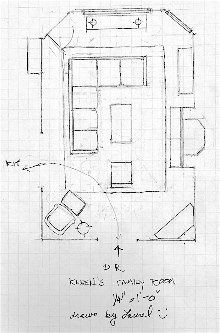
furniture - family room addition - space planning
Oh, so bad. But do note that the number of squares corresponds to the actual measurements. That’s very important when doing a scale drawing. But, you can see the erasers as I tried different things. This took me a few hours to do.

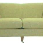
For seating in this spacious family room, which needs to handle a small crowd, I am thinking that a sectional will be best. I have included a couple of comfortable, more compact pieces. (below)


One, the Spruce Street, is by Serena and Lily who’s having a sale right now– on all of their upholstery – use code DETAILS.

This sectional’s seating from front to back (including pitch) is only 35″ deep and it is very comfortable.
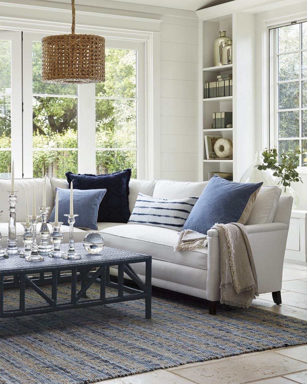
https://rstyle.me/n/c82mybbufmpThis or the image links to the sofa version of the Spruce Street Sectional.


I’m okay with the coffee table staying as is, but if a change is desired, I’m in love with the new smaller version of the Reese Coffee table.


20% off custom furniture - serena and lily + lovely Reese coffee table

At 24″ x 48″ x 17″ high, it is actually not that small, but a beautiful size for most sofas as you can see above. And I love the slightly lower height. My ideal height for a coffee table is from 15″ – 17.” Lower than 17″ is rare and even 17″ is not common. Oh well…

I would do a slipper chair facing the big window as part of a conversational grouping. If other chairs are needed, they can be brought in from the dining room.

Chairs for the family room and dining room.

Love the dining room side chairs. My only issue is with the wing chairs for both rooms. I love wing chairs but the fabric on these is not right for this room. And, from the image, the chair looks too large to be a host chair.

In the family room, it’s too formal and is making the room look a little too old-fashioned, I think. But, I think that Karen knows this as the furniture has seen it’s day and was purchased for a more formal living room, originally.

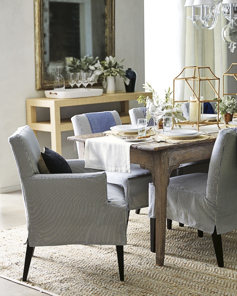
Serena and Lily Dining Room - Jackson Arm Chair slipcovered

Serena and Lily Jackson Armchair – on sale!


I am thinking a small occasional chair perhaps like the Belgian Club chair with nails.


Karen went on to explain a few more things for me/us about this family room addition.

Re: the window seat next to the exit door.

The kitchen was here before we added on the family room. So to keep it balanced we had the 6 windows. I used to have a game table by the big window and the window seat was used as extra seating – we also store blankets in it. I’m not attached to it- I just could never figure out if the kitchen banquet area would look unbalanced if the window wasn’t there. So it’s an interior window, which makes even less sense.


I think we’ll just ignore it.


We will probably have to do this project in phases given the budget or lack thereof, right now. I am hoping to buy some new couches, chairs and a table or two and add some lighting. We have lighting on dimmers now, but as you said – lots of bad shadows. Our priority is to have comfortable seating because we do spend time in here reading, talking and watching t.v.


What else? Well, we have a cuddly dog, we adore. She is with us all the time when we are at home. We let her up on the sofas and chairs- so durability is important.


You know, it’s funny (but not really). In all of the years I’ve been in this business, and I’ve spoken with hundreds of clients and potential clients, EVERYBODY says that durability is important. haha! But, of course it is. We all want our furniture to hold up!

Everyone loves the fireplace and we are often the “winter home”- We definitely nest in front of fireplace with friends.

That sounds absolutely wonderful! You know… on second thought, I don’t think that you should do anything, Karen. And that’s because your friends will never leave! haha!


But truly. It’s an inherently beautiful room and I think with some new furniture, lighting, art/accessories, TV stand and an area rug… this room could be an absolute show-stopper.

Below is a widget of furnishings. Some are very reasonably priced and some are higher-end. However, much of it is on sale. And in some cases, there are alternative options.

Please enjoy and for further information, please click on the individual images.


If you do an area rug and it is lighter, then maybe a darker sectional would be good, but over-all, I probably prefer a lighter fabric. Oh, I don’t know. I like both! For sure, I’d go with the crypton or else the Perennials fabrics at Serena and Lily. They do give out samples.


Also, please know that my measurements might not be accurate. These ideas are conceptual. There is no way, I can put an entire room together in one day– AND write a blog post. But, I think that this is a good start.


It is my recommendation to consult with a designer in your area before making purchases. I recommend this for everyone who does not do interior design for a living. DECORATING IS DIFFICULT! But, it’s best to find someone with a similar aesthetic and I realize that is sometimes not easy to do.

Well, I hope that this was beneficial to many of you because these are all universal decorating issues!

xo,


PS: If you missed the hot sales this weekend, there are some wonderful sales going on, plus the “private OKL sale.”

48 Responses

  1. thank you laurel et al for your comments on our room. I promise I’ll send photos in as I work on it and probably a question or two. We heart our Whoodle and she is a cuddly as she looks albeit very protective. Laurel- you are so gifted and thank you thank you for all the beautiful suggestions. K

  2. Well, I shirked all of my duties this afternoon and sat outside with a glass of iced tea and my laptop in order to catch up on your posts. I’m so glad I did – As always, I leave so inspired!

  3. Hi Laurel,

    I’m a structural engineer and I’ve been out on site with a couple of the architects from my office to take measurements of existing buildings and they were not helpful. Granted they were the young ones but it was like they don’t know what to do. So you have to be careful listening to architects. Sometimes they can act like they know more than they do. Maybe this is just a trait of the 20 somethings.

  4. Hi Laurel,
    Your floor plan/furniture arrangement looks like it would really make her room so comfortable.
    You mentioned that the wall opposite the Drexel cabinet could benefit from some art & more lighting. It appears that lighting would be relatively easy to do since there’s electricity in that wall already. A grid of pictures with a sconce above could look lovely.

  5. I hope we get to see what she does with your suggestions because they are good ones!
    Question: you recommended an area rug on top of carpet which will look great, but do you have any tricks for how to keep the rug in place. My experience is that the rug wants to move with the nap of the carpet. Thanks

    1. Hi Krista,

      This looks to be some sort of loop construction which should hold the rug okay, but if not, then I would use a rug pad that’s meant to go over carpeting. I’m not a fan of Oriental rugs over cut-pile wall-to-wall, however. Cut pile is too mushy, IMO. I realize that it’s more expensive, but in my ideal world, there would be no plywood sub-floors that do not have a finish floor over them.

  6. I love all your suggestions. However, I would move the tv to the other side of the fireplace (next to the windows) and the large breakfront to the side closest to the dining room. I think that would balance the room better allowing the windows to be the focus and the practical storage of the breakfront closest to the dining room. Currently, the tv is just too far away from the sofas for proper viewing – even if she chooses a 60″ tv. I would mount the tv on a tilting, swivel arm which would allow for the best viewing. I love mine – neat and on the wall when not watching and out and angled when I need it. If I was feeling very fancy I’d buy the new Samsung Frame tv – so that it looks like art when just hanging on the wall.

    1. Hi Christina,

      The TV is a little far, that is true. And I did consider switching the TV and breakfront but can’t remember why I decided against it. There is more of an issue of glare by the window, but of course, that can be fixed with window treatments.

      If I were doing this room from scratch, I would probably not have the china cabinet in this room or the chair in the corner. In fact, ideally, the chair in the corner should go, or at least the ottoman because it is hindering other things that are desirable, like an end table and lamp.

      For optimal TV viewing, I think that the TV should be over the fireplace and with a tilting arm as you say. The seating is not too close. In fact with the newer TVs they are saying that for the new 4k TV’s that the optimal distance from a 54″ is only 4.5 feet! Otherwise, for a 1080 pixel about 9 feet is good. And that is about where we would be with the TV over the fireplace. And the Frame TVs are wonderful. I did a post about them here.

      Then, I would put two matching low cabinets flanking the fireplace, or two bookcases.

      In real life, I often came up with a floor plan and then discussed with the client and then revised accordingly. Sometimes I incorporated what they wished to me to use and then we could see that using those pieces wasn’t optimal. But sometimes, the plan is perhaps not the epitome of perfection, but good enough.

  7. Hi Laurel, this is a terrific series, it’s so very helpful. In my Instagram feed there’s a photo of a room with a similar layout by Jake Alexander Arnold. He is a modernist but it’s still interesting to see how he treats a similarly shaped room.

  8. I just want to add that I LOVE these sorts of posts–like others said, I learn so much from your explanations. I enjoy them so much that I tend to save them, not reading them right away so that I can look forward to them (but I’ve always been a little strange that way!). Thank you!

  9. I was looking through your widget (great suggestions BTW) and happened to notice a comment you made about MMS’s DR curtains. You said to please pleat the header not gather it like a ruffle onto the rod. I actually like this style and do it often myself. I just never have liked a pleated header, and always disagreed with my own mother who thought the the only acceptable way to go was “pinch pleats” as she called them. So could we agree to disagree on this one? I think people should have what they themselves LIKE in their homes.

    1. Hi Ellen,

      I think there’s a misunderstanding. It has always been and always will be my philosophy that people should have what they like for themselves. However, it is my experience that the majority of people have no idea what they like or what they want. And/or they are uncertain of how to put the elements together and what looks good with what. If you’re one of the minority who does know, that’s terrific.

      There is nothing wrong with a ruffled drape for the right kind of room. But, my design for this room is more tailored, and the window is super tall, so I think that the drapery should reflect that in its styling. To me, the ruffle says country-cottage and that is not the style I am going after for this space and home.

      I too, am not a huge fan of the standard, heavy buckram 4″ pinch pleats. If I do pinch pleats, I prefer them smaller (no more than 3″) and with a light buckram. My favorite header, however, is a French pleat. And for some fabrics I like a box pleat that’s lightly stitched down. I saw this once in a showroom in the D&D building some 20 years ago and used it so much, that my workroom called it “Laurie’s pleat.”

  10. For some reason, I cannot see the comments! I truly love the idea of more angle to the TV…and perhaps even a bit larger? People watch TV – it’s a fact! Can they rehang the exterior door to hinge on the right side going out? Does it go to a deck?

    If at all possible, can they put a few electrical sockets in the floor? Then the lamp cords don’t have to drag

  11. Wow, Laurel, great job deciphering the original floor plan as submitted and creating a better functioning floor plan. The suggestions in the widget are stylish and great solutions!

    Also, I love the dining room color and wonderful rug in Karen’s home.

    If Karen does hire a decorator I hope she will ask the decorator if the living room (unseen here) might function better as a family room – at least temporarily.
    Maybe that room would work better for tv viewing. If this is even feasible.

    I mention this because maybe it might help achieve her goal of hardwood floors sooner or purchasing a rug or helping to stage her furniture, lamps, etc purchases. And, without a tv, there is no glare issue.

    You have created a beautiful, elegant, unstuffy and comfortable solution that basically works without a tv, too! And perhaps more leeway for placement of the gorgeous cabinet.

  12. What a beautiful sectional! What fabric did you choose from the Serena & Lily website for your picture in the widget?

    1. Oh, that’s interesting JoAnn because my impression has always been that we do and they don’t. I guess it depends where one is looking. Perhaps they think based on our magazines that nobody does wall-to-wall here. In real life, a lot of people still do.

  13. Hi Laurel,
    I love this current “difficult” room series. Honestly it is refreshing to see normal homes where people struggle to figure out a room and have to work with a budget and existing items. Your ideas and creativity and solutions are beautiful but your understanding of real homes and families is why I love reading your blog. Thanks for all you share with us average, everyday home owners!

    1. Hi Aimee,

      So glad that you’re enjoying the posts. Most of my clientele were young families. Most were purchasing their first adult-type furniture. Very few had super-huge budgets. Of course, that’s relative.

  14. Hi Laurel, I wonder why not orient the sofa/sectional toward the fireplace and the windows instead of the dining room? Then switch the TV and cabinet , there must be glare on the TV now. I’m always amazed how often people don’t look out the windows. I voted, any idea on results? Denise

    1. Hi Denise,

      That’s a very good question. First of all, we don’t have a good place to put the TV, unless it’s on the other side of the fireplace and again on an angle as it is right now. In any case, there should be a better piece for it to sit on.

      However, the bigger issue is facing the seating with the back to both entrances. That is something to be avoided, if possible. In addition, it requires having to walk around the sectional, in order to sit in it. It closes off the energy to the room. My space planning teacher, Maggie Cohen would’ve given me a failing grade had I faced the furniture away from both entrances. And that is because there is a clear option to not do that.

      Are there times when there is no choice but to put the furniture facing away from the entrance? Yes, absolutely. But the objective should always to be to create a “gracious sense of entrance” into the seating area.

      As for glare. The TV is not directly facing the window, as it is on the angle, but yes, it is possible that certain times of the day, there could be glare. And that’s another great reason to have window treatments to eliminate window glare. The other thing is that I am surmising that this is more of an evening space, most of the time, except perhaps if there is a Sunday event during the day or a holiday.

      I also love the long table by the windows that opens up to be 32″ deep. In fact, it would be possible to eat there, or use the table for a buffet.

      While it’s certainly lovely to have a view to look out, All one has to do is turn their head if on the side facing the fireplace, or sit in the other two chairs. Since this room is used primarily for socialization, fireplace gathering and TV watching I feel that takes precedence over the view.

      Over-all, I feel that this orientation of the furniture is the best for the room and the needs of the people using it. But, thank you for your ideas, because it helps me explain my thinking better. And that’s one of the beauties of having the comments. Oftentimes, I think that they are better than the post!

      1. Thank you Laurel for answering. I’m a gardener and have oriented my gardens so I can view them from inside. I love interiors but the garden is my happy place. Much more forgiving! Thanks again. Denise

  15. On my west coast road trip I stayed in a lovely inn in Jacksonville, Oregon. You know it was nice because the TV in the room was hidden in an armoire. Now that’s class!! Prayers to those in the path of the hurricane on east coast and Hawaii. Move to Wisconsin, you’ll love it!!

    1. Hi Susie,

      Yes, prayers for our friends in harm’s way.

      There always seems to be a trade-off. Now, about Wisconsin. I lived in Madison for two years and Milwaukee for three years– in the 70s. And while I have some of the fondest memories of my life, they had more to do with what I was doing and who I was with, than where I was geographically. However, the winters nearly killed me. Below zero (Fahrenheit) temps. Wind chills up to 70 BELOW. Yes, and back in the 70s, you still had to go to school!!! Plus, mountains of snow, that stayed around until May.

      But, the very short summers are glorious. That, is true. I don’t recall ever having the crippling humidity we have here in New York.

  16. What about taking the bench seat and putting shelves for videos, and books. There needs to be more table top/tables for the seating – a small table at the end of the sofa with lighting on one end and a floor lamp at the other end of the sectional.
    What about putting the Drexel Cabinet on the opposite wall (behind the sofa) from the FIreplace?

    1. Hi Lawrie,

      Always good to think about the possibilities. I probably didn’t mention this, but there’s a window where the window seat is. Originally, it was an exterior window as this room is an addition.

      I don’t disagree regarding more tables. And I had one on the kitchen side, but then noticed that there’s an ottoman in front of the chair. If this were a real job, there would be a discussion regarding the need for the chair/ottoman here. But, there absolutely does need to be a clear path and we’re running out of real estate.

      Consideration was had also been given to moving the cabinet to the wall you suggested, but we do need to be able to get to the door and that would hinder that option. Therefore, I left it where it is.

  17. Your ideas and suggestions are excellent for those of us who want the gorgeous outcome – but need your professional roadmap to get there.
    Always delighted when your blog appears in my e mail.
    Thanks for all you do.

  18. I felt that room coming together in my mind’s eye perfectly. I do hope one day Karen sends in the finished result, as your ideas make soo much sense Laurel. As always, I learn so much..love it!

  19. Oh, that Serapi rug WOULD look so lovely in that room!It would tie in the wall-to-wall carpeting and the existing sofa. And I love the S&L Jackson dining chair you chose, amazing improvement for that room. You have a gift, Laurel.

  20. What a lovely room Karen has! And your floor plan and furniture suggestions are really beautiful! I hope Karen will share “after” pics of this project. And I’m drooling over those sectionals from One Kings Lane and Serena and Lily, as well as those darling host chairs. Yummy! Thanks for this inspiring post.

    1. Hi Janet,

      I’m incredibly blessed that I get to spend hours every week, looking at beautiful things and making up combinations in my head. It’s like all of the fun and none of the unpleasantness. Only, thing is my fingers do get a little sore. haha.

    1. Ahhh… yes, googling it. hahaha. When I was growing up, there were beagles, collies, German Shepherds, Boxers, Spaniels.Golden Retrievers, and a few others and now there are an insane number of breads. But, I guess too much inbreeding isn’t good for them.

Leave a Reply

Your email address will not be published. Required fields are marked *

This site uses Akismet to reduce spam. Learn how your comment data is processed.

Welcome To Laurel Home!

laurel-aarons-18th-e1456449963926

Hi, I’m Laurel, and Laurel Home is the website and blog for Laurel Bern Interiors.
I’ve been creating new-traditional interiors since 1988. The blog is where I share all.

New Edition, November 2023! Get The Indispensable Guide For 100s of Home Furnishings And Interior Design Sources That Everyone Is Raving About

laurels-rolodex-final-book-cover-master 10th edition 23-24

laurel home archives

Categories:

Please click the image below for more info about my rockin’ Interior Design Guides for 2024!

Laurel Home Interior Design Guides 2024
Amazon ad

please click below to check out my favorite decorating & design books

Laurel Bern's Favorite Interior Design and Decorating Books
Subscribe To The Laurel Home Blog And You Will Receive A FREE Guide Where I Share How To Get Your Paint Colors Right, The First Time.