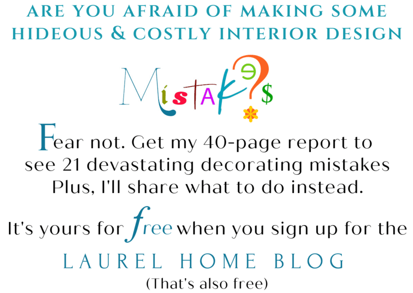
The other day somebody wrote on my Facebook page that a blogger had said that the boring white kitchen is dead. And I guess that goes for bathrooms too.
I don’t know who said that and I don’t want to know, because I’m not sure what I will do the next time I see her.
I mean, did the woman tell her future husband:
“The white diamond is boring and dead…
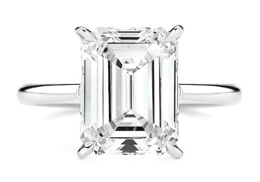
I’m so sick of diamonds!
so get me one of those “new” mood rings, okay?”
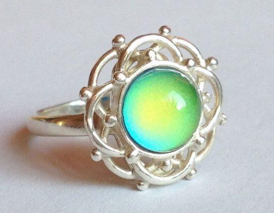
Am I dating myself here? These are definitely not new!
Then, she goes on to say:
Those boring white wedding dresses are out too.

But I saw this way cool dress that’s going to be killer.
(Indeed. I’m sure that many guests will die when they see her walking down the aisle.)
And boring white kitchens and baths???
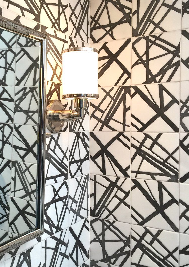
“We have to do this in our bath!
Kelly Wearstler designed it for Ann Sacks.
That means it’s the top of the line and the thing we MUST have!”
I wouldn’t bother to hire a wedding photographer.
That way, she won’t have to burn the house down to get rid of the wedding album and the bathroom tile.
Okay. That’s a little mean.
As for the tile?
I love Kelly. You guys know that, and I think that she’s immensely talented. You know that too.
And I love Ann Sacks too. It is definitely top of the line.
But that tile is messing up my head– big time.
I keep trying, trying, trying to make the lines connect, and well…
Is there a place one could put this?
Well, perhaps… however, I probably just black-listed myself, lol, so maybe I should shut up?
But hey, who am I? If you love that tile and you’re not trying to make the lines connect, and it isn’t driving you batshit crazy, and you need to make your guests leave immediately after dinner,
then go for it!
However, as I said on the Color Chats Panel, “I’m a classical girl.” And that’s a vast category, but there are limits.
BTW, I understand that there will be a video of the panel, and when it comes out, I’ll put a link on my sidebar. Cool.
But back to the subject at hand, the so-called BORING WHITE KITCHEN (and bath)
that is supposedly dead.
A white kitchen is NOT BORING. AND IT IS NOT DEAD.
It is the epitome of timeless.
And it’s fine if you don’t like or want a white kitchen.
We’ve been through that.
Although, I have to admit that I do love other kitchens too!
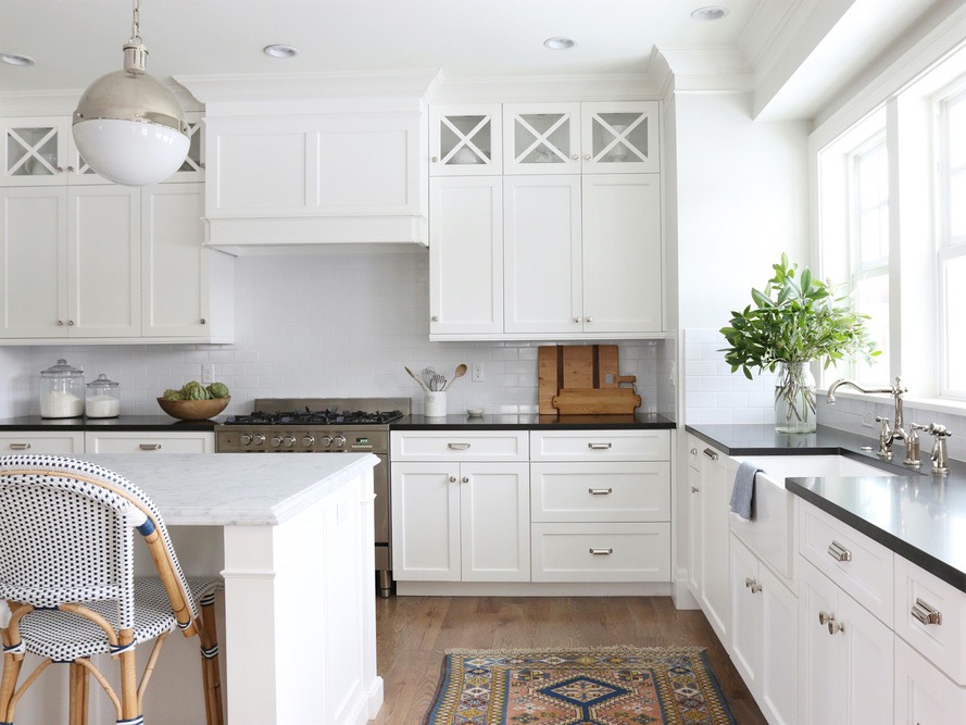
Studio McGee is one of my favorite young interior design firms that does white to perfection. Their mix of contemporary and traditional always feels just right.
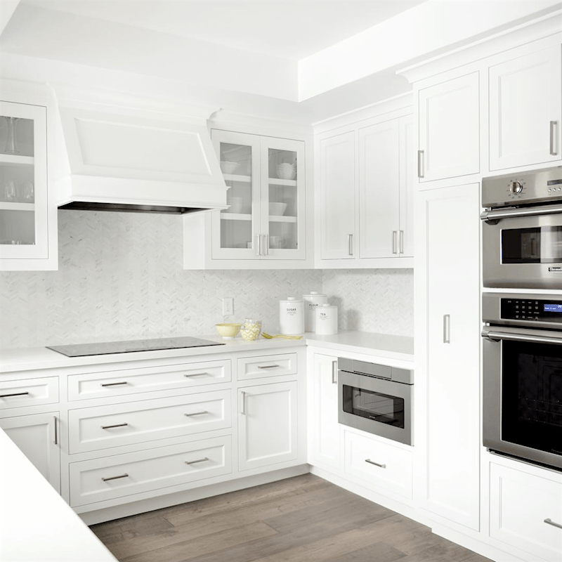
And how about this lovely, crisp not-boring white kitchen by another design hound, fabulously talented interior designer on the tour AND frequent commenter HERE, Laura Schwartz Muller of Four Point Design Construction –
And with Thermador appliances in classic stainless steel. You can also see more about Thermador here.
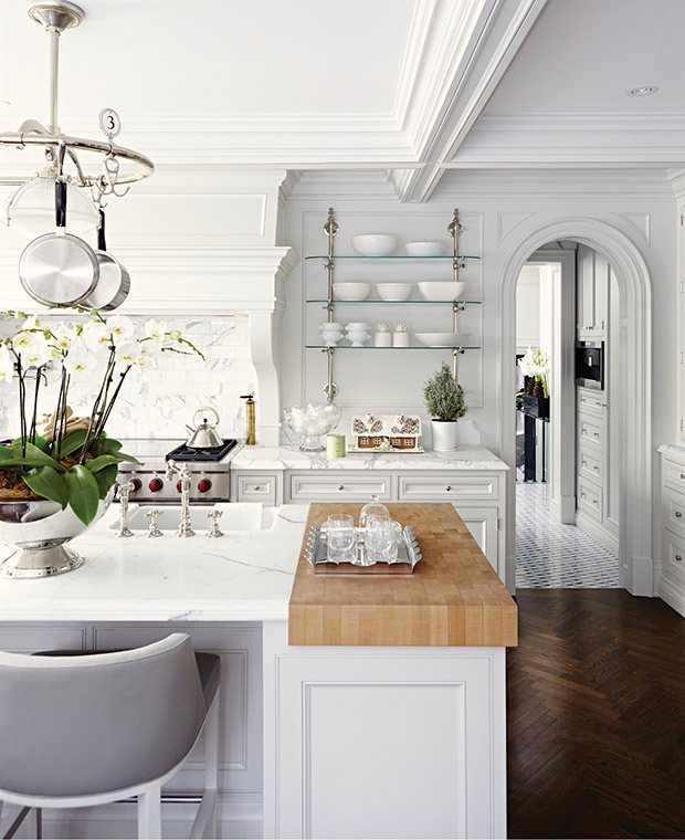
via House and Home – by designer Betty Theodoropoulos-photo- Angus Fergusson
Another boring white kitchen (that I would kill to have!)
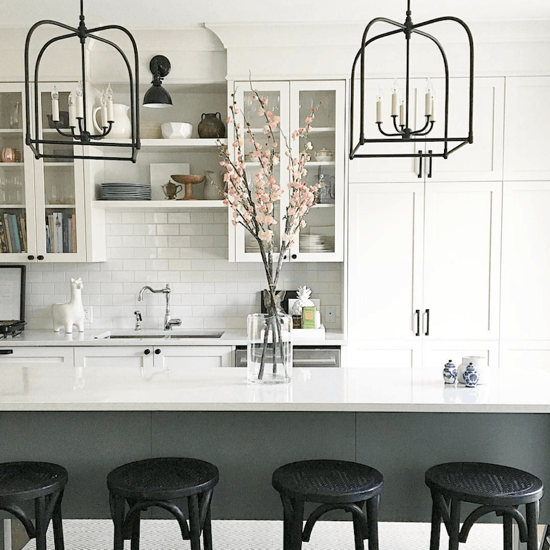
And, I adore this sleek, pretty young-traditional. (some would say transitional, but I’m not fond of that word) by another design hound tour member, the super-talented Vanessa Francis. She’s a Canadian designer, and I’m so glad that I’ve discovered her.
Her Instagram account is gorgeous! I definitely want to steal every photo!
And I was talking to my lovely designer friend and fabulous photographer Linda Holt, who was bemoaning that she would often hear chants of, “I don’t want that boring white subway tile.”
Well, it’s another classic. I’m not saying that there aren’t other options, but you really cannot go wrong with it.
Here’s the problem.
We have a showroom that wants to sell us tile.
And they could make it really easy for us…
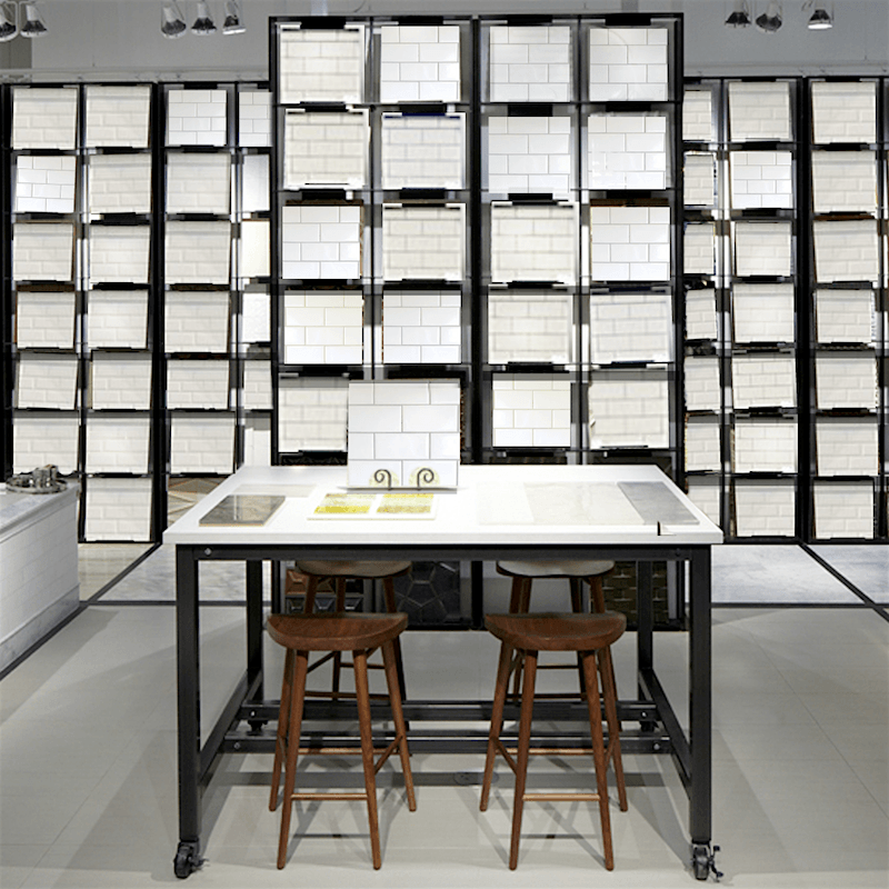
haha! Yes, yes… I fully realize that I’m a nutjob.
You get the point. The shop can’t JUST sell white subway tile.
Nobody would walk in.
Or they’d ask, “What else do you have? I’m so sick of white subway tile!”
(they think)
Well, M’am, we just got this beauty in.
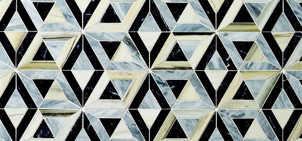
Oh Wow! That’s gorgeous! How much will it cost to do 30 sq feet of kitchen backsplash?
M’am, that’s $250 sq foot installed. Will that be cash or credit?
By the way, I do actually like this from Ann Sacks, and I have no idea how much it costs installed. However, I would not use this for a backsplash. It looks more like a floor to me.
Obviously, the blogger (and if she reads my blog, I’m dead) who said that white kitchens and bathrooms are over didn’t head over to DXV –
to see the gorgeous bathrooms created by the 2016 design panel.
Prepare to be dazzled!
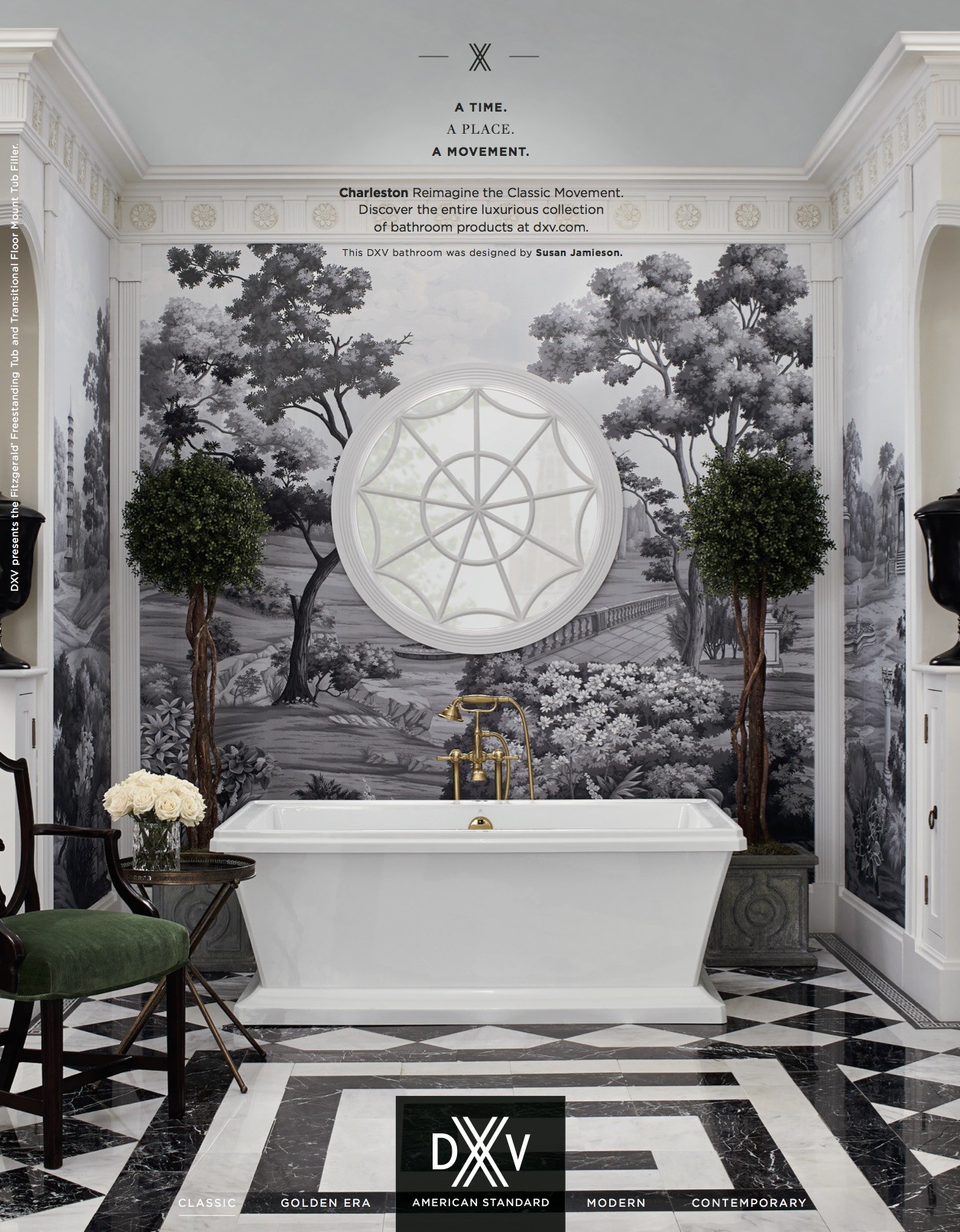
Charleston, SC-inspired bathroom by Susan Jamieson of Bridget Beari Designs.
How sick is that? And I mean the good kind of sick
I had a teaser on Instagram. “Wait Until You See The Bathroom!”
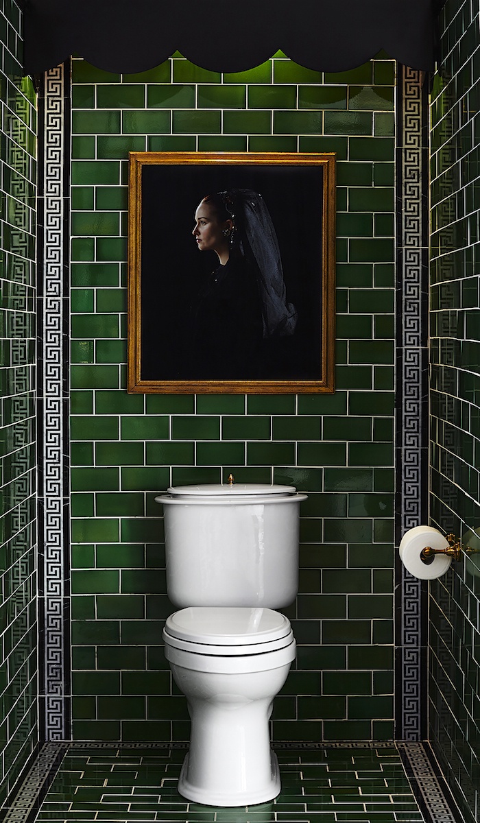
The Tile source is Heritage Tile.
And now, for the piece de resistance.
Are you ready?
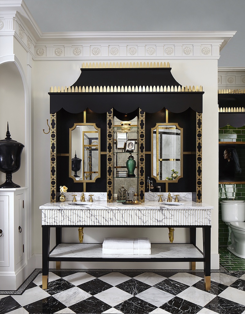
Stylish and original. Oh, and it’s white. Well, black and white. And gold. Magnificent design!
For the rest of the bathroom and all of the sources, click here.
Yes? I see that you’re looking a little confused…
Well… that is insanely gorgeous, but what’s this DXV panel thing?
Oh yes. Thanks for asking. Very interesting.
DXV is the luxury division of American Standard, and the parent company is known as LIXIL.
Of course, we all know American Standard.
But, American Standard sounds about as sexy and high-end as Chef Boyardee. Right?
In this era of creating an image through branding, they would never have called a company American Standard. So, we now have DXV and Grohe that make high-end faucets for the kitchen and baths.
As for the DXV panel, four interior design superstars are selected each year to design a bathroom with a different theme.
But here’s what happened. I was so busy cuddling with Nate Berkus that I missed the presentation of Lixil, DXV, Grohe, American Standard, and Metrie!
But that’s okay because I’m very familiar with Metrie. This is one of my favorite posts from a while back.
I found an image that has those doors. Fabulous “boring white bathroom” – NOT!
And then, I found out that it was done by the incredibly talented Lisa Mende for the DXV panel last year!
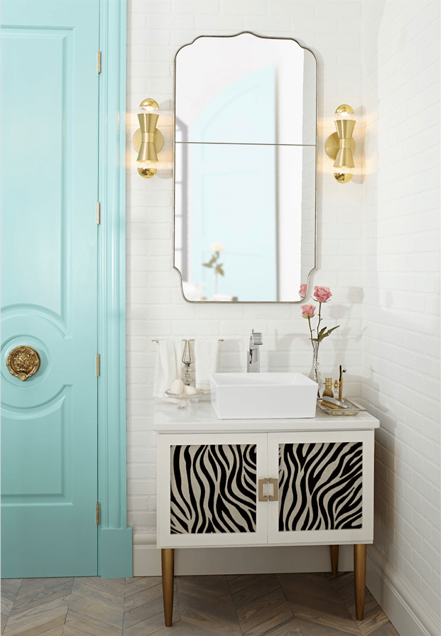
How fun is this bathroom with Tiffany Blue doors from Metrie.
I love Lisa’s classical yet innovative design!
DXV The Pop vessel sink and modern Rem faucet are from DXV.
All of the sources are listed here!
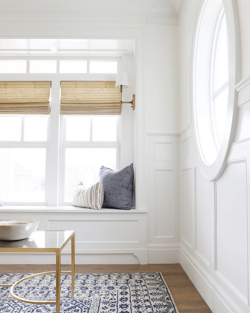
More fabulous Metrie mouldings in this elegant not-at-all boring white room by Studio McGee.
They also have a fabulous Instagram account with a huge following.
It was an amazing three days on the Design Hounds Blog Tour at KBIS.
We had a fabulous cocktail hour before dinner last night and were bussed to the Ritz Carleton in Orlando.
I know… it’s such a difficult job. ;]
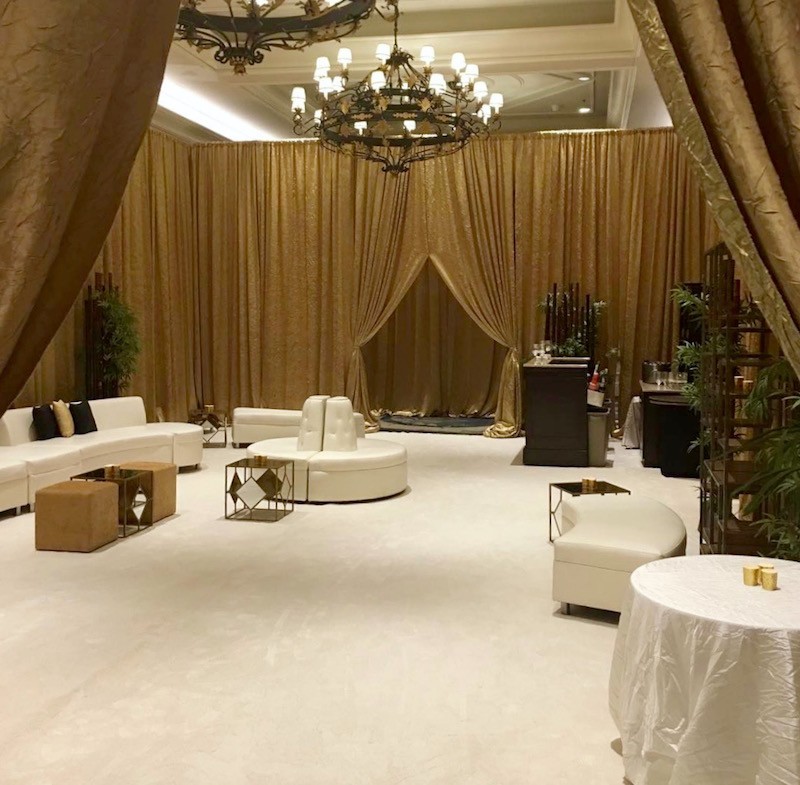
Then, we were ushered into a room that was part harem, part spa
with the softest, plushest carpeting spread wall-to-wall that God ever created.
It’s called Smart Strand Silk; only it’s not really silk. But it sure feels silky, and it’s supposed to be super-pet friendly. You can read about it here.
They did this just for us! It is normally a bare room with more typical hotel-type carpeting.
And then, we were instructed to remove our shoes.
We did.
Mine would’ve come off in any case. Haha.
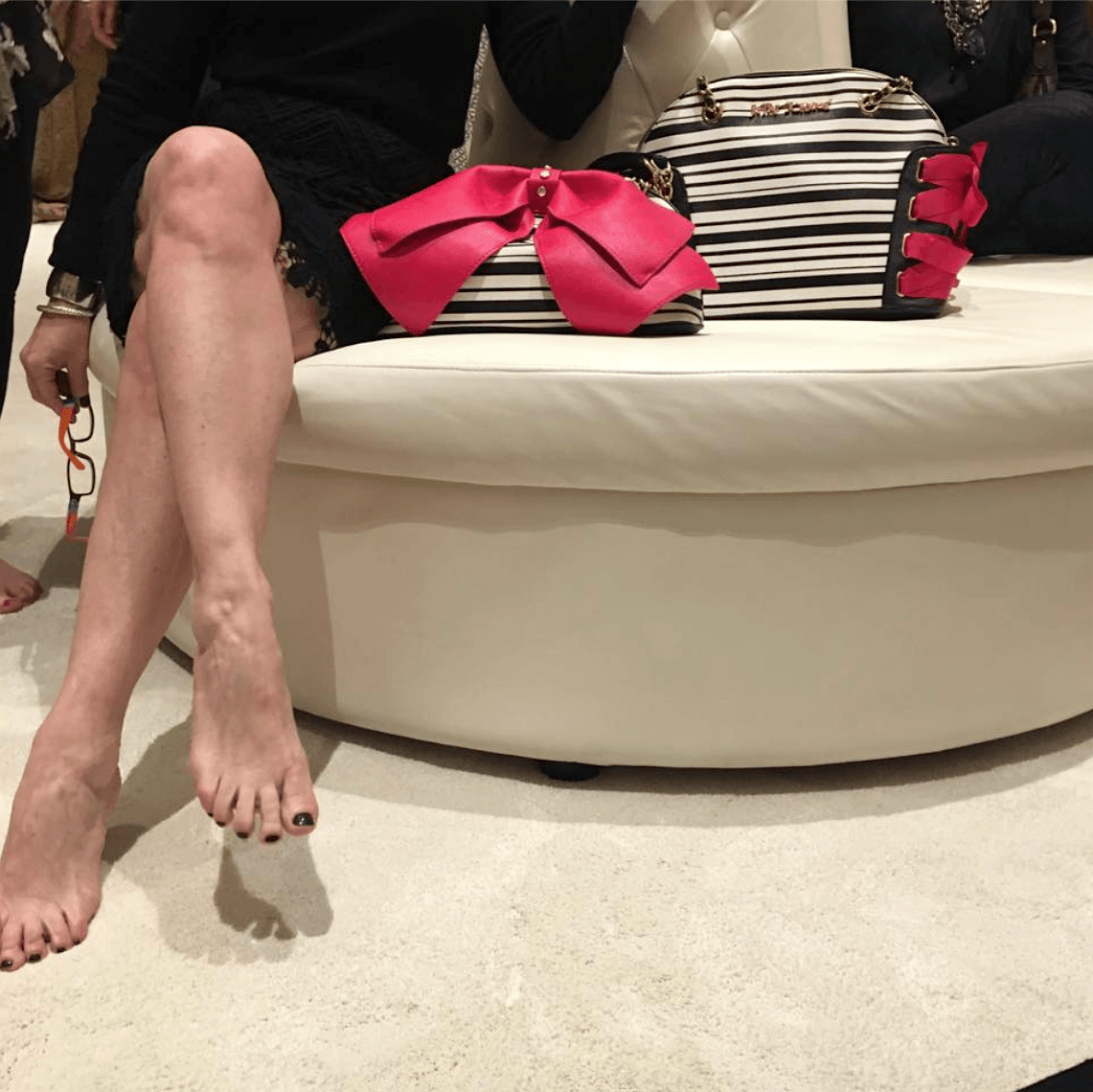
Here is the talented interior designer Kim Macumber showing off her lovely legs.
They plied us with bellinis and hors d’oeuvres which was very welcome.
In the back room, they had hand and back massages.
That sounds a little dirty. ;]
Like I said. Rough job. ;]
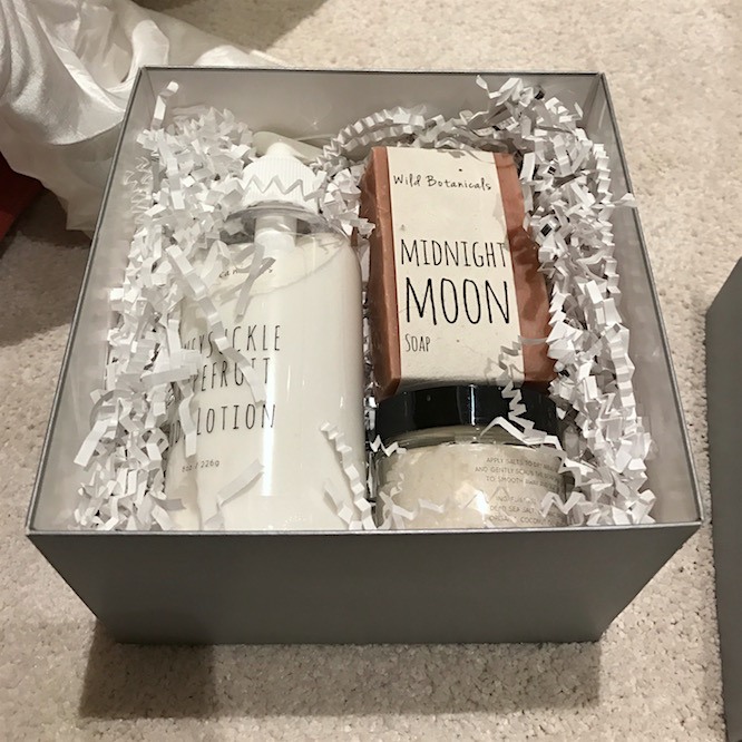
Thank you, Mohawk Carpets, for a lovely party and gifts!
Alas… It didn’t make it through security without the agent looking through every single thing in the case.
Yeah… it was the cream, but luckily she didn’t confiscate it!
Like I’m going to blow up the plane with hand cream and bath salts.
But I did thank her for keeping us safe; she’s just doing her job.
And thank you again to all of the sponsors and especially to Veronika Miller and her team at Modenus.
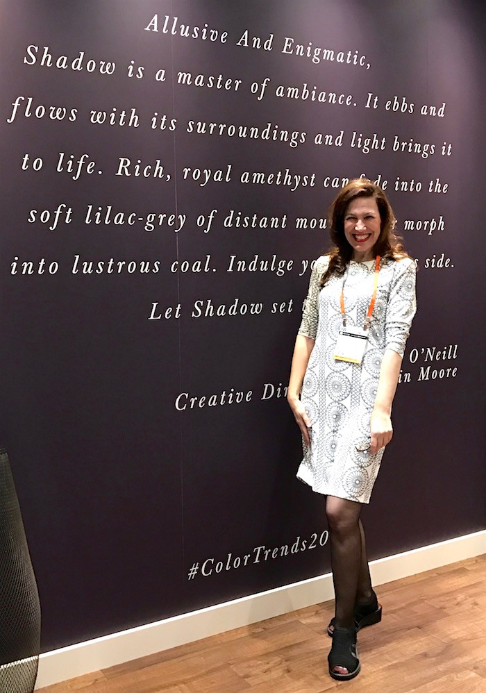
Here I am in the Benjamin Moore Booth in front of the “color of the year.”
looking like a giddy spokesperson.
And no. They still aren’t sponsoring me.
But, I’ve kind of given up on that notion.
It doesn’t matter. (that much) I’m delighted to be right where I am.
Very glad.
I’ll explain more about that soon.
xo,
Save
Save
Save
Save
Save
Save
Save
Save
Save
Related Posts
- A Dream Kitchen Salvaged and the Perfect Cabinet Color
- A Disturbing Bathroom Renovation Trend To Avoid
- The secrets to creating a beautiful interior. You can do it!
- Rugs-Carpets | Which is Better, Wool or Nylon?
- I Wanted Charming Home Decor, But Ended Up With Blah
- My Husband Loves Our Ugly Brick Fireplace
- Discover One Easy Way For a Design Blogger To Get Into Legal Trouble
84 Responses
I cannot thank you enough for this post. We just completed a 10 month total renovation of our home, and I have been a bit uncertain (dare I say disappointed) by our all white kitchen. I labored over every detail of this job for months, and while the finishes are beautiful in the kitchen, I secretly feel that we could have really done more (though, if anyone tells my husband that I said this, I will deny it to the grave). This post was just the reassurance that I needed.
Hi Aimee,
I’m so glad that the post is helpful for you! I love white kitchens!
LOL!, That’s the most honest and yet the most humorous review of white kitchens. I must applaud your experience of interior designing though. Plus, I couldn’t agree more on the fact that white kitchens are timeless. Anyways, I loved this post and your sense of humor , and as Lance Bass says “You’ve got to have a sense of humor to keep your sanity.” Props to you for having that ability to make even the simplest post a funny one!.
Sasha Brown
Thank you Sasha. I do appreciate that.
You are too cute Laurel and so funny! I love how you weave a great story using pretty pictures! Thanks for making my day!
Thanks so much Karen. That makes my day!
Thanks for the shout out too!!!!
Any time! xoxo
OMG, such a timely post. Just today I had a client show me the craziest busiest 3D tiles for her kitchen back splash. I was as diplomatic as I could be but told her she would be sick to death of those tiles within 6 months. I couldn’t talk her into white subway tiles but we did find a compromise. No white kitchen for her!
Hi Linda,
I was thinking about you the entire time I wrote this. I recall that you had another client who was also balking at something simple. Oh well…
Laurel,
I couldn’t agree more. With every single word. White kitchen, white bathroom and especially white master bedroom!
Hi Angelica,
I could easily live in an all-white house!
Hello! I feel compelled to finally post a comment after compulsively reading every one of your posts these past 3 weeks. I had the flu and it altered my brain chemistry to the point where I found myself enjoying an interior design blog! (Seriously, all new hobby thanks to you!)
But sadly (or not) your blog seems to be the only one my post flu brain enjoys. thank you!
Oh, and the white kitchen shall never fall from favor! (Ever)
Hi Stephanie,
So sorry you’ve been sick, but glad you found me to distract yourself. And BTW, I’m totally fine with you not reading the other blogs. lol
O Laurel, you’re a hoot – hubs and I had a good chuckle about the way you get your point through. Go girl! I just discovered your blog, and so glad I did. However, I have a lot of catching up to do, finding myself going from one post to the next – I’m not getting any work done!
You obviously got your time management down to a tee – tell us your secret? Thanks for all the fabulous entertainment and useful info. Mia
Hi Mia,
That is so sweet and well… I could sit here, (if this can be called sitting) and tell you that I have it all down to a system.
OR, that I manage my time really well.
I don’t. However, I very much enjoy all of this.
But here’s what has helped me. The biggest difference came from:
Getting rid of all of the soul-sucking slobs in my life as much as possible. Even if one is alone, it’s better than being dragged into the gutter relentlessly.
For me, doing that one thing, freed up huge block of time. :]
Beautiful stuff Laurel. You have too much fun. I wish I wish.
.
The first Studio McGee kitchen in white: What is the countertop made of please. Love some marble like products but the dark/black makes the other whites pop…to me anyway.
Merci’
Hi Sheryl,
Yes, fun in my fantasies too. But a girl can dream, right?
As for the SM counters. The island looks to be Carrera Marble but the perimeter, I’m not positive. Based on the sheen, it looks like a solid composite, like Caesarstone or Silestone, for example, but it could be soapstone or absolute black granite in a low luster. My money’s on door number one. You could also try contacting their office. I did not tell you to do that, though. ;] ;]
Loved this post! As others have noted, the so-called death of the white kitchen is just a ploy to get people to think about an unnecessary kitchen re-do, as per Nate Berkus’ “trend” comment.
My kitchen is in a 1916 apartment and was mostly empty – no cabinets or countertops – except for a wall of orange-ish oak and glass built-ins. I agreed with my husband that it wouldn’t be right to demolish that history or quality. Our first kitchen in 1989 was white Formica but when we did a totally necessary upgrade just recently he wanted to match the wood throughout and I said I’d go nuts. The solution was to retain the old built-ins and add white painted cabinets and white metal hardware. This works because the teeny amount of gold in the calacatta subway tile backsplash subtly ties the two woods together.
Gotta confess that I don’t like those apron-fronted sinks but suppose if there’s too much monotone they make things interesting.
I love the candid voice of your blog, so thank you, Laurel.
Hi Naomi,
That sounds way cool and I do love a mix of cabinets but not for the sake of it because it’s a trend they saw somewhere. It definitely works in an antique home like you have.
And thanks for your kind words! It always makes my day!
Thanks for the reminder about Smart Strand Silk, that stuff is heavenly and I want t in my bedroom! Also give me a white kitchen any day. White subway, hardwood floors and plain white porcelain dishes. They’re all great canvases for decorating.
Hi Susie,
I love white on white on white on white!
Laurel,
I got talked out of the white painted cabinets I really wanted, back in 2001 when wood stained cabinets were what the typical homeowner was installing back then. I love white cabinets, but when I saw the title of this post, I was hoping that you would be announcing that wood stained cabinets were coming back into style a bit, since I have to sell my home soon with its honey-spice maple cabinets, LOL!!
What do you think of the trend of white upper cabinets and wood stained, (or another color)lowers? I’ve seen some that look strikingly great in photos, but wonder how they really feel in real life. They also make me think that perhaps the designer was trying to please two different tastes, as in, “wood to please him, white to please her.” Do you think that this is a trend that will soon look as dated as flowery deco tiles do now? Or perhaps it is a very practical solution (wood doesn’t show all the dirty fingerprints and dings, etc.)
Laurel, do you remember back in the 70’s and early 80’s when almond was the neutral of choice for most people and was everywhere? Was white looking dated to designers back then? (I know you must have been very young back then!) I hope those days of “almond” reigning supreme never come back, but I know that everything goes in cycles, probably due, in part as you stated above, to manufacturer’s need to make us go out and by something new! Just wondering.
The DXV bathroom is gorgeous, but I don’t understand how it qualifies as a “white” bathroom, or am I missing the point of what you are saying? I love the emerald green tile–but that photo above the toilet has me so intrigued. What is that all about? I feel that it must be some sort of inside joke–the queen above the “throne”, LOL?
Speaking of modernized versions of classical “paintings”, I have to tell you that I was recently in the National Gallery of Art’s gift shop and saw a calendar which had, on the cover, an image of the original painting of the (J.S. Sargent?)one where you superimposed your lovely face over the painter, and my first reaction was, “It looks so much duller and less interesting than Laurel’s version!” I’m not kidding you – it is!
Thanks again for another entertaining and enlightening post.
Hi Phyllis,
Thanks for all of that. All good questions and please forgive me, but it’s more than my brain can handle at the moment. :]
Sorry, Laurel, LOL! I didn’t mean to overwhelm you with so many questions! Your posts just always spark so much thought and interest! (I did reread the post and saw where you said that the DXV bathroom is white and black and gold, so I guess I understand that part better now, LOL!
No worries Phyllis. Sundays are a little intense and by that time in the evening, my mind was going in and out of focus. lol
Hi! I love this post. Thanks so much! I don’t think white kitchens have ever been “out”. That’s the definition of TIMELESS. Stains come and go, and now painted cabinets are gaining ground, but whites are continually available as an option. I, too, just completed my first white kitchen! We moved into our new build 5 weeks ago, and I love it, love it, love it! I featured wood here and there in order to tie in with my somewhat rustic vibe, but I know it will stand the test of time.
Hi Gina,
Hooray! And I love wood too– for the floor or maybe an accent.
Thank you for the link to Heritage Tile, Laurel. I’ve already ordered samples for a client. One thing I noted on their site is that they offer glazed outlet covers that grout right in with the tile. Major good thing, that! When I order, I’m going to let them know I learned about them from you. And great post, as always. Aside from the ubiquitous white kitchen cabinetry, the best rooms are always predominantly white. But it can be difficult to get clients on board. They want those gray walls….
Hi Jana,
That’s terrific and I’m sure that they’ll appreciate knowing that you learned about them from my blog.
And yeah… I know that’s what they THINK they want. Not that there’s anything wrong with gray, but it depends on the home and what else is going on.
I have to agree, I’m tired of white subway tile. I love painted surfaces, it’s too hard to decide on a proper shade of wood stain. I love paint. Though here in Wisconsin sometimes people get carried away painting everything green and yellow for our mighty Packers!!
Hi Susie,
I lived in Wisconsin for five years. :]
Trends are the poor relations of style. You deliver style with every post. (to be fair I can see how hard it would be to separate the former from the latter for someone who never gave the subject any thought – that’s where it helps to find people like you to educate the palate.)
Hi Tasha,
And on top of it, the trends don’t change that much from year to year. It’s only after about ten years that one can begin to see changes. And then, it depends where one is looking.
My favorite rooms are ones that one can’t tell if they were done 30 years ago or yesterday.
Laurel – fellow design hound, thank you so much for the shout out! So glad to have met you on BlogTour. I’m now addicted to your blog! Great writing. xoxo
Hi Vanessa.
Woof! Woof!!! I’m so happy to see you! I’ll be sure to leave out plenty of biscuits. haha. And I’m addicted to your gorgeous photos, not to mention the beautiful work you do! xoxo
Laurel, what’s your opinion of the rose gold trend? Here to stay? Or will we be replacing all of our lights, faucets in 5 years?
Hi Christine,
I’m not a fan of rose gold. But that’s just me. I have seen it in some contemporary, feminine looking kitchens, but whether that will stand the test of time, is unknown. Probably not. It depends what else is going on. In any case, I love mixing metals. But the rose gold is more difficult to mix, I think.
The white kitchen out??? NEVAH!! Those white kitchens are classic and timeless and they help you sell your house when the time comes. Put your color on your walls if you must but do not litter your kitchen with colorful tile. It’s too much visual noise. Plus…that dress of yours, Laurel! Wow!
Hi Robyn,
I agree completely! And thank you for the compliment. I didn’t realize. I rarely where dresses, but wanted to look like a lady for Nate and that one is super comfortable. It’s from J. Mclaughlin.
Pamela mentioned two of the key words in this discussion about white kitchens (and white bathrooms). There’s “boring” and there’s “timeless”, and there’s also “trends”. Some white kitchens are “boring” to me because they are stark white, cold and sterile, without even a touch of color from a plant or a bowl of fruit. Some white kitchens are not “timeless” to me because they are overdone with with stuff to look “country” or “cottage”. Some designers and some bloggers, I think, don’t have a creative bone in their body so they have to follow trends, and white kitchens have been a sort of trend recently so they have to be banned now for the next trend. My 1980s oak cabinets are begging me to bring out the paint brush and they are going to go a warm white when it happens. And I’ll be happy as a lark despite what any designer or blogger thinks.
You’re totally right about that tile. I don’t have vertigo but I do have a focusing defect and just the pic of that tile can unbalance me visually. It already looks unbalanced mentally, as if someone in a psycho ward went off with a pen in hand.
Hi Sandy,
Yes, it looks mentally deranged. And maybe it’s meant to! But do we have to encourage it? lol
I suppose that there was a time when people looked askance at Picasso and others saying, is that art?
But tile is so permanent. Difficult to change once it’s there.
The title of this post immediately made me look forlornly over at my white kitchen with subway tile taken to the ceiling and think of the Nate Berkus quote you shared with us. Then I also remembered, ‘ah, this is a Laurel post, she’s not PROCLAIMING this – she’s about to set someone’s a$$ straight…’ 😉
Last spring we toured The Biltmore in NC and I couldn’t help but notice the white subway tile everywhere (granted, mostly in the staff quarters, but I’m cool wit dat) and ever since, I tell myself that it means it’s pretty much timeless.
All of your images are stunning (as usual!) and the emerald bathroom reminds me of the green tile they use in Le Diplomat in DC. I visited there a few years ago with my sisters and haven’t stopped thinking about it since. I didn’t have the guts to adorn a wall in the emerald tile so I’ve been trying to con my sister into doing it…
PS: This was a comment with no real direction. I apologize! You’re so fun to read and the way you write is like you’re dishing with a girlfriend, so it always makes me want to comment!
Hi Sarah,
Well, you’re on to me! lol. But the headline is super important. I don’t always get it right, but it can make a big difference in the post getting opened up or not.
And sometimes the headline IS literal, just to keep folks guessing. The worst thing a blogger can do is be boring and too predictable.
Some idiot wrote on FB that he liked the green tile, but there was too much of it. And it reminded me of the emperor telling Mozart that the composition was “nice,” just too many notes. Cut a few of them and it will be much better.
And Mozart says, “And which ones shall I cut?”
It’s only the WC area which is tiled to define it. It’s perfect as is and ties into the gorgeous green chair near the tub. And I adore the vertical border of Greek key tiles that melts into the floor border. Genius!
It’s VERY odd that Ben Moore isn’t sponsoring you! Kind of dumb of them. I love all the KBIS photos of the fab new products and colors, but I’m getting this vibe from some of the wood finishes that make me remember the pickled wood years. Just typing the word “pickled” makes me cringe. I wasn’t there and am just seeing photos, so maybe (hopefully) I’m wrong. Rock on Laurel. You’re doing a great job!
Hi Anne,
Thanks so much for the thoughts about BM. What I’ve discovered is that many big companies haven’t quite figured out the power that some of us have and how much we’re affecting their bottom line.
I have an even worse situation with CR Laine. Without warning, they yanked my account. A form letter.
Why? I’m not ordering? Why? I’m not designing. I’m blogging and writing about them, linking back to their website (but am removing the links). Those links were sending thousands to their website every year!
If only someone had bothered to make a phone call to find out what was going on?
And unfortunately, I did see a lot of that grayish greige, faux rustic, “wood” and have to say that I find it pretty awful.
Also, gold and brass are huge. I think that folks do need to be careful. There is a place for them, but not in every application.
Another post!
Great to see you looking so happy in the last photo Laurel!! Beautiful and entertaining post as always. Ugh, the CR Laine thing makes me cringe…what fools! The design industry is nutty and companies certainly don’t make it easy to do business with practices like that! But no matter, you Rock and always will!
Hi Angela,
Yeah…Apparently, they sent out dozens if not hundreds of these. I heard a story where I designer went to place an order for let’s say 36k retail and then was told that her account had been terminated. No warning. Nothing.
This doesn’t sound like CR Laine, so I’m not sure what has changed with them, but certainly, it would be wise to know who you’re sending a termination letter to.
I love you and your writing and your insight. That’s all.
I love you for saying that Jessica!
My nephew just bought a condo & is in the process of redoing the bathroom. Like a moth to a flame he goes for whatever the latest & greatest tile is. My husband & I tried to talk him into doing a classic white tile. But he says it’s boring.
How do you convince a 25 year old guy to do classic? Turns out you can’t.
I guess since it’s his home he can do whatever he wants.
Hi Mary,
Well… as the mother of two sons in their 20s who both live below the poverty line, I guess I have to say that I would be thrilled if they could afford to even have their own place one day.
They’re musicians and one has special needs.
Nephew will have to learn the hard way when he goes to sell the place and struggles to make back his investment.
But you never know. Maybe it’ll turn out to be quite handsome. There are other options that are– very nice.
That sounds like a post!
And that’s a post I would be very interested in reading!!
Hi Mary,
I’ll add it to the list.
I’m forever thankful that I’m too poor to follow trends. Always had a white kitchen, always had my blue and white pottery, always had white mattelasse bedding, etc. Well, you get the picture.
At 72, still tweaking the design here and there, but still classic, and oddly, still fresh.
Hi Gracie,
You hit the nail on the head. A true classic is ALWAYS fresh!
That’s such a cute picture of you in front of the amethyst wall; only I can’t help but notice that they spelled “elusive” as “allusive”. Oops! Nothing like making a larger-than-life sized sign at a major design show with the first word misspelled.
As to white kitchens, it depends. Some colour thrown in makes it all okay, but the starkers are boring. And you are absolutely right about that tile. No way! That tile would make anybody crazy. She also did a staircase that was so beautiful, but used a red graphic that looked just like a 5 year-old was let loose with a red paintbrush and went hog wild. It just doesn’t work.
Hi Cynthia,
I had to look that up about the words and it could be allusive which can mean – evocative. But the word is rarely used and they probably did mean elusive. Oh well…
Your point about color is a very good one and one I was thinking about but didn’t say outright. And that means that white does not mean the total absence of color. But for me, what makes a white kitchen rich and any room for that matter, is the thing I’m always harping on— the architectural details and proportion.
A cheap white kitchen with a poor design is most likely what folks are fearing.
A room with beautiful architectural details and proportion is a thing of beauty in and of itself, even empty. You are right to emphasize that. It’s the basis of all décor.
Amen.
Laurel, you are just the darlingest thing, and always right on target, sayin’ it with sass, class, and a dash of smart-a–to paraphrase something I saw the other day!
Girl, don’t you EVER let anyone tear you down or get down on yourself, you are the cat’s tuxedo.
(I refer to the post you so bravely wrote a while back; it really took courage to make yourself vulnerable by sharing that, like many of us, you yourself struggle with self-doubt and get depressed).
I know this is off-topic, but your blog, and you, are such a delight to me! And oh-by-the-way: I just did a VERY smart WHITE bath for a client, but I had to talk her into it (“Won’t that be boring ?”). They love it.
We will all be stealing your excellent analogy to the white diamond!! Perfect.
Hi Stephanie,
Thank you so much for your kind words. I feel incredibly blessed!
And yes, this is why I wrote the “boring white” post. It’s incredibly common. The other word that I hear that drives me a little nuts is “sterile.”
I second your comments on white kitchens and your point about the tile stores needing to sell tile. I am a huge fan of your classic style and look forward to reading your blog every Sunday! I grew up in New York and studied there. I wish I still lived in that fabulous city. Thanks for your weekly insights. Best -Maryellen-
Hi Maryellen,
Maybe some day you can come back! Thanks so much for your kind words!
Thank you for allaying my fears! I just had a new home built and went with white shaker style cabinets, with Minuet LG Quartz counters(marble pattern).
I love the classic look, and I thought if anything, it will make for a bright, inviting kitchen should I ever sell.
However, I did put in staggered glass and stone tile for the backsplash, in muted tones at least, which I subsequently learned you weren’t fond of. I guess I can’t win them all!
Love your blog Laurel!
Hi Paula,
Muted tones are alright for the staggered glass tile backsplash. It all sounds very pretty!
Laurel, you had me laughing my ass off this morning! Damn! You might be the only person who makes me laugh right now and I don’t even know you. Thanks, lady! Wonderful post.
Hi Lisa,
Well… you know me a little. haha! But great to see you and glad that you enjoyed the post!
Hi Laurel. Have to agree with you. I’ve been around for 62 years so I’ve seen a lot of trends come and go, but white is forever.
Hi Susan,
I’m right behind you. I’ll be 61 next month. :]
Such fun you had! Enough about the feet – what are those lovely black/white purses with the pink bows??? Fun post – many thanks!
Hi Julia,
You know, I don’t know about the purses, but others on the tour do know. Kim Macumber is super nice. I think that she knows.
Do you have a classic, standard white 3×6 subway tile you use? I don’t want pillowed/fluffed/super expensive but am wondering whether there is something between cheapest Home Depot and Ann Sacks that marks the sweet spot in terms of value, quality, and appearance.
Hi Atlantic,
That is a very good question and unfortunately, no, I don’t. I’ve had clients do the cheapest tile made OR the really expensive stuff.
And there are tiles in between that we’ve done too, but we’ve just gone to the store and said “that one.” The manufacturer isn’t listed.
One thing I’m not too keen on are machine-made tiles that are supposed to look hand-made. Generally, there’s an exaggeration of ripple that looks fake to me.
You might try checking out http://tilebar.com/
Their faux hand-made is actually pretty good and about $10 a sq foot. (not installed, of course) not bad. And they have a lot of other stuff too.
And also, probably more expensive, but the source in the post is worth a look see.
https://heritagetile.com/
Another great post with useful links and info, and comments that make me laugh because ITA. I wouldn’t have been so diplomatic about some things…
Hi Linda,
haha! I know. I don’t really get some of the tiles. Or as I always say, “just because you can, doesn’t mean you should.”
God help me, I HOPE white isn’t out. It is and always has been my absolute favorite kitchen. Going to reside proudly in my house in about two weeks, actually. Might be a little predictable, but never boring. Always timeless. Thanks for supporting the white-cabinet-cause. Hugs.
Hi Pamela,
I don’t think it will be either, but there sure was a lot of greige, gray and faux rusticity and then some super bright colors.
My white kitchen was subdued just enough with a bronze-ish cabinet glaze and a bronze-ish black island. Gorgeous small scale carrera subway to the ceiling behind the induction, hood and flue. The rest of the back splash is large scale subway, real shiny, greys and greige, that I loathe. But, it ties things together and will have to stay at least until the Minister of Finance can be better controlled. Monogram stainless with the glass front fridge. Thank goodness for designers.
Hi Anna,
Thanks for weighing in. My kitchen is far from perfect.
I love Ann Sacks and you too (even though that ‘psycho’ tile would drive you batsh*t crazy … ☺ …. your words) but hey you are super talented and I love your style of writing. That said; as I have a inner ear disorder which on occasion can trigger the symptoms of Vertigo, it and the other tile that you featured would set me right on my little butt particularly if it were in a confined area like a shower stall.
Thank you so much for the laugh and the lesson. -Brenda-
Hi Brenda,
Actually, I have that too or something similar. I don’t get dizzy, but I do get hideously nauseous. Lots of things can trigger it. A hot shower, motion, or some dizzying pattern.
Do you know why gyrotonics are? It’s an exercise and I actually can’t even think about it! I tried it once and it took me 24 hours to feel back to myself.
I actually carry bonine around with me, because when it happens, it’s very unpleasant.
The “floor tile” would need to be in a fairly large scale. The colors are nice.
Hi Laurel!
Thank you for another super interesting post..I’m a greige lover, and it’s love not infatuation so I’m incredibly calm and sure about my choices..but I love all the rest of the colors(even though not equally) and admire many kitchens including the white ones-it’s never just about the certain color.. it’s about the color-and its connection to the context. Like a good book is never about just one sentence even the most memorable one.
I love Ann Sacks too and used the store heavily for our remodel! We have the best store ever around here. We used couple more stores I was deeply impressed with..the rest mostly makes you ill. Physically. Huge, and nowhere to sit, and nobody to talk to properly. No, I’d rather look at great products and talk to nice people, and have a chair to sit down while talking, and know things will get taken care of. Worth paying more, in my book.
I’m also not a fan of a word “transitional”..interesting since I can’t exactly pinpoint why. Why aren’t you?
Sorry that I crammed everything into one post..but two long posts would be worse, right?:)
Hi Jenny,
Re: transitional, I always think, what are we transitioning into? It’s not modern and it’s not traditional. And often, it’s that bloated, weird stuff; not always, but often. It’s almost like if they say “traditional” it’s a dirty word. Or it sounds too much like grandma. But often, I find that it leans more to traditional, but young, or new traditional like I’ve always called it. Otherwise, if it’s not that, I would put it in the contemporary category.
People mix up contemporary and modern too. Modern is a mid-century period of furnishings. But contemporary can be part of that. I’m fine with any of those terms, but transitional sounds wrong most of the time.